├── img
├── rightSide.png
├── leftSideSmall.png
└── rightSideSmall.png
├── header_github_fluid.png
├── animated_fluid_slider.gif
├── src
├── styles.js
├── index.js
└── ogSlider.js
├── package.json
└── README.md
/img/rightSide.png:
--------------------------------------------------------------------------------
https://raw.githubusercontent.com/openGeeksLab/react-native-fluid-slider/HEAD/img/rightSide.png
--------------------------------------------------------------------------------
/img/leftSideSmall.png:
--------------------------------------------------------------------------------
https://raw.githubusercontent.com/openGeeksLab/react-native-fluid-slider/HEAD/img/leftSideSmall.png
--------------------------------------------------------------------------------
/img/rightSideSmall.png:
--------------------------------------------------------------------------------
https://raw.githubusercontent.com/openGeeksLab/react-native-fluid-slider/HEAD/img/rightSideSmall.png
--------------------------------------------------------------------------------
/header_github_fluid.png:
--------------------------------------------------------------------------------
https://raw.githubusercontent.com/openGeeksLab/react-native-fluid-slider/HEAD/header_github_fluid.png
--------------------------------------------------------------------------------
/animated_fluid_slider.gif:
--------------------------------------------------------------------------------
https://raw.githubusercontent.com/openGeeksLab/react-native-fluid-slider/HEAD/animated_fluid_slider.gif
--------------------------------------------------------------------------------
/src/styles.js:
--------------------------------------------------------------------------------
1 | import { StyleSheet } from 'react-native';
2 |
3 | const styles = StyleSheet.create({
4 | container: {
5 | backgroundColor: 'transparent',
6 | },
7 | trackStyle: {
8 | height: 4,
9 | }
10 | });
11 |
12 | export default styles;
13 |
--------------------------------------------------------------------------------
/package.json:
--------------------------------------------------------------------------------
1 | {
2 | "name": "@opengeekslab/react-native-fluid-slider",
3 | "version": "1.0.1",
4 | "description": "",
5 | "main": "src/index.js",
6 | "repository": {
7 | "type": "git",
8 | "url": "git+https://github.com/openGeeksLab/react-native-fluid-slider"
9 | },
10 | "scripts": {
11 | "test": "echo \"Error: no test specified\" && exit 1"
12 | },
13 | "keywords": [
14 | "react-native",
15 | "ios",
16 | "android"
17 | ],
18 | "author": "openGeeksLab",
19 | "license": "MIT",
20 | "bugs": {
21 | "url": "https://github.com/openGeeksLab/react-native-fluid-slider/issues"
22 | },
23 | "homepage": "https://github.com/openGeeksLab/react-native-fluid-slider/#README.md",
24 | "dependencies": {
25 | "prop-types": "^15.6.2"
26 | }
27 | }
28 |
--------------------------------------------------------------------------------
/src/index.js:
--------------------------------------------------------------------------------
1 | import React, { Component } from 'react';
2 | import { Text, View } from 'react-native';
3 | import PropTypes from 'prop-types';
4 |
5 | import Slider from './ogSlider';
6 | import styles from './styles';
7 |
8 | export default class App extends Component {
9 | static propTypes = {
10 | value: PropTypes.number,
11 | minimumValue: PropTypes.number,
12 | maximumValue: PropTypes.number,
13 | step: PropTypes.number,
14 | minimumTrackTintColor: PropTypes.string,
15 | maximumTrackTintColor: PropTypes.string,
16 | thumbTintColor: PropTypes.string,
17 | onValueChange: PropTypes.func,
18 | onSlidingComplete: PropTypes.func,
19 | }
20 | static defaultProps = {
21 | value: 0,
22 | minimumValue: 0,
23 | maximumValue: 100,
24 | step: 0,
25 | minimumTrackTintColor: '#FFFFFF',
26 | maximumTrackTintColor: '#FFFFFF',
27 | thumbTintColor: '#FFFFFF',
28 | onValueChange: () => {},
29 | onSlidingComplete: () => {},
30 | };
31 |
32 | getThumbMode = () => {
33 | const {
34 | value,
35 | minimumValue,
36 | maximumValue,
37 | } = this.props;
38 | if (value === maximumValue) {
39 | return 1;
40 | } else if (value === minimumValue) {
41 | return -1;
42 | }
43 | return 0;
44 | }
45 |
46 | render() {
47 | const {
48 | value,
49 | step,
50 | minimumValue,
51 | maximumValue,
52 | onValueChange,
53 | thumbTintColor,
54 | onSlidingComplete,
55 | minimumTrackTintColor,
56 | maximumTrackTintColor,
57 | } = this.props;
58 | return (
59 |
60 |
73 |
74 | );
75 | }
76 | }
77 |
--------------------------------------------------------------------------------
/README.md:
--------------------------------------------------------------------------------
1 |
2 |
3 |
4 |  9 |
10 |
9 |
10 |
11 |
12 | 
 13 |
14 |
13 |
14 |  15 |
15 |  16 |
16 |  17 |
17 |  18 |
19 |
18 |
19 | 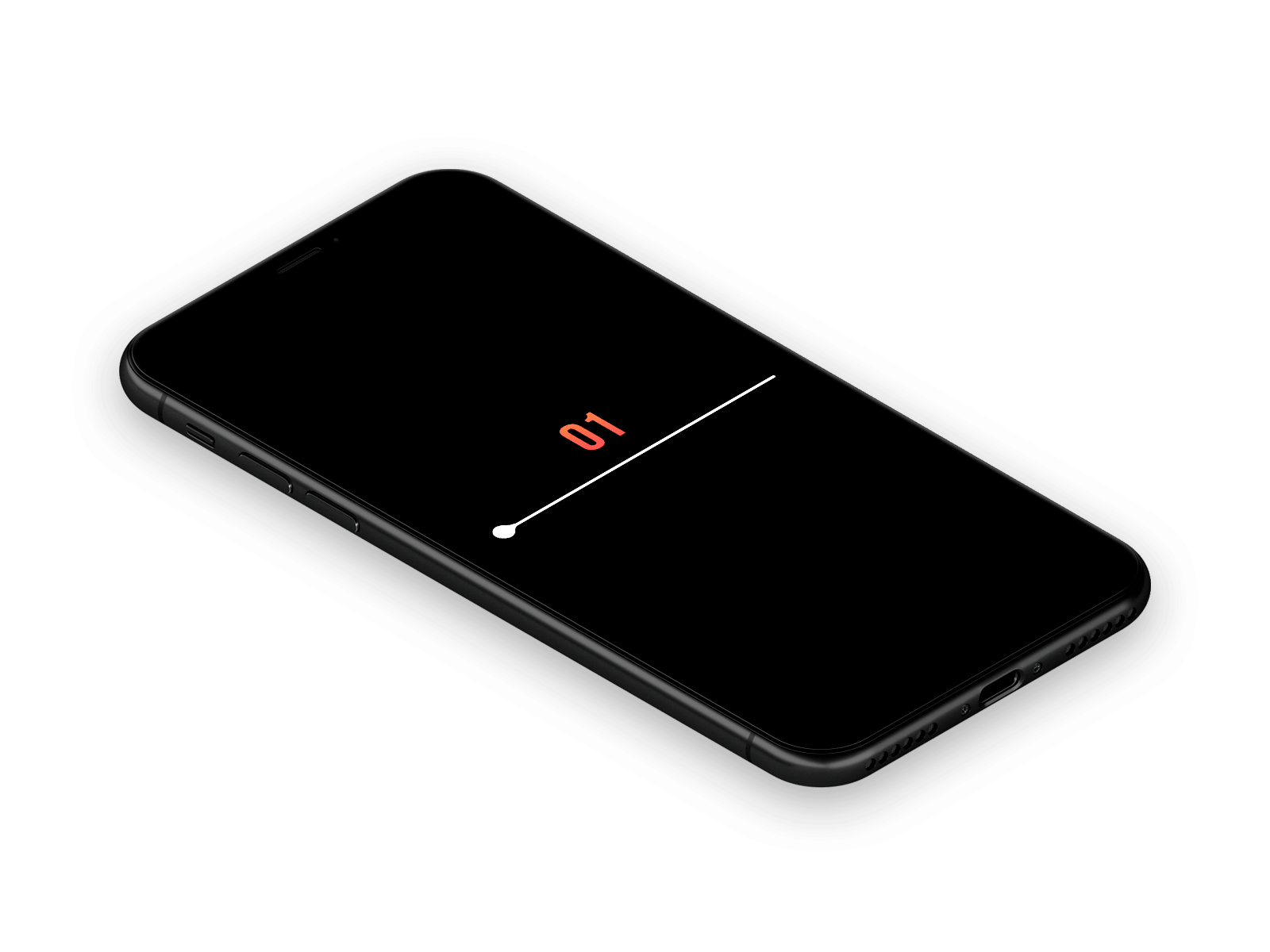 21 |
22 | # About
23 | Our company provides custom UI design and development solutions for mobile applications and websites.
24 |
25 | Need a team to create a project?
26 |
27 | This project is developed and maintained by openGeeksLab LLC.
28 |
29 |
30 |
21 |
22 | # About
23 | Our company provides custom UI design and development solutions for mobile applications and websites.
24 |
25 | Need a team to create a project?
26 |
27 | This project is developed and maintained by openGeeksLab LLC.
28 |
29 |
30 |  31 |
32 | # react-native-fluid-slider
33 |
34 | ## Requirements
35 | - React Native 0.50+
36 | - iOS 9.0+
37 | - Android 4.2+
38 |
39 | ## Installation
40 | Just run:
41 | - npm i react-native-fluid-slider
42 |
43 | ## Basic usage
44 | ```javascript
45 | import React, { Component } from 'react';
46 | import {
47 | StyleSheet,
48 | Text,
49 | View,
50 | } from 'react-native';
51 |
52 | import Slider from 'react-native-fluid-slider';
53 |
54 | export default class App extends Component {
55 | state = { value: 40 }
56 |
57 | render() {
58 | return (
59 |
60 |
61 |
62 | {this.state.value.toFixed()}
63 |
64 | this.setState({ value })}
67 | onSlidingComplete={(value) => { console.warn('Sliding Complete with value: ', value) }}
68 | />
69 |
70 |
71 | );
72 | }
73 | }
74 |
75 | const styles = StyleSheet.create({
76 | container: {
77 | flex: 1,
78 | justifyContent: 'center',
79 | backgroundColor: '#000',
80 | paddingHorizontal: 70,
81 | },
82 | sliderContainer: {
83 | width: '100%',
84 | },
85 | valueText: {
86 | fontSize: 40,
87 | textAlign: 'center',
88 | margin: 10,
89 | color: '#ee6d51',
90 | },
91 | });
92 | ```
93 | ## Properties
94 | `value` - is the value of the slider.
95 | `step` - is the slider step.
96 | `minimumValue` - is the minimum value.
97 | `maximumValue` - is the maximum value.
98 | `onValueChange` - it is called when the value of the slider is changed and getting the new slider value parameter.
99 | `onSlidingComplete` - is called when the slider is almost dragged(when the user releases the slider) The function can get one parameter, it's the value at the time of completion.
100 | `thumbTintColor` - is the slider color.
101 | `minimumTrackTintColor` - is the color of the slider track on the left of the slider.
102 | `maximumTrackTintColor` - is the color of the slider track on the right of the slider.
103 | # Contact us if interested.
104 |
105 |
106 |
107 |
108 | # Licence
109 | Expanding is released under the MIT license.
110 |
111 | Inspired by @Virgil Pana
112 |
--------------------------------------------------------------------------------
/src/ogSlider.js:
--------------------------------------------------------------------------------
1 | import React, { PureComponent } from 'react';
2 |
3 | import {
4 | Animated,
5 | Image,
6 | StyleSheet,
7 | PanResponder,
8 | View,
9 | Easing,
10 | ViewPropTypes,
11 | I18nManager,
12 | } from 'react-native';
13 |
14 | import PropTypes from 'prop-types';
15 |
16 | const TRACK_SIZE = 4;
17 | const THUMB_SIZE = 20;
18 |
19 | function Rect(x, y, width, height) {
20 | this.x = x;
21 | this.y = y;
22 | this.width = width;
23 | this.height = height;
24 | }
25 |
26 | Rect.prototype.containsPoint = function(x, y) {
27 | return (
28 | x >= this.x &&
29 | y >= this.y &&
30 | x <= this.x + this.width &&
31 | y <= this.y + this.height
32 | );
33 | };
34 |
35 | const DEFAULT_ANIMATION_CONFIGS = {
36 | spring: {
37 | friction: 7,
38 | tension: 100,
39 | },
40 | timing: {
41 | duration: 150,
42 | easing: Easing.inOut(Easing.ease),
43 | delay: 0,
44 | },
45 | };
46 |
47 | import THUMB_RIGHT from '../img/rightSide.png';
48 | import THUMB_LEFT_SMALL from '../img/leftSideSmall.png';
49 | import THUMB_RIGHT_SMALL from '../img/rightSideSmall.png';
50 |
51 | export default class Slider extends PureComponent {
52 | static propTypes = {
53 | /**
54 | * Initial value of the slider. The value should be between minimumValue
55 | * and maximumValue, which default to 0 and 1 respectively.
56 | * Default value is 0.
57 | *
58 | * *This is not a controlled component*, e.g. if you don't update
59 | * the value, the component won't be reset to its inital value.
60 | */
61 | value: PropTypes.number,
62 |
63 | /**
64 | * If true the user won't be able to move the slider.
65 | * Default value is false.
66 | */
67 | disabled: PropTypes.bool,
68 |
69 | /**
70 | * Initial minimum value of the slider. Default value is 0.
71 | */
72 | minimumValue: PropTypes.number,
73 |
74 | /**
75 | * Initial maximum value of the slider. Default value is 1.
76 | */
77 | maximumValue: PropTypes.number,
78 |
79 | /**
80 | * Step value of the slider. The value should be between 0 and
81 | * (maximumValue - minimumValue). Default value is 0.
82 | */
83 | step: PropTypes.number,
84 |
85 | /**
86 | * The color used for the track to the left of the button. Overrides the
87 | * default blue gradient image.
88 | */
89 | minimumTrackTintColor: PropTypes.string,
90 |
91 | /**
92 | * The color used for the track to the right of the button. Overrides the
93 | * default blue gradient image.
94 | */
95 | maximumTrackTintColor: PropTypes.string,
96 |
97 | /**
98 | * The color used for the thumb.
99 | */
100 | thumbTintColor: PropTypes.string,
101 |
102 | /**
103 | * The size of the touch area that allows moving the thumb.
104 | * The touch area has the same center has the visible thumb.
105 | * This allows to have a visually small thumb while still allowing the user
106 | * to move it easily.
107 | * The default is {width: 40, height: 40}.
108 | */
109 | thumbTouchSize: PropTypes.shape({
110 | width: PropTypes.number,
111 | height: PropTypes.number,
112 | }),
113 |
114 | /**
115 | * Callback continuously called while the user is dragging the slider.
116 | */
117 | onValueChange: PropTypes.func,
118 |
119 | /**
120 | * Callback called when the user starts changing the value (e.g. when
121 | * the slider is pressed).
122 | */
123 | onSlidingStart: PropTypes.func,
124 |
125 | /**
126 | * Callback called when the user finishes changing the value (e.g. when
127 | * the slider is released).
128 | */
129 | onSlidingComplete: PropTypes.func,
130 |
131 | /**
132 | * The style applied to the slider container.
133 | */
134 | style: ViewPropTypes.style,
135 |
136 | /**
137 | * The style applied to the track.
138 | */
139 | trackStyle: ViewPropTypes.style,
140 |
141 | /**
142 | * The style applied to the thumb.
143 | */
144 | thumbStyle: ViewPropTypes.style,
145 |
146 | /**
147 | * Sets an image for the thumb.
148 | */
149 | thumbImage: Image.propTypes.source,
150 |
151 | /**
152 | * Set this to true to visually see the thumb touch rect in green.
153 | */
154 | debugTouchArea: PropTypes.bool,
155 |
156 | /**
157 | * Set to true to animate values with default 'timing' animation type
158 | */
159 | animateTransitions: PropTypes.bool,
160 |
161 | /**
162 | * Custom Animation type. 'spring' or 'timing'.
163 | */
164 | animationType: PropTypes.oneOf(['spring', 'timing']),
165 |
166 | /**
167 | * Used to configure the animation parameters. These are the same parameters in the Animated library.
168 | */
169 | animationConfig: PropTypes.object,
170 | };
171 |
172 | static defaultProps = {
173 | value: 0,
174 | minimumValue: 0,
175 | maximumValue: 1,
176 | step: 0,
177 | minimumTrackTintColor: '#3f3f3f',
178 | maximumTrackTintColor: '#b3b3b3',
179 | thumbTintColor: '#343434',
180 | thumbTouchSize: { width: 40, height: 40 },
181 | debugTouchArea: false,
182 | animationType: 'timing',
183 | };
184 |
185 | state = {
186 | containerSize: { width: 0, height: 0 },
187 | trackSize: { width: 0, height: 0 },
188 | thumbSize: { width: 0, height: 0 },
189 | allMeasured: false,
190 | value: new Animated.Value(this.props.value),
191 | };
192 |
193 | componentWillMount() {
194 | this._panResponder = PanResponder.create({
195 | onStartShouldSetPanResponder: this._handleStartShouldSetPanResponder,
196 | onMoveShouldSetPanResponder: this._handleMoveShouldSetPanResponder,
197 | onPanResponderGrant: this._handlePanResponderGrant,
198 | onPanResponderMove: this._handlePanResponderMove,
199 | onPanResponderRelease: this._handlePanResponderEnd,
200 | onPanResponderTerminationRequest: this._handlePanResponderRequestEnd,
201 | onPanResponderTerminate: this._handlePanResponderEnd,
202 | });
203 | }
204 |
205 | componentWillReceiveProps(nextProps) {
206 | const newValue = nextProps.value;
207 |
208 | if (this.props.value !== newValue) {
209 | if (this.props.animateTransitions) {
210 | this._setCurrentValueAnimated(newValue);
211 | } else {
212 | this._setCurrentValue(newValue);
213 | }
214 | }
215 | }
216 |
217 | getStyles = (mode) => {
218 | if (mode === -1) {
219 | return {
220 | justifyContent:'flex-start',
221 | width: 29,
222 | };
223 | } else if (mode === 1) {
224 | return {
225 | justifyContent:'flex-end',
226 | width: 32,
227 | };
228 | }
229 | return {
230 | alignItems: 'center',
231 | width: 40,
232 | };
233 | }
234 |
235 | renderThumbSides = (thumbSide, isSmall, thumbTintColor) => {
236 | const leftSide = (
237 |
249 | );
250 | const rightSide = (
251 |
263 | );
264 | if (thumbSide === 'left') {
265 | return leftSide;
266 | } else if (thumbSide === 'right') {
267 | return rightSide;
268 | }
269 | return null;
270 | }
271 |
272 | render() {
273 | const {
274 | thumbMode,
275 | minimumValue,
276 | maximumValue,
277 | minimumTrackTintColor,
278 | maximumTrackTintColor,
279 | thumbTintColor,
280 | thumbImage,
281 | styles,
282 | style,
283 | trackStyle,
284 | thumbStyle,
285 | debugTouchArea,
286 | onValueChange,
287 | thumbTouchSize,
288 | animationType,
289 | animateTransitions,
290 | ...other
291 | } = this.props;
292 | const {
293 | value,
294 | containerSize,
295 | trackSize,
296 | thumbSize,
297 | allMeasured,
298 | } = this.state;
299 | const mainStyles = styles || defaultStyles;
300 | const thumbLeft = value.interpolate({
301 | inputRange: [minimumValue, maximumValue],
302 | outputRange: I18nManager.isRTL
303 | ? [0, -(containerSize.width - thumbSize.width)]
304 | : [0, containerSize.width - thumbSize.width],
305 | });
306 | const minimumTrackWidth = value.interpolate({
307 | inputRange: [minimumValue, maximumValue],
308 | outputRange: [0, containerSize.width - thumbSize.width],
309 | });
310 | const valueVisibleStyle = {};
311 | if (!allMeasured) {
312 | valueVisibleStyle.opacity = 0;
313 | }
314 |
315 | const minimumTrackStyle = {
316 | position: 'absolute',
317 | width: Animated.add(minimumTrackWidth, thumbSize.width / 2),
318 | backgroundColor: minimumTrackTintColor,
319 | ...valueVisibleStyle,
320 | };
321 |
322 | const touchOverflowStyle = this._getTouchOverflowStyle();
323 |
324 | const isSmall = thumbMode === -1 || thumbMode === 0;
325 |
326 | return (
327 |
332 |
341 |
345 |
346 |
358 | {thumbMode === 1 || thumbMode === 0 ? this.renderThumbSides('left', isSmall, thumbTintColor) : null }
359 |
367 | {thumbMode === -1 || thumbMode === 0 ? this.renderThumbSides('right', isSmall, thumbTintColor) : null }
368 |
369 |
374 | {debugTouchArea === true &&
375 | this._renderDebugThumbTouchRect(minimumTrackWidth)}
376 |
377 |
378 | );
379 | }
380 |
381 | _getPropsForComponentUpdate(props) {
382 | const {
383 | value,
384 | onValueChange,
385 | onSlidingStart,
386 | onSlidingComplete,
387 | style,
388 | trackStyle,
389 | thumbStyle,
390 | ...otherProps
391 | } = props;
392 |
393 | return otherProps;
394 | }
395 |
396 | _handleStartShouldSetPanResponder = (
397 | e: Object /* gestureState: Object */,
398 | ): boolean =>
399 | // Should we become active when the user presses down on the thumb?
400 | this._thumbHitTest(e);
401 |
402 | _handleMoveShouldSetPanResponder(/* e: Object, gestureState: Object */): boolean {
403 | // Should we become active when the user moves a touch over the thumb?
404 | return false;
405 | }
406 |
407 | _handlePanResponderGrant = (/* e: Object, gestureState: Object */) => {
408 | this._previousLeft = this._getThumbLeft(this._getCurrentValue());
409 | this._fireChangeEvent('onSlidingStart');
410 | };
411 |
412 | _handlePanResponderMove = (e: Object, gestureState: Object) => {
413 | if (this.props.disabled) {
414 | return;
415 | }
416 |
417 | this._setCurrentValue(this._getValue(gestureState));
418 | this._fireChangeEvent('onValueChange');
419 | };
420 |
421 | _handlePanResponderRequestEnd(e: Object, gestureState: Object) {
422 | // Should we allow another component to take over this pan?
423 | return false;
424 | }
425 |
426 | _handlePanResponderEnd = (e: Object, gestureState: Object) => {
427 | if (this.props.disabled) {
428 | return;
429 | }
430 |
431 | this._setCurrentValue(this._getValue(gestureState));
432 | this._fireChangeEvent('onSlidingComplete');
433 | };
434 |
435 | _measureContainer = (x: Object) => {
436 | this._handleMeasure('containerSize', x);
437 | };
438 |
439 | _measureTrack = (x: Object) => {
440 | this._handleMeasure('trackSize', x);
441 | };
442 |
443 | _measureThumb = (x: Object) => {
444 | this._handleMeasure('thumbSize', x);
445 | };
446 |
447 | _handleMeasure = (name: string, x: Object) => {
448 | const { width, height } = x.nativeEvent.layout;
449 | const size = { width, height };
450 |
451 | const storeName = `_${name}`;
452 | const currentSize = this[storeName];
453 | if (
454 | currentSize &&
455 | width === currentSize.width &&
456 | height === currentSize.height
457 | ) {
458 | return;
459 | }
460 | this[storeName] = size;
461 |
462 | if (this._containerSize && this._trackSize && this._thumbSize) {
463 | this.setState({
464 | containerSize: this._containerSize,
465 | trackSize: this._trackSize,
466 | thumbSize: this._thumbSize,
467 | allMeasured: true,
468 | });
469 | }
470 | };
471 |
472 | _getRatio = (value: number) =>
473 | (value - this.props.minimumValue) /
474 | (this.props.maximumValue - this.props.minimumValue);
475 |
476 | _getThumbLeft = (value: number) => {
477 | const nonRtlRatio = this._getRatio(value);
478 | const ratio = I18nManager.isRTL ? 1 - nonRtlRatio : nonRtlRatio;
479 | return (
480 | ratio * (this.state.containerSize.width - this.state.thumbSize.width)
481 | );
482 | };
483 |
484 | _getValue = (gestureState: Object) => {
485 | const length = this.state.containerSize.width - this.state.thumbSize.width;
486 | const thumbLeft = this._previousLeft + gestureState.dx;
487 |
488 | const nonRtlRatio = thumbLeft / length;
489 | const ratio = I18nManager.isRTL ? 1 - nonRtlRatio : nonRtlRatio;
490 |
491 | if (this.props.step) {
492 | return Math.max(
493 | this.props.minimumValue,
494 | Math.min(
495 | this.props.maximumValue,
496 | this.props.minimumValue +
497 | Math.round(
498 | ratio *
499 | (this.props.maximumValue - this.props.minimumValue) /
500 | this.props.step,
501 | ) *
502 | this.props.step,
503 | ),
504 | );
505 | }
506 | return Math.max(
507 | this.props.minimumValue,
508 | Math.min(
509 | this.props.maximumValue,
510 | ratio * (this.props.maximumValue - this.props.minimumValue) +
511 | this.props.minimumValue,
512 | ),
513 | );
514 | };
515 |
516 | _getCurrentValue = () => this.state.value.__getValue();
517 |
518 | _setCurrentValue = (value: number) => {
519 | this.state.value.setValue(value);
520 | };
521 |
522 | _setCurrentValueAnimated = (value: number) => {
523 | const animationType = this.props.animationType;
524 | const animationConfig = Object.assign(
525 | {},
526 | DEFAULT_ANIMATION_CONFIGS[animationType],
527 | this.props.animationConfig,
528 | {
529 | toValue: value,
530 | },
531 | );
532 |
533 | Animated[animationType](this.state.value, animationConfig).start();
534 | };
535 |
536 | _fireChangeEvent = event => {
537 | if (this.props[event]) {
538 | this.props[event](this._getCurrentValue());
539 | }
540 | };
541 |
542 | _getTouchOverflowSize = () => {
543 | const state = this.state;
544 | const props = this.props;
545 |
546 | const size = {};
547 | if (state.allMeasured === true) {
548 | size.width = Math.max(
549 | 0,
550 | props.thumbTouchSize.width - state.thumbSize.width,
551 | );
552 | size.height = Math.max(
553 | 0,
554 | props.thumbTouchSize.height - state.containerSize.height,
555 | );
556 | }
557 |
558 | return size;
559 | };
560 |
561 | _getTouchOverflowStyle = () => {
562 | const { width, height } = this._getTouchOverflowSize();
563 |
564 | const touchOverflowStyle = {};
565 | if (width !== undefined && height !== undefined) {
566 | const verticalMargin = -height / 2;
567 | touchOverflowStyle.marginTop = verticalMargin;
568 | touchOverflowStyle.marginBottom = verticalMargin;
569 |
570 | const horizontalMargin = -width / 2;
571 | touchOverflowStyle.marginLeft = horizontalMargin;
572 | touchOverflowStyle.marginRight = horizontalMargin;
573 | }
574 |
575 | if (this.props.debugTouchArea === true) {
576 | touchOverflowStyle.backgroundColor = 'orange';
577 | touchOverflowStyle.opacity = 0.5;
578 | }
579 |
580 | return touchOverflowStyle;
581 | };
582 |
583 | _thumbHitTest = (e: Object) => {
584 | const nativeEvent = e.nativeEvent;
585 | const thumbTouchRect = this._getThumbTouchRect();
586 | return thumbTouchRect.containsPoint(
587 | nativeEvent.locationX,
588 | nativeEvent.locationY,
589 | );
590 | };
591 |
592 | _getThumbTouchRect = () => {
593 | const state = this.state;
594 | const props = this.props;
595 | const touchOverflowSize = this._getTouchOverflowSize();
596 |
597 | return new Rect(
598 | touchOverflowSize.width / 2 +
599 | this._getThumbLeft(this._getCurrentValue()) +
600 | (state.thumbSize.width - props.thumbTouchSize.width) / 2,
601 | touchOverflowSize.height / 2 +
602 | (state.containerSize.height - props.thumbTouchSize.height) / 2,
603 | props.thumbTouchSize.width,
604 | props.thumbTouchSize.height,
605 | );
606 | };
607 |
608 | _renderDebugThumbTouchRect = thumbLeft => {
609 | const thumbTouchRect = this._getThumbTouchRect();
610 | const positionStyle = {
611 | left: thumbLeft,
612 | top: thumbTouchRect.y,
613 | width: thumbTouchRect.width,
614 | height: thumbTouchRect.height,
615 | };
616 |
617 | return (
618 |
622 | );
623 | };
624 |
625 | _renderThumbImage = () => {
626 | const { thumbImage } = this.props;
627 |
628 | if (!thumbImage) return;
629 |
630 | return ;
631 | };
632 | }
633 |
634 | var defaultStyles = StyleSheet.create({
635 | container: {
636 | height: 40,
637 | justifyContent: 'center',
638 | // alignItems: 'center',
639 | },
640 | track: {
641 | height: TRACK_SIZE,
642 | borderRadius: TRACK_SIZE / 2,
643 | },
644 | thumbContainer: {
645 | marginTop: 1,
646 | position: 'absolute',
647 | overflow: 'hidden',
648 | justifyContent: 'center',
649 | flexDirection: 'row',
650 | },
651 | thumb: {
652 | position: 'absolute',
653 | width: 30, //THUMB_SIZE,
654 | height: 24,// THUMB_SIZE,
655 | borderRadius: 24 / 2,
656 | },
657 | touchArea: {
658 | position: 'absolute',
659 | backgroundColor: 'transparent',
660 | top: 0,
661 | left: 0,
662 | right: 0,
663 | bottom: 0,
664 | },
665 | debugThumbTouchArea: {
666 | position: 'absolute',
667 | backgroundColor: 'green',
668 | opacity: 0.5,
669 | },
670 | });
671 |
--------------------------------------------------------------------------------
31 |
32 | # react-native-fluid-slider
33 |
34 | ## Requirements
35 | - React Native 0.50+
36 | - iOS 9.0+
37 | - Android 4.2+
38 |
39 | ## Installation
40 | Just run:
41 | - npm i react-native-fluid-slider
42 |
43 | ## Basic usage
44 | ```javascript
45 | import React, { Component } from 'react';
46 | import {
47 | StyleSheet,
48 | Text,
49 | View,
50 | } from 'react-native';
51 |
52 | import Slider from 'react-native-fluid-slider';
53 |
54 | export default class App extends Component {
55 | state = { value: 40 }
56 |
57 | render() {
58 | return (
59 |
60 |
61 |
62 | {this.state.value.toFixed()}
63 |
64 | this.setState({ value })}
67 | onSlidingComplete={(value) => { console.warn('Sliding Complete with value: ', value) }}
68 | />
69 |
70 |
71 | );
72 | }
73 | }
74 |
75 | const styles = StyleSheet.create({
76 | container: {
77 | flex: 1,
78 | justifyContent: 'center',
79 | backgroundColor: '#000',
80 | paddingHorizontal: 70,
81 | },
82 | sliderContainer: {
83 | width: '100%',
84 | },
85 | valueText: {
86 | fontSize: 40,
87 | textAlign: 'center',
88 | margin: 10,
89 | color: '#ee6d51',
90 | },
91 | });
92 | ```
93 | ## Properties
94 | `value` - is the value of the slider.
95 | `step` - is the slider step.
96 | `minimumValue` - is the minimum value.
97 | `maximumValue` - is the maximum value.
98 | `onValueChange` - it is called when the value of the slider is changed and getting the new slider value parameter.
99 | `onSlidingComplete` - is called when the slider is almost dragged(when the user releases the slider) The function can get one parameter, it's the value at the time of completion.
100 | `thumbTintColor` - is the slider color.
101 | `minimumTrackTintColor` - is the color of the slider track on the left of the slider.
102 | `maximumTrackTintColor` - is the color of the slider track on the right of the slider.
103 | # Contact us if interested.
104 |
105 |
106 |
107 |
108 | # Licence
109 | Expanding is released under the MIT license.
110 |
111 | Inspired by @Virgil Pana
112 |
--------------------------------------------------------------------------------
/src/ogSlider.js:
--------------------------------------------------------------------------------
1 | import React, { PureComponent } from 'react';
2 |
3 | import {
4 | Animated,
5 | Image,
6 | StyleSheet,
7 | PanResponder,
8 | View,
9 | Easing,
10 | ViewPropTypes,
11 | I18nManager,
12 | } from 'react-native';
13 |
14 | import PropTypes from 'prop-types';
15 |
16 | const TRACK_SIZE = 4;
17 | const THUMB_SIZE = 20;
18 |
19 | function Rect(x, y, width, height) {
20 | this.x = x;
21 | this.y = y;
22 | this.width = width;
23 | this.height = height;
24 | }
25 |
26 | Rect.prototype.containsPoint = function(x, y) {
27 | return (
28 | x >= this.x &&
29 | y >= this.y &&
30 | x <= this.x + this.width &&
31 | y <= this.y + this.height
32 | );
33 | };
34 |
35 | const DEFAULT_ANIMATION_CONFIGS = {
36 | spring: {
37 | friction: 7,
38 | tension: 100,
39 | },
40 | timing: {
41 | duration: 150,
42 | easing: Easing.inOut(Easing.ease),
43 | delay: 0,
44 | },
45 | };
46 |
47 | import THUMB_RIGHT from '../img/rightSide.png';
48 | import THUMB_LEFT_SMALL from '../img/leftSideSmall.png';
49 | import THUMB_RIGHT_SMALL from '../img/rightSideSmall.png';
50 |
51 | export default class Slider extends PureComponent {
52 | static propTypes = {
53 | /**
54 | * Initial value of the slider. The value should be between minimumValue
55 | * and maximumValue, which default to 0 and 1 respectively.
56 | * Default value is 0.
57 | *
58 | * *This is not a controlled component*, e.g. if you don't update
59 | * the value, the component won't be reset to its inital value.
60 | */
61 | value: PropTypes.number,
62 |
63 | /**
64 | * If true the user won't be able to move the slider.
65 | * Default value is false.
66 | */
67 | disabled: PropTypes.bool,
68 |
69 | /**
70 | * Initial minimum value of the slider. Default value is 0.
71 | */
72 | minimumValue: PropTypes.number,
73 |
74 | /**
75 | * Initial maximum value of the slider. Default value is 1.
76 | */
77 | maximumValue: PropTypes.number,
78 |
79 | /**
80 | * Step value of the slider. The value should be between 0 and
81 | * (maximumValue - minimumValue). Default value is 0.
82 | */
83 | step: PropTypes.number,
84 |
85 | /**
86 | * The color used for the track to the left of the button. Overrides the
87 | * default blue gradient image.
88 | */
89 | minimumTrackTintColor: PropTypes.string,
90 |
91 | /**
92 | * The color used for the track to the right of the button. Overrides the
93 | * default blue gradient image.
94 | */
95 | maximumTrackTintColor: PropTypes.string,
96 |
97 | /**
98 | * The color used for the thumb.
99 | */
100 | thumbTintColor: PropTypes.string,
101 |
102 | /**
103 | * The size of the touch area that allows moving the thumb.
104 | * The touch area has the same center has the visible thumb.
105 | * This allows to have a visually small thumb while still allowing the user
106 | * to move it easily.
107 | * The default is {width: 40, height: 40}.
108 | */
109 | thumbTouchSize: PropTypes.shape({
110 | width: PropTypes.number,
111 | height: PropTypes.number,
112 | }),
113 |
114 | /**
115 | * Callback continuously called while the user is dragging the slider.
116 | */
117 | onValueChange: PropTypes.func,
118 |
119 | /**
120 | * Callback called when the user starts changing the value (e.g. when
121 | * the slider is pressed).
122 | */
123 | onSlidingStart: PropTypes.func,
124 |
125 | /**
126 | * Callback called when the user finishes changing the value (e.g. when
127 | * the slider is released).
128 | */
129 | onSlidingComplete: PropTypes.func,
130 |
131 | /**
132 | * The style applied to the slider container.
133 | */
134 | style: ViewPropTypes.style,
135 |
136 | /**
137 | * The style applied to the track.
138 | */
139 | trackStyle: ViewPropTypes.style,
140 |
141 | /**
142 | * The style applied to the thumb.
143 | */
144 | thumbStyle: ViewPropTypes.style,
145 |
146 | /**
147 | * Sets an image for the thumb.
148 | */
149 | thumbImage: Image.propTypes.source,
150 |
151 | /**
152 | * Set this to true to visually see the thumb touch rect in green.
153 | */
154 | debugTouchArea: PropTypes.bool,
155 |
156 | /**
157 | * Set to true to animate values with default 'timing' animation type
158 | */
159 | animateTransitions: PropTypes.bool,
160 |
161 | /**
162 | * Custom Animation type. 'spring' or 'timing'.
163 | */
164 | animationType: PropTypes.oneOf(['spring', 'timing']),
165 |
166 | /**
167 | * Used to configure the animation parameters. These are the same parameters in the Animated library.
168 | */
169 | animationConfig: PropTypes.object,
170 | };
171 |
172 | static defaultProps = {
173 | value: 0,
174 | minimumValue: 0,
175 | maximumValue: 1,
176 | step: 0,
177 | minimumTrackTintColor: '#3f3f3f',
178 | maximumTrackTintColor: '#b3b3b3',
179 | thumbTintColor: '#343434',
180 | thumbTouchSize: { width: 40, height: 40 },
181 | debugTouchArea: false,
182 | animationType: 'timing',
183 | };
184 |
185 | state = {
186 | containerSize: { width: 0, height: 0 },
187 | trackSize: { width: 0, height: 0 },
188 | thumbSize: { width: 0, height: 0 },
189 | allMeasured: false,
190 | value: new Animated.Value(this.props.value),
191 | };
192 |
193 | componentWillMount() {
194 | this._panResponder = PanResponder.create({
195 | onStartShouldSetPanResponder: this._handleStartShouldSetPanResponder,
196 | onMoveShouldSetPanResponder: this._handleMoveShouldSetPanResponder,
197 | onPanResponderGrant: this._handlePanResponderGrant,
198 | onPanResponderMove: this._handlePanResponderMove,
199 | onPanResponderRelease: this._handlePanResponderEnd,
200 | onPanResponderTerminationRequest: this._handlePanResponderRequestEnd,
201 | onPanResponderTerminate: this._handlePanResponderEnd,
202 | });
203 | }
204 |
205 | componentWillReceiveProps(nextProps) {
206 | const newValue = nextProps.value;
207 |
208 | if (this.props.value !== newValue) {
209 | if (this.props.animateTransitions) {
210 | this._setCurrentValueAnimated(newValue);
211 | } else {
212 | this._setCurrentValue(newValue);
213 | }
214 | }
215 | }
216 |
217 | getStyles = (mode) => {
218 | if (mode === -1) {
219 | return {
220 | justifyContent:'flex-start',
221 | width: 29,
222 | };
223 | } else if (mode === 1) {
224 | return {
225 | justifyContent:'flex-end',
226 | width: 32,
227 | };
228 | }
229 | return {
230 | alignItems: 'center',
231 | width: 40,
232 | };
233 | }
234 |
235 | renderThumbSides = (thumbSide, isSmall, thumbTintColor) => {
236 | const leftSide = (
237 |
249 | );
250 | const rightSide = (
251 |
263 | );
264 | if (thumbSide === 'left') {
265 | return leftSide;
266 | } else if (thumbSide === 'right') {
267 | return rightSide;
268 | }
269 | return null;
270 | }
271 |
272 | render() {
273 | const {
274 | thumbMode,
275 | minimumValue,
276 | maximumValue,
277 | minimumTrackTintColor,
278 | maximumTrackTintColor,
279 | thumbTintColor,
280 | thumbImage,
281 | styles,
282 | style,
283 | trackStyle,
284 | thumbStyle,
285 | debugTouchArea,
286 | onValueChange,
287 | thumbTouchSize,
288 | animationType,
289 | animateTransitions,
290 | ...other
291 | } = this.props;
292 | const {
293 | value,
294 | containerSize,
295 | trackSize,
296 | thumbSize,
297 | allMeasured,
298 | } = this.state;
299 | const mainStyles = styles || defaultStyles;
300 | const thumbLeft = value.interpolate({
301 | inputRange: [minimumValue, maximumValue],
302 | outputRange: I18nManager.isRTL
303 | ? [0, -(containerSize.width - thumbSize.width)]
304 | : [0, containerSize.width - thumbSize.width],
305 | });
306 | const minimumTrackWidth = value.interpolate({
307 | inputRange: [minimumValue, maximumValue],
308 | outputRange: [0, containerSize.width - thumbSize.width],
309 | });
310 | const valueVisibleStyle = {};
311 | if (!allMeasured) {
312 | valueVisibleStyle.opacity = 0;
313 | }
314 |
315 | const minimumTrackStyle = {
316 | position: 'absolute',
317 | width: Animated.add(minimumTrackWidth, thumbSize.width / 2),
318 | backgroundColor: minimumTrackTintColor,
319 | ...valueVisibleStyle,
320 | };
321 |
322 | const touchOverflowStyle = this._getTouchOverflowStyle();
323 |
324 | const isSmall = thumbMode === -1 || thumbMode === 0;
325 |
326 | return (
327 |
332 |
341 |
345 |
346 |
358 | {thumbMode === 1 || thumbMode === 0 ? this.renderThumbSides('left', isSmall, thumbTintColor) : null }
359 |
367 | {thumbMode === -1 || thumbMode === 0 ? this.renderThumbSides('right', isSmall, thumbTintColor) : null }
368 |
369 |
374 | {debugTouchArea === true &&
375 | this._renderDebugThumbTouchRect(minimumTrackWidth)}
376 |
377 |
378 | );
379 | }
380 |
381 | _getPropsForComponentUpdate(props) {
382 | const {
383 | value,
384 | onValueChange,
385 | onSlidingStart,
386 | onSlidingComplete,
387 | style,
388 | trackStyle,
389 | thumbStyle,
390 | ...otherProps
391 | } = props;
392 |
393 | return otherProps;
394 | }
395 |
396 | _handleStartShouldSetPanResponder = (
397 | e: Object /* gestureState: Object */,
398 | ): boolean =>
399 | // Should we become active when the user presses down on the thumb?
400 | this._thumbHitTest(e);
401 |
402 | _handleMoveShouldSetPanResponder(/* e: Object, gestureState: Object */): boolean {
403 | // Should we become active when the user moves a touch over the thumb?
404 | return false;
405 | }
406 |
407 | _handlePanResponderGrant = (/* e: Object, gestureState: Object */) => {
408 | this._previousLeft = this._getThumbLeft(this._getCurrentValue());
409 | this._fireChangeEvent('onSlidingStart');
410 | };
411 |
412 | _handlePanResponderMove = (e: Object, gestureState: Object) => {
413 | if (this.props.disabled) {
414 | return;
415 | }
416 |
417 | this._setCurrentValue(this._getValue(gestureState));
418 | this._fireChangeEvent('onValueChange');
419 | };
420 |
421 | _handlePanResponderRequestEnd(e: Object, gestureState: Object) {
422 | // Should we allow another component to take over this pan?
423 | return false;
424 | }
425 |
426 | _handlePanResponderEnd = (e: Object, gestureState: Object) => {
427 | if (this.props.disabled) {
428 | return;
429 | }
430 |
431 | this._setCurrentValue(this._getValue(gestureState));
432 | this._fireChangeEvent('onSlidingComplete');
433 | };
434 |
435 | _measureContainer = (x: Object) => {
436 | this._handleMeasure('containerSize', x);
437 | };
438 |
439 | _measureTrack = (x: Object) => {
440 | this._handleMeasure('trackSize', x);
441 | };
442 |
443 | _measureThumb = (x: Object) => {
444 | this._handleMeasure('thumbSize', x);
445 | };
446 |
447 | _handleMeasure = (name: string, x: Object) => {
448 | const { width, height } = x.nativeEvent.layout;
449 | const size = { width, height };
450 |
451 | const storeName = `_${name}`;
452 | const currentSize = this[storeName];
453 | if (
454 | currentSize &&
455 | width === currentSize.width &&
456 | height === currentSize.height
457 | ) {
458 | return;
459 | }
460 | this[storeName] = size;
461 |
462 | if (this._containerSize && this._trackSize && this._thumbSize) {
463 | this.setState({
464 | containerSize: this._containerSize,
465 | trackSize: this._trackSize,
466 | thumbSize: this._thumbSize,
467 | allMeasured: true,
468 | });
469 | }
470 | };
471 |
472 | _getRatio = (value: number) =>
473 | (value - this.props.minimumValue) /
474 | (this.props.maximumValue - this.props.minimumValue);
475 |
476 | _getThumbLeft = (value: number) => {
477 | const nonRtlRatio = this._getRatio(value);
478 | const ratio = I18nManager.isRTL ? 1 - nonRtlRatio : nonRtlRatio;
479 | return (
480 | ratio * (this.state.containerSize.width - this.state.thumbSize.width)
481 | );
482 | };
483 |
484 | _getValue = (gestureState: Object) => {
485 | const length = this.state.containerSize.width - this.state.thumbSize.width;
486 | const thumbLeft = this._previousLeft + gestureState.dx;
487 |
488 | const nonRtlRatio = thumbLeft / length;
489 | const ratio = I18nManager.isRTL ? 1 - nonRtlRatio : nonRtlRatio;
490 |
491 | if (this.props.step) {
492 | return Math.max(
493 | this.props.minimumValue,
494 | Math.min(
495 | this.props.maximumValue,
496 | this.props.minimumValue +
497 | Math.round(
498 | ratio *
499 | (this.props.maximumValue - this.props.minimumValue) /
500 | this.props.step,
501 | ) *
502 | this.props.step,
503 | ),
504 | );
505 | }
506 | return Math.max(
507 | this.props.minimumValue,
508 | Math.min(
509 | this.props.maximumValue,
510 | ratio * (this.props.maximumValue - this.props.minimumValue) +
511 | this.props.minimumValue,
512 | ),
513 | );
514 | };
515 |
516 | _getCurrentValue = () => this.state.value.__getValue();
517 |
518 | _setCurrentValue = (value: number) => {
519 | this.state.value.setValue(value);
520 | };
521 |
522 | _setCurrentValueAnimated = (value: number) => {
523 | const animationType = this.props.animationType;
524 | const animationConfig = Object.assign(
525 | {},
526 | DEFAULT_ANIMATION_CONFIGS[animationType],
527 | this.props.animationConfig,
528 | {
529 | toValue: value,
530 | },
531 | );
532 |
533 | Animated[animationType](this.state.value, animationConfig).start();
534 | };
535 |
536 | _fireChangeEvent = event => {
537 | if (this.props[event]) {
538 | this.props[event](this._getCurrentValue());
539 | }
540 | };
541 |
542 | _getTouchOverflowSize = () => {
543 | const state = this.state;
544 | const props = this.props;
545 |
546 | const size = {};
547 | if (state.allMeasured === true) {
548 | size.width = Math.max(
549 | 0,
550 | props.thumbTouchSize.width - state.thumbSize.width,
551 | );
552 | size.height = Math.max(
553 | 0,
554 | props.thumbTouchSize.height - state.containerSize.height,
555 | );
556 | }
557 |
558 | return size;
559 | };
560 |
561 | _getTouchOverflowStyle = () => {
562 | const { width, height } = this._getTouchOverflowSize();
563 |
564 | const touchOverflowStyle = {};
565 | if (width !== undefined && height !== undefined) {
566 | const verticalMargin = -height / 2;
567 | touchOverflowStyle.marginTop = verticalMargin;
568 | touchOverflowStyle.marginBottom = verticalMargin;
569 |
570 | const horizontalMargin = -width / 2;
571 | touchOverflowStyle.marginLeft = horizontalMargin;
572 | touchOverflowStyle.marginRight = horizontalMargin;
573 | }
574 |
575 | if (this.props.debugTouchArea === true) {
576 | touchOverflowStyle.backgroundColor = 'orange';
577 | touchOverflowStyle.opacity = 0.5;
578 | }
579 |
580 | return touchOverflowStyle;
581 | };
582 |
583 | _thumbHitTest = (e: Object) => {
584 | const nativeEvent = e.nativeEvent;
585 | const thumbTouchRect = this._getThumbTouchRect();
586 | return thumbTouchRect.containsPoint(
587 | nativeEvent.locationX,
588 | nativeEvent.locationY,
589 | );
590 | };
591 |
592 | _getThumbTouchRect = () => {
593 | const state = this.state;
594 | const props = this.props;
595 | const touchOverflowSize = this._getTouchOverflowSize();
596 |
597 | return new Rect(
598 | touchOverflowSize.width / 2 +
599 | this._getThumbLeft(this._getCurrentValue()) +
600 | (state.thumbSize.width - props.thumbTouchSize.width) / 2,
601 | touchOverflowSize.height / 2 +
602 | (state.containerSize.height - props.thumbTouchSize.height) / 2,
603 | props.thumbTouchSize.width,
604 | props.thumbTouchSize.height,
605 | );
606 | };
607 |
608 | _renderDebugThumbTouchRect = thumbLeft => {
609 | const thumbTouchRect = this._getThumbTouchRect();
610 | const positionStyle = {
611 | left: thumbLeft,
612 | top: thumbTouchRect.y,
613 | width: thumbTouchRect.width,
614 | height: thumbTouchRect.height,
615 | };
616 |
617 | return (
618 |
622 | );
623 | };
624 |
625 | _renderThumbImage = () => {
626 | const { thumbImage } = this.props;
627 |
628 | if (!thumbImage) return;
629 |
630 | return ;
631 | };
632 | }
633 |
634 | var defaultStyles = StyleSheet.create({
635 | container: {
636 | height: 40,
637 | justifyContent: 'center',
638 | // alignItems: 'center',
639 | },
640 | track: {
641 | height: TRACK_SIZE,
642 | borderRadius: TRACK_SIZE / 2,
643 | },
644 | thumbContainer: {
645 | marginTop: 1,
646 | position: 'absolute',
647 | overflow: 'hidden',
648 | justifyContent: 'center',
649 | flexDirection: 'row',
650 | },
651 | thumb: {
652 | position: 'absolute',
653 | width: 30, //THUMB_SIZE,
654 | height: 24,// THUMB_SIZE,
655 | borderRadius: 24 / 2,
656 | },
657 | touchArea: {
658 | position: 'absolute',
659 | backgroundColor: 'transparent',
660 | top: 0,
661 | left: 0,
662 | right: 0,
663 | bottom: 0,
664 | },
665 | debugThumbTouchArea: {
666 | position: 'absolute',
667 | backgroundColor: 'green',
668 | opacity: 0.5,
669 | },
670 | });
671 |
--------------------------------------------------------------------------------