159 |
160 |
161 |
162 |
star_border Particle Physics Background and Activities
163 |
164 | We've provided you with some sample Jupyter Notebooks tutorials and activities in the repository, so you can poke around
165 | and see what you're getting yourself into. Just click on any of the buttons below to go to
166 | that Notebook running in Google Colab. If you're not sure how to run these, check out this video tutorial.
167 |
168 |
169 | You can also download the entire repository (see how to do this above) and run all these exercises locally.
170 |
171 |
172 | We've broken these Notebooks up into 5 categories: Physics Background, Experiments and Data, Code Background, Activities, and Want More?
173 |
174 |
175 |
176 |
177 | PHYSICS BACKGROUND
178 |
179 |
180 |
181 |
182 |
183 |

184 |
185 |
High Momentum Particles
186 |
Below, you can learn how special relativity relates to the kinematics of high momentum particles.
187 |
How it Relates
188 |
189 |
190 |
191 |

192 |
193 |
Particle and Detector Interaction
194 |
Below, you can learn what particles live long enough to interact directly with a detector and what particles need to be reconstructed from their decay products.
195 |
Particles and Reconstruction
196 |
197 |
198 |
199 |
200 |
201 |
202 |
203 |
204 | EXPERIMENTS AND THE DATA
205 |
206 |
207 |
208 |
209 |
210 |

211 |
212 |
CMS Experiment
213 |
An introduction to the CMS experiment and a very quick look at how to access its data.
214 |
CMS Experiment
215 |
216 |
217 |
218 |
219 |
220 |
CLEO Experiment
221 |
An introduction to the CLEO-II experiment and a quick look at how to access its data.
222 |
CLEO Experiment
223 |
224 |
225 |
226 |

227 |
228 |
BaBar Experiment
229 |
BAn introduction to the BaBar experiment and a quick look at how to access its data.
230 |
BaBar Experiment
231 |
232 |
233 |
234 |
235 |
236 |
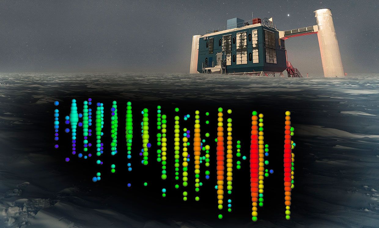
IceCube Experiment
237 |
An introduction to the IceCube experiment and a quick look at how to access its data.
238 |
IceCube Experiment
239 |
240 |
241 |
242 |

243 |
244 |
Sloan Digitial Sky Survey (SDSS) - COMING SOON!
245 |
An introduction to SDSS experiment and a quick look at how to access its data.
246 |
SDSS Experiment
247 |
248 |
249 |
250 |
251 |
252 |
253 |
254 |
255 | CODE BACKGROUND
256 |
257 |
258 |
259 |
260 |
261 |
262 |
Code Background for Activities
263 |
An explanation and example of the data model for the all data used in these activities.
264 |
Data and Models
265 |
266 |
267 |
268 |
269 |
270 |
271 |
272 |
273 | ACTIVITIES
274 |
275 |
276 |
277 |
278 |
279 |
280 |
Identifying Particles
281 |
The link will take you to an activity that will allow you to identify particles using invariant masses!
282 |
Identify!
283 |
284 |
285 |
286 |
287 |
Discovering Particles
288 |
The link will take you to an activity where you will be able to discover new particles in CMS!
289 |
Discover!
290 |
291 |
292 |
293 |
294 |
CLEO and D Mesons
295 |
The link will take you to an activity that will allow you to reconstruct D mesons!
296 |
Reconstruct!
297 |
298 |
299 |
300 |
301 |
Top Quark
302 |
The link will take you to an activity where you will find the mass and type of parent particle!
303 |
Determine!
304 |
305 |
306 |
307 |
308 |
Visualizing neutrino interactions
309 |
The link will take you to an activity that challenges you to come up with different ways to visualize the interactions in the IceCube experiment.
310 |
Visualize!
311 |
312 |
313 |
314 |
315 |
316 |
317 |
318 |
319 | WANT MORE?
320 |
321 |
322 |
323 |
324 |
325 |
Expand Your Research!
326 |
The link will take you to a "how to" for you to be able to further expand your learning and research!
327 |
How to Download More Data!
328 |
329 |
330 |
331 |
332 |
333 |
334 |
335 |
336 |
337 |
338 |
339 |
340 | info About
341 | P3
342 | Particle Physics Playground
343 |
344 |
345 |
346 |
347 |
348 |
349 | toc
350 | Overview
351 |
352 |
353 |
354 | This site provides activities, mostly using real data from past and present experiments,
355 | with the goal of teaching the experimental side of particle physics.
356 |
357 |
358 | This site is not meant to be a fully comprehensive tutorial.
359 | The ideal student will have learned the basic
360 | concepts elsewhere (classroom setting, mentor, independent study)
361 | and then will use these activities to test their understanding of
362 | the concepts and to develop some sense of how "real scientists"
363 | are doing this work in the field.
364 |
365 |
366 | These activities are built around
367 | the Python programming language,
368 | specifically the the iPython notebook.
369 | Anyone who uses these activities should familiarize
370 | themselves with both of these products.
371 |
372 |
373 | Have fun!
374 |
375 |
376 |
377 |
378 |
379 |
380 | link
381 | Links
382 |
383 |
405 |
406 |
407 |
408 |
409 |  410 |
410 |
411 |
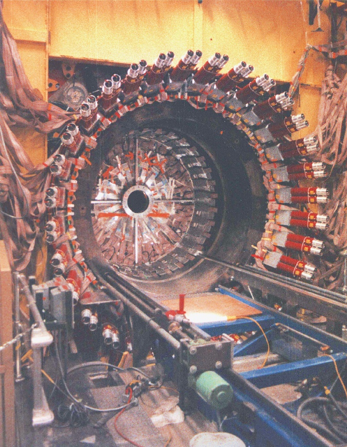
CMS (Compact Muon Solenoid) at CERN
412 |
413 |
414 |
415 |
416 |
417 |
418 |
419 |
420 |
421 |
422 |
423 |
424 |
425 |
426 |
427 |
428 |
429 |
430 |
431 |
432 | This project is licensed using the MIT Open Source license. This means
433 | that any of you anywhere can make a copy of this site and host it elsewhere.
434 | I am totally cool with that.
435 |
436 |
437 | However, it would be great to have some common repository for different experiments to
438 | have their data used to teach people science and train the next generation of particle
439 | physicists. I am therefore happy to include data and activities (at any level!) from
440 | interested individuals. To this end, I have some helpful suggestions (and requirements!)
441 | for those of you who would like to contribute.
442 |
443 |
444 | -
445 | Identify your learning objectives.
446 | Every exercise should identify
447 | the learning goals at the top. This allows the user/student to know what they
448 | will be getting out of the exercise and whether or not it will be useful to them.
449 | It has the additional benefit of forcing the author to consider how they will structure
450 | the exercise and what they want the user to come away with.
451 |
452 | -
453 | Provide REAL data.
454 | While it is often useful to use Monte Carlo to emphasize
455 | certain aspects of the data analysis with a more controlled dataset, I feel it is
456 | important to encourage experiments to provide their data to the public. If an
457 | experiment wants this site to host some of their data and activities, I would require
458 | at least some of the data actually come from their experiment.
459 |
460 |
461 |
462 |
463 |
464 |
465 |
466 |
467 |
468 |
469 |
470 |
471 |
472 |
473 |
474 |
475 |
476 |
477 |
How do I fix the error saying that there is no module pps_tools?To fix this error, first, make sure that your Runtime is set to Python 3, then go up to Runtime
478 | a the top menu and select Restart runtime. In general, most problems that don't have to do with your code itself can be solved by restarting the runtime!
479 |
Where to find the answer keys if you have finished the activities? Email Matt Bellis!
480 |
Which tutorial should I start with? 'Using Colab for the first time' is the place to start if this is indeed your first time here! We suggest watching all the videos though, to get an in-depth explanation of all the tools you will be using.
481 |
Which activity should I start with? We recommend you start with the CMS muons activity (Identifying particles), as it introduces importing the data from the Github site, as well as working with h5hep using data from the CMS experiment.
482 |
I've finished all the activities. What more can I do? We are in the planning stages of implementing more activities to the website, especially activities that use data from the BaBar experiment. Don't fret, more is on the way!
483 |
I'm running locally and my tools dont seem to be working Chances are your tools are outdated. Try updating them by pulling from the Github site, and running the `setup.py install` command from the conda terminal again.
484 |
485 |
486 |
487 |
488 |
489 |
490 |
491 |
492 |
group Contributors
493 | mail Send any questions or comments to Matt Bellis
494 |
495 |
496 |
509 |
510 |
Individuals
511 |
512 |
515 |
516 |
519 |
520 |
523 |
524 |
527 |
528 |
531 |
532 |
535 |
536 |
539 |
540 |
543 |
544 |
547 |
548 |
551 |
552 |
555 |
556 |
559 |
560 |
563 |
564 |
567 |
568 |
569 |
570 |
571 |
572 |
573 |
574 |
575 |
576 |
581 |
582 |
583 |
584 |
594 |
595 |
596 |
597 |
598 |
599 |
600 |
601 |
602 |
--------------------------------------------------------------------------------
/css/bootstrap-theme.css.map:
--------------------------------------------------------------------------------
1 | {"version":3,"sources":["less/theme.less","less/mixins/vendor-prefixes.less","bootstrap-theme.css","less/mixins/gradients.less","less/mixins/reset-filter.less"],"names":[],"mappings":"AAcA;;;;;;EAME,0CAAA;ECgDA,6FAAA;EACQ,qFAAA;EC5DT;AFgBC;;;;;;;;;;;;EC2CA,0DAAA;EACQ,kDAAA;EC7CT;AFVD;;;;;;EAiBI,mBAAA;EECH;AFgCC;;EAEE,wBAAA;EE9BH;AFmCD;EGlDI,0EAAA;EACA,qEAAA;EACA,+FAAA;EAAA,wEAAA;EAEA,wHAAA;ECnBF,qEAAA;EJiCA,6BAAA;EACA,uBAAA;EA+B2C,2BAAA;EAA2B,oBAAA;EExBvE;AFLC;;EAEE,2BAAA;EACA,8BAAA;EEOH;AFJC;;EAEE,2BAAA;EACA,uBAAA;EEMH;AFHC;;EAEE,2BAAA;EACA,wBAAA;EEKH;AFUD;EGnDI,0EAAA;EACA,qEAAA;EACA,+FAAA;EAAA,wEAAA;EAEA,wHAAA;ECnBF,qEAAA;EJiCA,6BAAA;EACA,uBAAA;EE+BD;AF7BC;;EAEE,2BAAA;EACA,8BAAA;EE+BH;AF5BC;;EAEE,2BAAA;EACA,uBAAA;EE8BH;AF3BC;;EAEE,2BAAA;EACA,wBAAA;EE6BH;AFbD;EGpDI,0EAAA;EACA,qEAAA;EACA,+FAAA;EAAA,wEAAA;EAEA,wHAAA;ECnBF,qEAAA;EJiCA,6BAAA;EACA,uBAAA;EEuDD;AFrDC;;EAEE,2BAAA;EACA,8BAAA;EEuDH;AFpDC;;EAEE,2BAAA;EACA,uBAAA;EEsDH;AFnDC;;EAEE,2BAAA;EACA,wBAAA;EEqDH;AFpCD;EGrDI,0EAAA;EACA,qEAAA;EACA,+FAAA;EAAA,wEAAA;EAEA,wHAAA;ECnBF,qEAAA;EJiCA,6BAAA;EACA,uBAAA;EE+ED;AF7EC;;EAEE,2BAAA;EACA,8BAAA;EE+EH;AF5EC;;EAEE,2BAAA;EACA,uBAAA;EE8EH;AF3EC;;EAEE,2BAAA;EACA,wBAAA;EE6EH;AF3DD;EGtDI,0EAAA;EACA,qEAAA;EACA,+FAAA;EAAA,wEAAA;EAEA,wHAAA;ECnBF,qEAAA;EJiCA,6BAAA;EACA,uBAAA;EEuGD;AFrGC;;EAEE,2BAAA;EACA,8BAAA;EEuGH;AFpGC;;EAEE,2BAAA;EACA,uBAAA;EEsGH;AFnGC;;EAEE,2BAAA;EACA,wBAAA;EEqGH;AFlFD;EGvDI,0EAAA;EACA,qEAAA;EACA,+FAAA;EAAA,wEAAA;EAEA,wHAAA;ECnBF,qEAAA;EJiCA,6BAAA;EACA,uBAAA;EE+HD;AF7HC;;EAEE,2BAAA;EACA,8BAAA;EE+HH;AF5HC;;EAEE,2BAAA;EACA,uBAAA;EE8HH;AF3HC;;EAEE,2BAAA;EACA,wBAAA;EE6HH;AFnGD;;ECfE,oDAAA;EACQ,4CAAA;ECsHT;AF9FD;;EGxEI,0EAAA;EACA,qEAAA;EACA,+FAAA;EAAA,wEAAA;EACA,6BAAA;EACA,wHAAA;EHuEF,2BAAA;EEoGD;AFlGD;;;EG7EI,0EAAA;EACA,qEAAA;EACA,+FAAA;EAAA,wEAAA;EACA,6BAAA;EACA,wHAAA;EH6EF,2BAAA;EEwGD;AF/FD;EG1FI,0EAAA;EACA,qEAAA;EACA,+FAAA;EAAA,wEAAA;EACA,6BAAA;EACA,wHAAA;ECnBF,qEAAA;EJ4GA,oBAAA;EC9CA,6FAAA;EACQ,qFAAA;ECoJT;AF1GD;;EG1FI,0EAAA;EACA,qEAAA;EACA,+FAAA;EAAA,wEAAA;EACA,6BAAA;EACA,wHAAA;EF2CF,0DAAA;EACQ,kDAAA;EC8JT;AFvGD;;EAEE,gDAAA;EEyGD;AFrGD;EG7GI,0EAAA;EACA,qEAAA;EACA,+FAAA;EAAA,wEAAA;EACA,6BAAA;EACA,wHAAA;ECnBF,qEAAA;EFyOD;AF7GD;;EG7GI,0EAAA;EACA,qEAAA;EACA,+FAAA;EAAA,wEAAA;EACA,6BAAA;EACA,wHAAA;EF2CF,yDAAA;EACQ,iDAAA;ECoLT;AFvHD;;EAYI,2CAAA;EE+GH;AF1GD;;;EAGE,kBAAA;EE4GD;AF5FD;EAVI;;;IAGE,aAAA;IG1IF,0EAAA;IACA,qEAAA;IACA,+FAAA;IAAA,wEAAA;IACA,6BAAA;IACA,wHAAA;IDoPD;EACF;AFnGD;EACE,+CAAA;ECxGA,4FAAA;EACQ,oFAAA;EC8MT;AF3FD;EGnKI,0EAAA;EACA,qEAAA;EACA,+FAAA;EAAA,wEAAA;EACA,6BAAA;EACA,wHAAA;EH2JF,uBAAA;EEuGD;AFlGD;EGpKI,0EAAA;EACA,qEAAA;EACA,+FAAA;EAAA,wEAAA;EACA,6BAAA;EACA,wHAAA;EH2JF,uBAAA;EE+GD;AFzGD;EGrKI,0EAAA;EACA,qEAAA;EACA,+FAAA;EAAA,wEAAA;EACA,6BAAA;EACA,wHAAA;EH2JF,uBAAA;EEuHD;AFhHD;EGtKI,0EAAA;EACA,qEAAA;EACA,+FAAA;EAAA,wEAAA;EACA,6BAAA;EACA,wHAAA;EH2JF,uBAAA;EE+HD;AFhHD;EG9KI,0EAAA;EACA,qEAAA;EACA,+FAAA;EAAA,wEAAA;EACA,6BAAA;EACA,wHAAA;EDiSH;AF7GD;EGxLI,0EAAA;EACA,qEAAA;EACA,+FAAA;EAAA,wEAAA;EACA,6BAAA;EACA,wHAAA;EDwSH;AFnHD;EGzLI,0EAAA;EACA,qEAAA;EACA,+FAAA;EAAA,wEAAA;EACA,6BAAA;EACA,wHAAA;ED+SH;AFzHD;EG1LI,0EAAA;EACA,qEAAA;EACA,+FAAA;EAAA,wEAAA;EACA,6BAAA;EACA,wHAAA;EDsTH;AF/HD;EG3LI,0EAAA;EACA,qEAAA;EACA,+FAAA;EAAA,wEAAA;EACA,6BAAA;EACA,wHAAA;ED6TH;AFrID;EG5LI,0EAAA;EACA,qEAAA;EACA,+FAAA;EAAA,wEAAA;EACA,6BAAA;EACA,wHAAA;EDoUH;AFxID;EG/JI,+MAAA;EACA,0MAAA;EACA,uMAAA;ED0SH;AFpID;EACE,oBAAA;EC3JA,oDAAA;EACQ,4CAAA;ECkST;AFrID;;;EAGE,+BAAA;EGhNE,0EAAA;EACA,qEAAA;EACA,+FAAA;EAAA,wEAAA;EACA,6BAAA;EACA,wHAAA;EH8MF,uBAAA;EE2ID;AFhJD;;;EAQI,mBAAA;EE6IH;AFnID;EChLE,mDAAA;EACQ,2CAAA;ECsTT;AF7HD;EGzOI,0EAAA;EACA,qEAAA;EACA,+FAAA;EAAA,wEAAA;EACA,6BAAA;EACA,wHAAA;EDyWH;AFnID;EG1OI,0EAAA;EACA,qEAAA;EACA,+FAAA;EAAA,wEAAA;EACA,6BAAA;EACA,wHAAA;EDgXH;AFzID;EG3OI,0EAAA;EACA,qEAAA;EACA,+FAAA;EAAA,wEAAA;EACA,6BAAA;EACA,wHAAA;EDuXH;AF/ID;EG5OI,0EAAA;EACA,qEAAA;EACA,+FAAA;EAAA,wEAAA;EACA,6BAAA;EACA,wHAAA;ED8XH;AFrJD;EG7OI,0EAAA;EACA,qEAAA;EACA,+FAAA;EAAA,wEAAA;EACA,6BAAA;EACA,wHAAA;EDqYH;AF3JD;EG9OI,0EAAA;EACA,qEAAA;EACA,+FAAA;EAAA,wEAAA;EACA,6BAAA;EACA,wHAAA;ED4YH;AF3JD;EGrPI,0EAAA;EACA,qEAAA;EACA,+FAAA;EAAA,wEAAA;EACA,6BAAA;EACA,wHAAA;EHmPF,uBAAA;ECxMA,2FAAA;EACQ,mFAAA;EC0WT","file":"bootstrap-theme.css","sourcesContent":["\n//\n// Load core variables and mixins\n// --------------------------------------------------\n\n@import \"variables.less\";\n@import \"mixins.less\";\n\n\n//\n// Buttons\n// --------------------------------------------------\n\n// Common styles\n.btn-default,\n.btn-primary,\n.btn-success,\n.btn-info,\n.btn-warning,\n.btn-danger {\n text-shadow: 0 -1px 0 rgba(0,0,0,.2);\n @shadow: inset 0 1px 0 rgba(255,255,255,.15), 0 1px 1px rgba(0,0,0,.075);\n .box-shadow(@shadow);\n\n // Reset the shadow\n &:active,\n &.active {\n .box-shadow(inset 0 3px 5px rgba(0,0,0,.125));\n }\n\n .badge {\n text-shadow: none;\n }\n}\n\n// Mixin for generating new styles\n.btn-styles(@btn-color: #555) {\n #gradient > .vertical(@start-color: @btn-color; @end-color: darken(@btn-color, 12%));\n .reset-filter(); // Disable gradients for IE9 because filter bleeds through rounded corners\n background-repeat: repeat-x;\n border-color: darken(@btn-color, 14%);\n\n &:hover,\n &:focus {\n background-color: darken(@btn-color, 12%);\n background-position: 0 -15px;\n }\n\n &:active,\n &.active {\n background-color: darken(@btn-color, 12%);\n border-color: darken(@btn-color, 14%);\n }\n\n &:disabled,\n &[disabled] {\n background-color: darken(@btn-color, 12%);\n background-image: none;\n }\n}\n\n// Common styles\n.btn {\n // Remove the gradient for the pressed/active state\n &:active,\n &.active {\n background-image: none;\n }\n}\n\n// Apply the mixin to the buttons\n.btn-default { .btn-styles(@btn-default-bg); text-shadow: 0 1px 0 #fff; border-color: #ccc; }\n.btn-primary { .btn-styles(@btn-primary-bg); }\n.btn-success { .btn-styles(@btn-success-bg); }\n.btn-info { .btn-styles(@btn-info-bg); }\n.btn-warning { .btn-styles(@btn-warning-bg); }\n.btn-danger { .btn-styles(@btn-danger-bg); }\n\n\n//\n// Images\n// --------------------------------------------------\n\n.thumbnail,\n.img-thumbnail {\n .box-shadow(0 1px 2px rgba(0,0,0,.075));\n}\n\n\n//\n// Dropdowns\n// --------------------------------------------------\n\n.dropdown-menu > li > a:hover,\n.dropdown-menu > li > a:focus {\n #gradient > .vertical(@start-color: @dropdown-link-hover-bg; @end-color: darken(@dropdown-link-hover-bg, 5%));\n background-color: darken(@dropdown-link-hover-bg, 5%);\n}\n.dropdown-menu > .active > a,\n.dropdown-menu > .active > a:hover,\n.dropdown-menu > .active > a:focus {\n #gradient > .vertical(@start-color: @dropdown-link-active-bg; @end-color: darken(@dropdown-link-active-bg, 5%));\n background-color: darken(@dropdown-link-active-bg, 5%);\n}\n\n\n//\n// Navbar\n// --------------------------------------------------\n\n// Default navbar\n.navbar-default {\n #gradient > .vertical(@start-color: lighten(@navbar-default-bg, 10%); @end-color: @navbar-default-bg);\n .reset-filter(); // Remove gradient in IE<10 to fix bug where dropdowns don't get triggered\n border-radius: @navbar-border-radius;\n @shadow: inset 0 1px 0 rgba(255,255,255,.15), 0 1px 5px rgba(0,0,0,.075);\n .box-shadow(@shadow);\n\n .navbar-nav > .open > a,\n .navbar-nav > .active > a {\n #gradient > .vertical(@start-color: darken(@navbar-default-link-active-bg, 5%); @end-color: darken(@navbar-default-link-active-bg, 2%));\n .box-shadow(inset 0 3px 9px rgba(0,0,0,.075));\n }\n}\n.navbar-brand,\n.navbar-nav > li > a {\n text-shadow: 0 1px 0 rgba(255,255,255,.25);\n}\n\n// Inverted navbar\n.navbar-inverse {\n #gradient > .vertical(@start-color: lighten(@navbar-inverse-bg, 10%); @end-color: @navbar-inverse-bg);\n .reset-filter(); // Remove gradient in IE<10 to fix bug where dropdowns don't get triggered\n\n .navbar-nav > .open > a,\n .navbar-nav > .active > a {\n #gradient > .vertical(@start-color: @navbar-inverse-link-active-bg; @end-color: lighten(@navbar-inverse-link-active-bg, 2.5%));\n .box-shadow(inset 0 3px 9px rgba(0,0,0,.25));\n }\n\n .navbar-brand,\n .navbar-nav > li > a {\n text-shadow: 0 -1px 0 rgba(0,0,0,.25);\n }\n}\n\n// Undo rounded corners in static and fixed navbars\n.navbar-static-top,\n.navbar-fixed-top,\n.navbar-fixed-bottom {\n border-radius: 0;\n}\n\n// Fix active state of dropdown items in collapsed mode\n@media (max-width: @grid-float-breakpoint-max) {\n .navbar .navbar-nav .open .dropdown-menu > .active > a {\n &,\n &:hover,\n &:focus {\n color: #fff;\n #gradient > .vertical(@start-color: @dropdown-link-active-bg; @end-color: darken(@dropdown-link-active-bg, 5%));\n }\n }\n}\n\n\n//\n// Alerts\n// --------------------------------------------------\n\n// Common styles\n.alert {\n text-shadow: 0 1px 0 rgba(255,255,255,.2);\n @shadow: inset 0 1px 0 rgba(255,255,255,.25), 0 1px 2px rgba(0,0,0,.05);\n .box-shadow(@shadow);\n}\n\n// Mixin for generating new styles\n.alert-styles(@color) {\n #gradient > .vertical(@start-color: @color; @end-color: darken(@color, 7.5%));\n border-color: darken(@color, 15%);\n}\n\n// Apply the mixin to the alerts\n.alert-success { .alert-styles(@alert-success-bg); }\n.alert-info { .alert-styles(@alert-info-bg); }\n.alert-warning { .alert-styles(@alert-warning-bg); }\n.alert-danger { .alert-styles(@alert-danger-bg); }\n\n\n//\n// Progress bars\n// --------------------------------------------------\n\n// Give the progress background some depth\n.progress {\n #gradient > .vertical(@start-color: darken(@progress-bg, 4%); @end-color: @progress-bg)\n}\n\n// Mixin for generating new styles\n.progress-bar-styles(@color) {\n #gradient > .vertical(@start-color: @color; @end-color: darken(@color, 10%));\n}\n\n// Apply the mixin to the progress bars\n.progress-bar { .progress-bar-styles(@progress-bar-bg); }\n.progress-bar-success { .progress-bar-styles(@progress-bar-success-bg); }\n.progress-bar-info { .progress-bar-styles(@progress-bar-info-bg); }\n.progress-bar-warning { .progress-bar-styles(@progress-bar-warning-bg); }\n.progress-bar-danger { .progress-bar-styles(@progress-bar-danger-bg); }\n\n// Reset the striped class because our mixins don't do multiple gradients and\n// the above custom styles override the new `.progress-bar-striped` in v3.2.0.\n.progress-bar-striped {\n #gradient > .striped();\n}\n\n\n//\n// List groups\n// --------------------------------------------------\n\n.list-group {\n border-radius: @border-radius-base;\n .box-shadow(0 1px 2px rgba(0,0,0,.075));\n}\n.list-group-item.active,\n.list-group-item.active:hover,\n.list-group-item.active:focus {\n text-shadow: 0 -1px 0 darken(@list-group-active-bg, 10%);\n #gradient > .vertical(@start-color: @list-group-active-bg; @end-color: darken(@list-group-active-bg, 7.5%));\n border-color: darken(@list-group-active-border, 7.5%);\n\n .badge {\n text-shadow: none;\n }\n}\n\n\n//\n// Panels\n// --------------------------------------------------\n\n// Common styles\n.panel {\n .box-shadow(0 1px 2px rgba(0,0,0,.05));\n}\n\n// Mixin for generating new styles\n.panel-heading-styles(@color) {\n #gradient > .vertical(@start-color: @color; @end-color: darken(@color, 5%));\n}\n\n// Apply the mixin to the panel headings only\n.panel-default > .panel-heading { .panel-heading-styles(@panel-default-heading-bg); }\n.panel-primary > .panel-heading { .panel-heading-styles(@panel-primary-heading-bg); }\n.panel-success > .panel-heading { .panel-heading-styles(@panel-success-heading-bg); }\n.panel-info > .panel-heading { .panel-heading-styles(@panel-info-heading-bg); }\n.panel-warning > .panel-heading { .panel-heading-styles(@panel-warning-heading-bg); }\n.panel-danger > .panel-heading { .panel-heading-styles(@panel-danger-heading-bg); }\n\n\n//\n// Wells\n// --------------------------------------------------\n\n.well {\n #gradient > .vertical(@start-color: darken(@well-bg, 5%); @end-color: @well-bg);\n border-color: darken(@well-bg, 10%);\n @shadow: inset 0 1px 3px rgba(0,0,0,.05), 0 1px 0 rgba(255,255,255,.1);\n .box-shadow(@shadow);\n}\n","// Vendor Prefixes\n//\n// All vendor mixins are deprecated as of v3.2.0 due to the introduction of\n// Autoprefixer in our Gruntfile. They will be removed in v4.\n\n// - Animations\n// - Backface visibility\n// - Box shadow\n// - Box sizing\n// - Content columns\n// - Hyphens\n// - Placeholder text\n// - Transformations\n// - Transitions\n// - User Select\n\n\n// Animations\n.animation(@animation) {\n -webkit-animation: @animation;\n -o-animation: @animation;\n animation: @animation;\n}\n.animation-name(@name) {\n -webkit-animation-name: @name;\n animation-name: @name;\n}\n.animation-duration(@duration) {\n -webkit-animation-duration: @duration;\n animation-duration: @duration;\n}\n.animation-timing-function(@timing-function) {\n -webkit-animation-timing-function: @timing-function;\n animation-timing-function: @timing-function;\n}\n.animation-delay(@delay) {\n -webkit-animation-delay: @delay;\n animation-delay: @delay;\n}\n.animation-iteration-count(@iteration-count) {\n -webkit-animation-iteration-count: @iteration-count;\n animation-iteration-count: @iteration-count;\n}\n.animation-direction(@direction) {\n -webkit-animation-direction: @direction;\n animation-direction: @direction;\n}\n.animation-fill-mode(@fill-mode) {\n -webkit-animation-fill-mode: @fill-mode;\n animation-fill-mode: @fill-mode;\n}\n\n// Backface visibility\n// Prevent browsers from flickering when using CSS 3D transforms.\n// Default value is `visible`, but can be changed to `hidden`\n\n.backface-visibility(@visibility){\n -webkit-backface-visibility: @visibility;\n -moz-backface-visibility: @visibility;\n backface-visibility: @visibility;\n}\n\n// Drop shadows\n//\n// Note: Deprecated `.box-shadow()` as of v3.1.0 since all of Bootstrap's\n// supported browsers that have box shadow capabilities now support it.\n\n.box-shadow(@shadow) {\n -webkit-box-shadow: @shadow; // iOS <4.3 & Android <4.1\n box-shadow: @shadow;\n}\n\n// Box sizing\n.box-sizing(@boxmodel) {\n -webkit-box-sizing: @boxmodel;\n -moz-box-sizing: @boxmodel;\n box-sizing: @boxmodel;\n}\n\n// CSS3 Content Columns\n.content-columns(@column-count; @column-gap: @grid-gutter-width) {\n -webkit-column-count: @column-count;\n -moz-column-count: @column-count;\n column-count: @column-count;\n -webkit-column-gap: @column-gap;\n -moz-column-gap: @column-gap;\n column-gap: @column-gap;\n}\n\n// Optional hyphenation\n.hyphens(@mode: auto) {\n word-wrap: break-word;\n -webkit-hyphens: @mode;\n -moz-hyphens: @mode;\n -ms-hyphens: @mode; // IE10+\n -o-hyphens: @mode;\n hyphens: @mode;\n}\n\n// Placeholder text\n.placeholder(@color: @input-color-placeholder) {\n // Firefox\n &::-moz-placeholder {\n color: @color;\n opacity: 1; // See https://github.com/twbs/bootstrap/pull/11526\n }\n &:-ms-input-placeholder { color: @color; } // Internet Explorer 10+\n &::-webkit-input-placeholder { color: @color; } // Safari and Chrome\n}\n\n// Transformations\n.scale(@ratio) {\n -webkit-transform: scale(@ratio);\n -ms-transform: scale(@ratio); // IE9 only\n -o-transform: scale(@ratio);\n transform: scale(@ratio);\n}\n.scale(@ratioX; @ratioY) {\n -webkit-transform: scale(@ratioX, @ratioY);\n -ms-transform: scale(@ratioX, @ratioY); // IE9 only\n -o-transform: scale(@ratioX, @ratioY);\n transform: scale(@ratioX, @ratioY);\n}\n.scaleX(@ratio) {\n -webkit-transform: scaleX(@ratio);\n -ms-transform: scaleX(@ratio); // IE9 only\n -o-transform: scaleX(@ratio);\n transform: scaleX(@ratio);\n}\n.scaleY(@ratio) {\n -webkit-transform: scaleY(@ratio);\n -ms-transform: scaleY(@ratio); // IE9 only\n -o-transform: scaleY(@ratio);\n transform: scaleY(@ratio);\n}\n.skew(@x; @y) {\n -webkit-transform: skewX(@x) skewY(@y);\n -ms-transform: skewX(@x) skewY(@y); // See https://github.com/twbs/bootstrap/issues/4885; IE9+\n -o-transform: skewX(@x) skewY(@y);\n transform: skewX(@x) skewY(@y);\n}\n.translate(@x; @y) {\n -webkit-transform: translate(@x, @y);\n -ms-transform: translate(@x, @y); // IE9 only\n -o-transform: translate(@x, @y);\n transform: translate(@x, @y);\n}\n.translate3d(@x; @y; @z) {\n -webkit-transform: translate3d(@x, @y, @z);\n transform: translate3d(@x, @y, @z);\n}\n.rotate(@degrees) {\n -webkit-transform: rotate(@degrees);\n -ms-transform: rotate(@degrees); // IE9 only\n -o-transform: rotate(@degrees);\n transform: rotate(@degrees);\n}\n.rotateX(@degrees) {\n -webkit-transform: rotateX(@degrees);\n -ms-transform: rotateX(@degrees); // IE9 only\n -o-transform: rotateX(@degrees);\n transform: rotateX(@degrees);\n}\n.rotateY(@degrees) {\n -webkit-transform: rotateY(@degrees);\n -ms-transform: rotateY(@degrees); // IE9 only\n -o-transform: rotateY(@degrees);\n transform: rotateY(@degrees);\n}\n.perspective(@perspective) {\n -webkit-perspective: @perspective;\n -moz-perspective: @perspective;\n perspective: @perspective;\n}\n.perspective-origin(@perspective) {\n -webkit-perspective-origin: @perspective;\n -moz-perspective-origin: @perspective;\n perspective-origin: @perspective;\n}\n.transform-origin(@origin) {\n -webkit-transform-origin: @origin;\n -moz-transform-origin: @origin;\n -ms-transform-origin: @origin; // IE9 only\n transform-origin: @origin;\n}\n\n\n// Transitions\n\n.transition(@transition) {\n -webkit-transition: @transition;\n -o-transition: @transition;\n transition: @transition;\n}\n.transition-property(@transition-property) {\n -webkit-transition-property: @transition-property;\n transition-property: @transition-property;\n}\n.transition-delay(@transition-delay) {\n -webkit-transition-delay: @transition-delay;\n transition-delay: @transition-delay;\n}\n.transition-duration(@transition-duration) {\n -webkit-transition-duration: @transition-duration;\n transition-duration: @transition-duration;\n}\n.transition-timing-function(@timing-function) {\n -webkit-transition-timing-function: @timing-function;\n transition-timing-function: @timing-function;\n}\n.transition-transform(@transition) {\n -webkit-transition: -webkit-transform @transition;\n -moz-transition: -moz-transform @transition;\n -o-transition: -o-transform @transition;\n transition: transform @transition;\n}\n\n\n// User select\n// For selecting text on the page\n\n.user-select(@select) {\n -webkit-user-select: @select;\n -moz-user-select: @select;\n -ms-user-select: @select; // IE10+\n user-select: @select;\n}\n",".btn-default,\n.btn-primary,\n.btn-success,\n.btn-info,\n.btn-warning,\n.btn-danger {\n text-shadow: 0 -1px 0 rgba(0, 0, 0, 0.2);\n -webkit-box-shadow: inset 0 1px 0 rgba(255, 255, 255, 0.15), 0 1px 1px rgba(0, 0, 0, 0.075);\n box-shadow: inset 0 1px 0 rgba(255, 255, 255, 0.15), 0 1px 1px rgba(0, 0, 0, 0.075);\n}\n.btn-default:active,\n.btn-primary:active,\n.btn-success:active,\n.btn-info:active,\n.btn-warning:active,\n.btn-danger:active,\n.btn-default.active,\n.btn-primary.active,\n.btn-success.active,\n.btn-info.active,\n.btn-warning.active,\n.btn-danger.active {\n -webkit-box-shadow: inset 0 3px 5px rgba(0, 0, 0, 0.125);\n box-shadow: inset 0 3px 5px rgba(0, 0, 0, 0.125);\n}\n.btn-default .badge,\n.btn-primary .badge,\n.btn-success .badge,\n.btn-info .badge,\n.btn-warning .badge,\n.btn-danger .badge {\n text-shadow: none;\n}\n.btn:active,\n.btn.active {\n background-image: none;\n}\n.btn-default {\n background-image: -webkit-linear-gradient(top, #ffffff 0%, #e0e0e0 100%);\n background-image: -o-linear-gradient(top, #ffffff 0%, #e0e0e0 100%);\n background-image: linear-gradient(to bottom, #ffffff 0%, #e0e0e0 100%);\n filter: progid:DXImageTransform.Microsoft.gradient(startColorstr='#ffffffff', endColorstr='#ffe0e0e0', GradientType=0);\n filter: progid:DXImageTransform.Microsoft.gradient(enabled = false);\n background-repeat: repeat-x;\n border-color: #dbdbdb;\n text-shadow: 0 1px 0 #fff;\n border-color: #ccc;\n}\n.btn-default:hover,\n.btn-default:focus {\n background-color: #e0e0e0;\n background-position: 0 -15px;\n}\n.btn-default:active,\n.btn-default.active {\n background-color: #e0e0e0;\n border-color: #dbdbdb;\n}\n.btn-default:disabled,\n.btn-default[disabled] {\n background-color: #e0e0e0;\n background-image: none;\n}\n.btn-primary {\n background-image: -webkit-linear-gradient(top, #337ab7 0%, #265a88 100%);\n background-image: -o-linear-gradient(top, #337ab7 0%, #265a88 100%);\n background-image: linear-gradient(to bottom, #337ab7 0%, #265a88 100%);\n filter: progid:DXImageTransform.Microsoft.gradient(startColorstr='#ff337ab7', endColorstr='#ff265a88', GradientType=0);\n filter: progid:DXImageTransform.Microsoft.gradient(enabled = false);\n background-repeat: repeat-x;\n border-color: #245580;\n}\n.btn-primary:hover,\n.btn-primary:focus {\n background-color: #265a88;\n background-position: 0 -15px;\n}\n.btn-primary:active,\n.btn-primary.active {\n background-color: #265a88;\n border-color: #245580;\n}\n.btn-primary:disabled,\n.btn-primary[disabled] {\n background-color: #265a88;\n background-image: none;\n}\n.btn-success {\n background-image: -webkit-linear-gradient(top, #5cb85c 0%, #419641 100%);\n background-image: -o-linear-gradient(top, #5cb85c 0%, #419641 100%);\n background-image: linear-gradient(to bottom, #5cb85c 0%, #419641 100%);\n filter: progid:DXImageTransform.Microsoft.gradient(startColorstr='#ff5cb85c', endColorstr='#ff419641', GradientType=0);\n filter: progid:DXImageTransform.Microsoft.gradient(enabled = false);\n background-repeat: repeat-x;\n border-color: #3e8f3e;\n}\n.btn-success:hover,\n.btn-success:focus {\n background-color: #419641;\n background-position: 0 -15px;\n}\n.btn-success:active,\n.btn-success.active {\n background-color: #419641;\n border-color: #3e8f3e;\n}\n.btn-success:disabled,\n.btn-success[disabled] {\n background-color: #419641;\n background-image: none;\n}\n.btn-info {\n background-image: -webkit-linear-gradient(top, #5bc0de 0%, #2aabd2 100%);\n background-image: -o-linear-gradient(top, #5bc0de 0%, #2aabd2 100%);\n background-image: linear-gradient(to bottom, #5bc0de 0%, #2aabd2 100%);\n filter: progid:DXImageTransform.Microsoft.gradient(startColorstr='#ff5bc0de', endColorstr='#ff2aabd2', GradientType=0);\n filter: progid:DXImageTransform.Microsoft.gradient(enabled = false);\n background-repeat: repeat-x;\n border-color: #28a4c9;\n}\n.btn-info:hover,\n.btn-info:focus {\n background-color: #2aabd2;\n background-position: 0 -15px;\n}\n.btn-info:active,\n.btn-info.active {\n background-color: #2aabd2;\n border-color: #28a4c9;\n}\n.btn-info:disabled,\n.btn-info[disabled] {\n background-color: #2aabd2;\n background-image: none;\n}\n.btn-warning {\n background-image: -webkit-linear-gradient(top, #f0ad4e 0%, #eb9316 100%);\n background-image: -o-linear-gradient(top, #f0ad4e 0%, #eb9316 100%);\n background-image: linear-gradient(to bottom, #f0ad4e 0%, #eb9316 100%);\n filter: progid:DXImageTransform.Microsoft.gradient(startColorstr='#fff0ad4e', endColorstr='#ffeb9316', GradientType=0);\n filter: progid:DXImageTransform.Microsoft.gradient(enabled = false);\n background-repeat: repeat-x;\n border-color: #e38d13;\n}\n.btn-warning:hover,\n.btn-warning:focus {\n background-color: #eb9316;\n background-position: 0 -15px;\n}\n.btn-warning:active,\n.btn-warning.active {\n background-color: #eb9316;\n border-color: #e38d13;\n}\n.btn-warning:disabled,\n.btn-warning[disabled] {\n background-color: #eb9316;\n background-image: none;\n}\n.btn-danger {\n background-image: -webkit-linear-gradient(top, #d9534f 0%, #c12e2a 100%);\n background-image: -o-linear-gradient(top, #d9534f 0%, #c12e2a 100%);\n background-image: linear-gradient(to bottom, #d9534f 0%, #c12e2a 100%);\n filter: progid:DXImageTransform.Microsoft.gradient(startColorstr='#ffd9534f', endColorstr='#ffc12e2a', GradientType=0);\n filter: progid:DXImageTransform.Microsoft.gradient(enabled = false);\n background-repeat: repeat-x;\n border-color: #b92c28;\n}\n.btn-danger:hover,\n.btn-danger:focus {\n background-color: #c12e2a;\n background-position: 0 -15px;\n}\n.btn-danger:active,\n.btn-danger.active {\n background-color: #c12e2a;\n border-color: #b92c28;\n}\n.btn-danger:disabled,\n.btn-danger[disabled] {\n background-color: #c12e2a;\n background-image: none;\n}\n.thumbnail,\n.img-thumbnail {\n -webkit-box-shadow: 0 1px 2px rgba(0, 0, 0, 0.075);\n box-shadow: 0 1px 2px rgba(0, 0, 0, 0.075);\n}\n.dropdown-menu > li > a:hover,\n.dropdown-menu > li > a:focus {\n background-image: -webkit-linear-gradient(top, #f5f5f5 0%, #e8e8e8 100%);\n background-image: -o-linear-gradient(top, #f5f5f5 0%, #e8e8e8 100%);\n background-image: linear-gradient(to bottom, #f5f5f5 0%, #e8e8e8 100%);\n background-repeat: repeat-x;\n filter: progid:DXImageTransform.Microsoft.gradient(startColorstr='#fff5f5f5', endColorstr='#ffe8e8e8', GradientType=0);\n background-color: #e8e8e8;\n}\n.dropdown-menu > .active > a,\n.dropdown-menu > .active > a:hover,\n.dropdown-menu > .active > a:focus {\n background-image: -webkit-linear-gradient(top, #337ab7 0%, #2e6da4 100%);\n background-image: -o-linear-gradient(top, #337ab7 0%, #2e6da4 100%);\n background-image: linear-gradient(to bottom, #337ab7 0%, #2e6da4 100%);\n background-repeat: repeat-x;\n filter: progid:DXImageTransform.Microsoft.gradient(startColorstr='#ff337ab7', endColorstr='#ff2e6da4', GradientType=0);\n background-color: #2e6da4;\n}\n.navbar-default {\n background-image: -webkit-linear-gradient(top, #ffffff 0%, #f8f8f8 100%);\n background-image: -o-linear-gradient(top, #ffffff 0%, #f8f8f8 100%);\n background-image: linear-gradient(to bottom, #ffffff 0%, #f8f8f8 100%);\n background-repeat: repeat-x;\n filter: progid:DXImageTransform.Microsoft.gradient(startColorstr='#ffffffff', endColorstr='#fff8f8f8', GradientType=0);\n filter: progid:DXImageTransform.Microsoft.gradient(enabled = false);\n border-radius: 4px;\n -webkit-box-shadow: inset 0 1px 0 rgba(255, 255, 255, 0.15), 0 1px 5px rgba(0, 0, 0, 0.075);\n box-shadow: inset 0 1px 0 rgba(255, 255, 255, 0.15), 0 1px 5px rgba(0, 0, 0, 0.075);\n}\n.navbar-default .navbar-nav > .open > a,\n.navbar-default .navbar-nav > .active > a {\n background-image: -webkit-linear-gradient(top, #dbdbdb 0%, #e2e2e2 100%);\n background-image: -o-linear-gradient(top, #dbdbdb 0%, #e2e2e2 100%);\n background-image: linear-gradient(to bottom, #dbdbdb 0%, #e2e2e2 100%);\n background-repeat: repeat-x;\n filter: progid:DXImageTransform.Microsoft.gradient(startColorstr='#ffdbdbdb', endColorstr='#ffe2e2e2', GradientType=0);\n -webkit-box-shadow: inset 0 3px 9px rgba(0, 0, 0, 0.075);\n box-shadow: inset 0 3px 9px rgba(0, 0, 0, 0.075);\n}\n.navbar-brand,\n.navbar-nav > li > a {\n text-shadow: 0 1px 0 rgba(255, 255, 255, 0.25);\n}\n.navbar-inverse {\n background-image: -webkit-linear-gradient(top, #3c3c3c 0%, #222222 100%);\n background-image: -o-linear-gradient(top, #3c3c3c 0%, #222222 100%);\n background-image: linear-gradient(to bottom, #3c3c3c 0%, #222222 100%);\n background-repeat: repeat-x;\n filter: progid:DXImageTransform.Microsoft.gradient(startColorstr='#ff3c3c3c', endColorstr='#ff222222', GradientType=0);\n filter: progid:DXImageTransform.Microsoft.gradient(enabled = false);\n}\n.navbar-inverse .navbar-nav > .open > a,\n.navbar-inverse .navbar-nav > .active > a {\n background-image: -webkit-linear-gradient(top, #080808 0%, #0f0f0f 100%);\n background-image: -o-linear-gradient(top, #080808 0%, #0f0f0f 100%);\n background-image: linear-gradient(to bottom, #080808 0%, #0f0f0f 100%);\n background-repeat: repeat-x;\n filter: progid:DXImageTransform.Microsoft.gradient(startColorstr='#ff080808', endColorstr='#ff0f0f0f', GradientType=0);\n -webkit-box-shadow: inset 0 3px 9px rgba(0, 0, 0, 0.25);\n box-shadow: inset 0 3px 9px rgba(0, 0, 0, 0.25);\n}\n.navbar-inverse .navbar-brand,\n.navbar-inverse .navbar-nav > li > a {\n text-shadow: 0 -1px 0 rgba(0, 0, 0, 0.25);\n}\n.navbar-static-top,\n.navbar-fixed-top,\n.navbar-fixed-bottom {\n border-radius: 0;\n}\n@media (max-width: 767px) {\n .navbar .navbar-nav .open .dropdown-menu > .active > a,\n .navbar .navbar-nav .open .dropdown-menu > .active > a:hover,\n .navbar .navbar-nav .open .dropdown-menu > .active > a:focus {\n color: #fff;\n background-image: -webkit-linear-gradient(top, #337ab7 0%, #2e6da4 100%);\n background-image: -o-linear-gradient(top, #337ab7 0%, #2e6da4 100%);\n background-image: linear-gradient(to bottom, #337ab7 0%, #2e6da4 100%);\n background-repeat: repeat-x;\n filter: progid:DXImageTransform.Microsoft.gradient(startColorstr='#ff337ab7', endColorstr='#ff2e6da4', GradientType=0);\n }\n}\n.alert {\n text-shadow: 0 1px 0 rgba(255, 255, 255, 0.2);\n -webkit-box-shadow: inset 0 1px 0 rgba(255, 255, 255, 0.25), 0 1px 2px rgba(0, 0, 0, 0.05);\n box-shadow: inset 0 1px 0 rgba(255, 255, 255, 0.25), 0 1px 2px rgba(0, 0, 0, 0.05);\n}\n.alert-success {\n background-image: -webkit-linear-gradient(top, #dff0d8 0%, #c8e5bc 100%);\n background-image: -o-linear-gradient(top, #dff0d8 0%, #c8e5bc 100%);\n background-image: linear-gradient(to bottom, #dff0d8 0%, #c8e5bc 100%);\n background-repeat: repeat-x;\n filter: progid:DXImageTransform.Microsoft.gradient(startColorstr='#ffdff0d8', endColorstr='#ffc8e5bc', GradientType=0);\n border-color: #b2dba1;\n}\n.alert-info {\n background-image: -webkit-linear-gradient(top, #d9edf7 0%, #b9def0 100%);\n background-image: -o-linear-gradient(top, #d9edf7 0%, #b9def0 100%);\n background-image: linear-gradient(to bottom, #d9edf7 0%, #b9def0 100%);\n background-repeat: repeat-x;\n filter: progid:DXImageTransform.Microsoft.gradient(startColorstr='#ffd9edf7', endColorstr='#ffb9def0', GradientType=0);\n border-color: #9acfea;\n}\n.alert-warning {\n background-image: -webkit-linear-gradient(top, #fcf8e3 0%, #f8efc0 100%);\n background-image: -o-linear-gradient(top, #fcf8e3 0%, #f8efc0 100%);\n background-image: linear-gradient(to bottom, #fcf8e3 0%, #f8efc0 100%);\n background-repeat: repeat-x;\n filter: progid:DXImageTransform.Microsoft.gradient(startColorstr='#fffcf8e3', endColorstr='#fff8efc0', GradientType=0);\n border-color: #f5e79e;\n}\n.alert-danger {\n background-image: -webkit-linear-gradient(top, #f2dede 0%, #e7c3c3 100%);\n background-image: -o-linear-gradient(top, #f2dede 0%, #e7c3c3 100%);\n background-image: linear-gradient(to bottom, #f2dede 0%, #e7c3c3 100%);\n background-repeat: repeat-x;\n filter: progid:DXImageTransform.Microsoft.gradient(startColorstr='#fff2dede', endColorstr='#ffe7c3c3', GradientType=0);\n border-color: #dca7a7;\n}\n.progress {\n background-image: -webkit-linear-gradient(top, #ebebeb 0%, #f5f5f5 100%);\n background-image: -o-linear-gradient(top, #ebebeb 0%, #f5f5f5 100%);\n background-image: linear-gradient(to bottom, #ebebeb 0%, #f5f5f5 100%);\n background-repeat: repeat-x;\n filter: progid:DXImageTransform.Microsoft.gradient(startColorstr='#ffebebeb', endColorstr='#fff5f5f5', GradientType=0);\n}\n.progress-bar {\n background-image: -webkit-linear-gradient(top, #337ab7 0%, #286090 100%);\n background-image: -o-linear-gradient(top, #337ab7 0%, #286090 100%);\n background-image: linear-gradient(to bottom, #337ab7 0%, #286090 100%);\n background-repeat: repeat-x;\n filter: progid:DXImageTransform.Microsoft.gradient(startColorstr='#ff337ab7', endColorstr='#ff286090', GradientType=0);\n}\n.progress-bar-success {\n background-image: -webkit-linear-gradient(top, #5cb85c 0%, #449d44 100%);\n background-image: -o-linear-gradient(top, #5cb85c 0%, #449d44 100%);\n background-image: linear-gradient(to bottom, #5cb85c 0%, #449d44 100%);\n background-repeat: repeat-x;\n filter: progid:DXImageTransform.Microsoft.gradient(startColorstr='#ff5cb85c', endColorstr='#ff449d44', GradientType=0);\n}\n.progress-bar-info {\n background-image: -webkit-linear-gradient(top, #5bc0de 0%, #31b0d5 100%);\n background-image: -o-linear-gradient(top, #5bc0de 0%, #31b0d5 100%);\n background-image: linear-gradient(to bottom, #5bc0de 0%, #31b0d5 100%);\n background-repeat: repeat-x;\n filter: progid:DXImageTransform.Microsoft.gradient(startColorstr='#ff5bc0de', endColorstr='#ff31b0d5', GradientType=0);\n}\n.progress-bar-warning {\n background-image: -webkit-linear-gradient(top, #f0ad4e 0%, #ec971f 100%);\n background-image: -o-linear-gradient(top, #f0ad4e 0%, #ec971f 100%);\n background-image: linear-gradient(to bottom, #f0ad4e 0%, #ec971f 100%);\n background-repeat: repeat-x;\n filter: progid:DXImageTransform.Microsoft.gradient(startColorstr='#fff0ad4e', endColorstr='#ffec971f', GradientType=0);\n}\n.progress-bar-danger {\n background-image: -webkit-linear-gradient(top, #d9534f 0%, #c9302c 100%);\n background-image: -o-linear-gradient(top, #d9534f 0%, #c9302c 100%);\n background-image: linear-gradient(to bottom, #d9534f 0%, #c9302c 100%);\n background-repeat: repeat-x;\n filter: progid:DXImageTransform.Microsoft.gradient(startColorstr='#ffd9534f', endColorstr='#ffc9302c', GradientType=0);\n}\n.progress-bar-striped {\n background-image: -webkit-linear-gradient(45deg, rgba(255, 255, 255, 0.15) 25%, transparent 25%, transparent 50%, rgba(255, 255, 255, 0.15) 50%, rgba(255, 255, 255, 0.15) 75%, transparent 75%, transparent);\n background-image: -o-linear-gradient(45deg, rgba(255, 255, 255, 0.15) 25%, transparent 25%, transparent 50%, rgba(255, 255, 255, 0.15) 50%, rgba(255, 255, 255, 0.15) 75%, transparent 75%, transparent);\n background-image: linear-gradient(45deg, rgba(255, 255, 255, 0.15) 25%, transparent 25%, transparent 50%, rgba(255, 255, 255, 0.15) 50%, rgba(255, 255, 255, 0.15) 75%, transparent 75%, transparent);\n}\n.list-group {\n border-radius: 4px;\n -webkit-box-shadow: 0 1px 2px rgba(0, 0, 0, 0.075);\n box-shadow: 0 1px 2px rgba(0, 0, 0, 0.075);\n}\n.list-group-item.active,\n.list-group-item.active:hover,\n.list-group-item.active:focus {\n text-shadow: 0 -1px 0 #286090;\n background-image: -webkit-linear-gradient(top, #337ab7 0%, #2b669a 100%);\n background-image: -o-linear-gradient(top, #337ab7 0%, #2b669a 100%);\n background-image: linear-gradient(to bottom, #337ab7 0%, #2b669a 100%);\n background-repeat: repeat-x;\n filter: progid:DXImageTransform.Microsoft.gradient(startColorstr='#ff337ab7', endColorstr='#ff2b669a', GradientType=0);\n border-color: #2b669a;\n}\n.list-group-item.active .badge,\n.list-group-item.active:hover .badge,\n.list-group-item.active:focus .badge {\n text-shadow: none;\n}\n.panel {\n -webkit-box-shadow: 0 1px 2px rgba(0, 0, 0, 0.05);\n box-shadow: 0 1px 2px rgba(0, 0, 0, 0.05);\n}\n.panel-default > .panel-heading {\n background-image: -webkit-linear-gradient(top, #f5f5f5 0%, #e8e8e8 100%);\n background-image: -o-linear-gradient(top, #f5f5f5 0%, #e8e8e8 100%);\n background-image: linear-gradient(to bottom, #f5f5f5 0%, #e8e8e8 100%);\n background-repeat: repeat-x;\n filter: progid:DXImageTransform.Microsoft.gradient(startColorstr='#fff5f5f5', endColorstr='#ffe8e8e8', GradientType=0);\n}\n.panel-primary > .panel-heading {\n background-image: -webkit-linear-gradient(top, #337ab7 0%, #2e6da4 100%);\n background-image: -o-linear-gradient(top, #337ab7 0%, #2e6da4 100%);\n background-image: linear-gradient(to bottom, #337ab7 0%, #2e6da4 100%);\n background-repeat: repeat-x;\n filter: progid:DXImageTransform.Microsoft.gradient(startColorstr='#ff337ab7', endColorstr='#ff2e6da4', GradientType=0);\n}\n.panel-success > .panel-heading {\n background-image: -webkit-linear-gradient(top, #dff0d8 0%, #d0e9c6 100%);\n background-image: -o-linear-gradient(top, #dff0d8 0%, #d0e9c6 100%);\n background-image: linear-gradient(to bottom, #dff0d8 0%, #d0e9c6 100%);\n background-repeat: repeat-x;\n filter: progid:DXImageTransform.Microsoft.gradient(startColorstr='#ffdff0d8', endColorstr='#ffd0e9c6', GradientType=0);\n}\n.panel-info > .panel-heading {\n background-image: -webkit-linear-gradient(top, #d9edf7 0%, #c4e3f3 100%);\n background-image: -o-linear-gradient(top, #d9edf7 0%, #c4e3f3 100%);\n background-image: linear-gradient(to bottom, #d9edf7 0%, #c4e3f3 100%);\n background-repeat: repeat-x;\n filter: progid:DXImageTransform.Microsoft.gradient(startColorstr='#ffd9edf7', endColorstr='#ffc4e3f3', GradientType=0);\n}\n.panel-warning > .panel-heading {\n background-image: -webkit-linear-gradient(top, #fcf8e3 0%, #faf2cc 100%);\n background-image: -o-linear-gradient(top, #fcf8e3 0%, #faf2cc 100%);\n background-image: linear-gradient(to bottom, #fcf8e3 0%, #faf2cc 100%);\n background-repeat: repeat-x;\n filter: progid:DXImageTransform.Microsoft.gradient(startColorstr='#fffcf8e3', endColorstr='#fffaf2cc', GradientType=0);\n}\n.panel-danger > .panel-heading {\n background-image: -webkit-linear-gradient(top, #f2dede 0%, #ebcccc 100%);\n background-image: -o-linear-gradient(top, #f2dede 0%, #ebcccc 100%);\n background-image: linear-gradient(to bottom, #f2dede 0%, #ebcccc 100%);\n background-repeat: repeat-x;\n filter: progid:DXImageTransform.Microsoft.gradient(startColorstr='#fff2dede', endColorstr='#ffebcccc', GradientType=0);\n}\n.well {\n background-image: -webkit-linear-gradient(top, #e8e8e8 0%, #f5f5f5 100%);\n background-image: -o-linear-gradient(top, #e8e8e8 0%, #f5f5f5 100%);\n background-image: linear-gradient(to bottom, #e8e8e8 0%, #f5f5f5 100%);\n background-repeat: repeat-x;\n filter: progid:DXImageTransform.Microsoft.gradient(startColorstr='#ffe8e8e8', endColorstr='#fff5f5f5', GradientType=0);\n border-color: #dcdcdc;\n -webkit-box-shadow: inset 0 1px 3px rgba(0, 0, 0, 0.05), 0 1px 0 rgba(255, 255, 255, 0.1);\n box-shadow: inset 0 1px 3px rgba(0, 0, 0, 0.05), 0 1px 0 rgba(255, 255, 255, 0.1);\n}\n/*# sourceMappingURL=bootstrap-theme.css.map */","// Gradients\n\n#gradient {\n\n // Horizontal gradient, from left to right\n //\n // Creates two color stops, start and end, by specifying a color and position for each color stop.\n // Color stops are not available in IE9 and below.\n .horizontal(@start-color: #555; @end-color: #333; @start-percent: 0%; @end-percent: 100%) {\n background-image: -webkit-linear-gradient(left, @start-color @start-percent, @end-color @end-percent); // Safari 5.1-6, Chrome 10+\n background-image: -o-linear-gradient(left, @start-color @start-percent, @end-color @end-percent); // Opera 12\n background-image: linear-gradient(to right, @start-color @start-percent, @end-color @end-percent); // Standard, IE10, Firefox 16+, Opera 12.10+, Safari 7+, Chrome 26+\n background-repeat: repeat-x;\n filter: e(%(\"progid:DXImageTransform.Microsoft.gradient(startColorstr='%d', endColorstr='%d', GradientType=1)\",argb(@start-color),argb(@end-color))); // IE9 and down\n }\n\n // Vertical gradient, from top to bottom\n //\n // Creates two color stops, start and end, by specifying a color and position for each color stop.\n // Color stops are not available in IE9 and below.\n .vertical(@start-color: #555; @end-color: #333; @start-percent: 0%; @end-percent: 100%) {\n background-image: -webkit-linear-gradient(top, @start-color @start-percent, @end-color @end-percent); // Safari 5.1-6, Chrome 10+\n background-image: -o-linear-gradient(top, @start-color @start-percent, @end-color @end-percent); // Opera 12\n background-image: linear-gradient(to bottom, @start-color @start-percent, @end-color @end-percent); // Standard, IE10, Firefox 16+, Opera 12.10+, Safari 7+, Chrome 26+\n background-repeat: repeat-x;\n filter: e(%(\"progid:DXImageTransform.Microsoft.gradient(startColorstr='%d', endColorstr='%d', GradientType=0)\",argb(@start-color),argb(@end-color))); // IE9 and down\n }\n\n .directional(@start-color: #555; @end-color: #333; @deg: 45deg) {\n background-repeat: repeat-x;\n background-image: -webkit-linear-gradient(@deg, @start-color, @end-color); // Safari 5.1-6, Chrome 10+\n background-image: -o-linear-gradient(@deg, @start-color, @end-color); // Opera 12\n background-image: linear-gradient(@deg, @start-color, @end-color); // Standard, IE10, Firefox 16+, Opera 12.10+, Safari 7+, Chrome 26+\n }\n .horizontal-three-colors(@start-color: #00b3ee; @mid-color: #7a43b6; @color-stop: 50%; @end-color: #c3325f) {\n background-image: -webkit-linear-gradient(left, @start-color, @mid-color @color-stop, @end-color);\n background-image: -o-linear-gradient(left, @start-color, @mid-color @color-stop, @end-color);\n background-image: linear-gradient(to right, @start-color, @mid-color @color-stop, @end-color);\n background-repeat: no-repeat;\n filter: e(%(\"progid:DXImageTransform.Microsoft.gradient(startColorstr='%d', endColorstr='%d', GradientType=1)\",argb(@start-color),argb(@end-color))); // IE9 and down, gets no color-stop at all for proper fallback\n }\n .vertical-three-colors(@start-color: #00b3ee; @mid-color: #7a43b6; @color-stop: 50%; @end-color: #c3325f) {\n background-image: -webkit-linear-gradient(@start-color, @mid-color @color-stop, @end-color);\n background-image: -o-linear-gradient(@start-color, @mid-color @color-stop, @end-color);\n background-image: linear-gradient(@start-color, @mid-color @color-stop, @end-color);\n background-repeat: no-repeat;\n filter: e(%(\"progid:DXImageTransform.Microsoft.gradient(startColorstr='%d', endColorstr='%d', GradientType=0)\",argb(@start-color),argb(@end-color))); // IE9 and down, gets no color-stop at all for proper fallback\n }\n .radial(@inner-color: #555; @outer-color: #333) {\n background-image: -webkit-radial-gradient(circle, @inner-color, @outer-color);\n background-image: radial-gradient(circle, @inner-color, @outer-color);\n background-repeat: no-repeat;\n }\n .striped(@color: rgba(255,255,255,.15); @angle: 45deg) {\n background-image: -webkit-linear-gradient(@angle, @color 25%, transparent 25%, transparent 50%, @color 50%, @color 75%, transparent 75%, transparent);\n background-image: -o-linear-gradient(@angle, @color 25%, transparent 25%, transparent 50%, @color 50%, @color 75%, transparent 75%, transparent);\n background-image: linear-gradient(@angle, @color 25%, transparent 25%, transparent 50%, @color 50%, @color 75%, transparent 75%, transparent);\n }\n}\n","// Reset filters for IE\n//\n// When you need to remove a gradient background, do not forget to use this to reset\n// the IE filter for IE9 and below.\n\n.reset-filter() {\n filter: e(%(\"progid:DXImageTransform.Microsoft.gradient(enabled = false)\"));\n}\n"]}
--------------------------------------------------------------------------------
 52 |
52 |  53 |
53 |