7 |  8 |
8 |
9 |
8 |
10 |
13 |
17 | Card title
11 |Cards have minimum height set. You can use Bootstrap card-decks to align them nicely in a row.
12 |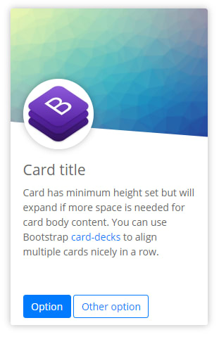 8 |
9 | Card minimum height is set to 450px and will extend to adapt to text, buttons, etc... whatever you put in card body. Use Bootstrap [card-decks](https://getbootstrap.com/docs/4.0/components/card/#card-decks) to align them nicely in a row. If you do not want the card to expand, set a max-height or height atribute on card level and scrollbar will be displayed in the card body.
10 |
11 |
8 |
9 | Card minimum height is set to 450px and will extend to adapt to text, buttons, etc... whatever you put in card body. Use Bootstrap [card-decks](https://getbootstrap.com/docs/4.0/components/card/#card-decks) to align them nicely in a row. If you do not want the card to expand, set a max-height or height atribute on card level and scrollbar will be displayed in the card body.
10 |
11 | 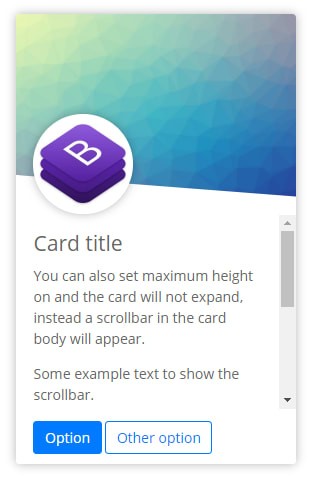 12 |
13 | You can use these custom cards together with standard Bootstrap 4 cards or use standard card options, like colors, footers etc.
14 |
15 |
12 |
13 | You can use these custom cards together with standard Bootstrap 4 cards or use standard card options, like colors, footers etc.
14 |
15 |  16 |
17 | There is also a wide variant, without the upper picture cut and with centered avatar.
18 |
19 |
16 |
17 | There is also a wide variant, without the upper picture cut and with centered avatar.
18 |
19 | 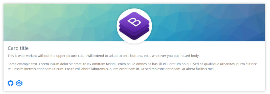 20 |
21 | #### Download
22 |
23 | Small card:
24 | - [HTML](https://raw.githubusercontent.com/peterdanis/custom-bootstrap-cards/master/small-card.html)
25 | - [CSS](https://raw.githubusercontent.com/peterdanis/custom-bootstrap-cards/master/small-card.css)
26 |
27 | Wide card:
28 | - [HTML](https://raw.githubusercontent.com/peterdanis/custom-bootstrap-cards/master/wide-card.html)
29 | - [CSS](https://raw.githubusercontent.com/peterdanis/custom-bootstrap-cards/master/wide-card.css)
30 |
--------------------------------------------------------------------------------
/small-card.css:
--------------------------------------------------------------------------------
1 | .card-custom {
2 | overflow: hidden;
3 | min-height: 450px;
4 | border: 0;
5 | box-shadow: 0 0 15px rgba(10, 10, 10, 0.3);
6 | }
7 |
8 | .card-custom-img {
9 | height: 200px;
10 | min-height: 200px;
11 | background-repeat: no-repeat;
12 | background-size: cover;
13 | background-position: center;
14 | border-color: inherit;
15 | }
16 |
17 | /* First border-left-width setting is a fallback */
18 | .card-custom-img::after {
19 | position: absolute;
20 | content: '';
21 | top: 161px;
22 | left: 0;
23 | width: 0;
24 | height: 0;
25 | border-style: solid;
26 | border-top-width: 40px;
27 | border-right-width: 0;
28 | border-bottom-width: 0;
29 | border-left-width: 545px;
30 | border-left-width: calc(575px - 5vw);
31 | border-top-color: transparent;
32 | border-right-color: transparent;
33 | border-bottom-color: transparent;
34 | border-left-color: inherit;
35 | }
36 |
37 | .card-custom-avatar img {
38 | border-radius: 50%;
39 | box-shadow: 0 0 15px rgba(10, 10, 10, 0.3);
40 | position: absolute;
41 | top: 100px;
42 | left: 1.25rem;
43 | width: 100px;
44 | height: 100px;
45 | }
46 |
--------------------------------------------------------------------------------
/small-card.html:
--------------------------------------------------------------------------------
1 |
2 |
3 |
4 |
8 |
20 |
21 | #### Download
22 |
23 | Small card:
24 | - [HTML](https://raw.githubusercontent.com/peterdanis/custom-bootstrap-cards/master/small-card.html)
25 | - [CSS](https://raw.githubusercontent.com/peterdanis/custom-bootstrap-cards/master/small-card.css)
26 |
27 | Wide card:
28 | - [HTML](https://raw.githubusercontent.com/peterdanis/custom-bootstrap-cards/master/wide-card.html)
29 | - [CSS](https://raw.githubusercontent.com/peterdanis/custom-bootstrap-cards/master/wide-card.css)
30 |
--------------------------------------------------------------------------------
/small-card.css:
--------------------------------------------------------------------------------
1 | .card-custom {
2 | overflow: hidden;
3 | min-height: 450px;
4 | border: 0;
5 | box-shadow: 0 0 15px rgba(10, 10, 10, 0.3);
6 | }
7 |
8 | .card-custom-img {
9 | height: 200px;
10 | min-height: 200px;
11 | background-repeat: no-repeat;
12 | background-size: cover;
13 | background-position: center;
14 | border-color: inherit;
15 | }
16 |
17 | /* First border-left-width setting is a fallback */
18 | .card-custom-img::after {
19 | position: absolute;
20 | content: '';
21 | top: 161px;
22 | left: 0;
23 | width: 0;
24 | height: 0;
25 | border-style: solid;
26 | border-top-width: 40px;
27 | border-right-width: 0;
28 | border-bottom-width: 0;
29 | border-left-width: 545px;
30 | border-left-width: calc(575px - 5vw);
31 | border-top-color: transparent;
32 | border-right-color: transparent;
33 | border-bottom-color: transparent;
34 | border-left-color: inherit;
35 | }
36 |
37 | .card-custom-avatar img {
38 | border-radius: 50%;
39 | box-shadow: 0 0 15px rgba(10, 10, 10, 0.3);
40 | position: absolute;
41 | top: 100px;
42 | left: 1.25rem;
43 | width: 100px;
44 | height: 100px;
45 | }
46 |
--------------------------------------------------------------------------------
/small-card.html:
--------------------------------------------------------------------------------
1 |
2 |
3 |
4 |
8 | Cards have minimum height set. You can use Bootstrap card-decks to align them nicely in a row.
12 |
8 | This is wide variant without the upper picture cut. It will extend to adapt to text, buttons, etc... whatever you put in card body.
12 |Some example text. Lorem ipsum dolor sit amet, te vix omittam fastidii, enim paulo omnes ea has, illud luptatum no qui. Sed ea qualisque urbanitas, purto elit nec te. Possim inermis antiopam ut eum. Eos te zril labore laboramus, quem erant nam in. Ut sed molestie antiopam. At altera facilisis mel.
13 |