├── content └── docs │ ├── getting-started │ ├── meta.json │ ├── installation.mdx │ └── quickstart.mdx │ ├── meta.json │ ├── integrations │ ├── polar-sh.mdx │ ├── index.mdx │ └── shadcn.mdx │ ├── contributing.mdx │ ├── examples │ └── showcase.mdx │ ├── guides │ ├── protecting-components.mdx │ ├── deployment.mdx │ └── custom-components.mdx │ ├── configuration │ ├── middleware.mdx │ ├── registry-json.mdx │ └── env.mdx │ ├── api │ ├── endpoints.mdx │ └── tokens-auth.mdx │ ├── index.mdx │ ├── faq.mdx │ └── troubleshooting.mdx ├── public ├── og.png ├── screenshot.png ├── vercel.svg ├── window.svg ├── file.svg ├── globe.svg ├── next.svg └── r │ ├── logo.json │ ├── branding.json │ ├── showcase.json │ └── registry-nextjs.json ├── app ├── favicon.ico ├── (docs) │ ├── api │ │ └── search │ │ │ └── route.ts │ └── docs │ │ ├── mdx-components.tsx │ │ ├── layout.config.tsx │ │ ├── layout.tsx │ │ └── [[...slug]] │ │ └── page.tsx ├── icon.tsx ├── (example) │ └── example │ │ ├── api │ │ └── validate-license │ │ │ └── route.ts │ │ ├── [name] │ │ └── route.ts │ │ └── access │ │ └── [name] │ │ └── page.tsx ├── (registry) │ └── registry │ │ ├── api │ │ └── validate-license │ │ │ └── route.ts │ │ ├── [name] │ │ └── route.ts │ │ └── access │ │ └── validate-license │ │ └── page.tsx ├── layout.tsx ├── globals.css └── (www) │ └── page.tsx ├── pnpm-workspace.yaml ├── postcss.config.mjs ├── source.config.ts ├── lib ├── utils.ts ├── source.ts ├── shadcn │ └── registry │ │ └── utils.ts └── polar │ └── client.ts ├── .env.example ├── next.config.ts ├── eslint.config.mjs ├── components.json ├── components ├── providers.tsx ├── ui │ ├── sonner.tsx │ ├── label.tsx │ ├── separator.tsx │ ├── input.tsx │ ├── avatar.tsx │ ├── badge.tsx │ ├── alert.tsx │ ├── scroll-area.tsx │ ├── tabs.tsx │ ├── resizable.tsx │ ├── accordion.tsx │ ├── button.tsx │ ├── card.tsx │ ├── form.tsx │ └── sheet.tsx ├── open-in-v0.tsx ├── add-command.tsx ├── demo.tsx ├── terminal-command-copy.tsx ├── validate-license-form.tsx └── logos.tsx ├── tsconfig.json ├── .gitignore ├── hooks └── use-copy-to-clipboard.ts ├── middleware.ts ├── registry └── new-york │ ├── branding │ └── zeta.tsx │ ├── middleware.ts │ ├── ui │ └── countdown.tsx │ └── examples │ └── showcase │ └── page.tsx ├── package.json ├── README.md └── registry.json /content/docs/getting-started/meta.json: -------------------------------------------------------------------------------- 1 | -------------------------------------------------------------------------------- /public/og.png: -------------------------------------------------------------------------------- https://raw.githubusercontent.com/rbadillap/zeta/HEAD/public/og.png -------------------------------------------------------------------------------- /app/favicon.ico: -------------------------------------------------------------------------------- https://raw.githubusercontent.com/rbadillap/zeta/HEAD/app/favicon.ico -------------------------------------------------------------------------------- /public/screenshot.png: -------------------------------------------------------------------------------- https://raw.githubusercontent.com/rbadillap/zeta/HEAD/public/screenshot.png -------------------------------------------------------------------------------- /pnpm-workspace.yaml: -------------------------------------------------------------------------------- 1 | onlyBuiltDependencies: 2 | - esbuild 3 | - msw 4 | - sharp 5 | - unrs-resolver 6 | -------------------------------------------------------------------------------- /postcss.config.mjs: -------------------------------------------------------------------------------- 1 | const config = { 2 | plugins: ["@tailwindcss/postcss"], 3 | }; 4 | 5 | export default config; 6 | -------------------------------------------------------------------------------- /source.config.ts: -------------------------------------------------------------------------------- 1 | import { defineDocs } from 'fumadocs-mdx/config'; 2 | 3 | export const docs = defineDocs({ 4 | dir: 'content/docs', 5 | }); -------------------------------------------------------------------------------- /public/vercel.svg: -------------------------------------------------------------------------------- 1 | -------------------------------------------------------------------------------- /app/(docs)/api/search/route.ts: -------------------------------------------------------------------------------- 1 | import { source } from '@/lib/source'; 2 | import { createFromSource } from 'fumadocs-core/search/server'; 3 | 4 | export const { GET } = createFromSource(source); -------------------------------------------------------------------------------- /lib/utils.ts: -------------------------------------------------------------------------------- 1 | import { clsx, type ClassValue } from "clsx" 2 | import { twMerge } from "tailwind-merge" 3 | 4 | export function cn(...inputs: ClassValue[]) { 5 | return twMerge(clsx(inputs)) 6 | } 7 | -------------------------------------------------------------------------------- /.env.example: -------------------------------------------------------------------------------- 1 | # Zeta registry (https://nextjs.org/docs/app/guides/authentication#1-generating-a-secret-key) 2 | REGISTRY_TOKEN_SECRET="" 3 | 4 | # Polar.sh 5 | POLAR_ORG_ID="" 6 | POLAR_ACCESS_TOKEN="" 7 | POLAR_IS_SANDBOX="false" -------------------------------------------------------------------------------- /app/(docs)/docs/mdx-components.tsx: -------------------------------------------------------------------------------- 1 | import defaultMdxComponents from 'fumadocs-ui/mdx'; 2 | import type { MDXComponents } from 'mdx/types'; 3 | 4 | export function getMDXComponents(components?: MDXComponents): MDXComponents { 5 | return { 6 | ...defaultMdxComponents, 7 | ...components, 8 | }; 9 | } -------------------------------------------------------------------------------- /next.config.ts: -------------------------------------------------------------------------------- 1 | import type { NextConfig } from "next"; 2 | import { createMDX } from 'fumadocs-mdx/next'; 3 | 4 | const withMDX = createMDX(); 5 | 6 | /** @type {import('next').NextConfig} */ 7 | const nextConfig: NextConfig = { 8 | reactStrictMode: true, 9 | }; 10 | 11 | export default withMDX(nextConfig); 12 | -------------------------------------------------------------------------------- /public/window.svg: -------------------------------------------------------------------------------- 1 | -------------------------------------------------------------------------------- /public/file.svg: -------------------------------------------------------------------------------- 1 | -------------------------------------------------------------------------------- /content/docs/meta.json: -------------------------------------------------------------------------------- 1 | { 2 | "pages": [ 3 | "index", 4 | "---Getting Started---", 5 | "...getting-started", 6 | "core", 7 | "configuration", 8 | "---Integrations---", 9 | "...integrations", 10 | "---Developer Guides---", 11 | "api", 12 | "guides", 13 | "examples", 14 | "faq", 15 | "troubleshooting", 16 | "contributing", 17 | "changelog" 18 | ] 19 | } 20 | -------------------------------------------------------------------------------- /app/(docs)/docs/layout.config.tsx: -------------------------------------------------------------------------------- 1 | import { BaseLayoutProps } from 'fumadocs-ui/layouts/shared'; 2 | import { GithubInfo } from 'fumadocs-ui/components/github-info'; 3 | 4 | export const baseOptions: BaseLayoutProps = { 5 | nav: { 6 | title: 'zeta', 7 | }, 8 | links: [ 9 | { 10 | type: 'custom', 11 | children: ( 12 | 13 | ), 14 | }, 15 | ], 16 | 17 | }; -------------------------------------------------------------------------------- /app/(docs)/docs/layout.tsx: -------------------------------------------------------------------------------- 1 | import { source } from '@/lib/source'; 2 | import { DocsLayout } from 'fumadocs-ui/layouts/docs'; 3 | import type { ReactNode } from 'react'; 4 | import { baseOptions } from '@/app/(docs)/docs/layout.config'; 5 | 6 | export default function Layout({ children }: { children: ReactNode }) { 7 | return ( 8 | 9 | {children} 10 | 11 | ); 12 | } -------------------------------------------------------------------------------- /eslint.config.mjs: -------------------------------------------------------------------------------- 1 | import { dirname } from "path"; 2 | import { fileURLToPath } from "url"; 3 | import { FlatCompat } from "@eslint/eslintrc"; 4 | 5 | const __filename = fileURLToPath(import.meta.url); 6 | const __dirname = dirname(__filename); 7 | 8 | const compat = new FlatCompat({ 9 | baseDirectory: __dirname, 10 | }); 11 | 12 | const eslintConfig = [ 13 | ...compat.extends("next/core-web-vitals", "next/typescript"), 14 | ]; 15 | 16 | export default eslintConfig; 17 | -------------------------------------------------------------------------------- /components.json: -------------------------------------------------------------------------------- 1 | { 2 | "$schema": "https://ui.shadcn.com/schema.json", 3 | "style": "new-york", 4 | "rsc": true, 5 | "tsx": true, 6 | "tailwind": { 7 | "config": "", 8 | "css": "app/globals.css", 9 | "baseColor": "neutral", 10 | "cssVariables": true, 11 | "prefix": "" 12 | }, 13 | "aliases": { 14 | "components": "@/components", 15 | "utils": "@/lib/utils", 16 | "ui": "@/components/ui", 17 | "lib": "@/lib", 18 | "hooks": "@/hooks" 19 | }, 20 | "iconLibrary": "lucide" 21 | } -------------------------------------------------------------------------------- /content/docs/integrations/polar-sh.mdx: -------------------------------------------------------------------------------- 1 | --- 2 | title: Polar.sh 3 | description: Integrate Polar.sh for license key management in Zeta Registry. 4 | icon: polar 5 | --- 6 | 7 | ## Polar.sh Integration 8 | 9 | **Features:** 10 | - **License Keys API:** Validate and manage license keys for premium/private components. 11 | 12 | **How Zeta uses Polar.sh:** 13 | - License key validation for protected components. 14 | - Only the License Keys API is used. 15 | - See [Environment Variables](/docs/configuration/env) for setup. 16 | -------------------------------------------------------------------------------- /components/providers.tsx: -------------------------------------------------------------------------------- 1 | "use client" 2 | 3 | import * as React from "react" 4 | import { ThemeProvider as NextThemesProvider } from "next-themes" 5 | import { RootProvider } from 'fumadocs-ui/provider'; 6 | 7 | export function Providers({ children }: { children: React.ReactNode }) { 8 | return ( 9 | 16 | 17 | {children} 18 | 19 | 20 | ) 21 | } 22 | -------------------------------------------------------------------------------- /content/docs/integrations/index.mdx: -------------------------------------------------------------------------------- 1 | --- 2 | title: Integrations 3 | description: Discover the third-party integrations available in Zeta. 4 | icon: Plug 5 | --- 6 | 7 | ## Integrations 8 | 9 | Zeta supports several third-party integrations to enhance your registry. Click on an integration to learn more. 10 | 11 | 12 | 16 | License key management for premium/protected components. 17 | 18 | 22 | Component registry, CLI, and UI primitives. 23 | 24 | -------------------------------------------------------------------------------- /lib/source.ts: -------------------------------------------------------------------------------- 1 | // .source folder will be generated when you run `next dev` 2 | import { docs } from '@/.source'; 3 | import { createElement } from 'react'; 4 | import { icons } from 'lucide-react'; 5 | import { loader } from 'fumadocs-core/source'; 6 | import Logo, { brands } from '@/components/logos'; 7 | 8 | export const source = loader({ 9 | baseUrl: '/docs', 10 | icon(icon) { 11 | if (icon && icon in icons) { 12 | return createElement(icons[icon as keyof typeof icons]); 13 | } 14 | 15 | if (icon && brands.includes(icon)) { 16 | return createElement(Logo, { name: icon }); 17 | } 18 | }, 19 | source: docs.toFumadocsSource(), 20 | }); -------------------------------------------------------------------------------- /components/ui/sonner.tsx: -------------------------------------------------------------------------------- 1 | "use client" 2 | 3 | import { useTheme } from "next-themes" 4 | import { Toaster as Sonner, ToasterProps } from "sonner" 5 | 6 | const Toaster = ({ ...props }: ToasterProps) => { 7 | const { theme = "system" } = useTheme() 8 | 9 | return ( 10 | 22 | ) 23 | } 24 | 25 | export { Toaster } 26 | -------------------------------------------------------------------------------- /content/docs/integrations/shadcn.mdx: -------------------------------------------------------------------------------- 1 | --- 2 | title: shadcn/ui 3 | description: Integrate with shadcn/ui for UI components in Zeta Registry. 4 | icon: shadcn 5 | --- 6 | 7 | ## shadcn/ui Integration 8 | 9 | **Features:** 10 | - **CLI:** Initialize and manage the registry and components. 11 | - **Registry:** Schema and structure for component distribution. 12 | - **Components:** Reusable UI primitives for Zeta's interface. 13 | 14 | **How Zeta uses shadcn/ui:** 15 | - Uses the CLI for setup and component management. 16 | - Follows the official registry schema. 17 | - Imports and distributes shadcn/ui components. 18 | - See [registry.json](/docs/configuration/registry-json) for more details. 19 | -------------------------------------------------------------------------------- /tsconfig.json: -------------------------------------------------------------------------------- 1 | { 2 | "compilerOptions": { 3 | "target": "ES2017", 4 | "lib": ["dom", "dom.iterable", "esnext"], 5 | "allowJs": true, 6 | "skipLibCheck": true, 7 | "strict": true, 8 | "noEmit": true, 9 | "esModuleInterop": true, 10 | "module": "esnext", 11 | "moduleResolution": "bundler", 12 | "resolveJsonModule": true, 13 | "isolatedModules": true, 14 | "jsx": "preserve", 15 | "incremental": true, 16 | "plugins": [ 17 | { 18 | "name": "next" 19 | } 20 | ], 21 | "paths": { 22 | "@/*": ["./*"] 23 | } 24 | }, 25 | "include": ["next-env.d.ts", "**/*.ts", "**/*.tsx", ".next/types/**/*.ts"], 26 | "exclude": ["node_modules"] 27 | } 28 | -------------------------------------------------------------------------------- /components/ui/label.tsx: -------------------------------------------------------------------------------- 1 | "use client" 2 | 3 | import * as React from "react" 4 | import * as LabelPrimitive from "@radix-ui/react-label" 5 | 6 | import { cn } from "@/lib/utils" 7 | 8 | function Label({ 9 | className, 10 | ...props 11 | }: React.ComponentProps) { 12 | return ( 13 | 21 | ) 22 | } 23 | 24 | export { Label } 25 | -------------------------------------------------------------------------------- /.gitignore: -------------------------------------------------------------------------------- 1 | # See https://help.github.com/articles/ignoring-files/ for more about ignoring files. 2 | 3 | # dependencies 4 | /node_modules 5 | /.pnp 6 | .pnp.* 7 | .yarn/* 8 | !.yarn/patches 9 | !.yarn/plugins 10 | !.yarn/releases 11 | !.yarn/versions 12 | 13 | # testing 14 | /coverage 15 | 16 | # next.js 17 | /.next/ 18 | /out/ 19 | 20 | # production 21 | /build 22 | 23 | # misc 24 | .DS_Store 25 | *.pem 26 | 27 | # debug 28 | npm-debug.log* 29 | yarn-debug.log* 30 | yarn-error.log* 31 | .pnpm-debug.log* 32 | 33 | # env files (can opt-in for committing if needed) 34 | .env* 35 | !.env.example 36 | 37 | # vercel 38 | .vercel 39 | 40 | # typescript 41 | *.tsbuildinfo 42 | next-env.d.ts 43 | 44 | # fumadocs 45 | .source 46 | 47 | # cursor 48 | .cursor -------------------------------------------------------------------------------- /hooks/use-copy-to-clipboard.ts: -------------------------------------------------------------------------------- 1 | "use client" 2 | 3 | import * as React from "react" 4 | 5 | export function useCopyToClipboard({ 6 | timeout = 2000, 7 | onCopy, 8 | }: { 9 | timeout?: number 10 | onCopy?: () => void 11 | } = {}) { 12 | const [isCopied, setIsCopied] = React.useState(false) 13 | 14 | const copyToClipboard = (value: string) => { 15 | if (typeof window === "undefined" || !navigator.clipboard.writeText) { 16 | return 17 | } 18 | 19 | if (!value) return 20 | 21 | navigator.clipboard.writeText(value).then(() => { 22 | setIsCopied(true) 23 | 24 | if (onCopy) { 25 | onCopy() 26 | } 27 | 28 | setTimeout(() => { 29 | setIsCopied(false) 30 | }, timeout) 31 | }, console.error) 32 | } 33 | 34 | return { isCopied, copyToClipboard } 35 | } -------------------------------------------------------------------------------- /lib/shadcn/registry/utils.ts: -------------------------------------------------------------------------------- 1 | import 'server-only' 2 | import { SignJWT, jwtVerify } from 'jose' 3 | import { nanoid } from 'nanoid' 4 | 5 | const key = new TextEncoder().encode( 6 | process.env.REGISTRY_TOKEN_SECRET || '' 7 | ) 8 | 9 | export async function generateToken(): Promise { 10 | if (!process.env.REGISTRY_TOKEN_SECRET) { 11 | throw new Error("REGISTRY_TOKEN_SECRET environment variable is required.") 12 | } 13 | 14 | return await new SignJWT({}) 15 | .setProtectedHeader({ alg: 'HS256' }) 16 | .setJti(nanoid()) 17 | .setIssuedAt() 18 | .setExpirationTime('24h') 19 | .sign(key) 20 | } 21 | 22 | export async function verifyToken(token: string): Promise { 23 | try { 24 | await jwtVerify(token, key) 25 | return true 26 | } catch { 27 | return false 28 | } 29 | } -------------------------------------------------------------------------------- /components/ui/separator.tsx: -------------------------------------------------------------------------------- 1 | "use client" 2 | 3 | import * as React from "react" 4 | import * as SeparatorPrimitive from "@radix-ui/react-separator" 5 | 6 | import { cn } from "@/lib/utils" 7 | 8 | function Separator({ 9 | className, 10 | orientation = "horizontal", 11 | decorative = true, 12 | ...props 13 | }: React.ComponentProps) { 14 | return ( 15 | 25 | ) 26 | } 27 | 28 | export { Separator } 29 | -------------------------------------------------------------------------------- /middleware.ts: -------------------------------------------------------------------------------- 1 | import { NextResponse } from "next/server" 2 | import type { NextRequest } from "next/server" 3 | import { verifyToken } from "@/lib/shadcn/registry/utils" 4 | 5 | export async function middleware(request: NextRequest) { 6 | // Get the authorization token from ?token= 7 | const token = request.nextUrl.searchParams.get('token') 8 | 9 | if (!token) { 10 | return NextResponse.redirect(new URL('/example/access/validate-license?return=/registry/logo', request.url)) 11 | } 12 | 13 | const isValidToken = await verifyToken(token) 14 | 15 | if (!isValidToken) { 16 | return NextResponse.json( 17 | { error: "Invalid or expired token" }, 18 | { status: 401 } 19 | ) 20 | } 21 | 22 | return NextResponse.next() 23 | } 24 | 25 | // Configure the paths that should be matched by this middleware 26 | export const config = { 27 | matcher: ['/registry/:path*', '/logo'] 28 | } -------------------------------------------------------------------------------- /app/icon.tsx: -------------------------------------------------------------------------------- 1 | import { ImageResponse } from 'next/og' 2 | import Zeta from '@/registry/new-york/branding/zeta' 3 | 4 | // Image metadata 5 | export const size = { 6 | width: 32, 7 | height: 32, 8 | } 9 | export const contentType = 'image/png' 10 | 11 | // Image generation 12 | export default function Icon() { 13 | return new ImageResponse( 14 | ( 15 | // ImageResponse JSX element 16 |
28 | 29 |
30 | ), 31 | // ImageResponse options 32 | { 33 | // For convenience, we can re-use the exported icons size metadata 34 | // config to also set the ImageResponse's width and height. 35 | ...size, 36 | } 37 | ) 38 | } -------------------------------------------------------------------------------- /app/(example)/example/api/validate-license/route.ts: -------------------------------------------------------------------------------- 1 | import { NextRequest, NextResponse } from "next/server" 2 | import { generateToken } from "@/lib/shadcn/registry/utils" 3 | 4 | interface ValidateLicenseRequest { 5 | licenseKey: string 6 | } 7 | 8 | export async function POST(req: NextRequest) { 9 | try { 10 | const body = (await req.json()) as ValidateLicenseRequest 11 | const { licenseKey } = body 12 | 13 | // For demo purposes, we'll return a valid token if the license key is "ZETA-DEMO" 14 | // for a real world example, check out the /api/validate-license route 15 | if (licenseKey === "ZETA-DEMO") { 16 | const token = await generateToken() 17 | return NextResponse.json({ valid: true, token }) 18 | } 19 | 20 | return NextResponse.json({ valid: false, error: "Invalid license key." }, { status: 400 }) 21 | } catch (error) { 22 | return NextResponse.json({ valid: false, error: (error as Error).message || "Malformed request." }, { status: 400 }) 23 | } 24 | } -------------------------------------------------------------------------------- /lib/polar/client.ts: -------------------------------------------------------------------------------- 1 | import { Polar } from "@polar-sh/sdk" 2 | 3 | const polar = new Polar({ 4 | server: process.env.POLAR_IS_SANDBOX === 'true' ? 'sandbox' : 'production', 5 | accessToken: process.env.POLAR_ACCESS_TOKEN ?? "", 6 | }) 7 | 8 | const POLAR_ORG_ID = process.env.POLAR_ORG_ID ?? "" 9 | 10 | export async function validateLicenseKey(licenseKey: string) { 11 | if (!POLAR_ORG_ID) { 12 | throw new Error("POLAR_ORG_ID environment variable is required.") 13 | } 14 | // Real validation depends on your organization and the correct endpoint 15 | // Using customerPortal.licenseKeys.validate as per official documentation 16 | try { 17 | const result = await polar.customerPortal.licenseKeys.validate({ 18 | key: licenseKey, 19 | organizationId: POLAR_ORG_ID, 20 | }) 21 | 22 | return result 23 | } catch (error) { 24 | console.error(error) 25 | // You can improve error handling as needed 26 | return { valid: false, error: (error as Error).message } 27 | } 28 | } -------------------------------------------------------------------------------- /public/globe.svg: -------------------------------------------------------------------------------- 1 | -------------------------------------------------------------------------------- /components/ui/input.tsx: -------------------------------------------------------------------------------- 1 | import * as React from "react" 2 | 3 | import { cn } from "@/lib/utils" 4 | 5 | function Input({ className, type, ...props }: React.ComponentProps<"input">) { 6 | return ( 7 | 18 | ) 19 | } 20 | 21 | export { Input } 22 | -------------------------------------------------------------------------------- /registry/new-york/branding/zeta.tsx: -------------------------------------------------------------------------------- 1 | export default function Zeta(props: React.SVGProps) { 2 | return ( 3 | 4 | 5 | 6 | 7 | 8 | 9 | ) 10 | } -------------------------------------------------------------------------------- /app/(registry)/registry/api/validate-license/route.ts: -------------------------------------------------------------------------------- 1 | import { NextRequest, NextResponse } from "next/server" 2 | import { validateLicenseKey } from "@/lib/polar/client" 3 | import { generateToken } from "@/lib/shadcn/registry/utils" 4 | 5 | interface ValidateLicenseRequest { 6 | licenseKey: string 7 | } 8 | 9 | export async function POST(req: NextRequest) { 10 | try { 11 | const body = (await req.json()) as ValidateLicenseRequest 12 | const { licenseKey } = body 13 | 14 | // Real validation with Polar 15 | const result = await validateLicenseKey(licenseKey) 16 | 17 | // If there is an error in the Polar client response 18 | if ('error' in result) { 19 | return NextResponse.json({ valid: false, error: result.error }, { status: 400 }) 20 | } 21 | 22 | // Consider valid if status is "granted" 23 | if (result.status === "granted") { 24 | const token = await generateToken() 25 | return NextResponse.json({ valid: true, token }) 26 | } 27 | 28 | return NextResponse.json({ valid: false, error: "Invalid license key." }, { status: 400 }) 29 | } catch (error) { 30 | console.error(error) 31 | return NextResponse.json({ valid: false, error: (error as Error).message || "Malformed request." }, { status: 400 }) 32 | } 33 | } -------------------------------------------------------------------------------- /components/ui/avatar.tsx: -------------------------------------------------------------------------------- 1 | "use client" 2 | 3 | import * as React from "react" 4 | import * as AvatarPrimitive from "@radix-ui/react-avatar" 5 | 6 | import { cn } from "@/lib/utils" 7 | 8 | function Avatar({ 9 | className, 10 | ...props 11 | }: React.ComponentProps) { 12 | return ( 13 | 21 | ) 22 | } 23 | 24 | function AvatarImage({ 25 | className, 26 | ...props 27 | }: React.ComponentProps) { 28 | return ( 29 | 34 | ) 35 | } 36 | 37 | function AvatarFallback({ 38 | className, 39 | ...props 40 | }: React.ComponentProps) { 41 | return ( 42 | 50 | ) 51 | } 52 | 53 | export { Avatar, AvatarImage, AvatarFallback } 54 | -------------------------------------------------------------------------------- /app/(docs)/docs/[[...slug]]/page.tsx: -------------------------------------------------------------------------------- 1 | import { source } from '@/lib/source'; 2 | import { 3 | DocsBody, 4 | DocsDescription, 5 | DocsPage, 6 | DocsTitle, 7 | } from 'fumadocs-ui/page'; 8 | import { notFound } from 'next/navigation'; 9 | import { getMDXComponents } from '@/app/(docs)/docs/mdx-components'; 10 | 11 | export default async function Page(props: { 12 | params: Promise<{ slug?: string[] }>; 13 | }) { 14 | const params = await props.params; 15 | const page = source.getPage(params.slug); 16 | if (!page) notFound(); 17 | 18 | const MDX = page.data.body; 19 | 20 | return ( 21 | 22 | {page.data.title} 23 | {page.data.description} 24 | 25 | 26 | 27 | 28 | ); 29 | } 30 | 31 | export async function generateStaticParams() { 32 | return source.generateParams(); 33 | } 34 | 35 | export async function generateMetadata(props: { 36 | params: Promise<{ slug?: string[] }>; 37 | }) { 38 | const params = await props.params; 39 | const page = source.getPage(params.slug); 40 | if (!page) notFound(); 41 | 42 | return { 43 | title: page.data.title, 44 | description: page.data.description, 45 | }; 46 | } -------------------------------------------------------------------------------- /public/next.svg: -------------------------------------------------------------------------------- 1 | -------------------------------------------------------------------------------- /content/docs/contributing.mdx: -------------------------------------------------------------------------------- 1 | --- 2 | title: Contributing 3 | description: How to contribute to Zeta Registry. 4 | icon: GitBranch 5 | --- 6 | 7 | ## How to Get Involved 8 | 9 | 10 | This guide is a work in progress. A more detailed contribution guide is coming soon. All contributions are welcome—feel free to open issues, discussions, or pull requests! 11 | 12 | 13 | Zeta is an open-source project hosted on [GitHub](https://github.com/rbadillap/zeta). Contributions of all kinds are encouraged, whether it's code, documentation, bug reports, or feature suggestions. 14 | 15 | ### Alpha Status 16 | 17 | Zeta is currently in **alpha**. The project is under active development and breaking changes may occur frequently, especially in these early months. Please keep this in mind when contributing or building on top of Zeta. 18 | 19 | ### How to Contribute 20 | 21 | - **Fork the repository** and create a new branch for your changes. 22 | - **Open a pull request** with a clear description of your changes. 23 | - **Report bugs or request features** via [GitHub Issues](https://github.com/rbadillap/zeta/issues). 24 | - **Join the discussion** in [GitHub Discussions](https://github.com/rbadillap/zeta/discussions). 25 | 26 | Your feedback and contributions help make Zeta better for everyone. Thank you for being part of the community! 27 | -------------------------------------------------------------------------------- /app/layout.tsx: -------------------------------------------------------------------------------- 1 | import type { Metadata } from "next"; 2 | import { Toaster } from "sonner"; 3 | import { Geist, Geist_Mono } from "next/font/google"; 4 | import "./globals.css"; 5 | import { Providers } from "@/components/providers"; 6 | import { Analytics } from "@vercel/analytics/react" 7 | 8 | const registryData = await import("@/registry.json") 9 | const registry = registryData.default 10 | 11 | const geistSans = Geist({ 12 | variable: "--font-geist-sans", 13 | subsets: ["latin"], 14 | }); 15 | 16 | const geistMono = Geist_Mono({ 17 | variable: "--font-geist-mono", 18 | subsets: ["latin"], 19 | }); 20 | 21 | export const metadata: Metadata = { 22 | title: registry.name, 23 | description: registry.description, 24 | icons: { 25 | icon: '/icon.png', 26 | }, 27 | twitter: { 28 | card: 'summary_large_image', 29 | title: registry.name, 30 | description: registry.description, 31 | images: ['/og.png'], 32 | }, 33 | }; 34 | 35 | export default function RootLayout({ 36 | children, 37 | }: Readonly<{ 38 | children: React.ReactNode; 39 | }>) { 40 | return ( 41 | 42 | 45 | {children} 46 | 47 | 48 | 49 | 50 | ); 51 | } 52 | -------------------------------------------------------------------------------- /content/docs/examples/showcase.mdx: -------------------------------------------------------------------------------- 1 | --- 2 | title: Showcase 3 | description: Examples and showcase of Zeta Registry in action. 4 | icon: Sparkles 5 | --- 6 | 7 | ## Showcase 8 | 9 | This showcase demonstrates a real-world usage of Zeta, including both the user interface and the underlying code. You can view the live showcase and inspect the implementation details below. 10 | 11 | ### Live Showcase 12 | 13 | You can open the project with Zeta pre-installed using v0.dev: 14 | 15 | [Open in v0.dev](https://v0.dev/chat/api/open?url=https://zeta-registry.vercel.app/r/showcase.json) 16 | 17 | 18 | [v0.dev](https://v0.dev) does not handle middleware redirects correctly. For full functionality, deploy the app as described in the [Deployment Guide](/docs/guides/deployment). 19 | 20 | 21 | ### Code Reference 22 | 23 | The main showcase page is implemented in: 24 | 25 | ../../../registry/new-york/examples/showcase/page.tsx 26 | 27 | The countdown component used in the showcase: 28 | 29 | ../../../registry/new-york/ui/countdown.tsx 30 | 31 | ### About Showcase vs. Example 32 | 33 | - The **showcase** demonstrates a complete, real-world usage of Zeta, including UI and code, and is referenced in the registry as a block (`showcase.json`). 34 | - The **example** directory may contain additional usage patterns or isolated code samples, but the showcase is the primary reference for a full implementation. 35 | -------------------------------------------------------------------------------- /registry/new-york/middleware.ts: -------------------------------------------------------------------------------- 1 | import { NextResponse } from "next/server" 2 | import type { NextRequest } from "next/server" 3 | import { verifyToken } from "@/lib/shadcn/registry/utils" 4 | 5 | export async function middleware(request: NextRequest) { 6 | // First, check if the path actually starts with /registry/ 7 | // This is a safety check in addition to the matcher 8 | if (!request.nextUrl.pathname.startsWith("/registry/")) { 9 | return NextResponse.next() 10 | } 11 | 12 | // Allow access to the license validation page without token 13 | if (request.nextUrl.pathname === '/registry/access/validate-license') { 14 | return NextResponse.next() 15 | } 16 | 17 | // Allow access to the license validation api without token but ensure is a POST request 18 | if (request.nextUrl.pathname === '/registry/api/validate-license' && request.method === 'POST') { 19 | return NextResponse.next() 20 | } 21 | 22 | // Get the authorization token from ?token= 23 | const token = request.nextUrl.searchParams.get('token') 24 | 25 | if (!token) { 26 | return NextResponse.redirect(new URL('/registry/access/validate-license?return=' + request.nextUrl.pathname, request.url)) 27 | } 28 | 29 | const isValidToken = await verifyToken(token) 30 | 31 | if (!isValidToken) { 32 | return NextResponse.json( 33 | { error: "Invalid or expired token" }, 34 | { status: 401 } 35 | ) 36 | } 37 | 38 | return NextResponse.next() 39 | } 40 | 41 | // Configure the paths that should be matched by this middleware 42 | export const config = { 43 | matcher: [ 44 | '/registry/:path*', 45 | ] 46 | } -------------------------------------------------------------------------------- /components/open-in-v0.tsx: -------------------------------------------------------------------------------- 1 | import { Button } from "@/components/ui/button" 2 | import { cn } from "@/lib/utils" 3 | 4 | export function OpenInV0({ 5 | url, 6 | className, 7 | }: { url: string } & React.ComponentProps) { 8 | return ( 9 | 41 | ) 42 | } -------------------------------------------------------------------------------- /public/r/logo.json: -------------------------------------------------------------------------------- 1 | { 2 | "$schema": "https://ui.shadcn.com/schema/registry-item.json", 3 | "name": "logo", 4 | "type": "registry:component", 5 | "title": "Branding", 6 | "author": "Ronny Badilla - @rbadillap", 7 | "description": "This component contains the branding for the Zeta registry. Feel free to use it in your project.", 8 | "files": [ 9 | { 10 | "path": "registry/new-york/branding/zeta.tsx", 11 | "content": "export default function Zeta(props: React.SVGProps) {\n return (\n \n \n \n \n \n \n )\n}", 12 | "type": "registry:component", 13 | "target": "components/logos/zeta.tsx" 14 | } 15 | ] 16 | } -------------------------------------------------------------------------------- /public/r/branding.json: -------------------------------------------------------------------------------- 1 | { 2 | "$schema": "https://ui.shadcn.com/schema/registry-item.json", 3 | "name": "branding", 4 | "type": "registry:component", 5 | "title": "Branding", 6 | "author": "Ronny Badilla - @rbadillap", 7 | "description": "This component contains the branding for the Zeta registry. Feel free to use it in your project.", 8 | "files": [ 9 | { 10 | "path": "registry/new-york/branding/zeta.tsx", 11 | "content": "export default function Zeta(props: React.SVGProps) {\n return (\n \n \n \n \n \n \n )\n}", 12 | "type": "registry:component", 13 | "target": "components/logos/zeta.tsx" 14 | } 15 | ] 16 | } -------------------------------------------------------------------------------- /registry/new-york/ui/countdown.tsx: -------------------------------------------------------------------------------- 1 | "use client" 2 | 3 | import * as React from "react" 4 | import { cn } from "@/lib/utils" 5 | 6 | interface CountdownProps { 7 | until?: Date | string 8 | label?: string 9 | className?: string 10 | } 11 | 12 | function getTimeLeft(until: Date): string { 13 | const now = new Date() 14 | const diff = Math.max(0, until.getTime() - now.getTime()) 15 | const hours = Math.floor(diff / 1000 / 60 / 60) 16 | const minutes = Math.floor((diff / 1000 / 60) % 60) 17 | const seconds = Math.floor((diff / 1000) % 60) 18 | return [hours, minutes, seconds] 19 | .map((n) => n.toString().padStart(2, "0")) 20 | .join(":") 21 | } 22 | 23 | export function Countdown({ until, label = "Time left", className }: CountdownProps) { 24 | const [time, setTime] = React.useState("") 25 | 26 | React.useEffect(() => { 27 | let target: Date 28 | if (until) { 29 | target = typeof until === "string" ? new Date(until) : until 30 | } else { 31 | target = new Date(Date.now() + 60 * 60 * 1000) // 1 hour from now 32 | } 33 | function update() { 34 | setTime(getTimeLeft(target)) 35 | } 36 | update() 37 | const interval = setInterval(() => { 38 | update() 39 | }, 1000) 40 | return () => clearInterval(interval) 41 | }, [until]) 42 | 43 | return ( 44 |
45 | 46 | {time} 47 | 48 | 49 | {label} 50 | 51 |
52 | ) 53 | } -------------------------------------------------------------------------------- /content/docs/guides/protecting-components.mdx: -------------------------------------------------------------------------------- 1 | --- 2 | title: Protecting Components 3 | description: How to protect your components in Zeta Registry. 4 | icon: ShieldCheck 5 | --- 6 | 7 | ## Introduction 8 | 9 | This guide explains how to protect non-public (private or premium) components in Zeta. The process is similar to creating custom components, with additional considerations for access control and distribution. 10 | 11 | ## Registering Protected Components 12 | 13 | - Protected components can be registered in a separate `registry.json` file within your `registry` directory, as long as the file follows the official schema. See the [registry.json documentation](/docs/configuration/registry-json) for details. 14 | - You may organize public and protected components in different namespaces or directories as needed. 15 | 16 | ## Build and Distribution 17 | 18 | - **Public components:** You can use `shadcn build` to generate and distribute public components. 19 | - **Protected components:** For any non-public components, do not use `shadcn build`. Zeta manages the build and distribution process to ensure proper access control and license enforcement. 20 | 21 | ## Access Control 22 | 23 | - Zeta uses middleware and license validation to restrict access to protected components. Ensure your middleware is configured as described in the [middleware guide](/docs/configuration/middleware). 24 | - Only users with a valid license or token will be able to access protected components. 25 | 26 | ## Best Practices 27 | 28 | - Always follow the official schema for all `registry.json` files. 29 | - Keep public and protected components organized and clearly separated. 30 | - Refer to the [registry.json documentation](/docs/configuration/registry-json) for schema details and examples. 31 | -------------------------------------------------------------------------------- /components/ui/badge.tsx: -------------------------------------------------------------------------------- 1 | import * as React from "react" 2 | import { Slot } from "@radix-ui/react-slot" 3 | import { cva, type VariantProps } from "class-variance-authority" 4 | 5 | import { cn } from "@/lib/utils" 6 | 7 | const badgeVariants = cva( 8 | "inline-flex items-center justify-center rounded-md border px-2 py-0.5 text-xs font-medium w-fit whitespace-nowrap shrink-0 [&>svg]:size-3 gap-1 [&>svg]:pointer-events-none focus-visible:border-ring focus-visible:ring-ring/50 focus-visible:ring-[3px] aria-invalid:ring-destructive/20 dark:aria-invalid:ring-destructive/40 aria-invalid:border-destructive transition-[color,box-shadow] overflow-hidden", 9 | { 10 | variants: { 11 | variant: { 12 | default: 13 | "border-transparent bg-primary text-primary-foreground [a&]:hover:bg-primary/90", 14 | secondary: 15 | "border-transparent bg-secondary text-secondary-foreground [a&]:hover:bg-secondary/90", 16 | destructive: 17 | "border-transparent bg-destructive text-white [a&]:hover:bg-destructive/90 focus-visible:ring-destructive/20 dark:focus-visible:ring-destructive/40 dark:bg-destructive/60", 18 | outline: 19 | "text-foreground [a&]:hover:bg-accent [a&]:hover:text-accent-foreground", 20 | }, 21 | }, 22 | defaultVariants: { 23 | variant: "default", 24 | }, 25 | } 26 | ) 27 | 28 | function Badge({ 29 | className, 30 | variant, 31 | asChild = false, 32 | ...props 33 | }: React.ComponentProps<"span"> & 34 | VariantProps & { asChild?: boolean }) { 35 | const Comp = asChild ? Slot : "span" 36 | 37 | return ( 38 | 43 | ) 44 | } 45 | 46 | export { Badge, badgeVariants } 47 | -------------------------------------------------------------------------------- /registry/new-york/examples/showcase/page.tsx: -------------------------------------------------------------------------------- 1 | "use client" 2 | 3 | import Link from "next/link" 4 | import { Card, CardContent } from "@/components/ui/card" 5 | import { Button } from "@/components/ui/button" 6 | import { Countdown } from "@/registry/new-york/ui/countdown" 7 | 8 | export default function Preview() { 9 | return ( 10 |
11 |
12 |
13 |
14 |

<Countdown />

15 |

16 | Use the countdown component. Perfect for launches, limited offers, 17 | and time-sensitive events—fully customizable, and minimalistic. 18 |

19 |
20 |
21 | 24 | 27 |
28 |
29 | 30 | 31 | 32 | 33 | 34 |
35 |
36 | ) 37 | } -------------------------------------------------------------------------------- /components/add-command.tsx: -------------------------------------------------------------------------------- 1 | 'use client' 2 | 3 | import * as React from "react" 4 | import { toast } from "sonner"; 5 | import { Button } from "@/components/ui/button"; 6 | import { CheckIcon } from "lucide-react"; 7 | import Logo from "@/components/logos"; 8 | import { useCopyToClipboard } from "@/hooks/use-copy-to-clipboard" 9 | import { ClipboardIcon } from "lucide-react"; 10 | 11 | const zetaRegistryUrl = 'https://zeta-registry.vercel.app' 12 | const registryUrl = `${zetaRegistryUrl}/r/registry-nextjs.json` 13 | 14 | export function AddCommand() { 15 | const { isCopied, copyToClipboard } = useCopyToClipboard() 16 | const { isCopied: isCopiedUrl, copyToClipboard: copyToClipboardUrl } = useCopyToClipboard() 17 | return ( 18 | <> 19 | 37 | 55 | 56 | ) 57 | } -------------------------------------------------------------------------------- /components/ui/alert.tsx: -------------------------------------------------------------------------------- 1 | import * as React from "react" 2 | import { cva, type VariantProps } from "class-variance-authority" 3 | 4 | import { cn } from "@/lib/utils" 5 | 6 | const alertVariants = cva( 7 | "relative w-full rounded-lg border px-4 py-3 text-sm grid has-[>svg]:grid-cols-[calc(var(--spacing)*4)_1fr] grid-cols-[0_1fr] has-[>svg]:gap-x-3 gap-y-0.5 items-start [&>svg]:size-4 [&>svg]:translate-y-0.5 [&>svg]:text-current", 8 | { 9 | variants: { 10 | variant: { 11 | default: "bg-card text-card-foreground", 12 | destructive: 13 | "text-destructive bg-card [&>svg]:text-current *:data-[slot=alert-description]:text-destructive/90", 14 | }, 15 | }, 16 | defaultVariants: { 17 | variant: "default", 18 | }, 19 | } 20 | ) 21 | 22 | function Alert({ 23 | className, 24 | variant, 25 | ...props 26 | }: React.ComponentProps<"div"> & VariantProps) { 27 | return ( 28 |
34 | ) 35 | } 36 | 37 | function AlertTitle({ className, ...props }: React.ComponentProps<"div">) { 38 | return ( 39 |
47 | ) 48 | } 49 | 50 | function AlertDescription({ 51 | className, 52 | ...props 53 | }: React.ComponentProps<"div">) { 54 | return ( 55 |
63 | ) 64 | } 65 | 66 | export { Alert, AlertTitle, AlertDescription } 67 | -------------------------------------------------------------------------------- /components/ui/scroll-area.tsx: -------------------------------------------------------------------------------- 1 | "use client" 2 | 3 | import * as React from "react" 4 | import * as ScrollAreaPrimitive from "@radix-ui/react-scroll-area" 5 | 6 | import { cn } from "@/lib/utils" 7 | 8 | function ScrollArea({ 9 | className, 10 | children, 11 | ...props 12 | }: React.ComponentProps) { 13 | return ( 14 | 19 | 23 | {children} 24 | 25 | 26 | 27 | 28 | ) 29 | } 30 | 31 | function ScrollBar({ 32 | className, 33 | orientation = "vertical", 34 | ...props 35 | }: React.ComponentProps) { 36 | return ( 37 | 50 | 54 | 55 | ) 56 | } 57 | 58 | export { ScrollArea, ScrollBar } 59 | -------------------------------------------------------------------------------- /content/docs/configuration/middleware.mdx: -------------------------------------------------------------------------------- 1 | --- 2 | title: Middleware 3 | description: Middleware options and customization in Zeta Registry. 4 | icon: Shuffle 5 | --- 6 | ## What is Middleware? 7 | 8 | Middleware in Next.js allows you to run code before a request is completed. It's ideal for authentication, access control, and request rewriting—making it a perfect fit for protecting registry components in Zeta. 9 | 10 | ## Zeta Registry Middleware 11 | 12 | Zeta's middleware ensures that only users with a valid license token can access protected components in your registry. It works by intercepting requests to `/registry/*` routes and enforcing license validation. 13 | 14 | ### How It Works 15 | 16 | - **Route Matching:** The middleware only runs for paths under `/registry/*`. 17 | - **Public Access:** The license validation page and API are always accessible. 18 | - **Token Requirement:** All other registry routes require a `?token=` query parameter. 19 | - **Validation:** If the token is missing or invalid, the user is redirected to the license validation page or receives a 401 error. 20 | 21 | ### Middleware Code 22 | 23 | This middleware code is automatically provided when you install Zeta using the shadcn add command (e.g., `pnpm dlx shadcn@latest add https://zeta-registry.vercel.app/r/registry-nextjs.json`). You do not need to create it from scratch—just review or customize as needed. 24 | 25 | ../../../registry/new-york/middleware.ts 26 | 27 | ### Customization 28 | 29 | You can adapt this middleware to: 30 | - Use different authentication methods (e.g., cookies, headers). 31 | - Protect additional routes. 32 | - Customize error handling or redirect logic. 33 | 34 | ### Best Practices 35 | 36 | - Always validate tokens server-side. 37 | - Never expose sensitive logic or secrets to the client. 38 | - Keep your middleware logic simple and focused on access control. 39 | -------------------------------------------------------------------------------- /content/docs/api/endpoints.mdx: -------------------------------------------------------------------------------- 1 | --- 2 | title: Endpoints 3 | description: API endpoints for Zeta Registry. 4 | icon: Network 5 | --- 6 | 7 | ## API Overview 8 | 9 | Zeta exposes HTTP endpoints for license validation and access management of protected components. All endpoints are designed to work securely with JWT-based authentication and Polar.sh license integration. 10 | 11 | 12 | For a full list of required environment variables and their configuration, see the Environment Variables documentation. 13 | 14 | 15 | ### Endpoint Details 16 | 17 | #### `POST /registry/api/validate-license` 18 | 19 | Validates a Polar.sh license key and, if valid, returns a JWT access token. 20 | 21 | **Request Body:** 22 | 23 | ```json 24 | { 25 | "licenseKey": "string" 26 | } 27 | ``` 28 | 29 | **Successful Response:** 30 | 31 | ```json 32 | { 33 | "valid": true, 34 | "token": "jwt-token-string" 35 | } 36 | ``` 37 | 38 | **Error Response:** 39 | 40 | ```json 41 | { 42 | "valid": false, 43 | "error": "Invalid license key." 44 | } 45 | ``` 46 | 47 | - **Method:** POST only 48 | - **Authentication:** Not required for this endpoint 49 | - **Logic:** 50 | - Uses the `validateLicenseKey` function to verify the license with Polar.sh. 51 | - If the license is valid (`status: "granted"`), generates a JWT token using `generateToken`. 52 | - If invalid, returns an error message. 53 | - **Environment Variables:** Requires `POLAR_ORG_ID`, `POLAR_ACCESS_TOKEN`, and `REGISTRY_TOKEN_SECRET`. See [Environment Variables](/docs/configuration/env) for details. 54 | 55 | ### Security Considerations 56 | 57 | - All critical endpoints (except license validation) require a valid JWT token, enforced by middleware. 58 | - The middleware ensures only users with a valid token can access protected resources under `/registry`. 59 | - For more on token management, see [Tokens & Auth](/docs/api/tokens-auth). 60 | -------------------------------------------------------------------------------- /content/docs/guides/deployment.mdx: -------------------------------------------------------------------------------- 1 | --- 2 | title: Deployment 3 | description: Deploying Zeta Registry to your preferred environment. 4 | icon: CloudUpload 5 | --- 6 | 7 | ## Introduction 8 | 9 | Zeta is a standard Next.js application. You can deploy it to any platform that supports Next.js. Official testing and support is provided for Vercel. Netlify is also supported, but may require additional configuration. 10 | 11 | ## Deploying to Vercel (Recommended) 12 | 13 | 1. Push your project to a Git repository (GitHub, GitLab, or Bitbucket). 14 | 2. Go to [vercel.com](https://vercel.com/) and import your repository. 15 | 3. Vercel will detect the Next.js app automatically. Use the default build settings unless you have custom requirements. 16 | 4. Set the required environment variables in the Vercel dashboard (`REGISTRY_TOKEN_SECRET`, `POLAR_ORG_ID`, `POLAR_ACCESS_TOKEN`, etc.). 17 | 5. Deploy the project. 18 | 19 | For more details, see the [Vercel Next.js documentation](https://vercel.com/docs/frameworks/nextjs). 20 | 21 | ## Deploying to Netlify 22 | 23 | 1. Push your project to a Git repository. 24 | 2. Go to [netlify.com](https://netlify.com/) and create a new site from your repository. 25 | 3. Set the build command to `pnpm build` (or `npm run build`, depending on your setup). 26 | 4. Set the publish directory to `.next`. 27 | 5. Set the required environment variables in the Netlify dashboard. 28 | 6. Deploy the project. 29 | 30 | For more details, see the [Netlify Next.js documentation](https://docs.netlify.com/integrations/frameworks/next-js/overview/). 31 | 32 | ## Other Platforms 33 | 34 | Zeta can be deployed to any environment that supports Next.js. Refer to the [official Next.js deployment documentation](https://nextjs.org/docs/deployment) for more options and advanced configuration. 35 | 36 | ## Notes 37 | 38 | - Ensure all required environment variables are set before deploying. 39 | - For troubleshooting, refer to the [Installation Guide](/docs/getting-started/installation) and [Environment Variables](/docs/configuration/env). 40 | -------------------------------------------------------------------------------- /package.json: -------------------------------------------------------------------------------- 1 | { 2 | "name": "zeta", 3 | "version": "0.1.0", 4 | "private": true, 5 | "scripts": { 6 | "dev": "next dev --turbopack", 7 | "build": "next build", 8 | "start": "next start", 9 | "lint": "next lint", 10 | "postinstall": "fumadocs-mdx" 11 | }, 12 | "dependencies": { 13 | "@hookform/resolvers": "^5.0.1", 14 | "@polar-sh/sdk": "^0.32.11", 15 | "@radix-ui/react-accordion": "^1.2.8", 16 | "@radix-ui/react-avatar": "^1.1.7", 17 | "@radix-ui/react-dialog": "^1.1.11", 18 | "@radix-ui/react-label": "^2.1.4", 19 | "@radix-ui/react-scroll-area": "^1.2.6", 20 | "@radix-ui/react-separator": "^1.1.4", 21 | "@radix-ui/react-slot": "^1.2.0", 22 | "@radix-ui/react-tabs": "^1.1.9", 23 | "@types/mdx": "^2.0.13", 24 | "@vercel/analytics": "^1.5.0", 25 | "class-variance-authority": "^0.7.1", 26 | "clsx": "^2.1.1", 27 | "fumadocs-core": "^15.3.1", 28 | "fumadocs-mdx": "^11.6.3", 29 | "fumadocs-ui": "^15.3.1", 30 | "jose": "^6.0.10", 31 | "lucide-react": "^0.503.0", 32 | "nanoid": "^5.1.5", 33 | "next": "15.3.1", 34 | "next-themes": "^0.4.6", 35 | "react": "^19.0.0", 36 | "react-dom": "^19.0.0", 37 | "react-hook-form": "^7.56.1", 38 | "react-hooks": "^1.0.1", 39 | "react-resizable-panels": "^2.1.9", 40 | "shadcn": "^2.5.0", 41 | "shiki": "^3.3.0", 42 | "sonner": "^2.0.3", 43 | "tailwind-merge": "^3.2.0", 44 | "ts-morph": "18.0.0", 45 | "zod": "^3.24.3" 46 | }, 47 | "devDependencies": { 48 | "@eslint/eslintrc": "^3", 49 | "@tailwindcss/postcss": "^4", 50 | "@types/node": "^20", 51 | "@types/react": "^19", 52 | "@types/react-dom": "^19", 53 | "eslint": "^9", 54 | "eslint-config-next": "15.3.1", 55 | "tailwindcss": "^4", 56 | "tw-animate-css": "^1.2.8", 57 | "typescript": "^5" 58 | }, 59 | "packageManager": "pnpm@10.10.0+sha512.d615db246fe70f25dcfea6d8d73dee782ce23e2245e3c4f6f888249fb568149318637dca73c2c5c8ef2a4ca0d5657fb9567188bfab47f566d1ee6ce987815c39" 60 | } 61 | -------------------------------------------------------------------------------- /content/docs/index.mdx: -------------------------------------------------------------------------------- 1 | --- 2 | title: Welcome 3 | description: Welcome to Zeta – the open-source registry for shadcn/ui components, with built-in protection and premium distribution. 4 | icon: BookOpen 5 | --- 6 | 7 | import { Step, Steps } from 'fumadocs-ui/components/steps'; 8 | 9 | ## What is Zeta? 10 | 11 | Zeta is an open-source platform designed to help you distribute, manage, and protect UI components—especially those built with [shadcn/ui](https://ui.shadcn.com). Whether you want to share components publicly or securely distribute premium assets, Zeta provides a modern, developer-friendly solution. 12 | 13 | ## Key Features 14 | 15 | - **Component Registry**: Centralized source for shadcn/ui components, supporting both open and protected (licensed) distribution. 16 | - **License Key Integration**: Secure access to premium/private components with license key validation (Polar.sh integration). 17 | - **Modern UI/UX**: Built with Shadcn UI, Radix, and Tailwind for a responsive, accessible interface. 18 | - **Extensible & Modular**: Easily integrate authentication, deployment, and more. 19 | 20 | ## How it Works 21 | 22 | 23 | 24 | Explore the registry for ready-to-use shadcn/ui components, or publish your own for others to use. 25 | 26 | 27 | Secure your premium or private components with license key validation, powered by Polar.sh. 28 | 29 | 30 | Use Zeta's modular design to connect with authentication, deployment, and other services as needed. 31 | 32 | 33 | 34 | ## Where to Go Next 35 | 36 | - [Getting Started](/docs/getting-started/installation) 37 | - [Examples](/docs/examples/showcase) 38 | - [Integrations](/docs/integrations) 39 | - [API Reference](/docs/api/endpoints) 40 | 41 | ## Credits & Community 42 | 43 | - Inspired by [shadcn/ui](https://ui.shadcn.com?utm_source=zeta) and [Polar.sh](https://polar.sh?utm_source=zeta). 44 | - Open to contributions and new integrations! -------------------------------------------------------------------------------- /content/docs/faq.mdx: -------------------------------------------------------------------------------- 1 | --- 2 | title: FAQ 3 | description: Frequently asked questions about Zeta Registry. 4 | icon: HelpCircle 5 | --- 6 | import { Accordion, Accordions } from 'fumadocs-ui/components/accordion'; 7 | 8 | 9 | 10 | A registry is a source of components that can be installed directly via the shadcn CLI, enabling easy sharing and distribution. 11 | 12 | 13 | By integrating with Polar.sh, you can issue and validate license keys, ensuring only authorized users can install your components. 14 | 15 | 16 | Polar.sh provides license key management and validation. Zeta integrates with Polar.sh to automate license checks for premium/private components. 17 | 18 | 19 | Absolutely! Zeta is open source and can be used for both public and private registries. 20 | 21 | 22 | Integrations with Better Auth for authentication and Vercel for deployment are in the works. 23 | 24 | 25 | Access keys are managed via Polar.sh. Check their documentation for details. 26 | 27 | 28 | No, Zeta is an independent project created by Ronny Badilla. It leverages Polar.sh for license key management. More integrations are planned in the future. 29 | 30 | 31 | Zeta is the eighth letter of the Greek... nah! it was the name randomly chosen by Vercel when I created the project :) 32 | 33 | 34 | -------------------------------------------------------------------------------- /components/ui/tabs.tsx: -------------------------------------------------------------------------------- 1 | "use client" 2 | 3 | import * as React from "react" 4 | import * as TabsPrimitive from "@radix-ui/react-tabs" 5 | 6 | import { cn } from "@/lib/utils" 7 | 8 | function Tabs({ 9 | className, 10 | ...props 11 | }: React.ComponentProps) { 12 | return ( 13 | 18 | ) 19 | } 20 | 21 | function TabsList({ 22 | className, 23 | ...props 24 | }: React.ComponentProps) { 25 | return ( 26 | 34 | ) 35 | } 36 | 37 | function TabsTrigger({ 38 | className, 39 | ...props 40 | }: React.ComponentProps) { 41 | return ( 42 | 50 | ) 51 | } 52 | 53 | function TabsContent({ 54 | className, 55 | ...props 56 | }: React.ComponentProps) { 57 | return ( 58 | 63 | ) 64 | } 65 | 66 | export { Tabs, TabsList, TabsTrigger, TabsContent } 67 | -------------------------------------------------------------------------------- /components/ui/resizable.tsx: -------------------------------------------------------------------------------- 1 | "use client" 2 | 3 | import * as React from "react" 4 | import { GripVerticalIcon } from "lucide-react" 5 | import * as ResizablePrimitive from "react-resizable-panels" 6 | 7 | import { cn } from "@/lib/utils" 8 | 9 | function ResizablePanelGroup({ 10 | className, 11 | ...props 12 | }: React.ComponentProps) { 13 | return ( 14 | 22 | ) 23 | } 24 | 25 | function ResizablePanel({ 26 | ...props 27 | }: React.ComponentProps) { 28 | return 29 | } 30 | 31 | function ResizableHandle({ 32 | withHandle, 33 | className, 34 | ...props 35 | }: React.ComponentProps & { 36 | withHandle?: boolean 37 | }) { 38 | return ( 39 | div]:rotate-90", 43 | className 44 | )} 45 | {...props} 46 | > 47 | {withHandle && ( 48 |
49 | 50 |
51 | )} 52 |
53 | ) 54 | } 55 | 56 | export { ResizablePanelGroup, ResizablePanel, ResizableHandle } 57 | -------------------------------------------------------------------------------- /app/(example)/example/[name]/route.ts: -------------------------------------------------------------------------------- 1 | import { NextResponse } from "next/server" 2 | import path from "path" 3 | import { promises as fs } from "fs" 4 | import { registryItemSchema } from "shadcn/registry" 5 | 6 | // Use the registry.json file to generate static paths. 7 | export const generateStaticParams = async () => { 8 | const registryData = await import("@/registry.json"); 9 | const registry = registryData.default; 10 | 11 | return registry.items.map((item) => ({ 12 | name: item.name, 13 | })); 14 | }; 15 | 16 | // This route shows an example for serving a component using a route handler. 17 | export async function GET( 18 | request: Request, 19 | { params }: { params: Promise<{ name: string }> } 20 | ) { 21 | try { 22 | const { name } = await params 23 | 24 | // Cache the registry import 25 | const registryData = await import("@/registry.json") 26 | const registry = registryData.default 27 | 28 | // Find the component from the registry. 29 | const component = registry.items.find((c) => c.name === name) 30 | 31 | // If the component is not found, return a 404 error. 32 | if (!component) { 33 | return NextResponse.json( 34 | { error: "Component not found" }, 35 | { status: 404 } 36 | ) 37 | } 38 | 39 | // Validate before file operations. 40 | const registryItem = registryItemSchema.parse(component) 41 | 42 | // If the component has no files, return a 400 error. 43 | if (!registryItem.files?.length) { 44 | return NextResponse.json( 45 | { error: "Component has no files" }, 46 | { status: 400 } 47 | ) 48 | } 49 | 50 | // Read all files in parallel. 51 | const filesWithContent = await Promise.all( 52 | registryItem.files.map(async (file) => { 53 | const filePath = path.join(process.cwd(), file.path) 54 | const content = await fs.readFile(filePath, "utf8") 55 | return { ...file, content } 56 | }) 57 | ) 58 | 59 | // Return the component with the files. 60 | return NextResponse.json({ ...registryItem, files: filesWithContent }) 61 | } catch (error) { 62 | console.error("Error processing component request:", error) 63 | return NextResponse.json({ error: "Something went wrong" }, { status: 500 }) 64 | } 65 | } 66 | -------------------------------------------------------------------------------- /app/(registry)/registry/[name]/route.ts: -------------------------------------------------------------------------------- 1 | import { NextResponse } from "next/server" 2 | import path from "path" 3 | import { promises as fs } from "fs" 4 | import { registryItemSchema } from "shadcn/registry" 5 | 6 | // Use the registry.json file to generate static paths. 7 | export const generateStaticParams = async () => { 8 | const registryData = await import("@/registry.json"); 9 | const registry = registryData.default; 10 | 11 | return registry.items.map((item) => ({ 12 | name: item.name, 13 | })); 14 | }; 15 | 16 | // This route shows an example for serving a component using a route handler. 17 | export async function GET( 18 | request: Request, 19 | { params }: { params: Promise<{ name: string }> } 20 | ) { 21 | try { 22 | const { name } = await params 23 | 24 | // Cache the registry import 25 | const registryData = await import("@/registry.json") 26 | const registry = registryData.default 27 | 28 | // Find the component from the registry. 29 | const component = registry.items.find((c) => c.name === name) 30 | 31 | // If the component is not found, return a 404 error. 32 | if (!component) { 33 | return NextResponse.json( 34 | { error: "Component not found" }, 35 | { status: 404 } 36 | ) 37 | } 38 | 39 | // Validate before file operations. 40 | const registryItem = registryItemSchema.parse(component) 41 | 42 | // If the component has no files, return a 400 error. 43 | if (!registryItem.files?.length) { 44 | return NextResponse.json( 45 | { error: "Component has no files" }, 46 | { status: 400 } 47 | ) 48 | } 49 | 50 | // Read all files in parallel. 51 | const filesWithContent = await Promise.all( 52 | registryItem.files.map(async (file) => { 53 | const filePath = path.join(process.cwd(), file.path) 54 | const content = await fs.readFile(filePath, "utf8") 55 | return { ...file, content } 56 | }) 57 | ) 58 | 59 | // Return the component with the files. 60 | return NextResponse.json({ ...registryItem, files: filesWithContent }) 61 | } catch (error) { 62 | console.error("Error processing component request:", error) 63 | return NextResponse.json({ error: "Something went wrong" }, { status: 500 }) 64 | } 65 | } 66 | -------------------------------------------------------------------------------- /components/ui/accordion.tsx: -------------------------------------------------------------------------------- 1 | "use client" 2 | 3 | import * as React from "react" 4 | import * as AccordionPrimitive from "@radix-ui/react-accordion" 5 | import { ChevronDownIcon } from "lucide-react" 6 | 7 | import { cn } from "@/lib/utils" 8 | 9 | function Accordion({ 10 | ...props 11 | }: React.ComponentProps) { 12 | return 13 | } 14 | 15 | function AccordionItem({ 16 | className, 17 | ...props 18 | }: React.ComponentProps) { 19 | return ( 20 | 25 | ) 26 | } 27 | 28 | function AccordionTrigger({ 29 | className, 30 | children, 31 | ...props 32 | }: React.ComponentProps) { 33 | return ( 34 | 35 | svg]:rotate-180", 39 | className 40 | )} 41 | {...props} 42 | > 43 | {children} 44 | 45 | 46 | 47 | ) 48 | } 49 | 50 | function AccordionContent({ 51 | className, 52 | children, 53 | ...props 54 | }: React.ComponentProps) { 55 | return ( 56 | 61 |
{children}
62 |
63 | ) 64 | } 65 | 66 | export { Accordion, AccordionItem, AccordionTrigger, AccordionContent } 67 | -------------------------------------------------------------------------------- /components/ui/button.tsx: -------------------------------------------------------------------------------- 1 | import * as React from "react" 2 | import { Slot } from "@radix-ui/react-slot" 3 | import { cva, type VariantProps } from "class-variance-authority" 4 | 5 | import { cn } from "@/lib/utils" 6 | 7 | const buttonVariants = cva( 8 | "inline-flex items-center justify-center gap-2 whitespace-nowrap rounded-md text-sm font-medium transition-all disabled:pointer-events-none disabled:opacity-50 [&_svg]:pointer-events-none [&_svg:not([class*='size-'])]:size-4 shrink-0 [&_svg]:shrink-0 outline-none focus-visible:border-ring focus-visible:ring-ring/50 focus-visible:ring-[3px] aria-invalid:ring-destructive/20 dark:aria-invalid:ring-destructive/40 aria-invalid:border-destructive", 9 | { 10 | variants: { 11 | variant: { 12 | default: 13 | "bg-primary text-primary-foreground shadow-xs hover:bg-primary/90", 14 | destructive: 15 | "bg-destructive text-white shadow-xs hover:bg-destructive/90 focus-visible:ring-destructive/20 dark:focus-visible:ring-destructive/40 dark:bg-destructive/60", 16 | outline: 17 | "border bg-background shadow-xs hover:bg-accent hover:text-accent-foreground dark:bg-input/30 dark:border-input dark:hover:bg-input/50", 18 | secondary: 19 | "bg-secondary text-secondary-foreground shadow-xs hover:bg-secondary/80", 20 | ghost: 21 | "hover:bg-accent hover:text-accent-foreground dark:hover:bg-accent/50", 22 | link: "text-primary underline-offset-4 hover:underline", 23 | }, 24 | size: { 25 | default: "h-9 px-4 py-2 has-[>svg]:px-3", 26 | sm: "h-8 rounded-md gap-1.5 px-3 has-[>svg]:px-2.5", 27 | lg: "h-10 rounded-md px-6 has-[>svg]:px-4", 28 | icon: "size-9", 29 | }, 30 | }, 31 | defaultVariants: { 32 | variant: "default", 33 | size: "default", 34 | }, 35 | } 36 | ) 37 | 38 | function Button({ 39 | className, 40 | variant, 41 | size, 42 | asChild = false, 43 | ...props 44 | }: React.ComponentProps<"button"> & 45 | VariantProps & { 46 | asChild?: boolean 47 | }) { 48 | const Comp = asChild ? Slot : "button" 49 | 50 | return ( 51 | 56 | ) 57 | } 58 | 59 | export { Button, buttonVariants } 60 | -------------------------------------------------------------------------------- /components/ui/card.tsx: -------------------------------------------------------------------------------- 1 | import * as React from "react" 2 | 3 | import { cn } from "@/lib/utils" 4 | 5 | function Card({ className, ...props }: React.ComponentProps<"div">) { 6 | return ( 7 |
15 | ) 16 | } 17 | 18 | function CardHeader({ className, ...props }: React.ComponentProps<"div">) { 19 | return ( 20 |
28 | ) 29 | } 30 | 31 | function CardTitle({ className, ...props }: React.ComponentProps<"div">) { 32 | return ( 33 |
38 | ) 39 | } 40 | 41 | function CardDescription({ className, ...props }: React.ComponentProps<"div">) { 42 | return ( 43 |
48 | ) 49 | } 50 | 51 | function CardAction({ className, ...props }: React.ComponentProps<"div">) { 52 | return ( 53 |
61 | ) 62 | } 63 | 64 | function CardContent({ className, ...props }: React.ComponentProps<"div">) { 65 | return ( 66 |
71 | ) 72 | } 73 | 74 | function CardFooter({ className, ...props }: React.ComponentProps<"div">) { 75 | return ( 76 |
81 | ) 82 | } 83 | 84 | export { 85 | Card, 86 | CardHeader, 87 | CardFooter, 88 | CardTitle, 89 | CardAction, 90 | CardDescription, 91 | CardContent, 92 | } 93 | -------------------------------------------------------------------------------- /content/docs/api/tokens-auth.mdx: -------------------------------------------------------------------------------- 1 | --- 2 | title: Tokens & Auth 3 | description: Authentication and token management in Zeta Registry. 4 | icon: Lock 5 | --- 6 | 7 | ## Tokens & Auth 8 | 9 | Zeta uses **JSON Web Tokens (JWT)** to protect access to premium components and private routes within the registry. Tokens are generated and validated on the backend, ensuring that only authenticated or licensed users can access protected resources. 10 | 11 | ### Token Generation 12 | 13 | Tokens are generated using the `generateToken` function in [`lib/shadcn/registry/utils.ts`](https://github.com/rbadillap/zeta/blob/main/lib/shadcn/registry/utils.ts). This function uses the [`jose`](https://github.com/panva/jose) and [`nanoid`](https://github.com/ai/nanoid) packages, and requires the `REGISTRY_TOKEN_SECRET` environment variable to sign the token. 14 | 15 | ```ts 16 | import { generateToken } from "@/lib/shadcn/registry/utils" 17 | 18 | const token = await generateToken() 19 | ``` 20 | 21 | 22 | - **Expiration:** Tokens are valid for 24 hours. 23 | - **Unique identifier:** Each token includes a JTI generated with `nanoid`. 24 | 25 | 26 | ### Token Validation 27 | 28 | Validation is performed with the `verifyToken` function, which checks the signature and expiration of the JWT. 29 | 30 | ```ts 31 | import { verifyToken } from "@/lib/shadcn/registry/utils" 32 | 33 | const isValid = await verifyToken(token) 34 | ``` 35 | 36 | If the token is invalid or expired, access is denied. 37 | 38 | ### Required Environment Variables 39 | 40 | See the [Environment Variables](/docs/configuration/env) section for a full reference and security tips. 41 | 42 | - `REGISTRY_TOKEN_SECRET`: Secret key for signing and verifying JWTs. **Required.** 43 | 44 | ### Middleware Protection 45 | 46 | The middleware (`registry/new-york/middleware.ts`) intercepts all routes under `/registry` and requires a valid token in the query string (`?token=`), except for license validation routes. 47 | 48 | - If the token is missing or invalid, users are redirected to `/registry/access/validate-license`. 49 | - The endpoint `/registry/api/validate-license` allows POST requests without a token to facilitate initial license validation. 50 | 51 | ### Best Practices 52 | 53 | - Never commit your secret keys or `.env` files to version control. 54 | - Always use HTTPS to transmit tokens. 55 | - Do not include sensitive user data in the JWT payload. 56 | - Store secrets securely using a secret manager or environment configuration. 57 | -------------------------------------------------------------------------------- /content/docs/guides/custom-components.mdx: -------------------------------------------------------------------------------- 1 | --- 2 | title: Custom Components 3 | description: Guide to creating custom components in Zeta Registry. 4 | icon: Puzzle 5 | --- 6 | 7 | ## Introduction 8 | 9 | This guide explains how to create and register a custom UI component in Zeta. It is intended for developers who want to add their own components to the registry, either for private or public use. 10 | 11 | ## Prerequisites 12 | 13 | - Zeta project set up 14 | - Access to shadcn/ui 15 | - pnpm installed 16 | - Familiarity with React and TypeScript 17 | 18 | ## Recommended Structure 19 | 20 | Place your custom components in the `registry` directory at the project root (referred to as `@registry`). 21 | Organize related files (component, styles, documentation) within the same directory for clarity. 22 | 23 | ## Creating a Custom Component 24 | 25 | 1. **Create the file** 26 | - Example: `MyComponent.tsx` inside the appropriate namespace folder within `registry` (e.g., `registry/new-york/ui/MyComponent.tsx`). 27 | 2. **Define the component** 28 | - Use a functional React component with TypeScript. 29 | - Example: 30 | 31 | ```tsx 32 | import React from "react"; 33 | 34 | interface MyComponentProps { 35 | label: string; 36 | } 37 | 38 | export function MyComponent({ label }: MyComponentProps) { 39 | return
{label}
; 40 | } 41 | ``` 42 | 43 | 3. **Add props and logic** 44 | - Define clear, typed props. 45 | - Keep logic simple and reusable. 46 | 4. **Apply styles** 47 | - Use Tailwind CSS or shadcn/ui primitives for styling. 48 | 5. **Document the component** 49 | - Add a short comment or MDX file describing usage and props. 50 | 51 | ## Registering the Component in Zeta 52 | 53 | Add your component to the `registry.json` file in your namespace within the `registry` directory. Follow the official schema. Example: 54 | 55 | ```json 56 | { 57 | "name": "my-component", 58 | "type": "registry:component", 59 | "title": "My Component", 60 | "description": "A simple custom component.", 61 | "author": "Your Name", 62 | "dependencies": ["react"], 63 | "files": ["ui/MyComponent.tsx"] 64 | } 65 | ``` 66 | 67 | ## Testing and Validation 68 | 69 | - Import and use your component in an example page or test file. 70 | - Ensure it renders correctly and props work as expected. 71 | - Check that it appears in the registry and is accessible as intended. 72 | 73 | ## Additional Notes 74 | 75 | - Do not use `shadcn build`. Zeta manages the build and distribution process. 76 | - For details on the registry schema, see [registry.json documentation](/docs/configuration/registry-json). 77 | - Protect premium components as needed using the middleware and license system. 78 | -------------------------------------------------------------------------------- /README.md: -------------------------------------------------------------------------------- 1 | # Zeta – Secure shadcn/ui Component Registry 2 | 3 |

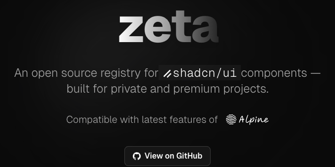
4 | hero image 5 |

6 | 7 | Zeta is an open source registry for [shadcn/ui](https://ui.shadcn.com/) components, designed for secure distribution of private or premium components. It integrates with [Polar.sh](https://docs.polar.sh/features/benefits/license-keys) for automated license key management and validation. 8 | 9 | --- 10 | 11 | ## 📚 Documentation 12 | 13 | Comprehensive documentation is available in the [`/content/docs`](./content/docs/) directory: 14 | 15 | - [Getting Started](./content/docs/getting-started/) 16 | - [Integrations](./content/docs/integrations/) 17 | - [Examples](./content/docs/examples/) 18 | - [Guides](./content/docs/guides/) 19 | - [API Reference](./content/docs/api/) 20 | - [Configuration](./content/docs/configuration/) 21 | - [FAQ](./content/docs/faq.mdx) 22 | - [Troubleshooting](./content/docs/troubleshooting.mdx) 23 | - [Contributing](./content/docs/contributing.mdx) 24 | 25 | > **Tip:** If you are using the deployed app, documentation is also available at `/docs`. 26 | 27 | --- 28 | 29 | ## Quick Start 30 | 31 | For a full setup guide, see [Getting Started](./content/docs/getting-started/). 32 | 33 | 1. **Create a License Key** 34 | - Use [Polar.sh](https://docs.polar.sh/features/benefits/license-keys) to generate a license key. 35 | 2. **Set Up Your Project** 36 | - You can use the shadcn CLI or clone this repository. See [Getting Started](./content/docs/getting-started/) for details. 37 | 3. **Configure Environment Variables** 38 | - Copy `.env.example` to `.env` and fill in the required values. See [Configuration](./content/docs/configuration/). 39 | 4. **Add and Protect Components** 40 | - Follow the [Component Registry Guide](./content/docs/examples/) to add and protect your components. 41 | 5. **Run the Registry Server** 42 | - Start the dev server with `pnpm dev`. 43 | 44 | --- 45 | 46 | ## How It Works 47 | 48 | 1. **Create a license key** in Polar.sh 49 | 2. **Set up your registry** (clone this repo or use shadcn CLI) 50 | 3. **Configure environment variables** for Polar integration and token signing 51 | 4. **Add and protect your components** in the registry 52 | 5. **Distribute components** securely—users must provide a valid license key to install 53 | 54 | --- 55 | 56 | ## Links & Further Reading 57 | 58 | - [Polar.sh License Key Docs](https://docs.polar.sh/features/benefits/license-keys) 59 | - [shadcn Registry Getting Started](https://ui.shadcn.com/docs/registry/getting-started) 60 | - [Zeta Demo](https://zeta-registry.vercel.app#example) 61 | - [Zeta Issues & Discussions](https://github.com/rbadillap/zeta/discussions) 62 | 63 | --- 64 | 65 | ## License 66 | 67 | [MIT License](LICENSE) 68 | -------------------------------------------------------------------------------- /app/(example)/example/access/[name]/page.tsx: -------------------------------------------------------------------------------- 1 | "use client" 2 | 3 | import React from "react" 4 | import Logo from "@/components/logos" 5 | import { ValidateLicenseForm } from "@/components/validate-license-form" 6 | import { toast } from "sonner" 7 | import { TerminalCommandCopy } from "@/components/terminal-command-copy" 8 | import { Badge } from "@/components/ui/badge" 9 | import { Check, Copy } from "lucide-react" 10 | 11 | function DemoDescription() { 12 | const [isCopied, setIsCopied] = React.useState(false) 13 | 14 | const exampleLicenseKey = 'ZETA-DEMO' 15 | 16 | function copyToClipboard() { 17 | navigator.clipboard.writeText(exampleLicenseKey) 18 | .then(() => { 19 | setIsCopied(true) 20 | setTimeout(() => setIsCopied(false), 2000) // Reset after 2 seconds 21 | }) 22 | .catch((err) => { 23 | console.error('Failed to copy:', err) 24 | toast.error('Failed to copy to clipboard') 25 | }) 26 | } 27 | 28 | return ( 29 |

30 | For demo purposes, the license key is{" "} 31 | 36 | {exampleLicenseKey} 37 | 38 | {isCopied ? : } 39 | 40 | 41 |

42 | ) 43 | } 44 | 45 | export default function ValidateLicensePage() { 46 | const [isLicenseValid, setIsLicenseValid] = React.useState(false) 47 | const [token, setToken] = React.useState(null) 48 | 49 | async function handleSubmit(data: { licenseKey: string }) { 50 | try { 51 | const res = await fetch("/example/api/validate-license", { 52 | method: "POST", 53 | headers: { "Content-Type": "application/json" }, 54 | body: JSON.stringify({ licenseKey: data.licenseKey }) 55 | }) 56 | const result = await res.json() 57 | if (res.ok && result.valid && result.token) { 58 | setToken(result.token) 59 | setIsLicenseValid(true) 60 | toast.success("License key validated successfully.") 61 | } else { 62 | toast.error(result.error || "Invalid license key.") 63 | } 64 | } catch (error) { 65 | toast.error((error as Error).message || "Unexpected error.") 66 | } 67 | } 68 | 69 | return ( 70 |
71 |
72 | {!isLicenseValid ? ( 73 | } 76 | description={} 77 | onSubmit={handleSubmit} 78 | /> 79 | ) : ( 80 | 84 | )} 85 |
86 |
87 | ) 88 | } -------------------------------------------------------------------------------- /content/docs/configuration/registry-json.mdx: -------------------------------------------------------------------------------- 1 | --- 2 | title: registry.json 3 | description: Structure and usage of the registry.json file in Zeta, following the official shadcn/ui schema. 4 | icon: FileJson 5 | --- 6 | 7 | ## What is `registry.json`? 8 | 9 | The `registry.json` file is the heart of your component registry in Zeta. It defines the metadata, dependencies, and items (components, blocks, hooks, etc.) that make up your registry. 10 | 11 | 12 | This file follows the [official shadcn/ui schema](https://ui.shadcn.com/schema/registry.json), ensuring compatibility and portability. 13 | 14 | 15 | ## General Structure 16 | 17 | ```json lineNumbers 18 | { 19 | "$schema": "https://ui.shadcn.com/schema/registry.json", 20 | "name": "Zeta Registry", 21 | "description": "Protect your blocks and components...", 22 | "homepage": "https://zeta-registry.vercel.app", 23 | "items": [ /* ... */ ] 24 | } 25 | ``` 26 | 27 | - **$schema**: URL to the official schema, enables validation and autocompletion. 28 | - **name**: Unique name for your registry. 29 | - **description**: Short description of your registry. 30 | - **homepage**: Main URL or demo. 31 | - **items**: Array of items, each following the [official item schema](https://ui.shadcn.com/schema/registry-item.json). 32 | 33 | ## Items and Dependencies 34 | 35 | Each item can be a component, block, hook, etc. 36 | The most important fields are: 37 | 38 | - **name**: Unique name for the item. 39 | - **type**: Type (`registry:block`, `registry:component`, etc.). 40 | - **title**: Human-readable title. 41 | - **description**: Short description. 42 | - **author**: Author of the item. 43 | - **dependencies**: NPM packages required for this item (**priority**). 44 | - **registryDependencies**: Other registry items or URLs of external registries. 45 | 46 | 47 | - Use `dependencies` to declare all required NPM packages (e.g., `shadcn`, `lucide-react`, `zod`, etc.). 48 | - Use `registryDependencies` to reference shadcn/ui components or external blocks. 49 | 50 | 51 | ## Real Example 52 | 53 | ```json 54 | { 55 | "name": "registry-nextjs", 56 | "type": "registry:block", 57 | "title": "Zeta Registry", 58 | "author": "Ronny Badilla - @rbadillap", 59 | "dependencies": [ 60 | "shadcn", 61 | "lucide-react", 62 | "zod", 63 | "@hookform/resolvers", 64 | "react-hook-form", 65 | "@polar-sh/sdk", 66 | "jose", 67 | "nanoid" 68 | ], 69 | "registryDependencies": [ 70 | "alert", 71 | "button", 72 | "card", 73 | "form", 74 | "input" 75 | ], 76 | "description": "This block contains all the necessary files and configurations to serve and manage a shadcn/ui component registry, including API protection, and more features.", 77 | "files": [ /* ... */ ] 78 | } 79 | ``` 80 | 81 | - **dependencies**: All NPM packages required for the block to work properly. 82 | - **registryDependencies**: shadcn/ui components or blocks used internally by this block. 83 | 84 | ## Best Practices 85 | 86 | - Always use the official schema for validation and compatibility. 87 | - Declare all dependencies explicitly. 88 | - Keep names and descriptions clear and unique. 89 | - Update dependencies regularly to avoid vulnerabilities. 90 | -------------------------------------------------------------------------------- /content/docs/configuration/env.mdx: -------------------------------------------------------------------------------- 1 | --- 2 | title: Environment Variables 3 | description: Configure environment variables for Zeta Registry. 4 | icon: Settings 5 | --- 6 | import { TypeTable } from 'fumadocs-ui/components/type-table'; 7 | import { Accordion, Accordions } from 'fumadocs-ui/components/accordion'; 8 | 9 | ## Environment Variables 10 | 11 | Zeta uses environment variables to securely manage secrets and integrate with external services like Polar.sh. You must configure these variables before running your registry. 12 | 13 | ### Required Variables 14 | 15 | | Variable | Type | Required | Description | 16 | |-------------------------|--------|----------|-----------------------------------------------------------------------------| 17 | | REGISTRY_TOKEN_SECRET | string | Yes | Secret key for signing and verifying registry tokens. Generate a strong random value. [Docs](https://nextjs.org/docs/app/guides/authentication#1-generating-a-secret-key) | 18 | | POLAR_ORG_ID | string | Yes | Your Polar.sh organization ID. Find it in your Polar dashboard. | 19 | | POLAR_ACCESS_TOKEN | string | Yes | API token for accessing Polar.sh endpoints. | 20 | | POLAR_IS_SANDBOX | bool | No | Set to `true` to use Polar's sandbox environment for testing. Defaults to `false`. | 21 | 22 | ### Example `.env` file 23 | 24 | ```sh 25 | REGISTRY_TOKEN_SECRET=your-random-secret 26 | POLAR_ORG_ID=your-polar-organization-id 27 | POLAR_ACCESS_TOKEN=your-polar-access-token 28 | POLAR_IS_SANDBOX=false 29 | ``` 30 | 31 | ### Tips 32 | 33 | - Never commit your `.env` file to version control. 34 | - Use a password manager or secret manager to store sensitive values. 35 | - For more details on each variable, see the [installation guide](/docs/getting-started/installation). 36 | 37 | ### Detailed Variable Reference 38 | 39 | 40 | 41 | **Required.** Secret key for signing and verifying registry tokens. 42 | - Generate a strong, random value. See official Next.js guide. 43 | - This value is used to sign and verify tokens for secure access to protected components. 44 | - Never share or commit this value to version control. 45 | - The JWT token is generated using the packages [`jose`](https://github.com/panva/jose) and [`nanoid`](https://github.com/ai/nanoid) 46 | 47 | 48 | **Required.** Your Polar.sh organization ID. 49 | - Find this in your [Polar dashboard/settings](https://polar.sh/dashboard). 50 | - Used to associate your registry with your Polar.sh account for license management. 51 | 52 | 53 | **Required.** API token for accessing Polar.sh endpoints. 54 | - Generate this token in your [Polar.sh dashboard/settings](https://polar.sh/dashboard) 55 | - Allows Zeta to validate license keys by checking the scope: `license_keys:read`. 56 | - Keep this token secret and never expose it publicly. 57 | 58 | 59 | **Optional.** Use Polar's sandbox environment for testing. 60 | - Set to `true` to enable sandbox mode, which is useful for development and testing. 61 | - Defaults to `false` (production mode). 62 | - See [Polar.sh License Key Docs](https://docs.polar.sh/features/benefits/license-keys) for more info. 63 | 64 | 65 | -------------------------------------------------------------------------------- /app/(registry)/registry/access/validate-license/page.tsx: -------------------------------------------------------------------------------- 1 | "use client" 2 | 3 | import React, { Suspense } from "react" 4 | // import Logo from "@/components/logos" 5 | import { ValidateLicenseForm } from "@/components/validate-license-form" 6 | import { TerminalCommandCopy } from "@/components/terminal-command-copy" 7 | 8 | function PolarLogo(props: React.SVGProps) { 9 | return ( 10 | 11 | 12 | 13 | 14 | 15 | 16 | 17 | 18 | 19 | 20 | ) 21 | } 22 | 23 | export default function ValidateLicensePage() { 24 | const [isLicenseValid, setIsLicenseValid] = React.useState(false) 25 | const [token, setToken] = React.useState(null) 26 | const [error, setError] = React.useState(null) 27 | 28 | async function handleSubmit(data: { licenseKey: string }) { 29 | setError(null) 30 | try { 31 | const res = await fetch("/registry/api/validate-license", { 32 | method: "POST", 33 | headers: { "Content-Type": "application/json" }, 34 | body: JSON.stringify({ licenseKey: data.licenseKey }) 35 | }) 36 | const result = await res.json() 37 | if (res.ok && result.valid && result.token) { 38 | setToken(result.token) 39 | setIsLicenseValid(true) 40 | } else { 41 | setError(result.error || "Invalid license key.") 42 | } 43 | } catch (error) { 44 | setError((error as Error).message || "Unexpected error.") 45 | } 46 | } 47 | 48 | return ( 49 |
50 |
51 | {!isLicenseValid ? ( 52 | } 55 | onSubmit={handleSubmit} 56 | error={error} 57 | /> 58 | ) : ( 59 | Loading...
}> 60 | 64 | 65 | )} 66 | 67 | 68 | ) 69 | } -------------------------------------------------------------------------------- /public/r/showcase.json: -------------------------------------------------------------------------------- 1 | { 2 | "$schema": "https://ui.shadcn.com/schema/registry-item.json", 3 | "name": "showcase", 4 | "type": "registry:block", 5 | "title": "Showcase", 6 | "author": "Ronny Badilla - @rbadillap", 7 | "description": "This block contains a real world example of how to use Zeta.", 8 | "registryDependencies": [ 9 | "https://zeta-registry.vercel.app/r/registry-nextjs.json" 10 | ], 11 | "files": [ 12 | { 13 | "path": "registry/new-york/examples/showcase/page.tsx", 14 | "content": "\"use client\"\n\nimport Link from \"next/link\"\nimport { Card, CardContent } from \"@/components/ui/card\"\nimport { Button } from \"@/components/ui/button\"\nimport { Countdown } from \"@/registry/new-york/ui/countdown\"\n\nexport default function Preview() {\n return (\n
\n
\n
\n
\n

<Countdown />

\n

\n Use the countdown component. Perfect for launches, limited offers, \n and time-sensitive events—fully customizable, and minimalistic.\n

\n
\n
\n \n \n
\n
\n \n \n \n \n \n
\n
\n )\n} ", 15 | "type": "registry:page", 16 | "target": "app/page.tsx" 17 | }, 18 | { 19 | "path": "registry/new-york/ui/countdown.tsx", 20 | "content": "\"use client\"\n\nimport * as React from \"react\"\nimport { cn } from \"@/lib/utils\"\n\ninterface CountdownProps {\n until?: Date | string\n label?: string\n className?: string\n}\n\nfunction getTimeLeft(until: Date): string {\n const now = new Date()\n const diff = Math.max(0, until.getTime() - now.getTime())\n const hours = Math.floor(diff / 1000 / 60 / 60)\n const minutes = Math.floor((diff / 1000 / 60) % 60)\n const seconds = Math.floor((diff / 1000) % 60)\n return [hours, minutes, seconds]\n .map((n) => n.toString().padStart(2, \"0\"))\n .join(\":\")\n}\n\nexport function Countdown({ until, label = \"Time left\", className }: CountdownProps) {\n const [time, setTime] = React.useState(\"\")\n\n React.useEffect(() => {\n let target: Date\n if (until) {\n target = typeof until === \"string\" ? new Date(until) : until\n } else {\n target = new Date(Date.now() + 60 * 60 * 1000) // 1 hour from now\n }\n function update() {\n setTime(getTimeLeft(target))\n }\n update()\n const interval = setInterval(() => {\n update()\n }, 1000)\n return () => clearInterval(interval)\n }, [until])\n\n return (\n
\n \n {time}\n \n \n {label}\n \n
\n )\n} ", 21 | "type": "registry:component", 22 | "target": "components/ui/countdown.tsx" 23 | } 24 | ] 25 | } -------------------------------------------------------------------------------- /content/docs/getting-started/installation.mdx: -------------------------------------------------------------------------------- 1 | --- 2 | title: Installation 3 | description: How to install and set up Zeta in your project. 4 | icon: Wrench 5 | --- 6 | import { Tab, Tabs } from 'fumadocs-ui/components/tabs'; 7 | 8 | ## Introduction 9 | 10 | Learn how to install Zeta, the secure shadcn/ui component registry, in your Next.js project. This guide covers the basics to get you started quickly, with links to more detailed configuration topics. 11 | 12 | ## Prerequisites 13 | 14 | - Node.js 18+ 15 | - pnpm 16 | - A Next.js app (recommended) 17 | - Polar.sh account for license key management - [Create an account](https://polar.sh?utm_source=zeta) 18 | 19 | ## Installation Methods 20 | 21 | ### A. Using shadcn CLI (Recommended) 22 | 23 | 24 | 25 | ```bash tab="npm" 26 | npx shadcn@latest add https://zeta-registry.vercel.app/r/registry-nextjs.json 27 | ``` 28 | 29 | ```bash tab="pnpm" 30 | pnpm dlx shadcn@latest add https://zeta-registry.vercel.app/r/registry-nextjs.json 31 | ``` 32 | 33 | ```bash tab="yarn" 34 | yarn dlx shadcn@latest add https://zeta-registry.vercel.app/r/registry-nextjs.json 35 | ``` 36 | 37 | ```bash tab="bun" 38 | bunx shadcn@latest add https://zeta-registry.vercel.app/r/registry-nextjs.json 39 | ``` 40 | 41 | 42 | 43 | This will copy Zeta registry components into your project. 44 | 45 | ### B. Cloning the Repository 46 | 47 | 48 | 49 | ```bash tab="npm" 50 | git clone https://github.com/rbadillap/zeta.git 51 | cd zeta 52 | npm install # this is a nextjs app 53 | ``` 54 | 55 | ```bash tab="pnpm" 56 | git clone https://github.com/rbadillap/zeta.git 57 | cd zeta 58 | pnpm install 59 | ``` 60 | 61 | ```bash tab="yarn" 62 | git clone https://github.com/rbadillap/zeta.git 63 | cd zeta 64 | yarn install 65 | ``` 66 | 67 | ```bash tab="bun" 68 | git clone https://github.com/rbadillap/zeta.git 69 | cd zeta 70 | bun install 71 | ``` 72 | 73 | 74 | 75 | ## Basic Configuration 76 | 77 | After installation, you need to configure your environment and registry files. For full details, see the [Configuration Guide](/docs/configuration/env). 78 | 79 | ### 1. Environment Variables 80 | 81 | 82 | 83 | ```bash tab="Unix" 84 | cp .env.example .env 85 | ``` 86 | 87 | ```sh tab="Windows" 88 | copy .env.example .env 89 | ``` 90 | 91 | 92 | 93 | - Fill in the required values. See [Environment Variables Reference](/docs/configuration/env) for details on each variable. 94 | 95 | ### 2. Registry File 96 | 97 | - Ensure you have a `registry.json` file and at least one component in your registry directory. 98 | - For more information, see [Registry File Configuration](/docs/configuration/registry-json). 99 | 100 | ### 3. Middleware (Optional) 101 | 102 | - To protect premium/private components, configure middleware for access control. 103 | - See [Middleware Configuration](/docs/configuration/middleware) for setup instructions. 104 | 105 | ## First Run 106 | 107 | 108 | 109 | ```bash tab="npm" 110 | npm run dev 111 | ``` 112 | 113 | ```bash tab="pnpm" 114 | pnpm dev 115 | ``` 116 | 117 | ```bash tab="yarn" 118 | yarn dev 119 | ``` 120 | 121 | ```bash tab="bun" 122 | bun run dev 123 | ``` 124 | 125 | 126 | 127 | Visit [http://localhost:3000](http://localhost:3000) to see your registry. 128 | 129 | ## Next Steps 130 | 131 | - [Protecting Components](/docs/guides/protecting-components) 132 | - [Usage Examples](/docs/examples/showcae) 133 | - [Integrations](/docs/integrations) 134 | - [API Reference](/docs/api/endpoints) 135 | - [Configuration Guide](/docs/configuration/env) 136 | 137 | ## Troubleshooting 138 | 139 | - See [Zeta Discussions](https://github.com/rbadillap/zeta/discussions) for help. 140 | - Double-check your environment variables and Polar.sh credentials if you encounter issues. -------------------------------------------------------------------------------- /registry.json: -------------------------------------------------------------------------------- 1 | { 2 | "$schema": "https://ui.shadcn.com/schema/registry.json", 3 | "name": "Zeta Registry | A shadcn/ui registry for private and premium projects", 4 | "description": "Protect your blocks and components with integrations such as Polar.sh License Keys, and more.", 5 | "homepage": "https://zeta-registry.vercel.app", 6 | "items": [ 7 | { 8 | "name": "registry-nextjs", 9 | "type": "registry:block", 10 | "title": "Zeta Registry", 11 | "author": "Ronny Badilla - @rbadillap", 12 | "dependencies": [ 13 | "shadcn", 14 | "lucide-react", 15 | "zod", 16 | "@hookform/resolvers", 17 | "react-hook-form", 18 | "@polar-sh/sdk", 19 | "jose", 20 | "nanoid" 21 | ], 22 | "registryDependencies": [ 23 | "alert", 24 | "button", 25 | "card", 26 | "form", 27 | "input" 28 | ], 29 | "description": 30 | "This block contains contains all the necessary files and configurations to serve and manage a shadcn/ui component registry, including API protection, and more features.", 31 | "files": [ 32 | { 33 | "path": "app/(registry)/registry/[name]/route.ts", 34 | "type": "registry:file", 35 | "target": "app/registry/[name]/route.ts" 36 | }, 37 | { 38 | "path": "app/(registry)/registry/access/validate-license/page.tsx", 39 | "type": "registry:page", 40 | "target": "app/registry/access/validate-license/page.tsx" 41 | }, 42 | { 43 | "path": "app/(registry)/registry/api/validate-license/route.ts", 44 | "type": "registry:file", 45 | "target": "app/registry/api/validate-license/route.ts" 46 | }, 47 | { 48 | "path": "components/terminal-command-copy.tsx", 49 | "type": "registry:component", 50 | "target": "components/terminal-command-copy.tsx" 51 | }, 52 | { 53 | "path": "components/validate-license-form.tsx", 54 | "type": "registry:component", 55 | "target": "components/validate-license-form.tsx" 56 | }, 57 | { 58 | "path": "hooks/use-copy-to-clipboard.ts", 59 | "type": "registry:hook", 60 | "target": "hooks/use-copy-to-clipboard.ts" 61 | }, 62 | { 63 | "path": "lib/polar/client.ts", 64 | "type": "registry:lib", 65 | "target": "lib/polar/client.ts" 66 | }, 67 | { 68 | "path": "lib/shadcn/registry/utils.ts", 69 | "type": "registry:lib", 70 | "target": "lib/shadcn/registry/utils.ts" 71 | }, 72 | { 73 | "path": "registry/new-york/middleware.ts", 74 | "type": "registry:file", 75 | "target": "middleware.ts" 76 | } 77 | ] 78 | }, 79 | { 80 | "name": "logo", 81 | "type": "registry:component", 82 | "title": "Branding", 83 | "author": "Ronny Badilla - @rbadillap", 84 | "description": "This component contains the branding for the Zeta registry. Feel free to use it in your project.", 85 | "files": [ 86 | { 87 | "path": "registry/new-york/branding/zeta.tsx", 88 | "type": "registry:component", 89 | "target": "components/logos/zeta.tsx" 90 | } 91 | ] 92 | }, 93 | { 94 | "name": "showcase", 95 | "type": "registry:block", 96 | "title": "Showcase", 97 | "author": "Ronny Badilla - @rbadillap", 98 | "description": "This block contains a real world example of how to use Zeta.", 99 | "registryDependencies": [ 100 | "https://zeta-registry.vercel.app/r/registry-nextjs.json" 101 | ], 102 | "files": [ 103 | { 104 | "path": "registry/new-york/examples/showcase/page.tsx", 105 | "type": "registry:page", 106 | "target": "app/page.tsx" 107 | }, 108 | { 109 | "path": "registry/new-york/ui/countdown.tsx", 110 | "type": "registry:component", 111 | "target": "components/ui/countdown.tsx" 112 | } 113 | ] 114 | } 115 | ] 116 | } 117 | -------------------------------------------------------------------------------- /content/docs/getting-started/quickstart.mdx: -------------------------------------------------------------------------------- 1 | --- 2 | title: Quickstart 3 | description: Get started with Zeta, secure, protect, and distribute your shadcn/ui components. 4 | icon: Album 5 | --- 6 | import { Tabs, Tab } from 'fumadocs-ui/components/tabs'; 7 | 8 | ## Getting Started 9 | 10 | Follow these steps to set up Zeta and protect your shadcn/ui components in a Next.js project. 11 | 12 | ### 1. Create a Next.js App 13 | 14 | 15 | ```bash tab="npm" 16 | npx shadcn@latest init -d 17 | ``` 18 | ```bash tab="pnpm" 19 | pnpm dlx shadcn@latest init -d 20 | ``` 21 | ```bash tab="yarn" 22 | yarn dlx shadcn@latest init -d 23 | ``` 24 | ```bash tab="bun" 25 | bunx shadcn@latest init -d 26 | ``` 27 | 28 | 29 | - Select **Next.js** when prompted and provide a project name. 30 | - The `-d` flag uses default options for a faster setup. 31 | 32 | ### 2. Change to Your Project Directory 33 | 34 | ```bash 35 | cd 36 | ``` 37 | 38 | ### 3. Add the Zeta Registry 39 | 40 | 41 | ```bash tab="npm" 42 | npx shadcn@latest add https://zeta-registry.vercel.app/r/registry-nextjs.json 43 | ``` 44 | ```bash tab="pnpm" 45 | pnpm dlx shadcn@latest add https://zeta-registry.vercel.app/r/registry-nextjs.json 46 | ``` 47 | ```bash tab="yarn" 48 | yarn dlx shadcn@latest add https://zeta-registry.vercel.app/r/registry-nextjs.json 49 | ``` 50 | ```bash tab="bun" 51 | bunx shadcn@latest add https://zeta-registry.vercel.app/r/registry-nextjs.json 52 | ``` 53 | 54 | 55 | ### 4. Configure Environment Variables 56 | 57 | Copy the example env file and fill in your values: 58 | 59 | 60 | ```bash tab="Unix" 61 | cp .env.example .env 62 | ``` 63 | ```sh tab="Windows" 64 | copy .env.example .env 65 | ``` 66 | 67 | 68 | Fill in the required values: 69 | 70 | | Variable | Type | Required | Description | 71 | |-------------------------|--------|----------|-----------------------------------------------------------------------------| 72 | | REGISTRY_TOKEN_SECRET | string | Yes | Secret key for signing and verifying registry tokens. [Docs](https://nextjs.org/docs/app/guides/authentication#1-generating-a-secret-key) | 73 | | POLAR_ORG_ID | string | Yes | Your Polar.sh organization ID. | 74 | | POLAR_ACCESS_TOKEN | string | Yes | API token for accessing Polar.sh endpoints. | 75 | | POLAR_IS_SANDBOX | bool | No | Set to `true` for sandbox/testing. Defaults to `false`. | 76 | 77 | See the [full environment variable reference](/docs/configuration/env) for details. 78 | 79 | ### 5. Create a Protected Component 80 | 81 | - Create your component in `registry/new-york/`. 82 | - Add a `registry.json` file describing your component. 83 | See the [shadcn registry-item.json documentation](https://ui.shadcn.com/docs/registry/registry-item-json) for schema and examples. 84 | 85 | ### 6. Start the Development Server 86 | 87 | 88 | ```bash tab="npm" 89 | npm run dev 90 | ``` 91 | ```bash tab="pnpm" 92 | pnpm dev 93 | ``` 94 | ```bash tab="yarn" 95 | yarn dev 96 | ``` 97 | ```bash tab="bun" 98 | bun run dev 99 | ``` 100 | 101 | 102 | ### 7. Access Your Protected Component 103 | 104 | Visit: 105 | ``` 106 | http://localhost:3000/registry/ 107 | ``` 108 | Your component is now protected and only accessible via the registry route. 109 | 110 | --- 111 | 112 | 113 | Do **not** use the `shadcn build` command (e.g. `pnpm dlx shadcn build`). 114 | Zeta handles the build and serving process internally. Running `build` will generate a public `r` folder with JSON files per component, which is not compatible with Zeta's access control. 115 | 116 | -------------------------------------------------------------------------------- /components/demo.tsx: -------------------------------------------------------------------------------- 1 | import path from 'path' 2 | import fs from 'fs/promises' 3 | import type { BundledLanguage } from 'shiki' 4 | import { codeToHtml } from 'shiki' 5 | import { 6 | Tabs, 7 | TabsContent, 8 | TabsList, 9 | TabsTrigger 10 | } from "@/components/ui/tabs" 11 | import { 12 | Accordion, 13 | AccordionContent, 14 | AccordionItem, 15 | AccordionTrigger 16 | } from "@/components/ui/accordion" 17 | import { AddCommand } from '@/components/add-command' 18 | import { OpenInV0 } from '@/components/open-in-v0' 19 | 20 | const registryData = await import("@/registry.json") 21 | const registry = registryData.default 22 | 23 | const files = await Promise.all( 24 | registry.items.flatMap((item) => 25 | item.files.map(async (file) => { 26 | const filePath = path.join(process.cwd(), file.path) 27 | const content = await fs.readFile(filePath, "utf8") 28 | return { ...file, content } 29 | }) 30 | ) 31 | ) 32 | 33 | interface CodeBlockProps { 34 | children: string 35 | lang: BundledLanguage 36 | className?: string 37 | } 38 | 39 | async function CodeBlock(props: CodeBlockProps) { 40 | const out = await codeToHtml(props.children, { 41 | lang: props.lang, 42 | theme: 'dark-plus' 43 | }) 44 | 45 | return
46 | } 47 | 48 | export function Demo() { 49 | return ( 50 |
51 | {/* Demo Preview */} 52 |
53 | 54 |
55 | 56 | Preview 57 | Code 58 | registry.json 59 | 60 | 61 |
62 | 63 | 64 |
65 |
66 | 67 |
68 | 69 |
70 |