├── .gitignore
├── .npmignore
├── Images
├── BottomSheet
│ ├── 1.png
│ └── 2.png
└── Typography
│ └── index.png
├── README.md
├── docs
├── ActionButton.md
├── Avatar.md
├── Badge.md
├── BottomSheet.md
├── Button.md
├── Card.md
├── Checkbox.md
├── Dialog.md
├── Icon.md
├── IconToggle.md
├── Indicator.md
├── Menu.md
├── SimpleToolbar.md
├── Toast.md
├── Toolbar.md
├── Typography.md
├── images
│ ├── avatar.png
│ └── bottom_sheet_list.png
└── index.md
├── example
├── .buckconfig
├── .flowconfig
├── .gitattributes
├── .gitignore
├── .watchmanconfig
├── App.js
├── __tests__
│ └── App.js
├── android
│ ├── app
│ │ ├── BUCK
│ │ ├── build.gradle
│ │ ├── build_defs.bzl
│ │ ├── proguard-rules.pro
│ │ └── src
│ │ │ └── main
│ │ │ ├── AndroidManifest.xml
│ │ │ ├── java
│ │ │ └── com
│ │ │ │ └── example
│ │ │ │ ├── MainActivity.java
│ │ │ │ └── MainApplication.java
│ │ │ └── res
│ │ │ ├── mipmap-hdpi
│ │ │ ├── ic_launcher.png
│ │ │ └── ic_launcher_round.png
│ │ │ ├── mipmap-mdpi
│ │ │ ├── ic_launcher.png
│ │ │ └── ic_launcher_round.png
│ │ │ ├── mipmap-xhdpi
│ │ │ ├── ic_launcher.png
│ │ │ └── ic_launcher_round.png
│ │ │ ├── mipmap-xxhdpi
│ │ │ ├── ic_launcher.png
│ │ │ └── ic_launcher_round.png
│ │ │ ├── mipmap-xxxhdpi
│ │ │ ├── ic_launcher.png
│ │ │ └── ic_launcher_round.png
│ │ │ └── values
│ │ │ ├── strings.xml
│ │ │ └── styles.xml
│ ├── build.gradle
│ ├── gradle.properties
│ ├── gradle
│ │ └── wrapper
│ │ │ ├── gradle-wrapper.jar
│ │ │ └── gradle-wrapper.properties
│ ├── gradlew
│ ├── gradlew.bat
│ ├── keystores
│ │ ├── BUCK
│ │ └── debug.keystore.properties
│ └── settings.gradle
├── app.json
├── babel.config.js
├── index.js
├── ios
│ ├── example-tvOS
│ │ └── Info.plist
│ ├── example-tvOSTests
│ │ └── Info.plist
│ ├── example.xcodeproj
│ │ ├── project.pbxproj
│ │ └── xcshareddata
│ │ │ └── xcschemes
│ │ │ ├── example-tvOS.xcscheme
│ │ │ └── example.xcscheme
│ ├── example
│ │ ├── AppDelegate.h
│ │ ├── AppDelegate.m
│ │ ├── Base.lproj
│ │ │ └── LaunchScreen.xib
│ │ ├── Images.xcassets
│ │ │ ├── AppIcon.appiconset
│ │ │ │ └── Contents.json
│ │ │ └── Contents.json
│ │ ├── Info.plist
│ │ └── main.m
│ └── exampleTests
│ │ ├── Info.plist
│ │ └── exampleTests.m
├── package.json
└── yarn.lock
├── index.d.ts
├── package.json
├── roboto
├── Apache License.txt
├── Roboto-Black.ttf
├── Roboto-BlackItalic.ttf
├── Roboto-Bold.ttf
├── Roboto-BoldItalic.ttf
├── Roboto-Italic.ttf
├── Roboto-Light.ttf
├── Roboto-LightItalic.ttf
├── Roboto-Medium.ttf
├── Roboto-MediumItalic.ttf
├── Roboto-Regular.ttf
├── Roboto-Thin.ttf
├── Roboto-ThinItalic.ttf
├── RobotoCondensed-Bold.ttf
├── RobotoCondensed-BoldItalic.ttf
├── RobotoCondensed-Italic.ttf
├── RobotoCondensed-Light.ttf
├── RobotoCondensed-LightItalic.ttf
└── RobotoCondensed-Regular.ttf
├── src
├── ActionButton
│ ├── ActionButton.flow.js
│ └── index.js
├── Avatar
│ ├── Avatar.flow.js
│ └── index.js
├── Badge
│ ├── Badge.flow.js
│ ├── Badge.react.js
│ └── index.js
├── BottomSheet
│ ├── BSDivider.flow.js
│ ├── BSGridItem.flow.js
│ ├── BSListItem.flow.js
│ ├── BottomSheet.flow.js
│ └── index.js
├── Button
│ ├── Button.flow.js
│ ├── examples
│ │ └── index.js
│ └── index.js
├── Card
│ ├── Card.flow.js
│ └── index.js
├── Checkbox
│ ├── Checkbox.flow.js
│ └── index.js
├── Container
│ ├── __test__
│ │ ├── Container.test.js
│ │ └── __snapshots__
│ │ │ └── Container.test.js.snap
│ └── index.js
├── Dialog
│ ├── Actions.flow.js
│ ├── Content.flow.js
│ ├── Dialog.flow.js
│ ├── DialogDefaultActions.flow.js
│ ├── DialogStackedActions.react.js
│ ├── Title.flow.js
│ └── index.js
├── Divider
│ ├── Divider.flow.js
│ └── index.js
├── Icon
│ ├── Icon.flow.js
│ └── index.js
├── IconToggle
│ ├── IconToggle.react.js
│ └── index.js
├── Indicator
│ ├── Indicator.js
│ ├── ball-indicator
│ │ ├── index.js
│ │ └── styles.js
│ ├── bar-indicator
│ │ ├── index.js
│ │ └── styles.js
│ ├── dot-indicator
│ │ ├── index.js
│ │ └── styles.js
│ ├── index.js
│ ├── indicator
│ │ └── index.js
│ ├── material-indicator
│ │ ├── index.js
│ │ └── styles.js
│ ├── pacman-indicator
│ │ ├── index.js
│ │ └── styles.js
│ ├── pulse-indicator
│ │ ├── index.js
│ │ └── styles.js
│ ├── skype-indicator
│ │ ├── index.js
│ │ └── styles.js
│ ├── ui-activity-indicator
│ │ ├── index.js
│ │ └── styles.js
│ └── wave-indicator
│ │ ├── index.js
│ │ └── styles.js
├── ListItem
│ ├── ListItem.flow.js
│ └── index.js
├── METester
│ ├── ActionButtonExample.js
│ ├── AvatarExample.js
│ ├── BadgeExmaple.js
│ ├── BottomSheetExample.js
│ ├── ButtonExample.js
│ ├── CardExample.js
│ ├── CenterContainer.js
│ ├── CheckboxExample.js
│ ├── DialogExample.js
│ ├── DividerExample.js
│ ├── IconExample.js
│ ├── Images
│ │ └── launch-icon.png
│ ├── IndicatorExample.js
│ ├── ListItemExample.js
│ ├── MenuExample.js
│ ├── PlaceHolderExample.js
│ ├── RadioButtonExample.js
│ ├── SimpleToolbarExample.js
│ ├── ToastExample.js
│ ├── ToolbarExample.js
│ └── TypographyExample.js
├── Menu
│ ├── Menu.js
│ ├── MenuDivider.js
│ ├── MenuItem.js
│ └── index.js
├── Modalbox
│ └── ModalBox.js
├── Placeholder
│ ├── Box.js
│ ├── ImageContent.js
│ ├── Line.js
│ ├── Media.js
│ ├── MultiWords.js
│ ├── Paragraph.js
│ └── index.js
├── PressRipple
│ ├── PressRipple.js
│ └── index.js
├── RadioButton
│ ├── RadioButton.flow.js
│ └── index.js
├── Ripple
│ ├── Test
│ │ └── app.js
│ ├── index.js
│ └── styles.js
├── RippleFeedback
│ ├── RippleFeedback.react.js
│ └── index.js
├── SimpleToolbar
│ ├── CenterElement.flow.js
│ ├── SimpleToolbar.flow.js
│ └── index.js
├── Snackbar
│ ├── Snackbar.react.js
│ └── index.js
├── Steppers
│ ├── StepIcon.js
│ ├── StepItem.js
│ ├── StepLine.js
│ └── Stepper.js
├── Subheader
│ ├── Subheader.flow.js
│ └── index.js
├── TextField
│ ├── FloatingLabel.js
│ ├── TextField.js
│ ├── TextFieldBase.js
│ ├── Underline.js
│ └── index.js
├── Toast
│ ├── Toast.flow.js
│ └── index.js
├── Toolbar
│ ├── CenterElement.flow.js
│ ├── LeftElement.flow.js
│ ├── RightElement.flow.js
│ ├── Toolbar.flow.js
│ └── index.js
├── Typography
│ └── Typography.js
├── awesome
│ └── ScrollVertical
│ │ └── ScrollVertical.js
├── index.js
├── styles
│ ├── Metrics.js
│ ├── __test__
│ │ ├── getPlatformElevation.test.js
│ │ └── getTheme.test.js
│ ├── colors.js
│ ├── constants.js
│ ├── getPlatformElevation.android.js
│ ├── getPlatformElevation.ios.js
│ ├── getPlatformElevation.web.js
│ ├── getTheme.js
│ ├── spacing.js
│ ├── themes
│ │ └── light.js
│ └── typography.js
└── utils
│ ├── MotionCurve.js
│ ├── MotionDuration.js
│ ├── __test__
│ └── isFunction.test.js
│ ├── index.js
│ ├── isFunction.js
│ └── meDeprecatedPropType.js
└── yarn.lock
/.gitignore:
--------------------------------------------------------------------------------
1 | .idea
2 |
3 | node_modules/
4 |
--------------------------------------------------------------------------------
/.npmignore:
--------------------------------------------------------------------------------
1 | .idea
2 | example
--------------------------------------------------------------------------------
/Images/BottomSheet/1.png:
--------------------------------------------------------------------------------
https://raw.githubusercontent.com/react-native-studio/material-elements/42d579b5cd89fae9ab6ce4b3db5c1bab8b447127/Images/BottomSheet/1.png
--------------------------------------------------------------------------------
/Images/BottomSheet/2.png:
--------------------------------------------------------------------------------
https://raw.githubusercontent.com/react-native-studio/material-elements/42d579b5cd89fae9ab6ce4b3db5c1bab8b447127/Images/BottomSheet/2.png
--------------------------------------------------------------------------------
/Images/Typography/index.png:
--------------------------------------------------------------------------------
https://raw.githubusercontent.com/react-native-studio/material-elements/42d579b5cd89fae9ab6ce4b3db5c1bab8b447127/Images/Typography/index.png
--------------------------------------------------------------------------------
/README.md:
--------------------------------------------------------------------------------
1 | # material-elements [](https://badge.fury.io/js/material-elements)
2 | 基于material design设计的react native UI库
3 | ### 第一步 安装
4 | 运行 `npm install --save material-elements`
5 |
6 | 或者 `yarn add material-elements(需要安装yarn)`
7 |
8 |
9 | #### link
10 | material-elements 依赖于react-native-vector-icons
11 |
12 | 运行 `yarn add react-native-vector-icons`
13 |
14 |
15 | 将vector-icons链入工程
16 |
17 | `react-native link react-native-vector-icons`
18 |
19 | ### 使用
20 |
21 | 下面是material-elements所包含的组件
22 | 请见[示例](https://github.com/react-native-studio/material-elements/tree/master/src/METester)
23 | - Action Button
24 | - Avatar
25 | - Badge
26 | - [Button](https://github.com/react-native-studio/material-elements/blob/master/docs/Button.md)
27 | - [Card](https://github.com/react-native-studio/material-elements/blob/master/docs/Card.md)
28 | - Checkbox
29 | - Dialog
30 | - Divider
31 | - [Icon](https://github.com/react-native-studio/material-elements/blob/master/docs/Icon.md)
32 | - Icon toggles
33 | - List item
34 | - Radio button
35 | - Subheader
36 | - Toolbar
37 | - SimpleToolbar
38 | - BottomSheet
39 | - Menu
40 | - Toast
41 | - TextField
42 | - Indicator
43 | - [Typography](https://github.com/react-native-studio/material-elements/blob/master/docs/Typography.md)
44 | #### 后续将完善文档,丰富material-elements组件库
45 |
--------------------------------------------------------------------------------
/docs/ActionButton.md:
--------------------------------------------------------------------------------
1 | # [Action Button](https://material.google.com/components/buttons-floating-action-button.html)
2 |  3 |
3 |  4 |
4 |  5 |
6 |
7 | ### Usage
8 |
9 | ```js
10 | ...
11 | import { ActionButton } from 'material-elements';
12 | ...
13 | render() {
14 |
15 | // default with icon (default icon is +)
16 | // with done icon
17 |
18 | }
19 | ```
20 | ### API
21 | ```js
22 | const propTypes = {
23 | /**
24 | * Array of names of icons (or elements) that will be shown after the main button is pressed
25 | * Remember, you should specify key for each element, if you use array of elements
26 | */
27 | actions: PropTypes.oneOfType([
28 | PropTypes.arrayOf(PropTypes.string),
29 | PropTypes.arrayOf(PropTypes.element),
30 | PropTypes.arrayOf(PropTypes.shape({
31 | icon: PropTypes.oneOfType([
32 | PropTypes.string,
33 | PropTypes.element,
34 | ]),
35 | label: PropTypes.string,
36 | name: PropTypes.string,
37 | })),
38 | ]),
39 | /**
40 | * 按钮onPress时触发,text作为参数传递
41 | */
42 | onPress: PropTypes.func,
43 | /**
44 | * 按钮onLongPress时触发,text作为参数传递
45 | */
46 | onLongPress: PropTypes.func,
47 | /**
48 | * 是否隐藏button
49 | */
50 | hidden: PropTypes.bool,
51 | /**
52 | * 可为字符串或者Component
53 | */
54 | icon: PropTypes.oneOfType([
55 | PropTypes.string,
56 | PropTypes.element,
57 | ]),
58 | /**
59 | *
60 | * 当transition为null时,不会产生动画
61 | */
62 | transition: PropTypes.oneOf(['toolbar', 'speedDial']),
63 | /**
64 | * 设置水波纹颜色
65 | */
66 | rippleColor: PropTypes.string,
67 | /**
68 | * 设置button的style
69 | */
70 | style: PropTypes.shape({
71 | container: ViewPropTypes.style,
72 | icon: Text.propTypes.style,
73 | }),
74 | };
75 | ```
76 |
--------------------------------------------------------------------------------
/docs/Avatar.md:
--------------------------------------------------------------------------------
1 | # **Avatar**
2 |
3 |
4 |
5 |
6 |
7 | ### Usage
8 |
9 | ```js
10 | ...
11 | import { ActionButton } from 'material-elements';
12 | ...
13 | render() {
14 |
15 | // default with icon (default icon is +)
16 | // with done icon
17 |
18 | }
19 | ```
20 | ### API
21 | ```js
22 | const propTypes = {
23 | /**
24 | * Array of names of icons (or elements) that will be shown after the main button is pressed
25 | * Remember, you should specify key for each element, if you use array of elements
26 | */
27 | actions: PropTypes.oneOfType([
28 | PropTypes.arrayOf(PropTypes.string),
29 | PropTypes.arrayOf(PropTypes.element),
30 | PropTypes.arrayOf(PropTypes.shape({
31 | icon: PropTypes.oneOfType([
32 | PropTypes.string,
33 | PropTypes.element,
34 | ]),
35 | label: PropTypes.string,
36 | name: PropTypes.string,
37 | })),
38 | ]),
39 | /**
40 | * 按钮onPress时触发,text作为参数传递
41 | */
42 | onPress: PropTypes.func,
43 | /**
44 | * 按钮onLongPress时触发,text作为参数传递
45 | */
46 | onLongPress: PropTypes.func,
47 | /**
48 | * 是否隐藏button
49 | */
50 | hidden: PropTypes.bool,
51 | /**
52 | * 可为字符串或者Component
53 | */
54 | icon: PropTypes.oneOfType([
55 | PropTypes.string,
56 | PropTypes.element,
57 | ]),
58 | /**
59 | *
60 | * 当transition为null时,不会产生动画
61 | */
62 | transition: PropTypes.oneOf(['toolbar', 'speedDial']),
63 | /**
64 | * 设置水波纹颜色
65 | */
66 | rippleColor: PropTypes.string,
67 | /**
68 | * 设置button的style
69 | */
70 | style: PropTypes.shape({
71 | container: ViewPropTypes.style,
72 | icon: Text.propTypes.style,
73 | }),
74 | };
75 | ```
76 |
--------------------------------------------------------------------------------
/docs/Avatar.md:
--------------------------------------------------------------------------------
1 | # **Avatar**
2 |
3 |
4 |  5 |
6 | ### 使用
7 |
8 | ```js
9 | import { Avatar } from 'material-elements';
10 |
11 |
12 |
13 |
14 |
15 |
16 |
17 |
18 |
19 |
20 | ```
21 |
22 | ### API
23 |
24 | |属性|类型|默认值|说明|
25 | |:---:|:---:|:---:|:---:|
26 | |text|string|无|显示在Avatar中文字|
27 | |icon|{name:string,size:number,type:string,color:string}|无|显示在avatar中的icon|
28 | |image|Image.props|无|可设置所有Image属性|
29 | |size|number|48|avatar的尺寸|
30 | |style|{container:ViewPropTypes.style,content:Text.style}||content作用于Text组件|
31 |
--------------------------------------------------------------------------------
/docs/Badge.md:
--------------------------------------------------------------------------------
1 | # Badge
2 |
5 |
6 | ### 使用
7 |
8 | ```js
9 | import { Avatar } from 'material-elements';
10 |
11 |
12 |
13 |
14 |
15 |
16 |
17 |
18 |
19 |
20 | ```
21 |
22 | ### API
23 |
24 | |属性|类型|默认值|说明|
25 | |:---:|:---:|:---:|:---:|
26 | |text|string|无|显示在Avatar中文字|
27 | |icon|{name:string,size:number,type:string,color:string}|无|显示在avatar中的icon|
28 | |image|Image.props|无|可设置所有Image属性|
29 | |size|number|48|avatar的尺寸|
30 | |style|{container:ViewPropTypes.style,content:Text.style}||content作用于Text组件|
31 |
--------------------------------------------------------------------------------
/docs/Badge.md:
--------------------------------------------------------------------------------
1 | # Badge
2 | 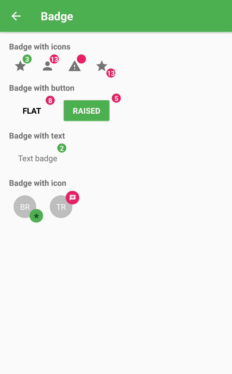 3 |
4 | ### Usage
5 |
6 | ```js
7 | ...
8 | import { Badge, Icon, Avatar } from 'material-elements';
9 | ...
10 | render() {
11 |
16 |
17 |
18 | }
19 | ```
20 | ### API
21 | ```js
22 | const propTypes = {
23 | /**
24 | * badge
25 | */
26 | children: PropTypes.node,
27 | /**
28 | * badge内容
29 | */
30 | text: PropTypes.string,
31 | /**
32 | * badge里的icon内容
33 | */
34 | icon:PropTypes.shape({
35 | name:PropTypes.string,
36 | color:PropTypes.string,
37 | type:PropTypes.string,
38 | size:PropTypes.number,
39 | }),
40 | /**
41 | * badge container style={{ container: { width: size, height: size, borderRadius: size / 2 }}}
42 | */
43 | size: PropTypes.number,
44 |
45 | style: PropTypes.shape({
46 | container: ViewPropTypes.style,
47 | }),
48 | /**
49 | * 整个node的尺寸
50 | */
51 | nodeSize:PropTypes.number,
52 | };
53 | };
54 | ```
55 |
--------------------------------------------------------------------------------
/docs/BottomSheet.md:
--------------------------------------------------------------------------------
1 |
2 |
3 |
4 | ### Usage
5 |
6 | ```js
7 | ...
8 | import { Badge, Icon, Avatar } from 'material-elements';
9 | ...
10 | render() {
11 |
16 |
17 |
18 | }
19 | ```
20 | ### API
21 | ```js
22 | const propTypes = {
23 | /**
24 | * badge
25 | */
26 | children: PropTypes.node,
27 | /**
28 | * badge内容
29 | */
30 | text: PropTypes.string,
31 | /**
32 | * badge里的icon内容
33 | */
34 | icon:PropTypes.shape({
35 | name:PropTypes.string,
36 | color:PropTypes.string,
37 | type:PropTypes.string,
38 | size:PropTypes.number,
39 | }),
40 | /**
41 | * badge container style={{ container: { width: size, height: size, borderRadius: size / 2 }}}
42 | */
43 | size: PropTypes.number,
44 |
45 | style: PropTypes.shape({
46 | container: ViewPropTypes.style,
47 | }),
48 | /**
49 | * 整个node的尺寸
50 | */
51 | nodeSize:PropTypes.number,
52 | };
53 | };
54 | ```
55 |
--------------------------------------------------------------------------------
/docs/BottomSheet.md:
--------------------------------------------------------------------------------
1 |
2 |  3 |
3 |  4 |
5 | # BottomSheet
6 |
7 | ### 使用
8 |
9 | ```js
10 | ...
11 | import {BottomSheet} from 'material-elements';
12 | ...
13 |
14 | render(){
15 | return (
16 |
17 | {
29 | this.setState({isModalVisible:false})
30 | }}
31 | visible={this.state.isModalVisible}
32 | title="BottomSheet"/>
33 |
34 | )
35 | }
36 | ```
37 |
38 | ### API
39 |
40 | ```js
41 | static propTypes={
42 | /**
43 | * bottomsheet的title
44 | */
45 | title:PropTypes.string,
46 | /**
47 | * bottonsheet是否可见
48 | */
49 | visible:PropTypes.bool,
50 | /**
51 | * buttonsheet离开时触发
52 | */
53 | onClosed:PropTypes.func,
54 | /**
55 | * buttonsheet进入时触发
56 | */
57 | onOpened:PropTypes.func,
58 | /**
59 | * 以list方式呈现
60 | */
61 | listItems:PropTypes.arrayOf(PropTypes.shape({
62 | icon:PropTypes.shape({
63 | name:PropTypes.string,
64 | type:PropTypes.string,
65 | color:PropTypes.string,
66 | size:PropTypes.number,
67 | }),
68 | text:PropTypes.string,
69 | })),
70 | /**
71 | * 以grid方式呈现
72 | */
73 | gridItems:PropTypes.arrayOf(PropTypes.shape({
74 | icon:PropTypes.shape({
75 | name:PropTypes.string,
76 | type:PropTypes.string,
77 | color:PropTypes.string,
78 | size:PropTypes.number,
79 | }),
80 | text:PropTypes.string,
81 | })),
82 | /**
83 | * divider对应的item,从0开始,对于grid布局,暂且不支持divider
84 | */
85 | itemDivider:PropTypes.number,
86 | /**
87 | * item press时触发,传递{text,index}参数
88 | */
89 | onItemPress:PropTypes.func,
90 | }
91 | ```
--------------------------------------------------------------------------------
/docs/Button.md:
--------------------------------------------------------------------------------
1 | # [Button](https://material.google.com/components/buttons.html)
2 |
3 | ### 属性表格
4 |
5 | |属性名|参数|描述|
6 | |:---:|:---:|:---:|
7 | |disabled|bool|button是否可用|
8 | |raised|bool|button是否具有凸起效果|
9 | |onPress|func|按下触发|
10 | |onLongPress|func|长按触发|
11 | |text|string|button显示文字|
12 | |upperCase|bool|是否转换为大写|
13 | |icon|{name:string,type:string,size:string,color:string}|button上的icon|
14 | |accent|bool||
15 | |primary|bool||
16 | |iconPosition|'left' or 'right'||
17 | |useTextColorForRippleColor|bool||
18 |
19 |
--------------------------------------------------------------------------------
/docs/Card.md:
--------------------------------------------------------------------------------
1 | # [Card](https://material.io/guidelines/components/cards.html)
2 |
3 | ### 属性表格
4 |
5 | |属性名|参数|描述|
6 | |:---:|:---:|:---:|
7 | |children|node|Card子组件|
8 | |onPress|func||
9 | |fullWidth|bool|是否铺满|
10 |
11 |
--------------------------------------------------------------------------------
/docs/Checkbox.md:
--------------------------------------------------------------------------------
1 | # Checkbox
2 | 
3 |
4 | ### Usage
5 | ```js
6 | ...
7 | import { Checkbox } from 'material-elements'
8 | ...
9 |
10 | render() {
11 |
12 | {
13 | this.setState((preState)=>({check:!preState.check}))
14 | }}/>
15 |
16 | }
17 | ```
18 |
19 |
20 | ### API
21 | ```js
22 | static propTypes= {
23 | /**
24 | * 是否选中
25 | */
26 | checked: PropTypes.bool,
27 | /**
28 | * checkbox是否有用
29 | */
30 | disabled: PropTypes.bool,
31 | /**
32 | * 当checked为false是展现的icon
33 | */
34 | uncheckedIcon:PropTypes.shape({
35 | name:PropTypes.string,
36 | size:PropTypes.number,
37 | color:PropTypes.string,
38 | type:PropTypes.string,
39 | }),
40 | /**
41 | * Event that is called when state is changed
42 | */
43 | onCheck: PropTypes.func.isRequired,
44 | /**
45 | * 当checked为true是展现的icon
46 | */
47 | checkedIcon:PropTypes.shape({
48 | name:PropTypes.string,
49 | size:PropTypes.number,
50 | color:PropTypes.string,
51 | type:PropTypes.string,
52 | })
53 | }
54 | ```
55 |
--------------------------------------------------------------------------------
/docs/Dialog.md:
--------------------------------------------------------------------------------
1 | # [Dialog](https://material.google.com/components/dialogs.html#dialogs-behavior)
2 |
4 |
5 | # BottomSheet
6 |
7 | ### 使用
8 |
9 | ```js
10 | ...
11 | import {BottomSheet} from 'material-elements';
12 | ...
13 |
14 | render(){
15 | return (
16 |
17 | {
29 | this.setState({isModalVisible:false})
30 | }}
31 | visible={this.state.isModalVisible}
32 | title="BottomSheet"/>
33 |
34 | )
35 | }
36 | ```
37 |
38 | ### API
39 |
40 | ```js
41 | static propTypes={
42 | /**
43 | * bottomsheet的title
44 | */
45 | title:PropTypes.string,
46 | /**
47 | * bottonsheet是否可见
48 | */
49 | visible:PropTypes.bool,
50 | /**
51 | * buttonsheet离开时触发
52 | */
53 | onClosed:PropTypes.func,
54 | /**
55 | * buttonsheet进入时触发
56 | */
57 | onOpened:PropTypes.func,
58 | /**
59 | * 以list方式呈现
60 | */
61 | listItems:PropTypes.arrayOf(PropTypes.shape({
62 | icon:PropTypes.shape({
63 | name:PropTypes.string,
64 | type:PropTypes.string,
65 | color:PropTypes.string,
66 | size:PropTypes.number,
67 | }),
68 | text:PropTypes.string,
69 | })),
70 | /**
71 | * 以grid方式呈现
72 | */
73 | gridItems:PropTypes.arrayOf(PropTypes.shape({
74 | icon:PropTypes.shape({
75 | name:PropTypes.string,
76 | type:PropTypes.string,
77 | color:PropTypes.string,
78 | size:PropTypes.number,
79 | }),
80 | text:PropTypes.string,
81 | })),
82 | /**
83 | * divider对应的item,从0开始,对于grid布局,暂且不支持divider
84 | */
85 | itemDivider:PropTypes.number,
86 | /**
87 | * item press时触发,传递{text,index}参数
88 | */
89 | onItemPress:PropTypes.func,
90 | }
91 | ```
--------------------------------------------------------------------------------
/docs/Button.md:
--------------------------------------------------------------------------------
1 | # [Button](https://material.google.com/components/buttons.html)
2 |
3 | ### 属性表格
4 |
5 | |属性名|参数|描述|
6 | |:---:|:---:|:---:|
7 | |disabled|bool|button是否可用|
8 | |raised|bool|button是否具有凸起效果|
9 | |onPress|func|按下触发|
10 | |onLongPress|func|长按触发|
11 | |text|string|button显示文字|
12 | |upperCase|bool|是否转换为大写|
13 | |icon|{name:string,type:string,size:string,color:string}|button上的icon|
14 | |accent|bool||
15 | |primary|bool||
16 | |iconPosition|'left' or 'right'||
17 | |useTextColorForRippleColor|bool||
18 |
19 |
--------------------------------------------------------------------------------
/docs/Card.md:
--------------------------------------------------------------------------------
1 | # [Card](https://material.io/guidelines/components/cards.html)
2 |
3 | ### 属性表格
4 |
5 | |属性名|参数|描述|
6 | |:---:|:---:|:---:|
7 | |children|node|Card子组件|
8 | |onPress|func||
9 | |fullWidth|bool|是否铺满|
10 |
11 |
--------------------------------------------------------------------------------
/docs/Checkbox.md:
--------------------------------------------------------------------------------
1 | # Checkbox
2 | 
3 |
4 | ### Usage
5 | ```js
6 | ...
7 | import { Checkbox } from 'material-elements'
8 | ...
9 |
10 | render() {
11 |
12 | {
13 | this.setState((preState)=>({check:!preState.check}))
14 | }}/>
15 |
16 | }
17 | ```
18 |
19 |
20 | ### API
21 | ```js
22 | static propTypes= {
23 | /**
24 | * 是否选中
25 | */
26 | checked: PropTypes.bool,
27 | /**
28 | * checkbox是否有用
29 | */
30 | disabled: PropTypes.bool,
31 | /**
32 | * 当checked为false是展现的icon
33 | */
34 | uncheckedIcon:PropTypes.shape({
35 | name:PropTypes.string,
36 | size:PropTypes.number,
37 | color:PropTypes.string,
38 | type:PropTypes.string,
39 | }),
40 | /**
41 | * Event that is called when state is changed
42 | */
43 | onCheck: PropTypes.func.isRequired,
44 | /**
45 | * 当checked为true是展现的icon
46 | */
47 | checkedIcon:PropTypes.shape({
48 | name:PropTypes.string,
49 | size:PropTypes.number,
50 | color:PropTypes.string,
51 | type:PropTypes.string,
52 | })
53 | }
54 | ```
55 |
--------------------------------------------------------------------------------
/docs/Dialog.md:
--------------------------------------------------------------------------------
1 | # [Dialog](https://material.google.com/components/dialogs.html#dialogs-behavior)
2 | 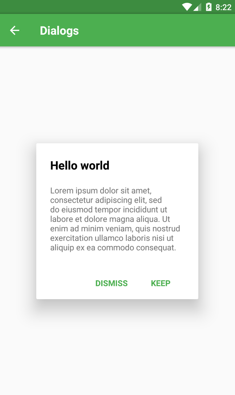 3 |
4 | ### Usage
5 |
6 | ```js
7 | ...
8 | import { Dialog, DialogDefaultActions } from '../react-native-material-ui';
9 | ...
10 | render() {
11 |
12 |
26 |
27 | }
28 | ```
29 | ### API
30 | ```js
31 | ...
32 | ```
33 |
34 | ##### TODO
35 | - [ ] Add API to doc
36 |
--------------------------------------------------------------------------------
/docs/Icon.md:
--------------------------------------------------------------------------------
1 | # Icon
2 |
3 | ###属性表格
4 |
5 | |属性名|参数|描述|
6 | |:---:|:---:|:---:|
7 | |name|string|icon名称|
8 | |size|number|icon尺寸|
9 | |color|string|icon颜色|
10 | |type|string|icon类型|
11 | |style|Text.propTypes.style|icon的style|
12 |
13 | icon提供的type有:
14 | ```js
15 | const iconType = {
16 | MaterialIcons: 'MaterialIcons',
17 | FontAwesome: 'FontAwesome',
18 | Ionicons: 'Ionicons',
19 | MaterialCommunityIcons: 'MaterialCommunityIcons'
20 | }
21 | ```
22 |
23 |
--------------------------------------------------------------------------------
/docs/IconToggle.md:
--------------------------------------------------------------------------------
1 | # IconToggle
2 |
3 | ### 使用
4 |
5 | ```js
6 | ...
7 | import {IconToggle} from 'material-elements';
8 | ...
9 | render(){
10 | return (
11 |
12 |
13 |
14 |
15 | )
16 | }
17 | ```
18 | ### API
19 | ```js
20 | const propTypes = {
21 | /**
22 | * icon颜色
23 | */
24 | color: PropTypes.string,
25 | /**
26 | * icon按下的颜色
27 | */
28 | underlayColor: PropTypes.string,
29 | /**
30 | * 水波纹最大透明度
31 | */
32 | maxOpacity: PropTypes.number,
33 | /**
34 | * underlayColor的size
35 | */
36 | percent: PropTypes.number,
37 | /**
38 | * 是否可用
39 | */
40 | disabled: PropTypes.bool,
41 | /**
42 | * icon尺寸,默认24
43 | */
44 | size: PropTypes.number,
45 | /**
46 | * icon的name
47 | */
48 | name: PropTypes.string.isRequired,
49 | /**
50 | * It'll be used instead of icon (see props name) if exists
51 | */
52 | children: PropTypes.element,
53 | /**
54 | * 按下触发
55 | */
56 | onPress: PropTypes.func,
57 | /**
58 | * icon的类型
59 | */
60 | type:PropTypes.oneOf([
61 | Icon.iconType.Ionicons,
62 | Icon.iconType.MaterialCommunityIcons,
63 | Icon.iconType.MaterialIcons,
64 | Icon.FontAwesome,
65 | ])
66 | };
67 | ```
--------------------------------------------------------------------------------
/docs/Indicator.md:
--------------------------------------------------------------------------------
1 | # Indicator
2 |
--------------------------------------------------------------------------------
/docs/Menu.md:
--------------------------------------------------------------------------------
1 | # Menu
2 |
3 | #### 使用
4 |
5 | ```js
6 | ...
7 | import {Menu} from 'material-elements';
8 | ...
9 | hideMenu = () => {
10 | this.menu.hide();
11 | };
12 |
13 | showMenu = () => {
14 | this.menu.show();
15 | };
16 | render(){
17 | return (
18 |
19 |
30 |
31 | )
32 | }
33 |
34 | ```
35 |
36 | #### API
37 |
38 | ```js
39 | Menu:
40 | static propTypes = {
41 | /**
42 | * menu的button,点击button可弹出menu
43 | */
44 | button: PropTypes.node.isRequired,
45 | /**
46 | *应传入MenuItem 或 MenuDivider组件
47 | */
48 | children: PropTypes.node.isRequired,
49 | /**
50 | * 用户自定义的style
51 | */
52 | style:PropTypes.shape({
53 | container:ViewPropTypes.style
54 | })
55 | };
56 |
57 |
58 |
59 | Menu.Item:
60 | static propTypes={
61 | /**
62 | * item是否可用
63 | */
64 | disabled: PropTypes.bool,
65 | /**
66 | * disabled为true时text的颜色
67 | */
68 | disabledTextColor: PropTypes.string,
69 | /**
70 | * item 按下时触发
71 | */
72 | onPress: PropTypes.func,
73 | /**
74 | * item按下时的颜色,
75 | */
76 | underlayColor: TouchableHighlight.propTypes.underlayColor,
77 | /**
78 | * item中的text
79 | */
80 | text:PropTypes.string,
81 | /**
82 | * item中的icon
83 | */
84 | icon:PropTypes.shape({
85 | ...Icon.propTypes
86 | }),
87 | /**
88 | * 自定义的style
89 | */
90 | style:PropTypes.shape({
91 | container:ViewPropTypes.style,
92 | text:Text.propTypes.style,
93 | icon:PropTypes.object,
94 | })
95 | }
96 | ```
--------------------------------------------------------------------------------
/docs/SimpleToolbar.md:
--------------------------------------------------------------------------------
1 | # SimpleToolbar
2 |
3 | ### 使用
4 | ```js
5 | ...
6 | import {SimpleToolbar} from 'material-elements'
7 | ...
8 |
9 | render(){
10 | return (
11 |
12 | {}} title="主题"/>
13 |
14 | )
15 | }
16 |
17 | ```
18 |
19 | ### API
20 |
21 | ```js
22 | static propTypes = {
23 | title: PropTypes.string,
24 | leftIconName:PropTypes.string,
25 | rightIconName:PropTypes.string,
26 | onLeftIconPress:PropTypes.func,
27 | onRightIconPress:PropTypes.func,
28 | }
29 | ```
--------------------------------------------------------------------------------
/docs/Toast.md:
--------------------------------------------------------------------------------
1 | # Toast
2 |
3 | #### 使用
4 |
5 | ```js
6 | ...
7 | import {Toast} from 'material-elements';
8 | ...
9 |
10 | showToast=()=>{
11 | this.toast && this.toast.show('message',Toast.SHORT)
12 | }
13 |
14 | render(){
15 | return (
16 |
17 | this.toast=ref}/>
18 |
19 | )
20 | }
21 |
22 | duration可取Toast.LONG或者Toast.SHORT
23 | ```
--------------------------------------------------------------------------------
/docs/Typography.md:
--------------------------------------------------------------------------------
1 | # Typography
2 |
3 | ### 属性表格
4 |
5 | |属性名|参数|描述|
6 | |:---:|:---:|:---:|
7 | |variant|string|Typography的样式名|
8 | |style|{text:Text.style}|Typography自定义样式|
9 |
10 | ##### variant可选参数:button/caption/body1/body2/subheading/title/headline/display1/display2/display3/display4
11 |
12 | # 使用
13 |
14 | ```display4
15 | display3
16 | display2
17 | display1
18 | headline
19 | title
20 | subheading
21 | body2
22 | body1
23 | caption
24 | button
25 | ```
26 |
27 |
3 |
4 | ### Usage
5 |
6 | ```js
7 | ...
8 | import { Dialog, DialogDefaultActions } from '../react-native-material-ui';
9 | ...
10 | render() {
11 |
12 |
26 |
27 | }
28 | ```
29 | ### API
30 | ```js
31 | ...
32 | ```
33 |
34 | ##### TODO
35 | - [ ] Add API to doc
36 |
--------------------------------------------------------------------------------
/docs/Icon.md:
--------------------------------------------------------------------------------
1 | # Icon
2 |
3 | ###属性表格
4 |
5 | |属性名|参数|描述|
6 | |:---:|:---:|:---:|
7 | |name|string|icon名称|
8 | |size|number|icon尺寸|
9 | |color|string|icon颜色|
10 | |type|string|icon类型|
11 | |style|Text.propTypes.style|icon的style|
12 |
13 | icon提供的type有:
14 | ```js
15 | const iconType = {
16 | MaterialIcons: 'MaterialIcons',
17 | FontAwesome: 'FontAwesome',
18 | Ionicons: 'Ionicons',
19 | MaterialCommunityIcons: 'MaterialCommunityIcons'
20 | }
21 | ```
22 |
23 |
--------------------------------------------------------------------------------
/docs/IconToggle.md:
--------------------------------------------------------------------------------
1 | # IconToggle
2 |
3 | ### 使用
4 |
5 | ```js
6 | ...
7 | import {IconToggle} from 'material-elements';
8 | ...
9 | render(){
10 | return (
11 |
12 |
13 |
14 |
15 | )
16 | }
17 | ```
18 | ### API
19 | ```js
20 | const propTypes = {
21 | /**
22 | * icon颜色
23 | */
24 | color: PropTypes.string,
25 | /**
26 | * icon按下的颜色
27 | */
28 | underlayColor: PropTypes.string,
29 | /**
30 | * 水波纹最大透明度
31 | */
32 | maxOpacity: PropTypes.number,
33 | /**
34 | * underlayColor的size
35 | */
36 | percent: PropTypes.number,
37 | /**
38 | * 是否可用
39 | */
40 | disabled: PropTypes.bool,
41 | /**
42 | * icon尺寸,默认24
43 | */
44 | size: PropTypes.number,
45 | /**
46 | * icon的name
47 | */
48 | name: PropTypes.string.isRequired,
49 | /**
50 | * It'll be used instead of icon (see props name) if exists
51 | */
52 | children: PropTypes.element,
53 | /**
54 | * 按下触发
55 | */
56 | onPress: PropTypes.func,
57 | /**
58 | * icon的类型
59 | */
60 | type:PropTypes.oneOf([
61 | Icon.iconType.Ionicons,
62 | Icon.iconType.MaterialCommunityIcons,
63 | Icon.iconType.MaterialIcons,
64 | Icon.FontAwesome,
65 | ])
66 | };
67 | ```
--------------------------------------------------------------------------------
/docs/Indicator.md:
--------------------------------------------------------------------------------
1 | # Indicator
2 |
--------------------------------------------------------------------------------
/docs/Menu.md:
--------------------------------------------------------------------------------
1 | # Menu
2 |
3 | #### 使用
4 |
5 | ```js
6 | ...
7 | import {Menu} from 'material-elements';
8 | ...
9 | hideMenu = () => {
10 | this.menu.hide();
11 | };
12 |
13 | showMenu = () => {
14 | this.menu.show();
15 | };
16 | render(){
17 | return (
18 |
19 |
30 |
31 | )
32 | }
33 |
34 | ```
35 |
36 | #### API
37 |
38 | ```js
39 | Menu:
40 | static propTypes = {
41 | /**
42 | * menu的button,点击button可弹出menu
43 | */
44 | button: PropTypes.node.isRequired,
45 | /**
46 | *应传入MenuItem 或 MenuDivider组件
47 | */
48 | children: PropTypes.node.isRequired,
49 | /**
50 | * 用户自定义的style
51 | */
52 | style:PropTypes.shape({
53 | container:ViewPropTypes.style
54 | })
55 | };
56 |
57 |
58 |
59 | Menu.Item:
60 | static propTypes={
61 | /**
62 | * item是否可用
63 | */
64 | disabled: PropTypes.bool,
65 | /**
66 | * disabled为true时text的颜色
67 | */
68 | disabledTextColor: PropTypes.string,
69 | /**
70 | * item 按下时触发
71 | */
72 | onPress: PropTypes.func,
73 | /**
74 | * item按下时的颜色,
75 | */
76 | underlayColor: TouchableHighlight.propTypes.underlayColor,
77 | /**
78 | * item中的text
79 | */
80 | text:PropTypes.string,
81 | /**
82 | * item中的icon
83 | */
84 | icon:PropTypes.shape({
85 | ...Icon.propTypes
86 | }),
87 | /**
88 | * 自定义的style
89 | */
90 | style:PropTypes.shape({
91 | container:ViewPropTypes.style,
92 | text:Text.propTypes.style,
93 | icon:PropTypes.object,
94 | })
95 | }
96 | ```
--------------------------------------------------------------------------------
/docs/SimpleToolbar.md:
--------------------------------------------------------------------------------
1 | # SimpleToolbar
2 |
3 | ### 使用
4 | ```js
5 | ...
6 | import {SimpleToolbar} from 'material-elements'
7 | ...
8 |
9 | render(){
10 | return (
11 |
12 | {}} title="主题"/>
13 |
14 | )
15 | }
16 |
17 | ```
18 |
19 | ### API
20 |
21 | ```js
22 | static propTypes = {
23 | title: PropTypes.string,
24 | leftIconName:PropTypes.string,
25 | rightIconName:PropTypes.string,
26 | onLeftIconPress:PropTypes.func,
27 | onRightIconPress:PropTypes.func,
28 | }
29 | ```
--------------------------------------------------------------------------------
/docs/Toast.md:
--------------------------------------------------------------------------------
1 | # Toast
2 |
3 | #### 使用
4 |
5 | ```js
6 | ...
7 | import {Toast} from 'material-elements';
8 | ...
9 |
10 | showToast=()=>{
11 | this.toast && this.toast.show('message',Toast.SHORT)
12 | }
13 |
14 | render(){
15 | return (
16 |
17 | this.toast=ref}/>
18 |
19 | )
20 | }
21 |
22 | duration可取Toast.LONG或者Toast.SHORT
23 | ```
--------------------------------------------------------------------------------
/docs/Typography.md:
--------------------------------------------------------------------------------
1 | # Typography
2 |
3 | ### 属性表格
4 |
5 | |属性名|参数|描述|
6 | |:---:|:---:|:---:|
7 | |variant|string|Typography的样式名|
8 | |style|{text:Text.style}|Typography自定义样式|
9 |
10 | ##### variant可选参数:button/caption/body1/body2/subheading/title/headline/display1/display2/display3/display4
11 |
12 | # 使用
13 |
14 | ```display4
15 | display3
16 | display2
17 | display1
18 | headline
19 | title
20 | subheading
21 | body2
22 | body1
23 | caption
24 | button
25 | ```
26 |
27 | 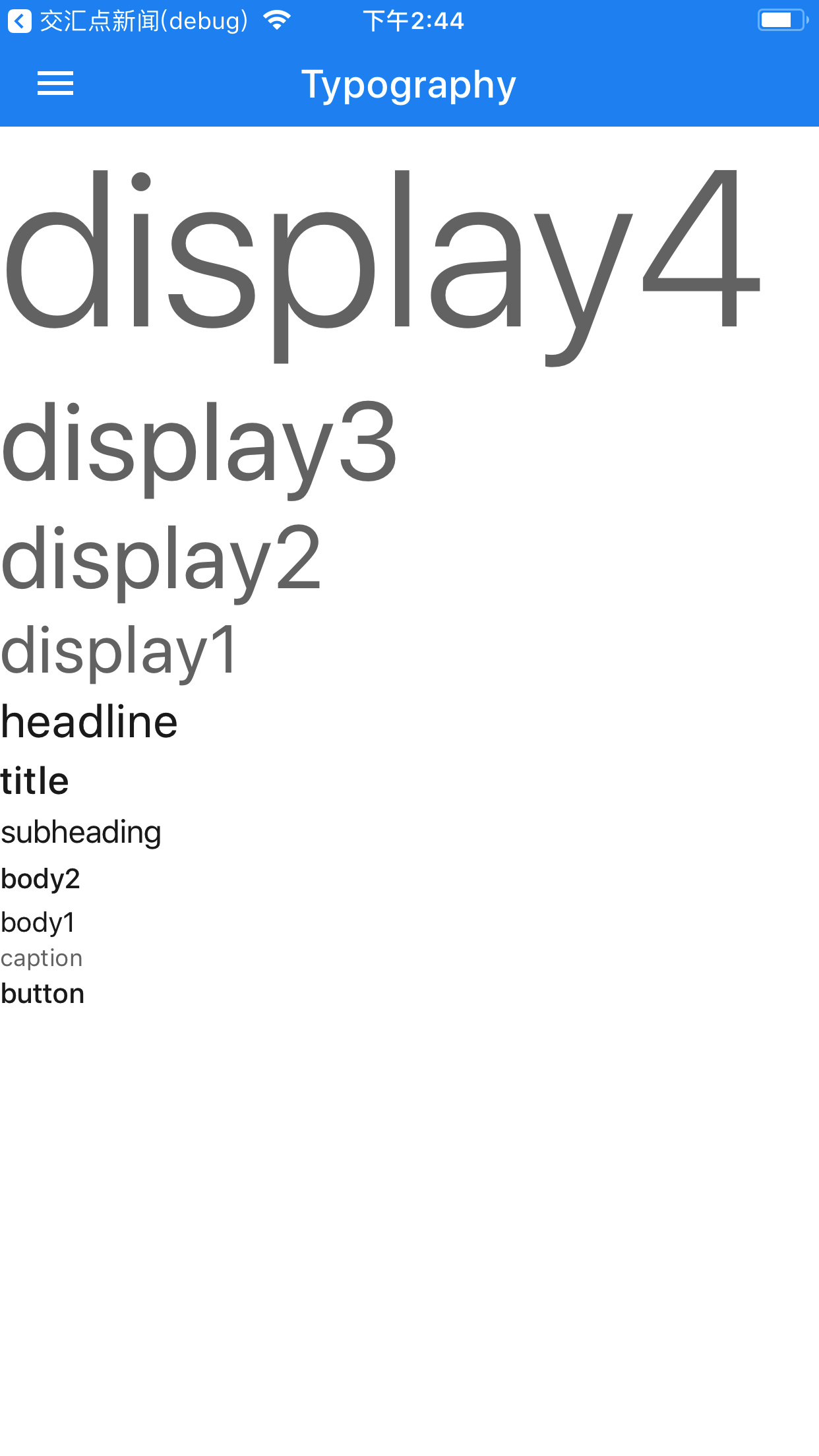 28 |
--------------------------------------------------------------------------------
/docs/images/avatar.png:
--------------------------------------------------------------------------------
https://raw.githubusercontent.com/react-native-studio/material-elements/42d579b5cd89fae9ab6ce4b3db5c1bab8b447127/docs/images/avatar.png
--------------------------------------------------------------------------------
/docs/images/bottom_sheet_list.png:
--------------------------------------------------------------------------------
https://raw.githubusercontent.com/react-native-studio/material-elements/42d579b5cd89fae9ab6ce4b3db5c1bab8b447127/docs/images/bottom_sheet_list.png
--------------------------------------------------------------------------------
/docs/index.md:
--------------------------------------------------------------------------------
1 | # **Install**
2 |
3 |
4 | ## install material-elements
5 | 运行 `npm install --save material-elements`
6 |
7 | 如果你安装了yarn,可以使用 `yarn add material-elements`
8 |
9 |
10 | ## install react-native-vector-icons
11 | material-elements 依赖于react-native-vector-icons
28 |
--------------------------------------------------------------------------------
/docs/images/avatar.png:
--------------------------------------------------------------------------------
https://raw.githubusercontent.com/react-native-studio/material-elements/42d579b5cd89fae9ab6ce4b3db5c1bab8b447127/docs/images/avatar.png
--------------------------------------------------------------------------------
/docs/images/bottom_sheet_list.png:
--------------------------------------------------------------------------------
https://raw.githubusercontent.com/react-native-studio/material-elements/42d579b5cd89fae9ab6ce4b3db5c1bab8b447127/docs/images/bottom_sheet_list.png
--------------------------------------------------------------------------------
/docs/index.md:
--------------------------------------------------------------------------------
1 | # **Install**
2 |
3 |
4 | ## install material-elements
5 | 运行 `npm install --save material-elements`
6 |
7 | 如果你安装了yarn,可以使用 `yarn add material-elements`
8 |
9 |
10 | ## install react-native-vector-icons
11 | material-elements 依赖于react-native-vector-icons
12 | 运行 `npm install --save react-native-vector-icons`
13 |
14 | 如果你安装了yarn,你可以使用`yarn add react-native-vector-icons`
15 |
16 | 将vector-icons link 到工程中
17 | `react-native link react-native-vector-icons`
18 |
19 | ## usage
20 |
21 | ```js
22 | import {Button} from 'material-elements';
23 |
24 |