├── src
├── data.js
├── store.js
├── object-properties.js
├── components
│ ├── CustomIcon.jsx
│ ├── CustomContainer.jsx
│ ├── Components.jsx
│ ├── NumberInput.jsx
│ ├── TextInput.jsx
│ ├── Notification.jsx
│ ├── CustomSwitch.jsx
│ ├── CustomRating.jsx
│ ├── CustomSlider.jsx
│ ├── CustomCheckbox.jsx
│ ├── Dropdown.jsx
│ ├── CustomDialog.jsx
│ ├── DropdownMultiple.jsx
│ ├── DialogButton.jsx
│ ├── CustomDatePicker.jsx
│ └── CustomButton.jsx
├── states
│ └── formsSlice.js
├── index.js
├── root.jsx
├── services
│ └── backend.js
├── utils
│ └── lui-icons.js
└── extDefinition.js
├── meta.json
├── test
└── integration
│ ├── hello.int.js
│ └── setup.int.js
├── .gitignore
├── LICENSE
├── package.json
├── rollup.config.js
└── README.md
/src/data.js:
--------------------------------------------------------------------------------
1 | export default {
2 | targets: []
3 | };
4 |
--------------------------------------------------------------------------------
/src/store.js:
--------------------------------------------------------------------------------
1 | import { configureStore } from '@reduxjs/toolkit';
2 | import formsReducer from './states/formsSlice';
3 | export default configureStore({
4 | reducer: {
5 | forms: formsReducer
6 | },
7 | });
--------------------------------------------------------------------------------
/meta.json:
--------------------------------------------------------------------------------
1 | {
2 | "name": "Automation trigger",
3 | "icon": "code",
4 | "version": "1.2.1",
5 | "description": "Automation trigger for Qlik Sense",
6 | "author": "Riley MacDonald",
7 | "type": "visualization"
8 | }
--------------------------------------------------------------------------------
/src/object-properties.js:
--------------------------------------------------------------------------------
1 | const properties = {
2 | showTitles: true,
3 | title: '',
4 | subtitle: '',
5 | footnote: '',
6 | qHyperCubeDef: {
7 | qInitialDataFetch: [{ qWidth: 20, qHeight: 500 }],
8 | },
9 | };
10 |
11 | export default properties;
12 |
--------------------------------------------------------------------------------
/src/components/CustomIcon.jsx:
--------------------------------------------------------------------------------
1 | import React from 'react';
2 |
3 | export default function CustomIcon({iconType}) {
4 | return (
5 |
9 |
10 | );
11 | }
--------------------------------------------------------------------------------
/test/integration/hello.int.js:
--------------------------------------------------------------------------------
1 | describe('sn', () => {
2 | const content = '.njs-viz[data-render-count="1"]';
3 | it('should say hello', async () => {
4 | const app = encodeURIComponent(process.env.APP_ID || '/apps/ctrl00.qvf');
5 | await page.goto(`${process.env.BASE_URL}/render/?app=${app}`);
6 | await page.waitForSelector(content, { visible: true });
7 | const text = await page.$eval(content, (el) => el.textContent);
8 | expect(text).to.equal('Hello!');
9 | });
10 | });
11 |
--------------------------------------------------------------------------------
/src/components/CustomContainer.jsx:
--------------------------------------------------------------------------------
1 | import React from 'react';
2 | import makeStyles from '@mui/styles/makeStyles';
3 | import { Grid } from '@mui/material';
4 |
5 | export default function CustomContainer() {
6 |
7 | const useStyles = makeStyles((theme) => ({
8 | container: {
9 | display: 'flex',
10 | flexDirection: 'column',
11 | justifyContent: 'space-around',
12 | height: '100%'
13 | }
14 | }));
15 | const classes = useStyles();
16 |
17 | return (
18 |
19 | );
20 | }
--------------------------------------------------------------------------------
/.gitignore:
--------------------------------------------------------------------------------
1 | *.log
2 | *.log
3 | .cache
4 | .DS_Store
5 | .idea
6 | .vscode
7 | .npmrc
8 | *.zip
9 |
10 | automation-trigger-ext
11 | /automation-trigger-ext
12 |
13 | node_modules
14 | dist
15 | docs
16 | coverage
17 | qlik-blends-ext
18 | # See https://help.github.com/articles/ignoring-files/ for more about ignoring files.
19 |
20 | # dependencies
21 | /node_modules
22 | /.pnp
23 | .pnp.js
24 |
25 | # testing
26 | /coverage
27 |
28 | # production
29 | /build
30 |
31 | # misc
32 | .DS_Store
33 | .env.local
34 | .env.development.local
35 | .env.test.local
36 | .env.production.local
37 |
38 | npm-debug.log*
39 | yarn-debug.log*
40 | yarn-error.log*
--------------------------------------------------------------------------------
/test/integration/setup.int.js:
--------------------------------------------------------------------------------
1 | const serve = require('@nebula.js/cli-serve'); // eslint-disable-line
2 |
3 | page.on('pageerror', (e) => {
4 | console.error('Web: ', e.message);
5 | });
6 |
7 | page.on('console', (msg) => {
8 | for (let i = 0; i < msg.args().length; ++i) {
9 | console.log(`console ${msg.text()}`);
10 | }
11 | });
12 |
13 | if (!process.env.BASE_URL) {
14 | let s;
15 |
16 | before(async function setup() {
17 | this.timeout(15000);
18 | s = await serve({
19 | open: false,
20 | });
21 |
22 | process.env.BASE_URL = s.url;
23 | });
24 |
25 | after(() => {
26 | s.close();
27 | });
28 | }
29 |
--------------------------------------------------------------------------------
/LICENSE:
--------------------------------------------------------------------------------
1 | MIT License
2 |
3 | Copyright (c) 2021 datalitlearning
4 |
5 | Permission is hereby granted, free of charge, to any person obtaining a copy
6 | of this software and associated documentation files (the "Software"), to deal
7 | in the Software without restriction, including without limitation the rights
8 | to use, copy, modify, merge, publish, distribute, sublicense, and/or sell
9 | copies of the Software, and to permit persons to whom the Software is
10 | furnished to do so, subject to the following conditions:
11 |
12 | The above copyright notice and this permission notice shall be included in all
13 | copies or substantial portions of the Software.
14 |
15 | THE SOFTWARE IS PROVIDED "AS IS", WITHOUT WARRANTY OF ANY KIND, EXPRESS OR
16 | IMPLIED, INCLUDING BUT NOT LIMITED TO THE WARRANTIES OF MERCHANTABILITY,
17 | FITNESS FOR A PARTICULAR PURPOSE AND NONINFRINGEMENT. IN NO EVENT SHALL THE
18 | AUTHORS OR COPYRIGHT HOLDERS BE LIABLE FOR ANY CLAIM, DAMAGES OR OTHER
19 | LIABILITY, WHETHER IN AN ACTION OF CONTRACT, TORT OR OTHERWISE, ARISING FROM,
20 | OUT OF OR IN CONNECTION WITH THE SOFTWARE OR THE USE OR OTHER DEALINGS IN THE
21 | SOFTWARE.
22 |
--------------------------------------------------------------------------------
/src/components/Components.jsx:
--------------------------------------------------------------------------------
1 | import React from "react";
2 | import TextInput from "./TextInput";
3 | import NumberInput from "./NumberInput";
4 | import CustomCheckbox from "./CustomCheckbox";
5 | import DropdownMultiple from "./DropdownMultiple"
6 | import Dropdown from "./Dropdown"
7 | import CustomSwitch from "./CustomSwitch"
8 | import CustomSlider from "./CustomSlider";
9 | import CustomButton from "./CustomButton";
10 | import CustomDatePicker from "./CustomDatePicker";
11 | import CustomRating from "./CustomRating";
12 |
13 | const Components = {
14 | textInput: TextInput,
15 | numberInput: NumberInput,
16 | checkbox: CustomCheckbox,
17 | dropdown: Dropdown,
18 | dropdownMultiple: DropdownMultiple,
19 | switch: CustomSwitch,
20 | slider: CustomSlider,
21 | button: CustomButton,
22 | rating: CustomRating,
23 | datePicker: CustomDatePicker,
24 | };
25 |
26 | export default (block, blendGlobalTheme, blend, refs, getData) => {
27 | if (typeof Components[block.component] !== "undefined") {
28 | return React.createElement(Components[block.component], {
29 | key: block.id,
30 | block: block,
31 | blendGlobalTheme: blendGlobalTheme,
32 | blend: blend,
33 | refs: refs,
34 | getData: getData
35 | });
36 | }
37 | }
--------------------------------------------------------------------------------
/src/components/NumberInput.jsx:
--------------------------------------------------------------------------------
1 | import React from 'react';
2 | import makeStyles from '@mui/styles/makeStyles';
3 | import TextField from '@mui/material/TextField';
4 | import { setItem, selectAllItems, selectItem } from '../states/formsSlice'
5 | import { useSelector, useDispatch } from 'react-redux';
6 |
7 |
8 |
9 | export default function NumberInput({block, blendGlobalTheme, blend}) {
10 | const dispatch = useDispatch();
11 | let value
12 | const tmpValue = useSelector(state => selectItem(state, block.ref))
13 | if(tmpValue === 'undefined') {
14 | const payload = {
15 | ref: block.ref,
16 | data: block.defaultValueNumber
17 | }
18 | dispatch(setItem(payload))
19 | value = block.defaultValueNumber
20 | }
21 | else {
22 | value = tmpValue
23 | }
24 | const useStyles = makeStyles((theme) => ({
25 | numberField: {
26 | width: `${block.width}%`,
27 | marginBottom: 12,
28 | alignSelf: block.alignment
29 | }
30 | }));
31 | const classes = useStyles();
32 |
33 | const onNumberChange = (e) => {
34 | const payload = {
35 | ref: block.ref,
36 | data: e.target.value
37 | }
38 | dispatch(setItem(payload))
39 | };
40 |
41 | return (
42 |
49 | );
50 | }
--------------------------------------------------------------------------------
/src/components/TextInput.jsx:
--------------------------------------------------------------------------------
1 | import React from 'react';
2 | import makeStyles from '@mui/styles/makeStyles';
3 | import TextField from '@mui/material/TextField';
4 | import { setItem, selectAllItems, selectItem } from '../states/formsSlice'
5 | import { useSelector, useDispatch } from 'react-redux';
6 |
7 |
8 |
9 | export default function TextInput({block, blendGlobalTheme, blend}) {
10 | const dispatch = useDispatch();
11 | let value
12 | const tmpValue = useSelector(state => selectItem(state, block.ref))
13 | if(tmpValue === 'undefined') {
14 | const payload = {
15 | ref: block.ref,
16 | data: block.defaultValueString
17 | }
18 | dispatch(setItem(payload))
19 | value = block.defaultValueString
20 | }
21 | else {
22 | value = tmpValue
23 | }
24 | const useStyles = makeStyles((theme) => ({
25 | textField: {
26 | width: `${block.width}%`,
27 | marginBottom: 12,
28 | alignSelf: block.alignment
29 | }
30 | }));
31 | const classes = useStyles();
32 |
33 | const onTextChange = (e) => {
34 | const payload = {
35 | ref: block.ref,
36 | data: e.target.value
37 | }
38 | dispatch(setItem(payload))
39 | };
40 |
41 | return (
42 |
50 | );
51 | }
--------------------------------------------------------------------------------
/src/components/Notification.jsx:
--------------------------------------------------------------------------------
1 | import React from 'react';
2 | import TextField from '@mui/material/TextField';
3 | import Snackbar from '@mui/material/Snackbar';
4 | import MuiAlert from '@mui/material/Alert';
5 | import Portal from '@mui/material/Portal';
6 | import makeStyles from '@mui/styles/makeStyles';
7 | import { selectMessage, selectSnackbarOpen, selectSeverity, setSnackbarOpen } from '../states/formsSlice'
8 | import { useSelector, useDispatch } from 'react-redux';
9 |
10 | const Alert = React.forwardRef(function Alert(props, ref) {
11 | return ;
12 | });
13 |
14 | const useStyles = makeStyles((theme) => ({
15 | notification: {
16 | zIndex: 2000
17 | },
18 | }));
19 |
20 | export default function Notification() {
21 | const dispatch = useDispatch()
22 | const classes = useStyles()
23 | const showSnackbar = useSelector(selectSnackbarOpen)
24 | const message = useSelector(selectMessage)
25 | const severity = useSelector(selectSeverity)
26 |
27 |
28 | const handleClose = async () => {
29 | dispatch(setSnackbarOpen(false))
30 | }
31 |
32 | return (
33 |
34 |
39 |
42 | {message}
43 |
44 |
45 |
46 | );
47 | }
--------------------------------------------------------------------------------
/src/components/CustomSwitch.jsx:
--------------------------------------------------------------------------------
1 | import React from 'react';
2 | import makeStyles from '@mui/styles/makeStyles';
3 | import FormControlLabel from '@mui/material/FormControlLabel';
4 | import Switch from '@mui/material/Switch';
5 | import { setItem, selectAllItems, selectItem } from '../states/formsSlice'
6 | import { useSelector, useDispatch } from 'react-redux';
7 |
8 |
9 |
10 | export default function CustomSwitch({block, globalTheme, blend}) {
11 | const dispatch = useDispatch();
12 | let value
13 | const tmpValue = useSelector(state => selectItem(state, block.ref))
14 | const defaultValue = block.defaultValueNumber === 1 ? true : false
15 | if(tmpValue === 'undefined') {
16 | const payload = {
17 | ref: block.ref,
18 | data: defaultValue
19 | }
20 | dispatch(setItem(payload))
21 | value = defaultValue
22 | }
23 | else {
24 | value = tmpValue
25 | }
26 | const useStyles = makeStyles((theme) => ({
27 | switch: {
28 | width: `${block.width}%`,
29 | marginBottom: 12,
30 | alignSelf: block.alignment
31 | }
32 | }));
33 | const classes = useStyles();
34 |
35 | const onSwitchChange = (e) => {
36 | const payload = {
37 | ref: block.ref,
38 | data: e.target.checked
39 | }
40 | dispatch(setItem(payload))
41 | };
42 |
43 | return (
44 |
52 | }
53 | label={block.label}
54 | />
55 | );
56 | }
--------------------------------------------------------------------------------
/src/components/CustomRating.jsx:
--------------------------------------------------------------------------------
1 | import React from 'react';
2 | import makeStyles from '@mui/styles/makeStyles';
3 | import Typography from '@mui/material/Typography';
4 | import Rating from '@mui/material/Rating';
5 | import { setItem, selectItem } from '../states/formsSlice'
6 | import { useSelector, useDispatch } from 'react-redux';
7 |
8 |
9 |
10 | export default function Custom({ block, globalTheme, blend }) {
11 | const dispatch = useDispatch();
12 | let value
13 | const tmpValue = useSelector(state => selectItem(state, block.ref))
14 | if (tmpValue === 'undefined') {
15 | const payload = {
16 | ref: block.ref,
17 | data: block.defaultValueNumber
18 | }
19 | dispatch(setItem(payload))
20 | value = block.defaultValueNumber
21 | }
22 | else {
23 | value = tmpValue
24 | }
25 | const useStyles = makeStyles((theme) => ({
26 | slider: {
27 | width: `${block.width}%`,
28 | marginBottom: 12,
29 | alignSelf: block.alignment
30 | }
31 | }));
32 |
33 | const classes = useStyles();
34 |
35 | const onRatingChange = (e) => {
36 | const payload = {
37 | ref: block.ref,
38 | data: e.target.value
39 | }
40 | dispatch(setItem(payload))
41 | };
42 |
43 | return (
44 |
45 |
46 | {block.label}
47 |
48 |
55 |
56 | );
57 | }
--------------------------------------------------------------------------------
/src/components/CustomSlider.jsx:
--------------------------------------------------------------------------------
1 | import React from 'react';
2 | import makeStyles from '@mui/styles/makeStyles';
3 | import Typography from '@mui/material/Typography';
4 | import Slider from '@mui/material/Slider';
5 | import { setItem, selectAllItems, selectItem } from '../states/formsSlice'
6 | import { useSelector, useDispatch } from 'react-redux';
7 |
8 |
9 |
10 | export default function CustomSlider({block, globalTheme, blend}) {
11 | const dispatch = useDispatch();
12 | let value
13 | const tmpValue = useSelector(state => selectItem(state, block.ref))
14 | if(tmpValue === 'undefined') {
15 | const payload = {
16 | ref: block.ref,
17 | data: block.defaultValueNumber
18 | }
19 | dispatch(setItem(payload))
20 | value = block.defaultValueNumber
21 | }
22 | else {
23 | value = tmpValue
24 | }
25 | const useStyles = makeStyles((theme) => ({
26 | slider: {
27 | width: `${block.width}%`,
28 | marginBottom: 12,
29 | alignSelf: block.alignment
30 | }
31 | }));
32 | const classes = useStyles();
33 |
34 | const onSliderChange = (e) => {
35 | const payload = {
36 | ref: block.ref,
37 | data: e.target.value
38 | }
39 | dispatch(setItem(payload))
40 | };
41 |
42 | return (
43 |
44 |
45 | {block.label}
46 |
47 |
56 |
57 | );
58 | }
--------------------------------------------------------------------------------
/src/components/CustomCheckbox.jsx:
--------------------------------------------------------------------------------
1 | import React from "react";
2 | import makeStyles from '@mui/styles/makeStyles';
3 | import Checkbox from "@mui/material/Checkbox";
4 | import FormControlLabel from "@mui/material/FormControlLabel";
5 | import { setItem, selectAllItems, selectItem } from '../states/formsSlice'
6 | import { useSelector, useDispatch } from 'react-redux';
7 |
8 | export default function CustomCheckbox({block, globalTheme, blend}) {
9 | const dispatch = useDispatch();
10 | const useStyles = makeStyles((theme) => ({
11 | checkbox: {
12 | width: `${block.width}%`,
13 | marginBottom: 12,
14 | alignSelf: block.alignment
15 | },
16 | }));
17 | const classes = useStyles();
18 | let value
19 | const tmpValue = useSelector(state => selectItem(state, block.ref))
20 |
21 | const defaultValue = block.defaultValueNumber === 1 ? true : false
22 | if(tmpValue === 'undefined') {
23 | const payload = {
24 | ref: block.ref,
25 | data: defaultValue
26 | }
27 | dispatch(setItem(payload))
28 | value = defaultValue
29 | }
30 | else {
31 | value = tmpValue
32 | }
33 |
34 |
35 | const onCheckBoxChange = (e) => {
36 | const payload = {
37 | ref: block.ref,
38 | data: e.target.checked,
39 | };
40 | dispatch(setItem(payload))
41 | };
42 |
43 | return (
44 |
52 | }
53 | label={block.label}
54 | />
55 | );
56 | }
57 |
--------------------------------------------------------------------------------
/src/states/formsSlice.js:
--------------------------------------------------------------------------------
1 | import { createSlice } from '@reduxjs/toolkit';
2 |
3 | export const slice = createSlice({
4 | name: 'forms',
5 | initialState: {
6 | items: {},
7 | dialogOpen: false,
8 | snackbarOpen: false,
9 | message: '',
10 | redirect: '',
11 | severity: 'success'
12 | },
13 | reducers: {
14 | setForms: (state, action) => {
15 | state.items = action.payload
16 | },
17 | setItem: (state, action) => {
18 | state.items[action.payload.ref] = action.payload.data
19 | },
20 | removeItem: (state, action) => {
21 | delete state.items[action.payload]
22 | },
23 | setDialog: (state, action) => {
24 | state.dialogOpen = action.payload
25 | },
26 | setSnackbarOpen: (state, action) => {
27 | state.snackbarOpen = action.payload
28 | },
29 | setMessage: (state, action) => {
30 | state.message = action.payload
31 | },
32 | setRedirect: (state, action) => {
33 | state.redirect = action.payload
34 | },
35 | setSeverity: (state, action) => {
36 | state.severity = action.payload
37 | },
38 | },
39 | });
40 |
41 | export const selectAllItems = state => state.forms.items;
42 | export const selectItem = function(state, ref) {
43 | if(typeof state.forms.items[ref] !== 'undefined') {
44 | return state.forms.items[ref]
45 | }
46 | else {
47 | return 'undefined'
48 | }
49 | }
50 | export const selectDialog = state => state.forms.dialogOpen;
51 | export const selectSnackbarOpen = state => state.forms.snackbarOpen;
52 | export const selectMessage = state => state.forms.message;
53 | export const selectRedirect = state => state.forms.redirect;
54 | export const selectSeverity = state => state.forms.severity;
55 | export const { setItem, removeItem, setDialog, setMessage, setRedirect, setSnackbarOpen, setSeverity } = slice.actions;
56 |
57 | export default slice.reducer;
--------------------------------------------------------------------------------
/src/components/Dropdown.jsx:
--------------------------------------------------------------------------------
1 | import React from "react";
2 | import makeStyles from '@mui/styles/makeStyles';
3 | import { setItem, selectItem } from '../states/formsSlice'
4 | import { useSelector, useDispatch } from 'react-redux';
5 | import TextField from '@mui/material/TextField';
6 | import Autocomplete from '@mui/material/Autocomplete';
7 |
8 | export default function Dropdown({block, blendGlobalTheme, blend}) {
9 | const dispatch = useDispatch();
10 | const useStyles = makeStyles((theme) => ({
11 | dropdown: {
12 | width: `${block.width}%`,
13 | marginBottom: 12,
14 | alignSelf: block.alignment
15 | },
16 | }));
17 | const classes = useStyles();
18 | let value
19 | const tmpValue = useSelector(state => selectItem(state, block.ref))
20 | if(tmpValue === 'undefined') {
21 | const payload = {
22 | ref: block.ref,
23 | data: block.defaultValueString
24 | }
25 | dispatch(setItem(payload))
26 | value = block.defaultValueString
27 | }
28 | else {
29 | value = tmpValue
30 | }
31 |
32 | const options = block.dropdownOptions === "" || typeof block.dropdownOptions === 'undefined' ? [] : block.dropdownOptions.split(',')
33 |
34 | const onDropdownChange = (newValue) => {
35 | const payload = {
36 | ref: block.ref,
37 | data: newValue,
38 | };
39 | dispatch(setItem(payload))
40 | };
41 |
42 |
43 |
44 | return (
45 | 1 ? options: []}
51 | className={classes.dropdown}
52 | renderInput={(params) => }
53 | onChange={(event, newValue) => {
54 | onDropdownChange(newValue);
55 | }}
56 | />
57 | );
58 | }
59 |
--------------------------------------------------------------------------------
/src/components/CustomDialog.jsx:
--------------------------------------------------------------------------------
1 | import React from 'react';
2 | import makeStyles from '@mui/styles/makeStyles';
3 | import Dialog from '@mui/material/Dialog';
4 | import DialogActions from '@mui/material/DialogActions';
5 | import DialogContent from '@mui/material/DialogContent';
6 | import DialogTitle from '@mui/material/DialogTitle';
7 | import Button from '@mui/material/Button';
8 | import Paper from '@mui/material/Paper';
9 | import Draggable from 'react-draggable';
10 | import { selectAllItems, setDialog, selectDialog } from '../states/formsSlice'
11 | import { useSelector, useDispatch } from 'react-redux';
12 |
13 | function PaperComponent(props) {
14 | return (
15 |
19 |
20 |
21 | );
22 | }
23 |
24 | export default function CustomDialog({dialog, customButton}) {
25 | const dispatch = useDispatch();
26 | const items = useSelector(selectAllItems)
27 | const dialogOpen = useSelector(selectDialog)
28 | const [loading, setLoading] = React.useState(false)
29 | const useStyles = makeStyles((theme) => ({
30 | textField: {
31 | }
32 | }));
33 | const classes = useStyles();
34 |
35 | const onClose = (e) => {
36 | dispatch(setDialog(false))
37 | };
38 |
39 | return (
40 |
57 | );
58 | }
--------------------------------------------------------------------------------
/src/components/DropdownMultiple.jsx:
--------------------------------------------------------------------------------
1 | import React from "react";
2 | import makeStyles from '@mui/styles/makeStyles';
3 | import { setItem, selectItem } from '../states/formsSlice'
4 | import { useSelector, useDispatch } from 'react-redux';
5 | import TextField from '@mui/material/TextField';
6 | import Autocomplete from '@mui/material/Autocomplete';
7 |
8 | export default function DropdownMultiple({block, blendGlobalTheme, blend}) {
9 | const dispatch = useDispatch();
10 | const useStyles = makeStyles((theme) => ({
11 | dropdown: {
12 | width: `${block.width}%`,
13 | marginBottom: 12,
14 | alignSelf: block.alignment
15 | },
16 | }));
17 | const classes = useStyles();
18 | let value
19 | const tmpValue = useSelector(state => selectItem(state, block.ref))
20 | if(typeof tmpValue === 'undefined') {
21 | const payload = {
22 | ref: block.ref,
23 | data: block.defaultValueString ? block.defaultValueString.split(',') : []
24 | }
25 | dispatch(setItem(payload))
26 | value = block.defaultValueString ? block.defaultValueString.split(',') : []
27 | }
28 | else {
29 | value = tmpValue
30 | }
31 |
32 | const options = block.dropdownOptions === "" || typeof block.dropdownOptions === 'undefined' ? [] : block.dropdownOptions.split(',')
33 |
34 | const onDropdownChange = (newValue) => {
35 | const payload = {
36 | ref: block.ref,
37 | data: newValue,
38 | };
39 | dispatch(setItem(payload))
40 | };
41 |
42 | return (
43 | 1 ? options: []}
49 | className={classes.dropdown}
50 | renderInput={(params) => }
51 | onChange={(event, newValue) => {
52 | onDropdownChange(newValue);
53 | }}
54 | />
55 | );
56 | }
57 |
--------------------------------------------------------------------------------
/src/components/DialogButton.jsx:
--------------------------------------------------------------------------------
1 | import React from 'react';
2 | import makeStyles from '@mui/styles/makeStyles';
3 | import TextField from '@mui/material/TextField';
4 | import Button from '@mui/material/Button';
5 | import CustomIcon from './CustomIcon'
6 | import { setDialog } from '../states/formsSlice'
7 | import { useSelector, useDispatch } from 'react-redux';
8 |
9 | export default function DialogButton({dialog}) {
10 | const dispatch = useDispatch();
11 | let height
12 | let width
13 | if(dialog.heightAuto) {
14 | height = 'auto'
15 | }
16 | else {
17 | height = `${dialog.height}%`
18 | }
19 | if(dialog.widthAuto) {
20 | width = 'auto'
21 | }
22 | else {
23 | width = `${dialog.buttonWidth}%`
24 | }
25 |
26 | const useStyles = makeStyles((theme) => ({
27 | button: {
28 | width: width,
29 | alignSelf: dialog.alignment,
30 | height: height
31 | }
32 | }));
33 | const classes = useStyles();
34 |
35 | const onButtonClick = (e) => {
36 | dispatch(setDialog(true))
37 | };
38 |
39 |
40 | let disabled
41 | if(dialog.id.length > 1) {
42 | if(dialog.useEnabledCondition) {
43 | if(dialog.enabledCondition === 1) {
44 | disabled = false
45 | }
46 | else {
47 | disabled = true
48 | }
49 | }
50 | else {
51 | disabled = false
52 | }
53 | }
54 | else {
55 | disabled = true
56 | }
57 |
58 | let startIcon
59 | let endIcon
60 | if(dialog.useIcon) {
61 | if(dialog.iconPosition === 'left') {
62 | startIcon =
63 | }
64 | else {
65 | endIcon =
66 | }
67 | }
68 |
69 |
70 | return (
71 |
82 | );
83 | }
--------------------------------------------------------------------------------
/src/components/CustomDatePicker.jsx:
--------------------------------------------------------------------------------
1 | import React from 'react';
2 | import makeStyles from '@mui/styles/makeStyles';
3 | import TextField from '@mui/material/TextField';
4 | import { setItem, selectItem } from '../states/formsSlice'
5 | import { useSelector, useDispatch } from 'react-redux';
6 | import { DatePicker } from '@mui/lab';
7 | import AdapterDateFns from '@mui/lab/AdapterDateFns';
8 | import { format } from 'date-fns'
9 | import LocalizationProvider from '@mui/lab/LocalizationProvider';
10 |
11 | const convertNumberDate = (numberData) => {
12 | const hours = Math.floor((numberData % 1) * 24);
13 | const minutes = Math.floor((((numberData % 1) * 24) - hours) * 60)
14 | return new Date(Date.UTC(0, 0, numberData, hours - 17, minutes));
15 | }
16 |
17 | export default function CustomDatePicker({ block, blendGlobalTheme, blend }) {
18 | const useStyles = makeStyles((theme) => ({
19 | datePicker: {
20 | width: `${block.width}%`,
21 | marginBottom: 12,
22 | alignSelf: block.alignment
23 | },
24 | }));
25 | const classes = useStyles();
26 | const dispatch = useDispatch();
27 | let date
28 | const tmpDate = useSelector(state => selectItem(state, block.ref))
29 | if (tmpDate === 'undefined') {
30 | const payload = {
31 | ref: block.ref,
32 | data: convertNumberDate(block.defaultValueDate)
33 | }
34 | dispatch(setItem(payload))
35 | date = convertNumberDate(block.defaultValueDate)
36 | }
37 | else {
38 | date = tmpDate
39 | }
40 |
41 |
42 |
43 | const onDateChange = (newValue) => {
44 | const payload = {
45 | ref: block.ref,
46 | data: newValue
47 | }
48 | dispatch(setItem(payload))
49 | };
50 |
51 | return (
52 |
53 | }
61 | />
62 |
63 | );
64 | }
--------------------------------------------------------------------------------
/package.json:
--------------------------------------------------------------------------------
1 | {
2 | "name": "automation-trigger",
3 | "version": "1.2.1",
4 | "description": "",
5 | "license": "MIT",
6 | "author": {
7 | "name": "Riley MacDonald"
8 | },
9 | "keywords": [
10 | "qlik",
11 | "automation"
12 | ],
13 | "files": [
14 | "dist"
15 | ],
16 | "engines": {
17 | "node": ">=8"
18 | },
19 | "main": "dist/automation-trigger.js",
20 | "module": "dist/automation-trigger.esm.js",
21 | "scripts": {
22 | "build": "rollup -c rollup.config.js -w",
23 | "lint": "eslint src",
24 | "start": "nebula serve --no-build",
25 | "sense": "nebula sense --ext src/extDefinition.js --meta ./meta.json --sourcemap true && cd ../ && python build.py extension",
26 | "test:integration": "aw puppet --testExt '*.int.js' --glob 'test/integration/**/*.int.js'"
27 | },
28 | "devDependencies": {
29 | "@after-work.js/aw": "6.0.10",
30 | "@babel/cli": "7.4.4",
31 | "@babel/plugin-transform-react-jsx": "7.3.0",
32 | "@babel/preset-env": "7.4.5",
33 | "@babel/preset-react": "7.0.0",
34 | "@nebula.js/cli": "1.0.2-alpha.1",
35 | "@nebula.js/cli-build": "1.0.2-alpha.1",
36 | "@nebula.js/cli-sense": "1.0.2-alpha.1",
37 | "@nebula.js/cli-serve": "1.0.2-alpha.1",
38 | "@rollup/plugin-commonjs": "^17.0.0",
39 | "eslint": "5.12.1",
40 | "eslint-config-airbnb": "17.1.0",
41 | "eslint-plugin-import": "2.15.0",
42 | "eslint-plugin-jsx-a11y": "6.2.1",
43 | "eslint-plugin-mocha": "5.2.1",
44 | "eslint-plugin-react": "7.13.0",
45 | "react": "^17.0.1",
46 | "react-dom": "^17.0.1",
47 | "rollup": "^2.30.0",
48 | "rollup-plugin-babel": "4.3.2",
49 | "rollup-plugin-node-resolve": "5.0.0",
50 | "rollup-plugin-postcss": "2.0.3",
51 | "rollup-plugin-replace": "2.2.0"
52 | },
53 | "peerDependencies": {
54 | "@nebula.js/stardust": "^1.x"
55 | },
56 | "dependencies": {
57 | "@emotion/react": "^11.5.0",
58 | "@emotion/styled": "^11.3.0",
59 | "@material-ui/core": "^5.0.0-alpha.24",
60 | "@material-ui/lab": "^5.0.0-alpha.24",
61 | "@mui/icons-material": "^5.1.0",
62 | "@mui/lab": "^5.0.0-alpha.54",
63 | "@mui/material": "^5.1.0",
64 | "@mui/styles": "^5.1.0",
65 | "@reduxjs/toolkit": "^1.5.0",
66 | "clipboard-copy": "^4.0.1",
67 | "date-fns": "^2.25.0",
68 | "react-draggable": "^4.4.3",
69 | "react-redux": "^7.2.2"
70 | }
71 | }
72 |
--------------------------------------------------------------------------------
/rollup.config.js:
--------------------------------------------------------------------------------
1 | const path = require('path');
2 |
3 | const commonjs = require('@rollup/plugin-commonjs');
4 | const babel = require('rollup-plugin-babel');
5 | const nodeResolve = require('rollup-plugin-node-resolve');
6 | const postcss = require('rollup-plugin-postcss');
7 | const replace = require('rollup-plugin-replace');
8 |
9 | const extensions = ['.js', '.jsx', '.ts', '.tsx'];
10 |
11 | module.exports = [
12 | {
13 | input: path.resolve(__dirname, 'src', './index.js'),
14 | output: {
15 | file: path.resolve(__dirname, 'dist', 'automation-trigger.js'),
16 | name: 'mystuff',
17 | format: 'umd',
18 | exports: 'default',
19 | sourcemap: true,
20 | globals: {
21 | '@nebula.js/stardust': 'stardust',
22 | },
23 | },
24 | external: ['@nebula.js/stardust'],
25 | plugins: [
26 | nodeResolve({
27 | extensions: ['.js', '.jsx'],
28 | }),
29 | replace({
30 | 'process.env.NODE_ENV': JSON.stringify('production'),
31 | }),
32 | babel({
33 | babelrc: false,
34 | exclude: './node_modules/**',
35 | extensions,
36 | include: ['src/**'],
37 | presets: [
38 | [
39 | '@babel/preset-env',
40 | {
41 | modules: false,
42 | targets: {
43 | browsers: ['last 2 Chrome versions'],
44 | },
45 | },
46 | ],
47 | ],
48 | plugins: [['@babel/plugin-transform-react-jsx']],
49 | }),
50 | postcss({}),
51 | commonjs(),
52 | ],
53 | },
54 | {
55 | input: path.resolve(__dirname, 'src', './extDefinition.js'),
56 | output: {
57 | file: path.resolve(__dirname, 'dist', 'extDefinition.js'),
58 | name: 'mystuff',
59 | format: 'umd',
60 | exports: 'default',
61 | sourcemap: true,
62 | globals: {
63 | '@nebula.js/stardust': 'stardust',
64 | },
65 | },
66 | external: ['@nebula.js/stardust'],
67 | plugins: [
68 | nodeResolve({
69 | extensions: ['.js', '.jsx'],
70 | }),
71 | replace({
72 | 'process.env.NODE_ENV': JSON.stringify('production'),
73 | }),
74 | babel({
75 | babelrc: false,
76 | exclude: './node_modules/**',
77 | extensions,
78 | include: ['src/**'],
79 | presets: [
80 | [
81 | '@babel/preset-env',
82 | {
83 | modules: false,
84 | targets: {
85 | browsers: ['last 2 Chrome versions'],
86 | },
87 | },
88 | ],
89 | ],
90 | plugins: [['@babel/plugin-transform-react-jsx']],
91 | }),
92 | postcss({}),
93 | commonjs(),
94 | ],
95 | },
96 | ];
97 |
--------------------------------------------------------------------------------
/src/index.js:
--------------------------------------------------------------------------------
1 | import { useElement, useLayout, useEffect, useApp, useConstraints } from '@nebula.js/stardust';
2 | import { applyExecutionToken, applyExecutionTokenMigration, getAutomations } from './services/backend';
3 | import properties from './object-properties';
4 | import extDefinition from './extDefinition'
5 | import data from './data';
6 | import { render } from './root';
7 |
8 | let rendered = false
9 |
10 | export default function supernova() {
11 | return {
12 | qae: {
13 | properties,
14 | data,
15 | },
16 | component() {
17 | const app = useApp()
18 | const el = useElement()
19 | const layout = useLayout()
20 | const { active } = useConstraints()
21 | const edit = active ? active : false
22 | const getData = function () {
23 | return layout.qHyperCube.qDataPages
24 | }
25 | useEffect(async () => {
26 | if(!rendered) {
27 | rendered = true
28 | }
29 | else {
30 | if (layout.blend.id.length > 1 && active) {
31 | const automations = await getAutomations()
32 | const ids = automations.map(a=>a.value)
33 | if(ids.includes(layout.blend.id)) {
34 | if(typeof layout.blend.executionToken === 'undefined') {
35 | await applyExecutionTokenMigration(app, layout.blend.id, layout.qInfo.qId, layout.blend)
36 | }
37 | else {
38 | await applyExecutionToken(app, layout.blend.id, layout.qInfo.qId)
39 | }
40 | }
41 | }
42 | }
43 | }, [layout.blend.id]);
44 |
45 | useEffect(async () => {
46 | const blendGlobalTheme = layout.blendGlobalTheme
47 | const blend = layout.blend
48 | blend.app = app
49 | if (layout.items.length > 0) {
50 | blend.buttonHeightAuto = true
51 | }
52 |
53 | const formItems = layout.items
54 | const refs = layout.items.map(i => i.ref)
55 | const dialog = {
56 | app: layout.blend.app,
57 | id: layout.blend.id,
58 | executionToken: layout.blend.executionToken,
59 | show: layout.blendDialog.show,
60 | buttonWidth: layout.blendDialog.buttonWidth,
61 | buttonLabel: layout.blendDialog.buttonLabel,
62 | widthAuto: layout.blendDialog.buttonWidthAuto,
63 | width: layout.blendDialog.width,
64 | heightAuto: layout.blendDialog.buttonHeightAuto,
65 | height: layout.blendDialog.buttonHeight,
66 | alignment: layout.blendDialog.alignment,
67 | title: layout.blendDialog.title,
68 | useIcon: layout.blendDialog.icon.useIcon,
69 | iconType: layout.blendDialog.icon.iconType,
70 | iconPosition: layout.blendDialog.icon.position,
71 | enabledCondition: layout.blend.enabledCondition,
72 | useEnabledCondition: layout.blend.useEnabledCondition
73 | }
74 | render(el, formItems, blendGlobalTheme, blend, refs, getData, dialog, app, layout.qInfo.qId);
75 | }, [layout]);
76 | },
77 | };
78 | }
79 |
--------------------------------------------------------------------------------
/src/root.jsx:
--------------------------------------------------------------------------------
1 | import ReactDOM from "react-dom";
2 | import React from "react";
3 | import Components from "./components/Components";
4 | import CustomButton from "./components/CustomButton";
5 | import CustomDialog from './components/CustomDialog';
6 | import DialogButton from './components/DialogButton';
7 | import Notification from './components/Notification';
8 | import { Provider } from "react-redux";
9 | import Box from '@mui/material/Box';
10 | import { createTheme, ThemeProvider, StyledEngineProvider, adaptV4Theme } from '@mui/material/styles';
11 | import { configureStore } from '@reduxjs/toolkit';
12 | import formsReducer from './states/formsSlice';
13 | import AdapterDateFns from '@mui/lab/AdapterDateFns';
14 | import LocalizationProvider from '@mui/lab/LocalizationProvider';
15 |
16 | export function render(element, items, blendGlobalTheme, blend, refs, getData, dialog, app, id) {
17 | const theme = createTheme(adaptV4Theme({
18 | palette: {
19 | mode: 'light',
20 | primary: {
21 | main: blendGlobalTheme.primaryColor.color,
22 | contrastText: blendGlobalTheme.fontColor.color,
23 | },
24 | secondary: {
25 | main: blendGlobalTheme.secondaryColor.color,
26 | },
27 | success: {
28 | main: blendGlobalTheme.primaryColor.color,
29 | contrastText: blendGlobalTheme.fontColor.color,
30 | },
31 | text: {
32 | primary: 'rgba(0, 0, 0, 0.87)'
33 | }
34 | },
35 | typography: {
36 | button: {
37 | textTransform: 'none',
38 | },
39 | fontFamily: 'Source Sans Pro,sans-serif'
40 | },
41 | }));
42 |
43 | const formItems = items.map((item) => Components(item, blendGlobalTheme, blend));
44 | let finalFormItems
45 | let button
46 | let dialogButton
47 | let finalDialog
48 | if (dialog.show) {
49 | button =
50 | blend.buttonWidth = 'auto'
51 | dialogButton =
52 | dialog.formItems = formItems
53 | finalDialog =
54 | }
55 | else {
56 | button =
57 | finalFormItems = formItems
58 | }
59 |
60 |
61 | const store = configureStore({
62 | reducer: {
63 | forms: formsReducer
64 | },
65 | });
66 |
67 | let notification
68 | if (blend.showSuccessMsg) {
69 | notification =
70 | }
71 |
72 | ReactDOM.render(
73 |
74 |
75 |
76 |
77 | {finalDialog}
78 |
91 | {finalFormItems}
92 | {button}
93 | {notification}
94 |
95 |
96 |
97 |
98 | ,
99 | element
100 | );
101 | }
102 |
103 | export function teardown(element) {
104 | ReactDOM.unmountComponentAtNode(element);
105 | }
106 |
--------------------------------------------------------------------------------
/src/components/CustomButton.jsx:
--------------------------------------------------------------------------------
1 | import React from 'react';
2 | import makeStyles from '@mui/styles/makeStyles';
3 | import LoadingButton from '@mui/lab/LoadingButton';
4 | import { executeAutomation, createBookmark, getAppId, getSheetId } from '../services/backend'
5 | import { selectAllItems, setDialog, setSnackbarOpen, setMessage, setSeverity, setRedirect } from '../states/formsSlice'
6 | import { useSelector, useDispatch } from 'react-redux';
7 | import CustomIcon from './CustomIcon'
8 |
9 | export default function CustomButton({ blend, refs, getData, items, dialog, app, id }) {
10 | const dispatch = useDispatch();
11 | let height
12 | let width
13 | if (!dialog.show) {
14 | if (blend.buttonHeightAuto) {
15 | height = 'auto'
16 | }
17 | else {
18 | height = `${blend.buttonHeight}%`
19 | }
20 | if (blend.buttonWidthAuto) {
21 | width = 'auto'
22 | }
23 | else {
24 | width = `${blend.buttonWidth}%`
25 | }
26 | }
27 | const useStyles = makeStyles((theme) => ({
28 | button: {
29 | width: width,
30 | alignSelf: blend.alignment,
31 | height: height
32 | },
33 | }));
34 | const classes = useStyles();
35 | const itemsState = useSelector(selectAllItems)
36 | const [loading, setLoading] = React.useState(false)
37 |
38 | let requiredItemsFilled = true
39 |
40 | for(let i = 0; i {
69 | if (typeof msg !== 'undefined') {
70 | if (blend.showSuccessMsgOutput) {
71 | try {
72 | let jsonMsg = JSON.parse(msg)
73 | dispatch(setMessage(jsonMsg.message))
74 | dispatch(setRedirect(jsonMsg.redirect))
75 | if (typeof jsonMsg.redirect !== 'undefined') {
76 | setTimeout(() => {
77 | if (jsonMsg.newTab) {
78 | window.open(jsonMsg.redirect, '_blank');
79 | }
80 | else {
81 | window.location.href = jsonMsg.redirect
82 | }
83 | }, typeof jsonMsg.timeout !== 'undefined' ? jsonMsg.timeout : 800);
84 | }
85 | }
86 | catch (e) {
87 | // array
88 | if (typeof msg === 'object' && msg.length > 0) {
89 | dispatch(setMessage(msg.join(' ')))
90 | }
91 | // string
92 | else {
93 | dispatch(setMessage(msg))
94 | }
95 | }
96 | }
97 | else {
98 | dispatch(setMessage(blend.customErrorMsg))
99 | }
100 | }
101 | }
102 |
103 | const onButtonClick = async () => {
104 | setLoading(true)
105 | let clone = { ...itemsState }
106 | for (const key in clone) {
107 | if (!refs.includes(key)) {
108 | delete clone[key]
109 | }
110 | }
111 | let bookmarkId
112 | if (blend.sendSelections) {
113 | bookmarkId = await createBookmark(blend.app)
114 | }
115 | const m = await executeAutomation(blend.id, { form: clone, data: { hypercube: getData() }, bookmarkid: blend.sendSelections ? bookmarkId : '', app: await getAppId(app), sheetid: await getSheetId(app, id) }, blend.executionToken)
116 | dispatch(setSeverity(m.ok || m.msg === 'queued' ? 'success': 'warning'))
117 | parseMsg(m.msg === 'queued' ? blend.customSuccessMsg : m.msg )
118 | if(blend.showSuccessMsg) {
119 | dispatch(setSnackbarOpen(true))
120 | }
121 | if (dialog.show) {
122 | dispatch(setDialog(false))
123 | }
124 | setLoading(false)
125 | };
126 |
127 | let disabled
128 | if (blend.id.length > 1) {
129 | if (blend.useEnabledCondition) {
130 | if (blend.enabledCondition === 1) {
131 | disabled = false
132 | }
133 | else {
134 | disabled = true
135 | }
136 | }
137 | else {
138 | disabled = false
139 | }
140 | }
141 | else {
142 | disabled = true
143 | }
144 | if (!requiredItemsFilled) {
145 | disabled = true
146 | }
147 |
148 | let startIcon
149 | let endIcon
150 | if (blend.icon.useIcon) {
151 | if (blend.icon.position === 'left') {
152 | startIcon =
153 | }
154 | else {
155 | endIcon =
156 | }
157 | }
158 | return (
159 |
170 | {blend.buttonLabel}
171 |
172 | );
173 | }
--------------------------------------------------------------------------------
/src/services/backend.js:
--------------------------------------------------------------------------------
1 | //const baseUrl = window.location.href.split('qlikcloud.com')[0] + 'qlikcloud.com'
2 | //const appId = window.location.href.split('qlikcloud.com/sense/app/')[1].split('/')[0]
3 | //const sheetId = window.location.href.split('qlikcloud.com/sense/app/')[1].split('/')[2]
4 | const baseUrl = '..'
5 |
6 | function get(endpoint) {
7 | return new Promise(async function (resolve, reject) {
8 | try {
9 | const headers = {
10 | 'Content-Type': 'application/json'
11 | }
12 | const options = {
13 | method: 'GET',
14 | headers: headers
15 | }
16 | const url = `${baseUrl}/api/v1/${endpoint}`
17 | const response = await fetch(url, options)
18 | if (response.status === 200) {
19 | resolve(await response.json())
20 | }
21 | else {
22 | reject(response.status)
23 | }
24 | }
25 | catch (err) {
26 | reject(err)
27 | console.error(err)
28 | }
29 | })
30 | }
31 |
32 | function post(endpoint, executionToken, body) {
33 | return new Promise(async function (resolve, reject) {
34 | try {
35 | const headers = {
36 | 'X-Execution-Token': executionToken,
37 | 'Content-Type': 'application/json'
38 | }
39 | const options = {
40 | method: 'POST',
41 | headers: headers,
42 | body: JSON.stringify(body)
43 | }
44 | const response = await fetch(`${baseUrl}/api/v1/${endpoint}`, options)
45 | let data
46 |
47 | if (response.status === 200) {
48 | const data = await response.json()
49 | if (data.status === 'queued') {
50 | resolve({ ok: true, msg: 'queued', code: 200 })
51 | }
52 | else {
53 | resolve({ ok: true, msg: data, code: 200 })
54 | }
55 | }
56 | if (response.status === 500) {
57 | const data = await response.json()
58 | const msg = data[0].response.body.errors.map(e => e.detail).join(' | ')
59 | resolve({ ok: false, msg: msg, code: 500 })
60 | }
61 | if (response.status === 404) {
62 | const data = await response.json()
63 | const msg = data.errors.map(e => e.detail).join(' | ')
64 | resolve({ ok: false, msg: msg, code: 404 })
65 | }
66 | }
67 | catch (err) {
68 | reject(err)
69 | console.error(err)
70 | }
71 | })
72 | }
73 |
74 | export const getBaseUrl = () => {
75 | return baseUrl
76 | }
77 |
78 | export const getAppId = async (app) => {
79 | return new Promise(async (resolve) => {
80 | const appId = await app.evaluateEx('DocumentName()')
81 | resolve(appId.qText)
82 | })
83 | }
84 |
85 | export const getSheetId = async (app, id) => {
86 | return new Promise(async (resolve) => {
87 | const obj = await app.getObject(id)
88 | const parent = await obj.getParent()
89 | resolve(parent.id)
90 | })
91 | }
92 |
93 |
94 |
95 | export const getAutomations = async () => {
96 | const automations = await get('items?resourceType=automation&limit=100')
97 | return automations.data.map(function (a) {
98 | return { value: a.resourceId, label: a.name }
99 | })
100 | }
101 |
102 | export const getAutomation = async (automationId) => {
103 | return await get(`automations/${automationId}`)
104 | }
105 |
106 | export const executeAutomation = async (automationId, data, executionToken) => {
107 | return new Promise(async function (resolve, reject) {
108 | resolve(await post(`automations/${automationId}/actions/execute`, executionToken, data))
109 | })
110 | }
111 |
112 | export const applyExecutionToken = async (app, automationId, thisObjectId) => {
113 | try {
114 | const automation = await getAutomation(automationId)
115 | const executionToken = automation.executionToken
116 | const thisObject = await app.getObject(thisObjectId)
117 | const patchParams = {
118 | qSoftPatch: false,
119 | qPatches: [{
120 | qPath: '/blend/executionToken',
121 | qOp: 'replace',
122 | qValue: JSON.stringify(executionToken)
123 | }]
124 | }
125 | await thisObject.applyPatches(patchParams)
126 | }
127 | catch (e) {
128 | console.info('This user does not have access to modify to selected automation')
129 | }
130 | }
131 |
132 | export const applyExecutionTokenMigration = async (app, automationId, thisObjectId, b) => {
133 | try {
134 | const automation = await getAutomation(automationId)
135 | const executionToken = automation.executionToken
136 | let blend = {...b}
137 | blend.executionToken = executionToken
138 | const thisObject = await app.getObject(thisObjectId)
139 | const patchParams = {
140 | qSoftPatch: false,
141 | qPatches: [{
142 | qPath: '/blend',
143 | qOp: 'replace',
144 | qValue: JSON.stringify(blend)
145 | }]
146 | }
147 | await thisObject.applyPatches(patchParams)
148 | }
149 | catch (e) {
150 | console.info('This user does not have access to modify to selected automation')
151 | }
152 | }
153 |
154 | export const createBookmark = (app) => {
155 | return new Promise(async function (resolve, reject) {
156 | try {
157 | const newDate = new Date();
158 | const props = {
159 | qProp: {
160 | qInfo: {
161 | qId: `automation_${app.id}_${newDate.getTime()}`,
162 | qType: 'bookmark',
163 | },
164 | qMetaDef: {
165 | title: `Generated automation bookmark on ${newDate.toISOString()}`,
166 | description: 'Generated to provide target automation with bookmark to get current selection state',
167 | _createdBy: 'automation-trigger',
168 | _createdFor: 'automation',
169 | _createdOn: `${newDate.toISOString()}`,
170 | _id: `automation_${encodeURIComponent(app.id)}_${newDate.getTime()}`,
171 | },
172 | },
173 | };
174 | const bookmark = await app.createBookmark(props)
175 | const layout = await bookmark.getLayout()
176 | resolve(layout.qInfo.qId)
177 | }
178 | catch (err) {
179 | reject(err)
180 | }
181 | })
182 | }
--------------------------------------------------------------------------------
/README.md:
--------------------------------------------------------------------------------
1 | # Automation trigger for Qlik Sense
2 | Automation trigger for Qlik Sense is a extension which allows you to trigger automations directly from Qlik Sense. There are three basic options on how you can trigger an automation:
3 | * Dialog with form items
4 |
5 | 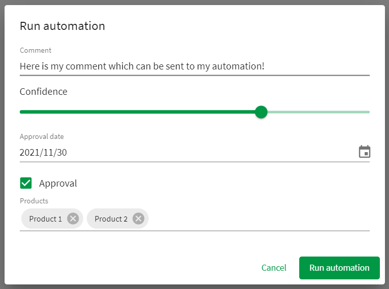
6 | * Within extension with form items
7 |
8 | 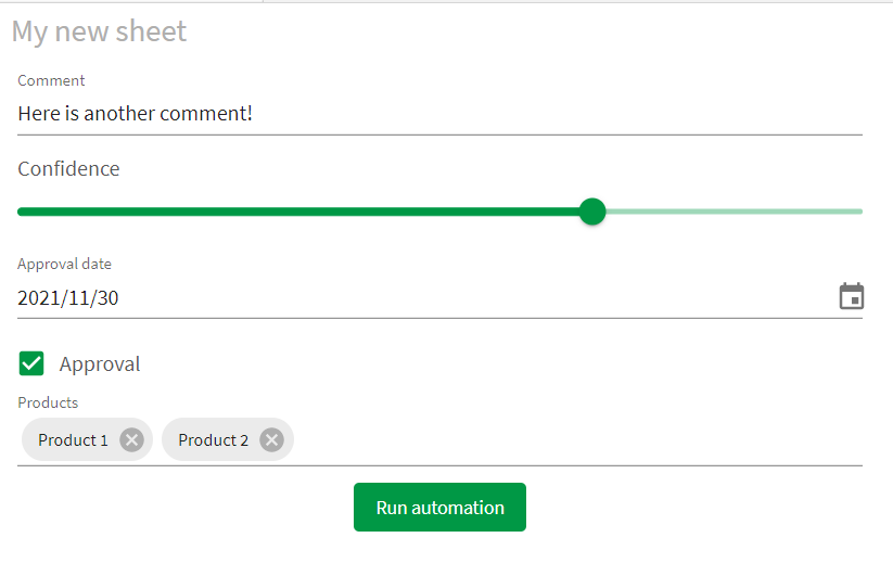
9 | * Simple button
10 |
11 | 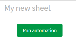
12 | # Installation steps:
13 | 1. Download the latest release from the following link: https://github.com/rileymd88/automation-trigger/releases/download/v1.2.1/automation-trigger.zip
14 | 2. Import into Qlik Sense using the management console
15 |
16 | # Release Notes
17 | * 1.2.1
18 | * Bug fix which stopped form data from being sent to the automation
19 | * 1.2.0
20 | * Added support for asynchronous automation runs
21 | * 1.1.9
22 | * Added required input setting to checkbox and switch
23 | * 1.1.8
24 | * Text input will show multiple lines when longer text is inputted
25 | * Fixed bug which prevented a vertical scrollbar from showing
26 | * 1.1.7
27 | * Fixed bug when migrating extension from a version < 1.1.0
28 | * 1.1.6
29 | * Updated to deal with new automations API
30 | * 1.1.5
31 | * Bug fixes
32 | * 1.1.4
33 | * Improved error handling
34 | * 1.1.3
35 | * Bug fixes
36 | * 1.1.2
37 | * Further bug fixes for error when user runs an automation that they do not own
38 | * 1.1.1
39 | * Fixed error when user runs an automation that they do not own
40 | * 1.1.0
41 | * Added Date picker form item
42 | * Added Rating form item
43 | * Renamed everything to reference automations instead of blends
44 | * Added ability to select automations from a list
45 | * Added direct link to automation from the extension
46 | * Added ability to copy an input block from the extension which can be pasted into an automation for faster startup
47 | * Added ability to create bookmark when the automation is triggered and have this bookmark ID sent to the automation
48 | * Added sheetId and appId to data sent to automation
49 | * Added ability to redirect users to another website after the automation has finished
50 | * Added font color theme property
51 | * 1.0.1
52 | * Bug fix for the Dropdown multiple select form item
53 | * 1.0.0
54 | * First release
55 |
56 | # Properties
57 | ### Dimensions & measures
58 | * Any data added as dimensions and measures will be sent to the automation within the body of the webhook
59 |
60 | ### Form
61 | * You can click on add items to add a form item to the extension. You will then be prompted to choose the type and set some appearance settings. Each item will save data which will also be sent to the automation within the body of the webhook. The `Reference` field will be used as a JSON key in the data which gets sent to the body of the webhook so either remember the generated id or change it to something you can remember.
62 | **Ensure that the reference string does NOT contain any spaces or strange characters**
63 |
64 | * The following form item types available
65 | * Checkbox
66 | * Date picker
67 | * Dropdown
68 | * Dropdown multiple select
69 | * Number
70 | * Rating
71 | * Slider
72 | * Switch
73 | * Text
74 |
75 | ### Automation
76 | * **Select an automation:** Here you can select an automation - At this time it is only possible to select an Automation that you have created
77 | * **Automation link:** This is a hyperlink which brings you directly to the automation editor for the selected automation
78 | * **Copy input block:** By clicking on this button, you will copy into your clipboard an input block for your automation which parses the data sent from this extension to the automation. From within your automation simply right click and select Paste Block(s)
79 | * **Include selections:** If this option is enabled, a bookmark will be created when the automation is run and the bookmark id will be sent to the automation. You can use the bookmark id together with the apply bookmark
80 | * **Condition to enable automation:** Here you can use a Qlik Sense formula to determine when it should be possible to run the automation. If the formula returns 1, the automation can be run. If the formula returns 0, the automation cannot be run
81 |
82 | ### Appearance
83 | * **Run automation button:** Here you can define the look and feel of the run automation button
84 | * **Dialog:** Here you can choose if you want to have a dialog to enter form information. The look and feel of the dialog can also be defined here
85 | * **Notification:** Here you can choose if you want to have a notification pop up when the automation has finished running. You can define the message by using the Output block in your automation or within the extension itself. If your automation is running asynchronously, the Success message will show in the notification. The Success message can be found in Appearance -> Notification settings when toggling off the Show automation output switch. If you would like to redirect your end user after the automation has run, then you can do this be returning a JSON response in the following format within the Output block:
86 | ```
87 | {
88 | "message": "Hello world",
89 | "redirect": "https://google.de",
90 | "newTab": true,
91 | "timeout": 100
92 | }
93 | ```
94 | **When using the redirect option ensure that the Display Mode for the Output block is set to Use only this output (overwrite previous outputs) and that popups are not being blocked**
95 |
96 | 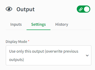
97 |
98 | **attribute**|**description**|**type**
99 | :-----:|:-----:|:-----:
100 | message|The message which will be shown in the notification|string
101 | redirect|The URL which the user will be redirected to after the automation has run|string
102 | newTab|Determines if the URL will open in a new tab or not|boolean
103 | timeout|The amount of time in ms before redirecting the user |integer
104 |
105 | You can also choose to have the notification message be based on a Qlik Sense formula
106 | * **Theme:** Here you can define the color scheme for the extension
107 |
108 | # Getting started with the extension
109 | 1. Create an empty automation by clicking on + Add new and then New automation from the Qlik Sense hub
110 |
111 | 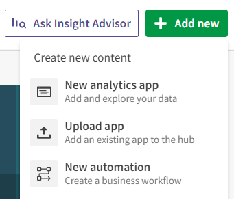
112 |
113 | 2. Enter a name for your automation and click Save
114 |
115 | 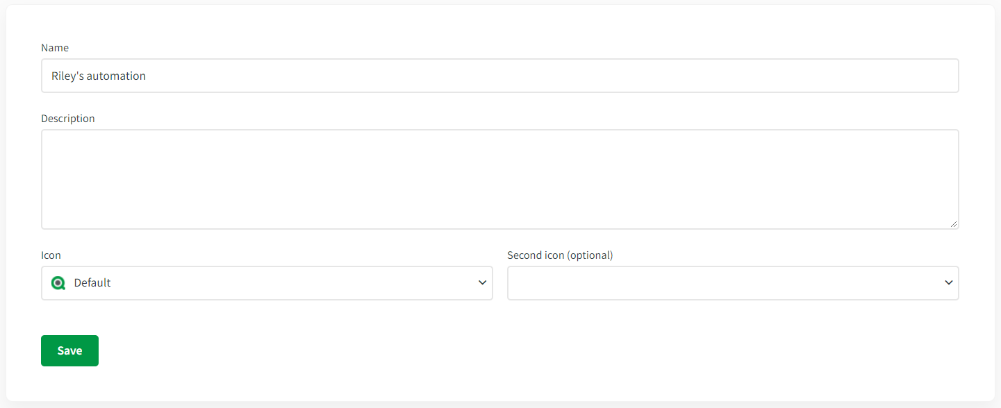
116 |
117 | 3. Select the Start block and then set the Run Mode to Triggered
118 |
119 | 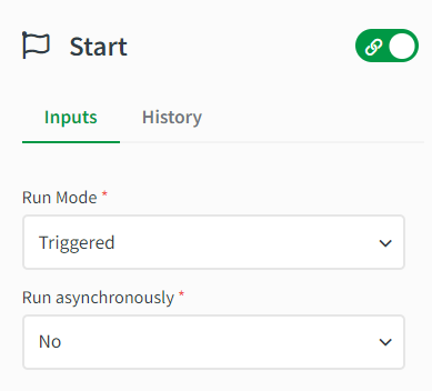
120 |
121 | 4. Now navigate to your Qlik Sense app and find the Automation trigger extension and add it to your sheet
122 | 5. Go to the extension properties and go to the Automation section and select your automation
123 | 6. Click on the Copy input block and then click on the Automation link to open the automation
124 |
125 | 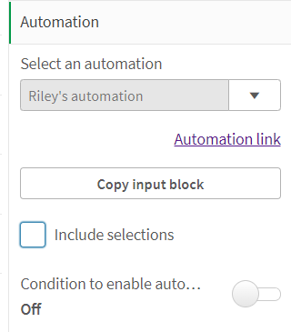
126 |
127 | 7. On the canvas of the automation, right click and select Paste Block(s). You should now see a new block called Inputs on your canvas. This block will parse the data sent from the extension to make it easy to use in your automation
128 |
129 | 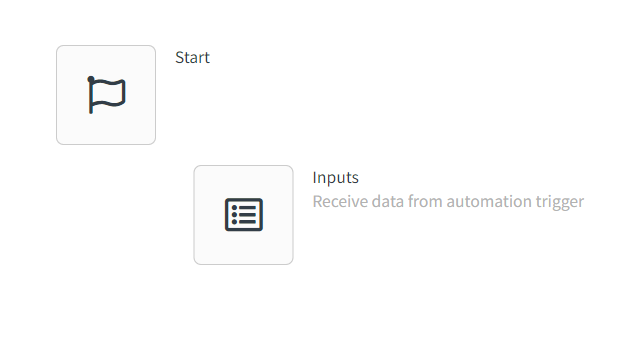
130 |
131 | 8. Drag the new Input block below the Start block so that are connected
132 |
133 | 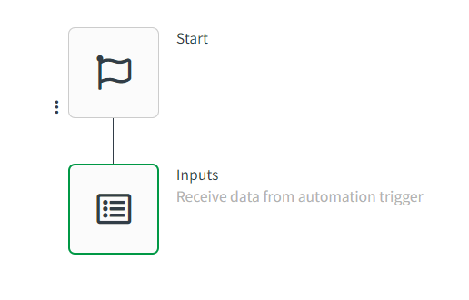
134 |
135 | 9. Now you can use the data from the extension in your automation as it will available in the Input block
136 | 10. For this basic example, I have set up several form items and have the dimensions User and Time
137 |
138 | 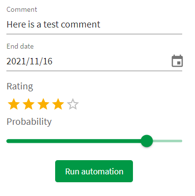
139 |
140 | 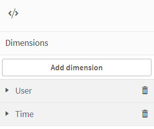
141 |
142 | 9. Once I click on the automation, I can then view what the received data looks like by going to the Overview of the automation and selecting the Last Run tab and the Per Block option
143 |
144 | 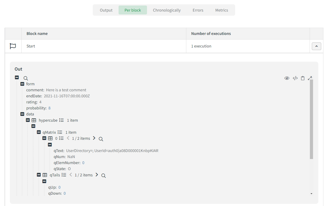
145 |
146 | ```
147 | {
148 | "form": {
149 | "comment": "Here is a test comment",
150 | "endDate": "2021-11-16T07:00:00.000Z",
151 | "rating": "4",
152 | "probability": 8
153 | },
154 | "data": {
155 | "hypercube": [
156 | {
157 | "qMatrix": [
158 | [
159 | {
160 | "qText": "UserDirectory=; UserId=auth0|a08D000001KnbpKIAR",
161 | "qNum": "NaN",
162 | "qElemNumber": 0,
163 | "qState": "O"
164 | },
165 | {
166 | "qText": "16.11.2021 11:33:02",
167 | "qNum": 44516.48127314815,
168 | "qElemNumber": 0,
169 | "qState": "O"
170 | }
171 | ]
172 | ],
173 | "qTails": [
174 | {
175 | "qUp": 0,
176 | "qDown": 0
177 | },
178 | {
179 | "qUp": 0,
180 | "qDown": 0
181 | }
182 | ],
183 | "qArea": {
184 | "qLeft": 0,
185 | "qTop": 0,
186 | "qWidth": 2,
187 | "qHeight": 1
188 | }
189 | }
190 | ]
191 | },
192 | "bookmarkid": "",
193 | "app": "d62893fa-2c18-49cc-8013-31dc47508ea9",
194 | "sheetid": "ec5e7e0b-6a65-4f73-8271-fb1c5c5e28c0"
195 | }
196 | ```
197 | 10. If we want to ensure we receive a message when the automation has run, we can add an Output block to our automation. If you also want to redirect users after the automation has run, please refer to the documentation above in the Appearance area
198 |
199 | 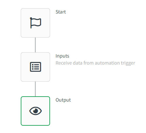
200 |
201 | 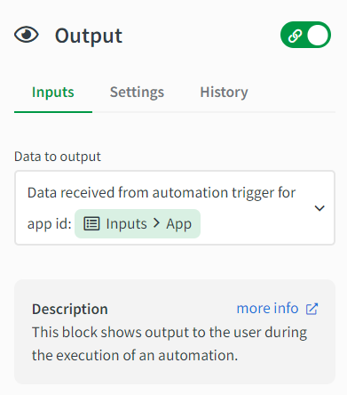
202 |
203 | 11. After adding the Output block to our automation and clicking save, we should see the following notification in the Qlik Sense app after triggering the automation
204 |
205 | 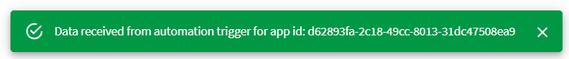
206 |
207 | # Current limitations
208 | * The extension will only show the first 100 automations for each user
209 | * The extension can only send a maximum of 20 columns and 500 rows of data to an automation
210 | * If this extension triggers a reload within the same app where it exists, notification messages will be blank. To workaround this you can send the input block before a reload is started
211 |
212 | # Developing the extension
213 | 1. Clone the repository
214 | 2. In the package.json file replace `nebula sense --ext src/extDefinition.js --meta ./meta.json && cd ../ && python build.py extension` with `nebula sense --ext src/extDefinition.js --meta ./meta.json`
215 | 2. Run `npm i`
216 | 3. Run `npm run build`
217 | 4. Run `npm run sense`
218 | 5. Then zip the contents in the folder automation-trigger-ext and then upload as an extension
219 |
220 |
--------------------------------------------------------------------------------
/src/utils/lui-icons.js:
--------------------------------------------------------------------------------
1 | export default [
2 | {
3 | value: 'image',
4 | icon: 'image',
5 | label: 'Image',
6 | },
7 | {
8 | value: 'back',
9 | icon: 'back',
10 | label: 'Back',
11 | },
12 | {
13 | value: 'forward',
14 | icon: 'forward',
15 | label: 'Forward',
16 | },
17 | {
18 | value: 'history',
19 | icon: 'history',
20 | label: 'History',
21 | },
22 | {
23 | value: 'help',
24 | icon: 'help',
25 | label: 'Help',
26 | },
27 | {
28 | value: 'info',
29 | icon: 'info',
30 | label: 'Info',
31 | },
32 | {
33 | value: 'text',
34 | icon: 'text',
35 | label: 'Text',
36 | },
37 | {
38 | value: 'group',
39 | icon: 'group',
40 | label: 'Group',
41 | },
42 | {
43 | value: 'search',
44 | icon: 'search',
45 | label: 'Search',
46 | },
47 | {
48 | value: 'zoom-in',
49 | icon: 'zoom-in',
50 | label: 'Zoom in',
51 | },
52 | {
53 | value: 'zoom-out',
54 | icon: 'zoom-out',
55 | label: 'Zoom out',
56 | },
57 | {
58 | value: 'export',
59 | icon: 'export',
60 | label: 'Export',
61 | },
62 | {
63 | value: 'import',
64 | icon: 'import',
65 | label: 'Import',
66 | },
67 | {
68 | value: 'field',
69 | icon: 'field',
70 | label: 'Field',
71 | },
72 | {
73 | value: 'lock',
74 | icon: 'lock',
75 | label: 'Lock',
76 | },
77 | {
78 | value: 'unlock',
79 | icon: 'unlock',
80 | label: 'Unlock',
81 | },
82 | {
83 | value: 'database',
84 | icon: 'database',
85 | label: 'Database',
86 | },
87 | {
88 | value: 'calendar',
89 | icon: 'calendar',
90 | label: 'Calendar',
91 | },
92 | {
93 | value: 'bookmark',
94 | icon: 'bookmark',
95 | label: 'Bookmark',
96 | },
97 | {
98 | value: 'library',
99 | icon: 'library',
100 | label: 'Library',
101 | },
102 | {
103 | value: 'star',
104 | icon: 'star',
105 | label: 'Star',
106 | },
107 | {
108 | value: 'print',
109 | icon: 'print',
110 | label: 'Print',
111 | },
112 | {
113 | value: 'remove',
114 | icon: 'remove',
115 | label: 'Remove',
116 | },
117 | {
118 | value: 'handle',
119 | icon: 'handle',
120 | label: 'Handle',
121 | },
122 | {
123 | value: 'handle-horizontal',
124 | icon: 'handle-horizontal',
125 | label: 'Handle horizontal',
126 | },
127 | {
128 | value: 'menu',
129 | icon: 'menu',
130 | label: 'Menu',
131 | },
132 | {
133 | value: 'list',
134 | icon: 'list',
135 | label: 'List',
136 | },
137 | {
138 | value: 'unordered-list',
139 | icon: 'unordered-list',
140 | label: 'Unordered list',
141 | },
142 | {
143 | value: 'clock',
144 | icon: 'clock',
145 | label: 'Clock',
146 | },
147 | {
148 | value: 'puzzle',
149 | icon: 'puzzle',
150 | label: 'Puzzle',
151 | },
152 | {
153 | value: 'filterpane',
154 | icon: 'filterpane',
155 | label: 'Filterpane',
156 | },
157 | {
158 | value: 'plus',
159 | icon: 'plus',
160 | label: 'Plus',
161 | },
162 | {
163 | value: 'minus',
164 | icon: 'minus',
165 | label: 'Minus',
166 | },
167 | {
168 | value: 'triangle-top',
169 | icon: 'triangle-top',
170 | label: 'Triangle top',
171 | },
172 | {
173 | value: 'triangle-bottom',
174 | icon: 'triangle-bottom',
175 | label: 'Triangle bottom',
176 | },
177 | {
178 | value: 'triangle-left',
179 | icon: 'triangle-left',
180 | label: 'Triangle left',
181 | },
182 | {
183 | value: 'triangle-right',
184 | icon: 'triangle-right',
185 | label: 'Triangle right',
186 | },
187 | {
188 | value: 'tick',
189 | icon: 'tick',
190 | label: 'Tick',
191 | },
192 | {
193 | value: 'cogwheel',
194 | icon: 'cogwheel',
195 | label: 'Cogwheel',
196 | },
197 | {
198 | value: 'settings',
199 | icon: 'settings',
200 | label: 'Settings',
201 | },
202 | {
203 | value: 'cut',
204 | icon: 'cut',
205 | label: 'Cut',
206 | },
207 | {
208 | value: 'copy',
209 | icon: 'copy',
210 | label: 'Copy',
211 | },
212 | {
213 | value: 'paste',
214 | icon: 'paste',
215 | label: 'Paste',
216 | },
217 | {
218 | value: 'camera',
219 | icon: 'camera',
220 | label: 'Camera',
221 | },
222 | {
223 | value: 'slide-show',
224 | icon: 'slide-show',
225 | label: 'Slide show',
226 | },
227 | {
228 | value: 'palette',
229 | icon: 'palette',
230 | label: 'Palette',
231 | },
232 | {
233 | value: 'shapes',
234 | icon: 'shapes',
235 | label: 'Shapes',
236 | },
237 | {
238 | value: 'effects',
239 | icon: 'effects',
240 | label: 'Effects',
241 | },
242 | {
243 | value: 'file',
244 | icon: 'file',
245 | label: 'File',
246 | },
247 | {
248 | value: 'expand',
249 | icon: 'expand',
250 | label: 'Expand',
251 | },
252 | {
253 | value: 'collapse',
254 | icon: 'collapse',
255 | label: 'Collapse',
256 | },
257 | {
258 | value: 'bin',
259 | icon: 'bin',
260 | label: 'Bin',
261 | },
262 | {
263 | value: 'link',
264 | icon: 'link',
265 | label: 'Link',
266 | },
267 | {
268 | value: 'pivot',
269 | icon: 'pivot',
270 | label: 'Pivot',
271 | },
272 | {
273 | value: 'reload',
274 | icon: 'reload',
275 | label: 'Reload',
276 | },
277 | {
278 | value: 'add',
279 | icon: 'add',
280 | label: 'Add',
281 | },
282 | {
283 | value: 'edit',
284 | icon: 'edit',
285 | label: 'Edit',
286 | },
287 | {
288 | value: 'key',
289 | icon: 'key',
290 | label: 'Key',
291 | },
292 | {
293 | value: 'box',
294 | icon: 'box',
295 | label: 'Box',
296 | },
297 | {
298 | value: 'home',
299 | icon: 'home',
300 | label: 'Home',
301 | },
302 | {
303 | value: 'person',
304 | icon: 'person',
305 | label: 'Person',
306 | },
307 | {
308 | value: 'grid',
309 | icon: 'grid',
310 | label: 'Grid',
311 | },
312 | {
313 | value: 'cloud',
314 | icon: 'cloud',
315 | label: 'Cloud',
316 | },
317 | {
318 | value: 'more',
319 | icon: 'more',
320 | label: 'More',
321 | },
322 | {
323 | value: 'folder',
324 | icon: 'folder',
325 | label: 'Folder',
326 | },
327 | {
328 | value: 'drop',
329 | icon: 'drop',
330 | label: 'Drop',
331 | },
332 | {
333 | value: 'play',
334 | icon: 'play',
335 | label: 'Play',
336 | },
337 | {
338 | value: 'tag',
339 | icon: 'tag',
340 | label: 'Tag',
341 | },
342 | {
343 | value: 'close',
344 | icon: 'close',
345 | label: 'Close',
346 | },
347 | {
348 | value: 'warning',
349 | icon: 'warning',
350 | label: 'Warning',
351 | },
352 | {
353 | value: 'warning-triangle',
354 | icon: 'warning-triangle',
355 | label: 'Warning triangle',
356 | },
357 | {
358 | value: 'share',
359 | icon: 'share',
360 | label: 'Share',
361 | },
362 | {
363 | value: 'top',
364 | icon: 'top',
365 | label: 'Top',
366 | },
367 | {
368 | value: 'low-resolution',
369 | icon: 'low-resolution',
370 | label: 'Low resolution',
371 | },
372 | {
373 | value: 'high-resolution',
374 | icon: 'high-resolution',
375 | label: 'High resolution',
376 | },
377 | {
378 | value: 'view',
379 | icon: 'view',
380 | label: 'View',
381 | },
382 | {
383 | value: 'control',
384 | icon: 'control',
385 | label: 'Control',
386 | },
387 | {
388 | value: 'code',
389 | icon: 'code',
390 | label: 'Code',
391 | },
392 | {
393 | value: 'upload',
394 | icon: 'upload',
395 | label: 'Upload',
396 | },
397 | {
398 | value: 'repair',
399 | icon: 'repair',
400 | label: 'Repair',
401 | },
402 | {
403 | value: 'split',
404 | icon: 'split',
405 | label: 'Split',
406 | },
407 | {
408 | value: 'up-down',
409 | icon: 'up-down',
410 | label: 'Up down',
411 | },
412 | {
413 | value: 'disconnect',
414 | icon: 'disconnect',
415 | label: 'Disconnect',
416 | },
417 | {
418 | value: 'photo-library',
419 | icon: 'photo-library',
420 | label: 'Photo library',
421 | },
422 | {
423 | value: 'application',
424 | icon: 'application',
425 | label: 'Application',
426 | },
427 | {
428 | value: 'new-tab',
429 | icon: 'new-tab',
430 | label: 'New tab',
431 | },
432 | {
433 | value: 'ascending',
434 | icon: 'ascending',
435 | label: 'Ascending',
436 | },
437 | {
438 | value: 'descending',
439 | icon: 'descending',
440 | label: 'Descending',
441 | },
442 | {
443 | value: 'arrow-up',
444 | icon: 'arrow-up',
445 | label: 'Arrow up',
446 | },
447 | {
448 | value: 'arrow-down',
449 | icon: 'arrow-down',
450 | label: 'Arrow down',
451 | },
452 | {
453 | value: 'arrow-right',
454 | icon: 'arrow-right',
455 | label: 'Arrow right',
456 | },
457 | {
458 | value: 'arrow-left',
459 | icon: 'arrow-left',
460 | label: 'Arrow left',
461 | },
462 | {
463 | value: 'sync',
464 | icon: 'sync',
465 | label: 'Sync',
466 | },
467 | {
468 | value: 'draggable',
469 | icon: 'draggable',
470 | label: 'Draggable',
471 | },
472 | {
473 | value: 'book',
474 | icon: 'book',
475 | label: 'Book',
476 | },
477 | {
478 | value: 'measure',
479 | icon: 'measure',
480 | label: 'Measure',
481 | },
482 | {
483 | value: 'download',
484 | icon: 'download',
485 | label: 'Download',
486 | },
487 | {
488 | value: 'more-rounded',
489 | icon: 'more-rounded',
490 | label: 'More rounded',
491 | },
492 | {
493 | value: 'align-object-left',
494 | icon: 'align-object-left',
495 | label: 'Align object-left',
496 | },
497 | {
498 | value: 'align-object-center',
499 | icon: 'align-object-center',
500 | label: 'Align object-center',
501 | },
502 | {
503 | value: 'align-object-right',
504 | icon: 'align-object-right',
505 | label: 'Align object-right',
506 | },
507 | {
508 | value: 'submit',
509 | icon: 'submit',
510 | label: 'Submit',
511 | },
512 | {
513 | value: 'operators',
514 | icon: 'operators',
515 | label: 'Operators',
516 | },
517 | {
518 | value: 'general-data-class',
519 | icon: 'general-data-class',
520 | label: 'General data-class',
521 | },
522 | {
523 | value: 'building',
524 | icon: 'building',
525 | label: 'Building',
526 | },
527 | {
528 | value: 'bell',
529 | icon: 'bell',
530 | label: 'Bell',
531 | },
532 | {
533 | value: 'unlink',
534 | icon: 'unlink',
535 | label: 'Unlink',
536 | },
537 | {
538 | value: 'lightbulb',
539 | icon: 'lightbulb',
540 | label: 'Lightbulb',
541 | },
542 | {
543 | value: 'log-in',
544 | icon: 'log-in',
545 | label: 'Log in',
546 | },
547 | {
548 | value: 'log-out',
549 | icon: 'log-out',
550 | label: 'Log out',
551 | },
552 | {
553 | value: 'previous',
554 | icon: 'previous',
555 | label: 'Previous',
556 | },
557 | {
558 | value: 'goto',
559 | icon: 'goto',
560 | label: 'Goto',
561 | },
562 | {
563 | value: 'save',
564 | icon: 'save',
565 | label: 'Save',
566 | },
567 | {
568 | value: 'pause',
569 | icon: 'pause',
570 | label: 'Pause',
571 | },
572 | {
573 | value: 'stop',
574 | icon: 'stop',
575 | label: 'Stop',
576 | },
577 | {
578 | value: 'step-in',
579 | icon: 'step-in',
580 | label: 'Step in',
581 | },
582 | {
583 | value: 'comment',
584 | icon: 'comment',
585 | label: 'Comment',
586 | },
587 | {
588 | value: 'indent',
589 | icon: 'indent',
590 | label: 'Indent',
591 | },
592 | {
593 | value: 'undent',
594 | icon: 'undent',
595 | label: 'Undent',
596 | },
597 | {
598 | value: 'filter',
599 | icon: 'filter',
600 | label: 'Filter',
601 | },
602 | {
603 | value: 'clear-filter',
604 | icon: 'clear-filter',
605 | label: 'Clear filter',
606 | },
607 | {
608 | value: 'insert',
609 | icon: 'insert',
610 | label: 'Insert',
611 | },
612 | {
613 | value: 'direction-left',
614 | icon: 'direction-left',
615 | label: 'Direction left',
616 | },
617 | {
618 | value: 'swap',
619 | icon: 'swap',
620 | label: 'Swap',
621 | },
622 | {
623 | value: 'bubbles',
624 | icon: 'bubbles',
625 | label: 'Bubbles',
626 | },
627 | {
628 | value: 'sheet',
629 | icon: 'sheet',
630 | label: 'Sheet',
631 | },
632 | {
633 | value: 'object',
634 | icon: 'object',
635 | label: 'Object',
636 | },
637 | {
638 | value: 'clear-selections',
639 | icon: 'clear-selections',
640 | label: 'Clear selections',
641 | },
642 | {
643 | value: 'selections-tool',
644 | icon: 'selections-tool',
645 | label: 'Selections tool',
646 | },
647 | {
648 | value: 'selections-reload',
649 | icon: 'selections-reload',
650 | label: 'Selections reload',
651 | },
652 | {
653 | value: 'selections-back',
654 | icon: 'selections-back',
655 | label: 'Selections back',
656 | },
657 | {
658 | value: 'selections-forward',
659 | icon: 'selections-forward',
660 | label: 'Selections forward',
661 | },
662 | {
663 | value: 'expression',
664 | icon: 'expression',
665 | label: 'Expression',
666 | },
667 | {
668 | value: 'select-alternative',
669 | icon: 'select-alternative',
670 | label: 'Select alternative',
671 | },
672 | {
673 | value: 'select-possible',
674 | icon: 'select-possible',
675 | label: 'Select possible',
676 | },
677 | {
678 | value: 'select-excluded',
679 | icon: 'select-excluded',
680 | label: 'Select excluded',
681 | },
682 | {
683 | value: 'select-all',
684 | icon: 'select-all',
685 | label: 'Select all',
686 | },
687 | {
688 | value: 'bar-chart',
689 | icon: 'bar-chart',
690 | label: 'Bar chart',
691 | },
692 | {
693 | value: 'bar-chart-horizontal',
694 | icon: 'bar-chart-horizontal',
695 | label: 'Bar chart-horizontal',
696 | },
697 | {
698 | value: 'line-chart',
699 | icon: 'line-chart',
700 | label: 'Line chart',
701 | },
702 | {
703 | value: 'pie-chart',
704 | icon: 'pie-chart',
705 | label: 'Pie chart',
706 | },
707 | {
708 | value: 'gauge-chart',
709 | icon: 'gauge-chart',
710 | label: 'Gauge chart',
711 | },
712 | {
713 | value: 'kpi',
714 | icon: 'kpi',
715 | label: 'Kpi',
716 | },
717 | {
718 | value: 'scatter-chart',
719 | icon: 'scatter-chart',
720 | label: 'Scatter chart',
721 | },
722 | {
723 | value: 'map',
724 | icon: 'map',
725 | label: 'Map',
726 | },
727 | {
728 | value: 'table',
729 | icon: 'table',
730 | label: 'Table',
731 | },
732 | {
733 | value: 'pivot-table',
734 | icon: 'pivot-table',
735 | label: 'Pivot table',
736 | },
737 | {
738 | value: 'treemap',
739 | icon: 'treemap',
740 | label: 'Treemap',
741 | },
742 | {
743 | value: 'combo-chart',
744 | icon: 'combo-chart',
745 | label: 'Combo chart',
746 | },
747 | {
748 | value: 'boxplot',
749 | icon: 'boxplot',
750 | label: 'Boxplot',
751 | },
752 | {
753 | value: 'distributionplot',
754 | icon: 'distributionplot',
755 | label: 'Distributionplot',
756 | },
757 | {
758 | value: 'histogram',
759 | icon: 'histogram',
760 | label: 'Histogram',
761 | },
762 | {
763 | value: 'direct-discovery',
764 | icon: 'direct-discovery',
765 | label: 'Direct discovery',
766 | },
767 | {
768 | value: 'data-model',
769 | icon: 'data-model',
770 | label: 'Data model',
771 | },
772 | {
773 | value: 'script',
774 | icon: 'script',
775 | label: 'Script',
776 | },
777 | {
778 | value: 'script-ok',
779 | icon: 'script-ok',
780 | label: 'Script ok',
781 | },
782 | {
783 | value: 'debug',
784 | icon: 'debug',
785 | label: 'Debug',
786 | },
787 | {
788 | value: 'auto-layout',
789 | icon: 'auto-layout',
790 | label: 'Auto layout',
791 | },
792 | ];
--------------------------------------------------------------------------------
/src/extDefinition.js:
--------------------------------------------------------------------------------
1 | import { getAutomations, getBaseUrl } from './services/backend'
2 | import luiIcons from './utils/lui-icons';
3 | import copy from 'clipboard-copy';
4 |
5 | var component = {
6 | label: 'Item type',
7 | component: 'expression-with-dropdown',
8 | dropdownOnly: true,
9 | type: 'string',
10 | ref: 'component',
11 | defaultValue: '',
12 | options: [
13 | { value: 'checkbox', label: 'Checkbox' },
14 | { value: 'datePicker', label: 'Date picker' },
15 | { value: 'dropdown', label: 'Dropdown' },
16 | { value: 'dropdownMultiple', label: 'Dropdown multiple select' },
17 | { value: 'numberInput', label: 'Number' },
18 | { value: 'rating', label: 'Rating' },
19 | { value: 'slider', label: 'Slider' },
20 | { value: 'switch', label: 'Switch' },
21 | { value: 'textInput', label: 'Text' },
22 | ]
23 | }
24 |
25 | const types = {
26 | checkbox: 'boolean',
27 | dropdown: 'string'
28 | }
29 |
30 | const stringComponents = ['dropdown', 'dropdownMultiple', 'textInput']
31 | const numberComponents = ['numberInput', 'slider', 'switch', 'checkbox', 'rating']
32 | const dateComponents = ['datePicker']
33 | const booleanComponents = ['switch', 'checkbox']
34 |
35 | var defaultValueString = {
36 | type: 'string',
37 | ref: 'defaultValueString',
38 | label: 'Default value',
39 | defaultValue: '',
40 | expression: 'optional',
41 | show: function (item) {
42 | return stringComponents.includes(item.component)
43 | }
44 | }
45 |
46 | var defaultValueNumber = {
47 | type: 'number',
48 | ref: 'defaultValueNumber',
49 | label: 'Default value',
50 | defaultValue: '1',
51 | expression: 'optional',
52 | show: function (item) {
53 | return numberComponents.includes(item.component)
54 | }
55 | }
56 |
57 | var defaultValueDate = {
58 | type: 'number',
59 | ref: 'defaultValueDate',
60 | label: 'Default value',
61 | defaultValue: "=Date(Today(), 'YYYY/MM/DD')",
62 | expression: 'always',
63 | show: function (item) {
64 | return dateComponents.includes(item.component)
65 | }
66 | }
67 |
68 | var dateFormat = {
69 | label: 'Date format',
70 | component: 'expression-with-dropdown',
71 | dropdownOnly: true,
72 | type: 'string',
73 | ref: 'dateFormat',
74 | defaultValue: 'yyyy/MM/dd|____/__/__',
75 | options: [
76 | { value: 'yyyy-MM-dd|____-__-__', label: 'YYYY-MM-DD' },
77 | { value: 'yyyy.MM.dd|____.__.__', label: 'YYYY.MM.DD' },
78 | { value: 'yyyy/MM/dd|____/__/__', label: 'YYYY/MM/dd' },
79 | { value: 'dd-MM-yyyy|__-__-____', label: 'DD-MM-YYYY' },
80 | { value: 'dd.MM.yyyy|__.__.____', label: 'DD.MM.YYYY' },
81 | { value: 'dd/MM/yyyy|__/__/____', label: 'DD/MM/YYYY' },
82 | { value: 'MM-dd-yyyy|__-__-____', label: 'MM-DD-YYYY' },
83 | { value: 'MM.dd.yyyy|__.__.____', label: 'MM.DD.YYYY' },
84 | { value: 'MM/dd/yyyy|__/__/____', label: 'MM/DD/YYYY' },
85 | ],
86 | show: function (item) {
87 | return dateComponents.includes(item.component)
88 | }
89 | }
90 |
91 | /* var defaultValueBoolean = {
92 | type: 'boolean',
93 | component: 'switch',
94 | ref: 'defaultValueBoolean',
95 | label: 'Default value',
96 | defaultValue: false,
97 | options: [
98 | {
99 | value: true,
100 | translation: 'properties.on',
101 | },
102 | {
103 | value: false,
104 | translation: 'properties.off',
105 | },
106 | ],
107 | show: function(item) {
108 | return booleanComponents.includes(item.component)
109 | }
110 | } */
111 |
112 | var width = {
113 | type: "number",
114 | component: "slider",
115 | label: "Width",
116 | ref: "width",
117 | min: 10,
118 | max: 100,
119 | step: 1,
120 | defaultValue: 100
121 | }
122 |
123 | var label = {
124 | type: 'string',
125 | ref: 'label',
126 | label: 'Label',
127 | defaultValue: 'Label',
128 | expression: 'optional'
129 | }
130 |
131 | var step = {
132 | type: 'number',
133 | ref: 'step',
134 | label: 'Step',
135 | defaultValue: 1,
136 | expression: 'optional',
137 | show: function (item) {
138 | if (item.component === 'slider') { return true; }
139 | }
140 | }
141 |
142 | var min = {
143 | type: 'number',
144 | ref: 'min',
145 | label: 'Min',
146 | defaultValue: 0,
147 | expression: 'optional',
148 | show: function (item) {
149 | if (item.component === 'slider') { return true; }
150 | }
151 | }
152 |
153 | var max = {
154 | type: 'number',
155 | ref: 'max',
156 | label: 'Max',
157 | defaultValue: 10,
158 | expression: 'optional',
159 | show: function (item) {
160 | if (item.component === 'slider') { return true; }
161 | }
162 | }
163 |
164 | var precision = {
165 | type: 'number',
166 | ref: 'precision',
167 | label: 'Rating precision',
168 | defaultValue: 0.5,
169 | expression: 'optional',
170 | show: function (item) {
171 | if (item.component === 'rating') { return true; }
172 | }
173 | }
174 |
175 | var maxRating = {
176 | type: 'number',
177 | ref: 'maxRating',
178 | label: 'Number of stars',
179 | defaultValue: 5,
180 | expression: 'optional',
181 | show: function (item) {
182 | if (item.component === 'rating') { return true; }
183 | }
184 | }
185 |
186 | var ratingSize = {
187 | label: 'Rating size',
188 | component: 'expression-with-dropdown',
189 | dropdownOnly: true,
190 | type: 'string',
191 | ref: 'ratingSize',
192 | defaultValue: 'medium',
193 | options: [
194 | { value: 'small', label: 'Small' },
195 | { value: 'medium', label: 'Medium' },
196 | { value: 'large', label: 'Large' },
197 | ],
198 | show: function (item) {
199 | if (item.component === 'rating') { return true; }
200 | }
201 | }
202 |
203 | var dropdownOptions = {
204 | type: 'string',
205 | ref: 'dropdownOptions',
206 | label: 'Dropdown values',
207 | defaultValue: '',
208 | expression: 'optional',
209 | show: function (item) {
210 | if (item.component === 'dropdown' || item.component === 'dropdownMultiple') { return true; }
211 | }
212 | }
213 |
214 | var explainDropdown = {
215 | label: `Enter dropdown values using a comma as a seperator`,
216 | component: 'text',
217 | show: function (item) {
218 | if (item.component === 'dropdown' || item.component === 'dropdownMultiple') { return true; }
219 | }
220 | }
221 |
222 | var ref = {
223 | type: 'string',
224 | ref: 'ref',
225 | label: 'Reference',
226 | defaultValue: function () {
227 | return Math.random().toString(36).substr(2, 5);
228 | },
229 | expression: 'optional'
230 | }
231 |
232 | var explainRef = {
233 | label: `The reference is used as a key when sending the data to your automation`,
234 | component: 'text'
235 | }
236 |
237 | var automationLink = {
238 | label: "Automation link",
239 | component: "link",
240 | url: function (layout) { return `${getBaseUrl()}/automations/${layout.blend.id}/editor`},
241 | show: function (layout) { return layout.blend.id.length > 1 }
242 | }
243 |
244 | var required = {
245 | ref: 'required',
246 | type: 'boolean',
247 | component: 'switch',
248 | translation: 'Required input',
249 | options: [
250 | {
251 | value: true,
252 | translation: 'properties.on',
253 | },
254 | {
255 | value: false,
256 | translation: 'properties.off',
257 | },
258 | ],
259 | defaultValue: false,
260 | }
261 |
262 | var requiredValue = {
263 | ref: 'requiredValue',
264 | type: 'boolean',
265 | component: 'switch',
266 | translation: 'Required value',
267 | options: [
268 | {
269 | value: true,
270 | translation: 'properties.on',
271 | },
272 | {
273 | value: false,
274 | translation: 'properties.off',
275 | },
276 | ],
277 | defaultValue: true,
278 | show: (item) => item.required
279 | }
280 |
281 | var alignment = {
282 | component: 'item-selection-list',
283 | type: 'string',
284 | ref: 'alignment',
285 | translation: 'properties.Alignment',
286 | horizontal: true,
287 | defaultValue: 'flex-start',
288 | items: [
289 | {
290 | component: 'icon-item',
291 | icon: 'align_left',
292 | value: 'flex-start',
293 | translation: 'properties.dock.left',
294 | labelPlacement: 'bottom',
295 | },
296 | {
297 | component: 'icon-item',
298 | icon: 'align_center',
299 | value: 'center',
300 | translation: 'Common.Center',
301 | labelPlacement: 'bottom',
302 | },
303 | {
304 | component: 'icon-item',
305 | icon: 'align_right',
306 | value: 'flex-end',
307 | translation: 'properties.dock.right',
308 | labelPlacement: 'bottom',
309 | },
310 | ],
311 | }
312 |
313 | var config = {
314 | type: "items",
315 | label: "Form",
316 | component: "items",
317 | items: {
318 | objects: {
319 | ref: "itemsList",
320 | label: "Items",
321 | type: "items",
322 | items: {
323 | objects: {
324 | type: 'array',
325 | ref: 'items',
326 | label: 'Items',
327 | itemTitleRef: function (item) {
328 | return `${item.component} ${item.ref}`;
329 | },
330 | allowAdd: true,
331 | allowRemove: true,
332 | allowMove: true,
333 | addTranslation: 'Add items',
334 | items: {
335 | component: component,
336 | defaultValueString: defaultValueString,
337 | defaultValueNumber: defaultValueNumber,
338 | defaultValueDate: defaultValueDate,
339 | dateFormat: dateFormat,
340 | step: step,
341 | min: min,
342 | max: max,
343 | precision: precision,
344 | maxRating: maxRating,
345 | ratingSize: ratingSize,
346 | dropdownOptions: dropdownOptions,
347 | explainDropdown: explainDropdown,
348 | width: width,
349 | alignment: alignment,
350 | label: label,
351 | ref: ref,
352 | explainRef: explainRef,
353 | required: required,
354 | requiredValue: requiredValue,
355 | }
356 | }
357 | }
358 | }
359 | }
360 | };
361 |
362 | var blends = {
363 | label: 'Select an automation',
364 | component: 'expression-with-dropdown',
365 | dropdownOnly: true,
366 | type: 'string',
367 | ref: 'blend.id',
368 | defaultValue: '',
369 | options: function () {
370 | return getAutomations()
371 | }
372 | }
373 |
374 | /* var blendUrl = {
375 | type: 'string',
376 | ref: 'blend.id',
377 | label: 'Blendr POST webhook URL',
378 | defaultValue: '',
379 | expression: 'optional',
380 | show: function () {
381 | return !blendr.useApis
382 | }
383 | } */
384 |
385 | var blendExecutionToken = {
386 | type: 'string',
387 | ref: 'blend.executionToken',
388 | label: 'Blendr execution token',
389 | defaultValue: '',
390 | expression: 'optional',
391 | show: function () {
392 | return false
393 | }
394 | }
395 |
396 | var buttonLabel = {
397 | type: 'string',
398 | ref: 'blend.buttonLabel',
399 | label: 'Button label',
400 | defaultValue: 'Run automation',
401 | expression: 'optional'
402 | }
403 |
404 | var runningBlendLabel = {
405 | type: 'string',
406 | ref: 'blend.runningBlendLabel',
407 | label: 'Loading message',
408 | defaultValue: 'Running automation...',
409 | expression: 'optional'
410 | }
411 |
412 | var buttonWidth = {
413 | type: "number",
414 | component: "slider",
415 | label: "Button width",
416 | ref: "blend.buttonWidth",
417 | min: 10,
418 | max: 100,
419 | step: 1,
420 | defaultValue: 100,
421 | show: function (item) {
422 | return !item.blendDialog.show && !item.blend.buttonWidthAuto
423 | }
424 | }
425 |
426 | var buttonAlignment = {
427 | component: 'item-selection-list',
428 | type: 'string',
429 | ref: 'blend.alignment',
430 | translation: 'properties.Alignment',
431 | horizontal: true,
432 | defaultValue: 'center',
433 | items: [
434 | {
435 | component: 'icon-item',
436 | icon: 'align_left',
437 | value: 'flex-start',
438 | translation: 'properties.dock.left',
439 | labelPlacement: 'bottom',
440 | },
441 | {
442 | component: 'icon-item',
443 | icon: 'align_center',
444 | value: 'center',
445 | translation: 'Common.Center',
446 | labelPlacement: 'bottom',
447 | },
448 | {
449 | component: 'icon-item',
450 | icon: 'align_right',
451 | value: 'flex-end',
452 | translation: 'properties.dock.right',
453 | labelPlacement: 'bottom',
454 | },
455 | ],
456 | show: function (item) {
457 | return !item.blendDialog.show
458 | }
459 | }
460 |
461 | var useCondition = {
462 | type: 'boolean',
463 | component: 'switch',
464 | translation: 'Condition to enable automation',
465 | ref: 'blend.useEnabledCondition',
466 | defaultValue: false,
467 | options: [
468 | {
469 | value: true,
470 | translation: 'properties.on',
471 | },
472 | {
473 | value: false,
474 | translation: 'properties.off',
475 | },
476 | ],
477 | }
478 |
479 | var condition = {
480 | ref: 'blend.enabledCondition',
481 | translation: 'properties.enableCondition',
482 | type: 'integer',
483 | expression: 'optional',
484 | show: (data) => data.blend.useEnabledCondition,
485 | }
486 |
487 | var sendSelections = {
488 | type: 'boolean',
489 | ref: 'blend.sendSelections',
490 | translation: 'Object.ActionButton.Automation.SendSelections',
491 | defaultValue: false,
492 | }
493 |
494 | var copyButton = {
495 | component: 'button',
496 | label: 'Copy input block',
497 | action: function() {
498 | const jsonInputBlock = {"blocks":[{"id":"95447E1E-EB22-4094-8FE7-7702E862A7B1","type":"FormBlock","x":92,"y":195,"disabled":false,"name":"inputs","displayName":"Inputs","comment":"Receive data from automation trigger","childId":null,"inputs":[],"settings":[{"id":"persist_data","value":"no","type":"select","displayValue":"No","structure":[]}],"collapsed":[{"name":"loop","isCollapsed":false}],"form":[{"id":"inputs-input-0","label":"form","helpText":null,"type":"data","values":null,"isRequired":true,"options":{},"order":0},{"id":"inputs-input-1","label":"data","helpText":null,"type":"data","values":null,"isRequired":true,"options":{},"order":1},{"id":"inputs-input-2","label":"sheetid","helpText":"Sheet ID","type":"input","values":null,"isRequired":true,"options":{},"order":2},{"id":"inputs-input-3","label":"app","helpText":"App ID","type":"input","values":null,"isRequired":true,"options":{},"order":3},{"id":"inputs-input-4","label":"bookmarkid","helpText":"Bookmark ID","type":"input","values":null,"isRequired":false,"options":{},"order":4}],"persistData":"no"}],"variables":[]}
499 | copy(JSON.stringify(jsonInputBlock))
500 | }
501 | }
502 |
503 | var blend = {
504 | type: "items",
505 | label: "Automation",
506 | component: "items",
507 | items: {
508 | blends: blends,
509 | blendExecutionToken: blendExecutionToken,
510 | automationLink: automationLink,
511 | copyButton: copyButton,
512 | sendSelections: sendSelections,
513 | useCondition: useCondition,
514 | condition: condition
515 | }
516 | }
517 |
518 | var general = {
519 | type: 'items',
520 | translation: 'properties.general',
521 | items: {
522 | showTitles: {},
523 | details: {
524 | show: false,
525 | },
526 | label: {
527 | component: 'string',
528 | ref: 'style.label',
529 | translation: 'Common.Label',
530 | expression: 'optional',
531 | },
532 | },
533 | }
534 |
535 | var variant = {
536 | label: 'Variant type',
537 | component: 'dropdown',
538 | type: 'string',
539 | ref: 'blendGlobalTheme.variant',
540 | defaultValue: 'standard',
541 | options: [
542 | { value: 'filled', label: 'Filled' },
543 | { value: 'outlined', label: 'Outlined' },
544 | { value: 'standard', label: 'Standard' },
545 | ]
546 | }
547 |
548 | var colorPickerPrimary = {
549 | component: 'color-picker',
550 | type: 'object',
551 | ref: 'blendGlobalTheme.primaryColor',
552 | translation: 'Primary color',
553 | dualOutput: true,
554 | defaultValue: {
555 | color: "#009845",
556 | index: "-1"
557 | }
558 | }
559 |
560 | var colorPickerSecondary = {
561 | component: 'color-picker',
562 | type: 'object',
563 | ref: 'blendGlobalTheme.secondaryColor',
564 | translation: 'Secondary color',
565 | dualOutput: true,
566 | defaultValue: {
567 | color: "#757575",
568 | index: "-1"
569 | }
570 | }
571 |
572 | var colorPickerFont = {
573 | component: 'color-picker',
574 | type: 'object',
575 | ref: 'blendGlobalTheme.fontColor',
576 | translation: 'Font color',
577 | dualOutput: true,
578 | defaultValue: {
579 | color: "#FFFFFF",
580 | index: "-1"
581 | }
582 | }
583 |
584 | var theme = {
585 | grouped: true,
586 | type: 'items',
587 | translation: 'Theme',
588 | items: {
589 | colorPickerPrimary: colorPickerPrimary,
590 | colorPickerSecondary: colorPickerSecondary,
591 | colorPickerFont: colorPickerFont,
592 | variant: variant
593 | }
594 | }
595 |
596 | var buttonUseIcon = {
597 | ref: 'blend.icon.useIcon',
598 | type: 'boolean',
599 | translation: 'properties.icon.use',
600 | component: 'switch',
601 | options: [
602 | {
603 | value: true,
604 | translation: 'properties.on',
605 | },
606 | {
607 | value: false,
608 | translation: 'properties.off',
609 | },
610 | ],
611 | defaultValue: false,
612 | }
613 |
614 | var buttonIconType = {
615 | ref: 'blend.icon.iconType',
616 | component: 'expression-with-dropdown',
617 | translation: 'Icon',
618 | defaultValue: '',
619 | options: luiIcons,
620 | expressionType: 'StringExpression',
621 | show: function (data) {
622 | return data.blend.icon.useIcon
623 | }
624 | }
625 | var buttonIconPosition = {
626 | ref: 'blend.icon.position',
627 | component: 'dropdown',
628 | translation: 'Common.Position',
629 | options: [
630 | {
631 | translation: 'properties.dock.left',
632 | value: 'left',
633 | },
634 | {
635 | translation: 'properties.dock.right',
636 | value: 'right',
637 | },
638 | ],
639 | show: function (data) {
640 | return data.blend.icon.useIcon
641 | }
642 | }
643 |
644 | var dialogShow = {
645 | ref: 'blendDialog.show',
646 | type: 'boolean',
647 | component: 'switch',
648 | translation: 'Use dialog',
649 | options: [
650 | {
651 | value: true,
652 | translation: 'properties.on',
653 | },
654 | {
655 | value: false,
656 | translation: 'properties.off',
657 | },
658 | ],
659 | defaultValue: false
660 | }
661 |
662 | var dialogWidth = {
663 | label: 'Dialog width',
664 | component: 'expression-with-dropdown',
665 | dropdownOnly: true,
666 | type: 'string',
667 | ref: 'blendDialog.width',
668 | defaultValue: 'md',
669 | options: [
670 | { value: 'xs', label: 'Extra small' },
671 | { value: 'sm', label: 'Small' },
672 | { value: 'md', label: 'Medium' },
673 | { value: 'lg', label: 'Large' },
674 | { value: 'xl', label: 'Extra large' },
675 | ],
676 | show: function (item) {
677 | return item.blendDialog.show
678 | }
679 | }
680 |
681 | var dialogTitle = {
682 | type: 'string',
683 | ref: 'blendDialog.title',
684 | label: 'Dialog title',
685 | defaultValue: 'Dialog title',
686 | expression: 'optional',
687 | show: function (item) {
688 | return item.blendDialog.show
689 | }
690 | }
691 |
692 | var dialogButtonLabel = {
693 | type: 'string',
694 | ref: 'blendDialog.buttonLabel',
695 | label: 'Button label',
696 | defaultValue: 'Open dialog',
697 | expression: 'optional',
698 | show: function (item) {
699 | return item.blendDialog.show
700 | }
701 | }
702 |
703 | var dialogUseIcon = {
704 | ref: 'blendDialog.icon.useIcon',
705 | type: 'boolean',
706 | translation: 'properties.icon.use',
707 | component: 'switch',
708 | options: [
709 | {
710 | value: true,
711 | translation: 'properties.on',
712 | },
713 | {
714 | value: false,
715 | translation: 'properties.off',
716 | },
717 | ],
718 | defaultValue: false,
719 | show: function (item) {
720 | return item.blendDialog.show
721 | }
722 | }
723 |
724 | var dialogIconType = {
725 | ref: 'blendDialog.icon.iconType',
726 | component: 'expression-with-dropdown',
727 | translation: 'Icon',
728 | defaultValue: '',
729 | options: luiIcons,
730 | expressionType: 'StringExpression',
731 | show: function (item) {
732 | return item.blendDialog.show && item.blendDialog.icon.useIcon
733 | }
734 | }
735 | var dialogIconPosition = {
736 | ref: 'blendDialog.icon.position',
737 | component: 'dropdown',
738 | translation: 'Common.Position',
739 | options: [
740 | {
741 | translation: 'properties.dock.left',
742 | value: 'left',
743 | },
744 | {
745 | translation: 'properties.dock.right',
746 | value: 'right',
747 | },
748 | ],
749 | show: function (item) {
750 | return item.blendDialog.show && item.blendDialog.icon.useIcon
751 | }
752 | }
753 |
754 | var dialogAlignment = {
755 | component: 'item-selection-list',
756 | type: 'string',
757 | ref: 'blendDialog.alignment',
758 | translation: 'properties.Alignment',
759 | horizontal: true,
760 | defaultValue: 'center',
761 | items: [
762 | {
763 | component: 'icon-item',
764 | icon: 'align_left',
765 | value: 'flex-start',
766 | translation: 'properties.dock.left',
767 | labelPlacement: 'bottom',
768 | },
769 | {
770 | component: 'icon-item',
771 | icon: 'align_center',
772 | value: 'center',
773 | translation: 'Common.Center',
774 | labelPlacement: 'bottom',
775 | },
776 | {
777 | component: 'icon-item',
778 | icon: 'align_right',
779 | value: 'flex-end',
780 | translation: 'properties.dock.right',
781 | labelPlacement: 'bottom',
782 | },
783 | ],
784 | show: function (item) {
785 | return item.blendDialog.show
786 | }
787 | }
788 |
789 | var dialogButtonWidthAuto = {
790 | ref: 'blendDialog.buttonWidthAuto',
791 | type: 'boolean',
792 | translation: 'Auto button width',
793 | component: 'switch',
794 | options: [
795 | {
796 | value: true,
797 | translation: 'properties.on',
798 | },
799 | {
800 | value: false,
801 | translation: 'properties.off',
802 | },
803 | ],
804 | defaultValue: true,
805 | show: function (item) {
806 | return item.blendDialog.show
807 | }
808 | }
809 |
810 | var dialogButtonWidth = {
811 | type: "number",
812 | component: "slider",
813 | label: "Button width",
814 | ref: "blendDialog.buttonWidth",
815 | min: 10,
816 | max: 100,
817 | step: 1,
818 | defaultValue: 100,
819 | show: function (item) {
820 | return item.blendDialog.show && !item.blendDialog.buttonWidthAuto
821 | }
822 | }
823 |
824 | var dialogButtonHeightAuto = {
825 | ref: 'blendDialog.buttonHeightAuto',
826 | type: 'boolean',
827 | translation: 'Auto button height',
828 | component: 'switch',
829 | options: [
830 | {
831 | value: true,
832 | translation: 'properties.on',
833 | },
834 | {
835 | value: false,
836 | translation: 'properties.off',
837 | },
838 | ],
839 | defaultValue: true,
840 | show: function (item) {
841 | return item.blendDialog.show
842 | }
843 | }
844 |
845 | var dialogButtonHeight = {
846 | type: "number",
847 | component: "slider",
848 | label: "Button height",
849 | ref: "blendDialog.buttonHeight",
850 | min: 10,
851 | max: 100,
852 | step: 1,
853 | defaultValue: 100,
854 | show: function (item) {
855 | return !item.blendDialog.buttonHeightAuto && item.blendDialog.show
856 | }
857 | }
858 |
859 | var dialog = {
860 | grouped: true,
861 | type: 'items',
862 | translation: 'Dialog',
863 | items: {
864 | dialogShow: dialogShow,
865 | dialogButtonLabel: dialogButtonLabel,
866 | dialogButtonHeightAuto: dialogButtonHeightAuto,
867 | dialogButtonHeight: dialogButtonHeight,
868 | dialogButtonWidthAuto: dialogButtonWidthAuto,
869 | dialogButtonWidth: dialogButtonWidth,
870 | dialogAlignment: dialogAlignment,
871 | dialogUseIcon: dialogUseIcon,
872 | dialogIconType: dialogIconType,
873 | dialogIconPosition: dialogIconPosition,
874 | dialogTitle: dialogTitle,
875 | dialogWidth: dialogWidth,
876 | }
877 | }
878 |
879 |
880 |
881 | var successMessageShow = {
882 | ref: 'blend.showSuccessMsg',
883 | type: 'boolean',
884 | translation: 'Show notification',
885 | component: 'switch',
886 | options: [
887 | {
888 | value: true,
889 | translation: 'properties.on',
890 | },
891 | {
892 | value: false,
893 | translation: 'properties.off',
894 | },
895 | ],
896 | defaultValue: true,
897 | }
898 |
899 | var successMessageShowOutput = {
900 | ref: 'blend.showSuccessMsgOutput',
901 | type: 'boolean',
902 | translation: 'Show automation output',
903 | component: 'switch',
904 | options: [
905 | {
906 | value: true,
907 | translation: 'properties.on',
908 | },
909 | {
910 | value: false,
911 | translation: 'properties.off',
912 | },
913 | ],
914 | defaultValue: true,
915 | show: function (item) {
916 | return item.blend.showSuccessMsg
917 | }
918 | }
919 |
920 | var customSuccessMsg = {
921 | type: 'string',
922 | ref: 'blend.customSuccessMsg',
923 | label: 'Success message',
924 | defaultValue: 'Automation run successfully!',
925 | expression: 'optional',
926 | show: function (item) {
927 | return item.blend.showSuccessMsg && !item.blend.showSuccessMsgOutput
928 | }
929 | }
930 |
931 | var customErrorMsg = {
932 | type: 'string',
933 | ref: 'blend.customErrorMsg',
934 | label: 'Error message',
935 | defaultValue: 'There was an error running your automation',
936 | expression: 'optional',
937 | show: function (item) {
938 | return item.blend.showSuccessMsg && !item.blend.showSuccessMsgOutput
939 | }
940 | }
941 |
942 | var notification = {
943 | grouped: true,
944 | type: 'items',
945 | translation: 'Notification',
946 | items: {
947 | successMessageShow: successMessageShow,
948 | successMessageShowOutput: successMessageShowOutput,
949 | customSuccessMsg: customSuccessMsg,
950 | customErrorMsg: customErrorMsg
951 | }
952 | }
953 |
954 | var buttonHeightAuto = {
955 | ref: 'blend.buttonHeightAuto',
956 | type: 'boolean',
957 | translation: 'Auto button height',
958 | component: 'switch',
959 | options: [
960 | {
961 | value: true,
962 | translation: 'properties.on',
963 | },
964 | {
965 | value: false,
966 | translation: 'properties.off',
967 | },
968 | ],
969 | defaultValue: true,
970 | show: function (item) {
971 | return !item.blendDialog.show
972 | }
973 | }
974 |
975 | var buttonHeight = {
976 | type: "number",
977 | component: "slider",
978 | label: "Button height",
979 | ref: "blend.buttonHeight",
980 | min: 10,
981 | max: 100,
982 | step: 1,
983 | defaultValue: 100,
984 | show: function (item) {
985 | return !item.blend.buttonHeightAuto && !item.blendDialog.show
986 | }
987 | }
988 |
989 | var buttonWidthAuto = {
990 | ref: 'blend.buttonWidthAuto',
991 | type: 'boolean',
992 | translation: 'Auto button width',
993 | component: 'switch',
994 | options: [
995 | {
996 | value: true,
997 | translation: 'properties.on',
998 | },
999 | {
1000 | value: false,
1001 | translation: 'properties.off',
1002 | },
1003 | ],
1004 | defaultValue: true,
1005 | show: function (item) {
1006 | return !item.blendDialog.show
1007 | }
1008 | }
1009 |
1010 |
1011 |
1012 | var button = {
1013 | grouped: true,
1014 | type: 'items',
1015 | translation: 'Run automation button',
1016 | items: {
1017 | buttonLabel: buttonLabel,
1018 | runningBlendLabel: runningBlendLabel,
1019 | buttonHeightAuto: buttonHeightAuto,
1020 | buttonHeight: buttonHeight,
1021 | buttonWidthAuto: buttonWidthAuto,
1022 | buttonWidth: buttonWidth,
1023 | buttonAlignment: buttonAlignment,
1024 | buttonUseIcon: buttonUseIcon,
1025 | buttonIconType: buttonIconType,
1026 | buttonIconPosition: buttonIconPosition
1027 | }
1028 | }
1029 |
1030 | export default {
1031 | definition: {
1032 | type: 'items',
1033 | component: 'accordion',
1034 | items: {
1035 | dimensions: {
1036 | uses: "dimensions",
1037 | min: 0,
1038 | max: 20
1039 | },
1040 | measures: {
1041 | uses: "measures",
1042 | min: 0,
1043 | max: 20
1044 | },
1045 | config: config,
1046 | automation: blend,
1047 | settings: {
1048 | component: 'expandable-items',
1049 | translation: 'Common.Appearance',
1050 | uses: 'settings',
1051 | items: {
1052 | general: general,
1053 | button: button,
1054 | dialog: dialog,
1055 | notification: notification,
1056 | theme: theme
1057 | }
1058 | },
1059 | },
1060 | },
1061 | support: {
1062 | export: false,
1063 | exportData: false,
1064 | snapshot: false,
1065 | viewData: false,
1066 | },
1067 | };
--------------------------------------------------------------------------------