├── index.js
├── .npmignore
├── babel.config.js
├── __tests__
├── AwesomeAlert.test.js
├── props.js
└── __snapshots__
│ └── AwesomeAlert.test.js.snap
├── LICENSE
├── index.d.ts
├── src
├── styles.js
└── AwesomeAlert.js
├── package.json
├── .gitignore
└── README.md
/index.js:
--------------------------------------------------------------------------------
1 | import AwesomeAlert from './src/AwesomeAlert';
2 |
3 | export default AwesomeAlert;
4 |
--------------------------------------------------------------------------------
/.npmignore:
--------------------------------------------------------------------------------
1 | .DS_Store
2 | logs
3 | *.log
4 | pids
5 | *.pid
6 | *.seed
7 | lib-cov
8 | coverage
9 | .lock-wscript
10 | build/Release
11 | node_modules
12 | res
13 | examples
14 | test/
15 |
--------------------------------------------------------------------------------
/babel.config.js:
--------------------------------------------------------------------------------
1 | module.exports = {
2 | presets: ['module:metro-react-native-babel-preset'],
3 | env: {
4 | development: {
5 | plugins: ['@babel/plugin-proposal-class-properties']
6 | }
7 | }
8 | };
9 |
--------------------------------------------------------------------------------
/__tests__/AwesomeAlert.test.js:
--------------------------------------------------------------------------------
1 | import 'react-native';
2 | import React from 'react';
3 |
4 | import renderer from 'react-test-renderer';
5 |
6 | import AwesomeAlert from '../src/AwesomeAlert';
7 |
8 | import props from './props';
9 |
10 | test('renders correctly', () => {
11 | const tree = renderer.create().toJSON();
12 | expect(tree).toMatchSnapshot();
13 | });
14 |
--------------------------------------------------------------------------------
/__tests__/props.js:
--------------------------------------------------------------------------------
1 | const show = true;
2 | const showProgress = true;
3 | const title = "Awesome Alert";
4 | const message= "I am just a message";
5 | const closeOnTouchOutside = true;
6 | const closeOnHardwareBackPress = true;
7 | const showCancelButton = true;
8 | const showConfirmButton = true;
9 | const cancelText = "Dismiss";
10 | const confirmText = "Confirm";
11 | const cancelButtonColor = "#D0D0D0";
12 | const confirmButtonColor = "#AEDEF4";
13 |
14 | const props = {
15 | show,
16 | showProgress,
17 | title,
18 | message,
19 | closeOnTouchOutside,
20 | closeOnHardwareBackPress,
21 | showCancelButton,
22 | showConfirmButton,
23 | cancelText,
24 | confirmText,
25 | cancelButtonColor,
26 | confirmButtonColor
27 | };
28 |
29 | export default props;
30 |
--------------------------------------------------------------------------------
/LICENSE:
--------------------------------------------------------------------------------
1 | MIT License
2 |
3 | Copyright (c) 2017 Rishabh bhatia
4 |
5 | Permission is hereby granted, free of charge, to any person obtaining a copy
6 | of this software and associated documentation files (the "Software"), to deal
7 | in the Software without restriction, including without limitation the rights
8 | to use, copy, modify, merge, publish, distribute, sublicense, and/or sell
9 | copies of the Software, and to permit persons to whom the Software is
10 | furnished to do so, subject to the following conditions:
11 |
12 | The above copyright notice and this permission notice shall be included in all
13 | copies or substantial portions of the Software.
14 |
15 | THE SOFTWARE IS PROVIDED "AS IS", WITHOUT WARRANTY OF ANY KIND, EXPRESS OR
16 | IMPLIED, INCLUDING BUT NOT LIMITED TO THE WARRANTIES OF MERCHANTABILITY,
17 | FITNESS FOR A PARTICULAR PURPOSE AND NONINFRINGEMENT. IN NO EVENT SHALL THE
18 | AUTHORS OR COPYRIGHT HOLDERS BE LIABLE FOR ANY CLAIM, DAMAGES OR OTHER
19 | LIABILITY, WHETHER IN AN ACTION OF CONTRACT, TORT OR OTHERWISE, ARISING FROM,
20 | OUT OF OR IN CONNECTION WITH THE SOFTWARE OR THE USE OR OTHER DEALINGS IN THE
21 | SOFTWARE.
22 |
--------------------------------------------------------------------------------
/index.d.ts:
--------------------------------------------------------------------------------
1 | import React from 'react';
2 | import { ModalProps } from 'react-native';
3 |
4 | export interface AwesomeAlertProps {
5 | show?: boolean;
6 | useNativeDriver?: boolean;
7 | showProgress?: boolean;
8 | title?: string;
9 | message?: string;
10 | closeOnTouchOutside?: boolean;
11 | closeOnHardwareBackPress?: boolean;
12 | showCancelButton?: boolean;
13 | showConfirmButton?: boolean;
14 | cancelText?: string;
15 | confirmText?: string;
16 | onCancelPressed?: () => void;
17 | onConfirmPressed?: () => void;
18 | onDismiss?: () => void;
19 | customView?: JSX.Element | React.ReactNode;
20 | alertContainerStyle?: object;
21 | overlayStyle?: object;
22 | progressSize?: string;
23 | progressColor?: string;
24 | contentContainerStyle?: object;
25 | contentStyle?: object;
26 | titleStyle?: object;
27 | messageStyle?: object;
28 | actionContainerStyle?: object;
29 | cancelButtonColor?: string;
30 | cancelButtonTextStyle?: object;
31 | cancelButtonStyle?: object;
32 | confirmButtonColor?: string;
33 | confirmButtonTextStyle?: object;
34 | confirmButtonStyle?: object;
35 | modalProps?: ModalProps;
36 | }
37 |
38 | declare class AwesomeAlert extends React.Component {}
39 |
40 | export default AwesomeAlert;
41 |
--------------------------------------------------------------------------------
/src/styles.js:
--------------------------------------------------------------------------------
1 | import { StyleSheet, Dimensions } from 'react-native';
2 |
3 | const { height, width } = Dimensions.get('window');
4 |
5 | const styles = StyleSheet.create({
6 | container: {
7 | flex: 1,
8 | width: '100%',
9 | height: '100%',
10 | alignItems: 'center',
11 | justifyContent: 'center',
12 | position: 'absolute'
13 | },
14 | overlay: {
15 | width: width,
16 | height: height,
17 | position: 'absolute',
18 | backgroundColor: 'rgba(52,52,52,0.5)'
19 | },
20 | contentContainer: {
21 | maxWidth: '80%',
22 | borderRadius: 5,
23 | backgroundColor: 'white',
24 | padding: 10
25 | },
26 | content: {
27 | justifyContent: 'center',
28 | alignItems: 'center',
29 | padding: 10
30 | },
31 | action: {
32 | flexDirection: 'row',
33 | justifyContent: 'center',
34 | alignItems: 'flex-end',
35 | marginTop: 5
36 | },
37 | title: {
38 | paddingVertical: 5,
39 | paddingHorizontal: 15,
40 | color: '#626262',
41 | fontSize: 18
42 | },
43 | message: {
44 | paddingTop: 5,
45 | color: '#7b7b7b',
46 | fontSize: 14
47 | },
48 | button: {
49 | paddingHorizontal: 10,
50 | paddingVertical: 7,
51 | margin: 5,
52 | borderRadius: 5
53 | },
54 | buttonText: {
55 | color: '#fff',
56 | fontSize: 13
57 | }
58 | });
59 |
60 | export default styles;
61 |
--------------------------------------------------------------------------------
/package.json:
--------------------------------------------------------------------------------
1 | {
2 | "name": "react-native-awesome-alerts",
3 | "version": "2.0.0",
4 | "description": "Awesome alert for React Native iOS, android and web",
5 | "main": "index.js",
6 | "types": "index.d.ts",
7 | "scripts": {
8 | "test": "node node_modules/jest/bin/jest.js --watch"
9 | },
10 | "jest": {
11 | "preset": "react-native",
12 | "testPathIgnorePatterns": [
13 | "/props.js",
14 | "/node_modules"
15 | ],
16 | "timers": "fake"
17 | },
18 | "repository": {
19 | "type": "git",
20 | "url": "git+https://github.com/rishabhbhatia/react-native-awesome-alerts.git"
21 | },
22 | "keywords": [
23 | "react-native",
24 | "alerts",
25 | "dialog",
26 | "iOS",
27 | "android"
28 | ],
29 | "author": "rishabhbhatia",
30 | "license": "ISC",
31 | "bugs": {
32 | "url": "https://github.com/rishabhbhatia/react-native-awesome-alerts/issues"
33 | },
34 | "homepage": "https://github.com/rishabhbhatia/react-native-awesome-alerts#readme",
35 | "dependencies": {
36 | "prop-types": "^15.7.2"
37 | },
38 | "devDependencies": {
39 | "@babel/plugin-proposal-class-properties": "^7.14.5",
40 | "babel-cli": "^6.26.0",
41 | "babel-jest": "^27.0.2",
42 | "jest": "^27.0.4",
43 | "metro-react-native-babel-preset": "~0.66.0",
44 | "react": "^16.14.0",
45 | "react-native": "~0.64.1",
46 | "react-test-renderer": "^16.14.0"
47 | }
48 | }
49 |
--------------------------------------------------------------------------------
/.gitignore:
--------------------------------------------------------------------------------
1 | # Logs
2 | logs
3 | *.log
4 |
5 | # Runtime data
6 | pids
7 | *.pid
8 | *.seed
9 |
10 | # Directory for instrumented libs generated by jscoverage/JSCover
11 | lib-cov
12 |
13 | # Coverage directory used by tools like istanbul
14 | coverage
15 |
16 | # Grunt intermediate storage (http://gruntjs.com/creating-plugins#storing-task-files)
17 | .grunt
18 |
19 | # node-waf configuration
20 | .lock-wscript
21 |
22 | # Compiled binary addons (http://nodejs.org/api/addons.html)
23 | build/Release
24 |
25 | # Dependency directory
26 | # https://www.npmjs.org/doc/misc/npm-faq.html#should-i-check-my-node_modules-folder-into-git
27 | /node_modules
28 |
29 | # Npm debug files
30 | npm-debug.*
31 |
32 | # Expo
33 | .expo/
34 |
35 | # DS store file
36 | .DS_Store
37 |
38 | # IntelliJ
39 | .idea/
40 |
41 | # Vim
42 | *.sw*
43 | dist/
44 |
45 | # Vscode
46 | .vscode
47 |
48 | # Xcode
49 | #
50 | build/
51 | *.pbxuser
52 | !default.pbxuser
53 | *.mode1v3
54 | !default.mode1v3
55 | *.mode2v3
56 | !default.mode2v3
57 | *.perspectivev3
58 | !default.perspectivev3
59 | xcuserdata
60 | *.xccheckout
61 | *.moved-aside
62 | DerivedData
63 | *.hmap
64 | *.ipa
65 | *.xcuserstate
66 | project.xcworkspace
67 |
68 | # Android/IntelliJ
69 | #
70 | build/
71 | .idea
72 | .gradle
73 | local.properties
74 | *.iml
75 |
76 | # node.js
77 | #
78 | node_modules/
79 | npm-debug.log
80 | yarn-error.log
81 |
82 | # local package (with local-package-publisher)
83 | #
84 | .local-pack/
--------------------------------------------------------------------------------
/__tests__/__snapshots__/AwesomeAlert.test.js.snap:
--------------------------------------------------------------------------------
1 | // Jest Snapshot v1, https://goo.gl/fbAQLP
2 |
3 | exports[`renders correctly 1`] = `
4 |
11 |
26 |
48 |
63 |
75 |
81 |
94 | Awesome Alert
95 |
96 |
108 | I am just a message
109 |
110 |
111 |
124 |
146 |
157 | Dismiss
158 |
159 |
160 |
182 |
193 | Confirm
194 |
195 |
196 |
197 |
198 |
199 |
200 | `;
201 |
--------------------------------------------------------------------------------
/README.md:
--------------------------------------------------------------------------------
1 |
2 |  3 |
3 |
4 |
5 | # React Native Awesome Alerts
6 |
7 | ### Demo [(Watch it on YouTube)](https://youtu.be/VIJYKUFpFCU)
8 |
9 | 
10 |
11 |
12 | ## Getting Started
13 |
14 | - [Installation](#installation)
15 | - [Basic Usage](#basic-usage)
16 | - [Props](#props)
17 |
18 | ### Installation
19 | ```bash
20 | $ npm i react-native-awesome-alerts --save
21 | ```
22 |
23 | ### Basic Usage
24 | ```jsx
25 | import React from 'react';
26 | import { StyleSheet, View, Text, TouchableOpacity } from 'react-native';
27 |
28 | import AwesomeAlert from 'react-native-awesome-alerts';
29 |
30 | export default class App extends React.Component {
31 |
32 | constructor(props) {
33 | super(props);
34 | this.state = { showAlert: false };
35 | };
36 |
37 | showAlert = () => {
38 | this.setState({
39 | showAlert: true
40 | });
41 | };
42 |
43 | hideAlert = () => {
44 | this.setState({
45 | showAlert: false
46 | });
47 | };
48 |
49 | render() {
50 | const {showAlert} = this.state;
51 |
52 | return (
53 |
54 |
55 | I'm AwesomeAlert
56 | {
57 | this.showAlert();
58 | }}>
59 |
60 | Try me!
61 |
62 |
63 |
64 | {
77 | this.hideAlert();
78 | }}
79 | onConfirmPressed={() => {
80 | this.hideAlert();
81 | }}
82 | />
83 |
84 | );
85 | };
86 | };
87 |
88 | const styles = StyleSheet.create({
89 | container: {
90 | flex: 1,
91 | alignItems: 'center',
92 | justifyContent: 'center',
93 | backgroundColor: '#fff',
94 | },
95 | button: {
96 | margin: 10,
97 | paddingHorizontal: 10,
98 | paddingVertical: 7,
99 | borderRadius: 5,
100 | backgroundColor: "#AEDEF4",
101 | },
102 | text: {
103 | color: '#fff',
104 | fontSize: 15
105 | }
106 | });
107 |
108 | ```
109 | 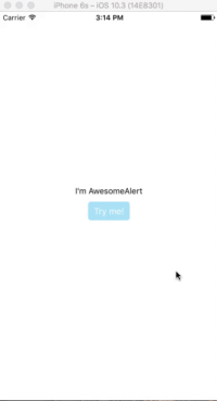
110 |
111 | ### Props
112 |
113 | #### Basic
114 |
115 | | Prop | Type | Description | Default |
116 | | :----------------------- | :-------: | :--------------------------------------------: | :------ |
117 | | show | `boolean` | Show / Hide awesome alert | false |
118 | | animatedValue | `number` | Animated value | 0.3 |
119 | | useNativeDriver | `boolean` | Use native driver for animations | false |
120 | | showProgress | `boolean` | Show / Hide progress bar | false |
121 | | title | `string` | Title text to display | hidden |
122 | | message | `string` | Message text to display | hidden |
123 | | closeOnTouchOutside | `bool` | Dismiss alert on clicking outside | true |
124 | | closeOnHardwareBackPress | `bool` | Dismiss alert on hardware back press (android) | true |
125 | | showCancelButton | `bool` | Show a cancel button | false |
126 | | showConfirmButton | `bool` | Show a confirmation button | false |
127 | | cancelText | `string` | Cancel button text | Cancel |
128 | | confirmText | `string` | Confirm button text | Confirm |
129 | | onCancelPressed | `func` | Action to perform when Cancel is pressed | - |
130 | | onConfirmPressed | `func` | Action to perform when Confirm is pressed | - |
131 | | onDismiss | `func` | Callback for when alert is dismissed | - |
132 | | customView | `object` | Custom view to render inside alert | null |
133 | | modalProps | `object` | Additional props to pass for Modal | - |
134 | | confirmButtonTestID | `string` | Confirm button testID | awesome-alert-confirm-btn|
135 | | cancelButtonTestID | `string` | Cancel button testID | awesome-alert-cancel-btn|
136 |
137 | #### Styling
138 |
139 | | Prop | Type | Description | Default |
140 | | :--------------------- | :------: | :--------------------------: | :------ |
141 | | alertContainerStyle | `object` | Alert parent container style | - |
142 | | overlayStyle | `object` | Overlay style | - |
143 | | progressSize | `string` | Size of activity indicator | - |
144 | | progressColor | `string` | Color of activity indicator | - |
145 | | contentContainerStyle | `object` | Alert popup style | - |
146 | | contentStyle | `object` | Alert popup content style | - |
147 | | titleStyle | `object` | Title style | - |
148 | | messageStyle | `object` | Message style | - |
149 | | actionContainerStyle | `object` | Action container style | - |
150 | | cancelButtonColor | `string` | Background color | #D0D0D0 |
151 | | confirmButtonColor | `string` | Background color | #AEDEF4 |
152 | | cancelButtonStyle | `object` | Cancel button style | - |
153 | | cancelButtonTextStyle | `object` | Cancel button text style | - |
154 | | confirmButtonStyle | `object` | Confirm button style | - |
155 | | confirmButtonTextStyle | `object` | Confirm button text style | - |
156 |
157 | ## Tests
158 | For automated tests, buttons default to data-testid='awesome-alert-cancel-btn' and data-testID='awesome-alert-confirm-btn'
159 | properties for the cancel and confirm buttons, respectively. However, feel free to pass in your own via the props.
160 |
161 | ## Inspiration
162 |
163 | Pedant: sweet-alert-dialog [(Github)](https://github.com/pedant/sweet-alert-dialog)
164 |
165 | ## Questions
166 |
167 | Feel free to [Contact me](mailto:rishabh.bhatia08@gmail.com) or [Create an issue](https://github.com/rishabhbhatia/react-native-awesome-alerts/issues/new)
168 |
169 | ## License
170 |
171 | Released under the [Mit License](https://opensource.org/licenses/MIT)
172 |
--------------------------------------------------------------------------------
/src/AwesomeAlert.js:
--------------------------------------------------------------------------------
1 | import React, { Component } from 'react';
2 | import {
3 | Text,
4 | Animated,
5 | View,
6 | TouchableOpacity,
7 | TouchableWithoutFeedback,
8 | ActivityIndicator,
9 | BackHandler,
10 | Modal,
11 | Platform,
12 | } from 'react-native';
13 |
14 | import PropTypes from 'prop-types';
15 |
16 | import styles from './styles';
17 |
18 | const HwBackHandler = BackHandler;
19 | const HW_BACK_EVENT = 'hardwareBackPress';
20 |
21 | const { OS } = Platform;
22 |
23 | export default class AwesomeAlert extends Component {
24 | constructor(props) {
25 | super(props);
26 | const { show } = this.props;
27 | this.springValue = new Animated.Value(props.animatedValue);
28 |
29 | this.state = {
30 | showSelf: false,
31 | };
32 |
33 | if (show) this._springShow(true);
34 | }
35 |
36 | componentDidMount() {
37 | HwBackHandler.addEventListener(HW_BACK_EVENT, this._handleHwBackEvent);
38 | }
39 |
40 | _springShow = (fromConstructor) => {
41 | const { useNativeDriver = false } = this.props;
42 |
43 | this._toggleAlert(fromConstructor);
44 | Animated.spring(this.springValue, {
45 | toValue: 1,
46 | bounciness: 10,
47 | useNativeDriver,
48 | }).start();
49 | };
50 |
51 | _springHide = () => {
52 | const { useNativeDriver = false } = this.props;
53 |
54 | if (this.state.showSelf === true) {
55 | Animated.spring(this.springValue, {
56 | toValue: 0,
57 | tension: 10,
58 | useNativeDriver,
59 | }).start();
60 |
61 | setTimeout(() => {
62 | this._toggleAlert();
63 | this._onDismiss();
64 | }, 70);
65 | }
66 | };
67 |
68 | _toggleAlert = (fromConstructor) => {
69 | if (fromConstructor) this.state = { showSelf: true };
70 | else this.setState({ showSelf: !this.state.showSelf });
71 | };
72 |
73 | _handleHwBackEvent = () => {
74 | const { closeOnHardwareBackPress } = this.props;
75 | if (this.state.showSelf && closeOnHardwareBackPress) {
76 | this._springHide();
77 | return true;
78 | } else if (!closeOnHardwareBackPress && this.state.showSelf) {
79 | return true;
80 | }
81 |
82 | return false;
83 | };
84 |
85 | _onTapOutside = () => {
86 | const { closeOnTouchOutside } = this.props;
87 | if (closeOnTouchOutside) this._springHide();
88 | };
89 |
90 | _onDismiss = () => {
91 | const { onDismiss } = this.props;
92 | onDismiss && onDismiss();
93 | };
94 |
95 | _renderButton = (data) => {
96 | const {
97 | testID,
98 | text,
99 | backgroundColor,
100 | buttonStyle,
101 | buttonTextStyle,
102 | onPress,
103 | } = data;
104 |
105 | return (
106 |
107 | {text}
108 |
109 | );
110 | };
111 |
112 | _renderAlert = () => {
113 | const animation = { transform: [{ scale: this.springValue }] };
114 |
115 | const { showProgress } = this.props;
116 | const { title, message, customView = null } = this.props;
117 |
118 | const {
119 | showCancelButton,
120 | cancelText,
121 | cancelButtonColor,
122 | cancelButtonStyle,
123 | cancelButtonTextStyle,
124 | onCancelPressed,
125 | cancelButtonTestID
126 | } = this.props;
127 |
128 | const {
129 | showConfirmButton,
130 | confirmText,
131 | confirmButtonColor,
132 | confirmButtonStyle,
133 | confirmButtonTextStyle,
134 | onConfirmPressed,
135 | confirmButtonTestID
136 | } = this.props;
137 |
138 | const {
139 | alertContainerStyle,
140 | overlayStyle,
141 | progressSize,
142 | progressColor,
143 | contentContainerStyle,
144 | contentStyle,
145 | titleStyle,
146 | messageStyle,
147 | actionContainerStyle,
148 | } = this.props;
149 |
150 | const cancelButtonData = {
151 | testID: cancelButtonTestID,
152 | text: cancelText,
153 | backgroundColor: cancelButtonColor,
154 | buttonStyle: cancelButtonStyle,
155 | buttonTextStyle: cancelButtonTextStyle,
156 | onPress: onCancelPressed,
157 | };
158 |
159 | const confirmButtonData = {
160 | testID: confirmButtonTestID,
161 | text: confirmText,
162 | backgroundColor: confirmButtonColor,
163 | buttonStyle: confirmButtonStyle,
164 | buttonTextStyle: confirmButtonTextStyle,
165 | onPress: onConfirmPressed,
166 | };
167 |
168 | return (
169 |
170 |
171 |
172 |
173 |
176 |
177 | {showProgress ? (
178 |
179 | ) : null}
180 | {title ? (
181 | {title}
182 | ) : null}
183 | {message ? (
184 | {message}
185 | ) : null}
186 | {customView}
187 |
188 |
189 | {showCancelButton ? this._renderButton(cancelButtonData) : null}
190 | {showConfirmButton ? this._renderButton(confirmButtonData) : null}
191 |
192 |
193 |
194 | );
195 | };
196 |
197 | render() {
198 | const { show, showSelf } = this.state;
199 | const { modalProps = {}, closeOnHardwareBackPress } = this.props;
200 |
201 | const wrapInModal = OS === 'android' || OS === 'ios';
202 |
203 | return showSelf ?
204 | wrapInModal ? (
205 | {
210 | if (showSelf && closeOnHardwareBackPress) {
211 | this._springHide();
212 | }
213 | }}
214 | {...modalProps}
215 | >
216 | {this._renderAlert()}
217 |
218 | ) : this._renderAlert()
219 | : null;
220 | }
221 |
222 | UNSAFE_componentWillReceiveProps(nextProps) {
223 | const { show } = nextProps;
224 | const { showSelf } = this.state;
225 |
226 | if (show && !showSelf) this._springShow();
227 | else if (show === false && showSelf) this._springHide();
228 | }
229 |
230 | componentWillUnmount() {
231 | HwBackHandler.removeEventListener(HW_BACK_EVENT, this._handleHwBackEvent);
232 | }
233 | }
234 |
235 | AwesomeAlert.propTypes = {
236 | show: PropTypes.bool,
237 | animatedValue: PropTypes.number,
238 | useNativeDriver: PropTypes.bool,
239 | showProgress: PropTypes.bool,
240 | title: PropTypes.string,
241 | message: PropTypes.string,
242 | closeOnTouchOutside: PropTypes.bool,
243 | closeOnHardwareBackPress: PropTypes.bool,
244 | showCancelButton: PropTypes.bool,
245 | showConfirmButton: PropTypes.bool,
246 | cancelText: PropTypes.string,
247 | confirmText: PropTypes.string,
248 | cancelButtonColor: PropTypes.string,
249 | confirmButtonColor: PropTypes.string,
250 | onCancelPressed: PropTypes.func,
251 | onConfirmPressed: PropTypes.func,
252 | customView: PropTypes.oneOfType([
253 | PropTypes.element,
254 | PropTypes.node,
255 | PropTypes.func,
256 | ]),
257 | modalProps: PropTypes.object,
258 | cancelButtonTestID: PropTypes.string,
259 | confirmButtonTestID: PropTypes.string
260 | };
261 |
262 | AwesomeAlert.defaultProps = {
263 | show: false,
264 | animatedValue: 0.3,
265 | useNativeDriver: false,
266 | showProgress: false,
267 | closeOnTouchOutside: true,
268 | closeOnHardwareBackPress: true,
269 | showCancelButton: false,
270 | showConfirmButton: false,
271 | cancelText: 'Cancel',
272 | confirmText: 'Confirm',
273 | cancelButtonColor: '#D0D0D0',
274 | confirmButtonColor: '#AEDEF4',
275 | customView: null,
276 | modalProps: {},
277 | cancelButtonTestID: 'awesome-alert-cancel-btn',
278 | confirmButtonTestID: 'awesome-alert-confirm-btn'
279 | };
280 |
--------------------------------------------------------------------------------