├── .gitignore
├── cottrell2020
├── cottrell2020.R
├── cottrell2020_final.png
├── fish.png
└── readme.md
├── craven2019
├── craven2019.R
├── craven2019_final.png
└── readme.md
├── dannenberg2020
├── dannenberg2020.R
├── dannenberg2020_final.png
├── data
│ └── world_phenoregions_L1.tif
└── readme.md
├── engemann2020
├── engemann2020.R
├── engemann2020_final.png
└── readme.md
├── ggplot tips and tricks by Cédric Scherer.pdf
├── guyton2020
├── animals
│ ├── buffalo.png
│ ├── impala.png
│ ├── oribi.png
│ ├── reedbuck.png
│ ├── warthog.png
│ └── waterbuck.png
├── data
│ └── Mimosa_RRA_FOO.csv
├── guyton2020.R
├── guyton2020_final.png
└── readme.md
├── haase2020
├── haase2020.R
├── haase2020_final.png
└── readme.md
├── janssen2020
├── janssen2020-fig3_final.png
├── janssen2020_fig3.R
└── readme.md
├── klingbeil2021
├── animals
│ ├── PhyloPic.3baf6f47.Ferran-Sayol.Mesitornis_Mesitornis-unicolor_Mesitornithidae.png
│ ├── PhyloPic.822f98c6.Mason-McNair.Paspalum_Paspalum-vaginatum.png
│ ├── PhyloPic.ad11bfb7.Ferran-Sayol.Threskiornis_Threskiornis-aethiopicus_Threskiornithidae_Threskiornithinae.png
│ └── PhyloPic.ca1082e0.George-Edward-Lodge-modified-by-T-Michael-Keesey.Aves.png
├── klingbeil2021.R
├── klingbeil2021_final.png
└── readme.md
├── macdougall2020
├── macdougall2020.R
├── macdougall2020_final.png
└── readme.md
├── nerlekar2020
├── nerlekar2020.R
├── nerlekar2020_final.png
├── point_data.csv
└── readme.md
├── ober2020
├── ober2020.R
├── ober2020_final.png
└── readme.md
├── readme.md
├── reyes2019
├── readme.md
├── reyes2019.R
└── reyes2019_final.png
├── suggitt2019
├── data
│ ├── Koppen_Geiger Edited and Completed
│ │ ├── Read me.txt
│ │ ├── Shapefiles
│ │ │ ├── world_climates_completed_koppen_geiger.cpg
│ │ │ ├── world_climates_completed_koppen_geiger.dbf
│ │ │ ├── world_climates_completed_koppen_geiger.prj
│ │ │ ├── world_climates_completed_koppen_geiger.qpj
│ │ │ ├── world_climates_completed_koppen_geiger.shp
│ │ │ └── world_climates_completed_koppen_geiger.shx
│ │ └── Style
│ │ │ └── world_climate.qml
│ └── Vellend_data_updated.csv
├── readme.md
├── suggitt2019.R
├── suggitt2019_final.png
└── suggitt2019_original.jpg
├── sullivan2020
├── map_points.geojson
├── readme.md
├── sullivan2020.R
└── sullivan2020_final.png
├── thein2020
├── create_data.R
├── readme.md
├── simulated_data.csv
├── thein2020.R
└── thein2020_final.png
├── yan2019
├── readme.md
├── yan2019.R
└── yan2019_final.png
└── zhang2020
├── readme.md
├── zhang2020.R
└── zhang2020_final.png
/.gitignore:
--------------------------------------------------------------------------------
1 | # History files
2 | .Rhistory
3 | .Rapp.history
4 |
5 | # Session Data files
6 | .RData
7 |
8 | # User-specific files
9 | .Ruserdata
10 |
11 | # Example code in package build process
12 | *-Ex.R
13 |
14 | # Output files from R CMD build
15 | /*.tar.gz
16 |
17 | # Output files from R CMD check
18 | /*.Rcheck/
19 |
20 | # RStudio files
21 | .Rproj.user/
22 |
23 | # produced vignettes
24 | vignettes/*.html
25 | vignettes/*.pdf
26 |
27 | # OAuth2 token, see https://github.com/hadley/httr/releases/tag/v0.3
28 | .httr-oauth
29 |
30 | # knitr and R markdown default cache directories
31 | *_cache/
32 | /cache/
33 |
34 | # Temporary files created by R markdown
35 | *.utf8.md
36 | *.knit.md
37 |
38 | # R Environment Variables
39 | .Renviron
40 |
--------------------------------------------------------------------------------
/cottrell2020/cottrell2020.R:
--------------------------------------------------------------------------------
1 | library(tidyverse)
2 | library(cowplot)
3 | library(ggnewscale)
4 | library(png)
5 |
6 | ##################################
7 | # This is a replication of Figure 1 from the following paper
8 | # Cottrell, R.S., Blanchard, J.L., Halpern, B.S. et al. Global adoption of novel
9 | # aquaculture feeds could substantially reduce forage fish demand by 2030.
10 | # Nature Food 1, 301–308 (2020). https://doi.org/10.1038/s43016-020-0078-x
11 |
12 | # This figure uses simulated data and is not an exact copy.
13 | # It's meant for educational purposes only.
14 | #############################################
15 | # First generate random data to use in the figure
16 | generate_random_timeseries = function(n,initial_value, trend,error){
17 | ts = 1:n
18 | ts[1] = initial_value
19 | for(t in 2:n){
20 | ts[t] = ts[t-1] + trend + rnorm(1, mean=0, sd=error)
21 | }
22 | return(ts)
23 | }
24 |
25 | set.seed(2)
26 |
27 | years=1960:2013
28 | timeseries_data = tibble(aquaculture = generate_random_timeseries(n=length(years),initial_value = 0, trend=4e4, error = 2e6))
29 | timeseries_data$total_animal_feed = timeseries_data$aquaculture + 8e6 + rnorm(nrow(timeseries_data), mean=0,sd=2e6)
30 | timeseries_data$historic_supply = timeseries_data$aquaculture + 20e6 + rnorm(nrow(timeseries_data), mean=0,sd=2e6)
31 | timeseries_data$year = years
32 |
33 | # Make the timeseries data tidy for use in ggplot
34 | timeseries_data_long = timeseries_data %>%
35 | pivot_longer(cols =c(aquaculture, total_animal_feed, historic_supply), names_to = 'demand_type', values_to = 'tonnes')
36 |
37 | # It's common to have values with _ and stuff in them so they're easier to use column names and stuff,
38 | # but those usually make for bad figure text. Use a factor to assign nice labels, and at the same time
39 | # specify the order of those labels. Which specified the order they get colored and the order in the legend.
40 | demand_type_values = c('historic_supply','total_animal_feed','aquaculture')
41 | demand_type_labels = c('Historical Supply','Total animal feed use','Aquaculture use')
42 |
43 | timeseries_data_long$demand_type = factor(timeseries_data_long$demand_type, levels=demand_type_values,
44 | labels = demand_type_labels, ordered = TRUE)
45 | ######################################
46 | avg_value_labels = tribble(
47 | ~label_y, ~avg_label,
48 | 32e6, 'Average Supply\n1980-2013',
49 | 24e6, 'Proposed\nEBFM limit',
50 | 18e6, 'Average feed use\n1980-2013'
51 | )
52 |
53 | timeseries_plot = ggplot(timeseries_data_long,aes(x=year, y=tonnes, color=demand_type)) +
54 | geom_line(size=2) +
55 | scale_color_manual(values=c('steelblue1','black','grey50')) +
56 | ggnewscale::new_scale_color() +
57 | geom_segment(x=2013,xend=2035,y=30e6,yend=30e6, color='black', linetype='solid', size=1.5) + # avg supply '80-'13 # These 3 lines and labels off to the right are easiest to do 1 at a time.
58 | geom_segment(x=2013,xend=2035,y=22e6,yend=22e6, color='black',linetype='dashed', size=1.5) + # proposed limit # Its possible to make a data.frame defining each one as was done with the text, but
59 | geom_segment(x=2013,xend=2035,y=20e6,yend=20e6, color='grey50',linetype='solid', size=1.5) + # avg feed use # it gets complicated because of the different colors also used in the mains lines and forming a single legend.
60 | geom_text(data=avg_value_labels,aes(x=2014,y=label_y,label=avg_label),size=8,hjust=0,inherit.aes = F) + # inherit.aes=FALSE here because the label data.frame does not have demand type, specified in the main ggplot call
61 | geom_vline(xintercept = 2013, color='grey50',linetype='dashed') + # y, and x values are different than whats in the main ggplot() call.
62 | scale_x_continuous(breaks=c(1970,1990,2010,2030), limits = c(1960,2035)) +
63 | #scale_y_continuous(labels = scales::label_math(.x, format=function(l){paste(l/10e5,'x 10^6')})) +
64 | #scale_y_continuous(labels = function(l){paste(l/10e5,'x 10^6')}) +
65 | scale_y_continuous(limits = c(0,4.1e7),breaks = c(0,1e7,2e7,3e7,4e7), expand = c(0,0), # Expand here takes the buffer off the top and bottom, putting the 0 values directly on the bottom axis line.
66 | labels=parse(text=c('0','10 %*% 10^6','20 %*% 10^6','30 %*% 10^6','40 %*% 10^6'))) + # scales::label_math or scales::label_scientific are probably able to make these labels automatically,
67 | theme_classic(35) + # but I could not figure out how to get this exact format.
68 | theme(legend.position = c(0.18,0.98),
69 | legend.text = element_text(size=25),
70 | legend.key.width = unit(25,'mm'),
71 | legend.title = element_blank(),
72 | legend.background = element_blank(),
73 | axis.line = element_line(color='grey80'),
74 | axis.text = element_text(color='black')) +
75 | labs(y='Forage fish demand (tonnes)',x='Year')
76 |
77 | ########################################################
78 | # The bar plot
79 |
80 | # eyeball the mean values
81 | barplot_data = tribble(
82 | ~scenario,~demand,~demand_sd,
83 | 'BAU', 22e6, 2e6,
84 | 'Rap.Gr.',26e6, 2e6,
85 | 'Cons.Shft',37e6, 2e6
86 | )
87 |
88 | # Make scenario and put them in the same order specified in the tribble
89 | # to specify the left-> right order on the x-axis.
90 | barplot_data$scenario = fct_inorder(barplot_data$scenario)
91 |
92 | barplot = ggplot(barplot_data, aes(x=scenario, y=demand, fill=scenario)) +
93 | geom_col(width=0.5) +
94 | scale_fill_manual(values=c('midnightblue','palegreen3','deeppink3')) + # interesting color choices here...
95 | geom_errorbar(aes(ymax = demand+demand_sd, ymin=demand-demand_sd), width=0.1, size=1) +
96 | geom_hline(yintercept = 30e6, color='black', linetype='solid',size=1.5) + # avg supply '80-'13
97 | geom_hline(yintercept=22e6, color='black',linetype='dashed',size=1.5) + # proposed limit
98 | geom_hline(yintercept=20e6, color='grey50',linetype='solid',size=1.5) + # avg feed use
99 | scale_y_continuous(limits = c(0,4.1e7),breaks = c(0,1e7,2e7,3e7,4e7), expand = c(0,0),
100 | labels=parse(text=c('0','10 %*% 10^6','20 %*% 10^6','30 %*% 10^6','40 %*% 10^6'))) +
101 | theme_bw(35) +
102 | theme(legend.position = 'none',
103 | panel.border = element_blank(),
104 | panel.grid = element_blank(),
105 | axis.line = element_line(color='grey80'),
106 | axis.text = element_text(color='black')) +
107 | labs(y='Forage fish demand (tonnes)', x='Aquaculture 2030 scenario')
108 |
109 | #######################################################
110 | fish = png::readPNG('cottrell2020/fish.png')
111 |
112 | final_figure = plot_grid(timeseries_plot, barplot, nrow = 1,
113 | rel_heights = c(0.9,0.9), rel_widths = c(1,0.7),
114 | labels = c('a','b'), label_size = 40) +
115 | draw_image(fish,x=0.44, y=0.82, width=0.12, height=0.12)
116 |
117 | water_mark = 'Example figure for educational purposes only. Not made with real data.\n See github.com/sdtaylor/complex_figure_examples'
118 |
119 | final_figure = ggdraw(final_figure) +
120 | geom_rect(data=data.frame(xmin=0.05,ymin=0.05), aes(xmin=xmin,ymin=ymin, xmax=xmin+0.4,ymax=ymin+0.1),alpha=0.9, fill='grey90', color='black') +
121 | draw_text(water_mark, x=0.05, y=0.1, size=20, hjust = 0)
122 |
123 | save_plot('./cottrell2020/cottrell2020_final.png', plot=final_figure,
124 | base_height = 30, base_width = 70, units='cm', dpi=50)
125 |
126 |
--------------------------------------------------------------------------------
/cottrell2020/cottrell2020_final.png:
--------------------------------------------------------------------------------
https://raw.githubusercontent.com/sdtaylor/complex_figure_examples/bbfb102e71f6b9a6177e0845996594d962225dbc/cottrell2020/cottrell2020_final.png
--------------------------------------------------------------------------------
/cottrell2020/fish.png:
--------------------------------------------------------------------------------
https://raw.githubusercontent.com/sdtaylor/complex_figure_examples/bbfb102e71f6b9a6177e0845996594d962225dbc/cottrell2020/fish.png
--------------------------------------------------------------------------------
/cottrell2020/readme.md:
--------------------------------------------------------------------------------
1 | ## Paper
2 | Cottrell, R.S., Blanchard, J.L., Halpern, B.S. et al. Global adoption of novel aquaculture feeds could substantially reduce forage fish demand by 2030. Nature Food 1, 301–308 (2020). https://doi.org/10.1038/s43016-020-0078-x
3 |
4 | Figure 1
5 |
6 | ## Notes
7 |
8 | A good example on how to get non-standard y-axis label. It's probably possible to have the 40x10**6 format being done automatically using `scales::label_math` or `scales::label_scientific`, but I could not figure that out.
9 |
10 | ## Reproduced Figure
11 | 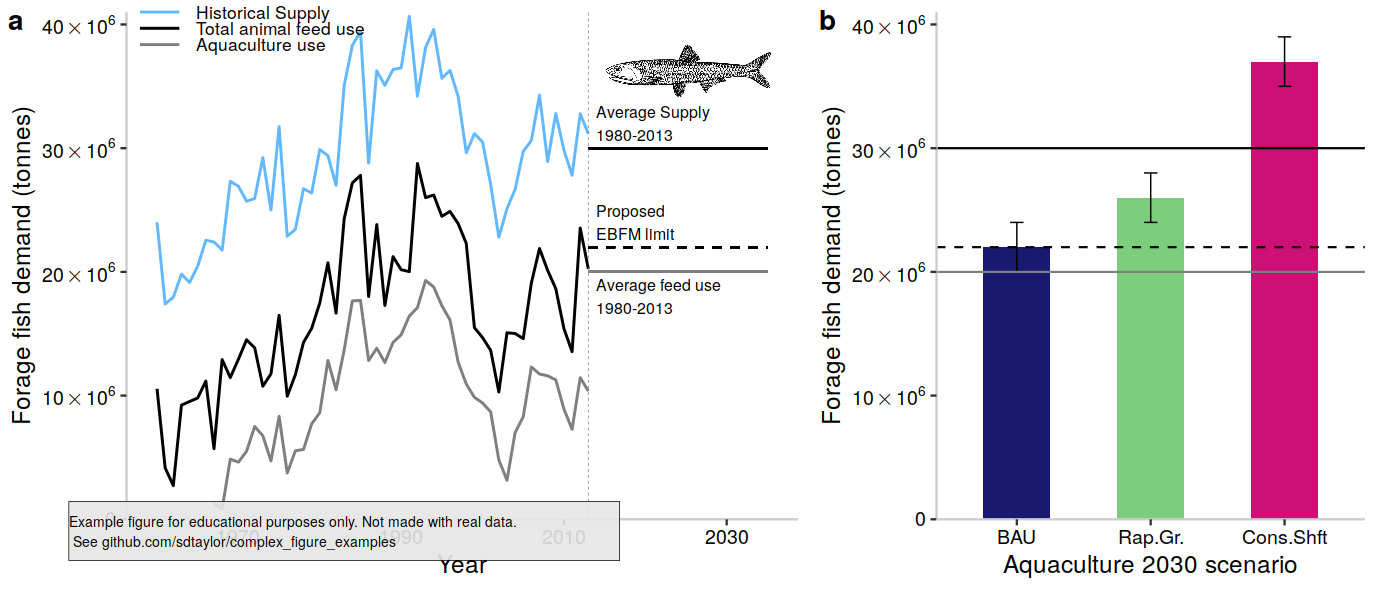
12 |
--------------------------------------------------------------------------------
/craven2019/craven2019.R:
--------------------------------------------------------------------------------
1 | library(tidyverse)
2 | library(cowplot) # cowplot is used here just for the disclaimer watermark at the end. Its not needed for the primary figure.
3 |
4 | ##################################
5 | # This is a replication of Figure 5 from the following paper
6 | # Craven, D., Knight, T.M., Barton, K.E., Bialic-Murphy, L. and Chase, J.M., 2019.
7 | # Dissecting macroecological and macroevolutionary patterns of forest biodiversity across the Hawaiian archipelago.
8 | # Proceedings of the National Academy of Sciences, 116(33), pp.16436-16441. https://doi.org/10.1073/pnas.1901954116
9 |
10 | # Data used here are simulated, and not meant to replicate the original figure exactly.
11 | ##################################
12 | set.seed(1)
13 |
14 | data_starter = tribble(
15 | ~island, ~species, ~beta_s_mean,
16 | "Hawai'i",'All species', 8,
17 | "Hawai'i",'Native species', 7,
18 | "Maui Nui",'All species', 7,
19 | "Maui Nui",'Native species', 6.5,
20 | "O'ahu",'All species', 9,
21 | "O'ahu",'Native species', 11,
22 | "Kaua'i",'All species', 10,
23 | "Kaua'i",'Native species', 17,
24 | )
25 |
26 | # Make the order as the same specified above. This affects the left-right ordering on the x-axis.
27 | data_starter$island = fct_inorder(data_starter$island)
28 |
29 | figure_data = data_starter %>%
30 | group_by(island, species) %>%
31 | summarise(beta_s = rnorm(n=100, mean=beta_s_mean, sd=2)) %>%
32 | ungroup()
33 |
34 | # The fading effect around the points of this plot are points of individual observations.
35 | # They have a low alpha value, so when a lot are stacked together it becomes darker.
36 | # Its done here with geom_point() and the alpha argument.
37 |
38 | # How does position_dodge() know to split them up by species?? It references the group argument in the first aes() call,
39 | # which is not set explicitly but gets set automatically when color is set. Try replacing color with group to see what happens.
40 |
41 | final_figure = ggplot(figure_data, aes(x=island, y=beta_s, color=species)) +
42 | geom_point(position = position_dodge(width = 0.5),size=3, alpha=0.1) +
43 | stat_summary(geom='point', fun = 'mean', # This places the mean point at the center.
44 | size=7,
45 | position = position_dodge(width=0.5)) +
46 | scale_color_manual(values = c("purple4","darkorange")) +
47 | theme_bw(25) +
48 | theme(legend.position = 'top',
49 | legend.direction = 'horizontal',
50 | panel.grid = element_blank(),
51 | panel.background = element_rect(size = 2, color='black'),
52 | axis.text = element_text(face = 'bold',color='black'),
53 | legend.text = element_text(face='bold'),
54 | axis.title = element_text(face='bold')) +
55 | labs(x='', y='βs', color='') + # Note the beta symbol is a unicode character. Easiest method is copy pasting from wikipedia directly into R.
56 | guides(color=guide_legend(override.aes = list(size=10))) # With guides the legend symbols can be made bigger than whats in the plot.
57 |
58 | #############################################
59 | water_mark = 'Example figure for educational purposes only. Not made with real data.\n See github.com/sdtaylor/complex_figure_examples'
60 |
61 | final_figure = ggdraw(final_figure) +
62 | geom_rect(data=data.frame(xmin=0.05,ymin=0.15), aes(xmin=xmin,ymin=ymin, xmax=xmin+0.5,ymax=ymin+0.1),alpha=0.9, fill='grey90', color='black') +
63 | draw_text(water_mark, x=0.05, y=0.2, size=10, hjust = 0)
64 |
65 | save_plot('./craven2019/craven2019_final.png',plot = final_figure, base_height = 6.5, base_width = 10)
66 |
--------------------------------------------------------------------------------
/craven2019/craven2019_final.png:
--------------------------------------------------------------------------------
https://raw.githubusercontent.com/sdtaylor/complex_figure_examples/bbfb102e71f6b9a6177e0845996594d962225dbc/craven2019/craven2019_final.png
--------------------------------------------------------------------------------
/craven2019/readme.md:
--------------------------------------------------------------------------------
1 | ## Paper
2 | Craven, D., Knight, T.M., Barton, K.E., Bialic-Murphy, L. and Chase, J.M., 2019. Dissecting macroecological and macroevolutionary patterns of forest biodiversity across the Hawaiian archipelago. Proceedings of the National Academy of Sciences, 116(33), pp.16436-16441. https://doi.org/10.1073/pnas.1901954116
3 |
4 | Figure 5
5 |
6 | ## Notes
7 | A good example for:
8 | - using `position_dodge()` with points.
9 | - creating a nice fade effect using points with the `alpha` argument.
10 | - having special sympbols in the axis labels.
11 |
12 | ## Reproduced Figure
13 | 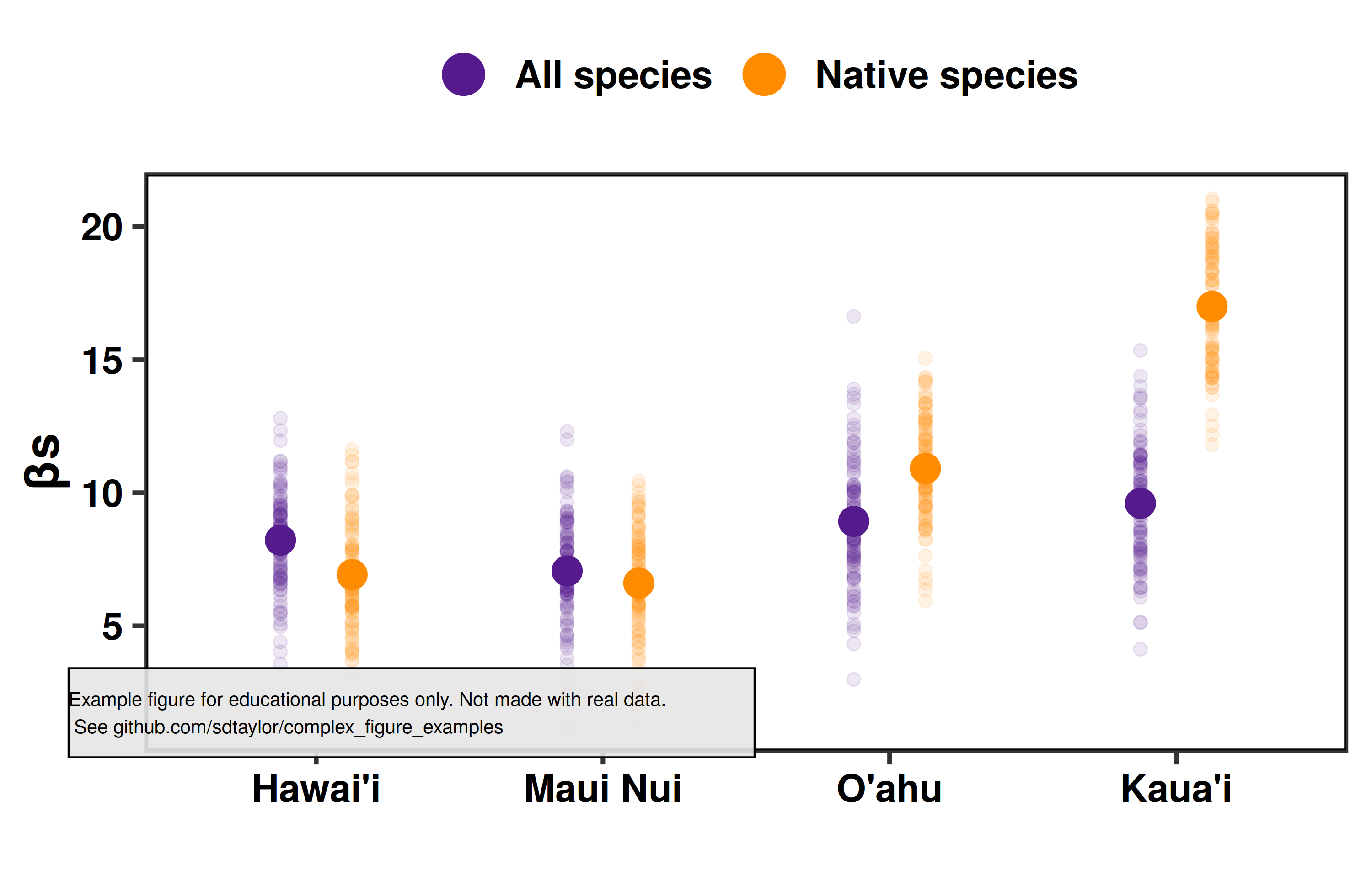
14 |
--------------------------------------------------------------------------------
/dannenberg2020/dannenberg2020.R:
--------------------------------------------------------------------------------
1 | library(tidyverse)
2 | library(sf)
3 | library(cowplot)
4 |
5 | ##################################
6 | # This is a replication of Figure 4 from the following paper
7 | # Dannenberg, M., Wang, X., Yan, D., & Smith, W. (2020). Phenological Characteristics of
8 | # Global Ecosystems Based on Optical, Fluorescence, and Microwave Remote Sensing.
9 | # Remote Sensing, 12(4), 671. https://doi.org/10.3390/rs12040671
10 |
11 | # This figure uses simulated data and is not an exact copy.
12 | # It's meant for educational purposes only.
13 | ##################################
14 |
15 |
16 | # The data is supplied as a raster. Which is converted to an sf polygon object
17 | # by way of a SpatialPolygonDataframe.
18 | # The reason for this is the sf package has great support for plotting maps in different
19 | # projections.
20 | # The phenoregion raster is from the paper. downloaded from https://data.mendeley.com/datasets/k35ry274gv/1
21 | phenoregion_raster = raster::raster('./dannenberg2020/data/world_phenoregions_L1.tif')
22 | phenoregion_polygon = raster::rasterToPolygons(phenoregion_raster)
23 | phenoregions = st_as_sf(phenoregion_polygon) %>%
24 | rename(phenoregion = world_phenoregions_L1) %>%
25 | group_by(phenoregion) %>%
26 | summarise() %>%
27 | ungroup()
28 |
29 | # The colors here are done with 4 base colors and 3 levels of "adding" more white to them.
30 | # This can be done by adjusting the transparency in ggplot thru the alpha argument.
31 | # This method of representing 2 variables is well researched see:
32 | # Kaye et al. 2012. Mapping the climate: Guidance on appropriate techniques to map climate variables and their uncertainty.
33 | # Geoscientific Model Development, 5(1), 245–256. https://doi.org/10.5194/gmd-5-245-2012
34 |
35 | # #483248 purple
36 | # #33b69b bluish
37 | # #e29601 gold
38 | # #eb6b51 red
39 | phenoregion_colors = tribble(
40 | ~phenoregion, ~color, ~alpha, ~seasonality, ~productivity,
41 | 1, '#eb6b51', 0.5, 3, 1,
42 | 2, '#e29601', 0.5, 3, 2,
43 | 3, '#33b69b', 0.5, 3, 3,
44 | 4, '#483248', 0.5, 3, 4,
45 | 5, '#eb6b51', 0.75, 2, 1,
46 | 6, '#e29601', 0.75, 2, 2,
47 | 7, '#33b69b', 0.75, 2, 3,
48 | 8, '#483248', 0.75, 2, 4,
49 | 9, '#eb6b51', 1.0, 1, 1,
50 | 10, '#e29601', 1.0, 1, 2,
51 | 11, '#33b69b', 1.0, 1, 3,
52 | 12, '#483248', 1.0, 1, 4
53 | )
54 |
55 | #################################################################################
56 | # Setup the legend.
57 | # The style of legend can't be done automatically in ggplot. But it can be done
58 | # manually be creating a 2nd smaller plot which is a 3x4 grid.
59 |
60 | base_legend = ggplot(phenoregion_colors, aes(x=productivity, y=seasonality,
61 | fill=as.factor(phenoregion), alpha=as.factor(phenoregion))) +
62 | geom_tile(colour='black', size=0.5) +
63 | geom_text(aes(label=phenoregion), size=4, alpha=1, color='black') +
64 | scale_fill_manual(values = phenoregion_colors$color) +
65 | scale_alpha_manual(values = phenoregion_colors$alpha) +
66 | theme_nothing() +
67 | labs(title = 'Phenoregion')+
68 | theme(plot.title = element_text(hjust=0.5, vjust=0, face = 'bold', size=15))
69 |
70 | full_legend= ggdraw() +
71 | draw_plot(base_legend, scale=0.6, hjust = -0.1, vjust=-0.1) +
72 | draw_text('Productivity', x = 0.55, y=0.1, size=14) +
73 | draw_line(x=c(0.4, 0.8), y=c(0.23,0.23), size=0.8, arrow = arrow(length=unit(4,'mm'))) +
74 | draw_text('Seasonality', x = 0.14, y=0.35, size=14) +
75 | draw_line(x=c(0.27, 0.27), y=c(0.35,0.75), size=0.8, arrow = arrow(length=unit(4,'mm')))
76 |
77 | ############################################
78 | # Pie chart
79 | # Getting the order and the labels on this pie chart was a huge pain.
80 | # Note that the final pie chart labels are still a bit off.
81 | # Pie charts also have well studied problems. See https://stats.stackexchange.com/questions/8974/problems-with-pie-charts/
82 | # If you're thinking of doing something similar please consider just a barchart.
83 |
84 | # The pie chart by default goes clockwise from numbers 1->12
85 | # The original pie chart in the paper is not exactly that so it must be coerced manually.
86 | pie_chart_order = data.frame(phenoregion = c(12,8,4,11,7,3,10,6,2,9,5,1))
87 | pie_chart_order$pie_order = 1:nrow(pie_chart_order)
88 |
89 | phenoregions$area = st_area(phenoregions)
90 |
91 | pie_chart_data = phenoregions %>%
92 | as_tibble() %>%
93 | select(phenoregion, area) %>%
94 | mutate(area = as.numeric(round(area/sum(area),2))) %>%
95 | mutate(chart_label = paste0(round(area*100,0),'%')) %>%
96 | left_join(phenoregion_colors, by='phenoregion') %>%
97 | left_join(pie_chart_order, by='phenoregion') %>%
98 | arrange(pie_order)
99 |
100 | # The phenoregion ordering within the factor is now coerced to the order specified above in pie_chart_order
101 | pie_chart_data$phenoregion = fct_inorder(factor(pie_chart_data$phenoregion))
102 |
103 | # The labels around the pie chart can be done by labelling specific spots
104 | # on the y axis, which is then wrapped around. The exact locations of
105 | # each labely are confusingly calculated here...
106 | pie_chart_data$label_y_pos = NA
107 | pie_chart_data$label_y_pos[1] = pie_chart_data$area[1]/2
108 | for(phenoregion_i in 2:nrow(pie_chart_data)){
109 | pie_chart_data$label_y_pos[phenoregion_i] = sum(pie_chart_data$area[1:(phenoregion_i-1)]) + (pie_chart_data$area[phenoregion_i]/2)
110 | }
111 | pie_chart_data$label_y_pos = 1-pie_chart_data$label_y_pos
112 |
113 |
114 | pie_chart = ggplot(pie_chart_data, aes(x="", y=area, fill=phenoregion,alpha=phenoregion)) +
115 | geom_bar(stat='identity', width=1, color='black') +
116 | scale_fill_manual(values=pie_chart_data$color) +
117 | scale_alpha_manual(values = pie_chart_data$alpha) +
118 | scale_y_continuous(breaks = pie_chart_data$label_y_pos, labels=pie_chart_data$chart_label) +
119 | #geom_text(aes(label=area), position = position_stack(vjust=0.5), hjust=1) +
120 | coord_polar('y',start=0, direction=-1) +
121 | theme_nothing() +
122 | theme(panel.grid = element_blank(),
123 | panel.border = element_blank(),
124 | axis.title = element_blank(),
125 | axis.ticks = element_blank(),
126 | axis.text = element_text(size=10, hjust = 2),
127 | legend.position = 'none',
128 | legend.background = element_rect(color='black'),
129 | legend.title = element_blank())
130 |
131 | #############################################
132 | # The map
133 |
134 | map = ggplot(phenoregions) +
135 | geom_sf(aes(fill=as.factor(phenoregion), alpha=as.factor(phenoregion)), color='transparent') +
136 | scale_fill_manual(values = phenoregion_colors$color) +
137 | scale_alpha_manual(values = phenoregion_colors$alpha) +
138 | coord_sf(crs = "+proj=natearth +wktext") +
139 | theme_minimal() +
140 | theme(axis.text = element_blank(),
141 | legend.position = 'none')
142 |
143 | #############################################
144 | # Put it together.
145 |
146 | final_figure = ggdraw() +
147 | draw_plot(map, x=0,y=0, scale=0.8, hjust = 0.1) +
148 | draw_plot(pie_chart, scale=0.4, x=0.38, y=0.1) +
149 | draw_plot(full_legend, scale=0.35, x=0.35, y=-0.3)
150 |
151 |
152 | water_mark = 'Example figure for educational purposes only. Not made with real data.\n See github.com/sdtaylor/complex_figure_examples'
153 |
154 | final_figure = ggdraw(final_figure) +
155 | geom_rect(data=data.frame(xmin=0.05,ymin=0.05), aes(xmin=xmin,ymin=ymin, xmax=xmin+0.4,ymax=ymin+0.1),alpha=0.9, fill='grey90', color='black') +
156 | draw_text(water_mark, x=0.05, y=0.1, size=10, hjust = 0)
157 |
158 | save_plot('./dannenberg2020/dannenberg2020_final.png', plot = final_figure, base_height = 5, base_width = 12)
159 |
--------------------------------------------------------------------------------
/dannenberg2020/dannenberg2020_final.png:
--------------------------------------------------------------------------------
https://raw.githubusercontent.com/sdtaylor/complex_figure_examples/bbfb102e71f6b9a6177e0845996594d962225dbc/dannenberg2020/dannenberg2020_final.png
--------------------------------------------------------------------------------
/dannenberg2020/data/world_phenoregions_L1.tif:
--------------------------------------------------------------------------------
https://raw.githubusercontent.com/sdtaylor/complex_figure_examples/bbfb102e71f6b9a6177e0845996594d962225dbc/dannenberg2020/data/world_phenoregions_L1.tif
--------------------------------------------------------------------------------
/dannenberg2020/readme.md:
--------------------------------------------------------------------------------
1 | ## Paper
2 | Dannenberg, M., Wang, X., Yan, D., & Smith, W. (2020). Phenological Characteristics of Global Ecosystems Based on Optical, Fluorescence, and Microwave Remote Sensing. Remote Sensing, 12(4), 671. https://doi.org/10.3390/rs12040671
3 |
4 | Figure 4
5 |
6 | ## Notes
7 | The authors provided the raster dataset for this figure which made it pretty simple. The bicolor map is a really clever way to present it (see [this study](https://doi.org/10.5194/gmd-5-245-2012) for research into it), but it was not trivial to do.
8 |
9 | The hardest part was actually the pie chart since there is not native way to label around the edge like in the original figure. If you're looking to create something similar please just use a barchart.
10 |
11 | ## Reproduced Figure
12 | 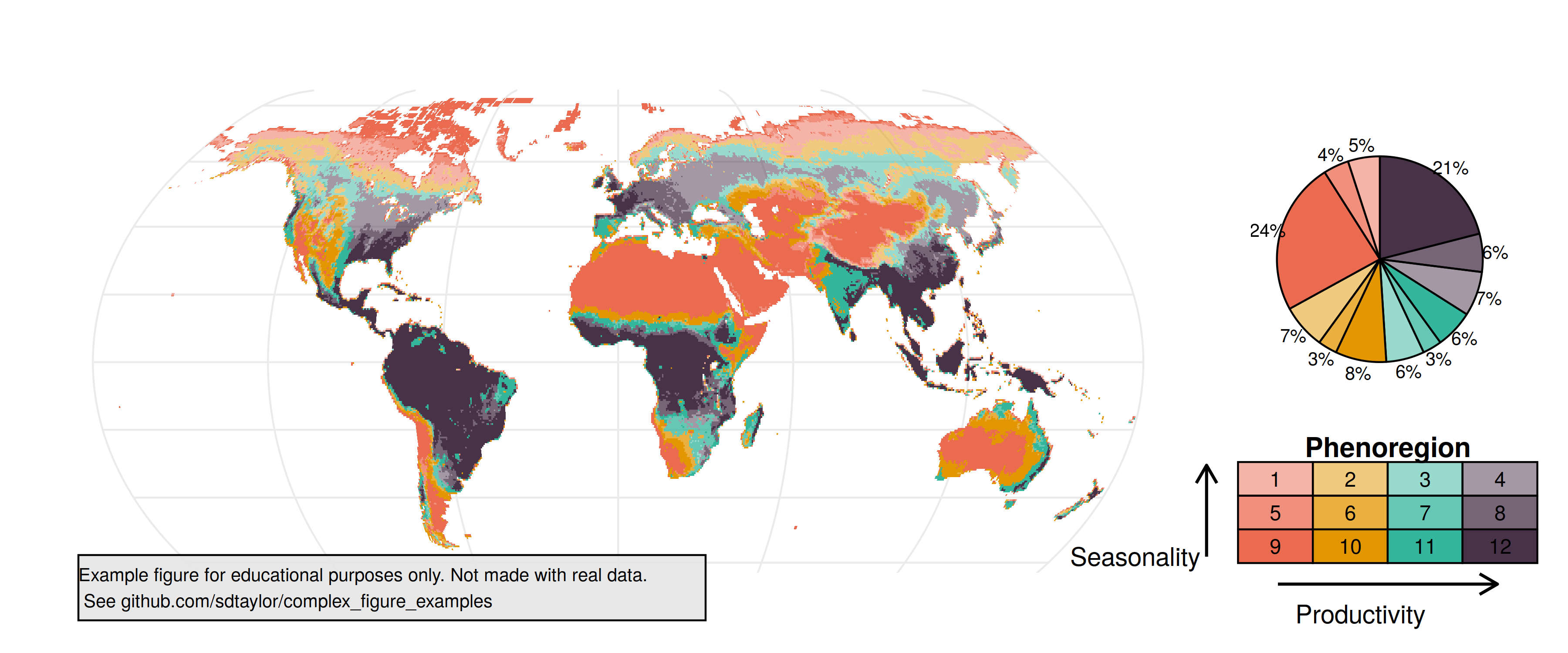
13 |
--------------------------------------------------------------------------------
/engemann2020/engemann2020.R:
--------------------------------------------------------------------------------
1 | library(tidyverse)
2 | library(cowplot) # cowplot is used here just for the disclaimer watermark at the end. Its not needed for the primary figure.
3 |
4 | ##################################
5 | # This is a replication of Figure 1 from the following paper
6 | # Engemann et al. 2020. Associations between growing up in natural
7 | # environments and subsequent psychiatric disorders in Denmark.
8 | # Environmental Research. https://doi.org/10.1016/j.envres.2020.109788.
9 |
10 | # Data used here are simulated, and not meant to replicate the original figure exactly.
11 | ##################################
12 |
13 | hazard_data = tribble(
14 | ~space_type, ~space_subtype, ~hazard_ratio, ~hazard_sd,
15 | 'Agriculture', 'Agriculture basic', 0.88, 0.01,
16 | 'Agriculture', 'Agriculture adjusted', 0.89, 0.01,
17 | 'Green space', 'Near-natural green space basic', 0.78, 0.05,
18 | 'Green space', 'Near-natural green space adjusted', 0.85, 0.05,
19 | 'Blue space', 'Blue space basic', 0.84, 0.025,
20 | 'Blue space', 'Blue space adjusted', 0.86, 0.025,
21 | 'Urban', 'Urban', 1.0, 0)
22 |
23 | # Use fct_inorder to set the factor order specified in the table above.
24 | # Otherwise the order will be alphabetical.
25 | hazard_data$space_subtype = fct_inorder(hazard_data$space_subtype)
26 | hazard_data$space_type = fct_inorder(hazard_data$space_type)
27 |
28 | final_figure = ggplot(hazard_data, aes(x=space_type, y=hazard_ratio, color=space_subtype)) +
29 | geom_hline(yintercept = 1, linetype='dotted', size=1) + # put the horizontal line first so points are drawn on top of it
30 | geom_point(position = position_dodge(width=0.2), size=4) +
31 | scale_color_manual(values = c('gold','goldenrod4','darkolivegreen3','green4','skyblue2','blue4','grey80')) +
32 | geom_errorbar(aes(ymax = hazard_ratio + hazard_sd, ymin = hazard_ratio - hazard_sd), width=0.05,
33 | position = position_dodge(width = 0.2)) +
34 | theme_bw(20) +
35 | theme(panel.grid = element_blank(),
36 | panel.border = element_blank(), # Turn off the full border but initialize the bottom and left lines
37 | axis.line.x.bottom = element_line(size=0.5),
38 | axis.line.y.left = element_line(size=0.5),
39 | axis.text.x = element_text(angle=45, hjust=1),
40 | legend.text = element_text(size=12),
41 | legend.title = element_blank()) +
42 | labs(x='',y='Hazard ratio (95% CI)')
43 |
44 | #############################################
45 | water_mark = 'Example figure for educational purposes only. Not made with real data.\n See github.com/sdtaylor/complex_figure_examples'
46 |
47 | final_figure = ggdraw(final_figure) +
48 | geom_rect(data=data.frame(xmin=0.1,ymin=0.25), aes(xmin=xmin,ymin=ymin, xmax=xmin+0.5,ymax=ymin+0.1),alpha=0.9, fill='grey90', color='black') +
49 | draw_text(water_mark, x=0.12, y=0.3, size=8, hjust = 0)
50 |
51 |
52 | save_plot('engemann2020/engemann2020_final.png', plot = final_figure, base_width = 10, base_height = 5)
53 |
--------------------------------------------------------------------------------
/engemann2020/engemann2020_final.png:
--------------------------------------------------------------------------------
https://raw.githubusercontent.com/sdtaylor/complex_figure_examples/bbfb102e71f6b9a6177e0845996594d962225dbc/engemann2020/engemann2020_final.png
--------------------------------------------------------------------------------
/engemann2020/readme.md:
--------------------------------------------------------------------------------
1 | ## Paper
2 | Engemann et al. 2020. Associations between growing up in natural environments and subsequent psychiatric disorders in Denmark. Environmental Research. https://doi.org/10.1016/j.envres.2020.109788.
3 |
4 | Figure 1
5 |
6 | ## Notes
7 | This figure pairs observations via two fields which get mapped to the x-axis and color. `position_dodge()` is used to separate the points slightly.
8 |
9 |
10 | ## Reproduced Figure
11 | 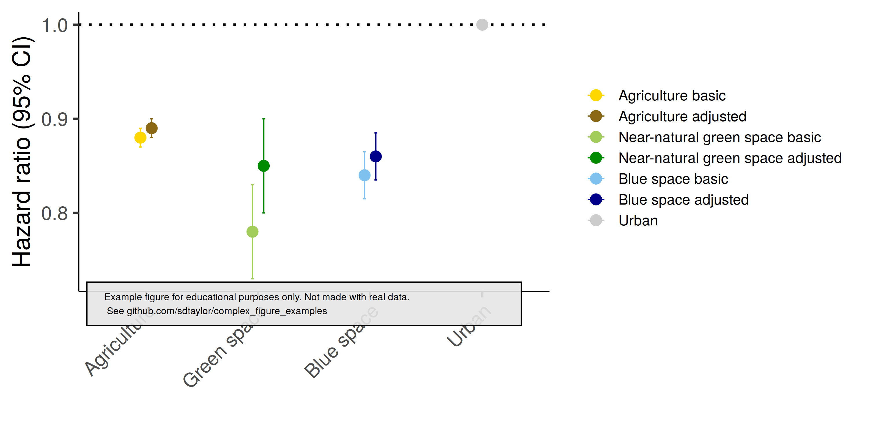
12 |
--------------------------------------------------------------------------------
/ggplot tips and tricks by Cédric Scherer.pdf:
--------------------------------------------------------------------------------
https://raw.githubusercontent.com/sdtaylor/complex_figure_examples/bbfb102e71f6b9a6177e0845996594d962225dbc/ggplot tips and tricks by Cédric Scherer.pdf
--------------------------------------------------------------------------------
/guyton2020/animals/buffalo.png:
--------------------------------------------------------------------------------
https://raw.githubusercontent.com/sdtaylor/complex_figure_examples/bbfb102e71f6b9a6177e0845996594d962225dbc/guyton2020/animals/buffalo.png
--------------------------------------------------------------------------------
/guyton2020/animals/impala.png:
--------------------------------------------------------------------------------
https://raw.githubusercontent.com/sdtaylor/complex_figure_examples/bbfb102e71f6b9a6177e0845996594d962225dbc/guyton2020/animals/impala.png
--------------------------------------------------------------------------------
/guyton2020/animals/oribi.png:
--------------------------------------------------------------------------------
https://raw.githubusercontent.com/sdtaylor/complex_figure_examples/bbfb102e71f6b9a6177e0845996594d962225dbc/guyton2020/animals/oribi.png
--------------------------------------------------------------------------------
/guyton2020/animals/reedbuck.png:
--------------------------------------------------------------------------------
https://raw.githubusercontent.com/sdtaylor/complex_figure_examples/bbfb102e71f6b9a6177e0845996594d962225dbc/guyton2020/animals/reedbuck.png
--------------------------------------------------------------------------------
/guyton2020/animals/warthog.png:
--------------------------------------------------------------------------------
https://raw.githubusercontent.com/sdtaylor/complex_figure_examples/bbfb102e71f6b9a6177e0845996594d962225dbc/guyton2020/animals/warthog.png
--------------------------------------------------------------------------------
/guyton2020/animals/waterbuck.png:
--------------------------------------------------------------------------------
https://raw.githubusercontent.com/sdtaylor/complex_figure_examples/bbfb102e71f6b9a6177e0845996594d962225dbc/guyton2020/animals/waterbuck.png
--------------------------------------------------------------------------------
/guyton2020/data/Mimosa_RRA_FOO.csv:
--------------------------------------------------------------------------------
1 | Species,Year,Season,Mean mimosa RRA,SEM Mimosa RRA,Mimosa FOO,Number of samples
2 | Waterbuck,2013,early dry,0.394033333,0.04860809,0.8,50
3 | Waterbuck,2015,early dry,0.331408333,0.033239899,0.9375,80
4 | Waterbuck,2016,early dry,0.362784314,0.084072107,0.823529412,17
5 | Waterbuck,2017,early dry,0.246729167,0.066045307,0.8125,16
6 | Waterbuck,2018,early dry,0.159577778,0.054935802,0.6,15
7 | Warthog,2013,early dry,0.013444444,0.005316793,0.366666667,30
8 | Warthog,2015,early dry,0.003631579,0.002225567,0.157894737,19
9 | Warthog,2016,early dry,0.0038,0.0038,0.2,5
10 | Warthog,2017,early dry,0.016787879,0.0159405,0.181818182,11
11 | Warthog,2018,early dry,0.022955556,0.008299542,0.6,15
12 | Reedbuck,2015,early dry,0.185541667,0.053099791,0.875,16
13 | Reedbuck,2016,early dry,0.462904762,0.135919438,0.857142857,7
14 | Reedbuck,2017,early dry,0.296,0.086345887,0.636363636,11
15 | Reedbuck,2018,early dry,0.201285714,0.076065583,0.928571429,14
16 | Impala,2015,early dry,0.592962963,0.121587664,1,9
17 | Impala,2016,early dry,0.557833333,0.130313267,1,8
18 | Impala,2017,early dry,0.281692308,0.068337726,0.769230769,13
19 | Impala,2018,early dry,0.222288889,0.066029686,0.8,15
20 | Oribi,2015,early dry,0.351333333,0.124113568,1,5
21 | Oribi,2016,early dry,0.353111111,0.107921868,0.888888889,9
22 | Oribi,2017,early dry,0.361138889,0.117984922,0.833333333,12
23 | Oribi,2018,early dry,0.266422222,0.088637682,0.733333333,15
24 | Buffalo,2015,early dry,0.409740741,0.031844755,0.962962963,27
25 | Impala,2017,late dry,0.149,0.149,0.25,4
26 | Impala,2018,late dry,0.086833333,0.055443582,0.5,6
27 | Oribi,2017,late dry,0.210208333,0.113107196,0.625,8
28 | Oribi,2018,late dry,0.723888889,0.15034722,0.8333333,6
29 | Reedbuck,2017,late dry,0.191,NA,1,1
30 | Reedbuck,2018,late dry,0.181833333,0.181833333,0.25,4
31 | Warthog,2017,late dry,0,0,0,5
32 | Warthog,2018,late dry,0.008066667,0.008066667,0.2,5
33 | Waterbuck,2017,late dry,0.309,0.165246012,0.8,5
34 | Waterbuck,2018,late dry,0.236444444,0.098060891,0.8333333,6
--------------------------------------------------------------------------------
/guyton2020/guyton2020.R:
--------------------------------------------------------------------------------
1 | library(tidyverse)
2 | library(janitor)
3 | library(cowplot)
4 | library(png)
5 |
6 | ##################################
7 | # This is a replication of Figure 5 from the following paper
8 | # Guyton, J. A. et al. (2020). Trophic rewilding revives biotic resistance to shrub invasion.
9 | # Nature Ecology & Evolution, 1-13. https://doi.org/10.1038/s41559-019-1068-y
10 |
11 | # This figure uses simulated data and is not an exact copy.
12 | # It's meant for educational purposes only.
13 | ##################################
14 |
15 | buffalo = png::readPNG('guyton2020/animals/buffalo.png')
16 | impala = png::readPNG('guyton2020/animals/impala.png')
17 | oribi = png::readPNG('guyton2020/animals/oribi.png')
18 | reedbuck = png::readPNG('guyton2020/animals/reedbuck.png')
19 | waterbuck = png::readPNG('guyton2020/animals/waterbuck.png')
20 | warthog = png::readPNG('guyton2020/animals/warthog.png')
21 |
22 |
23 | ################################
24 | # The dataset for this figure is available from https://doi.org/10.5061/dryad.sxksn02zc
25 | animal_data = read_csv('guyton2020/data/Mimosa_RRA_FOO.csv') %>%
26 | janitor::clean_names() %>%
27 | filter(season=='early dry')
28 |
29 | # Add in NA values for missing years of some animals.
30 | # This will ensure the spacing of the bar graph columns are correct.
31 | # Comment out this part to see how it affects the figure.
32 | animal_data = animal_data %>%
33 | complete(year, species)
34 |
35 | animal_order = c('Warthog','Waterbuck','Reedbuck','Impala','Oribi','Buffalo')
36 | animal_data$species = factor(animal_data$species, levels = animal_order, ordered = TRUE)
37 |
38 | # 2013, 2015, 2016, 2017, 2018
39 | year_colors = c('yellow2','orange2','palegreen4','tan3','steelblue4')
40 | animal_data$year = as.factor(animal_data$year)
41 |
42 | ############################################
43 | # Left side plot
44 | barplot_a = ggplot(animal_data, aes(x=species, y=mean_mimosa_rra, fill=as.factor(year))) +
45 | geom_col(position = position_dodge(width=1), color='black') +
46 | geom_text(aes(y=mean_mimosa_rra + sem_mimosa_rra + 0.05, label=number_of_samples),
47 | position = position_dodge(width=1)) + # note sure why geom_text needs the width set in position dodge while geom_col and geom_errobar do not
48 | geom_errorbar(aes(ymin = mean_mimosa_rra - sem_mimosa_rra, ymax=mean_mimosa_rra + sem_mimosa_rra),
49 | width=0.5,position = position_dodge(width=1)) +
50 | scale_fill_manual(values=year_colors) +
51 | ylim(0, 0.9) +
52 | labs(x='LMH',y='M. pigra relative sequence read abundance per sample') +
53 | theme_bw() +
54 | theme(panel.grid = element_blank(),
55 | axis.ticks.x = element_blank(),
56 | axis.line.x.bottom = element_line(size=0.5),
57 | axis.line.y.left = element_line(size=0.5),
58 | axis.text = element_text(face='bold', size=12),
59 | panel.background = element_blank(),
60 | panel.border = element_blank(),
61 | legend.position = c(0.08,0.75)) +
62 | guides(fill = guide_legend(title = 'Year'))
63 |
64 | barplot_a_with_animals = ggdraw() +
65 | draw_plot(barplot_a, height=0.95) +
66 | draw_image(buffalo, x=0.85, y=0.62, width=0.08, height=0.08) + # buffalo
67 | draw_image(oribi, x=0.71, y=0.65, width=0.08, height=0.08) + # oribi
68 | draw_image(impala, x=0.55, y=0.8, width=0.08, height=0.08) + # impala
69 | draw_image(reedbuck, x=0.45, y=0.72, width=0.08, height=0.08) + # reedbuck
70 | draw_image(waterbuck, x=0.27, y=0.62, width=0.08, height=0.08) + # waterbuck
71 | draw_image(warthog, x=0.12, y=0.25, width=0.08, height=0.08) # warthog
72 |
73 | ############################################
74 | # Right side plot
75 | barplot_b = ggplot(animal_data, aes(x=species, y=mimosa_foo, fill=as.factor(year))) +
76 | geom_col(position = position_dodge(), color='black') +
77 | scale_fill_manual(values=year_colors) +
78 | ylim(0, 1) +
79 | labs(x='LMH',y='Proportional occurrence of M. pigra accross samples') +
80 | theme_bw() +
81 | theme(panel.grid = element_blank(),
82 | axis.ticks.x = element_blank(),
83 | axis.line.x.bottom = element_line(size=0.5),
84 | axis.line.y.left = element_line(size=0.5),
85 | axis.text = element_text(face='bold', size=12),
86 | panel.background = element_blank(),
87 | panel.border = element_blank(),
88 | legend.position = 'none')
89 |
90 | barplot_b_with_animals =ggdraw() +
91 | draw_plot(barplot_b, height=0.95) +
92 | draw_image(buffalo, x=0.85, y=0.88, width=0.08, height=0.08) + # buffalo
93 | draw_image(oribi, x=0.71, y=0.9, width=0.08, height=0.08) + # oribi
94 | draw_image(impala, x=0.55, y=0.91, width=0.08, height=0.08) + # impala
95 | draw_image(reedbuck, x=0.42, y=0.85, width=0.08, height=0.08) + # reedbuck
96 | draw_image(waterbuck, x=0.25, y=0.88, width=0.08, height=0.08) + # waterbuck
97 | draw_image(warthog, x=0.10, y=0.5, width=0.08, height=0.08) # warthog
98 |
99 | ##############################################################3
100 |
101 | final_figure = plot_grid(barplot_a_with_animals, barplot_b_with_animals, labels = c('A','B'))
102 | water_mark = 'Example figure for educational purposes only. Not made with real data.\n See github.com/sdtaylor/complex_figure_examples'
103 |
104 | final_figure = ggdraw(final_figure) +
105 | geom_rect(data=data.frame(xmin=0.05,ymin=0.05), aes(xmin=xmin,ymin=ymin, xmax=xmin+0.4,ymax=ymin+0.1),alpha=0.9, fill='grey90', color='black') +
106 | draw_text(water_mark, x=0.05, y=0.1, size=10, hjust = 0)
107 |
108 | save_plot('./guyton2020/guyton2020_final.png', plot=final_figure, base_height = 6, base_width = 13)
109 |
--------------------------------------------------------------------------------
/guyton2020/guyton2020_final.png:
--------------------------------------------------------------------------------
https://raw.githubusercontent.com/sdtaylor/complex_figure_examples/bbfb102e71f6b9a6177e0845996594d962225dbc/guyton2020/guyton2020_final.png
--------------------------------------------------------------------------------
/guyton2020/readme.md:
--------------------------------------------------------------------------------
1 | ## Paper
2 | Guyton, J.A., Pansu, J., Hutchinson, M.C., Kartzinel, T.R., Potter, A.B., Coverdale, T.C., Daskin, J.H., da Conceição, A.G., Peel, M.J., Stalmans, M.E. and Pringle, R.M. (2020). Trophic rewilding revives biotic resistance to shrub invasion. Nature Ecology & Evolution, 1-13. https://doi.org/10.1038/s41559-019-1068-y
3 |
4 | Figure 3
5 |
6 | ## Notes
7 |
8 | An important aspect here was filling in missing values for each animal so that spacing on the x-axis is done correctly. Placement of animal silhouettes required fine tuning of each one using x,y arguments in `cowplot::draw_image()`. Also note how the primary bar graphs have their `height` in `draw_plot()` adjusted down slightly to make room for the silhouettes. The animal silhouettes are not exact matches for each species.
9 |
10 | ## Reproduced Figure
11 | 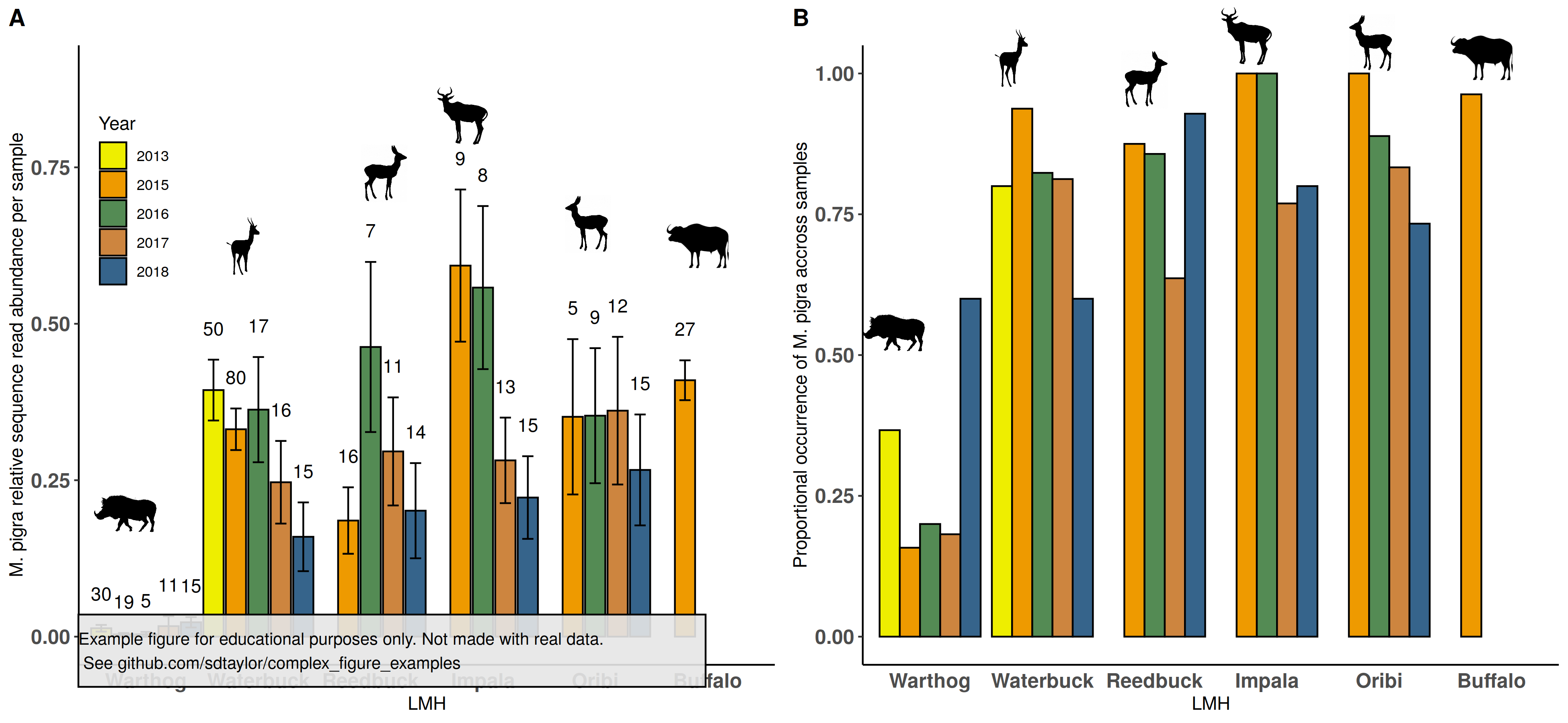
12 |
--------------------------------------------------------------------------------
/haase2020/haase2020.R:
--------------------------------------------------------------------------------
1 | library(tidyverse)
2 | library(cowplot)
3 |
4 | #--------------
5 | # This is a replication of Figure 2 from the following paper
6 | # Haase, Catherine G., et al. 2020. "Body mass and hibernation microclimate may
7 | # predict bat susceptibility to white‐nose syndrome." Ecology and Evolution.
8 | # https://doi.org/10.1002/ece3.7070
9 |
10 | # This figure uses simulated data and is not an exact copy.
11 | # It's meant for educational purposes only.
12 | #--------------
13 |
14 | figure_data = tribble(
15 | ~species, ~survival, ~survival_sd,
16 | 'Eptesicus fuscus', 105, 50,
17 | 'Corynorhinus townsendii', 60, 110,
18 | 'Myotis velifer', 60, 100,
19 | 'Perimyotis subflavus', -10, 25,
20 | 'Myotis thysanodes', -50, 100,
21 | 'Myotis volans', -55, 90,
22 | 'Myotis lucifugus', -60, 90,
23 | 'Myotis evotis', -70, 80,
24 | 'Myotis ciliolabrum', -90, 25
25 | )
26 |
27 | # Calculate low and high values for the error bars
28 | figure_data = figure_data %>%
29 | mutate(survival_low = survival - survival_sd,
30 | survival_high = survival + survival_sd)
31 |
32 | # Make the y-axis a factor with order according to the survival (lowest to highest)
33 | # note here the first position will be at the bottom (y = 0).
34 | # If this is not done then the y-axis will be ordered alphabetically
35 | figure_data$species = fct_reorder(figure_data$species, figure_data$survival)
36 |
37 |
38 | final_figure = ggplot(figure_data, aes(y=species, x=survival)) +
39 | geom_errorbarh(aes(xmin = survival_low, xmax=survival_high), height=0.2) + # Put error bars first so the points get drawn on top.
40 | geom_point(size=4, shape=21, fill='#1b9e77', color='black', stroke=0.4) + # the "21" shape is a point with an outer stroke. With this the fill arg becomes
41 | geom_vline(xintercept = 0, linetype='dashed') + # the main color, and the color arg becomes the outer line color, and stroke the outer line width.
42 | theme_bw() +
43 | theme(panel.grid = element_blank(),
44 | axis.title.x = element_text(size=12, color='black'),
45 | axis.text.x = element_text(size=12, color='black'),
46 | axis.text.y = element_text(size=14, color='black', face = 'italic')) +
47 | labs(x='Difference between Predicted Survival and Winter Duration (days)', y='')
48 |
49 |
50 | #--------------
51 | water_mark = 'Example figure for educational purposes only. Not made with real data.\n See github.com/sdtaylor/complex_figure_examples'
52 |
53 | final_figure = ggdraw(final_figure) +
54 | geom_rect(data=data.frame(xmin=0.05,ymin=0.05), aes(xmin=xmin,ymin=ymin, xmax=xmin+0.6,ymax=ymin+0.1),alpha=0.9, fill='grey90', color='black') +
55 | draw_text(water_mark, x=0.05, y=0.1, size=10, hjust = 0)
56 |
57 | save_plot('./haase2020/haase2020_final.png', plot=final_figure, base_height = 5, base_width = 8)
58 |
--------------------------------------------------------------------------------
/haase2020/haase2020_final.png:
--------------------------------------------------------------------------------
https://raw.githubusercontent.com/sdtaylor/complex_figure_examples/bbfb102e71f6b9a6177e0845996594d962225dbc/haase2020/haase2020_final.png
--------------------------------------------------------------------------------
/haase2020/readme.md:
--------------------------------------------------------------------------------
1 | ## Paper
2 | Haase, Catherine G., et al. 2020. "Body mass and hibernation microclimate may predict bat susceptibility to white‐nose syndrome." Ecology and Evolution. https://doi.org/10.1002/ece3.7070
3 |
4 | Figure 2
5 |
6 | ## Notes
7 | Good example of ordering a discrete variable by the plot values. Which makes a nice cascade affect with the points.
8 |
9 | ## Reproduced Figure
10 | 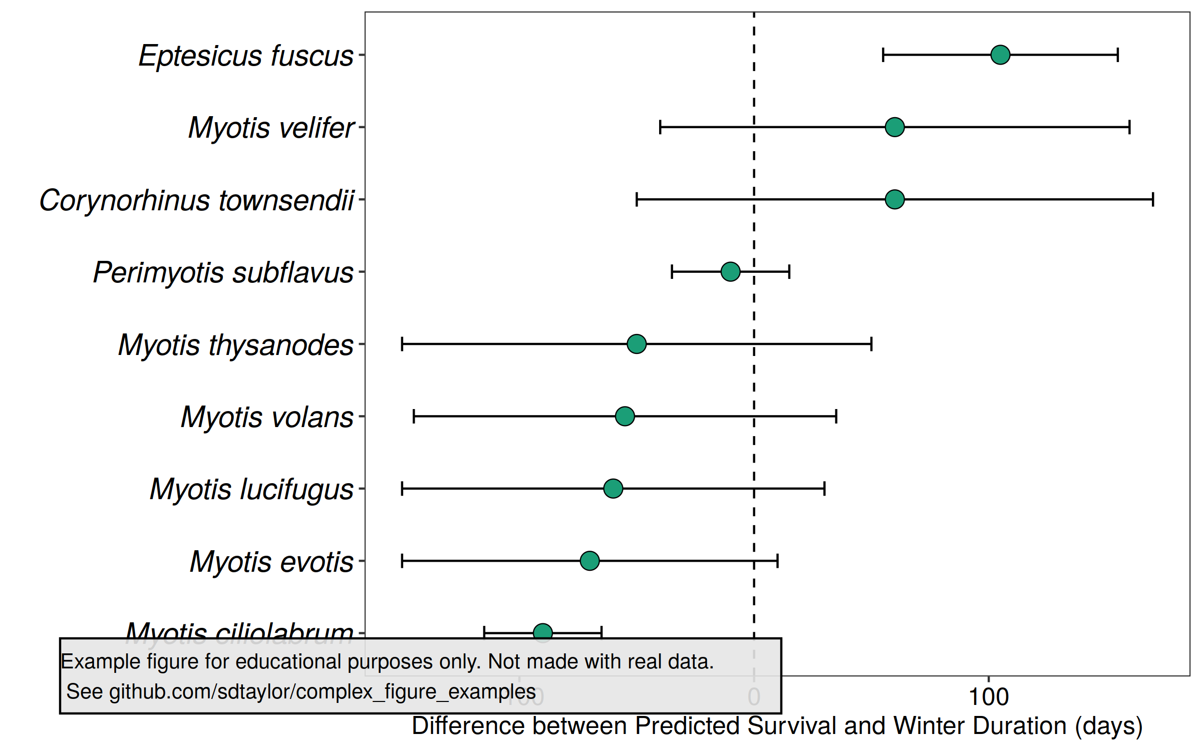
11 |
--------------------------------------------------------------------------------
/janssen2020/janssen2020-fig3_final.png:
--------------------------------------------------------------------------------
https://raw.githubusercontent.com/sdtaylor/complex_figure_examples/bbfb102e71f6b9a6177e0845996594d962225dbc/janssen2020/janssen2020-fig3_final.png
--------------------------------------------------------------------------------
/janssen2020/janssen2020_fig3.R:
--------------------------------------------------------------------------------
1 | library(tidyverse)
2 | library(cowplot) # cowplot is used here just for the disclaimer watermark at the end. Its not needed for the primary figure.
3 |
4 | ##################################
5 | # This is a replication of Figure 2 from the following paper
6 | # Janssen, T., Fleischer, K., Luyssaert, S., Naudts, K. and Dolman, H., 2020. Drought resistance increases from the individual to the ecosystem level in highly diverse neotropical rain forest: a meta-analysis of leaf, tree and ecosystem responses to drought. Biogeosciences. https://doi.org/10.5194/bg-17-2621-2020
7 |
8 | # Data used here are simulated, and not meant to replicate the original figure exactly.
9 |
10 | ##############################
11 | # Specify each y-axis label
12 | leaf_measurements = c('Midday stomatal conductance',
13 | 'Midday photosynthesis',
14 | 'Midday intrinsic water use efficiency',
15 | 'Predawn water leaf potental',
16 | 'Midday leaf water potential')
17 |
18 | tree_measurements = c('Midday water potential gradient',
19 | 'Midday soil-leaf hydraulic conductance',
20 | 'Midday crown conduncance',
21 | 'Daily transpiration',
22 | 'Stem diameter growth',
23 | 'Leaf flushing',
24 | 'Litterfall')
25 |
26 | ecosystem_measurements = c('Evapotranspiration',
27 | 'Net ecosystem productivity',
28 | 'Net primary producivity',
29 | 'Above-ground net primary productivity',
30 | 'Gross ecosystem productivity',
31 | 'Ecosystem respiration',
32 | 'Ecosystem water use efficiency')
33 |
34 | drought_types = c('seasonal','eposodic')
35 |
36 | # Setup a tidy data frame so each row represents a single point/line
37 | leaf_entries = expand_grid(measurement_level='leaf', measurement = leaf_measurements, drought_type = drought_types)
38 | tree_entries = expand_grid(measurement_level='tree', measurement = tree_measurements, drought_type = drought_types)
39 | ecosystem_entries = expand_grid(measurement_level='ecosystem', measurement = ecosystem_measurements, drought_type = drought_types)
40 |
41 | all_data = leaf_entries %>%
42 | bind_rows(tree_entries) %>%
43 | bind_rows(ecosystem_entries)
44 |
45 | # Simulate some data to get the mean, and upper/lower 95 confidence intervals in the 0-1 bounds
46 | set.seed(2)
47 | all_data$change_mean = runif(nrow(all_data), min=-1,max=0.25)
48 | all_data$change_upper = pmin(all_data$change_mean + rbeta(nrow(all_data), 2,5),1)
49 | all_data$change_lower = pmax(all_data$change_mean - rbeta(nrow(all_data), 2,5),-1)
50 |
51 | # Simulate random significance tests
52 | all_data$sig_factor = sample(c('n.s.','*','**','***'), size=nrow(all_data), replace = TRUE)
53 | all_data$sample_size = round(runif(n=nrow(all_data), min=5,max=50),0)
54 |
55 | # Build a text label to show significance test results and sample size adjacent to each line.
56 | all_data = all_data %>%
57 | mutate(measurement_text = paste0(sig_factor,'(',sample_size,')'))
58 |
59 | # The small offset between the red/blue values can be done by making a small nudge value
60 | # based on the type. y_nudge is then used inside position_nudge in ggplot
61 | all_data = all_data %>%
62 | mutate(y_line_nudge = case_when(
63 | drought_type == 'seasonal' ~ 0.15,
64 | drought_type == 'eposodic' ~ -0.15),
65 | y_text_nudge = case_when(
66 | drought_type == 'seasonal' ~ 0.5,
67 | drought_type == 'eposodic' ~ -0.5))
68 |
69 | # Setup a factor to put the measurement level in the top->down order we want in the facet_wrap
70 | # Also use it to assign a nice label with A-B labelling
71 | measurement_levels = c('leaf','tree','ecosystem')
72 | measurement_level_labels = c('(a) Leaf','(b) Tree','(c) Ecosystem')
73 | all_data$measurement_level = factor(all_data$measurement_level, levels = measurement_levels, labels = measurement_level_labels, ordered = TRUE)
74 |
75 | # Specify the ordering of the y-axis measurments.
76 | # This will be ordered in the order specified for each above.
77 | # Note ggplot will start the first entry at 0 and go up. Thus this uses fct_rev() in the first ggplot line to reverse that.
78 | all_data$measurement = factor(all_data$measurement, levels = c(leaf_measurements, tree_measurements, ecosystem_measurements), ordered = TRUE)
79 |
80 | final_figure = ggplot(all_data, aes(y=fct_rev(measurement), x=change_mean, color=drought_type)) +
81 | geom_vline(xintercept = 0) +
82 | geom_point(position = position_dodge(width = 0.5), size=2) +
83 | geom_errorbarh(aes(xmin=change_lower, xmax=change_upper), position = position_dodge(width=0.5),
84 | height=0, size=1) +
85 | geom_text(aes(label = measurement_text), position = position_dodge(width = 2), # Note the dodge with for the text is higher to push them above/below the lines
86 | size=3.5) +
87 | scale_color_manual(values=c( "#0072B2", "#D55E00")) +
88 | scale_x_continuous(breaks=c(-1,-0.5,0,0.5), labels = function(x){round(x*100,0)}) + ## Use a function in the x_axis labels to convert the percentage to a whole number
89 | facet_wrap(~measurement_level, ncol=1, scales='free_y') + ## The scales='free_y' argument here makes it so each plot only has
90 | theme_bw(15) + # the respective measurements for each level, and not empty values for others.
91 | theme(legend.position = 'none', # remove it to see what happens
92 | strip.background = element_blank(),
93 | strip.text = element_text(hjust=0, size=18, face = 'bold')) +
94 | labs(x='',y='')
95 |
96 | #############################################
97 |
98 | water_mark = 'Example figure for educational purposes only. Not made with real data.\n See github.com/sdtaylor/complex_figure_examples'
99 |
100 | final_figure = ggdraw(final_figure) +
101 | geom_rect(data=data.frame(xmin=0.05,ymin=0.05), aes(xmin=xmin,ymin=ymin, xmax=xmin+0.5,ymax=ymin+0.1),alpha=0.9, fill='grey90', color='black') +
102 | draw_text(water_mark, x=0.05, y=0.1, size=10, hjust = 0)
103 |
104 | save_plot('./janssen2020/janssen2020-fig3_final.png',plot = final_figure, base_height = 10, base_width = 10)
105 |
--------------------------------------------------------------------------------
/janssen2020/readme.md:
--------------------------------------------------------------------------------
1 | ## Paper
2 | Janssen, T., Fleischer, K., Luyssaert, S., Naudts, K. and Dolman, H., 2020. Drought resistance increases from the individual to the ecosystem level in highly diverse neotropical rain forest: a meta-analysis of leaf, tree and ecosystem responses to drought. Biogeosciences. https://doi.org/10.5194/bg-17-2621-2020
3 |
4 | ## Figure 3 Notes
5 | Great example of a multi-plot figure with a shared x-axis, and where each subplot has a unique and categorical y-axis.
6 |
7 | ## Reproduced Figure 3
8 | 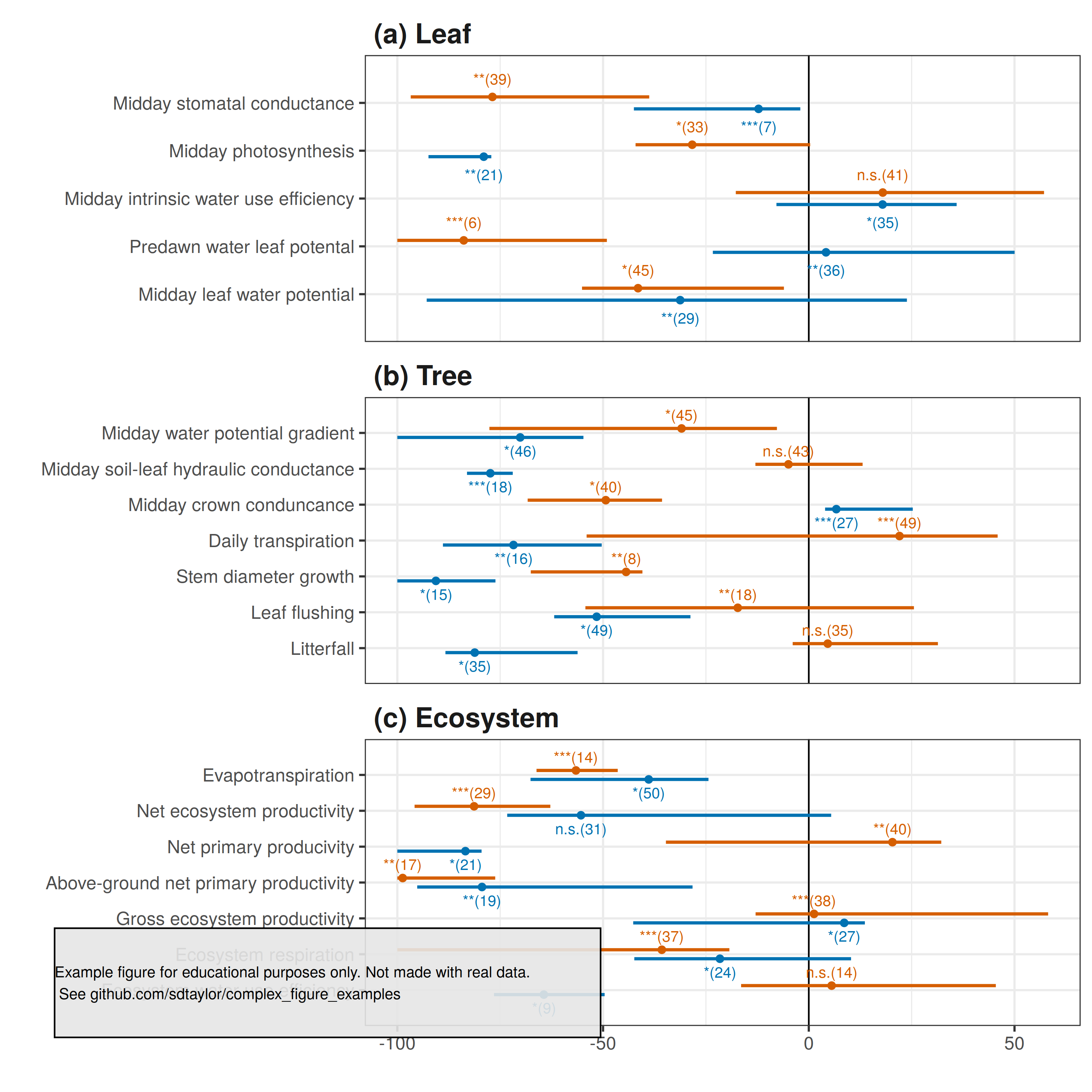
9 |
--------------------------------------------------------------------------------
/klingbeil2021/animals/PhyloPic.3baf6f47.Ferran-Sayol.Mesitornis_Mesitornis-unicolor_Mesitornithidae.png:
--------------------------------------------------------------------------------
https://raw.githubusercontent.com/sdtaylor/complex_figure_examples/bbfb102e71f6b9a6177e0845996594d962225dbc/klingbeil2021/animals/PhyloPic.3baf6f47.Ferran-Sayol.Mesitornis_Mesitornis-unicolor_Mesitornithidae.png
--------------------------------------------------------------------------------
/klingbeil2021/animals/PhyloPic.822f98c6.Mason-McNair.Paspalum_Paspalum-vaginatum.png:
--------------------------------------------------------------------------------
https://raw.githubusercontent.com/sdtaylor/complex_figure_examples/bbfb102e71f6b9a6177e0845996594d962225dbc/klingbeil2021/animals/PhyloPic.822f98c6.Mason-McNair.Paspalum_Paspalum-vaginatum.png
--------------------------------------------------------------------------------
/klingbeil2021/animals/PhyloPic.ad11bfb7.Ferran-Sayol.Threskiornis_Threskiornis-aethiopicus_Threskiornithidae_Threskiornithinae.png:
--------------------------------------------------------------------------------
https://raw.githubusercontent.com/sdtaylor/complex_figure_examples/bbfb102e71f6b9a6177e0845996594d962225dbc/klingbeil2021/animals/PhyloPic.ad11bfb7.Ferran-Sayol.Threskiornis_Threskiornis-aethiopicus_Threskiornithidae_Threskiornithinae.png
--------------------------------------------------------------------------------
/klingbeil2021/animals/PhyloPic.ca1082e0.George-Edward-Lodge-modified-by-T-Michael-Keesey.Aves.png:
--------------------------------------------------------------------------------
https://raw.githubusercontent.com/sdtaylor/complex_figure_examples/bbfb102e71f6b9a6177e0845996594d962225dbc/klingbeil2021/animals/PhyloPic.ca1082e0.George-Edward-Lodge-modified-by-T-Michael-Keesey.Aves.png
--------------------------------------------------------------------------------
/klingbeil2021/klingbeil2021.R:
--------------------------------------------------------------------------------
1 | library(tidyverse)
2 | library(cowplot)
3 | library(png)
4 |
5 |
6 | #-------------------------------
7 | # This is a replication of Figure 2 from the following paper
8 | # Klingbeil, B.T., Cohen, J.B., Correll, M.D. et al. High uncertainty over the future of
9 | # tidal marsh birds under current sea-level rise projections. Biodivers Conserv (2021).
10 | # https://doi.org/10.1007/s10531-020-02098-z
11 |
12 | # It's meant for educational purposes only.
13 | #-------------------------------
14 |
15 | # Data estimated from the original plot.
16 |
17 | figure_data = tribble(
18 | ~bird_type, ~model_type, ~marsh_area_percent,
19 | 'AREA', 'dynamic', 0.12,
20 | 'AREA', 'static', 0.10,
21 | 'CLRA', 'dynamic', 0.10,
22 | 'CLRA', 'static', 0.05,
23 | 'NESP', 'dynamic', 0.20,
24 | 'NESP', 'static', 0.25,
25 | 'SALS', 'dynamic', 0.18,
26 | 'SALS', 'static', 0.10,
27 | 'SESP', 'dynamic', 0.10,
28 | 'SESP', 'static', 0.05,
29 | 'WILL', 'dynamic', 0.11,
30 | 'WILL', 'static', 0.07
31 | )
32 |
33 |
34 | # Make the bird_type a factor with ordering as the order seen in the data.frame. This determines the x-axis order.
35 | # This isn't strictly necccesary, as the order seen in the original plot is alphabetical,
36 | # and ggplot will order it that way by default.
37 | figure_data$bird_type = forcats::fct_inorder(figure_data$bird_type)
38 |
39 | #-------------------------------
40 | # load images
41 | #-------------------------------
42 | bird1 = png::readPNG('klingbeil2021/animals/PhyloPic.3baf6f47.Ferran-Sayol.Mesitornis_Mesitornis-unicolor_Mesitornithidae.png')
43 | bird2 = png::readPNG('klingbeil2021/animals/PhyloPic.ad11bfb7.Ferran-Sayol.Threskiornis_Threskiornis-aethiopicus_Threskiornithidae_Threskiornithinae.png')
44 | bird3 = png::readPNG('klingbeil2021/animals/PhyloPic.ca1082e0.George-Edward-Lodge-modified-by-T-Michael-Keesey.Aves.png')
45 | grass = png::readPNG('klingbeil2021/animals/PhyloPic.822f98c6.Mason-McNair.Paspalum_Paspalum-vaginatum.png')
46 |
47 | #-------------------------------
48 |
49 | main_figure = ggplot(figure_data, aes(x=bird_type, y=marsh_area_percent, fill=model_type)) +
50 | geom_col(aes(y=1), position = position_dodge(width = 0.9),width=0.8, alpha=0.2) + # This first geom_col is for the faint colored bars.
51 | geom_col(position = position_dodge(width=0.9), width = 0.8) + # This geom_col draws the primary colored bars
52 | # Both sets of bars have the same fill color, but the larger ones are made fainter with alpha.
53 | # The width inside position_dodge() controls distance between grey/green bars.
54 | # Width for geom_col controls distance between paired bars (ie. between the bird types)
55 | scale_fill_manual(values=c('darkgreen','grey20')) +
56 | scale_y_continuous(breaks=c(0,0.25,0.5,0.75,1.0), labels = function(x){paste0(ceiling(x*100),'%')}) + # y axis is 0-1 but the label function converts to %
57 | theme_bw() +
58 | theme(legend.position = 'none',
59 | panel.grid = element_blank(),
60 | panel.border = element_blank(), # Turn off the full border but initialize the bottom and left lines
61 | axis.line.x.bottom = element_line(size=0.5),
62 | axis.line.y.left = element_line(size=0.5),
63 | axis.title = element_text(size=15, face = 'bold'),
64 | axis.text = element_text(color='black', size=10, face='bold'),
65 | axis.ticks.x = element_blank()) +
66 | labs(y='Percent of 2010 Estimate', x='SLR Response')
67 |
68 | #---------------------------
69 | # Add the silhouettes. The position and size of these takes a few minutes of
70 | # trial and error.
71 |
72 | figure_with_animals = ggdraw() +
73 | draw_plot(main_figure, height=0.9) +
74 | draw_image(grass, x=0.11, y=0.87, width=0.1, height=0.1) + # AREA
75 | draw_image(bird1, x=0.28, y=0.86, width=0.1, height=0.1) + # CLRA
76 | draw_image(bird2, x=0.40, y=0.86, width=0.1, height=0.1) + # NESP
77 | draw_image(bird3, x=0.56, y=0.86, width=0.1, height=0.1) + # SALS
78 | draw_image(bird1, x=0.70, y=0.86, width=0.1, height=0.1) + # SESP
79 | draw_image(bird2, x=0.85, y=0.86, width=0.1, height=0.1) # WILL
80 |
81 | #---------------------------
82 | # Add the watermark
83 |
84 | water_mark = 'Example figure for educational purposes only. Not made with real data.\n See github.com/sdtaylor/complex_figure_examples'
85 |
86 | final_figure = ggdraw(figure_with_animals) +
87 | geom_rect(data=data.frame(xmin=0.05,ymin=0.01), aes(xmin=xmin,ymin=ymin, xmax=xmin+0.6,ymax=ymin+0.1),alpha=0.9, fill='grey90', color='black') +
88 | draw_text(water_mark, x=0.05, y=0.05, size=10, hjust = 0)
89 |
90 | save_plot('./klingbeil2021/klingbeil2021_final.png', plot=final_figure, base_height = 6, base_width = 10)
91 |
--------------------------------------------------------------------------------
/klingbeil2021/klingbeil2021_final.png:
--------------------------------------------------------------------------------
https://raw.githubusercontent.com/sdtaylor/complex_figure_examples/bbfb102e71f6b9a6177e0845996594d962225dbc/klingbeil2021/klingbeil2021_final.png
--------------------------------------------------------------------------------
/klingbeil2021/readme.md:
--------------------------------------------------------------------------------
1 | ## Paper
2 | Klingbeil, B.T., Cohen, J.B., Correll, M.D. et al. High uncertainty over the future of tidal marsh birds under current sea-level rise projections. Biodivers Conserv (2021). https://doi.org/10.1007/s10531-020-02098-z
3 |
4 | Figure 2
5 |
6 | ## Notes
7 |
8 | This is a clever use of transparent columns to fill in the complete 100% of area for the bar plots and provide a nice guide for the eye.
9 |
10 | Note how the data is organized. Every unique bar value has a line of data which is labeled with the bird, and model type (green/grey). Birds are the x-axis values while the model type (green/grey) is separated with `position_dodge()`.
11 |
12 | Silhouettes are from http://phylopic.org/
13 | bird 1: http://phylopic.org/image/ca1082e0-718c-48dc-a011-995511e48180/
14 | bird 2: http://phylopic.org/image/3baf6f47-7496-45cc-b21f-3f0bee99d65b/
15 | bird 3: http://phylopic.org/image/ad11bfb7-4ab8-47d2-8e25-0e11ab947e20/
16 | grass: http://phylopic.org/image/822f98c6-4272-43ba-9414-a71345547455/
17 |
18 | ## Reproduced Figure
19 | 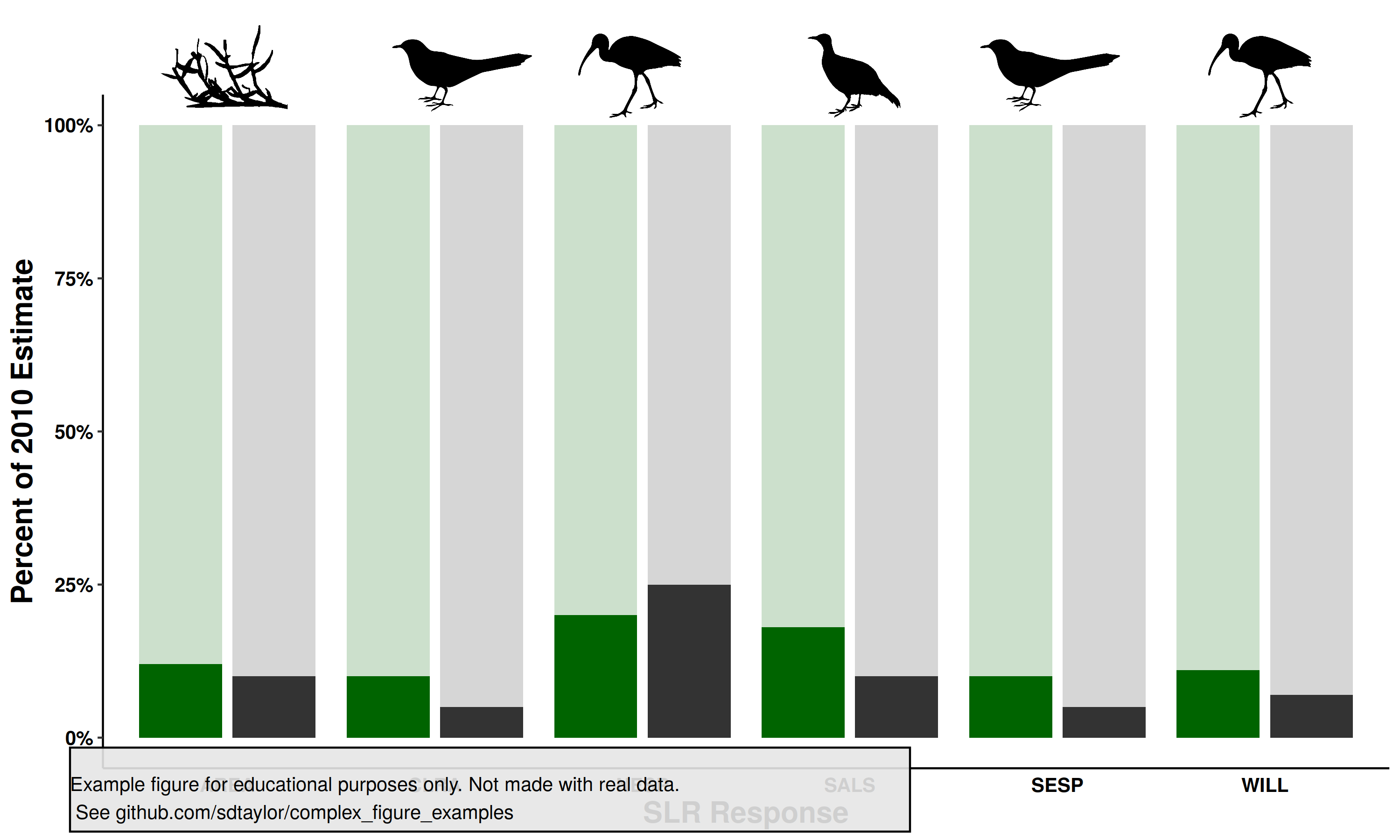
20 |
--------------------------------------------------------------------------------
/macdougall2020/macdougall2020.R:
--------------------------------------------------------------------------------
1 | library(tidyverse)
2 | library(cowplot)
3 |
4 | ##################################
5 | # This is a replication of Figure 7 from the following paper
6 | # MacDougall, Andrew H., et al. "Is there warming in the pipeline? A multi-model analysis of the zero emission commitment from CO2."
7 | # Biogeosciences Discussions (2020): 1-45. https://doi.org/10.5194/bg-17-2987-2020
8 |
9 | # Data used here are mostly simulated, and not meant to replicate the original figure exactly.
10 |
11 | #############################################
12 |
13 | # Here I judged by eye the value of everything. Note there are newline characters (\n) in the model
14 | # names for the ones to wrap to 2 lines. Alternatilly you could use stringr::str_wrap(), but that would
15 | # not give as much control in exactly how they look.
16 | flux_data = tribble(
17 | ~model, ~delta_n, ~f_ocean, ~f_land, ~zec,
18 | 'PLASIM-\nGENIE', 0.9, -0.7, -0.2, -0.38,
19 | 'GFDL\nESM2M', 0.6, -0.4, -0.2, -0.23,
20 | 'MPI-ESMI1.2', 0.6, -0.4, -0.4, -0.3,
21 | 'CanESM5', 0.85, -0.25, -0.5, -0.15,
22 | 'MIROC-\nlite', 0.5, -0.5, -0.25, -0.05,
23 | 'MIROC-\nES2L', 0.65, -0.4, -0.3, -0.05,
24 | 'LOVE\nCLIM 1.2', 1.2, -0.35, -0.5, -0.04,
25 | 'UVic\nESCM 2.10',0.6, -0.55, -0.1, -0.04,
26 | 'Bern3D\n-LPX', 0.65, -0.4, -0.3, 0.02,
27 | 'ACCESS-\nESM1.5', 0.55, -0.35, -0.1, 0.02,
28 | 'MESM', 0.62, -0.75, -0.22, 0.03,
29 | 'CNRM-ESM2', 0.88, -0.25, -0.5, 0.05,
30 | 'DCESS', 0.85, -0.4, -0.25, 0.05,
31 | 'UKESM1', 1.00, -0.43, -0.22, 0.25,
32 | 'IAPRAS', 1.4, -0.8, -0.1, 0.251
33 | )
34 |
35 | # The left to right ordering of models is small->large, based on the ZEC value of the lower bar plot.
36 | # Thats specified using this function in the forecats library, where the factor order is matched to some numeric value.
37 | flux_data$model = fct_reorder(flux_data$model, flux_data$zec)
38 |
39 | # The 3 variables in the a figure (delta_n, f_ocean, and f_land) need to be in a tidy format
40 | # where they share a common column for the flux amount, and a new column is used to identify
41 | # the flux type. The zec variable is excluded here as its used in the b figure.
42 | flux_data_long = flux_data %>%
43 | select(-zec) %>%
44 | pivot_longer(cols=c('delta_n','f_ocean','f_land'), names_to = 'flux_var', values_to = 'flux_value')
45 |
46 | # Generate random values for the error bars
47 | set.seed(2)
48 | flux_data_long$flux_value_sd = runif(n=nrow(flux_data_long), 0.1, 0.3)
49 | flux_data_long$flux_value_sd = with(flux_data_long, ifelse(flux_var=='f_ocean',NA,flux_value_sd))
50 |
51 | # The lower error bars for f_land are tricky here. The bars are specified with position_stack, but there is no
52 | # corresponding way to "stack" the error bars. See https://stackoverflow.com/a/30873811
53 | # The solution is to manually specify the error bars. So here the upper one is the sd around only the delta_n,
54 | # while the lower one is the sd around the sum(f_ocean,f_land). Each will get there own geom_errorbar call.
55 | upper_error_bars = flux_data_long %>%
56 | filter(flux_var == 'delta_n') %>%
57 | group_by(model) %>%
58 | summarise(ymax = flux_value + flux_value_sd,
59 | ymin = flux_value - flux_value_sd) %>%
60 | ungroup()
61 |
62 | lower_error_bars = flux_data_long %>%
63 | filter(flux_var %in% c('f_ocean','f_land')) %>%
64 | group_by(model) %>%
65 | summarise(ymax = sum(flux_value) + flux_value_sd,
66 | ymin = sum(flux_value) - flux_value_sd) %>%
67 | ungroup()
68 |
69 |
70 | # Specify the desired order of the 3 variables and assign the legend labels.
71 | # This affects the stacking and coloring order. I'm not sure exactly how this interacts with the negative values.
72 | # If you have have a similar problem I recommend adjusting the ordering here until you get a solution you like.
73 | # This can also potentially be adjusted by using reverse=TRUE insdie the position_stack() call for geom_col().
74 | # Note also by default the legend will go, top to bottom, f_land, f_ocean, delta_n. Thats reversed in the guide() call, which
75 | # does not affect the stacking/color order.
76 | # Δ symbol was copy pasted from wikipedia. It can go straight into the label without any special calls.
77 | flux_data_long$flux_var = factor(flux_data_long$flux_var, levels = c('f_land','f_ocean','delta_n'), labels = c('F land','F ocean','-Δ N'), ordered = T)
78 |
79 | # The flux amount column is then used for the y-axis, while they are assigned a color fill with
80 | # the flux_var column.
81 | barplot_a = ggplot(flux_data_long,aes(x=model, y=flux_value, fill=flux_var)) +
82 | geom_col(width=0.5, position = position_stack()) +
83 | geom_errorbar(data = upper_error_bars, aes(x=model,ymin = ymin, ymax = ymax), width=0, inherit.aes = FALSE) + # Note these have to not inherit the aes, the error bar data.frames
84 | geom_errorbar(data = lower_error_bars, aes(x=model,ymin = ymin, ymax = ymax), width=0, inherit.aes = FALSE) + # are expected to have a flux_value and flux_var columns.
85 | geom_hline(yintercept = 0) +
86 | scale_fill_manual(values=c('darkgreen','dodgerblue2','deepskyblue4')) +
87 | scale_y_continuous(breaks=c(-1,-0.5,0,0.5,1.0,1.5), limits = c(-1.2,1.6)) +
88 | theme_bw(5) +
89 | theme(panel.grid = element_blank(),
90 | axis.text = element_text(color='black'),
91 | axis.text.y= element_text(size=6),
92 | legend.title = element_blank(),
93 | legend.text = element_text(size=6),
94 | legend.position = c(0.07,0.91)) +
95 | guides(fill=guide_legend(reverse = TRUE, keyheight = unit(2,'mm'))) +
96 | labs(x='', y=bquote('Flux'~(Wm^-2))) # The superscript in the axis label is done via bquote. Some tutorials also use expression()
97 |
98 |
99 | barplot_b = ggplot(flux_data, aes(x=model, y=zec)) +
100 | geom_col(width=0.5, fill='black') +
101 | geom_hline(yintercept = 0) +
102 | ylim(-0.4,0.4) +
103 | theme_bw(5) +
104 | theme(panel.grid = element_blank(),
105 | panel.border = element_blank(), # Turn off the full border but initialize the bottom and left lines
106 | axis.line.x.bottom = element_line(size=0.3),
107 | axis.line.y.left = element_line(size=0.3),
108 | axis.text = element_text(color='black'),
109 | axis.text.y= element_text(size=6),
110 | legend.title = element_blank()) +
111 | labs(x='', y='ZEC (°C)')
112 |
113 | final_figure = plot_grid(barplot_a, barplot_b, ncol=1, rel_heights = c(1,0.5), align = 'h', axis='lr',
114 | labels = c('(a)','(b)'), label_size=7, label_x = 0.96, label_y=0.99, label_fontface = 'plain')
115 |
116 | #############################################
117 | water_mark = 'Example figure for educational purposes only. Not made with real data.\n See github.com/sdtaylor/complex_figure_examples'
118 |
119 | final_figure = ggdraw(final_figure) +
120 | geom_rect(data=data.frame(xmin=0.1,ymin=0.25), aes(xmin=xmin,ymin=ymin, xmax=xmin+0.5,ymax=ymin+0.1),alpha=0.9, fill='grey90', color='black') +
121 | draw_text(water_mark, x=0.12, y=0.3, size=6, hjust = 0)
122 |
123 | save_plot('macdougall2020/macdougall2020_final.png', plot = final_figure)
124 |
125 |
126 |
--------------------------------------------------------------------------------
/macdougall2020/macdougall2020_final.png:
--------------------------------------------------------------------------------
https://raw.githubusercontent.com/sdtaylor/complex_figure_examples/bbfb102e71f6b9a6177e0845996594d962225dbc/macdougall2020/macdougall2020_final.png
--------------------------------------------------------------------------------
/macdougall2020/readme.md:
--------------------------------------------------------------------------------
1 | ## Paper
2 | MacDougall, Andrew H., et al. "Is there warming in the pipeline? A multi-model analysis of the zero emission commitment from CO2." Biogeosciences Discussions (2020): 1-45. https://doi.org/10.5194/bg-17-2987-2020
3 |
4 | Figure 7
5 |
6 | ## Notes
7 | - positioning of the lower error bars needs to be done manually, since they can't be combined with the "stacking" of the bar plots.
8 | - getting the stacking order and color assignments correct is a bit finicky.
9 | - the x-axis order is specified not alphabetically, but by increasing ZEC value.
10 |
11 | ## Reproduced Figure
12 | 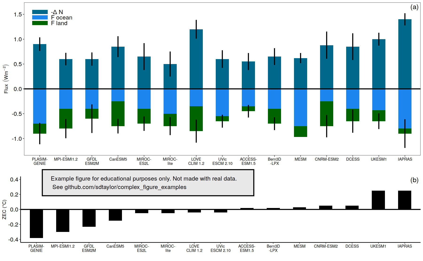
13 |
--------------------------------------------------------------------------------
/nerlekar2020/nerlekar2020.R:
--------------------------------------------------------------------------------
1 | library(tidyverse)
2 | library(sf)
3 | library(rnaturalearth)
4 | library(patchwork)
5 | library(cowplot) # note cowplot is only used to attach the watermark at the end.
6 |
7 |
8 | #--------------
9 | # This is a replication of Figure 1 from the following paper
10 | # Nerlekar, A.N. and Veldman, J.W., 2020. High plant diversity and slow assembly
11 | # of old-growth grasslands. Proceedings of the National Academy of Sciences, 117(31), pp.18550-18556.
12 | # https://doi.org/10.1073/pnas.1922266117
13 |
14 | # This figure uses simulated data and is not an exact copy.
15 | # It's meant for educational purposes only.
16 | #--------------
17 |
18 | # The data is a csv with lat,lon, map (mean annual precip), mat (mean annual temp), and the continent.
19 | # This converts it to a spatial object so it can be mapped with the sf package.
20 | point_data = read_csv('nerlekar2020/point_data.csv') %>%
21 | st_as_sf(coords = c('lon','lat'), crs=4326)
22 |
23 | # Make labels for the legend which include the sample size.
24 | point_data = point_data %>%
25 | group_by(continent) %>%
26 | mutate(continent_label = paste0(continent, ' (n=',n(),')')) %>%
27 | ungroup()
28 |
29 | # Note this palette is not color-blind friendly.
30 | # africa, asia, aus, europe, n amer, s amer
31 | continent_colors = c('salmon','black','#d55e00','#e6ab02','#56b4e9','#7570b3')
32 |
33 | # To get the affect of only land outlines as simply as possible we'll combine
34 | # two free datasets. The country and coastlines from Natural Earth. https://www.naturalearthdata.com/
35 | # vai the rnaturalearth package.
36 | # The coastline data is a *line* object, therefore it's impossible to give it a fill
37 | # color, for that we need a *polygon* object, so the country one will work.
38 | countries = ne_countries(scale=110, returnclass = 'sf')
39 | coastlines = ne_coastline(returnclass = 'sf')
40 |
41 | # The country polygon object will have the grey fill, but the lines of each country will be set to transparent.
42 | # the coastline line object will be black to create the desired affect.
43 | # Try commenting out to the 2 different lines or changing the fill/color values to see what happens.
44 |
45 | world_map_panel = ggplot() +
46 | geom_sf(data=countries, fill='grey90', color='transparent') +
47 | geom_sf(data=coastlines, color='black', size=0.25) +
48 | geom_sf(data=point_data, aes(color=continent_label),size=3) +
49 | scale_color_manual(values=continent_colors) +
50 | coord_sf(ylim = c(-50, 80)) + # Zoom in a bit to exclude antarctica
51 | theme(panel.background = element_blank(),
52 | panel.grid = element_blank(),
53 | axis.text = element_blank(),
54 | axis.title = element_blank(),
55 | legend.text = element_text(color='black', size=10),
56 | legend.key = element_blank(), # this element turns off the background of the points inside the legend.
57 | legend.title = element_blank(),
58 | legend.position = c(0.1,0.2))
59 |
60 |
61 | mat_map_panel = ggplot(point_data, aes(x=map, y=mat, color=continent_label)) +
62 | geom_point(size=4) +
63 | scale_color_manual(values=continent_colors) +
64 | scale_x_continuous(breaks = seq(0,2500,500)) +
65 | scale_y_continuous(breaks = seq(0,25,5)) +
66 | theme(panel.grid = element_blank(),
67 | panel.background = element_blank(),
68 | panel.border = element_blank(), # Turn off the full border but initialize the bottom and left lines
69 | axis.line.x.bottom = element_line(size=0.5),
70 | axis.line.y.left = element_line(size=0.5),
71 | axis.text = element_text(size=12, face='bold', color='black'),
72 | axis.title = element_text(size=13, face='bold'),
73 | legend.position = 'none') +
74 | labs(x='Mean annual precipitation (mm)', y='Mean annual temperature (°C)')
75 |
76 | # Combining plots here is done using the patchwork library.
77 | # See https://patchwork.data-imaginist.com/articles/guides/layout.html
78 | final_figure = world_map_panel + mat_map_panel +
79 | plot_layout(nrow = 1, widths = c(3,1.5)) +
80 | plot_annotation(tag_levels = 'A') & # This & is special for the patchwork library and applies the theme to all plots.
81 | theme(plot.tag = element_text(size = 16, face = 'bold')) # See https://patchwork.data-imaginist.com/articles/guides/annotation.html for detail
82 |
83 |
84 | #--------------
85 | water_mark = 'Example figure for educational purposes only. Not made with real data.\n See github.com/sdtaylor/complex_figure_examples'
86 |
87 | final_figure = ggdraw(final_figure) +
88 | geom_rect(data=data.frame(xmin=0.05,ymin=0.05), aes(xmin=xmin,ymin=ymin, xmax=xmin+0.6,ymax=ymin+0.1),alpha=0.9, fill='grey90', color='black') +
89 | draw_text(water_mark, x=0.05, y=0.1, size=10, hjust = 0)
90 |
91 | save_plot('./nerlekar2020/nerlekar2020_final.png', plot=final_figure, base_height = 4, base_width = 12)
92 |
--------------------------------------------------------------------------------
/nerlekar2020/nerlekar2020_final.png:
--------------------------------------------------------------------------------
https://raw.githubusercontent.com/sdtaylor/complex_figure_examples/bbfb102e71f6b9a6177e0845996594d962225dbc/nerlekar2020/nerlekar2020_final.png
--------------------------------------------------------------------------------
/nerlekar2020/point_data.csv:
--------------------------------------------------------------------------------
1 | continent,mat,map,lon,lat
2 | North America,23,1200,-105.1171875,39.639537564366684
3 | North America,22,1250,-87.5390625,39.232253141714885
4 | North America,21,1550,-84.287109375,31.653381399664
5 | North America,15,2000,-82.6171875,33.063924198120645
6 | Europe,15,500,17.75390625,60.23981116999893
7 | Europe,15.3,450,9.580078125,52.3755991766591
8 | Europe,15.5,550,4.921875,45.82879925192134
9 | Europe,13,800,26.19140625,49.66762782262194
10 | Europe,10,500,31.025390625,47.45780853075031
11 | Europe,10.5,550,23.37890625,46.255846818480315
12 | Europe,6.5,530,32.16796875,50.84757295365389
13 | Europe,8,750,18.45703125,53.54030739150022
14 | Europe,8.5,800,15.8203125,44.96479793033101
15 | Europe,10,750,11.42578125,47.15984001304432
16 | Europe,8.5,900,10.810546875,45.336701909968134
17 | Europe,8.7,930,36.9140625,49.439556958940855
18 | Europe,6.5,800,13.359375,53.592504809039376
19 | Asia,3,250,104.4140625,36.87962060502676
20 | Asia,2.5,550,75.5859375,50.51342652633956
21 | Asia,2.4,500,69.2578125,56.9449741808516
22 | Australia,15.5,450,146.865234375,-21.289374355860424
23 | Australia,23,530,145.1953125,-36.738884124394296
24 | Africa,22,1010,29.46533203125,-26.64745870265937
25 | Africa,12.5,1050,29.94873046875,-28.362401735238222
26 | South America,21,1200,-46.05468749999999,-22.187404991398775
27 | South America,20.5,1250,-49.833984375,-23.96617587126503
28 | South America,20,1600,-50.625,-23.644524198573677
29 | South America,15,2100,-52.91015625,-30.751277776257812
30 |
--------------------------------------------------------------------------------
/nerlekar2020/readme.md:
--------------------------------------------------------------------------------
1 | ## Paper
2 | Nerlekar, A.N. and Veldman, J.W., 2020. High plant diversity and slow assembly of old-growth grasslands. Proceedings of the National Academy of Sciences, 117(31), pp.18550-18556. https://doi.org/10.1073/pnas.1922266117
3 |
4 | Figure 1
5 |
6 | ## Notes
7 | Great world map example with attached data plot and matching points.
8 |
9 | ## Reproduced Figure
10 | 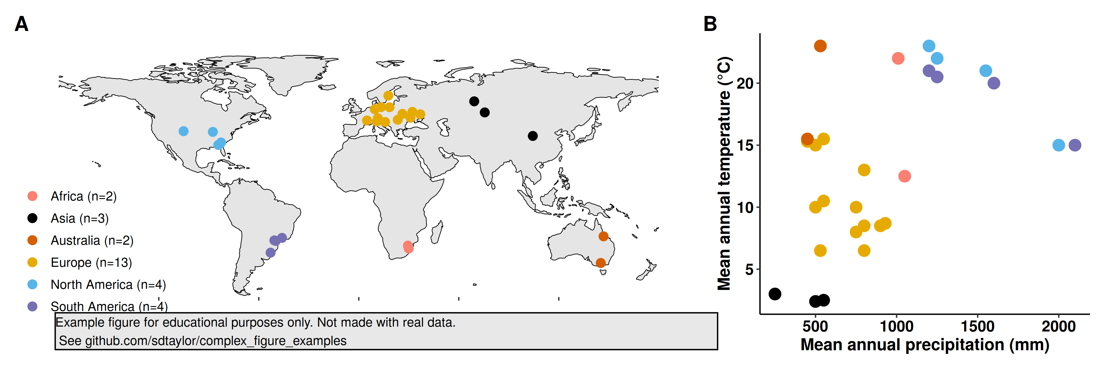
11 |
--------------------------------------------------------------------------------
/ober2020/ober2020.R:
--------------------------------------------------------------------------------
1 | library(tidyverse)
2 | library(cowplot) # cowplot is used here just for the disclaimer watermark at the end. Its not needed for the primary figure.
3 |
4 | ##################################
5 | # This is a replication of Figure 2 from the following paper
6 | # Ober, H.K., Jones, G.M., Gottlieb, I.G., Johnson, S.A., Smith, L., Brosi, B. and Fletcher, R.J., Jr. (2020),
7 | # Bat community response to intensification of biomass production
8 | # for bioenergy across the southeastern USA. Ecol Appl
9 | # https://doi.org/10.1002/eap.2155
10 |
11 | # Data used here are simulated, and not meant to replicate the original figure exactly.
12 | ##################################
13 | bats = c('Big brown*','Eastern red*','Hoary','Southeastern myotis',
14 | 'Little brown','Evening','Tri-colored','Brazillian free-tailed')
15 |
16 | habitats = c('Corn','Residue removed','Residue left','Unthinned','Thinned','Young','Mature','Reference')
17 |
18 | all_data = expand_grid(bat = bats, habitat = habitats)
19 |
20 | # Simulate some data to get the mean, and upper/lower 95 confidence intervals in the 0-1 bounds
21 | all_data$occurance_prob_mean = runif(nrow(all_data), min=0.01,max=0.95)
22 | all_data$occurance_prob_upper = pmin(all_data$occurance_prob_mean + rbeta(nrow(all_data), 2,5),1)
23 | all_data$occurance_prob_lower = pmax(all_data$occurance_prob_mean - rbeta(nrow(all_data), 2,5),0)
24 |
25 | ##########################################
26 | # Create factors in the data data.frame with the explicit order of the vectors specified above.
27 | # This affects the ordering of the facets (bats) and y-axis (habitat) of the plot.
28 | all_data$bat = factor(all_data$bat, levels = bats, ordered = TRUE)
29 | all_data$habitat = factor(all_data$habitat, levels = habitats, ordered = TRUE)
30 |
31 | ##########################################
32 | # These lines are all that is needed for the basic figure outline.
33 | # Everything else is just theme elements.
34 | primary_figure = ggplot(all_data, aes(y=fct_rev(habitat), x=occurance_prob_mean)) +
35 | geom_errorbarh(aes(xmax = occurance_prob_upper, xmin = occurance_prob_lower),size=1, height=0) + # Height here turns off vertical ends on error bars
36 | geom_point(size=4, color='black') + # You could used the shape=1 argument here to get a circle instead of a solid point. But the error bar
37 | geom_point(size=2, color='white') + # would be visible through it. Instead draw a small white point on top of a slightly larger black point.
38 | scale_x_continuous(breaks = c(0.2,0.5,0.8)) +
39 | facet_wrap(~bat, nrow=2) +
40 | labs(x='Occurrence probability (95% CRI)', y='')
41 |
42 |
43 | final_figure = primary_figure +
44 | theme_bw(10) +
45 | theme(strip.background = element_blank(), # Turn off strip background so the bat names "float"
46 | panel.grid = element_blank(), # turn off x/y grid lines
47 | panel.background = element_rect(size=2, color='black'), # make the border on each subplot bigger
48 | axis.ticks = element_line(size = 1),
49 | axis.text = element_text(size=10, face = 'bold', color='black'),
50 | axis.title = element_text(size=10, face = 'bold', color='black'),
51 | strip.text = element_text(size=10, face = 'bold', color='black'))
52 |
53 | #############################################
54 |
55 | water_mark = 'Example figure for educational purposes only. Not made with real data.\n See github.com/sdtaylor/complex_figure_examples'
56 |
57 | final_figure = ggdraw(final_figure) +
58 | geom_rect(data=data.frame(xmin=0.05,ymin=0.05), aes(xmin=xmin,ymin=ymin, xmax=xmin+0.5,ymax=ymin+0.1),alpha=0.9, fill='grey90', color='black') +
59 | draw_text(water_mark, x=0.05, y=0.1, size=10, hjust = 0)
60 |
61 | save_plot('./ober2020/ober2020_final.png',plot = final_figure, base_height = 6.5, base_width = 10)
62 |
--------------------------------------------------------------------------------
/ober2020/ober2020_final.png:
--------------------------------------------------------------------------------
https://raw.githubusercontent.com/sdtaylor/complex_figure_examples/bbfb102e71f6b9a6177e0845996594d962225dbc/ober2020/ober2020_final.png
--------------------------------------------------------------------------------
/ober2020/readme.md:
--------------------------------------------------------------------------------
1 | ## Paper
2 | Ober, H.K., Jones, G.M., Gottlieb, I.G., Johnson, S.A., Smith, L., Brosi, B. and Fletcher, R.J., Jr. (2020), Bat community response to intensification of biomass production for bioenergy across the southeastern USA. Ecolical Applications. https://doi.org/10.1002/eap.2155
3 |
4 | Figure 2
5 |
6 | ## Notes
7 | An extremely straightforward figure. Simpler is sometimes better.
8 |
9 | ## Reproduced Figure
10 | 
11 |
--------------------------------------------------------------------------------
/readme.md:
--------------------------------------------------------------------------------
1 | # ggplot scientific figure gallery
2 |
3 | This repo hosts R code for creating non-trivial figures inspired from actual scientific articles.
4 | Everything is done in R using the packages `ggplot2`,`cowplot`, and sometimes `patchwork`. When the original data is provided in a supplement it's used here, but otherwise data is simulated to produce a similar looking figure. The point is not to reproduce a figure exactly pixel by pixel, but give an example on how to structure and build them from scratch.
5 |
6 | # Gallery
7 |
8 |  9 |
9 |  10 |
10 |  11 |
11 |  12 |
12 |  13 |
13 |  14 |
14 |  15 |
15 |  16 |
16 |  17 |
17 |  18 |
18 |  19 |
19 |  20 |
20 |  21 |
21 |  22 |
22 |  23 |
23 |
24 |  25 |
25 |  26 |
--------------------------------------------------------------------------------
/reyes2019/readme.md:
--------------------------------------------------------------------------------
1 | ## Paper
2 | Reyes, J. J., & Elias, E. (2019). Spatio-temporal variation of crop loss in the United States from 2001 to 2016. Environmental Research Letters, 14(7), 074017. https://doi.org/10.1088/1748-9326/ab1ac9
3 |
4 | Figure 5
5 |
6 | ## Notes
7 | A nice way of showing variation across many categories.
8 | Note this is done using `geom_point()`, the X/O significance are different shapes.
9 |
10 | ## Reproduced Figure
11 | 
12 |
--------------------------------------------------------------------------------
/reyes2019/reyes2019.R:
--------------------------------------------------------------------------------
1 | library(tidyverse)
2 | library(cowplot) # cowplot is used here just for the disclaimer watermark at the end. Its not needed for the primary figure.
3 |
4 |
5 | cause_of_loss = c('Wind/Excess Wind','Hot Wind','Heat','Hail','Freeze','Flood','Failure Irrig Supply',
6 | 'Excess Moisture/Precip/Rain','Drought','Cold Wet Weather')
7 | time_periods = c('Annual','JAN','FEB','MAR','APR','MAY','JUN','JUL','AUG','SEP','OCT','NOV','DEC')
8 |
9 | all_data = expand_grid(cause = cause_of_loss, time = time_periods)
10 |
11 | # Order them in the order specified above. Note for the cause loss the order will be reversed
12 | # in ggplot call because I made the order top->bottom, but ggplot orders it bottom->top (ie. starting at 0 on the y-axis)
13 | all_data$cause = factor(all_data$cause, levels = cause_of_loss, ordered = TRUE)
14 | all_data$time = factor(all_data$time, levels = time_periods, ordered = TRUE)
15 |
16 | set.seed(1)
17 | # Make some random significance values
18 | all_data$tau = rnorm(n=nrow(all_data), mean=0, sd=0.3)
19 | all_data$sig = ifelse(abs(all_data$tau) > 0.6 , 'yes','no')
20 |
21 |
22 | final_figure = ggplot(all_data, aes(x=time, y=fct_rev(cause), color=tau, shape=sig)) +
23 | geom_point(size=14, stroke=5) +
24 | scale_color_distiller(palette = 'RdBu', limits=c(-1,1)) +
25 | scale_shape_manual(values=c(1,4)) +
26 | theme_bw(28) +
27 | theme(panel.grid = element_blank(),
28 | legend.position = 'bottom',
29 | axis.title = element_blank(),
30 | legend.direction = 'horizontal') +
31 | guides(color=guide_colorbar(title.position = 'top', title = 'tau', barwidth = unit(8,'cm'), barheight = unit(1.5,'cm')),
32 | shape=guide_legend(title.position = 'top', title = 'Significance', override.aes = list(size=8,stroke=3)))
33 |
34 | #############################################
35 | water_mark = 'Example figure for educational purposes only. Not made with real data.\n See github.com/sdtaylor/complex_figure_examples'
36 |
37 | final_figure = ggdraw(final_figure) +
38 | geom_rect(data=data.frame(xmin=0.05,ymin=0.15), aes(xmin=xmin,ymin=ymin, xmax=xmin+0.5,ymax=ymin+0.1),alpha=0.9, fill='grey90', color='black') +
39 | draw_text(water_mark, x=0.05, y=0.2, size=15, hjust = 0)
40 |
41 | ggsave(plot = final_figure, filename = 'reyes2019/reyes2019_final.png', width=45, height = 25, unit='cm', dpi=50)
42 |
--------------------------------------------------------------------------------
/reyes2019/reyes2019_final.png:
--------------------------------------------------------------------------------
https://raw.githubusercontent.com/sdtaylor/complex_figure_examples/bbfb102e71f6b9a6177e0845996594d962225dbc/reyes2019/reyes2019_final.png
--------------------------------------------------------------------------------
/suggitt2019/data/Koppen_Geiger Edited and Completed/Read me.txt:
--------------------------------------------------------------------------------
1 | The climate Shapefile is based on the Koppen-Geiger
2 |
3 | Vectorised by by Geoafrikana.com
4 |
5 | based on raster file from
6 | Kottek, M., J. Grieser, C. Beck, B. Rudolf, and F. Rubel, 2006: World Map of the K?ppen-Geiger climate classification updated. Meteorol. Z., 15, 259-263. DOI: 10.1127/0941-2948/2006/0130.
7 |
--------------------------------------------------------------------------------
/suggitt2019/data/Koppen_Geiger Edited and Completed/Shapefiles/world_climates_completed_koppen_geiger.cpg:
--------------------------------------------------------------------------------
1 | UTF-8
--------------------------------------------------------------------------------
/suggitt2019/data/Koppen_Geiger Edited and Completed/Shapefiles/world_climates_completed_koppen_geiger.dbf:
--------------------------------------------------------------------------------
https://raw.githubusercontent.com/sdtaylor/complex_figure_examples/bbfb102e71f6b9a6177e0845996594d962225dbc/suggitt2019/data/Koppen_Geiger Edited and Completed/Shapefiles/world_climates_completed_koppen_geiger.dbf
--------------------------------------------------------------------------------
/suggitt2019/data/Koppen_Geiger Edited and Completed/Shapefiles/world_climates_completed_koppen_geiger.prj:
--------------------------------------------------------------------------------
1 | GEOGCS["GCS_WGS_1984",DATUM["D_WGS_1984",SPHEROID["WGS_1984",6378137,298.257223563]],PRIMEM["Greenwich",0],UNIT["Degree",0.017453292519943295]]
--------------------------------------------------------------------------------
/suggitt2019/data/Koppen_Geiger Edited and Completed/Shapefiles/world_climates_completed_koppen_geiger.qpj:
--------------------------------------------------------------------------------
1 | GEOGCS["WGS 84",DATUM["WGS_1984",SPHEROID["WGS 84",6378137,298.257223563,AUTHORITY["EPSG","7030"]],AUTHORITY["EPSG","6326"]],PRIMEM["Greenwich",0,AUTHORITY["EPSG","8901"]],UNIT["degree",0.0174532925199433,AUTHORITY["EPSG","9122"]],AUTHORITY["EPSG","4326"]]
2 |
--------------------------------------------------------------------------------
/suggitt2019/data/Koppen_Geiger Edited and Completed/Shapefiles/world_climates_completed_koppen_geiger.shp:
--------------------------------------------------------------------------------
https://raw.githubusercontent.com/sdtaylor/complex_figure_examples/bbfb102e71f6b9a6177e0845996594d962225dbc/suggitt2019/data/Koppen_Geiger Edited and Completed/Shapefiles/world_climates_completed_koppen_geiger.shp
--------------------------------------------------------------------------------
/suggitt2019/data/Koppen_Geiger Edited and Completed/Shapefiles/world_climates_completed_koppen_geiger.shx:
--------------------------------------------------------------------------------
https://raw.githubusercontent.com/sdtaylor/complex_figure_examples/bbfb102e71f6b9a6177e0845996594d962225dbc/suggitt2019/data/Koppen_Geiger Edited and Completed/Shapefiles/world_climates_completed_koppen_geiger.shx
--------------------------------------------------------------------------------
/suggitt2019/data/Koppen_Geiger Edited and Completed/Style/world_climate.qml:
--------------------------------------------------------------------------------
1 |
2 |
3 |
4 |
5 |
6 |
7 |
8 |
9 |
10 |
11 |
12 |
13 |
14 |
15 |
16 |
17 |
18 |
19 |
20 |
21 |
22 |
23 |
24 |
25 |
26 |
27 |
28 |
29 |
30 |
31 |
32 |
33 |
34 |
35 |
36 |
37 |
38 |
39 |
40 |
41 |
42 |
43 |
44 |
45 |
46 |
47 |
48 |
49 |
50 |
51 |
52 |
53 |
54 |
56 |
57 |
58 |
59 |
60 |
61 |
62 |
63 |
64 |
65 |
66 |
67 |
68 |
69 |
70 |
71 |
72 |
73 |
74 |
75 |
76 |
78 |
79 |
80 |
81 |
82 |
83 |
84 |
85 |
86 |
87 |
88 |
89 |
90 |
91 |
92 |
93 |
94 |
95 |
96 |
97 |
98 |
100 |
101 |
102 |
103 |
104 |
105 |
106 |
107 |
108 |
109 |
110 |
111 |
112 |
113 |
114 |
115 |
116 |
117 |
118 |
119 |
120 |
122 |
123 |
124 |
125 |
126 |
127 |
128 |
129 |
130 |
131 |
132 |
133 |
134 |
135 |
136 |
137 |
138 |
139 |
140 |
141 |
142 |
144 |
145 |
146 |
147 |
148 |
149 |
150 |
151 |
152 |
153 |
154 |
155 |
156 |
157 |
158 |
159 |
160 |
161 |
162 |
163 |
164 |
166 |
167 |
168 |
169 |
170 |
171 |
172 |
173 |
174 |
175 |
176 |
177 |
178 |
179 |
180 |
181 |
182 |
183 |
184 |
185 |
186 |
188 |
189 |
190 |
191 |
192 |
193 |
194 |
195 |
196 |
197 |
198 |
199 |
200 |
201 |
202 |
203 |
204 |
205 |
206 |
207 |
208 |
210 |
211 |
212 |
213 |
214 |
215 |
216 |
217 |
218 |
219 |
220 |
221 |
222 |
223 |
224 |
225 |
226 |
227 |
228 |
229 |
230 |
232 |
233 |
234 |
235 |
236 |
237 |
238 |
239 |
240 |
241 |
242 |
243 |
244 |
245 |
246 |
247 |
248 |
249 |
250 |
251 |
252 |
254 |
255 |
256 |
257 |
258 |
259 |
260 |
261 |
262 |
263 |
264 |
265 |
266 |
267 |
268 |
269 |
270 |
271 |
272 |
273 |
274 |
276 |
277 |
278 |
279 |
280 |
281 |
282 |
283 |
284 |
285 |
286 |
287 |
288 |
289 |
290 |
291 |
292 |
293 |
294 |
295 |
296 |
298 |
299 |
300 |
301 |
302 |
303 |
304 |
305 |
306 |
307 |
308 |
309 |
310 |
311 |
312 |
313 |
314 |
315 |
316 |
317 |
318 |
320 |
321 |
322 |
323 |
324 |
325 |
326 |
327 |
328 |
329 |
330 |
331 |
332 |
333 |
334 |
335 |
336 |
337 |
338 |
339 |
340 |
342 |
343 |
344 |
345 |
346 |
347 |
348 |
349 |
350 |
351 |
352 |
353 |
354 |
355 |
356 |
357 |
358 |
359 |
360 |
361 |
362 |
364 |
365 |
366 |
367 |
368 |
369 |
370 |
371 |
372 |
373 |
374 |
375 |
376 |
377 |
378 |
379 |
380 |
381 |
382 |
383 |
384 |
386 |
387 |
388 |
389 |
390 |
391 |
392 |
393 |
394 |
395 |
396 |
397 |
398 |
399 |
400 |
401 |
402 |
403 |
404 |
405 |
406 |
408 |
409 |
410 |
411 |
412 |
413 |
414 |
415 |
416 |
417 |
418 |
419 |
420 |
421 |
422 |
423 |
424 |
425 |
426 |
427 |
428 |
430 |
431 |
432 |
433 |
434 |
435 |
436 |
437 |
438 |
439 |
440 |
441 |
442 |
443 |
444 |
445 |
446 |
447 |
448 |
449 |
450 |
452 |
453 |
454 |
455 |
456 |
457 |
458 |
459 |
460 |
461 |
462 |
463 |
464 |
465 |
466 |
467 |
468 |
469 |
470 |
471 |
472 |
474 |
475 |
476 |
477 |
478 |
479 |
480 |
481 |
482 |
483 |
484 |
485 |
486 |
487 |
488 |
489 |
490 |
491 |
492 |
493 |
494 |
496 |
497 |
498 |
499 |
500 |
501 |
502 |
503 |
504 |
505 |
506 |
507 |
508 |
509 |
510 |
511 |
512 |
513 |
514 |
515 |
516 |
518 |
519 |
520 |
521 |
522 |
523 |
524 |
525 |
526 |
527 |
528 |
529 |
530 |
531 |
532 |
533 |
534 |
535 |
536 |
537 |
538 |
540 |
541 |
542 |
543 |
544 |
545 |
546 |
547 |
548 |
549 |
550 |
551 |
552 |
553 |
554 |
555 |
556 |
557 |
558 |
559 |
560 |
562 |
563 |
564 |
565 |
566 |
567 |
568 |
569 |
570 |
571 |
572 |
573 |
574 |
575 |
576 |
577 |
578 |
579 |
580 |
581 |
582 |
584 |
585 |
586 |
587 |
588 |
589 |
590 |
591 |
592 |
593 |
594 |
595 |
596 |
597 |
598 |
599 |
600 |
601 |
602 |
603 |
604 |
606 |
607 |
608 |
609 |
610 |
611 |
612 |
613 |
614 |
615 |
616 |
617 |
618 |
619 |
620 |
621 |
622 |
623 |
624 |
625 |
626 |
628 |
629 |
630 |
631 |
632 |
633 |
634 |
635 |
636 |
637 |
638 |
639 |
640 |
641 |
642 |
643 |
644 |
645 |
646 |
647 |
648 |
650 |
651 |
652 |
653 |
654 |
655 |
656 |
657 |
658 |
659 |
660 |
661 |
662 |
663 |
664 |
665 |
666 |
667 |
668 |
669 |
670 |
672 |
673 |
674 |
675 |
676 |
677 |
678 |
679 |
680 |
681 |
682 |
683 |
684 |
685 |
686 |
687 |
688 |
689 |
690 |
691 |
692 |
694 |
695 |
696 |
697 |
698 |
699 |
700 |
701 |
702 |
703 |
704 |
705 |
706 |
707 |
708 |
709 |
710 |
711 |
712 |
713 |
714 |
716 |
717 |
718 |
719 |
720 |
721 |
722 |
723 |
724 |
725 |
726 |
727 |
728 |
729 |
730 |
731 |
732 |
733 |
734 |
735 |
736 |
738 |
739 |
740 |
741 |
742 |
743 |
744 |
745 |
746 |
747 |
748 |
749 |
750 |
751 |
752 |
753 |
754 |
755 |
756 |
757 |
758 |
760 |
761 |
762 |
763 |
764 |
765 |
766 |
767 |
768 |
769 |
770 |
771 |
772 |
773 |
774 |
775 |
776 |
777 |
778 |
779 |
780 |
781 |
782 |
784 |
785 |
786 |
787 |
788 |
789 |
790 |
791 |
792 |
793 |
794 |
795 |
796 | dn
797 |
798 |
799 |
800 |
801 |
802 | 0
803 | 0
804 | 1
805 |
806 |
807 |
808 |
809 |
810 |
811 |
812 |
813 |
815 |
816 |
817 |
818 |
819 |
820 |
821 |
822 |
823 |
824 |
825 |
826 |
827 |
828 |
829 |
830 |
831 |
832 |
833 |
834 |
835 |
836 |
837 |
838 |
839 |
840 |
841 |
842 |
843 |
844 |
845 |
846 |
847 |
848 |
849 |
850 |
851 |
852 |
853 |
854 |
855 |
856 |
857 |
858 |
859 |
860 |
861 |
862 |
863 |
864 |
865 |
866 | 0
867 |
868 |
885 | 0
886 | generatedlayout
887 |
888 |
889 |
890 |
891 |
892 |
893 |
894 |
895 |
896 |
897 |
898 |
899 |
900 |
901 | dn
902 |
903 | 2
904 |
905 |
--------------------------------------------------------------------------------
/suggitt2019/readme.md:
--------------------------------------------------------------------------------
1 | ## Paper
2 | Suggitt, A. J., Lister, D. G., & Thomas, C. D. (2019). Widespread effects ofclimate change on local plant diversity. Current Biology, 29(17), 2905-2911. https://doi.org/10.1016/j.cub.2019.06.079
3 |
4 | Figure 1
5 |
6 | ## Notes
7 |
8 | Each of the 5 subplots in this figure are relatively easy to make on their own. The hardest part here was getting them to align correctly using several calls to `cowplow::plot_grid()`. It took many iterations making small adjustments across all the different `rel_width`,`rel_height`,and `scale` arguments to get it just right.
9 |
10 | ## Reproduced Figure
11 | 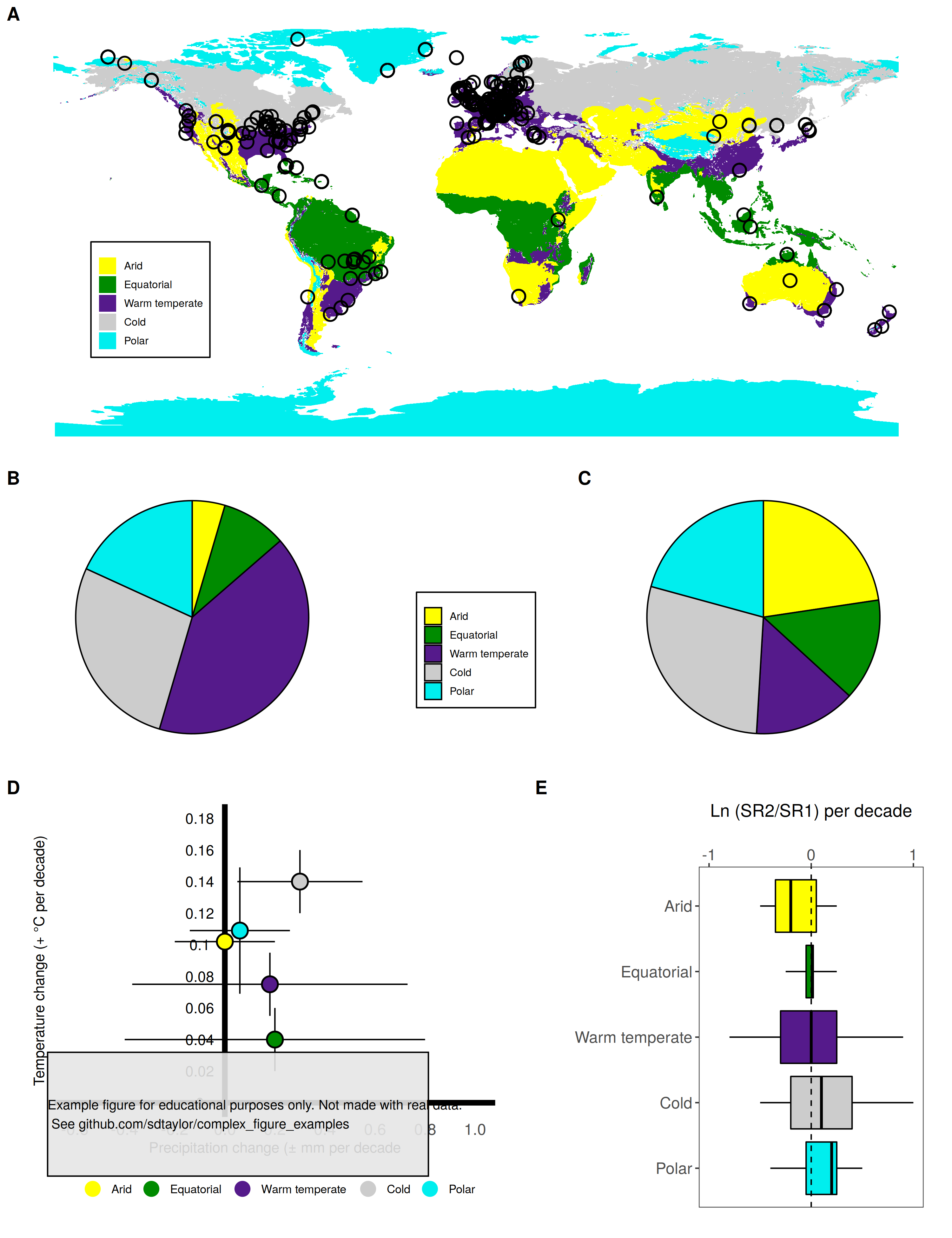
12 |
--------------------------------------------------------------------------------
/suggitt2019/suggitt2019.R:
--------------------------------------------------------------------------------
1 | library(tidyverse)
2 | library(sf)
3 |
4 | ##################################
5 | # This is a replication of Figure 1 from the following paper
6 | # Suggitt, A. J., Lister, D. G., & Thomas, C. D. (2019). Widespread effects of
7 | # climate change on local plant diversity. Current Biology, 29(17), 2905-2911.
8 | # https://doi.org/10.1016/j.cub.2019.06.079
9 |
10 | # Data used here are roughly approximated from the original figure, and
11 | # not meant to replicate it exactly.
12 | ##################################
13 |
14 | ###############################################################
15 | ###############################################################
16 | # Plot A, the map.
17 |
18 | # Kopen polygons from http://koeppen-geiger.vu-wien.ac.at/present.htm
19 | kopen_climate_regions = sf::read_sf('./suggitt2019/data/Koppen_Geiger Edited and Completed/Shapefiles/world_climates_completed_koppen_geiger.shp')
20 |
21 | # Match up the kopen classifications with the regions defined in the paper.
22 | suggitt_regions = tribble(
23 | ~kopen_group, ~region, ~fill_color,
24 | 'B', 'Arid', 'yellow',
25 | 'A', 'Equatorial', 'green4',
26 | 'C', 'Warm temperate', 'purple4',
27 | 'D', 'Cold', 'grey80',
28 | 'E', 'Polar', 'cyan2'
29 | )
30 | kopen_climate_regions = kopen_climate_regions %>%
31 | mutate(kopen_group = stringr::str_sub(climates_f,1,1)) %>%
32 | left_join(suggitt_regions, by='kopen_group')
33 |
34 | # simplify polygon lines for quicker rendering
35 | kopen_climate_regions = kopen_climate_regions %>%
36 | st_simplify(dTolerance = 0.25)
37 |
38 | # Make 1 polygon entry per region.
39 | # See https://stackoverflow.com/questions/57625471/create-new-geometry-on-grouped-column-in-r-sf
40 | kopen_climate_regions = kopen_climate_regions %>%
41 | group_by(region) %>%
42 | summarise() %>%
43 | ungroup() %>%
44 | filter(!is.na(region))
45 |
46 | # Convert the region column to a factor with the order of the suggitt_regions data.frame
47 | # This allows the colors to line up with the scale_fill_manual line below.
48 | # Note this also defines the ordering of the map legend.
49 | kopen_climate_regions$region = factor(kopen_climate_regions$region, levels = suggitt_regions$region, ordered = T)
50 |
51 | # These are the sites from Vellend et al. 2016 supp. info
52 | # https://esajournals.onlinelibrary.wiley.com/doi/abs/10.1002/ecy.1660
53 | map_points = read_csv('suggitt2019/data/Vellend_data_updated.csv') %>%
54 | st_as_sf(coords = c('Longitude','Latitude'), crs=4326)
55 |
56 | plot_A_map = ggplot() +
57 | geom_sf(data=kopen_climate_regions, aes(fill=region), color='transparent') +
58 | scale_fill_manual(values=suggitt_regions$fill_color) +
59 | geom_sf(data=map_points, shape=1,stroke=1, size=4) +
60 | theme_minimal() +
61 | theme(legend.position = c(0.15,0.35),
62 | legend.background = element_rect(color='black'),
63 | legend.title = element_blank(),
64 | legend.text = element_text(size=8),
65 | legend.key.size = unit(5,'mm'),
66 | panel.grid = element_blank())
67 |
68 |
69 | ###############################################################
70 | ###############################################################
71 | # Plots B and C, Pie Charts
72 |
73 | pie_chart_data = tribble(
74 | ~region, ~fill_color, ~pie_B, ~pie_C,
75 | 'Arid', 'yellow', 5, 24,
76 | 'Equatorial', 'green4', 10, 15,
77 | 'Warm temperate', 'purple4', 45, 15,
78 | 'Cold', 'grey80', 30, 30,
79 | 'Polar', 'cyan2', 20,22
80 | )
81 |
82 | # Matching the ordering is tricky here. The ggplot fill argument wants a factor, so by
83 | # default it turn the region column into a factor ordered alphabetially.
84 | # We must make a factor first using the order specified in the tribble above.
85 |
86 | pie_chart_data$region = fct_inorder(pie_chart_data$region)
87 |
88 | pie_chart_B = ggplot(pie_chart_data, aes(x="", y=pie_B, fill=region)) +
89 | geom_bar(stat='identity', width=1, color='black') +
90 | scale_fill_manual(values=pie_chart_data$fill_color) +
91 | coord_polar('y',start=0, direction=-1) +
92 | theme_bw() +
93 | theme(panel.grid = element_blank(),
94 | panel.border = element_blank(),
95 | axis.title = element_blank(),
96 | axis.ticks = element_blank(),
97 | axis.text = element_blank(),
98 | legend.position = 'none',
99 | legend.background = element_rect(color='black'),
100 | legend.title = element_blank())
101 |
102 | pie_chart_C = ggplot(pie_chart_data, aes(x="", y=pie_C, fill=region)) +
103 | geom_bar(stat='identity', width=1, color='black') +
104 | scale_fill_manual(values=pie_chart_data$fill_color) +
105 | coord_polar('y',start=0, direction=-1) +
106 | theme_bw() +
107 | theme(panel.grid = element_blank(),
108 | panel.border = element_blank(),
109 | axis.title = element_blank(),
110 | axis.ticks = element_blank(),
111 | axis.text = element_blank(),
112 | legend.position = 'none')
113 |
114 | ##################################################
115 | ##################################################
116 | # Plot D temp/precip change plot
117 |
118 | plot_D_data = tribble(
119 | ~region, ~fill_color, ~precip_mean, ~precip_sd, ~temp_mean, ~temp_sd,
120 | 'Arid', 'yellow', 0, 0.2, 0.102, 0.02,
121 | 'Equatorial', 'green4', 0.2, 0.6, 0.04, 0.02,
122 | 'Warm temperate', 'purple4',0.18, 0.55, 0.075, 0.02,
123 | 'Cold', 'grey80', 0.3, 0.25, 0.14, 0.02,
124 | 'Polar', 'cyan2', 0.06, 0.2, 0.109, 0.04
125 | )
126 |
127 | # There is no good way to place axis text in the middle of the plot, instead of on the left margin.
128 | # so this places it manually with geom_text
129 | y_axis_text = data.frame(y=seq(0, 0.18, 0.02),x=-0.1)
130 |
131 | plot_D_data$region = fct_inorder(plot_D_data$region)
132 |
133 | # note that ordering of the diferent geoms matter here.
134 | # The points should be last so they overlay the error bars, and x/y axis lines.
135 |
136 | plot_D = ggplot(plot_D_data, aes(x=precip_mean,y=temp_mean)) +
137 | geom_hline(yintercept = 0, size=2) +
138 | geom_vline(xintercept = 0, size=2) +
139 | geom_errorbar(aes(ymin = temp_mean - temp_sd, ymax=temp_mean+temp_sd), width=0) + # height/width of 0 here gets rid of
140 | geom_errorbarh(aes(xmin=precip_mean-precip_sd, xmax=precip_mean+precip_sd), height=0) + # the error bar ends
141 | geom_point(aes(color=region), size=5) +
142 | geom_point(shape=1, stroke=1, size=5, color='black') +
143 | scale_color_manual(values=plot_D_data$fill_color) +
144 | scale_x_continuous(breaks=round(seq(-0.6,1,0.2),1), limits=c(-0.6,1)) +
145 | geom_text(data=y_axis_text, aes(x=x,y=y,label=y)) +
146 | labs(y='Temperature change (+ °C per decade)', x='Precipitation change (± mm per decade',
147 | color='') +
148 | theme_bw() +
149 | theme(axis.text.y = element_blank(),
150 | axis.text.x = element_text(size=12),
151 | panel.grid = element_blank(),
152 | panel.border = element_blank(),
153 | axis.title = element_text(),
154 | axis.ticks = element_blank(),
155 | legend.position = 'bottom')
156 |
157 | ##################################################
158 | ##################################################
159 | # Plot E temp/precip change plot
160 |
161 | plot_E_data = tribble(
162 | ~region, ~fill_color, ~y0, ~y25, ~y50, ~y75, ~y100,
163 | 'Arid', 'yellow', -0.5, -0.35, -0.2, 0.05, 0.25,
164 | 'Equatorial', 'green4', -0.25, -0.05, 0.01, 0.02, 0.25,
165 | 'Warm temperate', 'purple4',-0.8,-0.3, 0, 0.25, 0.9,
166 | 'Cold', 'grey80', -0.5, -0.2, 0.1, 0.4, 1.0,
167 | 'Polar', 'cyan2', -0.4, -0.05, 0.2, 0.25, 0.5
168 | )
169 |
170 | # Order the region to what is specifed in the tribble()
171 | # Note that its reveresed for the x axis ordering, but not for the fill order.
172 | plot_E_data$region = fct_inorder(plot_E_data$region)
173 |
174 | plot_E = ggplot(plot_E_data, aes(x=fct_rev(region), fill=region)) +
175 | geom_boxplot(aes(ymin = y0, lower = y25, middle = y50, upper = y75, ymax = y100), stat='identity', position = 'identity',
176 | width=0.8, color='black') +
177 | scale_fill_manual(values = plot_E_data$fill_color) +
178 | scale_y_continuous(breaks = c(-1,0,1), limits=c(-1,1), position='right') +
179 | geom_hline(yintercept = 0, linetype='dashed') +
180 | coord_flip() + # running just the above code makes vertical box plots. coord_flip makes them horizontal.
181 | theme_bw() +
182 | labs(x='',y='', title = 'Ln (SR2/SR1) per decade') +
183 | theme(panel.grid = element_blank(),
184 | plot.title = element_text(hjust=0.5),
185 | axis.text = element_text(size=12),
186 | legend.position = 'none')
187 |
188 |
189 | ##################################################
190 | ##################################################
191 | # put it all together!
192 | # Cowplot is the best option here for fine tuning the sizing and scales of the 5 subplots.
193 | library(cowplot)
194 |
195 | middle_legend = get_legend(pie_chart_B + theme(legend.position = c(0.5,0.4),
196 | legend.text = element_text(size=8),
197 | legend.key.size = unit(5,'mm'),
198 | legend.direction = 'vertical'))
199 | middle_row = plot_grid(pie_chart_B,middle_legend, pie_chart_C, nrow=1, rel_widths = c(1,0.5,1), rel_heights = c(1,0.5,1), labels = c('B','','C'))
200 |
201 | # Scale here is important to "shrink" the D plot a tad.
202 | bottom_row = plot_grid(plot_D, plot_E, labels = c('D','E'),
203 | rel_widths = c(1,0.8), scale = c(0.9,0.9))
204 |
205 | top_row = plot_grid(plot_A_map, labels = c('A'))
206 |
207 | final_figure = plot_grid(top_row, middle_row, bottom_row, ncol=1, rel_widths = c(1,0.8,1), rel_heights = c(1.5,1,1.5))
208 |
209 | water_mark = 'Example figure for educational purposes only. Not made with real data.\n See github.com/sdtaylor/complex_figure_examples'
210 |
211 | final_figure = ggdraw(final_figure) +
212 | geom_rect(data=data.frame(xmin=0.05,ymin=0.05), aes(xmin=xmin,ymin=ymin, xmax=xmin+0.4,ymax=ymin+0.1),alpha=0.9, fill='grey90', color='black') +
213 | draw_text(water_mark, x=0.05, y=0.1, size=10, hjust = 0)
214 |
215 | save_plot('./suggitt2019/suggitt2019_final.png',plot = final_figure, base_height = 13, base_width = 10)
216 |
--------------------------------------------------------------------------------
/suggitt2019/suggitt2019_final.png:
--------------------------------------------------------------------------------
https://raw.githubusercontent.com/sdtaylor/complex_figure_examples/bbfb102e71f6b9a6177e0845996594d962225dbc/suggitt2019/suggitt2019_final.png
--------------------------------------------------------------------------------
/suggitt2019/suggitt2019_original.jpg:
--------------------------------------------------------------------------------
https://raw.githubusercontent.com/sdtaylor/complex_figure_examples/bbfb102e71f6b9a6177e0845996594d962225dbc/suggitt2019/suggitt2019_original.jpg
--------------------------------------------------------------------------------
/sullivan2020/map_points.geojson:
--------------------------------------------------------------------------------
1 | {
2 | "type": "FeatureCollection",
3 | "features": [
4 | {
5 | "type": "Feature",
6 | "properties": {
7 | "continent": "S America"
8 | },
9 | "geometry": {
10 | "type": "Point",
11 | "coordinates": [
12 | -50.625,
13 | -4.390228926463384
14 | ]
15 | }
16 | },
17 | {
18 | "type": "Feature",
19 | "properties": {
20 | "continent": "S America"
21 | },
22 | "geometry": {
23 | "type": "Point",
24 | "coordinates": [
25 | -65.91796875,
26 | -1.318243056862001
27 | ]
28 | }
29 | },
30 | {
31 | "type": "Feature",
32 | "properties": {
33 | "continent": "S America"
34 | },
35 | "geometry": {
36 | "type": "Point",
37 | "coordinates": [
38 | -66.62109375,
39 | -7.623886853120036
40 | ]
41 | }
42 | },
43 | {
44 | "type": "Feature",
45 | "properties": {
46 | "continent": "S America"
47 | },
48 | "geometry": {
49 | "type": "Point",
50 | "coordinates": [
51 | -60.64453125000001,
52 | 0.7909904981540058
53 | ]
54 | }
55 | },
56 | {
57 | "type": "Feature",
58 | "properties": {
59 | "continent": "S America"
60 | },
61 | "geometry": {
62 | "type": "Point",
63 | "coordinates": [
64 | -60.029296875,
65 | -5.44102230371796
66 | ]
67 | }
68 | },
69 | {
70 | "type": "Feature",
71 | "properties": {
72 | "continent": "S America"
73 | },
74 | "geometry": {
75 | "type": "Point",
76 | "coordinates": [
77 | -69.169921875,
78 | 2.28455066023697
79 | ]
80 | }
81 | },
82 | {
83 | "type": "Feature",
84 | "properties": {
85 | "continent": "S America"
86 | },
87 | "geometry": {
88 | "type": "Point",
89 | "coordinates": [
90 | -60.64453125000001,
91 | -9.44906182688142
92 | ]
93 | }
94 | },
95 | {
96 | "type": "Feature",
97 | "properties": {
98 | "continent": "S America"
99 | },
100 | "geometry": {
101 | "type": "Point",
102 | "coordinates": [
103 | -73.388671875,
104 | -1.1425024037061522
105 | ]
106 | }
107 | },
108 | {
109 | "type": "Feature",
110 | "properties": {
111 | "continent": "S America"
112 | },
113 | "geometry": {
114 | "type": "Point",
115 | "coordinates": [
116 | -73.47656249999999,
117 | -6.577303118123875
118 | ]
119 | }
120 | },
121 | {
122 | "type": "Feature",
123 | "properties": {
124 | "continent": "S America"
125 | },
126 | "geometry": {
127 | "type": "Point",
128 | "coordinates": [
129 | -57.48046875,
130 | -5.9657536710655235
131 | ]
132 | }
133 | },
134 | {
135 | "type": "Feature",
136 | "properties": {
137 | "continent": "S America"
138 | },
139 | "geometry": {
140 | "type": "Point",
141 | "coordinates": [
142 | -70.83984375,
143 | -10.574222078332806
144 | ]
145 | }
146 | },
147 | {
148 | "type": "Feature",
149 | "properties": {
150 | "continent": "S America"
151 | },
152 | "geometry": {
153 | "type": "Point",
154 | "coordinates": [
155 | -62.84179687499999,
156 | 6.664607562172573
157 | ]
158 | }
159 | },
160 | {
161 | "type": "Feature",
162 | "properties": {
163 | "continent": "S America"
164 | },
165 | "geometry": {
166 | "type": "Point",
167 | "coordinates": [
168 | -71.015625,
169 | 5.266007882805498
170 | ]
171 | }
172 | },
173 | {
174 | "type": "Feature",
175 | "properties": {
176 | "continent": "S America"
177 | },
178 | "geometry": {
179 | "type": "Point",
180 | "coordinates": [
181 | -51.85546874999999,
182 | -6.926426847059551
183 | ]
184 | }
185 | },
186 | {
187 | "type": "Feature",
188 | "properties": {
189 | "continent": "S America"
190 | },
191 | "geometry": {
192 | "type": "Point",
193 | "coordinates": [
194 | -54.404296875,
195 | -0.4394488164139641
196 | ]
197 | }
198 | },
199 | {
200 | "type": "Feature",
201 | "properties": {
202 | "continent": "S America"
203 | },
204 | "geometry": {
205 | "type": "Point",
206 | "coordinates": [
207 | -75.41015624999999,
208 | -9.622414142924805
209 | ]
210 | }
211 | },
212 | {
213 | "type": "Feature",
214 | "properties": {
215 | "continent": "S America"
216 | },
217 | "geometry": {
218 | "type": "Point",
219 | "coordinates": [
220 | -67.8515625,
221 | -2.108898659243126
222 | ]
223 | }
224 | },
225 | {
226 | "type": "Feature",
227 | "properties": {
228 | "continent": "S America"
229 | },
230 | "geometry": {
231 | "type": "Point",
232 | "coordinates": [
233 | -64.599609375,
234 | -11.092165893501988
235 | ]
236 | }
237 | },
238 | {
239 | "type": "Feature",
240 | "properties": {
241 | "continent": "S America"
242 | },
243 | "geometry": {
244 | "type": "Point",
245 | "coordinates": [
246 | -64.423828125,
247 | 4.214943141390651
248 | ]
249 | }
250 | },
251 | {
252 | "type": "Feature",
253 | "properties": {
254 | "continent": "S America"
255 | },
256 | "geometry": {
257 | "type": "Point",
258 | "coordinates": [
259 | -73.564453125,
260 | 3.0746950723696944
261 | ]
262 | }
263 | },
264 | {
265 | "type": "Feature",
266 | "properties": {
267 | "continent": "S America"
268 | },
269 | "geometry": {
270 | "type": "Point",
271 | "coordinates": [
272 | -65.91796875,
273 | -14.093957177836224
274 | ]
275 | }
276 | },
277 | {
278 | "type": "Feature",
279 | "properties": {
280 | "continent": "S America"
281 | },
282 | "geometry": {
283 | "type": "Point",
284 | "coordinates": [
285 | -71.89453125,
286 | -13.838079936422462
287 | ]
288 | }
289 | },
290 | {
291 | "type": "Feature",
292 | "properties": {
293 | "continent": "S America"
294 | },
295 | "geometry": {
296 | "type": "Point",
297 | "coordinates": [
298 | -76.552734375,
299 | -3.337953961416472
300 | ]
301 | }
302 | },
303 | {
304 | "type": "Feature",
305 | "properties": {
306 | "continent": "S America"
307 | },
308 | "geometry": {
309 | "type": "Point",
310 | "coordinates": [
311 | -76.11328125,
312 | 1.5818302639606454
313 | ]
314 | }
315 | },
316 | {
317 | "type": "Feature",
318 | "properties": {
319 | "continent": "S America"
320 | },
321 | "geometry": {
322 | "type": "Point",
323 | "coordinates": [
324 | -64.86328125,
325 | -3.337953961416472
326 | ]
327 | }
328 | },
329 | {
330 | "type": "Feature",
331 | "properties": {
332 | "continent": "S America"
333 | },
334 | "geometry": {
335 | "type": "Point",
336 | "coordinates": [
337 | -67.1484375,
338 | 7.710991655433217
339 | ]
340 | }
341 | },
342 | {
343 | "type": "Feature",
344 | "properties": {
345 | "continent": "Africa"
346 | },
347 | "geometry": {
348 | "type": "Point",
349 | "coordinates": [
350 | -11.162109375,
351 | 7.623886853120049
352 | ]
353 | }
354 | },
355 | {
356 | "type": "Feature",
357 | "properties": {
358 | "continent": "Africa"
359 | },
360 | "geometry": {
361 | "type": "Point",
362 | "coordinates": [
363 | -5.537109374999999,
364 | 6.751896464843375
365 | ]
366 | }
367 | },
368 | {
369 | "type": "Feature",
370 | "properties": {
371 | "continent": "Africa"
372 | },
373 | "geometry": {
374 | "type": "Point",
375 | "coordinates": [
376 | -7.294921874999999,
377 | 7.18810087117902
378 | ]
379 | }
380 | },
381 | {
382 | "type": "Feature",
383 | "properties": {
384 | "continent": "Africa"
385 | },
386 | "geometry": {
387 | "type": "Point",
388 | "coordinates": [
389 | -7.91015625,
390 | 10.401377554543553
391 | ]
392 | }
393 | },
394 | {
395 | "type": "Feature",
396 | "properties": {
397 | "continent": "Africa"
398 | },
399 | "geometry": {
400 | "type": "Point",
401 | "coordinates": [
402 | -2.548828125,
403 | 7.710991655433217
404 | ]
405 | }
406 | },
407 | {
408 | "type": "Feature",
409 | "properties": {
410 | "continent": "Africa"
411 | },
412 | "geometry": {
413 | "type": "Point",
414 | "coordinates": [
415 | -0.703125,
416 | 9.188870084473406
417 | ]
418 | }
419 | },
420 | {
421 | "type": "Feature",
422 | "properties": {
423 | "continent": "Africa"
424 | },
425 | "geometry": {
426 | "type": "Point",
427 | "coordinates": [
428 | -0.087890625,
429 | 6.926426847059551
430 | ]
431 | }
432 | },
433 | {
434 | "type": "Feature",
435 | "properties": {
436 | "continent": "Africa"
437 | },
438 | "geometry": {
439 | "type": "Point",
440 | "coordinates": [
441 | -2.109375,
442 | 7.100892668623654
443 | ]
444 | }
445 | },
446 | {
447 | "type": "Feature",
448 | "properties": {
449 | "continent": "Africa"
450 | },
451 | "geometry": {
452 | "type": "Point",
453 | "coordinates": [
454 | -3.076171875,
455 | 10.746969318460001
456 | ]
457 | }
458 | },
459 | {
460 | "type": "Feature",
461 | "properties": {
462 | "continent": "Africa"
463 | },
464 | "geometry": {
465 | "type": "Point",
466 | "coordinates": [
467 | -1.318359375,
468 | 5.878332109674327
469 | ]
470 | }
471 | },
472 | {
473 | "type": "Feature",
474 | "properties": {
475 | "continent": "Africa"
476 | },
477 | "geometry": {
478 | "type": "Point",
479 | "coordinates": [
480 | 1.0546875,
481 | 9.795677582829743
482 | ]
483 | }
484 | },
485 | {
486 | "type": "Feature",
487 | "properties": {
488 | "continent": "Africa"
489 | },
490 | "geometry": {
491 | "type": "Point",
492 | "coordinates": [
493 | 9.4921875,
494 | 4.653079918274051
495 | ]
496 | }
497 | },
498 | {
499 | "type": "Feature",
500 | "properties": {
501 | "continent": "Africa"
502 | },
503 | "geometry": {
504 | "type": "Point",
505 | "coordinates": [
506 | 12.041015625,
507 | 4.8282597468669755
508 | ]
509 | }
510 | },
511 | {
512 | "type": "Feature",
513 | "properties": {
514 | "continent": "Africa"
515 | },
516 | "geometry": {
517 | "type": "Point",
518 | "coordinates": [
519 | 11.689453125,
520 | 3.2502085616531686
521 | ]
522 | }
523 | },
524 | {
525 | "type": "Feature",
526 | "properties": {
527 | "continent": "Africa"
528 | },
529 | "geometry": {
530 | "type": "Point",
531 | "coordinates": [
532 | 10.810546875,
533 | 2.5479878714713835
534 | ]
535 | }
536 | },
537 | {
538 | "type": "Feature",
539 | "properties": {
540 | "continent": "Africa"
541 | },
542 | "geometry": {
543 | "type": "Point",
544 | "coordinates": [
545 | 10.634765625,
546 | 2.1088986592431382
547 | ]
548 | }
549 | },
550 | {
551 | "type": "Feature",
552 | "properties": {
553 | "continent": "Africa"
554 | },
555 | "geometry": {
556 | "type": "Point",
557 | "coordinates": [
558 | 11.25,
559 | 0.17578097424708533
560 | ]
561 | }
562 | },
563 | {
564 | "type": "Feature",
565 | "properties": {
566 | "continent": "Africa"
567 | },
568 | "geometry": {
569 | "type": "Point",
570 | "coordinates": [
571 | 13.095703125,
572 | 2.3723687086440504
573 | ]
574 | }
575 | },
576 | {
577 | "type": "Feature",
578 | "properties": {
579 | "continent": "Africa"
580 | },
581 | "geometry": {
582 | "type": "Point",
583 | "coordinates": [
584 | 14.765625,
585 | 5.353521355337334
586 | ]
587 | }
588 | },
589 | {
590 | "type": "Feature",
591 | "properties": {
592 | "continent": "Africa"
593 | },
594 | "geometry": {
595 | "type": "Point",
596 | "coordinates": [
597 | 13.447265624999998,
598 | 0.17578097424708533
599 | ]
600 | }
601 | },
602 | {
603 | "type": "Feature",
604 | "properties": {
605 | "continent": "Africa"
606 | },
607 | "geometry": {
608 | "type": "Point",
609 | "coordinates": [
610 | 11.865234375,
611 | -0.7031073524364783
612 | ]
613 | }
614 | },
615 | {
616 | "type": "Feature",
617 | "properties": {
618 | "continent": "Africa"
619 | },
620 | "geometry": {
621 | "type": "Point",
622 | "coordinates": [
623 | 15.8203125,
624 | 2.5479878714713835
625 | ]
626 | }
627 | },
628 | {
629 | "type": "Feature",
630 | "properties": {
631 | "continent": "Africa"
632 | },
633 | "geometry": {
634 | "type": "Point",
635 | "coordinates": [
636 | 13.18359375,
637 | -2.108898659243126
638 | ]
639 | }
640 | },
641 | {
642 | "type": "Feature",
643 | "properties": {
644 | "continent": "Africa"
645 | },
646 | "geometry": {
647 | "type": "Point",
648 | "coordinates": [
649 | 15.556640624999998,
650 | 0.7909904981540058
651 | ]
652 | }
653 | },
654 | {
655 | "type": "Feature",
656 | "properties": {
657 | "continent": "Africa"
658 | },
659 | "geometry": {
660 | "type": "Point",
661 | "coordinates": [
662 | 13.447265624999998,
663 | 6.140554782450308
664 | ]
665 | }
666 | },
667 | {
668 | "type": "Feature",
669 | "properties": {
670 | "continent": "Africa"
671 | },
672 | "geometry": {
673 | "type": "Point",
674 | "coordinates": [
675 | 26.7626953125,
676 | 2.591888984149953
677 | ]
678 | }
679 | },
680 | {
681 | "type": "Feature",
682 | "properties": {
683 | "continent": "Africa"
684 | },
685 | "geometry": {
686 | "type": "Point",
687 | "coordinates": [
688 | 24.6533203125,
689 | 0.615222552406841
690 | ]
691 | }
692 | },
693 | {
694 | "type": "Feature",
695 | "properties": {
696 | "continent": "Africa"
697 | },
698 | "geometry": {
699 | "type": "Point",
700 | "coordinates": [
701 | 38.14453125,
702 | -6.926426847059551
703 | ]
704 | }
705 | },
706 | {
707 | "type": "Feature",
708 | "properties": {
709 | "continent": "Africa"
710 | },
711 | "geometry": {
712 | "type": "Point",
713 | "coordinates": [
714 | 36.9580078125,
715 | -8.146242825034385
716 | ]
717 | }
718 | },
719 | {
720 | "type": "Feature",
721 | "properties": {
722 | "continent": "Africa"
723 | },
724 | "geometry": {
725 | "type": "Point",
726 | "coordinates": [
727 | 36.8701171875,
728 | -5.922044619883305
729 | ]
730 | }
731 | },
732 | {
733 | "type": "Feature",
734 | "properties": {
735 | "continent": "Africa"
736 | },
737 | "geometry": {
738 | "type": "Point",
739 | "coordinates": [
740 | 38.759765625,
741 | -4.915832801313164
742 | ]
743 | }
744 | },
745 | {
746 | "type": "Feature",
747 | "properties": {
748 | "continent": "Africa"
749 | },
750 | "geometry": {
751 | "type": "Point",
752 | "coordinates": [
753 | 36.8701171875,
754 | -6.708253968671543
755 | ]
756 | }
757 | },
758 | {
759 | "type": "Feature",
760 | "properties": {
761 | "continent": "Africa"
762 | },
763 | "geometry": {
764 | "type": "Point",
765 | "coordinates": [
766 | 37.8369140625,
767 | -4.34641127533318
768 | ]
769 | }
770 | },
771 | {
772 | "type": "Feature",
773 | "properties": {
774 | "continent": "Africa"
775 | },
776 | "geometry": {
777 | "type": "Point",
778 | "coordinates": [
779 | 38.056640625,
780 | -5.0909441750333855
781 | ]
782 | }
783 | },
784 | {
785 | "type": "Feature",
786 | "properties": {
787 | "continent": "Africa"
788 | },
789 | "geometry": {
790 | "type": "Point",
791 | "coordinates": [
792 | 38.056640625,
793 | -7.972197714386866
794 | ]
795 | }
796 | },
797 | {
798 | "type": "Feature",
799 | "properties": {
800 | "continent": "Africa"
801 | },
802 | "geometry": {
803 | "type": "Point",
804 | "coordinates": [
805 | 37.08984375,
806 | -5.484768018141262
807 | ]
808 | }
809 | },
810 | {
811 | "type": "Feature",
812 | "properties": {
813 | "continent": "Africa"
814 | },
815 | "geometry": {
816 | "type": "Point",
817 | "coordinates": [
818 | 28.696289062499996,
819 | 2.767477951092084
820 | ]
821 | }
822 | },
823 | {
824 | "type": "Feature",
825 | "properties": {
826 | "continent": "Africa"
827 | },
828 | "geometry": {
829 | "type": "Point",
830 | "coordinates": [
831 | 33.0029296875,
832 | 2.943040910055132
833 | ]
834 | }
835 | },
836 | {
837 | "type": "Feature",
838 | "properties": {
839 | "continent": "Africa"
840 | },
841 | "geometry": {
842 | "type": "Point",
843 | "coordinates": [
844 | 31.113281249999996,
845 | 2.591888984149953
846 | ]
847 | }
848 | },
849 | {
850 | "type": "Feature",
851 | "properties": {
852 | "continent": "Africa"
853 | },
854 | "geometry": {
855 | "type": "Point",
856 | "coordinates": [
857 | 33.8818359375,
858 | 2.28455066023697
859 | ]
860 | }
861 | },
862 | {
863 | "type": "Feature",
864 | "properties": {
865 | "continent": "Africa"
866 | },
867 | "geometry": {
868 | "type": "Point",
869 | "coordinates": [
870 | 32.1240234375,
871 | 2.152813583128846
872 | ]
873 | }
874 | },
875 | {
876 | "type": "Feature",
877 | "properties": {
878 | "continent": "Africa"
879 | },
880 | "geometry": {
881 | "type": "Point",
882 | "coordinates": [
883 | 19.775390625,
884 | -0.08789059053082422
885 | ]
886 | }
887 | },
888 | {
889 | "type": "Feature",
890 | "properties": {
891 | "continent": "Africa"
892 | },
893 | "geometry": {
894 | "type": "Point",
895 | "coordinates": [
896 | 22.32421875,
897 | 1.845383988573187
898 | ]
899 | }
900 | },
901 | {
902 | "type": "Feature",
903 | "properties": {
904 | "continent": "Africa"
905 | },
906 | "geometry": {
907 | "type": "Point",
908 | "coordinates": [
909 | 18.369140624999996,
910 | 0
911 | ]
912 | }
913 | },
914 | {
915 | "type": "Feature",
916 | "properties": {
917 | "continent": "Africa"
918 | },
919 | "geometry": {
920 | "type": "Point",
921 | "coordinates": [
922 | 19.6875,
923 | 2.1967272417616712
924 | ]
925 | }
926 | },
927 | {
928 | "type": "Feature",
929 | "properties": {
930 | "continent": "Africa"
931 | },
932 | "geometry": {
933 | "type": "Point",
934 | "coordinates": [
935 | 22.5,
936 | 0.5712795966325395
937 | ]
938 | }
939 | },
940 | {
941 | "type": "Feature",
942 | "properties": {
943 | "continent": "Asia"
944 | },
945 | "geometry": {
946 | "type": "Point",
947 | "coordinates": [
948 | 100.01953125,
949 | -0.04394530819134536
950 | ]
951 | }
952 | },
953 | {
954 | "type": "Feature",
955 | "properties": {
956 | "continent": "Asia"
957 | },
958 | "geometry": {
959 | "type": "Point",
960 | "coordinates": [
961 | 116.76269531249999,
962 | 6.096859818887948
963 | ]
964 | }
965 | },
966 | {
967 | "type": "Feature",
968 | "properties": {
969 | "continent": "Asia"
970 | },
971 | "geometry": {
972 | "type": "Point",
973 | "coordinates": [
974 | 116.3232421875,
975 | 3.6888551431470478
976 | ]
977 | }
978 | },
979 | {
980 | "type": "Feature",
981 | "properties": {
982 | "continent": "Asia"
983 | },
984 | "geometry": {
985 | "type": "Point",
986 | "coordinates": [
987 | 117.1142578125,
988 | 2.5040852618529215
989 | ]
990 | }
991 | },
992 | {
993 | "type": "Feature",
994 | "properties": {
995 | "continent": "Asia"
996 | },
997 | "geometry": {
998 | "type": "Point",
999 | "coordinates": [
1000 | 114.43359375,
1001 | 2.4601811810210052
1002 | ]
1003 | }
1004 | },
1005 | {
1006 | "type": "Feature",
1007 | "properties": {
1008 | "continent": "Asia"
1009 | },
1010 | "geometry": {
1011 | "type": "Point",
1012 | "coordinates": [
1013 | 116.49902343749999,
1014 | 0.4394488164139768
1015 | ]
1016 | }
1017 | },
1018 | {
1019 | "type": "Feature",
1020 | "properties": {
1021 | "continent": "Asia"
1022 | },
1023 | "geometry": {
1024 | "type": "Point",
1025 | "coordinates": [
1026 | 113.818359375,
1027 | 0
1028 | ]
1029 | }
1030 | },
1031 | {
1032 | "type": "Feature",
1033 | "properties": {
1034 | "continent": "Asia"
1035 | },
1036 | "geometry": {
1037 | "type": "Point",
1038 | "coordinates": [
1039 | 115.53222656249999,
1040 | -0.3515602939922709
1041 | ]
1042 | }
1043 | },
1044 | {
1045 | "type": "Feature",
1046 | "properties": {
1047 | "continent": "Asia"
1048 | },
1049 | "geometry": {
1050 | "type": "Point",
1051 | "coordinates": [
1052 | 111.796875,
1053 | 1.7136116598836224
1054 | ]
1055 | }
1056 | },
1057 | {
1058 | "type": "Feature",
1059 | "properties": {
1060 | "continent": "Asia"
1061 | },
1062 | "geometry": {
1063 | "type": "Point",
1064 | "coordinates": [
1065 | 113.4228515625,
1066 | 2.3723687086440504
1067 | ]
1068 | }
1069 | },
1070 | {
1071 | "type": "Feature",
1072 | "properties": {
1073 | "continent": "Asia"
1074 | },
1075 | "geometry": {
1076 | "type": "Point",
1077 | "coordinates": [
1078 | 115.31249999999999,
1079 | 3.2940822283128175
1080 | ]
1081 | }
1082 | },
1083 | {
1084 | "type": "Feature",
1085 | "properties": {
1086 | "continent": "Asia"
1087 | },
1088 | "geometry": {
1089 | "type": "Point",
1090 | "coordinates": [
1091 | 117.0703125,
1092 | 4.8282597468669755
1093 | ]
1094 | }
1095 | },
1096 | {
1097 | "type": "Feature",
1098 | "properties": {
1099 | "continent": "Asia"
1100 | },
1101 | "geometry": {
1102 | "type": "Point",
1103 | "coordinates": [
1104 | 117.0703125,
1105 | 1.845383988573187
1106 | ]
1107 | }
1108 | },
1109 | {
1110 | "type": "Feature",
1111 | "properties": {
1112 | "continent": "Australia"
1113 | },
1114 | "geometry": {
1115 | "type": "Point",
1116 | "coordinates": [
1117 | 144.140625,
1118 | -14.944784875088372
1119 | ]
1120 | }
1121 | },
1122 | {
1123 | "type": "Feature",
1124 | "properties": {
1125 | "continent": "Australia"
1126 | },
1127 | "geometry": {
1128 | "type": "Point",
1129 | "coordinates": [
1130 | 144.931640625,
1131 | -16.8886597873816
1132 | ]
1133 | }
1134 | },
1135 | {
1136 | "type": "Feature",
1137 | "properties": {
1138 | "continent": "Australia"
1139 | },
1140 | "geometry": {
1141 | "type": "Point",
1142 | "coordinates": [
1143 | 145.3271484375,
1144 | -17.14079039331664
1145 | ]
1146 | }
1147 | },
1148 | {
1149 | "type": "Feature",
1150 | "properties": {
1151 | "continent": "Australia"
1152 | },
1153 | "geometry": {
1154 | "type": "Point",
1155 | "coordinates": [
1156 | 144.3603515625,
1157 | -16.720385051693988
1158 | ]
1159 | }
1160 | },
1161 | {
1162 | "type": "Feature",
1163 | "properties": {
1164 | "continent": "Australia"
1165 | },
1166 | "geometry": {
1167 | "type": "Point",
1168 | "coordinates": [
1169 | 145.3271484375,
1170 | -17.769612247142653
1171 | ]
1172 | }
1173 | },
1174 | {
1175 | "type": "Feature",
1176 | "properties": {
1177 | "continent": "Australia"
1178 | },
1179 | "geometry": {
1180 | "type": "Point",
1181 | "coordinates": [
1182 | 144.2724609375,
1183 | -17.392579271057766
1184 | ]
1185 | }
1186 | },
1187 | {
1188 | "type": "Feature",
1189 | "properties": {
1190 | "continent": "Australia"
1191 | },
1192 | "geometry": {
1193 | "type": "Point",
1194 | "coordinates": [
1195 | 144.580078125,
1196 | -18.18760655249461
1197 | ]
1198 | }
1199 | }
1200 | ]
1201 | }
--------------------------------------------------------------------------------
/sullivan2020/readme.md:
--------------------------------------------------------------------------------
1 | ## Paper
2 | Sullivan et al. 2020. Long-term thermal sensitivity of Earth’s tropical forests. Science. 368:6493, 869-874. https://doi.org/10.1126/science.aaw7578
3 |
4 | Figure 1
5 |
6 | ## Notes
7 | A good example of:
8 |
9 | - When you have multiple plots with exactly the same style, setting up a function to create them instead of doing each one individually.
10 | - Nice map using the `sf` package.
11 | - Superscript and potentially other math equations in the axis label.
12 |
13 |
14 | ## Reproduced Figure
15 | 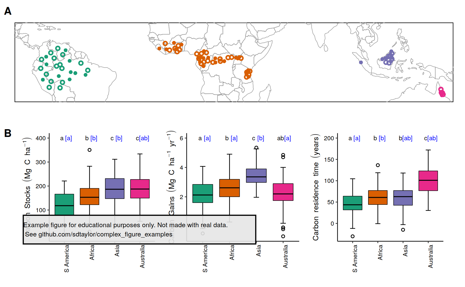
16 |
--------------------------------------------------------------------------------
/sullivan2020/sullivan2020.R:
--------------------------------------------------------------------------------
1 | library(tidyverse)
2 | library(sf)
3 | library(rnaturalearth)
4 | library(cowplot)
5 |
6 | ##################################
7 | # This is a replication of Figure 1 from the following paper
8 | # Sullivan et al. 2020. Long-term thermal sensitivity of Earth’s tropical forests.
9 | # Science. 368:6493, 869-874. https://doi.org/10.1126/science.aaw7578
10 |
11 | # Data used here are simulated, and not meant to replicate the original figure exactly.
12 |
13 | #############################################
14 | # These points are randomly placed in the same vicinity of the original map. Done using http://geojson.io
15 | # Any shapefile format should work with st_read()
16 | map_points = st_read('sullivan2020/map_points.geojson')
17 | # Randomly assign census type to have open and closed points
18 | map_points$plot_type = sample(c('multicensus','single_census'), size=nrow(map_points), replace = T)
19 |
20 | # Make contient a factor with a specific order to order, the same as the barchart below, so the colors get assigned the same
21 | map_points$continent = factor(map_points$continent, levels = c('S America','Africa','Asia','Australia'), ordered = T)
22 |
23 | countries = rnaturalearth::ne_countries(returnclass = "sf")
24 |
25 | map = ggplot() +
26 | geom_sf(data = countries, fill='transparent', color='grey60', size=0.2) +
27 | geom_sf(data=map_points, aes(color=continent, shape=plot_type), size=1, stroke=1) +
28 | coord_sf(xlim = c(-80,140), ylim = c(-20,20)) +
29 | scale_color_brewer(palette = 'Dark2') +
30 | scale_shape_manual(values = c(1,16)) +
31 | theme_minimal() +
32 | theme(panel.background = element_rect(color='black'),
33 | panel.grid = element_blank(),
34 | axis.text = element_blank(),
35 | plot.margin = margin(0,0,0,0),
36 | legend.position = 'none')
37 |
38 | ##############################################
39 |
40 | # The text labels in the boxplots are a bit tricky. Here I specify the exact text and y postion I want each one to be placed.
41 | # Note I have to do it separately for the black and blue text. The x placement will be continent, the x-axis value.
42 | # They're further refined below, where the two different colored texts are nudged slightly apart.
43 | # The exact placement and nudging values are done thru a lot of trail and error by making small changes.
44 |
45 | # The mean_value and sd_values are just used to create random data points to use with the boxplot
46 |
47 | barchart_data_starter = tribble(
48 | ~carbon_metric, ~continent, ~mean_value, ~sd_value, ~text1, ~text2, ~text_y,
49 | 'stocks', 'S America', 120, 50, 'a', '[a]', 400,
50 | 'stocks', 'Africa', 160, 50, 'b', '[b]', 400,
51 | 'stocks', 'Asia', 190, 60, 'c', '[b]', 400,
52 | 'stocks', 'Australia', 200, 50, 'c', '[ab]', 400,
53 | 'gains', 'S America', 2.1, 1, 'a', '[a]', 6,
54 | 'gains', 'Africa', 2.5, 1, 'b', '[a]', 6,
55 | 'gains', 'Asia', 3.5, 0.8, 'c', '[b]', 6,
56 | 'gains', 'Australia', 2.2, 1, 'ab', '[a]', 6,
57 | 'time', 'S America', 50, 25, 'a', '[a]', 200,
58 | 'time', 'Africa', 60, 25, 'b', '[b]', 200,
59 | 'time', 'Asia', 60, 25, 'b', '[ab]', 200,
60 | 'time', 'Australia', 100, 30, 'c', '[ab]', 200
61 | )
62 |
63 | set.seed(1)
64 |
65 | # Get some random values to make the boxplots
66 | barchart_data = barchart_data_starter %>%
67 | group_by(carbon_metric, continent) %>%
68 | summarise(carbon_value=rnorm(n=100,mean=mean_value, sd=sd_value)) %>%
69 | ungroup()
70 |
71 | # Make contient a factor with a specific order to order the x-axis
72 | barchart_data$continent = factor(barchart_data$continent, levels = c('S America','Africa','Asia','Australia'), ordered = T)
73 |
74 | # The style of all 3 bar plots is exactly the same, with the underlying data the difference. So here
75 | # we use a function to return the same chart, with metric specifying which of the 3 data attributes to use.
76 | get_barchart = function(metric, y_label){
77 | df_data = barchart_data %>%
78 | filter(carbon_metric==metric)
79 |
80 | df_text = barchart_data_starter %>%
81 | filter(carbon_metric==metric)
82 |
83 | ggplot(df_data, aes(x=continent, y=carbon_value, fill=continent)) +
84 | stat_boxplot(geom ='errorbar',width=0.2, size=0.3, color='black') + # Draw an error bar separately to get the top/bottom horizontal lines
85 | geom_boxplot(size=0.2, linetype='solid',color='black', # Size here dictates the thickness of the boxplot outline.
86 | outlier.size = 1, outlier.shape = 1) +
87 | scale_fill_brewer(palette = 'Dark2') +
88 | geom_text(data = df_text, aes(y=text_y, label=text1), size=2, position = position_nudge(x=-0.1)) + # The text needs to be done twice since they have different colors.
89 | geom_text(data = df_text, aes(y=text_y, label=text2), size=2, position = position_nudge(x=0.17), color='blue') + # They are both nudged slightly to the left/right, otherwise they would be
90 | theme_bw(7) + # drawn on top of eachother. The x-axis placement (continent) is inherited from
91 | theme(legend.position = 'none', # the primary ggplot call.
92 | plot.margin = margin(0,5,0,5), # Put a little space between boxplots, but not on top or bottom.
93 | panel.grid = element_blank(),
94 | panel.border = element_blank(), # Turn off the full border but initialize the bottom and
95 | axis.line.x.bottom = element_line(size=0.3), # left lines.
96 | axis.line.y.left = element_line(size=0.3),
97 | axis.text = element_text(color='black'),
98 | axis.text.x = element_text(angle=90, hjust=1)) + # continent labels being rotated is done here.
99 | labs(y=y_label, x='')
100 | }
101 |
102 | stock_plot = get_barchart(metric='stocks', y_label = expression(Carbon~Stocks~(Mg~C~ha^{-1}))) # The expression calls here allow the superscript to be used
103 | gains_plot = get_barchart(metric='gains', y_label = expression(Carbon~Gains~(Mg~C~ha^{-1}~yr^{-1}))) # thru plotmath calls.
104 | time_plot = get_barchart(metric='time', y_label = expression(Carbon~residence~time~(years))) # This 3rd graph doesn't need any superscript, but it's passed thru expression
105 | # anyway to match the font style
106 | box_plots = plot_grid(stock_plot, gains_plot, time_plot, nrow = 1)
107 |
108 |
109 | final_figure = plot_grid(map, box_plots, ncol=1, rel_heights = c(0.8,1), scale=c(0.95,0.93), # Scale them down a tad to create a whitespace buffer.
110 | labels = c('A','B'), vjust=c(1.9,1.2), label_size = 10) # vjust nudges the A,B labels
111 |
112 |
113 | #############################################
114 | water_mark = 'Example figure for educational purposes only. Not made with real data.\n See github.com/sdtaylor/complex_figure_examples'
115 |
116 | final_figure = ggdraw(final_figure) +
117 | geom_rect(data=data.frame(xmin=0.05,ymin=0.15), aes(xmin=xmin,ymin=ymin, xmax=xmin+0.5,ymax=ymin+0.1),alpha=0.9, fill='grey90', color='black') +
118 | draw_text(water_mark, x=0.05, y=0.2, size=6, hjust = 0)
119 |
120 |
121 | save_plot('sullivan2020/sullivan2020_final.png', plot = final_figure)
122 |
123 |
--------------------------------------------------------------------------------
/sullivan2020/sullivan2020_final.png:
--------------------------------------------------------------------------------
https://raw.githubusercontent.com/sdtaylor/complex_figure_examples/bbfb102e71f6b9a6177e0845996594d962225dbc/sullivan2020/sullivan2020_final.png
--------------------------------------------------------------------------------
/thein2020/create_data.R:
--------------------------------------------------------------------------------
1 | library(tidyverse)
2 |
3 |
4 | #---------------------------------------
5 | # Here we create a fake dataset similar to the Thein 2020 figure.
6 | # It will have the following form:
7 | # elev season depot_encounter removal_from_depot total_removal species_removed
8 | # 0.7965260 Wet Season 19.15570 37.21124 19.50298 19.24666
9 | # 1.1163717 Wet Season 18.09308 33.13282 17.06157 16.98486
10 | # 1.7185601 Wet Season 17.57028 36.90911 18.87783 17.99193
11 | # .......
12 | # .......
13 | #---------------------------------------
14 |
15 | set.seed(1)
16 |
17 | upward_curve = function(x, height, noise=2){
18 | curve = 3*x*x - 9*x + height
19 | curve = curve + rnorm(length(curve), mean=0, sd=noise) # add some noise
20 | curve = pmax(curve, 0) # but keep it above 0
21 | return(curve)
22 | }
23 | downward_curve = function(x, height, noise=2){
24 | curve = -1.5*x*x + 5*x + height
25 | curve = curve + rnorm(length(curve), mean=0, sd=noise) # add some noise
26 | curve = pmax(curve, 0) # but keep it above 0
27 | return(curve)
28 | }
29 |
30 |
31 | wet_season_n = 25
32 | dry_season_n = 25
33 |
34 | wet_season = data.frame(elev = runif(wet_season_n, 0.5,3))
35 | wet_season$season = 'Wet Season'
36 | wet_season$depot_encounter = upward_curve(wet_season$elev, height=25)
37 | wet_season$removal_from_depot = upward_curve(wet_season$elev, height=40)
38 | wet_season$total_removal = upward_curve(wet_season$elev, height=25)
39 | wet_season$species_removed = upward_curve(wet_season$elev, height=22)
40 |
41 | dry_season = data.frame(elev = runif(dry_season_n, 0.5,3))
42 | dry_season$season = 'Dry Season'
43 | dry_season$depot_encounter = downward_curve(dry_season$elev, height=1)
44 | dry_season$removal_from_depot = downward_curve(dry_season$elev, height=22)
45 | dry_season$total_removal = downward_curve(dry_season$elev, height=1)
46 | dry_season$species_removed = downward_curve(dry_season$elev, height=5)
47 |
48 |
49 | both_seasons = wet_season %>%
50 | bind_rows(dry_season)
51 |
52 | write_csv(both_seasons, 'thein2020/simulated_data.csv')
53 |
54 | # both_seasons %>%
55 | # pivot_longer(c(-elev, -season), names_to='metric', values_to='metric_value') %>%
56 | # ggplot(aes(x=elev, y=metric_value, color=season)) +
57 | # geom_point() +
58 | # geom_smooth(method='lm', formula = y~poly(x,2)) +
59 | # facet_wrap(~metric, ncol=2, scales='free')
60 |
--------------------------------------------------------------------------------
/thein2020/readme.md:
--------------------------------------------------------------------------------
1 | ## Paper
2 | Thein, M. M., Wu, L. M., Corlett, R. T., Quan, R. C., & Wang, B. (2020). Changes in seed predation along a 2300‐m elevational gradient on a tropical mountain in Myanmar: a standardized test with 32 non‐native plant species. Ecography. https://doi.org/10.1111/ecog.05385
3 |
4 | Figure 1
5 |
6 | ## Notes
7 |
8 | This figure has 4 panels which share the same x-axis variable, but have different y-axis variables. There are two ways to go about this and both are presented in the example script.
9 | 1) create 4 different panels and combine them using a special library (here using patchwork, but can also be done with cowplot)
10 | 2) use `facet_wrap`, where the facet labels become the y-axis titles.
11 |
12 | ## Reproduced Figure
13 | 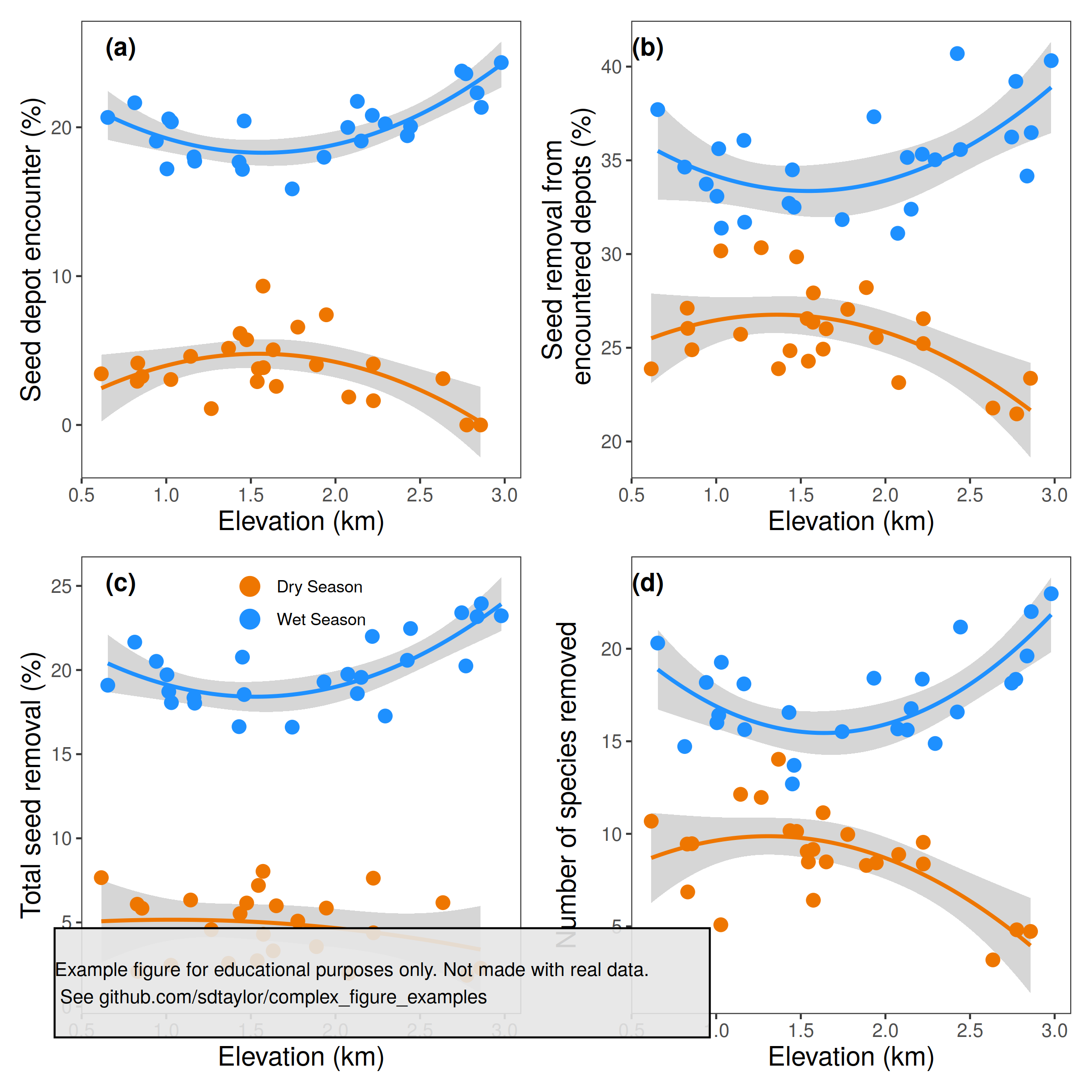
14 |
--------------------------------------------------------------------------------
/thein2020/simulated_data.csv:
--------------------------------------------------------------------------------
1 | elev,season,depot_encounter,removal_from_depot,total_removal,species_removed
2 | 1.16377165785525,Wet Season,18.010225346807776,36.06575669589098,18.357497849870313,18.10118612879642
3 | 1.4303097490919754,Wet Season,17.666139957420235,32.70587762950633,16.634632775475033,16.55791897420556
4 | 1.932133408379741,Wet Season,17.987196182323544,37.32602402753509,19.29474480963305,18.40884245304054
5 | 2.7705194749869406,Wet Season,23.597106105275536,39.21415139073938,20.242462419498274,18.346134985474404
6 | 1.0042048275936395,Wet Season,17.20359630437522,33.08187061383805,19.7193208050428,16.004180478936426
7 | 2.7459742124192417,Wet Season,23.778721812752686,36.24326862180558,23.404180511786443,18.14561176753616
8 | 2.8616881715133786,Wet Season,21.337507185458428,36.47944293514893,23.943160392661586,22.005102062539663
9 | 2.151994481217116,Wet Season,19.076754640056112,32.394109249836134,19.56360319393328,16.764725693191803
10 | 2.072785109747201,Wet Season,19.989039637807746,31.106684243702333,19.74892510015541,15.66990059119944
11 | 0.6544656761689112,Wet Season,20.66145759995917,37.70785887262985,19.096764722911693,20.306761680462174
12 | 1.0149364372482523,Wet Season,20.564238999218073,35.61995423687304,18.71752245489218,16.41389916111764
13 | 0.9413918813224882,Wet Season,19.071915541989668,33.73147170790778,20.51440049054551,18.17921694784554
14 | 2.217557116644457,Wet Season,20.801880591408775,35.32693937028553,21.996602851329495,18.358383016141836
15 | 1.4602592955343425,Wet Season,20.426276695065653,32.50133253360702,18.54228093229042,13.701184727245085
16 | 2.424603549996391,Wet Season,19.432767494604125,40.697404431786964,20.579167977665882,16.582695358581947
17 | 1.744248105213046,Wet Season,15.859772702956114,31.838293176189747,16.604834676803815,15.522132016310483
18 | 2.294046270661056,Wet Season,20.2349807842289,35.03177349242904,17.266355958192236,14.880756884650811
19 | 2.979765237076208,Wet Season,24.347702357698616,40.31939811628592,23.22493642043369,22.97255303437059
20 | 1.4500879485858604,Wet Season,17.171697128608596,34.4939602257616,20.765639851529045,12.695974775052456
21 | 2.4436130532994866,Wet Season,20.054596148157977,35.575969777779825,22.4655011546806,21.172111390001426
22 | 2.836763077764772,Wet Season,22.31186328463297,34.16300603020556,23.171775324718556,19.609413386220027
23 | 1.030356303206645,Wet Season,20.365197100584087,31.38446683587202,18.062075039058612,19.26829002144577
24 | 2.129184415214695,Wet Season,21.741442593221574,35.15507687698988,18.599658886203258,15.61257931008238
25 | 0.81388773990329355,Wet Season,21.64657083125663,34.6401591434337,21.656223822183243,14.717676429353913
26 | 1.16805167181883,Wet Season,17.721542858763062,31.699270752509605,18.02901301957077,15.631334812922432
27 | 1.7773992458824068,Dry Season,6.573606724619822,27.048648313062323,5.078822053894459,9.96707778981888
28 | 1.1440531520638615,Dry Season,4.609850529945769,25.719859672769147,6.332258549458745,12.134725910606514
29 | 0.6161522173788399,Dry Season,3.436027411488812,23.875159005335217,7.6617857717274775,10.684472621306849
30 | 1.5446406458504498,Dry Season,3.7810101845209934,24.285606847124903,7.199116019559844,8.482515540666775
31 | 2.6350037556840107,Dry Season,3.111611045224153,21.785230969433822,6.175968386490199,3.1896805191318576
32 | 1.368076694314368,Dry Season,5.153253590151678,23.882548116051286,2.5702858661665595,14.028255888950977
33 | 0.828605801332742,Dry Season,2.9353586731409687,27.113205253088125,6.080938785767055,9.447279979191283
34 | 1.436217161361128,Dry Season,6.14999859018846,24.84447281532967,5.526855812244618,10.169660876850717
35 | 2.0785505709936842,Dry Season,1.8754059771275906,23.143340445932182,1.9776940825166798,8.885395094409347
36 | 1.475197334191762,Dry Season,5.724791630328619,29.85025715359625,6.153721394045366,10.131892754654942
37 | 2.2240696219960228,Dry Season,1.6277199376766442,26.550820339496713,4.383110375319784,8.371867921212482
38 | 2.2235335311852396,Dry Season,4.0995633557953255,25.22422140764248,7.630690233408141,9.542904895977573
39 | 1.8872515578987077,Dry Season,4.0371203164168765,28.21064622272493,3.5615161260975596,8.293186637351601
40 | 1.5740610194625333,Dry Season,3.849613396463525,27.926648260575394,4.2933794499684295,6.413387202730602
41 | 1.6318001570180058,Dry Season,5.051049600729262,24.926357059961752,3.312624161669172,11.140519691333804
42 | 1.266108147217892,Dry Season,1.0972771240521517,30.33820090449311,4.571788052539095,11.965486026411266
43 | 1.9458848600042984,Dry Season,7.402889091467695,25.53966840714854,5.853746026403246,8.432241328979343
44 | 2.7759257606230676,Dry Season,0,21.471993759953587,1.8574867141399911,4.8144035491638215
45 | 0.8565102053107694,Dry Season,3.255075625906832,24.893337224943163,5.84288276481495,9.46661904020725
46 | 1.5376190632814541,Dry Season,2.9098465306717753,26.556763419222154,2.725521168148536,9.052268466969508
47 | 1.0273143766680732,Dry Season,3.0518716381901028,30.16946643869572,2.4575408149615154,5.087072826927321
48 | 1.571875927154906,Dry Season,9.327521831477581,26.36479347600831,8.03550415390945,9.157452459581426
49 | 0.831724938005209,Dry Season,4.155766370662896,26.03497274212322,2.089280200667094,6.8603744634201
50 | 1.6502411146648228,Dry Season,2.5936609076601673,26.011956097815755,5.9902113931638485,8.484324808808008
51 | 2.857392648118548,Dry Season,0,23.37192243757676,2.2777720200920077,4.72677939703814
52 |
--------------------------------------------------------------------------------
/thein2020/thein2020.R:
--------------------------------------------------------------------------------
1 | library(tidyverse)
2 | library(patchwork)
3 | library(cowplot)
4 |
5 | #--------------
6 | # This is a replication of Figure 1 from the following paper
7 | # Thein, M. M., Wu, L. M., Corlett, R. T., Quan, R. C., & Wang, B. (2020). Changes in seed predation
8 | # along a 2300‐m elevational gradient on a tropical mountain in Myanmar: a standardized test
9 | # with 32 non‐native plant species. Ecography. https://doi.org/10.1111/ecog.05385
10 |
11 | # This figure uses simulated data and is not an exact copy.
12 | # It's meant for educational purposes only.
13 | #--------------
14 | # The reproduced plot is made creating 4 different panels and combining them using the patchwork library.
15 | # An alternative method is at the end to create the same figure using facets instead.
16 | #--------------
17 |
18 |
19 | figure_data = read_csv('thein2020/simulated_data.csv')
20 |
21 | # Here we make 4 unique plots for the 4 variables.
22 | # They share everything in column except the data, so a common
23 | # base_figure can be specified with everything except the geoms.
24 | #
25 | # Note how the x and color values here get passed on to geom_point() and
26 | # geom_smooth() for all plots.
27 | base_figure = ggplot(figure_data, aes(x=elev, color=season)) +
28 | scale_color_manual(values = c('darkorange2','dodgerblue')) +
29 | scale_x_continuous(breaks=c(0.5, 1, 1.5, 2, 2.5, 3)) +
30 | theme_bw() +
31 | theme(legend.position = 'none') + # Turn off the legend for all plots. This can be turned back on in the plot where it's needed.
32 | labs(x='Elevation (km)')
33 |
34 | point_size = 3
35 |
36 | panel_a = base_figure +
37 | geom_smooth(aes(y=depot_encounter),method='lm', formula = y~poly(x,2)) + # Fit a 2nd order polynomial smoothing line, this needs to be repeated for each
38 | geom_point(aes(y=depot_encounter), size=point_size) + # panel using the respective variable.
39 | labs(y='Seed depot encounter (%)')
40 |
41 | panel_b = base_figure +
42 | geom_smooth(aes(y=removal_from_depot),method='lm', formula = y~poly(x,2)) +
43 | geom_point(aes(y=removal_from_depot), size=point_size) +
44 | labs(y='Seed removal from\n encountered depots (%)') # Note the \n to get the text to wrap
45 |
46 | panel_c = base_figure +
47 | geom_smooth(aes(y=total_removal),method='lm', formula = y~poly(x,2), show.legend = FALSE) +
48 | geom_point(aes(y=total_removal), size=point_size) +
49 | theme(legend.title = element_blank(), # Add the legend to the (c) panel. Position is relative to this panel only.
50 | legend.background = element_blank(), # show.legend = FALSE in the geom_smooth for this panel turns off the line inside the legend
51 | legend.position = c(0.5,0.91)) +
52 | labs(y='Total seed removal (%)') +
53 | guides(color = guide_legend(override.aes = list(size=4.5))) # Make the points in the legend slightly larger to distinquish from surrounding points.
54 |
55 | panel_d = base_figure +
56 | geom_smooth(aes(y=species_removed),method='lm', formula = y~poly(x,2)) +
57 | geom_point(aes(y=species_removed), size=point_size) +
58 | labs(y='Number of species removed')
59 |
60 |
61 | # put them together with patchwork
62 | primary_figure = panel_a + panel_b + panel_c + panel_d +
63 | plot_layout(ncol=2) +
64 | plot_annotation(tag_levels = 'a', tag_prefix = '(', tag_suffix = ')') & # This & is special for the patchwork library and applies the theme to all plots.
65 | theme(plot.tag.position = c(0.2,0.95), # See https://patchwork.data-imaginist.com/articles/guides/annotation.html for detail
66 | plot.tag = element_text(face = 'bold'),
67 | panel.grid = element_blank(),
68 | axis.text = element_text(size=10),
69 | axis.title = element_text(size=14))
70 |
71 | #--------------
72 | water_mark = 'Example figure for educational purposes only. Not made with real data.\n See github.com/sdtaylor/complex_figure_examples'
73 |
74 | final_figure = ggdraw(primary_figure) +
75 | geom_rect(data=data.frame(xmin=0.05,ymin=0.05), aes(xmin=xmin,ymin=ymin, xmax=xmin+0.6,ymax=ymin+0.1),alpha=0.9, fill='grey90', color='black') +
76 | draw_text(water_mark, x=0.05, y=0.1, size=10, hjust = 0)
77 |
78 | save_plot('./thein2020/thein2020_final.png', plot=final_figure, base_height = 8, base_width = 8)
79 |
80 |
81 |
82 | #--------------
83 | # Alternative method using facets
84 | # This uses the tagger package to label a-c on the panels.
85 | # https://github.com/eliocamp/tagger
86 | #--------------
87 | #
88 | # This can also be done using a facet instead of 4 separate plots
89 | # 1st need to convert the data to a long format, where there is a new column for the variable of interest
90 | figure_data_long = figure_data %>%
91 | pivot_longer(c(-elev, -season), names_to='variable', values_to='variable_value')
92 |
93 | # Convert the variable to a factor column, where the factor labels are the ultimate title on each panel
94 | # The order here also defines the panel order (left -> right, top -> bottom)
95 | variables = c('depot_encounter',
96 | 'removal_from_depot',
97 | 'total_removal',
98 | 'species_removed')
99 | nice_variable_names = c('Seed depot encounter (%)',
100 | 'Seed removal from\n encountered depots (%)',
101 | 'Total seed removal (%)',
102 | 'Number of species removed')
103 |
104 | figure_data_long$variable = factor(figure_data_long$variable, levels = variables, labels = nice_variable_names, ordered = TRUE)
105 |
106 |
107 | alternate_method_figure = ggplot(figure_data_long, aes(x=elev, y=variable_value, color=season)) +
108 | geom_point(size=3) +
109 | geom_smooth(method='lm', formula = y~poly(x,2), show.legend = FALSE) +
110 | scale_color_manual(values = c('darkorange2','dodgerblue')) +
111 | scale_x_continuous(breaks=c(0.5, 1, 1.5, 2, 2.5, 3)) +
112 | facet_wrap(~variable, scales='free', strip.position = 'left') + # set te "strip" to the left side
113 | tagger::tag_facets(tag_prefix = '(', tag_suffix = ')') +
114 | theme_bw() +
115 | theme(panel.grid = element_blank(),
116 | legend.position = c(0.75,0.425),
117 | legend.title = element_blank(),
118 | axis.text = element_text(size=10),
119 | axis.title = element_text(size=14),
120 | strip.text = element_text(size=18),
121 | strip.background = element_blank(), # Turn off the grey strip background, and
122 | strip.placement = 'outside') + # put it outside the axis numbers.
123 | labs(x='Elevation (km)', y='') +
124 | guides(color = guide_legend(override.aes = list(size=4.5))) # Make the points in the legend slightly larger to distinquish from surrounding points.
125 |
126 |
127 |
--------------------------------------------------------------------------------
/thein2020/thein2020_final.png:
--------------------------------------------------------------------------------
https://raw.githubusercontent.com/sdtaylor/complex_figure_examples/bbfb102e71f6b9a6177e0845996594d962225dbc/thein2020/thein2020_final.png
--------------------------------------------------------------------------------
/yan2019/readme.md:
--------------------------------------------------------------------------------
1 | ## Paper
2 | Yan, D., Scott, R. L., Moore, D. J. P., Biederman, J. A., & Smith, W. K. (2019). Understanding the relationship between vegetation greenness and productivity across dryland ecosystems through the integration of PhenoCam, satellite, and eddy covariance data. Remote Sensing of Environment, 223, 50–62. https://doi.org/10.1016/j.rse.2018.12.029
3 |
4 | Figure 5
5 |
6 | ## Notes
7 |
8 | This uses two base figures. One for the scatterplot and one for the barcharts. The scatter plot uses facet_wrap, but all the row, column, and axis titles are inserted manually using `cowplot::draw_plot() + geom_text()`. facet_wrap does not have a way to insert text like this outside the normal facet_wrap strip labels.
9 |
10 | ## Reproduced Figure
11 | 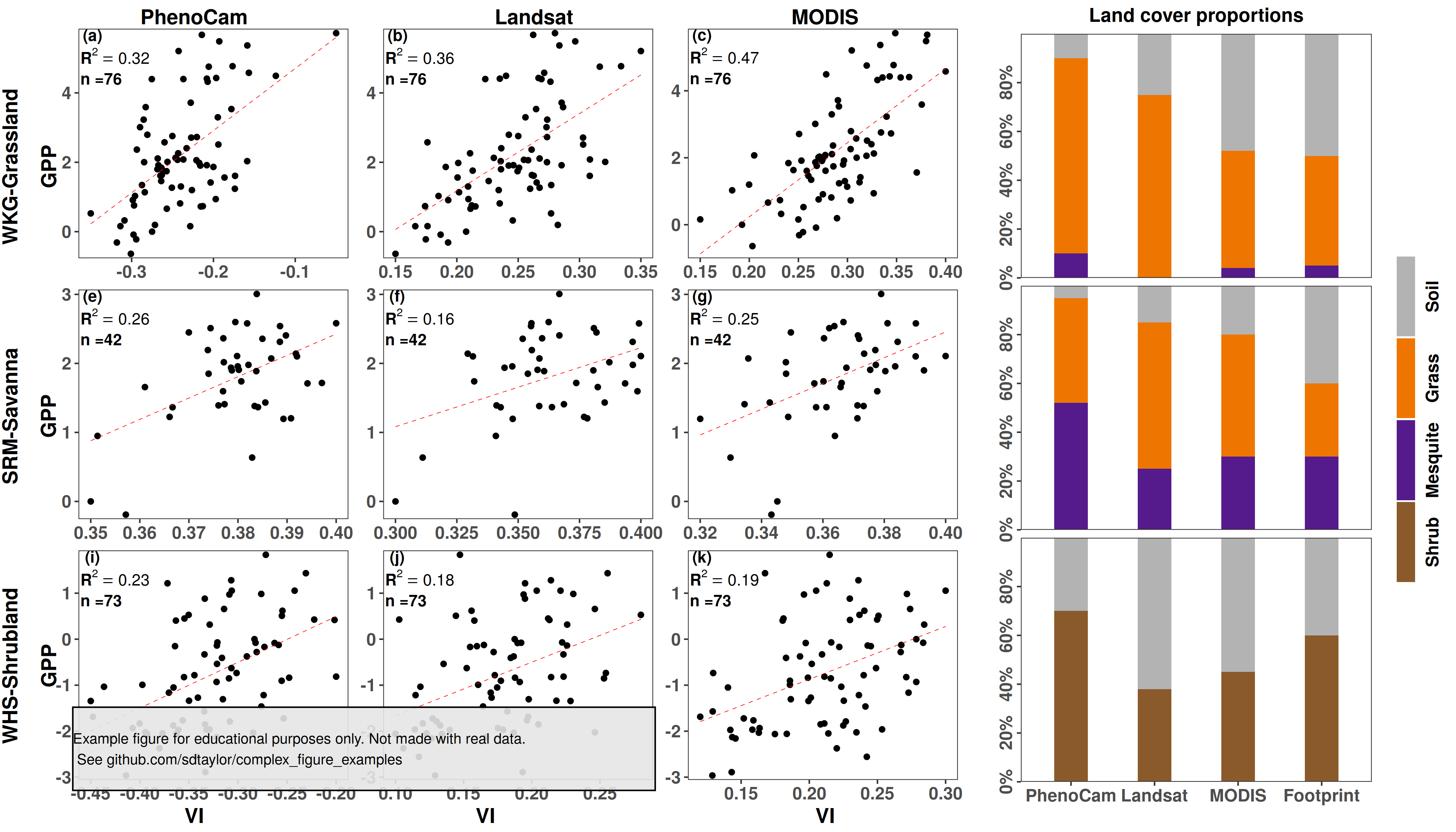
12 |
--------------------------------------------------------------------------------
/yan2019/yan2019.R:
--------------------------------------------------------------------------------
1 | library(tidyverse)
2 | library(cowplot)
3 |
4 | ##################################
5 | # This is a replication of Figure 5 from the following paper
6 | # Yan, D., Scott, R. L., Moore, D. J. P., Biederman, J. A., & Smith, W. K. (2019).
7 | # Understanding the relationship between vegetation greenness and productivity across
8 | # dryland ecosystems through the integration of PhenoCam, satellite, and eddy covariance data.
9 | # Remote Sensing of Environment, 223, 50–62. https://doi.org/10.1016/j.rse.2018.12.029
10 |
11 | # This figure uses simulated data and is not an exact copy.
12 | # It's meant for educational purposes only.
13 | ##################################
14 |
15 | #####################################
16 | # Generate some similar looking data for the figures
17 | generate_random_timeseries = function(n,initial_value,error){
18 | ts = rep(NA, n)
19 | ts[1] = initial_value
20 | for(t in 2:n){
21 | ts[t] = ts[t-1] + rnorm(1, mean=0, sd=error)
22 | }
23 | return(ts)
24 | }
25 |
26 | generate_correlated_timeseries = function(ts, error, scale_min, scale_max){
27 | n=length(ts)
28 | new_ts = ts + rnorm(n=n, mean=0, sd=error)
29 | return(scales::rescale(new_ts, to=c(scale_min,scale_max)))
30 | }
31 |
32 | set.seed(1)
33 |
34 | # The data consist of 3 locations, each with a GPP measurement (y axis) and 3 correlated visual indexes (Phenocam, landsat, & MODIS)
35 | grassland = data.frame(gpp = generate_random_timeseries(n=76, initial_value = 0, error = 0.5), site='grassland')
36 | grassland$phenocam = generate_correlated_timeseries(grassland$gpp, error=2, scale_min=-0.35,scale_max = -0.05)
37 | grassland$landsat = generate_correlated_timeseries(grassland$gpp, error=2, scale_min=0.15, scale_max = 0.35)
38 | grassland$modis = generate_correlated_timeseries(grassland$gpp, error=2, scale_min=0.15, scale_max = 0.4)
39 |
40 | savanna = data.frame(gpp = generate_random_timeseries(n=42, initial_value = 0, error = 0.5), site='savanna')
41 | savanna$phenocam = generate_correlated_timeseries(savanna$gpp, error=2, scale_min=0.35,scale_max = 0.4)
42 | savanna$landsat = generate_correlated_timeseries(savanna$gpp, error=2, scale_min=0.3, scale_max = 0.4)
43 | savanna$modis = generate_correlated_timeseries(savanna$gpp, error=2, scale_min=0.32, scale_max = 0.4)
44 |
45 | shrubland = data.frame(gpp = generate_random_timeseries(n=73, initial_value = 0, error = 0.5), site='shrubland')
46 | shrubland$phenocam = generate_correlated_timeseries(shrubland$gpp, error=2, scale_min=-0.45,scale_max = -0.2)
47 | shrubland$landsat = generate_correlated_timeseries(shrubland$gpp, error=2, scale_min=0.1, scale_max = 0.28)
48 | shrubland$modis = generate_correlated_timeseries(shrubland$gpp, error=2, scale_min=0.12, scale_max = 0.3)
49 |
50 | scatter_plot_data = grassland %>%
51 | bind_rows(savanna) %>%
52 | bind_rows(shrubland) %>%
53 | pivot_longer(cols=c(phenocam, landsat, modis), names_to = 'sensor', values_to = 'sensor_value')
54 |
55 |
56 |
57 | #### Now eyeball the data for the barplots
58 | barplot_data = tribble(
59 | ~site, ~sensor, ~landcover, ~percent,
60 | 'grassland','PhenoCam','Mesquite',10,
61 | 'grassland','PhenoCam','Grass',80,
62 | 'grassland','PhenoCam','Soil',10,
63 | 'grassland','Landsat','Mesquite',0,
64 | 'grassland','Landsat','Grass',75,
65 | 'grassland','Landsat','Soil',25,
66 | 'grassland','MODIS','Mesquite',4,
67 | 'grassland','MODIS','Grass',48,
68 | 'grassland','MODIS','Soil',48,
69 | 'grassland','Footprint','Mesquite',5,
70 | 'grassland','Footprint','Grass',45,
71 | 'grassland','Footprint','Soil',50,
72 |
73 | 'savanna','PhenoCam','Mesquite',52,
74 | 'savanna','PhenoCam','Grass',43,
75 | 'savanna','PhenoCam','Soil',5,
76 | 'savanna','Landsat','Mesquite',25,
77 | 'savanna','Landsat','Grass',60,
78 | 'savanna','Landsat','Soil',15,
79 | 'savanna','MODIS','Mesquite',30,
80 | 'savanna','MODIS','Grass',50,
81 | 'savanna','MODIS','Soil',20,
82 | 'savanna','Footprint','Mesquite',30,
83 | 'savanna','Footprint','Grass',30,
84 | 'savanna','Footprint','Soil',40,
85 |
86 | 'shrubland','PhenoCam','Shrub',70,
87 | 'shrubland','PhenoCam','Soil',30,
88 | 'shrubland','Landsat','Shrub',38,
89 | 'shrubland','Landsat','Soil',62,
90 | 'shrubland','MODIS','Shrub',45,
91 | 'shrubland','MODIS','Soil',55,
92 | 'shrubland','Footprint','Shrub',60,
93 | 'shrubland','Footprint','Soil',40
94 | )
95 |
96 |
97 | #############################################################3
98 | # 1st the scatter plot
99 | #
100 |
101 | sensor_values = c('phenocam','landsat','modis')
102 | sensor_labels = c('PhenoCam','Landsat','MODIS')
103 | site_values = c('grassland','savanna','shrubland')
104 | site_labels = c('WKG-Grassland','SRM-Savanna','WHS-Shrubland')
105 |
106 | scatter_plot_data$sensor = factor(scatter_plot_data$sensor, levels = sensor_values, labels = sensor_labels, ordered = T)
107 | scatter_plot_data$site = factor(scatter_plot_data$site, levels = site_values, labels = site_labels, ordered = T)
108 |
109 | # Note there are many ways to extract summary and model statistics
110 | # in a group_by operation. group_by + do, using purrr, there are also methods in
111 | # the ggpmisc package which insert summary stats directly in figures.
112 | get_r2 = function(x,y){summary(lm(y~x))$r.squared}
113 |
114 | scatter_plot_labels = scatter_plot_data %>%
115 | group_by(site, sensor) %>%
116 | summarise(r2 = get_r2(x=sensor_value, y=gpp),
117 | n=n(),
118 | x_pos = min(sensor_value),
119 | y_pos = max(gpp) - (0.03* diff(range(gpp)))) %>%
120 | ungroup() %>%
121 | mutate(r2_label = paste0('bold(R^2==',round(r2,2),')'),
122 | n_label = paste0('n =',n))
123 |
124 | # Order by site and sensor so the letter labels get ordered correctly.
125 | scatter_plot_labels = arrange(scatter_plot_labels, site, sensor)
126 | scatter_plot_labels$letter = c('(a)','(b)','(c)','(e)','(f)','(g)','(i)','(j)','(k)')
127 |
128 |
129 | # Here the best option for the 3x3 grid of plots is facet_wrap, since it handles all the alignment
130 | # it is too usefull not to use. The labelling of the rows and columns as in the original figure is
131 | # not possible with facet_wrap though. So here we'll essentially "turn off" the default labels
132 | # by setting strip.background and strip.text to element_blank(), and then adding the 6 row/column
133 | # labels manually. The alignment of the text inside each plot is done manually in the scatter_plot_labels
134 | # data.frame, and nudged slightly by hand below using the hjust/vjust arguments.
135 |
136 | scatter_plot = ggplot(scatter_plot_data, aes(x=sensor_value, y=gpp)) +
137 | geom_point() +
138 | geom_smooth(method='lm', se=FALSE, linetype='dashed', color='red', size=0.2) +
139 | geom_text(data=scatter_plot_labels, aes(x=x_pos, y=y_pos, label=letter), hjust=0.4, vjust=0.1, fontface='bold') +
140 | geom_text(data=scatter_plot_labels, aes(x=x_pos, y=y_pos, label=r2_label),hjust=0.15, vjust=1.5, fontface='bold', parse=TRUE) +
141 | geom_text(data=scatter_plot_labels, aes(x=x_pos, y=y_pos, label=n_label), hjust=0.25, vjust=3.8, fontface='bold') +
142 | scale_y_continuous(expand = expansion(mult=0.02)) +
143 | facet_wrap(site~sensor, scales='free', strip.position = 'left') +
144 | theme_bw() +
145 | theme(strip.background = element_blank(),
146 | strip.text = element_blank(),
147 | axis.title = element_blank(),
148 | panel.grid = element_blank(),
149 | axis.text = element_text(face='bold', size=12))
150 |
151 | top_y = 0.98
152 | left_x_site = 0.01
153 | left_x_axis = 0.05
154 | bottom_y = 0.02
155 | scatter_plot_axis_labels = tribble(
156 | ~label, ~x, ~y, ~angle,
157 | 'WKG-Grassland', left_x_site, 0.8, 90,
158 | 'SRM-Savanna', left_x_site, 0.5, 90,
159 | 'WHS-Shrubland', left_x_site, 0.2, 90,
160 |
161 | 'GPP', left_x_axis, 0.8, 90,
162 | 'GPP', left_x_axis, 0.5, 90,
163 | 'GPP', left_x_axis, 0.2, 90,
164 |
165 | 'PhenoCam', 0.2, top_y, 0,
166 | 'Landsat', 0.55, top_y, 0,
167 | 'MODIS', 0.85, top_y, 0,
168 |
169 | 'VI', 0.2, bottom_y, 0,
170 | 'VI', 0.5, bottom_y, 0,
171 | 'VI', 0.85, bottom_y, 0
172 | )
173 |
174 | # Insert the 3x3 scatter plot using draw_plot so it can be scaled slightly
175 |
176 | scatter_plot_with_labels = ggdraw() +
177 | draw_plot(scatter_plot, scale=0.95, hjust = -0.02) +
178 | geom_text(data = scatter_plot_axis_labels, aes(x=x,y=y,label=label,angle=angle),
179 | hjust=0.5, fontface='bold', size=5)
180 |
181 | ##################################################
182 | # The barplots
183 |
184 | barplot_sensor_order = c('PhenoCam','Landsat','MODIS','Footprint')
185 | barplot_data$sensor = factor(barplot_data$sensor, levels = barplot_sensor_order, ordered = TRUE)
186 |
187 | barplot_landcover_details = tribble(
188 | ~landcover, ~fill_color,
189 | 'Soil', 'grey70',
190 | 'Grass', 'darkorange2',
191 | 'Mesquite', 'purple4',
192 | 'Shrub', 'tan4'
193 | )
194 |
195 | barplot_data$landcover = factor(barplot_data$landcover, levels=barplot_landcover_details$landcover, ordered = TRUE)
196 |
197 | # This is "close enough" version of the bar plot. Replicating the original one from Yan 2019 exactly would
198 | # be clumsy here, as the each of the 3 barplots would need to be done individually to each have their own
199 | # legend.
200 | barplot = ggplot(barplot_data, aes(x=sensor, y=percent, fill=landcover)) +
201 | geom_col(width=0.4) +
202 | scale_fill_manual(values = barplot_landcover_details$fill_color) +
203 | scale_y_continuous(breaks=c(0,20,40,60,80), labels = function(x){paste0(x,'%')}, expand=c(0,0)) +
204 | facet_grid(site~.) +
205 | theme_bw() +
206 | theme(strip.background = element_blank(),
207 | strip.text = element_blank(),
208 | panel.grid = element_blank(),
209 | plot.title = element_text(face='bold', hjust=0.5),
210 | axis.text.x = element_text(face = 'bold', size=12),
211 | axis.text.y = element_text(face = 'bold', size=12, angle = 90, hjust=0.5),
212 | legend.key.height = unit(20,'mm'),
213 | ) +
214 | labs(x='',y='',title='Land cover proportions') +
215 | guides(fill = guide_legend(direction = 'vertical', label.position = 'right', title='',
216 | keyheight = unit(20,'mm'), keywidth = unit(5,'mm'),
217 | label.theme = element_text(angle=90, hjust=0.5, face='bold')))
218 |
219 | ####################################
220 | # And combine them
221 |
222 | aligned=align_plots(scatter_plot_with_labels, barplot, align = 'v', axis='tb')
223 | final_figure = plot_grid(aligned[[1]], aligned[[2]], nrow=1, rel_widths = c(1,0.5))
224 |
225 | water_mark = 'Example figure for educational purposes only. Not made with real data.\n See github.com/sdtaylor/complex_figure_examples'
226 |
227 | final_figure = ggdraw(final_figure) +
228 | geom_rect(data=data.frame(xmin=0.05,ymin=0.05), aes(xmin=xmin,ymin=ymin, xmax=xmin+0.4,ymax=ymin+0.1),alpha=0.9, fill='grey90', color='black') +
229 | draw_text(water_mark, x=0.05, y=0.1, size=10, hjust = 0)
230 |
231 | save_plot('./yan2019/yan2019_final.png', plot=final_figure, base_height = 8, base_width = 14)
232 |
--------------------------------------------------------------------------------
/yan2019/yan2019_final.png:
--------------------------------------------------------------------------------
https://raw.githubusercontent.com/sdtaylor/complex_figure_examples/bbfb102e71f6b9a6177e0845996594d962225dbc/yan2019/yan2019_final.png
--------------------------------------------------------------------------------
/zhang2020/readme.md:
--------------------------------------------------------------------------------
1 | ## Paper
2 | Zhang, Qiang, et al. "Trait–environment relationships differ between mixed‐species flocking and non‐flocking bird assemblages." 2020. Ecology. https://doi.org/10.1002/ecy.3124
3 |
4 | ## Reproduced Figure 3
5 | 
6 |
--------------------------------------------------------------------------------
/zhang2020/zhang2020.R:
--------------------------------------------------------------------------------
1 | library(tidyverse)
2 | library(cowplot)
3 |
4 | ##################################
5 | # This is a replication of Figure 3 from the following paper
6 | # Zhang, Qiang, et al. "Trait–environment relationships differ between mixed‐species flocking and non‐flocking bird assemblages."
7 | # 2020. Ecology. https://doi.org/10.1002/ecy.3124
8 |
9 | # This figure uses simulated data and is not an exact copy.
10 | # It's meant for educational purposes only.
11 | #############################################
12 |
13 | predictors = c('Elevation','NDVI','Arbor','Shrub','Herb','DBHmean','Heightmax','IVdomi','PC1','PC2')
14 | traits = c('Diet.FRU','Diet.INS','Diet.OMN','Subs.CAN','Subs.GRU','Subs.MID','Subs.UND','Breeding','Nest',
15 | 'Clutch','Body','Bill','Tarsus','Disperse','Habitat','Vertical')
16 |
17 | # A plot like this requires a data.frame row for every row x columnn combination in the figure. expand_grid does this
18 | # to make data for this example, but your data may need reshaping.
19 |
20 | plot_a_data = expand_grid(trait = traits, predictor = predictors)
21 | plot_b_data = expand_grid(trait = traits, predictor = predictors)
22 |
23 | # Mark some random locations for color coding by grey/red/blue, indicating no/positive/negative associationes.
24 | set.seed(1)
25 | plot_a_data$significance = 'none'
26 | plot_a_data$significance[sample.int(160, 3)] = 'negative' # 3 random entires choses out of a possible 160
27 | plot_a_data$significance[sample.int(160, 2)] = 'positive' #
28 |
29 | plot_b_data$significance = 'none'
30 | plot_b_data$significance[sample.int(160, 12)] = 'negative' # 3 random entires choses out of a possible 160
31 | plot_b_data$significance[sample.int(160, 20)] = 'positive' #
32 |
33 | #######################
34 | # Correctly order everything using factors.
35 | # For trait and predictor this dictactes the order of the axis labels. For significance this dictates
36 | # the order the colors are assigned, which allows us to easily match the correct color using scale_fill_manual()
37 |
38 | # The ordered=TRUE arguments sets the order as the one specified in the levels argument. For predictor and trait this
39 | # ends up being the order specified in the first variables above.
40 | # Note that in the ggplot call trait is wrapped with fct_rev. Since the traits are ordered top->bottom, but ggplot
41 | # orders from bottom->top (ie. starting at 0)
42 | plot_a_data$significance = factor(plot_a_data$significance, levels=c('none','positive','negative'))
43 | plot_a_data$predictor = factor(plot_a_data$predictor, levels=predictors, ordered = TRUE)
44 | plot_a_data$trait = factor(plot_a_data$trait, levels=traits, ordered = TRUE)
45 |
46 | plot_b_data$significance = factor(plot_b_data$significance, levels=c('none','positive','negative'))
47 | plot_b_data$predictor = factor(plot_b_data$predictor, levels=predictors, ordered = TRUE)
48 | plot_b_data$trait = factor(plot_b_data$trait, levels=traits, ordered = TRUE)
49 | #######################
50 |
51 | # Both x and y axis are discrete here. So to draw lines intercepting them we can
52 | # place geom_vline and geom_hline at the appropriate 0.5 intervals.
53 | # Note there are probably better visuals to distinguish the different trait groups...
54 | trait_grey_lines = c(10.5,11.5,12.5,14.5,15.5)
55 | trait_black_lines = c(0.5,1.5,2.5,3.5,4.5,5.5,6.5,7.5,8.5,9.5,13.5,16.5)
56 |
57 | plot_a = ggplot(plot_a_data, aes(x=predictor, y=fct_rev(trait), fill=significance)) +
58 | geom_tile() +
59 | scale_fill_manual(values=c('grey80','deepskyblue','red2')) +
60 | geom_hline(yintercept = trait_black_lines, color='black', size=1) +
61 | geom_hline(yintercept = trait_grey_lines, color='grey95', size=1) +
62 | geom_vline(xintercept = seq(0.5,11.5,1), color='black', size=1) + # predictor lines are at every interval
63 | scale_x_discrete(position = 'top', expand=c(0,0)) + # put the x axis text on top. expand = c(0,0) drops the buffer at the edges of the plot
64 | scale_y_discrete(expand=c(0,0)) +
65 | theme(axis.title = element_blank(),
66 | axis.text = element_text(color='black',size=18),
67 | axis.text.x = element_text(angle=90, hjust=0),
68 | axis.ticks = element_blank(),
69 | legend.position = 'none')
70 |
71 | plot_b = ggplot(plot_b_data, aes(x=predictor, y=fct_rev(trait), fill=significance)) +
72 | geom_tile() +
73 | scale_fill_manual(values=c('grey80','deepskyblue','red2')) +
74 | geom_hline(yintercept = trait_black_lines, color='black', size=1) +
75 | geom_hline(yintercept = trait_grey_lines, color='grey95', size=1) +
76 | geom_vline(xintercept = seq(0.5,11.5,1), color='black', size=1) + # predictor lines are at every interval
77 | scale_x_discrete(position = 'top', expand=c(0,0)) + # put the x axis text on top. expand = c(0,0) drops the buffer at the edges of the plot
78 | scale_y_discrete(expand=c(0,0)) +
79 | theme(axis.title = element_blank(),
80 | axis.text = element_text(color='black',size=18),
81 | axis.text.x = element_text(angle=90, hjust=0),
82 | axis.ticks = element_blank(),
83 | legend.position = 'none')
84 |
85 | final_figure = plot_grid(plot_a, plot_b, nrow=1, labels=c('(a)','(b)'), label_size = 22)
86 |
87 | #################################################
88 | water_mark = 'Example figure for educational purposes only. Not made with real data.\n See github.com/sdtaylor/complex_figure_examples'
89 |
90 | final_figure = ggdraw(final_figure) +
91 | geom_rect(data=data.frame(xmin=0.05,ymin=0.05), aes(xmin=xmin,ymin=ymin, xmax=xmin+2.4,ymax=ymin+0.1),alpha=0.9, fill='grey90', color='black') +
92 | draw_text(water_mark, x=0.05, y=0.1, size=20, hjust = 0)
93 |
94 | save_plot('./zhang2020/zhang2020_final.png', plot=final_figure, base_height = 9, base_width = 12, dpi=50)
95 |
--------------------------------------------------------------------------------
/zhang2020/zhang2020_final.png:
--------------------------------------------------------------------------------
https://raw.githubusercontent.com/sdtaylor/complex_figure_examples/bbfb102e71f6b9a6177e0845996594d962225dbc/zhang2020/zhang2020_final.png
--------------------------------------------------------------------------------
26 |
--------------------------------------------------------------------------------
/reyes2019/readme.md:
--------------------------------------------------------------------------------
1 | ## Paper
2 | Reyes, J. J., & Elias, E. (2019). Spatio-temporal variation of crop loss in the United States from 2001 to 2016. Environmental Research Letters, 14(7), 074017. https://doi.org/10.1088/1748-9326/ab1ac9
3 |
4 | Figure 5
5 |
6 | ## Notes
7 | A nice way of showing variation across many categories.
8 | Note this is done using `geom_point()`, the X/O significance are different shapes.
9 |
10 | ## Reproduced Figure
11 | 
12 |
--------------------------------------------------------------------------------
/reyes2019/reyes2019.R:
--------------------------------------------------------------------------------
1 | library(tidyverse)
2 | library(cowplot) # cowplot is used here just for the disclaimer watermark at the end. Its not needed for the primary figure.
3 |
4 |
5 | cause_of_loss = c('Wind/Excess Wind','Hot Wind','Heat','Hail','Freeze','Flood','Failure Irrig Supply',
6 | 'Excess Moisture/Precip/Rain','Drought','Cold Wet Weather')
7 | time_periods = c('Annual','JAN','FEB','MAR','APR','MAY','JUN','JUL','AUG','SEP','OCT','NOV','DEC')
8 |
9 | all_data = expand_grid(cause = cause_of_loss, time = time_periods)
10 |
11 | # Order them in the order specified above. Note for the cause loss the order will be reversed
12 | # in ggplot call because I made the order top->bottom, but ggplot orders it bottom->top (ie. starting at 0 on the y-axis)
13 | all_data$cause = factor(all_data$cause, levels = cause_of_loss, ordered = TRUE)
14 | all_data$time = factor(all_data$time, levels = time_periods, ordered = TRUE)
15 |
16 | set.seed(1)
17 | # Make some random significance values
18 | all_data$tau = rnorm(n=nrow(all_data), mean=0, sd=0.3)
19 | all_data$sig = ifelse(abs(all_data$tau) > 0.6 , 'yes','no')
20 |
21 |
22 | final_figure = ggplot(all_data, aes(x=time, y=fct_rev(cause), color=tau, shape=sig)) +
23 | geom_point(size=14, stroke=5) +
24 | scale_color_distiller(palette = 'RdBu', limits=c(-1,1)) +
25 | scale_shape_manual(values=c(1,4)) +
26 | theme_bw(28) +
27 | theme(panel.grid = element_blank(),
28 | legend.position = 'bottom',
29 | axis.title = element_blank(),
30 | legend.direction = 'horizontal') +
31 | guides(color=guide_colorbar(title.position = 'top', title = 'tau', barwidth = unit(8,'cm'), barheight = unit(1.5,'cm')),
32 | shape=guide_legend(title.position = 'top', title = 'Significance', override.aes = list(size=8,stroke=3)))
33 |
34 | #############################################
35 | water_mark = 'Example figure for educational purposes only. Not made with real data.\n See github.com/sdtaylor/complex_figure_examples'
36 |
37 | final_figure = ggdraw(final_figure) +
38 | geom_rect(data=data.frame(xmin=0.05,ymin=0.15), aes(xmin=xmin,ymin=ymin, xmax=xmin+0.5,ymax=ymin+0.1),alpha=0.9, fill='grey90', color='black') +
39 | draw_text(water_mark, x=0.05, y=0.2, size=15, hjust = 0)
40 |
41 | ggsave(plot = final_figure, filename = 'reyes2019/reyes2019_final.png', width=45, height = 25, unit='cm', dpi=50)
42 |
--------------------------------------------------------------------------------
/reyes2019/reyes2019_final.png:
--------------------------------------------------------------------------------
https://raw.githubusercontent.com/sdtaylor/complex_figure_examples/bbfb102e71f6b9a6177e0845996594d962225dbc/reyes2019/reyes2019_final.png
--------------------------------------------------------------------------------
/suggitt2019/data/Koppen_Geiger Edited and Completed/Read me.txt:
--------------------------------------------------------------------------------
1 | The climate Shapefile is based on the Koppen-Geiger
2 |
3 | Vectorised by by Geoafrikana.com
4 |
5 | based on raster file from
6 | Kottek, M., J. Grieser, C. Beck, B. Rudolf, and F. Rubel, 2006: World Map of the K?ppen-Geiger climate classification updated. Meteorol. Z., 15, 259-263. DOI: 10.1127/0941-2948/2006/0130.
7 |
--------------------------------------------------------------------------------
/suggitt2019/data/Koppen_Geiger Edited and Completed/Shapefiles/world_climates_completed_koppen_geiger.cpg:
--------------------------------------------------------------------------------
1 | UTF-8
--------------------------------------------------------------------------------
/suggitt2019/data/Koppen_Geiger Edited and Completed/Shapefiles/world_climates_completed_koppen_geiger.dbf:
--------------------------------------------------------------------------------
https://raw.githubusercontent.com/sdtaylor/complex_figure_examples/bbfb102e71f6b9a6177e0845996594d962225dbc/suggitt2019/data/Koppen_Geiger Edited and Completed/Shapefiles/world_climates_completed_koppen_geiger.dbf
--------------------------------------------------------------------------------
/suggitt2019/data/Koppen_Geiger Edited and Completed/Shapefiles/world_climates_completed_koppen_geiger.prj:
--------------------------------------------------------------------------------
1 | GEOGCS["GCS_WGS_1984",DATUM["D_WGS_1984",SPHEROID["WGS_1984",6378137,298.257223563]],PRIMEM["Greenwich",0],UNIT["Degree",0.017453292519943295]]
--------------------------------------------------------------------------------
/suggitt2019/data/Koppen_Geiger Edited and Completed/Shapefiles/world_climates_completed_koppen_geiger.qpj:
--------------------------------------------------------------------------------
1 | GEOGCS["WGS 84",DATUM["WGS_1984",SPHEROID["WGS 84",6378137,298.257223563,AUTHORITY["EPSG","7030"]],AUTHORITY["EPSG","6326"]],PRIMEM["Greenwich",0,AUTHORITY["EPSG","8901"]],UNIT["degree",0.0174532925199433,AUTHORITY["EPSG","9122"]],AUTHORITY["EPSG","4326"]]
2 |
--------------------------------------------------------------------------------
/suggitt2019/data/Koppen_Geiger Edited and Completed/Shapefiles/world_climates_completed_koppen_geiger.shp:
--------------------------------------------------------------------------------
https://raw.githubusercontent.com/sdtaylor/complex_figure_examples/bbfb102e71f6b9a6177e0845996594d962225dbc/suggitt2019/data/Koppen_Geiger Edited and Completed/Shapefiles/world_climates_completed_koppen_geiger.shp
--------------------------------------------------------------------------------
/suggitt2019/data/Koppen_Geiger Edited and Completed/Shapefiles/world_climates_completed_koppen_geiger.shx:
--------------------------------------------------------------------------------
https://raw.githubusercontent.com/sdtaylor/complex_figure_examples/bbfb102e71f6b9a6177e0845996594d962225dbc/suggitt2019/data/Koppen_Geiger Edited and Completed/Shapefiles/world_climates_completed_koppen_geiger.shx
--------------------------------------------------------------------------------
/suggitt2019/data/Koppen_Geiger Edited and Completed/Style/world_climate.qml:
--------------------------------------------------------------------------------
1 |
2 |
3 |
4 |
5 |
6 |
7 |
8 |
9 |
10 |
11 |
12 |
13 |
14 |
15 |
16 |
17 |
18 |
19 |
20 |
21 |
22 |
23 |
24 |
25 |
26 |
27 |
28 |
29 |
30 |
31 |
32 |
33 |
34 |
35 |
36 |
37 |
38 |
39 |
40 |
41 |
42 |
43 |
44 |
45 |
46 |
47 |
48 |
49 |
50 |
51 |
52 |
53 |
54 |
56 |
57 |
58 |
59 |
60 |
61 |
62 |
63 |
64 |
65 |
66 |
67 |
68 |
69 |
70 |
71 |
72 |
73 |
74 |
75 |
76 |
78 |
79 |
80 |
81 |
82 |
83 |
84 |
85 |
86 |
87 |
88 |
89 |
90 |
91 |
92 |
93 |
94 |
95 |
96 |
97 |
98 |
100 |
101 |
102 |
103 |
104 |
105 |
106 |
107 |
108 |
109 |
110 |
111 |
112 |
113 |
114 |
115 |
116 |
117 |
118 |
119 |
120 |
122 |
123 |
124 |
125 |
126 |
127 |
128 |
129 |
130 |
131 |
132 |
133 |
134 |
135 |
136 |
137 |
138 |
139 |
140 |
141 |
142 |
144 |
145 |
146 |
147 |
148 |
149 |
150 |
151 |
152 |
153 |
154 |
155 |
156 |
157 |
158 |
159 |
160 |
161 |
162 |
163 |
164 |
166 |
167 |
168 |
169 |
170 |
171 |
172 |
173 |
174 |
175 |
176 |
177 |
178 |
179 |
180 |
181 |
182 |
183 |
184 |
185 |
186 |
188 |
189 |
190 |
191 |
192 |
193 |
194 |
195 |
196 |
197 |
198 |
199 |
200 |
201 |
202 |
203 |
204 |
205 |
206 |
207 |
208 |
210 |
211 |
212 |
213 |
214 |
215 |
216 |
217 |
218 |
219 |
220 |
221 |
222 |
223 |
224 |
225 |
226 |
227 |
228 |
229 |
230 |
232 |
233 |
234 |
235 |
236 |
237 |
238 |
239 |
240 |
241 |
242 |
243 |
244 |
245 |
246 |
247 |
248 |
249 |
250 |
251 |
252 |
254 |
255 |
256 |
257 |
258 |
259 |
260 |
261 |
262 |
263 |
264 |
265 |
266 |
267 |
268 |
269 |
270 |
271 |
272 |
273 |
274 |
276 |
277 |
278 |
279 |
280 |
281 |
282 |
283 |
284 |
285 |
286 |
287 |
288 |
289 |
290 |
291 |
292 |
293 |
294 |
295 |
296 |
298 |
299 |
300 |
301 |
302 |
303 |
304 |
305 |
306 |
307 |
308 |
309 |
310 |
311 |
312 |
313 |
314 |
315 |
316 |
317 |
318 |
320 |
321 |
322 |
323 |
324 |
325 |
326 |
327 |
328 |
329 |
330 |
331 |
332 |
333 |
334 |
335 |
336 |
337 |
338 |
339 |
340 |
342 |
343 |
344 |
345 |
346 |
347 |
348 |
349 |
350 |
351 |
352 |
353 |
354 |
355 |
356 |
357 |
358 |
359 |
360 |
361 |
362 |
364 |
365 |
366 |
367 |
368 |
369 |
370 |
371 |
372 |
373 |
374 |
375 |
376 |
377 |
378 |
379 |
380 |
381 |
382 |
383 |
384 |
386 |
387 |
388 |
389 |
390 |
391 |
392 |
393 |
394 |
395 |
396 |
397 |
398 |
399 |
400 |
401 |
402 |
403 |
404 |
405 |
406 |
408 |
409 |
410 |
411 |
412 |
413 |
414 |
415 |
416 |
417 |
418 |
419 |
420 |
421 |
422 |
423 |
424 |
425 |
426 |
427 |
428 |
430 |
431 |
432 |
433 |
434 |
435 |
436 |
437 |
438 |
439 |
440 |
441 |
442 |
443 |
444 |
445 |
446 |
447 |
448 |
449 |
450 |
452 |
453 |
454 |
455 |
456 |
457 |
458 |
459 |
460 |
461 |
462 |
463 |
464 |
465 |
466 |
467 |
468 |
469 |
470 |
471 |
472 |
474 |
475 |
476 |
477 |
478 |
479 |
480 |
481 |
482 |
483 |
484 |
485 |
486 |
487 |
488 |
489 |
490 |
491 |
492 |
493 |
494 |
496 |
497 |
498 |
499 |
500 |
501 |
502 |
503 |
504 |
505 |
506 |
507 |
508 |
509 |
510 |
511 |
512 |
513 |
514 |
515 |
516 |
518 |
519 |
520 |
521 |
522 |
523 |
524 |
525 |
526 |
527 |
528 |
529 |
530 |
531 |
532 |
533 |
534 |
535 |
536 |
537 |
538 |
540 |
541 |
542 |
543 |
544 |
545 |
546 |
547 |
548 |
549 |
550 |
551 |
552 |
553 |
554 |
555 |
556 |
557 |
558 |
559 |
560 |
562 |
563 |
564 |
565 |
566 |
567 |
568 |
569 |
570 |
571 |
572 |
573 |
574 |
575 |
576 |
577 |
578 |
579 |
580 |
581 |
582 |
584 |
585 |
586 |
587 |
588 |
589 |
590 |
591 |
592 |
593 |
594 |
595 |
596 |
597 |
598 |
599 |
600 |
601 |
602 |
603 |
604 |
606 |
607 |
608 |
609 |
610 |
611 |
612 |
613 |
614 |
615 |
616 |
617 |
618 |
619 |
620 |
621 |
622 |
623 |
624 |
625 |
626 |
628 |
629 |
630 |
631 |
632 |
633 |
634 |
635 |
636 |
637 |
638 |
639 |
640 |
641 |
642 |
643 |
644 |
645 |
646 |
647 |
648 |
650 |
651 |
652 |
653 |
654 |
655 |
656 |
657 |
658 |
659 |
660 |
661 |
662 |
663 |
664 |
665 |
666 |
667 |
668 |
669 |
670 |
672 |
673 |
674 |
675 |
676 |
677 |
678 |
679 |
680 |
681 |
682 |
683 |
684 |
685 |
686 |
687 |
688 |
689 |
690 |
691 |
692 |
694 |
695 |
696 |
697 |
698 |
699 |
700 |
701 |
702 |
703 |
704 |
705 |
706 |
707 |
708 |
709 |
710 |
711 |
712 |
713 |
714 |
716 |
717 |
718 |
719 |
720 |
721 |
722 |
723 |
724 |
725 |
726 |
727 |
728 |
729 |
730 |
731 |
732 |
733 |
734 |
735 |
736 |
738 |
739 |
740 |
741 |
742 |
743 |
744 |
745 |
746 |
747 |
748 |
749 |
750 |
751 |
752 |
753 |
754 |
755 |
756 |
757 |
758 |
760 |
761 |
762 |
763 |
764 |
765 |
766 |
767 |
768 |
769 |
770 |
771 |
772 |
773 |
774 |
775 |
776 |
777 |
778 |
779 |
780 |
781 |
782 |
784 |
785 |
786 |
787 |
788 |
789 |
790 |
791 |
792 |
793 |
794 |
795 |
796 | dn
797 |
798 |
799 |
800 |
801 |
802 | 0
803 | 0
804 | 1
805 |
806 |
807 |
808 |
809 |
810 |
811 |
812 |
813 |
815 |
816 |
817 |
818 |
819 |
820 |
821 |
822 |
823 |
824 |
825 |
826 |
827 |
828 |
829 |
830 |
831 |
832 |
833 |
834 |
835 |
836 |
837 |
838 |
839 |
840 |
841 |
842 |
843 |
844 |
845 |
846 |
847 |
848 |
849 |
850 |
851 |
852 |
853 |
854 |
855 |
856 |
857 |
858 |
859 |
860 |
861 |
862 |
863 |
864 |
865 |
866 | 0
867 |
868 |
885 | 0
886 | generatedlayout
887 |
888 |
889 |
890 |
891 |
892 |
893 |
894 |
895 |
896 |
897 |
898 |
899 |
900 |
901 | dn
902 |
903 | 2
904 |
905 |
--------------------------------------------------------------------------------
/suggitt2019/readme.md:
--------------------------------------------------------------------------------
1 | ## Paper
2 | Suggitt, A. J., Lister, D. G., & Thomas, C. D. (2019). Widespread effects ofclimate change on local plant diversity. Current Biology, 29(17), 2905-2911. https://doi.org/10.1016/j.cub.2019.06.079
3 |
4 | Figure 1
5 |
6 | ## Notes
7 |
8 | Each of the 5 subplots in this figure are relatively easy to make on their own. The hardest part here was getting them to align correctly using several calls to `cowplow::plot_grid()`. It took many iterations making small adjustments across all the different `rel_width`,`rel_height`,and `scale` arguments to get it just right.
9 |
10 | ## Reproduced Figure
11 | 
12 |
--------------------------------------------------------------------------------
/suggitt2019/suggitt2019.R:
--------------------------------------------------------------------------------
1 | library(tidyverse)
2 | library(sf)
3 |
4 | ##################################
5 | # This is a replication of Figure 1 from the following paper
6 | # Suggitt, A. J., Lister, D. G., & Thomas, C. D. (2019). Widespread effects of
7 | # climate change on local plant diversity. Current Biology, 29(17), 2905-2911.
8 | # https://doi.org/10.1016/j.cub.2019.06.079
9 |
10 | # Data used here are roughly approximated from the original figure, and
11 | # not meant to replicate it exactly.
12 | ##################################
13 |
14 | ###############################################################
15 | ###############################################################
16 | # Plot A, the map.
17 |
18 | # Kopen polygons from http://koeppen-geiger.vu-wien.ac.at/present.htm
19 | kopen_climate_regions = sf::read_sf('./suggitt2019/data/Koppen_Geiger Edited and Completed/Shapefiles/world_climates_completed_koppen_geiger.shp')
20 |
21 | # Match up the kopen classifications with the regions defined in the paper.
22 | suggitt_regions = tribble(
23 | ~kopen_group, ~region, ~fill_color,
24 | 'B', 'Arid', 'yellow',
25 | 'A', 'Equatorial', 'green4',
26 | 'C', 'Warm temperate', 'purple4',
27 | 'D', 'Cold', 'grey80',
28 | 'E', 'Polar', 'cyan2'
29 | )
30 | kopen_climate_regions = kopen_climate_regions %>%
31 | mutate(kopen_group = stringr::str_sub(climates_f,1,1)) %>%
32 | left_join(suggitt_regions, by='kopen_group')
33 |
34 | # simplify polygon lines for quicker rendering
35 | kopen_climate_regions = kopen_climate_regions %>%
36 | st_simplify(dTolerance = 0.25)
37 |
38 | # Make 1 polygon entry per region.
39 | # See https://stackoverflow.com/questions/57625471/create-new-geometry-on-grouped-column-in-r-sf
40 | kopen_climate_regions = kopen_climate_regions %>%
41 | group_by(region) %>%
42 | summarise() %>%
43 | ungroup() %>%
44 | filter(!is.na(region))
45 |
46 | # Convert the region column to a factor with the order of the suggitt_regions data.frame
47 | # This allows the colors to line up with the scale_fill_manual line below.
48 | # Note this also defines the ordering of the map legend.
49 | kopen_climate_regions$region = factor(kopen_climate_regions$region, levels = suggitt_regions$region, ordered = T)
50 |
51 | # These are the sites from Vellend et al. 2016 supp. info
52 | # https://esajournals.onlinelibrary.wiley.com/doi/abs/10.1002/ecy.1660
53 | map_points = read_csv('suggitt2019/data/Vellend_data_updated.csv') %>%
54 | st_as_sf(coords = c('Longitude','Latitude'), crs=4326)
55 |
56 | plot_A_map = ggplot() +
57 | geom_sf(data=kopen_climate_regions, aes(fill=region), color='transparent') +
58 | scale_fill_manual(values=suggitt_regions$fill_color) +
59 | geom_sf(data=map_points, shape=1,stroke=1, size=4) +
60 | theme_minimal() +
61 | theme(legend.position = c(0.15,0.35),
62 | legend.background = element_rect(color='black'),
63 | legend.title = element_blank(),
64 | legend.text = element_text(size=8),
65 | legend.key.size = unit(5,'mm'),
66 | panel.grid = element_blank())
67 |
68 |
69 | ###############################################################
70 | ###############################################################
71 | # Plots B and C, Pie Charts
72 |
73 | pie_chart_data = tribble(
74 | ~region, ~fill_color, ~pie_B, ~pie_C,
75 | 'Arid', 'yellow', 5, 24,
76 | 'Equatorial', 'green4', 10, 15,
77 | 'Warm temperate', 'purple4', 45, 15,
78 | 'Cold', 'grey80', 30, 30,
79 | 'Polar', 'cyan2', 20,22
80 | )
81 |
82 | # Matching the ordering is tricky here. The ggplot fill argument wants a factor, so by
83 | # default it turn the region column into a factor ordered alphabetially.
84 | # We must make a factor first using the order specified in the tribble above.
85 |
86 | pie_chart_data$region = fct_inorder(pie_chart_data$region)
87 |
88 | pie_chart_B = ggplot(pie_chart_data, aes(x="", y=pie_B, fill=region)) +
89 | geom_bar(stat='identity', width=1, color='black') +
90 | scale_fill_manual(values=pie_chart_data$fill_color) +
91 | coord_polar('y',start=0, direction=-1) +
92 | theme_bw() +
93 | theme(panel.grid = element_blank(),
94 | panel.border = element_blank(),
95 | axis.title = element_blank(),
96 | axis.ticks = element_blank(),
97 | axis.text = element_blank(),
98 | legend.position = 'none',
99 | legend.background = element_rect(color='black'),
100 | legend.title = element_blank())
101 |
102 | pie_chart_C = ggplot(pie_chart_data, aes(x="", y=pie_C, fill=region)) +
103 | geom_bar(stat='identity', width=1, color='black') +
104 | scale_fill_manual(values=pie_chart_data$fill_color) +
105 | coord_polar('y',start=0, direction=-1) +
106 | theme_bw() +
107 | theme(panel.grid = element_blank(),
108 | panel.border = element_blank(),
109 | axis.title = element_blank(),
110 | axis.ticks = element_blank(),
111 | axis.text = element_blank(),
112 | legend.position = 'none')
113 |
114 | ##################################################
115 | ##################################################
116 | # Plot D temp/precip change plot
117 |
118 | plot_D_data = tribble(
119 | ~region, ~fill_color, ~precip_mean, ~precip_sd, ~temp_mean, ~temp_sd,
120 | 'Arid', 'yellow', 0, 0.2, 0.102, 0.02,
121 | 'Equatorial', 'green4', 0.2, 0.6, 0.04, 0.02,
122 | 'Warm temperate', 'purple4',0.18, 0.55, 0.075, 0.02,
123 | 'Cold', 'grey80', 0.3, 0.25, 0.14, 0.02,
124 | 'Polar', 'cyan2', 0.06, 0.2, 0.109, 0.04
125 | )
126 |
127 | # There is no good way to place axis text in the middle of the plot, instead of on the left margin.
128 | # so this places it manually with geom_text
129 | y_axis_text = data.frame(y=seq(0, 0.18, 0.02),x=-0.1)
130 |
131 | plot_D_data$region = fct_inorder(plot_D_data$region)
132 |
133 | # note that ordering of the diferent geoms matter here.
134 | # The points should be last so they overlay the error bars, and x/y axis lines.
135 |
136 | plot_D = ggplot(plot_D_data, aes(x=precip_mean,y=temp_mean)) +
137 | geom_hline(yintercept = 0, size=2) +
138 | geom_vline(xintercept = 0, size=2) +
139 | geom_errorbar(aes(ymin = temp_mean - temp_sd, ymax=temp_mean+temp_sd), width=0) + # height/width of 0 here gets rid of
140 | geom_errorbarh(aes(xmin=precip_mean-precip_sd, xmax=precip_mean+precip_sd), height=0) + # the error bar ends
141 | geom_point(aes(color=region), size=5) +
142 | geom_point(shape=1, stroke=1, size=5, color='black') +
143 | scale_color_manual(values=plot_D_data$fill_color) +
144 | scale_x_continuous(breaks=round(seq(-0.6,1,0.2),1), limits=c(-0.6,1)) +
145 | geom_text(data=y_axis_text, aes(x=x,y=y,label=y)) +
146 | labs(y='Temperature change (+ °C per decade)', x='Precipitation change (± mm per decade',
147 | color='') +
148 | theme_bw() +
149 | theme(axis.text.y = element_blank(),
150 | axis.text.x = element_text(size=12),
151 | panel.grid = element_blank(),
152 | panel.border = element_blank(),
153 | axis.title = element_text(),
154 | axis.ticks = element_blank(),
155 | legend.position = 'bottom')
156 |
157 | ##################################################
158 | ##################################################
159 | # Plot E temp/precip change plot
160 |
161 | plot_E_data = tribble(
162 | ~region, ~fill_color, ~y0, ~y25, ~y50, ~y75, ~y100,
163 | 'Arid', 'yellow', -0.5, -0.35, -0.2, 0.05, 0.25,
164 | 'Equatorial', 'green4', -0.25, -0.05, 0.01, 0.02, 0.25,
165 | 'Warm temperate', 'purple4',-0.8,-0.3, 0, 0.25, 0.9,
166 | 'Cold', 'grey80', -0.5, -0.2, 0.1, 0.4, 1.0,
167 | 'Polar', 'cyan2', -0.4, -0.05, 0.2, 0.25, 0.5
168 | )
169 |
170 | # Order the region to what is specifed in the tribble()
171 | # Note that its reveresed for the x axis ordering, but not for the fill order.
172 | plot_E_data$region = fct_inorder(plot_E_data$region)
173 |
174 | plot_E = ggplot(plot_E_data, aes(x=fct_rev(region), fill=region)) +
175 | geom_boxplot(aes(ymin = y0, lower = y25, middle = y50, upper = y75, ymax = y100), stat='identity', position = 'identity',
176 | width=0.8, color='black') +
177 | scale_fill_manual(values = plot_E_data$fill_color) +
178 | scale_y_continuous(breaks = c(-1,0,1), limits=c(-1,1), position='right') +
179 | geom_hline(yintercept = 0, linetype='dashed') +
180 | coord_flip() + # running just the above code makes vertical box plots. coord_flip makes them horizontal.
181 | theme_bw() +
182 | labs(x='',y='', title = 'Ln (SR2/SR1) per decade') +
183 | theme(panel.grid = element_blank(),
184 | plot.title = element_text(hjust=0.5),
185 | axis.text = element_text(size=12),
186 | legend.position = 'none')
187 |
188 |
189 | ##################################################
190 | ##################################################
191 | # put it all together!
192 | # Cowplot is the best option here for fine tuning the sizing and scales of the 5 subplots.
193 | library(cowplot)
194 |
195 | middle_legend = get_legend(pie_chart_B + theme(legend.position = c(0.5,0.4),
196 | legend.text = element_text(size=8),
197 | legend.key.size = unit(5,'mm'),
198 | legend.direction = 'vertical'))
199 | middle_row = plot_grid(pie_chart_B,middle_legend, pie_chart_C, nrow=1, rel_widths = c(1,0.5,1), rel_heights = c(1,0.5,1), labels = c('B','','C'))
200 |
201 | # Scale here is important to "shrink" the D plot a tad.
202 | bottom_row = plot_grid(plot_D, plot_E, labels = c('D','E'),
203 | rel_widths = c(1,0.8), scale = c(0.9,0.9))
204 |
205 | top_row = plot_grid(plot_A_map, labels = c('A'))
206 |
207 | final_figure = plot_grid(top_row, middle_row, bottom_row, ncol=1, rel_widths = c(1,0.8,1), rel_heights = c(1.5,1,1.5))
208 |
209 | water_mark = 'Example figure for educational purposes only. Not made with real data.\n See github.com/sdtaylor/complex_figure_examples'
210 |
211 | final_figure = ggdraw(final_figure) +
212 | geom_rect(data=data.frame(xmin=0.05,ymin=0.05), aes(xmin=xmin,ymin=ymin, xmax=xmin+0.4,ymax=ymin+0.1),alpha=0.9, fill='grey90', color='black') +
213 | draw_text(water_mark, x=0.05, y=0.1, size=10, hjust = 0)
214 |
215 | save_plot('./suggitt2019/suggitt2019_final.png',plot = final_figure, base_height = 13, base_width = 10)
216 |
--------------------------------------------------------------------------------
/suggitt2019/suggitt2019_final.png:
--------------------------------------------------------------------------------
https://raw.githubusercontent.com/sdtaylor/complex_figure_examples/bbfb102e71f6b9a6177e0845996594d962225dbc/suggitt2019/suggitt2019_final.png
--------------------------------------------------------------------------------
/suggitt2019/suggitt2019_original.jpg:
--------------------------------------------------------------------------------
https://raw.githubusercontent.com/sdtaylor/complex_figure_examples/bbfb102e71f6b9a6177e0845996594d962225dbc/suggitt2019/suggitt2019_original.jpg
--------------------------------------------------------------------------------
/sullivan2020/map_points.geojson:
--------------------------------------------------------------------------------
1 | {
2 | "type": "FeatureCollection",
3 | "features": [
4 | {
5 | "type": "Feature",
6 | "properties": {
7 | "continent": "S America"
8 | },
9 | "geometry": {
10 | "type": "Point",
11 | "coordinates": [
12 | -50.625,
13 | -4.390228926463384
14 | ]
15 | }
16 | },
17 | {
18 | "type": "Feature",
19 | "properties": {
20 | "continent": "S America"
21 | },
22 | "geometry": {
23 | "type": "Point",
24 | "coordinates": [
25 | -65.91796875,
26 | -1.318243056862001
27 | ]
28 | }
29 | },
30 | {
31 | "type": "Feature",
32 | "properties": {
33 | "continent": "S America"
34 | },
35 | "geometry": {
36 | "type": "Point",
37 | "coordinates": [
38 | -66.62109375,
39 | -7.623886853120036
40 | ]
41 | }
42 | },
43 | {
44 | "type": "Feature",
45 | "properties": {
46 | "continent": "S America"
47 | },
48 | "geometry": {
49 | "type": "Point",
50 | "coordinates": [
51 | -60.64453125000001,
52 | 0.7909904981540058
53 | ]
54 | }
55 | },
56 | {
57 | "type": "Feature",
58 | "properties": {
59 | "continent": "S America"
60 | },
61 | "geometry": {
62 | "type": "Point",
63 | "coordinates": [
64 | -60.029296875,
65 | -5.44102230371796
66 | ]
67 | }
68 | },
69 | {
70 | "type": "Feature",
71 | "properties": {
72 | "continent": "S America"
73 | },
74 | "geometry": {
75 | "type": "Point",
76 | "coordinates": [
77 | -69.169921875,
78 | 2.28455066023697
79 | ]
80 | }
81 | },
82 | {
83 | "type": "Feature",
84 | "properties": {
85 | "continent": "S America"
86 | },
87 | "geometry": {
88 | "type": "Point",
89 | "coordinates": [
90 | -60.64453125000001,
91 | -9.44906182688142
92 | ]
93 | }
94 | },
95 | {
96 | "type": "Feature",
97 | "properties": {
98 | "continent": "S America"
99 | },
100 | "geometry": {
101 | "type": "Point",
102 | "coordinates": [
103 | -73.388671875,
104 | -1.1425024037061522
105 | ]
106 | }
107 | },
108 | {
109 | "type": "Feature",
110 | "properties": {
111 | "continent": "S America"
112 | },
113 | "geometry": {
114 | "type": "Point",
115 | "coordinates": [
116 | -73.47656249999999,
117 | -6.577303118123875
118 | ]
119 | }
120 | },
121 | {
122 | "type": "Feature",
123 | "properties": {
124 | "continent": "S America"
125 | },
126 | "geometry": {
127 | "type": "Point",
128 | "coordinates": [
129 | -57.48046875,
130 | -5.9657536710655235
131 | ]
132 | }
133 | },
134 | {
135 | "type": "Feature",
136 | "properties": {
137 | "continent": "S America"
138 | },
139 | "geometry": {
140 | "type": "Point",
141 | "coordinates": [
142 | -70.83984375,
143 | -10.574222078332806
144 | ]
145 | }
146 | },
147 | {
148 | "type": "Feature",
149 | "properties": {
150 | "continent": "S America"
151 | },
152 | "geometry": {
153 | "type": "Point",
154 | "coordinates": [
155 | -62.84179687499999,
156 | 6.664607562172573
157 | ]
158 | }
159 | },
160 | {
161 | "type": "Feature",
162 | "properties": {
163 | "continent": "S America"
164 | },
165 | "geometry": {
166 | "type": "Point",
167 | "coordinates": [
168 | -71.015625,
169 | 5.266007882805498
170 | ]
171 | }
172 | },
173 | {
174 | "type": "Feature",
175 | "properties": {
176 | "continent": "S America"
177 | },
178 | "geometry": {
179 | "type": "Point",
180 | "coordinates": [
181 | -51.85546874999999,
182 | -6.926426847059551
183 | ]
184 | }
185 | },
186 | {
187 | "type": "Feature",
188 | "properties": {
189 | "continent": "S America"
190 | },
191 | "geometry": {
192 | "type": "Point",
193 | "coordinates": [
194 | -54.404296875,
195 | -0.4394488164139641
196 | ]
197 | }
198 | },
199 | {
200 | "type": "Feature",
201 | "properties": {
202 | "continent": "S America"
203 | },
204 | "geometry": {
205 | "type": "Point",
206 | "coordinates": [
207 | -75.41015624999999,
208 | -9.622414142924805
209 | ]
210 | }
211 | },
212 | {
213 | "type": "Feature",
214 | "properties": {
215 | "continent": "S America"
216 | },
217 | "geometry": {
218 | "type": "Point",
219 | "coordinates": [
220 | -67.8515625,
221 | -2.108898659243126
222 | ]
223 | }
224 | },
225 | {
226 | "type": "Feature",
227 | "properties": {
228 | "continent": "S America"
229 | },
230 | "geometry": {
231 | "type": "Point",
232 | "coordinates": [
233 | -64.599609375,
234 | -11.092165893501988
235 | ]
236 | }
237 | },
238 | {
239 | "type": "Feature",
240 | "properties": {
241 | "continent": "S America"
242 | },
243 | "geometry": {
244 | "type": "Point",
245 | "coordinates": [
246 | -64.423828125,
247 | 4.214943141390651
248 | ]
249 | }
250 | },
251 | {
252 | "type": "Feature",
253 | "properties": {
254 | "continent": "S America"
255 | },
256 | "geometry": {
257 | "type": "Point",
258 | "coordinates": [
259 | -73.564453125,
260 | 3.0746950723696944
261 | ]
262 | }
263 | },
264 | {
265 | "type": "Feature",
266 | "properties": {
267 | "continent": "S America"
268 | },
269 | "geometry": {
270 | "type": "Point",
271 | "coordinates": [
272 | -65.91796875,
273 | -14.093957177836224
274 | ]
275 | }
276 | },
277 | {
278 | "type": "Feature",
279 | "properties": {
280 | "continent": "S America"
281 | },
282 | "geometry": {
283 | "type": "Point",
284 | "coordinates": [
285 | -71.89453125,
286 | -13.838079936422462
287 | ]
288 | }
289 | },
290 | {
291 | "type": "Feature",
292 | "properties": {
293 | "continent": "S America"
294 | },
295 | "geometry": {
296 | "type": "Point",
297 | "coordinates": [
298 | -76.552734375,
299 | -3.337953961416472
300 | ]
301 | }
302 | },
303 | {
304 | "type": "Feature",
305 | "properties": {
306 | "continent": "S America"
307 | },
308 | "geometry": {
309 | "type": "Point",
310 | "coordinates": [
311 | -76.11328125,
312 | 1.5818302639606454
313 | ]
314 | }
315 | },
316 | {
317 | "type": "Feature",
318 | "properties": {
319 | "continent": "S America"
320 | },
321 | "geometry": {
322 | "type": "Point",
323 | "coordinates": [
324 | -64.86328125,
325 | -3.337953961416472
326 | ]
327 | }
328 | },
329 | {
330 | "type": "Feature",
331 | "properties": {
332 | "continent": "S America"
333 | },
334 | "geometry": {
335 | "type": "Point",
336 | "coordinates": [
337 | -67.1484375,
338 | 7.710991655433217
339 | ]
340 | }
341 | },
342 | {
343 | "type": "Feature",
344 | "properties": {
345 | "continent": "Africa"
346 | },
347 | "geometry": {
348 | "type": "Point",
349 | "coordinates": [
350 | -11.162109375,
351 | 7.623886853120049
352 | ]
353 | }
354 | },
355 | {
356 | "type": "Feature",
357 | "properties": {
358 | "continent": "Africa"
359 | },
360 | "geometry": {
361 | "type": "Point",
362 | "coordinates": [
363 | -5.537109374999999,
364 | 6.751896464843375
365 | ]
366 | }
367 | },
368 | {
369 | "type": "Feature",
370 | "properties": {
371 | "continent": "Africa"
372 | },
373 | "geometry": {
374 | "type": "Point",
375 | "coordinates": [
376 | -7.294921874999999,
377 | 7.18810087117902
378 | ]
379 | }
380 | },
381 | {
382 | "type": "Feature",
383 | "properties": {
384 | "continent": "Africa"
385 | },
386 | "geometry": {
387 | "type": "Point",
388 | "coordinates": [
389 | -7.91015625,
390 | 10.401377554543553
391 | ]
392 | }
393 | },
394 | {
395 | "type": "Feature",
396 | "properties": {
397 | "continent": "Africa"
398 | },
399 | "geometry": {
400 | "type": "Point",
401 | "coordinates": [
402 | -2.548828125,
403 | 7.710991655433217
404 | ]
405 | }
406 | },
407 | {
408 | "type": "Feature",
409 | "properties": {
410 | "continent": "Africa"
411 | },
412 | "geometry": {
413 | "type": "Point",
414 | "coordinates": [
415 | -0.703125,
416 | 9.188870084473406
417 | ]
418 | }
419 | },
420 | {
421 | "type": "Feature",
422 | "properties": {
423 | "continent": "Africa"
424 | },
425 | "geometry": {
426 | "type": "Point",
427 | "coordinates": [
428 | -0.087890625,
429 | 6.926426847059551
430 | ]
431 | }
432 | },
433 | {
434 | "type": "Feature",
435 | "properties": {
436 | "continent": "Africa"
437 | },
438 | "geometry": {
439 | "type": "Point",
440 | "coordinates": [
441 | -2.109375,
442 | 7.100892668623654
443 | ]
444 | }
445 | },
446 | {
447 | "type": "Feature",
448 | "properties": {
449 | "continent": "Africa"
450 | },
451 | "geometry": {
452 | "type": "Point",
453 | "coordinates": [
454 | -3.076171875,
455 | 10.746969318460001
456 | ]
457 | }
458 | },
459 | {
460 | "type": "Feature",
461 | "properties": {
462 | "continent": "Africa"
463 | },
464 | "geometry": {
465 | "type": "Point",
466 | "coordinates": [
467 | -1.318359375,
468 | 5.878332109674327
469 | ]
470 | }
471 | },
472 | {
473 | "type": "Feature",
474 | "properties": {
475 | "continent": "Africa"
476 | },
477 | "geometry": {
478 | "type": "Point",
479 | "coordinates": [
480 | 1.0546875,
481 | 9.795677582829743
482 | ]
483 | }
484 | },
485 | {
486 | "type": "Feature",
487 | "properties": {
488 | "continent": "Africa"
489 | },
490 | "geometry": {
491 | "type": "Point",
492 | "coordinates": [
493 | 9.4921875,
494 | 4.653079918274051
495 | ]
496 | }
497 | },
498 | {
499 | "type": "Feature",
500 | "properties": {
501 | "continent": "Africa"
502 | },
503 | "geometry": {
504 | "type": "Point",
505 | "coordinates": [
506 | 12.041015625,
507 | 4.8282597468669755
508 | ]
509 | }
510 | },
511 | {
512 | "type": "Feature",
513 | "properties": {
514 | "continent": "Africa"
515 | },
516 | "geometry": {
517 | "type": "Point",
518 | "coordinates": [
519 | 11.689453125,
520 | 3.2502085616531686
521 | ]
522 | }
523 | },
524 | {
525 | "type": "Feature",
526 | "properties": {
527 | "continent": "Africa"
528 | },
529 | "geometry": {
530 | "type": "Point",
531 | "coordinates": [
532 | 10.810546875,
533 | 2.5479878714713835
534 | ]
535 | }
536 | },
537 | {
538 | "type": "Feature",
539 | "properties": {
540 | "continent": "Africa"
541 | },
542 | "geometry": {
543 | "type": "Point",
544 | "coordinates": [
545 | 10.634765625,
546 | 2.1088986592431382
547 | ]
548 | }
549 | },
550 | {
551 | "type": "Feature",
552 | "properties": {
553 | "continent": "Africa"
554 | },
555 | "geometry": {
556 | "type": "Point",
557 | "coordinates": [
558 | 11.25,
559 | 0.17578097424708533
560 | ]
561 | }
562 | },
563 | {
564 | "type": "Feature",
565 | "properties": {
566 | "continent": "Africa"
567 | },
568 | "geometry": {
569 | "type": "Point",
570 | "coordinates": [
571 | 13.095703125,
572 | 2.3723687086440504
573 | ]
574 | }
575 | },
576 | {
577 | "type": "Feature",
578 | "properties": {
579 | "continent": "Africa"
580 | },
581 | "geometry": {
582 | "type": "Point",
583 | "coordinates": [
584 | 14.765625,
585 | 5.353521355337334
586 | ]
587 | }
588 | },
589 | {
590 | "type": "Feature",
591 | "properties": {
592 | "continent": "Africa"
593 | },
594 | "geometry": {
595 | "type": "Point",
596 | "coordinates": [
597 | 13.447265624999998,
598 | 0.17578097424708533
599 | ]
600 | }
601 | },
602 | {
603 | "type": "Feature",
604 | "properties": {
605 | "continent": "Africa"
606 | },
607 | "geometry": {
608 | "type": "Point",
609 | "coordinates": [
610 | 11.865234375,
611 | -0.7031073524364783
612 | ]
613 | }
614 | },
615 | {
616 | "type": "Feature",
617 | "properties": {
618 | "continent": "Africa"
619 | },
620 | "geometry": {
621 | "type": "Point",
622 | "coordinates": [
623 | 15.8203125,
624 | 2.5479878714713835
625 | ]
626 | }
627 | },
628 | {
629 | "type": "Feature",
630 | "properties": {
631 | "continent": "Africa"
632 | },
633 | "geometry": {
634 | "type": "Point",
635 | "coordinates": [
636 | 13.18359375,
637 | -2.108898659243126
638 | ]
639 | }
640 | },
641 | {
642 | "type": "Feature",
643 | "properties": {
644 | "continent": "Africa"
645 | },
646 | "geometry": {
647 | "type": "Point",
648 | "coordinates": [
649 | 15.556640624999998,
650 | 0.7909904981540058
651 | ]
652 | }
653 | },
654 | {
655 | "type": "Feature",
656 | "properties": {
657 | "continent": "Africa"
658 | },
659 | "geometry": {
660 | "type": "Point",
661 | "coordinates": [
662 | 13.447265624999998,
663 | 6.140554782450308
664 | ]
665 | }
666 | },
667 | {
668 | "type": "Feature",
669 | "properties": {
670 | "continent": "Africa"
671 | },
672 | "geometry": {
673 | "type": "Point",
674 | "coordinates": [
675 | 26.7626953125,
676 | 2.591888984149953
677 | ]
678 | }
679 | },
680 | {
681 | "type": "Feature",
682 | "properties": {
683 | "continent": "Africa"
684 | },
685 | "geometry": {
686 | "type": "Point",
687 | "coordinates": [
688 | 24.6533203125,
689 | 0.615222552406841
690 | ]
691 | }
692 | },
693 | {
694 | "type": "Feature",
695 | "properties": {
696 | "continent": "Africa"
697 | },
698 | "geometry": {
699 | "type": "Point",
700 | "coordinates": [
701 | 38.14453125,
702 | -6.926426847059551
703 | ]
704 | }
705 | },
706 | {
707 | "type": "Feature",
708 | "properties": {
709 | "continent": "Africa"
710 | },
711 | "geometry": {
712 | "type": "Point",
713 | "coordinates": [
714 | 36.9580078125,
715 | -8.146242825034385
716 | ]
717 | }
718 | },
719 | {
720 | "type": "Feature",
721 | "properties": {
722 | "continent": "Africa"
723 | },
724 | "geometry": {
725 | "type": "Point",
726 | "coordinates": [
727 | 36.8701171875,
728 | -5.922044619883305
729 | ]
730 | }
731 | },
732 | {
733 | "type": "Feature",
734 | "properties": {
735 | "continent": "Africa"
736 | },
737 | "geometry": {
738 | "type": "Point",
739 | "coordinates": [
740 | 38.759765625,
741 | -4.915832801313164
742 | ]
743 | }
744 | },
745 | {
746 | "type": "Feature",
747 | "properties": {
748 | "continent": "Africa"
749 | },
750 | "geometry": {
751 | "type": "Point",
752 | "coordinates": [
753 | 36.8701171875,
754 | -6.708253968671543
755 | ]
756 | }
757 | },
758 | {
759 | "type": "Feature",
760 | "properties": {
761 | "continent": "Africa"
762 | },
763 | "geometry": {
764 | "type": "Point",
765 | "coordinates": [
766 | 37.8369140625,
767 | -4.34641127533318
768 | ]
769 | }
770 | },
771 | {
772 | "type": "Feature",
773 | "properties": {
774 | "continent": "Africa"
775 | },
776 | "geometry": {
777 | "type": "Point",
778 | "coordinates": [
779 | 38.056640625,
780 | -5.0909441750333855
781 | ]
782 | }
783 | },
784 | {
785 | "type": "Feature",
786 | "properties": {
787 | "continent": "Africa"
788 | },
789 | "geometry": {
790 | "type": "Point",
791 | "coordinates": [
792 | 38.056640625,
793 | -7.972197714386866
794 | ]
795 | }
796 | },
797 | {
798 | "type": "Feature",
799 | "properties": {
800 | "continent": "Africa"
801 | },
802 | "geometry": {
803 | "type": "Point",
804 | "coordinates": [
805 | 37.08984375,
806 | -5.484768018141262
807 | ]
808 | }
809 | },
810 | {
811 | "type": "Feature",
812 | "properties": {
813 | "continent": "Africa"
814 | },
815 | "geometry": {
816 | "type": "Point",
817 | "coordinates": [
818 | 28.696289062499996,
819 | 2.767477951092084
820 | ]
821 | }
822 | },
823 | {
824 | "type": "Feature",
825 | "properties": {
826 | "continent": "Africa"
827 | },
828 | "geometry": {
829 | "type": "Point",
830 | "coordinates": [
831 | 33.0029296875,
832 | 2.943040910055132
833 | ]
834 | }
835 | },
836 | {
837 | "type": "Feature",
838 | "properties": {
839 | "continent": "Africa"
840 | },
841 | "geometry": {
842 | "type": "Point",
843 | "coordinates": [
844 | 31.113281249999996,
845 | 2.591888984149953
846 | ]
847 | }
848 | },
849 | {
850 | "type": "Feature",
851 | "properties": {
852 | "continent": "Africa"
853 | },
854 | "geometry": {
855 | "type": "Point",
856 | "coordinates": [
857 | 33.8818359375,
858 | 2.28455066023697
859 | ]
860 | }
861 | },
862 | {
863 | "type": "Feature",
864 | "properties": {
865 | "continent": "Africa"
866 | },
867 | "geometry": {
868 | "type": "Point",
869 | "coordinates": [
870 | 32.1240234375,
871 | 2.152813583128846
872 | ]
873 | }
874 | },
875 | {
876 | "type": "Feature",
877 | "properties": {
878 | "continent": "Africa"
879 | },
880 | "geometry": {
881 | "type": "Point",
882 | "coordinates": [
883 | 19.775390625,
884 | -0.08789059053082422
885 | ]
886 | }
887 | },
888 | {
889 | "type": "Feature",
890 | "properties": {
891 | "continent": "Africa"
892 | },
893 | "geometry": {
894 | "type": "Point",
895 | "coordinates": [
896 | 22.32421875,
897 | 1.845383988573187
898 | ]
899 | }
900 | },
901 | {
902 | "type": "Feature",
903 | "properties": {
904 | "continent": "Africa"
905 | },
906 | "geometry": {
907 | "type": "Point",
908 | "coordinates": [
909 | 18.369140624999996,
910 | 0
911 | ]
912 | }
913 | },
914 | {
915 | "type": "Feature",
916 | "properties": {
917 | "continent": "Africa"
918 | },
919 | "geometry": {
920 | "type": "Point",
921 | "coordinates": [
922 | 19.6875,
923 | 2.1967272417616712
924 | ]
925 | }
926 | },
927 | {
928 | "type": "Feature",
929 | "properties": {
930 | "continent": "Africa"
931 | },
932 | "geometry": {
933 | "type": "Point",
934 | "coordinates": [
935 | 22.5,
936 | 0.5712795966325395
937 | ]
938 | }
939 | },
940 | {
941 | "type": "Feature",
942 | "properties": {
943 | "continent": "Asia"
944 | },
945 | "geometry": {
946 | "type": "Point",
947 | "coordinates": [
948 | 100.01953125,
949 | -0.04394530819134536
950 | ]
951 | }
952 | },
953 | {
954 | "type": "Feature",
955 | "properties": {
956 | "continent": "Asia"
957 | },
958 | "geometry": {
959 | "type": "Point",
960 | "coordinates": [
961 | 116.76269531249999,
962 | 6.096859818887948
963 | ]
964 | }
965 | },
966 | {
967 | "type": "Feature",
968 | "properties": {
969 | "continent": "Asia"
970 | },
971 | "geometry": {
972 | "type": "Point",
973 | "coordinates": [
974 | 116.3232421875,
975 | 3.6888551431470478
976 | ]
977 | }
978 | },
979 | {
980 | "type": "Feature",
981 | "properties": {
982 | "continent": "Asia"
983 | },
984 | "geometry": {
985 | "type": "Point",
986 | "coordinates": [
987 | 117.1142578125,
988 | 2.5040852618529215
989 | ]
990 | }
991 | },
992 | {
993 | "type": "Feature",
994 | "properties": {
995 | "continent": "Asia"
996 | },
997 | "geometry": {
998 | "type": "Point",
999 | "coordinates": [
1000 | 114.43359375,
1001 | 2.4601811810210052
1002 | ]
1003 | }
1004 | },
1005 | {
1006 | "type": "Feature",
1007 | "properties": {
1008 | "continent": "Asia"
1009 | },
1010 | "geometry": {
1011 | "type": "Point",
1012 | "coordinates": [
1013 | 116.49902343749999,
1014 | 0.4394488164139768
1015 | ]
1016 | }
1017 | },
1018 | {
1019 | "type": "Feature",
1020 | "properties": {
1021 | "continent": "Asia"
1022 | },
1023 | "geometry": {
1024 | "type": "Point",
1025 | "coordinates": [
1026 | 113.818359375,
1027 | 0
1028 | ]
1029 | }
1030 | },
1031 | {
1032 | "type": "Feature",
1033 | "properties": {
1034 | "continent": "Asia"
1035 | },
1036 | "geometry": {
1037 | "type": "Point",
1038 | "coordinates": [
1039 | 115.53222656249999,
1040 | -0.3515602939922709
1041 | ]
1042 | }
1043 | },
1044 | {
1045 | "type": "Feature",
1046 | "properties": {
1047 | "continent": "Asia"
1048 | },
1049 | "geometry": {
1050 | "type": "Point",
1051 | "coordinates": [
1052 | 111.796875,
1053 | 1.7136116598836224
1054 | ]
1055 | }
1056 | },
1057 | {
1058 | "type": "Feature",
1059 | "properties": {
1060 | "continent": "Asia"
1061 | },
1062 | "geometry": {
1063 | "type": "Point",
1064 | "coordinates": [
1065 | 113.4228515625,
1066 | 2.3723687086440504
1067 | ]
1068 | }
1069 | },
1070 | {
1071 | "type": "Feature",
1072 | "properties": {
1073 | "continent": "Asia"
1074 | },
1075 | "geometry": {
1076 | "type": "Point",
1077 | "coordinates": [
1078 | 115.31249999999999,
1079 | 3.2940822283128175
1080 | ]
1081 | }
1082 | },
1083 | {
1084 | "type": "Feature",
1085 | "properties": {
1086 | "continent": "Asia"
1087 | },
1088 | "geometry": {
1089 | "type": "Point",
1090 | "coordinates": [
1091 | 117.0703125,
1092 | 4.8282597468669755
1093 | ]
1094 | }
1095 | },
1096 | {
1097 | "type": "Feature",
1098 | "properties": {
1099 | "continent": "Asia"
1100 | },
1101 | "geometry": {
1102 | "type": "Point",
1103 | "coordinates": [
1104 | 117.0703125,
1105 | 1.845383988573187
1106 | ]
1107 | }
1108 | },
1109 | {
1110 | "type": "Feature",
1111 | "properties": {
1112 | "continent": "Australia"
1113 | },
1114 | "geometry": {
1115 | "type": "Point",
1116 | "coordinates": [
1117 | 144.140625,
1118 | -14.944784875088372
1119 | ]
1120 | }
1121 | },
1122 | {
1123 | "type": "Feature",
1124 | "properties": {
1125 | "continent": "Australia"
1126 | },
1127 | "geometry": {
1128 | "type": "Point",
1129 | "coordinates": [
1130 | 144.931640625,
1131 | -16.8886597873816
1132 | ]
1133 | }
1134 | },
1135 | {
1136 | "type": "Feature",
1137 | "properties": {
1138 | "continent": "Australia"
1139 | },
1140 | "geometry": {
1141 | "type": "Point",
1142 | "coordinates": [
1143 | 145.3271484375,
1144 | -17.14079039331664
1145 | ]
1146 | }
1147 | },
1148 | {
1149 | "type": "Feature",
1150 | "properties": {
1151 | "continent": "Australia"
1152 | },
1153 | "geometry": {
1154 | "type": "Point",
1155 | "coordinates": [
1156 | 144.3603515625,
1157 | -16.720385051693988
1158 | ]
1159 | }
1160 | },
1161 | {
1162 | "type": "Feature",
1163 | "properties": {
1164 | "continent": "Australia"
1165 | },
1166 | "geometry": {
1167 | "type": "Point",
1168 | "coordinates": [
1169 | 145.3271484375,
1170 | -17.769612247142653
1171 | ]
1172 | }
1173 | },
1174 | {
1175 | "type": "Feature",
1176 | "properties": {
1177 | "continent": "Australia"
1178 | },
1179 | "geometry": {
1180 | "type": "Point",
1181 | "coordinates": [
1182 | 144.2724609375,
1183 | -17.392579271057766
1184 | ]
1185 | }
1186 | },
1187 | {
1188 | "type": "Feature",
1189 | "properties": {
1190 | "continent": "Australia"
1191 | },
1192 | "geometry": {
1193 | "type": "Point",
1194 | "coordinates": [
1195 | 144.580078125,
1196 | -18.18760655249461
1197 | ]
1198 | }
1199 | }
1200 | ]
1201 | }
--------------------------------------------------------------------------------
/sullivan2020/readme.md:
--------------------------------------------------------------------------------
1 | ## Paper
2 | Sullivan et al. 2020. Long-term thermal sensitivity of Earth’s tropical forests. Science. 368:6493, 869-874. https://doi.org/10.1126/science.aaw7578
3 |
4 | Figure 1
5 |
6 | ## Notes
7 | A good example of:
8 |
9 | - When you have multiple plots with exactly the same style, setting up a function to create them instead of doing each one individually.
10 | - Nice map using the `sf` package.
11 | - Superscript and potentially other math equations in the axis label.
12 |
13 |
14 | ## Reproduced Figure
15 | 
16 |
--------------------------------------------------------------------------------
/sullivan2020/sullivan2020.R:
--------------------------------------------------------------------------------
1 | library(tidyverse)
2 | library(sf)
3 | library(rnaturalearth)
4 | library(cowplot)
5 |
6 | ##################################
7 | # This is a replication of Figure 1 from the following paper
8 | # Sullivan et al. 2020. Long-term thermal sensitivity of Earth’s tropical forests.
9 | # Science. 368:6493, 869-874. https://doi.org/10.1126/science.aaw7578
10 |
11 | # Data used here are simulated, and not meant to replicate the original figure exactly.
12 |
13 | #############################################
14 | # These points are randomly placed in the same vicinity of the original map. Done using http://geojson.io
15 | # Any shapefile format should work with st_read()
16 | map_points = st_read('sullivan2020/map_points.geojson')
17 | # Randomly assign census type to have open and closed points
18 | map_points$plot_type = sample(c('multicensus','single_census'), size=nrow(map_points), replace = T)
19 |
20 | # Make contient a factor with a specific order to order, the same as the barchart below, so the colors get assigned the same
21 | map_points$continent = factor(map_points$continent, levels = c('S America','Africa','Asia','Australia'), ordered = T)
22 |
23 | countries = rnaturalearth::ne_countries(returnclass = "sf")
24 |
25 | map = ggplot() +
26 | geom_sf(data = countries, fill='transparent', color='grey60', size=0.2) +
27 | geom_sf(data=map_points, aes(color=continent, shape=plot_type), size=1, stroke=1) +
28 | coord_sf(xlim = c(-80,140), ylim = c(-20,20)) +
29 | scale_color_brewer(palette = 'Dark2') +
30 | scale_shape_manual(values = c(1,16)) +
31 | theme_minimal() +
32 | theme(panel.background = element_rect(color='black'),
33 | panel.grid = element_blank(),
34 | axis.text = element_blank(),
35 | plot.margin = margin(0,0,0,0),
36 | legend.position = 'none')
37 |
38 | ##############################################
39 |
40 | # The text labels in the boxplots are a bit tricky. Here I specify the exact text and y postion I want each one to be placed.
41 | # Note I have to do it separately for the black and blue text. The x placement will be continent, the x-axis value.
42 | # They're further refined below, where the two different colored texts are nudged slightly apart.
43 | # The exact placement and nudging values are done thru a lot of trail and error by making small changes.
44 |
45 | # The mean_value and sd_values are just used to create random data points to use with the boxplot
46 |
47 | barchart_data_starter = tribble(
48 | ~carbon_metric, ~continent, ~mean_value, ~sd_value, ~text1, ~text2, ~text_y,
49 | 'stocks', 'S America', 120, 50, 'a', '[a]', 400,
50 | 'stocks', 'Africa', 160, 50, 'b', '[b]', 400,
51 | 'stocks', 'Asia', 190, 60, 'c', '[b]', 400,
52 | 'stocks', 'Australia', 200, 50, 'c', '[ab]', 400,
53 | 'gains', 'S America', 2.1, 1, 'a', '[a]', 6,
54 | 'gains', 'Africa', 2.5, 1, 'b', '[a]', 6,
55 | 'gains', 'Asia', 3.5, 0.8, 'c', '[b]', 6,
56 | 'gains', 'Australia', 2.2, 1, 'ab', '[a]', 6,
57 | 'time', 'S America', 50, 25, 'a', '[a]', 200,
58 | 'time', 'Africa', 60, 25, 'b', '[b]', 200,
59 | 'time', 'Asia', 60, 25, 'b', '[ab]', 200,
60 | 'time', 'Australia', 100, 30, 'c', '[ab]', 200
61 | )
62 |
63 | set.seed(1)
64 |
65 | # Get some random values to make the boxplots
66 | barchart_data = barchart_data_starter %>%
67 | group_by(carbon_metric, continent) %>%
68 | summarise(carbon_value=rnorm(n=100,mean=mean_value, sd=sd_value)) %>%
69 | ungroup()
70 |
71 | # Make contient a factor with a specific order to order the x-axis
72 | barchart_data$continent = factor(barchart_data$continent, levels = c('S America','Africa','Asia','Australia'), ordered = T)
73 |
74 | # The style of all 3 bar plots is exactly the same, with the underlying data the difference. So here
75 | # we use a function to return the same chart, with metric specifying which of the 3 data attributes to use.
76 | get_barchart = function(metric, y_label){
77 | df_data = barchart_data %>%
78 | filter(carbon_metric==metric)
79 |
80 | df_text = barchart_data_starter %>%
81 | filter(carbon_metric==metric)
82 |
83 | ggplot(df_data, aes(x=continent, y=carbon_value, fill=continent)) +
84 | stat_boxplot(geom ='errorbar',width=0.2, size=0.3, color='black') + # Draw an error bar separately to get the top/bottom horizontal lines
85 | geom_boxplot(size=0.2, linetype='solid',color='black', # Size here dictates the thickness of the boxplot outline.
86 | outlier.size = 1, outlier.shape = 1) +
87 | scale_fill_brewer(palette = 'Dark2') +
88 | geom_text(data = df_text, aes(y=text_y, label=text1), size=2, position = position_nudge(x=-0.1)) + # The text needs to be done twice since they have different colors.
89 | geom_text(data = df_text, aes(y=text_y, label=text2), size=2, position = position_nudge(x=0.17), color='blue') + # They are both nudged slightly to the left/right, otherwise they would be
90 | theme_bw(7) + # drawn on top of eachother. The x-axis placement (continent) is inherited from
91 | theme(legend.position = 'none', # the primary ggplot call.
92 | plot.margin = margin(0,5,0,5), # Put a little space between boxplots, but not on top or bottom.
93 | panel.grid = element_blank(),
94 | panel.border = element_blank(), # Turn off the full border but initialize the bottom and
95 | axis.line.x.bottom = element_line(size=0.3), # left lines.
96 | axis.line.y.left = element_line(size=0.3),
97 | axis.text = element_text(color='black'),
98 | axis.text.x = element_text(angle=90, hjust=1)) + # continent labels being rotated is done here.
99 | labs(y=y_label, x='')
100 | }
101 |
102 | stock_plot = get_barchart(metric='stocks', y_label = expression(Carbon~Stocks~(Mg~C~ha^{-1}))) # The expression calls here allow the superscript to be used
103 | gains_plot = get_barchart(metric='gains', y_label = expression(Carbon~Gains~(Mg~C~ha^{-1}~yr^{-1}))) # thru plotmath calls.
104 | time_plot = get_barchart(metric='time', y_label = expression(Carbon~residence~time~(years))) # This 3rd graph doesn't need any superscript, but it's passed thru expression
105 | # anyway to match the font style
106 | box_plots = plot_grid(stock_plot, gains_plot, time_plot, nrow = 1)
107 |
108 |
109 | final_figure = plot_grid(map, box_plots, ncol=1, rel_heights = c(0.8,1), scale=c(0.95,0.93), # Scale them down a tad to create a whitespace buffer.
110 | labels = c('A','B'), vjust=c(1.9,1.2), label_size = 10) # vjust nudges the A,B labels
111 |
112 |
113 | #############################################
114 | water_mark = 'Example figure for educational purposes only. Not made with real data.\n See github.com/sdtaylor/complex_figure_examples'
115 |
116 | final_figure = ggdraw(final_figure) +
117 | geom_rect(data=data.frame(xmin=0.05,ymin=0.15), aes(xmin=xmin,ymin=ymin, xmax=xmin+0.5,ymax=ymin+0.1),alpha=0.9, fill='grey90', color='black') +
118 | draw_text(water_mark, x=0.05, y=0.2, size=6, hjust = 0)
119 |
120 |
121 | save_plot('sullivan2020/sullivan2020_final.png', plot = final_figure)
122 |
123 |
--------------------------------------------------------------------------------
/sullivan2020/sullivan2020_final.png:
--------------------------------------------------------------------------------
https://raw.githubusercontent.com/sdtaylor/complex_figure_examples/bbfb102e71f6b9a6177e0845996594d962225dbc/sullivan2020/sullivan2020_final.png
--------------------------------------------------------------------------------
/thein2020/create_data.R:
--------------------------------------------------------------------------------
1 | library(tidyverse)
2 |
3 |
4 | #---------------------------------------
5 | # Here we create a fake dataset similar to the Thein 2020 figure.
6 | # It will have the following form:
7 | # elev season depot_encounter removal_from_depot total_removal species_removed
8 | # 0.7965260 Wet Season 19.15570 37.21124 19.50298 19.24666
9 | # 1.1163717 Wet Season 18.09308 33.13282 17.06157 16.98486
10 | # 1.7185601 Wet Season 17.57028 36.90911 18.87783 17.99193
11 | # .......
12 | # .......
13 | #---------------------------------------
14 |
15 | set.seed(1)
16 |
17 | upward_curve = function(x, height, noise=2){
18 | curve = 3*x*x - 9*x + height
19 | curve = curve + rnorm(length(curve), mean=0, sd=noise) # add some noise
20 | curve = pmax(curve, 0) # but keep it above 0
21 | return(curve)
22 | }
23 | downward_curve = function(x, height, noise=2){
24 | curve = -1.5*x*x + 5*x + height
25 | curve = curve + rnorm(length(curve), mean=0, sd=noise) # add some noise
26 | curve = pmax(curve, 0) # but keep it above 0
27 | return(curve)
28 | }
29 |
30 |
31 | wet_season_n = 25
32 | dry_season_n = 25
33 |
34 | wet_season = data.frame(elev = runif(wet_season_n, 0.5,3))
35 | wet_season$season = 'Wet Season'
36 | wet_season$depot_encounter = upward_curve(wet_season$elev, height=25)
37 | wet_season$removal_from_depot = upward_curve(wet_season$elev, height=40)
38 | wet_season$total_removal = upward_curve(wet_season$elev, height=25)
39 | wet_season$species_removed = upward_curve(wet_season$elev, height=22)
40 |
41 | dry_season = data.frame(elev = runif(dry_season_n, 0.5,3))
42 | dry_season$season = 'Dry Season'
43 | dry_season$depot_encounter = downward_curve(dry_season$elev, height=1)
44 | dry_season$removal_from_depot = downward_curve(dry_season$elev, height=22)
45 | dry_season$total_removal = downward_curve(dry_season$elev, height=1)
46 | dry_season$species_removed = downward_curve(dry_season$elev, height=5)
47 |
48 |
49 | both_seasons = wet_season %>%
50 | bind_rows(dry_season)
51 |
52 | write_csv(both_seasons, 'thein2020/simulated_data.csv')
53 |
54 | # both_seasons %>%
55 | # pivot_longer(c(-elev, -season), names_to='metric', values_to='metric_value') %>%
56 | # ggplot(aes(x=elev, y=metric_value, color=season)) +
57 | # geom_point() +
58 | # geom_smooth(method='lm', formula = y~poly(x,2)) +
59 | # facet_wrap(~metric, ncol=2, scales='free')
60 |
--------------------------------------------------------------------------------
/thein2020/readme.md:
--------------------------------------------------------------------------------
1 | ## Paper
2 | Thein, M. M., Wu, L. M., Corlett, R. T., Quan, R. C., & Wang, B. (2020). Changes in seed predation along a 2300‐m elevational gradient on a tropical mountain in Myanmar: a standardized test with 32 non‐native plant species. Ecography. https://doi.org/10.1111/ecog.05385
3 |
4 | Figure 1
5 |
6 | ## Notes
7 |
8 | This figure has 4 panels which share the same x-axis variable, but have different y-axis variables. There are two ways to go about this and both are presented in the example script.
9 | 1) create 4 different panels and combine them using a special library (here using patchwork, but can also be done with cowplot)
10 | 2) use `facet_wrap`, where the facet labels become the y-axis titles.
11 |
12 | ## Reproduced Figure
13 | 
14 |
--------------------------------------------------------------------------------
/thein2020/simulated_data.csv:
--------------------------------------------------------------------------------
1 | elev,season,depot_encounter,removal_from_depot,total_removal,species_removed
2 | 1.16377165785525,Wet Season,18.010225346807776,36.06575669589098,18.357497849870313,18.10118612879642
3 | 1.4303097490919754,Wet Season,17.666139957420235,32.70587762950633,16.634632775475033,16.55791897420556
4 | 1.932133408379741,Wet Season,17.987196182323544,37.32602402753509,19.29474480963305,18.40884245304054
5 | 2.7705194749869406,Wet Season,23.597106105275536,39.21415139073938,20.242462419498274,18.346134985474404
6 | 1.0042048275936395,Wet Season,17.20359630437522,33.08187061383805,19.7193208050428,16.004180478936426
7 | 2.7459742124192417,Wet Season,23.778721812752686,36.24326862180558,23.404180511786443,18.14561176753616
8 | 2.8616881715133786,Wet Season,21.337507185458428,36.47944293514893,23.943160392661586,22.005102062539663
9 | 2.151994481217116,Wet Season,19.076754640056112,32.394109249836134,19.56360319393328,16.764725693191803
10 | 2.072785109747201,Wet Season,19.989039637807746,31.106684243702333,19.74892510015541,15.66990059119944
11 | 0.6544656761689112,Wet Season,20.66145759995917,37.70785887262985,19.096764722911693,20.306761680462174
12 | 1.0149364372482523,Wet Season,20.564238999218073,35.61995423687304,18.71752245489218,16.41389916111764
13 | 0.9413918813224882,Wet Season,19.071915541989668,33.73147170790778,20.51440049054551,18.17921694784554
14 | 2.217557116644457,Wet Season,20.801880591408775,35.32693937028553,21.996602851329495,18.358383016141836
15 | 1.4602592955343425,Wet Season,20.426276695065653,32.50133253360702,18.54228093229042,13.701184727245085
16 | 2.424603549996391,Wet Season,19.432767494604125,40.697404431786964,20.579167977665882,16.582695358581947
17 | 1.744248105213046,Wet Season,15.859772702956114,31.838293176189747,16.604834676803815,15.522132016310483
18 | 2.294046270661056,Wet Season,20.2349807842289,35.03177349242904,17.266355958192236,14.880756884650811
19 | 2.979765237076208,Wet Season,24.347702357698616,40.31939811628592,23.22493642043369,22.97255303437059
20 | 1.4500879485858604,Wet Season,17.171697128608596,34.4939602257616,20.765639851529045,12.695974775052456
21 | 2.4436130532994866,Wet Season,20.054596148157977,35.575969777779825,22.4655011546806,21.172111390001426
22 | 2.836763077764772,Wet Season,22.31186328463297,34.16300603020556,23.171775324718556,19.609413386220027
23 | 1.030356303206645,Wet Season,20.365197100584087,31.38446683587202,18.062075039058612,19.26829002144577
24 | 2.129184415214695,Wet Season,21.741442593221574,35.15507687698988,18.599658886203258,15.61257931008238
25 | 0.81388773990329355,Wet Season,21.64657083125663,34.6401591434337,21.656223822183243,14.717676429353913
26 | 1.16805167181883,Wet Season,17.721542858763062,31.699270752509605,18.02901301957077,15.631334812922432
27 | 1.7773992458824068,Dry Season,6.573606724619822,27.048648313062323,5.078822053894459,9.96707778981888
28 | 1.1440531520638615,Dry Season,4.609850529945769,25.719859672769147,6.332258549458745,12.134725910606514
29 | 0.6161522173788399,Dry Season,3.436027411488812,23.875159005335217,7.6617857717274775,10.684472621306849
30 | 1.5446406458504498,Dry Season,3.7810101845209934,24.285606847124903,7.199116019559844,8.482515540666775
31 | 2.6350037556840107,Dry Season,3.111611045224153,21.785230969433822,6.175968386490199,3.1896805191318576
32 | 1.368076694314368,Dry Season,5.153253590151678,23.882548116051286,2.5702858661665595,14.028255888950977
33 | 0.828605801332742,Dry Season,2.9353586731409687,27.113205253088125,6.080938785767055,9.447279979191283
34 | 1.436217161361128,Dry Season,6.14999859018846,24.84447281532967,5.526855812244618,10.169660876850717
35 | 2.0785505709936842,Dry Season,1.8754059771275906,23.143340445932182,1.9776940825166798,8.885395094409347
36 | 1.475197334191762,Dry Season,5.724791630328619,29.85025715359625,6.153721394045366,10.131892754654942
37 | 2.2240696219960228,Dry Season,1.6277199376766442,26.550820339496713,4.383110375319784,8.371867921212482
38 | 2.2235335311852396,Dry Season,4.0995633557953255,25.22422140764248,7.630690233408141,9.542904895977573
39 | 1.8872515578987077,Dry Season,4.0371203164168765,28.21064622272493,3.5615161260975596,8.293186637351601
40 | 1.5740610194625333,Dry Season,3.849613396463525,27.926648260575394,4.2933794499684295,6.413387202730602
41 | 1.6318001570180058,Dry Season,5.051049600729262,24.926357059961752,3.312624161669172,11.140519691333804
42 | 1.266108147217892,Dry Season,1.0972771240521517,30.33820090449311,4.571788052539095,11.965486026411266
43 | 1.9458848600042984,Dry Season,7.402889091467695,25.53966840714854,5.853746026403246,8.432241328979343
44 | 2.7759257606230676,Dry Season,0,21.471993759953587,1.8574867141399911,4.8144035491638215
45 | 0.8565102053107694,Dry Season,3.255075625906832,24.893337224943163,5.84288276481495,9.46661904020725
46 | 1.5376190632814541,Dry Season,2.9098465306717753,26.556763419222154,2.725521168148536,9.052268466969508
47 | 1.0273143766680732,Dry Season,3.0518716381901028,30.16946643869572,2.4575408149615154,5.087072826927321
48 | 1.571875927154906,Dry Season,9.327521831477581,26.36479347600831,8.03550415390945,9.157452459581426
49 | 0.831724938005209,Dry Season,4.155766370662896,26.03497274212322,2.089280200667094,6.8603744634201
50 | 1.6502411146648228,Dry Season,2.5936609076601673,26.011956097815755,5.9902113931638485,8.484324808808008
51 | 2.857392648118548,Dry Season,0,23.37192243757676,2.2777720200920077,4.72677939703814
52 |
--------------------------------------------------------------------------------
/thein2020/thein2020.R:
--------------------------------------------------------------------------------
1 | library(tidyverse)
2 | library(patchwork)
3 | library(cowplot)
4 |
5 | #--------------
6 | # This is a replication of Figure 1 from the following paper
7 | # Thein, M. M., Wu, L. M., Corlett, R. T., Quan, R. C., & Wang, B. (2020). Changes in seed predation
8 | # along a 2300‐m elevational gradient on a tropical mountain in Myanmar: a standardized test
9 | # with 32 non‐native plant species. Ecography. https://doi.org/10.1111/ecog.05385
10 |
11 | # This figure uses simulated data and is not an exact copy.
12 | # It's meant for educational purposes only.
13 | #--------------
14 | # The reproduced plot is made creating 4 different panels and combining them using the patchwork library.
15 | # An alternative method is at the end to create the same figure using facets instead.
16 | #--------------
17 |
18 |
19 | figure_data = read_csv('thein2020/simulated_data.csv')
20 |
21 | # Here we make 4 unique plots for the 4 variables.
22 | # They share everything in column except the data, so a common
23 | # base_figure can be specified with everything except the geoms.
24 | #
25 | # Note how the x and color values here get passed on to geom_point() and
26 | # geom_smooth() for all plots.
27 | base_figure = ggplot(figure_data, aes(x=elev, color=season)) +
28 | scale_color_manual(values = c('darkorange2','dodgerblue')) +
29 | scale_x_continuous(breaks=c(0.5, 1, 1.5, 2, 2.5, 3)) +
30 | theme_bw() +
31 | theme(legend.position = 'none') + # Turn off the legend for all plots. This can be turned back on in the plot where it's needed.
32 | labs(x='Elevation (km)')
33 |
34 | point_size = 3
35 |
36 | panel_a = base_figure +
37 | geom_smooth(aes(y=depot_encounter),method='lm', formula = y~poly(x,2)) + # Fit a 2nd order polynomial smoothing line, this needs to be repeated for each
38 | geom_point(aes(y=depot_encounter), size=point_size) + # panel using the respective variable.
39 | labs(y='Seed depot encounter (%)')
40 |
41 | panel_b = base_figure +
42 | geom_smooth(aes(y=removal_from_depot),method='lm', formula = y~poly(x,2)) +
43 | geom_point(aes(y=removal_from_depot), size=point_size) +
44 | labs(y='Seed removal from\n encountered depots (%)') # Note the \n to get the text to wrap
45 |
46 | panel_c = base_figure +
47 | geom_smooth(aes(y=total_removal),method='lm', formula = y~poly(x,2), show.legend = FALSE) +
48 | geom_point(aes(y=total_removal), size=point_size) +
49 | theme(legend.title = element_blank(), # Add the legend to the (c) panel. Position is relative to this panel only.
50 | legend.background = element_blank(), # show.legend = FALSE in the geom_smooth for this panel turns off the line inside the legend
51 | legend.position = c(0.5,0.91)) +
52 | labs(y='Total seed removal (%)') +
53 | guides(color = guide_legend(override.aes = list(size=4.5))) # Make the points in the legend slightly larger to distinquish from surrounding points.
54 |
55 | panel_d = base_figure +
56 | geom_smooth(aes(y=species_removed),method='lm', formula = y~poly(x,2)) +
57 | geom_point(aes(y=species_removed), size=point_size) +
58 | labs(y='Number of species removed')
59 |
60 |
61 | # put them together with patchwork
62 | primary_figure = panel_a + panel_b + panel_c + panel_d +
63 | plot_layout(ncol=2) +
64 | plot_annotation(tag_levels = 'a', tag_prefix = '(', tag_suffix = ')') & # This & is special for the patchwork library and applies the theme to all plots.
65 | theme(plot.tag.position = c(0.2,0.95), # See https://patchwork.data-imaginist.com/articles/guides/annotation.html for detail
66 | plot.tag = element_text(face = 'bold'),
67 | panel.grid = element_blank(),
68 | axis.text = element_text(size=10),
69 | axis.title = element_text(size=14))
70 |
71 | #--------------
72 | water_mark = 'Example figure for educational purposes only. Not made with real data.\n See github.com/sdtaylor/complex_figure_examples'
73 |
74 | final_figure = ggdraw(primary_figure) +
75 | geom_rect(data=data.frame(xmin=0.05,ymin=0.05), aes(xmin=xmin,ymin=ymin, xmax=xmin+0.6,ymax=ymin+0.1),alpha=0.9, fill='grey90', color='black') +
76 | draw_text(water_mark, x=0.05, y=0.1, size=10, hjust = 0)
77 |
78 | save_plot('./thein2020/thein2020_final.png', plot=final_figure, base_height = 8, base_width = 8)
79 |
80 |
81 |
82 | #--------------
83 | # Alternative method using facets
84 | # This uses the tagger package to label a-c on the panels.
85 | # https://github.com/eliocamp/tagger
86 | #--------------
87 | #
88 | # This can also be done using a facet instead of 4 separate plots
89 | # 1st need to convert the data to a long format, where there is a new column for the variable of interest
90 | figure_data_long = figure_data %>%
91 | pivot_longer(c(-elev, -season), names_to='variable', values_to='variable_value')
92 |
93 | # Convert the variable to a factor column, where the factor labels are the ultimate title on each panel
94 | # The order here also defines the panel order (left -> right, top -> bottom)
95 | variables = c('depot_encounter',
96 | 'removal_from_depot',
97 | 'total_removal',
98 | 'species_removed')
99 | nice_variable_names = c('Seed depot encounter (%)',
100 | 'Seed removal from\n encountered depots (%)',
101 | 'Total seed removal (%)',
102 | 'Number of species removed')
103 |
104 | figure_data_long$variable = factor(figure_data_long$variable, levels = variables, labels = nice_variable_names, ordered = TRUE)
105 |
106 |
107 | alternate_method_figure = ggplot(figure_data_long, aes(x=elev, y=variable_value, color=season)) +
108 | geom_point(size=3) +
109 | geom_smooth(method='lm', formula = y~poly(x,2), show.legend = FALSE) +
110 | scale_color_manual(values = c('darkorange2','dodgerblue')) +
111 | scale_x_continuous(breaks=c(0.5, 1, 1.5, 2, 2.5, 3)) +
112 | facet_wrap(~variable, scales='free', strip.position = 'left') + # set te "strip" to the left side
113 | tagger::tag_facets(tag_prefix = '(', tag_suffix = ')') +
114 | theme_bw() +
115 | theme(panel.grid = element_blank(),
116 | legend.position = c(0.75,0.425),
117 | legend.title = element_blank(),
118 | axis.text = element_text(size=10),
119 | axis.title = element_text(size=14),
120 | strip.text = element_text(size=18),
121 | strip.background = element_blank(), # Turn off the grey strip background, and
122 | strip.placement = 'outside') + # put it outside the axis numbers.
123 | labs(x='Elevation (km)', y='') +
124 | guides(color = guide_legend(override.aes = list(size=4.5))) # Make the points in the legend slightly larger to distinquish from surrounding points.
125 |
126 |
127 |
--------------------------------------------------------------------------------
/thein2020/thein2020_final.png:
--------------------------------------------------------------------------------
https://raw.githubusercontent.com/sdtaylor/complex_figure_examples/bbfb102e71f6b9a6177e0845996594d962225dbc/thein2020/thein2020_final.png
--------------------------------------------------------------------------------
/yan2019/readme.md:
--------------------------------------------------------------------------------
1 | ## Paper
2 | Yan, D., Scott, R. L., Moore, D. J. P., Biederman, J. A., & Smith, W. K. (2019). Understanding the relationship between vegetation greenness and productivity across dryland ecosystems through the integration of PhenoCam, satellite, and eddy covariance data. Remote Sensing of Environment, 223, 50–62. https://doi.org/10.1016/j.rse.2018.12.029
3 |
4 | Figure 5
5 |
6 | ## Notes
7 |
8 | This uses two base figures. One for the scatterplot and one for the barcharts. The scatter plot uses facet_wrap, but all the row, column, and axis titles are inserted manually using `cowplot::draw_plot() + geom_text()`. facet_wrap does not have a way to insert text like this outside the normal facet_wrap strip labels.
9 |
10 | ## Reproduced Figure
11 | 
12 |
--------------------------------------------------------------------------------
/yan2019/yan2019.R:
--------------------------------------------------------------------------------
1 | library(tidyverse)
2 | library(cowplot)
3 |
4 | ##################################
5 | # This is a replication of Figure 5 from the following paper
6 | # Yan, D., Scott, R. L., Moore, D. J. P., Biederman, J. A., & Smith, W. K. (2019).
7 | # Understanding the relationship between vegetation greenness and productivity across
8 | # dryland ecosystems through the integration of PhenoCam, satellite, and eddy covariance data.
9 | # Remote Sensing of Environment, 223, 50–62. https://doi.org/10.1016/j.rse.2018.12.029
10 |
11 | # This figure uses simulated data and is not an exact copy.
12 | # It's meant for educational purposes only.
13 | ##################################
14 |
15 | #####################################
16 | # Generate some similar looking data for the figures
17 | generate_random_timeseries = function(n,initial_value,error){
18 | ts = rep(NA, n)
19 | ts[1] = initial_value
20 | for(t in 2:n){
21 | ts[t] = ts[t-1] + rnorm(1, mean=0, sd=error)
22 | }
23 | return(ts)
24 | }
25 |
26 | generate_correlated_timeseries = function(ts, error, scale_min, scale_max){
27 | n=length(ts)
28 | new_ts = ts + rnorm(n=n, mean=0, sd=error)
29 | return(scales::rescale(new_ts, to=c(scale_min,scale_max)))
30 | }
31 |
32 | set.seed(1)
33 |
34 | # The data consist of 3 locations, each with a GPP measurement (y axis) and 3 correlated visual indexes (Phenocam, landsat, & MODIS)
35 | grassland = data.frame(gpp = generate_random_timeseries(n=76, initial_value = 0, error = 0.5), site='grassland')
36 | grassland$phenocam = generate_correlated_timeseries(grassland$gpp, error=2, scale_min=-0.35,scale_max = -0.05)
37 | grassland$landsat = generate_correlated_timeseries(grassland$gpp, error=2, scale_min=0.15, scale_max = 0.35)
38 | grassland$modis = generate_correlated_timeseries(grassland$gpp, error=2, scale_min=0.15, scale_max = 0.4)
39 |
40 | savanna = data.frame(gpp = generate_random_timeseries(n=42, initial_value = 0, error = 0.5), site='savanna')
41 | savanna$phenocam = generate_correlated_timeseries(savanna$gpp, error=2, scale_min=0.35,scale_max = 0.4)
42 | savanna$landsat = generate_correlated_timeseries(savanna$gpp, error=2, scale_min=0.3, scale_max = 0.4)
43 | savanna$modis = generate_correlated_timeseries(savanna$gpp, error=2, scale_min=0.32, scale_max = 0.4)
44 |
45 | shrubland = data.frame(gpp = generate_random_timeseries(n=73, initial_value = 0, error = 0.5), site='shrubland')
46 | shrubland$phenocam = generate_correlated_timeseries(shrubland$gpp, error=2, scale_min=-0.45,scale_max = -0.2)
47 | shrubland$landsat = generate_correlated_timeseries(shrubland$gpp, error=2, scale_min=0.1, scale_max = 0.28)
48 | shrubland$modis = generate_correlated_timeseries(shrubland$gpp, error=2, scale_min=0.12, scale_max = 0.3)
49 |
50 | scatter_plot_data = grassland %>%
51 | bind_rows(savanna) %>%
52 | bind_rows(shrubland) %>%
53 | pivot_longer(cols=c(phenocam, landsat, modis), names_to = 'sensor', values_to = 'sensor_value')
54 |
55 |
56 |
57 | #### Now eyeball the data for the barplots
58 | barplot_data = tribble(
59 | ~site, ~sensor, ~landcover, ~percent,
60 | 'grassland','PhenoCam','Mesquite',10,
61 | 'grassland','PhenoCam','Grass',80,
62 | 'grassland','PhenoCam','Soil',10,
63 | 'grassland','Landsat','Mesquite',0,
64 | 'grassland','Landsat','Grass',75,
65 | 'grassland','Landsat','Soil',25,
66 | 'grassland','MODIS','Mesquite',4,
67 | 'grassland','MODIS','Grass',48,
68 | 'grassland','MODIS','Soil',48,
69 | 'grassland','Footprint','Mesquite',5,
70 | 'grassland','Footprint','Grass',45,
71 | 'grassland','Footprint','Soil',50,
72 |
73 | 'savanna','PhenoCam','Mesquite',52,
74 | 'savanna','PhenoCam','Grass',43,
75 | 'savanna','PhenoCam','Soil',5,
76 | 'savanna','Landsat','Mesquite',25,
77 | 'savanna','Landsat','Grass',60,
78 | 'savanna','Landsat','Soil',15,
79 | 'savanna','MODIS','Mesquite',30,
80 | 'savanna','MODIS','Grass',50,
81 | 'savanna','MODIS','Soil',20,
82 | 'savanna','Footprint','Mesquite',30,
83 | 'savanna','Footprint','Grass',30,
84 | 'savanna','Footprint','Soil',40,
85 |
86 | 'shrubland','PhenoCam','Shrub',70,
87 | 'shrubland','PhenoCam','Soil',30,
88 | 'shrubland','Landsat','Shrub',38,
89 | 'shrubland','Landsat','Soil',62,
90 | 'shrubland','MODIS','Shrub',45,
91 | 'shrubland','MODIS','Soil',55,
92 | 'shrubland','Footprint','Shrub',60,
93 | 'shrubland','Footprint','Soil',40
94 | )
95 |
96 |
97 | #############################################################3
98 | # 1st the scatter plot
99 | #
100 |
101 | sensor_values = c('phenocam','landsat','modis')
102 | sensor_labels = c('PhenoCam','Landsat','MODIS')
103 | site_values = c('grassland','savanna','shrubland')
104 | site_labels = c('WKG-Grassland','SRM-Savanna','WHS-Shrubland')
105 |
106 | scatter_plot_data$sensor = factor(scatter_plot_data$sensor, levels = sensor_values, labels = sensor_labels, ordered = T)
107 | scatter_plot_data$site = factor(scatter_plot_data$site, levels = site_values, labels = site_labels, ordered = T)
108 |
109 | # Note there are many ways to extract summary and model statistics
110 | # in a group_by operation. group_by + do, using purrr, there are also methods in
111 | # the ggpmisc package which insert summary stats directly in figures.
112 | get_r2 = function(x,y){summary(lm(y~x))$r.squared}
113 |
114 | scatter_plot_labels = scatter_plot_data %>%
115 | group_by(site, sensor) %>%
116 | summarise(r2 = get_r2(x=sensor_value, y=gpp),
117 | n=n(),
118 | x_pos = min(sensor_value),
119 | y_pos = max(gpp) - (0.03* diff(range(gpp)))) %>%
120 | ungroup() %>%
121 | mutate(r2_label = paste0('bold(R^2==',round(r2,2),')'),
122 | n_label = paste0('n =',n))
123 |
124 | # Order by site and sensor so the letter labels get ordered correctly.
125 | scatter_plot_labels = arrange(scatter_plot_labels, site, sensor)
126 | scatter_plot_labels$letter = c('(a)','(b)','(c)','(e)','(f)','(g)','(i)','(j)','(k)')
127 |
128 |
129 | # Here the best option for the 3x3 grid of plots is facet_wrap, since it handles all the alignment
130 | # it is too usefull not to use. The labelling of the rows and columns as in the original figure is
131 | # not possible with facet_wrap though. So here we'll essentially "turn off" the default labels
132 | # by setting strip.background and strip.text to element_blank(), and then adding the 6 row/column
133 | # labels manually. The alignment of the text inside each plot is done manually in the scatter_plot_labels
134 | # data.frame, and nudged slightly by hand below using the hjust/vjust arguments.
135 |
136 | scatter_plot = ggplot(scatter_plot_data, aes(x=sensor_value, y=gpp)) +
137 | geom_point() +
138 | geom_smooth(method='lm', se=FALSE, linetype='dashed', color='red', size=0.2) +
139 | geom_text(data=scatter_plot_labels, aes(x=x_pos, y=y_pos, label=letter), hjust=0.4, vjust=0.1, fontface='bold') +
140 | geom_text(data=scatter_plot_labels, aes(x=x_pos, y=y_pos, label=r2_label),hjust=0.15, vjust=1.5, fontface='bold', parse=TRUE) +
141 | geom_text(data=scatter_plot_labels, aes(x=x_pos, y=y_pos, label=n_label), hjust=0.25, vjust=3.8, fontface='bold') +
142 | scale_y_continuous(expand = expansion(mult=0.02)) +
143 | facet_wrap(site~sensor, scales='free', strip.position = 'left') +
144 | theme_bw() +
145 | theme(strip.background = element_blank(),
146 | strip.text = element_blank(),
147 | axis.title = element_blank(),
148 | panel.grid = element_blank(),
149 | axis.text = element_text(face='bold', size=12))
150 |
151 | top_y = 0.98
152 | left_x_site = 0.01
153 | left_x_axis = 0.05
154 | bottom_y = 0.02
155 | scatter_plot_axis_labels = tribble(
156 | ~label, ~x, ~y, ~angle,
157 | 'WKG-Grassland', left_x_site, 0.8, 90,
158 | 'SRM-Savanna', left_x_site, 0.5, 90,
159 | 'WHS-Shrubland', left_x_site, 0.2, 90,
160 |
161 | 'GPP', left_x_axis, 0.8, 90,
162 | 'GPP', left_x_axis, 0.5, 90,
163 | 'GPP', left_x_axis, 0.2, 90,
164 |
165 | 'PhenoCam', 0.2, top_y, 0,
166 | 'Landsat', 0.55, top_y, 0,
167 | 'MODIS', 0.85, top_y, 0,
168 |
169 | 'VI', 0.2, bottom_y, 0,
170 | 'VI', 0.5, bottom_y, 0,
171 | 'VI', 0.85, bottom_y, 0
172 | )
173 |
174 | # Insert the 3x3 scatter plot using draw_plot so it can be scaled slightly
175 |
176 | scatter_plot_with_labels = ggdraw() +
177 | draw_plot(scatter_plot, scale=0.95, hjust = -0.02) +
178 | geom_text(data = scatter_plot_axis_labels, aes(x=x,y=y,label=label,angle=angle),
179 | hjust=0.5, fontface='bold', size=5)
180 |
181 | ##################################################
182 | # The barplots
183 |
184 | barplot_sensor_order = c('PhenoCam','Landsat','MODIS','Footprint')
185 | barplot_data$sensor = factor(barplot_data$sensor, levels = barplot_sensor_order, ordered = TRUE)
186 |
187 | barplot_landcover_details = tribble(
188 | ~landcover, ~fill_color,
189 | 'Soil', 'grey70',
190 | 'Grass', 'darkorange2',
191 | 'Mesquite', 'purple4',
192 | 'Shrub', 'tan4'
193 | )
194 |
195 | barplot_data$landcover = factor(barplot_data$landcover, levels=barplot_landcover_details$landcover, ordered = TRUE)
196 |
197 | # This is "close enough" version of the bar plot. Replicating the original one from Yan 2019 exactly would
198 | # be clumsy here, as the each of the 3 barplots would need to be done individually to each have their own
199 | # legend.
200 | barplot = ggplot(barplot_data, aes(x=sensor, y=percent, fill=landcover)) +
201 | geom_col(width=0.4) +
202 | scale_fill_manual(values = barplot_landcover_details$fill_color) +
203 | scale_y_continuous(breaks=c(0,20,40,60,80), labels = function(x){paste0(x,'%')}, expand=c(0,0)) +
204 | facet_grid(site~.) +
205 | theme_bw() +
206 | theme(strip.background = element_blank(),
207 | strip.text = element_blank(),
208 | panel.grid = element_blank(),
209 | plot.title = element_text(face='bold', hjust=0.5),
210 | axis.text.x = element_text(face = 'bold', size=12),
211 | axis.text.y = element_text(face = 'bold', size=12, angle = 90, hjust=0.5),
212 | legend.key.height = unit(20,'mm'),
213 | ) +
214 | labs(x='',y='',title='Land cover proportions') +
215 | guides(fill = guide_legend(direction = 'vertical', label.position = 'right', title='',
216 | keyheight = unit(20,'mm'), keywidth = unit(5,'mm'),
217 | label.theme = element_text(angle=90, hjust=0.5, face='bold')))
218 |
219 | ####################################
220 | # And combine them
221 |
222 | aligned=align_plots(scatter_plot_with_labels, barplot, align = 'v', axis='tb')
223 | final_figure = plot_grid(aligned[[1]], aligned[[2]], nrow=1, rel_widths = c(1,0.5))
224 |
225 | water_mark = 'Example figure for educational purposes only. Not made with real data.\n See github.com/sdtaylor/complex_figure_examples'
226 |
227 | final_figure = ggdraw(final_figure) +
228 | geom_rect(data=data.frame(xmin=0.05,ymin=0.05), aes(xmin=xmin,ymin=ymin, xmax=xmin+0.4,ymax=ymin+0.1),alpha=0.9, fill='grey90', color='black') +
229 | draw_text(water_mark, x=0.05, y=0.1, size=10, hjust = 0)
230 |
231 | save_plot('./yan2019/yan2019_final.png', plot=final_figure, base_height = 8, base_width = 14)
232 |
--------------------------------------------------------------------------------
/yan2019/yan2019_final.png:
--------------------------------------------------------------------------------
https://raw.githubusercontent.com/sdtaylor/complex_figure_examples/bbfb102e71f6b9a6177e0845996594d962225dbc/yan2019/yan2019_final.png
--------------------------------------------------------------------------------
/zhang2020/readme.md:
--------------------------------------------------------------------------------
1 | ## Paper
2 | Zhang, Qiang, et al. "Trait–environment relationships differ between mixed‐species flocking and non‐flocking bird assemblages." 2020. Ecology. https://doi.org/10.1002/ecy.3124
3 |
4 | ## Reproduced Figure 3
5 | 
6 |
--------------------------------------------------------------------------------
/zhang2020/zhang2020.R:
--------------------------------------------------------------------------------
1 | library(tidyverse)
2 | library(cowplot)
3 |
4 | ##################################
5 | # This is a replication of Figure 3 from the following paper
6 | # Zhang, Qiang, et al. "Trait–environment relationships differ between mixed‐species flocking and non‐flocking bird assemblages."
7 | # 2020. Ecology. https://doi.org/10.1002/ecy.3124
8 |
9 | # This figure uses simulated data and is not an exact copy.
10 | # It's meant for educational purposes only.
11 | #############################################
12 |
13 | predictors = c('Elevation','NDVI','Arbor','Shrub','Herb','DBHmean','Heightmax','IVdomi','PC1','PC2')
14 | traits = c('Diet.FRU','Diet.INS','Diet.OMN','Subs.CAN','Subs.GRU','Subs.MID','Subs.UND','Breeding','Nest',
15 | 'Clutch','Body','Bill','Tarsus','Disperse','Habitat','Vertical')
16 |
17 | # A plot like this requires a data.frame row for every row x columnn combination in the figure. expand_grid does this
18 | # to make data for this example, but your data may need reshaping.
19 |
20 | plot_a_data = expand_grid(trait = traits, predictor = predictors)
21 | plot_b_data = expand_grid(trait = traits, predictor = predictors)
22 |
23 | # Mark some random locations for color coding by grey/red/blue, indicating no/positive/negative associationes.
24 | set.seed(1)
25 | plot_a_data$significance = 'none'
26 | plot_a_data$significance[sample.int(160, 3)] = 'negative' # 3 random entires choses out of a possible 160
27 | plot_a_data$significance[sample.int(160, 2)] = 'positive' #
28 |
29 | plot_b_data$significance = 'none'
30 | plot_b_data$significance[sample.int(160, 12)] = 'negative' # 3 random entires choses out of a possible 160
31 | plot_b_data$significance[sample.int(160, 20)] = 'positive' #
32 |
33 | #######################
34 | # Correctly order everything using factors.
35 | # For trait and predictor this dictactes the order of the axis labels. For significance this dictates
36 | # the order the colors are assigned, which allows us to easily match the correct color using scale_fill_manual()
37 |
38 | # The ordered=TRUE arguments sets the order as the one specified in the levels argument. For predictor and trait this
39 | # ends up being the order specified in the first variables above.
40 | # Note that in the ggplot call trait is wrapped with fct_rev. Since the traits are ordered top->bottom, but ggplot
41 | # orders from bottom->top (ie. starting at 0)
42 | plot_a_data$significance = factor(plot_a_data$significance, levels=c('none','positive','negative'))
43 | plot_a_data$predictor = factor(plot_a_data$predictor, levels=predictors, ordered = TRUE)
44 | plot_a_data$trait = factor(plot_a_data$trait, levels=traits, ordered = TRUE)
45 |
46 | plot_b_data$significance = factor(plot_b_data$significance, levels=c('none','positive','negative'))
47 | plot_b_data$predictor = factor(plot_b_data$predictor, levels=predictors, ordered = TRUE)
48 | plot_b_data$trait = factor(plot_b_data$trait, levels=traits, ordered = TRUE)
49 | #######################
50 |
51 | # Both x and y axis are discrete here. So to draw lines intercepting them we can
52 | # place geom_vline and geom_hline at the appropriate 0.5 intervals.
53 | # Note there are probably better visuals to distinguish the different trait groups...
54 | trait_grey_lines = c(10.5,11.5,12.5,14.5,15.5)
55 | trait_black_lines = c(0.5,1.5,2.5,3.5,4.5,5.5,6.5,7.5,8.5,9.5,13.5,16.5)
56 |
57 | plot_a = ggplot(plot_a_data, aes(x=predictor, y=fct_rev(trait), fill=significance)) +
58 | geom_tile() +
59 | scale_fill_manual(values=c('grey80','deepskyblue','red2')) +
60 | geom_hline(yintercept = trait_black_lines, color='black', size=1) +
61 | geom_hline(yintercept = trait_grey_lines, color='grey95', size=1) +
62 | geom_vline(xintercept = seq(0.5,11.5,1), color='black', size=1) + # predictor lines are at every interval
63 | scale_x_discrete(position = 'top', expand=c(0,0)) + # put the x axis text on top. expand = c(0,0) drops the buffer at the edges of the plot
64 | scale_y_discrete(expand=c(0,0)) +
65 | theme(axis.title = element_blank(),
66 | axis.text = element_text(color='black',size=18),
67 | axis.text.x = element_text(angle=90, hjust=0),
68 | axis.ticks = element_blank(),
69 | legend.position = 'none')
70 |
71 | plot_b = ggplot(plot_b_data, aes(x=predictor, y=fct_rev(trait), fill=significance)) +
72 | geom_tile() +
73 | scale_fill_manual(values=c('grey80','deepskyblue','red2')) +
74 | geom_hline(yintercept = trait_black_lines, color='black', size=1) +
75 | geom_hline(yintercept = trait_grey_lines, color='grey95', size=1) +
76 | geom_vline(xintercept = seq(0.5,11.5,1), color='black', size=1) + # predictor lines are at every interval
77 | scale_x_discrete(position = 'top', expand=c(0,0)) + # put the x axis text on top. expand = c(0,0) drops the buffer at the edges of the plot
78 | scale_y_discrete(expand=c(0,0)) +
79 | theme(axis.title = element_blank(),
80 | axis.text = element_text(color='black',size=18),
81 | axis.text.x = element_text(angle=90, hjust=0),
82 | axis.ticks = element_blank(),
83 | legend.position = 'none')
84 |
85 | final_figure = plot_grid(plot_a, plot_b, nrow=1, labels=c('(a)','(b)'), label_size = 22)
86 |
87 | #################################################
88 | water_mark = 'Example figure for educational purposes only. Not made with real data.\n See github.com/sdtaylor/complex_figure_examples'
89 |
90 | final_figure = ggdraw(final_figure) +
91 | geom_rect(data=data.frame(xmin=0.05,ymin=0.05), aes(xmin=xmin,ymin=ymin, xmax=xmin+2.4,ymax=ymin+0.1),alpha=0.9, fill='grey90', color='black') +
92 | draw_text(water_mark, x=0.05, y=0.1, size=20, hjust = 0)
93 |
94 | save_plot('./zhang2020/zhang2020_final.png', plot=final_figure, base_height = 9, base_width = 12, dpi=50)
95 |
--------------------------------------------------------------------------------
/zhang2020/zhang2020_final.png:
--------------------------------------------------------------------------------
https://raw.githubusercontent.com/sdtaylor/complex_figure_examples/bbfb102e71f6b9a6177e0845996594d962225dbc/zhang2020/zhang2020_final.png
--------------------------------------------------------------------------------