├── _config.yml ├── .bowerrc ├── www ├── assets │ └── images │ │ ├── navbar.png │ │ ├── app_file.png │ │ ├── label box.png │ │ ├── separator.png │ │ ├── inputs type.png │ │ ├── Steroidesign.png │ │ ├── block_buttons.png │ │ ├── color palette.png │ │ ├── compare themes.png │ │ ├── input_disabled.png │ │ ├── invalid_input.png │ │ ├── invalid_select.png │ │ ├── logo evolution.png │ │ ├── simple_labels.png │ │ ├── simple_sub_nav.png │ │ ├── social_buttons.png │ │ ├── sub_nav_tabs.png │ │ ├── button_disabled.png │ │ ├── helpful_buttons.png │ │ ├── primary_buttons.png │ │ ├── select_disabled.png │ │ ├── structure_files.png │ │ ├── waysily-example.png │ │ ├── secondary_buttons.png │ │ ├── select components.png │ │ ├── primary_buttons_w_o_bg.png │ │ ├── secondary_buttons_w_o_bg.png │ │ ├── photo-default.svg │ │ └── logo.svg ├── theme │ ├── components │ │ ├── _logo.scss │ │ ├── _box.scss │ │ ├── _stars.scss │ │ ├── _paragraphs.scss │ │ ├── _links.scss │ │ ├── _avatar.scss │ │ ├── _labels.scss │ │ ├── _subnav.scss │ │ ├── _header.scss │ │ ├── _buttons.scss │ │ └── _inputs.scss │ ├── app.scss │ └── core │ │ └── _globals.scss └── build │ └── js │ └── feather.min.js ├── .gitignore ├── bower.json ├── info.txt ├── package.json ├── gulpfile.js ├── README.md └── Airbnb.md /_config.yml: -------------------------------------------------------------------------------- 1 | theme: jekyll-theme-minimal -------------------------------------------------------------------------------- /.bowerrc: -------------------------------------------------------------------------------- 1 | { 2 | "directory": "www/bower_components" 3 | } 4 | -------------------------------------------------------------------------------- /www/assets/images/navbar.png: -------------------------------------------------------------------------------- https://raw.githubusercontent.com/serudda/steroidesign/HEAD/www/assets/images/navbar.png -------------------------------------------------------------------------------- /www/assets/images/app_file.png: -------------------------------------------------------------------------------- https://raw.githubusercontent.com/serudda/steroidesign/HEAD/www/assets/images/app_file.png -------------------------------------------------------------------------------- /www/assets/images/label box.png: -------------------------------------------------------------------------------- https://raw.githubusercontent.com/serudda/steroidesign/HEAD/www/assets/images/label box.png -------------------------------------------------------------------------------- /www/assets/images/separator.png: -------------------------------------------------------------------------------- https://raw.githubusercontent.com/serudda/steroidesign/HEAD/www/assets/images/separator.png -------------------------------------------------------------------------------- /www/assets/images/inputs type.png: -------------------------------------------------------------------------------- https://raw.githubusercontent.com/serudda/steroidesign/HEAD/www/assets/images/inputs type.png -------------------------------------------------------------------------------- /www/assets/images/Steroidesign.png: -------------------------------------------------------------------------------- https://raw.githubusercontent.com/serudda/steroidesign/HEAD/www/assets/images/Steroidesign.png -------------------------------------------------------------------------------- /www/assets/images/block_buttons.png: -------------------------------------------------------------------------------- https://raw.githubusercontent.com/serudda/steroidesign/HEAD/www/assets/images/block_buttons.png -------------------------------------------------------------------------------- /www/assets/images/color palette.png: -------------------------------------------------------------------------------- https://raw.githubusercontent.com/serudda/steroidesign/HEAD/www/assets/images/color palette.png -------------------------------------------------------------------------------- /www/assets/images/compare themes.png: -------------------------------------------------------------------------------- https://raw.githubusercontent.com/serudda/steroidesign/HEAD/www/assets/images/compare themes.png -------------------------------------------------------------------------------- /www/assets/images/input_disabled.png: -------------------------------------------------------------------------------- https://raw.githubusercontent.com/serudda/steroidesign/HEAD/www/assets/images/input_disabled.png -------------------------------------------------------------------------------- /www/assets/images/invalid_input.png: -------------------------------------------------------------------------------- https://raw.githubusercontent.com/serudda/steroidesign/HEAD/www/assets/images/invalid_input.png -------------------------------------------------------------------------------- /www/assets/images/invalid_select.png: -------------------------------------------------------------------------------- https://raw.githubusercontent.com/serudda/steroidesign/HEAD/www/assets/images/invalid_select.png -------------------------------------------------------------------------------- /www/assets/images/logo evolution.png: -------------------------------------------------------------------------------- https://raw.githubusercontent.com/serudda/steroidesign/HEAD/www/assets/images/logo evolution.png -------------------------------------------------------------------------------- /www/assets/images/simple_labels.png: -------------------------------------------------------------------------------- https://raw.githubusercontent.com/serudda/steroidesign/HEAD/www/assets/images/simple_labels.png -------------------------------------------------------------------------------- /www/assets/images/simple_sub_nav.png: -------------------------------------------------------------------------------- https://raw.githubusercontent.com/serudda/steroidesign/HEAD/www/assets/images/simple_sub_nav.png -------------------------------------------------------------------------------- /www/assets/images/social_buttons.png: -------------------------------------------------------------------------------- https://raw.githubusercontent.com/serudda/steroidesign/HEAD/www/assets/images/social_buttons.png -------------------------------------------------------------------------------- /www/assets/images/sub_nav_tabs.png: -------------------------------------------------------------------------------- https://raw.githubusercontent.com/serudda/steroidesign/HEAD/www/assets/images/sub_nav_tabs.png -------------------------------------------------------------------------------- /www/assets/images/button_disabled.png: -------------------------------------------------------------------------------- https://raw.githubusercontent.com/serudda/steroidesign/HEAD/www/assets/images/button_disabled.png -------------------------------------------------------------------------------- /www/assets/images/helpful_buttons.png: -------------------------------------------------------------------------------- https://raw.githubusercontent.com/serudda/steroidesign/HEAD/www/assets/images/helpful_buttons.png -------------------------------------------------------------------------------- /www/assets/images/primary_buttons.png: -------------------------------------------------------------------------------- https://raw.githubusercontent.com/serudda/steroidesign/HEAD/www/assets/images/primary_buttons.png -------------------------------------------------------------------------------- /www/assets/images/select_disabled.png: -------------------------------------------------------------------------------- https://raw.githubusercontent.com/serudda/steroidesign/HEAD/www/assets/images/select_disabled.png -------------------------------------------------------------------------------- /www/assets/images/structure_files.png: -------------------------------------------------------------------------------- https://raw.githubusercontent.com/serudda/steroidesign/HEAD/www/assets/images/structure_files.png -------------------------------------------------------------------------------- /www/assets/images/waysily-example.png: -------------------------------------------------------------------------------- https://raw.githubusercontent.com/serudda/steroidesign/HEAD/www/assets/images/waysily-example.png -------------------------------------------------------------------------------- /www/assets/images/secondary_buttons.png: -------------------------------------------------------------------------------- https://raw.githubusercontent.com/serudda/steroidesign/HEAD/www/assets/images/secondary_buttons.png -------------------------------------------------------------------------------- /www/assets/images/select components.png: -------------------------------------------------------------------------------- https://raw.githubusercontent.com/serudda/steroidesign/HEAD/www/assets/images/select components.png -------------------------------------------------------------------------------- /www/assets/images/primary_buttons_w_o_bg.png: -------------------------------------------------------------------------------- https://raw.githubusercontent.com/serudda/steroidesign/HEAD/www/assets/images/primary_buttons_w_o_bg.png -------------------------------------------------------------------------------- /www/assets/images/secondary_buttons_w_o_bg.png: -------------------------------------------------------------------------------- https://raw.githubusercontent.com/serudda/steroidesign/HEAD/www/assets/images/secondary_buttons_w_o_bg.png -------------------------------------------------------------------------------- /.gitignore: -------------------------------------------------------------------------------- 1 | # Specifies intentionally untracked files to ignore when using Git 2 | # http://git-scm.com/docs/gitignore 3 | 4 | node_modules/ 5 | www/bower_components 6 | -------------------------------------------------------------------------------- /www/theme/components/_logo.scss: -------------------------------------------------------------------------------- 1 | /**********************************************************/ 2 | /* LOGO */ 3 | /**********************************************************/ 4 | 5 | /* VARIABLES */ 6 | $logo-path: $global-image-path + '/' + $global-logo; 7 | $logo-width: 32px; 8 | $logo-height: 35px; 9 | /**********************************************************/ 10 | 11 | 12 | .ma-logo { 13 | background-image: url($logo-path); 14 | background-repeat: no-repeat; 15 | height: $logo-height; 16 | width: $logo-width; 17 | display: inline-block; 18 | } 19 | -------------------------------------------------------------------------------- /bower.json: -------------------------------------------------------------------------------- 1 | { 2 | "name": "Steroidesign", 3 | "version": "1.0.0", 4 | "authors": [ 5 | "Rosita & Sergio" 6 | ], 7 | "description": "Theme based on Airbnb styles (buttons, color palette, components, etc.) ready to use in your own projects.", 8 | "keywords": [], 9 | "license": "REGULAR LICENSE", 10 | "homepage": "url", 11 | "private": true, 12 | "ignore": [ 13 | "**/.*", 14 | "node_modules", 15 | "bower_components", 16 | "test", 17 | "tests" 18 | ], 19 | "dependencies": { 20 | "animate.css": "^3.5.2", 21 | "bootstrap": "boostrap#^3.3.7", 22 | "jquery": "^3.2.1" 23 | } 24 | } 25 | -------------------------------------------------------------------------------- /info.txt: -------------------------------------------------------------------------------- 1 | Airbnb - July 7 2017 2 | 3 | PUV: Book unique homes and experience a city like a local. 4 | description: N/A. 5 | 6 | 7 | Official Font: LL Circular + LL Brown (https://lineto.com/The+Fonts/Font+Categories/Text+Fonts/Circular/) 8 | It's not free, its price is around $930 (family package) 9 | 10 | Alternatives: 11 | - Lato (https://fonts.google.com/specimen/Lato) 12 | - Futura (https://www.myfonts.com/fonts/linotype/futura/) 13 | - Nunito (https://fonts.google.com/specimen/Nunito) 14 | - Campton (http://www.myfonts.com/fonts/rene-bieder/campton/) 15 | - Cabin (https://fonts.google.com/specimen/Cabin) 16 | 17 | Font used: Lato (https://fonts.google.com/specimen/Lato) 18 | 19 | Icons used: http://fontawesome.io/ 20 | Icons used: https://feathericons.com/ 21 | -------------------------------------------------------------------------------- /www/theme/app.scss: -------------------------------------------------------------------------------- 1 | // App Shared Sass 2 | // -------------------------------------------------- 3 | // All Core Sass files goes into the theme/core files (variables, globals) 4 | @import 'core/globals'; 5 | 6 | // MainApp Components 7 | // -------------------------------------------------- 8 | // avatar Style 9 | @import 'components/avatar'; 10 | // box Style 11 | @import 'components/box'; 12 | // buttons Style 13 | @import 'components/buttons'; 14 | // header Style 15 | @import 'components/header'; 16 | // input text Style 17 | @import 'components/inputs'; 18 | // labels Style 19 | @import 'components/labels'; 20 | // links Style 21 | @import 'components/links'; 22 | // logo Styles 23 | @import 'components/logo'; 24 | // paragraphs Style 25 | @import 'components/paragraphs'; 26 | // stars Style 27 | @import 'components/stars'; 28 | // sub nav Style 29 | @import 'components/subnav'; 30 | -------------------------------------------------------------------------------- /package.json: -------------------------------------------------------------------------------- 1 | { 2 | "name": "Steroidesign", 3 | "version": "1.0.0", 4 | "description": "Theme based on Airbnb styles (buttons, color palette, components, etc.) ready to use in your own projects.", 5 | "keywords": [], 6 | "author": "Rosita & Sergio", 7 | "license": "REGULAR LICENSE", 8 | "dependencies": { 9 | "bower": "^1.8.0", 10 | "express": "^4.15.3", 11 | "feather-icons": "^3.1.0" 12 | }, 13 | "devDependencies": { 14 | "bower-files": "^4.0.0", 15 | "gulp": "^3.9.1", 16 | "gulp-autoprefixer": "^4.0.0", 17 | "gulp-concat": "^2.6.1", 18 | "gulp-connect": "^5.0.0", 19 | "gulp-rename": "^1.2.2", 20 | "gulp-sass": "^3.1.0", 21 | "gulp-sourcemaps": "^2.6.0", 22 | "gulp-uglify": "^3.0.0", 23 | "gulp-uglifycss": "^1.0.8", 24 | "gulp-util": "^3.0.8", 25 | "gulp-webserver": "^0.9.1", 26 | "phantomjs": "^2.1.7" 27 | } 28 | } 29 | -------------------------------------------------------------------------------- /www/assets/images/photo-default.svg: -------------------------------------------------------------------------------- 1 | 2 | 3 | 5 | 9 | 10 | 14 | 15 | -------------------------------------------------------------------------------- /www/theme/components/_box.scss: -------------------------------------------------------------------------------- 1 | /**********************************************************/ 2 | /* BOX */ 3 | /**********************************************************/ 4 | 5 | /* VARIABLES */ 6 | $box-bg-color: $white; 7 | $box-border: 1px solid #dce0e0; 8 | $box-paddings: ( 9 | title: 12px 20px, 10 | content: 20px, 11 | footer: 20px, 12 | ); 13 | 14 | $box-title-bg-color: #edefed; 15 | $box-title-font-color: $body-font-color; 16 | $box-title-font-size: 16px; 17 | 18 | /**********************************************************/ 19 | 20 | 21 | 22 | .ma-box { 23 | background-color: $box-bg-color; 24 | border: $box-border; 25 | text-align: left; 26 | 27 | &__title { 28 | border-bottom: $box-border; 29 | padding: map-get($box-paddings, title); 30 | background-color: $box-title-bg-color; 31 | color: $box-title-font-color; 32 | font-size: $box-title-font-size; 33 | } 34 | 35 | &__content { 36 | padding: map-get($box-paddings, content); 37 | } 38 | 39 | &__footer { 40 | padding: map-get($box-paddings, footer); 41 | border-top: $box-border; 42 | } 43 | } 44 | -------------------------------------------------------------------------------- /www/theme/components/_stars.scss: -------------------------------------------------------------------------------- 1 | /**********************************************************/ 2 | /* STARS */ 3 | /**********************************************************/ 4 | 5 | /* VARIABLES */ 6 | $star-font-color: map-get($main-palette, secondary); 7 | $star-font-sizes: ( 8 | tiny: 14px, 9 | small: 18px, 10 | default: 24px, 11 | large: 30px, 12 | ); 13 | 14 | $star-label-container-margin-left: 3px; 15 | 16 | 17 | /**********************************************************/ 18 | 19 | 20 | .ma-stars { 21 | display:inline-block; 22 | 23 | &__icon { 24 | color: $star-font-color; 25 | 26 | &--tiny { 27 | font-size: map-get($star-font-sizes, tiny)!important; 28 | } 29 | 30 | &--small { 31 | font-size: map-get($star-font-sizes, small)!important; 32 | } 33 | 34 | &--default { 35 | font-size: map-get($star-font-sizes, default)!important; 36 | } 37 | 38 | &--large { 39 | font-size: map-get($star-font-sizes, large)!important; 40 | } 41 | } 42 | 43 | } 44 | 45 | .ma-stars-withLabel { 46 | &__label-container { 47 | display: inline-block; 48 | vertical-align: top; 49 | margin-left: $star-label-container-margin-left; 50 | } 51 | } 52 | -------------------------------------------------------------------------------- /www/theme/components/_paragraphs.scss: -------------------------------------------------------------------------------- 1 | /**********************************************************/ 2 | /* PARAGRAPHS */ 3 | /**********************************************************/ 4 | 5 | /* VARIABLES */ 6 | $paragraph-font-sizes: ( 7 | small: map-get($global-font-sizes, small), 8 | default: map-get($global-font-sizes, default), 9 | large: map-get($global-font-sizes, large), 10 | ); 11 | $paragraph-font-weight: 300; 12 | $paragraph-font-colors: ( 13 | primary: map-get($main-palette, primary), 14 | secondary: map-get($main-palette, secondary), 15 | alert: #d93900, 16 | ); 17 | 18 | /**********************************************************/ 19 | 20 | 21 | .ma-p { 22 | letter-spacing: 0; 23 | font-style: normal; 24 | font-weight: $paragraph-font-weight; 25 | text-rendering: optimizeLegibility; 26 | -webkit-font-smoothing: antialiased; 27 | 28 | 29 | /// PARAGRAPH SIZES 30 | 31 | &--small { 32 | font-size: map-get($paragraph-font-sizes, small); 33 | } 34 | 35 | &--default { 36 | font-size: map-get($paragraph-font-sizes, default); 37 | } 38 | 39 | &--large { 40 | font-size: map-get($paragraph-font-sizes, large); 41 | } 42 | 43 | 44 | /// PARAGRAPH COLORS 45 | 46 | &--alert { 47 | color: map-get($paragraph-font-colors, alert); 48 | } 49 | 50 | } 51 | -------------------------------------------------------------------------------- /www/theme/components/_links.scss: -------------------------------------------------------------------------------- 1 | /**********************************************************/ 2 | /* LINK */ 3 | /**********************************************************/ 4 | 5 | /* VARIABLES */ 6 | $link-simple-font-sizes: ( 7 | small: map-get($global-font-sizes, small), 8 | default: map-get($global-font-sizes, default), 9 | large: map-get($global-font-sizes, large), 10 | ); 11 | 12 | $link-font-colors: ( 13 | secondary: map-get($main-palette, secondary), 14 | minimal: $body-font-color, 15 | ); 16 | 17 | $link-border: 1px solid transparent; 18 | $link-font-weight: 400; 19 | 20 | /**********************************************************/ 21 | 22 | .ma-link { 23 | text-decoration: none; 24 | font-weight: normal; 25 | border: $link-border; 26 | transition: background 300ms ease-out; 27 | cursor: pointer; 28 | 29 | 30 | /* SIMPLE LINK */ 31 | /*****************************************/ 32 | 33 | &--simple { 34 | letter-spacing: 0; 35 | font-style: normal; 36 | font-weight: $link-font-weight; 37 | 38 | ///SIMPLE LINK SIZE 39 | 40 | &--small { 41 | font-size: map-get($link-simple-font-sizes, small); 42 | } 43 | 44 | &--default { 45 | font-size: map-get($link-simple-font-sizes, default); 46 | } 47 | 48 | &--large { 49 | font-size: map-get($link-simple-font-sizes, large); 50 | } 51 | 52 | ///SIMPLE LINK COLOR 53 | 54 | &--minimal { 55 | color: map-get($link-font-colors, minimal); 56 | 57 | &:hover:enabled, &:focus { 58 | color: map-get($link-font-colors, minimal); 59 | text-decoration: underline; 60 | } 61 | } 62 | 63 | &--secondary { 64 | color: map-get($link-font-colors, secondary); 65 | 66 | &:hover:enabled, &:focus { 67 | color: map-get($link-font-colors, secondary); 68 | text-decoration: underline; 69 | } 70 | } 71 | 72 | } 73 | 74 | } 75 | -------------------------------------------------------------------------------- /www/assets/images/logo.svg: -------------------------------------------------------------------------------- 1 | 2 | 3 | 5 | 8 | 9 | 10 | 26 | 27 | 28 | 29 | -------------------------------------------------------------------------------- /www/theme/components/_avatar.scss: -------------------------------------------------------------------------------- 1 | /**********************************************************/ 2 | /* AVATAR PROFILE */ 3 | /**********************************************************/ 4 | 5 | /* VARIABLES */ 6 | $avatar-default-path: $global-image-path + '/' + $global-photo-default-file; 7 | $avatar-sizes: ( 8 | tiny: 32px, 9 | small: 70px, 10 | default: 120px, 11 | large: 180px, 12 | ); 13 | $avatar-borders: ( 14 | primary: 2px solid map-get($main-palette, primary), 15 | secondary: 2px solid map-get($main-palette, secondary), 16 | minimal: 2px solid $light-dark, 17 | ); 18 | $avatar-bg: $light-dark; 19 | 20 | 21 | /**********************************************************/ 22 | 23 | 24 | .ma-avatar { 25 | -webkit-backface-visibility: hidden; 26 | -moz-backface-visibility: hidden; 27 | backface-visibility: hidden; 28 | position: relative; 29 | display: inline-block; 30 | overflow: hidden; 31 | 32 | background-color: $avatar-bg; 33 | background: url($avatar-default-path) 0 0 no-repeat; 34 | -webkit-background-size: cover; 35 | -moz-background-size: cover; 36 | -o-background-size: cover; 37 | background-size: cover; 38 | 39 | 40 | ///AVATAR_SIZE 41 | 42 | &--tiny { 43 | height: map-get($avatar-sizes, tiny); 44 | width: map-get($avatar-sizes, tiny); 45 | } 46 | 47 | &--small { 48 | height: map-get($avatar-sizes, small); 49 | width: map-get($avatar-sizes, small); 50 | } 51 | 52 | &--default { 53 | width: map-get($avatar-sizes, default); 54 | height: map-get($avatar-sizes, default); 55 | } 56 | 57 | &--medium { 58 | width: map-get($avatar-sizes, medium); 59 | height: map-get($avatar-sizes, medium); 60 | } 61 | 62 | &--large { 63 | width: map-get($avatar-sizes, large); 64 | height: map-get($avatar-sizes, large); 65 | } 66 | 67 | &--empty { 68 | background: $avatar-bg; 69 | } 70 | 71 | 72 | ///AVATAR_COLOR 73 | 74 | &--border-primary { 75 | border: map-get($avatar-borders, primary); 76 | } 77 | 78 | &--border-secondary { 79 | border: map-get($avatar-borders, secondary); 80 | } 81 | 82 | &--border-minimal { 83 | border: map-get($avatar-borders, minimal); 84 | } 85 | 86 | } 87 | -------------------------------------------------------------------------------- /gulpfile.js: -------------------------------------------------------------------------------- 1 | // VARIABLES 2 | var gulp = require('gulp'); 3 | var concat = require('gulp-concat'); 4 | var rename = require('gulp-rename'); 5 | var uglify = require('gulp-uglify'); 6 | var sass = require('gulp-sass'); 7 | var sourcemaps = require('gulp-sourcemaps'); 8 | var autoprefixer = require('gulp-autoprefixer'); 9 | var connect = require('gulp-connect'); 10 | var webserver = require('gulp-webserver'); 11 | var lib = require('bower-files')(); 12 | var express = require('express'); 13 | 14 | var app = express(); 15 | 16 | /*Path Files*/ 17 | var paths = { 18 | index: 'www/index.html', 19 | htmlTemplates: ['www/*.html'], 20 | vendorStyles: [ 21 | 'www/bower_components/animate.css/animate.min.css', 22 | 'www/bower_components/bootstrap/dist/css/bootstrap.min.css', 23 | ], 24 | inputSass: 'www/theme/**/*.scss', 25 | outputSass: 'www/theme/', 26 | sassdocOptions: {dest: './www/css/doc'} 27 | }; 28 | 29 | /** 30 | * LOCAL SERVER 31 | * @desc This task is the responsible to run a local server in order to work locally 32 | */ 33 | 34 | gulp.task('webserver', function() { 35 | connect.server({ 36 | root: 'www', 37 | livereload: true, 38 | middleware: function(connect, opt) { 39 | return [app]; 40 | }, 41 | fallback: 'www/index.html' 42 | }); 43 | }); 44 | 45 | /** 46 | * SASS to CSS - based on http://www.sitepoint.com/simple-gulpy-workflow-sass/ 47 | * @desc This task take app.scss and transform this to .css, 48 | after that put each new .css into App_Web -> dist -> styles 49 | */ 50 | 51 | var sassOptions = { 52 | outputStyle: 'compressed', 53 | errLogToConsole: true 54 | }; 55 | 56 | gulp.task('sass-min', function() { 57 | gulp 58 | .src(paths.inputSass) 59 | .pipe(sourcemaps.init()) 60 | .pipe(sass(sassOptions).on('error', sass.logError)) 61 | .pipe(rename('app.min.css')) 62 | .pipe(autoprefixer()) 63 | .pipe(sourcemaps.write()) 64 | .pipe(gulp.dest(paths.outputSass)) 65 | .pipe(connect.reload()); 66 | }); 67 | 68 | gulp.task('sass', function () { 69 | gulp 70 | .src(paths.inputSass) 71 | .pipe(sourcemaps.init()) 72 | .pipe(sass().on('error', sass.logError)) 73 | .pipe(autoprefixer()) 74 | .pipe(sourcemaps.write()) 75 | .pipe(gulp.dest(paths.outputSass)) 76 | .pipe(connect.reload()); 77 | }); 78 | 79 | /** 80 | * HTML RELOAD 81 | * @desc This task is the responsible to reload browser when one html has changed 82 | */ 83 | 84 | gulp.task('html', function () { 85 | gulp.src(paths.htmlTemplates) 86 | .pipe(connect.reload()); 87 | }); 88 | 89 | /** 90 | * BUILD VENDOR CSS 91 | * @desc This task is responsible for building vendor styles to one vendor css 92 | */ 93 | 94 | gulp.task('vendorCSS', function () { 95 | return gulp.src(paths.vendorStyles) 96 | .pipe(concat('vendor.min.css')) 97 | .pipe(gulp.dest('www/build/css')); 98 | }); 99 | 100 | /** 101 | * BUILD BOWER JS 102 | * @desc This task is responsible for building vendor js based on bower files 103 | */ 104 | 105 | gulp.task('bowerJS', function () { 106 | return gulp.src(lib.ext('js').files) 107 | .pipe(concat('vendor.min.js')) 108 | .pipe(uglify()) 109 | .pipe(gulp.dest('www/build/js')); 110 | }); 111 | 112 | /** 113 | * WATCH METHOD 114 | * @desc This task is the responsible to listen each change on some files in 115 | * order to reload browser or 116 | * doing some special task 117 | */ 118 | 119 | gulp.task('watch', function() { 120 | gulp.watch(paths.inputSass, ['sass', 'sass-min', 'vendorCSS']); 121 | gulp.watch([paths.htmlTemplates], ['html']); 122 | }); 123 | 124 | /* BUILD VENDOR */ 125 | gulp.task('build-vendor', ['bowerJS', 'vendorCSS']); 126 | /* LAUNCH LOCALSERVER */ 127 | gulp.task('start', ['sass', 'sass-min', 'html', 'webserver', 'build-vendor', 'watch']); 128 | -------------------------------------------------------------------------------- /www/theme/components/_labels.scss: -------------------------------------------------------------------------------- 1 | /**********************************************************/ 2 | /* LABELS */ 3 | /**********************************************************/ 4 | 5 | /* VARIABLES */ 6 | $label-box-border: 1px solid transparent; 7 | $label-box-radius: 4px; 8 | $label-box-line-height: 16px; 9 | $label-box-letter-spacing: 0.4px; 10 | 11 | $label-box-paddings: ( 12 | small: 1px 4px, 13 | default: 4px 8px, 14 | large: 6px 10px, 15 | ); 16 | 17 | $label-box-font-sizes: ( 18 | small: 12px, 19 | default: 16px, 20 | large: 18px, 21 | ); 22 | 23 | $label-box-bg-color: ( 24 | primary: map-get($main-palette, primary), 25 | primary-without-bg: transparent, 26 | secondary: map-get($main-palette, secondary), 27 | secondary-without-bg: transparent, 28 | minimal: $white, 29 | ); 30 | 31 | $label-box-font-colors: ( 32 | primary: $white, 33 | primary-without-bg: map-get($main-palette, primary), 34 | secondary: $white, 35 | secondary-without-bg: map-get($main-palette, secondary), 36 | minimal: $body-font-color, 37 | ); 38 | 39 | $label-simple-font-sizes: ( 40 | small: 12px, 41 | default: 16px, 42 | large: 18px, 43 | ); 44 | 45 | /**********************************************************/ 46 | 47 | 48 | .ma-label { 49 | 50 | display: inline-block; 51 | 52 | 53 | /* LABEL BOX */ 54 | /*****************************************/ 55 | 56 | &--box { 57 | border: $label-box-border; 58 | -webkit-border-radius: $label-box-radius; 59 | -moz-border-radius: $label-box-radius; 60 | border-radius: $label-box-radius; 61 | word-wrap: break-word; 62 | line-height: $label-box-line-height; 63 | letter-spacing: $label-box-letter-spacing; 64 | font-weight: normal; 65 | 66 | 67 | ///LABEL BOX SIZE 68 | 69 | &--small { 70 | padding: map-get($label-box-paddings, small); 71 | font-size: map-get($label-box-font-sizes, small); 72 | } 73 | 74 | &--default { 75 | padding: map-get($label-box-paddings, default); 76 | font-size: map-get($label-box-font-sizes, default); 77 | } 78 | 79 | &--large { 80 | padding: map-get($label-box-paddings, large); 81 | font-size: map-get($label-box-font-sizes, large); 82 | } 83 | 84 | 85 | ///LABEL BOX COLOR 86 | 87 | &--primary { 88 | background-color: map-get($label-box-bg-color, primary); 89 | color: map-get($label-box-font-colors, primary); 90 | } 91 | 92 | &--secondary { 93 | background-color: map-get($label-box-bg-color, secondary); 94 | color: map-get($label-box-font-colors, secondary); 95 | } 96 | 97 | &--white { 98 | background-color: map-get($label-box-bg-color, minimal); 99 | color: map-get($label-box-font-colors, minimal); 100 | } 101 | 102 | } 103 | 104 | 105 | /* SIMPLE LABEL */ 106 | /*****************************************/ 107 | 108 | &--simple { 109 | letter-spacing: 0; 110 | font-style: normal; 111 | 112 | 113 | ///SIMPLE LABEL SIZE 114 | 115 | &--small { 116 | font-size: map-get($label-simple-font-sizes, small); 117 | } 118 | 119 | &--default { 120 | font-size: map-get($label-simple-font-sizes, default); 121 | } 122 | 123 | &--large { 124 | font-size: map-get($label-simple-font-sizes, large); 125 | } 126 | 127 | 128 | ///SIMPLE LABEL COLOR 129 | 130 | &--primary { 131 | color: map-get($main-palette, primary); 132 | } 133 | 134 | &--secondary { 135 | color: map-get($main-palette, secondary); 136 | } 137 | } 138 | 139 | } 140 | -------------------------------------------------------------------------------- /www/theme/components/_subnav.scss: -------------------------------------------------------------------------------- 1 | /**********************************************************/ 2 | /* SUBNAV */ 3 | /**********************************************************/ 4 | 5 | /* VARIABLES */ 6 | $subnav-height: 51px; 7 | $subnav-bg-color: $white; 8 | $subnav-border-bottom: 1px solid #DBDBDB; 9 | $subnav-width: 100%; 10 | $subnav-z-index: 200; 11 | 12 | $subnav-item-font-weight: normal; 13 | $subnav-item-font-size: 15px; 14 | $subnav-item-font-color: map-get($main-palette, secondary); 15 | $subnav-item-line-height: 18px; 16 | $subnav-item-letter-spacing: 0.2px; 17 | $subnav-item-padding: 0; 18 | 19 | $subnav-item-content-padding: 16px 0 16px 0; 20 | $subnav-item-active-font-color: $body-font-color; 21 | $subnav-item-active-font-weight: 600; 22 | 23 | $subnav-item-active-font-color-hover: $body-font-color; 24 | $subnav-item-active-font-weight-hover: 600; 25 | 26 | $subnav-tabs-item-font-size: 12px; 27 | $subnav-tabs-item-content-padding: 12px 0 12px 0; 28 | 29 | $subnav-tabs-item-font-weight: 700; 30 | $subnav-tabs-item-font-color: $body-font-color; 31 | $subnav-tabs-item-line-height: 18px; 32 | $subnav-tabs-item-letter-spacing: 0.2px; 33 | $subnav-tabs-item-padding: 0; 34 | $subnav-tabs-box-shadow: 0 5px 7px -4px rgba(0,0,0,0.1); 35 | 36 | $subnav-tabs-item-active-font-color-hover: map-get($main-palette, secondary); 37 | 38 | $subnav-tabs-item-active-border-bottom-hover: 2px solid map-get($main-palette, secondary); 39 | 40 | 41 | /**********************************************************/ 42 | 43 | .ma-subnav { 44 | background: $subnav-bg-color; 45 | border-bottom: $subnav-border-bottom; 46 | display: block; 47 | width: $subnav-width; 48 | z-index: $subnav-z-index; 49 | 50 | 51 | ///SUBNAV_MODIFIERS 52 | 53 | //Subnav Simple 54 | &--simple & { 55 | height: $subnav-height; 56 | 57 | &__item { 58 | font-weight: $subnav-item-font-weight; 59 | color: $subnav-item-font-color!important; 60 | word-wrap: break-word; 61 | font-size: $subnav-item-font-size; 62 | line-height: $subnav-item-line-height; 63 | letter-spacing: $subnav-item-letter-spacing; 64 | padding: $subnav-item-padding; 65 | display: inline; 66 | 67 | .content { 68 | display: inline-block; 69 | padding: $subnav-item-content-padding; 70 | } 71 | 72 | a { 73 | color: $subnav-item-font-color; 74 | &:hover { 75 | color: $subnav-item-font-color; 76 | } 77 | } 78 | 79 | .active { 80 | color: $subnav-item-active-font-color; 81 | font-weight: $subnav-item-active-font-weight; 82 | &:hover { 83 | color: $subnav-item-active-font-color-hover!important; 84 | font-weight: $subnav-item-active-font-weight-hover!important; 85 | } 86 | } 87 | } 88 | } 89 | 90 | 91 | //Subnav Tabs 92 | &--tabs & { 93 | 94 | &__item { 95 | font-weight: $subnav-tabs-item-font-weight; 96 | color: $subnav-tabs-item-font-color!important; 97 | word-wrap: break-word; 98 | font-size: $subnav-tabs-item-font-size; 99 | line-height: $subnav-tabs-item-line-height; 100 | letter-spacing: $subnav-tabs-item-letter-spacing; 101 | padding: $subnav-tabs-item-padding; 102 | display: inline; 103 | 104 | .content { 105 | display: inline-block; 106 | padding: $subnav-tabs-item-content-padding; 107 | cursor: pointer; 108 | 109 | a { 110 | &:hover { 111 | color: inherit; 112 | } 113 | } 114 | 115 | &:hover { 116 | color: $subnav-tabs-item-font-color!important; 117 | } 118 | 119 | &.active { 120 | color: $subnav-tabs-item-active-font-color-hover; 121 | border-bottom: $subnav-tabs-item-active-border-bottom-hover; 122 | &:hover { 123 | color: $subnav-tabs-item-active-font-color-hover!important; 124 | } 125 | } 126 | } 127 | } 128 | 129 | } 130 | 131 | &--tabs { 132 | box-shadow: $subnav-tabs-box-shadow; 133 | } 134 | 135 | 136 | } 137 | -------------------------------------------------------------------------------- /www/theme/components/_header.scss: -------------------------------------------------------------------------------- 1 | /**********************************************************/ 2 | /* HEADER */ 3 | /**********************************************************/ 4 | 5 | /* VARIABLES */ 6 | $header-height: 65px; 7 | $header-bg-color: $white; 8 | $header-border-bottom: 1px solid #DBDBDB; 9 | $header-width: 100%; 10 | $header-z-index: 200; 11 | 12 | $header-lg-logo-content-height: 64px; 13 | $header-lg-logo-content-padding: 0 24px; 14 | 15 | $header-lg-search-width: 100%; 16 | $header-lg-search-form-margin: 0; 17 | $header-lg-search-form-z-index: 11; 18 | $header-lg-search-bar-border-left: 1px solid #DBDBDB; 19 | $header-lg-search-bar-icon-top: 22px; 20 | $header-lg-search-bar-icon-left: 16px; 21 | $header-lg-search-bar-icon-color: $body-font-color; 22 | $header-lg-search-bar-icon-z-index: 1; 23 | $header-lg-search-bar-icon-stroke-width: 1; 24 | $header-lg-search-bar-icon-width: 20px; 25 | $header-lg-search-bar-icon-height: 20px; 26 | 27 | $header-lg-search-bar-input-height: 64px; 28 | $header-lg-search-bar-input-width: 100%; 29 | $header-lg-search-bar-input-padding: 0 0 0 48px; 30 | $header-lg-search-bar-input-border: 0 hidden transparent; 31 | $header-lg-search-bar-input-outline: 0; 32 | $header-lg-search-bar-input-font-size: 16px; 33 | 34 | $header-lg-nav-list-height: 64px; 35 | $header-lg-nav-list-padding: 0; 36 | $header-lg-nav-list-margin: 0; 37 | 38 | $header-lg-nav-list-btn-border: 0 hidden transparent; 39 | $header-lg-nav-list-btn-font-weight: 600; 40 | $header-lg-nav-list-btn-height: 64px; 41 | $header-lg-nav-list-btn-line-height:64px; 42 | $header-lg-nav-list-btn-margin: 0; 43 | $header-lg-nav-list-btn-padding: 0 16px; 44 | 45 | $header-lg-nav-list-btn-hover-border-bottom: 2px solid #767676; 46 | 47 | /**********************************************************/ 48 | 49 | .ma-header { 50 | height: $header-height; 51 | background: $header-bg-color; 52 | border-bottom: $header-border-bottom; 53 | display: block; 54 | width: $header-width; 55 | z-index: $header-z-index; 56 | 57 | 58 | ///HEADER_ELEMENTS 59 | 60 | //Logo container 61 | &__logo-container { 62 | position: relative; 63 | 64 | .ma-header--large & { 65 | display: table-cell; 66 | vertical-align: middle; 67 | 68 | .content { 69 | display: table-cell; 70 | height: $header-lg-logo-content-height; 71 | position: relative; 72 | text-align: center; 73 | text-decoration: none; 74 | padding: $header-lg-logo-content-padding; 75 | vertical-align: middle; 76 | white-space: nowrap; 77 | } 78 | } 79 | } 80 | 81 | //Search Bar container 82 | &__search-container { 83 | 84 | .ma-header--large & { 85 | display: table-cell; 86 | width: $header-lg-search-width; 87 | vertical-align: middle; 88 | 89 | .form-content { 90 | margin: $header-lg-search-form-margin; 91 | position: relative; 92 | z-index: $header-lg-search-form-z-index; 93 | } 94 | 95 | .ma-search-bar { 96 | position: relative; 97 | border-left: $header-lg-search-bar-border-left; 98 | 99 | &__icon { 100 | position: absolute; 101 | top: $header-lg-search-bar-icon-top; 102 | color: $header-lg-search-bar-icon-color; 103 | left: $header-lg-search-bar-icon-left; 104 | z-index: $header-lg-search-bar-icon-z-index; 105 | stroke-width: $header-lg-search-bar-icon-stroke-width; 106 | width: $header-lg-search-bar-icon-width; 107 | height: $header-lg-search-bar-icon-height; 108 | } 109 | 110 | &__input { 111 | height: $header-lg-search-bar-input-height; 112 | width: $header-lg-search-bar-input-width; 113 | padding: $header-lg-search-bar-input-padding; 114 | border: $header-lg-search-bar-input-border; 115 | outline: $header-lg-search-bar-input-outline; 116 | font-size: $header-lg-search-bar-input-font-size; 117 | } 118 | 119 | } 120 | } 121 | 122 | } 123 | 124 | //Nav Bar container 125 | &__nav-container { 126 | 127 | .ma-header--large & { 128 | display: table-cell; 129 | vertical-align: middle; 130 | 131 | .ma-nav-list { 132 | display: table; 133 | list-style: none; 134 | padding: $header-lg-nav-list-padding; 135 | margin: $header-lg-nav-list-margin; 136 | height: $header-lg-nav-list-height; 137 | 138 | &__item { 139 | display: table-cell; 140 | 141 | &__btn { 142 | -webkit-appearance: none; 143 | -moz-appearance: none; 144 | appearance: none; 145 | background: transparent; 146 | border: $header-lg-nav-list-btn-border; 147 | color: inherit; 148 | font-weight: $header-lg-nav-list-btn-font-weight; 149 | display: inline-block; 150 | height: $header-lg-nav-list-btn-height; 151 | line-height: $header-lg-nav-list-btn-line-height; 152 | text-decoration: none; 153 | margin: $header-lg-nav-list-btn-margin; 154 | position: relative; 155 | padding: $header-lg-nav-list-btn-padding; 156 | white-space: nowrap; 157 | 158 | &:hover { 159 | border-bottom: $header-lg-nav-list-btn-hover-border-bottom; 160 | } 161 | 162 | .content { 163 | display: inline-block; 164 | padding: 8px 0; 165 | vertical-align: middle; 166 | line-height: 1; 167 | } 168 | } 169 | } 170 | } 171 | } 172 | 173 | } 174 | 175 | 176 | ///HEADER_MODIFIERS 177 | 178 | &--large { 179 | display: table; 180 | width: 100%; 181 | } 182 | } 183 | -------------------------------------------------------------------------------- /www/theme/core/_globals.scss: -------------------------------------------------------------------------------- 1 | /*************************************************************/ 2 | /* GLOBALS STYLES */ 3 | /*************************************************************/ 4 | 5 | /* VARIABLES */ 6 | $main-palette: ( 7 | primary: #FF5A5F, 8 | secondary: #008489, 9 | ); 10 | 11 | $global-font-sizes:( 12 | small: 15px, 13 | default: 19px, 14 | large: 22px, 15 | ); 16 | 17 | $global-font-weight: 700; 18 | 19 | $global-image-path: "../../assets/images"; 20 | $global-photo-default-file: "photo-default.svg"; 21 | $global-logo: "logo.svg"; 22 | 23 | $white: #FFF; 24 | $light-dark: #767676; 25 | 26 | $body-font-color: #484848; 27 | $body-bg: $white; 28 | $body-font-family: 'Lato', 'Helvetica Neue', Helvetica, 'Roboto', sans-serif; 29 | $body-line-height: 1.43; 30 | $body-font-size: 14px; 31 | $body-font-weight: normal; 32 | 33 | 34 | $global-facebook-color: #4568b2; 35 | $global-google-color: $white; 36 | 37 | $title-font-sizes: ( 38 | h1:44px, 39 | h2:32px, 40 | h3:24px, 41 | h4:19px, 42 | h5:14px, 43 | h6:12px, 44 | ); 45 | 46 | $title-font-weight: 300; 47 | $title-line-height: 1.1; 48 | 49 | $sepator-border-color: #dce0e0; 50 | $separator-margin: 30px auto; 51 | 52 | // reference: https://github.com/zurb/foundation-sites/blob/develop/scss/settings/_settings.scss 53 | 54 | /**********************************************************/ 55 | 56 | 57 | 58 | /**********************************************************/ 59 | /* MODIFIERS */ 60 | /**********************************************************/ 61 | 62 | .link-reset { 63 | color: inherit; 64 | text-decoration: none!important; 65 | } 66 | 67 | .margin-reset {margin: 0;} 68 | 69 | .padding-reset {padding: 0;} 70 | 71 | /* Spaces */ 72 | .space-1 {margin-bottom: 6px;} 73 | .space-top-1 {margin-top: 6px;} 74 | .space-right-1 {margin-right: 6px;} 75 | .space-left-1 {margin-left: 6px;} 76 | 77 | .space-2 {margin-bottom: 12px;} 78 | .space-top-2 {margin-top: 12px;} 79 | .space-right-2 {margin-right: 12px;} 80 | .space-left-2 {margin-left: 12px;} 81 | 82 | .space-3 {margin-bottom: 18px;} 83 | .space-top-3 {margin-top: 18px;} 84 | .space-right-3 {margin-right: 18px;} 85 | .space-left-3 {margin-left: 18px;} 86 | 87 | .space-4 {margin-bottom: 24px;} 88 | .space-top-4 {margin-top: 24px;} 89 | .space-right-4 {margin-right: 24px;} 90 | .space-left-4 {margin-left: 24px;} 91 | 92 | .space-5 {margin-bottom: 30px;} 93 | .space-top-5 {margin-top: 30px;} 94 | .space-right-5 {margin-right: 30px;} 95 | .space-left-5 {margin-left: 30px;} 96 | 97 | .space-6 {margin-bottom: 36px;} 98 | .space-top-6 {margin-top: 36px;} 99 | .space-right-6 {margin-right: 36px;} 100 | .space-left-6 {margin-left: 36px;} 101 | 102 | .space-7 {margin-bottom: 42px;} 103 | .space-top-7 {margin-top: 42px;} 104 | .space-right-7 {margin-right: 42px;} 105 | .space-left-7 {margin-left: 42px;} 106 | 107 | .space-8 {margin-bottom: 48px;} 108 | .space-top-8 {margin-top: 48px;} 109 | .space-right-8 {margin-right: 48px;} 110 | .space-left-8 {margin-left: 48px;} 111 | 112 | .space-9 {margin-bottom: 54px;} 113 | .space-top-9 {margin-top: 54px;} 114 | .space-right-9 {margin-right: 54px;} 115 | .space-left-9 {margin-left: 54px;} 116 | 117 | .space-10 {margin-bottom: 60px;} 118 | .space-top-10 {margin-top: 60px;} 119 | .space-right-10 {margin-right: 60px;} 120 | .space-left-10 {margin-left: 60px;} 121 | 122 | .text-truncate { 123 | overflow: hidden; 124 | white-space: nowrap; 125 | -o-text-overflow: ellipsis; 126 | text-overflow: ellipsis; 127 | } 128 | 129 | .text-shadow { 130 | text-shadow: 1px 1px 2px rgba(0,0,0,0.5); 131 | } 132 | 133 | .text-wrap { 134 | word-wrap: break-word; 135 | } 136 | 137 | .round { 138 | -webkit-border-radius: 50%; 139 | -moz-border-radius: 50%; 140 | border-radius: 50%; 141 | } 142 | 143 | .strong { 144 | font-weight: 700!important; 145 | } 146 | 147 | .line-through { 148 | text-decoration: line-through!important; 149 | } 150 | 151 | .text-italic { 152 | font-style: italic!important; 153 | } 154 | 155 | .font-weight-normal { 156 | font-weight: normal!important; 157 | } 158 | 159 | /******************** END - MODIFIERS *********************/ 160 | 161 | 162 | 163 | /**********************************************************/ 164 | /* BODY MAIN STYLES */ 165 | /**********************************************************/ 166 | 167 | body.mainApp { 168 | 169 | background-color: $body-bg; 170 | font-family: $body-font-family; 171 | font-size: $body-font-size; 172 | font-weight: $body-font-weight; 173 | -webkit-font-smoothing: antialiased; 174 | line-height: $body-line-height; 175 | color: $body-font-color; 176 | overflow-x: hidden; 177 | 178 | strong { 179 | font-weight: bold; 180 | } 181 | 182 | h1 { 183 | font-size: map-get($title-font-sizes, h1); 184 | font-weight: $title-font-weight; 185 | line-height: $title-line-height; 186 | text-rendering: optimizelegibility; 187 | } 188 | 189 | h2 { 190 | font-size: map-get($title-font-sizes, h2); 191 | font-weight: $title-font-weight; 192 | line-height: $title-line-height; 193 | text-rendering: optimizelegibility; 194 | } 195 | 196 | h3 { 197 | font-size: map-get($title-font-sizes, h3); 198 | font-weight: $title-font-weight; 199 | line-height: $title-line-height; 200 | text-rendering: optimizelegibility; 201 | } 202 | 203 | h4 { 204 | font-size: map-get($title-font-sizes, h4); 205 | font-weight: $title-font-weight; 206 | line-height: $title-line-height; 207 | text-rendering: optimizelegibility; 208 | } 209 | 210 | h5 { 211 | font-size: map-get($title-font-sizes, h5); 212 | font-weight: $title-font-weight; 213 | line-height: $title-line-height; 214 | text-rendering: optimizelegibility; 215 | } 216 | 217 | h6 { 218 | font-size: map-get($title-font-sizes, h6); 219 | font-weight: $title-font-weight; 220 | line-height: $title-line-height; 221 | text-rendering: optimizelegibility; 222 | } 223 | 224 | label { 225 | font-weight: normal; 226 | display: block; 227 | padding-top: 9px; 228 | padding-bottom: 8px; 229 | margin-bottom: 0px; 230 | } 231 | 232 | .ma-separator { 233 | border-top: 0 hidden transparent; 234 | border-bottom: 1px solid $sepator-border-color; 235 | margin: $separator-margin; 236 | } 237 | 238 | .screen-reader-only { 239 | border: 0; 240 | clip: rect(0, 0, 0, 0); 241 | height: 1px; 242 | margin: -1px; 243 | overflow: hidden; 244 | padding: 0; 245 | position: absolute; 246 | width: 1px; 247 | } 248 | 249 | } 250 | 251 | 252 | /**************** END - BODY MAIN STYLES *****************/ 253 | -------------------------------------------------------------------------------- /README.md: -------------------------------------------------------------------------------- 1 |

2 | Steroidesign 3 |

4 | 5 |

6 | Make your projects look as good 💎 as the big ones 💪🏻 7 |

8 | 9 |
10 | 11 |

12 | 🚀 Join to the Steroidesign Weekly newsletter! 🚀 13 |
We'll submit a new theme every week (we know it's crazy, but it's not impossible 😵). 14 |

15 |

Show us your interest by signing up, so we'll know that there are people interested in this.

16 | 17 |
18 | 19 |

20 | Made with ❤ & ☕ by 21 | @rosa7082 22 | & 23 | @seruda 24 | in 25 | Portland, OR 26 | . 27 |

28 | 29 |
30 | 31 | ## Problem 32 | 33 | Whenever we start a new project, we spend a lot of time looking for inspiration on hundreds of websites, we take a little of each, and so we build our beloved Frankenstein 🤖. Our most important references are the most well-known Startups (Airbnb, Medium, Product Hunt, etc) as they have invested a lot of time in analyzing the best practices of design, validation of ideas, calls to action, hook, etc. And over time have been creating standards and trends. 34 | 35 |
36 | 37 | ## Solution 38 | 39 | Since many are looking for these sites, we decided to create a skeleton of HTML styles and components based on these big companies, themes that are 100% editable and adaptable to your own palette color or styles, adding your own magic 🔮!. So that your product remains authentic and unique. 40 | 41 | **With this, we do not seek to copy the big companies, but to obtain inspiration and have its base for our own projects.** 42 | 43 | The themes include the basic elements in a website: buttons, labels, links, typography, form elements, box components, search bar, navbars, etc, etc, etc. 44 | 45 | Contributions are more than welcome. 46 | 47 |
48 | 49 | ## Contents 50 | 51 | - [Base Methodology](#base-methodology) 52 | - [Installation and use](#installation-and-use) 53 | - [Themes](#themes) 54 | - [Airbnb](https://github.com/sergioruizdavila/startups-themes/blob/master/Airbnb.md) **(Done v.1.0.0)** 55 | - [Medium](#medium) (In Progress) 56 | - [Product Hunt](#product-hunt) (Coming soon) 57 | - [Asana](#asana) (Coming soon) 58 | - [Suggest us the next one](#suggest-us-the-next-one) 59 | - [License](#license) 60 | 61 |
62 | 63 | ## Base methodology 64 | 65 | For our own components, follow the BEM (Block, Element, Modifier) method for writing & organising CSS. BEM helps keep our CSS logical and predictable. The naming convention follows this pattern: 66 | 67 | ```css 68 | .block {} 69 | .block__element {} 70 | .block__element--modifier {} 71 | ``` 72 | 73 | - ```.block``` represents the higher level of an abstraction or component. 74 | 75 | - ```.block__element``` represents a descendent of .block that helps form .block as a whole. 76 | 77 | - ```.block--modifier``` represents a different state or version of .block. 78 | 79 | ### more references: 80 | 81 | - [http://getbem.com/introduction/](http://getbem.com/introduction/) 82 | - [https://www.toptal.com/css/introduction-to-bem-methodology](https://www.toptal.com/css/introduction-to-bem-methodology) 83 | 84 |
85 | 86 | --- 87 | 88 |
89 | 90 | 91 | ## Installation and use 92 | 93 |

94 | compare 95 |

96 | 97 |
98 | 99 | ### Install 100 | 101 | Really you don´t need an **'installation'**, you just could clone the project, take the 'theme' folder and you are able to start. The only tools that you need to use these themes are: 102 | 103 | - **Sass** 104 | - **Boostrap v3.3.7** *(to keep row and column structure, but you can feel free to use another library for that, the only issue is that you could see the components examples in index HTML a little bit wrong, because we use bootstrap to arrange each component inside row and column grids).* 105 | 106 |
107 | 108 | #### If you want to run the demo page, you should follow this steps: 109 | 110 | **1:** Install NodeJS v6 or latest (Not sure if there is any problem with previous versions, but this is the one we use). 111 | 112 | **2:** On terminal (inside root directory) run the following commands: 113 | 114 | 1. Clone the project. 115 | 116 | ``` 117 | git clone https://github.com/sergioruizdavila/startups-themes.git projectname 118 | ``` 119 | 120 | 2. Install gulp, bower and express components: 121 | ```shell 122 | npm install 123 | ``` 124 | 125 | 3. Install basic components such as boostrap, jquery, animate.css: 126 | ```shell 127 | bower install 128 | ``` 129 | 4. Launch a local server in order to see styles guideline: 130 | ```shell 131 | gulp start 132 | ``` 133 | 134 | **3:** Open your favorite browser, and browse to: 135 | 136 | **http://localhost:8080/** 137 | 138 | There you can see whole styles guidelinein in a demo page. 139 | 140 |
141 | 142 | 143 | ### How to use? 144 | 145 | It's very simple, you have to copy the **theme** folder into your own project, inside you will find all styles organized by **components**, and a folder named **core** which contains all global styles and variables (e.g. main palette, helper classes, font family, etc.). 146 | 147 |

148 | structure files 149 |

150 | 151 | **The file structure is:** 152 | 153 | - ***components:*** A folder containing all styles of each component (buttons, links, forms, paragraphs, inputs, etc.) 154 | 155 | - ***core:*** Here are all the base styles of your project, here you find a file named **_global.scss** which contains all the global variables, helper classes, and base classes to reset the styles of some global elements such as the body, H tags, labels, etc. 156 | 157 | - ***app.scss:*** This is the parent file which contains a reference to all other styles: 158 | 159 |

160 | app file 161 |

162 | 163 | - **app.min.css:** It's the final result after running a small task in Gulp, compile it, concatenates and minifies every style in a single file. This is the file you should add in the **< head >** html section. 164 | 165 | ```html 166 | 167 | 168 | 169 | 170 | 171 | ``` 172 | - **app.css**: If you don't use Sass or another preprocessor, don't worry you can take this file and include it into your own project, and you could use any of the components freely. 173 | 174 |
175 | 176 | You can also see examples of all components on **index.html**. You will see all the components organized by groups, you can simply take the component you need, and take it to your own project. 177 | 178 | Any questions please write us: [@rosa7082](https://www.twitter.com/rosa7082) & [@seruda](https://www.twitter.com/seruda) 179 | 180 | **Enjoy it!** 181 | 182 |
183 | 184 | ## Themes 185 | 186 | ### Airbnb 187 | Status: **[See components (v1.0.0)](https://github.com/sergioruizdavila/startups-themes/blob/master/Airbnb.md)** 188 | 189 | We used this theme in other own project: [http://www.waysily.com](http://www.waysily.com) 190 | 191 |

192 | compare 193 |

194 | 195 | ### Medium 196 | Status: ***In Progress*** 197 | 198 | ### Product Hunt 199 | Status: ***Coming soon*** 200 | 201 | ### Asana 202 | Status: ***Coming soon*** 203 | 204 |
205 | 206 | ## Suggest us the next one 207 | 208 | We started working on the themes that we believe would be the most beautiful and complete. But if you want us to start in a more great one, just let us know: [@rosa7082](https://www.twitter.com/rosa7082) & [@seruda](https://www.twitter.com/seruda), or by email: [Rosita](mailto:rosa.alvarez.maza@gmail.com) & [Sergio](mailto:sergioruizdavila@gmail.com). You can write us if you'd like to talk to us. 209 | 210 |
211 | 212 | ## License 213 | 214 | [![CC0](http://mirrors.creativecommons.org/presskit/buttons/88x31/svg/cc-zero.svg)](https://creativecommons.org/publicdomain/zero/1.0/) 215 | 216 | **Important:** Themes are not a copy, we write styles and structure from scratch, based on our own file structure and our own way of organizing styles (based n the [BEM methodology](https://en.bem.info/)), what we want with this is to create a 'skeleton' that can be used, edited, modified and replaced in any project. 217 | 218 | We are not responsible for misinterpretation or inappropriate use of this content and information. In the same way, we will not be responsible for the damages caused directly or indirectly by the using of this material. In no way are we liable for the consequences of the improper or negligent use of this material. 219 | -------------------------------------------------------------------------------- /www/theme/components/_buttons.scss: -------------------------------------------------------------------------------- 1 | /**********************************************************/ 2 | /* BUTTONS */ 3 | /**********************************************************/ 4 | 5 | /* VARIABLES */ 6 | $button-radius: 4px; 7 | $button-border: 2px solid transparent; 8 | 9 | $button-paddings: ( 10 | small: 8px 16px, 11 | default: 12px 22px, 12 | large: 12px 24px, 13 | ); 14 | 15 | $button-line-heights: ( 16 | small: 15px, 17 | default: 22px, 18 | large: 22px, 19 | ); 20 | 21 | $button-bg-color: ( 22 | primary: map-get($main-palette, primary), 23 | primary-without-bg: transparent, 24 | secondary: map-get($main-palette, secondary), 25 | secondary-without-bg: transparent, 26 | minimal: $white, 27 | facebook: $global-facebook-color, 28 | google: $global-google-color, 29 | ); 30 | 31 | $button-font-sizes: ( 32 | small: 14px, 33 | default: 17px, 34 | large: 19px, 35 | ); 36 | 37 | $button-font-weight: ( 38 | small: $global-font-weight, 39 | default: $global-font-weight, 40 | large: $global-font-weight, 41 | ); 42 | 43 | $button-font-colors: ( 44 | primary: $white, 45 | primary-without-bg: map-get($main-palette, primary), 46 | secondary: $white, 47 | secondary-without-bg: map-get($main-palette, secondary), 48 | minimal: $body-font-color, 49 | facebook: $white, 50 | google: $body-font-color, 51 | ); 52 | 53 | $button-border-colors: ( 54 | primary: transparent, 55 | primary-without-bg: map-get($main-palette, primary), 56 | secondary: transparent, 57 | secondary-without-bg: map-get($main-palette, secondary), 58 | minimal: #C4C4C4, 59 | facebook: transparent, 60 | google: $body-font-color, 61 | ); 62 | 63 | $button-opacity-disabled: 0.25; 64 | $button-block-width: 100%; 65 | 66 | $button-helpful-font-color: $light-dark; 67 | $button-helpful-bg-color: $white; 68 | $button-helpful-bg-color-hover: #f5f5f5; 69 | $button-helpful-colors: ( 70 | primary: map-get($main-palette, primary), 71 | secondary: map-get($main-palette, secondary), 72 | minimal: $button-helpful-font-color, 73 | ); 74 | $button-helpful-paddings: ( 75 | small: 4px 12px, 76 | ); 77 | $button-helpful-font-sizes: ( 78 | icon: 15px, 79 | text: 15px, 80 | count: 14px, 81 | ); 82 | $button-helpful-text-padding: 10px; 83 | $button-helpful-count-padding: 10px; 84 | $button-helpful-count-margin: 10px; 85 | $button-helpful-count-border-color: #dce0e0; 86 | $button-helpful-count-font-weight: $global-font-weight; 87 | 88 | 89 | /**********************************************************/ 90 | 91 | .ma-btn { 92 | 93 | cursor: pointer; 94 | position: relative; 95 | display: inline-block; 96 | text-align: center; 97 | text-decoration: none; 98 | -webkit-border-radius: $button-radius; 99 | -moz-border-radius: $button-radius; 100 | border-radius: $button-radius; 101 | border: $button-border; 102 | width: auto; 103 | -webkit-font-smoothing: antialiased; 104 | 105 | 106 | ///BUTTON_SIZE 107 | 108 | &--small { 109 | padding: map-get($button-paddings, small); 110 | font-size: map-get($button-font-sizes, small); 111 | font-weight: map-get($button-font-weight, small); 112 | line-height: map-get($button-line-heights, small); 113 | } 114 | 115 | &--default { 116 | padding: map-get($button-paddings, default); 117 | font-size: map-get($button-font-sizes, default); 118 | font-weight: map-get($button-font-weight, default); 119 | line-height: map-get($button-line-heights, default); 120 | } 121 | 122 | &--large { 123 | padding: map-get($button-paddings, large); 124 | font-size: map-get($button-font-sizes, large); 125 | font-weight: map-get($button-font-weight, large); 126 | line-height: map-get($button-line-heights, large); 127 | } 128 | 129 | &--block { 130 | display: block; 131 | white-space: normal; 132 | width: $button-block-width; 133 | } 134 | 135 | 136 | ///BUTTON_COLOR 137 | 138 | &--primary { 139 | background: 0 0; 140 | color: map-get($button-font-colors, primary); 141 | background-color: map-get($button-bg-color, primary); 142 | 143 | &:hover { 144 | background: 0 0; 145 | color: map-get($button-font-colors, primary); 146 | background-color: map-get($button-bg-color, primary); 147 | } 148 | 149 | &:focus { 150 | background: 0 0; 151 | color: map-get($button-font-colors, primary); 152 | background-color: map-get($button-bg-color, primary); 153 | } 154 | } 155 | 156 | &--primary-without-bg { 157 | background: 0 0; 158 | color: map-get($button-font-colors, primary-without-bg); 159 | background-color: map-get($button-bg-color, primary-without-bg); 160 | border-color: map-get($button-border-colors, primary-without-bg); 161 | 162 | &:hover { 163 | background: 0 0; 164 | color: map-get($button-font-colors, primary-without-bg); 165 | background-color: map-get($button-bg-color, primary-without-bg); 166 | border-color: map-get($button-border-colors, primary-without-bg); 167 | } 168 | 169 | &:focus { 170 | background: 0 0; 171 | color: map-get($button-font-colors, primary-without-bg); 172 | background-color: map-get($button-bg-color, primary-without-bg); 173 | border-color: map-get($button-border-colors, primary-without-bg); 174 | } 175 | } 176 | 177 | &--secondary { 178 | background: 0 0; 179 | color: map-get($button-font-colors, secondary); 180 | background-color: map-get($button-bg-color, secondary); 181 | 182 | &:hover { 183 | background: 0 0; 184 | color: map-get($button-font-colors, secondary); 185 | background-color: map-get($button-bg-color, secondary); 186 | } 187 | 188 | &:focus { 189 | background: 0 0; 190 | color: map-get($button-font-colors, secondary); 191 | background-color: map-get($button-bg-color, secondary); 192 | } 193 | } 194 | 195 | &--secondary-without-bg { 196 | color: map-get($button-font-colors, secondary-without-bg); 197 | background-color: map-get($button-bg-color, secondary-without-bg); 198 | border-color: map-get($button-border-colors, secondary-without-bg); 199 | 200 | &:hover { 201 | color: map-get($button-font-colors, secondary-without-bg); 202 | background-color: map-get($button-bg-color, secondary-without-bg); 203 | border-color: map-get($button-border-colors, secondary-without-bg); 204 | } 205 | 206 | &:focus { 207 | color: map-get($button-font-colors, secondary-without-bg); 208 | background-color: map-get($button-bg-color, secondary-without-bg); 209 | border-color: map-get($button-border-colors, secondary-without-bg); 210 | } 211 | } 212 | 213 | &--minimal { 214 | background-color: map-get($button-bg-color, minimal); 215 | color: map-get($button-font-colors, minimal); 216 | border: 1px solid map-get($button-border-colors, minimal); 217 | 218 | &:hover { 219 | background-color: map-get($button-bg-color, minimal); 220 | color: map-get($button-font-colors, minimal); 221 | border: 1px solid map-get($button-border-colors, minimal); 222 | } 223 | 224 | &:focus { 225 | background-color: map-get($button-bg-color, minimal); 226 | color: map-get($button-font-colors, minimal); 227 | border: 1px solid map-get($button-border-colors, minimal); 228 | } 229 | } 230 | 231 | 232 | /* SPECIAL BUTTONS */ 233 | /**********************************************/ 234 | 235 | 236 | //Helpful Button 237 | &--helpful { 238 | border: 1px solid map-get($button-border-colors, minimal); 239 | overflow: hidden; 240 | background: $button-helpful-bg-color; 241 | 242 | ///HELPFUL_BUTTON_SIZE 243 | 244 | &--small { 245 | padding: map-get($button-helpful-paddings, small); 246 | } 247 | 248 | ///HELPFUL_BUTTON_COLOR 249 | 250 | &--primary { 251 | color: map-get($button-helpful-colors, primary); 252 | 253 | &:hover { 254 | border-color: map-get($button-helpful-colors, primary); 255 | } 256 | } 257 | 258 | &--secondary { 259 | color: map-get($button-helpful-colors, secondary); 260 | 261 | &:hover { 262 | border-color: map-get($button-helpful-colors, secondary); 263 | } 264 | } 265 | 266 | &--minimal { 267 | color: map-get($button-helpful-colors, minimal); 268 | 269 | &:hover { 270 | background-color: $button-helpful-bg-color-hover; 271 | } 272 | } 273 | 274 | 275 | ///HELFUL_BUTTON_ELEMENTS 276 | 277 | i { 278 | font-size: map-get($button-helpful-font-sizes, icon); 279 | } 280 | 281 | &__text { 282 | font-size: map-get($button-helpful-font-sizes, text); 283 | padding-left: $button-helpful-text-padding; 284 | display: inline; 285 | font-weight: normal; 286 | } 287 | 288 | &__count { 289 | font-size: map-get($button-helpful-font-sizes, count); 290 | border-left: 1px solid $button-helpful-count-border-color; 291 | margin-left: $button-helpful-count-margin; 292 | padding-left: $button-helpful-count-padding; 293 | display: inline-block; 294 | overflow: hidden; 295 | font-weight: $button-helpful-count-font-weight; 296 | vertical-align: bottom; 297 | } 298 | } 299 | 300 | 301 | //Facebook Button 302 | &--facebook { 303 | color: map-get($button-font-colors, facebook); 304 | background-color: map-get($button-bg-color, facebook); 305 | } 306 | 307 | &--facebook & { 308 | &__content { 309 | margin: 0px auto; 310 | display: table; 311 | 312 | &__icon-container { 313 | display: table-cell; 314 | vertical-align: middle; 315 | } 316 | } 317 | } 318 | 319 | 320 | //Google Button 321 | &--google { 322 | color: map-get($button-font-colors, google); 323 | background-color: map-get($button-bg-color, google); 324 | border-color: map-get($button-border-colors, google); 325 | } 326 | 327 | &--google & { 328 | &__content { 329 | margin: 0px auto; 330 | display: table; 331 | 332 | &__icon-container { 333 | display: table-cell; 334 | vertical-align: middle; 335 | } 336 | } 337 | } 338 | 339 | } 340 | 341 | .ma-btn[disabled] { 342 | opacity: $button-opacity-disabled; 343 | cursor: not-allowed; 344 | } 345 | -------------------------------------------------------------------------------- /www/theme/components/_inputs.scss: -------------------------------------------------------------------------------- 1 | /**********************************************************/ 2 | /* INPUT TEXT */ 3 | /**********************************************************/ 4 | 5 | /* VARIABLES */ 6 | 7 | // Input Text 8 | $input-border: 1px solid #aaa; 9 | $input-radius: 2px; 10 | $input-bg-color: $white; 11 | $input-invalid-bg-color: #fff2ef; 12 | $input-invalid-border-color: #d93900; 13 | $input-font-color: $body-font-color; 14 | $input-width: 100%; 15 | $input-paddings: ( 16 | small: 8px 10px, 17 | default: 10px, 18 | large: 13px, 19 | ); 20 | 21 | $input-font-sizes: ( 22 | small: 14px, 23 | default: 16px, 24 | large: 18px, 25 | ); 26 | 27 | $input-border-color-focus: map-get($main-palette, secondary); 28 | $input-outline-focus: 0; 29 | $input-disabled-opacity: 0.5; 30 | $input-disabled-bg-color: #F5F5F5; 31 | 32 | // Select 33 | $select-paddings: ( 34 | small: 8px 25px 8px 10px, 35 | default: 12px 30px 12px 12px, 36 | large: 15px 35px 15px 15px, 37 | ); 38 | 39 | $select-icon-top: ( 40 | small: 10px, 41 | default: 12px, 42 | large: 16px, 43 | ); 44 | $select-icon-right: ( 45 | small: 5px, 46 | default: 5px, 47 | large: 5px, 48 | ); 49 | $select-icon-stroke-width: ( 50 | small: 1, 51 | default: 1, 52 | large: 1, 53 | ); 54 | 55 | $select-icon-width-small: 15px; 56 | $select-icon-height-small: 15px; 57 | 58 | $select-background: white\0 !important; 59 | 60 | $select-icon-font-size-small: 10px; 61 | $select-icon-color: $light-dark; 62 | $select-icon-width: 2em; 63 | $select-icon-padding: 0.7em; 64 | $select-icon-line-height: 1; 65 | $select-icon-transform: scale(0.84, 0.42); 66 | 67 | // Checkbox 68 | $checkbox-font-color: $body-font-color; 69 | $checkbox-bg-color: $white; 70 | $checkbox-margin: 2px 5px 0 0; 71 | $checkbox-height: 1.25em; 72 | $checkbox-width: 1.25em; 73 | $checkbox-font-size: 0.85em; 74 | $checkbox-left: 1px; 75 | $checkbox-width: 1.25em; 76 | $checkbox-color: ( 77 | primary: map-get($main-palette, primary), 78 | secondary: map-get($main-palette, secondary), 79 | minimal: $body-font-color, 80 | disabled: $light-dark, 81 | ); 82 | 83 | // Searchbox 84 | $searchbox-font-color: $body-font-color; 85 | $searchbox-font-size: 19px; 86 | $searchbox-line-height: 24px; 87 | $searchbox-radius: 4px; 88 | $searchbox-border: 1px solid #DBDBDB; 89 | $searchbox-box-shadow: 0 1px 3px 0px rgba(0, 0, 0, 0.08); 90 | $searchbox-padding: 0; 91 | $searchbox-icon-container-padding: 7px 7px 2px 7px; 92 | $searchbox-icon-height: 20px; 93 | $searchbox-icon-width: 20px; 94 | $searchbox-icon-stroke-width: 1; 95 | $searchbox-input-font-size: 15px; 96 | $searchbox-input-font-color: $body-font-color; 97 | $searchbox-input-line-height: 18px; 98 | $searchbox-input-letter-space: 0.2px; 99 | $searchbox-input-font-weight: 600; 100 | $searchbox-input-bg-color: transparent; 101 | $searchbox-input-border: 0 hidden transparent; 102 | $searchbox-input-padding: 8px 8px 8px 35px; 103 | $searchbox-input-width: 250px; 104 | $searchbox-input-focus-width: 500px; 105 | $searchbox-input-focus-border-bottom: 2px solid map-get($main-palette, secondary); 106 | 107 | /**********************************************************/ 108 | 109 | 110 | /* TEXT INPUT */ 111 | /**********************************************/ 112 | .ma-input { 113 | border: $input-border; 114 | -webkit-border-radius: $input-radius; 115 | -moz-border-radius: $input-radius; 116 | border-radius: $input-radius; 117 | -webkit-transition: border-color ease-in-out .15s,-webkit-box-shadow ease-in-out .15s; 118 | -o-transition: border-color ease-in-out .15s,box-shadow ease-in-out .15s; 119 | transition: border-color ease-in-out .15s,box-shadow ease-in-out .15s; 120 | background-color: $input-bg-color; 121 | color: $input-font-color; 122 | display: block; 123 | width: $input-width; 124 | 125 | &:focus { 126 | border-color: $input-border-color-focus; 127 | outline: $input-outline-focus; 128 | } 129 | 130 | &--small { 131 | padding: map-get($input-paddings, small); 132 | font-size: map-get($input-font-sizes, small); 133 | } 134 | 135 | &--default { 136 | padding: map-get($input-paddings, default); 137 | font-size: map-get($input-font-sizes, default); 138 | } 139 | 140 | &--large { 141 | padding: map-get($input-paddings, large); 142 | font-size: map-get($input-font-sizes, large); 143 | } 144 | 145 | &--invalid { 146 | background-color: $input-invalid-bg-color; 147 | border-color: $input-invalid-border-color; 148 | } 149 | } 150 | 151 | .ma-input[disabled] { 152 | opacity: $input-disabled-opacity; 153 | cursor: not-allowed; 154 | background-color: $input-disabled-bg-color; 155 | } 156 | 157 | 158 | 159 | /* SELECT INPUT */ 160 | /**********************************************/ 161 | .ma-select-container { 162 | position: relative; 163 | display: inline-block; 164 | vertical-align: bottom; 165 | 166 | 167 | /// SELECT CONTAINER SIZES 168 | 169 | &--small { 170 | .ma-select-arrow { 171 | position: absolute; 172 | top: map-get($select-icon-top, small); 173 | right: map-get($select-icon-right, small); 174 | line-height: 0; 175 | pointer-events: none; 176 | 177 | &__icon { 178 | stroke-width: map-get($select-icon-stroke-width, small); 179 | width: $select-icon-width-small; 180 | height: $select-icon-height-small; 181 | } 182 | } 183 | } 184 | 185 | &--default { 186 | .ma-select-arrow { 187 | position: absolute; 188 | top: map-get($select-icon-top, default); 189 | right: map-get($select-icon-right, default); 190 | line-height: 0; 191 | pointer-events: none; 192 | 193 | &__icon { 194 | stroke-width: map-get($select-icon-stroke-width, default); 195 | } 196 | } 197 | } 198 | 199 | &--large { 200 | .ma-select-arrow { 201 | position: absolute; 202 | top: map-get($select-icon-top, large); 203 | right: map-get($select-icon-right, large); 204 | line-height: 0; 205 | pointer-events: none; 206 | 207 | &__icon { 208 | stroke-width: map-get($select-icon-stroke-width, large); 209 | } 210 | } 211 | } 212 | 213 | &--block { 214 | width: $input-width; 215 | } 216 | 217 | .ma-select { 218 | -webkit-appearance: none; 219 | -moz-appearance: none; 220 | appearance: none; 221 | background: $select-background; 222 | line-height: normal; 223 | 224 | 225 | /// SELECT SIZES 226 | 227 | &--small { 228 | padding: map-get($select-paddings, small); 229 | } 230 | 231 | &--default { 232 | padding: map-get($select-paddings, default); 233 | font-size: map-get($input-font-sizes, default); 234 | } 235 | 236 | &--large { 237 | padding: map-get($select-paddings, large); 238 | font-size: map-get($input-font-sizes, large); 239 | } 240 | 241 | &--block { 242 | width: $input-width; 243 | } 244 | 245 | &--invalid { 246 | background-color: $input-invalid-bg-color; 247 | border-color: $input-invalid-border-color; 248 | } 249 | 250 | } 251 | 252 | } 253 | 254 | 255 | 256 | /* SEARCHBOX */ 257 | /**********************************************/ 258 | .ma-searchbox { 259 | font-size: $searchbox-font-size; 260 | line-height: $searchbox-line-height; 261 | letter-spacing: undefined; 262 | color: $searchbox-font-color; 263 | border-radius: $searchbox-radius; 264 | border: $searchbox-border; 265 | box-shadow: $searchbox-box-shadow; 266 | padding: $searchbox-padding; 267 | display: table; 268 | table-layout: fixed; 269 | position: relative; 270 | overflow: hidden; 271 | 272 | &__icon-container { 273 | float: left; 274 | padding: $searchbox-icon-container-padding; 275 | position: absolute; 276 | 277 | .feather-search { 278 | height: $searchbox-icon-height; 279 | width: $searchbox-icon-width; 280 | stroke-width: $searchbox-icon-stroke-width; 281 | } 282 | } 283 | 284 | &__input-container { 285 | overflow: hidden; 286 | position: relative; 287 | 288 | &__input { 289 | font-size: $searchbox-input-font-size; 290 | line-height: $searchbox-input-line-height; 291 | letter-spacing: $searchbox-input-letter-space; 292 | color: $searchbox-input-font-color; 293 | font-weight: $searchbox-input-font-weight; 294 | background-color: $searchbox-input-bg-color; 295 | border: $searchbox-input-border; 296 | padding: $searchbox-input-padding; 297 | text-overflow: ellipsis; 298 | outline: none; 299 | width: $searchbox-input-width; 300 | -webkit-transition: width 0.3s ease-in-out; 301 | -moz-transition: width 0.3s ease-in-out; 302 | -o-transition: width 0.3s ease-in-out; 303 | transition: width 0.3s ease-in-out; 304 | 305 | &:focus { 306 | width: $searchbox-input-focus-width; 307 | border-bottom: $searchbox-input-focus-border-bottom; 308 | outline: none; 309 | } 310 | } 311 | } 312 | } 313 | 314 | 315 | 316 | /* TEXTAREA */ 317 | /**********************************************/ 318 | .ma-textarea { 319 | resize: vertical; 320 | } 321 | 322 | 323 | 324 | /* CHECKBOX */ 325 | /**********************************************/ 326 | .ma-checkbox { 327 | input[type="checkbox"] { 328 | position: relative; 329 | -webkit-appearance: none; 330 | height: $checkbox-height; 331 | width: $checkbox-width; 332 | margin: $checkbox-margin; 333 | vertical-align: top; 334 | border: $input-border; 335 | -webkit-border-radius: $input-radius; 336 | -moz-border-radius: $input-radius; 337 | border-radius: $input-radius; 338 | background-color: $checkbox-bg-color; 339 | color: $checkbox-font-color; 340 | 341 | &:checked:before { 342 | content: "\2713"; 343 | position: absolute; 344 | font-size: $checkbox-font-size; 345 | left: $checkbox-left; 346 | text-align: center; 347 | width: $checkbox-width; 348 | } 349 | } 350 | 351 | &--primary { 352 | input[type="checkbox"] { 353 | &:checked:before { 354 | color: map-get($checkbox-color, primary); 355 | } 356 | } 357 | } 358 | 359 | &--secondary { 360 | input[type="checkbox"] { 361 | &:checked:before { 362 | color: map-get($checkbox-color, secondary); 363 | } 364 | } 365 | } 366 | 367 | &--minimal { 368 | input[type="checkbox"] { 369 | &:checked:before { 370 | color: map-get($checkbox-color, minimal); 371 | } 372 | } 373 | } 374 | 375 | &--disabled { 376 | color: map-get($checkbox-color, disabled); 377 | cursor: not-allowed; 378 | 379 | input[type="checkbox"][disabled] { 380 | opacity: $input-disabled-opacity; 381 | } 382 | } 383 | } 384 | -------------------------------------------------------------------------------- /Airbnb.md: -------------------------------------------------------------------------------- 1 | # Airbnb 2 | 3 |
4 | 5 | 6 | 7 | 8 | 9 | 10 | 11 | 12 |
Updated
July 17, 2017
13 | 14 |
15 | 16 | ### Current Unique Value Proposition (UVP) 17 | 18 |
19 | 20 |
21 |

Book unique homes and experience a city like a local.

22 |
23 | 24 |
25 | 26 | ### Current supporting headline 27 | 28 |
29 | 30 |
31 |

N/A

32 |
33 | 34 |
35 | 36 | --- 37 | 38 |
39 | 40 | ### Logo evolution 41 | 42 |

43 | logo evolution 44 |

45 | 46 |
47 | 48 | --- 49 | 50 | ### Color Palette 51 | 52 |

53 | logo evolution 54 |

55 | 56 |
57 | 58 | --- 59 | 60 |
61 | 62 | ### Font Family 63 | 64 | 65 | 66 | **Official Font:** 67 | 68 | - **LL Circular + LL Brown** [https://lineto.com/The+Fonts/Font+Categories/Text+Fonts/Circular/](https://lineto.com/The+Fonts/Font+Categories/Text+Fonts/Circular/)
69 | Note: It's not free, its price is around $930 (family package) 70 | 71 | **Alternatives:** 72 | 73 | - **Lato** [https://fonts.google.com/specimen/Lato](https://fonts.google.com/specimen/Lato) 74 | - **Futura** [https://www.myfonts.com/fonts/linotype/futura/](https://www.myfonts.com/fonts/linotype/futura/) 75 | - **Nunito** [https://fonts.google.com/specimen/Nunito](https://fonts.google.com/specimen/Nunito) 76 | - **Campton** [http://www.myfonts.com/fonts/rene-bieder/campton/](http://www.myfonts.com/fonts/rene-bieder/campton/) 77 | - **Cabin** [https://fonts.google.com/specimen/Cabin](https://fonts.google.com/specimen/Cabin) 78 | 79 |
80 | 81 | --- 82 | 83 |
84 | 85 | # Components 86 | 87 |
88 | 89 | ## Contents 90 | 91 | - [Buttons](#buttons) 92 | - [Primary Buttons](#primary-buttons) 93 | - [Secondary Buttons](#secondary-buttons) 94 | - [Primary Without Background Buttons](#primary-without-background-buttons) 95 | - [Secondary Without Background Buttons](#secondary-without-background-buttons) 96 | - [Block Buttons](#block-buttons) 97 | - [Special Buttons](#special-buttons) 98 | - [Social Buttons](#social-buttons) 99 | - [Helpful Buttons](#helpful-buttons) 100 | - [Button Disabled](#button-disabled) 101 | - [Inputs](#inputs) 102 | - [Selects and Textarea](#selects-and-textarea) 103 | - [Selects](#selects) 104 | - [Invalid Select](#invalid-select) 105 | - [Select Disabled](#select-disabled) 106 | - [Labels](#labels) 107 | - [Navbar](#navbar) 108 | - [Subnav](#subnav) 109 | - [Simple Subnav](#simple-subnav) 110 | - [Subnav Tabs](#subnav-tabs) 111 | - [Others Components](#others-components) 112 | - [Helper classes](#helper-classes) 113 | - [resets](#resets) 114 | - [spaces](#spaces) 115 | - [text modifiers](#text-modifiers) 116 | - [others](#others) 117 | - [Resources used](#resources-used) 118 | - [Feedback](#feedback) 119 | - [Donate fo another ☕](#donate) 120 | - [License](#license) 121 | 122 |
123 | 124 | 125 | --- 126 | 127 |
128 | 129 | ## Buttons 130 | 131 | In order to override the default styles provided by Boostrap (if you are using it), it's necessary to use the class: **```.ma-btn```**, we recommend not to use the classes provided by Boostrap for the buttons since you would have style conflicts, and you would have to work extra trying to overwrite them. 132 | 133 | The buttons have modifiers of type and size: 134 | 135 | - **Size:** ```--small, --default, --large, --block``` 136 | - **Type:** ```--primary, --primary-without-bg, --secondary, --secondary-without-bg, --minimal``` 137 | 138 |
139 | 140 | ### Primary Buttons 141 | 142 | The modifier of a primary button is **```--primary```** which determines the buttons with the primary color of the project. Next to this modifier you can use size modifiers: 143 | 144 |

145 | buttons list 146 |

147 | 148 | ```html 149 | 150 | 151 | 152 | 153 | ``` 154 |
155 | 156 | --- 157 | 158 |
159 | 160 | ### Secondary Buttons 161 | 162 | The modifier of a secondary button is **```--secondary```** which determines the buttons with the secondary color of the project. Next to this modifier you can use size modifiers: 163 | 164 |

165 | buttons list 166 |

167 | 168 | ```html 169 | 170 | 171 | 172 | 173 | ``` 174 |
175 | 176 | --- 177 | 178 |
179 | 180 | ### Primary Without Background Buttons 181 | 182 | The modifier of a primary button without background is **```--primary-without-bg```**. Next to this modifier you can use size modifiers: 183 | 184 |

185 | buttons list 186 |

187 | 188 | ```html 189 | 190 | 191 | 192 | 193 | ``` 194 |
195 | 196 | --- 197 | 198 |
199 | 200 | ### Secondary Without Background Buttons 201 | 202 | The modifier of a secondary button without background is **```--secondary-without-bg```**. Next to this modifier you can use size modifiers: 203 | 204 |

205 | buttons list 206 |

207 | 208 | ```html 209 | 210 | 211 | 212 | 213 | ``` 214 | 215 |
216 | 217 | --- 218 | 219 |
220 | 221 | ### Block Buttons 222 | 223 | The block buttons, are the ones that adapt their width dynamically, that is to say, they occupy the space from end to end inside the container in which they are, in other words, they do not have a fixed width. 224 | 225 | To use this type of buttons, simply add the size modifier: **```--block```**, this will add a width of 100% and allow it adapt its width responsively. 226 | 227 |

228 | block button 229 |

230 | 231 | ```html 232 | 235 | ``` 236 | 237 |
238 | 239 | --- 240 | 241 |
242 | 243 | ### Special Buttons 244 | 245 | There are also special types of buttons that have a special design and different from the traditional buttons. Among them, we have the Social Buttons (**```ma-btn--facebook```**, **```ma-btn--google```**) and Helpful buttons (**```ma-btn--helpful```**). 246 | 247 | #### Social Buttons 248 | 249 | The social buttons are composed of the text and an icon allusive to the respective social network. 250 | 251 | In addition, social buttons also have size modifiers: **```--small```**, **```--default```** y **```--large```** 252 | 253 |

254 | social buttons list 255 |

256 | 257 | ```html 258 | 259 | 269 | 270 | 271 | 282 | ``` 283 | 284 |
285 | 286 | #### Helpful Buttons 287 | 288 | The helpful buttons are buttons that Airbnb uses to rate the reviews and comments given by its users on the platform. It has a label and a counter. 289 | 290 | In addition, the helpful buttons also have modifiers of type: **```--minimal```**, **```--primary```** y **```--secondary```** 291 | 292 | So far we only include the size modifier: **```--small```**, later we'll work a little more in detail on this type of components, and we'll add more modifiers. 293 | 294 |

295 | helpful buttons list 296 |

297 | 298 | ```html 299 | 300 | 307 | 308 | 309 | 316 | 317 | 318 | 325 | ``` 326 | 327 |
328 | 329 | #### Button Disabled 330 | 331 | The buttons have a modifier that allows us to change the styles to the disabled buttons easily. This does not require a modifier class, simply by setting the button to disabled, this will take the styles we have provided by default to the buttons disabled. 332 | 333 |

334 | button disabled 335 |

336 | 337 | ```html 338 | 341 | ``` 342 | 343 |
344 | 345 | --- 346 | 347 |
348 | 349 | 350 | ## Inputs 351 | 352 | In order to override the default styles provided by Boostrap (if you are using it), you need to use: ```.ma-input```, we recommend not to use the classes provided by Boostrap for the buttons since you would have style conflicts, and you would have to work extra trying to overwrite them. 353 | 354 | The use very similar to the button component, the only difference is that they do not have modifiers of type, only of size: 355 | 356 | - **Size:** ```--small, --default, --large, --block``` 357 | 358 |

359 | inputs list 360 |

361 | 362 | ```html 363 | 364 | 365 | 366 | 367 | 368 | 369 | 370 | 371 | 372 | 373 | 374 |

375 | The magical day you were dropped from the sky 376 | by a stork. We use this data for analysis and 377 | never share it with other users. 378 |

379 | ``` 380 | 381 | It also includes two very useful modifiers when adding validations to each field, these are: ```--invalid``` and ```disabled```: 382 | 383 | - **```--invalid```**: By adding the ```--invalid``` modifier, it will alter the colors of the input to show the user that he did not pass the validation required by the component: 384 | 385 |
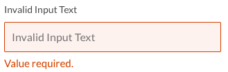
386 | inputs list 387 |

388 | 389 | ```html 390 | 391 |

392 | Value required. 393 |

394 | ``` 395 | 396 | - **```disabled```**: This does not require a modifier class, simply by setting the input to disabled, this will take the styles we have provided by default to the inputs disabled. 397 | 398 |

399 | inputs list 400 |

401 | 402 | ```html 403 | 404 | ``` 405 | 406 |
407 | 408 | ### Selects and Textarea 409 | 410 | It's necessary for the Select and Textarea components to use the ```.ma-input``` class to inherit base classes from an input (e.g. focus effect, disabled, etc.). 411 | 412 | #### Selects 413 | 414 | The select component uses ```.ma-select``` as a base class, but the select component is a bit more complex in their structure, since they have a ```.ma-select-container``` (which is the one that will contain ```.ma-select``` and ```.ma-select-arrow```). 415 | 416 | The select component also have size modifier: 417 | 418 | - **Size:** ```--small, --default, --large, --block``` 419 | 420 | **Important note:** ```.ma-select-container```and the ```.ma-select``` element must contain the same size modifier, that is, if ```.ma-select-container``` is ```--small```, the child element ```.ma-select``` should also be ```--small``` and use the same modifier. 421 | 422 |

423 | inputs list 424 |

425 | 426 | ```html 427 | 428 |
429 | 430 | 431 | 437 | 438 | 439 | 440 | 441 | 442 | 443 |
444 | ``` 445 | 446 |
447 | 448 | The select components also have modifier: ```--invalid``` and ```disabled```. 449 | 450 |
451 | 452 | #### Invalid Select 453 | 454 |

455 | invalid select 456 |

457 | 458 | ```html 459 |
460 | 468 | 469 | 470 | 471 |
472 |

473 | Language required. 474 |

475 | ``` 476 | 477 |
478 | 479 | #### Select Disabled 480 | 481 |

482 | select disabled 483 |

484 | 485 | ```html 486 |
487 | 495 | 496 | 497 | 498 |
499 | ``` 500 | 501 |
502 | 503 | --- 504 | 505 |
506 | 507 | ## Labels 508 | 509 | Labels are tags generally used to highlight something, (e.g. a new section, you will be accustomed to place the tag **NEW**). 510 | 511 | The main class of label is ```.ma-label```, which are separated in two groups, the label simple ```--simple``` and label box ```--box```, which have modifiers of type and size: 512 | 513 | - **Size:** ```--small```, ```--default```, ```--large``` 514 | 515 | - **Type:** ```--primary```, ```--secondary```, ```--white```(label box only) 516 | 517 | Each modifier must be bound to its group, either ```--simple``` or ```--box```, (e.g. **```--simple--small```**, **```--box--primary```**). 518 | 519 |
520 | 521 |

522 | labels box 523 |

524 | 525 | ```html 526 | 527 | New 528 | 529 | 530 | New 531 | 532 | 533 | New 534 | ``` 535 | 536 |
537 | 538 |

539 | labels box 540 |

541 | 542 | ```html 543 | 544 |
2 positions
545 | 546 | 547 |
2 positions
548 | 549 | 550 |
2 positions
551 | ``` 552 | 553 |
554 | 555 | --- 556 | 557 |
558 | 559 | ## Navbar 560 | 561 | The navbar or header is the top bar that allows the user to have constant access to section like Edit Profile, Log in, Sign up, Setting, etc. 562 | 563 | It has become a trend that many sites include a search bar in its header or navbar in order that users can more easily access the products or services that the site is offering. 564 | 565 | To use this component we use the class: **```.ma-header```**, with the **```--large```** modifier for medium and large screens, and the modifier **```--small```** for small screens and small devices. 566 | 567 | Within the navbar we can find: the **logo**, **navigation buttons** (e.g. Log in, Sign up, Edit Profile, etc.), and the **search bar**. 568 | 569 |

570 | labels box 571 |

572 | 573 | ```html 574 |
575 | 576 | 577 |
578 | 579 |
580 | 583 |
584 |
585 |
586 | 587 | 588 |
589 | 596 |
597 | 598 | 599 |
600 | 622 |
623 | 624 |
625 | ``` 626 |
627 | 628 | --- 629 | 630 |
631 | 632 | ## Subnav 633 | 634 | Subnav is a navigation bar that allows you to navigate within the same page, contains simpler options, and usually, it named: tabs. 635 | 636 | We use the class: **```.ma-subnav```** to make use of this component, which is separated into two groups, the **simple subnav** and the **subnav tabs**. 637 | 638 | ### Simple Subnav 639 | 640 | To use a simple subnav you have to add the modifier **```--simple```** to the ```.ma-subnav``` class. To add a new subnav option, add a div element with the **```.ma-subnav__item```** class. 641 | 642 |

643 | labels box 644 |

645 | 646 | ```html 647 | 648 |
649 | 681 |
682 | ``` 683 | 684 |
685 | 686 | ### Subnav Tabs 687 | 688 | To use a subnav tabs you have to add the modifier **```--tabs```** to the ```.ma-subnav``` class. To add a new subnav option, add a div element in the same way as in subnav simple. 689 | 690 |

691 | labels box 692 |

693 | 694 | ```html 695 | 696 |
697 | 723 |
724 | ``` 725 | 726 |
727 | 728 | ## Others Components 729 | 730 | There are components that we have not documented here, either by time or because they are so simple that it is not worth making this guide more extensive. 731 | 732 | This is the list of other components that are included the Airbnb theme: 733 | 734 | - Typograph 735 | - Titles 736 | - Paragraph 737 | - Forms 738 | - Basic form 739 | - Horizontal form 740 | - Checkbox 741 | - Searchbox alternative 742 | - Box component 743 | - Rate stars 744 | - Profile avatars 745 | 746 |
747 | 748 | ## Helper Classes 749 | 750 | We have added some classes that save a lot of time and code lines, here are some of the helper classes that you will love: 751 | 752 | ### resets: 753 | - **```.link-reset```**: reset base link styles (browser and boostrap styles). 754 | - **```.margin-reset```**: Put your element with margin 0. 755 | - **```.padding-reset```**: Put your element with padding 0. 756 | 757 | ### spaces: 758 | #### (we love it ❤) 759 | 760 | - **```.space-*```**: Add bottom margin to the element (use from 1 to 10 scale: e.g. ```.space-3```). 761 | - **```.space-top-*```**: Add top margin to the element (use from 1 to 10 scale: e.g. ```.space-top-10```). 762 | - **```.space-left-*```**: Add left margin to the element (use from 1 to 10 scale: e.g. ```.space-left-1```). 763 | - **```.space-right-*```**: Add right margin to the element (use from 1 to 10 scale: e.g. ```.space-right-8```). 764 | 765 | ### text modifiers: 766 | - **```.text-shadow```**: Add a subtle and cute text shadow. 767 | - **```.line-through```**: Add a line through text. 768 | - **```.text-italic```**: Add text italic style to the text with this class. 769 | - **```.strong```**: Add a font-weight of 700 to the text with this class. 770 | - **```.font-weight-normal```**: Reset the font weight to normal text. 771 | 772 | ### others: 773 | - **```.round```**: Round a element modifing its border radius to 50%. 774 | - **```.ma-separator```**: Add a cute separator line. 775 | 776 |

777 | separator 778 |

779 | 780 | ```html 781 |
782 | ``` 783 | 784 |
785 | 786 | ## Resources used 787 | 788 | To help make the project look much more professional and cute, we included the following third-party resources: 789 | 790 | - **feather icons**: Beautiful open sources icons, really are so beautiful. [https://feathericons.com/](https://feathericons.com/) 791 | - **fontawesome**: Well known open sources icons. [http://fontawesome.io/](http://fontawesome.io/) 792 | - **google font**: A set of fonts from google. For the Airbnb theme, we used **'Lato font family'**. [https://fonts.googleapis.com/css?family=Lato](https://fonts.googleapis.com/css?family=Lato) 793 | 794 |
795 | 796 | ## Feedback 797 | 798 | Do not forget to sign up in our [Steroidesign weekly](http://eepurl.com/cWWRrD) newsletter to receives the updates about this theme and news about new themes. 799 | 800 | Any suggestion you have, or if you want to contribute some help, idea or improvement you can write us to our twitter: [@rosa7082](https://www.twitter.com/rosa7082) & [@seruda](https://www.twitter.com/seruda), do not hesitate to follow us and receive all the updates weekly by subscribing to our newsletter. Weekly we'll be uploading theme updates and new themes. 801 | 802 |
803 | 804 | 805 | ## License 806 | 807 | [![CC0](http://mirrors.creativecommons.org/presskit/buttons/88x31/svg/cc-zero.svg)](https://creativecommons.org/publicdomain/zero/1.0/) 808 | 809 | **Important:** Themes are not a copy, we write styles and structure from scratch, based on our own file structure and our own way of organizing styles (based n the [BEM methodology](https://en.bem.info/)), what we want with this is to create a 'skeleton' that can be used, edited, modified and replaced in any project. 810 | 811 | We are not responsible for misinterpretation or inappropriate use of this content and information. In the same way, we will not be responsible for the damages caused directly or indirectly by the using of this material. In no way are we liable for the consequences of the improper or negligent use of this material. 812 | -------------------------------------------------------------------------------- /www/build/js/feather.min.js: -------------------------------------------------------------------------------- 1 | !function(e,n){"object"==typeof exports&&"object"==typeof module?module.exports=n():"function"==typeof define&&define.amd?define([],n):"object"==typeof exports?exports.feather=n():e.feather=n()}(this,function(){return function(e){function n(t){if(i[t])return i[t].exports;var l=i[t]={i:t,l:!1,exports:{}};return e[t].call(l.exports,l,l.exports,n),l.l=!0,l.exports}var i={};return n.m=e,n.c=i,n.d=function(e,i,t){n.o(e,i)||Object.defineProperty(e,i,{configurable:!1,enumerable:!0,get:t})},n.n=function(e){var i=e&&e.__esModule?function(){return e.default}:function(){return e};return n.d(i,"a",i),i},n.o=function(e,n){return Object.prototype.hasOwnProperty.call(e,n)},n.p="",n(n.s=47)}([function(e,n,i){var t=i(35)("wks"),l=i(16),r=i(1).Symbol,o="function"==typeof r;(e.exports=function(e){return t[e]||(t[e]=o&&r[e]||(o?r:l)("Symbol."+e))}).store=t},function(e,n){var i=e.exports="undefined"!=typeof window&&window.Math==Math?window:"undefined"!=typeof self&&self.Math==Math?self:Function("return this")();"number"==typeof __g&&(__g=i)},function(e,n,i){var t=i(8),l=i(28),r=i(30),o=Object.defineProperty;n.f=i(4)?Object.defineProperty:function(e,n,i){if(t(e),n=r(n,!0),t(i),l)try{return o(e,n,i)}catch(e){}if("get"in i||"set"in i)throw TypeError("Accessors not supported!");return"value"in i&&(e[n]=i.value),e}},function(e,n){e.exports=function(e){return"object"==typeof e?null!==e:"function"==typeof e}},function(e,n,i){e.exports=!i(11)(function(){return 7!=Object.defineProperty({},"a",{get:function(){return 7}}).a})},function(e,n){var i={}.hasOwnProperty;e.exports=function(e,n){return i.call(e,n)}},function(e,n){var i=e.exports={version:"2.4.0"};"number"==typeof __e&&(__e=i)},function(e,n,i){var t=i(2),l=i(15);e.exports=i(4)?function(e,n,i){return t.f(e,n,l(1,i))}:function(e,n,i){return e[n]=i,e}},function(e,n,i){var t=i(3);e.exports=function(e){if(!t(e))throw TypeError(e+" is not an object!");return e}},function(e,n,i){var t=i(1),l=i(7),r=i(5),o=i(16)("src"),a=Function.toString,y=(""+a).split("toString");i(6).inspectSource=function(e){return a.call(e)},(e.exports=function(e,n,i,a){var c="function"==typeof i;c&&(r(i,"name")||l(i,"name",n)),e[n]!==i&&(c&&(r(i,o)||l(i,o,e[n]?""+e[n]:y.join(String(n)))),e===t?e[n]=i:a?e[n]?e[n]=i:l(e,n,i):(delete e[n],l(e,n,i)))})(Function.prototype,"toString",function(){return"function"==typeof this&&this[o]||a.call(this)})},function(e,n,i){var t=i(1),l=i(6),r=i(7),o=i(9),a=i(12),y=function(e,n,i){var c,p,x,h,u=e&y.F,s=e&y.G,f=e&y.S,d=e&y.P,v=e&y.B,g=s?t:f?t[n]||(t[n]={}):(t[n]||{}).prototype,M=s?l:l[n]||(l[n]={}),m=M.prototype||(M.prototype={});s&&(i=n);for(c in i)p=!u&&g&&void 0!==g[c],x=(p?g:i)[c],h=v&&p?a(x,t):d&&"function"==typeof x?a(Function.call,x):x,g&&o(g,c,x,e&y.U),M[c]!=x&&r(M,c,h),d&&m[c]!=x&&(m[c]=x)};t.core=l,y.F=1,y.G=2,y.S=4,y.P=8,y.B=16,y.W=32,y.U=64,y.R=128,e.exports=y},function(e,n){e.exports=function(e){try{return!!e()}catch(e){return!0}}},function(e,n,i){var t=i(51);e.exports=function(e,n,i){if(t(e),void 0===n)return e;switch(i){case 1:return function(i){return e.call(n,i)};case 2:return function(i,t){return e.call(n,i,t)};case 3:return function(i,t,l){return e.call(n,i,t,l)}}return function(){return e.apply(n,arguments)}}},function(e,n){e.exports={}},function(e,n){e.exports=function(e){if(void 0==e)throw TypeError("Can't call method on "+e);return e}},function(e,n){e.exports=function(e,n){return{enumerable:!(1&e),configurable:!(2&e),writable:!(4&e),value:n}}},function(e,n){var i=0,t=Math.random();e.exports=function(e){return"Symbol(".concat(void 0===e?"":e,")_",(++i+t).toString(36))}},function(e,n,i){var t=i(33),l=i(14);e.exports=function(e){return t(l(e))}},function(e,n){var i=Math.ceil,t=Math.floor;e.exports=function(e){return isNaN(e=+e)?0:(e>0?t:i)(e)}},function(e,n,i){"use strict";var t=i(50),l=i(10),r=i(9),o=i(7),a=i(5),y=i(13),c=i(52),p=i(22),x=i(58),h=i(0)("iterator"),u=!([].keys&&"next"in[].keys()),s=function(){return this};e.exports=function(e,n,i,f,d,v,g){c(i,n,f);var M,m,w,b=function(e){if(!u&&e in H)return H[e];switch(e){case"keys":case"values":return function(){return new i(this,e)}}return function(){return new i(this,e)}},A=n+" Iterator",_="values"==d,z=!1,H=e.prototype,O=H[h]||H["@@iterator"]||d&&H[d],V=O||b(d),j=d?_?b("entries"):V:void 0,k="Array"==n?H.entries||O:O;if(k&&(w=x(k.call(new e)))!==Object.prototype&&(p(w,A,!0),t||a(w,h)||o(w,h,s)),_&&O&&"values"!==O.name&&(z=!0,V=function(){return O.call(this)}),t&&!g||!u&&!z&&H[h]||o(H,h,V),y[n]=V,y[A]=s,d)if(M={values:_?V:b("values"),keys:v?V:b("keys"),entries:j},g)for(m in M)m in H||r(H,m,M[m]);else l(l.P+l.F*(u||z),n,M);return M}},function(e,n,i){var t=i(18),l=Math.min;e.exports=function(e){return e>0?l(t(e),9007199254740991):0}},function(e,n,i){var t=i(35)("keys"),l=i(16);e.exports=function(e){return t[e]||(t[e]=l(e))}},function(e,n,i){var t=i(2).f,l=i(5),r=i(0)("toStringTag");e.exports=function(e,n,i){e&&!l(e=i?e:e.prototype,r)&&t(e,r,{configurable:!0,value:n})}},function(e,n,i){var t=i(14);e.exports=function(e){return Object(t(e))}},function(e,n,i){var t=i(34),l=i(0)("toStringTag"),r="Arguments"==t(function(){return arguments}()),o=function(e,n){try{return e[n]}catch(e){}};e.exports=function(e){var n,i,a;return void 0===e?"Undefined":null===e?"Null":"string"==typeof(i=o(n=Object(e),l))?i:r?t(n):"Object"==(a=t(n))&&"function"==typeof n.callee?"Arguments":a}},function(e,n,i){var t=i(12),l=i(37),r=i(38),o=i(8),a=i(20),y=i(39),c={},p={},n=e.exports=function(e,n,i,x,h){var u,s,f,d,v=h?function(){return e}:y(e),g=t(i,x,n?2:1),M=0;if("function"!=typeof v)throw TypeError(e+" is not iterable!");if(r(v)){for(u=a(e.length);u>M;M++)if((d=n?g(o(s=e[M])[0],s[1]):g(e[M]))===c||d===p)return d}else for(f=v.call(e);!(s=f.next()).done;)if((d=l(f,g,s.value,n))===c||d===p)return d};n.BREAK=c,n.RETURN=p},function(e,n){e.exports={activity:'',airplay:'',"alert-circle":'',"alert-octagon":'',"alert-triangle":'',"align-center":'',"align-justify":'',"align-left":'',"align-right":'',anchor:'',aperture:'',"arrow-down-left":'',"arrow-down-right":'',"arrow-down":'',"arrow-left":'',"arrow-right":'',"arrow-up-left":'',"arrow-up-right":'',"arrow-up":'',"at-sign":'',award:'',"bar-chart-2":'',"bar-chart":'',"battery-charging":'',battery:'',"bell-off":'',bell:'',bluetooth:'',book:'',bookmark:'',box:'',briefcase:'',calendar:'',"camera-off":'',camera:'',cast:'',"check-circle":'',"check-square":'',check:'',"chevron-down":'',"chevron-left":'',"chevron-right":'',"chevron-up":'',"chevrons-down":'',"chevrons-left":'',"chevrons-right":'',"chevrons-up":'',chrome:'',circle:'',clipboard:'',clock:'',"cloud-drizzle":'',"cloud-lightning":'',"cloud-off":'',"cloud-rain":'',"cloud-snow":'',cloud:'',codepen:'',command:'',compass:'',copy:'',"corner-down-left":'',"corner-down-right":'',"corner-left-down":'',"corner-left-up":'',"corner-right-down":'',"corner-right-up":'',"corner-up-left":'',"corner-up-right":'',cpu:'',"credit-card":'',crosshair:'',delete:'',disc:'',"download-cloud":'',download:'',droplet:'',"edit-2":'',"edit-3":'',edit:'',"external-link":'',"eye-off":'',eye:'',facebook:'',"fast-forward":'',feather:'',"file-minus":'',"file-plus":'',"file-text":'',file:'',film:'',filter:'',flag:'',folder:'',github:'',gitlab:'',globe:'',grid:'',hash:'',headphones:'',heart:'',home:'',image:'',inbox:'',info:'',instagram:'',layers:'',layout:'',"life-buoy":'',"link-2":'',link:'',list:'',loader:'',lock:'',"log-in":'',"log-out":'',mail:'',"map-pin":'',map:'',"maximize-2":'',maximize:'',menu:'',"message-circle":'',"message-square":'',"mic-off":'',mic:'',"minimize-2":'',minimize:'',"minus-circle":'',"minus-square":'',minus:'',monitor:'',moon:'',"more-horizontal":'',"more-vertical":'',move:'',music:'',"navigation-2":'',navigation:'',octagon:'',package:'',paperclip:'',"pause-circle":'',pause:'',percent:'',"phone-call":'',"phone-forwarded":'',"phone-incoming":'',"phone-missed":'',"phone-off":'',"phone-outgoing":'',phone:'',"pie-chart":'',"play-circle":'',play:'',"plus-circle":'',"plus-square":'',plus:'',pocket:'',power:'',printer:'',radio:'',"refresh-ccw":'',"refresh-cw":'',repeat:'',rewind:'',"rotate-ccw":'',"rotate-cw":'',save:'',scissors:'',search:'',server:'',settings:'',"share-2":'',share:'',shield:'',shuffle:'',sidebar:'',"skip-back":'',"skip-forward":'',slack:'',slash:'',sliders:'',smartphone:'',speaker:'',square:'',star:'',"stop-circle":'',sun:'',sunrise:'',sunset:'',tablet:'',tag:'',target:'',thermometer:'',"thumbs-down":'',"thumbs-up":'',"toggle-left":'',"toggle-right":'',"trash-2":'',trash:'',"trending-down":'',"trending-up":'',triangle:'',tv:'',twitter:'',type:'',umbrella:'',unlock:'',"upload-cloud":'',upload:'',"user-check":'',"user-minus":'',"user-plus":'',"user-x":'',user:'',users:'',"video-off":'',video:'',voicemail:'',"volume-1":'',"volume-2":'',"volume-x":'',volume:'',watch:'',"wifi-off":'',wifi:'',wind:'',"x-circle":'',"x-square":'',x:'',zap:'',"zoom-in":'',"zoom-out":''}},function(e,n,i){"use strict";var t=i(49)(!0);i(19)(String,"String",function(e){this._t=String(e),this._i=0},function(){var e,n=this._t,i=this._i;return i>=n.length?{value:void 0,done:!0}:(e=t(n,i),this._i+=e.length,{value:e,done:!1})})},function(e,n,i){e.exports=!i(4)&&!i(11)(function(){return 7!=Object.defineProperty(i(29)("div"),"a",{get:function(){return 7}}).a})},function(e,n,i){var t=i(3),l=i(1).document,r=t(l)&&t(l.createElement);e.exports=function(e){return r?l.createElement(e):{}}},function(e,n,i){var t=i(3);e.exports=function(e,n){if(!t(e))return e;var i,l;if(n&&"function"==typeof(i=e.toString)&&!t(l=i.call(e)))return l;if("function"==typeof(i=e.valueOf)&&!t(l=i.call(e)))return l;if(!n&&"function"==typeof(i=e.toString)&&!t(l=i.call(e)))return l;throw TypeError("Can't convert object to primitive value")}},function(e,n,i){var t=i(8),l=i(53),r=i(36),o=i(21)("IE_PROTO"),a=function(){},y=function(){var e,n=i(29)("iframe"),t=r.length;for(n.style.display="none",i(57).appendChild(n),n.src="javascript:",e=n.contentWindow.document,e.open(),e.write("