├── .editorconfig
├── .gitignore
├── .vscode
├── extensions.json
├── launch.json
└── tasks.json
├── LICENSE.md
├── README.md
├── angular.json
├── package-lock.json
├── package.json
├── projects
├── angular-hover-gradient-button
│ ├── README.md
│ ├── ng-package.json
│ ├── package.json
│ ├── src
│ │ ├── lib
│ │ │ ├── angular-hover-gradient-button.component.html
│ │ │ ├── angular-hover-gradient-button.component.scss
│ │ │ ├── angular-hover-gradient-button.component.spec.ts
│ │ │ ├── angular-hover-gradient-button.component.ts
│ │ │ ├── angular-hover-gradient-button.service.spec.ts
│ │ │ └── angular-hover-gradient-button.service.ts
│ │ └── public-api.ts
│ ├── tsconfig.lib.json
│ ├── tsconfig.lib.prod.json
│ └── tsconfig.spec.json
└── hover-gradient-button-example
│ ├── src
│ ├── app
│ │ ├── app.component.html
│ │ ├── app.component.scss
│ │ ├── app.component.spec.ts
│ │ ├── app.component.ts
│ │ ├── app.config.ts
│ │ └── app.routes.ts
│ ├── assets
│ │ └── .gitkeep
│ ├── favicon.ico
│ ├── index.html
│ ├── main.ts
│ └── styles.scss
│ ├── tsconfig.app.json
│ └── tsconfig.spec.json
└── tsconfig.json
/.editorconfig:
--------------------------------------------------------------------------------
1 | # Editor configuration, see https://editorconfig.org
2 | root = true
3 |
4 | [*]
5 | charset = utf-8
6 | indent_style = space
7 | indent_size = 2
8 | insert_final_newline = true
9 | trim_trailing_whitespace = true
10 |
11 | [*.ts]
12 | quote_type = single
13 |
14 | [*.md]
15 | max_line_length = off
16 | trim_trailing_whitespace = false
17 |
--------------------------------------------------------------------------------
/.gitignore:
--------------------------------------------------------------------------------
1 | # See http://help.github.com/ignore-files/ for more about ignoring files.
2 |
3 | # Compiled output
4 | /dist
5 | /tmp
6 | /out-tsc
7 | /bazel-out
8 |
9 | # Node
10 | /node_modules
11 | npm-debug.log
12 | yarn-error.log
13 |
14 | # IDEs and editors
15 | .idea/
16 | .project
17 | .classpath
18 | .c9/
19 | *.launch
20 | .settings/
21 | *.sublime-workspace
22 |
23 | # Visual Studio Code
24 | .vscode/*
25 | !.vscode/settings.json
26 | !.vscode/tasks.json
27 | !.vscode/launch.json
28 | !.vscode/extensions.json
29 | .history/*
30 |
31 | # Miscellaneous
32 | /.angular/cache
33 | .sass-cache/
34 | /connect.lock
35 | /coverage
36 | /libpeerconnection.log
37 | testem.log
38 | /typings
39 |
40 | # System files
41 | .DS_Store
42 | Thumbs.db
43 |
--------------------------------------------------------------------------------
/.vscode/extensions.json:
--------------------------------------------------------------------------------
1 | {
2 | // For more information, visit: https://go.microsoft.com/fwlink/?linkid=827846
3 | "recommendations": ["angular.ng-template"]
4 | }
5 |
--------------------------------------------------------------------------------
/.vscode/launch.json:
--------------------------------------------------------------------------------
1 | {
2 | // For more information, visit: https://go.microsoft.com/fwlink/?linkid=830387
3 | "version": "0.2.0",
4 | "configurations": [
5 | {
6 | "name": "ng serve",
7 | "type": "chrome",
8 | "request": "launch",
9 | "preLaunchTask": "npm: start",
10 | "url": "http://localhost:4200/"
11 | },
12 | {
13 | "name": "ng test",
14 | "type": "chrome",
15 | "request": "launch",
16 | "preLaunchTask": "npm: test",
17 | "url": "http://localhost:9876/debug.html"
18 | }
19 | ]
20 | }
21 |
--------------------------------------------------------------------------------
/.vscode/tasks.json:
--------------------------------------------------------------------------------
1 | {
2 | // For more information, visit: https://go.microsoft.com/fwlink/?LinkId=733558
3 | "version": "2.0.0",
4 | "tasks": [
5 | {
6 | "type": "npm",
7 | "script": "start",
8 | "isBackground": true,
9 | "problemMatcher": {
10 | "owner": "typescript",
11 | "pattern": "$tsc",
12 | "background": {
13 | "activeOnStart": true,
14 | "beginsPattern": {
15 | "regexp": "(.*?)"
16 | },
17 | "endsPattern": {
18 | "regexp": "bundle generation complete"
19 | }
20 | }
21 | }
22 | },
23 | {
24 | "type": "npm",
25 | "script": "test",
26 | "isBackground": true,
27 | "problemMatcher": {
28 | "owner": "typescript",
29 | "pattern": "$tsc",
30 | "background": {
31 | "activeOnStart": true,
32 | "beginsPattern": {
33 | "regexp": "(.*?)"
34 | },
35 | "endsPattern": {
36 | "regexp": "bundle generation complete"
37 | }
38 | }
39 | }
40 | }
41 | ]
42 | }
43 |
--------------------------------------------------------------------------------
/LICENSE.md:
--------------------------------------------------------------------------------
1 | ISC License
2 |
3 | Copyright (c) 2024, Thiago Pires
4 |
5 | Permission to use, copy, modify, and/or distribute this software for any
6 | purpose with or without fee is hereby granted, provided that the above
7 | copyright notice and this permission notice appear in all copies.
8 |
9 | THE SOFTWARE IS PROVIDED "AS IS" AND THE AUTHOR DISCLAIMS ALL WARRANTIES
10 | WITH REGARD TO THIS SOFTWARE INCLUDING ALL IMPLIED WARRANTIES OF
11 | MERCHANTABILITY AND FITNESS. IN NO EVENT SHALL THE AUTHOR BE LIABLE FOR
12 | ANY SPECIAL, DIRECT, INDIRECT, OR CONSEQUENTIAL DAMAGES OR ANY DAMAGES
13 | WHATSOEVER RESULTING FROM LOSS OF USE, DATA OR PROFITS, WHETHER IN AN
14 | ACTION OF CONTRACT, NEGLIGENCE OR OTHER TORTIOUS ACTION, ARISING OUT OF
15 | OR IN CONNECTION WITH THE USE OR PERFORMANCE OF THIS SOFTWARE.
16 |
--------------------------------------------------------------------------------
/README.md:
--------------------------------------------------------------------------------
1 | # Angular Hover Gradient Button
2 |
3 | The Angular Hover Gradient Button is a customizable, easy-to-use Angular button with a hover gradient effect on hover.
4 |
5 | ### [Sample code](https://github.com/thiagopac/angular-hover-gradient-button/tree/main/projects/hover-gradient-button-example/src/app) | [Stackblitz](https://stackblitz.com/~/github.com/thiagopac/angular-hover-gradient-button-sample)
6 |
7 | 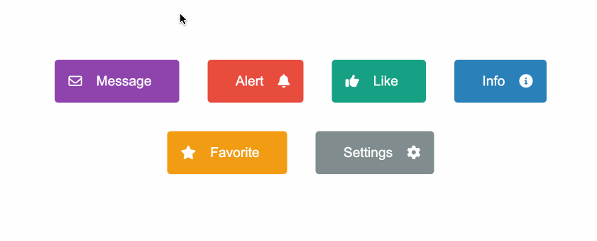
8 |
9 | ## Features
10 |
11 | - Customizable background color and hover color.
12 | - Support for icons on the left or right side of the button's label.
13 | - Flexible and easy-to-use with dynamic content.
14 |
15 | ## Installation
16 |
17 | To install the Angular Hover Gradient Button in your project, you can run the following command:
18 |
19 | ```bash
20 | npm install angular-hover-gradient-button
21 | ```
22 |
23 | ## Usage
24 |
25 | First, import `AngularHoverGradientButton` in your Angular module or component:
26 |
27 | ```typescript
28 | import { AngularHoverGradientButton } from "angular-hover-gradient-button";
29 |
30 | @NgModule({
31 | declarations: [AppComponent],
32 | imports: [BrowserModule, AngularHoverGradientButton],
33 | bootstrap: [AppComponent],
34 | })
35 | export class AppModule {}
36 | ```
37 |
38 | Then, you can use the `angular-hover-gradient-button` component in your templates:
39 |
40 | ```html
41 |
42 |
43 | Message
44 |
45 | ```
46 |
47 | ## Icons
48 |
49 | The `angular-hover-gradient-button` component supports positioning of icon display using the `slot` attribute.
50 |
51 | ### Slot Attribute
52 |
53 | The `slot` attribute determines the position of the icon within the button. There are two options for `slot`:
54 |
55 | - `left`: Positions the icon on the left side of the button.
56 | - `right`: Positions the icon on the right side of the button.
57 |
58 | Example usage:
59 |
60 | ```html
61 |
62 |
63 |
64 |
65 | ```
66 |
67 | ## Inputs
68 |
69 | | Input | Description | Type | Default Value |
70 | | ----------------- | ------------------------------- | ------ | ------------- |
71 | | `backgroundColor` | Background color of the button. | String | `'#1e3799'` |
72 | | `hoverColor` | Color of the progress bar. | String | `'#78e08f'` |
73 |
74 | ## Styling
75 |
76 | The component supports customization through CSS variables. You can override the following variables to customize the appearance:
77 |
78 | ```scss
79 | angular-hover-gradient-button {
80 | --button-color: white;
81 | --button-padding: 1em;
82 | --button-border-radius: 5px;
83 | --button-border: none;
84 | --button-font-size: 1.2em;
85 | }
86 | ```
87 |
88 | ## Contributing
89 |
90 | Contributions are welcome! Please open an issue or submit a pull request with your improvements.
91 |
92 | ## License
93 |
94 | This project is licensed under the [ISC License](LICENSE.md).
95 |
--------------------------------------------------------------------------------
/angular.json:
--------------------------------------------------------------------------------
1 | {
2 | "$schema": "./node_modules/@angular/cli/lib/config/schema.json",
3 | "version": 1,
4 | "newProjectRoot": "projects",
5 | "projects": {
6 | "angular-hover-gradient-button": {
7 | "projectType": "library",
8 | "root": "projects/angular-hover-gradient-button",
9 | "sourceRoot": "projects/angular-hover-gradient-button/src",
10 | "prefix": "lib",
11 | "architect": {
12 | "build": {
13 | "builder": "@angular-devkit/build-angular:ng-packagr",
14 | "options": {
15 | "project": "projects/angular-hover-gradient-button/ng-package.json"
16 | },
17 | "configurations": {
18 | "production": {
19 | "tsConfig": "projects/angular-hover-gradient-button/tsconfig.lib.prod.json"
20 | },
21 | "development": {
22 | "tsConfig": "projects/angular-hover-gradient-button/tsconfig.lib.json"
23 | }
24 | },
25 | "defaultConfiguration": "production"
26 | },
27 | "test": {
28 | "builder": "@angular-devkit/build-angular:karma",
29 | "options": {
30 | "tsConfig": "projects/angular-hover-gradient-button/tsconfig.spec.json",
31 | "polyfills": [
32 | "zone.js",
33 | "zone.js/testing"
34 | ]
35 | }
36 | }
37 | }
38 | },
39 | "hover-gradient-button-example": {
40 | "projectType": "application",
41 | "schematics": {
42 | "@schematics/angular:component": {
43 | "style": "scss"
44 | }
45 | },
46 | "root": "projects/hover-gradient-button-example",
47 | "sourceRoot": "projects/hover-gradient-button-example/src",
48 | "prefix": "app",
49 | "architect": {
50 | "build": {
51 | "builder": "@angular-devkit/build-angular:application",
52 | "options": {
53 | "outputPath": "dist/hover-gradient-button-example",
54 | "index": "projects/hover-gradient-button-example/src/index.html",
55 | "browser": "projects/hover-gradient-button-example/src/main.ts",
56 | "polyfills": [
57 | "zone.js"
58 | ],
59 | "tsConfig": "projects/hover-gradient-button-example/tsconfig.app.json",
60 | "inlineStyleLanguage": "scss",
61 | "assets": [
62 | "projects/hover-gradient-button-example/src/favicon.ico",
63 | "projects/hover-gradient-button-example/src/assets"
64 | ],
65 | "styles": [
66 | "projects/hover-gradient-button-example/src/styles.scss"
67 | ],
68 | "scripts": []
69 | },
70 | "configurations": {
71 | "production": {
72 | "budgets": [
73 | {
74 | "type": "initial",
75 | "maximumWarning": "500kb",
76 | "maximumError": "1mb"
77 | },
78 | {
79 | "type": "anyComponentStyle",
80 | "maximumWarning": "2kb",
81 | "maximumError": "4kb"
82 | }
83 | ],
84 | "outputHashing": "all"
85 | },
86 | "development": {
87 | "optimization": false,
88 | "extractLicenses": false,
89 | "sourceMap": true
90 | }
91 | },
92 | "defaultConfiguration": "production"
93 | },
94 | "serve": {
95 | "builder": "@angular-devkit/build-angular:dev-server",
96 | "configurations": {
97 | "production": {
98 | "buildTarget": "hover-gradient-button-example:build:production"
99 | },
100 | "development": {
101 | "buildTarget": "hover-gradient-button-example:build:development"
102 | }
103 | },
104 | "defaultConfiguration": "development"
105 | },
106 | "extract-i18n": {
107 | "builder": "@angular-devkit/build-angular:extract-i18n",
108 | "options": {
109 | "buildTarget": "hover-gradient-button-example:build"
110 | }
111 | },
112 | "test": {
113 | "builder": "@angular-devkit/build-angular:karma",
114 | "options": {
115 | "polyfills": [
116 | "zone.js",
117 | "zone.js/testing"
118 | ],
119 | "tsConfig": "projects/hover-gradient-button-example/tsconfig.spec.json",
120 | "inlineStyleLanguage": "scss",
121 | "assets": [
122 | "projects/hover-gradient-button-example/src/favicon.ico",
123 | "projects/hover-gradient-button-example/src/assets"
124 | ],
125 | "styles": [
126 | "projects/hover-gradient-button-example/src/styles.scss"
127 | ],
128 | "scripts": []
129 | }
130 | }
131 | }
132 | }
133 | }
134 | }
135 |
--------------------------------------------------------------------------------
/package.json:
--------------------------------------------------------------------------------
1 | {
2 | "name": "hover-gradient-button",
3 | "version": "0.0.2",
4 | "scripts": {
5 | "ng": "ng",
6 | "start": "ng serve",
7 | "build": "ng build",
8 | "watch": "ng build --watch --configuration development",
9 | "test": "ng test",
10 | "build-lib": "ng build angular-hover-gradient-button",
11 | "pack-lib": "cd dist/angular-hover-gradient-button && npm pack"
12 | },
13 | "private": true,
14 | "keywords": [
15 | "angular",
16 | "button",
17 | "hover",
18 | "gradient",
19 | "gradient mouse hover",
20 | "angular button",
21 | "gradient effect",
22 | "glow effect"
23 | ],
24 | "dependencies": {
25 | "@angular/animations": "^17.1.0",
26 | "@angular/common": "^17.1.0",
27 | "@angular/compiler": "^17.1.0",
28 | "@angular/core": "^17.1.0",
29 | "@angular/forms": "^17.1.0",
30 | "@angular/platform-browser": "^17.1.0",
31 | "@angular/platform-browser-dynamic": "^17.1.0",
32 | "@angular/router": "^17.1.0",
33 | "rxjs": "~7.8.0",
34 | "tslib": "^2.3.0",
35 | "zone.js": "~0.14.3"
36 | },
37 | "devDependencies": {
38 | "@angular-devkit/build-angular": "^17.2.1",
39 | "@angular/cli": "^17.1.1",
40 | "@angular/compiler-cli": "^17.1.0",
41 | "@types/jasmine": "~5.1.0",
42 | "jasmine-core": "~5.1.0",
43 | "karma": "~6.4.0",
44 | "karma-chrome-launcher": "~3.2.0",
45 | "karma-coverage": "~2.2.0",
46 | "karma-jasmine": "~5.1.0",
47 | "karma-jasmine-html-reporter": "~2.1.0",
48 | "ng-packagr": "^17.2.0",
49 | "typescript": "~5.3.2"
50 | }
51 | }
52 |
--------------------------------------------------------------------------------
/projects/angular-hover-gradient-button/README.md:
--------------------------------------------------------------------------------
1 | # Angular Hover Gradient Button
2 |
3 | The Angular Hover Gradient Button is a customizable, easy-to-use Angular button with a hover gradient effect on hover.
4 |
5 | ### [Sample code](https://github.com/thiagopac/angular-hover-gradient-button/tree/main/projects/hover-gradient-button-example/src/app) | [Stackblitz](https://stackblitz.com/~/github.com/thiagopac/angular-hover-gradient-button-sample)
6 |
7 | 
8 |
9 | ## Features
10 |
11 | - Customizable background color and hover color.
12 | - Support for icons on the left or right side of the button's label.
13 | - Flexible and easy-to-use with dynamic content.
14 |
15 | ## Installation
16 |
17 | To install the Angular Hover Gradient Button in your project, you can run the following command:
18 |
19 | ```bash
20 | npm install angular-hover-gradient-button
21 | ```
22 |
23 | ## Usage
24 |
25 | First, import `AngularHoverGradientButton` in your Angular module or component:
26 |
27 | ```typescript
28 | import { AngularHoverGradientButton } from "angular-hover-gradient-button";
29 |
30 | @NgModule({
31 | declarations: [AppComponent],
32 | imports: [BrowserModule, AngularHoverGradientButton],
33 | bootstrap: [AppComponent],
34 | })
35 | export class AppModule {}
36 | ```
37 |
38 | Then, you can use the `angular-hover-gradient-button` component in your templates:
39 |
40 | ```html
41 |
42 |
43 | Message
44 |
45 | ```
46 |
47 | ## Icons
48 |
49 | The `angular-hover-gradient-button` component supports positioning of icon display using the `slot` attribute.
50 |
51 | ### Slot Attribute
52 |
53 | The `slot` attribute determines the position of the icon within the button. There are two options for `slot`:
54 |
55 | - `left`: Positions the icon on the left side of the button.
56 | - `right`: Positions the icon on the right side of the button.
57 |
58 | Example usage:
59 |
60 | ```html
61 |
62 |
63 |
64 |
65 | ```
66 |
67 | ## Inputs
68 |
69 | | Input | Description | Type | Default Value |
70 | | ----------------- | ------------------------------- | ------ | ------------- |
71 | | `backgroundColor` | Background color of the button. | String | `'#1e3799'` |
72 | | `hoverColor` | Color of the progress bar. | String | `'#78e08f'` |
73 |
74 | ## Styling
75 |
76 | The component supports customization through CSS variables. You can override the following variables to customize the appearance:
77 |
78 | ```scss
79 | angular-hover-gradient-button {
80 | --button-color: white;
81 | --button-padding: 1em;
82 | --button-border-radius: 5px;
83 | --button-border: none;
84 | --button-font-size: 1.2em;
85 | }
86 | ```
87 |
88 | ## Contributing
89 |
90 | Contributions are welcome! Please open an issue or submit a pull request with your improvements.
91 |
92 | ## License
93 |
94 | This project is licensed under the [ISC License](LICENSE.md).
95 |
--------------------------------------------------------------------------------
/projects/angular-hover-gradient-button/ng-package.json:
--------------------------------------------------------------------------------
1 | {
2 | "$schema": "../../node_modules/ng-packagr/ng-package.schema.json",
3 | "dest": "../../dist/angular-hover-gradient-button",
4 | "lib": {
5 | "entryFile": "src/public-api.ts"
6 | }
7 | }
--------------------------------------------------------------------------------
/projects/angular-hover-gradient-button/package.json:
--------------------------------------------------------------------------------
1 | {
2 | "name": "angular-hover-gradient-button",
3 | "version": "0.0.2",
4 | "peerDependencies": {
5 | "@angular/common": "^17.2.0",
6 | "@angular/core": "^17.2.0"
7 | },
8 | "keywords": [
9 | "angular",
10 | "button",
11 | "hover",
12 | "gradient",
13 | "gradient mouse hover",
14 | "angular button",
15 | "gradient effect",
16 | "glow effect"
17 | ],
18 | "dependencies": {
19 | "tslib": "^2.3.0"
20 | },
21 | "sideEffects": false
22 | }
23 |
--------------------------------------------------------------------------------
/projects/angular-hover-gradient-button/src/lib/angular-hover-gradient-button.component.html:
--------------------------------------------------------------------------------
1 |
10 |
--------------------------------------------------------------------------------
/projects/angular-hover-gradient-button/src/lib/angular-hover-gradient-button.component.scss:
--------------------------------------------------------------------------------
1 | :root {
2 | --button-color: white;
3 | --button-padding: 1em;
4 | --button-border-radius: 5px;
5 | --button-border: none;
6 | --button-font-size: 1.2em;
7 | }
8 |
9 | button {
10 | display: inline-flex;
11 | align-items: center;
12 | position: relative;
13 | justify-content: center;
14 | gap: 10px;
15 | width: auto;
16 | appearance: none;
17 | background-color: var(--background-color, #5f27cd);
18 | padding: var(--button-padding, 1em);
19 | border: var(--button-border, none);
20 | color: var(--button-color, white);
21 | font-size: var(--button-font-size, 1.2em);
22 | cursor: pointer;
23 | outline: none;
24 | overflow: hidden;
25 | border-radius: var(--button-border-radius, 5px);
26 | z-index: 1;
27 | justify-content: center;
28 | gap: 20px;
29 | }
30 |
31 | .icon-container {
32 | display: flex;
33 | align-items: center;
34 | z-index: 3;
35 | }
36 |
37 | button span {
38 | display: inline-flex;
39 | align-items: center;
40 | pointer-events: none;
41 | z-index: 3;
42 | }
43 |
44 | button::before {
45 | --size: 0;
46 |
47 | content: "";
48 | position: absolute;
49 | left: var(--x);
50 | top: var(--y);
51 | width: var(--size);
52 | height: var(--size);
53 | background: radial-gradient(
54 | circle closest-side,
55 | var(--hover-color),
56 | transparent
57 | );
58 | transform: translate(-50%, -50%);
59 | transition: width 0.2s ease, height 0.2s ease;
60 | z-index: 0;
61 | }
62 |
63 | button:hover::before {
64 | --size: 400px;
65 | }
66 |
--------------------------------------------------------------------------------
/projects/angular-hover-gradient-button/src/lib/angular-hover-gradient-button.component.spec.ts:
--------------------------------------------------------------------------------
1 | import { ComponentFixture, TestBed } from '@angular/core/testing';
2 |
3 | import { AngularHoverGradientButtonComponent } from './angular-hover-gradient-button.component';
4 |
5 | describe('AngularHoverGradientButtonComponent', () => {
6 | let component: AngularHoverGradientButtonComponent;
7 | let fixture: ComponentFixture;
8 |
9 | beforeEach(async () => {
10 | await TestBed.configureTestingModule({
11 | imports: [AngularHoverGradientButtonComponent]
12 | })
13 | .compileComponents();
14 |
15 | fixture = TestBed.createComponent(AngularHoverGradientButtonComponent);
16 | component = fixture.componentInstance;
17 | fixture.detectChanges();
18 | });
19 |
20 | it('should create', () => {
21 | expect(component).toBeTruthy();
22 | });
23 | });
24 |
--------------------------------------------------------------------------------
/projects/angular-hover-gradient-button/src/lib/angular-hover-gradient-button.component.ts:
--------------------------------------------------------------------------------
1 | import { CommonModule } from '@angular/common';
2 | import {
3 | Component,
4 | ElementRef,
5 | HostBinding,
6 | Input,
7 | ViewChild,
8 | } from '@angular/core';
9 |
10 | @Component({
11 | selector: 'angular-hover-gradient-button',
12 | standalone: true,
13 | imports: [CommonModule],
14 | templateUrl: './angular-hover-gradient-button.component.html',
15 | styleUrls: ['./angular-hover-gradient-button.component.scss'],
16 | })
17 | export class AngularHoverGradientButton {
18 | @ViewChild('button') button!: ElementRef;
19 | @HostBinding('style.--background-color') get bg() {
20 | return this.backgroundColor;
21 | }
22 | @HostBinding('style.--hover-color') get hover() {
23 | return this.hoverColor;
24 | }
25 |
26 | @Input() backgroundColor: string = '#1e3799';
27 | @Input() hoverColor: string = '#78e08f';
28 |
29 | constructor() {}
30 |
31 | onMouseMove(event: MouseEvent): void {
32 | const rect = this.button.nativeElement.getBoundingClientRect();
33 | const x = event.clientX - rect.left;
34 | const y = event.clientY - rect.top;
35 |
36 | this.button.nativeElement.style.setProperty('--x', `${x}px`);
37 | this.button.nativeElement.style.setProperty('--y', `${y}px`);
38 | }
39 | }
40 |
--------------------------------------------------------------------------------
/projects/angular-hover-gradient-button/src/lib/angular-hover-gradient-button.service.spec.ts:
--------------------------------------------------------------------------------
1 | import { TestBed } from '@angular/core/testing';
2 |
3 | import { AngularHoverGradientButtonService } from './angular-hover-gradient-button.service';
4 |
5 | describe('AngularHoverGradientButtonService', () => {
6 | let service: AngularHoverGradientButtonService;
7 |
8 | beforeEach(() => {
9 | TestBed.configureTestingModule({});
10 | service = TestBed.inject(AngularHoverGradientButtonService);
11 | });
12 |
13 | it('should be created', () => {
14 | expect(service).toBeTruthy();
15 | });
16 | });
17 |
--------------------------------------------------------------------------------
/projects/angular-hover-gradient-button/src/lib/angular-hover-gradient-button.service.ts:
--------------------------------------------------------------------------------
1 | import { Injectable } from '@angular/core';
2 |
3 | @Injectable({
4 | providedIn: 'root'
5 | })
6 | export class AngularHoverGradientButtonService {
7 |
8 | constructor() { }
9 | }
10 |
--------------------------------------------------------------------------------
/projects/angular-hover-gradient-button/src/public-api.ts:
--------------------------------------------------------------------------------
1 | /*
2 | * Public API Surface of angular-hover-gradient-button
3 | */
4 |
5 | export * from './lib/angular-hover-gradient-button.service';
6 | export * from './lib/angular-hover-gradient-button.component';
7 |
--------------------------------------------------------------------------------
/projects/angular-hover-gradient-button/tsconfig.lib.json:
--------------------------------------------------------------------------------
1 | /* To learn more about this file see: https://angular.io/config/tsconfig. */
2 | {
3 | "extends": "../../tsconfig.json",
4 | "compilerOptions": {
5 | "outDir": "../../out-tsc/lib",
6 | "declaration": true,
7 | "declarationMap": true,
8 | "inlineSources": true,
9 | "types": []
10 | },
11 | "exclude": [
12 | "**/*.spec.ts"
13 | ]
14 | }
15 |
--------------------------------------------------------------------------------
/projects/angular-hover-gradient-button/tsconfig.lib.prod.json:
--------------------------------------------------------------------------------
1 | /* To learn more about this file see: https://angular.io/config/tsconfig. */
2 | {
3 | "extends": "./tsconfig.lib.json",
4 | "compilerOptions": {
5 | "declarationMap": false
6 | },
7 | "angularCompilerOptions": {
8 | "compilationMode": "partial"
9 | }
10 | }
11 |
--------------------------------------------------------------------------------
/projects/angular-hover-gradient-button/tsconfig.spec.json:
--------------------------------------------------------------------------------
1 | /* To learn more about this file see: https://angular.io/config/tsconfig. */
2 | {
3 | "extends": "../../tsconfig.json",
4 | "compilerOptions": {
5 | "outDir": "../../out-tsc/spec",
6 | "types": [
7 | "jasmine"
8 | ]
9 | },
10 | "include": [
11 | "**/*.spec.ts",
12 | "**/*.d.ts"
13 | ]
14 | }
15 |
--------------------------------------------------------------------------------
/projects/hover-gradient-button-example/src/app/app.component.html:
--------------------------------------------------------------------------------
1 |
2 |
3 |
7 |
8 | Message
9 |
10 |
11 |
12 |
16 | Alert
17 |
18 |
19 |
20 |
21 |
25 |
26 | Like
27 |
28 |
29 |
30 |
34 | Info
35 |
36 |
37 |
38 |
39 |
43 |
44 | Favorite
45 |
46 |
47 |
48 |
52 | Settings
53 |
54 |
55 |
56 |