(null);
27 | const handleDateChange = (date: Date | null) => setPickedDate(date);
28 |
29 | const resetDate = () => setPickedDate(new Date());
30 | const resetPicker = () => setPickedData(data[1]);
31 |
32 | const instructions = Platform.select({
33 | ios: 'Welcome to the iOS Example App for react-native-woodpicker. Enjoy!',
34 | android:
35 | 'Welcome to the Android Example App for react-native-woodpicker. Enjoy!',
36 | });
37 |
38 | const handleText = () => pickedDate?.toDateString?.() ?? 'No value Selected';
39 | const openPickerWidthRef = () => pickerRef.current?.open();
40 | const openDatePickerWithRef = () => datePickerRef.current?.open();
41 |
42 | return (
43 |
44 | Welcome to React Native!
45 | To get started, edit App.js
46 | {instructions}
47 |
58 |
59 |
60 |
75 |
76 |
77 |
78 | );
79 | };
80 |
81 | const styles = StyleSheet.create({
82 | container: {
83 | flex: 1,
84 | justifyContent: 'center',
85 | alignItems: 'center',
86 | backgroundColor: '#F5FCFF',
87 | },
88 | welcome: {
89 | fontSize: 20,
90 | textAlign: 'center',
91 | margin: 10,
92 | },
93 | instructions: {
94 | textAlign: 'center',
95 | color: '#333333',
96 | marginBottom: 5,
97 | },
98 | pickerStyle: {
99 | backgroundColor: 'white',
100 | borderWidth: 1,
101 | borderColor: 'blue',
102 | borderRadius: 5,
103 | alignItems: 'center',
104 | paddingHorizontal: 8,
105 | paddingVertical: 8,
106 | marginHorizontal: 8,
107 | marginVertical: 8,
108 | height: 40,
109 | width: 200,
110 | },
111 | });
112 |
113 | export default App;
114 |
--------------------------------------------------------------------------------
/example/ExampleApp/android/app/_BUCK:
--------------------------------------------------------------------------------
1 | # To learn about Buck see [Docs](https://buckbuild.com/).
2 | # To run your application with Buck:
3 | # - install Buck
4 | # - `npm start` - to start the packager
5 | # - `cd android`
6 | # - `keytool -genkey -v -keystore keystores/debug.keystore -storepass android -alias androiddebugkey -keypass android -dname "CN=Android Debug,O=Android,C=US"`
7 | # - `./gradlew :app:copyDownloadableDepsToLibs` - make all Gradle compile dependencies available to Buck
8 | # - `buck install -r android/app` - compile, install and run application
9 | #
10 |
11 | load(":build_defs.bzl", "create_aar_targets", "create_jar_targets")
12 |
13 | lib_deps = []
14 |
15 | create_aar_targets(glob(["libs/*.aar"]))
16 |
17 | create_jar_targets(glob(["libs/*.jar"]))
18 |
19 | android_library(
20 | name = "all-libs",
21 | exported_deps = lib_deps,
22 | )
23 |
24 | android_library(
25 | name = "app-code",
26 | srcs = glob([
27 | "src/main/java/**/*.java",
28 | ]),
29 | deps = [
30 | ":all-libs",
31 | ":build_config",
32 | ":res",
33 | ],
34 | )
35 |
36 | android_build_config(
37 | name = "build_config",
38 | package = "com.exampleapp",
39 | )
40 |
41 | android_resource(
42 | name = "res",
43 | package = "com.exampleapp",
44 | res = "src/main/res",
45 | )
46 |
47 | android_binary(
48 | name = "app",
49 | keystore = "//android/keystores:debug",
50 | manifest = "src/main/AndroidManifest.xml",
51 | package_type = "debug",
52 | deps = [
53 | ":app-code",
54 | ],
55 | )
56 |
--------------------------------------------------------------------------------
/example/ExampleApp/android/app/build.gradle:
--------------------------------------------------------------------------------
1 | apply plugin: "com.android.application"
2 |
3 | import com.android.build.OutputFile
4 |
5 | /**
6 | * The react.gradle file registers a task for each build variant (e.g. bundleDebugJsAndAssets
7 | * and bundleReleaseJsAndAssets).
8 | * These basically call `react-native bundle` with the correct arguments during the Android build
9 | * cycle. By default, bundleDebugJsAndAssets is skipped, as in debug/dev mode we prefer to load the
10 | * bundle directly from the development server. Below you can see all the possible configurations
11 | * and their defaults. If you decide to add a configuration block, make sure to add it before the
12 | * `apply from: "../../node_modules/react-native/react.gradle"` line.
13 | *
14 | * project.ext.react = [
15 | * // the name of the generated asset file containing your JS bundle
16 | * bundleAssetName: "index.android.bundle",
17 | *
18 | * // the entry file for bundle generation. If none specified and
19 | * // "index.android.js" exists, it will be used. Otherwise "index.js" is
20 | * // default. Can be overridden with ENTRY_FILE environment variable.
21 | * entryFile: "index.android.js",
22 | *
23 | * // https://reactnative.dev/docs/performance#enable-the-ram-format
24 | * bundleCommand: "ram-bundle",
25 | *
26 | * // whether to bundle JS and assets in debug mode
27 | * bundleInDebug: false,
28 | *
29 | * // whether to bundle JS and assets in release mode
30 | * bundleInRelease: true,
31 | *
32 | * // whether to bundle JS and assets in another build variant (if configured).
33 | * // See http://tools.android.com/tech-docs/new-build-system/user-guide#TOC-Build-Variants
34 | * // The configuration property can be in the following formats
35 | * // 'bundleIn${productFlavor}${buildType}'
36 | * // 'bundleIn${buildType}'
37 | * // bundleInFreeDebug: true,
38 | * // bundleInPaidRelease: true,
39 | * // bundleInBeta: true,
40 | *
41 | * // whether to disable dev mode in custom build variants (by default only disabled in release)
42 | * // for example: to disable dev mode in the staging build type (if configured)
43 | * devDisabledInStaging: true,
44 | * // The configuration property can be in the following formats
45 | * // 'devDisabledIn${productFlavor}${buildType}'
46 | * // 'devDisabledIn${buildType}'
47 | *
48 | * // the root of your project, i.e. where "package.json" lives
49 | * root: "../../",
50 | *
51 | * // where to put the JS bundle asset in debug mode
52 | * jsBundleDirDebug: "$buildDir/intermediates/assets/debug",
53 | *
54 | * // where to put the JS bundle asset in release mode
55 | * jsBundleDirRelease: "$buildDir/intermediates/assets/release",
56 | *
57 | * // where to put drawable resources / React Native assets, e.g. the ones you use via
58 | * // require('./image.png')), in debug mode
59 | * resourcesDirDebug: "$buildDir/intermediates/res/merged/debug",
60 | *
61 | * // where to put drawable resources / React Native assets, e.g. the ones you use via
62 | * // require('./image.png')), in release mode
63 | * resourcesDirRelease: "$buildDir/intermediates/res/merged/release",
64 | *
65 | * // by default the gradle tasks are skipped if none of the JS files or assets change; this means
66 | * // that we don't look at files in android/ or ios/ to determine whether the tasks are up to
67 | * // date; if you have any other folders that you want to ignore for performance reasons (gradle
68 | * // indexes the entire tree), add them here. Alternatively, if you have JS files in android/
69 | * // for example, you might want to remove it from here.
70 | * inputExcludes: ["android/**", "ios/**"],
71 | *
72 | * // override which node gets called and with what additional arguments
73 | * nodeExecutableAndArgs: ["node"],
74 | *
75 | * // supply additional arguments to the packager
76 | * extraPackagerArgs: []
77 | * ]
78 | */
79 |
80 | project.ext.react = [
81 | enableHermes: false, // clean and rebuild if changing
82 | ]
83 |
84 | apply from: "../../node_modules/react-native/react.gradle"
85 |
86 | /**
87 | * Set this to true to create two separate APKs instead of one:
88 | * - An APK that only works on ARM devices
89 | * - An APK that only works on x86 devices
90 | * The advantage is the size of the APK is reduced by about 4MB.
91 | * Upload all the APKs to the Play Store and people will download
92 | * the correct one based on the CPU architecture of their device.
93 | */
94 | def enableSeparateBuildPerCPUArchitecture = false
95 |
96 | /**
97 | * Run Proguard to shrink the Java bytecode in release builds.
98 | */
99 | def enableProguardInReleaseBuilds = false
100 |
101 | /**
102 | * The preferred build flavor of JavaScriptCore.
103 | *
104 | * For example, to use the international variant, you can use:
105 | * `def jscFlavor = 'org.webkit:android-jsc-intl:+'`
106 | *
107 | * The international variant includes ICU i18n library and necessary data
108 | * allowing to use e.g. `Date.toLocaleString` and `String.localeCompare` that
109 | * give correct results when using with locales other than en-US. Note that
110 | * this variant is about 6MiB larger per architecture than default.
111 | */
112 | def jscFlavor = 'org.webkit:android-jsc:+'
113 |
114 | /**
115 | * Whether to enable the Hermes VM.
116 | *
117 | * This should be set on project.ext.react and mirrored here. If it is not set
118 | * on project.ext.react, JavaScript will not be compiled to Hermes Bytecode
119 | * and the benefits of using Hermes will therefore be sharply reduced.
120 | */
121 | def enableHermes = project.ext.react.get("enableHermes", false);
122 |
123 | /**
124 | * Architectures to build native code for in debug.
125 | */
126 | def nativeArchitectures = project.getProperties().get("reactNativeDebugArchitectures")
127 |
128 | android {
129 | ndkVersion rootProject.ext.ndkVersion
130 |
131 | compileSdkVersion rootProject.ext.compileSdkVersion
132 |
133 | defaultConfig {
134 | applicationId "com.exampleapp"
135 | minSdkVersion rootProject.ext.minSdkVersion
136 | targetSdkVersion rootProject.ext.targetSdkVersion
137 | versionCode 1
138 | versionName "1.0"
139 | }
140 | splits {
141 | abi {
142 | reset()
143 | enable enableSeparateBuildPerCPUArchitecture
144 | universalApk false // If true, also generate a universal APK
145 | include "armeabi-v7a", "x86", "arm64-v8a", "x86_64"
146 | }
147 | }
148 | signingConfigs {
149 | debug {
150 | storeFile file('debug.keystore')
151 | storePassword 'android'
152 | keyAlias 'androiddebugkey'
153 | keyPassword 'android'
154 | }
155 | }
156 | buildTypes {
157 | debug {
158 | signingConfig signingConfigs.debug
159 | if (nativeArchitectures) {
160 | ndk {
161 | abiFilters nativeArchitectures.split(',')
162 | }
163 | }
164 | }
165 | release {
166 | // Caution! In production, you need to generate your own keystore file.
167 | // see https://reactnative.dev/docs/signed-apk-android.
168 | signingConfig signingConfigs.debug
169 | minifyEnabled enableProguardInReleaseBuilds
170 | proguardFiles getDefaultProguardFile("proguard-android.txt"), "proguard-rules.pro"
171 | }
172 | }
173 |
174 | // applicationVariants are e.g. debug, release
175 | applicationVariants.all { variant ->
176 | variant.outputs.each { output ->
177 | // For each separate APK per architecture, set a unique version code as described here:
178 | // https://developer.android.com/studio/build/configure-apk-splits.html
179 | // Example: versionCode 1 will generate 1001 for armeabi-v7a, 1002 for x86, etc.
180 | def versionCodes = ["armeabi-v7a": 1, "x86": 2, "arm64-v8a": 3, "x86_64": 4]
181 | def abi = output.getFilter(OutputFile.ABI)
182 | if (abi != null) { // null for the universal-debug, universal-release variants
183 | output.versionCodeOverride =
184 | defaultConfig.versionCode * 1000 + versionCodes.get(abi)
185 | }
186 |
187 | }
188 | }
189 | }
190 |
191 | dependencies {
192 | implementation fileTree(dir: "libs", include: ["*.jar"])
193 | //noinspection GradleDynamicVersion
194 | implementation "com.facebook.react:react-native:+" // From node_modules
195 |
196 | implementation "androidx.swiperefreshlayout:swiperefreshlayout:1.0.0"
197 |
198 | debugImplementation("com.facebook.flipper:flipper:${FLIPPER_VERSION}") {
199 | exclude group:'com.facebook.fbjni'
200 | }
201 |
202 | debugImplementation("com.facebook.flipper:flipper-network-plugin:${FLIPPER_VERSION}") {
203 | exclude group:'com.facebook.flipper'
204 | exclude group:'com.squareup.okhttp3', module:'okhttp'
205 | }
206 |
207 | debugImplementation("com.facebook.flipper:flipper-fresco-plugin:${FLIPPER_VERSION}") {
208 | exclude group:'com.facebook.flipper'
209 | }
210 |
211 | if (enableHermes) {
212 | def hermesPath = "../../node_modules/hermes-engine/android/";
213 | debugImplementation files(hermesPath + "hermes-debug.aar")
214 | releaseImplementation files(hermesPath + "hermes-release.aar")
215 | } else {
216 | implementation jscFlavor
217 | }
218 | }
219 |
220 | // Run this once to be able to run the application with BUCK
221 | // puts all compile dependencies into folder libs for BUCK to use
222 | task copyDownloadableDepsToLibs(type: Copy) {
223 | from configurations.implementation
224 | into 'libs'
225 | }
226 |
227 | apply from: file("../../node_modules/@react-native-community/cli-platform-android/native_modules.gradle"); applyNativeModulesAppBuildGradle(project)
228 |
--------------------------------------------------------------------------------
/example/ExampleApp/android/app/build_defs.bzl:
--------------------------------------------------------------------------------
1 | """Helper definitions to glob .aar and .jar targets"""
2 |
3 | def create_aar_targets(aarfiles):
4 | for aarfile in aarfiles:
5 | name = "aars__" + aarfile[aarfile.rindex("/") + 1:aarfile.rindex(".aar")]
6 | lib_deps.append(":" + name)
7 | android_prebuilt_aar(
8 | name = name,
9 | aar = aarfile,
10 | )
11 |
12 | def create_jar_targets(jarfiles):
13 | for jarfile in jarfiles:
14 | name = "jars__" + jarfile[jarfile.rindex("/") + 1:jarfile.rindex(".jar")]
15 | lib_deps.append(":" + name)
16 | prebuilt_jar(
17 | name = name,
18 | binary_jar = jarfile,
19 | )
20 |
--------------------------------------------------------------------------------
/example/ExampleApp/android/app/debug.keystore:
--------------------------------------------------------------------------------
https://raw.githubusercontent.com/thodubois/react-native-woodpicker/9a9603e7ece24b51a201cfbb1a2791e0fe6809e9/example/ExampleApp/android/app/debug.keystore
--------------------------------------------------------------------------------
/example/ExampleApp/android/app/proguard-rules.pro:
--------------------------------------------------------------------------------
1 | # Add project specific ProGuard rules here.
2 | # By default, the flags in this file are appended to flags specified
3 | # in /usr/local/Cellar/android-sdk/24.3.3/tools/proguard/proguard-android.txt
4 | # You can edit the include path and order by changing the proguardFiles
5 | # directive in build.gradle.
6 | #
7 | # For more details, see
8 | # http://developer.android.com/guide/developing/tools/proguard.html
9 |
10 | # Add any project specific keep options here:
11 |
--------------------------------------------------------------------------------
/example/ExampleApp/android/app/src/debug/AndroidManifest.xml:
--------------------------------------------------------------------------------
1 |
2 |
4 |
5 |
6 |
7 |
11 |
12 |
13 |
14 |
--------------------------------------------------------------------------------
/example/ExampleApp/android/app/src/debug/java/com/exampleapp/ReactNativeFlipper.java:
--------------------------------------------------------------------------------
1 | /**
2 | * Copyright (c) Facebook, Inc. and its affiliates.
3 | *
4 | * This source code is licensed under the MIT license found in the LICENSE file in the root
5 | * directory of this source tree.
6 | */
7 | package com.exampleapp;
8 |
9 | import android.content.Context;
10 | import com.facebook.flipper.android.AndroidFlipperClient;
11 | import com.facebook.flipper.android.utils.FlipperUtils;
12 | import com.facebook.flipper.core.FlipperClient;
13 | import com.facebook.flipper.plugins.crashreporter.CrashReporterPlugin;
14 | import com.facebook.flipper.plugins.databases.DatabasesFlipperPlugin;
15 | import com.facebook.flipper.plugins.fresco.FrescoFlipperPlugin;
16 | import com.facebook.flipper.plugins.inspector.DescriptorMapping;
17 | import com.facebook.flipper.plugins.inspector.InspectorFlipperPlugin;
18 | import com.facebook.flipper.plugins.network.FlipperOkhttpInterceptor;
19 | import com.facebook.flipper.plugins.network.NetworkFlipperPlugin;
20 | import com.facebook.flipper.plugins.react.ReactFlipperPlugin;
21 | import com.facebook.flipper.plugins.sharedpreferences.SharedPreferencesFlipperPlugin;
22 | import com.facebook.react.ReactInstanceManager;
23 | import com.facebook.react.bridge.ReactContext;
24 | import com.facebook.react.modules.network.NetworkingModule;
25 | import okhttp3.OkHttpClient;
26 |
27 | public class ReactNativeFlipper {
28 | public static void initializeFlipper(Context context, ReactInstanceManager reactInstanceManager) {
29 | if (FlipperUtils.shouldEnableFlipper(context)) {
30 | final FlipperClient client = AndroidFlipperClient.getInstance(context);
31 |
32 | client.addPlugin(new InspectorFlipperPlugin(context, DescriptorMapping.withDefaults()));
33 | client.addPlugin(new ReactFlipperPlugin());
34 | client.addPlugin(new DatabasesFlipperPlugin(context));
35 | client.addPlugin(new SharedPreferencesFlipperPlugin(context));
36 | client.addPlugin(CrashReporterPlugin.getInstance());
37 |
38 | NetworkFlipperPlugin networkFlipperPlugin = new NetworkFlipperPlugin();
39 | NetworkingModule.setCustomClientBuilder(
40 | new NetworkingModule.CustomClientBuilder() {
41 | @Override
42 | public void apply(OkHttpClient.Builder builder) {
43 | builder.addNetworkInterceptor(new FlipperOkhttpInterceptor(networkFlipperPlugin));
44 | }
45 | });
46 | client.addPlugin(networkFlipperPlugin);
47 | client.start();
48 |
49 | // Fresco Plugin needs to ensure that ImagePipelineFactory is initialized
50 | // Hence we run if after all native modules have been initialized
51 | ReactContext reactContext = reactInstanceManager.getCurrentReactContext();
52 | if (reactContext == null) {
53 | reactInstanceManager.addReactInstanceEventListener(
54 | new ReactInstanceManager.ReactInstanceEventListener() {
55 | @Override
56 | public void onReactContextInitialized(ReactContext reactContext) {
57 | reactInstanceManager.removeReactInstanceEventListener(this);
58 | reactContext.runOnNativeModulesQueueThread(
59 | new Runnable() {
60 | @Override
61 | public void run() {
62 | client.addPlugin(new FrescoFlipperPlugin());
63 | }
64 | });
65 | }
66 | });
67 | } else {
68 | client.addPlugin(new FrescoFlipperPlugin());
69 | }
70 | }
71 | }
72 | }
73 |
--------------------------------------------------------------------------------
/example/ExampleApp/android/app/src/main/AndroidManifest.xml:
--------------------------------------------------------------------------------
1 |
3 |
4 |
5 |
6 |
13 |
19 |
20 |
21 |
22 |
23 |
24 |
25 |
26 |
--------------------------------------------------------------------------------
/example/ExampleApp/android/app/src/main/java/com/exampleapp/MainActivity.java:
--------------------------------------------------------------------------------
1 | package com.exampleapp;
2 |
3 | import com.facebook.react.ReactActivity;
4 |
5 | public class MainActivity extends ReactActivity {
6 |
7 | /**
8 | * Returns the name of the main component registered from JavaScript. This is used to schedule
9 | * rendering of the component.
10 | */
11 | @Override
12 | protected String getMainComponentName() {
13 | return "ExampleApp";
14 | }
15 | }
16 |
--------------------------------------------------------------------------------
/example/ExampleApp/android/app/src/main/java/com/exampleapp/MainApplication.java:
--------------------------------------------------------------------------------
1 | package com.exampleapp;
2 |
3 | import android.app.Application;
4 | import android.content.Context;
5 | import com.facebook.react.PackageList;
6 | import com.facebook.react.ReactApplication;
7 | import com.facebook.react.ReactInstanceManager;
8 | import com.facebook.react.ReactNativeHost;
9 | import com.facebook.react.ReactPackage;
10 | import com.facebook.soloader.SoLoader;
11 | import java.lang.reflect.InvocationTargetException;
12 | import java.util.List;
13 |
14 | public class MainApplication extends Application implements ReactApplication {
15 |
16 | private final ReactNativeHost mReactNativeHost =
17 | new ReactNativeHost(this) {
18 | @Override
19 | public boolean getUseDeveloperSupport() {
20 | return BuildConfig.DEBUG;
21 | }
22 |
23 | @Override
24 | protected List getPackages() {
25 | @SuppressWarnings("UnnecessaryLocalVariable")
26 | List packages = new PackageList(this).getPackages();
27 | // Packages that cannot be autolinked yet can be added manually here, for example:
28 | // packages.add(new MyReactNativePackage());
29 | return packages;
30 | }
31 |
32 | @Override
33 | protected String getJSMainModuleName() {
34 | return "index";
35 | }
36 | };
37 |
38 | @Override
39 | public ReactNativeHost getReactNativeHost() {
40 | return mReactNativeHost;
41 | }
42 |
43 | @Override
44 | public void onCreate() {
45 | super.onCreate();
46 | SoLoader.init(this, /* native exopackage */ false);
47 | initializeFlipper(this, getReactNativeHost().getReactInstanceManager());
48 | }
49 |
50 | /**
51 | * Loads Flipper in React Native templates. Call this in the onCreate method with something like
52 | * initializeFlipper(this, getReactNativeHost().getReactInstanceManager());
53 | *
54 | * @param context
55 | * @param reactInstanceManager
56 | */
57 | private static void initializeFlipper(
58 | Context context, ReactInstanceManager reactInstanceManager) {
59 | if (BuildConfig.DEBUG) {
60 | try {
61 | /*
62 | We use reflection here to pick up the class that initializes Flipper,
63 | since Flipper library is not available in release mode
64 | */
65 | Class aClass = Class.forName("com.exampleapp.ReactNativeFlipper");
66 | aClass
67 | .getMethod("initializeFlipper", Context.class, ReactInstanceManager.class)
68 | .invoke(null, context, reactInstanceManager);
69 | } catch (ClassNotFoundException e) {
70 | e.printStackTrace();
71 | } catch (NoSuchMethodException e) {
72 | e.printStackTrace();
73 | } catch (IllegalAccessException e) {
74 | e.printStackTrace();
75 | } catch (InvocationTargetException e) {
76 | e.printStackTrace();
77 | }
78 | }
79 | }
80 | }
81 |
--------------------------------------------------------------------------------
/example/ExampleApp/android/app/src/main/res/mipmap-hdpi/ic_launcher.png:
--------------------------------------------------------------------------------
https://raw.githubusercontent.com/thodubois/react-native-woodpicker/9a9603e7ece24b51a201cfbb1a2791e0fe6809e9/example/ExampleApp/android/app/src/main/res/mipmap-hdpi/ic_launcher.png
--------------------------------------------------------------------------------
/example/ExampleApp/android/app/src/main/res/mipmap-hdpi/ic_launcher_round.png:
--------------------------------------------------------------------------------
https://raw.githubusercontent.com/thodubois/react-native-woodpicker/9a9603e7ece24b51a201cfbb1a2791e0fe6809e9/example/ExampleApp/android/app/src/main/res/mipmap-hdpi/ic_launcher_round.png
--------------------------------------------------------------------------------
/example/ExampleApp/android/app/src/main/res/mipmap-mdpi/ic_launcher.png:
--------------------------------------------------------------------------------
https://raw.githubusercontent.com/thodubois/react-native-woodpicker/9a9603e7ece24b51a201cfbb1a2791e0fe6809e9/example/ExampleApp/android/app/src/main/res/mipmap-mdpi/ic_launcher.png
--------------------------------------------------------------------------------
/example/ExampleApp/android/app/src/main/res/mipmap-mdpi/ic_launcher_round.png:
--------------------------------------------------------------------------------
https://raw.githubusercontent.com/thodubois/react-native-woodpicker/9a9603e7ece24b51a201cfbb1a2791e0fe6809e9/example/ExampleApp/android/app/src/main/res/mipmap-mdpi/ic_launcher_round.png
--------------------------------------------------------------------------------
/example/ExampleApp/android/app/src/main/res/mipmap-xhdpi/ic_launcher.png:
--------------------------------------------------------------------------------
https://raw.githubusercontent.com/thodubois/react-native-woodpicker/9a9603e7ece24b51a201cfbb1a2791e0fe6809e9/example/ExampleApp/android/app/src/main/res/mipmap-xhdpi/ic_launcher.png
--------------------------------------------------------------------------------
/example/ExampleApp/android/app/src/main/res/mipmap-xhdpi/ic_launcher_round.png:
--------------------------------------------------------------------------------
https://raw.githubusercontent.com/thodubois/react-native-woodpicker/9a9603e7ece24b51a201cfbb1a2791e0fe6809e9/example/ExampleApp/android/app/src/main/res/mipmap-xhdpi/ic_launcher_round.png
--------------------------------------------------------------------------------
/example/ExampleApp/android/app/src/main/res/mipmap-xxhdpi/ic_launcher.png:
--------------------------------------------------------------------------------
https://raw.githubusercontent.com/thodubois/react-native-woodpicker/9a9603e7ece24b51a201cfbb1a2791e0fe6809e9/example/ExampleApp/android/app/src/main/res/mipmap-xxhdpi/ic_launcher.png
--------------------------------------------------------------------------------
/example/ExampleApp/android/app/src/main/res/mipmap-xxhdpi/ic_launcher_round.png:
--------------------------------------------------------------------------------
https://raw.githubusercontent.com/thodubois/react-native-woodpicker/9a9603e7ece24b51a201cfbb1a2791e0fe6809e9/example/ExampleApp/android/app/src/main/res/mipmap-xxhdpi/ic_launcher_round.png
--------------------------------------------------------------------------------
/example/ExampleApp/android/app/src/main/res/mipmap-xxxhdpi/ic_launcher.png:
--------------------------------------------------------------------------------
https://raw.githubusercontent.com/thodubois/react-native-woodpicker/9a9603e7ece24b51a201cfbb1a2791e0fe6809e9/example/ExampleApp/android/app/src/main/res/mipmap-xxxhdpi/ic_launcher.png
--------------------------------------------------------------------------------
/example/ExampleApp/android/app/src/main/res/mipmap-xxxhdpi/ic_launcher_round.png:
--------------------------------------------------------------------------------
https://raw.githubusercontent.com/thodubois/react-native-woodpicker/9a9603e7ece24b51a201cfbb1a2791e0fe6809e9/example/ExampleApp/android/app/src/main/res/mipmap-xxxhdpi/ic_launcher_round.png
--------------------------------------------------------------------------------
/example/ExampleApp/android/app/src/main/res/values/strings.xml:
--------------------------------------------------------------------------------
1 |
2 | ExampleApp
3 |
4 |
--------------------------------------------------------------------------------
/example/ExampleApp/android/app/src/main/res/values/styles.xml:
--------------------------------------------------------------------------------
1 |
2 |
3 |
4 |
7 |
8 |
9 |
--------------------------------------------------------------------------------
/example/ExampleApp/android/build.gradle:
--------------------------------------------------------------------------------
1 | // Top-level build file where you can add configuration options common to all sub-projects/modules.
2 |
3 | buildscript {
4 | ext {
5 | buildToolsVersion = "30.0.2"
6 | minSdkVersion = 21
7 | compileSdkVersion = 30
8 | targetSdkVersion = 30
9 | ndkVersion = "21.4.7075529"
10 | }
11 | repositories {
12 | google()
13 | mavenCentral()
14 | }
15 | dependencies {
16 | classpath("com.android.tools.build:gradle:4.2.2")
17 | // NOTE: Do not place your application dependencies here; they belong
18 | // in the individual module build.gradle files
19 | }
20 | }
21 |
22 | allprojects {
23 | repositories {
24 | mavenCentral()
25 | mavenLocal()
26 | maven {
27 | // All of React Native (JS, Obj-C sources, Android binaries) is installed from npm
28 | url("$rootDir/../node_modules/react-native/android")
29 | }
30 | maven {
31 | // Android JSC is installed from npm
32 | url("$rootDir/../node_modules/jsc-android/dist")
33 | }
34 |
35 | google()
36 | maven { url 'https://www.jitpack.io' }
37 | }
38 | }
39 |
--------------------------------------------------------------------------------
/example/ExampleApp/android/gradle.properties:
--------------------------------------------------------------------------------
1 | # Project-wide Gradle settings.
2 |
3 | # IDE (e.g. Android Studio) users:
4 | # Gradle settings configured through the IDE *will override*
5 | # any settings specified in this file.
6 |
7 | # For more details on how to configure your build environment visit
8 | # http://www.gradle.org/docs/current/userguide/build_environment.html
9 |
10 | # Specifies the JVM arguments used for the daemon process.
11 | # The setting is particularly useful for tweaking memory settings.
12 | # Default value: -Xmx10248m -XX:MaxPermSize=256m
13 | # org.gradle.jvmargs=-Xmx2048m -XX:MaxPermSize=512m -XX:+HeapDumpOnOutOfMemoryError -Dfile.encoding=UTF-8
14 |
15 | # When configured, Gradle will run in incubating parallel mode.
16 | # This option should only be used with decoupled projects. More details, visit
17 | # http://www.gradle.org/docs/current/userguide/multi_project_builds.html#sec:decoupled_projects
18 | # org.gradle.parallel=true
19 |
20 | # AndroidX package structure to make it clearer which packages are bundled with the
21 | # Android operating system, and which are packaged with your app's APK
22 | # https://developer.android.com/topic/libraries/support-library/androidx-rn
23 | android.useAndroidX=true
24 | # Automatically convert third-party libraries to use AndroidX
25 | android.enableJetifier=true
26 |
27 | # Version of flipper SDK to use with React Native
28 | FLIPPER_VERSION=0.99.0
29 |
--------------------------------------------------------------------------------
/example/ExampleApp/android/gradle/wrapper/gradle-wrapper.jar:
--------------------------------------------------------------------------------
https://raw.githubusercontent.com/thodubois/react-native-woodpicker/9a9603e7ece24b51a201cfbb1a2791e0fe6809e9/example/ExampleApp/android/gradle/wrapper/gradle-wrapper.jar
--------------------------------------------------------------------------------
/example/ExampleApp/android/gradle/wrapper/gradle-wrapper.properties:
--------------------------------------------------------------------------------
1 | distributionBase=GRADLE_USER_HOME
2 | distributionPath=wrapper/dists
3 | distributionUrl=https\://services.gradle.org/distributions/gradle-6.9-all.zip
4 | zipStoreBase=GRADLE_USER_HOME
5 | zipStorePath=wrapper/dists
6 |
--------------------------------------------------------------------------------
/example/ExampleApp/android/gradlew:
--------------------------------------------------------------------------------
1 | #!/usr/bin/env sh
2 |
3 | #
4 | # Copyright 2015 the original author or authors.
5 | #
6 | # Licensed under the Apache License, Version 2.0 (the "License");
7 | # you may not use this file except in compliance with the License.
8 | # You may obtain a copy of the License at
9 | #
10 | # https://www.apache.org/licenses/LICENSE-2.0
11 | #
12 | # Unless required by applicable law or agreed to in writing, software
13 | # distributed under the License is distributed on an "AS IS" BASIS,
14 | # WITHOUT WARRANTIES OR CONDITIONS OF ANY KIND, either express or implied.
15 | # See the License for the specific language governing permissions and
16 | # limitations under the License.
17 | #
18 |
19 | ##############################################################################
20 | ##
21 | ## Gradle start up script for UN*X
22 | ##
23 | ##############################################################################
24 |
25 | # Attempt to set APP_HOME
26 | # Resolve links: $0 may be a link
27 | PRG="$0"
28 | # Need this for relative symlinks.
29 | while [ -h "$PRG" ] ; do
30 | ls=`ls -ld "$PRG"`
31 | link=`expr "$ls" : '.*-> \(.*\)$'`
32 | if expr "$link" : '/.*' > /dev/null; then
33 | PRG="$link"
34 | else
35 | PRG=`dirname "$PRG"`"/$link"
36 | fi
37 | done
38 | SAVED="`pwd`"
39 | cd "`dirname \"$PRG\"`/" >/dev/null
40 | APP_HOME="`pwd -P`"
41 | cd "$SAVED" >/dev/null
42 |
43 | APP_NAME="Gradle"
44 | APP_BASE_NAME=`basename "$0"`
45 |
46 | # Add default JVM options here. You can also use JAVA_OPTS and GRADLE_OPTS to pass JVM options to this script.
47 | DEFAULT_JVM_OPTS='"-Xmx64m" "-Xms64m"'
48 |
49 | # Use the maximum available, or set MAX_FD != -1 to use that value.
50 | MAX_FD="maximum"
51 |
52 | warn () {
53 | echo "$*"
54 | }
55 |
56 | die () {
57 | echo
58 | echo "$*"
59 | echo
60 | exit 1
61 | }
62 |
63 | # OS specific support (must be 'true' or 'false').
64 | cygwin=false
65 | msys=false
66 | darwin=false
67 | nonstop=false
68 | case "`uname`" in
69 | CYGWIN* )
70 | cygwin=true
71 | ;;
72 | Darwin* )
73 | darwin=true
74 | ;;
75 | MINGW* )
76 | msys=true
77 | ;;
78 | NONSTOP* )
79 | nonstop=true
80 | ;;
81 | esac
82 |
83 | CLASSPATH=$APP_HOME/gradle/wrapper/gradle-wrapper.jar
84 |
85 |
86 | # Determine the Java command to use to start the JVM.
87 | if [ -n "$JAVA_HOME" ] ; then
88 | if [ -x "$JAVA_HOME/jre/sh/java" ] ; then
89 | # IBM's JDK on AIX uses strange locations for the executables
90 | JAVACMD="$JAVA_HOME/jre/sh/java"
91 | else
92 | JAVACMD="$JAVA_HOME/bin/java"
93 | fi
94 | if [ ! -x "$JAVACMD" ] ; then
95 | die "ERROR: JAVA_HOME is set to an invalid directory: $JAVA_HOME
96 |
97 | Please set the JAVA_HOME variable in your environment to match the
98 | location of your Java installation."
99 | fi
100 | else
101 | JAVACMD="java"
102 | which java >/dev/null 2>&1 || die "ERROR: JAVA_HOME is not set and no 'java' command could be found in your PATH.
103 |
104 | Please set the JAVA_HOME variable in your environment to match the
105 | location of your Java installation."
106 | fi
107 |
108 | # Increase the maximum file descriptors if we can.
109 | if [ "$cygwin" = "false" -a "$darwin" = "false" -a "$nonstop" = "false" ] ; then
110 | MAX_FD_LIMIT=`ulimit -H -n`
111 | if [ $? -eq 0 ] ; then
112 | if [ "$MAX_FD" = "maximum" -o "$MAX_FD" = "max" ] ; then
113 | MAX_FD="$MAX_FD_LIMIT"
114 | fi
115 | ulimit -n $MAX_FD
116 | if [ $? -ne 0 ] ; then
117 | warn "Could not set maximum file descriptor limit: $MAX_FD"
118 | fi
119 | else
120 | warn "Could not query maximum file descriptor limit: $MAX_FD_LIMIT"
121 | fi
122 | fi
123 |
124 | # For Darwin, add options to specify how the application appears in the dock
125 | if $darwin; then
126 | GRADLE_OPTS="$GRADLE_OPTS \"-Xdock:name=$APP_NAME\" \"-Xdock:icon=$APP_HOME/media/gradle.icns\""
127 | fi
128 |
129 | # For Cygwin or MSYS, switch paths to Windows format before running java
130 | if [ "$cygwin" = "true" -o "$msys" = "true" ] ; then
131 | APP_HOME=`cygpath --path --mixed "$APP_HOME"`
132 | CLASSPATH=`cygpath --path --mixed "$CLASSPATH"`
133 |
134 | JAVACMD=`cygpath --unix "$JAVACMD"`
135 |
136 | # We build the pattern for arguments to be converted via cygpath
137 | ROOTDIRSRAW=`find -L / -maxdepth 1 -mindepth 1 -type d 2>/dev/null`
138 | SEP=""
139 | for dir in $ROOTDIRSRAW ; do
140 | ROOTDIRS="$ROOTDIRS$SEP$dir"
141 | SEP="|"
142 | done
143 | OURCYGPATTERN="(^($ROOTDIRS))"
144 | # Add a user-defined pattern to the cygpath arguments
145 | if [ "$GRADLE_CYGPATTERN" != "" ] ; then
146 | OURCYGPATTERN="$OURCYGPATTERN|($GRADLE_CYGPATTERN)"
147 | fi
148 | # Now convert the arguments - kludge to limit ourselves to /bin/sh
149 | i=0
150 | for arg in "$@" ; do
151 | CHECK=`echo "$arg"|egrep -c "$OURCYGPATTERN" -`
152 | CHECK2=`echo "$arg"|egrep -c "^-"` ### Determine if an option
153 |
154 | if [ $CHECK -ne 0 ] && [ $CHECK2 -eq 0 ] ; then ### Added a condition
155 | eval `echo args$i`=`cygpath --path --ignore --mixed "$arg"`
156 | else
157 | eval `echo args$i`="\"$arg\""
158 | fi
159 | i=`expr $i + 1`
160 | done
161 | case $i in
162 | 0) set -- ;;
163 | 1) set -- "$args0" ;;
164 | 2) set -- "$args0" "$args1" ;;
165 | 3) set -- "$args0" "$args1" "$args2" ;;
166 | 4) set -- "$args0" "$args1" "$args2" "$args3" ;;
167 | 5) set -- "$args0" "$args1" "$args2" "$args3" "$args4" ;;
168 | 6) set -- "$args0" "$args1" "$args2" "$args3" "$args4" "$args5" ;;
169 | 7) set -- "$args0" "$args1" "$args2" "$args3" "$args4" "$args5" "$args6" ;;
170 | 8) set -- "$args0" "$args1" "$args2" "$args3" "$args4" "$args5" "$args6" "$args7" ;;
171 | 9) set -- "$args0" "$args1" "$args2" "$args3" "$args4" "$args5" "$args6" "$args7" "$args8" ;;
172 | esac
173 | fi
174 |
175 | # Escape application args
176 | save () {
177 | for i do printf %s\\n "$i" | sed "s/'/'\\\\''/g;1s/^/'/;\$s/\$/' \\\\/" ; done
178 | echo " "
179 | }
180 | APP_ARGS=`save "$@"`
181 |
182 | # Collect all arguments for the java command, following the shell quoting and substitution rules
183 | eval set -- $DEFAULT_JVM_OPTS $JAVA_OPTS $GRADLE_OPTS "\"-Dorg.gradle.appname=$APP_BASE_NAME\"" -classpath "\"$CLASSPATH\"" org.gradle.wrapper.GradleWrapperMain "$APP_ARGS"
184 |
185 | exec "$JAVACMD" "$@"
186 |
--------------------------------------------------------------------------------
/example/ExampleApp/android/gradlew.bat:
--------------------------------------------------------------------------------
1 | @rem
2 | @rem Copyright 2015 the original author or authors.
3 | @rem
4 | @rem Licensed under the Apache License, Version 2.0 (the "License");
5 | @rem you may not use this file except in compliance with the License.
6 | @rem You may obtain a copy of the License at
7 | @rem
8 | @rem https://www.apache.org/licenses/LICENSE-2.0
9 | @rem
10 | @rem Unless required by applicable law or agreed to in writing, software
11 | @rem distributed under the License is distributed on an "AS IS" BASIS,
12 | @rem WITHOUT WARRANTIES OR CONDITIONS OF ANY KIND, either express or implied.
13 | @rem See the License for the specific language governing permissions and
14 | @rem limitations under the License.
15 | @rem
16 |
17 | @if "%DEBUG%" == "" @echo off
18 | @rem ##########################################################################
19 | @rem
20 | @rem Gradle startup script for Windows
21 | @rem
22 | @rem ##########################################################################
23 |
24 | @rem Set local scope for the variables with windows NT shell
25 | if "%OS%"=="Windows_NT" setlocal
26 |
27 | set DIRNAME=%~dp0
28 | if "%DIRNAME%" == "" set DIRNAME=.
29 | set APP_BASE_NAME=%~n0
30 | set APP_HOME=%DIRNAME%
31 |
32 | @rem Resolve any "." and ".." in APP_HOME to make it shorter.
33 | for %%i in ("%APP_HOME%") do set APP_HOME=%%~fi
34 |
35 | @rem Add default JVM options here. You can also use JAVA_OPTS and GRADLE_OPTS to pass JVM options to this script.
36 | set DEFAULT_JVM_OPTS="-Xmx64m" "-Xms64m"
37 |
38 | @rem Find java.exe
39 | if defined JAVA_HOME goto findJavaFromJavaHome
40 |
41 | set JAVA_EXE=java.exe
42 | %JAVA_EXE% -version >NUL 2>&1
43 | if "%ERRORLEVEL%" == "0" goto execute
44 |
45 | echo.
46 | echo ERROR: JAVA_HOME is not set and no 'java' command could be found in your PATH.
47 | echo.
48 | echo Please set the JAVA_HOME variable in your environment to match the
49 | echo location of your Java installation.
50 |
51 | goto fail
52 |
53 | :findJavaFromJavaHome
54 | set JAVA_HOME=%JAVA_HOME:"=%
55 | set JAVA_EXE=%JAVA_HOME%/bin/java.exe
56 |
57 | if exist "%JAVA_EXE%" goto execute
58 |
59 | echo.
60 | echo ERROR: JAVA_HOME is set to an invalid directory: %JAVA_HOME%
61 | echo.
62 | echo Please set the JAVA_HOME variable in your environment to match the
63 | echo location of your Java installation.
64 |
65 | goto fail
66 |
67 | :execute
68 | @rem Setup the command line
69 |
70 | set CLASSPATH=%APP_HOME%\gradle\wrapper\gradle-wrapper.jar
71 |
72 |
73 | @rem Execute Gradle
74 | "%JAVA_EXE%" %DEFAULT_JVM_OPTS% %JAVA_OPTS% %GRADLE_OPTS% "-Dorg.gradle.appname=%APP_BASE_NAME%" -classpath "%CLASSPATH%" org.gradle.wrapper.GradleWrapperMain %*
75 |
76 | :end
77 | @rem End local scope for the variables with windows NT shell
78 | if "%ERRORLEVEL%"=="0" goto mainEnd
79 |
80 | :fail
81 | rem Set variable GRADLE_EXIT_CONSOLE if you need the _script_ return code instead of
82 | rem the _cmd.exe /c_ return code!
83 | if not "" == "%GRADLE_EXIT_CONSOLE%" exit 1
84 | exit /b 1
85 |
86 | :mainEnd
87 | if "%OS%"=="Windows_NT" endlocal
88 |
89 | :omega
90 |
--------------------------------------------------------------------------------
/example/ExampleApp/android/settings.gradle:
--------------------------------------------------------------------------------
1 | rootProject.name = 'ExampleApp'
2 | apply from: file("../node_modules/@react-native-community/cli-platform-android/native_modules.gradle"); applyNativeModulesSettingsGradle(settings)
3 | include ':app'
4 |
--------------------------------------------------------------------------------
/example/ExampleApp/app.json:
--------------------------------------------------------------------------------
1 | {
2 | "name": "ExampleApp",
3 | "displayName": "ExampleApp"
4 | }
--------------------------------------------------------------------------------
/example/ExampleApp/babel.config.js:
--------------------------------------------------------------------------------
1 | module.exports = {
2 | presets: ['module:metro-react-native-babel-preset'],
3 | };
4 |
--------------------------------------------------------------------------------
/example/ExampleApp/index.js:
--------------------------------------------------------------------------------
1 | /**
2 | * @format
3 | */
4 |
5 | import {AppRegistry} from 'react-native';
6 | import App from './App';
7 | import {name as appName} from './app.json';
8 |
9 | AppRegistry.registerComponent(appName, () => App);
10 |
--------------------------------------------------------------------------------
/example/ExampleApp/ios/ExampleApp.xcodeproj/project.pbxproj:
--------------------------------------------------------------------------------
1 | // !$*UTF8*$!
2 | {
3 | archiveVersion = 1;
4 | classes = {
5 | };
6 | objectVersion = 54;
7 | objects = {
8 |
9 | /* Begin PBXBuildFile section */
10 | 00E356F31AD99517003FC87E /* ExampleAppTests.m in Sources */ = {isa = PBXBuildFile; fileRef = 00E356F21AD99517003FC87E /* ExampleAppTests.m */; };
11 | 13B07FBC1A68108700A75B9A /* AppDelegate.m in Sources */ = {isa = PBXBuildFile; fileRef = 13B07FB01A68108700A75B9A /* AppDelegate.m */; };
12 | 13B07FBF1A68108700A75B9A /* Images.xcassets in Resources */ = {isa = PBXBuildFile; fileRef = 13B07FB51A68108700A75B9A /* Images.xcassets */; };
13 | 13B07FC11A68108700A75B9A /* main.m in Sources */ = {isa = PBXBuildFile; fileRef = 13B07FB71A68108700A75B9A /* main.m */; };
14 | 6172F2D35A4C3AA820D92908 /* libPods-ExampleApp.a in Frameworks */ = {isa = PBXBuildFile; fileRef = 6423831EA8574132BED9D8CC /* libPods-ExampleApp.a */; };
15 | 7EF68E3733C33B6898317E18 /* libPods-ExampleApp-ExampleAppTests.a in Frameworks */ = {isa = PBXBuildFile; fileRef = ABFE59519B596E51CEFDCCC0 /* libPods-ExampleApp-ExampleAppTests.a */; };
16 | 81AB9BB82411601600AC10FF /* LaunchScreen.storyboard in Resources */ = {isa = PBXBuildFile; fileRef = 81AB9BB72411601600AC10FF /* LaunchScreen.storyboard */; };
17 | /* End PBXBuildFile section */
18 |
19 | /* Begin PBXContainerItemProxy section */
20 | 00E356F41AD99517003FC87E /* PBXContainerItemProxy */ = {
21 | isa = PBXContainerItemProxy;
22 | containerPortal = 83CBB9F71A601CBA00E9B192 /* Project object */;
23 | proxyType = 1;
24 | remoteGlobalIDString = 13B07F861A680F5B00A75B9A;
25 | remoteInfo = ExampleApp;
26 | };
27 | /* End PBXContainerItemProxy section */
28 |
29 | /* Begin PBXFileReference section */
30 | 00E356EE1AD99517003FC87E /* ExampleAppTests.xctest */ = {isa = PBXFileReference; explicitFileType = wrapper.cfbundle; includeInIndex = 0; path = ExampleAppTests.xctest; sourceTree = BUILT_PRODUCTS_DIR; };
31 | 00E356F11AD99517003FC87E /* Info.plist */ = {isa = PBXFileReference; lastKnownFileType = text.plist.xml; path = Info.plist; sourceTree = ""; };
32 | 00E356F21AD99517003FC87E /* ExampleAppTests.m */ = {isa = PBXFileReference; lastKnownFileType = sourcecode.c.objc; path = ExampleAppTests.m; sourceTree = ""; };
33 | 13B07F961A680F5B00A75B9A /* ExampleApp.app */ = {isa = PBXFileReference; explicitFileType = wrapper.application; includeInIndex = 0; path = ExampleApp.app; sourceTree = BUILT_PRODUCTS_DIR; };
34 | 13B07FAF1A68108700A75B9A /* AppDelegate.h */ = {isa = PBXFileReference; fileEncoding = 4; lastKnownFileType = sourcecode.c.h; name = AppDelegate.h; path = ExampleApp/AppDelegate.h; sourceTree = ""; };
35 | 13B07FB01A68108700A75B9A /* AppDelegate.m */ = {isa = PBXFileReference; fileEncoding = 4; lastKnownFileType = sourcecode.c.objc; name = AppDelegate.m; path = ExampleApp/AppDelegate.m; sourceTree = ""; };
36 | 13B07FB51A68108700A75B9A /* Images.xcassets */ = {isa = PBXFileReference; lastKnownFileType = folder.assetcatalog; name = Images.xcassets; path = ExampleApp/Images.xcassets; sourceTree = ""; };
37 | 13B07FB61A68108700A75B9A /* Info.plist */ = {isa = PBXFileReference; fileEncoding = 4; lastKnownFileType = text.plist.xml; name = Info.plist; path = ExampleApp/Info.plist; sourceTree = ""; };
38 | 13B07FB71A68108700A75B9A /* main.m */ = {isa = PBXFileReference; fileEncoding = 4; lastKnownFileType = sourcecode.c.objc; name = main.m; path = ExampleApp/main.m; sourceTree = ""; };
39 | 1D0AE47A65C8663E3B452821 /* Pods-ExampleApp-ExampleAppTests.release.xcconfig */ = {isa = PBXFileReference; includeInIndex = 1; lastKnownFileType = text.xcconfig; name = "Pods-ExampleApp-ExampleAppTests.release.xcconfig"; path = "Target Support Files/Pods-ExampleApp-ExampleAppTests/Pods-ExampleApp-ExampleAppTests.release.xcconfig"; sourceTree = ""; };
40 | 6423831EA8574132BED9D8CC /* libPods-ExampleApp.a */ = {isa = PBXFileReference; explicitFileType = archive.ar; includeInIndex = 0; path = "libPods-ExampleApp.a"; sourceTree = BUILT_PRODUCTS_DIR; };
41 | 6C97AB639B58BBB4B15BBE30 /* Pods-ExampleApp-ExampleAppTests.debug.xcconfig */ = {isa = PBXFileReference; includeInIndex = 1; lastKnownFileType = text.xcconfig; name = "Pods-ExampleApp-ExampleAppTests.debug.xcconfig"; path = "Target Support Files/Pods-ExampleApp-ExampleAppTests/Pods-ExampleApp-ExampleAppTests.debug.xcconfig"; sourceTree = ""; };
42 | 81AB9BB72411601600AC10FF /* LaunchScreen.storyboard */ = {isa = PBXFileReference; fileEncoding = 4; lastKnownFileType = file.storyboard; name = LaunchScreen.storyboard; path = ExampleApp/LaunchScreen.storyboard; sourceTree = ""; };
43 | ABFE59519B596E51CEFDCCC0 /* libPods-ExampleApp-ExampleAppTests.a */ = {isa = PBXFileReference; explicitFileType = archive.ar; includeInIndex = 0; path = "libPods-ExampleApp-ExampleAppTests.a"; sourceTree = BUILT_PRODUCTS_DIR; };
44 | C0A881CF5CF3F2B244570E2A /* Pods-ExampleApp.debug.xcconfig */ = {isa = PBXFileReference; includeInIndex = 1; lastKnownFileType = text.xcconfig; name = "Pods-ExampleApp.debug.xcconfig"; path = "Target Support Files/Pods-ExampleApp/Pods-ExampleApp.debug.xcconfig"; sourceTree = ""; };
45 | D00AAFFCFCFDA5787532823F /* Pods-ExampleApp.release.xcconfig */ = {isa = PBXFileReference; includeInIndex = 1; lastKnownFileType = text.xcconfig; name = "Pods-ExampleApp.release.xcconfig"; path = "Target Support Files/Pods-ExampleApp/Pods-ExampleApp.release.xcconfig"; sourceTree = ""; };
46 | ED297162215061F000B7C4FE /* JavaScriptCore.framework */ = {isa = PBXFileReference; lastKnownFileType = wrapper.framework; name = JavaScriptCore.framework; path = System/Library/Frameworks/JavaScriptCore.framework; sourceTree = SDKROOT; };
47 | /* End PBXFileReference section */
48 |
49 | /* Begin PBXFrameworksBuildPhase section */
50 | 00E356EB1AD99517003FC87E /* Frameworks */ = {
51 | isa = PBXFrameworksBuildPhase;
52 | buildActionMask = 2147483647;
53 | files = (
54 | 7EF68E3733C33B6898317E18 /* libPods-ExampleApp-ExampleAppTests.a in Frameworks */,
55 | );
56 | runOnlyForDeploymentPostprocessing = 0;
57 | };
58 | 13B07F8C1A680F5B00A75B9A /* Frameworks */ = {
59 | isa = PBXFrameworksBuildPhase;
60 | buildActionMask = 2147483647;
61 | files = (
62 | 6172F2D35A4C3AA820D92908 /* libPods-ExampleApp.a in Frameworks */,
63 | );
64 | runOnlyForDeploymentPostprocessing = 0;
65 | };
66 | /* End PBXFrameworksBuildPhase section */
67 |
68 | /* Begin PBXGroup section */
69 | 00E356EF1AD99517003FC87E /* ExampleAppTests */ = {
70 | isa = PBXGroup;
71 | children = (
72 | 00E356F21AD99517003FC87E /* ExampleAppTests.m */,
73 | 00E356F01AD99517003FC87E /* Supporting Files */,
74 | );
75 | path = ExampleAppTests;
76 | sourceTree = "";
77 | };
78 | 00E356F01AD99517003FC87E /* Supporting Files */ = {
79 | isa = PBXGroup;
80 | children = (
81 | 00E356F11AD99517003FC87E /* Info.plist */,
82 | );
83 | name = "Supporting Files";
84 | sourceTree = "";
85 | };
86 | 13B07FAE1A68108700A75B9A /* ExampleApp */ = {
87 | isa = PBXGroup;
88 | children = (
89 | 13B07FAF1A68108700A75B9A /* AppDelegate.h */,
90 | 13B07FB01A68108700A75B9A /* AppDelegate.m */,
91 | 13B07FB51A68108700A75B9A /* Images.xcassets */,
92 | 13B07FB61A68108700A75B9A /* Info.plist */,
93 | 81AB9BB72411601600AC10FF /* LaunchScreen.storyboard */,
94 | 13B07FB71A68108700A75B9A /* main.m */,
95 | );
96 | name = ExampleApp;
97 | sourceTree = "";
98 | };
99 | 2D16E6871FA4F8E400B85C8A /* Frameworks */ = {
100 | isa = PBXGroup;
101 | children = (
102 | ED297162215061F000B7C4FE /* JavaScriptCore.framework */,
103 | 6423831EA8574132BED9D8CC /* libPods-ExampleApp.a */,
104 | ABFE59519B596E51CEFDCCC0 /* libPods-ExampleApp-ExampleAppTests.a */,
105 | );
106 | name = Frameworks;
107 | sourceTree = "";
108 | };
109 | 832341AE1AAA6A7D00B99B32 /* Libraries */ = {
110 | isa = PBXGroup;
111 | children = (
112 | );
113 | name = Libraries;
114 | sourceTree = "";
115 | };
116 | 83CBB9F61A601CBA00E9B192 = {
117 | isa = PBXGroup;
118 | children = (
119 | 13B07FAE1A68108700A75B9A /* ExampleApp */,
120 | 832341AE1AAA6A7D00B99B32 /* Libraries */,
121 | 00E356EF1AD99517003FC87E /* ExampleAppTests */,
122 | 83CBBA001A601CBA00E9B192 /* Products */,
123 | 2D16E6871FA4F8E400B85C8A /* Frameworks */,
124 | E233CBF5F47BEE60B243DCF8 /* Pods */,
125 | );
126 | indentWidth = 2;
127 | sourceTree = "";
128 | tabWidth = 2;
129 | usesTabs = 0;
130 | };
131 | 83CBBA001A601CBA00E9B192 /* Products */ = {
132 | isa = PBXGroup;
133 | children = (
134 | 13B07F961A680F5B00A75B9A /* ExampleApp.app */,
135 | 00E356EE1AD99517003FC87E /* ExampleAppTests.xctest */,
136 | );
137 | name = Products;
138 | sourceTree = "";
139 | };
140 | E233CBF5F47BEE60B243DCF8 /* Pods */ = {
141 | isa = PBXGroup;
142 | children = (
143 | C0A881CF5CF3F2B244570E2A /* Pods-ExampleApp.debug.xcconfig */,
144 | D00AAFFCFCFDA5787532823F /* Pods-ExampleApp.release.xcconfig */,
145 | 6C97AB639B58BBB4B15BBE30 /* Pods-ExampleApp-ExampleAppTests.debug.xcconfig */,
146 | 1D0AE47A65C8663E3B452821 /* Pods-ExampleApp-ExampleAppTests.release.xcconfig */,
147 | );
148 | name = Pods;
149 | path = Pods;
150 | sourceTree = "";
151 | };
152 | /* End PBXGroup section */
153 |
154 | /* Begin PBXNativeTarget section */
155 | 00E356ED1AD99517003FC87E /* ExampleAppTests */ = {
156 | isa = PBXNativeTarget;
157 | buildConfigurationList = 00E357021AD99517003FC87E /* Build configuration list for PBXNativeTarget "ExampleAppTests" */;
158 | buildPhases = (
159 | A130D646172E58E1D159D8F2 /* [CP] Check Pods Manifest.lock */,
160 | 00E356EA1AD99517003FC87E /* Sources */,
161 | 00E356EB1AD99517003FC87E /* Frameworks */,
162 | 00E356EC1AD99517003FC87E /* Resources */,
163 | 077E01280D4B4AD18B2E1770 /* [CP] Embed Pods Frameworks */,
164 | 4E62BDF20514810D028A5FBF /* [CP] Copy Pods Resources */,
165 | );
166 | buildRules = (
167 | );
168 | dependencies = (
169 | 00E356F51AD99517003FC87E /* PBXTargetDependency */,
170 | );
171 | name = ExampleAppTests;
172 | productName = ExampleAppTests;
173 | productReference = 00E356EE1AD99517003FC87E /* ExampleAppTests.xctest */;
174 | productType = "com.apple.product-type.bundle.unit-test";
175 | };
176 | 13B07F861A680F5B00A75B9A /* ExampleApp */ = {
177 | isa = PBXNativeTarget;
178 | buildConfigurationList = 13B07F931A680F5B00A75B9A /* Build configuration list for PBXNativeTarget "ExampleApp" */;
179 | buildPhases = (
180 | 3E482C27206C4DEF2FE45063 /* [CP] Check Pods Manifest.lock */,
181 | FD10A7F022414F080027D42C /* Start Packager */,
182 | 13B07F871A680F5B00A75B9A /* Sources */,
183 | 13B07F8C1A680F5B00A75B9A /* Frameworks */,
184 | 13B07F8E1A680F5B00A75B9A /* Resources */,
185 | 00DD1BFF1BD5951E006B06BC /* Bundle React Native code and images */,
186 | C8AC78B0264D0F9F6F6D630E /* [CP] Embed Pods Frameworks */,
187 | ADC9DDC32298B72B3CF5DC8E /* [CP] Copy Pods Resources */,
188 | );
189 | buildRules = (
190 | );
191 | dependencies = (
192 | );
193 | name = ExampleApp;
194 | productName = ExampleApp;
195 | productReference = 13B07F961A680F5B00A75B9A /* ExampleApp.app */;
196 | productType = "com.apple.product-type.application";
197 | };
198 | /* End PBXNativeTarget section */
199 |
200 | /* Begin PBXProject section */
201 | 83CBB9F71A601CBA00E9B192 /* Project object */ = {
202 | isa = PBXProject;
203 | attributes = {
204 | LastUpgradeCheck = 1210;
205 | TargetAttributes = {
206 | 00E356ED1AD99517003FC87E = {
207 | CreatedOnToolsVersion = 6.2;
208 | TestTargetID = 13B07F861A680F5B00A75B9A;
209 | };
210 | 13B07F861A680F5B00A75B9A = {
211 | LastSwiftMigration = 1120;
212 | };
213 | };
214 | };
215 | buildConfigurationList = 83CBB9FA1A601CBA00E9B192 /* Build configuration list for PBXProject "ExampleApp" */;
216 | compatibilityVersion = "Xcode 12.0";
217 | developmentRegion = en;
218 | hasScannedForEncodings = 0;
219 | knownRegions = (
220 | en,
221 | Base,
222 | );
223 | mainGroup = 83CBB9F61A601CBA00E9B192;
224 | productRefGroup = 83CBBA001A601CBA00E9B192 /* Products */;
225 | projectDirPath = "";
226 | projectRoot = "";
227 | targets = (
228 | 13B07F861A680F5B00A75B9A /* ExampleApp */,
229 | 00E356ED1AD99517003FC87E /* ExampleAppTests */,
230 | );
231 | };
232 | /* End PBXProject section */
233 |
234 | /* Begin PBXResourcesBuildPhase section */
235 | 00E356EC1AD99517003FC87E /* Resources */ = {
236 | isa = PBXResourcesBuildPhase;
237 | buildActionMask = 2147483647;
238 | files = (
239 | );
240 | runOnlyForDeploymentPostprocessing = 0;
241 | };
242 | 13B07F8E1A680F5B00A75B9A /* Resources */ = {
243 | isa = PBXResourcesBuildPhase;
244 | buildActionMask = 2147483647;
245 | files = (
246 | 81AB9BB82411601600AC10FF /* LaunchScreen.storyboard in Resources */,
247 | 13B07FBF1A68108700A75B9A /* Images.xcassets in Resources */,
248 | );
249 | runOnlyForDeploymentPostprocessing = 0;
250 | };
251 | /* End PBXResourcesBuildPhase section */
252 |
253 | /* Begin PBXShellScriptBuildPhase section */
254 | 00DD1BFF1BD5951E006B06BC /* Bundle React Native code and images */ = {
255 | isa = PBXShellScriptBuildPhase;
256 | buildActionMask = 2147483647;
257 | files = (
258 | );
259 | inputPaths = (
260 | );
261 | name = "Bundle React Native code and images";
262 | outputPaths = (
263 | );
264 | runOnlyForDeploymentPostprocessing = 0;
265 | shellPath = /bin/sh;
266 | shellScript = "set -e\n\nexport NODE_BINARY=node\n../node_modules/react-native/scripts/react-native-xcode.sh\n";
267 | };
268 | 077E01280D4B4AD18B2E1770 /* [CP] Embed Pods Frameworks */ = {
269 | isa = PBXShellScriptBuildPhase;
270 | buildActionMask = 2147483647;
271 | files = (
272 | );
273 | inputFileListPaths = (
274 | "${PODS_ROOT}/Target Support Files/Pods-ExampleApp-ExampleAppTests/Pods-ExampleApp-ExampleAppTests-frameworks-${CONFIGURATION}-input-files.xcfilelist",
275 | );
276 | name = "[CP] Embed Pods Frameworks";
277 | outputFileListPaths = (
278 | "${PODS_ROOT}/Target Support Files/Pods-ExampleApp-ExampleAppTests/Pods-ExampleApp-ExampleAppTests-frameworks-${CONFIGURATION}-output-files.xcfilelist",
279 | );
280 | runOnlyForDeploymentPostprocessing = 0;
281 | shellPath = /bin/sh;
282 | shellScript = "\"${PODS_ROOT}/Target Support Files/Pods-ExampleApp-ExampleAppTests/Pods-ExampleApp-ExampleAppTests-frameworks.sh\"\n";
283 | showEnvVarsInLog = 0;
284 | };
285 | 3E482C27206C4DEF2FE45063 /* [CP] Check Pods Manifest.lock */ = {
286 | isa = PBXShellScriptBuildPhase;
287 | buildActionMask = 2147483647;
288 | files = (
289 | );
290 | inputFileListPaths = (
291 | );
292 | inputPaths = (
293 | "${PODS_PODFILE_DIR_PATH}/Podfile.lock",
294 | "${PODS_ROOT}/Manifest.lock",
295 | );
296 | name = "[CP] Check Pods Manifest.lock";
297 | outputFileListPaths = (
298 | );
299 | outputPaths = (
300 | "$(DERIVED_FILE_DIR)/Pods-ExampleApp-checkManifestLockResult.txt",
301 | );
302 | runOnlyForDeploymentPostprocessing = 0;
303 | shellPath = /bin/sh;
304 | shellScript = "diff \"${PODS_PODFILE_DIR_PATH}/Podfile.lock\" \"${PODS_ROOT}/Manifest.lock\" > /dev/null\nif [ $? != 0 ] ; then\n # print error to STDERR\n echo \"error: The sandbox is not in sync with the Podfile.lock. Run 'pod install' or update your CocoaPods installation.\" >&2\n exit 1\nfi\n# This output is used by Xcode 'outputs' to avoid re-running this script phase.\necho \"SUCCESS\" > \"${SCRIPT_OUTPUT_FILE_0}\"\n";
305 | showEnvVarsInLog = 0;
306 | };
307 | 4E62BDF20514810D028A5FBF /* [CP] Copy Pods Resources */ = {
308 | isa = PBXShellScriptBuildPhase;
309 | buildActionMask = 2147483647;
310 | files = (
311 | );
312 | inputFileListPaths = (
313 | "${PODS_ROOT}/Target Support Files/Pods-ExampleApp-ExampleAppTests/Pods-ExampleApp-ExampleAppTests-resources-${CONFIGURATION}-input-files.xcfilelist",
314 | );
315 | name = "[CP] Copy Pods Resources";
316 | outputFileListPaths = (
317 | "${PODS_ROOT}/Target Support Files/Pods-ExampleApp-ExampleAppTests/Pods-ExampleApp-ExampleAppTests-resources-${CONFIGURATION}-output-files.xcfilelist",
318 | );
319 | runOnlyForDeploymentPostprocessing = 0;
320 | shellPath = /bin/sh;
321 | shellScript = "\"${PODS_ROOT}/Target Support Files/Pods-ExampleApp-ExampleAppTests/Pods-ExampleApp-ExampleAppTests-resources.sh\"\n";
322 | showEnvVarsInLog = 0;
323 | };
324 | A130D646172E58E1D159D8F2 /* [CP] Check Pods Manifest.lock */ = {
325 | isa = PBXShellScriptBuildPhase;
326 | buildActionMask = 2147483647;
327 | files = (
328 | );
329 | inputFileListPaths = (
330 | );
331 | inputPaths = (
332 | "${PODS_PODFILE_DIR_PATH}/Podfile.lock",
333 | "${PODS_ROOT}/Manifest.lock",
334 | );
335 | name = "[CP] Check Pods Manifest.lock";
336 | outputFileListPaths = (
337 | );
338 | outputPaths = (
339 | "$(DERIVED_FILE_DIR)/Pods-ExampleApp-ExampleAppTests-checkManifestLockResult.txt",
340 | );
341 | runOnlyForDeploymentPostprocessing = 0;
342 | shellPath = /bin/sh;
343 | shellScript = "diff \"${PODS_PODFILE_DIR_PATH}/Podfile.lock\" \"${PODS_ROOT}/Manifest.lock\" > /dev/null\nif [ $? != 0 ] ; then\n # print error to STDERR\n echo \"error: The sandbox is not in sync with the Podfile.lock. Run 'pod install' or update your CocoaPods installation.\" >&2\n exit 1\nfi\n# This output is used by Xcode 'outputs' to avoid re-running this script phase.\necho \"SUCCESS\" > \"${SCRIPT_OUTPUT_FILE_0}\"\n";
344 | showEnvVarsInLog = 0;
345 | };
346 | ADC9DDC32298B72B3CF5DC8E /* [CP] Copy Pods Resources */ = {
347 | isa = PBXShellScriptBuildPhase;
348 | buildActionMask = 2147483647;
349 | files = (
350 | );
351 | inputFileListPaths = (
352 | "${PODS_ROOT}/Target Support Files/Pods-ExampleApp/Pods-ExampleApp-resources-${CONFIGURATION}-input-files.xcfilelist",
353 | );
354 | name = "[CP] Copy Pods Resources";
355 | outputFileListPaths = (
356 | "${PODS_ROOT}/Target Support Files/Pods-ExampleApp/Pods-ExampleApp-resources-${CONFIGURATION}-output-files.xcfilelist",
357 | );
358 | runOnlyForDeploymentPostprocessing = 0;
359 | shellPath = /bin/sh;
360 | shellScript = "\"${PODS_ROOT}/Target Support Files/Pods-ExampleApp/Pods-ExampleApp-resources.sh\"\n";
361 | showEnvVarsInLog = 0;
362 | };
363 | C8AC78B0264D0F9F6F6D630E /* [CP] Embed Pods Frameworks */ = {
364 | isa = PBXShellScriptBuildPhase;
365 | buildActionMask = 2147483647;
366 | files = (
367 | );
368 | inputFileListPaths = (
369 | "${PODS_ROOT}/Target Support Files/Pods-ExampleApp/Pods-ExampleApp-frameworks-${CONFIGURATION}-input-files.xcfilelist",
370 | );
371 | name = "[CP] Embed Pods Frameworks";
372 | outputFileListPaths = (
373 | "${PODS_ROOT}/Target Support Files/Pods-ExampleApp/Pods-ExampleApp-frameworks-${CONFIGURATION}-output-files.xcfilelist",
374 | );
375 | runOnlyForDeploymentPostprocessing = 0;
376 | shellPath = /bin/sh;
377 | shellScript = "\"${PODS_ROOT}/Target Support Files/Pods-ExampleApp/Pods-ExampleApp-frameworks.sh\"\n";
378 | showEnvVarsInLog = 0;
379 | };
380 | FD10A7F022414F080027D42C /* Start Packager */ = {
381 | isa = PBXShellScriptBuildPhase;
382 | buildActionMask = 2147483647;
383 | files = (
384 | );
385 | inputFileListPaths = (
386 | );
387 | inputPaths = (
388 | );
389 | name = "Start Packager";
390 | outputFileListPaths = (
391 | );
392 | outputPaths = (
393 | );
394 | runOnlyForDeploymentPostprocessing = 0;
395 | shellPath = /bin/sh;
396 | shellScript = "export RCT_METRO_PORT=\"${RCT_METRO_PORT:=8081}\"\necho \"export RCT_METRO_PORT=${RCT_METRO_PORT}\" > \"${SRCROOT}/../node_modules/react-native/scripts/.packager.env\"\nif [ -z \"${RCT_NO_LAUNCH_PACKAGER+xxx}\" ] ; then\n if nc -w 5 -z localhost ${RCT_METRO_PORT} ; then\n if ! curl -s \"http://localhost:${RCT_METRO_PORT}/status\" | grep -q \"packager-status:running\" ; then\n echo \"Port ${RCT_METRO_PORT} already in use, packager is either not running or not running correctly\"\n exit 2\n fi\n else\n open \"$SRCROOT/../node_modules/react-native/scripts/launchPackager.command\" || echo \"Can't start packager automatically\"\n fi\nfi\n";
397 | showEnvVarsInLog = 0;
398 | };
399 | /* End PBXShellScriptBuildPhase section */
400 |
401 | /* Begin PBXSourcesBuildPhase section */
402 | 00E356EA1AD99517003FC87E /* Sources */ = {
403 | isa = PBXSourcesBuildPhase;
404 | buildActionMask = 2147483647;
405 | files = (
406 | 00E356F31AD99517003FC87E /* ExampleAppTests.m in Sources */,
407 | );
408 | runOnlyForDeploymentPostprocessing = 0;
409 | };
410 | 13B07F871A680F5B00A75B9A /* Sources */ = {
411 | isa = PBXSourcesBuildPhase;
412 | buildActionMask = 2147483647;
413 | files = (
414 | 13B07FBC1A68108700A75B9A /* AppDelegate.m in Sources */,
415 | 13B07FC11A68108700A75B9A /* main.m in Sources */,
416 | );
417 | runOnlyForDeploymentPostprocessing = 0;
418 | };
419 | /* End PBXSourcesBuildPhase section */
420 |
421 | /* Begin PBXTargetDependency section */
422 | 00E356F51AD99517003FC87E /* PBXTargetDependency */ = {
423 | isa = PBXTargetDependency;
424 | target = 13B07F861A680F5B00A75B9A /* ExampleApp */;
425 | targetProxy = 00E356F41AD99517003FC87E /* PBXContainerItemProxy */;
426 | };
427 | /* End PBXTargetDependency section */
428 |
429 | /* Begin XCBuildConfiguration section */
430 | 00E356F61AD99517003FC87E /* Debug */ = {
431 | isa = XCBuildConfiguration;
432 | baseConfigurationReference = 6C97AB639B58BBB4B15BBE30 /* Pods-ExampleApp-ExampleAppTests.debug.xcconfig */;
433 | buildSettings = {
434 | BUNDLE_LOADER = "$(TEST_HOST)";
435 | GCC_PREPROCESSOR_DEFINITIONS = (
436 | "DEBUG=1",
437 | "$(inherited)",
438 | );
439 | INFOPLIST_FILE = ExampleAppTests/Info.plist;
440 | IPHONEOS_DEPLOYMENT_TARGET = 11.0;
441 | LD_RUNPATH_SEARCH_PATHS = (
442 | "$(inherited)",
443 | "@executable_path/Frameworks",
444 | "@loader_path/Frameworks",
445 | );
446 | OTHER_LDFLAGS = (
447 | "-ObjC",
448 | "-lc++",
449 | "$(inherited)",
450 | );
451 | PRODUCT_BUNDLE_IDENTIFIER = "org.reactjs.native.example.$(PRODUCT_NAME:rfc1034identifier)";
452 | PRODUCT_NAME = "$(TARGET_NAME)";
453 | TEST_HOST = "$(BUILT_PRODUCTS_DIR)/ExampleApp.app/ExampleApp";
454 | };
455 | name = Debug;
456 | };
457 | 00E356F71AD99517003FC87E /* Release */ = {
458 | isa = XCBuildConfiguration;
459 | baseConfigurationReference = 1D0AE47A65C8663E3B452821 /* Pods-ExampleApp-ExampleAppTests.release.xcconfig */;
460 | buildSettings = {
461 | BUNDLE_LOADER = "$(TEST_HOST)";
462 | COPY_PHASE_STRIP = NO;
463 | INFOPLIST_FILE = ExampleAppTests/Info.plist;
464 | IPHONEOS_DEPLOYMENT_TARGET = 11.0;
465 | LD_RUNPATH_SEARCH_PATHS = (
466 | "$(inherited)",
467 | "@executable_path/Frameworks",
468 | "@loader_path/Frameworks",
469 | );
470 | OTHER_LDFLAGS = (
471 | "-ObjC",
472 | "-lc++",
473 | "$(inherited)",
474 | );
475 | PRODUCT_BUNDLE_IDENTIFIER = "org.reactjs.native.example.$(PRODUCT_NAME:rfc1034identifier)";
476 | PRODUCT_NAME = "$(TARGET_NAME)";
477 | TEST_HOST = "$(BUILT_PRODUCTS_DIR)/ExampleApp.app/ExampleApp";
478 | };
479 | name = Release;
480 | };
481 | 13B07F941A680F5B00A75B9A /* Debug */ = {
482 | isa = XCBuildConfiguration;
483 | baseConfigurationReference = C0A881CF5CF3F2B244570E2A /* Pods-ExampleApp.debug.xcconfig */;
484 | buildSettings = {
485 | ASSETCATALOG_COMPILER_APPICON_NAME = AppIcon;
486 | CLANG_ENABLE_MODULES = YES;
487 | CURRENT_PROJECT_VERSION = 1;
488 | ENABLE_BITCODE = NO;
489 | INFOPLIST_FILE = ExampleApp/Info.plist;
490 | LD_RUNPATH_SEARCH_PATHS = (
491 | "$(inherited)",
492 | "@executable_path/Frameworks",
493 | );
494 | OTHER_LDFLAGS = (
495 | "$(inherited)",
496 | "-ObjC",
497 | "-lc++",
498 | );
499 | PRODUCT_BUNDLE_IDENTIFIER = "org.reactjs.native.example.$(PRODUCT_NAME:rfc1034identifier)";
500 | PRODUCT_NAME = ExampleApp;
501 | SWIFT_OPTIMIZATION_LEVEL = "-Onone";
502 | SWIFT_VERSION = 5.0;
503 | VERSIONING_SYSTEM = "apple-generic";
504 | };
505 | name = Debug;
506 | };
507 | 13B07F951A680F5B00A75B9A /* Release */ = {
508 | isa = XCBuildConfiguration;
509 | baseConfigurationReference = D00AAFFCFCFDA5787532823F /* Pods-ExampleApp.release.xcconfig */;
510 | buildSettings = {
511 | ASSETCATALOG_COMPILER_APPICON_NAME = AppIcon;
512 | CLANG_ENABLE_MODULES = YES;
513 | CURRENT_PROJECT_VERSION = 1;
514 | INFOPLIST_FILE = ExampleApp/Info.plist;
515 | LD_RUNPATH_SEARCH_PATHS = (
516 | "$(inherited)",
517 | "@executable_path/Frameworks",
518 | );
519 | OTHER_LDFLAGS = (
520 | "$(inherited)",
521 | "-ObjC",
522 | "-lc++",
523 | );
524 | PRODUCT_BUNDLE_IDENTIFIER = "org.reactjs.native.example.$(PRODUCT_NAME:rfc1034identifier)";
525 | PRODUCT_NAME = ExampleApp;
526 | SWIFT_VERSION = 5.0;
527 | VERSIONING_SYSTEM = "apple-generic";
528 | };
529 | name = Release;
530 | };
531 | 83CBBA201A601CBA00E9B192 /* Debug */ = {
532 | isa = XCBuildConfiguration;
533 | buildSettings = {
534 | ALWAYS_SEARCH_USER_PATHS = NO;
535 | CLANG_ANALYZER_LOCALIZABILITY_NONLOCALIZED = YES;
536 | CLANG_CXX_LANGUAGE_STANDARD = "gnu++0x";
537 | CLANG_CXX_LIBRARY = "libc++";
538 | CLANG_ENABLE_MODULES = YES;
539 | CLANG_ENABLE_OBJC_ARC = YES;
540 | CLANG_WARN_BLOCK_CAPTURE_AUTORELEASING = YES;
541 | CLANG_WARN_BOOL_CONVERSION = YES;
542 | CLANG_WARN_COMMA = YES;
543 | CLANG_WARN_CONSTANT_CONVERSION = YES;
544 | CLANG_WARN_DEPRECATED_OBJC_IMPLEMENTATIONS = YES;
545 | CLANG_WARN_DIRECT_OBJC_ISA_USAGE = YES_ERROR;
546 | CLANG_WARN_EMPTY_BODY = YES;
547 | CLANG_WARN_ENUM_CONVERSION = YES;
548 | CLANG_WARN_INFINITE_RECURSION = YES;
549 | CLANG_WARN_INT_CONVERSION = YES;
550 | CLANG_WARN_NON_LITERAL_NULL_CONVERSION = YES;
551 | CLANG_WARN_OBJC_IMPLICIT_RETAIN_SELF = YES;
552 | CLANG_WARN_OBJC_LITERAL_CONVERSION = YES;
553 | CLANG_WARN_OBJC_ROOT_CLASS = YES_ERROR;
554 | CLANG_WARN_QUOTED_INCLUDE_IN_FRAMEWORK_HEADER = YES;
555 | CLANG_WARN_RANGE_LOOP_ANALYSIS = YES;
556 | CLANG_WARN_STRICT_PROTOTYPES = YES;
557 | CLANG_WARN_SUSPICIOUS_MOVE = YES;
558 | CLANG_WARN_UNREACHABLE_CODE = YES;
559 | CLANG_WARN__DUPLICATE_METHOD_MATCH = YES;
560 | "CODE_SIGN_IDENTITY[sdk=iphoneos*]" = "iPhone Developer";
561 | COPY_PHASE_STRIP = NO;
562 | ENABLE_STRICT_OBJC_MSGSEND = YES;
563 | ENABLE_TESTABILITY = YES;
564 | "EXCLUDED_ARCHS[sdk=iphonesimulator*]" = "arm64 ";
565 | GCC_C_LANGUAGE_STANDARD = gnu99;
566 | GCC_DYNAMIC_NO_PIC = NO;
567 | GCC_NO_COMMON_BLOCKS = YES;
568 | GCC_OPTIMIZATION_LEVEL = 0;
569 | GCC_PREPROCESSOR_DEFINITIONS = (
570 | "DEBUG=1",
571 | "$(inherited)",
572 | );
573 | GCC_SYMBOLS_PRIVATE_EXTERN = NO;
574 | GCC_WARN_64_TO_32_BIT_CONVERSION = YES;
575 | GCC_WARN_ABOUT_RETURN_TYPE = YES_ERROR;
576 | GCC_WARN_UNDECLARED_SELECTOR = YES;
577 | GCC_WARN_UNINITIALIZED_AUTOS = YES_AGGRESSIVE;
578 | GCC_WARN_UNUSED_FUNCTION = YES;
579 | GCC_WARN_UNUSED_VARIABLE = YES;
580 | IPHONEOS_DEPLOYMENT_TARGET = 11.0;
581 | LD_RUNPATH_SEARCH_PATHS = (
582 | /usr/lib/swift,
583 | "$(inherited)",
584 | );
585 | LIBRARY_SEARCH_PATHS = (
586 | "\"$(SDKROOT)/usr/lib/swift\"",
587 | "\"$(TOOLCHAIN_DIR)/usr/lib/swift/$(PLATFORM_NAME)\"",
588 | "\"$(TOOLCHAIN_DIR)/usr/lib/swift-5.0/$(PLATFORM_NAME)\"",
589 | "\"$(inherited)\"",
590 | );
591 | MTL_ENABLE_DEBUG_INFO = YES;
592 | ONLY_ACTIVE_ARCH = YES;
593 | SDKROOT = iphoneos;
594 | };
595 | name = Debug;
596 | };
597 | 83CBBA211A601CBA00E9B192 /* Release */ = {
598 | isa = XCBuildConfiguration;
599 | buildSettings = {
600 | ALWAYS_SEARCH_USER_PATHS = NO;
601 | CLANG_ANALYZER_LOCALIZABILITY_NONLOCALIZED = YES;
602 | CLANG_CXX_LANGUAGE_STANDARD = "gnu++0x";
603 | CLANG_CXX_LIBRARY = "libc++";
604 | CLANG_ENABLE_MODULES = YES;
605 | CLANG_ENABLE_OBJC_ARC = YES;
606 | CLANG_WARN_BLOCK_CAPTURE_AUTORELEASING = YES;
607 | CLANG_WARN_BOOL_CONVERSION = YES;
608 | CLANG_WARN_COMMA = YES;
609 | CLANG_WARN_CONSTANT_CONVERSION = YES;
610 | CLANG_WARN_DEPRECATED_OBJC_IMPLEMENTATIONS = YES;
611 | CLANG_WARN_DIRECT_OBJC_ISA_USAGE = YES_ERROR;
612 | CLANG_WARN_EMPTY_BODY = YES;
613 | CLANG_WARN_ENUM_CONVERSION = YES;
614 | CLANG_WARN_INFINITE_RECURSION = YES;
615 | CLANG_WARN_INT_CONVERSION = YES;
616 | CLANG_WARN_NON_LITERAL_NULL_CONVERSION = YES;
617 | CLANG_WARN_OBJC_IMPLICIT_RETAIN_SELF = YES;
618 | CLANG_WARN_OBJC_LITERAL_CONVERSION = YES;
619 | CLANG_WARN_OBJC_ROOT_CLASS = YES_ERROR;
620 | CLANG_WARN_QUOTED_INCLUDE_IN_FRAMEWORK_HEADER = YES;
621 | CLANG_WARN_RANGE_LOOP_ANALYSIS = YES;
622 | CLANG_WARN_STRICT_PROTOTYPES = YES;
623 | CLANG_WARN_SUSPICIOUS_MOVE = YES;
624 | CLANG_WARN_UNREACHABLE_CODE = YES;
625 | CLANG_WARN__DUPLICATE_METHOD_MATCH = YES;
626 | "CODE_SIGN_IDENTITY[sdk=iphoneos*]" = "iPhone Developer";
627 | COPY_PHASE_STRIP = YES;
628 | ENABLE_NS_ASSERTIONS = NO;
629 | ENABLE_STRICT_OBJC_MSGSEND = YES;
630 | "EXCLUDED_ARCHS[sdk=iphonesimulator*]" = "arm64 ";
631 | GCC_C_LANGUAGE_STANDARD = gnu99;
632 | GCC_NO_COMMON_BLOCKS = YES;
633 | GCC_WARN_64_TO_32_BIT_CONVERSION = YES;
634 | GCC_WARN_ABOUT_RETURN_TYPE = YES_ERROR;
635 | GCC_WARN_UNDECLARED_SELECTOR = YES;
636 | GCC_WARN_UNINITIALIZED_AUTOS = YES_AGGRESSIVE;
637 | GCC_WARN_UNUSED_FUNCTION = YES;
638 | GCC_WARN_UNUSED_VARIABLE = YES;
639 | IPHONEOS_DEPLOYMENT_TARGET = 11.0;
640 | LD_RUNPATH_SEARCH_PATHS = (
641 | /usr/lib/swift,
642 | "$(inherited)",
643 | );
644 | LIBRARY_SEARCH_PATHS = (
645 | "\"$(SDKROOT)/usr/lib/swift\"",
646 | "\"$(TOOLCHAIN_DIR)/usr/lib/swift/$(PLATFORM_NAME)\"",
647 | "\"$(TOOLCHAIN_DIR)/usr/lib/swift-5.0/$(PLATFORM_NAME)\"",
648 | "\"$(inherited)\"",
649 | );
650 | MTL_ENABLE_DEBUG_INFO = NO;
651 | SDKROOT = iphoneos;
652 | VALIDATE_PRODUCT = YES;
653 | };
654 | name = Release;
655 | };
656 | /* End XCBuildConfiguration section */
657 |
658 | /* Begin XCConfigurationList section */
659 | 00E357021AD99517003FC87E /* Build configuration list for PBXNativeTarget "ExampleAppTests" */ = {
660 | isa = XCConfigurationList;
661 | buildConfigurations = (
662 | 00E356F61AD99517003FC87E /* Debug */,
663 | 00E356F71AD99517003FC87E /* Release */,
664 | );
665 | defaultConfigurationIsVisible = 0;
666 | defaultConfigurationName = Release;
667 | };
668 | 13B07F931A680F5B00A75B9A /* Build configuration list for PBXNativeTarget "ExampleApp" */ = {
669 | isa = XCConfigurationList;
670 | buildConfigurations = (
671 | 13B07F941A680F5B00A75B9A /* Debug */,
672 | 13B07F951A680F5B00A75B9A /* Release */,
673 | );
674 | defaultConfigurationIsVisible = 0;
675 | defaultConfigurationName = Release;
676 | };
677 | 83CBB9FA1A601CBA00E9B192 /* Build configuration list for PBXProject "ExampleApp" */ = {
678 | isa = XCConfigurationList;
679 | buildConfigurations = (
680 | 83CBBA201A601CBA00E9B192 /* Debug */,
681 | 83CBBA211A601CBA00E9B192 /* Release */,
682 | );
683 | defaultConfigurationIsVisible = 0;
684 | defaultConfigurationName = Release;
685 | };
686 | /* End XCConfigurationList section */
687 | };
688 | rootObject = 83CBB9F71A601CBA00E9B192 /* Project object */;
689 | }
690 |
--------------------------------------------------------------------------------
/example/ExampleApp/ios/ExampleApp.xcodeproj/xcshareddata/xcschemes/ExampleApp.xcscheme:
--------------------------------------------------------------------------------
1 |
2 |
5 |
8 |
9 |
15 |
21 |
22 |
23 |
24 |
25 |
30 |
31 |
33 |
39 |
40 |
41 |
42 |
43 |
53 |
55 |
61 |
62 |
63 |
64 |
70 |
72 |
78 |
79 |
80 |
81 |
83 |
84 |
87 |
88 |
89 |
--------------------------------------------------------------------------------
/example/ExampleApp/ios/ExampleApp.xcworkspace/contents.xcworkspacedata:
--------------------------------------------------------------------------------
1 |
2 |
4 |
6 |
7 |
9 |
10 |
11 |
--------------------------------------------------------------------------------
/example/ExampleApp/ios/ExampleApp/AppDelegate.h:
--------------------------------------------------------------------------------
1 | #import
2 | #import
3 |
4 | @interface AppDelegate : UIResponder
5 |
6 | @property (nonatomic, strong) UIWindow *window;
7 |
8 | @end
9 |
--------------------------------------------------------------------------------
/example/ExampleApp/ios/ExampleApp/AppDelegate.m:
--------------------------------------------------------------------------------
1 | #import "AppDelegate.h"
2 |
3 | #import
4 | #import
5 | #import
6 |
7 | #ifdef FB_SONARKIT_ENABLED
8 | #import
9 | #import
10 | #import
11 | #import
12 | #import
13 | #import
14 |
15 | static void InitializeFlipper(UIApplication *application) {
16 | FlipperClient *client = [FlipperClient sharedClient];
17 | SKDescriptorMapper *layoutDescriptorMapper = [[SKDescriptorMapper alloc] initWithDefaults];
18 | [client addPlugin:[[FlipperKitLayoutPlugin alloc] initWithRootNode:application withDescriptorMapper:layoutDescriptorMapper]];
19 | [client addPlugin:[[FKUserDefaultsPlugin alloc] initWithSuiteName:nil]];
20 | [client addPlugin:[FlipperKitReactPlugin new]];
21 | [client addPlugin:[[FlipperKitNetworkPlugin alloc] initWithNetworkAdapter:[SKIOSNetworkAdapter new]]];
22 | [client start];
23 | }
24 | #endif
25 |
26 | @implementation AppDelegate
27 |
28 | - (BOOL)application:(UIApplication *)application didFinishLaunchingWithOptions:(NSDictionary *)launchOptions
29 | {
30 | #ifdef FB_SONARKIT_ENABLED
31 | InitializeFlipper(application);
32 | #endif
33 |
34 | RCTBridge *bridge = [[RCTBridge alloc] initWithDelegate:self launchOptions:launchOptions];
35 | RCTRootView *rootView = [[RCTRootView alloc] initWithBridge:bridge
36 | moduleName:@"ExampleApp"
37 | initialProperties:nil];
38 |
39 | if (@available(iOS 13.0, *)) {
40 | rootView.backgroundColor = [UIColor systemBackgroundColor];
41 | } else {
42 | rootView.backgroundColor = [UIColor whiteColor];
43 | }
44 |
45 | self.window = [[UIWindow alloc] initWithFrame:[UIScreen mainScreen].bounds];
46 | UIViewController *rootViewController = [UIViewController new];
47 | rootViewController.view = rootView;
48 | self.window.rootViewController = rootViewController;
49 | [self.window makeKeyAndVisible];
50 | return YES;
51 | }
52 |
53 | - (NSURL *)sourceURLForBridge:(RCTBridge *)bridge
54 | {
55 | #if DEBUG
56 | return [[RCTBundleURLProvider sharedSettings] jsBundleURLForBundleRoot:@"index" fallbackResource:nil];
57 | #else
58 | return [[NSBundle mainBundle] URLForResource:@"main" withExtension:@"jsbundle"];
59 | #endif
60 | }
61 |
62 | @end
63 |
--------------------------------------------------------------------------------
/example/ExampleApp/ios/ExampleApp/Images.xcassets/AppIcon.appiconset/Contents.json:
--------------------------------------------------------------------------------
1 | {
2 | "images" : [
3 | {
4 | "idiom" : "iphone",
5 | "size" : "29x29",
6 | "scale" : "2x"
7 | },
8 | {
9 | "idiom" : "iphone",
10 | "size" : "29x29",
11 | "scale" : "3x"
12 | },
13 | {
14 | "idiom" : "iphone",
15 | "size" : "40x40",
16 | "scale" : "2x"
17 | },
18 | {
19 | "idiom" : "iphone",
20 | "size" : "40x40",
21 | "scale" : "3x"
22 | },
23 | {
24 | "idiom" : "iphone",
25 | "size" : "60x60",
26 | "scale" : "2x"
27 | },
28 | {
29 | "idiom" : "iphone",
30 | "size" : "60x60",
31 | "scale" : "3x"
32 | }
33 | ],
34 | "info" : {
35 | "version" : 1,
36 | "author" : "xcode"
37 | }
38 | }
--------------------------------------------------------------------------------
/example/ExampleApp/ios/ExampleApp/Images.xcassets/Contents.json:
--------------------------------------------------------------------------------
1 | {
2 | "info" : {
3 | "version" : 1,
4 | "author" : "xcode"
5 | }
6 | }
7 |
--------------------------------------------------------------------------------
/example/ExampleApp/ios/ExampleApp/Info.plist:
--------------------------------------------------------------------------------
1 |
2 |
3 |
4 |
5 | CFBundleDevelopmentRegion
6 | en
7 | CFBundleDisplayName
8 | ExampleApp
9 | CFBundleExecutable
10 | $(EXECUTABLE_NAME)
11 | CFBundleIdentifier
12 | $(PRODUCT_BUNDLE_IDENTIFIER)
13 | CFBundleInfoDictionaryVersion
14 | 6.0
15 | CFBundleName
16 | $(PRODUCT_NAME)
17 | CFBundlePackageType
18 | APPL
19 | CFBundleShortVersionString
20 | 1.0
21 | CFBundleSignature
22 | ????
23 | CFBundleVersion
24 | 1
25 | LSRequiresIPhoneOS
26 |
27 | NSAppTransportSecurity
28 |
29 | NSExceptionDomains
30 |
31 | localhost
32 |
33 | NSExceptionAllowsInsecureHTTPLoads
34 |
35 |
36 |
37 |
38 | NSLocationWhenInUseUsageDescription
39 |
40 | UILaunchStoryboardName
41 | LaunchScreen
42 | UIRequiredDeviceCapabilities
43 |
44 | armv7
45 |
46 | UISupportedInterfaceOrientations
47 |
48 | UIInterfaceOrientationPortrait
49 | UIInterfaceOrientationLandscapeLeft
50 | UIInterfaceOrientationLandscapeRight
51 |
52 | UIViewControllerBasedStatusBarAppearance
53 |
54 |
55 |
56 |
--------------------------------------------------------------------------------
/example/ExampleApp/ios/ExampleApp/LaunchScreen.storyboard:
--------------------------------------------------------------------------------
1 |
2 |
3 |
4 |
5 |
6 |
7 |
8 |
9 |
10 |
11 |
12 |
13 |
14 |
15 |
16 |
17 |
18 |
19 |
24 |
29 |
30 |
31 |
32 |
33 |
34 |
35 |
36 |
37 |
38 |
39 |
40 |
41 |
42 |
43 |
44 |
45 |
46 |
47 |
48 |
--------------------------------------------------------------------------------
/example/ExampleApp/ios/ExampleApp/main.m:
--------------------------------------------------------------------------------
1 | #import
2 |
3 | #import "AppDelegate.h"
4 |
5 | int main(int argc, char * argv[]) {
6 | @autoreleasepool {
7 | return UIApplicationMain(argc, argv, nil, NSStringFromClass([AppDelegate class]));
8 | }
9 | }
10 |
--------------------------------------------------------------------------------
/example/ExampleApp/ios/ExampleAppTests/ExampleAppTests.m:
--------------------------------------------------------------------------------
1 | #import
2 | #import
3 |
4 | #import
5 | #import
6 |
7 | #define TIMEOUT_SECONDS 600
8 | #define TEXT_TO_LOOK_FOR @"Welcome to React"
9 |
10 | @interface ExampleAppTests : XCTestCase
11 |
12 | @end
13 |
14 | @implementation ExampleAppTests
15 |
16 | - (BOOL)findSubviewInView:(UIView *)view matching:(BOOL(^)(UIView *view))test
17 | {
18 | if (test(view)) {
19 | return YES;
20 | }
21 | for (UIView *subview in [view subviews]) {
22 | if ([self findSubviewInView:subview matching:test]) {
23 | return YES;
24 | }
25 | }
26 | return NO;
27 | }
28 |
29 | - (void)testRendersWelcomeScreen
30 | {
31 | UIViewController *vc = [[[RCTSharedApplication() delegate] window] rootViewController];
32 | NSDate *date = [NSDate dateWithTimeIntervalSinceNow:TIMEOUT_SECONDS];
33 | BOOL foundElement = NO;
34 |
35 | __block NSString *redboxError = nil;
36 | #ifdef DEBUG
37 | RCTSetLogFunction(^(RCTLogLevel level, RCTLogSource source, NSString *fileName, NSNumber *lineNumber, NSString *message) {
38 | if (level >= RCTLogLevelError) {
39 | redboxError = message;
40 | }
41 | });
42 | #endif
43 |
44 | while ([date timeIntervalSinceNow] > 0 && !foundElement && !redboxError) {
45 | [[NSRunLoop mainRunLoop] runMode:NSDefaultRunLoopMode beforeDate:[NSDate dateWithTimeIntervalSinceNow:0.1]];
46 | [[NSRunLoop mainRunLoop] runMode:NSRunLoopCommonModes beforeDate:[NSDate dateWithTimeIntervalSinceNow:0.1]];
47 |
48 | foundElement = [self findSubviewInView:vc.view matching:^BOOL(UIView *view) {
49 | if ([view.accessibilityLabel isEqualToString:TEXT_TO_LOOK_FOR]) {
50 | return YES;
51 | }
52 | return NO;
53 | }];
54 | }
55 |
56 | #ifdef DEBUG
57 | RCTSetLogFunction(RCTDefaultLogFunction);
58 | #endif
59 |
60 | XCTAssertNil(redboxError, @"RedBox error: %@", redboxError);
61 | XCTAssertTrue(foundElement, @"Couldn't find element with text '%@' in %d seconds", TEXT_TO_LOOK_FOR, TIMEOUT_SECONDS);
62 | }
63 |
64 |
65 | @end
66 |
--------------------------------------------------------------------------------
/example/ExampleApp/ios/ExampleAppTests/Info.plist:
--------------------------------------------------------------------------------
1 |
2 |
3 |
4 |
5 | CFBundleDevelopmentRegion
6 | en
7 | CFBundleExecutable
8 | $(EXECUTABLE_NAME)
9 | CFBundleIdentifier
10 | $(PRODUCT_BUNDLE_IDENTIFIER)
11 | CFBundleInfoDictionaryVersion
12 | 6.0
13 | CFBundleName
14 | $(PRODUCT_NAME)
15 | CFBundlePackageType
16 | BNDL
17 | CFBundleShortVersionString
18 | 1.0
19 | CFBundleSignature
20 | ????
21 | CFBundleVersion
22 | 1
23 |
24 |
25 |
--------------------------------------------------------------------------------
/example/ExampleApp/ios/Podfile:
--------------------------------------------------------------------------------
1 | require_relative '../node_modules/react-native/scripts/react_native_pods'
2 | require_relative '../node_modules/@react-native-community/cli-platform-ios/native_modules'
3 |
4 | platform :ios, '11.0'
5 |
6 | target 'ExampleApp' do
7 | config = use_native_modules!
8 |
9 | use_react_native!(
10 | :path => config[:reactNativePath],
11 | # to enable hermes on iOS, change `false` to `true` and then install pods
12 | :hermes_enabled => false
13 | )
14 |
15 | target 'ExampleAppTests' do
16 | inherit! :complete
17 | # Pods for testing
18 | end
19 |
20 | # Enables Flipper.
21 | #
22 | # Note that if you have use_frameworks! enabled, Flipper will not work and
23 | # you should disable the next line.
24 | use_flipper!()
25 |
26 | post_install do |installer|
27 | react_native_post_install(installer)
28 | __apply_Xcode_12_5_M1_post_install_workaround(installer)
29 | end
30 | end
--------------------------------------------------------------------------------
/example/ExampleApp/ios/Podfile.lock:
--------------------------------------------------------------------------------
1 | PODS:
2 | - boost (1.76.0)
3 | - CocoaAsyncSocket (7.6.5)
4 | - DoubleConversion (1.1.6)
5 | - FBLazyVector (0.66.1)
6 | - FBReactNativeSpec (0.66.1):
7 | - RCT-Folly (= 2021.06.28.00-v2)
8 | - RCTRequired (= 0.66.1)
9 | - RCTTypeSafety (= 0.66.1)
10 | - React-Core (= 0.66.1)
11 | - React-jsi (= 0.66.1)
12 | - ReactCommon/turbomodule/core (= 0.66.1)
13 | - Flipper (0.99.0):
14 | - Flipper-Folly (~> 2.6)
15 | - Flipper-RSocket (~> 1.4)
16 | - Flipper-Boost-iOSX (1.76.0.1.11)
17 | - Flipper-DoubleConversion (3.1.7)
18 | - Flipper-Fmt (7.1.7)
19 | - Flipper-Folly (2.6.7):
20 | - Flipper-Boost-iOSX
21 | - Flipper-DoubleConversion
22 | - Flipper-Fmt (= 7.1.7)
23 | - Flipper-Glog
24 | - libevent (~> 2.1.12)
25 | - OpenSSL-Universal (= 1.1.180)
26 | - Flipper-Glog (0.3.6)
27 | - Flipper-PeerTalk (0.0.4)
28 | - Flipper-RSocket (1.4.3):
29 | - Flipper-Folly (~> 2.6)
30 | - FlipperKit (0.99.0):
31 | - FlipperKit/Core (= 0.99.0)
32 | - FlipperKit/Core (0.99.0):
33 | - Flipper (~> 0.99.0)
34 | - FlipperKit/CppBridge
35 | - FlipperKit/FBCxxFollyDynamicConvert
36 | - FlipperKit/FBDefines
37 | - FlipperKit/FKPortForwarding
38 | - FlipperKit/CppBridge (0.99.0):
39 | - Flipper (~> 0.99.0)
40 | - FlipperKit/FBCxxFollyDynamicConvert (0.99.0):
41 | - Flipper-Folly (~> 2.6)
42 | - FlipperKit/FBDefines (0.99.0)
43 | - FlipperKit/FKPortForwarding (0.99.0):
44 | - CocoaAsyncSocket (~> 7.6)
45 | - Flipper-PeerTalk (~> 0.0.4)
46 | - FlipperKit/FlipperKitHighlightOverlay (0.99.0)
47 | - FlipperKit/FlipperKitLayoutHelpers (0.99.0):
48 | - FlipperKit/Core
49 | - FlipperKit/FlipperKitHighlightOverlay
50 | - FlipperKit/FlipperKitLayoutTextSearchable
51 | - FlipperKit/FlipperKitLayoutIOSDescriptors (0.99.0):
52 | - FlipperKit/Core
53 | - FlipperKit/FlipperKitHighlightOverlay
54 | - FlipperKit/FlipperKitLayoutHelpers
55 | - YogaKit (~> 1.18)
56 | - FlipperKit/FlipperKitLayoutPlugin (0.99.0):
57 | - FlipperKit/Core
58 | - FlipperKit/FlipperKitHighlightOverlay
59 | - FlipperKit/FlipperKitLayoutHelpers
60 | - FlipperKit/FlipperKitLayoutIOSDescriptors
61 | - FlipperKit/FlipperKitLayoutTextSearchable
62 | - YogaKit (~> 1.18)
63 | - FlipperKit/FlipperKitLayoutTextSearchable (0.99.0)
64 | - FlipperKit/FlipperKitNetworkPlugin (0.99.0):
65 | - FlipperKit/Core
66 | - FlipperKit/FlipperKitReactPlugin (0.99.0):
67 | - FlipperKit/Core
68 | - FlipperKit/FlipperKitUserDefaultsPlugin (0.99.0):
69 | - FlipperKit/Core
70 | - FlipperKit/SKIOSNetworkPlugin (0.99.0):
71 | - FlipperKit/Core
72 | - FlipperKit/FlipperKitNetworkPlugin
73 | - fmt (6.2.1)
74 | - glog (0.3.5)
75 | - libevent (2.1.12)
76 | - OpenSSL-Universal (1.1.180)
77 | - RCT-Folly (2021.06.28.00-v2):
78 | - boost
79 | - DoubleConversion
80 | - fmt (~> 6.2.1)
81 | - glog
82 | - RCT-Folly/Default (= 2021.06.28.00-v2)
83 | - RCT-Folly/Default (2021.06.28.00-v2):
84 | - boost
85 | - DoubleConversion
86 | - fmt (~> 6.2.1)
87 | - glog
88 | - RCTRequired (0.66.1)
89 | - RCTTypeSafety (0.66.1):
90 | - FBLazyVector (= 0.66.1)
91 | - RCT-Folly (= 2021.06.28.00-v2)
92 | - RCTRequired (= 0.66.1)
93 | - React-Core (= 0.66.1)
94 | - React (0.66.1):
95 | - React-Core (= 0.66.1)
96 | - React-Core/DevSupport (= 0.66.1)
97 | - React-Core/RCTWebSocket (= 0.66.1)
98 | - React-RCTActionSheet (= 0.66.1)
99 | - React-RCTAnimation (= 0.66.1)
100 | - React-RCTBlob (= 0.66.1)
101 | - React-RCTImage (= 0.66.1)
102 | - React-RCTLinking (= 0.66.1)
103 | - React-RCTNetwork (= 0.66.1)
104 | - React-RCTSettings (= 0.66.1)
105 | - React-RCTText (= 0.66.1)
106 | - React-RCTVibration (= 0.66.1)
107 | - React-callinvoker (0.66.1)
108 | - React-Core (0.66.1):
109 | - glog
110 | - RCT-Folly (= 2021.06.28.00-v2)
111 | - React-Core/Default (= 0.66.1)
112 | - React-cxxreact (= 0.66.1)
113 | - React-jsi (= 0.66.1)
114 | - React-jsiexecutor (= 0.66.1)
115 | - React-perflogger (= 0.66.1)
116 | - Yoga
117 | - React-Core/CoreModulesHeaders (0.66.1):
118 | - glog
119 | - RCT-Folly (= 2021.06.28.00-v2)
120 | - React-Core/Default
121 | - React-cxxreact (= 0.66.1)
122 | - React-jsi (= 0.66.1)
123 | - React-jsiexecutor (= 0.66.1)
124 | - React-perflogger (= 0.66.1)
125 | - Yoga
126 | - React-Core/Default (0.66.1):
127 | - glog
128 | - RCT-Folly (= 2021.06.28.00-v2)
129 | - React-cxxreact (= 0.66.1)
130 | - React-jsi (= 0.66.1)
131 | - React-jsiexecutor (= 0.66.1)
132 | - React-perflogger (= 0.66.1)
133 | - Yoga
134 | - React-Core/DevSupport (0.66.1):
135 | - glog
136 | - RCT-Folly (= 2021.06.28.00-v2)
137 | - React-Core/Default (= 0.66.1)
138 | - React-Core/RCTWebSocket (= 0.66.1)
139 | - React-cxxreact (= 0.66.1)
140 | - React-jsi (= 0.66.1)
141 | - React-jsiexecutor (= 0.66.1)
142 | - React-jsinspector (= 0.66.1)
143 | - React-perflogger (= 0.66.1)
144 | - Yoga
145 | - React-Core/RCTActionSheetHeaders (0.66.1):
146 | - glog
147 | - RCT-Folly (= 2021.06.28.00-v2)
148 | - React-Core/Default
149 | - React-cxxreact (= 0.66.1)
150 | - React-jsi (= 0.66.1)
151 | - React-jsiexecutor (= 0.66.1)
152 | - React-perflogger (= 0.66.1)
153 | - Yoga
154 | - React-Core/RCTAnimationHeaders (0.66.1):
155 | - glog
156 | - RCT-Folly (= 2021.06.28.00-v2)
157 | - React-Core/Default
158 | - React-cxxreact (= 0.66.1)
159 | - React-jsi (= 0.66.1)
160 | - React-jsiexecutor (= 0.66.1)
161 | - React-perflogger (= 0.66.1)
162 | - Yoga
163 | - React-Core/RCTBlobHeaders (0.66.1):
164 | - glog
165 | - RCT-Folly (= 2021.06.28.00-v2)
166 | - React-Core/Default
167 | - React-cxxreact (= 0.66.1)
168 | - React-jsi (= 0.66.1)
169 | - React-jsiexecutor (= 0.66.1)
170 | - React-perflogger (= 0.66.1)
171 | - Yoga
172 | - React-Core/RCTImageHeaders (0.66.1):
173 | - glog
174 | - RCT-Folly (= 2021.06.28.00-v2)
175 | - React-Core/Default
176 | - React-cxxreact (= 0.66.1)
177 | - React-jsi (= 0.66.1)
178 | - React-jsiexecutor (= 0.66.1)
179 | - React-perflogger (= 0.66.1)
180 | - Yoga
181 | - React-Core/RCTLinkingHeaders (0.66.1):
182 | - glog
183 | - RCT-Folly (= 2021.06.28.00-v2)
184 | - React-Core/Default
185 | - React-cxxreact (= 0.66.1)
186 | - React-jsi (= 0.66.1)
187 | - React-jsiexecutor (= 0.66.1)
188 | - React-perflogger (= 0.66.1)
189 | - Yoga
190 | - React-Core/RCTNetworkHeaders (0.66.1):
191 | - glog
192 | - RCT-Folly (= 2021.06.28.00-v2)
193 | - React-Core/Default
194 | - React-cxxreact (= 0.66.1)
195 | - React-jsi (= 0.66.1)
196 | - React-jsiexecutor (= 0.66.1)
197 | - React-perflogger (= 0.66.1)
198 | - Yoga
199 | - React-Core/RCTSettingsHeaders (0.66.1):
200 | - glog
201 | - RCT-Folly (= 2021.06.28.00-v2)
202 | - React-Core/Default
203 | - React-cxxreact (= 0.66.1)
204 | - React-jsi (= 0.66.1)
205 | - React-jsiexecutor (= 0.66.1)
206 | - React-perflogger (= 0.66.1)
207 | - Yoga
208 | - React-Core/RCTTextHeaders (0.66.1):
209 | - glog
210 | - RCT-Folly (= 2021.06.28.00-v2)
211 | - React-Core/Default
212 | - React-cxxreact (= 0.66.1)
213 | - React-jsi (= 0.66.1)
214 | - React-jsiexecutor (= 0.66.1)
215 | - React-perflogger (= 0.66.1)
216 | - Yoga
217 | - React-Core/RCTVibrationHeaders (0.66.1):
218 | - glog
219 | - RCT-Folly (= 2021.06.28.00-v2)
220 | - React-Core/Default
221 | - React-cxxreact (= 0.66.1)
222 | - React-jsi (= 0.66.1)
223 | - React-jsiexecutor (= 0.66.1)
224 | - React-perflogger (= 0.66.1)
225 | - Yoga
226 | - React-Core/RCTWebSocket (0.66.1):
227 | - glog
228 | - RCT-Folly (= 2021.06.28.00-v2)
229 | - React-Core/Default (= 0.66.1)
230 | - React-cxxreact (= 0.66.1)
231 | - React-jsi (= 0.66.1)
232 | - React-jsiexecutor (= 0.66.1)
233 | - React-perflogger (= 0.66.1)
234 | - Yoga
235 | - React-CoreModules (0.66.1):
236 | - FBReactNativeSpec (= 0.66.1)
237 | - RCT-Folly (= 2021.06.28.00-v2)
238 | - RCTTypeSafety (= 0.66.1)
239 | - React-Core/CoreModulesHeaders (= 0.66.1)
240 | - React-jsi (= 0.66.1)
241 | - React-RCTImage (= 0.66.1)
242 | - ReactCommon/turbomodule/core (= 0.66.1)
243 | - React-cxxreact (0.66.1):
244 | - boost (= 1.76.0)
245 | - DoubleConversion
246 | - glog
247 | - RCT-Folly (= 2021.06.28.00-v2)
248 | - React-callinvoker (= 0.66.1)
249 | - React-jsi (= 0.66.1)
250 | - React-jsinspector (= 0.66.1)
251 | - React-logger (= 0.66.1)
252 | - React-perflogger (= 0.66.1)
253 | - React-runtimeexecutor (= 0.66.1)
254 | - React-jsi (0.66.1):
255 | - boost (= 1.76.0)
256 | - DoubleConversion
257 | - glog
258 | - RCT-Folly (= 2021.06.28.00-v2)
259 | - React-jsi/Default (= 0.66.1)
260 | - React-jsi/Default (0.66.1):
261 | - boost (= 1.76.0)
262 | - DoubleConversion
263 | - glog
264 | - RCT-Folly (= 2021.06.28.00-v2)
265 | - React-jsiexecutor (0.66.1):
266 | - DoubleConversion
267 | - glog
268 | - RCT-Folly (= 2021.06.28.00-v2)
269 | - React-cxxreact (= 0.66.1)
270 | - React-jsi (= 0.66.1)
271 | - React-perflogger (= 0.66.1)
272 | - React-jsinspector (0.66.1)
273 | - React-logger (0.66.1):
274 | - glog
275 | - React-perflogger (0.66.1)
276 | - React-RCTActionSheet (0.66.1):
277 | - React-Core/RCTActionSheetHeaders (= 0.66.1)
278 | - React-RCTAnimation (0.66.1):
279 | - FBReactNativeSpec (= 0.66.1)
280 | - RCT-Folly (= 2021.06.28.00-v2)
281 | - RCTTypeSafety (= 0.66.1)
282 | - React-Core/RCTAnimationHeaders (= 0.66.1)
283 | - React-jsi (= 0.66.1)
284 | - ReactCommon/turbomodule/core (= 0.66.1)
285 | - React-RCTBlob (0.66.1):
286 | - FBReactNativeSpec (= 0.66.1)
287 | - RCT-Folly (= 2021.06.28.00-v2)
288 | - React-Core/RCTBlobHeaders (= 0.66.1)
289 | - React-Core/RCTWebSocket (= 0.66.1)
290 | - React-jsi (= 0.66.1)
291 | - React-RCTNetwork (= 0.66.1)
292 | - ReactCommon/turbomodule/core (= 0.66.1)
293 | - React-RCTImage (0.66.1):
294 | - FBReactNativeSpec (= 0.66.1)
295 | - RCT-Folly (= 2021.06.28.00-v2)
296 | - RCTTypeSafety (= 0.66.1)
297 | - React-Core/RCTImageHeaders (= 0.66.1)
298 | - React-jsi (= 0.66.1)
299 | - React-RCTNetwork (= 0.66.1)
300 | - ReactCommon/turbomodule/core (= 0.66.1)
301 | - React-RCTLinking (0.66.1):
302 | - FBReactNativeSpec (= 0.66.1)
303 | - React-Core/RCTLinkingHeaders (= 0.66.1)
304 | - React-jsi (= 0.66.1)
305 | - ReactCommon/turbomodule/core (= 0.66.1)
306 | - React-RCTNetwork (0.66.1):
307 | - FBReactNativeSpec (= 0.66.1)
308 | - RCT-Folly (= 2021.06.28.00-v2)
309 | - RCTTypeSafety (= 0.66.1)
310 | - React-Core/RCTNetworkHeaders (= 0.66.1)
311 | - React-jsi (= 0.66.1)
312 | - ReactCommon/turbomodule/core (= 0.66.1)
313 | - React-RCTSettings (0.66.1):
314 | - FBReactNativeSpec (= 0.66.1)
315 | - RCT-Folly (= 2021.06.28.00-v2)
316 | - RCTTypeSafety (= 0.66.1)
317 | - React-Core/RCTSettingsHeaders (= 0.66.1)
318 | - React-jsi (= 0.66.1)
319 | - ReactCommon/turbomodule/core (= 0.66.1)
320 | - React-RCTText (0.66.1):
321 | - React-Core/RCTTextHeaders (= 0.66.1)
322 | - React-RCTVibration (0.66.1):
323 | - FBReactNativeSpec (= 0.66.1)
324 | - RCT-Folly (= 2021.06.28.00-v2)
325 | - React-Core/RCTVibrationHeaders (= 0.66.1)
326 | - React-jsi (= 0.66.1)
327 | - ReactCommon/turbomodule/core (= 0.66.1)
328 | - React-runtimeexecutor (0.66.1):
329 | - React-jsi (= 0.66.1)
330 | - ReactCommon/turbomodule/core (0.66.1):
331 | - DoubleConversion
332 | - glog
333 | - RCT-Folly (= 2021.06.28.00-v2)
334 | - React-callinvoker (= 0.66.1)
335 | - React-Core (= 0.66.1)
336 | - React-cxxreact (= 0.66.1)
337 | - React-jsi (= 0.66.1)
338 | - React-logger (= 0.66.1)
339 | - React-perflogger (= 0.66.1)
340 | - RNCPicker (2.1.0):
341 | - React-Core
342 | - RNDateTimePicker (3.5.2):
343 | - React-Core
344 | - Yoga (1.14.0)
345 | - YogaKit (1.18.1):
346 | - Yoga (~> 1.14)
347 |
348 | DEPENDENCIES:
349 | - boost (from `../node_modules/react-native/third-party-podspecs/boost.podspec`)
350 | - DoubleConversion (from `../node_modules/react-native/third-party-podspecs/DoubleConversion.podspec`)
351 | - FBLazyVector (from `../node_modules/react-native/Libraries/FBLazyVector`)
352 | - FBReactNativeSpec (from `../node_modules/react-native/React/FBReactNativeSpec`)
353 | - Flipper (= 0.99.0)
354 | - Flipper-Boost-iOSX (= 1.76.0.1.11)
355 | - Flipper-DoubleConversion (= 3.1.7)
356 | - Flipper-Fmt (= 7.1.7)
357 | - Flipper-Folly (= 2.6.7)
358 | - Flipper-Glog (= 0.3.6)
359 | - Flipper-PeerTalk (= 0.0.4)
360 | - Flipper-RSocket (= 1.4.3)
361 | - FlipperKit (= 0.99.0)
362 | - FlipperKit/Core (= 0.99.0)
363 | - FlipperKit/CppBridge (= 0.99.0)
364 | - FlipperKit/FBCxxFollyDynamicConvert (= 0.99.0)
365 | - FlipperKit/FBDefines (= 0.99.0)
366 | - FlipperKit/FKPortForwarding (= 0.99.0)
367 | - FlipperKit/FlipperKitHighlightOverlay (= 0.99.0)
368 | - FlipperKit/FlipperKitLayoutPlugin (= 0.99.0)
369 | - FlipperKit/FlipperKitLayoutTextSearchable (= 0.99.0)
370 | - FlipperKit/FlipperKitNetworkPlugin (= 0.99.0)
371 | - FlipperKit/FlipperKitReactPlugin (= 0.99.0)
372 | - FlipperKit/FlipperKitUserDefaultsPlugin (= 0.99.0)
373 | - FlipperKit/SKIOSNetworkPlugin (= 0.99.0)
374 | - glog (from `../node_modules/react-native/third-party-podspecs/glog.podspec`)
375 | - RCT-Folly (from `../node_modules/react-native/third-party-podspecs/RCT-Folly.podspec`)
376 | - RCTRequired (from `../node_modules/react-native/Libraries/RCTRequired`)
377 | - RCTTypeSafety (from `../node_modules/react-native/Libraries/TypeSafety`)
378 | - React (from `../node_modules/react-native/`)
379 | - React-callinvoker (from `../node_modules/react-native/ReactCommon/callinvoker`)
380 | - React-Core (from `../node_modules/react-native/`)
381 | - React-Core/DevSupport (from `../node_modules/react-native/`)
382 | - React-Core/RCTWebSocket (from `../node_modules/react-native/`)
383 | - React-CoreModules (from `../node_modules/react-native/React/CoreModules`)
384 | - React-cxxreact (from `../node_modules/react-native/ReactCommon/cxxreact`)
385 | - React-jsi (from `../node_modules/react-native/ReactCommon/jsi`)
386 | - React-jsiexecutor (from `../node_modules/react-native/ReactCommon/jsiexecutor`)
387 | - React-jsinspector (from `../node_modules/react-native/ReactCommon/jsinspector`)
388 | - React-logger (from `../node_modules/react-native/ReactCommon/logger`)
389 | - React-perflogger (from `../node_modules/react-native/ReactCommon/reactperflogger`)
390 | - React-RCTActionSheet (from `../node_modules/react-native/Libraries/ActionSheetIOS`)
391 | - React-RCTAnimation (from `../node_modules/react-native/Libraries/NativeAnimation`)
392 | - React-RCTBlob (from `../node_modules/react-native/Libraries/Blob`)
393 | - React-RCTImage (from `../node_modules/react-native/Libraries/Image`)
394 | - React-RCTLinking (from `../node_modules/react-native/Libraries/LinkingIOS`)
395 | - React-RCTNetwork (from `../node_modules/react-native/Libraries/Network`)
396 | - React-RCTSettings (from `../node_modules/react-native/Libraries/Settings`)
397 | - React-RCTText (from `../node_modules/react-native/Libraries/Text`)
398 | - React-RCTVibration (from `../node_modules/react-native/Libraries/Vibration`)
399 | - React-runtimeexecutor (from `../node_modules/react-native/ReactCommon/runtimeexecutor`)
400 | - ReactCommon/turbomodule/core (from `../node_modules/react-native/ReactCommon`)
401 | - "RNCPicker (from `../node_modules/@react-native-picker/picker`)"
402 | - "RNDateTimePicker (from `../node_modules/@react-native-community/datetimepicker`)"
403 | - Yoga (from `../node_modules/react-native/ReactCommon/yoga`)
404 |
405 | SPEC REPOS:
406 | trunk:
407 | - CocoaAsyncSocket
408 | - Flipper
409 | - Flipper-Boost-iOSX
410 | - Flipper-DoubleConversion
411 | - Flipper-Fmt
412 | - Flipper-Folly
413 | - Flipper-Glog
414 | - Flipper-PeerTalk
415 | - Flipper-RSocket
416 | - FlipperKit
417 | - fmt
418 | - libevent
419 | - OpenSSL-Universal
420 | - YogaKit
421 |
422 | EXTERNAL SOURCES:
423 | boost:
424 | :podspec: "../node_modules/react-native/third-party-podspecs/boost.podspec"
425 | DoubleConversion:
426 | :podspec: "../node_modules/react-native/third-party-podspecs/DoubleConversion.podspec"
427 | FBLazyVector:
428 | :path: "../node_modules/react-native/Libraries/FBLazyVector"
429 | FBReactNativeSpec:
430 | :path: "../node_modules/react-native/React/FBReactNativeSpec"
431 | glog:
432 | :podspec: "../node_modules/react-native/third-party-podspecs/glog.podspec"
433 | RCT-Folly:
434 | :podspec: "../node_modules/react-native/third-party-podspecs/RCT-Folly.podspec"
435 | RCTRequired:
436 | :path: "../node_modules/react-native/Libraries/RCTRequired"
437 | RCTTypeSafety:
438 | :path: "../node_modules/react-native/Libraries/TypeSafety"
439 | React:
440 | :path: "../node_modules/react-native/"
441 | React-callinvoker:
442 | :path: "../node_modules/react-native/ReactCommon/callinvoker"
443 | React-Core:
444 | :path: "../node_modules/react-native/"
445 | React-CoreModules:
446 | :path: "../node_modules/react-native/React/CoreModules"
447 | React-cxxreact:
448 | :path: "../node_modules/react-native/ReactCommon/cxxreact"
449 | React-jsi:
450 | :path: "../node_modules/react-native/ReactCommon/jsi"
451 | React-jsiexecutor:
452 | :path: "../node_modules/react-native/ReactCommon/jsiexecutor"
453 | React-jsinspector:
454 | :path: "../node_modules/react-native/ReactCommon/jsinspector"
455 | React-logger:
456 | :path: "../node_modules/react-native/ReactCommon/logger"
457 | React-perflogger:
458 | :path: "../node_modules/react-native/ReactCommon/reactperflogger"
459 | React-RCTActionSheet:
460 | :path: "../node_modules/react-native/Libraries/ActionSheetIOS"
461 | React-RCTAnimation:
462 | :path: "../node_modules/react-native/Libraries/NativeAnimation"
463 | React-RCTBlob:
464 | :path: "../node_modules/react-native/Libraries/Blob"
465 | React-RCTImage:
466 | :path: "../node_modules/react-native/Libraries/Image"
467 | React-RCTLinking:
468 | :path: "../node_modules/react-native/Libraries/LinkingIOS"
469 | React-RCTNetwork:
470 | :path: "../node_modules/react-native/Libraries/Network"
471 | React-RCTSettings:
472 | :path: "../node_modules/react-native/Libraries/Settings"
473 | React-RCTText:
474 | :path: "../node_modules/react-native/Libraries/Text"
475 | React-RCTVibration:
476 | :path: "../node_modules/react-native/Libraries/Vibration"
477 | React-runtimeexecutor:
478 | :path: "../node_modules/react-native/ReactCommon/runtimeexecutor"
479 | ReactCommon:
480 | :path: "../node_modules/react-native/ReactCommon"
481 | RNCPicker:
482 | :path: "../node_modules/@react-native-picker/picker"
483 | RNDateTimePicker:
484 | :path: "../node_modules/@react-native-community/datetimepicker"
485 | Yoga:
486 | :path: "../node_modules/react-native/ReactCommon/yoga"
487 |
488 | SPEC CHECKSUMS:
489 | boost: a7c83b31436843459a1961bfd74b96033dc77234
490 | CocoaAsyncSocket: 065fd1e645c7abab64f7a6a2007a48038fdc6a99
491 | DoubleConversion: 831926d9b8bf8166fd87886c4abab286c2422662
492 | FBLazyVector: 500821d196c3d1bd10e7e828bc93ce075234080f
493 | FBReactNativeSpec: 74c869e2cffa2ffec685cd1bac6788c021da6005
494 | Flipper: 30e8eeeed6abdc98edaf32af0cda2f198be4b733
495 | Flipper-Boost-iOSX: fd1e2b8cbef7e662a122412d7ac5f5bea715403c
496 | Flipper-DoubleConversion: 57ffbe81ef95306cc9e69c4aa3aeeeeb58a6a28c
497 | Flipper-Fmt: 60cbdd92fc254826e61d669a5d87ef7015396a9b
498 | Flipper-Folly: 83af37379faa69497529e414bd43fbfc7cae259a
499 | Flipper-Glog: 1dfd6abf1e922806c52ceb8701a3599a79a200a6
500 | Flipper-PeerTalk: 116d8f857dc6ef55c7a5a75ea3ceaafe878aadc9
501 | Flipper-RSocket: d9d9ade67cbecf6ac10730304bf5607266dd2541
502 | FlipperKit: d8d346844eca5d9120c17d441a2f38596e8ed2b9
503 | fmt: ff9d55029c625d3757ed641535fd4a75fedc7ce9
504 | glog: 5337263514dd6f09803962437687240c5dc39aa4
505 | libevent: 4049cae6c81cdb3654a443be001fb9bdceff7913
506 | OpenSSL-Universal: 1aa4f6a6ee7256b83db99ec1ccdaa80d10f9af9b
507 | RCT-Folly: a21c126816d8025b547704b777a2ba552f3d9fa9
508 | RCTRequired: 3cc065b52aa18db729268b9bd78a2feffb4d0f91
509 | RCTTypeSafety: 3c4fc37d5dea452d2ef17324db5504ec2f05083a
510 | React: 4a00720816c52a213424442954acb7e4b724804a
511 | React-callinvoker: 911fc6570538f3bb5c61edf9dc907c1beb4355bf
512 | React-Core: e134d3a5d7b2a1a731589be776e20dbb14868f27
513 | React-CoreModules: 2f8588b2aa47e7fef27125c8eaaabda963b3ac62
514 | React-cxxreact: 8f1382538cad0cc8b8eafca6d66268828e353bea
515 | React-jsi: 9fe1854d2c0486216acebd5db3c38b4ccb23ca0b
516 | React-jsiexecutor: db2f6e22a534d466fc0e34e622df47d9d20bab2f
517 | React-jsinspector: 8c0517dee5e8c70cd6c3066f20213ff7ce54f176
518 | React-logger: bfddd3418dc1d45b77b822958f3e31422e2c179b
519 | React-perflogger: fcac6090a80e3d967791b4c7f1b1a017f9d4a398
520 | React-RCTActionSheet: caf5913d9f9e605f5467206cf9d1caa6d47d7ad6
521 | React-RCTAnimation: 6539e3bf594f6a529cd861985ba6548286ae1ead
522 | React-RCTBlob: 6e2e999d28b15fd03ed533f164ce33e0fcde571a
523 | React-RCTImage: c6bbb10eedb6b840c4474f2108b864173b83de15
524 | React-RCTLinking: 8fda9bb8fdb104e78110a903a9a77754318c7d11
525 | React-RCTNetwork: 2b26daad93830501cf14aab03eac04e304f942d3
526 | React-RCTSettings: 89c0dcee7adb706c749383596f57c1e882a27843
527 | React-RCTText: 71734fce8e6cb854daeb4a5eec182c303ea58473
528 | React-RCTVibration: 6600b5eed7c0fda4a433fa1198d1cb2690151791
529 | React-runtimeexecutor: 33a949a51bec5f8a3c9e8d8092deb259600d761e
530 | ReactCommon: 620442811dc6f707b4bf5e3b27d4f19c12d5a821
531 | RNCPicker: f7a40b21b915b7a187624d52f52b7bc2f73ea413
532 | RNDateTimePicker: 7658208086d86d09e1627b5c34ba0cf237c60140
533 | Yoga: 2b4a01651f42a32f82e6cef3830a3ba48088237f
534 | YogaKit: f782866e155069a2cca2517aafea43200b01fd5a
535 |
536 | PODFILE CHECKSUM: bb458be01dee2e2ca9b50708766b36661efd29d5
537 |
538 | COCOAPODS: 1.10.1
539 |
--------------------------------------------------------------------------------
/example/ExampleApp/metro.config.js:
--------------------------------------------------------------------------------
1 | /**
2 | * Metro configuration for React Native
3 | * https://github.com/facebook/react-native
4 | *
5 | * @format
6 | */
7 |
8 | module.exports = {
9 | transformer: {
10 | getTransformOptions: async () => ({
11 | transform: {
12 | experimentalImportSupport: false,
13 | inlineRequires: true,
14 | },
15 | }),
16 | },
17 | };
18 |
--------------------------------------------------------------------------------
/example/ExampleApp/package.json:
--------------------------------------------------------------------------------
1 | {
2 | "name": "exampleapp",
3 | "version": "0.0.1",
4 | "private": true,
5 | "scripts": {
6 | "android": "react-native run-android",
7 | "ios": "react-native run-ios",
8 | "start": "react-native start",
9 | "test": "jest",
10 | "lint": "eslint . --ext .js,.jsx,.ts,.tsx"
11 | },
12 | "dependencies": {
13 | "@react-native-community/datetimepicker": "^3.5.2",
14 | "@react-native-picker/picker": "^2.1.0",
15 | "react": "17.0.2",
16 | "react-native": "0.66.1",
17 | "react-native-woodpicker": "^0.3.17"
18 | },
19 | "devDependencies": {
20 | "@babel/core": "^7.12.9",
21 | "@babel/runtime": "^7.12.5",
22 | "@react-native-community/eslint-config": "^2.0.0",
23 | "@types/jest": "^26.0.23",
24 | "@types/react-native": "^0.65.0",
25 | "@types/react-test-renderer": "^17.0.1",
26 | "babel-jest": "^26.6.3",
27 | "eslint": "^7.14.0",
28 | "jest": "^26.6.3",
29 | "metro-react-native-babel-preset": "^0.66.2",
30 | "react-test-renderer": "17.0.2",
31 | "typescript": "^3.8.3"
32 | },
33 | "resolutions": {
34 | "@types/react": "^17"
35 | },
36 | "jest": {
37 | "preset": "react-native",
38 | "moduleFileExtensions": [
39 | "ts",
40 | "tsx",
41 | "js",
42 | "jsx",
43 | "json",
44 | "node"
45 | ]
46 | }
47 | }
48 |
--------------------------------------------------------------------------------
/example/ExampleApp/tsconfig.json:
--------------------------------------------------------------------------------
1 |
2 | {
3 | "compilerOptions": {
4 | /* Basic Options */
5 | "target": "esnext", /* Specify ECMAScript target version: 'ES3' (default), 'ES5', 'ES2015', 'ES2016', 'ES2017','ES2018' or 'ESNEXT'. */
6 | "module": "commonjs", /* Specify module code generation: 'none', 'commonjs', 'amd', 'system', 'umd', 'es2015', or 'ESNext'. */
7 | "lib": ["es2017"], /* Specify library files to be included in the compilation. */
8 | "allowJs": true, /* Allow javascript files to be compiled. */
9 | // "checkJs": true, /* Report errors in .js files. */
10 | "jsx": "react-native", /* Specify JSX code generation: 'preserve', 'react-native', or 'react'. */
11 | // "declaration": true, /* Generates corresponding '.d.ts' file. */
12 | // "sourceMap": true, /* Generates corresponding '.map' file. */
13 | // "outFile": "./", /* Concatenate and emit output to single file. */
14 | // "outDir": "./", /* Redirect output structure to the directory. */
15 | // "rootDir": "./", /* Specify the root directory of input files. Use to control the output directory structure with --outDir. */
16 | // "removeComments": true, /* Do not emit comments to output. */
17 | "noEmit": true, /* Do not emit outputs. */
18 | // "incremental": true, /* Enable incremental compilation */
19 | // "importHelpers": true, /* Import emit helpers from 'tslib'. */
20 | // "downlevelIteration": true, /* Provide full support for iterables in 'for-of', spread, and destructuring when targeting 'ES5' or 'ES3'. */
21 | "isolatedModules": true, /* Transpile each file as a separate module (similar to 'ts.transpileModule'). */
22 |
23 | /* Strict Type-Checking Options */
24 | "strict": true, /* Enable all strict type-checking options. */
25 | // "noImplicitAny": true, /* Raise error on expressions and declarations with an implied 'any' type. */
26 | // "strictNullChecks": true, /* Enable strict null checks. */
27 | // "strictFunctionTypes": true, /* Enable strict checking of function types. */
28 | // "strictPropertyInitialization": true, /* Enable strict checking of property initialization in classes. */
29 | // "noImplicitThis": true, /* Raise error on 'this' expressions with an implied 'any' type. */
30 | // "alwaysStrict": true, /* Parse in strict mode and emit "use strict" for each source file. */
31 |
32 | /* Additional Checks */
33 | // "noUnusedLocals": true, /* Report errors on unused locals. */
34 | // "noUnusedParameters": true, /* Report errors on unused parameters. */
35 | // "noImplicitReturns": true, /* Report error when not all code paths in function return a value. */
36 | // "noFallthroughCasesInSwitch": true, /* Report errors for fallthrough cases in switch statement. */
37 |
38 | /* Module Resolution Options */
39 | "moduleResolution": "node", /* Specify module resolution strategy: 'node' (Node.js) or 'classic' (TypeScript pre-1.6). */
40 | // "baseUrl": "./", /* Base directory to resolve non-absolute module names. */
41 | // "paths": {}, /* A series of entries which re-map imports to lookup locations relative to the 'baseUrl'. */
42 | // "rootDirs": [], /* List of root folders whose combined content represents the structure of the project at runtime. */
43 | // "typeRoots": [], /* List of folders to include type definitions from. */
44 | // "types": [], /* Type declaration files to be included in compilation. */
45 | "allowSyntheticDefaultImports": true, /* Allow default imports from modules with no default export. This does not affect code emit, just typechecking. */
46 | "esModuleInterop": true, /* Enables emit interoperability between CommonJS and ES Modules via creation of namespace objects for all imports. Implies 'allowSyntheticDefaultImports'. */
47 | // "preserveSymlinks": true, /* Do not resolve the real path of symlinks. */
48 | "skipLibCheck": false, /* Skip type checking of declaration files. */
49 | "resolveJsonModule": true /* Allows importing modules with a ‘.json’ extension, which is a common practice in node projects. */
50 |
51 | /* Source Map Options */
52 | // "sourceRoot": "./", /* Specify the location where debugger should locate TypeScript files instead of source locations. */
53 | // "mapRoot": "./", /* Specify the location where debugger should locate map files instead of generated locations. */
54 | // "inlineSourceMap": true, /* Emit a single file with source maps instead of having a separate file. */
55 | // "inlineSources": true, /* Emit the source alongside the sourcemaps within a single file; requires '--inlineSourceMap' or '--sourceMap' to be set. */
56 |
57 | /* Experimental Options */
58 | // "experimentalDecorators": true, /* Enables experimental support for ES7 decorators. */
59 | // "emitDecoratorMetadata": true, /* Enables experimental support for emitting type metadata for decorators. */
60 | },
61 | "exclude": [
62 | "node_modules", "babel.config.js", "metro.config.js", "jest.config.js"
63 | ]
64 | }
65 |
--------------------------------------------------------------------------------
/package.json:
--------------------------------------------------------------------------------
1 | {
2 | "name": "react-native-woodpicker",
3 | "version": "0.3.17",
4 | "description": "React Native picker and date picker for iOS and Android",
5 | "type": "module",
6 | "main": "./dist/index.js",
7 | "module": "./dist/index.js",
8 | "types": "./dist/index.d.ts",
9 | "author": "Fromwood",
10 | "license": "MIT",
11 | "repository": {
12 | "type": "git",
13 | "url": "https://github.com/thodubois/react-native-woodpicker"
14 | },
15 | "bugs": {
16 | "url": "https://github.com/thodubois/react-native-woodpicker/issues"
17 | },
18 | "homepage": "https://github.com/thodubois/react-native-woodpicker#readme",
19 | "keywords": [
20 | "react-native",
21 | "picker",
22 | "datetimepicker",
23 | "react"
24 | ],
25 | "scripts": {
26 | "build": "tsc",
27 | "test": "echo \"Error: no test specified\" && exit 1",
28 | "lint": "eslint ./src"
29 | },
30 | "devDependencies": {
31 | "@react-native-community/datetimepicker": "3.5.0",
32 | "@react-native-picker/picker": "1.16.1",
33 | "@types/react": "17.0.2",
34 | "@types/react-native": "0.66.1",
35 | "@typescript-eslint/eslint-plugin": "4.22.0",
36 | "@typescript-eslint/parser": "4.22.0",
37 | "eslint": "7.25.0",
38 | "react": "17.0.2",
39 | "react-dom": "17.0.2",
40 | "typescript": "4.4.4"
41 | }
42 | }
43 |
--------------------------------------------------------------------------------
/src/components/AndroidDatePicker.tsx:
--------------------------------------------------------------------------------
1 | import React from "react";
2 | import { View, ViewStyle } from "react-native";
3 | import DateTimePicker from "@react-native-community/datetimepicker";
4 | import { Display, Mode } from "../types/datepicker";
5 |
6 | export type Props = {
7 | value: Date;
8 | show: boolean;
9 | mode?: Mode;
10 | disabled?: boolean;
11 | display?: Display;
12 | renderInput: () => JSX.Element;
13 | containerStyle?: ViewStyle | undefined;
14 | neutralButtonLabel?: string;
15 | onChange: (_: any, newDate?: Date | undefined) => void;
16 | };
17 |
18 | const AndroidDatePicker = ({
19 | show,
20 | disabled,
21 | renderInput,
22 | containerStyle,
23 | ...pickerProps
24 | }: Props): JSX.Element => {
25 | return (
26 | <>
27 | {renderInput()}
28 | {show && !disabled ? : null}
29 |
30 | );
31 | };
32 |
33 | export default AndroidDatePicker;
34 |
--------------------------------------------------------------------------------
/src/components/AndroidPicker.tsx:
--------------------------------------------------------------------------------
1 | import React, { forwardRef, Ref } from "react";
2 | import { View, ViewStyle } from "react-native";
3 | import { Picker as RNPicker } from "@react-native-picker/picker";
4 | import { styles } from "../helpers/stylesHelper";
5 | import { PickerItem } from "../types";
6 | import { AndroidPickerInstance } from "../types/picker";
7 |
8 | export type Props = {
9 | selectedItem: any;
10 | disabled?: boolean;
11 | title?: string;
12 | mode?: "dialog" | "dropdown";
13 | renderInput: () => JSX.Element;
14 | renderPickerItems: () => Array;
15 | onItemChange:
16 | | ((itemValue: PickerItem, itemIndex: number) => void)
17 | | undefined;
18 | containerStyle?: ViewStyle;
19 | onBlur: () => void;
20 | onFocus: () => void;
21 | customProps: { [key: string]: any };
22 | };
23 |
24 | const AndroidPicker = forwardRef(
25 | (
26 | {
27 | selectedItem,
28 | disabled,
29 | title,
30 | mode,
31 | renderInput,
32 | renderPickerItems,
33 | onItemChange,
34 | onBlur,
35 | onFocus,
36 | containerStyle,
37 | customProps,
38 | }: Props,
39 | ref: Ref
40 | ): JSX.Element => {
41 | return (
42 |
43 | {renderInput()}
44 |
58 | {renderPickerItems()}
59 |
60 |
61 | );
62 | }
63 | );
64 |
65 | export default AndroidPicker;
66 |
--------------------------------------------------------------------------------
/src/components/DatePicker.tsx:
--------------------------------------------------------------------------------
1 | import type {
2 | DatePickerProps,
3 | InputProps,
4 | DoneBarProps,
5 | DatePickerInstance,
6 | } from "../types";
7 |
8 | import React, {
9 | useState,
10 | useRef,
11 | useMemo,
12 | useEffect,
13 | forwardRef,
14 | Ref,
15 | useImperativeHandle,
16 | } from "react";
17 | import { Animated, Platform } from "react-native";
18 | import DefaultInputButton from "./InputButton";
19 | import DefaultDoneBar from "./DoneBar";
20 | import IOSDatePicker from "./IOSDatePicker";
21 | import AndroidDatePicker from "./AndroidDatePicker";
22 | import { isIOS } from "../helpers/iphone";
23 | import { DEFAULT_BACKDROP_ANIMATION } from "../constants/animation";
24 | import { getAnimatedProperties } from "../helpers/animation";
25 |
26 | const DatePicker = forwardRef(
27 | (
28 | {
29 | value,
30 | onDateChange,
31 | text = "",
32 | isNullable = false,
33 | title = "",
34 | doneButtonLabel = "",
35 | onOpen = () => null,
36 | onClose = () => null,
37 | disabled = false,
38 | iosDisplay = "spinner",
39 | androidDisplay = "spinner",
40 | iosMode = "date",
41 | androidMode = "date",
42 | InputComponent,
43 | DoneBarComponent,
44 | backdropAnimation = DEFAULT_BACKDROP_ANIMATION,
45 | style,
46 | containerStyle,
47 | textInputStyle,
48 | touchableStyle,
49 | iosCompactHiddenStyle,
50 | androidCustomProps,
51 | iosCustomProps,
52 | ...pickerProps
53 | }: DatePickerProps,
54 | ref: Ref
55 | ): JSX.Element => {
56 | const [pickedDate, setPickedDate] = useState(value || new Date());
57 | const [show, setShow] = useState(false);
58 | const fadeAnimationValue = useRef(new Animated.Value(0)).current;
59 |
60 | const animationProperties = useMemo(
61 | () => getAnimatedProperties(backdropAnimation),
62 | [backdropAnimation]
63 | );
64 |
65 | useImperativeHandle(
66 | ref,
67 | () => ({
68 | open: () => setShow(true),
69 | close: () => setShow(false),
70 | }),
71 | []
72 | );
73 |
74 | useEffect(() => {
75 | if (value !== pickedDate) {
76 | setPickedDate(value || new Date());
77 | }
78 | }, [value]);
79 |
80 | const handleiOSDateChange = (_: any, newDate?: Date) => {
81 | if (!newDate) return;
82 | if (iosDisplay === "compact") {
83 | onDateChange && onDateChange(newDate);
84 | return;
85 | }
86 |
87 | setPickedDate(newDate);
88 | };
89 |
90 | const handleAndroidDateChange = (_: any, newDate?: Date) => {
91 | togglePicker();
92 | if (newDate !== undefined) {
93 | setPickedDate(newDate);
94 | onDateChange && onDateChange(newDate);
95 | }
96 | };
97 |
98 | const resetValue = () => onDateChange && onDateChange(null);
99 |
100 | const toggle = () => {
101 | setShow(!show);
102 | show ? onOpen?.() : onClose?.();
103 | };
104 |
105 | const togglePicker = () => {
106 | if (disabled) {
107 | return;
108 | }
109 |
110 | // No animation needed for Android
111 | if (!isIOS) {
112 | toggle();
113 | return;
114 | }
115 |
116 | if (!show) {
117 | toggle();
118 | }
119 |
120 | Animated.timing(fadeAnimationValue, {
121 | toValue: !show ? animationProperties.opacity : 0,
122 | duration: !show ? animationProperties.duration : 0,
123 | delay: !show ? animationProperties.delay : 0,
124 | useNativeDriver: true,
125 | }).start(show ? toggle : undefined);
126 | };
127 |
128 | const onDonePress = () => {
129 | togglePicker();
130 | onDateChange(pickedDate);
131 | };
132 |
133 | const renderInputButton = (
134 | renderHiddenCompactIOSPicker: () => JSX.Element | null = () => null
135 | ) => {
136 | const inputProps: InputProps = {
137 | resetValue,
138 | togglePicker,
139 | style,
140 | text,
141 | textInputStyle,
142 | touchableStyle,
143 | isNullable,
144 | isCompactHiddenPickerNeeded:
145 | isIOS && Number(Platform.Version) >= 14 && iosDisplay === "compact",
146 | renderHiddenCompactIOSPicker,
147 | };
148 | const RenderComponent: React.ElementType = InputComponent
149 | ? InputComponent
150 | : DefaultInputButton;
151 | return ;
152 | };
153 |
154 | const renderDoneBarButton = () => {
155 | const barProps: DoneBarProps = {
156 | title,
157 | doneButtonLabel,
158 | onDonePress,
159 | };
160 | const RenderComponent = DoneBarComponent
161 | ? DoneBarComponent
162 | : DefaultDoneBar;
163 | return ;
164 | };
165 |
166 | const {
167 | locale,
168 | timeZoneOffsetInMinutes,
169 | textColor,
170 | neutralButtonLabel,
171 | ...commonProps
172 | } = pickerProps;
173 |
174 | const datePickerProps = {
175 | show,
176 | disabled,
177 | animationValue: fadeAnimationValue,
178 | value: pickedDate,
179 | togglePicker,
180 | renderInput: renderInputButton,
181 | renderDoneBar: renderDoneBarButton,
182 | containerStyle: containerStyle,
183 | ...commonProps,
184 | };
185 |
186 | if (isIOS) {
187 | return (
188 |
199 | );
200 | }
201 |
202 | return (
203 |
211 | );
212 | }
213 | );
214 |
215 | export default DatePicker;
216 |
--------------------------------------------------------------------------------
/src/components/DoneBar.tsx:
--------------------------------------------------------------------------------
1 | import type { DoneBarProps } from "../types";
2 |
3 | import React from "react";
4 | import { View, Text, TouchableWithoutFeedback } from "react-native";
5 | import { styles } from "../helpers/stylesHelper";
6 |
7 | const DoneBar = ({
8 | title,
9 | doneButtonLabel,
10 | onDonePress,
11 | }: DoneBarProps): JSX.Element => {
12 | return (
13 |
14 |
15 | {title}
16 |
17 |
18 |
19 |
20 | {doneButtonLabel || "Done"}
21 |
22 |
23 |
24 |
25 | );
26 | };
27 |
28 | export default DoneBar;
29 |
--------------------------------------------------------------------------------
/src/components/IOSDatePicker.tsx:
--------------------------------------------------------------------------------
1 | import React from "react";
2 | import {
3 | View,
4 | Modal,
5 | Animated,
6 | TouchableOpacity,
7 | ViewStyle,
8 | GestureResponderEvent,
9 | Platform,
10 | } from "react-native";
11 | import DateTimePicker from "@react-native-community/datetimepicker";
12 | import { styles } from "../helpers/stylesHelper";
13 | import { IOSDisplay, Mode } from "../types/datepicker";
14 |
15 | export type Props = {
16 | value: Date;
17 | show: boolean;
18 | mode?: Mode;
19 | disabled?: boolean;
20 | animationValue: Animated.Value;
21 | renderInput: (
22 | renderHiddenCompactIOSPicker?: () => JSX.Element
23 | ) => JSX.Element;
24 | renderDoneBar: () => JSX.Element;
25 | togglePicker: (event: GestureResponderEvent) => void;
26 | containerStyle?: ViewStyle;
27 | locale?: string;
28 | timeZoneOffsetInMinutes?: number;
29 | textColor?: string;
30 | onChange: (_: any, newDate?: Date | undefined) => void;
31 | display?: IOSDisplay;
32 | iosCompactHiddenStyle?: ViewStyle;
33 | };
34 |
35 | const IOSDatePicker = ({
36 | show,
37 | disabled,
38 | animationValue,
39 | display,
40 | renderInput,
41 | renderDoneBar,
42 | togglePicker,
43 | containerStyle,
44 | iosCompactHiddenStyle,
45 | ...pickerProps
46 | }: Props): JSX.Element => {
47 | if (Number(Platform.Version) >= 14 && display === "compact") {
48 | return renderInput(() => (
49 |
55 | ));
56 | }
57 | return (
58 |
59 | {renderInput()}
60 |
66 |
67 |
75 |
76 | {renderDoneBar()}
77 |
83 |
88 |
89 |
90 |
91 | );
92 | };
93 |
94 | export default IOSDatePicker;
95 |
--------------------------------------------------------------------------------
/src/components/IOSPicker.tsx:
--------------------------------------------------------------------------------
1 | import React from "react";
2 | import type { PickerItem } from "../types";
3 |
4 | import {
5 | View,
6 | Modal,
7 | Animated,
8 | TouchableOpacity,
9 | ViewStyle,
10 | GestureResponderEvent,
11 | } from "react-native";
12 | import { Picker as RNPicker } from "@react-native-picker/picker";
13 | import { styles } from "../helpers/stylesHelper";
14 |
15 | export type Props = {
16 | selectedItem: any;
17 | disabled?: boolean;
18 | show: boolean;
19 | title?: string;
20 | renderInput: () => JSX.Element;
21 | renderDoneBar: () => JSX.Element;
22 | renderPickerItems: () => Array;
23 | onItemChange: (item: PickerItem, index: number) => void;
24 | togglePicker: (event: GestureResponderEvent) => void;
25 | containerStyle?: ViewStyle;
26 | animationValue: Animated.Value;
27 | customProps: { [key: string]: any };
28 | };
29 |
30 | const IOSPicker = ({
31 | selectedItem,
32 | disabled,
33 | show,
34 | title,
35 | renderInput,
36 | renderDoneBar,
37 | renderPickerItems,
38 | onItemChange,
39 | togglePicker,
40 | containerStyle,
41 | animationValue,
42 | customProps,
43 | }: Props): JSX.Element => {
44 | return (
45 |
46 | {renderInput()}
47 |
53 |
54 |
62 |
63 | {renderDoneBar()}
64 |
72 | {renderPickerItems()}
73 |
74 |
75 |
76 | );
77 | };
78 |
79 | export default IOSPicker;
80 |
--------------------------------------------------------------------------------
/src/components/InputButton.tsx:
--------------------------------------------------------------------------------
1 | import type { InputProps } from "../types";
2 |
3 | import React from "react";
4 | import { View, Text, TouchableWithoutFeedback } from "react-native";
5 | import { styles } from "../helpers/stylesHelper";
6 |
7 | const InputButton = ({
8 | resetValue,
9 | togglePicker,
10 | style,
11 | text,
12 | textInputStyle,
13 | touchableStyle,
14 | isNullable,
15 | isCompactHiddenPickerNeeded,
16 | renderHiddenCompactIOSPicker,
17 | }: InputProps): JSX.Element => {
18 | return (
19 |
20 | {isCompactHiddenPickerNeeded ? (
21 |
22 |
27 | {text}
28 |
29 | {renderHiddenCompactIOSPicker()}
30 |
31 | ) : (
32 |
33 |
34 |
39 | {text}
40 |
41 |
42 |
43 | )}
44 | {isNullable && (
45 |
46 |
47 | {"\u2715"}
48 |
49 |
50 | )}
51 |
52 | );
53 | };
54 |
55 | export default InputButton;
56 |
--------------------------------------------------------------------------------
/src/components/Picker.tsx:
--------------------------------------------------------------------------------
1 | import React, {
2 | useState,
3 | useRef,
4 | useMemo,
5 | useEffect,
6 | forwardRef,
7 | useImperativeHandle,
8 | Ref,
9 | } from "react";
10 | import { PickerProps, PickerItem, InputProps, DoneBarProps } from "../types";
11 |
12 | import { Animated, Platform } from "react-native";
13 | import { Picker as RNPicker } from "@react-native-picker/picker";
14 | import DefaultInputButton from "./InputButton";
15 | import DefaultDoneBar from "./DoneBar";
16 | import IOSPicker, { Props as IOSPickerProps } from "./IOSPicker";
17 | import AndroidPicker, { Props as AndroidPickerProps } from "./AndroidPicker";
18 | import { DEFAULT_BACKDROP_ANIMATION } from "../constants/animation";
19 | import { getAnimatedProperties } from "../helpers/animation";
20 | import { isIOS } from "../helpers/iphone";
21 | import { EMPTY_ITEM } from "../constants/item";
22 | import { PickerInstance, AndroidPickerInstance } from "../types/picker";
23 |
24 | const Picker = forwardRef(
25 | (
26 | {
27 | item,
28 | items,
29 | onItemChange,
30 | disabled = false,
31 | placeholder = "",
32 | title = "",
33 | mode = "dialog",
34 | doneButtonLabel = "",
35 | isNullable = false,
36 | onOpen = () => null,
37 | onClose = () => null,
38 | style,
39 | containerStyle,
40 | textInputStyle,
41 | touchableStyle,
42 | itemFontFamily,
43 | itemColor,
44 | InputComponent,
45 | DoneBarComponent,
46 | backdropAnimation = DEFAULT_BACKDROP_ANIMATION,
47 | androidCustomProps,
48 | iosCustomProps,
49 | }: PickerProps,
50 | ref: Ref
51 | ): JSX.Element => {
52 | const isAndroid = Platform.OS === "android";
53 | const androidPickerRef = useRef(null);
54 |
55 | const [show, setShow] = useState(false);
56 | const [selectedItem, setSelectedItem] = useState(
57 | item
58 | ? items.find(
59 | ({ label, value }) => label === item.label && value === item.value
60 | ) || EMPTY_ITEM
61 | : isNullable
62 | ? EMPTY_ITEM
63 | : items[0]
64 | );
65 | const [initialised, setInitialised] = useState(false);
66 | const fadeAnimationValue = useRef(new Animated.Value(0)).current;
67 |
68 | const animationProperties = useMemo(
69 | () => getAnimatedProperties(backdropAnimation),
70 | [backdropAnimation]
71 | );
72 |
73 | useImperativeHandle(
74 | ref,
75 | () => ({
76 | open: () => {
77 | setShow(true);
78 | if (isAndroid) {
79 | androidPickerRef.current?.focus();
80 | }
81 | },
82 | close: () => {
83 | setShow(false);
84 |
85 | if (isAndroid) {
86 | androidPickerRef.current?.blur();
87 | }
88 | },
89 | }),
90 | []
91 | );
92 |
93 | const handleItemChange = (value: PickerItem, index: number) => {
94 | const nullableItems = isNullable ? [EMPTY_ITEM, ...items] : items;
95 |
96 | const newSelectedItem =
97 | nullableItems.find((currentItem) => value === currentItem.value) ||
98 | EMPTY_ITEM;
99 |
100 | onItemChange(newSelectedItem, index);
101 |
102 | setSelectedItem(newSelectedItem);
103 | };
104 |
105 | const handleAndroidPickerBlur = () => {
106 | setShow(false);
107 | androidCustomProps?.onBlur?.();
108 | };
109 |
110 | const handleAndroidPickerFocus = () => {
111 | setShow(true);
112 | androidCustomProps?.onFocus?.();
113 | };
114 |
115 | const toggle = () => {
116 | setShow((state) => !state);
117 | };
118 |
119 | const togglePicker = () => {
120 | if (disabled) {
121 | return;
122 | }
123 |
124 | // Handle Android picker input toggle
125 | if (isAndroid) {
126 | toggle();
127 | return;
128 | }
129 |
130 | // Handle iOS and other picker input toggle
131 | if (!show) {
132 | toggle();
133 | }
134 |
135 | Animated.timing(fadeAnimationValue, {
136 | toValue: !show ? animationProperties.opacity : 0,
137 | duration: !show ? animationProperties.duration : 0,
138 | delay: !show ? animationProperties.delay : 0,
139 | useNativeDriver: true,
140 | }).start(show ? toggle : undefined);
141 | };
142 |
143 | useEffect(() => {
144 | setInitialised(true);
145 | }, []);
146 |
147 | useEffect(() => {
148 | if (show && initialised) {
149 | onOpen && onOpen();
150 | if (isAndroid) {
151 | androidPickerRef.current?.focus();
152 | }
153 | }
154 |
155 | if (!show && initialised) {
156 | onClose && onClose();
157 | if (isAndroid) {
158 | androidPickerRef.current?.blur();
159 | }
160 | }
161 |
162 | // Only execute when show changes
163 | }, [show]);
164 |
165 | useEffect(() => {
166 | const nullableItems = isNullable ? [EMPTY_ITEM, ...items] : items;
167 | const itemIndex = nullableItems.findIndex(
168 | ({ label }) => label === item?.label
169 | );
170 | if (itemIndex !== -1) {
171 | setSelectedItem(nullableItems[itemIndex]);
172 | }
173 | }, [item]);
174 |
175 | const onDonePress = () => {
176 | togglePicker();
177 | const itemIndex = (isNullable ? [EMPTY_ITEM, ...items] : items).findIndex(
178 | ({ value }) => value === selectedItem.value
179 | );
180 | onItemChange(selectedItem, itemIndex);
181 | };
182 |
183 | const renderPickerItems = (): Array => {
184 | const tempItems = isNullable ? [EMPTY_ITEM, ...items] : items;
185 | return tempItems.map((current) => {
186 | return (
187 |
196 | );
197 | });
198 | };
199 |
200 | const renderPlaceholder = () => {
201 | if (item && item.label) {
202 | return item.label;
203 | }
204 | if (!isNullable && selectedItem.label) {
205 | return selectedItem.label;
206 | }
207 | return placeholder;
208 | };
209 |
210 | const renderInputButton = () => {
211 | const inputProps: InputProps = {
212 | togglePicker,
213 | style,
214 | text: renderPlaceholder(),
215 | textInputStyle,
216 | touchableStyle,
217 | isNullable: false, // DatePicker only
218 | resetValue: undefined,
219 | renderHiddenCompactIOSPicker: () => null, //DatePicker only
220 | };
221 | const RenderComponent = InputComponent
222 | ? InputComponent
223 | : DefaultInputButton;
224 | return ;
225 | };
226 |
227 | const renderDoneBarButton = () => {
228 | const barProps: DoneBarProps = {
229 | title,
230 | doneButtonLabel,
231 | onDonePress,
232 | };
233 | const RenderComponent = DoneBarComponent
234 | ? DoneBarComponent
235 | : DefaultDoneBar;
236 | return ;
237 | };
238 |
239 | const pickerProps = {
240 | selectedItem,
241 | disabled,
242 | title,
243 | renderPickerItems,
244 | renderInput: renderInputButton,
245 | onItemChange: handleItemChange,
246 | togglePicker,
247 | containerStyle,
248 | };
249 |
250 | if (isIOS) {
251 | const iosProps: IOSPickerProps = {
252 | ...pickerProps,
253 | show,
254 | renderDoneBar: renderDoneBarButton,
255 | togglePicker,
256 | containerStyle,
257 | animationValue: fadeAnimationValue,
258 | customProps: iosCustomProps || {},
259 | };
260 | return ;
261 | }
262 | const androidProps: AndroidPickerProps = {
263 | ...pickerProps,
264 | mode,
265 | customProps: androidCustomProps || {},
266 | onBlur: handleAndroidPickerBlur,
267 | onFocus: handleAndroidPickerFocus,
268 | };
269 |
270 | return ;
271 | }
272 | );
273 |
274 | export default Picker;
275 |
--------------------------------------------------------------------------------
/src/constants/animation.ts:
--------------------------------------------------------------------------------
1 | import type { BackdropAnimationType } from "../types/animation";
2 |
3 | export const DEFAULT_BACKDROP_ANIMATION: BackdropAnimationType = {
4 | opacity: 0.5,
5 | duration: 1000,
6 | delay: 300,
7 | };
8 |
--------------------------------------------------------------------------------
/src/constants/item.ts:
--------------------------------------------------------------------------------
1 | import type { PickerItem } from "../types";
2 | export const EMPTY_ITEM: PickerItem = { value: "", label: "" };
3 |
--------------------------------------------------------------------------------
/src/helpers/animation.ts:
--------------------------------------------------------------------------------
1 | import type { BackdropAnimationType } from "../types";
2 |
3 | import { DEFAULT_BACKDROP_ANIMATION } from "../constants/animation";
4 |
5 | export function getAnimatedProperties(
6 | backdropAnimation?: BackdropAnimationType
7 | ): BackdropAnimationType {
8 | return {
9 | ...DEFAULT_BACKDROP_ANIMATION,
10 | ...(backdropAnimation || {}),
11 | };
12 | }
13 |
--------------------------------------------------------------------------------
/src/helpers/iphone.ts:
--------------------------------------------------------------------------------
1 | import { Dimensions, Platform } from "react-native";
2 |
3 | export const ifIphoneX = (
4 | iphoneXStyle: string | number,
5 | regularStyle: string | number
6 | ): string | number => {
7 | if (isIphoneX()) {
8 | return iphoneXStyle;
9 | }
10 | return regularStyle;
11 | };
12 |
13 | export const isIphoneX = (): boolean => {
14 | const dimen: { height: number; width: number } = Dimensions.get("window");
15 |
16 | const hasDimen1: boolean = dimen.height === 812 || dimen.width === 812;
17 | const hasDimen2: boolean = dimen.height === 896 || dimen.width === 896;
18 |
19 | return (
20 | Platform.OS === "ios" &&
21 | !Platform.isPad &&
22 | !Platform.isTVOS &&
23 | (hasDimen1 || hasDimen2)
24 | );
25 | };
26 |
27 | export const isIOS: boolean = Platform.OS === "ios";
28 |
--------------------------------------------------------------------------------
/src/helpers/stylesHelper.ts:
--------------------------------------------------------------------------------
1 | import { StyleSheet, ViewStyle, TextStyle } from "react-native";
2 | import { ifIphoneX, isIOS } from "./iphone";
3 |
4 | interface Style {
5 | blurTouchable: ViewStyle;
6 | input: ViewStyle;
7 | animatedInput: ViewStyle;
8 | placeholderStyle: TextStyle;
9 | doneBar: ViewStyle;
10 | doneButtonLabelStyle: TextStyle;
11 | doneColumnStyle: ViewStyle;
12 | iosPickerContainerStyle: ViewStyle;
13 | resetButtonStyle: ViewStyle;
14 | resetButtonContainerStyle: ViewStyle;
15 | placeHolderContainerStyle: ViewStyle;
16 | iosPickerContainer: ViewStyle;
17 | androidPickerContainer: ViewStyle;
18 | hiddenDateTimePicker: ViewStyle;
19 | iosPickerContainerInline: ViewStyle;
20 | }
21 |
22 | export const styles = StyleSheet.create
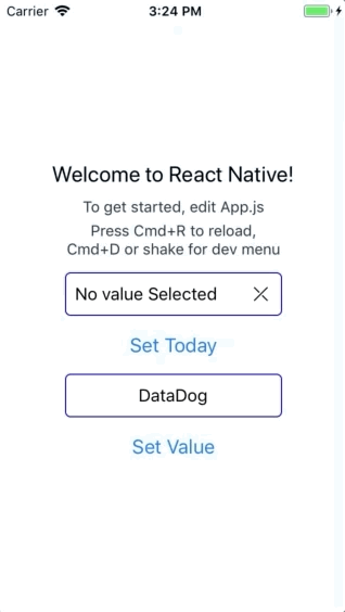 8 |
8 | 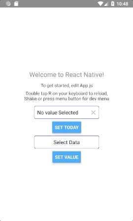 9 |
10 | ## Installation
11 |
12 | ```bash
13 | yarn add react-native-woodpicker @react-native-community/datetimepicker @react-native-picker/picker
14 | ```
15 |
16 | or
17 |
18 | ```bash
19 | npm install react-native-woodpicker @react-native-community/datetimepicker @react-native-picker/picker --save
20 | ```
21 |
22 | ### Expo
23 |
24 | ```bash
25 | // add react-native-woodpicker with your package manager (yarn / npm / ...) and :
26 | expo install @react-native-community/datetimepicker @react-native-picker/picker
27 | ```
28 |
29 | ## Version
30 |
31 | ### 0.1.0
32 |
33 | New Version 0.1.0 integrate new React-Native component **DateTimePicker** from `@react-native-community/datetimepicker` and **Hooks**.
34 | Don't forget to add it to your project.
35 |
36 | ### 0.2.0
37 |
38 | New Version 0.2.0 integrate new React-Native component **Picker** from `@react-native-community/picker`.
39 |
40 | ### 0.3.0
41 |
42 | New Version 0.3.0 use Typescript and change the picker dependency from `@react-native-community/picker` to `@react-native-picker/picker`.
43 |
44 | ## Contribution
45 |
46 | Thanks to everyone for your contribution!
47 | I try my best to review and update this repository.
48 | PR and feedback are welcomed!
49 |
50 | ## Usage
51 |
52 | ### Picker
53 |
54 | You can use Picker to pick values/objects.
55 |
56 | ```jsx
57 | import type { PickerItem } from 'react-native-woodpicker'
58 | import { Picker } from 'react-native-woodpicker'
59 |
60 | [...]
61 |
62 | const ExampleApp = (): JSX.Element => {
63 | const [pickedData, setPickedData] = useState
9 |
10 | ## Installation
11 |
12 | ```bash
13 | yarn add react-native-woodpicker @react-native-community/datetimepicker @react-native-picker/picker
14 | ```
15 |
16 | or
17 |
18 | ```bash
19 | npm install react-native-woodpicker @react-native-community/datetimepicker @react-native-picker/picker --save
20 | ```
21 |
22 | ### Expo
23 |
24 | ```bash
25 | // add react-native-woodpicker with your package manager (yarn / npm / ...) and :
26 | expo install @react-native-community/datetimepicker @react-native-picker/picker
27 | ```
28 |
29 | ## Version
30 |
31 | ### 0.1.0
32 |
33 | New Version 0.1.0 integrate new React-Native component **DateTimePicker** from `@react-native-community/datetimepicker` and **Hooks**.
34 | Don't forget to add it to your project.
35 |
36 | ### 0.2.0
37 |
38 | New Version 0.2.0 integrate new React-Native component **Picker** from `@react-native-community/picker`.
39 |
40 | ### 0.3.0
41 |
42 | New Version 0.3.0 use Typescript and change the picker dependency from `@react-native-community/picker` to `@react-native-picker/picker`.
43 |
44 | ## Contribution
45 |
46 | Thanks to everyone for your contribution!
47 | I try my best to review and update this repository.
48 | PR and feedback are welcomed!
49 |
50 | ## Usage
51 |
52 | ### Picker
53 |
54 | You can use Picker to pick values/objects.
55 |
56 | ```jsx
57 | import type { PickerItem } from 'react-native-woodpicker'
58 | import { Picker } from 'react-native-woodpicker'
59 |
60 | [...]
61 |
62 | const ExampleApp = (): JSX.Element => {
63 | const [pickedData, setPickedData] = useState