├── .gitignore
├── .prettierrc
├── .vscode
└── settings.json
├── .yarnignore
├── .yarnrc
├── README.md
├── code
├── AutoAnimatedState.tsx
├── PreventLayoutIdGeneration.tsx
├── Switch.tsx
├── SwitchOverrideExamples.tsx
├── SwitchToStateAction.tsx
├── actions.ts
├── canvas.tsx
├── controls.ts
├── hooks
│ ├── useDoubleTap.ts
│ └── useLongPress.ts
├── index.ts
├── placeholderState.tsx
├── store
│ ├── globalStore.ts
│ └── keyStore.ts
├── thumbnailStyles.ts
├── transitions.ts
├── useWhyDidYouUpdate.ts
└── utils
│ ├── addAnimatableWrapperToNodeIfNeeded.tsx
│ ├── calculateRect.ts
│ ├── equalizeArrayLength.ts
│ ├── extractEventHandlersFromProps.ts
│ ├── nodeHelpers.ts
│ ├── omit.ts
│ ├── pick.ts
│ ├── propNameHelpers.ts
│ ├── randomID.ts
│ └── styleParsing.ts
├── design
└── document.json
├── metadata
├── artwork.png
└── icon.png
├── package.json
├── tsconfig.json
└── yarn.lock
/.gitignore:
--------------------------------------------------------------------------------
1 | # General
2 | .DS_Store
3 | Icon\r
4 | .vscode
5 |
6 | # Framer
7 | .cache
8 | .config.json
9 | .backups
10 | .framer-lock
11 | .project.log
12 | yarn-error.log
13 | build
14 | dist
15 | node_modules
16 | .npmrc
17 | *.framerxproj
18 |
--------------------------------------------------------------------------------
/.prettierrc:
--------------------------------------------------------------------------------
1 | {
2 | "tabWidth": 4,
3 | "semi": false,
4 | "singleQuote": false,
5 | "trailingComma": "es5"
6 | }
7 |
--------------------------------------------------------------------------------
/.vscode/settings.json:
--------------------------------------------------------------------------------
1 | {
2 | "editor.formatOnSave": true
3 | }
--------------------------------------------------------------------------------
/.yarnignore:
--------------------------------------------------------------------------------
1 | /build
2 | .DS_Store
3 | Icon\r
4 | .cache
5 | .config.json
6 | .backups
7 | .project.log
8 |
--------------------------------------------------------------------------------
/.yarnrc:
--------------------------------------------------------------------------------
1 |
2 | --link-folder "/Users/tisho/Library/Application Support/Framer X/yarn-link-folder"
3 | disable-self-update-check true
4 | yarn-path "/Applications/Framer X.app/Contents/Resources/Server/lib/framerYarn.js"
5 |
--------------------------------------------------------------------------------
/README.md:
--------------------------------------------------------------------------------
1 | # Switch
2 |
3 | `Switch` is a utility component that lets you switch between different states of an element on the canvas using animated transitions. It comes with an additional `SwitchToStateAction` component, which acts as a hotspot that can change the current state of a `Switch` without writing any code.
4 |
5 | **[→ View documentation on GitHub](https://github.com/tisho/Switch.framerfx)**
6 |
7 | **[→ File an issue on GitHub](https://github.com/tisho/Switch.framerfx/issues/new)**
8 |
9 | # Latest Release
10 |
11 | 3/26/2021
12 |
13 | - FIX: Compatibility fixes for latest version of Framer Motion that broke
14 | certain gradient, border and cross-dissolve transitions
15 |
16 | 3/24/2021
17 |
18 | - FIX: Compatibility fixes for latest version of Framer Motion that broke Auto
19 | Animate transitions
20 |
21 | **[→ See past releases](#past-releases)**
22 |
23 | # Examples
24 |
25 | **[→ See examples in Framer Web (requires free account)](https://framer.com/projects/new?duplicate=3bx2ztPRfzFiMJ8hWdmw)**
26 |
27 | **[→ Download examples (.framerx file)](https://tisho-co.s3.amazonaws.com/img/framer-switch/switch-examples.framerx)**
28 |
29 | ## Bottom Sheet
30 |
31 | 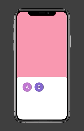
32 |
33 | ## Tabs
34 |
35 | 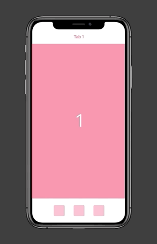
36 |
37 | ## Carousel
38 |
39 | 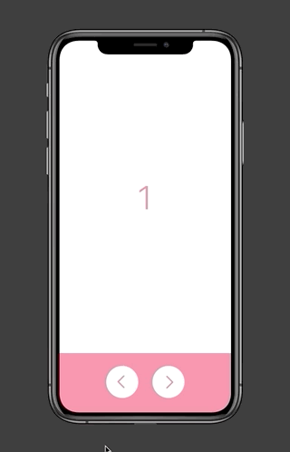
40 |
41 | ## Tooltip
42 |
43 | 
44 |
45 | ## Toggle
46 |
47 | 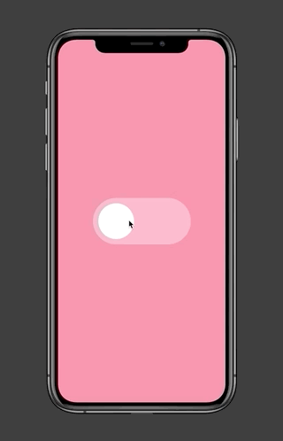
48 |
49 | # Usage
50 |
51 | ## Interactive Switch
52 |
53 | Interactive Switches can manage their own state. Use them when you need to have a Switch change its own state when it's tapped / hovered over. Here are a few examples of components that are a good fit for an interactive Switch:
54 |
55 | - A button with a normal / hover / active state
56 | - An on/off toggle
57 | - A checkbox
58 | - A tooltip that expands on hover
59 |
60 | ### Creating an Interactive Switch
61 |
62 | 1. Drag and drop a Switch component onto the canvas.
63 |
64 | 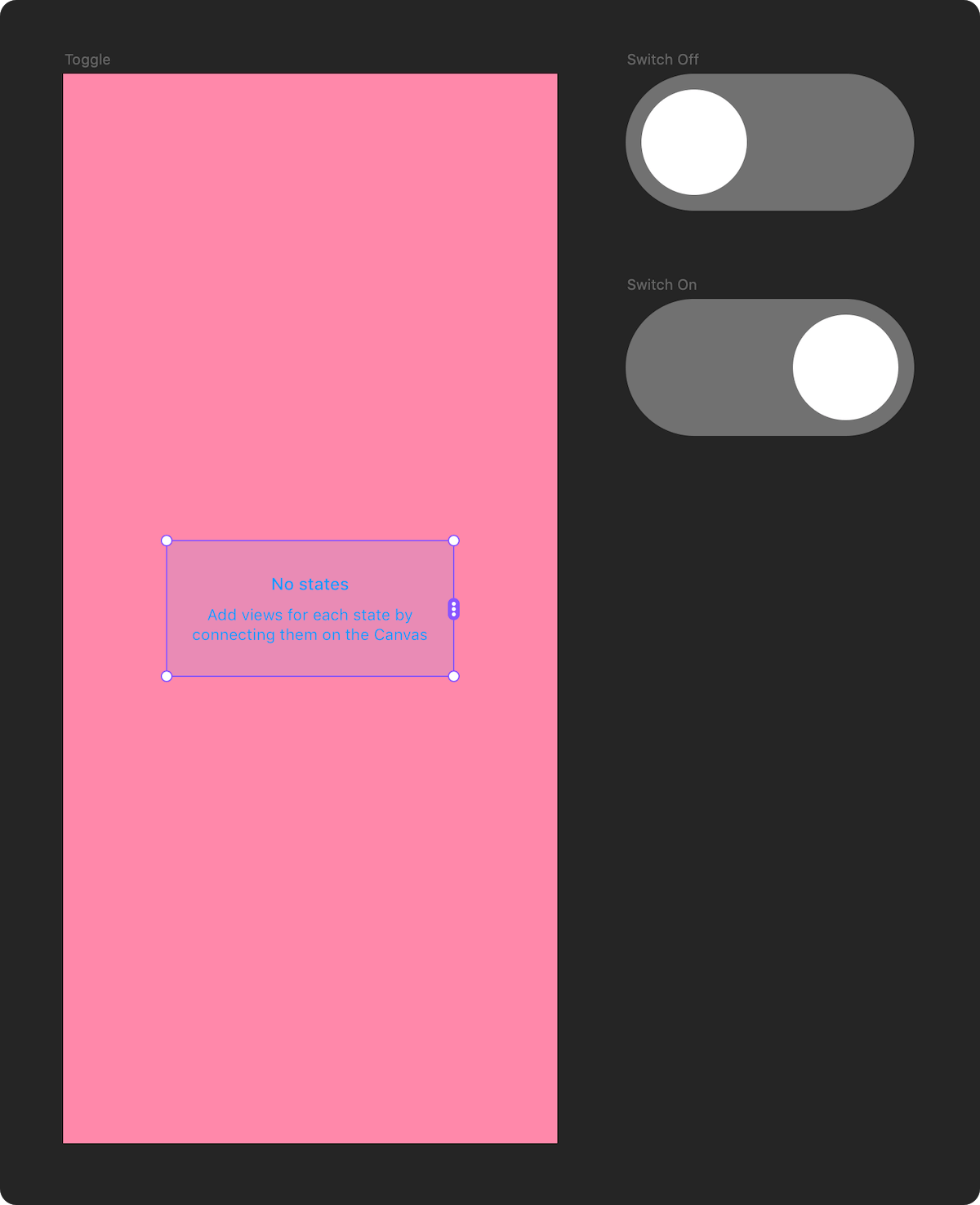
65 |
66 | 2. Connect it to the states you want to switch between.
67 |
68 | 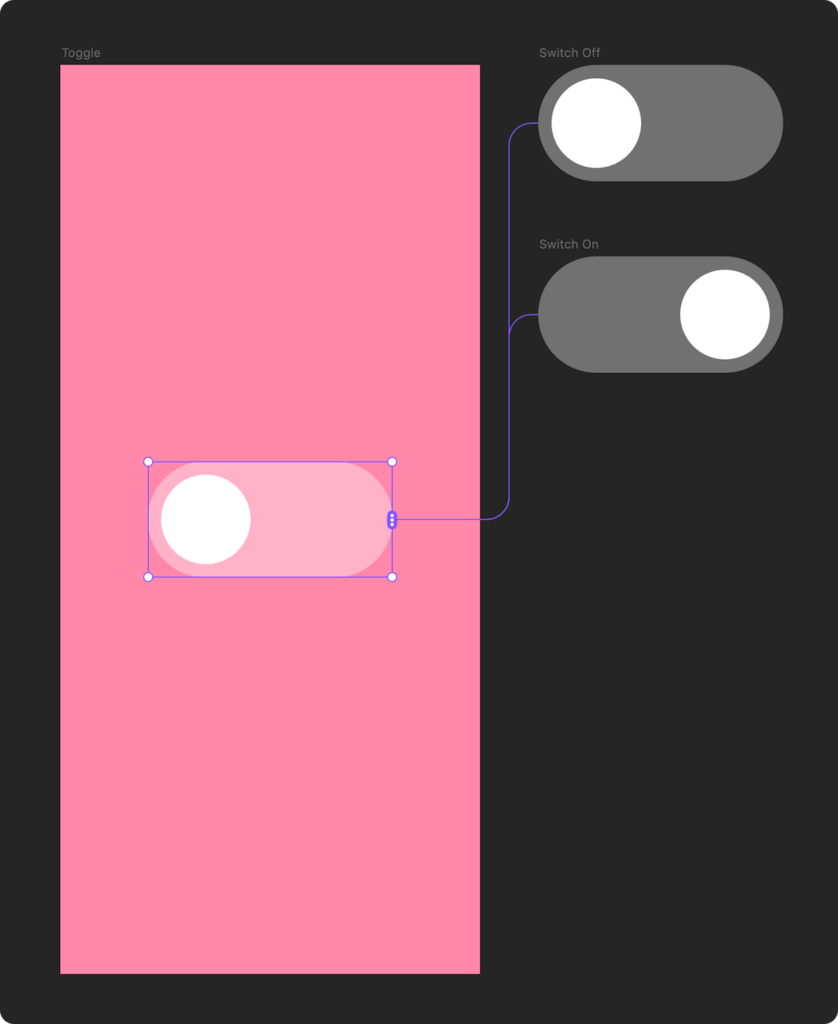
69 |
70 | 3. In the properties panel, set "Interactive" to "Yes".
71 |
72 | 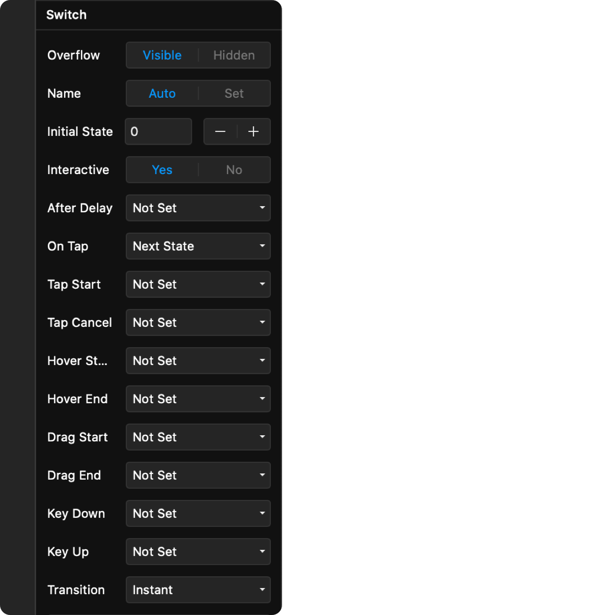
73 |
74 | 4. Choose the trigger for the state change, and the target action.
75 |
76 | 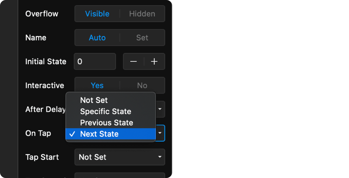
77 |
78 | 5. Customize the transition to use when switching between states.
79 |
80 | 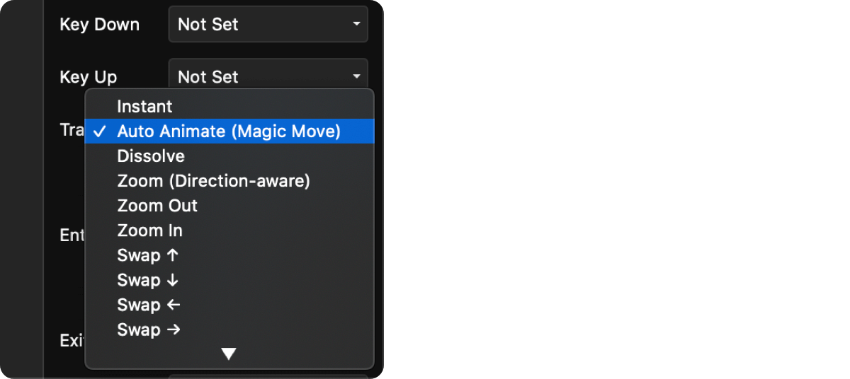
81 |
82 | 6. Preview your prototype.
83 |
84 | ## Controlled Switch
85 |
86 | Controlled Switches rely on other elements to set their state. Here are a few use cases that are a good fit for a controlled Switch:
87 |
88 | - A bottom sheet that changes its contents based on a button being pressed.
89 | - Tabbed navigation
90 | - A carousel with external Previous / Next buttons
91 |
92 | ### Creating a Controlled Switch
93 |
94 | 1. Drag and drop a Switch component onto the canvas.
95 |
96 | 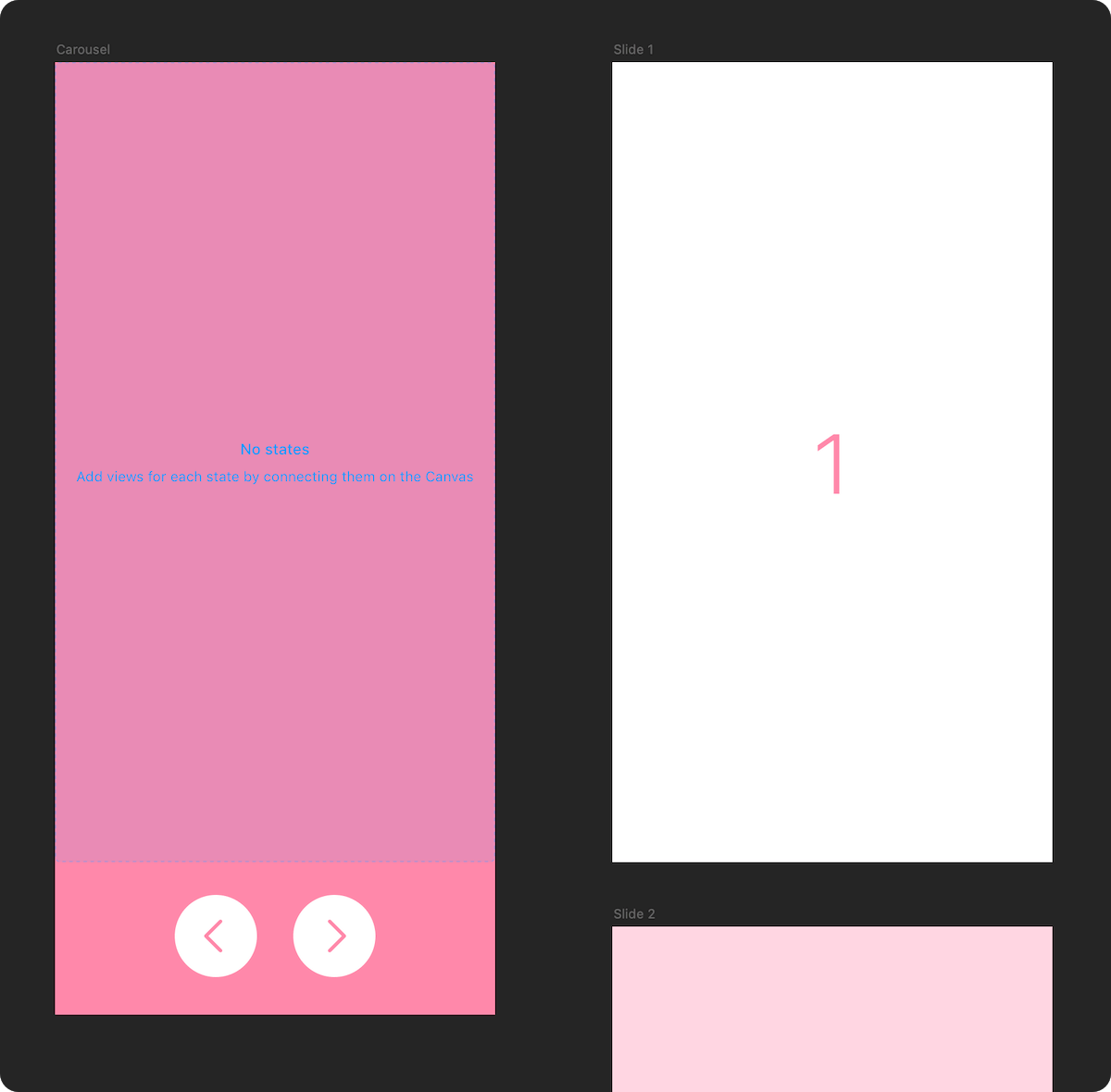
97 |
98 | 2. Connect it to the states you want to switch between.
99 |
100 | 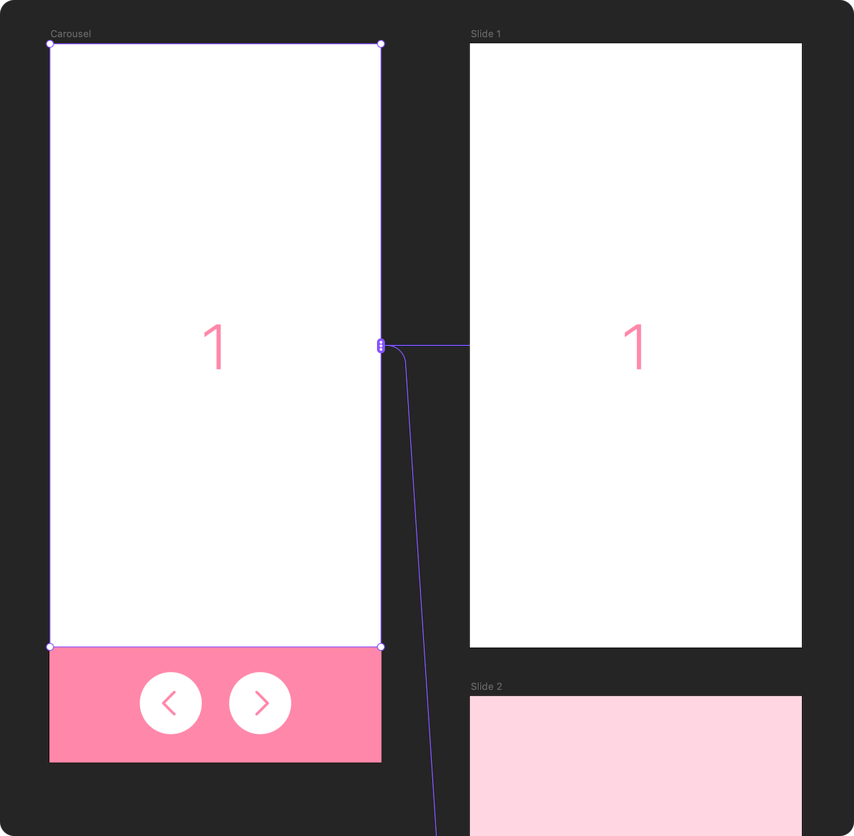
101 |
102 | 3. Choose a unique name for your switch. This name will let other `SwitchToStateAction` hotspots control the state of your switch.
103 |
104 | 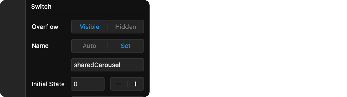
105 |
106 | 4. Drag and drop a `SwitchToStateAction` component onto the canvas. This component will act as a hotspot that changes the state of a Switch component when the user interacts with it.
107 |
108 | 
109 |
110 | 5. Change the name of the target `Switch` to the name you used in step 3, then pick a trigger, and a target state.
111 |
112 | 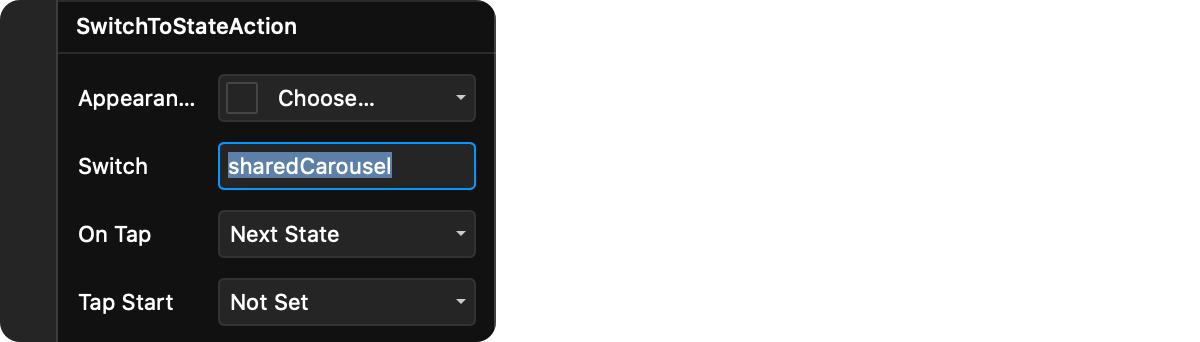
113 |
114 | 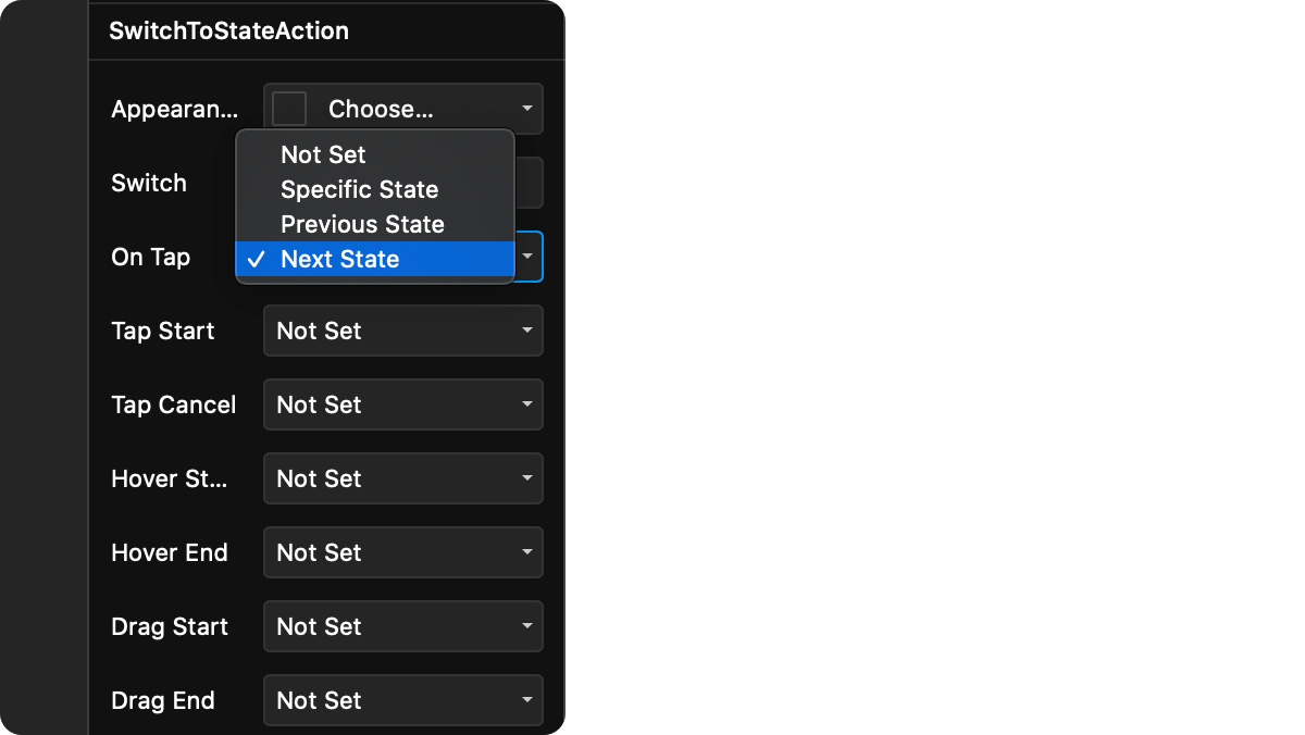
115 |
116 | 6. Customize the transition to use when switching between states.
117 |
118 | 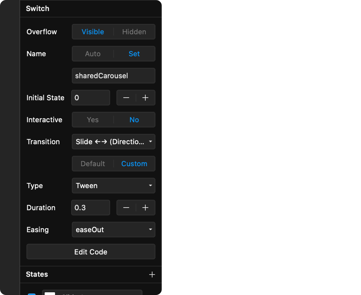
119 |
120 | 7. Preview your prototype.
121 |
122 | # Auto-Animating Between States
123 |
124 | The "Auto-Animate" transition works differently from the other available state transitions. When triggered, elements shared between two states will animate their properties smoothly between each state. If there are elements in the next state that don't exist in the current one, they'll fade in, and elements that should no longer be shown will fade out.
125 |
126 | 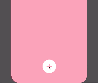
127 |
128 | 
129 |
130 | 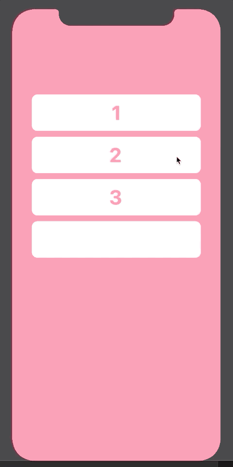
131 |
132 | ## How Element Matching Works
133 |
134 | Before an auto-animate transition begins, the Switch component looks for matching elements between the current and the next state. To figure out if an element matches another element, it looks at:
135 |
136 | - the element's name in the layer panel
137 | - its type (Frame, Stack, code component, etc)
138 | - its order in the layer list
139 | - what level of the layer hierarchy it sits in (i.e. whether it's nested in another Frame)
140 |
141 | Note: Names of Graphic layers are currently not recognized properly. To transition between Graphic layers, wrap them in a Frame and name the Frame.
142 |
143 | ## Supported Transitions Between Matching Elements
144 |
145 | If an element is found to be matching another element, we'll create an animated transition for the following properties:
146 |
147 | - Size
148 | - Position (including layout in Stacks)
149 | - Rotation
150 | - Opacity
151 | - Background (linear gradients, radial gradients, and image fill transitions are all supported)
152 | - Border (radius, color and width)
153 | - Shadow (up to 10 box / inner shadows are supported)
154 |
155 | If the two matching elements are of a different type (e.g. a transition between a Frame and a Graphic), or are of a type where a smooth transition isn't possible (e.g. transitions between two Text layers), the two elements will be animated using a cross-dissolve.
156 |
157 | ## Customizing Auto-Animation Transition Timing
158 |
159 | Each auto-animate transition groups transitioning elements in 3 categories:
160 |
161 | - Morphing Elements: Elements that exist both in the current and the next state
162 | - Entering Elements: Elements that only exist in the next state
163 | - Exiting Elements: Elements that only exist in the current state
164 |
165 | Each group can have different transition timing. Morphing elements always use the timing options defined right below the "Transition" property when it's set to "Auto-Animate". The Enter and Exit transitions will have their own options right below (by default, they're set to a 0.3s dissolve).
166 |
167 | Additionally, auto-animate lets you take advantage of Framer Motion's ability to stagger or delay animations of nested elements.
168 |
169 | 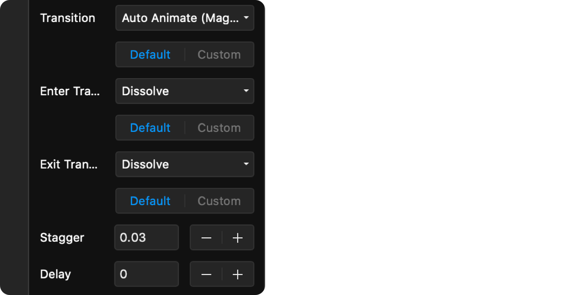
170 |
171 | ## Auto-Animations Between Code Components
172 |
173 | Since code components can render arbitrary HTML, it's hard for Switch to figure out if content rendered by the code component should also be auto-animated. To get around this issue, whenever it encounters a Code Component, the Switch will only animate its position and size. It will then determine if any of the component's props have changed between the different states, and if they have, it will pass the new props to the component.
174 |
175 | Matching code components will not get unmounted and remounted between states, just passed new props. This is especially powerful with components that are expensive to fully re-render, like maps and videos.
176 |
177 | If this behavior doesn't match what you expect, you can set the `morphCodeComponentPropsOnly` prop on a Switch instance to `false` through an Override, and we'll fall back to a cross-dissolve between the two states of the code component.
178 |
179 | # Using Switch in Code
180 |
181 | Use these in Overrides, or when you use the `Switch` component from code.
182 |
183 | ## Switch Overrides
184 |
185 | | Prop | Type | Description |
186 | | ---------------------- | -------- | ----------------------------------------------------------------------------------------------------------------------------------------------------------------------------------------------------------------------------------------------------------------------------------------------------------------------------------------------------- |
187 | | `autoAssignIdentifier` | boolean | When `true`, the Switch instance will get its own random identifier automatically. Default: `false` |
188 | | `identifier` | string | The name of the Switch instance. Make sure this is unique. |
189 | | `initialState` | number | The index of the initial state of the Switch. Default: `0` |
190 | | `overflow` | boolean | Whether content outside the bounds of the container will be shown or not. Default: `true` |
191 | | `onSwitch` | function | A callback function that will be called whenever the Switch component switches its state. The function is passed in the current state index, the previous state index, and the identifier of the Switch component in this order. |
192 | | `shouldTrigger` | function | A callback function that will be called right before a trigger is fired. Returning `false` from this callback will stop the trigger from firing. All original arguments to the trigger will be passed down to the function (e.g. `event`) |
193 | | `transition` | enum | The transition to use when switching states. Can be one of: `instant`, `autoanimate`, `dissolve`, `zoom`, `zoomout`, `zoomin`, `swapup`, `swapdown`, `swapleft`, `swapright`, `slidehorizontal`, `slidevertical`, `slideup`, `slidedown`, `slideleft`, `slideright`, `pushhorizontal`, `pushvertical`, `pushup`, `pushdown`, `pushleft`, `pushright`. |
194 |
195 | ## SwitchToStateAction Overrides
196 |
197 | | Prop | Type | Description |
198 | | --------------- | -------- | ----------------------------------------------------------------------------------------------------------------------------------------------------------------------------------------------------------------------------------------- |
199 | | `targetType` | enum | Defines whether the SwitchToStateAction will target the `closest` switch, or target a specifically `named` Switch. Possible values are: `closest`, `named`. Default is `named`. |
200 | | `target` | string | The name of the Switch instance to target. Make sure this is unique and matches the name of an existing Switch. Only used when `targetType` is set to `named`. |
201 | | `shouldTrigger` | function | A callback function that will be called right before a trigger is fired. Returning `false` from this callback will stop the trigger from firing. All original arguments to the trigger will be passed down to the function (e.g. `event`) |
202 |
203 | ## Controlling Switches with the `useSwitch` Hook
204 |
205 | To control Switches from code, first import the `useSwitch` hook at the top of your file:
206 |
207 | ```
208 | import { useSwitch } from "@framer/tishogeorgiev.switch/code"
209 | ```
210 |
211 | **Note on Framer Web**: Sometimes Web will throw an error in the in-app preview saying it can't find `useSwitch`. This is because it hasn't had time to reload all of its dependencies. When this happens, refresh your browser and it should be fine.
212 |
213 | **Note**: You will likely get a red underline under `@framer/tishogeorgiev.switch/code`, with an error message like "Cannot find module '@framer/tishogeorgiev.switch/code'". You can safely ignore this error, as the code will work anyway. If it bothers you, import `useSwitch` like this, instead:
214 |
215 | ```
216 | // @ts-ignore
217 | import { useSwitch } from "@framer/tishogeorgiev.switch/code"
218 | ```
219 |
220 | Then call the `useSwitch()` hook in your code component or override:
221 |
222 | ```typescript
223 | export function SwitchButton(): Override {
224 | const controls = useSwitch()
225 |
226 | return {
227 | onTap: () => {
228 | controls.setSwitchState("sharedSwitch", 1)
229 | },
230 | }
231 | }
232 | ```
233 |
234 | Note: you can **only** call this hook from inside a React component or override. Calling it from a different place in your code could result in unexpected behavior. [Read more about the rules of hook usage](https://reactjs.org/docs/hooks-rules.html).
235 |
236 | The `useSwitch` hook will return a controls object with the following functions:
237 |
238 | - `controls.getSwitches() => string[]`
239 |
240 | Returns an array of identifiers for all registered Switches.
241 |
242 | - `controls.getSwitchStateIndex(identifier: string) => number`
243 |
244 | Returns the index of the current state of a Switch.
245 |
246 | - `controls.setSwitchState(identifier: string, state: string | number)`
247 |
248 | Sets the current state of a Switch. You can use either the name of the target state (which will be the same as the name of its layer in the Layers panel), or its numerical state index.
249 |
250 | - `controls.setSwitchStateIndex(identifier: string, state: number)`
251 |
252 | **(Deprecated in favor of `setSwitchState`)** Sets the current state index of a Switch. If the index isn't valid, it will still be accepted, but the targeted Switch will remain set to its last known good state.
253 |
254 | - `controls.setNextSwitchState(identifier: string, options: { wrapAround?: boolean } = {})`
255 |
256 | Sets the current state of a Switch to the next available one (the order is the same as the order in which you connected the states). The second `options` parameter is optional, and allows you to specify whether the state will wrap around if trying to advance past the last one. By default, `wrapAround` is true.
257 |
258 | Compatibility note: This method used to be called `setNextSwitchStateIndex` in versions prior to v1.8.0. The old name is still supported.
259 |
260 | - `controls.setPreviousSwitchState(identifier: string, options: { wrapAround?: boolean } = {})`
261 |
262 | Sets the current state of a Switch to the previous one (one behind the current one). The second `options` parameter is optional, and allows you to specify whether the state will wrap around if trying to go back beyond the first one. By default, `wrapAround` is true.
263 |
264 | Compatibility note: This method used to be called `setPreviousSwitchStateIndex` in versions prior to v1.8.0. The old name is still supported.
265 |
266 | - `controls.getAllSwitchStates(identifier: string) => string[]`
267 |
268 | Returns an array of all names states for a Switch. Frames that haven't been explicitly named might have `undefined` as their name.
269 |
270 | - `controls.registerSwitchStates(identifier: string, states: string[])`
271 |
272 | Registers a list of named states for a particular Switch identifier. For internal use only.
273 |
274 | # Past Releases
275 |
276 | 12/17/2020
277 |
278 | - FIX: Compatibility fixes for latest version of Framer that resolve issues
279 | with animating border radii and gradient fills.
280 |
281 | 10/30/2020
282 |
283 | - FIX: Fixed an issue where border radius wasn't being parsed correctly when using Auto Animate (Thanks, @astegmaier).
284 |
285 | 10/07/2020
286 |
287 | - FIX: Fixed an issue that prevented Auto Animate from running on latest version of Framer Motion (Thanks, Victor).
288 |
289 | 9/08/2020
290 |
291 | - FIX: Addressed compatibility issues with the version of Framer Motion 2 used in an upcoming release of Framer (Thanks @hemlok). **NOTE** If your prototype suddenly has glitchy/broken animations, you should update to this version (open the insert menu by pressing `I`, then go to the Switch package and wait for the "Update" button to show up). Let me know if you continue to have problems after.
292 |
293 | 9/01/2020
294 |
295 | - FIX: Fixed an issue that could cause border radius properties to not be parsed correctly.
296 |
297 | 7/17/2020
298 |
299 | - FIX: Fixed an issue that could prevent Auto-Animate from working on some versions of Framer Web.
300 |
301 | 5/29/2020
302 |
303 | - NEW: Added the ability for SwitchToStateAction to control the closest parent Switch, instead of needing to specify the name of a Switch to control. This helps tremendously when using Switch in reusable components, or multi-step animations, and takes away the need to even set a name for most Switches. I've reconfigured a lot of the existing examples to take advantage of this, so take a look if you're wondering how to set it up.
304 |
305 | 5/26/2020
306 |
307 | - FIX: Fixed an issue that prevented Switch containers from receiving focus when clicked, which sometimes prevented keyboard triggers from working (thanks @Si).
308 |
309 | 5/14/2020
310 |
311 | - FIX: Fixed an issue that prevented animated borders and box shadows from animating to the right color when using shared colors (thanks @Joe Preston).
312 |
313 | 4/6/2020
314 |
315 | - FIX: Improved the way Switch loads in order to work around some issues in Framer that could cause the Switch component to disappear from the project entirely, leaving existing instances on the canvas disconnected from their states.
316 | - FIX: Fixed a regression that made Switches show an error when you first toggle the "Interactive" property.
317 |
318 | 3/24/2020
319 |
320 | - FIX: Fixed an issue that kept layers visible during an auto-animate transition, even when they were hidden from the layers panel in the target state (thanks @davidhoeller).
321 | - FIX: Fixed text and graphic layers flickering on first render, and significantly reduced flickering between text/graphics that stayed the same between states (thanks @Benjamin Frenzel).
322 |
323 | 3/23/2020
324 |
325 | - NEW: Added two new triggers: Double Tap and Long Press, paving the way for more gestures.
326 | - FIX: The zoom transition was missing transition props (thanks @Johannes Tutsch).
327 | - FIX: Fixed an issue that made states using the slide transition to appear above layers that are technically placed above the Switch in the view hierarchy (thanks @JeppeVolander)
328 | - FIX: Fixed Stacks and Graphics in Framer Web / Beta appearing in the wrong position when using Auto-Animate.
329 | - FIX: Fixed layers with Overrides or Interactions added in Framer Web / Beta appearing in the wrong position when using Auto-Animate.
330 | - FIX: Fixed an issue that made states render twice if they have Overrides or Interactions applied, which made "After Delay" triggers also trigger twice.
331 |
332 | 2/13/2020
333 |
334 | - FIX: Fixed an issue that prevented a Switch container from properly following layout constraints in responsive mode (thanks @Bojan Kocijan).
335 |
336 | 2/5/2020
337 |
338 | - FIX: Fixed a few issues related to using Switch from a code component.
339 | - FIX: Fixed draggable components breaking when used with auto-animate.
340 | - FIX: Fixed an issue that prevented `setSwitchState` from switching to an index if the name for the state for that index was undefined.
341 |
342 | 2/4/2020
343 |
344 | - FIX: Fixed custom easing curves not working in tween transitions (thanks @David Ikuye).
345 | - NEW: Added more easing curve presets, including most of the ones on https://easings.net. You can find them all under the Easing dropdown when customizing a tween transition.
346 |
347 | 1/31/2020
348 |
349 | - FIX: Fixed auto-animate breaking in shared link previews on Framer Web (thanks @Alexis).
350 |
351 | 1/10/2020
352 |
353 | - FIX: Fixed an issue where an entering or cross-dissolving element would always animate to opacity: 1, even if its target opacity was different.
354 | - FIX: Fixed an issue where the position of an entering element wasn't computed correctly when its container itself was moving/resizing.
355 |
356 | 1/8/2020
357 |
358 | - FIX: Fixed transitions that include colors defined as shared colors (thanks @CharlieWandCo).
359 |
360 | 1/2/2020
361 |
362 | - NEW: Named states. You can now refer to states by the name you've given them in the Layers panel, instead of by numerical index. You can now set a trigger action to "Specific State Name" and just type the name of the layer for the target state on your canvas. Note that default layer names, such as "Frame", are not supported, so make sure you explicitly set a name in the Layers panel.
363 | - NEW: Related to the named states support, you can now use the new `setSwitchState` function from code to set a Switch to either a named state, or a numerical index. See more in the [Using Switch in Code](#using-switch-in-code) section.
364 | - FIX: Auto-animate transitions between Text and Graphic layers should now look noticeably better.
365 | - FIX: Auto-animate transitions between Stacks with Overrides applied are now handled correctly.
366 | - FIX: Auto-animate transitions between more complex Graphic layers sometimes produced odd animations. This should now be fixed.
367 |
368 | 12/15/2019
369 |
370 | - **NEW: Auto-Animate (Magic Move)** added to the list of available transitions between states. Read on to [find out how Auto Animate works](#auto-animating-between-states), and definitely let me know if you spot any bugs when using the auto-animate transition.
371 | - NEW: Switch names can now be set to "Auto" if you never intend to set their state from a hotspot or through code, and don't want the Switch state to be shared with another Switch.
372 | - NEW: Added "After Delay" to the list of available triggers, which lets you switch to another state after a specified amount of time. The time is counted from the moment the hotspot (`SwitchToStateAction`) or the Switch component is mounted on the current view.
373 | - NEW: Added two new actions available through the `useSwitch` hook: `setNextSwitchStateIndex` and `setPreviousSwitchStateIndex`, allowing you to quickly set the next/previous state of a Switch.
374 | - FIX: Any time a Switch updated its state, all Switches in view would re-render, regardless of whether the update was intended for them, or not. This is no longer the case.
375 |
376 | 12/8/2019
377 |
378 | - FIX: Ensured that default props are correctly passed to a Switch component when used directly from code.
379 |
380 | 11/28/2019
381 |
382 | - FIX: Fixed an issue where the connecting the first state of a Switch would cause an error.
383 | - FIX: Fixed an issue that prevented event handlers you set through Overrides from firing if the same trigger wasn't also set on the Switch instance.
384 |
385 | 11/27/2019
386 |
387 | - NEW: Added two new triggers: "Key Down" and "Key Up", which allow you to switch states using keyboard shortcuts. You can use single keys as shortcuts, or more complex shortcuts like `ctrl+o, cmd+shift+t`. Switch uses the popular [hotkeys-js](https://github.com/jaywcjlove/hotkeys) library, so take a look at some of the examples on its Github page to get an idea of the syntax.
388 |
389 | 11/26/2019
390 |
391 | - **BREAKING CHANGE:** `SwitchToStateAction` now lets you define actions for multiple triggers, similar to a fully interactive Switch. Unfortunately, this change isn't compatible with the previous version of this package, so if you update to the latest version, make sure you rewire all hotspots you're using.
392 | - NEW: Code-level API for controlling Switches using the new `useSwitch` hook. More details in the docs below.
393 | - NEW: Added a `shouldTrigger` callback to SwitchToStateAction, which will be called whenever a trigger is about to be executed. If `shouldTrigger` returns `false`, the trigger won't fire. Check out the "Slide to Unlock" example in the updated examples project.
394 | - FIX: Fixed an issue that prevented Switches to use plain Stacks or some code component instances as states.
395 | - FIX: If an invalid state index is passed to the Switch, it will now stay at the last known good state, instead of reverting to the placeholder state.
396 |
397 | 11/21/2019
398 |
399 | - NEW: Added `onSwitch` callback to Switch component, which will be called when the current state changes.
400 |
401 | # Get In Touch
402 |
403 | - **@tisho** on Twitter
404 | - **@tisho** on the [Framer Slack](https://www.framer.com/community/)
405 |
--------------------------------------------------------------------------------
/code/AutoAnimatedState.tsx:
--------------------------------------------------------------------------------
1 | import * as React from "react"
2 | import { useState, useEffect, memo, cloneElement } from "react"
3 | import { Size, useAnimation } from "framer"
4 | import * as Framer from "framer"
5 | import { getCache } from "./store/keyStore"
6 | import { pick } from "./utils/pick"
7 | import { randomID } from "./utils/randomID"
8 | import {
9 | getBackgroundColorPair,
10 | getBorderPair,
11 | getBorderRadius,
12 | getBoxShadowPair,
13 | getOpacity,
14 | getRotate,
15 | isBackgroundTransitionAnimatable,
16 | filterOutAbsolutePositioningProps,
17 | } from "./utils/styleParsing"
18 | import {
19 | canAnimateNodeChildren,
20 | getNodeName,
21 | getNodeId,
22 | getNodeType,
23 | getNodeRect,
24 | getNodeChildren,
25 | isNodeVisible,
26 | nodeWithIdAndKey,
27 | isNodeAnimatable,
28 | isSameComponent,
29 | } from "./utils/nodeHelpers"
30 | import { addAnimatableWrapperToNodeIfNeeded } from "./utils/addAnimatableWrapperToNodeIfNeeded"
31 |
32 | const motionSupportsLayoutProp = "AnimateLayoutFeature" in Framer
33 | const motionNeedsInitialVariant = !("createCrossfader" in Framer)
34 |
35 | const propsForPositionReset = {
36 | top: null,
37 | right: null,
38 | bottom: null,
39 | left: null,
40 | center: null,
41 | }
42 |
43 | const _AutoAnimatedState = ({
44 | source,
45 | target,
46 | transitionPropsForElement,
47 | sourceParentSize,
48 | targetParentSize,
49 | direction,
50 | morphCodeComponentPropsOnly = true,
51 | parentContext = null,
52 | sourceKey = null,
53 | keyCache = null,
54 | transitionKey = null,
55 | }) => {
56 | const [id, _] = useState(randomID())
57 | const keySourceCache = keyCache || getCache(id)
58 | const getSourceKey = keySourceCache.getSourceKey
59 |
60 | // Ensure both source and target have an id and key, even if they're auto-generated
61 | source = nodeWithIdAndKey(source)
62 | target = nodeWithIdAndKey(target)
63 |
64 | // The transition key will be used to create a unique name for the
65 | // initial/next variant used in animating the state transition.
66 | // All children will share the same transition key, so options like
67 | // staggerChildren can take effect.
68 | const tkey = transitionKey || `${source.key}-${target.key}`
69 |
70 | const sourceNodeType = getNodeType(source)
71 | const targetNodeType = getNodeType(target)
72 |
73 | const useAbsolutePositioning = !(
74 | ["StackLegacyContainer", "Stack"].indexOf(sourceNodeType) > -1 ||
75 | ["StackLegacyContainer", "Stack"].indexOf(targetNodeType) > -1 ||
76 | parentContext === "Stack"
77 | )
78 |
79 | const controls = useAnimation()
80 | const initialVariantName = `__switch_initial_${tkey}`
81 | const nextVariantName = `__switch_next_${tkey}`
82 | const isRoot = transitionKey === null
83 |
84 | const sourcePositionAndSizeProps = getNodeRect(source, sourceParentSize)
85 | const targetPositionAndSizeProps = getNodeRect(target, targetParentSize)
86 |
87 | const shouldAnimateChildren =
88 | canAnimateNodeChildren(source) && canAnimateNodeChildren(target)
89 |
90 | const sourceStateChildren = shouldAnimateChildren
91 | ? getNodeChildren(source)
92 | : []
93 | const targetStateChildren = shouldAnimateChildren
94 | ? getNodeChildren(target)
95 | : []
96 |
97 | const morphingChildrenPairs = []
98 | const morphingChildrenIds = []
99 | const enteringChildrenIds = []
100 | const exitingChildrenIds = []
101 |
102 | const sourceStateChildrenIds = sourceStateChildren.map(getNodeId)
103 |
104 | targetStateChildren.forEach((child) => {
105 | const name = getNodeName(child)
106 | const id = getNodeId(child)
107 |
108 | // if the child isn't visible in the target state, skip it, so it can be marked for exiting
109 | if (!isNodeVisible(child)) {
110 | return
111 | }
112 |
113 | // find the first match by name that's not already in the morphing children list
114 | const match = sourceStateChildren.find((otherChild) => {
115 | const otherName = getNodeName(otherChild)
116 | const otherId = getNodeId(otherChild)
117 |
118 | return (
119 | name === otherName &&
120 | morphingChildrenIds.indexOf(otherId) === -1
121 | )
122 | })
123 |
124 | if (match) {
125 | const otherId = getNodeId(match)
126 | morphingChildrenIds.push(otherId)
127 | morphingChildrenPairs.push({ source: otherId, target: id })
128 | return
129 | }
130 |
131 | // if there's no match, this child is entering the scene
132 | enteringChildrenIds.push(id)
133 | })
134 |
135 | // exiting children will be all children from the current state that haven't been tagged as morphing
136 | sourceStateChildren.forEach((child) => {
137 | const id = getNodeId(child)
138 | if (morphingChildrenIds.indexOf(id) === -1) {
139 | exitingChildrenIds.push(id)
140 | }
141 | })
142 |
143 | // put together final hierarchy
144 |
145 | // step 1: replace morphing children with their equivalents from current state
146 | // morphing children will be evaluated separately, so the fact that we're using
147 | // the source child in this stage of the hierarchy doesn't mean much.
148 | const targetHierarchy = targetStateChildren.map((child) => {
149 | const id = getNodeId(child)
150 | const morphingPair = morphingChildrenPairs.find((c) => c.target === id)
151 |
152 | if (morphingPair) {
153 | return sourceStateChildren.find(
154 | (c) => getNodeId(c) === morphingPair.source
155 | )
156 | }
157 | return child
158 | })
159 |
160 | // step 2: place exiting children back into the hierarchy
161 | exitingChildrenIds.forEach((id) => {
162 | const index = sourceStateChildrenIds.indexOf(id)
163 | let closestMorphingChildId
164 |
165 | for (let i = index; i >= 0; i--) {
166 | if (morphingChildrenIds.indexOf(sourceStateChildrenIds[i]) !== -1) {
167 | closestMorphingChildId = sourceStateChildrenIds[i]
168 | break
169 | }
170 | }
171 |
172 | const indexOfClosestMorphingChild = targetHierarchy.findIndex(
173 | (c) => getNodeId(c) === closestMorphingChildId
174 | )
175 | const child = sourceStateChildren.find((c) => getNodeId(c) === id)
176 |
177 | if (typeof indexOfClosestMorphingChild !== "undefined") {
178 | targetHierarchy.splice(indexOfClosestMorphingChild + 1, 0, child)
179 | } else {
180 | targetHierarchy.unshift(child)
181 | }
182 | })
183 |
184 | // ------------ Build Final Hierarchy with Animated Elements --------------
185 |
186 | const animatedHierarchy = targetHierarchy.map((child) => {
187 | const id = getNodeId(child)
188 | const morphingPair = morphingChildrenPairs.find((c) => c.source === id)
189 | if (morphingPair) {
190 | const targetChild = targetStateChildren.find(
191 | (c) => getNodeId(c) === morphingPair.target
192 | )
193 |
194 | const key = getSourceKey(targetChild.key, child.key)
195 |
196 | return React.createElement(AutoAnimatedState, {
197 | key,
198 | sourceKey: key,
199 | transitionKey: tkey,
200 | source: child,
201 | target: targetChild,
202 | transitionPropsForElement,
203 | sourceParentSize: Size(
204 | sourcePositionAndSizeProps.width,
205 | sourcePositionAndSizeProps.height
206 | ),
207 | targetParentSize: Size(
208 | targetPositionAndSizeProps.width,
209 | targetPositionAndSizeProps.height
210 | ),
211 | direction,
212 | parentContext:
213 | ["StackLegacyContainer", "Stack"].indexOf(sourceNodeType) >
214 | -1 ||
215 | ["StackLegacyContainer", "Stack"].indexOf(targetNodeType) >
216 | -1
217 | ? "Stack"
218 | : null,
219 | keyCache: keySourceCache,
220 | })
221 | }
222 |
223 | const positionAndSize = getNodeRect(child, sourcePositionAndSizeProps)
224 |
225 | const wrappedChild = addAnimatableWrapperToNodeIfNeeded(child, {
226 | ...propsForPositionReset,
227 | width: "100%",
228 | height: "100%",
229 | })
230 |
231 | if (enteringChildrenIds.indexOf(id) !== -1) {
232 | const positionAndSizeInTarget = getNodeRect(
233 | child,
234 | targetPositionAndSizeProps
235 | )
236 | let props = {
237 | ...propsForPositionReset,
238 | ...positionAndSizeInTarget,
239 | ...transitionPropsForElement({
240 | source: child,
241 | sourceRect: positionAndSize,
242 | transition: "enter",
243 | transitionKey: tkey,
244 | useAbsolutePositioning,
245 | }),
246 | }
247 |
248 | props = useAbsolutePositioning
249 | ? props
250 | : filterOutAbsolutePositioningProps(props)
251 |
252 | return cloneElement(wrappedChild, props)
253 | }
254 |
255 | if (exitingChildrenIds.indexOf(id) !== -1) {
256 | let props = {
257 | ...propsForPositionReset,
258 | ...positionAndSize,
259 | ...transitionPropsForElement({
260 | source: child,
261 | sourceRect: positionAndSize,
262 | transition: "exit",
263 | transitionKey: tkey,
264 | useAbsolutePositioning,
265 | }),
266 | }
267 |
268 | props = useAbsolutePositioning
269 | ? props
270 | : filterOutAbsolutePositioningProps(props)
271 |
272 | return cloneElement(wrappedChild, props)
273 | }
274 | })
275 |
276 | // ------------ Set Up Transition Effect --------------
277 |
278 | // Decide which transition to run
279 | const hasNonAnimatableTransitions =
280 | sourceNodeType === targetNodeType &&
281 | !isBackgroundTransitionAnimatable(source, target)
282 |
283 | const shouldCrossDissolve =
284 | sourceNodeType !== targetNodeType ||
285 | hasNonAnimatableTransitions ||
286 | !isNodeAnimatable(source) ||
287 | !isNodeAnimatable(target)
288 |
289 | const shouldMorphComponentProps =
290 | morphCodeComponentPropsOnly &&
291 | sourceNodeType === "ComponentContainer" &&
292 | targetNodeType === "ComponentContainer" &&
293 | isSameComponent(source, target)
294 |
295 | useEffect(() => {
296 | // We only need to start the variant transition at the root level.
297 | // animations deeper in the hierarchy will be automatically triggered,
298 | // because they share the same variant name through the transition key.
299 | if (!isRoot) {
300 | return
301 | }
302 |
303 | if (
304 | source.type === target.type &&
305 | getNodeId(source) === getNodeId(target)
306 | ) {
307 | // skip animation entirely if we're not transitioning to a new state
308 | controls.set(nextVariantName)
309 | } else {
310 | // delay animation until after the next paint / layout, so animations
311 | // can start from the correct values
312 | requestAnimationFrame(() =>
313 | setTimeout(() => {
314 | controls.start(nextVariantName)
315 | }, 0)
316 | )
317 | }
318 | }, [source, target, controls, initialVariantName, nextVariantName])
319 |
320 | // ------------ Cross-Dissolving Elements --------------
321 |
322 | if (shouldCrossDissolve && !shouldMorphComponentProps) {
323 | const enteringChildVariants = {
324 | [initialVariantName]: {
325 | opacity: 0,
326 | display: "block",
327 | },
328 | [nextVariantName]: {
329 | ...targetPositionAndSizeProps,
330 | opacity: getOpacity(target.props.style || {}),
331 | display: "block",
332 | scaleX: 1,
333 | scaleY: 1,
334 | translateX: [0, 0],
335 | },
336 | }
337 |
338 | const exitingChildVariants = {
339 | [initialVariantName]: {
340 | opacity: getOpacity(source.props.style || {}),
341 | display: "block",
342 | },
343 | [nextVariantName]: {
344 | ...pick(targetPositionAndSizeProps, ["top", "left"]),
345 | scaleX:
346 | targetPositionAndSizeProps.width /
347 | sourcePositionAndSizeProps.width,
348 | scaleY:
349 | targetPositionAndSizeProps.height /
350 | sourcePositionAndSizeProps.height,
351 | opacity: 0,
352 | transitionEnd: {
353 | translateX: -9999,
354 | },
355 | },
356 | }
357 |
358 | const enterTransitionProps = transitionPropsForElement({
359 | source,
360 | target,
361 | transition: "cross-dissolve-enter",
362 | })
363 |
364 | const exitTransitionProps = transitionPropsForElement({
365 | source,
366 | target,
367 | transition: "cross-dissolve-exit",
368 | })
369 |
370 | const key = getSourceKey(sourceKey, source.key)
371 | const keyForEnteringChild =
372 | direction === 1 ? `__enter_${key}` : `__exit_${key}`
373 |
374 | const sameSourceAndTarget = source.key === target.key
375 |
376 | let enteringChildProps = {
377 | key: keyForEnteringChild,
378 | ...propsForPositionReset,
379 | ...pick(sourcePositionAndSizeProps, ["top", "left"]),
380 | ...pick(targetPositionAndSizeProps, ["width", "height"]),
381 | originX: 0,
382 | originY: 0,
383 | scaleX:
384 | sourcePositionAndSizeProps.width /
385 | targetPositionAndSizeProps.width,
386 | scaleY:
387 | sourcePositionAndSizeProps.height /
388 | targetPositionAndSizeProps.height,
389 | variants: {
390 | ...(target.props.variants || {}),
391 | ...enteringChildVariants,
392 | },
393 | animate: isRoot ? controls : undefined,
394 | ...enterTransitionProps,
395 | }
396 |
397 | if (motionNeedsInitialVariant) {
398 | enteringChildProps.initial = initialVariantName
399 | }
400 |
401 | enteringChildProps = useAbsolutePositioning
402 | ? enteringChildProps
403 | : filterOutAbsolutePositioningProps(enteringChildProps)
404 |
405 | const keyForExitingChild =
406 | direction === 1 ? `__exit_${key}` : `__enter_${key}`
407 |
408 | let exitingChildProps = {
409 | key: keyForExitingChild,
410 | // disable magic motion for same source-target transitions, because otherwise
411 | // the layout of the exiting child will get cached by motion, and any subsequent
412 | // animations will use it as a starting point, which will cause a noticeable flicker.
413 | _canMagicMotion: !sameSourceAndTarget,
414 | ...propsForPositionReset,
415 | ...sourcePositionAndSizeProps,
416 | originX: 0,
417 | originY: 0,
418 | scaleX: 1,
419 | scaleY: 1,
420 | variants: {
421 | ...(source.props.variants || {}),
422 | ...exitingChildVariants,
423 | },
424 | animate: isRoot ? controls : undefined,
425 | ...exitTransitionProps,
426 | }
427 |
428 | if (motionNeedsInitialVariant) {
429 | exitingChildProps.initial = initialVariantName
430 | }
431 |
432 | exitingChildProps = useAbsolutePositioning
433 | ? exitingChildProps
434 | : filterOutAbsolutePositioningProps(exitingChildProps)
435 |
436 | const wrappedSource = addAnimatableWrapperToNodeIfNeeded(
437 | source,
438 | {
439 | ...propsForPositionReset,
440 | width: "100%",
441 | height: "100%",
442 | },
443 | shouldAnimateChildren ? animatedHierarchy : []
444 | )
445 |
446 | const wrappedTarget = addAnimatableWrapperToNodeIfNeeded(
447 | target,
448 | {
449 | ...propsForPositionReset,
450 | ...pick(targetPositionAndSizeProps, ["width", "height"]),
451 | },
452 | shouldAnimateChildren ? animatedHierarchy : []
453 | )
454 |
455 | const enteringElement = cloneElement(wrappedTarget, enteringChildProps)
456 | const exitingElement = cloneElement(wrappedSource, exitingChildProps)
457 |
458 | return (
459 | <>
460 | {exitingElement}
461 | {enteringElement}
462 |
463 | )
464 | }
465 |
466 | // ------------ Variants for Morphing Elements --------------
467 |
468 | const {
469 | sourceProps: initialVariant,
470 | targetProps: nextVariant,
471 | } = getPropTransitionsBetweenNodes(
472 | source,
473 | target,
474 | sourceParentSize,
475 | targetParentSize,
476 | parentContext
477 | )
478 |
479 | let transitionProps = {
480 | ...propsForPositionReset,
481 | ...sourcePositionAndSizeProps,
482 | _border: null,
483 | style: {
484 | ...source.props.style,
485 | },
486 | variants: {
487 | ...(target.props.variants || {}),
488 | [nextVariantName]: nextVariant,
489 | },
490 | animate: isRoot ? controls : undefined,
491 | ...transitionPropsForElement({
492 | source,
493 | target,
494 | transition: "morph",
495 | }),
496 | }
497 |
498 | if (motionNeedsInitialVariant) {
499 | transitionProps.initial = initialVariantName
500 | transitionProps.variants[initialVariantName] = initialVariant
501 | }
502 |
503 | transitionProps =
504 | !useAbsolutePositioning && sourceNodeType !== "Stack"
505 | ? filterOutAbsolutePositioningProps(transitionProps)
506 | : transitionProps
507 |
508 | const key = getSourceKey(sourceKey, source.key)
509 |
510 | // ------------ Stacks --------------
511 |
512 | if (sourceNodeType === "StackLegacyContainer") {
513 | const containerProps = {
514 | key,
515 | id: null,
516 | ...propsForPositionReset,
517 | ...sourcePositionAndSizeProps,
518 | top: 0,
519 | left: 0,
520 | _border: null,
521 | }
522 |
523 | const sourceStack = React.Children.toArray(source.props.children)[0]
524 | const targetStack = React.Children.toArray(target.props.children)[0]
525 |
526 | const {
527 | sourceProps: stackInitialVariant,
528 | targetProps: stackNextVariant,
529 | } = getPropTransitionsBetweenNodes(
530 | sourceStack,
531 | targetStack,
532 | sourcePositionAndSizeProps,
533 | targetPositionAndSizeProps,
534 | parentContext
535 | )
536 |
537 | let stackProps = {
538 | key,
539 | id: null,
540 | ...transitionProps,
541 | top: sourcePositionAndSizeProps.top,
542 | left: sourcePositionAndSizeProps.left,
543 | variants: {
544 | [initialVariantName]: stackInitialVariant,
545 | [nextVariantName]: {
546 | ...stackNextVariant,
547 | top: targetPositionAndSizeProps.top,
548 | left: targetPositionAndSizeProps.left,
549 | },
550 | },
551 | }
552 |
553 | stackProps =
554 | parentContext === "Stack"
555 | ? filterOutAbsolutePositioningProps(stackProps)
556 | : stackProps
557 |
558 | return cloneElement(
559 | source,
560 | containerProps,
561 | cloneElement(sourceStack, stackProps, ...animatedHierarchy)
562 | )
563 | }
564 |
565 | // ------------ Code Components --------------
566 |
567 | if (shouldMorphComponentProps) {
568 | const sourceComponent = React.Children.toArray(source.props.children)[0]
569 | const targetComponent = React.Children.toArray(target.props.children)[0]
570 |
571 | const layoutTransitionProps = motionSupportsLayoutProp
572 | ? { layout: !useAbsolutePositioning }
573 | : {
574 | positionTransition: useAbsolutePositioning
575 | ? false
576 | : transitionPropsForElement({
577 | source,
578 | target,
579 | transition: "morph",
580 | }).transition,
581 | }
582 |
583 | const containerProps = {
584 | ...transitionProps,
585 | ...layoutTransitionProps,
586 | key,
587 | }
588 |
589 | const wrappedSource = addAnimatableWrapperToNodeIfNeeded(
590 | source,
591 | {
592 | ...propsForPositionReset,
593 | width: "100%",
594 | height: "100%",
595 | id: target.props.id,
596 | key,
597 | },
598 | [
599 | cloneElement(sourceComponent, {
600 | ...targetComponent.props,
601 | key,
602 | }),
603 | ]
604 | )
605 |
606 | return <>{cloneElement(wrappedSource, containerProps)}
607 | }
608 |
609 | // ------------ All Other Morphable Elements --------------
610 |
611 | const wrappedTarget = addAnimatableWrapperToNodeIfNeeded(target, {
612 | ...propsForPositionReset,
613 | width: "100%",
614 | height: "100%",
615 | key,
616 | })
617 |
618 | // `positionTransition` is deprecated in Motion 2, and produces unexpected results when
619 | // used inside of Framer.
620 | const layoutTransitionProps = motionSupportsLayoutProp
621 | ? { layout: !useAbsolutePositioning }
622 | : {
623 | positionTransition: useAbsolutePositioning
624 | ? false
625 | : transitionPropsForElement({
626 | source,
627 | target,
628 | transition: "morph",
629 | }).transition,
630 | }
631 |
632 | return cloneElement(
633 | wrappedTarget,
634 | {
635 | id: null,
636 | ...transitionProps,
637 | ...layoutTransitionProps,
638 | key,
639 | },
640 | [{animatedHierarchy}]
641 | )
642 | }
643 |
644 | _AutoAnimatedState.displayName = "AutoAnimatedState"
645 | export const AutoAnimatedState = memo(_AutoAnimatedState) as any
646 |
647 | const getPropTransitionsBetweenNodes = (
648 | source,
649 | target,
650 | sourceParentSize,
651 | targetParentSize,
652 | parentContext
653 | ) => {
654 | const targetPositionAndSizeProps = getNodeRect(target, targetParentSize)
655 |
656 | const [
657 | sourceBackgroundProps,
658 | targetBackgroundProps,
659 | ] = getBackgroundColorPair(source.props, target.props)
660 |
661 | const [sourceBoxShadow, targetBoxShadow] = getBoxShadowPair(
662 | source.props,
663 | target.props
664 | )
665 |
666 | const [sourceBorder, targetBorder] = getBorderPair(
667 | source.props,
668 | target.props
669 | )
670 |
671 | const sourceProps = {
672 | opacity: getOpacity(source.props.style),
673 | rotate: getRotate(source.props.style),
674 | ...getBorderRadius(source.props.style),
675 | ...sourceBackgroundProps,
676 | boxShadow: sourceBoxShadow,
677 | ...sourceBorder,
678 | }
679 |
680 | let targetProps = {
681 | ...targetPositionAndSizeProps,
682 | opacity: getOpacity(target.props.style),
683 | rotate: getRotate(target.props.style),
684 | ...getBorderRadius(target.props.style),
685 | ...targetBackgroundProps,
686 | boxShadow: targetBoxShadow,
687 | ...targetBorder,
688 | }
689 |
690 | targetProps =
691 | parentContext === "Stack"
692 | ? filterOutAbsolutePositioningProps(targetProps)
693 | : targetProps
694 |
695 | return {
696 | sourceProps,
697 | targetProps,
698 | }
699 | }
700 |
--------------------------------------------------------------------------------
/code/PreventLayoutIdGeneration.tsx:
--------------------------------------------------------------------------------
1 | import * as Framer from "framer"
2 | import * as React from "react"
3 |
4 | const _PreventLayoutIdGeneration = (props: {
5 | children: React.ReactNode | React.ReactNode[]
6 | }) => {
7 | const context = React.useRef({
8 | getLayoutId: (args) => null,
9 | persistLayoutIdCache: () => {},
10 | top: false,
11 | }).current
12 |
13 | // LayoutIdContext may not exist on Framer if Switch is used in an old version of Framer.
14 | // @ts-ignore
15 | if (Framer.LayoutIdContext) {
16 | return (
17 | // @ts-ignore
18 |
19 | )
20 | }
21 |
22 | return <>{props.children}
23 | }
24 |
25 | export const PreventLayoutIdGeneration = _PreventLayoutIdGeneration as any
26 |
--------------------------------------------------------------------------------
/code/Switch.tsx:
--------------------------------------------------------------------------------
1 | import * as React from "react"
2 | import {
3 | createElement,
4 | useEffect,
5 | useRef,
6 | useState,
7 | useMemo,
8 | memo,
9 | } from "react"
10 | import { addCallback } from "reactn"
11 | import {
12 | Frame,
13 | addPropertyControls,
14 | ControlType,
15 | AnimatePresence,
16 | RenderTarget,
17 | Size,
18 | ControlDescription,
19 | } from "framer"
20 | import hotkeys, { KeyHandler } from "hotkeys-js"
21 | import { actions } from "./store/globalStore"
22 | import { placeholderState } from "./placeholderState"
23 | import { TRANSITIONS, DEFAULT_TWEEN, DEFAULT_SPRING } from "./transitions"
24 | import { omit } from "./utils/omit"
25 | import { colors as thumbnailColors } from "./thumbnailStyles"
26 | import {
27 | eventTriggerProps,
28 | keyEventTriggerProps,
29 | automaticEventTriggerProps,
30 | eventTriggerPropertyControls,
31 | transitionPropertyControls,
32 | } from "./controls"
33 | import { extractEventHandlersFromProps } from "./utils/extractEventHandlersFromProps"
34 | import { AutoAnimatedState } from "./AutoAnimatedState"
35 | import { sanitizePropName } from "./utils/propNameHelpers"
36 | import { randomID } from "./utils/randomID"
37 | import { PreventLayoutIdGeneration } from "./PreventLayoutIdGeneration"
38 |
39 | // ------------------- Switch Component -------------------
40 |
41 | function _Switch(props) {
42 | const {
43 | children,
44 | autoAssignIdentifier,
45 | identifier = "",
46 | transition = "instant",
47 | overflow = true,
48 | initialState = 0,
49 | isInteractive,
50 | onSwitch,
51 | morphCodeComponentPropsOnly,
52 | ...rest
53 | } = props
54 |
55 | if (RenderTarget.current() === RenderTarget.thumbnail) {
56 | return
57 | }
58 |
59 | const [currentStateIndex, setCurrentStateIndex] = useState(initialState)
60 |
61 | const [randomIdentifier] = useState(() => randomID())
62 |
63 | const [id, setId] = useState(
64 | autoAssignIdentifier ? randomIdentifier : identifier
65 | )
66 |
67 | useEffect(() => {
68 | setId(autoAssignIdentifier ? randomIdentifier : identifier)
69 | }, [autoAssignIdentifier, identifier])
70 |
71 | const {
72 | getSwitchStateIndex,
73 | getAllSwitchStates,
74 | setSwitchStateIndex,
75 | registerSwitchStates,
76 | } = actions
77 |
78 | const states = React.Children.toArray(children).map(
79 | (c) => c.props.name || ""
80 | )
81 | const sanitizedIdentifier = sanitizePropName(id)
82 | const current =
83 | typeof currentStateIndex === "undefined"
84 | ? initialState
85 | : currentStateIndex
86 |
87 | // the current index ref will be used to calculate direction
88 | const currentIndexRef = useRef(current)
89 | const previousIndexRef = useRef(current)
90 |
91 | const previous = currentIndexRef.current
92 | const atWrapBoundary =
93 | (previous === states.length - 1 && current === 0) ||
94 | (previous === 0 && current === states.length - 1)
95 | let direction = previous <= current ? 1 : -1
96 |
97 | // at the wrap boundary directions are intentionally reversed,
98 | // so that going from 0 to the last state looks like going back,
99 | // instead of going forward
100 | if (atWrapBoundary) {
101 | direction = -direction
102 | }
103 |
104 | if (children[current]) {
105 | currentIndexRef.current = current
106 | } else if (children[previous]) {
107 | currentIndexRef.current = previous
108 | } else {
109 | currentIndexRef.current = initialState
110 | }
111 |
112 | // ensure that previousIndexRef always points to the true previous index
113 | // i.e. even if you re-render the same state, previousIndexRef won't change
114 | // this is needed to pass the correct source/target for AutoAnimatedState
115 | if (currentIndexRef.current !== previous) {
116 | previousIndexRef.current = previous
117 | }
118 |
119 | if (
120 | currentIndexRef.current !== previous &&
121 | typeof onSwitch !== "undefined"
122 | ) {
123 | onSwitch(currentIndexRef.current, previous, sanitizedIdentifier)
124 | }
125 |
126 | const child = children[currentIndexRef.current]
127 |
128 | useEffect(() => {
129 | return addCallback(({ __switch }) => {
130 | const updatedIndex = __switch[sanitizedIdentifier]
131 | if (currentIndexRef.current !== updatedIndex) {
132 | setCurrentStateIndex(updatedIndex)
133 | }
134 | })
135 | }, [sanitizedIdentifier])
136 |
137 | // update the state for this element if the user manually
138 | // changes the initial state from the property controls
139 | useEffect(() => {
140 | setSwitchStateIndex(sanitizedIdentifier, initialState)
141 | }, [initialState, sanitizedIdentifier])
142 |
143 | // store a registry of available states, so the SwitchToStateAction
144 | // instances can figure out what the next/previous state is
145 | useEffect(() => {
146 | registerSwitchStates(sanitizedIdentifier, states)
147 | }, [children, sanitizedIdentifier])
148 |
149 | // Extract event handlers from props
150 | // Note: extract runs hooks for some gesture-related events, so it's
151 | // important to NOT run it conditionally
152 | let [
153 | eventHandlers,
154 | keyEvents,
155 | automaticEvents,
156 | ] = extractEventHandlersFromProps(
157 | props,
158 | { getSwitchStateIndex, getAllSwitchStates, setSwitchStateIndex },
159 | sanitizedIdentifier
160 | )
161 |
162 | // reset the results of the previous call if this switch isn't interactive
163 | if (!isInteractive) {
164 | eventHandlers = {}
165 | keyEvents = []
166 | automaticEvents = []
167 | }
168 |
169 | const automaticEventProps = Object.keys(props)
170 | .filter((prop) => automaticEventTriggerProps.indexOf(prop) !== -1)
171 | .map((prop) => props[prop])
172 |
173 | // execute automatic (delay) event triggers
174 | useEffect(() => {
175 | if (RenderTarget.current() !== RenderTarget.preview) {
176 | return
177 | }
178 |
179 | const timeouts = automaticEvents.map(({ handler }) => handler())
180 |
181 | return () => {
182 | timeouts.forEach(clearTimeout)
183 | }
184 | }, [...automaticEventProps, sanitizedIdentifier])
185 |
186 | // attach key event handlers
187 | const keyEventProps = Object.keys(props)
188 | .filter((prop) => keyEventTriggerProps.indexOf(prop) !== -1)
189 | .map((prop) => props[prop])
190 |
191 | useEffect(() => {
192 | if (RenderTarget.current() !== RenderTarget.preview) {
193 | return
194 | }
195 |
196 | keyEvents.forEach(({ hotkey, options, handler }) =>
197 | hotkeys(hotkey, options, handler as KeyHandler)
198 | )
199 |
200 | return () => {
201 | keyEvents.forEach(({ hotkey, handler }) =>
202 | hotkeys.unbind(hotkey, handler as KeyHandler)
203 | )
204 | }
205 | }, [...keyEventProps, sanitizedIdentifier])
206 |
207 | const transitionPropsForElement = ({
208 | source,
209 | sourceRect,
210 | target,
211 | transition,
212 | useAbsolutePositioning,
213 | transitionKey,
214 | }) => {
215 | if (transition === "enter") {
216 | return TRANSITIONS[props.enterTransition](source.props, props, {
217 | transitionKey,
218 | sourceRect,
219 | useAbsolutePositioning,
220 | })
221 | }
222 |
223 | if (transition === "exit") {
224 | return TRANSITIONS[props.exitTransition](source.props, props, {
225 | transitionKey,
226 | sourceRect,
227 | useAbsolutePositioning,
228 | })
229 | }
230 |
231 | if (
232 | transition === "cross-dissolve-enter" ||
233 | transition === "cross-dissolve-exit"
234 | ) {
235 | return TRANSITIONS.crossdissolve(source.props, props, {
236 | direction: transition,
237 | })
238 | }
239 |
240 | return TRANSITIONS.morph(source.props, props)
241 | }
242 |
243 | const size = useMemo(() => {
244 | if (child) {
245 | return Size(child.props.width, child.props.height)
246 | }
247 | }, [child])
248 |
249 | // if not connected to anything, show placeholder
250 | if (!child) {
251 | return createElement(placeholderState, {
252 | title: "No states",
253 | label: "Add views for each state by connecting them on the Canvas",
254 | })
255 | }
256 |
257 | if (RenderTarget.current() !== RenderTarget.preview) {
258 | return (
259 |
266 | {child}
267 |
268 | )
269 | }
270 |
271 | if (transition === "autoanimate") {
272 | return (
273 |
282 |
283 |
284 |
297 |
298 |
299 |
300 | )
301 | }
302 |
303 | return (
304 |
314 |
315 |
316 |
327 | {child}
328 |
329 |
330 |
331 |
332 | )
333 | }
334 |
335 | const defaultProps = {
336 | overflow: true,
337 | autoAssignIdentifier: false,
338 | identifier: "sharedSwitch",
339 | initialState: 0,
340 | isInteractive: false,
341 | // Specifies how code components will be handled during auto-animate.
342 | // When this is true, the auto animator will try to preserve code component
343 | // instances between states and only throw new props at them. When it's false,
344 | // code components will cross-dissolve between instances in the source / target state.
345 | // Switch this to `false` with an override if code components don't seem to behave
346 | // as expected during auto animate transitions.
347 | morphCodeComponentPropsOnly: true,
348 | transition: "instant",
349 | transitionConfigType: "default",
350 | transitionType: "spring",
351 | enterTransition: "enterdissolve",
352 | enterTransitionConfigType: "default",
353 | enterTransitionType: "tween",
354 | exitTransition: "exitdissolve",
355 | exitTransitionConfigType: "default",
356 | exitTransitionType: "tween",
357 | damping: DEFAULT_SPRING.damping,
358 | mass: DEFAULT_SPRING.mass,
359 | stiffness: DEFAULT_SPRING.stiffness,
360 | duration: DEFAULT_TWEEN.duration,
361 | ease: "easeOut",
362 | customEase: "0.25, 0.1, 0.25, 1",
363 | enterDamping: DEFAULT_SPRING.damping,
364 | enterMass: DEFAULT_SPRING.mass,
365 | enterStiffness: DEFAULT_SPRING.stiffness,
366 | enterDuration: DEFAULT_TWEEN.duration,
367 | enterEase: "easeOut",
368 | enterCustomEase: "0.25, 0.1, 0.25, 1",
369 | exitDamping: DEFAULT_SPRING.damping,
370 | exitMass: DEFAULT_SPRING.mass,
371 | exitStiffness: DEFAULT_SPRING.stiffness,
372 | exitDuration: DEFAULT_TWEEN.duration,
373 | exitEase: "easeOut",
374 | exitCustomEase: "0.25, 0.1, 0.25, 1",
375 | staggerChildren: 0,
376 | delayChildren: 0,
377 |
378 | // Auto-generated from the following code:
379 | //
380 | // JSON.stringify(
381 | // Object.keys(eventTriggerPropertyControls).reduce((res, prop) => {
382 | // if ("defaultValue" in eventTriggerPropertyControls[prop]) {
383 | // res[prop] = eventTriggerPropertyControls[prop].defaultValue
384 | // }
385 | // return res
386 | // }, {})
387 | // )
388 |
389 | afterDelayAction: "unset",
390 | afterDelaySpecificIndex: 0,
391 | afterDelaySpecificName: "",
392 | afterDelayDelay: 0,
393 | onTapAction: "unset",
394 | onTapSpecificIndex: 0,
395 | onTapSpecificName: "",
396 | onTapStartAction: "unset",
397 | onTapStartSpecificIndex: 0,
398 | onTapStartSpecificName: "",
399 | onTapCancelAction: "unset",
400 | onTapCancelSpecificIndex: 0,
401 | onTapCancelSpecificName: "",
402 | onHoverStartAction: "unset",
403 | onHoverStartSpecificIndex: 0,
404 | onHoverStartSpecificName: "",
405 | onHoverEndAction: "unset",
406 | onHoverEndSpecificIndex: 0,
407 | onHoverEndSpecificName: "",
408 | onDragStartAction: "unset",
409 | onDragStartSpecificIndex: 0,
410 | onDragStartSpecificName: "",
411 | onDragEndAction: "unset",
412 | onDragEndSpecificIndex: 0,
413 | onDragEndSpecificName: "",
414 | onDoubleTapAction: "unset",
415 | onDoubleTapSpecificIndex: 0,
416 | onDoubleTapSpecificName: "",
417 | onLongPressAction: "unset",
418 | onLongPressSpecificIndex: 0,
419 | onLongPressSpecificName: "",
420 | onLongPressDuration: 0.5,
421 | onKeyDownAction: "unset",
422 | onKeyDownSpecificIndex: 0,
423 | onKeyDownSpecificName: "",
424 | onKeyDownKey: "",
425 | onKeyUpAction: "unset",
426 | onKeyUpSpecificIndex: 0,
427 | onKeyUpSpecificName: "",
428 | onKeyUpKey: "",
429 | }
430 |
431 | _Switch.defaultProps = {
432 | height: 240,
433 | width: 240,
434 | ...defaultProps,
435 | }
436 |
437 | _Switch.displayName = "Switch"
438 | const __Switch = memo(_Switch)
439 |
440 | export const Switch = (props) => <__Switch {...props} />
441 |
442 | // ------------------- Property Controls ------------------
443 |
444 | addPropertyControls(Switch, {
445 | overflow: {
446 | type: ControlType.Boolean,
447 | title: "Overflow",
448 | defaultValue: defaultProps.overflow,
449 | enabledTitle: "Visible",
450 | disabledTitle: "Hidden",
451 | },
452 |
453 | children: {
454 | title: "States",
455 | type: ControlType.Array,
456 | propertyControl: {
457 | type: ControlType.ComponentInstance,
458 | },
459 | },
460 |
461 | autoAssignIdentifier: {
462 | title: "Name",
463 | type: ControlType.Boolean,
464 | enabledTitle: "Auto",
465 | disabledTitle: "Set",
466 | defaultValue: defaultProps.autoAssignIdentifier,
467 | },
468 |
469 | identifier: {
470 | title: " ",
471 | type: ControlType.String,
472 | defaultValue: defaultProps.identifier,
473 | hidden: (props) => props.autoAssignIdentifier,
474 | },
475 |
476 | initialState: {
477 | title: "Initial State",
478 | type: ControlType.Number,
479 | displayStepper: true,
480 | defaultValue: defaultProps.initialState,
481 | },
482 |
483 | // Event Handling
484 |
485 | isInteractive: {
486 | title: "Interactive",
487 | type: ControlType.Boolean,
488 | enabledTitle: "Yes",
489 | disabledTitle: "No",
490 | defaultValue: defaultProps.isInteractive,
491 | },
492 |
493 | ...eventTriggerPropertyControls,
494 |
495 | // Transition Options
496 |
497 | transition: {
498 | title: "Transition",
499 | type: ControlType.Enum,
500 | options: [
501 | "instant",
502 | "autoanimate",
503 | "dissolve",
504 | "zoom",
505 | "zoomout",
506 | "zoomin",
507 | "swapup",
508 | "swapdown",
509 | "swapleft",
510 | "swapright",
511 | "slidehorizontal",
512 | "slidevertical",
513 | "slideup",
514 | "slidedown",
515 | "slideleft",
516 | "slideright",
517 | "pushhorizontal",
518 | "pushvertical",
519 | "pushup",
520 | "pushdown",
521 | "pushleft",
522 | "pushright",
523 | ],
524 | optionTitles: [
525 | "Instant",
526 | "Auto Animate (Magic Move)",
527 | "Dissolve",
528 | "Zoom (Direction-aware)",
529 | "Zoom Out",
530 | "Zoom In",
531 | "Swap ↑",
532 | "Swap ↓",
533 | "Swap ←",
534 | "Swap →",
535 | "Slide ←→ (Direction-aware)",
536 | "Slide ↑↓ (Direction-aware)",
537 | "Slide ↑",
538 | "Slide ↓",
539 | "Slide ←",
540 | "Slide →",
541 | "Push ←→ (Direction-aware)",
542 | "Push ↑↓ (Direction-aware)",
543 | "Push ↑",
544 | "Push ↓",
545 | "Push ←",
546 | "Push →",
547 | ],
548 | defaultValue: defaultProps.transition,
549 | },
550 |
551 | // -- start: default/morph transition options --
552 |
553 | transitionConfigType: {
554 | ...transitionPropertyControls.transitionConfigType,
555 | defaultValue: defaultProps["transitionConfigType"],
556 | hidden: (props) => props["transition"] === "instant",
557 | },
558 |
559 | transitionType: {
560 | ...transitionPropertyControls.transitionType,
561 | defaultValue: defaultProps["transitionType"],
562 | hidden: (props) =>
563 | props["transition"] === "instant" ||
564 | props["transitionConfigType"] === "default",
565 | },
566 |
567 | damping: {
568 | ...transitionPropertyControls.damping,
569 | hidden: (props) =>
570 | props["transition"] === "instant" ||
571 | props["transitionType"] !== "spring" ||
572 | props["transitionConfigType"] === "default",
573 | defaultValue: defaultProps["damping"],
574 | },
575 |
576 | mass: {
577 | ...transitionPropertyControls.mass,
578 | hidden: (props) =>
579 | props["transition"] === "instant" ||
580 | props["transitionType"] !== "spring" ||
581 | props["transitionConfigType"] === "default",
582 | defaultValue: defaultProps["mass"],
583 | },
584 |
585 | stiffness: {
586 | ...transitionPropertyControls.stiffness,
587 | hidden: (props) =>
588 | props["transition"] === "instant" ||
589 | props["transitionType"] !== "spring" ||
590 | props["transitionConfigType"] === "default",
591 | defaultValue: defaultProps["stiffness"],
592 | },
593 |
594 | duration: {
595 | ...transitionPropertyControls.duration,
596 | hidden: (props) =>
597 | props["transition"] === "instant" ||
598 | props["transitionType"] !== "tween" ||
599 | props["transitionConfigType"] === "default",
600 | defaultValue: defaultProps["duration"],
601 | },
602 |
603 | ease: {
604 | ...transitionPropertyControls.ease,
605 | hidden: (props) =>
606 | props["transition"] === "instant" ||
607 | props["transitionType"] !== "tween" ||
608 | props["transitionConfigType"] === "default",
609 | defaultValue: defaultProps["ease"],
610 | },
611 |
612 | customEase: {
613 | ...transitionPropertyControls.customEase,
614 | hidden: (props) =>
615 | props["transition"] === "instant" ||
616 | props["transitionType"] !== "tween" ||
617 | props["transitionConfigType"] === "default" ||
618 | props["ease"] !== "custom",
619 | defaultValue: defaultProps["customEase"],
620 | },
621 |
622 | // -- end: default/morph transition options --
623 |
624 | enterTransition: {
625 | title: "Enter Transition",
626 | type: ControlType.Enum,
627 | options: ["enterdissolve", "growdissolve", "enterInstant"],
628 | optionTitles: ["Dissolve", "Grow", "Instant"],
629 | defaultValue: defaultProps.enterTransition,
630 | hidden: (props) => props.transition !== "autoanimate",
631 | },
632 |
633 | // -- start: enter transition options
634 |
635 | enterTransitionConfigType: {
636 | ...transitionPropertyControls.transitionConfigType,
637 | defaultValue: defaultProps["transitionConfigType"],
638 | hidden: (props) =>
639 | props["transition"] !== "autoanimate" ||
640 | props["enterTransition"] === "enterInstant",
641 | },
642 |
643 | enterTransitionType: {
644 | ...transitionPropertyControls.transitionType,
645 | defaultValue: defaultProps["transitionType"],
646 | hidden: (props) =>
647 | props["transition"] !== "autoanimate" ||
648 | props["enterTransition"] === "enterInstant" ||
649 | props["enterTransitionConfigType"] === "default",
650 | },
651 |
652 | enterDamping: {
653 | ...transitionPropertyControls.damping,
654 | hidden: (props) =>
655 | props["transition"] !== "autoanimate" ||
656 | props["enterTransition"] === "enterInstant" ||
657 | props["enterTransitionType"] !== "spring" ||
658 | props["enterTransitionConfigType"] === "default",
659 | defaultValue: defaultProps["enterDamping"],
660 | },
661 |
662 | enterMass: {
663 | ...transitionPropertyControls.mass,
664 | hidden: (props) =>
665 | props["transition"] !== "autoanimate" ||
666 | props["enterTransition"] === "enterInstant" ||
667 | props["enterTransitionType"] !== "spring" ||
668 | props["enterTransitionConfigType"] === "default",
669 | defaultValue: defaultProps["enterMass"],
670 | },
671 |
672 | enterStiffness: {
673 | ...transitionPropertyControls.stiffness,
674 | hidden: (props) =>
675 | props["transition"] !== "autoanimate" ||
676 | props["enterTransition"] === "enterInstant" ||
677 | props["enterTransitionType"] !== "spring" ||
678 | props["enterTransitionConfigType"] === "default",
679 | defaultValue: defaultProps["enterStiffness"],
680 | },
681 |
682 | enterDuration: {
683 | ...transitionPropertyControls.duration,
684 | hidden: (props) =>
685 | props["transition"] !== "autoanimate" ||
686 | props["enterTransition"] === "enterInstant" ||
687 | props["enterTransitionType"] !== "tween" ||
688 | props["enterTransitionConfigType"] === "default",
689 | defaultValue: defaultProps["enterDuration"],
690 | },
691 |
692 | enterEase: {
693 | ...transitionPropertyControls.ease,
694 | hidden: (props) =>
695 | props["transition"] !== "autoanimate" ||
696 | props["enterTransition"] === "enterInstant" ||
697 | props["enterTransitionType"] !== "tween" ||
698 | props["enterTransitionConfigType"] === "default",
699 | defaultValue: defaultProps["enterEase"],
700 | },
701 |
702 | enterCustomEase: {
703 | ...transitionPropertyControls.customEase,
704 | hidden: (props) =>
705 | props["transition"] !== "autoanimate" ||
706 | props["enterTransition"] === "enterInstant" ||
707 | props["enterTransitionType"] !== "tween" ||
708 | props["enterTransitionConfigType"] === "default" ||
709 | props["enterEase"] !== "custom",
710 | defaultValue: defaultProps["enterCustomEase"],
711 | },
712 |
713 | // -- end: enter transition options
714 |
715 | exitTransition: {
716 | title: "Exit Transition",
717 | type: ControlType.Enum,
718 | options: ["exitdissolve", "shrinkdissolve", "exitInstant"],
719 | optionTitles: ["Dissolve", "Shrink", "Instant"],
720 | defaultValue: defaultProps.exitTransition,
721 | hidden: (props) => props.transition !== "autoanimate",
722 | },
723 |
724 | // -- start: exit transition options
725 |
726 | exitTransitionConfigType: {
727 | ...transitionPropertyControls.transitionConfigType,
728 | defaultValue: defaultProps["transitionConfigType"],
729 | hidden: (props) =>
730 | props["transition"] !== "autoanimate" ||
731 | props["exitTransition"] === "exitInstant",
732 | },
733 |
734 | exitTransitionType: {
735 | ...transitionPropertyControls.transitionType,
736 | defaultValue: defaultProps["transitionType"],
737 | hidden: (props) =>
738 | props["transition"] !== "autoanimate" ||
739 | props["exitTransition"] === "exitInstant" ||
740 | props["exitTransitionConfigType"] === "default",
741 | },
742 |
743 | exitDamping: {
744 | ...transitionPropertyControls.damping,
745 | hidden: (props) =>
746 | props["transition"] !== "autoanimate" ||
747 | props["exitTransition"] === "exitInstant" ||
748 | props["exitTransitionType"] !== "spring" ||
749 | props["exitTransitionConfigType"] === "default",
750 | defaultValue: defaultProps["exitDamping"],
751 | },
752 |
753 | exitMass: {
754 | ...transitionPropertyControls.mass,
755 | hidden: (props) =>
756 | props["transition"] !== "autoanimate" ||
757 | props["exitTransition"] === "exitInstant" ||
758 | props["exitTransitionType"] !== "spring" ||
759 | props["exitTransitionConfigType"] === "default",
760 | defaultValue: defaultProps["exitMass"],
761 | },
762 |
763 | exitStiffness: {
764 | ...transitionPropertyControls.stiffness,
765 | hidden: (props) =>
766 | props["transition"] !== "autoanimate" ||
767 | props["exitTransition"] === "exitInstant" ||
768 | props["exitTransitionType"] !== "spring" ||
769 | props["exitTransitionConfigType"] === "default",
770 | defaultValue: defaultProps["exitStiffness"],
771 | },
772 |
773 | exitDuration: {
774 | ...transitionPropertyControls.duration,
775 | hidden: (props) =>
776 | props["transition"] !== "autoanimate" ||
777 | props["exitTransition"] === "exitInstant" ||
778 | props["exitTransitionType"] !== "tween" ||
779 | props["exitTransitionConfigType"] === "default",
780 | defaultValue: defaultProps["exitDuration"],
781 | },
782 |
783 | exitEase: {
784 | ...transitionPropertyControls.ease,
785 | hidden: (props) =>
786 | props["transition"] !== "autoanimate" ||
787 | props["exitTransition"] === "exitInstant" ||
788 | props["exitTransitionType"] !== "tween" ||
789 | props["exitTransitionConfigType"] === "default",
790 | defaultValue: defaultProps["exitEase"],
791 | },
792 |
793 | exitCustomEase: {
794 | ...transitionPropertyControls.customEase,
795 | hidden: (props) =>
796 | props["transition"] !== "autoanimate" ||
797 | props["exitTransition"] === "exitInstant" ||
798 | props["exitTransitionType"] !== "tween" ||
799 | props["exitTransitionConfigType"] === "default" ||
800 | props["exitEase"] !== "custom",
801 | defaultValue: defaultProps["exitCustomEase"],
802 | },
803 |
804 | // -- end: exit transition options
805 |
806 | staggerChildren: {
807 | title: "Stagger",
808 | type: ControlType.Number,
809 | displayStepper: true,
810 | step: 0.01,
811 | unit: "s",
812 | defaultValue: defaultProps.staggerChildren,
813 | hidden: (props) => props.transition !== "autoanimate",
814 | },
815 |
816 | delayChildren: {
817 | title: "Delay",
818 | type: ControlType.Number,
819 | displayStepper: true,
820 | step: 0.1,
821 | unit: "s",
822 | defaultValue: defaultProps.delayChildren,
823 | hidden: (props) => props.transition !== "autoanimate",
824 | },
825 | } as { [key: string]: ControlDescription })
826 |
827 | // ---------------------- Thumbnail -----------------------
828 |
829 | function SwitchThumbnail() {
830 | return (
831 |
837 |
838 |
871 |
872 |
873 | )
874 | }
875 |
--------------------------------------------------------------------------------
/code/SwitchOverrideExamples.tsx:
--------------------------------------------------------------------------------
1 | import { Override, useAnimation } from "framer"
2 | import { useSwitch } from "./"
3 |
4 | export function UnlockSlider(): Override {
5 | const controls = useAnimation()
6 | const dragThreshold = 200
7 |
8 | return {
9 | animate: controls,
10 | drag: "x",
11 | dragElastic: false,
12 | dragMomentum: false,
13 | dragConstraints: { left: 0, right: 200 },
14 | onDragEnd: (e, { point }) => {
15 | // animate the slider to the start if it hasn't reached the
16 | // drag threshold
17 | if (point.x < dragThreshold) {
18 | controls.start({ x: 0 })
19 | }
20 | },
21 |
22 | // Only allow the SwitchToState action to trigger if the slider
23 | // has reached the drag threshold (200px to the right)
24 | shouldTrigger: (e, { point }) => point.x >= dragThreshold,
25 | }
26 | }
27 |
28 | export function ScaleDown(): Override {
29 | return {
30 | whileTap: { scale: 0.8 },
31 | }
32 | }
33 |
34 | export function ExternalSwitchControl(): Override {
35 | const controls = useSwitch()
36 |
37 | return {
38 | onTap: () => {
39 | controls.setSwitchState("sharedFancyTabNav", "Middle Focused")
40 | },
41 | }
42 | }
43 |
--------------------------------------------------------------------------------
/code/SwitchToStateAction.tsx:
--------------------------------------------------------------------------------
1 | import * as React from "react"
2 | import { useEffect, useState, useRef, createElement, memo } from "react"
3 | import { Frame, addPropertyControls, ControlType, RenderTarget } from "framer"
4 | import hotkeys, { KeyHandler } from "hotkeys-js"
5 | import { placeholderState } from "./placeholderState"
6 | import { sanitizePropName } from "./utils/propNameHelpers"
7 | import { omit } from "./utils/omit"
8 | import { colors as thumbnailColors } from "./thumbnailStyles"
9 | import { extractEventHandlersFromProps } from "./utils/extractEventHandlersFromProps"
10 | import { randomID } from "./utils/randomID"
11 | import {
12 | eventTriggerProps,
13 | keyEventTriggerProps,
14 | automaticEventTriggerProps,
15 | eventTriggerPropertyControls,
16 | } from "./controls"
17 | import { actions } from "./store/globalStore"
18 |
19 | // ------------- SwitchToStateAction Component ------------
20 |
21 | function _SwitchToStateAction(props) {
22 | const { children, target, targetType, ...rest } = props
23 | const ref = useRef(null)
24 | const sanitizedTarget = sanitizePropName(target)
25 | const [targetId, setTargetId] = useState(
26 | targetType === "named" ? sanitizedTarget : randomID()
27 | )
28 |
29 | if (RenderTarget.current() === RenderTarget.thumbnail) {
30 | return
31 | }
32 |
33 | const {
34 | getSwitchStateIndex,
35 | setSwitchStateIndex,
36 | registerSwitchStates,
37 | getAllSwitchStates,
38 | } = actions
39 |
40 | // Extract event handlers from props
41 | let [
42 | eventHandlers,
43 | keyEvents,
44 | automaticEvents,
45 | ] = extractEventHandlersFromProps(
46 | props,
47 | {
48 | getSwitchStateIndex,
49 | setSwitchStateIndex,
50 | registerSwitchStates,
51 | getAllSwitchStates,
52 | },
53 | targetId
54 | )
55 |
56 | const automaticEventProps = Object.keys(props)
57 | .filter((prop) => automaticEventTriggerProps.indexOf(prop) !== -1)
58 | .map((prop) => props[prop])
59 |
60 | // find id of closest switch if targetType is `closest`
61 | useEffect(() => {
62 | if (
63 | RenderTarget.current() !== RenderTarget.preview ||
64 | !ref.current ||
65 | targetType !== "closest"
66 | ) {
67 | return
68 | }
69 |
70 | const closestSwitch = ref.current.closest(
71 | "[data-switch-id]"
72 | ) as HTMLElement | null
73 |
74 | if (closestSwitch) {
75 | const id = sanitizePropName(closestSwitch.dataset.switchId)
76 | if (targetId !== id) {
77 | setTargetId(id)
78 | }
79 | }
80 | }, [targetType, ref.current])
81 |
82 | // execute automatic (delay) event triggers
83 | useEffect(() => {
84 | if (RenderTarget.current() !== RenderTarget.preview) {
85 | return
86 | }
87 |
88 | const timeouts = automaticEvents.map(({ handler }) => handler())
89 |
90 | return () => {
91 | timeouts.forEach(clearTimeout)
92 | }
93 | }, [...automaticEventProps, targetId, props.id])
94 |
95 | // attach key event handlers
96 | const keyEventProps = Object.keys(props)
97 | .filter((prop) => keyEventTriggerProps.indexOf(prop) !== -1)
98 | .map((prop) => props[prop])
99 |
100 | useEffect(() => {
101 | if (RenderTarget.current() !== RenderTarget.preview) {
102 | return
103 | }
104 |
105 | keyEvents.forEach(({ hotkey, options, handler }) =>
106 | hotkeys(hotkey, options, handler as KeyHandler)
107 | )
108 |
109 | return () => {
110 | keyEvents.forEach(({ hotkey, handler }) =>
111 | hotkeys.unbind(hotkey, handler as KeyHandler)
112 | )
113 | }
114 | }, [...keyEventProps, targetId, props.id])
115 |
116 | const child = children && React.Children.toArray(children)[0]
117 | let placeholder
118 |
119 | if (!child) {
120 | placeholder = createElement(placeholderState, {
121 | striped: true,
122 | })
123 | }
124 |
125 | return (
126 |
133 | {!child && RenderTarget.current() === RenderTarget.canvas
134 | ? placeholder
135 | : null}
136 | {children}
137 |
138 | )
139 | }
140 |
141 | _SwitchToStateAction.displayName = "SwitchToStateAction"
142 |
143 | const __SwitchToStateAction = memo(_SwitchToStateAction)
144 |
145 | export const SwitchToStateAction = (props) => (
146 | <__SwitchToStateAction {...props} />
147 | )
148 |
149 | const defaultProps = {
150 | width: 50,
151 | height: 50,
152 | targetType: "named",
153 | target: "sharedSwitch",
154 | isInteractive: true,
155 | }
156 |
157 | SwitchToStateAction.defaultProps = defaultProps
158 |
159 | // ------------------- Property Controls ------------------
160 |
161 | addPropertyControls(SwitchToStateAction, {
162 | children: {
163 | type: ControlType.ComponentInstance,
164 | title: "Appearance",
165 | },
166 | targetType: {
167 | title: "Switch",
168 | type: ControlType.Enum,
169 | options: ["closest", "named"],
170 | optionTitles: ["Closest", "Named"],
171 | defaultValue: defaultProps.targetType,
172 | },
173 | target: {
174 | type: ControlType.String,
175 | title: " ",
176 | defaultValue: defaultProps.target,
177 | placeholder: "Name of Switch",
178 | hidden: (props) => props.targetType !== "named",
179 | },
180 |
181 | ...eventTriggerPropertyControls,
182 | })
183 |
184 | // ---------------------- Thumbnail -----------------------
185 |
186 | function SwitchToStateActionThumbnail() {
187 | return (
188 |
194 |
200 |
201 | )
202 | }
203 |
--------------------------------------------------------------------------------
/code/actions.ts:
--------------------------------------------------------------------------------
1 | export function handleTrigger(
2 | { getSwitchStateIndex, getAllSwitchStates, setSwitchStateIndex },
3 | target,
4 | action,
5 | targetState
6 | ) {
7 | if (target === "") return
8 |
9 | const current = getSwitchStateIndex(target)
10 | const states = getAllSwitchStates(target)
11 |
12 | if (typeof current === "undefined") {
13 | console.warn(
14 | ` Tried to modify the state of the Switch "${target}" that either doesn't exist, or doesn't have any connected states.`
15 | )
16 | return
17 | }
18 |
19 | if (action === "specific") {
20 | setSwitchStateIndex(target, targetState)
21 | }
22 |
23 | if (action === "specific-name") {
24 | const index = states.indexOf(targetState)
25 | if (index !== -1) {
26 | setSwitchStateIndex(target, index)
27 | } else {
28 | console.warn(
29 | ` Requested state name "${targetState}" wasn't found in the list of available states for this instance: ${states.join(
30 | ", "
31 | )}.\nMake sure the name matches the name of the state in the Layers panel exactly.`
32 | )
33 | }
34 | }
35 |
36 | if (action === "next") {
37 | setSwitchStateIndex(
38 | target,
39 | current + 1 >= states.length ? 0 : current + 1
40 | )
41 | }
42 |
43 | if (action === "previous") {
44 | setSwitchStateIndex(
45 | target,
46 | current - 1 < 0 ? states.length - 1 : current - 1
47 | )
48 | }
49 | }
50 |
--------------------------------------------------------------------------------
/code/canvas.tsx:
--------------------------------------------------------------------------------
1 | // WARNING: this file is auto generated, any changes will be lost
2 | import { createDesignComponent, CanvasStore } from "framer"
3 | const canvas = CanvasStore.shared(); // CANVAS_DATA;
4 |
--------------------------------------------------------------------------------
/code/controls.ts:
--------------------------------------------------------------------------------
1 | import { ControlType, PropertyControls, ControlDescription } from "framer"
2 |
3 | export const keyEventTriggerNames = ["onKeyDown", "onKeyUp"]
4 | export const automaticEventTriggerNames = ["afterDelay"]
5 | export const gestureEventNames = ["onDoubleTap", "onLongPress"]
6 |
7 | export const eventTriggerNames = [
8 | ...automaticEventTriggerNames,
9 | "onTap",
10 | "onTapStart",
11 | "onTapCancel",
12 | "onHoverStart",
13 | "onHoverEnd",
14 | "onDragStart",
15 | "onDragEnd",
16 | ...gestureEventNames,
17 | ...keyEventTriggerNames,
18 | ]
19 |
20 | export const isCustomEvent = (name: string) => {
21 | return (
22 | automaticEventTriggerNames.indexOf(name) !== -1 ||
23 | gestureEventNames.indexOf(name) !== -1
24 | )
25 | }
26 |
27 | export const eventTriggerTitles = {
28 | onTap: "On Tap",
29 | onTapStart: "Tap Start",
30 | onTapCancel: "Tap Cancel",
31 | afterDelay: "After Delay",
32 | onHoverStart: "Hover Start",
33 | onHoverEnd: "Hover End",
34 | onDragStart: "Drag Start",
35 | onDragEnd: "Drag End",
36 | onDoubleTap: "Double Tap",
37 | onLongPress: "Long Press",
38 | onKeyDown: "Key Down",
39 | onKeyUp: "Key Up",
40 | }
41 |
42 | // Auto-generated from:
43 | //
44 | // console.log(
45 | // JSON.stringify([
46 | // ...eventTriggerNames,
47 | // ...eventTriggerNames.map(name => `${name}Action`),
48 | // ...eventTriggerNames.map(name => `${name}SpecificIndex`),
49 | // ...eventTriggerNames.map(name => `${name}SpecificName`),
50 | // ...keyEventTriggerNames.map(name => `${name}Key`),
51 | // ...automaticEventTriggerNames.map(name => `${name}Delay`),
52 | // "onLongPressDuration",
53 | // ])
54 | // )
55 |
56 | export const eventTriggerProps = [
57 | "afterDelay",
58 | "onTap",
59 | "onTapStart",
60 | "onTapCancel",
61 | "onHoverStart",
62 | "onHoverEnd",
63 | "onDragStart",
64 | "onDragEnd",
65 | "onDoubleTap",
66 | "onLongPress",
67 | "onKeyDown",
68 | "onKeyUp",
69 | "afterDelayAction",
70 | "onTapAction",
71 | "onTapStartAction",
72 | "onTapCancelAction",
73 | "onHoverStartAction",
74 | "onHoverEndAction",
75 | "onDragStartAction",
76 | "onDragEndAction",
77 | "onDoubleTapAction",
78 | "onLongPressAction",
79 | "onKeyDownAction",
80 | "onKeyUpAction",
81 | "afterDelaySpecificIndex",
82 | "onTapSpecificIndex",
83 | "onTapStartSpecificIndex",
84 | "onTapCancelSpecificIndex",
85 | "onHoverStartSpecificIndex",
86 | "onHoverEndSpecificIndex",
87 | "onDragStartSpecificIndex",
88 | "onDragEndSpecificIndex",
89 | "onDoubleTapSpecificIndex",
90 | "onLongPressSpecificIndex",
91 | "onKeyDownSpecificIndex",
92 | "onKeyUpSpecificIndex",
93 | "afterDelaySpecificName",
94 | "onTapSpecificName",
95 | "onTapStartSpecificName",
96 | "onTapCancelSpecificName",
97 | "onHoverStartSpecificName",
98 | "onHoverEndSpecificName",
99 | "onDragStartSpecificName",
100 | "onDragEndSpecificName",
101 | "onDoubleTapSpecificName",
102 | "onLongPressSpecificName",
103 | "onKeyDownSpecificName",
104 | "onKeyUpSpecificName",
105 | "onKeyDownKey",
106 | "onKeyUpKey",
107 | "afterDelayDelay",
108 | "onLongPressDuration",
109 | ]
110 |
111 | // console.log(
112 | // JSON.stringify([
113 | // ...keyEventTriggerNames.map(name => `${name}Action`),
114 | // ...keyEventTriggerNames.map(name => `${name}SpecificIndex`),
115 | // ...keyEventTriggerNames.map(name => `${name}SpecificName`),
116 | // ...keyEventTriggerNames.map(name => `${name}Key`),
117 | // ])
118 | // )
119 |
120 | export const keyEventTriggerProps = [
121 | "onKeyDownAction",
122 | "onKeyUpAction",
123 | "onKeyDownSpecificIndex",
124 | "onKeyUpSpecificIndex",
125 | "onKeyDownSpecificName",
126 | "onKeyUpSpecificName",
127 | "onKeyDownKey",
128 | "onKeyUpKey",
129 | ]
130 |
131 | // console.log(
132 | // JSON.stringify([
133 | // ...automaticEventTriggerNames.map(name => `${name}Action`),
134 | // ...automaticEventTriggerNames.map(name => `${name}SpecificIndex`),
135 | // ...automaticEventTriggerNames.map(name => `${name}SpecificName`),
136 | // ...automaticEventTriggerNames.map(name => `${name}Delay`),
137 | // ])
138 | // )
139 |
140 | export const automaticEventTriggerProps = [
141 | "afterDelayAction",
142 | "afterDelaySpecificIndex",
143 | "afterDelaySpecificName",
144 | "afterDelayDelay",
145 | ]
146 |
147 | export const eventTriggerPropertyControls: PropertyControls = {}
148 |
149 | for (let trigger of eventTriggerNames) {
150 | eventTriggerPropertyControls[`${trigger}Action`] = {
151 | title: eventTriggerTitles[trigger] || trigger,
152 | type: ControlType.Enum,
153 | options: ["unset", "specific", "specific-name", "previous", "next"],
154 | optionTitles: [
155 | "Not Set",
156 | "Specific State Index",
157 | "Specific State Name",
158 | "Previous State",
159 | "Next State",
160 | ],
161 | defaultValue: "unset",
162 | hidden: props => props.isInteractive === false,
163 | }
164 |
165 | eventTriggerPropertyControls[`${trigger}SpecificIndex`] = {
166 | title: "↳ State",
167 | type: ControlType.Number,
168 | displayStepper: true,
169 | defaultValue: 0,
170 | hidden: props =>
171 | props.isInteractive === false ||
172 | props[`${trigger}Action`] !== "specific",
173 | }
174 |
175 | eventTriggerPropertyControls[`${trigger}SpecificName`] = {
176 | title: "↳ State",
177 | type: ControlType.String,
178 | defaultValue: "",
179 | hidden: props =>
180 | props.isInteractive === false ||
181 | props[`${trigger}Action`] !== "specific-name",
182 | }
183 |
184 | if (keyEventTriggerNames.indexOf(trigger) !== -1) {
185 | eventTriggerPropertyControls[`${trigger}Key`] = {
186 | title: "↳ Key",
187 | type: ControlType.String,
188 | defaultValue: "",
189 | hidden: props =>
190 | props.isInteractive === false ||
191 | props[`${trigger}Action`] === "unset",
192 | }
193 | }
194 |
195 | if (automaticEventTriggerNames.indexOf(trigger) !== -1) {
196 | eventTriggerPropertyControls[`${trigger}Delay`] = {
197 | title: "↳ Delay",
198 | type: ControlType.Number,
199 | displayStepper: true,
200 | step: 0.1,
201 | defaultValue: 0,
202 | hidden: props =>
203 | props.isInteractive === false ||
204 | props[`${trigger}Action`] === "unset",
205 | }
206 | }
207 |
208 | if (trigger === "onLongPress") {
209 | eventTriggerPropertyControls["onLongPressDuration"] = {
210 | title: "↳ Duration",
211 | type: ControlType.Number,
212 | displayStepper: true,
213 | step: 0.1,
214 | defaultValue: 0.5,
215 | unit: "s",
216 | hidden: props =>
217 | props.isInteractive === false ||
218 | props[`${trigger}Action`] === "unset",
219 | }
220 | }
221 | }
222 |
223 | export const transitionPropertyControls: {
224 | [key: string]: Partial
225 | } = {
226 | transitionConfigType: {
227 | title: " ",
228 | type: ControlType.SegmentedEnum,
229 | options: ["default", "custom"],
230 | optionTitles: ["Default", "Custom"],
231 | },
232 |
233 | transitionType: {
234 | title: "Type",
235 | type: ControlType.Enum,
236 | options: ["spring", "tween"],
237 | optionTitles: ["Spring", "Tween"],
238 | },
239 |
240 | damping: {
241 | title: "Damping",
242 | type: ControlType.Number,
243 | min: 0,
244 | max: 50,
245 | },
246 |
247 | mass: {
248 | title: "Mass",
249 | type: ControlType.Number,
250 | step: 0.1,
251 | min: 0,
252 | max: 5,
253 | },
254 |
255 | stiffness: {
256 | title: "Stiffness",
257 | type: ControlType.Number,
258 | min: 0,
259 | max: 1000,
260 | },
261 |
262 | duration: {
263 | title: "Duration",
264 | type: ControlType.Number,
265 | step: 0.1,
266 | min: 0,
267 | unit: "s",
268 | displayStepper: true,
269 | },
270 |
271 | ease: {
272 | title: "Easing",
273 | type: ControlType.Enum,
274 | options: [
275 | "custom",
276 | "linear",
277 | "easeIn",
278 | "easeOut",
279 | "easeInOut",
280 | "easeInSine",
281 | "easeOutSine",
282 | "easeInOutSine",
283 | "easeInQuad",
284 | "easeOutQuad",
285 | "easeInOutQuad",
286 | "easeInCubic",
287 | "easeOutCubic",
288 | "easeInOutCubic",
289 | "easeInQuart",
290 | "easeOutQuart",
291 | "easeInOutQuart",
292 | "easeInQuint",
293 | "easeOutQuint",
294 | "easeInOutQuint",
295 | "easeInExpo",
296 | "easeOutExpo",
297 | "easeInOutExpo",
298 | "circIn",
299 | "circOut",
300 | "circInOut",
301 | "backIn",
302 | "backOut",
303 | "backInOut",
304 | "anticipate",
305 | ],
306 | optionTitles: [
307 | "Custom",
308 | "linear",
309 | "easeIn",
310 | "easeOut",
311 | "easeInOut",
312 | "easeInSine",
313 | "easeOutSine",
314 | "easeInOutSine",
315 | "easeInQuad",
316 | "easeOutQuad",
317 | "easeInOutQuad",
318 | "easeInCubic",
319 | "easeOutCubic",
320 | "easeInOutCubic",
321 | "easeInQuart",
322 | "easeOutQuart",
323 | "easeInOutQuart",
324 | "easeInQuint",
325 | "easeOutQuint",
326 | "easeInOutQuint",
327 | "easeInExpo",
328 | "easeOutExpo",
329 | "easeInOutExpo",
330 | "circIn",
331 | "circOut",
332 | "circInOut",
333 | "backIn",
334 | "backOut",
335 | "backInOut",
336 | "anticipate",
337 | ],
338 | },
339 |
340 | customEase: {
341 | title: " ",
342 | type: ControlType.String,
343 | },
344 | }
345 |
--------------------------------------------------------------------------------
/code/hooks/useDoubleTap.ts:
--------------------------------------------------------------------------------
1 | // code from https://github.com/framer/snippets/blob/master/gestures/Double%20tap.md
2 | import { useRef } from "react"
3 |
4 | export function useDoubleTap(
5 | callback: (e: MouseEvent | TouchEvent) => void,
6 | timeout: number = 300 // ms
7 | ) {
8 | // Maintain the previous timestamp in a ref so it persists between renders
9 | const prevTapTimestamp = useRef(0)
10 |
11 | // Returns a function that will only fire the provided `callback` if it's
12 | // fired twice within the defined `timeout`.
13 | return (e: MouseEvent | TouchEvent) => {
14 | // performance.now() is a browser-specific function that returns the
15 | // current timestamp in milliseconds
16 | const tapTimestamp = performance.now()
17 |
18 | // We can get the time since the previous click by subtracting it from
19 | // the current timestamp. If that duration is than `timeout`, fire our callback
20 | if (tapTimestamp - prevTapTimestamp.current <= timeout) {
21 | callback(e)
22 |
23 | // Reset the previous timestamp to `0` to prevent users triggering
24 | // further double taps by tapping in rapid succession
25 | prevTapTimestamp.current = 0
26 | } else {
27 | // Otherwise update the previous timestamp to the latest timestamp.
28 | prevTapTimestamp.current = tapTimestamp
29 | }
30 | }
31 | }
32 |
--------------------------------------------------------------------------------
/code/hooks/useLongPress.ts:
--------------------------------------------------------------------------------
1 | import { useCallback, useRef } from "react"
2 |
3 | export function useLongPress(
4 | callback: (e: MouseEvent | TouchEvent) => void,
5 | duration: number = 500
6 | ) {
7 | // This will be a reference to our `setTimeout` counter, so we can clear it
8 | // if the user moves or releases their pointer.
9 | const timeout = useRef(null)
10 |
11 | // Create an event handler for mouse down and touch start events. We wrap the
12 | // handler in the `useCallback` hook and pass `callback` and `duration` as
13 | // dependencies so it only creates a new callback if either of these changes.
14 | const onPressStart = useCallback(
15 | (event: MouseEvent | TouchEvent) => {
16 | // Start a timeout that will fire the supplied callback after the
17 | // provided `duration`
18 | timeout.current = setTimeout(() => callback(event), duration)
19 | },
20 | [callback, duration]
21 | )
22 |
23 | // This function, when called, will cancel the timeout and thus end the
24 | // gesture. We provide an empty dependency array as we never want this
25 | // function to change for the lifecycle of the component.
26 | const cancelTimeout = useCallback(() => clearTimeout(timeout.current), [])
27 |
28 | return {
29 | // Initiate the gesture on mouse down or touch start
30 | onMouseDown: onPressStart,
31 | onTouchStart: onPressStart,
32 |
33 | // Cancel the gesture if the pointer is moved. This is quite an aggressive
34 | // approach so you might want to make an alternative function here that
35 | // detects how far the pointer has moved from its origin using `e.pageX`
36 | // for `MouseEvent`s or `e.touches[0].pageX` for `TouchEvent`s.
37 | onMouseMove: cancelTimeout,
38 | onTouchMove: cancelTimeout,
39 |
40 | // Cancel the timeout when the pointer session is ended.
41 | onMouseUp: cancelTimeout,
42 | onTouchEnd: cancelTimeout,
43 | }
44 | }
45 |
--------------------------------------------------------------------------------
/code/index.ts:
--------------------------------------------------------------------------------
1 | export { useSwitch } from "./store/globalStore"
2 | export { Switch } from "./Switch"
3 | export { SwitchToStateAction } from "./SwitchToStateAction"
4 |
--------------------------------------------------------------------------------
/code/placeholderState.tsx:
--------------------------------------------------------------------------------
1 | import * as React from "react"
2 | import { CSSProperties } from "react"
3 | import { Stack, Color, Frame } from "framer"
4 |
5 | interface Props {
6 | title?: string
7 | label?: string
8 | error?: boolean
9 | striped?: boolean
10 | }
11 |
12 | const textStyles: CSSProperties = {
13 | maxWidth: "100%",
14 | overflow: "hidden",
15 | textOverflow: "ellipsis",
16 | textAlign: "center",
17 | wordWrap: "normal",
18 | }
19 |
20 | const colors = {
21 | error: "#FF3333",
22 | placeholder: "#0099FF",
23 | placeholderLight: "rgba(0, 153, 255, 0.25)",
24 | }
25 |
26 | const stripedStyles = {
27 | backgroundImage: `linear-gradient(135deg, ${colors.placeholderLight} 5.56%, transparent 5.56%, transparent 50%, ${colors.placeholderLight} 50%, ${colors.placeholderLight} 55.56%, transparent 55.56%, transparent 100%)`,
28 | backgroundSize: `12.73px 12.73px`,
29 | }
30 |
31 | export function placeholderState({
32 | title,
33 | label,
34 | error,
35 | striped = false,
36 | }: Props) {
37 | const color = Color(error ? colors.error : colors.placeholder)
38 |
39 | return (
40 |
55 | {title && (
56 |
68 | {title}
69 |
70 | )}
71 | {label && (
72 |
80 | {label}
81 |
82 | )}
83 |
84 | )
85 | }
86 |
--------------------------------------------------------------------------------
/code/store/globalStore.ts:
--------------------------------------------------------------------------------
1 | import { setGlobal, getGlobal, useGlobal } from "reactn"
2 |
3 | setGlobal({
4 | __switch: { __registry: {} },
5 | })
6 |
7 | type SwitchControls = () => {
8 | getSwitches: () => string[]
9 | getSwitchStateIndex: (identifier: string) => number
10 | getAllSwitchStates: (identifier: string) => string[]
11 | setSwitchStateIndex: (identifier: string, state: number) => void
12 | registerSwitchStates: (identifier: string, states: string[]) => void
13 | }
14 |
15 | type PrevNextSwitchOptions = {
16 | wrapAround?: boolean
17 | }
18 |
19 | export const useSwitch: SwitchControls = () => {
20 | const [store, setStore] = useGlobal("__switch")
21 | const prevNextSwitchOptions = {
22 | wrapAround: true,
23 | }
24 |
25 | const getSwitchStateIndex = (identifier: string) => {
26 | return store[identifier]
27 | }
28 |
29 | const setSwitchStateIndex = (identifier: string, state: number) => {
30 | store[identifier] = state
31 | setStore(store)
32 | }
33 |
34 | const setSwitchState = (identifier: string, state: string | number) => {
35 | const states = getAllSwitchStates(identifier)
36 | const index = typeof state === "number" ? state : states.indexOf(state)
37 |
38 | if (index === -1) {
39 | console.warn(
40 | ` Requested state name "${state}" wasn't found in the list of available states for this instance: ${states.join(
41 | ", "
42 | )}.\nMake sure the name matches the name of the state in the Layers panel exactly.`
43 | )
44 | return
45 | }
46 |
47 | if (typeof states[index] === "undefined") {
48 | console.warn(
49 | ` Requested state index "${index}" isn't valid. Number of states for this instance: ${states.length}.`
50 | )
51 | return
52 | }
53 |
54 | setSwitchStateIndex(identifier, index)
55 | }
56 |
57 | const setNextSwitchStateIndex = (
58 | identifier: string,
59 | options: PrevNextSwitchOptions = {}
60 | ) => {
61 | const { wrapAround } = { ...prevNextSwitchOptions, ...options }
62 | const current = getSwitchStateIndex(identifier)
63 | const states = getAllSwitchStates(identifier)
64 |
65 | setSwitchStateIndex(
66 | identifier,
67 | current + 1 >= states.length
68 | ? wrapAround
69 | ? 0
70 | : states.length - 1
71 | : current + 1
72 | )
73 | }
74 |
75 | const setPreviousSwitchStateIndex = (
76 | identifier: string,
77 | options: PrevNextSwitchOptions = {}
78 | ) => {
79 | const { wrapAround } = { ...prevNextSwitchOptions, ...options }
80 | const current = getSwitchStateIndex(identifier)
81 | const states = getAllSwitchStates(identifier)
82 |
83 | setSwitchStateIndex(
84 | identifier,
85 | current - 1 < 0 ? (wrapAround ? states.length - 1 : 0) : current - 1
86 | )
87 | }
88 |
89 | const registerSwitchStates = (identifier: string, states: string[]) => {
90 | store.__registry = {
91 | ...store.__registry,
92 | [identifier]: states,
93 | }
94 | setStore(store)
95 | }
96 |
97 | const getAllSwitchStates = (identifier: string) => {
98 | return store.__registry && store.__registry[identifier]
99 | ? store.__registry[identifier]
100 | : []
101 | }
102 |
103 | const getSwitches = () => {
104 | return Object.keys(store.__registry || {})
105 | }
106 |
107 | return {
108 | getSwitches,
109 | getSwitchStateIndex,
110 | getAllSwitchStates,
111 | setSwitchState,
112 | setSwitchStateIndex,
113 | setNextSwitchStateIndex,
114 | setNextSwitchState: setNextSwitchStateIndex,
115 | setPreviousSwitchStateIndex,
116 | setPreviousSwitchState: setPreviousSwitchStateIndex,
117 | registerSwitchStates,
118 | }
119 | }
120 |
121 | export const actions = {
122 | getSwitchStateIndex: identifier => {
123 | const store = getGlobal().__switch
124 | return store[identifier]
125 | },
126 | setSwitchStateIndex: (identifier, state) => {
127 | const store = getGlobal().__switch
128 | store[identifier] = state
129 | setGlobal({ ...getGlobal(), __switch: store })
130 | },
131 | registerSwitchStates: (identifier: string, states: string[]) => {
132 | const store = getGlobal().__switch
133 | store.__registry = {
134 | ...store.__registry,
135 | [identifier]: states,
136 | }
137 | setGlobal({ ...getGlobal(), __switch: store })
138 | },
139 | getAllSwitchStates: (identifier: string) => {
140 | const store = getGlobal().__switch
141 | return store.__registry && store.__registry[identifier]
142 | ? store.__registry[identifier]
143 | : []
144 | },
145 | }
146 |
--------------------------------------------------------------------------------
/code/store/keyStore.ts:
--------------------------------------------------------------------------------
1 | const caches = {}
2 |
3 | export const getCache = id => {
4 | if (!caches[id]) {
5 | caches[id] = {}
6 | }
7 |
8 | const cache = caches[id]
9 |
10 | return {
11 | getSourceKey: (targetKey, sourceKey) =>
12 | getSourceKey(cache, targetKey, sourceKey),
13 | }
14 | }
15 |
16 | const getSourceKey = (cache, targetKey, sourceKey) => {
17 | const key =
18 | targetKey in cache
19 | ? resolveKey(targetKey, cache)
20 | : resolveKey(sourceKey, cache)
21 | cache[targetKey] = key
22 | return key
23 | }
24 |
25 | const resolveKey = (targetKey, cache) => {
26 | const checkedKeys = {}
27 | let key = targetKey
28 | while (cache[key] && !(cache[key] in checkedKeys)) {
29 | checkedKeys[key] = true
30 | key = cache[key]
31 | }
32 | return key
33 | }
34 |
--------------------------------------------------------------------------------
/code/thumbnailStyles.ts:
--------------------------------------------------------------------------------
1 | export const colors = {
2 | primary: "#ED7BB6",
3 | background: "rgba(237, 123, 182, 0.25)",
4 | }
5 |
--------------------------------------------------------------------------------
/code/transitions.ts:
--------------------------------------------------------------------------------
1 | import { prefixPropName } from "./utils/propNameHelpers"
2 | import { getOpacity } from "./utils/styleParsing"
3 |
4 | const EASINGS = {
5 | linear: "linear",
6 | easeIn: "easeIn",
7 | easeOut: "easeOut",
8 | easeInOut: "easeInOut",
9 | easeInSine: [0.47, 0, 0.745, 0.715],
10 | easeOutSine: [0.39, 0.575, 0.565, 1],
11 | easeInOutSine: [0.445, 0.05, 0.55, 0.95],
12 | easeInQuad: [0.55, 0.085, 0.68, 0.53],
13 | easeOutQuad: [0.25, 0.46, 0.45, 0.94],
14 | easeInOutQuad: [0.455, 0.03, 0.515, 0.955],
15 | easeInCubic: [0.55, 0.055, 0.675, 0.19],
16 | easeOutCubic: [0.215, 0.61, 0.355, 1],
17 | easeInOutCubic: [0.645, 0.045, 0.355, 1],
18 | easeInQuart: [0.895, 0.03, 0.685, 0.22],
19 | easeOutQuart: [0.165, 0.84, 0.44, 1],
20 | easeInOutQuart: [0.77, 0, 0.175, 1],
21 | easeInQuint: [0.755, 0.05, 0.855, 0.06],
22 | easeOutQuint: [0.23, 1, 0.32, 1],
23 | easeInOutQuint: [0.86, 0, 0.07, 1],
24 | easeInExpo: [0.95, 0.05, 0.795, 0.035],
25 | easeOutExpo: [0.19, 1, 0.22, 1],
26 | easeInOutExpo: [1, 0, 0, 1],
27 | circIn: "circIn",
28 | circOut: "circOut",
29 | circInOut: "circInOut",
30 | backIn: "backIn",
31 | backOut: "backOut",
32 | backInOut: "backInOut",
33 | anticipate: "anticipate",
34 | }
35 |
36 | export const transitionOptionsFromProps = (props, prefix = null) => {
37 | const getProp = (n) => props[prefixPropName(n, prefix)]
38 | const type = getProp("transitionType")
39 |
40 | if (type === "tween") {
41 | return {
42 | type: "tween",
43 | duration: getProp("duration"),
44 | ease:
45 | getProp("ease") === "custom"
46 | ? getProp("customEase").split(/,\s+/).map(parseFloat)
47 | : EASINGS[getProp("ease")],
48 | }
49 | }
50 |
51 | if (type === "spring") {
52 | return {
53 | type: "spring",
54 | damping: getProp("damping"),
55 | mass: getProp("mass"),
56 | stiffness: getProp("stiffness"),
57 | velocity: 0,
58 | }
59 | }
60 |
61 | return DEFAULT_SPRING
62 | }
63 |
64 | export const DEFAULT_SPRING = {
65 | type: "spring",
66 | damping: 45,
67 | mass: 1,
68 | stiffness: 500,
69 | }
70 | export const DEFAULT_TWEEN = { type: "tween", ease: "easeInOut", duration: 0.3 }
71 |
72 | export const TRANSITIONS = {
73 | instant: (childProps, containerProps) => ({
74 | initial: { opacity: 0 },
75 | animate: { opacity: 1 },
76 | exit: { opacity: 0 },
77 | transition: { type: "tween", ease: "linear", duration: 0 },
78 | }),
79 | dissolve: (childProps, { transitionConfigType, ...containerProps }) => ({
80 | initial: { opacity: 0 },
81 | animate: { opacity: 1 },
82 | exit: { opacity: [1, 1, 0] },
83 | transition:
84 | transitionConfigType === "default"
85 | ? DEFAULT_TWEEN
86 | : transitionOptionsFromProps(containerProps),
87 | }),
88 | zoom: (
89 | childProps,
90 | { transitionConfigType, ...containerProps },
91 | direction
92 | ) => ({
93 | variants: {
94 | initial:
95 | direction === 1
96 | ? { opacity: 0, scale: 1.15, zIndex: 0 }
97 | : { opacity: 0, scale: 0.85, zIndex: 1 },
98 | enter: { opacity: [1, 1], scale: 1 },
99 | exit: (direction) =>
100 | direction === 1
101 | ? { scale: 0.85, opacity: 0, zIndex: 0 }
102 | : { opacity: 0, scale: 1.15, zIndex: 1 },
103 | },
104 | initial: "initial",
105 | animate: "enter",
106 | exit: "exit",
107 | transition:
108 | transitionConfigType === "default"
109 | ? DEFAULT_SPRING
110 | : transitionOptionsFromProps(containerProps),
111 | }),
112 | zoomout: (childProps, { transitionConfigType, ...containerProps }) => ({
113 | initial: { opacity: 0, scale: 1.15 },
114 | animate: { opacity: 1, scale: 1 },
115 | exit: { opacity: 0, scale: 0.85 },
116 | transition:
117 | transitionConfigType === "default"
118 | ? DEFAULT_SPRING
119 | : transitionOptionsFromProps(containerProps),
120 | }),
121 | zoomin: (childProps, { transitionConfigType, ...containerProps }) => ({
122 | initial: { opacity: 0, scale: 0.85 },
123 | animate: { opacity: 1, scale: 1 },
124 | exit: { opacity: 0, scale: 1.15 },
125 | transition:
126 | transitionConfigType === "default"
127 | ? DEFAULT_SPRING
128 | : transitionOptionsFromProps(containerProps),
129 | }),
130 | swapup: (childProps, { transitionConfigType, ...containerProps }) => ({
131 | initial: { y: containerProps.height },
132 | animate: { y: 0 },
133 | exit: { y: containerProps.height },
134 | transition:
135 | transitionConfigType === "default"
136 | ? DEFAULT_SPRING
137 | : transitionOptionsFromProps(containerProps),
138 | }),
139 | swapdown: (childProps, { transitionConfigType, ...containerProps }) => ({
140 | initial: { y: -containerProps.height },
141 | animate: { y: 0 },
142 | exit: { y: -containerProps.height },
143 | transition:
144 | transitionConfigType === "default"
145 | ? DEFAULT_SPRING
146 | : transitionOptionsFromProps(containerProps),
147 | }),
148 | swapleft: (childProps, { transitionConfigType, ...containerProps }) => ({
149 | initial: { x: -containerProps.width },
150 | animate: { x: 0 },
151 | exit: { x: -containerProps.width },
152 | transition:
153 | transitionConfigType === "default"
154 | ? DEFAULT_SPRING
155 | : transitionOptionsFromProps(containerProps),
156 | }),
157 | swapright: (childProps, { transitionConfigType, ...containerProps }) => ({
158 | initial: { x: containerProps.width },
159 | animate: { x: 0 },
160 | exit: { x: containerProps.width },
161 | transition:
162 | transitionConfigType === "default"
163 | ? DEFAULT_SPRING
164 | : transitionOptionsFromProps(containerProps),
165 | }),
166 | slidehorizontal: (
167 | childProps,
168 | { transitionConfigType, ...containerProps },
169 | direction
170 | ) => ({
171 | variants: {
172 | initial:
173 | direction === 1
174 | ? { x: containerProps.width, zIndex: 1 }
175 | : { x: 0, zIndex: 0 },
176 | enter: { x: 0, opacity: 1 },
177 | exit: (direction) => {
178 | return direction === -1
179 | ? { x: containerProps.width, zIndex: 1 }
180 | : { opacity: [1, 1, 0], zIndex: 0 }
181 | },
182 | },
183 | initial: "initial",
184 | animate: "enter",
185 | exit: "exit",
186 | transition:
187 | transitionConfigType === "default"
188 | ? DEFAULT_SPRING
189 | : transitionOptionsFromProps(containerProps),
190 | }),
191 | slidevertical: (
192 | childProps,
193 | { transitionConfigType, ...containerProps },
194 | direction
195 | ) => ({
196 | variants: {
197 | initial:
198 | direction === 1
199 | ? { y: containerProps.height, zIndex: 1 }
200 | : { y: 0, zIndex: 0 },
201 | enter: { y: 0, opacity: 1 },
202 | exit: (direction) => {
203 | return direction === -1
204 | ? { y: containerProps.height, zIndex: 1 }
205 | : { opacity: [1, 1, 0], zIndex: 0 }
206 | },
207 | },
208 | initial: "initial",
209 | animate: "enter",
210 | exit: "exit",
211 | transition:
212 | transitionConfigType === "default"
213 | ? DEFAULT_SPRING
214 | : transitionOptionsFromProps(containerProps),
215 | }),
216 | slideup: (childProps, { transitionConfigType, ...containerProps }) => ({
217 | initial: { y: containerProps.height },
218 | animate: { y: 0 },
219 | exit: { opacity: [1, 1, 0] },
220 | transition:
221 | transitionConfigType === "default"
222 | ? DEFAULT_SPRING
223 | : transitionOptionsFromProps(containerProps),
224 | }),
225 | slidedown: (childProps, { transitionConfigType, ...containerProps }) => ({
226 | initial: { y: -containerProps.height },
227 | animate: { y: 0 },
228 | exit: { opacity: [1, 1, 0] },
229 | transition:
230 | transitionConfigType === "default"
231 | ? DEFAULT_SPRING
232 | : transitionOptionsFromProps(containerProps),
233 | }),
234 | slideleft: (childProps, { transitionConfigType, ...containerProps }) => ({
235 | initial: { x: containerProps.width },
236 | animate: { x: 0 },
237 | exit: { opacity: [1, 1, 0] },
238 | transition:
239 | transitionConfigType === "default"
240 | ? DEFAULT_SPRING
241 | : transitionOptionsFromProps(containerProps),
242 | }),
243 | slideright: (childProps, { transitionConfigType, ...containerProps }) => ({
244 | initial: { x: -containerProps.width },
245 | animate: { x: 0 },
246 | exit: { opacity: [1, 1, 0] },
247 | transition:
248 | transitionConfigType === "default"
249 | ? DEFAULT_SPRING
250 | : transitionOptionsFromProps(containerProps),
251 | }),
252 | pushhorizontal: (
253 | childProps,
254 | { transitionConfigType, ...containerProps },
255 | direction
256 | ) => ({
257 | variants: {
258 | initial:
259 | direction === 1
260 | ? { x: containerProps.width }
261 | : { x: -containerProps.width },
262 | enter: { x: 0 },
263 | exit: (direction) =>
264 | direction === -1
265 | ? { x: containerProps.width, opacity: [1, 1, 1, 0] }
266 | : { x: -containerProps.width, opacity: [1, 1, 1, 0] },
267 | },
268 | initial: "initial",
269 | animate: "enter",
270 | exit: "exit",
271 | transition:
272 | transitionConfigType === "default"
273 | ? DEFAULT_SPRING
274 | : transitionOptionsFromProps(containerProps),
275 | }),
276 | pushvertical: (
277 | childProps,
278 | { transitionConfigType, ...containerProps },
279 | direction
280 | ) => ({
281 | variants: {
282 | initial:
283 | direction === 1
284 | ? { y: containerProps.height }
285 | : { y: -containerProps.height },
286 | enter: { y: 0 },
287 | exit: (direction) =>
288 | direction === -1
289 | ? { y: containerProps.height, opacity: [1, 1, 1, 0] }
290 | : { y: -containerProps.height, opacity: [1, 1, 1, 0] },
291 | },
292 | initial: "initial",
293 | animate: "enter",
294 | exit: "exit",
295 | transition:
296 | transitionConfigType === "default"
297 | ? DEFAULT_SPRING
298 | : transitionOptionsFromProps(containerProps),
299 | }),
300 | pushup: (childProps, { transitionConfigType, ...containerProps }) => ({
301 | initial: { y: containerProps.height },
302 | animate: { y: 0 },
303 | exit: { y: -containerProps.height, opacity: [1, 1, 1, 0] },
304 | transition:
305 | transitionConfigType === "default"
306 | ? DEFAULT_SPRING
307 | : transitionOptionsFromProps(containerProps),
308 | }),
309 | pushdown: (childProps, { transitionConfigType, ...containerProps }) => ({
310 | initial: { y: -containerProps.height },
311 | animate: { y: 0 },
312 | exit: { y: containerProps.height, opacity: [1, 1, 1, 0] },
313 | transition:
314 | transitionConfigType === "default"
315 | ? DEFAULT_SPRING
316 | : transitionOptionsFromProps(containerProps),
317 | }),
318 | pushleft: (childProps, { transitionConfigType, ...containerProps }) => ({
319 | initial: { x: containerProps.width },
320 | animate: { x: 0 },
321 | exit: { x: -containerProps.height, opacity: [1, 1, 1, 0] },
322 | transition:
323 | transitionConfigType === "default"
324 | ? DEFAULT_SPRING
325 | : transitionOptionsFromProps(containerProps),
326 | }),
327 | pushright: (childProps, { transitionConfigType, ...containerProps }) => ({
328 | initial: { x: -containerProps.width },
329 | animate: { x: 0 },
330 | exit: { x: containerProps.height, opacity: [1, 1, 1, 0] },
331 | transition:
332 | transitionConfigType === "default"
333 | ? DEFAULT_SPRING
334 | : transitionOptionsFromProps(containerProps),
335 | }),
336 | morph: (
337 | childProps,
338 | {
339 | transitionConfigType,
340 | staggerChildren,
341 | delayChildren,
342 | ...containerProps
343 | }
344 | ) => ({
345 | transition: {
346 | ...(transitionConfigType === "default"
347 | ? DEFAULT_SPRING
348 | : transitionOptionsFromProps(containerProps)),
349 | staggerChildren,
350 | delayChildren,
351 | },
352 | }),
353 | crossdissolve: (
354 | childProps,
355 | {
356 | transitionConfigType,
357 | staggerChildren,
358 | delayChildren,
359 | ...containerProps
360 | },
361 | { direction }
362 | ) => {
363 | const options =
364 | transitionConfigType === "default"
365 | ? DEFAULT_SPRING
366 | : transitionOptionsFromProps(containerProps)
367 |
368 | // When using a tween transition, we intentionally give opacity a different
369 | // curve, which aims to maximize the time that both the appearing and disappearing
370 | // elements stay at a higher opacity value. This works around the issue when in the
371 | // middle of the cross-dissolve, both elements have an opacity of 50% for a combined
372 | // max alpha value of 0.75. The observable effect is that of the element dimming/blinking
373 | // out of existence and then back in, rather than smoothly cross-fading between states.
374 | // A true cross-dissolve would have us paint the blended value of the front/back layer,
375 | // preserving the alpha of the target, but hopefully this is a good approximation.
376 | const opacity = {
377 | type: "tween",
378 | // using a blend of easeIn/easeOut means that in the middle
379 | // of the transition, both elements will be at >50% opacity
380 | ease:
381 | direction === "cross-dissolve-enter"
382 | ? EASINGS.easeOutCubic
383 | : EASINGS.easeInCubic,
384 | duration: options["duration"],
385 | }
386 |
387 | return {
388 | transition: {
389 | opacity,
390 | default: options,
391 | staggerChildren,
392 | delayChildren,
393 | },
394 | }
395 | },
396 | enterdissolve: (
397 | childProps,
398 | { enterTransitionConfigType, ...containerProps },
399 | {
400 | transitionKey: tkey,
401 | useAbsolutePositioning,
402 | sourceRect: rect,
403 | ...transitionOptions
404 | }
405 | ) => {
406 | if (!useAbsolutePositioning) {
407 | return TRANSITIONS.growdissolve(
408 | childProps,
409 | { enterTransitionConfigType, ...containerProps },
410 | {
411 | transitionKey: tkey,
412 | useAbsolutePositioning,
413 | sourceRect: rect,
414 | ...transitionOptions,
415 | }
416 | )
417 | }
418 |
419 | return {
420 | variants: {
421 | [`__switch_initial_${tkey}`]: { opacity: 0, display: "block" },
422 | [`__switch_next_${tkey}`]: {
423 | opacity: [0, getOpacity(childProps.style || {})],
424 | display: "block",
425 | width: [rect.width, rect.width],
426 | height: [rect.height, rect.height],
427 | },
428 | },
429 | initial: `__switch_initial_${tkey}`,
430 | animate: `__switch_next_${tkey}`,
431 | transition:
432 | enterTransitionConfigType === "default"
433 | ? DEFAULT_TWEEN
434 | : transitionOptionsFromProps(containerProps, "enter"),
435 | }
436 | },
437 | exitdissolve: (
438 | childProps,
439 | { exitTransitionConfigType, ...containerProps },
440 | { transitionKey: tkey, useAbsolutePositioning, ...transitionOptions }
441 | ) => {
442 | if (!useAbsolutePositioning) {
443 | return TRANSITIONS.shrinkdissolve(
444 | childProps,
445 | { exitTransitionConfigType, ...containerProps },
446 | {
447 | transitionKey: tkey,
448 | useAbsolutePositioning,
449 | ...transitionOptions,
450 | }
451 | )
452 | }
453 |
454 | return {
455 | variants: {
456 | [`__switch_initial_${tkey}`]: { opacity: 1 },
457 | [`__switch_next_${tkey}`]: {
458 | opacity: [getOpacity(childProps.style || {}), 0],
459 | transitionEnd: { display: "none" },
460 | },
461 | },
462 | initial: `__switch_initial_${tkey}`,
463 | animate: `__switch_next_${tkey}`,
464 | transition:
465 | exitTransitionConfigType === "default"
466 | ? DEFAULT_TWEEN
467 | : transitionOptionsFromProps(containerProps, "exit"),
468 | }
469 | },
470 | growdissolve: (
471 | childProps,
472 | { enterTransitionConfigType, ...containerProps },
473 | { transitionKey: tkey, sourceRect: rect }
474 | ) => ({
475 | variants: {
476 | [`__switch_initial_${tkey}`]: {
477 | opacity: 0,
478 | width: 0,
479 | height: 0,
480 | display: "block",
481 | },
482 | [`__switch_next_${tkey}`]: {
483 | opacity: getOpacity(childProps.style || {}),
484 | width: [0, rect.width],
485 | height: [0, rect.height],
486 | display: "block",
487 | },
488 | },
489 | initial: `__switch_initial_${tkey}`,
490 | animate: `__switch_next_${tkey}`,
491 | transition:
492 | enterTransitionConfigType === "default"
493 | ? DEFAULT_TWEEN
494 | : transitionOptionsFromProps(containerProps, "enter"),
495 | }),
496 | shrinkdissolve: (
497 | childProps,
498 | { exitTransitionConfigType, ...containerProps },
499 | { transitionKey: tkey, sourceRect: rect }
500 | ) => ({
501 | variants: {
502 | [`__switch_next_${tkey}`]: { opacity: 0, width: 0, height: 0 },
503 | },
504 | animate: `__switch_next_${tkey}`,
505 | transition:
506 | exitTransitionConfigType === "default"
507 | ? DEFAULT_TWEEN
508 | : transitionOptionsFromProps(containerProps, "exit"),
509 | }),
510 | enterInstant: (childProps, containerProps, { transitionKey: tkey }) => ({
511 | variants: {
512 | [`__switch_initial_${tkey}`]: {
513 | opacity: 0,
514 | display: "block",
515 | },
516 | [`__switch_next_${tkey}`]: {
517 | opacity: getOpacity(childProps.style || {}),
518 | display: "block",
519 | },
520 | },
521 | initial: `__switch_initial_${tkey}`,
522 | animate: `__switch_next_${tkey}`,
523 | transition: { type: "tween", ease: "linear", duration: 0 },
524 | }),
525 | exitInstant: (childProps, containerProps, { transitionKey: tkey }) => ({
526 | variants: {
527 | [`__switch_initial_${tkey}`]: {
528 | opacity: getOpacity(childProps.style || {}),
529 | },
530 | [`__switch_next_${tkey}`]: {
531 | opacity: 0,
532 | transitionEnd: { display: "none" },
533 | },
534 | },
535 | initial: `__switch_initial_${tkey}`,
536 | animate: `__switch_next_${tkey}`,
537 | transition: { type: "tween", ease: "linear", duration: 0 },
538 | }),
539 | }
540 |
--------------------------------------------------------------------------------
/code/useWhyDidYouUpdate.ts:
--------------------------------------------------------------------------------
1 | import { useRef, useEffect } from "react"
2 | export function useWhyDidYouUpdate(name, props) {
3 | // Get a mutable ref object where we can store props ...
4 | // ... for comparison next time this hook runs.
5 | const previousProps = useRef()
6 |
7 | useEffect(() => {
8 | if (previousProps.current) {
9 | // Get all keys from previous and current props
10 | const allKeys = Object.keys({ ...previousProps.current, ...props })
11 | // Use this object to keep track of changed props
12 | const changesObj = {}
13 | // Iterate through keys
14 | allKeys.forEach(key => {
15 | // If previous is different from current
16 | if (previousProps.current[key] !== props[key]) {
17 | // Add to changesObj
18 | changesObj[key] = {
19 | from: previousProps.current[key],
20 | to: props[key],
21 | }
22 | }
23 | })
24 |
25 | // If changesObj not empty then output to console
26 | if (Object.keys(changesObj).length) {
27 | console.log("[why-did-you-update]", name, changesObj)
28 | }
29 | }
30 |
31 | // Finally update previousProps with current props for next hook call
32 | previousProps.current = props
33 | })
34 | }
35 |
--------------------------------------------------------------------------------
/code/utils/addAnimatableWrapperToNodeIfNeeded.tsx:
--------------------------------------------------------------------------------
1 | import * as React from "react"
2 | import { cloneElement } from "react"
3 | import { Frame } from "framer"
4 | import { getNodeType, getNodeName, hasOverrides } from "./nodeHelpers"
5 |
6 | const AnimatableWrapper = ({ children, name, ...props }) => (
7 |
8 | {children}
9 |
10 | )
11 |
12 | AnimatableWrapper.displayName = "AnimatableWrapper"
13 |
14 | export const addAnimatableWrapperToNodeIfNeeded = (
15 | node,
16 | propOverrides = {},
17 | children = []
18 | ) => {
19 | const nodeType = getNodeType(node)
20 | const needsWrapper =
21 | ["Frame", "VectorWrapper", "AnimatableWrapper", "Stack"].indexOf(
22 | nodeType
23 | ) === -1
24 |
25 | return needsWrapper ? (
26 |
27 | {cloneElement(node, propOverrides, ...children)}
28 |
29 | ) : (
30 | node
31 | )
32 | }
33 |
--------------------------------------------------------------------------------
/code/utils/calculateRect.ts:
--------------------------------------------------------------------------------
1 | import { Animatable, Rect } from "framer"
2 |
3 | function isString(t: any): t is string {
4 | return typeof t === "string"
5 | }
6 |
7 | export function isFiniteNumber(value: any): value is number {
8 | return typeof value === "number" && isFinite(value)
9 | }
10 |
11 | function containsInvalidStringValues(props): boolean {
12 | const { left, right, top, bottom, center } = props
13 | // We never allow right or bottom to be strings
14 | if ([right, bottom].some(isString)) {
15 | return true
16 | }
17 | // Only allow a string for left, if it is part of the centering logic
18 | if (isString(left) && (!center || center === "y")) {
19 | // We are not centering or only centering in the opposite direction
20 | return true
21 | }
22 | // Only allow a string for top, if it is part of the centering logic
23 | if (isString(top) && (!center || center === "x")) {
24 | // We are not centering or only centering in the opposite direction
25 | return true
26 | }
27 | return false
28 | }
29 |
30 | export function constraintsEnabled(props) {
31 | const { _constraints } = props
32 | if (!_constraints) {
33 | return false
34 | }
35 |
36 | if (containsInvalidStringValues(props)) {
37 | return false
38 | }
39 |
40 | return _constraints.enabled
41 | }
42 |
43 | function sizeFromFiniteNumberProps(props) {
44 | const { size } = props
45 | let { width, height } = props
46 | if (isFiniteNumber(size)) {
47 | if (width === undefined) {
48 | width = size
49 | }
50 | if (height === undefined) {
51 | height = size
52 | }
53 | }
54 | if (isFiniteNumber(width) && isFiniteNumber(height)) {
55 | return {
56 | width: width,
57 | height: height,
58 | }
59 | }
60 | return null
61 | }
62 |
63 | function rectFromFiniteNumberProps(props) {
64 | const size = sizeFromFiniteNumberProps(props)
65 | if (size === null) {
66 | return null
67 | }
68 | const { left, top } = props
69 | if (isFiniteNumber(left) && isFiniteNumber(top)) {
70 | return {
71 | x: left,
72 | y: top,
73 | ...size,
74 | }
75 | }
76 | return null
77 | }
78 |
79 | export function pixelAligned(rect: Rect): Rect {
80 | const x = Math.round(rect.x)
81 | const y = Math.round(rect.y)
82 | const rectMaxX = Math.round(rect.x + rect.width)
83 | const rectMaxY = Math.round(rect.y + rect.height)
84 | const width = Math.max(rectMaxX - x, 0)
85 | const height = Math.max(rectMaxY - y, 0)
86 | return { x, y, width, height }
87 | }
88 |
89 | export enum ParentSizeState {
90 | Unknown, // There is no known ParentSize
91 | Disabled, // ParentSize should not be used for layout
92 | }
93 |
94 | export function deprecatedParentSize(parentSize) {
95 | if (
96 | parentSize === ParentSizeState.Unknown ||
97 | parentSize === ParentSizeState.Disabled
98 | ) {
99 | return null
100 | }
101 | return parentSize
102 | }
103 |
104 | export namespace ConstraintValues {
105 | // Returns a parent-relative rect given concrete ConstraintValues.
106 | export const toRect = (
107 | values,
108 | parentSize,
109 | autoSize,
110 | pixelAlign,
111 | // This argument is actually never used, because fractional sizes are always calculated by it's parent to static sizes
112 | freeSpace = null
113 | ) => {
114 | let x = values.left || 0
115 | let y = values.top || 0
116 | let width: number | null = null
117 | let height: number | null = null
118 |
119 | const parentWidth = parentSize
120 | ? Animatable.getNumber(parentSize.width)
121 | : null
122 | const parentHeight = parentSize
123 | ? Animatable.getNumber(parentSize.height)
124 | : null
125 |
126 | const hOpposingPinsOffset = pinnedOffset(values.left, values.right)
127 |
128 | if (parentWidth && isFiniteNumber(hOpposingPinsOffset)) {
129 | width = parentWidth - hOpposingPinsOffset
130 | } else if (autoSize && values.widthType === DimensionType.Auto) {
131 | width = autoSize.width
132 | } else if (isFiniteNumber(values.width)) {
133 | switch (values.widthType) {
134 | case DimensionType.FixedNumber:
135 | width = values.width
136 | break
137 | case DimensionType.FractionOfFreeSpace:
138 | width = freeSpace
139 | ? (freeSpace.freeSpaceInParent.width /
140 | freeSpace.freeSpaceUnitDivisor.width) *
141 | values.width
142 | : null
143 | break
144 | case DimensionType.Percentage:
145 | if (parentWidth) {
146 | width = parentWidth * values.width
147 | }
148 | break
149 | }
150 | }
151 |
152 | const vOpposingPinsOffset = pinnedOffset(values.top, values.bottom)
153 |
154 | if (parentHeight && isFiniteNumber(vOpposingPinsOffset)) {
155 | height = parentHeight - vOpposingPinsOffset
156 | } else if (autoSize && values.heightType === DimensionType.Auto) {
157 | height = autoSize.height
158 | } else if (isFiniteNumber(values.height)) {
159 | switch (values.heightType) {
160 | case DimensionType.FixedNumber:
161 | height = values.height
162 | break
163 | case DimensionType.FractionOfFreeSpace:
164 | height = freeSpace
165 | ? (freeSpace.freeSpaceInParent.height /
166 | freeSpace.freeSpaceUnitDivisor.height) *
167 | values.height
168 | : null
169 | break
170 | case DimensionType.Percentage:
171 | if (parentHeight) {
172 | height = parentHeight * values.height
173 | }
174 | break
175 | }
176 | }
177 |
178 | const sizeWithDefaults = sizeAfterApplyingDefaultsAndAspectRatio(
179 | width,
180 | height,
181 | values
182 | )
183 | width = sizeWithDefaults.width
184 | height = sizeWithDefaults.height
185 |
186 | if (values.left !== null) {
187 | x = values.left
188 | } else if (parentWidth && values.right !== null) {
189 | x = parentWidth - values.right - width
190 | } else if (parentWidth) {
191 | x = values.centerAnchorX * parentWidth - width / 2
192 | }
193 |
194 | if (values.top !== null) {
195 | y = values.top
196 | } else if (parentHeight && values.bottom !== null) {
197 | y = parentHeight - values.bottom - height
198 | } else if (parentHeight) {
199 | y = values.centerAnchorY * parentHeight - height / 2
200 | }
201 |
202 | const f = { x, y, width, height }
203 | if (pixelAlign) {
204 | return pixelAligned(f)
205 | }
206 | return f
207 | }
208 | }
209 |
210 | const defaultWidth = 200
211 | const defaultHeight = 200
212 |
213 | export enum DimensionType {
214 | FixedNumber,
215 | Percentage,
216 | /** @internal */ Auto,
217 | FractionOfFreeSpace,
218 | }
219 |
220 | function sizeAfterApplyingDefaultsAndAspectRatio(
221 | width: number | null,
222 | height: number | null,
223 | values
224 | ) {
225 | let w = isFiniteNumber(width) ? width : defaultWidth
226 | let h = isFiniteNumber(height) ? height : defaultHeight
227 |
228 | if (isFiniteNumber(values.aspectRatio)) {
229 | if (isFiniteNumber(values.left) && isFiniteNumber(values.right)) {
230 | h = w / values.aspectRatio
231 | } else if (
232 | isFiniteNumber(values.top) &&
233 | isFiniteNumber(values.bottom)
234 | ) {
235 | w = h * values.aspectRatio
236 | } else if (values.widthType !== DimensionType.FixedNumber) {
237 | h = w / values.aspectRatio
238 | } else {
239 | w = h * values.aspectRatio
240 | }
241 | }
242 |
243 | return {
244 | width: w,
245 | height: h,
246 | }
247 | }
248 |
249 | function pinnedOffset(start: number | null, end: number | null) {
250 | if (!isFiniteNumber(start) || !isFiniteNumber(end)) return null
251 | return start + end
252 | }
253 |
254 | export function calculateRect(props, parentSize, pixelAlign: boolean = true) {
255 | // if (!constraintsEnabled(props) || parentSize === ParentSizeState.Disabled) {
256 | // if (!constraintsEnabled(props)) {
257 | // return rectFromFiniteNumberProps(props)
258 | // }
259 | const constraintValues = getConstraintValues(props)
260 |
261 | return ConstraintValues.toRect(
262 | constraintValues,
263 | deprecatedParentSize(parentSize),
264 | null,
265 | pixelAlign
266 | )
267 | }
268 |
269 | export namespace ConstraintMask {
270 | // Modifies the constraint mask to remove invalid (mutually exclusive) options and returns the original.
271 | // TODO: this removes major inconsistencies but probably needs to be merged with ConstraintSolver.
272 | export const quickfix = constraints => {
273 | if (constraints.fixedSize) {
274 | // auto sized text
275 | // TODO: use auto dimension type
276 | constraints.widthType = DimensionType.FixedNumber
277 | constraints.heightType = DimensionType.FixedNumber
278 | constraints.aspectRatio = null
279 | }
280 |
281 | if (isFiniteNumber(constraints.aspectRatio)) {
282 | if (
283 | (constraints.left && constraints.right) ||
284 | (constraints.top && constraints.bottom)
285 | ) {
286 | constraints.widthType = DimensionType.FixedNumber
287 | constraints.heightType = DimensionType.FixedNumber
288 | }
289 | if (
290 | constraints.left &&
291 | constraints.right &&
292 | constraints.top &&
293 | constraints.bottom
294 | ) {
295 | constraints.bottom = false
296 | }
297 | if (
298 | constraints.widthType !== DimensionType.FixedNumber &&
299 | constraints.heightType !== DimensionType.FixedNumber
300 | ) {
301 | constraints.heightType = DimensionType.FixedNumber
302 | }
303 | }
304 |
305 | if (constraints.left && constraints.right) {
306 | constraints.widthType = DimensionType.FixedNumber
307 |
308 | if (constraints.fixedSize) {
309 | constraints.right = false
310 | }
311 | }
312 | if (constraints.top && constraints.bottom) {
313 | constraints.heightType = DimensionType.FixedNumber
314 |
315 | if (constraints.fixedSize) {
316 | constraints.bottom = false
317 | }
318 | }
319 |
320 | return constraints
321 | }
322 | }
323 |
324 | export function valueToDimensionType(
325 | value: string | number | Animatable | undefined
326 | ) {
327 | if (typeof value === "string") {
328 | const trimmedValue = value.trim()
329 | if (trimmedValue === "auto") return DimensionType.Auto
330 | if (trimmedValue.endsWith("fr"))
331 | return DimensionType.FractionOfFreeSpace
332 | if (trimmedValue.endsWith("%")) return DimensionType.Percentage
333 | }
334 | return DimensionType.FixedNumber
335 | }
336 |
337 | function getConstraintValues(props) {
338 | const { left, right, top, bottom, center, _constraints = {}, size } = props
339 | let { width, height } = props
340 | if (width === undefined) {
341 | width = size
342 | }
343 | if (height === undefined) {
344 | height = size
345 | }
346 | const { aspectRatio, autoSize } = _constraints
347 | const constraintMask = ConstraintMask.quickfix({
348 | left: isFiniteNumber(left),
349 | right: isFiniteNumber(right),
350 | top: isFiniteNumber(top),
351 | bottom: isFiniteNumber(bottom),
352 | widthType: valueToDimensionType(width),
353 | heightType: valueToDimensionType(height),
354 | aspectRatio: aspectRatio || null,
355 | fixedSize: autoSize === true,
356 | })
357 |
358 | let widthValue: number | null = null
359 | let heightValue: number | null = null
360 |
361 | let widthType = DimensionType.FixedNumber
362 | let heightType = DimensionType.FixedNumber
363 |
364 | if (
365 | constraintMask.widthType !== DimensionType.FixedNumber &&
366 | typeof width === "string"
367 | ) {
368 | const parsedWidth = parseFloat(width)
369 |
370 | if (width.endsWith("fr")) {
371 | widthType = DimensionType.FractionOfFreeSpace
372 | widthValue = parsedWidth
373 | } else if (width === "auto") {
374 | widthType = DimensionType.Auto
375 | } else {
376 | // Percentage
377 | widthType = DimensionType.Percentage
378 | widthValue = parsedWidth / 100
379 | }
380 | } else if (width !== undefined && typeof width !== "string") {
381 | widthValue = width
382 | }
383 |
384 | if (
385 | constraintMask.heightType !== DimensionType.FixedNumber &&
386 | typeof height === "string"
387 | ) {
388 | const parsedHeight = parseFloat(height)
389 |
390 | if (height.endsWith("fr")) {
391 | heightType = DimensionType.FractionOfFreeSpace
392 | heightValue = parsedHeight
393 | } else if (height === "auto") {
394 | heightType = DimensionType.Auto
395 | } else {
396 | // Percentage
397 | heightType = DimensionType.Percentage
398 | heightValue = parseFloat(height) / 100
399 | }
400 | } else if (height !== undefined && typeof height !== "string") {
401 | heightValue = height
402 | }
403 |
404 | let centerAnchorX = 0.5
405 | let centerAnchorY = 0.5
406 | // XXX: is this
407 | if (center === true || center === "x") {
408 | constraintMask.left = false
409 | if (typeof left === "string") {
410 | centerAnchorX = parseFloat(left) / 100
411 | }
412 | }
413 | if (center === true || center === "y") {
414 | constraintMask.top = false
415 | if (typeof top === "string") {
416 | centerAnchorY = parseFloat(top) / 100
417 | }
418 | }
419 |
420 | return {
421 | // Because we check isFiniteNumber when creating the masks,
422 | // We know that left, right, top and bottom are numbers if the mask is true for the corresponding value
423 | // We need to cast this because typescript does not understand that
424 | left: constraintMask.left ? (left as number) : null,
425 | right: constraintMask.right ? (right as number) : null,
426 | top: constraintMask.top ? (top as number) : null,
427 | bottom: constraintMask.bottom ? (bottom as number) : null,
428 | widthType,
429 | heightType,
430 | width: widthValue,
431 | height: heightValue,
432 | aspectRatio: constraintMask.aspectRatio || null,
433 | centerAnchorX: centerAnchorX,
434 | centerAnchorY: centerAnchorY,
435 | }
436 | }
437 |
--------------------------------------------------------------------------------
/code/utils/equalizeArrayLength.ts:
--------------------------------------------------------------------------------
1 | export const equalizeArrayLength = (source, target, paddingValue) => {
2 | let sourceResult = [...source]
3 | let targetResult = [...target]
4 |
5 | if (source.length !== target.length) {
6 | const diff = source.length - target.length
7 | const padding = Array(Math.abs(diff)).fill(paddingValue)
8 | if (diff > 0) {
9 | targetResult = [...padding, ...targetResult]
10 | } else {
11 | sourceResult = [...padding, ...sourceResult]
12 | }
13 | }
14 |
15 | return [sourceResult, targetResult]
16 | }
17 |
--------------------------------------------------------------------------------
/code/utils/extractEventHandlersFromProps.ts:
--------------------------------------------------------------------------------
1 | import {
2 | eventTriggerNames,
3 | keyEventTriggerNames,
4 | automaticEventTriggerNames,
5 | isCustomEvent,
6 | } from "../controls"
7 | import { handleTrigger } from "../actions"
8 | import { useDoubleTap } from "../hooks/useDoubleTap"
9 | import { useLongPress } from "../hooks/useLongPress"
10 |
11 | type EventHandlers = {
12 | [key: string]: Function
13 | }
14 |
15 | type KeyEventOptions = { keyup?: boolean; keydown?: boolean }
16 | type KeyEvent = {
17 | hotkey: string
18 | options: KeyEventOptions
19 | handler: Function
20 | }
21 |
22 | type AutomaticEvent = {
23 | delay: number
24 | handler: Function
25 | }
26 |
27 | export function extractEventHandlersFromProps(
28 | props,
29 | switchControls,
30 | sanitizedIdentifier
31 | ): [EventHandlers, KeyEvent[], AutomaticEvent[]] {
32 | const keyEvents = []
33 | const automaticEvents = []
34 |
35 | const eventHandlers = {}
36 |
37 | eventTriggerNames
38 | .reduce((handlers, event) => {
39 | const action = props[`${event}Action`]
40 |
41 | if (!isCustomEvent(event)) {
42 | const handlerFromProps = (...args) => {
43 | // execute any existing handlers
44 | if (props[event] && typeof props[event] === "function") {
45 | props[event](...args)
46 | }
47 | }
48 |
49 | mergeEvents(handlers, { [event]: handlerFromProps })
50 | }
51 |
52 | const handler = (...args) => {
53 | // execute any existing handlers if this is a custom event (like a gesture or delay)
54 | if (
55 | isCustomEvent(event) &&
56 | props[event] &&
57 | typeof props[event] === "function"
58 | ) {
59 | props[event](...args)
60 | }
61 |
62 | if (action !== "unset") {
63 | // check if a trigger condition has been passed in
64 | if (
65 | "shouldTrigger" in props &&
66 | typeof props.shouldTrigger === "function" &&
67 | !props.shouldTrigger(...args)
68 | ) {
69 | // block trigger, because shouldTrigger returned a falsy value
70 | return
71 | }
72 |
73 | handleTrigger(
74 | switchControls,
75 | sanitizedIdentifier,
76 | action,
77 | action === "specific-name"
78 | ? props[`${event}SpecificName`]
79 | : props[`${event}SpecificIndex`]
80 | )
81 | }
82 | }
83 |
84 | if (keyEventTriggerNames.indexOf(event) !== -1) {
85 | if (action !== "unset") {
86 | const hotkey = (props[`${event}Key`] || "").trim()
87 | if (hotkey !== "") {
88 | const options: KeyEventOptions = {
89 | keydown: true,
90 | keyup: false,
91 | }
92 | if (event === "onKeyUp") {
93 | options.keyup = true
94 | options.keydown = false
95 | }
96 | if (event === "onKeyDown") {
97 | options.keyup = false
98 | options.keydown = true
99 | }
100 | keyEvents.push({ hotkey, options, handler })
101 | }
102 | }
103 | } else if (automaticEventTriggerNames.indexOf(event) !== -1) {
104 | if (action !== "unset") {
105 | const delay = props[`${event}Delay`]
106 | const delayedHandler = () => {
107 | return setTimeout(handler, delay * 1000)
108 | }
109 | automaticEvents.push({ delay, handler: delayedHandler })
110 | }
111 | } else if (event === "onDoubleTap") {
112 | const onTap = useDoubleTap(handler)
113 |
114 | mergeEvents(handlers, { onTap })
115 | } else if (event === "onLongPress") {
116 | const duration = props[`onLongPressDuration`] * 1000
117 | const gestures = useLongPress(handler, duration)
118 |
119 | mergeEvents(handlers, gestures)
120 | } else {
121 | mergeEvents(handlers, { [event]: handler })
122 | }
123 |
124 | return handlers
125 | }, new Map())
126 | .forEach((handlers, event) => {
127 | eventHandlers[event] = createEventHandlerSequence(...handlers)
128 | })
129 |
130 | return [eventHandlers, keyEvents, automaticEvents]
131 | }
132 |
133 | function mergeEvents(
134 | map: Map,
135 | events: { [key: string]: Function }
136 | ) {
137 | for (let e in events) {
138 | if (events.hasOwnProperty(e)) {
139 | map.set(e, [...(map.get(e) || []), events[e]])
140 | }
141 | }
142 | }
143 |
144 | function createEventHandlerSequence(...handlers) {
145 | return (...args) => {
146 | for (let handler of handlers) {
147 | if (typeof handler === "function") {
148 | handler(...args)
149 | }
150 | }
151 | }
152 | }
153 |
--------------------------------------------------------------------------------
/code/utils/nodeHelpers.ts:
--------------------------------------------------------------------------------
1 | import * as React from "react"
2 | import {
3 | Frame,
4 | FrameWithMotion,
5 | Text,
6 | Vector,
7 | VectorGroup,
8 | ComponentContainer,
9 | SVG,
10 | Stack,
11 | } from "framer"
12 | import { calculateRect } from "./calculateRect"
13 | import { rectAsStyleProps } from "./styleParsing"
14 | import { randomID } from "./randomID"
15 |
16 | const nodeTypeMap = {
17 | Frame: "Frame",
18 | Text: "Text",
19 | Vector: "Vector",
20 | VectorGroup: "VectorGroup",
21 | VectorWrapper: "VectorWrapper",
22 | StackLegacyContainer: "StackLegacyContainer",
23 | Stack: "Stack",
24 | ComponentContainer: "ComponentContainer",
25 | SVG: "SVG",
26 | Unknown: "Unknown",
27 | }
28 |
29 | // The Switch doesn't support animating the hierarchy of SVG nodes,
30 | // or Text components for now
31 | const nonAnimatableChildrenNodeTypes = [
32 | "VectorWrapper",
33 | "Text",
34 | "ComponentContainer",
35 | "SVG",
36 | "Unknown",
37 | ]
38 |
39 | const animatableNodeTypes = ["Frame", "StackLegacyContainer", "Stack"]
40 |
41 | export const isNodeAnimatable = (node) =>
42 | animatableNodeTypes.indexOf(getNodeType(node)) !== -1
43 |
44 | export const canAnimateNodeChildren = (node) =>
45 | nonAnimatableChildrenNodeTypes.indexOf(getNodeType(node)) === -1
46 |
47 | export const isFrameLike = (node) => {
48 | return (
49 | node.props &&
50 | "_constraints" in node.props &&
51 | "_border" in node.props &&
52 | "style" in node.props &&
53 | "visible" in node.props &&
54 | "willChangeTransform" in node.props
55 | )
56 | }
57 |
58 | export const hasOverrides = (node) => {
59 | const name = getNodeTypeName(node)
60 |
61 | return (
62 | name === "s" ||
63 | (typeof name === "string" &&
64 | name.match(/^WithOverrides?\((Frame|Stack)/))
65 | )
66 | }
67 |
68 | export const getNodeName = (node) => {
69 | if (
70 | node.props &&
71 | typeof node.props.name !== "undefined" &&
72 | node.props.name !== null
73 | ) {
74 | return node.props.name
75 | }
76 |
77 | return getNodeType(node)
78 | }
79 |
80 | export const getNodeId = (node) => node.props.id
81 | export const getNodeTypeName = (node) => {
82 | if (node.type) {
83 | if (node.type === Frame) {
84 | return "Frame"
85 | }
86 |
87 | if (node.type === FrameWithMotion) {
88 | return "FrameWithMotion"
89 | }
90 |
91 | if (node.type === Vector) {
92 | return "Vector"
93 | }
94 |
95 | if (node.type === VectorGroup) {
96 | return "VectorGroup"
97 | }
98 |
99 | if (node.type === Text) {
100 | return "Text"
101 | }
102 |
103 | if (node.type === ComponentContainer) {
104 | return "ComponentContainer"
105 | }
106 |
107 | if (node.type === SVG) {
108 | return "SVG"
109 | }
110 |
111 | if (node.type === Stack) {
112 | return "Stack"
113 | }
114 |
115 | if ("displayName" in node.type) {
116 | return node.type.displayName
117 | }
118 |
119 | if ("name" in node.type) {
120 | return node.type.name
121 | }
122 |
123 | if (
124 | "render" in node.type &&
125 | typeof node.type.render === "function" &&
126 | "name" in node.type.render
127 | ) {
128 | return node.type.render.name
129 | }
130 | }
131 |
132 | return undefined
133 | }
134 |
135 | const isVectorWrapper = (node) => {
136 | // if all children are of type Vector or VectorGroup, this is a vector wrapper
137 | const children = React.Children.toArray(node.props.children || [])
138 |
139 | return (
140 | children.length > 0 &&
141 | children.every(
142 | (child) =>
143 | [nodeTypeMap.Vector, nodeTypeMap.VectorGroup].indexOf(
144 | getNodeType(child)
145 | ) !== -1
146 | )
147 | )
148 | }
149 |
150 | export const getNodeType = (node) => {
151 | const name = getNodeTypeName(node)
152 |
153 | // Known Frame case - Frames could be Vector Wrappers or regular frames
154 | if (name === "Frame" || name === "FrameWithMotion") {
155 | return getRefinedFrameType(node)
156 | }
157 |
158 | // Component containers could be legacy stacks
159 | if (name === "ComponentContainer" && isLegacyStack(node)) {
160 | return nodeTypeMap.StackLegacyContainer
161 | }
162 |
163 | // Unknown types and Frames with Overrides
164 | // name will be "" (empty string) when the component was created using an anonymous function
165 | if (typeof name === "undefined" || name === "" || hasOverrides(node)) {
166 | // Test for an overridden Legacy Stack (a component container underneath)
167 | if (isLegacyStack(node)) {
168 | return nodeTypeMap.StackLegacyContainer
169 | }
170 |
171 | // Test for a modern overridden Stack (will have a proper displayName)
172 | if (
173 | typeof name === "string" &&
174 | name.match(/^WithOverrides?\(Stack\)/)
175 | ) {
176 | return nodeTypeMap.Stack
177 | }
178 |
179 | // Test for Frame-like props and if true, apply the same Frame heuristics as
180 | // in the known Frame case above
181 | if (isFrameLike(node)) {
182 | return getRefinedFrameType(node)
183 | }
184 | }
185 |
186 | return nodeTypeMap[name] || nodeTypeMap.Unknown
187 | }
188 |
189 | // Refines the node type of a Frame to either a VectorWrapper, or a regular Frame.
190 | // The passed in node is assumed to be a Frame/FrameWithMotion or a Frame-like component.
191 | const getRefinedFrameType = (node) => {
192 | if (isVectorWrapper(node)) {
193 | return nodeTypeMap.VectorWrapper
194 | }
195 |
196 | return nodeTypeMap.Frame
197 | }
198 |
199 | export const isLegacyStack = (node) =>
200 | "componentIdentifier" in node.props &&
201 | node.props.componentIdentifier === "framer/Stack"
202 |
203 | export const isSameComponent = (source, target) => {
204 | return source.props.componentIdentifier === target.props.componentIdentifier
205 | }
206 |
207 | export const getNodeRect = (node, parentSize) => {
208 | const nodeType = getNodeType(node)
209 | let props = { ...node.props }
210 |
211 | if (nodeType === "StackLegacyContainer") {
212 | const stack = React.Children.toArray(node.props.children)[0]
213 |
214 | props.width = stack.props.width
215 | props.height = stack.props.height
216 | }
217 |
218 | const rect = calculateRect(props, parentSize)
219 | return rectAsStyleProps(rect)
220 | }
221 |
222 | export const nodeWithIdAndKey = (node) => {
223 | let id = getNodeId(node)
224 | id = typeof id === "undefined" || id === null ? randomID() : id
225 | const key =
226 | typeof node.key === "undefined" || node.key === null ? id : node.key
227 |
228 | return React.cloneElement(node, { key, id })
229 | }
230 |
231 | export const getNodeChildren = (node) => {
232 | const nodeType = getNodeType(node)
233 | let children = node.props.children
234 |
235 | if (nodeType === "StackLegacyContainer") {
236 | const stack = React.Children.toArray(children)[0]
237 | children = stack.props.children
238 | }
239 |
240 | return React.Children.map(children, nodeWithIdAndKey)
241 | }
242 |
243 | export const isNodeVisible = (node) => {
244 | return node.props && node.props.visible
245 | }
246 |
--------------------------------------------------------------------------------
/code/utils/omit.ts:
--------------------------------------------------------------------------------
1 | export function omit(source, blacklist) {
2 | return Object.keys(source)
3 | .filter(key => blacklist.indexOf(key) < 0)
4 | .reduce(
5 | (result, key) => Object.assign(result, { [key]: source[key] }),
6 | {}
7 | )
8 | }
9 |
--------------------------------------------------------------------------------
/code/utils/pick.ts:
--------------------------------------------------------------------------------
1 | export function pick(source, whitelist) {
2 | return Object.keys(source)
3 | .filter(key => whitelist.indexOf(key) >= 0)
4 | .reduce(
5 | (result, key) => Object.assign(result, { [key]: source[key] }),
6 | {}
7 | )
8 | }
9 |
--------------------------------------------------------------------------------
/code/utils/propNameHelpers.ts:
--------------------------------------------------------------------------------
1 | function capitalize(name: string): string {
2 | return name.charAt(0).toUpperCase() + name.slice(1)
3 | }
4 |
5 | export function prefixPropName(name: string, prefix: string = null): string {
6 | return prefix ? `${prefix}${capitalize(name)}` : name
7 | }
8 |
9 | export function sanitizePropName(name: string): string {
10 | return name.replace(/\s/, "")
11 | }
12 |
--------------------------------------------------------------------------------
/code/utils/randomID.ts:
--------------------------------------------------------------------------------
1 | const first = "ABCDEFGHIJKLMNOPQRSTUVWXYZabcdefghijklmnopqrstuvwxyz"
2 | const letters =
3 | "ABCDEFGHIJKLMNOPQRSTUVWXYZabcdefghijklmnopqrstuvwxyz0123456789_"
4 |
5 | function f(): string {
6 | return first[Math.floor(Math.random() * first.length)]
7 | }
8 |
9 | function l(): string {
10 | return letters[Math.floor(Math.random() * letters.length)]
11 | }
12 |
13 | export function randomID(): string {
14 | return f() + l() + l() + l() + l() + l() + l() + l() + l()
15 | }
16 |
--------------------------------------------------------------------------------
/code/utils/styleParsing.ts:
--------------------------------------------------------------------------------
1 | import { Color, LinearGradient, RadialGradient } from "framer"
2 | import { omit } from "./omit"
3 | import { equalizeArrayLength } from "./equalizeArrayLength"
4 |
5 | export const getOpacity = (style) =>
6 | typeof style === "undefined" ||
7 | typeof style.opacity === "undefined" ||
8 | style.opacity === null
9 | ? 1
10 | : style.opacity
11 |
12 | export const getRotate = (style) =>
13 | typeof style === "undefined" || typeof style.rotate === "undefined"
14 | ? 0
15 | : style.rotate
16 |
17 | const cssColorVarRegex = /\bvar\([^,]*, (.*)\)/
18 |
19 | export const getColorType = (colorObject) => {
20 | if (typeof colorObject === "undefined" || colorObject === null) {
21 | return "none"
22 | }
23 |
24 | if (typeof colorObject === "string") {
25 | if (colorObject.startsWith("linear-gradient")) {
26 | return "linear-gradient"
27 | }
28 |
29 | if (colorObject.startsWith("radial-gradient")) {
30 | return "radial-gradient"
31 | }
32 |
33 | return "plain"
34 | }
35 |
36 | if ("__class" in colorObject && colorObject.__class === "LinearGradient") {
37 | return "linear-gradient"
38 | }
39 |
40 | if ("__class" in colorObject && colorObject.__class === "RadialGradient") {
41 | return "radial-gradient"
42 | }
43 |
44 | if ("src" in colorObject) {
45 | return "image"
46 | }
47 |
48 | return "plain"
49 | }
50 |
51 | function parseColorStops(colorStopsCSS: string) {
52 | return colorStopsCSS
53 | .split(/, (?=[a-z])/)
54 | .map((stopCSS) => {
55 | const stopMatch = stopCSS.match(/(.*\)) ([\d\.]+)%$/)
56 | if (stopMatch) {
57 | return {
58 | value: stopMatch[1],
59 | position: parseFloat(stopMatch[2]) / 100,
60 | }
61 | }
62 | return null
63 | })
64 | .filter(Boolean)
65 | }
66 |
67 | function linearGradientFromCSS(css: string) {
68 | if (!css.startsWith("linear-gradient(")) return null
69 |
70 | const match = css.match(/linear-gradient\((\d+)deg, (.*)\)/)
71 | if (match) {
72 | const angle = parseFloat(match[1])
73 | const stops = parseColorStops(match[2])
74 |
75 | return {
76 | angle,
77 | stops,
78 | }
79 | }
80 |
81 | return null
82 | }
83 |
84 | function radialGradientFromCSS(css: string) {
85 | if (!css.startsWith("radial-gradient(")) return null
86 |
87 | const match = css.match(
88 | /radial-gradient\(([\d\.]+)% ([\d\.]+)% at ([\d\.]+)% ([\d\.]+)%, (.*)\)/
89 | )
90 | if (match) {
91 | const widthFactor = parseFloat(match[1]) / 100
92 | const heightFactor = parseFloat(match[2]) / 100
93 | const centerAnchorX = parseFloat(match[3]) / 100
94 | const centerAnchorY = parseFloat(match[4]) / 100
95 | const stops = parseColorStops(match[5])
96 |
97 | return {
98 | widthFactor,
99 | heightFactor,
100 | centerAnchorX,
101 | centerAnchorY,
102 | stops,
103 | }
104 | }
105 | return null
106 | }
107 |
108 | export const getBackgroundColorPair = (sourceProps, targetProps) => {
109 | let sourceColorSource = sourceProps.background
110 | if (!sourceColorSource && sourceProps.style) {
111 | sourceColorSource =
112 | sourceProps.style.backgroundColor || sourceProps.style.background
113 | }
114 | let targetColorSource = targetProps.background
115 | if (!targetColorSource && targetProps.style) {
116 | targetColorSource =
117 | targetProps.style.backgroundColor || targetProps.style.background
118 | }
119 |
120 | const sourceColorType = getColorType(sourceColorSource)
121 | const targetColorType = getColorType(targetColorSource)
122 |
123 | if (
124 | typeof sourceColorSource === "string" &&
125 | (sourceColorType === "linear-gradient" ||
126 | sourceColorType === "radial-gradient")
127 | ) {
128 | sourceColorSource =
129 | sourceColorType === "linear-gradient"
130 | ? linearGradientFromCSS(sourceColorSource)
131 | : radialGradientFromCSS(sourceColorSource)
132 | }
133 |
134 | if (
135 | typeof targetColorSource === "string" &&
136 | (targetColorType === "linear-gradient" ||
137 | targetColorType === "radial-gradient")
138 | ) {
139 | targetColorSource =
140 | targetColorType === "linear-gradient"
141 | ? linearGradientFromCSS(targetColorSource)
142 | : radialGradientFromCSS(targetColorSource)
143 | }
144 |
145 | let sourceLinear
146 | let targetLinear
147 | let sourceRadial
148 | let targetRadial
149 |
150 | if (targetColorType === "image" || sourceColorType === "image") {
151 | return [undefined, undefined]
152 | }
153 |
154 | if (targetColorType === "none" || targetColorType === "plain") {
155 | if (sourceColorType === "none" || sourceColorType === "plain") {
156 | const sourceColor = getPlainBackgroundColor(sourceProps)
157 | const targetColor = getPlainBackgroundColor(targetProps)
158 |
159 | sourceLinear = linearGradientFromColor(
160 | sourceColorType === "none" && targetColorType === "plain"
161 | ? transparent(targetColor)
162 | : sourceColor
163 | )
164 | targetLinear = linearGradientFromColor(
165 | sourceColorType === "plain" && targetColorType === "none"
166 | ? transparent(sourceColor)
167 | : targetColor
168 | )
169 |
170 | sourceRadial = radialGradientFromColor(
171 | sourceColorType === "none" && targetColorType === "plain"
172 | ? transparent(targetColor)
173 | : transparent(sourceColor)
174 | )
175 | targetRadial = radialGradientFromColor(
176 | sourceColorType === "plain" && targetColorType === "none"
177 | ? transparent(sourceColor)
178 | : transparent(targetColor)
179 | )
180 | }
181 |
182 | if (sourceColorType === "linear-gradient") {
183 | sourceLinear = linearGradientFromGradient(sourceColorSource)
184 | sourceRadial = radialGradientFromGradient(
185 | sourceColorSource,
186 | 0 // alpha
187 | )
188 | const targetColor = getPlainBackgroundColor(targetProps)
189 | targetLinear = linearGradientFromColor(
190 | targetColor,
191 | sourceColorSource.angle
192 | )
193 | targetRadial = radialGradientFromColor(transparent(targetColor))
194 | }
195 |
196 | if (sourceColorType === "radial-gradient") {
197 | sourceRadial = radialGradientFromGradient(sourceColorSource)
198 | const {
199 | widthFactor,
200 | heightFactor,
201 | centerAnchorX,
202 | centerAnchorY,
203 | } = sourceColorSource
204 |
205 | const gradientShape = `${widthFactor * 100}% ${heightFactor * 100}%`
206 | const gradientPosition = `${centerAnchorX * 100}% ${
207 | centerAnchorY * 100
208 | }%`
209 | const targetColor = getPlainBackgroundColor(targetProps)
210 | targetRadial = radialGradientFromColor(
211 | targetColor,
212 | gradientShape,
213 | gradientPosition
214 | )
215 |
216 | sourceLinear = linearGradientFromColor(transparent(targetColor))
217 | targetLinear = linearGradientFromColor(transparent(targetColor))
218 | }
219 | }
220 |
221 | if (targetColorType === "linear-gradient") {
222 | if (sourceColorType === "none" || sourceColorType === "plain") {
223 | const sourceColor = getPlainBackgroundColor(sourceProps)
224 | sourceLinear =
225 | sourceColorType === "none"
226 | ? linearGradientFromGradient(targetColorSource, 0)
227 | : linearGradientFromColor(
228 | sourceColor,
229 | targetColorSource.angle
230 | )
231 | sourceRadial =
232 | sourceColorType === "none"
233 | ? radialGradientFromGradient(targetColorSource, 0)
234 | : radialGradientFromColor(transparent(sourceColor))
235 |
236 | targetLinear = linearGradientFromGradient(targetColorSource)
237 | targetRadial = radialGradientFromGradient(targetColorSource, 0)
238 | }
239 |
240 | if (sourceColorType === "linear-gradient") {
241 | sourceLinear = linearGradientFromGradient(sourceColorSource)
242 | sourceRadial = radialGradientFromGradient(sourceColorSource, 0)
243 | targetLinear = linearGradientFromGradient(targetColorSource)
244 | targetRadial = radialGradientFromGradient(targetColorSource, 0)
245 | }
246 |
247 | if (sourceColorType === "radial-gradient") {
248 | sourceLinear = linearGradientFromGradient(sourceColorSource, 0)
249 | sourceRadial = radialGradientFromGradient(sourceColorSource)
250 | targetLinear = linearGradientFromGradient(targetColorSource)
251 | targetRadial = radialGradientFromGradient(targetColorSource, 0)
252 | }
253 | }
254 |
255 | if (targetColorType === "radial-gradient") {
256 | if (sourceColorType === "none" || sourceColorType === "plain") {
257 | const sourceColor = getPlainBackgroundColor(sourceProps)
258 |
259 | const {
260 | widthFactor,
261 | heightFactor,
262 | centerAnchorX,
263 | centerAnchorY,
264 | } = targetColorSource
265 |
266 | const gradientShape = `${widthFactor * 100}% ${heightFactor * 100}%`
267 | const gradientPosition = `${centerAnchorX * 100}% ${
268 | centerAnchorY * 100
269 | }%`
270 |
271 | sourceLinear =
272 | sourceColorType === "none"
273 | ? linearGradientFromGradient(targetColorSource, 0)
274 | : linearGradientFromColor(transparent(sourceColor))
275 | targetLinear =
276 | sourceColorType === "none"
277 | ? linearGradientFromGradient(targetColorSource, 0)
278 | : linearGradientFromColor(transparent(sourceColor))
279 |
280 | sourceRadial = radialGradientFromColor(
281 | sourceColor,
282 | gradientShape,
283 | gradientPosition
284 | )
285 | targetRadial = radialGradientFromGradient(targetColorSource)
286 | }
287 |
288 | if (sourceColorType === "linear-gradient") {
289 | sourceLinear = linearGradientFromGradient(sourceColorSource)
290 | sourceRadial = radialGradientFromGradient(sourceColorSource, 0)
291 | targetRadial = radialGradientFromGradient(targetColorSource)
292 | targetLinear = linearGradientFromGradient(targetColorSource, 0)
293 | }
294 |
295 | if (sourceColorType === "radial-gradient") {
296 | sourceLinear = linearGradientFromGradient(sourceColorSource, 0)
297 | sourceRadial = radialGradientFromGradient(sourceColorSource)
298 | targetLinear = linearGradientFromGradient(targetColorSource, 0)
299 | targetRadial = radialGradientFromGradient(targetColorSource)
300 | }
301 | }
302 |
303 | const sourceBackgroundProps = {
304 | backgroundColor: "rgba(0, 0, 0, 0)",
305 | backgroundImage: `${sourceLinear}, ${sourceRadial}`,
306 | }
307 |
308 | const targetBackgroundProps = {
309 | backgroundColor: "rgba(0, 0, 0, 0)",
310 | backgroundImage: `${targetLinear}, ${targetRadial}`,
311 | }
312 |
313 | return [sourceBackgroundProps, targetBackgroundProps]
314 | }
315 |
316 | export const isBackgroundTransitionAnimatable = (source, target) => {
317 | const sourceBackground = getColorType(source.props.background)
318 | const targetBackground = getColorType(target.props.background)
319 |
320 | return !(
321 | (sourceBackground !== "image" && targetBackground === "image") ||
322 | (sourceBackground === "image" && targetBackground !== "image")
323 | )
324 | }
325 |
326 | export const transparent = (color) =>
327 | Color.toString(Color.alpha(toColor(color), 0))
328 |
329 | export const linearGradientFromColor = (color, angle = 0) => {
330 | return `linear-gradient(${angle}deg, ${color} 0%, ${color} 100%)`
331 | }
332 |
333 | export const radialGradientFromColor = (
334 | color,
335 | shape = "50% 50%",
336 | position = "50% 50%"
337 | ) => {
338 | return `radial-gradient(${shape} at ${position}, ${color} 0%, ${color} 100%)`
339 | }
340 |
341 | const toColor = (color) => {
342 | if (typeof color === "string" && color.match(cssColorVarRegex)) {
343 | const matches = color.match(cssColorVarRegex)
344 | return Color(matches[1])
345 | }
346 |
347 | return Color(color)
348 | }
349 |
350 | export const getPlainBackgroundColor = (props) => {
351 | let color = "transparent"
352 |
353 | if (typeof props.style !== "undefined") {
354 | color =
355 | props.style.backgroundColor ||
356 | props.style.background ||
357 | "transparent"
358 | } else {
359 | color = props.backgroundColor || props.background || "transparent"
360 | }
361 |
362 | return Color.toString(toColor(color))
363 | }
364 |
365 | export const toCssGradientWithRgbStops = (
366 | gradient,
367 | targetGradientType = null,
368 | targetAlpha = null
369 | ) => {
370 | const stops = gradient.stops.map((stop) => ({
371 | ...stop,
372 | value: Color.toString(
373 | targetAlpha === null
374 | ? toColor(stop.value)
375 | : Color.alpha(toColor(stop.value), targetAlpha)
376 | ),
377 | }))
378 |
379 | let type = targetGradientType
380 | if (!type && gradient.__class === "LinearGradient") {
381 | type = "linear"
382 | }
383 |
384 | if (!type && gradient.__class === "RadialGradient") {
385 | type = "radial"
386 | }
387 |
388 | if (type === "linear") {
389 | return LinearGradient.toCSS({
390 | angle: 0,
391 | ...gradient,
392 | stops,
393 | })
394 | }
395 |
396 | if (type === "radial") {
397 | return RadialGradient.toCSS({
398 | widthFactor: 0.5,
399 | heightFactor: 0.5,
400 | centerAnchorX: 0.5,
401 | centerAnchorY: 0.5,
402 | ...gradient,
403 | stops,
404 | })
405 | }
406 |
407 | return gradient
408 | }
409 |
410 | export const linearGradientFromGradient = (gradient, alpha = null) =>
411 | toCssGradientWithRgbStops(gradient, "linear", alpha)
412 |
413 | export const radialGradientFromGradient = (gradient, alpha = null) =>
414 | toCssGradientWithRgbStops(gradient, "radial", alpha)
415 |
416 | const transparentShadow = `0px 0px 0px 0px rgba(0, 0, 0, 0)`
417 | const insetTransparentShadow = `inset ${transparentShadow}`
418 |
419 | const shadowRegex = new RegExp(/, (?=-?\d+px)|, (?=inset -?\d+px)/)
420 | const maxShadows = 10
421 | const colorRegex = /(#(?:[0-9a-f]{2}){2,4}|(#[0-9a-f]{3})|(rgb|hsl)a?\((-?\d+%?[,\s]+){2,3}\s*[\d\.]+%?\)|\b(black|silver|gray|whitesmoke|maroon|red|purple|fuchsia|green|lime|olivedrab|yellow|navy|blue|teal|aquamarine|orange|aliceblue|antiquewhite|aqua|azure|beige|bisque|blanchedalmond|blueviolet|brown|burlywood|cadetblue|chartreuse|chocolate|coral|cornflowerblue|cornsilk|crimson|darkblue|darkcyan|darkgoldenrod|darkgray|darkgreen|darkgrey|darkkhaki|darkmagenta|darkolivegreen|darkorange|darkorchid|darkred|darksalmon|darkseagreen|darkslateblue|darkslategray|darkslategrey|darkturquoise|darkviolet|deeppink|deepskyblue|dimgray|dimgrey|dodgerblue|firebrick|floralwhite|forestgreen|gainsboro|ghostwhite|goldenrod|gold|greenyellow|grey|honeydew|hotpink|indianred|indigo|ivory|khaki|lavenderblush|lavender|lawngreen|lemonchiffon|lightblue|lightcoral|lightcyan|lightgoldenrodyellow|lightgray|lightgreen|lightgrey|lightpink|lightsalmon|lightseagreen|lightskyblue|lightslategray|lightslategrey|lightsteelblue|lightyellow|limegreen|linen|mediumaquamarine|mediumblue|mediumorchid|mediumpurple|mediumseagreen|mediumslateblue|mediumspringgreen|mediumturquoise|mediumvioletred|midnightblue|mintcream|mistyrose|moccasin|navajowhite|oldlace|olive|orangered|orchid|palegoldenrod|palegreen|paleturquoise|palevioletred|papayawhip|peachpuff|peru|pink|plum|powderblue|rosybrown|royalblue|saddlebrown|salmon|sandybrown|seagreen|seashell|sienna|skyblue|slateblue|slategray|slategrey|snow|springgreen|steelblue|tan|thistle|tomato|turquoise|violet|wheat|white|yellowgreen|rebeccapurple)\b)/i
422 |
423 | export const convertColorsInStringToRgba = (string) => {
424 | const updated = string
425 | .replace(cssColorVarRegex, "$1")
426 | .replace(colorRegex, (match) => {
427 | return Color.toString(toColor(match))
428 | })
429 |
430 | return updated
431 | }
432 |
433 | export const getBoxShadowPair = (sourceProps, targetProps) => {
434 | let sourceShadows = getBoxShadow(sourceProps.style).split(shadowRegex)
435 | let sourceBoxShadows = sourceShadows
436 | .filter((s) => !s.match(/^inset/))
437 | .slice(0, maxShadows)
438 | .map(convertColorsInStringToRgba)
439 | let sourceInnerShadows = sourceShadows
440 | .filter((s) => s.match(/^inset/))
441 | .slice(0, maxShadows)
442 | .map(convertColorsInStringToRgba)
443 | let targetShadows = getBoxShadow(targetProps.style).split(shadowRegex)
444 | let targetBoxShadows = targetShadows
445 | .filter((s) => !s.match(/^inset/))
446 | .slice(0, maxShadows)
447 | .map(convertColorsInStringToRgba)
448 | let targetInnerShadows = targetShadows
449 | .filter((s) => s.match(/^inset/))
450 | .slice(0, maxShadows)
451 | .map(convertColorsInStringToRgba)
452 | const placeholderBoxShadows = Array(maxShadows).fill(transparentShadow)
453 | const placeholderInnerShadows = Array(maxShadows).fill(
454 | insetTransparentShadow
455 | )
456 |
457 | if (sourceBoxShadows.length <= placeholderBoxShadows.length) {
458 | let _
459 | ;[sourceBoxShadows, _] = equalizeArrayLength(
460 | sourceBoxShadows,
461 | placeholderBoxShadows,
462 | transparentShadow
463 | )
464 | }
465 |
466 | if (targetBoxShadows.length < placeholderBoxShadows.length) {
467 | let _
468 | ;[targetBoxShadows, _] = equalizeArrayLength(
469 | targetBoxShadows,
470 | placeholderBoxShadows,
471 | transparentShadow
472 | )
473 | }
474 |
475 | if (sourceInnerShadows.length <= placeholderInnerShadows.length) {
476 | let _
477 | ;[sourceInnerShadows, _] = equalizeArrayLength(
478 | sourceInnerShadows,
479 | placeholderInnerShadows,
480 | insetTransparentShadow
481 | )
482 | }
483 |
484 | if (targetInnerShadows.length < placeholderBoxShadows.length) {
485 | let _
486 | ;[targetInnerShadows, _] = equalizeArrayLength(
487 | targetInnerShadows,
488 | placeholderInnerShadows,
489 | insetTransparentShadow
490 | )
491 | }
492 |
493 | sourceShadows = [...sourceBoxShadows, ...sourceInnerShadows]
494 | targetShadows = [...targetBoxShadows, ...targetInnerShadows]
495 |
496 | const sourceShadowsStyle = sourceShadows.join(", ")
497 | const targetShadowsStyle = targetShadows.join(", ")
498 |
499 | return [sourceShadowsStyle, targetShadowsStyle]
500 | }
501 |
502 | export const getBoxShadow = (style) => {
503 | if (
504 | typeof style === "undefined" ||
505 | typeof style.boxShadow === "undefined" ||
506 | style.boxShadow === null
507 | ) {
508 | return transparentShadow
509 | }
510 |
511 | return style.boxShadow
512 | }
513 |
514 | export const getBorderRadius = (style) => {
515 | const result = {
516 | borderTopLeftRadius: "0px",
517 | borderTopRightRadius: "0px",
518 | borderBottomRightRadius: "0px",
519 | borderBottomLeftRadius: "0px",
520 | }
521 |
522 | if (typeof style === "undefined") return result
523 |
524 | // single value
525 | if (
526 | typeof style.borderRadius === "string" &&
527 | style.borderRadius.split(" ").length === 1
528 | ) {
529 | result.borderTopLeftRadius = style.borderRadius
530 | result.borderTopRightRadius = style.borderRadius
531 | result.borderBottomRightRadius = style.borderRadius
532 | result.borderBottomLeftRadius = style.borderRadius
533 | }
534 |
535 | // four values
536 | if (
537 | typeof style.borderRadius === "string" &&
538 | style.borderRadius.split(" ").length === 4
539 | ) {
540 | const values = style.borderRadius.split(" ")
541 | result.borderTopLeftRadius = values[0]
542 | result.borderTopRightRadius = values[1]
543 | result.borderBottomRightRadius = values[2]
544 | result.borderBottomLeftRadius = values[3]
545 | }
546 |
547 | // separate values
548 | for (let prop of [
549 | "borderTopLeftRadius",
550 | "borderTopRightRadius",
551 | "borderBottomRightRadius",
552 | "borderBottomLeftRadius",
553 | ]) {
554 | if (
555 | typeof style[prop] === "string" ||
556 | (typeof style[prop] === "number" && !Number.isNaN(style[prop]))
557 | ) {
558 | result[prop] =
559 | typeof style[prop] === "number"
560 | ? `${style[prop]}px`
561 | : style[prop]
562 | }
563 | }
564 |
565 | return result
566 | }
567 |
568 | export const getBorderPair = (sourceProps, targetProps) => {
569 | const sourceBorder = getBorder(sourceProps._border)
570 | const targetBorder = getBorder(targetProps._border)
571 |
572 | return [sourceBorder, targetBorder]
573 | }
574 |
575 | export const getBorder = (border) => {
576 | if (
577 | typeof border === "undefined" ||
578 | border === null ||
579 | Object.keys(border).length === 0
580 | ) {
581 | return {
582 | borderLeftWidth: "0px",
583 | borderTopWidth: "0px",
584 | borderRightWidth: "0px",
585 | borderBottomWidth: "0px",
586 | borderStyle: "solid",
587 | borderColor: "rgba(0, 0, 0, 0)",
588 | }
589 | }
590 |
591 | const rgbaColor = Color.toString(toColor(border.borderColor))
592 | let borderLeftWidth
593 | let borderTopWidth
594 | let borderRightWidth
595 | let borderBottomWidth
596 |
597 | if (typeof border.borderWidth === "number") {
598 | borderLeftWidth = borderTopWidth = borderRightWidth = borderBottomWidth = `${border.borderWidth}px`
599 | } else {
600 | borderLeftWidth = `${border.borderWidth.left}px`
601 | borderTopWidth = `${border.borderWidth.top}px`
602 | borderRightWidth = `${border.borderWidth.right}px`
603 | borderBottomWidth = `${border.borderWidth.bottom}px`
604 | }
605 |
606 | return {
607 | borderLeftWidth,
608 | borderTopWidth,
609 | borderRightWidth,
610 | borderBottomWidth,
611 | borderStyle: border.borderStyle,
612 | borderColor: rgbaColor,
613 | }
614 | }
615 |
616 | export const rectAsStyleProps = (rect) => {
617 | return {
618 | width: rect.width,
619 | height: rect.height,
620 | top: rect.y,
621 | left: rect.x,
622 | }
623 | }
624 |
625 | const absolutePositioningProps = ["top", "left", "bottom", "right"]
626 |
627 | export const filterOutAbsolutePositioningProps = (props) => {
628 | const filteredProps = omit(props, absolutePositioningProps)
629 |
630 | if (filteredProps.variants) {
631 | filteredProps.variants = Object.keys(filteredProps.variants).reduce(
632 | (res, v) => {
633 | res[v] = omit(
634 | filteredProps.variants[v],
635 | absolutePositioningProps
636 | )
637 | return res
638 | },
639 | {}
640 | )
641 | }
642 |
643 | return filteredProps
644 | }
645 |
--------------------------------------------------------------------------------
/metadata/artwork.png:
--------------------------------------------------------------------------------
https://raw.githubusercontent.com/tisho/Switch.framerfx/00190201a0ce089bfb829f64699e964abf6b7a1a/metadata/artwork.png
--------------------------------------------------------------------------------
/metadata/icon.png:
--------------------------------------------------------------------------------
https://raw.githubusercontent.com/tisho/Switch.framerfx/00190201a0ce089bfb829f64699e964abf6b7a1a/metadata/icon.png
--------------------------------------------------------------------------------
/package.json:
--------------------------------------------------------------------------------
1 | {
2 | "main": "dist/index.js",
3 | "license": "MIT",
4 | "devDependencies": {
5 | "@framer/framer.device-skin-apple-iphone-xs-spacegrey": "^1.0.0",
6 | "@types/react": "^16.8"
7 | },
8 | "peerDependencies": {
9 | "framer": "^1.0",
10 | "react": "^16.8"
11 | },
12 | "framer": {
13 | "id": "ed23e452-a6a0-4923-b8d0-b11df262bfbc",
14 | "displayName": "Switch"
15 | },
16 | "author": "Tisho Georgiev",
17 | "dependencies": {
18 | "hotkeys-js": "^3.7.3",
19 | "reactn": "^2.2.4"
20 | },
21 | "name": "@framer/tishogeorgiev.switch",
22 | "version": "1.31.0"
23 | }
24 |
--------------------------------------------------------------------------------
/tsconfig.json:
--------------------------------------------------------------------------------
1 | {
2 | "compilerOptions": {
3 | "target": "es2015",
4 | "lib": ["es2015", "dom"],
5 | "module": "commonjs",
6 | "jsx": "react",
7 | "outDir": "build",
8 | "sourceMap": false,
9 | "declaration": false,
10 | "resolveJsonModule": true,
11 | "noImplicitAny": false
12 | },
13 | "exclude": ["node_modules", "build"]
14 | }
15 |
--------------------------------------------------------------------------------
/yarn.lock:
--------------------------------------------------------------------------------
1 | # THIS IS AN AUTOGENERATED FILE. DO NOT EDIT THIS FILE DIRECTLY.
2 | # yarn lockfile v1
3 |
4 |
5 | "@framer/framer.device-skin-apple-iphone-xs-spacegrey@^1.0.0":
6 | version "1.0.0"
7 | resolved "https://registry.framer.com/@framer/framer.device-skin-apple-iphone-xs-spacegrey/-/@framer/framer.device-skin-apple-iphone-xs-spacegrey-1.0.0.tgz#d9f524f5a6a4afe8cb413c00f3f16fe4d52ee09e"
8 | integrity sha512-BWmGnCvnPmYel3ytJ1eiNxugHTj3e7eiih8L1b3RZtB4ZjgF6HiCMp+nsB0wAOJrMS2sA+fEYMDzxqybX9Dukg==
9 |
10 | "@types/prop-types@*":
11 | version "15.7.0"
12 | resolved "https://registry.yarnpkg.com/@types/prop-types/-/prop-types-15.7.0.tgz#4c48fed958d6dcf9487195a0ef6456d5f6e0163a"
13 | integrity sha512-eItQyV43bj4rR3JPV0Skpl1SncRCdziTEK9/v8VwXmV6d/qOUO8/EuWeHBbCZcsfSHfzI5UyMJLCSXtxxznyZg==
14 |
15 | "@types/react@^16.8":
16 | version "16.8.4"
17 | resolved "https://registry.yarnpkg.com/@types/react/-/react-16.8.4.tgz#134307f5266e866d5e7c25e47f31f9abd5b2ea34"
18 | integrity sha512-Mpz1NNMJvrjf0GcDqiK8+YeOydXfD8Mgag3UtqQ5lXYTsMnOiHcKmO48LiSWMb1rSHB9MV/jlgyNzeAVxWMZRQ==
19 | dependencies:
20 | "@types/prop-types" "*"
21 | csstype "^2.2.0"
22 |
23 | csstype@^2.2.0:
24 | version "2.6.1"
25 | resolved "https://registry.yarnpkg.com/csstype/-/csstype-2.6.1.tgz#4cfbf637a577497036ebcd7e32647ef19a0b8076"
26 | integrity sha512-wv7IRqCGsL7WGKB8gPvrl+++HlFM9kxAM6jL1EXNPNTshEJYilMkbfS2SnuHha77uosp/YVK0wAp2jmlBzn1tg==
27 |
28 | hotkeys-js@^3.7.3:
29 | version "3.7.3"
30 | resolved "https://registry.yarnpkg.com/hotkeys-js/-/hotkeys-js-3.7.3.tgz#f0c718166e844b3e52065d1b60cffaa6065b5183"
31 | integrity sha512-CSaeVPAKEEYNexYR35znMJnCqoofk7oqG/AOOqWow1qDT0Yxy+g+Y8Hs/LhGlsZaSJ7973YN6/N41LAr3t30QQ==
32 |
33 | reactn@^2.2.4:
34 | version "2.2.4"
35 | resolved "https://registry.yarnpkg.com/reactn/-/reactn-2.2.4.tgz#f42168177f865feeeba057c8ad558d5456c730f9"
36 | integrity sha512-ROZGocaVrunwcyxmmi7tQWk0/NhersX55Zh0yInDXxD2sc7L4iriSu6oG0Cmq2QcwfEJTFXIEL+ASBpDgAYywQ==
37 | dependencies:
38 | use-force-update "^1.0.5"
39 |
40 | use-force-update@^1.0.5:
41 | version "1.0.7"
42 | resolved "https://registry.yarnpkg.com/use-force-update/-/use-force-update-1.0.7.tgz#f5e672633f5a398b25c33b2287150918bcb3526b"
43 | integrity sha512-k5dppYhO+I5X/cd7ildbrzeMZJkWwdAh5adaIk0qKN2euh7J0h2GBGBcB4QZ385eyHHnp7LIygvebdRx3XKdwA==
44 |
--------------------------------------------------------------------------------