3 | #+HTML:  4 |
5 | * Dark-WhatsApp (né onyx)
6 | Complete dark mode implementation for [[https://web.whatsapp.com][WhatsApp Web]] with many improvements and
7 | customizable options.
8 |
9 | [[https://github.com/vednoc/dark-whatsapp/blob/master/changelog.org][https://img.shields.io/github/v/tag/vednoc/dark-whatsapp.svg?label=version&style=flat]]
10 | [[https://github.com/vednoc/dark-whatsapp/stargazers][https://img.shields.io/github/stars/vednoc/dark-whatsapp.svg?style=flat]]
11 | [[https://github.com/vednoc/dark-whatsapp/network][https://img.shields.io/github/forks/vednoc/dark-whatsapp.svg?color=007ec6&style=flat]]
12 | [[https://github.com/vednoc/dark-whatsapp/wiki][https://img.shields.io/badge/docs-on%20GitHub-007ec6.svg?&style=flat]]
13 | [[https://raw.githubusercontent.com/vednoc/dark-whatsapp/master/wa.user.styl][https://img.shields.io/badge/Install%20directly%20with-Stylus-116b59.svg?longCache=true&style=flat]]
14 | [[https://discord.gg/NpT8PzA][https://img.shields.io/discord/272011641694978048.svg?longCache=true&colorB=7289da&logo=discord&style=flat]]
15 |
16 | #+HTML:
4 |
5 | * Dark-WhatsApp (né onyx)
6 | Complete dark mode implementation for [[https://web.whatsapp.com][WhatsApp Web]] with many improvements and
7 | customizable options.
8 |
9 | [[https://github.com/vednoc/dark-whatsapp/blob/master/changelog.org][https://img.shields.io/github/v/tag/vednoc/dark-whatsapp.svg?label=version&style=flat]]
10 | [[https://github.com/vednoc/dark-whatsapp/stargazers][https://img.shields.io/github/stars/vednoc/dark-whatsapp.svg?style=flat]]
11 | [[https://github.com/vednoc/dark-whatsapp/network][https://img.shields.io/github/forks/vednoc/dark-whatsapp.svg?color=007ec6&style=flat]]
12 | [[https://github.com/vednoc/dark-whatsapp/wiki][https://img.shields.io/badge/docs-on%20GitHub-007ec6.svg?&style=flat]]
13 | [[https://raw.githubusercontent.com/vednoc/dark-whatsapp/master/wa.user.styl][https://img.shields.io/badge/Install%20directly%20with-Stylus-116b59.svg?longCache=true&style=flat]]
14 | [[https://discord.gg/NpT8PzA][https://img.shields.io/discord/272011641694978048.svg?longCache=true&colorB=7289da&logo=discord&style=flat]]
15 |
16 | #+HTML: 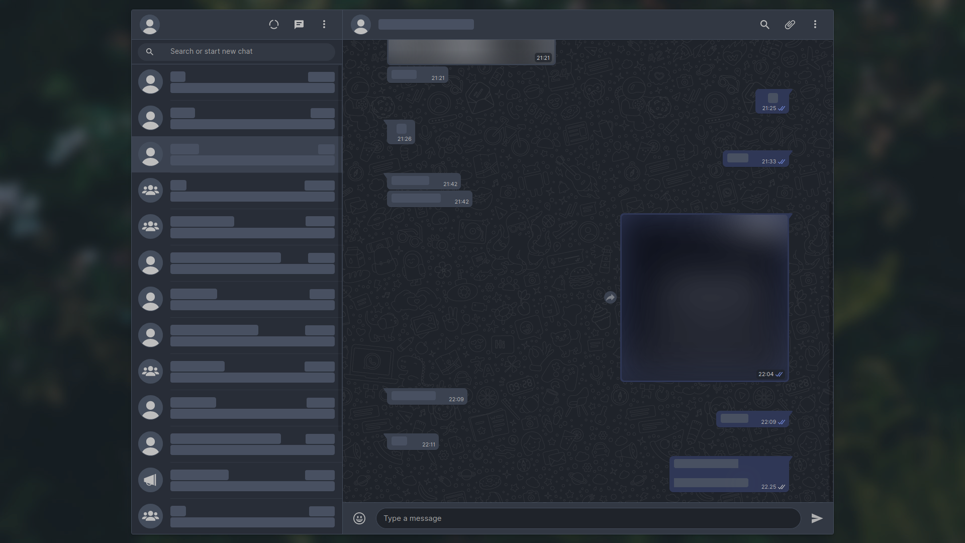 17 |
18 | /Version 3.0.0 with [[https://github.com/rsms/inter/][Inter]] as the custom font, and hidden notification alerts.
19 | Check [[https://github.com/vednoc/dark-whatsapp/wiki/Configuration][Configuration page]] on project/ wiki to get started customizing your
20 | Dark-WhatsApp. See more examples in the [[https://github.com/vednoc/dark-whatsapp/issues/178][Screenshot thread]].
21 |
22 | #+HTML:
17 |
18 | /Version 3.0.0 with [[https://github.com/rsms/inter/][Inter]] as the custom font, and hidden notification alerts.
19 | Check [[https://github.com/vednoc/dark-whatsapp/wiki/Configuration][Configuration page]] on project/ wiki to get started customizing your
20 | Dark-WhatsApp. See more examples in the [[https://github.com/vednoc/dark-whatsapp/issues/178][Screenshot thread]].
21 |
22 | #+HTML:
23 |
24 | ** Features
25 | - Complete dark mode — utilizing WhatsApp's native CSS variables
26 | - Customizable base colors — light/dark color-schemes are fully supported
27 | - Private mode — blurring contacts and/or chat media until you hover over them
28 | - Compact mode for small resolutions (optional, very hacky; works well though)
29 | - Fullscreen mode — if you prefer not wasting any available space
30 | - Custom background options for app/chat background images
31 | - Custom message bubble colors and/or their positions
32 | - Custom emoji opacity and unified big emoji sizes
33 | - Various styles and options for message tails
34 | - Custom chat window width, UI font, and more!
35 |
36 | Visit [[https://github.com/vednoc/dark-whatsapp/wiki/Configuration][configuration page]] to see the full list of features and how to use them.
37 |
38 | ** Installation
39 | You have to install [[https://add0n.com/stylus.html][Stylus]] and then click on the install link below.
40 |
41 | [[https://raw.githubusercontent.com/vednoc/dark-whatsapp/master/wa.user.styl][https://img.shields.io/badge/Install%20directly%20with-Stylus-116b59.svg]]
42 |
43 | *** Other ways to install this userstyle
44 | For userstyle managers other than Stylus or a custom-compiled version, see
45 | [[https://github.com/vednoc/dark-whatsapp/wiki/Installation][installation page]].
46 |
47 | ** Getting Started
48 | If you have a question, make sure to see [[https://github.com/vednoc/dark-whatsapp/wiki/FAQ][FAQ page]] first in order to see if your
49 | question has already been answered.
50 |
51 | To learn more about using this theme and customizing it for your personal use,
52 | visit the [[https://github.com/vednoc/dark-whatsapp/wiki/Configuration][configuration page]].
53 |
54 | ** Contributions
55 | Any contribution is greatly appreciated.
56 |
57 | If you'd like to contribute code, please make sure to read the [[https://github.com/vednoc/dark-whatsapp/blob/master/contributing.org][contribution
58 | guidelines]].
59 |
60 | If you really like this project and would like to tip me for my work, then you
61 | can:
62 | - Buy me a coffee over at [[https://ko-fi.com/vednoc][ko-fi]]
63 | - Support me over at [[https://liberapay.com/vednoc][LiberaPay]]
64 |
65 | ** Credits
66 | This project wouldn't be possible without:
67 | - [[https://github.com/erelado][erelado]] for making wiki pages, testing and reporting/fixing bugs
68 | - [[https://github.com/StylishThemes/][StylishThemes]] team for inspiration and documentation templates
69 | - [[https://unsplash.com/@totem_phillip][Phillip Sauerbeck]] for the gorgeous [[https://unsplash.com/photos/Tmk0MkQVwwA][background image]]
70 | - Everyone that helped with [[https://github.com/vednoc/dark-whatsapp/issues][issues]] and/or [[https://github.com/vednoc/dark-whatsapp/pulls][code]]
71 |
72 | Similar open-source projects:
73 | - [[https://github.com/Barina/Dark-Telegram][Barina/Dark-Telegram]] - Port of Dark-WhatsApp to Telegram
74 | - [[https://github.com/dcferreira/franz-themes][dcferreira/franz-themes]] - Port to Ferdi/Franz (desktop apps)
75 | - [[https://github.com/obvionaoe/dark][obvionaoe/dark]] - Port to Ferdi/Franz/Rambox (desktop apps)
76 | - [[https://github.com/amanharwara/altus][amanharwara/altus]] - Port to Altus (desktop app)
77 |
78 | ** License
79 | Code released under the [[license][MIT]] license.
80 |
--------------------------------------------------------------------------------
/wa.user.css:
--------------------------------------------------------------------------------
1 | /* ==UserStyle==
2 | @name Dark-WhatsApp Lite
3 | @description Non-customizable version of Dark-WhatsApp.
4 | @namespace github.com/vednoc/dark-whatsapp
5 | @homepageURL https://github.com/vednoc/dark-whatsapp
6 | @supportURL https://github.com/vednoc/dark-whatsapp/issues
7 | @updateURL https://userstyles.world/api/style/253.user.css
8 | @author vednoc
4 |
5 | * Dark-WhatsApp (né onyx)
6 | Complete dark mode implementation for [[https://web.whatsapp.com][WhatsApp Web]] with many improvements and
7 | customizable options.
8 |
9 | [[https://github.com/vednoc/dark-whatsapp/blob/master/changelog.org][https://img.shields.io/github/v/tag/vednoc/dark-whatsapp.svg?label=version&style=flat]]
10 | [[https://github.com/vednoc/dark-whatsapp/stargazers][https://img.shields.io/github/stars/vednoc/dark-whatsapp.svg?style=flat]]
11 | [[https://github.com/vednoc/dark-whatsapp/network][https://img.shields.io/github/forks/vednoc/dark-whatsapp.svg?color=007ec6&style=flat]]
12 | [[https://github.com/vednoc/dark-whatsapp/wiki][https://img.shields.io/badge/docs-on%20GitHub-007ec6.svg?&style=flat]]
13 | [[https://raw.githubusercontent.com/vednoc/dark-whatsapp/master/wa.user.styl][https://img.shields.io/badge/Install%20directly%20with-Stylus-116b59.svg?longCache=true&style=flat]]
14 | [[https://discord.gg/NpT8PzA][https://img.shields.io/discord/272011641694978048.svg?longCache=true&colorB=7289da&logo=discord&style=flat]]
15 |
16 | #+HTML:
17 |
18 | /Version 3.0.0 with [[https://github.com/rsms/inter/][Inter]] as the custom font, and hidden notification alerts.
19 | Check [[https://github.com/vednoc/dark-whatsapp/wiki/Configuration][Configuration page]] on project/ wiki to get started customizing your
20 | Dark-WhatsApp. See more examples in the [[https://github.com/vednoc/dark-whatsapp/issues/178][Screenshot thread]].
21 |
22 | #+HTML: