49 |
54 |
55 | 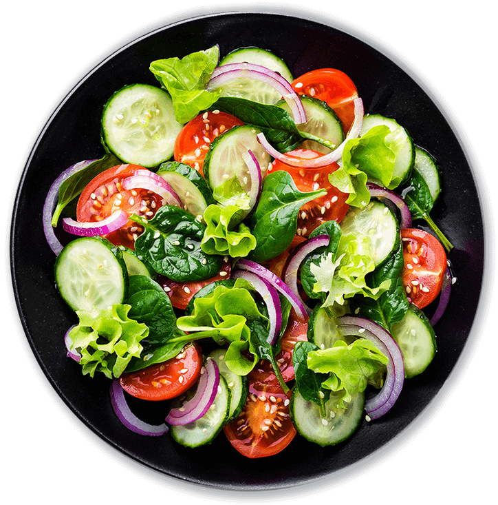 56 |
56 |
57 |
56 |
62 | 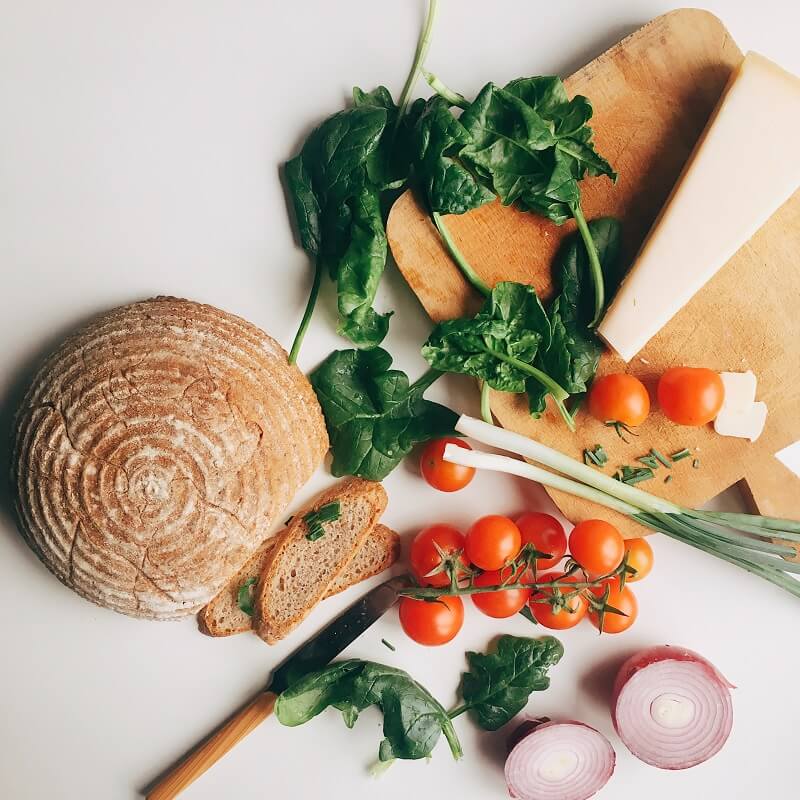 70 |
70 |
71 |
63 | About us
64 | We cook the best
65 |
68 |
69 | We cook the best
tasty food
65 | We cook the best food in the entire city, with excellent customer service, the best meals and at the best price, visit us.
66 | Explore history 67 |
70 | Our amazing services
77 | 78 |
79 |
358 |
80 |
141 |
144 |
145 | Excellent food
142 |We offer our clients excellent quality services for many years, with the best and delicious food in the city.
143 |
146 |
298 |
301 |
302 | Fast food
299 |We offer our clients excellent quality services for many years, with the best and delicious food in the city.
300 |
303 |
354 |
357 | Delivery
355 |We offer our clients excellent quality services for many years, with the best and delicious food in the city.
356 |Menu of the week
364 | 365 | 390 | 368 |
368 |  376 |
376 |  384 |
384 |
395 | 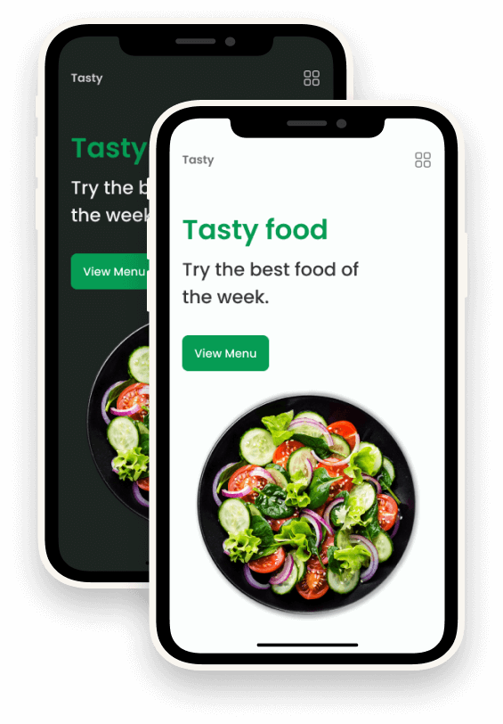 406 |
406 |
407 |
396 | App
397 |
404 |
405 | App is aviable
398 |Find our application and download it, you can make reservations, food orders, see your deliveries on the way and much more.
399 |
400 |  401 |
401 |  402 |
402 |
403 |
401 |
402 |
406 |
412 |
422 |
413 | Let's talk
414 |
417 |
418 |
421 | Contact us
415 |If you want to reserve a table in our restaurant, contact us and we will attend you quickly, with our 24/7 chat service.
416 |