';
4 | print_r($_SERVER);
5 | echo '
'; 6 | ?> -------------------------------------------------------------------------------- /assets/scss/bootstrap/mixins/_resize.scss: -------------------------------------------------------------------------------- 1 | // Resize anything 2 | 3 | @mixin resizable($direction) { 4 | overflow: auto; // Per CSS3 UI, `resize` only applies when `overflow` isn't `visible` 5 | resize: $direction; // Options: horizontal, vertical, both 6 | } 7 | -------------------------------------------------------------------------------- /assets/scss/bootstrap/mixins/_visibility.scss: -------------------------------------------------------------------------------- 1 | // stylelint-disable declaration-no-important 2 | 3 | // Visibility 4 | 5 | @mixin invisible($visibility) { 6 | visibility: $visibility !important; 7 | @include deprecate("`invisible()`", "v4.3.0", "v5"); 8 | } 9 | -------------------------------------------------------------------------------- /panel/.babelrc: -------------------------------------------------------------------------------- 1 | { 2 | "presets": [ 3 | [ 4 | "@babel/preset-env", 5 | { 6 | "useBuiltIns": "usage", 7 | "corejs": 2 8 | } 9 | ] 10 | ], 11 | "plugins": [ 12 | "@babel/syntax-dynamic-import" 13 | ] 14 | } -------------------------------------------------------------------------------- /panel/.gitignore: -------------------------------------------------------------------------------- 1 | # dependencies 2 | /node_modules 3 | /package-lock.json 4 | /yarn.lock 5 | 6 | # production 7 | /dist 8 | /_builder 9 | 10 | # misc 11 | .DS_Store 12 | .vscode/ 13 | 14 | # logs 15 | npm-debug.log* 16 | yarn-debug.log* 17 | yarn-error.log* 18 | -------------------------------------------------------------------------------- /panel/src/scss/3-components/_feather.scss: -------------------------------------------------------------------------------- 1 | .feather { 2 | width: 18px; 3 | height: 18px; 4 | stroke-width: 2; 5 | } 6 | 7 | .feather-sm { 8 | width: 14px; 9 | height: 14px; 10 | } 11 | 12 | .feather-lg { 13 | width: 36px; 14 | height: 36px; 15 | } 16 | -------------------------------------------------------------------------------- /assets/scss/bootstrap/utilities/_visibility.scss: -------------------------------------------------------------------------------- 1 | // stylelint-disable declaration-no-important 2 | 3 | // 4 | // Visibility utilities 5 | // 6 | 7 | .visible { 8 | visibility: visible !important; 9 | } 10 | 11 | .invisible { 12 | visibility: hidden !important; 13 | } 14 | -------------------------------------------------------------------------------- /panel/src/scss/3-components/_footer.scss: -------------------------------------------------------------------------------- 1 | footer.footer { 2 | padding: $spacer $spacer*0.875; 3 | direction: ltr; 4 | background: $footer-bg; 5 | 6 | ul { 7 | margin-bottom: 0; 8 | } 9 | 10 | @include media-breakpoint-down(md) { 11 | width: 100vw; 12 | } 13 | } 14 | -------------------------------------------------------------------------------- /assets/scss/bootstrap/utilities/_shadows.scss: -------------------------------------------------------------------------------- 1 | // stylelint-disable declaration-no-important 2 | 3 | .shadow-sm { box-shadow: $box-shadow-sm !important; } 4 | .shadow { box-shadow: $box-shadow !important; } 5 | .shadow-lg { box-shadow: $box-shadow-lg !important; } 6 | .shadow-none { box-shadow: none !important; } 7 | -------------------------------------------------------------------------------- /panel/src/scss/3-components/_reboot.scss: -------------------------------------------------------------------------------- 1 | body, html, #root { 2 | height: 100%; 3 | } 4 | 5 | body { 6 | overflow-y: scroll; 7 | opacity: 1 !important; 8 | } 9 | 10 | @media screen and (-ms-high-contrast: active), (-ms-high-contrast: none) { 11 | html { 12 | overflow-x: hidden; 13 | } 14 | } 15 | -------------------------------------------------------------------------------- /panel/src/scss/3-components/_tables.scss: -------------------------------------------------------------------------------- 1 | .table { 2 | thead, tbody, tfoot, tr, td, th { 3 | border-color: $table-border-color; 4 | } 5 | 6 | > :not(:last-child) > :last-child > * { 7 | border-color: $table-border-color; 8 | } 9 | } 10 | 11 | .table > tbody > tr > td { 12 | vertical-align: middle; 13 | } -------------------------------------------------------------------------------- /assets/js/main.js: -------------------------------------------------------------------------------- 1 | $(function() { 2 | 'use strict'; 3 | 4 | $('.form-control').on('input', function() { 5 | var $field = $(this).closest('.form-group'); 6 | if (this.value) { 7 | $field.addClass('field--not-empty'); 8 | } else { 9 | $field.removeClass('field--not-empty'); 10 | } 11 | }); 12 | 13 | }); -------------------------------------------------------------------------------- /assets/scss/bootstrap/mixins/_alert.scss: -------------------------------------------------------------------------------- 1 | @mixin alert-variant($background, $border, $color) { 2 | color: $color; 3 | @include gradient-bg($background); 4 | border-color: $border; 5 | 6 | hr { 7 | border-top-color: darken($border, 5%); 8 | } 9 | 10 | .alert-link { 11 | color: darken($color, 10%); 12 | } 13 | } 14 | -------------------------------------------------------------------------------- /panel/src/scss/3-components/_main.scss: -------------------------------------------------------------------------------- 1 | .main { 2 | display: flex; 3 | width: 100%; 4 | min-width: 0; 5 | min-height: 100vh; 6 | transition: $sidebar-transition; 7 | background: $body-bg; 8 | flex-direction: column; 9 | overflow: hidden; 10 | border-top-left-radius: 0; 11 | border-bottom-left-radius: 0; 12 | } 13 | -------------------------------------------------------------------------------- /exercises/session_variables.php: -------------------------------------------------------------------------------- 1 | '; 11 | print_r($_SESSION); 12 | echo ''; 13 | 14 | $inipath = php_ini_loaded_file(); 15 | echo $inipath; -------------------------------------------------------------------------------- /panel/src/scss/3-components/_avatar.scss: -------------------------------------------------------------------------------- 1 | .avatar { 2 | width: 40px; 3 | height: 40px; 4 | } 5 | 6 | .avatar-lg { 7 | width: 64px; 8 | height: 64px; 9 | } 10 | 11 | .avatar-title { 12 | display: flex; 13 | width: 100%; 14 | height: 100%; 15 | align-items: center; 16 | justify-content: center; 17 | color: $primary; 18 | } -------------------------------------------------------------------------------- /assets/scss/bootstrap/mixins/_nav-divider.scss: -------------------------------------------------------------------------------- 1 | // Horizontal dividers 2 | // 3 | // Dividers (basically an hr) within dropdowns and nav lists 4 | 5 | @mixin nav-divider($color: $nav-divider-color, $margin-y: $nav-divider-margin-y) { 6 | height: 0; 7 | margin: $margin-y 0; 8 | overflow: hidden; 9 | border-top: 1px solid $color; 10 | } 11 | -------------------------------------------------------------------------------- /panel/src/js/app.js: -------------------------------------------------------------------------------- 1 | import "../scss/app.scss"; 2 | 3 | // AdminKit (required) 4 | import "./modules/bootstrap"; 5 | import "./modules/sidebar"; 6 | import "./modules/theme"; 7 | import "./modules/feather"; 8 | 9 | // Charts 10 | import "./modules/chartjs"; 11 | 12 | // Forms 13 | import "./modules/flatpickr"; 14 | 15 | // Maps 16 | import "./modules/vector-maps"; -------------------------------------------------------------------------------- /panel/src/scss/3-components/_stat.scss: -------------------------------------------------------------------------------- 1 | .stat { 2 | background: $stat-bg; 3 | border-radius: 50%; 4 | width: 40px; 5 | height: 40px; 6 | align-items: center; 7 | justify-content: center; 8 | display: flex; 9 | 10 | svg { 11 | width: 18px; 12 | height: 18px; 13 | color: $stat-icon-color !important; 14 | stroke-width: 1.5; 15 | } 16 | } -------------------------------------------------------------------------------- /panel/src/scss/3-components/_type.scss: -------------------------------------------------------------------------------- 1 | .text-sm { 2 | font-size: $font-size-sm; 3 | } 4 | 5 | .text-lg { 6 | font-size: $font-size-lg; 7 | } 8 | 9 | b, strong { 10 | font-weight: $font-weight-bold; 11 | } 12 | 13 | pre.snippet { 14 | white-space: pre-wrap; 15 | word-wrap: break-word; 16 | text-align: justify; 17 | } 18 | 19 | a { 20 | cursor: pointer; 21 | } -------------------------------------------------------------------------------- /panel/src/scss/5-vendor/_simplebar.scss: -------------------------------------------------------------------------------- 1 | .simplebar-scrollbar:before { 2 | background: $simplebar-scrollbar-bg; 3 | } 4 | 5 | .simplebar-content { 6 | display: flex; 7 | flex-direction: column; 8 | height: 100vh; 9 | padding-bottom: 0 !important; 10 | } 11 | 12 | [data-simplebar] { 13 | position: sticky; 14 | top: 0; 15 | left: 0; 16 | width: $sidebar-width; 17 | } -------------------------------------------------------------------------------- /assets/scss/bootstrap/_transitions.scss: -------------------------------------------------------------------------------- 1 | .fade { 2 | @include transition($transition-fade); 3 | 4 | &:not(.show) { 5 | opacity: 0; 6 | } 7 | } 8 | 9 | .collapse { 10 | &:not(.show) { 11 | display: none; 12 | } 13 | } 14 | 15 | .collapsing { 16 | position: relative; 17 | height: 0; 18 | overflow: hidden; 19 | @include transition($transition-collapse); 20 | } 21 | -------------------------------------------------------------------------------- /panel/src/scss/3-components/_content.scss: -------------------------------------------------------------------------------- 1 | .content { 2 | padding: $content-padding-mobile; 3 | flex: 1; 4 | width: 100vw; 5 | max-width: 100vw; 6 | direction: ltr; 7 | 8 | @include media-breakpoint-up(md) { 9 | width: auto; 10 | max-width: auto; 11 | } 12 | 13 | @include media-breakpoint-up(lg) { 14 | padding: $content-padding-desktop; 15 | } 16 | } 17 | -------------------------------------------------------------------------------- /assets/scss/bootstrap/mixins/_text-hide.scss: -------------------------------------------------------------------------------- 1 | // CSS image replacement 2 | @mixin text-hide($ignore-warning: false) { 3 | // stylelint-disable-next-line font-family-no-missing-generic-family-keyword 4 | font: 0/0 a; 5 | color: transparent; 6 | text-shadow: none; 7 | background-color: transparent; 8 | border: 0; 9 | 10 | @include deprecate("`text-hide()`", "v4.1.0", "v5", $ignore-warning); 11 | } 12 | -------------------------------------------------------------------------------- /panel/src/scss/3-components/_chart.scss: -------------------------------------------------------------------------------- 1 | .chart { 2 | margin: auto; 3 | position: relative; 4 | width: 100%; 5 | min-height: 300px; 6 | 7 | &-xs { 8 | min-height: 200px; 9 | } 10 | 11 | &-sm { 12 | min-height: 252px; 13 | } 14 | 15 | &-lg { 16 | min-height: 350px; 17 | } 18 | 19 | &-xl { 20 | min-height: 500px; 21 | } 22 | 23 | canvas { 24 | max-width: 100%; 25 | } 26 | } 27 | -------------------------------------------------------------------------------- /assets/scss/bootstrap/mixins/_badge.scss: -------------------------------------------------------------------------------- 1 | @mixin badge-variant($bg) { 2 | color: color-yiq($bg); 3 | background-color: $bg; 4 | 5 | @at-root a#{&} { 6 | @include hover-focus { 7 | color: color-yiq($bg); 8 | background-color: darken($bg, 10%); 9 | } 10 | 11 | &:focus, 12 | &.focus { 13 | outline: 0; 14 | box-shadow: 0 0 0 $badge-focus-width rgba($bg, .5); 15 | } 16 | } 17 | } 18 | -------------------------------------------------------------------------------- /assets/scss/bootstrap/utilities/_float.scss: -------------------------------------------------------------------------------- 1 | // stylelint-disable declaration-no-important 2 | 3 | @each $breakpoint in map-keys($grid-breakpoints) { 4 | @include media-breakpoint-up($breakpoint) { 5 | $infix: breakpoint-infix($breakpoint, $grid-breakpoints); 6 | 7 | .float#{$infix}-left { float: left !important; } 8 | .float#{$infix}-right { float: right !important; } 9 | .float#{$infix}-none { float: none !important; } 10 | } 11 | } 12 | -------------------------------------------------------------------------------- /assets/scss/bootstrap/mixins/_text-emphasis.scss: -------------------------------------------------------------------------------- 1 | // stylelint-disable declaration-no-important 2 | 3 | // Typography 4 | 5 | @mixin text-emphasis-variant($parent, $color) { 6 | #{$parent} { 7 | color: $color !important; 8 | } 9 | @if $emphasized-link-hover-darken-percentage != 0 { 10 | a#{$parent} { 11 | @include hover-focus { 12 | color: darken($color, $emphasized-link-hover-darken-percentage) !important; 13 | } 14 | } 15 | } 16 | } 17 | -------------------------------------------------------------------------------- /assets/scss/bootstrap/mixins/_transition.scss: -------------------------------------------------------------------------------- 1 | // stylelint-disable property-blacklist 2 | @mixin transition($transition...) { 3 | @if $enable-transitions { 4 | @if length($transition) == 0 { 5 | transition: $transition-base; 6 | } @else { 7 | transition: $transition; 8 | } 9 | } 10 | 11 | @if $enable-prefers-reduced-motion-media-query { 12 | @media (prefers-reduced-motion: reduce) { 13 | transition: none; 14 | } 15 | } 16 | } 17 | -------------------------------------------------------------------------------- /assets/scss/bootstrap/mixins/_float.scss: -------------------------------------------------------------------------------- 1 | // stylelint-disable declaration-no-important 2 | 3 | @mixin float-left { 4 | float: left !important; 5 | @include deprecate("The `float-left` mixin", "v4.3.0", "v5"); 6 | } 7 | @mixin float-right { 8 | float: right !important; 9 | @include deprecate("The `float-right` mixin", "v4.3.0", "v5"); 10 | } 11 | @mixin float-none { 12 | float: none !important; 13 | @include deprecate("The `float-none` mixin", "v4.3.0", "v5"); 14 | } 15 | -------------------------------------------------------------------------------- /assets/scss/bootstrap/utilities/_align.scss: -------------------------------------------------------------------------------- 1 | // stylelint-disable declaration-no-important 2 | 3 | .align-baseline { vertical-align: baseline !important; } // Browser default 4 | .align-top { vertical-align: top !important; } 5 | .align-middle { vertical-align: middle !important; } 6 | .align-bottom { vertical-align: bottom !important; } 7 | .align-text-bottom { vertical-align: text-bottom !important; } 8 | .align-text-top { vertical-align: text-top !important; } 9 | -------------------------------------------------------------------------------- /assets/scss/bootstrap/bootstrap-reboot.scss: -------------------------------------------------------------------------------- 1 | /*! 2 | * Bootstrap Reboot v4.3.1 (https://getbootstrap.com/) 3 | * Copyright 2011-2019 The Bootstrap Authors 4 | * Copyright 2011-2019 Twitter, Inc. 5 | * Licensed under MIT (https://github.com/twbs/bootstrap/blob/master/LICENSE) 6 | * Forked from Normalize.css, licensed MIT (https://github.com/necolas/normalize.css/blob/master/LICENSE.md) 7 | */ 8 | 9 | @import "functions"; 10 | @import "variables"; 11 | @import "mixins"; 12 | @import "reboot"; 13 | -------------------------------------------------------------------------------- /assets/main.html: -------------------------------------------------------------------------------- 1 |
2 | For more awesome templates please visit Colorlib.
4 | 5 | 12 | -------------------------------------------------------------------------------- /assets/scss/bootstrap/_jumbotron.scss: -------------------------------------------------------------------------------- 1 | .jumbotron { 2 | padding: $jumbotron-padding ($jumbotron-padding / 2); 3 | margin-bottom: $jumbotron-padding; 4 | color: $jumbotron-color; 5 | background-color: $jumbotron-bg; 6 | @include border-radius($border-radius-lg); 7 | 8 | @include media-breakpoint-up(sm) { 9 | padding: ($jumbotron-padding * 2) $jumbotron-padding; 10 | } 11 | } 12 | 13 | .jumbotron-fluid { 14 | padding-right: 0; 15 | padding-left: 0; 16 | @include border-radius(0); 17 | } 18 | -------------------------------------------------------------------------------- /assets/scss/bootstrap/utilities/_background.scss: -------------------------------------------------------------------------------- 1 | // stylelint-disable declaration-no-important 2 | 3 | @each $color, $value in $theme-colors { 4 | @include bg-variant(".bg-#{$color}", $value); 5 | } 6 | 7 | @if $enable-gradients { 8 | @each $color, $value in $theme-colors { 9 | @include bg-gradient-variant(".bg-gradient-#{$color}", $value); 10 | } 11 | } 12 | 13 | .bg-white { 14 | background-color: $white !important; 15 | } 16 | 17 | .bg-transparent { 18 | background-color: transparent !important; 19 | } 20 | -------------------------------------------------------------------------------- /assets/scss/bootstrap/mixins/_list-group.scss: -------------------------------------------------------------------------------- 1 | // List Groups 2 | 3 | @mixin list-group-item-variant($state, $background, $color) { 4 | .list-group-item-#{$state} { 5 | color: $color; 6 | background-color: $background; 7 | 8 | &.list-group-item-action { 9 | @include hover-focus { 10 | color: $color; 11 | background-color: darken($background, 5%); 12 | } 13 | 14 | &.active { 15 | color: $white; 16 | background-color: $color; 17 | border-color: $color; 18 | } 19 | } 20 | } 21 | } 22 | -------------------------------------------------------------------------------- /assets/scss/bootstrap/utilities/_stretched-link.scss: -------------------------------------------------------------------------------- 1 | // 2 | // Stretched link 3 | // 4 | 5 | .stretched-link { 6 | &::after { 7 | position: absolute; 8 | top: 0; 9 | right: 0; 10 | bottom: 0; 11 | left: 0; 12 | z-index: 1; 13 | // Just in case `pointer-events: none` is set on a parent 14 | pointer-events: auto; 15 | content: ""; 16 | // IE10 bugfix, see https://stackoverflow.com/questions/16947967/ie10-hover-pseudo-class-doesnt-work-without-background-color 17 | background-color: rgba(0, 0, 0, 0); 18 | } 19 | } 20 | -------------------------------------------------------------------------------- /panel/src/scss/2-mixins/_button.scss: -------------------------------------------------------------------------------- 1 | @mixin button-color($color) { 2 | &, 3 | &:focus, 4 | &.focus, 5 | &.disabled, 6 | &:disabled, 7 | .show > &.dropdown-toggle { 8 | color: $color; 9 | } 10 | } 11 | 12 | @mixin button-color-hover($color) { 13 | &:hover:not(:disabled):not(.disabled), 14 | &.hover:not(:disabled):not(.disabled) { 15 | color: $color; 16 | } 17 | } 18 | 19 | @mixin button-color-active($color) { 20 | &:not(:disabled):not(.disabled):active, 21 | &:not(:disabled):not(.disabled).active { 22 | color: $color; 23 | } 24 | } 25 | -------------------------------------------------------------------------------- /assets/scss/bootstrap/mixins/_reset-text.scss: -------------------------------------------------------------------------------- 1 | @mixin reset-text { 2 | font-family: $font-family-base; 3 | // We deliberately do NOT reset font-size or word-wrap. 4 | font-style: normal; 5 | font-weight: $font-weight-normal; 6 | line-height: $line-height-base; 7 | text-align: left; // Fallback for where `start` is not supported 8 | text-align: start; 9 | text-decoration: none; 10 | text-shadow: none; 11 | text-transform: none; 12 | letter-spacing: normal; 13 | word-break: normal; 14 | word-spacing: normal; 15 | white-space: normal; 16 | line-break: auto; 17 | } 18 | -------------------------------------------------------------------------------- /assets/scss/bootstrap/mixins/_pagination.scss: -------------------------------------------------------------------------------- 1 | // Pagination 2 | 3 | @mixin pagination-size($padding-y, $padding-x, $font-size, $line-height, $border-radius) { 4 | .page-link { 5 | padding: $padding-y $padding-x; 6 | @include font-size($font-size); 7 | line-height: $line-height; 8 | } 9 | 10 | .page-item { 11 | &:first-child { 12 | .page-link { 13 | @include border-left-radius($border-radius); 14 | } 15 | } 16 | &:last-child { 17 | .page-link { 18 | @include border-right-radius($border-radius); 19 | } 20 | } 21 | } 22 | } 23 | -------------------------------------------------------------------------------- /assets/scss/bootstrap/_utilities.scss: -------------------------------------------------------------------------------- 1 | @import "utilities/align"; 2 | @import "utilities/background"; 3 | @import "utilities/borders"; 4 | @import "utilities/clearfix"; 5 | @import "utilities/display"; 6 | @import "utilities/embed"; 7 | @import "utilities/flex"; 8 | @import "utilities/float"; 9 | @import "utilities/overflow"; 10 | @import "utilities/position"; 11 | @import "utilities/screenreaders"; 12 | @import "utilities/shadows"; 13 | @import "utilities/sizing"; 14 | @import "utilities/stretched-link"; 15 | @import "utilities/spacing"; 16 | @import "utilities/text"; 17 | @import "utilities/visibility"; 18 | -------------------------------------------------------------------------------- /assets/scss/bootstrap/mixins/_background-variant.scss: -------------------------------------------------------------------------------- 1 | // stylelint-disable declaration-no-important 2 | 3 | // Contextual backgrounds 4 | 5 | @mixin bg-variant($parent, $color) { 6 | #{$parent} { 7 | background-color: $color !important; 8 | } 9 | a#{$parent}, 10 | button#{$parent} { 11 | @include hover-focus { 12 | background-color: darken($color, 10%) !important; 13 | } 14 | } 15 | } 16 | 17 | @mixin bg-gradient-variant($parent, $color) { 18 | #{$parent} { 19 | background: $color linear-gradient(180deg, mix($body-bg, $color, 15%), $color) repeat-x !important; 20 | } 21 | } 22 | -------------------------------------------------------------------------------- /assets/scss/bootstrap/utilities/_sizing.scss: -------------------------------------------------------------------------------- 1 | // stylelint-disable declaration-no-important 2 | 3 | // Width and height 4 | 5 | @each $prop, $abbrev in (width: w, height: h) { 6 | @each $size, $length in $sizes { 7 | .#{$abbrev}-#{$size} { #{$prop}: $length !important; } 8 | } 9 | } 10 | 11 | .mw-100 { max-width: 100% !important; } 12 | .mh-100 { max-height: 100% !important; } 13 | 14 | // Viewport additional helpers 15 | 16 | .min-vw-100 { min-width: 100vw !important; } 17 | .min-vh-100 { min-height: 100vh !important; } 18 | 19 | .vw-100 { width: 100vw !important; } 20 | .vh-100 { height: 100vh !important; } 21 | -------------------------------------------------------------------------------- /panel/src/scss/3-components/_buttons.scss: -------------------------------------------------------------------------------- 1 | .btn .feather { 2 | width: 14px; 3 | height: 14px; 4 | } 5 | 6 | @each $color, $value in $theme-colors { 7 | .btn-#{$color} { 8 | @include button-color($white); 9 | @include button-color-hover($white); 10 | } 11 | } 12 | 13 | @each $color, $value in $social-colors { 14 | .btn-#{$color} { 15 | @include button-variant($value, $value); 16 | @include button-color($white); 17 | @include button-color-hover($white); 18 | } 19 | } 20 | 21 | .btn-light, 22 | .btn-white { 23 | @include button-color($gray-800); 24 | @include button-color-hover($gray-800); 25 | } -------------------------------------------------------------------------------- /assets/scss/bootstrap/mixins/_box-shadow.scss: -------------------------------------------------------------------------------- 1 | @mixin box-shadow($shadow...) { 2 | @if $enable-shadows { 3 | $result: (); 4 | 5 | @if (length($shadow) == 1) { 6 | // We can pass `@include box-shadow(none);` 7 | $result: $shadow; 8 | } @else { 9 | // Filter to avoid invalid properties for example `box-shadow: none, 1px 1px black;` 10 | @for $i from 1 through length($shadow) { 11 | @if nth($shadow, $i) != "none" { 12 | $result: append($result, nth($shadow, $i), "comma"); 13 | } 14 | } 15 | } 16 | @if (length($result) > 0) { 17 | box-shadow: $result; 18 | } 19 | } 20 | } 21 | -------------------------------------------------------------------------------- /assets/scss/bootstrap/utilities/_position.scss: -------------------------------------------------------------------------------- 1 | // stylelint-disable declaration-no-important 2 | 3 | // Common values 4 | @each $position in $positions { 5 | .position-#{$position} { position: $position !important; } 6 | } 7 | 8 | // Shorthand 9 | 10 | .fixed-top { 11 | position: fixed; 12 | top: 0; 13 | right: 0; 14 | left: 0; 15 | z-index: $zindex-fixed; 16 | } 17 | 18 | .fixed-bottom { 19 | position: fixed; 20 | right: 0; 21 | bottom: 0; 22 | left: 0; 23 | z-index: $zindex-fixed; 24 | } 25 | 26 | .sticky-top { 27 | @supports (position: sticky) { 28 | position: sticky; 29 | top: 0; 30 | z-index: $zindex-sticky; 31 | } 32 | } 33 | -------------------------------------------------------------------------------- /assets/scss/bootstrap/utilities/_display.scss: -------------------------------------------------------------------------------- 1 | // stylelint-disable declaration-no-important 2 | 3 | // 4 | // Utilities for common `display` values 5 | // 6 | 7 | @each $breakpoint in map-keys($grid-breakpoints) { 8 | @include media-breakpoint-up($breakpoint) { 9 | $infix: breakpoint-infix($breakpoint, $grid-breakpoints); 10 | 11 | @each $value in $displays { 12 | .d#{$infix}-#{$value} { display: $value !important; } 13 | } 14 | } 15 | } 16 | 17 | 18 | // 19 | // Utilities for toggling `display` in print 20 | // 21 | 22 | @media print { 23 | @each $value in $displays { 24 | .d-print-#{$value} { display: $value !important; } 25 | } 26 | } 27 | -------------------------------------------------------------------------------- /assets/scss/bootstrap/_root.scss: -------------------------------------------------------------------------------- 1 | :root { 2 | // Custom variable values only support SassScript inside `#{}`. 3 | @each $color, $value in $colors { 4 | --#{$color}: #{$value}; 5 | } 6 | 7 | @each $color, $value in $theme-colors { 8 | --#{$color}: #{$value}; 9 | } 10 | 11 | @each $bp, $value in $grid-breakpoints { 12 | --breakpoint-#{$bp}: #{$value}; 13 | } 14 | 15 | // Use `inspect` for lists so that quoted items keep the quotes. 16 | // See https://github.com/sass/sass/issues/2383#issuecomment-336349172 17 | --font-family-sans-serif: #{inspect($font-family-sans-serif)}; 18 | --font-family-monospace: #{inspect($font-family-monospace)}; 19 | } 20 | -------------------------------------------------------------------------------- /assets/scss/bootstrap/mixins/_deprecate.scss: -------------------------------------------------------------------------------- 1 | // Deprecate mixin 2 | // 3 | // This mixin can be used to deprecate mixins or functions. 4 | // `$enable-deprecation-messages` is a global variable, `$ignore-warning` is a variable that can be passed to 5 | // some deprecated mixins to suppress the warning (for example if the mixin is still be used in the current version of Bootstrap) 6 | @mixin deprecate($name, $deprecate-version, $remove-version, $ignore-warning: false) { 7 | @if ($enable-deprecation-messages != false and $ignore-warning != true) { 8 | @warn "#{$name} has been deprecated as of #{$deprecate-version}. It will be removed entirely in #{$remove-version}."; 9 | } 10 | } 11 | -------------------------------------------------------------------------------- /panel/.github/ISSUE_TEMPLATE/feature_request.md: -------------------------------------------------------------------------------- 1 | --- 2 | name: Feature request 💄 3 | about: Suggest a new idea for AdminKit. 4 | labels: enhancement 5 | --- 6 | 7 | 8 | 9 | ## Summary 💡 10 | 11 | 12 | 13 | ## Examples 🌈 14 | 15 | 19 | 20 | ## Motivation 🔦 21 | 22 | -------------------------------------------------------------------------------- /panel/src/js/modules/theme.js: -------------------------------------------------------------------------------- 1 | /* 2 | * Add color theme colors to the window object 3 | * so this can be used by the charts and vector maps 4 | */ 5 | 6 | const theme = { 7 | "primary": "#3B7DDD", 8 | "secondary": "#6c757d", 9 | "success": "#1cbb8c", 10 | "info": "#17a2b8", 11 | "warning": "#fcb92c", 12 | "danger": "#dc3545", 13 | "white": "#fff", 14 | "gray-100": "#f8f9fa", 15 | "gray-200": "#e9ecef", 16 | "gray-300": "#dee2e6", 17 | "gray-400": "#ced4da", 18 | "gray-500": "#adb5bd", 19 | "gray-600": "#6c757d", 20 | "gray-700": "#495057", 21 | "gray-800": "#343a40", 22 | "gray-900": "#212529", 23 | "black": "#000" 24 | }; 25 | 26 | // Add theme to the window object 27 | window.theme = theme; -------------------------------------------------------------------------------- /assets/scss/bootstrap/bootstrap-grid.scss: -------------------------------------------------------------------------------- 1 | /*! 2 | * Bootstrap Grid v4.3.1 (https://getbootstrap.com/) 3 | * Copyright 2011-2019 The Bootstrap Authors 4 | * Copyright 2011-2019 Twitter, Inc. 5 | * Licensed under MIT (https://github.com/twbs/bootstrap/blob/master/LICENSE) 6 | */ 7 | 8 | html { 9 | box-sizing: border-box; 10 | -ms-overflow-style: scrollbar; 11 | } 12 | 13 | *, 14 | *::before, 15 | *::after { 16 | box-sizing: inherit; 17 | } 18 | 19 | @import "functions"; 20 | @import "variables"; 21 | 22 | @import "mixins/breakpoints"; 23 | @import "mixins/grid-framework"; 24 | @import "mixins/grid"; 25 | 26 | @import "grid"; 27 | @import "utilities/display"; 28 | @import "utilities/flex"; 29 | @import "utilities/spacing"; 30 | -------------------------------------------------------------------------------- /README.md: -------------------------------------------------------------------------------- 1 | # PHP Server Environment 2 | 3 | A project that works with Sessions in PHP can be found in this repository. We do this by using a session record that contains a username and password that must be validated in order to access the website. The user can log out to return to the registration page once inside. 4 | 5 | 6 | **Login Page** 7 |  8 | 9 | 10 | 11 | If the user doesn't exist, the website will display an error message: 12 | 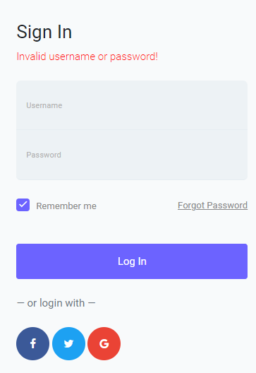 13 | 14 | 15 | **Dashboard Page** 16 | 17 | 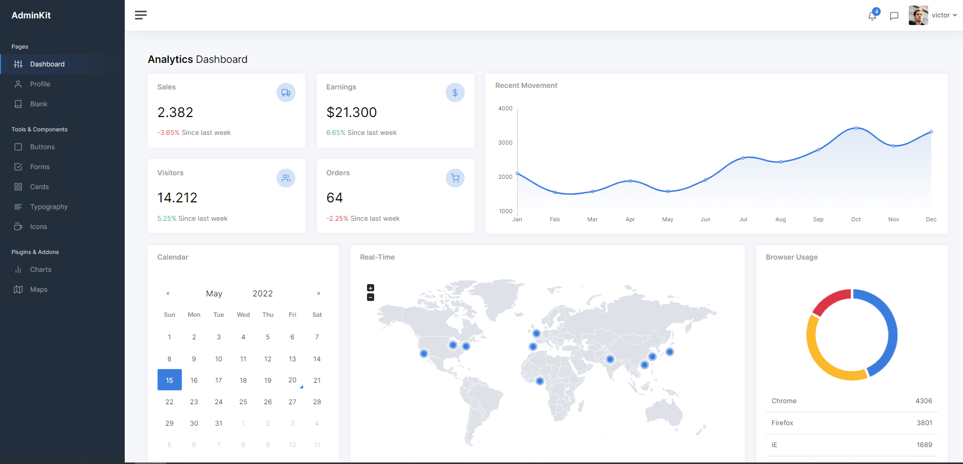 18 | 19 | 20 | **Logout** 21 |  -------------------------------------------------------------------------------- /assets/fonts/icomoon/Read Me.txt: -------------------------------------------------------------------------------- 1 | Open *demo.html* to see a list of all the glyphs in your font along with their codes/ligatures. 2 | 3 | To use the generated font in desktop programs, you can install the TTF font. In order to copy the character associated with each icon, refer to the text box at the bottom right corner of each glyph in demo.html. The character inside this text box may be invisible; but it can still be copied. See this guide for more info: https://icomoon.io/#docs/local-fonts 4 | 5 | You won't need any of the files located under the *demo-files* directory when including the generated font in your own projects. 6 | 7 | You can import *selection.json* back to the IcoMoon app using the *Import Icons* button (or via Main Menu → Manage Projects) to retrieve your icon selection. 8 | -------------------------------------------------------------------------------- /panel/.github/ISSUE_TEMPLATE/bug_report.md: -------------------------------------------------------------------------------- 1 | --- 2 | name: Bug report 🐛 3 | about: Create a bug report for AdminKit 4 | labels: bug 5 | --- 6 | 7 | 8 | 9 | ## Current Behavior 😯 10 | 11 | 12 | 13 | ## Expected Behavior 🤔 14 | 15 | 16 | 17 | ## Steps to Reproduce 🕹 18 | 19 | 20 | 21 | Steps: 22 | 23 | 1. 24 | 2. 25 | 3. 26 | 4. 27 | 28 | ## Your Environment 🌎 29 | 30 | 31 | 32 | - Browser: 33 | - OS: 34 | - Screen size: 35 | 36 | ## Screenshots 📷 37 | 38 | 39 | -------------------------------------------------------------------------------- /panel/src/scss/3-components/_card.scss: -------------------------------------------------------------------------------- 1 | .card { 2 | margin-bottom: $grid-gutter-width; 3 | box-shadow: $card-shadow; 4 | } 5 | 6 | .card-header { 7 | border-bottom-width: 1px; 8 | } 9 | 10 | .card-title { 11 | font-size: $card-title-font-size; 12 | font-weight: $card-title-font-weight; 13 | color: $card-title-color; 14 | } 15 | 16 | .card-subtitle { 17 | font-weight: $font-weight-normal; 18 | } 19 | 20 | .card-table { 21 | margin-bottom: 0; 22 | } 23 | 24 | .card-table tr td:first-child, 25 | .card-table tr th:first-child { 26 | padding-left: $card-spacer-x; 27 | } 28 | 29 | .card-table tr td:last-child, 30 | .card-table tr th:last-child { 31 | padding-right: $card-spacer-x; 32 | } 33 | 34 | .card-img, 35 | .card-img-top, 36 | .card-img-bottom { 37 | @include img-fluid; 38 | 39 | @media all and (-ms-high-contrast:none) { 40 | height: 100%; 41 | } 42 | } -------------------------------------------------------------------------------- /panel/src/scss/3-components/_hamburger.scss: -------------------------------------------------------------------------------- 1 | .hamburger, 2 | .hamburger:before, 3 | .hamburger:after { 4 | cursor: pointer; 5 | border-radius: 1px; 6 | height: 3px; 7 | width: $hamburger-width-middle; 8 | background: $gray-700; 9 | display: block; 10 | content: ''; 11 | transition: $transition-appearance-fast; 12 | } 13 | 14 | .hamburger { 15 | position: relative; 16 | } 17 | 18 | .hamburger:before { 19 | top: -7.5px; 20 | width: $hamburger-width-top; 21 | position: absolute; 22 | } 23 | 24 | .hamburger:after { 25 | bottom: -7.5px; 26 | width: $hamburger-width-bottom; 27 | position: absolute; 28 | } 29 | 30 | .sidebar-toggle:hover { 31 | .hamburger, 32 | .hamburger:before, 33 | .hamburger:after { 34 | background: $primary; 35 | } 36 | } 37 | 38 | .hamburger-right { 39 | &, 40 | &:before, 41 | &:after { 42 | right: 0; 43 | } 44 | } 45 | -------------------------------------------------------------------------------- /assets/scss/bootstrap/mixins/_screen-reader.scss: -------------------------------------------------------------------------------- 1 | // Only display content to screen readers 2 | // 3 | // See: https://a11yproject.com/posts/how-to-hide-content/ 4 | // See: https://hugogiraudel.com/2016/10/13/css-hide-and-seek/ 5 | 6 | @mixin sr-only { 7 | position: absolute; 8 | width: 1px; 9 | height: 1px; 10 | padding: 0; 11 | overflow: hidden; 12 | clip: rect(0, 0, 0, 0); 13 | white-space: nowrap; 14 | border: 0; 15 | } 16 | 17 | // Use in conjunction with .sr-only to only display content when it's focused. 18 | // 19 | // Useful for "Skip to main content" links; see https://www.w3.org/TR/2013/NOTE-WCAG20-TECHS-20130905/G1 20 | // 21 | // Credit: HTML5 Boilerplate 22 | 23 | @mixin sr-only-focusable { 24 | &:active, 25 | &:focus { 26 | position: static; 27 | width: auto; 28 | height: auto; 29 | overflow: visible; 30 | clip: auto; 31 | white-space: normal; 32 | } 33 | } 34 | -------------------------------------------------------------------------------- /assets/scss/bootstrap/mixins/_hover.scss: -------------------------------------------------------------------------------- 1 | // Hover mixin and `$enable-hover-media-query` are deprecated. 2 | // 3 | // Originally added during our alphas and maintained during betas, this mixin was 4 | // designed to prevent `:hover` stickiness on iOS-an issue where hover styles 5 | // would persist after initial touch. 6 | // 7 | // For backward compatibility, we've kept these mixins and updated them to 8 | // always return their regular pseudo-classes instead of a shimmed media query. 9 | // 10 | // Issue: https://github.com/twbs/bootstrap/issues/25195 11 | 12 | @mixin hover { 13 | &:hover { @content; } 14 | } 15 | 16 | @mixin hover-focus { 17 | &:hover, 18 | &:focus { 19 | @content; 20 | } 21 | } 22 | 23 | @mixin plain-hover-focus { 24 | &, 25 | &:hover, 26 | &:focus { 27 | @content; 28 | } 29 | } 30 | 31 | @mixin hover-focus-active { 32 | &:hover, 33 | &:focus, 34 | &:active { 35 | @content; 36 | } 37 | } 38 | -------------------------------------------------------------------------------- /assets/scss/bootstrap/mixins/_table-row.scss: -------------------------------------------------------------------------------- 1 | // Tables 2 | 3 | @mixin table-row-variant($state, $background, $border: null) { 4 | // Exact selectors below required to override `.table-striped` and prevent 5 | // inheritance to nested tables. 6 | .table-#{$state} { 7 | &, 8 | > th, 9 | > td { 10 | background-color: $background; 11 | } 12 | 13 | @if $border != null { 14 | th, 15 | td, 16 | thead th, 17 | tbody + tbody { 18 | border-color: $border; 19 | } 20 | } 21 | } 22 | 23 | // Hover states for `.table-hover` 24 | // Note: this is not available for cells or rows within `thead` or `tfoot`. 25 | .table-hover { 26 | $hover-background: darken($background, 5%); 27 | 28 | .table-#{$state} { 29 | @include hover { 30 | background-color: $hover-background; 31 | 32 | > td, 33 | > th { 34 | background-color: $hover-background; 35 | } 36 | } 37 | } 38 | } 39 | } 40 | -------------------------------------------------------------------------------- /assets/scss/bootstrap/utilities/_embed.scss: -------------------------------------------------------------------------------- 1 | // Credit: Nicolas Gallagher and SUIT CSS. 2 | 3 | .embed-responsive { 4 | position: relative; 5 | display: block; 6 | width: 100%; 7 | padding: 0; 8 | overflow: hidden; 9 | 10 | &::before { 11 | display: block; 12 | content: ""; 13 | } 14 | 15 | .embed-responsive-item, 16 | iframe, 17 | embed, 18 | object, 19 | video { 20 | position: absolute; 21 | top: 0; 22 | bottom: 0; 23 | left: 0; 24 | width: 100%; 25 | height: 100%; 26 | border: 0; 27 | } 28 | } 29 | 30 | @each $embed-responsive-aspect-ratio in $embed-responsive-aspect-ratios { 31 | $embed-responsive-aspect-ratio-x: nth($embed-responsive-aspect-ratio, 1); 32 | $embed-responsive-aspect-ratio-y: nth($embed-responsive-aspect-ratio, 2); 33 | 34 | .embed-responsive-#{$embed-responsive-aspect-ratio-x}by#{$embed-responsive-aspect-ratio-y} { 35 | &::before { 36 | padding-top: percentage($embed-responsive-aspect-ratio-y / $embed-responsive-aspect-ratio-x); 37 | } 38 | } 39 | } 40 | -------------------------------------------------------------------------------- /assets/scss/bootstrap/bootstrap.scss: -------------------------------------------------------------------------------- 1 | /*! 2 | * Bootstrap v4.3.1 (https://getbootstrap.com/) 3 | * Copyright 2011-2019 The Bootstrap Authors 4 | * Copyright 2011-2019 Twitter, Inc. 5 | * Licensed under MIT (https://github.com/twbs/bootstrap/blob/master/LICENSE) 6 | */ 7 | 8 | @import "functions"; 9 | @import "variables"; 10 | @import "mixins"; 11 | @import "root"; 12 | @import "reboot"; 13 | @import "type"; 14 | @import "images"; 15 | @import "code"; 16 | @import "grid"; 17 | @import "tables"; 18 | @import "forms"; 19 | @import "buttons"; 20 | @import "transitions"; 21 | @import "dropdown"; 22 | @import "button-group"; 23 | @import "input-group"; 24 | @import "custom-forms"; 25 | @import "nav"; 26 | @import "navbar"; 27 | @import "card"; 28 | @import "breadcrumb"; 29 | @import "pagination"; 30 | @import "badge"; 31 | @import "jumbotron"; 32 | @import "alert"; 33 | @import "progress"; 34 | @import "media"; 35 | @import "list-group"; 36 | @import "close"; 37 | @import "toasts"; 38 | @import "modal"; 39 | @import "tooltip"; 40 | @import "popover"; 41 | @import "carousel"; 42 | @import "spinners"; 43 | @import "utilities"; 44 | @import "print"; 45 | -------------------------------------------------------------------------------- /assets/fonts/icomoon/demo-files/demo.js: -------------------------------------------------------------------------------- 1 | if (!('boxShadow' in document.body.style)) { 2 | document.body.setAttribute('class', 'noBoxShadow'); 3 | } 4 | 5 | document.body.addEventListener("click", function(e) { 6 | var target = e.target; 7 | if (target.tagName === "INPUT" && 8 | target.getAttribute('class').indexOf('liga') === -1) { 9 | target.select(); 10 | } 11 | }); 12 | 13 | (function() { 14 | var fontSize = document.getElementById('fontSize'), 15 | testDrive = document.getElementById('testDrive'), 16 | testText = document.getElementById('testText'); 17 | function updateTest() { 18 | testDrive.innerHTML = testText.value || String.fromCharCode(160); 19 | if (window.icomoonLiga) { 20 | window.icomoonLiga(testDrive); 21 | } 22 | } 23 | function updateSize() { 24 | testDrive.style.fontSize = fontSize.value + 'px'; 25 | } 26 | fontSize.addEventListener('change', updateSize, false); 27 | testText.addEventListener('input', updateTest, false); 28 | testText.addEventListener('change', updateTest, false); 29 | updateSize(); 30 | }()); 31 | -------------------------------------------------------------------------------- /assets/scss/bootstrap/_close.scss: -------------------------------------------------------------------------------- 1 | .close { 2 | float: right; 3 | @include font-size($close-font-size); 4 | font-weight: $close-font-weight; 5 | line-height: 1; 6 | color: $close-color; 7 | text-shadow: $close-text-shadow; 8 | opacity: .5; 9 | 10 | // Override 's hover style 11 | @include hover { 12 | color: $close-color; 13 | text-decoration: none; 14 | } 15 | 16 | &:not(:disabled):not(.disabled) { 17 | @include hover-focus { 18 | opacity: .75; 19 | } 20 | } 21 | } 22 | 23 | // Additional properties for button version 24 | // iOS requires the button element instead of an anchor tag. 25 | // If you want the anchor version, it requires `href="#"`. 26 | // See https://developer.mozilla.org/en-US/docs/Web/Events/click#Safari_Mobile 27 | 28 | // stylelint-disable-next-line selector-no-qualifying-type 29 | button.close { 30 | padding: 0; 31 | background-color: transparent; 32 | border: 0; 33 | appearance: none; 34 | } 35 | 36 | // Future-proof disabling of clicks on `` elements 37 | 38 | // stylelint-disable-next-line selector-no-qualifying-type 39 | a.close.disabled { 40 | pointer-events: none; 41 | } 42 | -------------------------------------------------------------------------------- /panel/LICENSE: -------------------------------------------------------------------------------- 1 | The MIT License (MIT) 2 | 3 | Copyright (c) 2020 AdminKit Authors 4 | 5 | Permission is hereby granted, free of charge, to any person obtaining a copy 6 | of this software and associated documentation files (the "Software"), to deal 7 | in the Software without restriction, including without limitation the rights 8 | to use, copy, modify, merge, publish, distribute, sublicense, and/or sell 9 | copies of the Software, and to permit persons to whom the Software is 10 | furnished to do so, subject to the following conditions: 11 | 12 | The above copyright notice and this permission notice shall be included in 13 | all copies or substantial portions of the Software. 14 | 15 | THE SOFTWARE IS PROVIDED "AS IS", WITHOUT WARRANTY OF ANY KIND, EXPRESS OR 16 | IMPLIED, INCLUDING BUT NOT LIMITED TO THE WARRANTIES OF MERCHANTABILITY, 17 | FITNESS FOR A PARTICULAR PURPOSE AND NONINFRINGEMENT. IN NO EVENT SHALL THE 18 | AUTHORS OR COPYRIGHT HOLDERS BE LIABLE FOR ANY CLAIM, DAMAGES OR OTHER 19 | LIABILITY, WHETHER IN AN ACTION OF CONTRACT, TORT OR OTHERWISE, ARISING FROM, 20 | OUT OF OR IN CONNECTION WITH THE SOFTWARE OR THE USE OR OTHER DEALINGS IN 21 | THE SOFTWARE. 22 | -------------------------------------------------------------------------------- /assets/scss/bootstrap/_toasts.scss: -------------------------------------------------------------------------------- 1 | .toast { 2 | max-width: $toast-max-width; 3 | overflow: hidden; // cheap rounded corners on nested items 4 | @include font-size($toast-font-size); 5 | color: $toast-color; 6 | background-color: $toast-background-color; 7 | background-clip: padding-box; 8 | border: $toast-border-width solid $toast-border-color; 9 | box-shadow: $toast-box-shadow; 10 | backdrop-filter: blur(10px); 11 | opacity: 0; 12 | @include border-radius($toast-border-radius); 13 | 14 | &:not(:last-child) { 15 | margin-bottom: $toast-padding-x; 16 | } 17 | 18 | &.showing { 19 | opacity: 1; 20 | } 21 | 22 | &.show { 23 | display: block; 24 | opacity: 1; 25 | } 26 | 27 | &.hide { 28 | display: none; 29 | } 30 | } 31 | 32 | .toast-header { 33 | display: flex; 34 | align-items: center; 35 | padding: $toast-padding-y $toast-padding-x; 36 | color: $toast-header-color; 37 | background-color: $toast-header-background-color; 38 | background-clip: padding-box; 39 | border-bottom: $toast-border-width solid $toast-header-border-color; 40 | } 41 | 42 | .toast-body { 43 | padding: $toast-padding-x; // apply to both vertical and horizontal 44 | } 45 | -------------------------------------------------------------------------------- /assets/scss/bootstrap/_code.scss: -------------------------------------------------------------------------------- 1 | // Inline code 2 | code { 3 | @include font-size($code-font-size); 4 | color: $code-color; 5 | word-break: break-word; 6 | 7 | // Streamline the style when inside anchors to avoid broken underline and more 8 | a > & { 9 | color: inherit; 10 | } 11 | } 12 | 13 | // User input typically entered via keyboard 14 | kbd { 15 | padding: $kbd-padding-y $kbd-padding-x; 16 | @include font-size($kbd-font-size); 17 | color: $kbd-color; 18 | background-color: $kbd-bg; 19 | @include border-radius($border-radius-sm); 20 | @include box-shadow($kbd-box-shadow); 21 | 22 | kbd { 23 | padding: 0; 24 | @include font-size(100%); 25 | font-weight: $nested-kbd-font-weight; 26 | @include box-shadow(none); 27 | } 28 | } 29 | 30 | // Blocks of code 31 | pre { 32 | display: block; 33 | @include font-size($code-font-size); 34 | color: $pre-color; 35 | 36 | // Account for some code outputs that place code tags in pre tags 37 | code { 38 | @include font-size(inherit); 39 | color: inherit; 40 | word-break: normal; 41 | } 42 | } 43 | 44 | // Enable scrollable blocks of code 45 | .pre-scrollable { 46 | max-height: $pre-scrollable-max-height; 47 | overflow-y: scroll; 48 | } 49 | -------------------------------------------------------------------------------- /assets/scss/bootstrap/_grid.scss: -------------------------------------------------------------------------------- 1 | // Container widths 2 | // 3 | // Set the container width, and override it for fixed navbars in media queries. 4 | 5 | @if $enable-grid-classes { 6 | .container { 7 | @include make-container(); 8 | @include make-container-max-widths(); 9 | } 10 | } 11 | 12 | // Fluid container 13 | // 14 | // Utilizes the mixin meant for fixed width containers, but with 100% width for 15 | // fluid, full width layouts. 16 | 17 | @if $enable-grid-classes { 18 | .container-fluid { 19 | @include make-container(); 20 | } 21 | } 22 | 23 | // Row 24 | // 25 | // Rows contain and clear the floats of your columns. 26 | 27 | @if $enable-grid-classes { 28 | .row { 29 | @include make-row(); 30 | } 31 | 32 | // Remove the negative margin from default .row, then the horizontal padding 33 | // from all immediate children columns (to prevent runaway style inheritance). 34 | .no-gutters { 35 | margin-right: 0; 36 | margin-left: 0; 37 | 38 | > .col, 39 | > [class*="col-"] { 40 | padding-right: 0; 41 | padding-left: 0; 42 | } 43 | } 44 | } 45 | 46 | // Columns 47 | // 48 | // Common styles for small and large grid columns 49 | 50 | @if $enable-grid-classes { 51 | @include make-grid-columns(); 52 | } 53 | -------------------------------------------------------------------------------- /assets/scss/bootstrap/_progress.scss: -------------------------------------------------------------------------------- 1 | // Disable animation if transitions are disabled 2 | @if $enable-transitions { 3 | @keyframes progress-bar-stripes { 4 | from { background-position: $progress-height 0; } 5 | to { background-position: 0 0; } 6 | } 7 | } 8 | 9 | .progress { 10 | display: flex; 11 | height: $progress-height; 12 | overflow: hidden; // force rounded corners by cropping it 13 | @include font-size($progress-font-size); 14 | background-color: $progress-bg; 15 | @include border-radius($progress-border-radius); 16 | @include box-shadow($progress-box-shadow); 17 | } 18 | 19 | .progress-bar { 20 | display: flex; 21 | flex-direction: column; 22 | justify-content: center; 23 | color: $progress-bar-color; 24 | text-align: center; 25 | white-space: nowrap; 26 | background-color: $progress-bar-bg; 27 | @include transition($progress-bar-transition); 28 | } 29 | 30 | .progress-bar-striped { 31 | @include gradient-striped(); 32 | background-size: $progress-height $progress-height; 33 | } 34 | 35 | @if $enable-transitions { 36 | .progress-bar-animated { 37 | animation: progress-bar-stripes $progress-bar-animation-timing; 38 | 39 | @media (prefers-reduced-motion: reduce) { 40 | animation: none; 41 | } 42 | } 43 | } 44 | -------------------------------------------------------------------------------- /assets/scss/bootstrap/_mixins.scss: -------------------------------------------------------------------------------- 1 | // Toggles 2 | // 3 | // Used in conjunction with global variables to enable certain theme features. 4 | 5 | // Vendor 6 | @import "vendor/rfs"; 7 | 8 | // Deprecate 9 | @import "mixins/deprecate"; 10 | 11 | // Utilities 12 | @import "mixins/breakpoints"; 13 | @import "mixins/hover"; 14 | @import "mixins/image"; 15 | @import "mixins/badge"; 16 | @import "mixins/resize"; 17 | @import "mixins/screen-reader"; 18 | @import "mixins/size"; 19 | @import "mixins/reset-text"; 20 | @import "mixins/text-emphasis"; 21 | @import "mixins/text-hide"; 22 | @import "mixins/text-truncate"; 23 | @import "mixins/visibility"; 24 | 25 | // // Components 26 | @import "mixins/alert"; 27 | @import "mixins/buttons"; 28 | @import "mixins/caret"; 29 | @import "mixins/pagination"; 30 | @import "mixins/lists"; 31 | @import "mixins/list-group"; 32 | @import "mixins/nav-divider"; 33 | @import "mixins/forms"; 34 | @import "mixins/table-row"; 35 | 36 | // // Skins 37 | @import "mixins/background-variant"; 38 | @import "mixins/border-radius"; 39 | @import "mixins/box-shadow"; 40 | @import "mixins/gradients"; 41 | @import "mixins/transition"; 42 | 43 | // // Layout 44 | @import "mixins/clearfix"; 45 | @import "mixins/grid-framework"; 46 | @import "mixins/grid"; 47 | @import "mixins/float"; 48 | -------------------------------------------------------------------------------- /assets/scss/bootstrap/_spinners.scss: -------------------------------------------------------------------------------- 1 | // 2 | // Rotating border 3 | // 4 | 5 | @keyframes spinner-border { 6 | to { transform: rotate(360deg); } 7 | } 8 | 9 | .spinner-border { 10 | display: inline-block; 11 | width: $spinner-width; 12 | height: $spinner-height; 13 | vertical-align: text-bottom; 14 | border: $spinner-border-width solid currentColor; 15 | border-right-color: transparent; 16 | // stylelint-disable-next-line property-blacklist 17 | border-radius: 50%; 18 | animation: spinner-border .75s linear infinite; 19 | } 20 | 21 | .spinner-border-sm { 22 | width: $spinner-width-sm; 23 | height: $spinner-height-sm; 24 | border-width: $spinner-border-width-sm; 25 | } 26 | 27 | // 28 | // Growing circle 29 | // 30 | 31 | @keyframes spinner-grow { 32 | 0% { 33 | transform: scale(0); 34 | } 35 | 50% { 36 | opacity: 1; 37 | } 38 | } 39 | 40 | .spinner-grow { 41 | display: inline-block; 42 | width: $spinner-width; 43 | height: $spinner-height; 44 | vertical-align: text-bottom; 45 | background-color: currentColor; 46 | // stylelint-disable-next-line property-blacklist 47 | border-radius: 50%; 48 | opacity: 0; 49 | animation: spinner-grow .75s linear infinite; 50 | } 51 | 52 | .spinner-grow-sm { 53 | width: $spinner-width-sm; 54 | height: $spinner-height-sm; 55 | } 56 | -------------------------------------------------------------------------------- /assets/scss/bootstrap/mixins/_image.scss: -------------------------------------------------------------------------------- 1 | // Image Mixins 2 | // - Responsive image 3 | // - Retina image 4 | 5 | 6 | // Responsive image 7 | // 8 | // Keep images from scaling beyond the width of their parents. 9 | 10 | @mixin img-fluid { 11 | // Part 1: Set a maximum relative to the parent 12 | max-width: 100%; 13 | // Part 2: Override the height to auto, otherwise images will be stretched 14 | // when setting a width and height attribute on the img element. 15 | height: auto; 16 | } 17 | 18 | 19 | // Retina image 20 | // 21 | // Short retina mixin for setting background-image and -size. 22 | 23 | @mixin img-retina($file-1x, $file-2x, $width-1x, $height-1x) { 24 | background-image: url($file-1x); 25 | 26 | // Autoprefixer takes care of adding -webkit-min-device-pixel-ratio and -o-min-device-pixel-ratio, 27 | // but doesn't convert dppx=>dpi. 28 | // There's no such thing as unprefixed min-device-pixel-ratio since it's nonstandard. 29 | // Compatibility info: https://caniuse.com/#feat=css-media-resolution 30 | @media only screen and (min-resolution: 192dpi), // IE9-11 don't support dppx 31 | only screen and (min-resolution: 2dppx) { // Standardized 32 | background-image: url($file-2x); 33 | background-size: $width-1x $height-1x; 34 | } 35 | @include deprecate("`img-retina()`", "v4.3.0", "v5"); 36 | } 37 | -------------------------------------------------------------------------------- /assets/scss/bootstrap/_images.scss: -------------------------------------------------------------------------------- 1 | // Responsive images (ensure images don't scale beyond their parents) 2 | // 3 | // This is purposefully opt-in via an explicit class rather than being the default for all `