├── .github
└── FUNDING.yml
├── .gitignore
├── .npmignore
├── README.md
├── example
├── bottom-toolbar-demo
│ ├── .babelrc
│ ├── .gitignore
│ ├── .watchmanconfig
│ ├── App.js
│ ├── app.json
│ ├── assets
│ │ ├── icon.png
│ │ └── splash.png
│ ├── package.json
│ ├── screens
│ │ ├── UsageCustom.js
│ │ ├── UsageWithBottomSheet.js
│ │ ├── UsageWithIcons.js
│ │ └── index.js
│ └── yarn.lock
├── one.png
├── three.png
└── two.png
├── index.js
└── package.json
/.github/FUNDING.yml:
--------------------------------------------------------------------------------
1 | github: [vonovak]
2 |
--------------------------------------------------------------------------------
/.gitignore:
--------------------------------------------------------------------------------
1 | node_modules/**/*
2 | .expo/*
3 | npm-debug.*
4 |
--------------------------------------------------------------------------------
/.npmignore:
--------------------------------------------------------------------------------
1 | example
2 |
--------------------------------------------------------------------------------
/README.md:
--------------------------------------------------------------------------------
1 | # react-native-bottom-toolbar
2 |
3 | Bottom toolbar styled as in iOS, implemented in JS, typed with Flow. Highly configurable with text or icons (I recommend `react-native-vector-icons`) and nested actions that display in ActionSheetIOS (iOS only). You can also render your own components as content.
4 |
5 | ### Expo demo
6 |
7 | [here](https://expo.io/@vonovak/bottom-toolbar-demo), code for the demo is in the `example` folder
8 |
9 | ### Installation & usage
10 |
11 | `npm i react-native-bottom-toolbar`
12 | or
13 | `yarn add react-native-bottom-toolbar`
14 |
15 | ```
16 | import BottomToolbar from 'react-native-bottom-toolbar'
17 |
18 |
19 |
22 | console.warn(index + ' ' + JSON.stringify(propsOfThisAction))}
23 | />
24 |
27 | console.warn(index + ' ' + JSON.stringify(propsOfThisAction))}
28 | />
29 |
32 | console.warn(index + ' ' + JSON.stringify(propsOfThisAction))}
33 | />
34 |
35 | ```
36 |
37 | 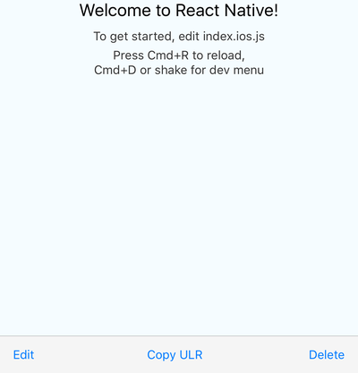 38 |
39 | ### Configuration
40 |
41 | The component accepts these props:
42 |
43 | ```
44 | type BottomToolbarProps = {
45 | IconComponent?: React.ComponentType<*>, // use this together with `color` prop and `iconName` from `BottomToolbar.Action`
46 | iconSize: number,
47 | onPress: (number, Object) => any,
48 | wrapperStyle?: ViewStyleProp,
49 | textStyle?: ViewStyleProp,
50 | buttonStyle?: ViewStyleProp,
51 | color: string,
52 | disabledColor: string,
53 | showIf: boolean,
54 | children: React.Node,
55 | };
56 |
57 | type ActionProps = {
58 | IconElement?: React.Node, // use this to provide your own custom react element (e.g. icon with text)
59 | IconComponent?: React.ComponentType<*>, // overrides `IconComponent` from `BottomToolbar`
60 | title: string,
61 | iconName?: string,
62 | disabled?: boolean,
63 | onPress?: (number, Object) => any,
64 | color?: string,
65 | testID?: string,
66 | iconSize?: number,
67 | actionSheetTitle?: string,
68 | actionSheetMessage?: string,
69 | };
70 |
71 | type NestedActionProps = {
72 | title: string,
73 | onPress?: (number, Object) => any,
74 | style?: 'cancel' | 'destructive',
75 | };
76 | ```
77 |
78 | The `onPress` function can be specified on three different levels: you may pass it as a prop to the component itself (see the first example), you may include it in the `BottomToolbar.Action` (see the first example), or may include it in the `BottomToolbar.NestedAction` (see the second example).
79 |
80 | The function has to be specified on at least one level. You may combine the levels together - the `onPress` of a `BottomToolbar.NestedAction` overrides the `onPress` of an `BottomToolbar.Action`, and the `onPress` of a `BottomToolbar.Action` overrides the `onPress` of the component. This gives you a lot of flexibility - you can have one event handler for all actions and nested actions, or you can specify the handlers separately. The `onPress` function always receives the `action` / `nested action` it was triggered from, so you can easily distinguish the event source.
81 |
82 | I suggest you pick an approach that works best for a given scenario and stick with it so you keep you code easy to understand.
83 |
84 | ### License
85 |
86 | MIT
87 |
--------------------------------------------------------------------------------
/example/bottom-toolbar-demo/.babelrc:
--------------------------------------------------------------------------------
1 | {
2 | "presets": ["babel-preset-expo"],
3 | "env": {
4 | "development": {
5 | "plugins": ["transform-react-jsx-source"]
6 | }
7 | }
8 | }
9 |
--------------------------------------------------------------------------------
/example/bottom-toolbar-demo/.gitignore:
--------------------------------------------------------------------------------
1 | node_modules/**/*
2 | .expo/*
3 | npm-debug.*
4 |
--------------------------------------------------------------------------------
/example/bottom-toolbar-demo/.watchmanconfig:
--------------------------------------------------------------------------------
1 | {}
2 |
--------------------------------------------------------------------------------
/example/bottom-toolbar-demo/App.js:
--------------------------------------------------------------------------------
1 | import { UsageCustom, UsageWithIcons, UsageWithBottomSheet } from './screens';
2 | import { StackNavigator } from 'react-navigation';
3 |
4 | export default StackNavigator({
5 | UsageWithIcons: {
6 | screen: UsageWithIcons,
7 | },
8 | UsageWithBottomSheet: {
9 | screen: UsageWithBottomSheet,
10 | },
11 | UsageCustom: {
12 | screen: UsageCustom,
13 | },
14 | });
15 |
--------------------------------------------------------------------------------
/example/bottom-toolbar-demo/app.json:
--------------------------------------------------------------------------------
1 | {
2 | "expo": {
3 | "name": "bottom-toolbar-demo",
4 | "description": "This project is really great.",
5 | "slug": "bottom-toolbar-demo",
6 | "privacy": "public",
7 | "sdkVersion": "25.0.0",
8 | "platforms": ["ios", "android"],
9 | "version": "1.0.0",
10 | "orientation": "portrait",
11 | "icon": "./assets/icon.png",
12 | "splash": {
13 | "image": "./assets/splash.png",
14 | "resizeMode": "contain",
15 | "backgroundColor": "#ffffff"
16 | },
17 | "ios": {
18 | "supportsTablet": true
19 | }
20 | }
21 | }
22 |
--------------------------------------------------------------------------------
/example/bottom-toolbar-demo/assets/icon.png:
--------------------------------------------------------------------------------
https://raw.githubusercontent.com/vonovak/react-native-bottom-toolbar/07cd1c9626fa5aca527d183052606a4a06f4f056/example/bottom-toolbar-demo/assets/icon.png
--------------------------------------------------------------------------------
/example/bottom-toolbar-demo/assets/splash.png:
--------------------------------------------------------------------------------
https://raw.githubusercontent.com/vonovak/react-native-bottom-toolbar/07cd1c9626fa5aca527d183052606a4a06f4f056/example/bottom-toolbar-demo/assets/splash.png
--------------------------------------------------------------------------------
/example/bottom-toolbar-demo/package.json:
--------------------------------------------------------------------------------
1 | {
2 | "main": "node_modules/expo/AppEntry.js",
3 | "private": true,
4 | "dependencies": {
5 | "expo": "^25.0.0",
6 | "react": "16.2.0",
7 | "react-native": "https://github.com/expo/react-native/archive/sdk-25.0.0.tar.gz",
8 | "react-native-bottom-toolbar": "file:../../",
9 | "react-navigation": "^1.0.0-beta.29"
10 | }
11 | }
12 |
--------------------------------------------------------------------------------
/example/bottom-toolbar-demo/screens/UsageCustom.js:
--------------------------------------------------------------------------------
1 | import React from 'react';
2 | import { StyleSheet, Text, View, Button, SafeAreaView } from 'react-native';
3 | import BottomToolbar from 'react-native-bottom-toolbar';
4 | import { Ionicons, MaterialIcons } from '@expo/vector-icons';
5 | import { withNavigation } from 'react-navigation';
6 |
7 | @withNavigation
8 | export class UsageCustom extends React.Component {
9 | static navigationOptions = {
10 | title: 'Usage with Text',
11 | };
12 | render() {
13 | return (
14 |
15 |
16 |
21 |
22 |
25 | alert(index + ' ' + JSON.stringify(propsOfThisAction))
26 | }
27 | />
28 |
31 | alert(index + ' ' + JSON.stringify(propsOfThisAction))
32 | }
33 | />
34 |
37 | alert(index + ' ' + JSON.stringify(propsOfThisAction))
38 | }
39 | />
40 |
41 |
42 | );
43 | }
44 | }
45 |
46 | const styles = StyleSheet.create({
47 | container: {
48 | flex: 1,
49 | backgroundColor: '#fff',
50 | },
51 | });
52 |
--------------------------------------------------------------------------------
/example/bottom-toolbar-demo/screens/UsageWithBottomSheet.js:
--------------------------------------------------------------------------------
1 | import React from 'react';
2 | import { StyleSheet, Text, SafeAreaView, View } from 'react-native';
3 | import BottomToolbar from 'react-native-bottom-toolbar';
4 | import { Ionicons, MaterialIcons } from '@expo/vector-icons';
5 |
6 | export class UsageWithBottomSheet extends React.Component {
7 | static navigationOptions = {
8 | title: 'Bottom Sheet Usage',
9 | };
10 | render() {
11 | return (
12 |
13 |
14 |
15 |
16 | }
19 | onPress={(index, propsOfThisAction) => alert(index + ' ' + propsOfThisAction.title)}
20 | />
21 | }
24 | onPress={(index, propsOfThisAction) => alert(index + ' ' + propsOfThisAction.title)}
25 | />
26 |
27 | {
31 | alert(`pressed ${index} with title ${actionPressed.title}`);
32 | }}
33 | />
34 |
35 | {
39 | alert(`pressed ${index} with title ${actionPressed.title}`);
40 | }}
41 | />
42 |
43 |
44 |
45 | );
46 | }
47 | }
48 |
49 | const styles = StyleSheet.create({
50 | container: {
51 | flex: 1,
52 | backgroundColor: '#fff',
53 | },
54 | });
55 |
--------------------------------------------------------------------------------
/example/bottom-toolbar-demo/screens/UsageWithIcons.js:
--------------------------------------------------------------------------------
1 | import React from 'react';
2 | import { StyleSheet, SafeAreaView, Text, View, Button } from 'react-native';
3 | import BottomToolbar from 'react-native-bottom-toolbar';
4 | import { Ionicons } from '@expo/vector-icons';
5 | import { withNavigation } from 'react-navigation';
6 |
7 | @withNavigation
8 | export class UsageWithIcons extends React.Component {
9 | static navigationOptions = {
10 | title: 'Usage With Icons',
11 | };
12 |
13 | render() {
14 | return (
15 |
16 |
17 |
22 |
23 |
27 | alert(index + ' ' + JSON.stringify(propsOfThisAction))
28 | }
29 | />
30 | }
34 | onPress={(index, propsOfThisAction) =>
35 | alert(index + ' and title: ' + propsOfThisAction.title)
36 | }
37 | />
38 |
41 | alert(index + ' ' + JSON.stringify(propsOfThisAction))
42 | }
43 | />
44 |
45 |
46 | );
47 | }
48 | }
49 |
50 | const styles = StyleSheet.create({
51 | container: {
52 | flex: 1,
53 | backgroundColor: '#fff',
54 | },
55 | });
56 |
--------------------------------------------------------------------------------
/example/bottom-toolbar-demo/screens/index.js:
--------------------------------------------------------------------------------
1 | export { UsageCustom } from './UsageCustom';
2 | export { UsageWithIcons } from './UsageWithIcons';
3 | export { UsageWithBottomSheet } from './UsageWithBottomSheet';
4 |
--------------------------------------------------------------------------------
/example/bottom-toolbar-demo/yarn.lock:
--------------------------------------------------------------------------------
1 | # THIS IS AN AUTOGENERATED FILE. DO NOT EDIT THIS FILE DIRECTLY.
2 | # yarn lockfile v1
3 |
4 |
5 | "@expo/vector-icons@^6.2.0":
6 | version "6.3.1"
7 | resolved "https://registry.npmjs.org/@expo/vector-icons/-/vector-icons-6.3.1.tgz#ffb97cc2343e4a330b44ce3063ee7c8571a6a50d"
8 | dependencies:
9 | lodash "^4.17.4"
10 | react-native-vector-icons "4.5.0"
11 |
12 | abbrev@1:
13 | version "1.1.1"
14 | resolved "https://registry.yarnpkg.com/abbrev/-/abbrev-1.1.1.tgz#f8f2c887ad10bf67f634f005b6987fed3179aac8"
15 |
16 | absolute-path@^0.0.0:
17 | version "0.0.0"
18 | resolved "https://registry.yarnpkg.com/absolute-path/-/absolute-path-0.0.0.tgz#a78762fbdadfb5297be99b15d35a785b2f095bf7"
19 |
20 | accepts@~1.2.12, accepts@~1.2.13:
21 | version "1.2.13"
22 | resolved "https://registry.yarnpkg.com/accepts/-/accepts-1.2.13.tgz#e5f1f3928c6d95fd96558c36ec3d9d0de4a6ecea"
23 | dependencies:
24 | mime-types "~2.1.6"
25 | negotiator "0.5.3"
26 |
27 | accepts@~1.3.0:
28 | version "1.3.5"
29 | resolved "https://registry.yarnpkg.com/accepts/-/accepts-1.3.5.tgz#eb777df6011723a3b14e8a72c0805c8e86746bd2"
30 | dependencies:
31 | mime-types "~2.1.18"
32 | negotiator "0.6.1"
33 |
34 | ajv@^5.3.0:
35 | version "5.5.2"
36 | resolved "https://registry.yarnpkg.com/ajv/-/ajv-5.5.2.tgz#73b5eeca3fab653e3d3f9422b341ad42205dc965"
37 | dependencies:
38 | co "^4.6.0"
39 | fast-deep-equal "^1.0.0"
40 | fast-json-stable-stringify "^2.0.0"
41 | json-schema-traverse "^0.3.0"
42 |
43 | ansi-colors@^1.0.1:
44 | version "1.1.0"
45 | resolved "https://registry.yarnpkg.com/ansi-colors/-/ansi-colors-1.1.0.tgz#6374b4dd5d4718ff3ce27a671a3b1cad077132a9"
46 | dependencies:
47 | ansi-wrap "^0.1.0"
48 |
49 | ansi-cyan@^0.1.1:
50 | version "0.1.1"
51 | resolved "https://registry.yarnpkg.com/ansi-cyan/-/ansi-cyan-0.1.1.tgz#538ae528af8982f28ae30d86f2f17456d2609873"
52 | dependencies:
53 | ansi-wrap "0.1.0"
54 |
55 | ansi-escapes@^3.0.0:
56 | version "3.1.0"
57 | resolved "https://registry.yarnpkg.com/ansi-escapes/-/ansi-escapes-3.1.0.tgz#f73207bb81207d75fd6c83f125af26eea378ca30"
58 |
59 | ansi-gray@^0.1.1:
60 | version "0.1.1"
61 | resolved "https://registry.yarnpkg.com/ansi-gray/-/ansi-gray-0.1.1.tgz#2962cf54ec9792c48510a3deb524436861ef7251"
62 | dependencies:
63 | ansi-wrap "0.1.0"
64 |
65 | ansi-red@^0.1.1:
66 | version "0.1.1"
67 | resolved "https://registry.yarnpkg.com/ansi-red/-/ansi-red-0.1.1.tgz#8c638f9d1080800a353c9c28c8a81ca4705d946c"
68 | dependencies:
69 | ansi-wrap "0.1.0"
70 |
71 | ansi-regex@^2.0.0:
72 | version "2.1.1"
73 | resolved "https://registry.yarnpkg.com/ansi-regex/-/ansi-regex-2.1.1.tgz#c3b33ab5ee360d86e0e628f0468ae7ef27d654df"
74 |
75 | ansi-regex@^3.0.0:
76 | version "3.0.0"
77 | resolved "https://registry.yarnpkg.com/ansi-regex/-/ansi-regex-3.0.0.tgz#ed0317c322064f79466c02966bddb605ab37d998"
78 |
79 | ansi-styles@^2.2.1:
80 | version "2.2.1"
81 | resolved "https://registry.yarnpkg.com/ansi-styles/-/ansi-styles-2.2.1.tgz#b432dd3358b634cf75e1e4664368240533c1ddbe"
82 |
83 | ansi-styles@^3.2.0, ansi-styles@^3.2.1:
84 | version "3.2.1"
85 | resolved "https://registry.yarnpkg.com/ansi-styles/-/ansi-styles-3.2.1.tgz#41fbb20243e50b12be0f04b8dedbf07520ce841d"
86 | dependencies:
87 | color-convert "^1.9.0"
88 |
89 | ansi-wrap@0.1.0, ansi-wrap@^0.1.0:
90 | version "0.1.0"
91 | resolved "https://registry.yarnpkg.com/ansi-wrap/-/ansi-wrap-0.1.0.tgz#a82250ddb0015e9a27ca82e82ea603bbfa45efaf"
92 |
93 | ansi@^0.3.0, ansi@~0.3.1:
94 | version "0.3.1"
95 | resolved "https://registry.yarnpkg.com/ansi/-/ansi-0.3.1.tgz#0c42d4fb17160d5a9af1e484bace1c66922c1b21"
96 |
97 | anymatch@^2.0.0:
98 | version "2.0.0"
99 | resolved "https://registry.yarnpkg.com/anymatch/-/anymatch-2.0.0.tgz#bcb24b4f37934d9aa7ac17b4adaf89e7c76ef2eb"
100 | dependencies:
101 | micromatch "^3.1.4"
102 | normalize-path "^2.1.1"
103 |
104 | aproba@^1.0.3:
105 | version "1.2.0"
106 | resolved "https://registry.yarnpkg.com/aproba/-/aproba-1.2.0.tgz#6802e6264efd18c790a1b0d517f0f2627bf2c94a"
107 |
108 | arch@^2.1.0:
109 | version "2.1.1"
110 | resolved "https://registry.yarnpkg.com/arch/-/arch-2.1.1.tgz#8f5c2731aa35a30929221bb0640eed65175ec84e"
111 |
112 | are-we-there-yet@~1.1.2:
113 | version "1.1.5"
114 | resolved "https://registry.yarnpkg.com/are-we-there-yet/-/are-we-there-yet-1.1.5.tgz#4b35c2944f062a8bfcda66410760350fe9ddfc21"
115 | dependencies:
116 | delegates "^1.0.0"
117 | readable-stream "^2.0.6"
118 |
119 | argsarray@^0.0.1:
120 | version "0.0.1"
121 | resolved "https://registry.yarnpkg.com/argsarray/-/argsarray-0.0.1.tgz#6e7207b4ecdb39b0af88303fa5ae22bda8df61cb"
122 |
123 | arr-diff@^1.0.1:
124 | version "1.1.0"
125 | resolved "https://registry.yarnpkg.com/arr-diff/-/arr-diff-1.1.0.tgz#687c32758163588fef7de7b36fabe495eb1a399a"
126 | dependencies:
127 | arr-flatten "^1.0.1"
128 | array-slice "^0.2.3"
129 |
130 | arr-diff@^2.0.0:
131 | version "2.0.0"
132 | resolved "https://registry.yarnpkg.com/arr-diff/-/arr-diff-2.0.0.tgz#8f3b827f955a8bd669697e4a4256ac3ceae356cf"
133 | dependencies:
134 | arr-flatten "^1.0.1"
135 |
136 | arr-diff@^4.0.0:
137 | version "4.0.0"
138 | resolved "https://registry.yarnpkg.com/arr-diff/-/arr-diff-4.0.0.tgz#d6461074febfec71e7e15235761a329a5dc7c520"
139 |
140 | arr-flatten@^1.0.1, arr-flatten@^1.1.0:
141 | version "1.1.0"
142 | resolved "https://registry.yarnpkg.com/arr-flatten/-/arr-flatten-1.1.0.tgz#36048bbff4e7b47e136644316c99669ea5ae91f1"
143 |
144 | arr-union@^2.0.1:
145 | version "2.1.0"
146 | resolved "https://registry.yarnpkg.com/arr-union/-/arr-union-2.1.0.tgz#20f9eab5ec70f5c7d215b1077b1c39161d292c7d"
147 |
148 | arr-union@^3.1.0:
149 | version "3.1.0"
150 | resolved "https://registry.yarnpkg.com/arr-union/-/arr-union-3.1.0.tgz#e39b09aea9def866a8f206e288af63919bae39c4"
151 |
152 | array-filter@~0.0.0:
153 | version "0.0.1"
154 | resolved "https://registry.yarnpkg.com/array-filter/-/array-filter-0.0.1.tgz#7da8cf2e26628ed732803581fd21f67cacd2eeec"
155 |
156 | array-map@~0.0.0:
157 | version "0.0.0"
158 | resolved "https://registry.yarnpkg.com/array-map/-/array-map-0.0.0.tgz#88a2bab73d1cf7bcd5c1b118a003f66f665fa662"
159 |
160 | array-reduce@~0.0.0:
161 | version "0.0.0"
162 | resolved "https://registry.yarnpkg.com/array-reduce/-/array-reduce-0.0.0.tgz#173899d3ffd1c7d9383e4479525dbe278cab5f2b"
163 |
164 | array-slice@^0.2.3:
165 | version "0.2.3"
166 | resolved "https://registry.yarnpkg.com/array-slice/-/array-slice-0.2.3.tgz#dd3cfb80ed7973a75117cdac69b0b99ec86186f5"
167 |
168 | array-unique@^0.2.1:
169 | version "0.2.1"
170 | resolved "https://registry.yarnpkg.com/array-unique/-/array-unique-0.2.1.tgz#a1d97ccafcbc2625cc70fadceb36a50c58b01a53"
171 |
172 | array-unique@^0.3.2:
173 | version "0.3.2"
174 | resolved "https://registry.yarnpkg.com/array-unique/-/array-unique-0.3.2.tgz#a894b75d4bc4f6cd679ef3244a9fd8f46ae2d428"
175 |
176 | art@^0.10.0:
177 | version "0.10.3"
178 | resolved "https://registry.yarnpkg.com/art/-/art-0.10.3.tgz#b01d84a968ccce6208df55a733838c96caeeaea2"
179 |
180 | asap@~2.0.3:
181 | version "2.0.6"
182 | resolved "https://registry.yarnpkg.com/asap/-/asap-2.0.6.tgz#e50347611d7e690943208bbdafebcbc2fb866d46"
183 |
184 | asn1@~0.2.3:
185 | version "0.2.4"
186 | resolved "https://registry.yarnpkg.com/asn1/-/asn1-0.2.4.tgz#8d2475dfab553bb33e77b54e59e880bb8ce23136"
187 | dependencies:
188 | safer-buffer "~2.1.0"
189 |
190 | assert-plus@1.0.0, assert-plus@^1.0.0:
191 | version "1.0.0"
192 | resolved "https://registry.yarnpkg.com/assert-plus/-/assert-plus-1.0.0.tgz#f12e0f3c5d77b0b1cdd9146942e4e96c1e4dd525"
193 |
194 | assign-symbols@^1.0.0:
195 | version "1.0.0"
196 | resolved "https://registry.yarnpkg.com/assign-symbols/-/assign-symbols-1.0.0.tgz#59667f41fadd4f20ccbc2bb96b8d4f7f78ec0367"
197 |
198 | async@^2.4.0:
199 | version "2.6.1"
200 | resolved "https://registry.yarnpkg.com/async/-/async-2.6.1.tgz#b245a23ca71930044ec53fa46aa00a3e87c6a610"
201 | dependencies:
202 | lodash "^4.17.10"
203 |
204 | asynckit@^0.4.0:
205 | version "0.4.0"
206 | resolved "https://registry.yarnpkg.com/asynckit/-/asynckit-0.4.0.tgz#c79ed97f7f34cb8f2ba1bc9790bcc366474b4b79"
207 |
208 | atob@^2.1.1:
209 | version "2.1.2"
210 | resolved "https://registry.yarnpkg.com/atob/-/atob-2.1.2.tgz#6d9517eb9e030d2436666651e86bd9f6f13533c9"
211 |
212 | aws-sign2@~0.7.0:
213 | version "0.7.0"
214 | resolved "https://registry.yarnpkg.com/aws-sign2/-/aws-sign2-0.7.0.tgz#b46e890934a9591f2d2f6f86d7e6a9f1b3fe76a8"
215 |
216 | aws4@^1.8.0:
217 | version "1.8.0"
218 | resolved "https://registry.yarnpkg.com/aws4/-/aws4-1.8.0.tgz#f0e003d9ca9e7f59c7a508945d7b2ef9a04a542f"
219 |
220 | babel-code-frame@^6.26.0:
221 | version "6.26.0"
222 | resolved "https://registry.yarnpkg.com/babel-code-frame/-/babel-code-frame-6.26.0.tgz#63fd43f7dc1e3bb7ce35947db8fe369a3f58c74b"
223 | dependencies:
224 | chalk "^1.1.3"
225 | esutils "^2.0.2"
226 | js-tokens "^3.0.2"
227 |
228 | babel-core@^6.24.1, babel-core@^6.26.0, babel-core@^6.7.2:
229 | version "6.26.3"
230 | resolved "https://registry.yarnpkg.com/babel-core/-/babel-core-6.26.3.tgz#b2e2f09e342d0f0c88e2f02e067794125e75c207"
231 | dependencies:
232 | babel-code-frame "^6.26.0"
233 | babel-generator "^6.26.0"
234 | babel-helpers "^6.24.1"
235 | babel-messages "^6.23.0"
236 | babel-register "^6.26.0"
237 | babel-runtime "^6.26.0"
238 | babel-template "^6.26.0"
239 | babel-traverse "^6.26.0"
240 | babel-types "^6.26.0"
241 | babylon "^6.18.0"
242 | convert-source-map "^1.5.1"
243 | debug "^2.6.9"
244 | json5 "^0.5.1"
245 | lodash "^4.17.4"
246 | minimatch "^3.0.4"
247 | path-is-absolute "^1.0.1"
248 | private "^0.1.8"
249 | slash "^1.0.0"
250 | source-map "^0.5.7"
251 |
252 | babel-generator@^6.26.0:
253 | version "6.26.1"
254 | resolved "https://registry.yarnpkg.com/babel-generator/-/babel-generator-6.26.1.tgz#1844408d3b8f0d35a404ea7ac180f087a601bd90"
255 | dependencies:
256 | babel-messages "^6.23.0"
257 | babel-runtime "^6.26.0"
258 | babel-types "^6.26.0"
259 | detect-indent "^4.0.0"
260 | jsesc "^1.3.0"
261 | lodash "^4.17.4"
262 | source-map "^0.5.7"
263 | trim-right "^1.0.1"
264 |
265 | babel-helper-builder-binary-assignment-operator-visitor@^6.24.1:
266 | version "6.24.1"
267 | resolved "https://registry.yarnpkg.com/babel-helper-builder-binary-assignment-operator-visitor/-/babel-helper-builder-binary-assignment-operator-visitor-6.24.1.tgz#cce4517ada356f4220bcae8a02c2b346f9a56664"
268 | dependencies:
269 | babel-helper-explode-assignable-expression "^6.24.1"
270 | babel-runtime "^6.22.0"
271 | babel-types "^6.24.1"
272 |
273 | babel-helper-builder-react-jsx@^6.24.1:
274 | version "6.26.0"
275 | resolved "https://registry.yarnpkg.com/babel-helper-builder-react-jsx/-/babel-helper-builder-react-jsx-6.26.0.tgz#39ff8313b75c8b65dceff1f31d383e0ff2a408a0"
276 | dependencies:
277 | babel-runtime "^6.26.0"
278 | babel-types "^6.26.0"
279 | esutils "^2.0.2"
280 |
281 | babel-helper-call-delegate@^6.24.1:
282 | version "6.24.1"
283 | resolved "https://registry.yarnpkg.com/babel-helper-call-delegate/-/babel-helper-call-delegate-6.24.1.tgz#ece6aacddc76e41c3461f88bfc575bd0daa2df8d"
284 | dependencies:
285 | babel-helper-hoist-variables "^6.24.1"
286 | babel-runtime "^6.22.0"
287 | babel-traverse "^6.24.1"
288 | babel-types "^6.24.1"
289 |
290 | babel-helper-define-map@^6.24.1:
291 | version "6.26.0"
292 | resolved "https://registry.yarnpkg.com/babel-helper-define-map/-/babel-helper-define-map-6.26.0.tgz#a5f56dab41a25f97ecb498c7ebaca9819f95be5f"
293 | dependencies:
294 | babel-helper-function-name "^6.24.1"
295 | babel-runtime "^6.26.0"
296 | babel-types "^6.26.0"
297 | lodash "^4.17.4"
298 |
299 | babel-helper-explode-assignable-expression@^6.24.1:
300 | version "6.24.1"
301 | resolved "https://registry.yarnpkg.com/babel-helper-explode-assignable-expression/-/babel-helper-explode-assignable-expression-6.24.1.tgz#f25b82cf7dc10433c55f70592d5746400ac22caa"
302 | dependencies:
303 | babel-runtime "^6.22.0"
304 | babel-traverse "^6.24.1"
305 | babel-types "^6.24.1"
306 |
307 | babel-helper-function-name@^6.24.1:
308 | version "6.24.1"
309 | resolved "https://registry.yarnpkg.com/babel-helper-function-name/-/babel-helper-function-name-6.24.1.tgz#d3475b8c03ed98242a25b48351ab18399d3580a9"
310 | dependencies:
311 | babel-helper-get-function-arity "^6.24.1"
312 | babel-runtime "^6.22.0"
313 | babel-template "^6.24.1"
314 | babel-traverse "^6.24.1"
315 | babel-types "^6.24.1"
316 |
317 | babel-helper-get-function-arity@^6.24.1:
318 | version "6.24.1"
319 | resolved "https://registry.yarnpkg.com/babel-helper-get-function-arity/-/babel-helper-get-function-arity-6.24.1.tgz#8f7782aa93407c41d3aa50908f89b031b1b6853d"
320 | dependencies:
321 | babel-runtime "^6.22.0"
322 | babel-types "^6.24.1"
323 |
324 | babel-helper-hoist-variables@^6.24.1:
325 | version "6.24.1"
326 | resolved "https://registry.yarnpkg.com/babel-helper-hoist-variables/-/babel-helper-hoist-variables-6.24.1.tgz#1ecb27689c9d25513eadbc9914a73f5408be7a76"
327 | dependencies:
328 | babel-runtime "^6.22.0"
329 | babel-types "^6.24.1"
330 |
331 | babel-helper-optimise-call-expression@^6.24.1:
332 | version "6.24.1"
333 | resolved "https://registry.yarnpkg.com/babel-helper-optimise-call-expression/-/babel-helper-optimise-call-expression-6.24.1.tgz#f7a13427ba9f73f8f4fa993c54a97882d1244257"
334 | dependencies:
335 | babel-runtime "^6.22.0"
336 | babel-types "^6.24.1"
337 |
338 | babel-helper-regex@^6.24.1:
339 | version "6.26.0"
340 | resolved "https://registry.yarnpkg.com/babel-helper-regex/-/babel-helper-regex-6.26.0.tgz#325c59f902f82f24b74faceed0363954f6495e72"
341 | dependencies:
342 | babel-runtime "^6.26.0"
343 | babel-types "^6.26.0"
344 | lodash "^4.17.4"
345 |
346 | babel-helper-remap-async-to-generator@^6.16.0:
347 | version "6.24.1"
348 | resolved "https://registry.yarnpkg.com/babel-helper-remap-async-to-generator/-/babel-helper-remap-async-to-generator-6.24.1.tgz#5ec581827ad723fecdd381f1c928390676e4551b"
349 | dependencies:
350 | babel-helper-function-name "^6.24.1"
351 | babel-runtime "^6.22.0"
352 | babel-template "^6.24.1"
353 | babel-traverse "^6.24.1"
354 | babel-types "^6.24.1"
355 |
356 | babel-helper-replace-supers@^6.24.1:
357 | version "6.24.1"
358 | resolved "https://registry.yarnpkg.com/babel-helper-replace-supers/-/babel-helper-replace-supers-6.24.1.tgz#bf6dbfe43938d17369a213ca8a8bf74b6a90ab1a"
359 | dependencies:
360 | babel-helper-optimise-call-expression "^6.24.1"
361 | babel-messages "^6.23.0"
362 | babel-runtime "^6.22.0"
363 | babel-template "^6.24.1"
364 | babel-traverse "^6.24.1"
365 | babel-types "^6.24.1"
366 |
367 | babel-helpers@^6.24.1:
368 | version "6.24.1"
369 | resolved "https://registry.yarnpkg.com/babel-helpers/-/babel-helpers-6.24.1.tgz#3471de9caec388e5c850e597e58a26ddf37602b2"
370 | dependencies:
371 | babel-runtime "^6.22.0"
372 | babel-template "^6.24.1"
373 |
374 | babel-messages@^6.23.0:
375 | version "6.23.0"
376 | resolved "https://registry.yarnpkg.com/babel-messages/-/babel-messages-6.23.0.tgz#f3cdf4703858035b2a2951c6ec5edf6c62f2630e"
377 | dependencies:
378 | babel-runtime "^6.22.0"
379 |
380 | babel-plugin-check-es2015-constants@^6.5.0, babel-plugin-check-es2015-constants@^6.8.0:
381 | version "6.22.0"
382 | resolved "https://registry.yarnpkg.com/babel-plugin-check-es2015-constants/-/babel-plugin-check-es2015-constants-6.22.0.tgz#35157b101426fd2ffd3da3f75c7d1e91835bbf8a"
383 | dependencies:
384 | babel-runtime "^6.22.0"
385 |
386 | babel-plugin-external-helpers@^6.18.0:
387 | version "6.22.0"
388 | resolved "https://registry.yarnpkg.com/babel-plugin-external-helpers/-/babel-plugin-external-helpers-6.22.0.tgz#2285f48b02bd5dede85175caf8c62e86adccefa1"
389 | dependencies:
390 | babel-runtime "^6.22.0"
391 |
392 | babel-plugin-module-resolver@^2.7.1:
393 | version "2.7.1"
394 | resolved "https://registry.yarnpkg.com/babel-plugin-module-resolver/-/babel-plugin-module-resolver-2.7.1.tgz#18be3c42ddf59f7a456c9e0512cd91394f6e4be1"
395 | dependencies:
396 | find-babel-config "^1.0.1"
397 | glob "^7.1.1"
398 | resolve "^1.2.0"
399 |
400 | babel-plugin-react-transform@^3.0.0:
401 | version "3.0.0"
402 | resolved "https://registry.yarnpkg.com/babel-plugin-react-transform/-/babel-plugin-react-transform-3.0.0.tgz#402f25137b7bb66e9b54ead75557dfbc7ecaaa74"
403 | dependencies:
404 | lodash "^4.6.1"
405 |
406 | babel-plugin-syntax-async-functions@^6.5.0, babel-plugin-syntax-async-functions@^6.8.0:
407 | version "6.13.0"
408 | resolved "https://registry.npmjs.org/babel-plugin-syntax-async-functions/-/babel-plugin-syntax-async-functions-6.13.0.tgz#cad9cad1191b5ad634bf30ae0872391e0647be95"
409 |
410 | babel-plugin-syntax-class-properties@^6.5.0, babel-plugin-syntax-class-properties@^6.8.0:
411 | version "6.13.0"
412 | resolved "https://registry.npmjs.org/babel-plugin-syntax-class-properties/-/babel-plugin-syntax-class-properties-6.13.0.tgz#d7eb23b79a317f8543962c505b827c7d6cac27de"
413 |
414 | babel-plugin-syntax-decorators@^6.1.18:
415 | version "6.13.0"
416 | resolved "https://registry.npmjs.org/babel-plugin-syntax-decorators/-/babel-plugin-syntax-decorators-6.13.0.tgz#312563b4dbde3cc806cee3e416cceeaddd11ac0b"
417 |
418 | babel-plugin-syntax-dynamic-import@^6.18.0:
419 | version "6.18.0"
420 | resolved "https://registry.npmjs.org/babel-plugin-syntax-dynamic-import/-/babel-plugin-syntax-dynamic-import-6.18.0.tgz#8d6a26229c83745a9982a441051572caa179b1da"
421 |
422 | babel-plugin-syntax-exponentiation-operator@^6.8.0:
423 | version "6.13.0"
424 | resolved "https://registry.npmjs.org/babel-plugin-syntax-exponentiation-operator/-/babel-plugin-syntax-exponentiation-operator-6.13.0.tgz#9ee7e8337290da95288201a6a57f4170317830de"
425 |
426 | babel-plugin-syntax-export-extensions@^6.8.0:
427 | version "6.13.0"
428 | resolved "https://registry.npmjs.org/babel-plugin-syntax-export-extensions/-/babel-plugin-syntax-export-extensions-6.13.0.tgz#70a1484f0f9089a4e84ad44bac353c95b9b12721"
429 |
430 | babel-plugin-syntax-flow@^6.18.0, babel-plugin-syntax-flow@^6.5.0, babel-plugin-syntax-flow@^6.8.0:
431 | version "6.18.0"
432 | resolved "https://registry.npmjs.org/babel-plugin-syntax-flow/-/babel-plugin-syntax-flow-6.18.0.tgz#4c3ab20a2af26aa20cd25995c398c4eb70310c8d"
433 |
434 | babel-plugin-syntax-jsx@^6.5.0, babel-plugin-syntax-jsx@^6.8.0:
435 | version "6.18.0"
436 | resolved "https://registry.npmjs.org/babel-plugin-syntax-jsx/-/babel-plugin-syntax-jsx-6.18.0.tgz#0af32a9a6e13ca7a3fd5069e62d7b0f58d0d8946"
437 |
438 | babel-plugin-syntax-object-rest-spread@^6.8.0:
439 | version "6.13.0"
440 | resolved "https://registry.npmjs.org/babel-plugin-syntax-object-rest-spread/-/babel-plugin-syntax-object-rest-spread-6.13.0.tgz#fd6536f2bce13836ffa3a5458c4903a597bb3bf5"
441 |
442 | babel-plugin-syntax-trailing-function-commas@^6.20.0, babel-plugin-syntax-trailing-function-commas@^6.5.0, babel-plugin-syntax-trailing-function-commas@^6.8.0:
443 | version "6.22.0"
444 | resolved "https://registry.yarnpkg.com/babel-plugin-syntax-trailing-function-commas/-/babel-plugin-syntax-trailing-function-commas-6.22.0.tgz#ba0360937f8d06e40180a43fe0d5616fff532cf3"
445 |
446 | babel-plugin-transform-async-to-generator@6.16.0:
447 | version "6.16.0"
448 | resolved "https://registry.npmjs.org/babel-plugin-transform-async-to-generator/-/babel-plugin-transform-async-to-generator-6.16.0.tgz#19ec36cb1486b59f9f468adfa42ce13908ca2999"
449 | dependencies:
450 | babel-helper-remap-async-to-generator "^6.16.0"
451 | babel-plugin-syntax-async-functions "^6.8.0"
452 | babel-runtime "^6.0.0"
453 |
454 | babel-plugin-transform-class-properties@^6.18.0, babel-plugin-transform-class-properties@^6.5.0, babel-plugin-transform-class-properties@^6.8.0:
455 | version "6.24.1"
456 | resolved "https://registry.yarnpkg.com/babel-plugin-transform-class-properties/-/babel-plugin-transform-class-properties-6.24.1.tgz#6a79763ea61d33d36f37b611aa9def81a81b46ac"
457 | dependencies:
458 | babel-helper-function-name "^6.24.1"
459 | babel-plugin-syntax-class-properties "^6.8.0"
460 | babel-runtime "^6.22.0"
461 | babel-template "^6.24.1"
462 |
463 | babel-plugin-transform-decorators-legacy@^1.3.4:
464 | version "1.3.5"
465 | resolved "https://registry.yarnpkg.com/babel-plugin-transform-decorators-legacy/-/babel-plugin-transform-decorators-legacy-1.3.5.tgz#0e492dffa0edd70529072887f8aa86d4dd8b40a1"
466 | dependencies:
467 | babel-plugin-syntax-decorators "^6.1.18"
468 | babel-runtime "^6.2.0"
469 | babel-template "^6.3.0"
470 |
471 | babel-plugin-transform-es2015-arrow-functions@^6.5.0, babel-plugin-transform-es2015-arrow-functions@^6.8.0:
472 | version "6.22.0"
473 | resolved "https://registry.yarnpkg.com/babel-plugin-transform-es2015-arrow-functions/-/babel-plugin-transform-es2015-arrow-functions-6.22.0.tgz#452692cb711d5f79dc7f85e440ce41b9f244d221"
474 | dependencies:
475 | babel-runtime "^6.22.0"
476 |
477 | babel-plugin-transform-es2015-block-scoped-functions@^6.8.0:
478 | version "6.22.0"
479 | resolved "https://registry.yarnpkg.com/babel-plugin-transform-es2015-block-scoped-functions/-/babel-plugin-transform-es2015-block-scoped-functions-6.22.0.tgz#bbc51b49f964d70cb8d8e0b94e820246ce3a6141"
480 | dependencies:
481 | babel-runtime "^6.22.0"
482 |
483 | babel-plugin-transform-es2015-block-scoping@^6.5.0, babel-plugin-transform-es2015-block-scoping@^6.8.0:
484 | version "6.26.0"
485 | resolved "https://registry.yarnpkg.com/babel-plugin-transform-es2015-block-scoping/-/babel-plugin-transform-es2015-block-scoping-6.26.0.tgz#d70f5299c1308d05c12f463813b0a09e73b1895f"
486 | dependencies:
487 | babel-runtime "^6.26.0"
488 | babel-template "^6.26.0"
489 | babel-traverse "^6.26.0"
490 | babel-types "^6.26.0"
491 | lodash "^4.17.4"
492 |
493 | babel-plugin-transform-es2015-classes@^6.5.0, babel-plugin-transform-es2015-classes@^6.8.0:
494 | version "6.24.1"
495 | resolved "https://registry.yarnpkg.com/babel-plugin-transform-es2015-classes/-/babel-plugin-transform-es2015-classes-6.24.1.tgz#5a4c58a50c9c9461e564b4b2a3bfabc97a2584db"
496 | dependencies:
497 | babel-helper-define-map "^6.24.1"
498 | babel-helper-function-name "^6.24.1"
499 | babel-helper-optimise-call-expression "^6.24.1"
500 | babel-helper-replace-supers "^6.24.1"
501 | babel-messages "^6.23.0"
502 | babel-runtime "^6.22.0"
503 | babel-template "^6.24.1"
504 | babel-traverse "^6.24.1"
505 | babel-types "^6.24.1"
506 |
507 | babel-plugin-transform-es2015-computed-properties@^6.5.0, babel-plugin-transform-es2015-computed-properties@^6.8.0:
508 | version "6.24.1"
509 | resolved "https://registry.yarnpkg.com/babel-plugin-transform-es2015-computed-properties/-/babel-plugin-transform-es2015-computed-properties-6.24.1.tgz#6fe2a8d16895d5634f4cd999b6d3480a308159b3"
510 | dependencies:
511 | babel-runtime "^6.22.0"
512 | babel-template "^6.24.1"
513 |
514 | babel-plugin-transform-es2015-destructuring@6.x, babel-plugin-transform-es2015-destructuring@^6.5.0, babel-plugin-transform-es2015-destructuring@^6.8.0:
515 | version "6.23.0"
516 | resolved "https://registry.yarnpkg.com/babel-plugin-transform-es2015-destructuring/-/babel-plugin-transform-es2015-destructuring-6.23.0.tgz#997bb1f1ab967f682d2b0876fe358d60e765c56d"
517 | dependencies:
518 | babel-runtime "^6.22.0"
519 |
520 | babel-plugin-transform-es2015-for-of@^6.5.0, babel-plugin-transform-es2015-for-of@^6.8.0:
521 | version "6.23.0"
522 | resolved "https://registry.yarnpkg.com/babel-plugin-transform-es2015-for-of/-/babel-plugin-transform-es2015-for-of-6.23.0.tgz#f47c95b2b613df1d3ecc2fdb7573623c75248691"
523 | dependencies:
524 | babel-runtime "^6.22.0"
525 |
526 | babel-plugin-transform-es2015-function-name@6.x, babel-plugin-transform-es2015-function-name@^6.5.0, babel-plugin-transform-es2015-function-name@^6.8.0:
527 | version "6.24.1"
528 | resolved "https://registry.yarnpkg.com/babel-plugin-transform-es2015-function-name/-/babel-plugin-transform-es2015-function-name-6.24.1.tgz#834c89853bc36b1af0f3a4c5dbaa94fd8eacaa8b"
529 | dependencies:
530 | babel-helper-function-name "^6.24.1"
531 | babel-runtime "^6.22.0"
532 | babel-types "^6.24.1"
533 |
534 | babel-plugin-transform-es2015-literals@^6.5.0, babel-plugin-transform-es2015-literals@^6.8.0:
535 | version "6.22.0"
536 | resolved "https://registry.yarnpkg.com/babel-plugin-transform-es2015-literals/-/babel-plugin-transform-es2015-literals-6.22.0.tgz#4f54a02d6cd66cf915280019a31d31925377ca2e"
537 | dependencies:
538 | babel-runtime "^6.22.0"
539 |
540 | babel-plugin-transform-es2015-modules-commonjs@6.x, babel-plugin-transform-es2015-modules-commonjs@^6.5.0, babel-plugin-transform-es2015-modules-commonjs@^6.8.0:
541 | version "6.26.2"
542 | resolved "https://registry.yarnpkg.com/babel-plugin-transform-es2015-modules-commonjs/-/babel-plugin-transform-es2015-modules-commonjs-6.26.2.tgz#58a793863a9e7ca870bdc5a881117ffac27db6f3"
543 | dependencies:
544 | babel-plugin-transform-strict-mode "^6.24.1"
545 | babel-runtime "^6.26.0"
546 | babel-template "^6.26.0"
547 | babel-types "^6.26.0"
548 |
549 | babel-plugin-transform-es2015-object-super@^6.8.0:
550 | version "6.24.1"
551 | resolved "https://registry.yarnpkg.com/babel-plugin-transform-es2015-object-super/-/babel-plugin-transform-es2015-object-super-6.24.1.tgz#24cef69ae21cb83a7f8603dad021f572eb278f8d"
552 | dependencies:
553 | babel-helper-replace-supers "^6.24.1"
554 | babel-runtime "^6.22.0"
555 |
556 | babel-plugin-transform-es2015-parameters@6.x, babel-plugin-transform-es2015-parameters@^6.5.0, babel-plugin-transform-es2015-parameters@^6.8.0:
557 | version "6.24.1"
558 | resolved "https://registry.yarnpkg.com/babel-plugin-transform-es2015-parameters/-/babel-plugin-transform-es2015-parameters-6.24.1.tgz#57ac351ab49caf14a97cd13b09f66fdf0a625f2b"
559 | dependencies:
560 | babel-helper-call-delegate "^6.24.1"
561 | babel-helper-get-function-arity "^6.24.1"
562 | babel-runtime "^6.22.0"
563 | babel-template "^6.24.1"
564 | babel-traverse "^6.24.1"
565 | babel-types "^6.24.1"
566 |
567 | babel-plugin-transform-es2015-shorthand-properties@6.x, babel-plugin-transform-es2015-shorthand-properties@^6.5.0, babel-plugin-transform-es2015-shorthand-properties@^6.8.0:
568 | version "6.24.1"
569 | resolved "https://registry.yarnpkg.com/babel-plugin-transform-es2015-shorthand-properties/-/babel-plugin-transform-es2015-shorthand-properties-6.24.1.tgz#24f875d6721c87661bbd99a4622e51f14de38aa0"
570 | dependencies:
571 | babel-runtime "^6.22.0"
572 | babel-types "^6.24.1"
573 |
574 | babel-plugin-transform-es2015-spread@6.x, babel-plugin-transform-es2015-spread@^6.5.0, babel-plugin-transform-es2015-spread@^6.8.0:
575 | version "6.22.0"
576 | resolved "https://registry.yarnpkg.com/babel-plugin-transform-es2015-spread/-/babel-plugin-transform-es2015-spread-6.22.0.tgz#d6d68a99f89aedc4536c81a542e8dd9f1746f8d1"
577 | dependencies:
578 | babel-runtime "^6.22.0"
579 |
580 | babel-plugin-transform-es2015-sticky-regex@6.x:
581 | version "6.24.1"
582 | resolved "https://registry.yarnpkg.com/babel-plugin-transform-es2015-sticky-regex/-/babel-plugin-transform-es2015-sticky-regex-6.24.1.tgz#00c1cdb1aca71112cdf0cf6126c2ed6b457ccdbc"
583 | dependencies:
584 | babel-helper-regex "^6.24.1"
585 | babel-runtime "^6.22.0"
586 | babel-types "^6.24.1"
587 |
588 | babel-plugin-transform-es2015-template-literals@^6.5.0, babel-plugin-transform-es2015-template-literals@^6.8.0:
589 | version "6.22.0"
590 | resolved "https://registry.yarnpkg.com/babel-plugin-transform-es2015-template-literals/-/babel-plugin-transform-es2015-template-literals-6.22.0.tgz#a84b3450f7e9f8f1f6839d6d687da84bb1236d8d"
591 | dependencies:
592 | babel-runtime "^6.22.0"
593 |
594 | babel-plugin-transform-es2015-unicode-regex@6.x:
595 | version "6.24.1"
596 | resolved "https://registry.yarnpkg.com/babel-plugin-transform-es2015-unicode-regex/-/babel-plugin-transform-es2015-unicode-regex-6.24.1.tgz#d38b12f42ea7323f729387f18a7c5ae1faeb35e9"
597 | dependencies:
598 | babel-helper-regex "^6.24.1"
599 | babel-runtime "^6.22.0"
600 | regexpu-core "^2.0.0"
601 |
602 | babel-plugin-transform-es3-member-expression-literals@^6.8.0:
603 | version "6.22.0"
604 | resolved "https://registry.yarnpkg.com/babel-plugin-transform-es3-member-expression-literals/-/babel-plugin-transform-es3-member-expression-literals-6.22.0.tgz#733d3444f3ecc41bef8ed1a6a4e09657b8969ebb"
605 | dependencies:
606 | babel-runtime "^6.22.0"
607 |
608 | babel-plugin-transform-es3-property-literals@^6.8.0:
609 | version "6.22.0"
610 | resolved "https://registry.yarnpkg.com/babel-plugin-transform-es3-property-literals/-/babel-plugin-transform-es3-property-literals-6.22.0.tgz#b2078d5842e22abf40f73e8cde9cd3711abd5758"
611 | dependencies:
612 | babel-runtime "^6.22.0"
613 |
614 | babel-plugin-transform-exponentiation-operator@^6.24.1, babel-plugin-transform-exponentiation-operator@^6.5.0:
615 | version "6.24.1"
616 | resolved "https://registry.yarnpkg.com/babel-plugin-transform-exponentiation-operator/-/babel-plugin-transform-exponentiation-operator-6.24.1.tgz#2ab0c9c7f3098fa48907772bb813fe41e8de3a0e"
617 | dependencies:
618 | babel-helper-builder-binary-assignment-operator-visitor "^6.24.1"
619 | babel-plugin-syntax-exponentiation-operator "^6.8.0"
620 | babel-runtime "^6.22.0"
621 |
622 | babel-plugin-transform-export-extensions@^6.22.0:
623 | version "6.22.0"
624 | resolved "https://registry.yarnpkg.com/babel-plugin-transform-export-extensions/-/babel-plugin-transform-export-extensions-6.22.0.tgz#53738b47e75e8218589eea946cbbd39109bbe653"
625 | dependencies:
626 | babel-plugin-syntax-export-extensions "^6.8.0"
627 | babel-runtime "^6.22.0"
628 |
629 | babel-plugin-transform-flow-strip-types@^6.21.0, babel-plugin-transform-flow-strip-types@^6.5.0, babel-plugin-transform-flow-strip-types@^6.8.0:
630 | version "6.22.0"
631 | resolved "https://registry.yarnpkg.com/babel-plugin-transform-flow-strip-types/-/babel-plugin-transform-flow-strip-types-6.22.0.tgz#84cb672935d43714fdc32bce84568d87441cf7cf"
632 | dependencies:
633 | babel-plugin-syntax-flow "^6.18.0"
634 | babel-runtime "^6.22.0"
635 |
636 | babel-plugin-transform-object-assign@^6.5.0:
637 | version "6.22.0"
638 | resolved "https://registry.yarnpkg.com/babel-plugin-transform-object-assign/-/babel-plugin-transform-object-assign-6.22.0.tgz#f99d2f66f1a0b0d498e346c5359684740caa20ba"
639 | dependencies:
640 | babel-runtime "^6.22.0"
641 |
642 | babel-plugin-transform-object-rest-spread@^6.20.2, babel-plugin-transform-object-rest-spread@^6.5.0, babel-plugin-transform-object-rest-spread@^6.8.0:
643 | version "6.26.0"
644 | resolved "https://registry.yarnpkg.com/babel-plugin-transform-object-rest-spread/-/babel-plugin-transform-object-rest-spread-6.26.0.tgz#0f36692d50fef6b7e2d4b3ac1478137a963b7b06"
645 | dependencies:
646 | babel-plugin-syntax-object-rest-spread "^6.8.0"
647 | babel-runtime "^6.26.0"
648 |
649 | babel-plugin-transform-react-display-name@^6.5.0, babel-plugin-transform-react-display-name@^6.8.0:
650 | version "6.25.0"
651 | resolved "https://registry.yarnpkg.com/babel-plugin-transform-react-display-name/-/babel-plugin-transform-react-display-name-6.25.0.tgz#67e2bf1f1e9c93ab08db96792e05392bf2cc28d1"
652 | dependencies:
653 | babel-runtime "^6.22.0"
654 |
655 | babel-plugin-transform-react-jsx-source@^6.5.0:
656 | version "6.22.0"
657 | resolved "https://registry.yarnpkg.com/babel-plugin-transform-react-jsx-source/-/babel-plugin-transform-react-jsx-source-6.22.0.tgz#66ac12153f5cd2d17b3c19268f4bf0197f44ecd6"
658 | dependencies:
659 | babel-plugin-syntax-jsx "^6.8.0"
660 | babel-runtime "^6.22.0"
661 |
662 | babel-plugin-transform-react-jsx@^6.5.0, babel-plugin-transform-react-jsx@^6.8.0:
663 | version "6.24.1"
664 | resolved "https://registry.yarnpkg.com/babel-plugin-transform-react-jsx/-/babel-plugin-transform-react-jsx-6.24.1.tgz#840a028e7df460dfc3a2d29f0c0d91f6376e66a3"
665 | dependencies:
666 | babel-helper-builder-react-jsx "^6.24.1"
667 | babel-plugin-syntax-jsx "^6.8.0"
668 | babel-runtime "^6.22.0"
669 |
670 | babel-plugin-transform-regenerator@^6.5.0:
671 | version "6.26.0"
672 | resolved "https://registry.yarnpkg.com/babel-plugin-transform-regenerator/-/babel-plugin-transform-regenerator-6.26.0.tgz#e0703696fbde27f0a3efcacf8b4dca2f7b3a8f2f"
673 | dependencies:
674 | regenerator-transform "^0.10.0"
675 |
676 | babel-plugin-transform-strict-mode@^6.24.1:
677 | version "6.24.1"
678 | resolved "https://registry.yarnpkg.com/babel-plugin-transform-strict-mode/-/babel-plugin-transform-strict-mode-6.24.1.tgz#d5faf7aa578a65bbe591cf5edae04a0c67020758"
679 | dependencies:
680 | babel-runtime "^6.22.0"
681 | babel-types "^6.24.1"
682 |
683 | babel-preset-es2015-node@^6.1.1:
684 | version "6.1.1"
685 | resolved "https://registry.yarnpkg.com/babel-preset-es2015-node/-/babel-preset-es2015-node-6.1.1.tgz#60b23157024b0cfebf3a63554cb05ee035b4e55f"
686 | dependencies:
687 | babel-plugin-transform-es2015-destructuring "6.x"
688 | babel-plugin-transform-es2015-function-name "6.x"
689 | babel-plugin-transform-es2015-modules-commonjs "6.x"
690 | babel-plugin-transform-es2015-parameters "6.x"
691 | babel-plugin-transform-es2015-shorthand-properties "6.x"
692 | babel-plugin-transform-es2015-spread "6.x"
693 | babel-plugin-transform-es2015-sticky-regex "6.x"
694 | babel-plugin-transform-es2015-unicode-regex "6.x"
695 | semver "5.x"
696 |
697 | babel-preset-expo@^4.0.0:
698 | version "4.0.0"
699 | resolved "https://registry.yarnpkg.com/babel-preset-expo/-/babel-preset-expo-4.0.0.tgz#5a87e427d4e3d6384e30a3d5f25d99a990980cb3"
700 | dependencies:
701 | babel-plugin-module-resolver "^2.7.1"
702 | babel-plugin-transform-decorators-legacy "^1.3.4"
703 | babel-plugin-transform-exponentiation-operator "^6.24.1"
704 | babel-plugin-transform-export-extensions "^6.22.0"
705 | babel-preset-react-native "^4.0.0"
706 |
707 | babel-preset-fbjs@^2.1.2, babel-preset-fbjs@^2.1.4:
708 | version "2.3.0"
709 | resolved "https://registry.yarnpkg.com/babel-preset-fbjs/-/babel-preset-fbjs-2.3.0.tgz#92ff81307c18b926895114f9828ae1674c097f80"
710 | dependencies:
711 | babel-plugin-check-es2015-constants "^6.8.0"
712 | babel-plugin-syntax-class-properties "^6.8.0"
713 | babel-plugin-syntax-flow "^6.8.0"
714 | babel-plugin-syntax-jsx "^6.8.0"
715 | babel-plugin-syntax-object-rest-spread "^6.8.0"
716 | babel-plugin-syntax-trailing-function-commas "^6.8.0"
717 | babel-plugin-transform-class-properties "^6.8.0"
718 | babel-plugin-transform-es2015-arrow-functions "^6.8.0"
719 | babel-plugin-transform-es2015-block-scoped-functions "^6.8.0"
720 | babel-plugin-transform-es2015-block-scoping "^6.8.0"
721 | babel-plugin-transform-es2015-classes "^6.8.0"
722 | babel-plugin-transform-es2015-computed-properties "^6.8.0"
723 | babel-plugin-transform-es2015-destructuring "^6.8.0"
724 | babel-plugin-transform-es2015-for-of "^6.8.0"
725 | babel-plugin-transform-es2015-function-name "^6.8.0"
726 | babel-plugin-transform-es2015-literals "^6.8.0"
727 | babel-plugin-transform-es2015-modules-commonjs "^6.8.0"
728 | babel-plugin-transform-es2015-object-super "^6.8.0"
729 | babel-plugin-transform-es2015-parameters "^6.8.0"
730 | babel-plugin-transform-es2015-shorthand-properties "^6.8.0"
731 | babel-plugin-transform-es2015-spread "^6.8.0"
732 | babel-plugin-transform-es2015-template-literals "^6.8.0"
733 | babel-plugin-transform-es3-member-expression-literals "^6.8.0"
734 | babel-plugin-transform-es3-property-literals "^6.8.0"
735 | babel-plugin-transform-flow-strip-types "^6.8.0"
736 | babel-plugin-transform-object-rest-spread "^6.8.0"
737 | babel-plugin-transform-react-display-name "^6.8.0"
738 | babel-plugin-transform-react-jsx "^6.8.0"
739 |
740 | babel-preset-react-native@^4.0.0:
741 | version "4.0.1"
742 | resolved "https://registry.yarnpkg.com/babel-preset-react-native/-/babel-preset-react-native-4.0.1.tgz#14ff07bdb6c8df9408082c0c18b2ce8e3392e76a"
743 | dependencies:
744 | babel-plugin-check-es2015-constants "^6.5.0"
745 | babel-plugin-react-transform "^3.0.0"
746 | babel-plugin-syntax-async-functions "^6.5.0"
747 | babel-plugin-syntax-class-properties "^6.5.0"
748 | babel-plugin-syntax-dynamic-import "^6.18.0"
749 | babel-plugin-syntax-flow "^6.5.0"
750 | babel-plugin-syntax-jsx "^6.5.0"
751 | babel-plugin-syntax-trailing-function-commas "^6.5.0"
752 | babel-plugin-transform-class-properties "^6.5.0"
753 | babel-plugin-transform-es2015-arrow-functions "^6.5.0"
754 | babel-plugin-transform-es2015-block-scoping "^6.5.0"
755 | babel-plugin-transform-es2015-classes "^6.5.0"
756 | babel-plugin-transform-es2015-computed-properties "^6.5.0"
757 | babel-plugin-transform-es2015-destructuring "^6.5.0"
758 | babel-plugin-transform-es2015-for-of "^6.5.0"
759 | babel-plugin-transform-es2015-function-name "^6.5.0"
760 | babel-plugin-transform-es2015-literals "^6.5.0"
761 | babel-plugin-transform-es2015-modules-commonjs "^6.5.0"
762 | babel-plugin-transform-es2015-parameters "^6.5.0"
763 | babel-plugin-transform-es2015-shorthand-properties "^6.5.0"
764 | babel-plugin-transform-es2015-spread "^6.5.0"
765 | babel-plugin-transform-es2015-template-literals "^6.5.0"
766 | babel-plugin-transform-exponentiation-operator "^6.5.0"
767 | babel-plugin-transform-flow-strip-types "^6.5.0"
768 | babel-plugin-transform-object-assign "^6.5.0"
769 | babel-plugin-transform-object-rest-spread "^6.5.0"
770 | babel-plugin-transform-react-display-name "^6.5.0"
771 | babel-plugin-transform-react-jsx "^6.5.0"
772 | babel-plugin-transform-react-jsx-source "^6.5.0"
773 | babel-plugin-transform-regenerator "^6.5.0"
774 | babel-template "^6.24.1"
775 | react-transform-hmr "^1.0.4"
776 |
777 | babel-register@^6.24.1, babel-register@^6.26.0:
778 | version "6.26.0"
779 | resolved "https://registry.yarnpkg.com/babel-register/-/babel-register-6.26.0.tgz#6ed021173e2fcb486d7acb45c6009a856f647071"
780 | dependencies:
781 | babel-core "^6.26.0"
782 | babel-runtime "^6.26.0"
783 | core-js "^2.5.0"
784 | home-or-tmp "^2.0.0"
785 | lodash "^4.17.4"
786 | mkdirp "^0.5.1"
787 | source-map-support "^0.4.15"
788 |
789 | babel-runtime@^6.0.0, babel-runtime@^6.18.0, babel-runtime@^6.2.0, babel-runtime@^6.22.0, babel-runtime@^6.23.0, babel-runtime@^6.26.0:
790 | version "6.26.0"
791 | resolved "https://registry.yarnpkg.com/babel-runtime/-/babel-runtime-6.26.0.tgz#965c7058668e82b55d7bfe04ff2337bc8b5647fe"
792 | dependencies:
793 | core-js "^2.4.0"
794 | regenerator-runtime "^0.11.0"
795 |
796 | babel-template@^6.24.1, babel-template@^6.26.0, babel-template@^6.3.0:
797 | version "6.26.0"
798 | resolved "https://registry.yarnpkg.com/babel-template/-/babel-template-6.26.0.tgz#de03e2d16396b069f46dd9fff8521fb1a0e35e02"
799 | dependencies:
800 | babel-runtime "^6.26.0"
801 | babel-traverse "^6.26.0"
802 | babel-types "^6.26.0"
803 | babylon "^6.18.0"
804 | lodash "^4.17.4"
805 |
806 | babel-traverse@^6.24.1, babel-traverse@^6.26.0:
807 | version "6.26.0"
808 | resolved "https://registry.yarnpkg.com/babel-traverse/-/babel-traverse-6.26.0.tgz#46a9cbd7edcc62c8e5c064e2d2d8d0f4035766ee"
809 | dependencies:
810 | babel-code-frame "^6.26.0"
811 | babel-messages "^6.23.0"
812 | babel-runtime "^6.26.0"
813 | babel-types "^6.26.0"
814 | babylon "^6.18.0"
815 | debug "^2.6.8"
816 | globals "^9.18.0"
817 | invariant "^2.2.2"
818 | lodash "^4.17.4"
819 |
820 | babel-types@^6.19.0, babel-types@^6.24.1, babel-types@^6.26.0:
821 | version "6.26.0"
822 | resolved "https://registry.yarnpkg.com/babel-types/-/babel-types-6.26.0.tgz#a3b073f94ab49eb6fa55cd65227a334380632497"
823 | dependencies:
824 | babel-runtime "^6.26.0"
825 | esutils "^2.0.2"
826 | lodash "^4.17.4"
827 | to-fast-properties "^1.0.3"
828 |
829 | babylon@^6.18.0:
830 | version "6.18.0"
831 | resolved "https://registry.yarnpkg.com/babylon/-/babylon-6.18.0.tgz#af2f3b88fa6f5c1e4c634d1a0f8eac4f55b395e3"
832 |
833 | balanced-match@^1.0.0:
834 | version "1.0.0"
835 | resolved "https://registry.yarnpkg.com/balanced-match/-/balanced-match-1.0.0.tgz#89b4d199ab2bee49de164ea02b89ce462d71b767"
836 |
837 | base64-js@0.0.8:
838 | version "0.0.8"
839 | resolved "https://registry.yarnpkg.com/base64-js/-/base64-js-0.0.8.tgz#1101e9544f4a76b1bc3b26d452ca96d7a35e7978"
840 |
841 | base64-js@1.1.2:
842 | version "1.1.2"
843 | resolved "https://registry.yarnpkg.com/base64-js/-/base64-js-1.1.2.tgz#d6400cac1c4c660976d90d07a04351d89395f5e8"
844 |
845 | base64-js@^1.1.2:
846 | version "1.3.0"
847 | resolved "https://registry.yarnpkg.com/base64-js/-/base64-js-1.3.0.tgz#cab1e6118f051095e58b5281aea8c1cd22bfc0e3"
848 |
849 | base64-url@1.2.1:
850 | version "1.2.1"
851 | resolved "https://registry.yarnpkg.com/base64-url/-/base64-url-1.2.1.tgz#199fd661702a0e7b7dcae6e0698bb089c52f6d78"
852 |
853 | base@^0.11.1:
854 | version "0.11.2"
855 | resolved "https://registry.yarnpkg.com/base/-/base-0.11.2.tgz#7bde5ced145b6d551a90db87f83c558b4eb48a8f"
856 | dependencies:
857 | cache-base "^1.0.1"
858 | class-utils "^0.3.5"
859 | component-emitter "^1.2.1"
860 | define-property "^1.0.0"
861 | isobject "^3.0.1"
862 | mixin-deep "^1.2.0"
863 | pascalcase "^0.1.1"
864 |
865 | basic-auth-connect@1.0.0:
866 | version "1.0.0"
867 | resolved "https://registry.yarnpkg.com/basic-auth-connect/-/basic-auth-connect-1.0.0.tgz#fdb0b43962ca7b40456a7c2bb48fe173da2d2122"
868 |
869 | basic-auth@~1.0.3:
870 | version "1.0.4"
871 | resolved "https://registry.yarnpkg.com/basic-auth/-/basic-auth-1.0.4.tgz#030935b01de7c9b94a824b29f3fccb750d3a5290"
872 |
873 | batch@0.5.3:
874 | version "0.5.3"
875 | resolved "https://registry.yarnpkg.com/batch/-/batch-0.5.3.tgz#3f3414f380321743bfc1042f9a83ff1d5824d464"
876 |
877 | bcrypt-pbkdf@^1.0.0:
878 | version "1.0.2"
879 | resolved "https://registry.yarnpkg.com/bcrypt-pbkdf/-/bcrypt-pbkdf-1.0.2.tgz#a4301d389b6a43f9b67ff3ca11a3f6637e360e9e"
880 | dependencies:
881 | tweetnacl "^0.14.3"
882 |
883 | big-integer@^1.6.7:
884 | version "1.6.36"
885 | resolved "https://registry.yarnpkg.com/big-integer/-/big-integer-1.6.36.tgz#78631076265d4ae3555c04f85e7d9d2f3a071a36"
886 |
887 | body-parser@~1.13.3:
888 | version "1.13.3"
889 | resolved "https://registry.yarnpkg.com/body-parser/-/body-parser-1.13.3.tgz#c08cf330c3358e151016a05746f13f029c97fa97"
890 | dependencies:
891 | bytes "2.1.0"
892 | content-type "~1.0.1"
893 | debug "~2.2.0"
894 | depd "~1.0.1"
895 | http-errors "~1.3.1"
896 | iconv-lite "0.4.11"
897 | on-finished "~2.3.0"
898 | qs "4.0.0"
899 | raw-body "~2.1.2"
900 | type-is "~1.6.6"
901 |
902 | bplist-creator@0.0.7:
903 | version "0.0.7"
904 | resolved "https://registry.yarnpkg.com/bplist-creator/-/bplist-creator-0.0.7.tgz#37df1536092824b87c42f957b01344117372ae45"
905 | dependencies:
906 | stream-buffers "~2.2.0"
907 |
908 | bplist-parser@0.1.1:
909 | version "0.1.1"
910 | resolved "https://registry.yarnpkg.com/bplist-parser/-/bplist-parser-0.1.1.tgz#d60d5dcc20cba6dc7e1f299b35d3e1f95dafbae6"
911 | dependencies:
912 | big-integer "^1.6.7"
913 |
914 | brace-expansion@^1.1.7:
915 | version "1.1.11"
916 | resolved "https://registry.yarnpkg.com/brace-expansion/-/brace-expansion-1.1.11.tgz#3c7fcbf529d87226f3d2f52b966ff5271eb441dd"
917 | dependencies:
918 | balanced-match "^1.0.0"
919 | concat-map "0.0.1"
920 |
921 | braces@^1.8.2:
922 | version "1.8.5"
923 | resolved "https://registry.yarnpkg.com/braces/-/braces-1.8.5.tgz#ba77962e12dff969d6b76711e914b737857bf6a7"
924 | dependencies:
925 | expand-range "^1.8.1"
926 | preserve "^0.2.0"
927 | repeat-element "^1.1.2"
928 |
929 | braces@^2.3.1:
930 | version "2.3.2"
931 | resolved "https://registry.yarnpkg.com/braces/-/braces-2.3.2.tgz#5979fd3f14cd531565e5fa2df1abfff1dfaee729"
932 | dependencies:
933 | arr-flatten "^1.1.0"
934 | array-unique "^0.3.2"
935 | extend-shallow "^2.0.1"
936 | fill-range "^4.0.0"
937 | isobject "^3.0.1"
938 | repeat-element "^1.1.2"
939 | snapdragon "^0.8.1"
940 | snapdragon-node "^2.0.1"
941 | split-string "^3.0.2"
942 | to-regex "^3.0.1"
943 |
944 | bser@^2.0.0:
945 | version "2.0.0"
946 | resolved "https://registry.yarnpkg.com/bser/-/bser-2.0.0.tgz#9ac78d3ed5d915804fd87acb158bc797147a1719"
947 | dependencies:
948 | node-int64 "^0.4.0"
949 |
950 | buffer-alloc-unsafe@^1.1.0:
951 | version "1.1.0"
952 | resolved "https://registry.yarnpkg.com/buffer-alloc-unsafe/-/buffer-alloc-unsafe-1.1.0.tgz#bd7dc26ae2972d0eda253be061dba992349c19f0"
953 |
954 | buffer-alloc@^1.1.0:
955 | version "1.2.0"
956 | resolved "https://registry.yarnpkg.com/buffer-alloc/-/buffer-alloc-1.2.0.tgz#890dd90d923a873e08e10e5fd51a57e5b7cce0ec"
957 | dependencies:
958 | buffer-alloc-unsafe "^1.1.0"
959 | buffer-fill "^1.0.0"
960 |
961 | buffer-fill@^1.0.0:
962 | version "1.0.0"
963 | resolved "https://registry.yarnpkg.com/buffer-fill/-/buffer-fill-1.0.0.tgz#f8f78b76789888ef39f205cd637f68e702122b2c"
964 |
965 | buffer-from@^1.0.0:
966 | version "1.1.1"
967 | resolved "https://registry.yarnpkg.com/buffer-from/-/buffer-from-1.1.1.tgz#32713bc028f75c02fdb710d7c7bcec1f2c6070ef"
968 |
969 | builtin-modules@^1.0.0:
970 | version "1.1.1"
971 | resolved "https://registry.yarnpkg.com/builtin-modules/-/builtin-modules-1.1.1.tgz#270f076c5a72c02f5b65a47df94c5fe3a278892f"
972 |
973 | bytes@2.1.0:
974 | version "2.1.0"
975 | resolved "https://registry.yarnpkg.com/bytes/-/bytes-2.1.0.tgz#ac93c410e2ffc9cc7cf4b464b38289067f5e47b4"
976 |
977 | bytes@2.4.0:
978 | version "2.4.0"
979 | resolved "https://registry.yarnpkg.com/bytes/-/bytes-2.4.0.tgz#7d97196f9d5baf7f6935e25985549edd2a6c2339"
980 |
981 | cache-base@^1.0.1:
982 | version "1.0.1"
983 | resolved "https://registry.yarnpkg.com/cache-base/-/cache-base-1.0.1.tgz#0a7f46416831c8b662ee36fe4e7c59d76f666ab2"
984 | dependencies:
985 | collection-visit "^1.0.0"
986 | component-emitter "^1.2.1"
987 | get-value "^2.0.6"
988 | has-value "^1.0.0"
989 | isobject "^3.0.1"
990 | set-value "^2.0.0"
991 | to-object-path "^0.3.0"
992 | union-value "^1.0.0"
993 | unset-value "^1.0.0"
994 |
995 | camelcase@^4.1.0:
996 | version "4.1.0"
997 | resolved "https://registry.yarnpkg.com/camelcase/-/camelcase-4.1.0.tgz#d545635be1e33c542649c69173e5de6acfae34dd"
998 |
999 | capture-exit@^1.2.0:
1000 | version "1.2.0"
1001 | resolved "https://registry.yarnpkg.com/capture-exit/-/capture-exit-1.2.0.tgz#1c5fcc489fd0ab00d4f1ac7ae1072e3173fbab6f"
1002 | dependencies:
1003 | rsvp "^3.3.3"
1004 |
1005 | caseless@~0.12.0:
1006 | version "0.12.0"
1007 | resolved "https://registry.yarnpkg.com/caseless/-/caseless-0.12.0.tgz#1b681c21ff84033c826543090689420d187151dc"
1008 |
1009 | chalk@^1.1.1, chalk@^1.1.3:
1010 | version "1.1.3"
1011 | resolved "https://registry.npmjs.org/chalk/-/chalk-1.1.3.tgz#a8115c55e4a702fe4d150abd3872822a7e09fc98"
1012 | dependencies:
1013 | ansi-styles "^2.2.1"
1014 | escape-string-regexp "^1.0.2"
1015 | has-ansi "^2.0.0"
1016 | strip-ansi "^3.0.0"
1017 | supports-color "^2.0.0"
1018 |
1019 | chalk@^2.0.0:
1020 | version "2.4.1"
1021 | resolved "https://registry.yarnpkg.com/chalk/-/chalk-2.4.1.tgz#18c49ab16a037b6eb0152cc83e3471338215b66e"
1022 | dependencies:
1023 | ansi-styles "^3.2.1"
1024 | escape-string-regexp "^1.0.5"
1025 | supports-color "^5.3.0"
1026 |
1027 | chardet@^0.4.0:
1028 | version "0.4.2"
1029 | resolved "https://registry.yarnpkg.com/chardet/-/chardet-0.4.2.tgz#b5473b33dc97c424e5d98dc87d55d4d8a29c8bf2"
1030 |
1031 | chownr@^1.1.4:
1032 | version "1.1.4"
1033 | resolved "https://registry.yarnpkg.com/chownr/-/chownr-1.1.4.tgz#6fc9d7b42d32a583596337666e7d08084da2cc6b"
1034 |
1035 | clamp@^1.0.1:
1036 | version "1.0.1"
1037 | resolved "https://registry.yarnpkg.com/clamp/-/clamp-1.0.1.tgz#66a0e64011816e37196828fdc8c8c147312c8634"
1038 |
1039 | class-utils@^0.3.5:
1040 | version "0.3.6"
1041 | resolved "https://registry.yarnpkg.com/class-utils/-/class-utils-0.3.6.tgz#f93369ae8b9a7ce02fd41faad0ca83033190c463"
1042 | dependencies:
1043 | arr-union "^3.1.0"
1044 | define-property "^0.2.5"
1045 | isobject "^3.0.0"
1046 | static-extend "^0.1.1"
1047 |
1048 | cli-cursor@^2.1.0:
1049 | version "2.1.0"
1050 | resolved "https://registry.yarnpkg.com/cli-cursor/-/cli-cursor-2.1.0.tgz#b35dac376479facc3e94747d41d0d0f5238ffcb5"
1051 | dependencies:
1052 | restore-cursor "^2.0.0"
1053 |
1054 | cli-width@^2.0.0:
1055 | version "2.2.0"
1056 | resolved "https://registry.yarnpkg.com/cli-width/-/cli-width-2.2.0.tgz#ff19ede8a9a5e579324147b0c11f0fbcbabed639"
1057 |
1058 | clipboardy@^1.2.2:
1059 | version "1.2.3"
1060 | resolved "https://registry.yarnpkg.com/clipboardy/-/clipboardy-1.2.3.tgz#0526361bf78724c1f20be248d428e365433c07ef"
1061 | dependencies:
1062 | arch "^2.1.0"
1063 | execa "^0.8.0"
1064 |
1065 | cliui@^3.2.0:
1066 | version "3.2.0"
1067 | resolved "https://registry.yarnpkg.com/cliui/-/cliui-3.2.0.tgz#120601537a916d29940f934da3b48d585a39213d"
1068 | dependencies:
1069 | string-width "^1.0.1"
1070 | strip-ansi "^3.0.1"
1071 | wrap-ansi "^2.0.0"
1072 |
1073 | co@^4.6.0:
1074 | version "4.6.0"
1075 | resolved "https://registry.yarnpkg.com/co/-/co-4.6.0.tgz#6ea6bdf3d853ae54ccb8e47bfa0bf3f9031fb184"
1076 |
1077 | code-point-at@^1.0.0:
1078 | version "1.1.0"
1079 | resolved "https://registry.yarnpkg.com/code-point-at/-/code-point-at-1.1.0.tgz#0d070b4d043a5bea33a2f1a40e2edb3d9a4ccf77"
1080 |
1081 | collection-visit@^1.0.0:
1082 | version "1.0.0"
1083 | resolved "https://registry.yarnpkg.com/collection-visit/-/collection-visit-1.0.0.tgz#4bc0373c164bc3291b4d368c829cf1a80a59dca0"
1084 | dependencies:
1085 | map-visit "^1.0.0"
1086 | object-visit "^1.0.0"
1087 |
1088 | color-convert@^1.9.0, color-convert@^1.9.1:
1089 | version "1.9.3"
1090 | resolved "https://registry.yarnpkg.com/color-convert/-/color-convert-1.9.3.tgz#bb71850690e1f136567de629d2d5471deda4c1e8"
1091 | dependencies:
1092 | color-name "1.1.3"
1093 |
1094 | color-name@1.1.3:
1095 | version "1.1.3"
1096 | resolved "https://registry.yarnpkg.com/color-name/-/color-name-1.1.3.tgz#a7d0558bd89c42f795dd42328f740831ca53bc25"
1097 |
1098 | color-name@^1.0.0:
1099 | version "1.1.4"
1100 | resolved "https://registry.yarnpkg.com/color-name/-/color-name-1.1.4.tgz#c2a09a87acbde69543de6f63fa3995c826c536a2"
1101 |
1102 | color-string@^1.5.2:
1103 | version "1.6.0"
1104 | resolved "https://registry.yarnpkg.com/color-string/-/color-string-1.6.0.tgz#c3915f61fe267672cb7e1e064c9d692219f6c312"
1105 | dependencies:
1106 | color-name "^1.0.0"
1107 | simple-swizzle "^0.2.2"
1108 |
1109 | color-support@^1.1.3:
1110 | version "1.1.3"
1111 | resolved "https://registry.yarnpkg.com/color-support/-/color-support-1.1.3.tgz#93834379a1cc9a0c61f82f52f0d04322251bd5a2"
1112 |
1113 | color@^2.0.1:
1114 | version "2.0.1"
1115 | resolved "https://registry.yarnpkg.com/color/-/color-2.0.1.tgz#e4ed78a3c4603d0891eba5430b04b86314f4c839"
1116 | dependencies:
1117 | color-convert "^1.9.1"
1118 | color-string "^1.5.2"
1119 |
1120 | combined-stream@1.0.6, combined-stream@~1.0.6:
1121 | version "1.0.6"
1122 | resolved "https://registry.yarnpkg.com/combined-stream/-/combined-stream-1.0.6.tgz#723e7df6e801ac5613113a7e445a9b69cb632818"
1123 | dependencies:
1124 | delayed-stream "~1.0.0"
1125 |
1126 | commander@^2.9.0:
1127 | version "2.18.0"
1128 | resolved "https://registry.yarnpkg.com/commander/-/commander-2.18.0.tgz#2bf063ddee7c7891176981a2cc798e5754bc6970"
1129 |
1130 | commander@~2.13.0:
1131 | version "2.13.0"
1132 | resolved "https://registry.yarnpkg.com/commander/-/commander-2.13.0.tgz#6964bca67685df7c1f1430c584f07d7597885b9c"
1133 |
1134 | component-emitter@^1.2.1:
1135 | version "1.2.1"
1136 | resolved "https://registry.yarnpkg.com/component-emitter/-/component-emitter-1.2.1.tgz#137918d6d78283f7df7a6b7c5a63e140e69425e6"
1137 |
1138 | compressible@~2.0.5:
1139 | version "2.0.14"
1140 | resolved "https://registry.yarnpkg.com/compressible/-/compressible-2.0.14.tgz#326c5f507fbb055f54116782b969a81b67a29da7"
1141 | dependencies:
1142 | mime-db ">= 1.34.0 < 2"
1143 |
1144 | compression@~1.5.2:
1145 | version "1.5.2"
1146 | resolved "https://registry.yarnpkg.com/compression/-/compression-1.5.2.tgz#b03b8d86e6f8ad29683cba8df91ddc6ffc77b395"
1147 | dependencies:
1148 | accepts "~1.2.12"
1149 | bytes "2.1.0"
1150 | compressible "~2.0.5"
1151 | debug "~2.2.0"
1152 | on-headers "~1.0.0"
1153 | vary "~1.0.1"
1154 |
1155 | concat-map@0.0.1:
1156 | version "0.0.1"
1157 | resolved "https://registry.yarnpkg.com/concat-map/-/concat-map-0.0.1.tgz#d8a96bd77fd68df7793a73036a3ba0d5405d477b"
1158 |
1159 | concat-stream@^1.6.0:
1160 | version "1.6.2"
1161 | resolved "https://registry.yarnpkg.com/concat-stream/-/concat-stream-1.6.2.tgz#904bdf194cd3122fc675c77fc4ac3d4ff0fd1a34"
1162 | dependencies:
1163 | buffer-from "^1.0.0"
1164 | inherits "^2.0.3"
1165 | readable-stream "^2.2.2"
1166 | typedarray "^0.0.6"
1167 |
1168 | connect-timeout@~1.6.2:
1169 | version "1.6.2"
1170 | resolved "https://registry.yarnpkg.com/connect-timeout/-/connect-timeout-1.6.2.tgz#de9a5ec61e33a12b6edaab7b5f062e98c599b88e"
1171 | dependencies:
1172 | debug "~2.2.0"
1173 | http-errors "~1.3.1"
1174 | ms "0.7.1"
1175 | on-headers "~1.0.0"
1176 |
1177 | connect@^2.8.3:
1178 | version "2.30.2"
1179 | resolved "https://registry.yarnpkg.com/connect/-/connect-2.30.2.tgz#8da9bcbe8a054d3d318d74dfec903b5c39a1b609"
1180 | dependencies:
1181 | basic-auth-connect "1.0.0"
1182 | body-parser "~1.13.3"
1183 | bytes "2.1.0"
1184 | compression "~1.5.2"
1185 | connect-timeout "~1.6.2"
1186 | content-type "~1.0.1"
1187 | cookie "0.1.3"
1188 | cookie-parser "~1.3.5"
1189 | cookie-signature "1.0.6"
1190 | csurf "~1.8.3"
1191 | debug "~2.2.0"
1192 | depd "~1.0.1"
1193 | errorhandler "~1.4.2"
1194 | express-session "~1.11.3"
1195 | finalhandler "0.4.0"
1196 | fresh "0.3.0"
1197 | http-errors "~1.3.1"
1198 | method-override "~2.3.5"
1199 | morgan "~1.6.1"
1200 | multiparty "3.3.2"
1201 | on-headers "~1.0.0"
1202 | parseurl "~1.3.0"
1203 | pause "0.1.0"
1204 | qs "4.0.0"
1205 | response-time "~2.3.1"
1206 | serve-favicon "~2.3.0"
1207 | serve-index "~1.7.2"
1208 | serve-static "~1.10.0"
1209 | type-is "~1.6.6"
1210 | utils-merge "1.0.0"
1211 | vhost "~3.0.1"
1212 |
1213 | connect@^3.6.5:
1214 | version "3.6.6"
1215 | resolved "https://registry.yarnpkg.com/connect/-/connect-3.6.6.tgz#09eff6c55af7236e137135a72574858b6786f524"
1216 | dependencies:
1217 | debug "2.6.9"
1218 | finalhandler "1.1.0"
1219 | parseurl "~1.3.2"
1220 | utils-merge "1.0.1"
1221 |
1222 | console-control-strings@^1.0.0, console-control-strings@~1.1.0:
1223 | version "1.1.0"
1224 | resolved "https://registry.yarnpkg.com/console-control-strings/-/console-control-strings-1.1.0.tgz#3d7cf4464db6446ea644bf4b39507f9851008e8e"
1225 |
1226 | content-type@~1.0.1:
1227 | version "1.0.4"
1228 | resolved "https://registry.yarnpkg.com/content-type/-/content-type-1.0.4.tgz#e138cc75e040c727b1966fe5e5f8c9aee256fe3b"
1229 |
1230 | convert-source-map@^1.5.1:
1231 | version "1.6.0"
1232 | resolved "https://registry.yarnpkg.com/convert-source-map/-/convert-source-map-1.6.0.tgz#51b537a8c43e0f04dec1993bffcdd504e758ac20"
1233 | dependencies:
1234 | safe-buffer "~5.1.1"
1235 |
1236 | cookie-parser@~1.3.5:
1237 | version "1.3.5"
1238 | resolved "https://registry.yarnpkg.com/cookie-parser/-/cookie-parser-1.3.5.tgz#9d755570fb5d17890771227a02314d9be7cf8356"
1239 | dependencies:
1240 | cookie "0.1.3"
1241 | cookie-signature "1.0.6"
1242 |
1243 | cookie-signature@1.0.6:
1244 | version "1.0.6"
1245 | resolved "https://registry.yarnpkg.com/cookie-signature/-/cookie-signature-1.0.6.tgz#e303a882b342cc3ee8ca513a79999734dab3ae2c"
1246 |
1247 | cookie@0.1.3:
1248 | version "0.1.3"
1249 | resolved "https://registry.yarnpkg.com/cookie/-/cookie-0.1.3.tgz#e734a5c1417fce472d5aef82c381cabb64d1a435"
1250 |
1251 | copy-descriptor@^0.1.0:
1252 | version "0.1.1"
1253 | resolved "https://registry.yarnpkg.com/copy-descriptor/-/copy-descriptor-0.1.1.tgz#676f6eb3c39997c2ee1ac3a924fd6124748f578d"
1254 |
1255 | core-js@^1.0.0:
1256 | version "1.2.7"
1257 | resolved "https://registry.yarnpkg.com/core-js/-/core-js-1.2.7.tgz#652294c14651db28fa93bd2d5ff2983a4f08c636"
1258 |
1259 | core-js@^2.2.2, core-js@^2.4.0, core-js@^2.4.1, core-js@^2.5.0:
1260 | version "2.5.7"
1261 | resolved "https://registry.yarnpkg.com/core-js/-/core-js-2.5.7.tgz#f972608ff0cead68b841a16a932d0b183791814e"
1262 |
1263 | core-util-is@1.0.2, core-util-is@~1.0.0:
1264 | version "1.0.2"
1265 | resolved "https://registry.yarnpkg.com/core-util-is/-/core-util-is-1.0.2.tgz#b5fd54220aa2bc5ab57aab7140c940754503c1a7"
1266 |
1267 | crc@3.3.0:
1268 | version "3.3.0"
1269 | resolved "https://registry.yarnpkg.com/crc/-/crc-3.3.0.tgz#fa622e1bc388bf257309082d6b65200ce67090ba"
1270 |
1271 | create-react-class@^15.5.2:
1272 | version "15.6.3"
1273 | resolved "https://registry.yarnpkg.com/create-react-class/-/create-react-class-15.6.3.tgz#2d73237fb3f970ae6ebe011a9e66f46dbca80036"
1274 | dependencies:
1275 | fbjs "^0.8.9"
1276 | loose-envify "^1.3.1"
1277 | object-assign "^4.1.1"
1278 |
1279 | cross-spawn@^5.0.1, cross-spawn@^5.1.0:
1280 | version "5.1.0"
1281 | resolved "https://registry.yarnpkg.com/cross-spawn/-/cross-spawn-5.1.0.tgz#e8bd0efee58fcff6f8f94510a0a554bbfa235449"
1282 | dependencies:
1283 | lru-cache "^4.0.1"
1284 | shebang-command "^1.2.0"
1285 | which "^1.2.9"
1286 |
1287 | csrf@~3.0.0:
1288 | version "3.0.6"
1289 | resolved "https://registry.yarnpkg.com/csrf/-/csrf-3.0.6.tgz#b61120ddceeafc91e76ed5313bb5c0b2667b710a"
1290 | dependencies:
1291 | rndm "1.2.0"
1292 | tsscmp "1.0.5"
1293 | uid-safe "2.1.4"
1294 |
1295 | csurf@~1.8.3:
1296 | version "1.8.3"
1297 | resolved "https://registry.yarnpkg.com/csurf/-/csurf-1.8.3.tgz#23f2a13bf1d8fce1d0c996588394442cba86a56a"
1298 | dependencies:
1299 | cookie "0.1.3"
1300 | cookie-signature "1.0.6"
1301 | csrf "~3.0.0"
1302 | http-errors "~1.3.1"
1303 |
1304 | dashdash@^1.12.0:
1305 | version "1.14.1"
1306 | resolved "https://registry.yarnpkg.com/dashdash/-/dashdash-1.14.1.tgz#853cfa0f7cbe2fed5de20326b8dd581035f6e2f0"
1307 | dependencies:
1308 | assert-plus "^1.0.0"
1309 |
1310 | debug@2.6.9, debug@^2.1.2, debug@^2.2.0, debug@^2.3.3, debug@^2.6.8, debug@^2.6.9:
1311 | version "2.6.9"
1312 | resolved "https://registry.yarnpkg.com/debug/-/debug-2.6.9.tgz#5d128515df134ff327e90a4c93f4e077a536341f"
1313 | dependencies:
1314 | ms "2.0.0"
1315 |
1316 | debug@~2.2.0:
1317 | version "2.2.0"
1318 | resolved "https://registry.npmjs.org/debug/-/debug-2.2.0.tgz#f87057e995b1a1f6ae6a4960664137bc56f039da"
1319 | dependencies:
1320 | ms "0.7.1"
1321 |
1322 | decamelize@^1.1.1:
1323 | version "1.2.0"
1324 | resolved "https://registry.yarnpkg.com/decamelize/-/decamelize-1.2.0.tgz#f6534d15148269b20352e7bee26f501f9a191290"
1325 |
1326 | decode-uri-component@^0.2.0:
1327 | version "0.2.0"
1328 | resolved "https://registry.yarnpkg.com/decode-uri-component/-/decode-uri-component-0.2.0.tgz#eb3913333458775cb84cd1a1fae062106bb87545"
1329 |
1330 | dedent@^0.6.0:
1331 | version "0.6.0"
1332 | resolved "https://registry.yarnpkg.com/dedent/-/dedent-0.6.0.tgz#0e6da8f0ce52838ef5cec5c8f9396b0c1b64a3cb"
1333 |
1334 | deep-extend@^0.6.0:
1335 | version "0.6.0"
1336 | resolved "https://registry.yarnpkg.com/deep-extend/-/deep-extend-0.6.0.tgz#c4fa7c95404a17a9c3e8ca7e1537312b736330ac"
1337 |
1338 | define-property@^0.2.5:
1339 | version "0.2.5"
1340 | resolved "https://registry.yarnpkg.com/define-property/-/define-property-0.2.5.tgz#c35b1ef918ec3c990f9a5bc57be04aacec5c8116"
1341 | dependencies:
1342 | is-descriptor "^0.1.0"
1343 |
1344 | define-property@^1.0.0:
1345 | version "1.0.0"
1346 | resolved "https://registry.yarnpkg.com/define-property/-/define-property-1.0.0.tgz#769ebaaf3f4a63aad3af9e8d304c9bbe79bfb0e6"
1347 | dependencies:
1348 | is-descriptor "^1.0.0"
1349 |
1350 | define-property@^2.0.2:
1351 | version "2.0.2"
1352 | resolved "https://registry.yarnpkg.com/define-property/-/define-property-2.0.2.tgz#d459689e8d654ba77e02a817f8710d702cb16e9d"
1353 | dependencies:
1354 | is-descriptor "^1.0.2"
1355 | isobject "^3.0.1"
1356 |
1357 | delayed-stream@~1.0.0:
1358 | version "1.0.0"
1359 | resolved "https://registry.yarnpkg.com/delayed-stream/-/delayed-stream-1.0.0.tgz#df3ae199acadfb7d440aaae0b29e2272b24ec619"
1360 |
1361 | delegates@^1.0.0:
1362 | version "1.0.0"
1363 | resolved "https://registry.yarnpkg.com/delegates/-/delegates-1.0.0.tgz#84c6e159b81904fdca59a0ef44cd870d31250f9a"
1364 |
1365 | denodeify@^1.2.1:
1366 | version "1.2.1"
1367 | resolved "https://registry.yarnpkg.com/denodeify/-/denodeify-1.2.1.tgz#3a36287f5034e699e7577901052c2e6c94251631"
1368 |
1369 | depd@~1.0.1:
1370 | version "1.0.1"
1371 | resolved "https://registry.yarnpkg.com/depd/-/depd-1.0.1.tgz#80aec64c9d6d97e65cc2a9caa93c0aa6abf73aaa"
1372 |
1373 | depd@~1.1.0:
1374 | version "1.1.2"
1375 | resolved "https://registry.yarnpkg.com/depd/-/depd-1.1.2.tgz#9bcd52e14c097763e749b274c4346ed2e560b5a9"
1376 |
1377 | destroy@~1.0.4:
1378 | version "1.0.4"
1379 | resolved "https://registry.yarnpkg.com/destroy/-/destroy-1.0.4.tgz#978857442c44749e4206613e37946205826abd80"
1380 |
1381 | detect-indent@^4.0.0:
1382 | version "4.0.0"
1383 | resolved "https://registry.yarnpkg.com/detect-indent/-/detect-indent-4.0.0.tgz#f76d064352cdf43a1cb6ce619c4ee3a9475de208"
1384 | dependencies:
1385 | repeating "^2.0.0"
1386 |
1387 | detect-libc@^1.0.2:
1388 | version "1.0.3"
1389 | resolved "https://registry.yarnpkg.com/detect-libc/-/detect-libc-1.0.3.tgz#fa137c4bd698edf55cd5cd02ac559f91a4c4ba9b"
1390 |
1391 | detect-newline@^2.1.0:
1392 | version "2.1.0"
1393 | resolved "https://registry.yarnpkg.com/detect-newline/-/detect-newline-2.1.0.tgz#f41f1c10be4b00e87b5f13da680759f2c5bfd3e2"
1394 |
1395 | dom-walk@^0.1.0:
1396 | version "0.1.1"
1397 | resolved "https://registry.yarnpkg.com/dom-walk/-/dom-walk-0.1.1.tgz#672226dc74c8f799ad35307df936aba11acd6018"
1398 |
1399 | ecc-jsbn@~0.1.1:
1400 | version "0.1.2"
1401 | resolved "https://registry.yarnpkg.com/ecc-jsbn/-/ecc-jsbn-0.1.2.tgz#3a83a904e54353287874c564b7549386849a98c9"
1402 | dependencies:
1403 | jsbn "~0.1.0"
1404 | safer-buffer "^2.1.0"
1405 |
1406 | ee-first@1.1.1:
1407 | version "1.1.1"
1408 | resolved "https://registry.yarnpkg.com/ee-first/-/ee-first-1.1.1.tgz#590c61156b0ae2f4f0255732a158b266bc56b21d"
1409 |
1410 | encodeurl@~1.0.1:
1411 | version "1.0.2"
1412 | resolved "https://registry.yarnpkg.com/encodeurl/-/encodeurl-1.0.2.tgz#ad3ff4c86ec2d029322f5a02c3a9a606c95b3f59"
1413 |
1414 | encoding@^0.1.11:
1415 | version "0.1.12"
1416 | resolved "https://registry.yarnpkg.com/encoding/-/encoding-0.1.12.tgz#538b66f3ee62cd1ab51ec323829d1f9480c74beb"
1417 | dependencies:
1418 | iconv-lite "~0.4.13"
1419 |
1420 | envinfo@^3.0.0:
1421 | version "3.11.1"
1422 | resolved "https://registry.yarnpkg.com/envinfo/-/envinfo-3.11.1.tgz#45968faf5079aa797b7dcdc3b123f340d4529e1c"
1423 | dependencies:
1424 | clipboardy "^1.2.2"
1425 | glob "^7.1.2"
1426 | minimist "^1.2.0"
1427 | os-name "^2.0.1"
1428 | which "^1.2.14"
1429 |
1430 | error-ex@^1.2.0:
1431 | version "1.3.2"
1432 | resolved "https://registry.yarnpkg.com/error-ex/-/error-ex-1.3.2.tgz#b4ac40648107fdcdcfae242f428bea8a14d4f1bf"
1433 | dependencies:
1434 | is-arrayish "^0.2.1"
1435 |
1436 | errorhandler@~1.4.2:
1437 | version "1.4.3"
1438 | resolved "https://registry.yarnpkg.com/errorhandler/-/errorhandler-1.4.3.tgz#b7b70ed8f359e9db88092f2d20c0f831420ad83f"
1439 | dependencies:
1440 | accepts "~1.3.0"
1441 | escape-html "~1.0.3"
1442 |
1443 | escape-html@1.0.2:
1444 | version "1.0.2"
1445 | resolved "https://registry.yarnpkg.com/escape-html/-/escape-html-1.0.2.tgz#d77d32fa98e38c2f41ae85e9278e0e0e6ba1022c"
1446 |
1447 | escape-html@~1.0.3:
1448 | version "1.0.3"
1449 | resolved "https://registry.yarnpkg.com/escape-html/-/escape-html-1.0.3.tgz#0258eae4d3d0c0974de1c169188ef0051d1d1988"
1450 |
1451 | escape-string-regexp@^1.0.2, escape-string-regexp@^1.0.5:
1452 | version "1.0.5"
1453 | resolved "https://registry.yarnpkg.com/escape-string-regexp/-/escape-string-regexp-1.0.5.tgz#1b61c0562190a8dff6ae3bb2cf0200ca130b86d4"
1454 |
1455 | esutils@^2.0.2:
1456 | version "2.0.2"
1457 | resolved "https://registry.yarnpkg.com/esutils/-/esutils-2.0.2.tgz#0abf4f1caa5bcb1f7a9d8acc6dea4faaa04bac9b"
1458 |
1459 | etag@~1.7.0:
1460 | version "1.7.0"
1461 | resolved "https://registry.yarnpkg.com/etag/-/etag-1.7.0.tgz#03d30b5f67dd6e632d2945d30d6652731a34d5d8"
1462 |
1463 | event-target-shim@^1.0.5:
1464 | version "1.1.1"
1465 | resolved "https://registry.yarnpkg.com/event-target-shim/-/event-target-shim-1.1.1.tgz#a86e5ee6bdaa16054475da797ccddf0c55698491"
1466 |
1467 | eventemitter3@^3.0.0:
1468 | version "3.1.0"
1469 | resolved "https://registry.yarnpkg.com/eventemitter3/-/eventemitter3-3.1.0.tgz#090b4d6cdbd645ed10bf750d4b5407942d7ba163"
1470 |
1471 | exec-sh@^0.2.0:
1472 | version "0.2.2"
1473 | resolved "https://registry.yarnpkg.com/exec-sh/-/exec-sh-0.2.2.tgz#2a5e7ffcbd7d0ba2755bdecb16e5a427dfbdec36"
1474 | dependencies:
1475 | merge "^1.2.0"
1476 |
1477 | execa@^0.7.0:
1478 | version "0.7.0"
1479 | resolved "https://registry.yarnpkg.com/execa/-/execa-0.7.0.tgz#944becd34cc41ee32a63a9faf27ad5a65fc59777"
1480 | dependencies:
1481 | cross-spawn "^5.0.1"
1482 | get-stream "^3.0.0"
1483 | is-stream "^1.1.0"
1484 | npm-run-path "^2.0.0"
1485 | p-finally "^1.0.0"
1486 | signal-exit "^3.0.0"
1487 | strip-eof "^1.0.0"
1488 |
1489 | execa@^0.8.0:
1490 | version "0.8.0"
1491 | resolved "https://registry.yarnpkg.com/execa/-/execa-0.8.0.tgz#d8d76bbc1b55217ed190fd6dd49d3c774ecfc8da"
1492 | dependencies:
1493 | cross-spawn "^5.0.1"
1494 | get-stream "^3.0.0"
1495 | is-stream "^1.1.0"
1496 | npm-run-path "^2.0.0"
1497 | p-finally "^1.0.0"
1498 | signal-exit "^3.0.0"
1499 | strip-eof "^1.0.0"
1500 |
1501 | expand-brackets@^0.1.4:
1502 | version "0.1.5"
1503 | resolved "https://registry.yarnpkg.com/expand-brackets/-/expand-brackets-0.1.5.tgz#df07284e342a807cd733ac5af72411e581d1177b"
1504 | dependencies:
1505 | is-posix-bracket "^0.1.0"
1506 |
1507 | expand-brackets@^2.1.4:
1508 | version "2.1.4"
1509 | resolved "https://registry.yarnpkg.com/expand-brackets/-/expand-brackets-2.1.4.tgz#b77735e315ce30f6b6eff0f83b04151a22449622"
1510 | dependencies:
1511 | debug "^2.3.3"
1512 | define-property "^0.2.5"
1513 | extend-shallow "^2.0.1"
1514 | posix-character-classes "^0.1.0"
1515 | regex-not "^1.0.0"
1516 | snapdragon "^0.8.1"
1517 | to-regex "^3.0.1"
1518 |
1519 | expand-range@^1.8.1:
1520 | version "1.8.2"
1521 | resolved "https://registry.yarnpkg.com/expand-range/-/expand-range-1.8.2.tgz#a299effd335fe2721ebae8e257ec79644fc85337"
1522 | dependencies:
1523 | fill-range "^2.1.0"
1524 |
1525 | expo@^25.0.0:
1526 | version "25.1.2"
1527 | resolved "https://registry.yarnpkg.com/expo/-/expo-25.1.2.tgz#120d8bc867cfb1c556035b6ff386ffef95fa3ebb"
1528 | dependencies:
1529 | "@expo/vector-icons" "^6.2.0"
1530 | babel-preset-expo "^4.0.0"
1531 | fbemitter "^2.1.1"
1532 | invariant "^2.2.2"
1533 | lodash.map "^4.6.0"
1534 | lodash.omit "^4.5.0"
1535 | lodash.zipobject "^4.1.3"
1536 | lottie-react-native "2.3.2"
1537 | md5-file "^3.2.3"
1538 | pretty-format "^21.2.1"
1539 | prop-types "^15.6.0"
1540 | qs "^6.5.0"
1541 | react-native-branch "2.0.0-beta.3"
1542 | react-native-gesture-handler "1.0.0-alpha.39"
1543 | react-native-maps "0.19.0"
1544 | react-native-svg "https://github.com/expo/react-native-svg/archive/5.5.1-exp.1.tar.gz"
1545 | uuid-js "^0.7.5"
1546 | websql "https://github.com/expo/node-websql/archive/18.0.0.tar.gz"
1547 |
1548 | express-session@~1.11.3:
1549 | version "1.11.3"
1550 | resolved "https://registry.yarnpkg.com/express-session/-/express-session-1.11.3.tgz#5cc98f3f5ff84ed835f91cbf0aabd0c7107400af"
1551 | dependencies:
1552 | cookie "0.1.3"
1553 | cookie-signature "1.0.6"
1554 | crc "3.3.0"
1555 | debug "~2.2.0"
1556 | depd "~1.0.1"
1557 | on-headers "~1.0.0"
1558 | parseurl "~1.3.0"
1559 | uid-safe "~2.0.0"
1560 | utils-merge "1.0.0"
1561 |
1562 | extend-shallow@^1.1.2:
1563 | version "1.1.4"
1564 | resolved "https://registry.yarnpkg.com/extend-shallow/-/extend-shallow-1.1.4.tgz#19d6bf94dfc09d76ba711f39b872d21ff4dd9071"
1565 | dependencies:
1566 | kind-of "^1.1.0"
1567 |
1568 | extend-shallow@^2.0.1:
1569 | version "2.0.1"
1570 | resolved "https://registry.yarnpkg.com/extend-shallow/-/extend-shallow-2.0.1.tgz#51af7d614ad9a9f610ea1bafbb989d6b1c56890f"
1571 | dependencies:
1572 | is-extendable "^0.1.0"
1573 |
1574 | extend-shallow@^3.0.0, extend-shallow@^3.0.2:
1575 | version "3.0.2"
1576 | resolved "https://registry.yarnpkg.com/extend-shallow/-/extend-shallow-3.0.2.tgz#26a71aaf073b39fb2127172746131c2704028db8"
1577 | dependencies:
1578 | assign-symbols "^1.0.0"
1579 | is-extendable "^1.0.1"
1580 |
1581 | extend@~3.0.2:
1582 | version "3.0.2"
1583 | resolved "https://registry.yarnpkg.com/extend/-/extend-3.0.2.tgz#f8b1136b4071fbd8eb140aff858b1019ec2915fa"
1584 |
1585 | external-editor@^2.0.4:
1586 | version "2.2.0"
1587 | resolved "https://registry.npmjs.org/external-editor/-/external-editor-2.2.0.tgz#045511cfd8d133f3846673d1047c154e214ad3d5"
1588 | dependencies:
1589 | chardet "^0.4.0"
1590 | iconv-lite "^0.4.17"
1591 | tmp "^0.0.33"
1592 |
1593 | extglob@^0.3.1:
1594 | version "0.3.2"
1595 | resolved "https://registry.yarnpkg.com/extglob/-/extglob-0.3.2.tgz#2e18ff3d2f49ab2765cec9023f011daa8d8349a1"
1596 | dependencies:
1597 | is-extglob "^1.0.0"
1598 |
1599 | extglob@^2.0.4:
1600 | version "2.0.4"
1601 | resolved "https://registry.yarnpkg.com/extglob/-/extglob-2.0.4.tgz#ad00fe4dc612a9232e8718711dc5cb5ab0285543"
1602 | dependencies:
1603 | array-unique "^0.3.2"
1604 | define-property "^1.0.0"
1605 | expand-brackets "^2.1.4"
1606 | extend-shallow "^2.0.1"
1607 | fragment-cache "^0.2.1"
1608 | regex-not "^1.0.0"
1609 | snapdragon "^0.8.1"
1610 | to-regex "^3.0.1"
1611 |
1612 | extsprintf@1.3.0:
1613 | version "1.3.0"
1614 | resolved "https://registry.yarnpkg.com/extsprintf/-/extsprintf-1.3.0.tgz#96918440e3041a7a414f8c52e3c574eb3c3e1e05"
1615 |
1616 | extsprintf@^1.2.0:
1617 | version "1.4.0"
1618 | resolved "https://registry.yarnpkg.com/extsprintf/-/extsprintf-1.4.0.tgz#e2689f8f356fad62cca65a3a91c5df5f9551692f"
1619 |
1620 | fancy-log@^1.3.2:
1621 | version "1.3.2"
1622 | resolved "https://registry.yarnpkg.com/fancy-log/-/fancy-log-1.3.2.tgz#f41125e3d84f2e7d89a43d06d958c8f78be16be1"
1623 | dependencies:
1624 | ansi-gray "^0.1.1"
1625 | color-support "^1.1.3"
1626 | time-stamp "^1.0.0"
1627 |
1628 | fast-deep-equal@^1.0.0:
1629 | version "1.1.0"
1630 | resolved "https://registry.yarnpkg.com/fast-deep-equal/-/fast-deep-equal-1.1.0.tgz#c053477817c86b51daa853c81e059b733d023614"
1631 |
1632 | fast-json-stable-stringify@^2.0.0:
1633 | version "2.0.0"
1634 | resolved "https://registry.yarnpkg.com/fast-json-stable-stringify/-/fast-json-stable-stringify-2.0.0.tgz#d5142c0caee6b1189f87d3a76111064f86c8bbf2"
1635 |
1636 | fb-watchman@^2.0.0:
1637 | version "2.0.0"
1638 | resolved "https://registry.yarnpkg.com/fb-watchman/-/fb-watchman-2.0.0.tgz#54e9abf7dfa2f26cd9b1636c588c1afc05de5d58"
1639 | dependencies:
1640 | bser "^2.0.0"
1641 |
1642 | fbemitter@^2.1.1:
1643 | version "2.1.1"
1644 | resolved "https://registry.yarnpkg.com/fbemitter/-/fbemitter-2.1.1.tgz#523e14fdaf5248805bb02f62efc33be703f51865"
1645 | dependencies:
1646 | fbjs "^0.8.4"
1647 |
1648 | fbjs-scripts@^0.8.1:
1649 | version "0.8.3"
1650 | resolved "https://registry.yarnpkg.com/fbjs-scripts/-/fbjs-scripts-0.8.3.tgz#b854de7a11e62a37f72dab9aaf4d9b53c4a03174"
1651 | dependencies:
1652 | ansi-colors "^1.0.1"
1653 | babel-core "^6.7.2"
1654 | babel-preset-fbjs "^2.1.2"
1655 | core-js "^2.4.1"
1656 | cross-spawn "^5.1.0"
1657 | fancy-log "^1.3.2"
1658 | object-assign "^4.0.1"
1659 | plugin-error "^0.1.2"
1660 | semver "^5.1.0"
1661 | through2 "^2.0.0"
1662 |
1663 | fbjs@^0.8.14, fbjs@^0.8.16, fbjs@^0.8.4, fbjs@^0.8.9:
1664 | version "0.8.17"
1665 | resolved "https://registry.yarnpkg.com/fbjs/-/fbjs-0.8.17.tgz#c4d598ead6949112653d6588b01a5cdcd9f90fdd"
1666 | dependencies:
1667 | core-js "^1.0.0"
1668 | isomorphic-fetch "^2.1.1"
1669 | loose-envify "^1.0.0"
1670 | object-assign "^4.1.0"
1671 | promise "^7.1.1"
1672 | setimmediate "^1.0.5"
1673 | ua-parser-js "^0.7.18"
1674 |
1675 | figures@^2.0.0:
1676 | version "2.0.0"
1677 | resolved "https://registry.yarnpkg.com/figures/-/figures-2.0.0.tgz#3ab1a2d2a62c8bfb431a0c94cb797a2fce27c962"
1678 | dependencies:
1679 | escape-string-regexp "^1.0.5"
1680 |
1681 | filename-regex@^2.0.0:
1682 | version "2.0.1"
1683 | resolved "https://registry.yarnpkg.com/filename-regex/-/filename-regex-2.0.1.tgz#c1c4b9bee3e09725ddb106b75c1e301fe2f18b26"
1684 |
1685 | fill-range@^2.1.0:
1686 | version "2.2.4"
1687 | resolved "https://registry.yarnpkg.com/fill-range/-/fill-range-2.2.4.tgz#eb1e773abb056dcd8df2bfdf6af59b8b3a936565"
1688 | dependencies:
1689 | is-number "^2.1.0"
1690 | isobject "^2.0.0"
1691 | randomatic "^3.0.0"
1692 | repeat-element "^1.1.2"
1693 | repeat-string "^1.5.2"
1694 |
1695 | fill-range@^4.0.0:
1696 | version "4.0.0"
1697 | resolved "https://registry.yarnpkg.com/fill-range/-/fill-range-4.0.0.tgz#d544811d428f98eb06a63dc402d2403c328c38f7"
1698 | dependencies:
1699 | extend-shallow "^2.0.1"
1700 | is-number "^3.0.0"
1701 | repeat-string "^1.6.1"
1702 | to-regex-range "^2.1.0"
1703 |
1704 | finalhandler@0.4.0:
1705 | version "0.4.0"
1706 | resolved "https://registry.yarnpkg.com/finalhandler/-/finalhandler-0.4.0.tgz#965a52d9e8d05d2b857548541fb89b53a2497d9b"
1707 | dependencies:
1708 | debug "~2.2.0"
1709 | escape-html "1.0.2"
1710 | on-finished "~2.3.0"
1711 | unpipe "~1.0.0"
1712 |
1713 | finalhandler@1.1.0:
1714 | version "1.1.0"
1715 | resolved "https://registry.yarnpkg.com/finalhandler/-/finalhandler-1.1.0.tgz#ce0b6855b45853e791b2fcc680046d88253dd7f5"
1716 | dependencies:
1717 | debug "2.6.9"
1718 | encodeurl "~1.0.1"
1719 | escape-html "~1.0.3"
1720 | on-finished "~2.3.0"
1721 | parseurl "~1.3.2"
1722 | statuses "~1.3.1"
1723 | unpipe "~1.0.0"
1724 |
1725 | find-babel-config@^1.0.1:
1726 | version "1.1.0"
1727 | resolved "https://registry.yarnpkg.com/find-babel-config/-/find-babel-config-1.1.0.tgz#acc01043a6749fec34429be6b64f542ebb5d6355"
1728 | dependencies:
1729 | json5 "^0.5.1"
1730 | path-exists "^3.0.0"
1731 |
1732 | find-up@^2.0.0:
1733 | version "2.1.0"
1734 | resolved "https://registry.yarnpkg.com/find-up/-/find-up-2.1.0.tgz#45d1b7e506c717ddd482775a2b77920a3c0c57a7"
1735 | dependencies:
1736 | locate-path "^2.0.0"
1737 |
1738 | for-in@^1.0.1, for-in@^1.0.2:
1739 | version "1.0.2"
1740 | resolved "https://registry.yarnpkg.com/for-in/-/for-in-1.0.2.tgz#81068d295a8142ec0ac726c6e2200c30fb6d5e80"
1741 |
1742 | for-own@^0.1.4:
1743 | version "0.1.5"
1744 | resolved "https://registry.yarnpkg.com/for-own/-/for-own-0.1.5.tgz#5265c681a4f294dabbf17c9509b6763aa84510ce"
1745 | dependencies:
1746 | for-in "^1.0.1"
1747 |
1748 | forever-agent@~0.6.1:
1749 | version "0.6.1"
1750 | resolved "https://registry.yarnpkg.com/forever-agent/-/forever-agent-0.6.1.tgz#fbc71f0c41adeb37f96c577ad1ed42d8fdacca91"
1751 |
1752 | form-data@~2.3.2:
1753 | version "2.3.2"
1754 | resolved "https://registry.yarnpkg.com/form-data/-/form-data-2.3.2.tgz#4970498be604c20c005d4f5c23aecd21d6b49099"
1755 | dependencies:
1756 | asynckit "^0.4.0"
1757 | combined-stream "1.0.6"
1758 | mime-types "^2.1.12"
1759 |
1760 | fragment-cache@^0.2.1:
1761 | version "0.2.1"
1762 | resolved "https://registry.yarnpkg.com/fragment-cache/-/fragment-cache-0.2.1.tgz#4290fad27f13e89be7f33799c6bc5a0abfff0d19"
1763 | dependencies:
1764 | map-cache "^0.2.2"
1765 |
1766 | fresh@0.3.0:
1767 | version "0.3.0"
1768 | resolved "https://registry.yarnpkg.com/fresh/-/fresh-0.3.0.tgz#651f838e22424e7566de161d8358caa199f83d4f"
1769 |
1770 | fs-extra@^1.0.0:
1771 | version "1.0.0"
1772 | resolved "https://registry.yarnpkg.com/fs-extra/-/fs-extra-1.0.0.tgz#cd3ce5f7e7cb6145883fcae3191e9877f8587950"
1773 | dependencies:
1774 | graceful-fs "^4.1.2"
1775 | jsonfile "^2.1.0"
1776 | klaw "^1.0.0"
1777 |
1778 | fs-minipass@^1.2.7:
1779 | version "1.2.7"
1780 | resolved "https://registry.yarnpkg.com/fs-minipass/-/fs-minipass-1.2.7.tgz#ccff8570841e7fe4265693da88936c55aed7f7c7"
1781 | dependencies:
1782 | minipass "^2.6.0"
1783 |
1784 | fs.realpath@^1.0.0:
1785 | version "1.0.0"
1786 | resolved "https://registry.yarnpkg.com/fs.realpath/-/fs.realpath-1.0.0.tgz#1504ad2523158caa40db4a2787cb01411994ea4f"
1787 |
1788 | fsevents@^1.2.3:
1789 | version "1.2.4"
1790 | resolved "https://registry.yarnpkg.com/fsevents/-/fsevents-1.2.4.tgz#f41dcb1af2582af3692da36fc55cbd8e1041c426"
1791 | dependencies:
1792 | nan "^2.9.2"
1793 | node-pre-gyp "^0.10.0"
1794 |
1795 | gauge@~1.2.5:
1796 | version "1.2.7"
1797 | resolved "https://registry.yarnpkg.com/gauge/-/gauge-1.2.7.tgz#e9cec5483d3d4ee0ef44b60a7d99e4935e136d93"
1798 | dependencies:
1799 | ansi "^0.3.0"
1800 | has-unicode "^2.0.0"
1801 | lodash.pad "^4.1.0"
1802 | lodash.padend "^4.1.0"
1803 | lodash.padstart "^4.1.0"
1804 |
1805 | gauge@~2.7.3:
1806 | version "2.7.4"
1807 | resolved "https://registry.yarnpkg.com/gauge/-/gauge-2.7.4.tgz#2c03405c7538c39d7eb37b317022e325fb018bf7"
1808 | dependencies:
1809 | aproba "^1.0.3"
1810 | console-control-strings "^1.0.0"
1811 | has-unicode "^2.0.0"
1812 | object-assign "^4.1.0"
1813 | signal-exit "^3.0.0"
1814 | string-width "^1.0.1"
1815 | strip-ansi "^3.0.1"
1816 | wide-align "^1.1.0"
1817 |
1818 | get-caller-file@^1.0.1:
1819 | version "1.0.3"
1820 | resolved "https://registry.yarnpkg.com/get-caller-file/-/get-caller-file-1.0.3.tgz#f978fa4c90d1dfe7ff2d6beda2a515e713bdcf4a"
1821 |
1822 | get-stream@^3.0.0:
1823 | version "3.0.0"
1824 | resolved "https://registry.yarnpkg.com/get-stream/-/get-stream-3.0.0.tgz#8e943d1358dc37555054ecbe2edb05aa174ede14"
1825 |
1826 | get-value@^2.0.3, get-value@^2.0.6:
1827 | version "2.0.6"
1828 | resolved "https://registry.yarnpkg.com/get-value/-/get-value-2.0.6.tgz#dc15ca1c672387ca76bd37ac0a395ba2042a2c28"
1829 |
1830 | getpass@^0.1.1:
1831 | version "0.1.7"
1832 | resolved "https://registry.yarnpkg.com/getpass/-/getpass-0.1.7.tgz#5eff8e3e684d569ae4cb2b1282604e8ba62149fa"
1833 | dependencies:
1834 | assert-plus "^1.0.0"
1835 |
1836 | glob-base@^0.3.0:
1837 | version "0.3.0"
1838 | resolved "https://registry.yarnpkg.com/glob-base/-/glob-base-0.3.0.tgz#dbb164f6221b1c0b1ccf82aea328b497df0ea3c4"
1839 | dependencies:
1840 | glob-parent "^2.0.0"
1841 | is-glob "^2.0.0"
1842 |
1843 | glob-parent@^2.0.0:
1844 | version "2.0.0"
1845 | resolved "https://registry.yarnpkg.com/glob-parent/-/glob-parent-2.0.0.tgz#81383d72db054fcccf5336daa902f182f6edbb28"
1846 | dependencies:
1847 | is-glob "^2.0.0"
1848 |
1849 | glob@^7.0.5, glob@^7.1.1, glob@^7.1.2:
1850 | version "7.1.3"
1851 | resolved "https://registry.yarnpkg.com/glob/-/glob-7.1.3.tgz#3960832d3f1574108342dafd3a67b332c0969df1"
1852 | dependencies:
1853 | fs.realpath "^1.0.0"
1854 | inflight "^1.0.4"
1855 | inherits "2"
1856 | minimatch "^3.0.4"
1857 | once "^1.3.0"
1858 | path-is-absolute "^1.0.0"
1859 |
1860 | global@^4.3.0:
1861 | version "4.3.2"
1862 | resolved "https://registry.yarnpkg.com/global/-/global-4.3.2.tgz#e76989268a6c74c38908b1305b10fc0e394e9d0f"
1863 | dependencies:
1864 | min-document "^2.19.0"
1865 | process "~0.5.1"
1866 |
1867 | globals@^9.18.0:
1868 | version "9.18.0"
1869 | resolved "https://registry.yarnpkg.com/globals/-/globals-9.18.0.tgz#aa3896b3e69b487f17e31ed2143d69a8e30c2d8a"
1870 |
1871 | graceful-fs@^4.1.11, graceful-fs@^4.1.2, graceful-fs@^4.1.3, graceful-fs@^4.1.6, graceful-fs@^4.1.9:
1872 | version "4.1.11"
1873 | resolved "https://registry.yarnpkg.com/graceful-fs/-/graceful-fs-4.1.11.tgz#0e8bdfe4d1ddb8854d64e04ea7c00e2a026e5658"
1874 |
1875 | growly@^1.3.0:
1876 | version "1.3.0"
1877 | resolved "https://registry.yarnpkg.com/growly/-/growly-1.3.0.tgz#f10748cbe76af964b7c96c93c6bcc28af120c081"
1878 |
1879 | har-schema@^2.0.0:
1880 | version "2.0.0"
1881 | resolved "https://registry.yarnpkg.com/har-schema/-/har-schema-2.0.0.tgz#a94c2224ebcac04782a0d9035521f24735b7ec92"
1882 |
1883 | har-validator@~5.1.0:
1884 | version "5.1.0"
1885 | resolved "https://registry.yarnpkg.com/har-validator/-/har-validator-5.1.0.tgz#44657f5688a22cfd4b72486e81b3a3fb11742c29"
1886 | dependencies:
1887 | ajv "^5.3.0"
1888 | har-schema "^2.0.0"
1889 |
1890 | has-ansi@^2.0.0:
1891 | version "2.0.0"
1892 | resolved "https://registry.yarnpkg.com/has-ansi/-/has-ansi-2.0.0.tgz#34f5049ce1ecdf2b0649af3ef24e45ed35416d91"
1893 | dependencies:
1894 | ansi-regex "^2.0.0"
1895 |
1896 | has-flag@^3.0.0:
1897 | version "3.0.0"
1898 | resolved "https://registry.yarnpkg.com/has-flag/-/has-flag-3.0.0.tgz#b5d454dc2199ae225699f3467e5a07f3b955bafd"
1899 |
1900 | has-unicode@^2.0.0:
1901 | version "2.0.1"
1902 | resolved "https://registry.yarnpkg.com/has-unicode/-/has-unicode-2.0.1.tgz#e0e6fe6a28cf51138855e086d1691e771de2a8b9"
1903 |
1904 | has-value@^0.3.1:
1905 | version "0.3.1"
1906 | resolved "https://registry.yarnpkg.com/has-value/-/has-value-0.3.1.tgz#7b1f58bada62ca827ec0a2078025654845995e1f"
1907 | dependencies:
1908 | get-value "^2.0.3"
1909 | has-values "^0.1.4"
1910 | isobject "^2.0.0"
1911 |
1912 | has-value@^1.0.0:
1913 | version "1.0.0"
1914 | resolved "https://registry.yarnpkg.com/has-value/-/has-value-1.0.0.tgz#18b281da585b1c5c51def24c930ed29a0be6b177"
1915 | dependencies:
1916 | get-value "^2.0.6"
1917 | has-values "^1.0.0"
1918 | isobject "^3.0.0"
1919 |
1920 | has-values@^0.1.4:
1921 | version "0.1.4"
1922 | resolved "https://registry.yarnpkg.com/has-values/-/has-values-0.1.4.tgz#6d61de95d91dfca9b9a02089ad384bff8f62b771"
1923 |
1924 | has-values@^1.0.0:
1925 | version "1.0.0"
1926 | resolved "https://registry.yarnpkg.com/has-values/-/has-values-1.0.0.tgz#95b0b63fec2146619a6fe57fe75628d5a39efe4f"
1927 | dependencies:
1928 | is-number "^3.0.0"
1929 | kind-of "^4.0.0"
1930 |
1931 | hoist-non-react-statics@^2.2.0, hoist-non-react-statics@^2.3.1:
1932 | version "2.5.5"
1933 | resolved "https://registry.yarnpkg.com/hoist-non-react-statics/-/hoist-non-react-statics-2.5.5.tgz#c5903cf409c0dfd908f388e619d86b9c1174cb47"
1934 |
1935 | home-or-tmp@^2.0.0:
1936 | version "2.0.0"
1937 | resolved "https://registry.yarnpkg.com/home-or-tmp/-/home-or-tmp-2.0.0.tgz#e36c3f2d2cae7d746a857e38d18d5f32a7882db8"
1938 | dependencies:
1939 | os-homedir "^1.0.0"
1940 | os-tmpdir "^1.0.1"
1941 |
1942 | hosted-git-info@^2.1.4:
1943 | version "2.8.9"
1944 | resolved "https://registry.yarnpkg.com/hosted-git-info/-/hosted-git-info-2.8.9.tgz#dffc0bf9a21c02209090f2aa69429e1414daf3f9"
1945 |
1946 | http-errors@~1.3.1:
1947 | version "1.3.1"
1948 | resolved "https://registry.npmjs.org/http-errors/-/http-errors-1.3.1.tgz#197e22cdebd4198585e8694ef6786197b91ed942"
1949 | dependencies:
1950 | inherits "~2.0.1"
1951 | statuses "1"
1952 |
1953 | http-signature@~1.2.0:
1954 | version "1.2.0"
1955 | resolved "https://registry.yarnpkg.com/http-signature/-/http-signature-1.2.0.tgz#9aecd925114772f3d95b65a60abb8f7c18fbace1"
1956 | dependencies:
1957 | assert-plus "^1.0.0"
1958 | jsprim "^1.2.2"
1959 | sshpk "^1.7.0"
1960 |
1961 | iconv-lite@0.4.11:
1962 | version "0.4.11"
1963 | resolved "https://registry.yarnpkg.com/iconv-lite/-/iconv-lite-0.4.11.tgz#2ecb42fd294744922209a2e7c404dac8793d8ade"
1964 |
1965 | iconv-lite@0.4.13:
1966 | version "0.4.13"
1967 | resolved "https://registry.yarnpkg.com/iconv-lite/-/iconv-lite-0.4.13.tgz#1f88aba4ab0b1508e8312acc39345f36e992e2f2"
1968 |
1969 | iconv-lite@^0.4.17, iconv-lite@^0.4.4, iconv-lite@~0.4.13:
1970 | version "0.4.24"
1971 | resolved "https://registry.yarnpkg.com/iconv-lite/-/iconv-lite-0.4.24.tgz#2022b4b25fbddc21d2f524974a474aafe733908b"
1972 | dependencies:
1973 | safer-buffer ">= 2.1.2 < 3"
1974 |
1975 | ignore-walk@^3.0.1:
1976 | version "3.0.1"
1977 | resolved "https://registry.yarnpkg.com/ignore-walk/-/ignore-walk-3.0.1.tgz#a83e62e7d272ac0e3b551aaa82831a19b69f82f8"
1978 | dependencies:
1979 | minimatch "^3.0.4"
1980 |
1981 | image-size@^0.6.0:
1982 | version "0.6.3"
1983 | resolved "https://registry.yarnpkg.com/image-size/-/image-size-0.6.3.tgz#e7e5c65bb534bd7cdcedd6cb5166272a85f75fb2"
1984 |
1985 | immediate@^3.2.2:
1986 | version "3.2.3"
1987 | resolved "https://registry.yarnpkg.com/immediate/-/immediate-3.2.3.tgz#d140fa8f614659bd6541233097ddaac25cdd991c"
1988 |
1989 | imurmurhash@^0.1.4:
1990 | version "0.1.4"
1991 | resolved "https://registry.yarnpkg.com/imurmurhash/-/imurmurhash-0.1.4.tgz#9218b9b2b928a238b13dc4fb6b6d576f231453ea"
1992 |
1993 | inflight@^1.0.4:
1994 | version "1.0.6"
1995 | resolved "https://registry.yarnpkg.com/inflight/-/inflight-1.0.6.tgz#49bd6331d7d02d0c09bc910a1075ba8165b56df9"
1996 | dependencies:
1997 | once "^1.3.0"
1998 | wrappy "1"
1999 |
2000 | inherits@2, inherits@^2.0.3, inherits@~2.0.1, inherits@~2.0.3:
2001 | version "2.0.3"
2002 | resolved "https://registry.yarnpkg.com/inherits/-/inherits-2.0.3.tgz#633c2c83e3da42a502f52466022480f4208261de"
2003 |
2004 | ini@~1.3.0:
2005 | version "1.3.8"
2006 | resolved "https://registry.yarnpkg.com/ini/-/ini-1.3.8.tgz#a29da425b48806f34767a4efce397269af28432c"
2007 |
2008 | inquirer@^3.0.6:
2009 | version "3.3.0"
2010 | resolved "https://registry.yarnpkg.com/inquirer/-/inquirer-3.3.0.tgz#9dd2f2ad765dcab1ff0443b491442a20ba227dc9"
2011 | dependencies:
2012 | ansi-escapes "^3.0.0"
2013 | chalk "^2.0.0"
2014 | cli-cursor "^2.1.0"
2015 | cli-width "^2.0.0"
2016 | external-editor "^2.0.4"
2017 | figures "^2.0.0"
2018 | lodash "^4.3.0"
2019 | mute-stream "0.0.7"
2020 | run-async "^2.2.0"
2021 | rx-lite "^4.0.8"
2022 | rx-lite-aggregates "^4.0.8"
2023 | string-width "^2.1.0"
2024 | strip-ansi "^4.0.0"
2025 | through "^2.3.6"
2026 |
2027 | invariant@^2.2.2:
2028 | version "2.2.4"
2029 | resolved "https://registry.yarnpkg.com/invariant/-/invariant-2.2.4.tgz#610f3c92c9359ce1db616e538008d23ff35158e6"
2030 | dependencies:
2031 | loose-envify "^1.0.0"
2032 |
2033 | invert-kv@^1.0.0:
2034 | version "1.0.0"
2035 | resolved "https://registry.yarnpkg.com/invert-kv/-/invert-kv-1.0.0.tgz#104a8e4aaca6d3d8cd157a8ef8bfab2d7a3ffdb6"
2036 |
2037 | is-accessor-descriptor@^0.1.6:
2038 | version "0.1.6"
2039 | resolved "https://registry.yarnpkg.com/is-accessor-descriptor/-/is-accessor-descriptor-0.1.6.tgz#a9e12cb3ae8d876727eeef3843f8a0897b5c98d6"
2040 | dependencies:
2041 | kind-of "^3.0.2"
2042 |
2043 | is-accessor-descriptor@^1.0.0:
2044 | version "1.0.0"
2045 | resolved "https://registry.yarnpkg.com/is-accessor-descriptor/-/is-accessor-descriptor-1.0.0.tgz#169c2f6d3df1f992618072365c9b0ea1f6878656"
2046 | dependencies:
2047 | kind-of "^6.0.0"
2048 |
2049 | is-arrayish@^0.2.1:
2050 | version "0.2.1"
2051 | resolved "https://registry.yarnpkg.com/is-arrayish/-/is-arrayish-0.2.1.tgz#77c99840527aa8ecb1a8ba697b80645a7a926a9d"
2052 |
2053 | is-arrayish@^0.3.1:
2054 | version "0.3.2"
2055 | resolved "https://registry.yarnpkg.com/is-arrayish/-/is-arrayish-0.3.2.tgz#4574a2ae56f7ab206896fb431eaeed066fdf8f03"
2056 |
2057 | is-buffer@^1.1.5:
2058 | version "1.1.6"
2059 | resolved "https://registry.yarnpkg.com/is-buffer/-/is-buffer-1.1.6.tgz#efaa2ea9daa0d7ab2ea13a97b2b8ad51fefbe8be"
2060 |
2061 | is-builtin-module@^1.0.0:
2062 | version "1.0.0"
2063 | resolved "https://registry.yarnpkg.com/is-builtin-module/-/is-builtin-module-1.0.0.tgz#540572d34f7ac3119f8f76c30cbc1b1e037affbe"
2064 | dependencies:
2065 | builtin-modules "^1.0.0"
2066 |
2067 | is-data-descriptor@^0.1.4:
2068 | version "0.1.4"
2069 | resolved "https://registry.yarnpkg.com/is-data-descriptor/-/is-data-descriptor-0.1.4.tgz#0b5ee648388e2c860282e793f1856fec3f301b56"
2070 | dependencies:
2071 | kind-of "^3.0.2"
2072 |
2073 | is-data-descriptor@^1.0.0:
2074 | version "1.0.0"
2075 | resolved "https://registry.yarnpkg.com/is-data-descriptor/-/is-data-descriptor-1.0.0.tgz#d84876321d0e7add03990406abbbbd36ba9268c7"
2076 | dependencies:
2077 | kind-of "^6.0.0"
2078 |
2079 | is-descriptor@^0.1.0:
2080 | version "0.1.6"
2081 | resolved "https://registry.yarnpkg.com/is-descriptor/-/is-descriptor-0.1.6.tgz#366d8240dde487ca51823b1ab9f07a10a78251ca"
2082 | dependencies:
2083 | is-accessor-descriptor "^0.1.6"
2084 | is-data-descriptor "^0.1.4"
2085 | kind-of "^5.0.0"
2086 |
2087 | is-descriptor@^1.0.0, is-descriptor@^1.0.2:
2088 | version "1.0.2"
2089 | resolved "https://registry.yarnpkg.com/is-descriptor/-/is-descriptor-1.0.2.tgz#3b159746a66604b04f8c81524ba365c5f14d86ec"
2090 | dependencies:
2091 | is-accessor-descriptor "^1.0.0"
2092 | is-data-descriptor "^1.0.0"
2093 | kind-of "^6.0.2"
2094 |
2095 | is-dotfile@^1.0.0:
2096 | version "1.0.3"
2097 | resolved "https://registry.yarnpkg.com/is-dotfile/-/is-dotfile-1.0.3.tgz#a6a2f32ffd2dfb04f5ca25ecd0f6b83cf798a1e1"
2098 |
2099 | is-equal-shallow@^0.1.3:
2100 | version "0.1.3"
2101 | resolved "https://registry.yarnpkg.com/is-equal-shallow/-/is-equal-shallow-0.1.3.tgz#2238098fc221de0bcfa5d9eac4c45d638aa1c534"
2102 | dependencies:
2103 | is-primitive "^2.0.0"
2104 |
2105 | is-extendable@^0.1.0, is-extendable@^0.1.1:
2106 | version "0.1.1"
2107 | resolved "https://registry.yarnpkg.com/is-extendable/-/is-extendable-0.1.1.tgz#62b110e289a471418e3ec36a617d472e301dfc89"
2108 |
2109 | is-extendable@^1.0.1:
2110 | version "1.0.1"
2111 | resolved "https://registry.yarnpkg.com/is-extendable/-/is-extendable-1.0.1.tgz#a7470f9e426733d81bd81e1155264e3a3507cab4"
2112 | dependencies:
2113 | is-plain-object "^2.0.4"
2114 |
2115 | is-extglob@^1.0.0:
2116 | version "1.0.0"
2117 | resolved "https://registry.yarnpkg.com/is-extglob/-/is-extglob-1.0.0.tgz#ac468177c4943405a092fc8f29760c6ffc6206c0"
2118 |
2119 | is-finite@^1.0.0:
2120 | version "1.0.2"
2121 | resolved "https://registry.yarnpkg.com/is-finite/-/is-finite-1.0.2.tgz#cc6677695602be550ef11e8b4aa6305342b6d0aa"
2122 | dependencies:
2123 | number-is-nan "^1.0.0"
2124 |
2125 | is-fullwidth-code-point@^1.0.0:
2126 | version "1.0.0"
2127 | resolved "https://registry.yarnpkg.com/is-fullwidth-code-point/-/is-fullwidth-code-point-1.0.0.tgz#ef9e31386f031a7f0d643af82fde50c457ef00cb"
2128 | dependencies:
2129 | number-is-nan "^1.0.0"
2130 |
2131 | is-fullwidth-code-point@^2.0.0:
2132 | version "2.0.0"
2133 | resolved "https://registry.yarnpkg.com/is-fullwidth-code-point/-/is-fullwidth-code-point-2.0.0.tgz#a3b30a5c4f199183167aaab93beefae3ddfb654f"
2134 |
2135 | is-glob@^2.0.0, is-glob@^2.0.1:
2136 | version "2.0.1"
2137 | resolved "https://registry.yarnpkg.com/is-glob/-/is-glob-2.0.1.tgz#d096f926a3ded5600f3fdfd91198cb0888c2d863"
2138 | dependencies:
2139 | is-extglob "^1.0.0"
2140 |
2141 | is-number@^2.1.0:
2142 | version "2.1.0"
2143 | resolved "https://registry.yarnpkg.com/is-number/-/is-number-2.1.0.tgz#01fcbbb393463a548f2f466cce16dece49db908f"
2144 | dependencies:
2145 | kind-of "^3.0.2"
2146 |
2147 | is-number@^3.0.0:
2148 | version "3.0.0"
2149 | resolved "https://registry.yarnpkg.com/is-number/-/is-number-3.0.0.tgz#24fd6201a4782cf50561c810276afc7d12d71195"
2150 | dependencies:
2151 | kind-of "^3.0.2"
2152 |
2153 | is-number@^4.0.0:
2154 | version "4.0.0"
2155 | resolved "https://registry.yarnpkg.com/is-number/-/is-number-4.0.0.tgz#0026e37f5454d73e356dfe6564699867c6a7f0ff"
2156 |
2157 | is-plain-object@^2.0.1, is-plain-object@^2.0.3, is-plain-object@^2.0.4:
2158 | version "2.0.4"
2159 | resolved "https://registry.yarnpkg.com/is-plain-object/-/is-plain-object-2.0.4.tgz#2c163b3fafb1b606d9d17928f05c2a1c38e07677"
2160 | dependencies:
2161 | isobject "^3.0.1"
2162 |
2163 | is-posix-bracket@^0.1.0:
2164 | version "0.1.1"
2165 | resolved "https://registry.yarnpkg.com/is-posix-bracket/-/is-posix-bracket-0.1.1.tgz#3334dc79774368e92f016e6fbc0a88f5cd6e6bc4"
2166 |
2167 | is-primitive@^2.0.0:
2168 | version "2.0.0"
2169 | resolved "https://registry.yarnpkg.com/is-primitive/-/is-primitive-2.0.0.tgz#207bab91638499c07b2adf240a41a87210034575"
2170 |
2171 | is-promise@^2.1.0:
2172 | version "2.1.0"
2173 | resolved "https://registry.yarnpkg.com/is-promise/-/is-promise-2.1.0.tgz#79a2a9ece7f096e80f36d2b2f3bc16c1ff4bf3fa"
2174 |
2175 | is-stream@^1.0.1, is-stream@^1.1.0:
2176 | version "1.1.0"
2177 | resolved "https://registry.yarnpkg.com/is-stream/-/is-stream-1.1.0.tgz#12d4a3dd4e68e0b79ceb8dbc84173ae80d91ca44"
2178 |
2179 | is-typedarray@~1.0.0:
2180 | version "1.0.0"
2181 | resolved "https://registry.yarnpkg.com/is-typedarray/-/is-typedarray-1.0.0.tgz#e479c80858df0c1b11ddda6940f96011fcda4a9a"
2182 |
2183 | is-windows@^1.0.2:
2184 | version "1.0.2"
2185 | resolved "https://registry.yarnpkg.com/is-windows/-/is-windows-1.0.2.tgz#d1850eb9791ecd18e6182ce12a30f396634bb19d"
2186 |
2187 | isarray@0.0.1:
2188 | version "0.0.1"
2189 | resolved "https://registry.yarnpkg.com/isarray/-/isarray-0.0.1.tgz#8a18acfca9a8f4177e09abfc6038939b05d1eedf"
2190 |
2191 | isarray@1.0.0, isarray@~1.0.0:
2192 | version "1.0.0"
2193 | resolved "https://registry.yarnpkg.com/isarray/-/isarray-1.0.0.tgz#bb935d48582cba168c06834957a54a3e07124f11"
2194 |
2195 | isexe@^2.0.0:
2196 | version "2.0.0"
2197 | resolved "https://registry.yarnpkg.com/isexe/-/isexe-2.0.0.tgz#e8fbf374dc556ff8947a10dcb0572d633f2cfa10"
2198 |
2199 | isobject@^2.0.0:
2200 | version "2.1.0"
2201 | resolved "https://registry.yarnpkg.com/isobject/-/isobject-2.1.0.tgz#f065561096a3f1da2ef46272f815c840d87e0c89"
2202 | dependencies:
2203 | isarray "1.0.0"
2204 |
2205 | isobject@^3.0.0, isobject@^3.0.1:
2206 | version "3.0.1"
2207 | resolved "https://registry.yarnpkg.com/isobject/-/isobject-3.0.1.tgz#4e431e92b11a9731636aa1f9c8d1ccbcfdab78df"
2208 |
2209 | isomorphic-fetch@^2.1.1:
2210 | version "2.2.1"
2211 | resolved "https://registry.yarnpkg.com/isomorphic-fetch/-/isomorphic-fetch-2.2.1.tgz#611ae1acf14f5e81f729507472819fe9733558a9"
2212 | dependencies:
2213 | node-fetch "^1.0.1"
2214 | whatwg-fetch ">=0.10.0"
2215 |
2216 | isstream@~0.1.2:
2217 | version "0.1.2"
2218 | resolved "https://registry.yarnpkg.com/isstream/-/isstream-0.1.2.tgz#47e63f7af55afa6f92e1500e690eb8b8529c099a"
2219 |
2220 | jest-docblock@22.1.0:
2221 | version "22.1.0"
2222 | resolved "https://registry.yarnpkg.com/jest-docblock/-/jest-docblock-22.1.0.tgz#3fe5986d5444cbcb149746eb4b07c57c5a464dfd"
2223 | dependencies:
2224 | detect-newline "^2.1.0"
2225 |
2226 | jest-docblock@^22.1.0:
2227 | version "22.4.3"
2228 | resolved "https://registry.yarnpkg.com/jest-docblock/-/jest-docblock-22.4.3.tgz#50886f132b42b280c903c592373bb6e93bb68b19"
2229 | dependencies:
2230 | detect-newline "^2.1.0"
2231 |
2232 | jest-haste-map@22.1.0:
2233 | version "22.1.0"
2234 | resolved "https://registry.yarnpkg.com/jest-haste-map/-/jest-haste-map-22.1.0.tgz#1174c6ff393f9818ebf1163710d8868b5370da2a"
2235 | dependencies:
2236 | fb-watchman "^2.0.0"
2237 | graceful-fs "^4.1.11"
2238 | jest-docblock "^22.1.0"
2239 | jest-worker "^22.1.0"
2240 | micromatch "^2.3.11"
2241 | sane "^2.0.0"
2242 |
2243 | jest-worker@22.1.0:
2244 | version "22.1.0"
2245 | resolved "https://registry.yarnpkg.com/jest-worker/-/jest-worker-22.1.0.tgz#0987832fe58fbdc205357f4c19b992446368cafb"
2246 | dependencies:
2247 | merge-stream "^1.0.1"
2248 |
2249 | jest-worker@^22.1.0:
2250 | version "22.4.3"
2251 | resolved "https://registry.yarnpkg.com/jest-worker/-/jest-worker-22.4.3.tgz#5c421417cba1c0abf64bf56bd5fb7968d79dd40b"
2252 | dependencies:
2253 | merge-stream "^1.0.1"
2254 |
2255 | "js-tokens@^3.0.0 || ^4.0.0":
2256 | version "4.0.0"
2257 | resolved "https://registry.yarnpkg.com/js-tokens/-/js-tokens-4.0.0.tgz#19203fb59991df98e3a287050d4647cdeaf32499"
2258 |
2259 | js-tokens@^3.0.2:
2260 | version "3.0.2"
2261 | resolved "https://registry.yarnpkg.com/js-tokens/-/js-tokens-3.0.2.tgz#9866df395102130e38f7f996bceb65443209c25b"
2262 |
2263 | jsbn@~0.1.0:
2264 | version "0.1.1"
2265 | resolved "https://registry.yarnpkg.com/jsbn/-/jsbn-0.1.1.tgz#a5e654c2e5a2deb5f201d96cefbca80c0ef2f513"
2266 |
2267 | jsesc@^1.3.0:
2268 | version "1.3.0"
2269 | resolved "https://registry.yarnpkg.com/jsesc/-/jsesc-1.3.0.tgz#46c3fec8c1892b12b0833db9bc7622176dbab34b"
2270 |
2271 | jsesc@~0.5.0:
2272 | version "0.5.0"
2273 | resolved "https://registry.yarnpkg.com/jsesc/-/jsesc-0.5.0.tgz#e7dee66e35d6fc16f710fe91d5cf69f70f08911d"
2274 |
2275 | json-schema-traverse@^0.3.0:
2276 | version "0.3.1"
2277 | resolved "https://registry.yarnpkg.com/json-schema-traverse/-/json-schema-traverse-0.3.1.tgz#349a6d44c53a51de89b40805c5d5e59b417d3340"
2278 |
2279 | json-schema@0.2.3:
2280 | version "0.2.3"
2281 | resolved "https://registry.yarnpkg.com/json-schema/-/json-schema-0.2.3.tgz#b480c892e59a2f05954ce727bd3f2a4e882f9e13"
2282 |
2283 | json-stable-stringify@^1.0.1:
2284 | version "1.0.1"
2285 | resolved "https://registry.yarnpkg.com/json-stable-stringify/-/json-stable-stringify-1.0.1.tgz#9a759d39c5f2ff503fd5300646ed445f88c4f9af"
2286 | dependencies:
2287 | jsonify "~0.0.0"
2288 |
2289 | json-stringify-safe@~5.0.1:
2290 | version "5.0.1"
2291 | resolved "https://registry.yarnpkg.com/json-stringify-safe/-/json-stringify-safe-5.0.1.tgz#1296a2d58fd45f19a0f6ce01d65701e2c735b6eb"
2292 |
2293 | json5@^0.4.0:
2294 | version "0.4.0"
2295 | resolved "https://registry.yarnpkg.com/json5/-/json5-0.4.0.tgz#054352e4c4c80c86c0923877d449de176a732c8d"
2296 |
2297 | json5@^0.5.1:
2298 | version "0.5.1"
2299 | resolved "https://registry.yarnpkg.com/json5/-/json5-0.5.1.tgz#1eade7acc012034ad84e2396767ead9fa5495821"
2300 |
2301 | jsonfile@^2.1.0:
2302 | version "2.4.0"
2303 | resolved "https://registry.npmjs.org/jsonfile/-/jsonfile-2.4.0.tgz#3736a2b428b87bbda0cc83b53fa3d633a35c2ae8"
2304 | optionalDependencies:
2305 | graceful-fs "^4.1.6"
2306 |
2307 | jsonify@~0.0.0:
2308 | version "0.0.0"
2309 | resolved "https://registry.yarnpkg.com/jsonify/-/jsonify-0.0.0.tgz#2c74b6ee41d93ca51b7b5aaee8f503631d252a73"
2310 |
2311 | jsprim@^1.2.2:
2312 | version "1.4.1"
2313 | resolved "https://registry.yarnpkg.com/jsprim/-/jsprim-1.4.1.tgz#313e66bc1e5cc06e438bc1b7499c2e5c56acb6a2"
2314 | dependencies:
2315 | assert-plus "1.0.0"
2316 | extsprintf "1.3.0"
2317 | json-schema "0.2.3"
2318 | verror "1.10.0"
2319 |
2320 | kind-of@^1.1.0:
2321 | version "1.1.0"
2322 | resolved "https://registry.yarnpkg.com/kind-of/-/kind-of-1.1.0.tgz#140a3d2d41a36d2efcfa9377b62c24f8495a5c44"
2323 |
2324 | kind-of@^3.0.2, kind-of@^3.0.3, kind-of@^3.2.0:
2325 | version "3.2.2"
2326 | resolved "https://registry.yarnpkg.com/kind-of/-/kind-of-3.2.2.tgz#31ea21a734bab9bbb0f32466d893aea51e4a3c64"
2327 | dependencies:
2328 | is-buffer "^1.1.5"
2329 |
2330 | kind-of@^4.0.0:
2331 | version "4.0.0"
2332 | resolved "https://registry.yarnpkg.com/kind-of/-/kind-of-4.0.0.tgz#20813df3d712928b207378691a45066fae72dd57"
2333 | dependencies:
2334 | is-buffer "^1.1.5"
2335 |
2336 | kind-of@^5.0.0:
2337 | version "5.1.0"
2338 | resolved "https://registry.yarnpkg.com/kind-of/-/kind-of-5.1.0.tgz#729c91e2d857b7a419a1f9aa65685c4c33f5845d"
2339 |
2340 | kind-of@^6.0.0, kind-of@^6.0.2:
2341 | version "6.0.2"
2342 | resolved "https://registry.yarnpkg.com/kind-of/-/kind-of-6.0.2.tgz#01146b36a6218e64e58f3a8d66de5d7fc6f6d051"
2343 |
2344 | klaw@^1.0.0:
2345 | version "1.3.1"
2346 | resolved "https://registry.yarnpkg.com/klaw/-/klaw-1.3.1.tgz#4088433b46b3b1ba259d78785d8e96f73ba02439"
2347 | optionalDependencies:
2348 | graceful-fs "^4.1.9"
2349 |
2350 | lcid@^1.0.0:
2351 | version "1.0.0"
2352 | resolved "https://registry.yarnpkg.com/lcid/-/lcid-1.0.0.tgz#308accafa0bc483a3867b4b6f2b9506251d1b835"
2353 | dependencies:
2354 | invert-kv "^1.0.0"
2355 |
2356 | left-pad@^1.1.3:
2357 | version "1.3.0"
2358 | resolved "https://registry.yarnpkg.com/left-pad/-/left-pad-1.3.0.tgz#5b8a3a7765dfe001261dde915589e782f8c94d1e"
2359 |
2360 | load-json-file@^2.0.0:
2361 | version "2.0.0"
2362 | resolved "https://registry.yarnpkg.com/load-json-file/-/load-json-file-2.0.0.tgz#7947e42149af80d696cbf797bcaabcfe1fe29ca8"
2363 | dependencies:
2364 | graceful-fs "^4.1.2"
2365 | parse-json "^2.2.0"
2366 | pify "^2.0.0"
2367 | strip-bom "^3.0.0"
2368 |
2369 | locate-path@^2.0.0:
2370 | version "2.0.0"
2371 | resolved "https://registry.yarnpkg.com/locate-path/-/locate-path-2.0.0.tgz#2b568b265eec944c6d9c0de9c3dbbbca0354cd8e"
2372 | dependencies:
2373 | p-locate "^2.0.0"
2374 | path-exists "^3.0.0"
2375 |
2376 | lodash.map@^4.6.0:
2377 | version "4.6.0"
2378 | resolved "https://registry.yarnpkg.com/lodash.map/-/lodash.map-4.6.0.tgz#771ec7839e3473d9c4cde28b19394c3562f4f6d3"
2379 |
2380 | lodash.omit@^4.5.0:
2381 | version "4.5.0"
2382 | resolved "https://registry.yarnpkg.com/lodash.omit/-/lodash.omit-4.5.0.tgz#6eb19ae5a1ee1dd9df0b969e66ce0b7fa30b5e60"
2383 |
2384 | lodash.pad@^4.1.0:
2385 | version "4.5.1"
2386 | resolved "https://registry.yarnpkg.com/lodash.pad/-/lodash.pad-4.5.1.tgz#4330949a833a7c8da22cc20f6a26c4d59debba70"
2387 |
2388 | lodash.padend@^4.1.0:
2389 | version "4.6.1"
2390 | resolved "https://registry.yarnpkg.com/lodash.padend/-/lodash.padend-4.6.1.tgz#53ccba047d06e158d311f45da625f4e49e6f166e"
2391 |
2392 | lodash.padstart@^4.1.0:
2393 | version "4.6.1"
2394 | resolved "https://registry.yarnpkg.com/lodash.padstart/-/lodash.padstart-4.6.1.tgz#d2e3eebff0d9d39ad50f5cbd1b52a7bce6bb611b"
2395 |
2396 | lodash.throttle@^4.1.1:
2397 | version "4.1.1"
2398 | resolved "https://registry.yarnpkg.com/lodash.throttle/-/lodash.throttle-4.1.1.tgz#c23e91b710242ac70c37f1e1cda9274cc39bf2f4"
2399 |
2400 | lodash.zipobject@^4.1.3:
2401 | version "4.1.3"
2402 | resolved "https://registry.yarnpkg.com/lodash.zipobject/-/lodash.zipobject-4.1.3.tgz#b399f5aba8ff62a746f6979bf20b214f964dbef8"
2403 |
2404 | lodash@^3.5.0:
2405 | version "3.10.1"
2406 | resolved "https://registry.npmjs.org/lodash/-/lodash-3.10.1.tgz#5bf45e8e49ba4189e17d482789dfd15bd140b7b6"
2407 |
2408 | lodash@^4.0.0, lodash@^4.16.6, lodash@^4.17.10, lodash@^4.17.4, lodash@^4.3.0, lodash@^4.6.1:
2409 | version "4.17.11"
2410 | resolved "https://registry.yarnpkg.com/lodash/-/lodash-4.17.11.tgz#b39ea6229ef607ecd89e2c8df12536891cac9b8d"
2411 |
2412 | loose-envify@^1.0.0, loose-envify@^1.1.0, loose-envify@^1.3.1:
2413 | version "1.4.0"
2414 | resolved "https://registry.yarnpkg.com/loose-envify/-/loose-envify-1.4.0.tgz#71ee51fa7be4caec1a63839f7e682d8132d30caf"
2415 | dependencies:
2416 | js-tokens "^3.0.0 || ^4.0.0"
2417 |
2418 | lottie-ios@^2.1.5:
2419 | version "2.5.0"
2420 | resolved "https://registry.yarnpkg.com/lottie-ios/-/lottie-ios-2.5.0.tgz#55c808e785d4a6933b0c10b395530b17098b05de"
2421 |
2422 | lottie-react-native@2.3.2:
2423 | version "2.3.2"
2424 | resolved "https://registry.yarnpkg.com/lottie-react-native/-/lottie-react-native-2.3.2.tgz#c9b751e1c121708cd6f50f7770cb5aa0e1042a29"
2425 | dependencies:
2426 | invariant "^2.2.2"
2427 | lottie-ios "^2.1.5"
2428 | prop-types "^15.5.10"
2429 | react-native-safe-module "^1.1.0"
2430 |
2431 | lru-cache@^4.0.1:
2432 | version "4.1.3"
2433 | resolved "https://registry.yarnpkg.com/lru-cache/-/lru-cache-4.1.3.tgz#a1175cf3496dfc8436c156c334b4955992bce69c"
2434 | dependencies:
2435 | pseudomap "^1.0.2"
2436 | yallist "^2.1.2"
2437 |
2438 | macos-release@^1.0.0:
2439 | version "1.1.0"
2440 | resolved "https://registry.yarnpkg.com/macos-release/-/macos-release-1.1.0.tgz#831945e29365b470aa8724b0ab36c8f8959d10fb"
2441 |
2442 | makeerror@1.0.x:
2443 | version "1.0.11"
2444 | resolved "https://registry.yarnpkg.com/makeerror/-/makeerror-1.0.11.tgz#e01a5c9109f2af79660e4e8b9587790184f5a96c"
2445 | dependencies:
2446 | tmpl "1.0.x"
2447 |
2448 | map-cache@^0.2.2:
2449 | version "0.2.2"
2450 | resolved "https://registry.yarnpkg.com/map-cache/-/map-cache-0.2.2.tgz#c32abd0bd6525d9b051645bb4f26ac5dc98a0dbf"
2451 |
2452 | map-visit@^1.0.0:
2453 | version "1.0.0"
2454 | resolved "https://registry.yarnpkg.com/map-visit/-/map-visit-1.0.0.tgz#ecdca8f13144e660f1b5bd41f12f3479d98dfb8f"
2455 | dependencies:
2456 | object-visit "^1.0.0"
2457 |
2458 | math-random@^1.0.1:
2459 | version "1.0.1"
2460 | resolved "https://registry.yarnpkg.com/math-random/-/math-random-1.0.1.tgz#8b3aac588b8a66e4975e3cdea67f7bb329601fac"
2461 |
2462 | md5-file@^3.2.3:
2463 | version "3.2.3"
2464 | resolved "https://registry.yarnpkg.com/md5-file/-/md5-file-3.2.3.tgz#f9bceb941eca2214a4c0727f5e700314e770f06f"
2465 | dependencies:
2466 | buffer-alloc "^1.1.0"
2467 |
2468 | media-typer@0.3.0:
2469 | version "0.3.0"
2470 | resolved "https://registry.yarnpkg.com/media-typer/-/media-typer-0.3.0.tgz#8710d7af0aa626f8fffa1ce00168545263255748"
2471 |
2472 | mem@^1.1.0:
2473 | version "1.1.0"
2474 | resolved "https://registry.yarnpkg.com/mem/-/mem-1.1.0.tgz#5edd52b485ca1d900fe64895505399a0dfa45f76"
2475 | dependencies:
2476 | mimic-fn "^1.0.0"
2477 |
2478 | merge-stream@^1.0.1:
2479 | version "1.0.1"
2480 | resolved "https://registry.yarnpkg.com/merge-stream/-/merge-stream-1.0.1.tgz#4041202d508a342ba00174008df0c251b8c135e1"
2481 | dependencies:
2482 | readable-stream "^2.0.1"
2483 |
2484 | merge@^1.2.0:
2485 | version "1.2.1"
2486 | resolved "https://registry.yarnpkg.com/merge/-/merge-1.2.1.tgz#38bebf80c3220a8a487b6fcfb3941bb11720c145"
2487 |
2488 | method-override@~2.3.5:
2489 | version "2.3.10"
2490 | resolved "https://registry.yarnpkg.com/method-override/-/method-override-2.3.10.tgz#e3daf8d5dee10dd2dce7d4ae88d62bbee77476b4"
2491 | dependencies:
2492 | debug "2.6.9"
2493 | methods "~1.1.2"
2494 | parseurl "~1.3.2"
2495 | vary "~1.1.2"
2496 |
2497 | methods@~1.1.2:
2498 | version "1.1.2"
2499 | resolved "https://registry.yarnpkg.com/methods/-/methods-1.1.2.tgz#5529a4d67654134edcc5266656835b0f851afcee"
2500 |
2501 | metro-core@0.24.7, metro-core@^0.24.4:
2502 | version "0.24.7"
2503 | resolved "https://registry.yarnpkg.com/metro-core/-/metro-core-0.24.7.tgz#89e4fbea5bad574eb971459ebfa74c028f52d278"
2504 | dependencies:
2505 | lodash.throttle "^4.1.1"
2506 |
2507 | metro-source-map@0.24.7:
2508 | version "0.24.7"
2509 | resolved "https://registry.yarnpkg.com/metro-source-map/-/metro-source-map-0.24.7.tgz#b13d0ae6417c2a2cd3d521ae6cd898196748ec0b"
2510 | dependencies:
2511 | source-map "^0.5.6"
2512 |
2513 | metro@^0.24.4:
2514 | version "0.24.7"
2515 | resolved "https://registry.yarnpkg.com/metro/-/metro-0.24.7.tgz#42cecdb236b702d16243812294f7d3b97c43378d"
2516 | dependencies:
2517 | absolute-path "^0.0.0"
2518 | async "^2.4.0"
2519 | babel-core "^6.24.1"
2520 | babel-generator "^6.26.0"
2521 | babel-plugin-external-helpers "^6.18.0"
2522 | babel-preset-es2015-node "^6.1.1"
2523 | babel-preset-fbjs "^2.1.4"
2524 | babel-preset-react-native "^4.0.0"
2525 | babel-register "^6.24.1"
2526 | babylon "^6.18.0"
2527 | chalk "^1.1.1"
2528 | concat-stream "^1.6.0"
2529 | connect "^3.6.5"
2530 | core-js "^2.2.2"
2531 | debug "^2.2.0"
2532 | denodeify "^1.2.1"
2533 | eventemitter3 "^3.0.0"
2534 | fbjs "^0.8.14"
2535 | fs-extra "^1.0.0"
2536 | graceful-fs "^4.1.3"
2537 | image-size "^0.6.0"
2538 | jest-docblock "22.1.0"
2539 | jest-haste-map "22.1.0"
2540 | jest-worker "22.1.0"
2541 | json-stable-stringify "^1.0.1"
2542 | json5 "^0.4.0"
2543 | left-pad "^1.1.3"
2544 | lodash.throttle "^4.1.1"
2545 | merge-stream "^1.0.1"
2546 | metro-core "0.24.7"
2547 | metro-source-map "0.24.7"
2548 | mime-types "2.1.11"
2549 | mkdirp "^0.5.1"
2550 | request "^2.79.0"
2551 | rimraf "^2.5.4"
2552 | serialize-error "^2.1.0"
2553 | source-map "^0.5.6"
2554 | temp "0.8.3"
2555 | throat "^4.1.0"
2556 | uglify-es "^3.1.9"
2557 | wordwrap "^1.0.0"
2558 | write-file-atomic "^1.2.0"
2559 | ws "^1.1.0"
2560 | xpipe "^1.0.5"
2561 | yargs "^9.0.0"
2562 |
2563 | micromatch@^2.3.11:
2564 | version "2.3.11"
2565 | resolved "https://registry.yarnpkg.com/micromatch/-/micromatch-2.3.11.tgz#86677c97d1720b363431d04d0d15293bd38c1565"
2566 | dependencies:
2567 | arr-diff "^2.0.0"
2568 | array-unique "^0.2.1"
2569 | braces "^1.8.2"
2570 | expand-brackets "^0.1.4"
2571 | extglob "^0.3.1"
2572 | filename-regex "^2.0.0"
2573 | is-extglob "^1.0.0"
2574 | is-glob "^2.0.1"
2575 | kind-of "^3.0.2"
2576 | normalize-path "^2.0.1"
2577 | object.omit "^2.0.0"
2578 | parse-glob "^3.0.4"
2579 | regex-cache "^0.4.2"
2580 |
2581 | micromatch@^3.1.4:
2582 | version "3.1.10"
2583 | resolved "https://registry.yarnpkg.com/micromatch/-/micromatch-3.1.10.tgz#70859bc95c9840952f359a068a3fc49f9ecfac23"
2584 | dependencies:
2585 | arr-diff "^4.0.0"
2586 | array-unique "^0.3.2"
2587 | braces "^2.3.1"
2588 | define-property "^2.0.2"
2589 | extend-shallow "^3.0.2"
2590 | extglob "^2.0.4"
2591 | fragment-cache "^0.2.1"
2592 | kind-of "^6.0.2"
2593 | nanomatch "^1.2.9"
2594 | object.pick "^1.3.0"
2595 | regex-not "^1.0.0"
2596 | snapdragon "^0.8.1"
2597 | to-regex "^3.0.2"
2598 |
2599 | "mime-db@>= 1.34.0 < 2", mime-db@~1.36.0:
2600 | version "1.36.0"
2601 | resolved "https://registry.yarnpkg.com/mime-db/-/mime-db-1.36.0.tgz#5020478db3c7fe93aad7bbcc4dcf869c43363397"
2602 |
2603 | mime-db@~1.23.0:
2604 | version "1.23.0"
2605 | resolved "https://registry.yarnpkg.com/mime-db/-/mime-db-1.23.0.tgz#a31b4070adaea27d732ea333740a64d0ec9a6659"
2606 |
2607 | mime-types@2.1.11:
2608 | version "2.1.11"
2609 | resolved "https://registry.yarnpkg.com/mime-types/-/mime-types-2.1.11.tgz#c259c471bda808a85d6cd193b430a5fae4473b3c"
2610 | dependencies:
2611 | mime-db "~1.23.0"
2612 |
2613 | mime-types@^2.1.12, mime-types@~2.1.18, mime-types@~2.1.19, mime-types@~2.1.6, mime-types@~2.1.9:
2614 | version "2.1.20"
2615 | resolved "https://registry.yarnpkg.com/mime-types/-/mime-types-2.1.20.tgz#930cb719d571e903738520f8470911548ca2cc19"
2616 | dependencies:
2617 | mime-db "~1.36.0"
2618 |
2619 | mime@1.3.4:
2620 | version "1.3.4"
2621 | resolved "https://registry.yarnpkg.com/mime/-/mime-1.3.4.tgz#115f9e3b6b3daf2959983cb38f149a2d40eb5d53"
2622 |
2623 | mime@^1.3.4:
2624 | version "1.6.0"
2625 | resolved "https://registry.yarnpkg.com/mime/-/mime-1.6.0.tgz#32cd9e5c64553bd58d19a568af452acff04981b1"
2626 |
2627 | mimic-fn@^1.0.0:
2628 | version "1.2.0"
2629 | resolved "https://registry.yarnpkg.com/mimic-fn/-/mimic-fn-1.2.0.tgz#820c86a39334640e99516928bd03fca88057d022"
2630 |
2631 | min-document@^2.19.0:
2632 | version "2.19.0"
2633 | resolved "https://registry.yarnpkg.com/min-document/-/min-document-2.19.0.tgz#7bd282e3f5842ed295bb748cdd9f1ffa2c824685"
2634 | dependencies:
2635 | dom-walk "^0.1.0"
2636 |
2637 | minimatch@^3.0.4:
2638 | version "3.0.4"
2639 | resolved "https://registry.yarnpkg.com/minimatch/-/minimatch-3.0.4.tgz#5166e286457f03306064be5497e8dbb0c3d32083"
2640 | dependencies:
2641 | brace-expansion "^1.1.7"
2642 |
2643 | minimist@^1.1.1, minimist@^1.2.0:
2644 | version "1.2.0"
2645 | resolved "https://registry.npmjs.org/minimist/-/minimist-1.2.0.tgz#a35008b20f41383eec1fb914f4cd5df79a264284"
2646 |
2647 | minimist@^1.2.5:
2648 | version "1.2.5"
2649 | resolved "https://registry.yarnpkg.com/minimist/-/minimist-1.2.5.tgz#67d66014b66a6a8aaa0c083c5fd58df4e4e97602"
2650 |
2651 | minimist@~0.0.1:
2652 | version "0.0.10"
2653 | resolved "https://registry.npmjs.org/minimist/-/minimist-0.0.10.tgz#de3f98543dbf96082be48ad1a0c7cda836301dcf"
2654 |
2655 | minipass@^2.6.0, minipass@^2.9.0:
2656 | version "2.9.0"
2657 | resolved "https://registry.yarnpkg.com/minipass/-/minipass-2.9.0.tgz#e713762e7d3e32fed803115cf93e04bca9fcc9a6"
2658 | dependencies:
2659 | safe-buffer "^5.1.2"
2660 | yallist "^3.0.0"
2661 |
2662 | minizlib@^1.3.3:
2663 | version "1.3.3"
2664 | resolved "https://registry.yarnpkg.com/minizlib/-/minizlib-1.3.3.tgz#2290de96818a34c29551c8a8d301216bd65a861d"
2665 | dependencies:
2666 | minipass "^2.9.0"
2667 |
2668 | mixin-deep@^1.2.0:
2669 | version "1.3.2"
2670 | resolved "https://registry.yarnpkg.com/mixin-deep/-/mixin-deep-1.3.2.tgz#1120b43dc359a785dce65b55b82e257ccf479566"
2671 | dependencies:
2672 | for-in "^1.0.2"
2673 | is-extendable "^1.0.1"
2674 |
2675 | mkdirp@^0.5.1, mkdirp@^0.5.5:
2676 | version "0.5.5"
2677 | resolved "https://registry.yarnpkg.com/mkdirp/-/mkdirp-0.5.5.tgz#d91cefd62d1436ca0f41620e251288d420099def"
2678 | dependencies:
2679 | minimist "^1.2.5"
2680 |
2681 | morgan@~1.6.1:
2682 | version "1.6.1"
2683 | resolved "https://registry.npmjs.org/morgan/-/morgan-1.6.1.tgz#5fd818398c6819cba28a7cd6664f292fe1c0bbf2"
2684 | dependencies:
2685 | basic-auth "~1.0.3"
2686 | debug "~2.2.0"
2687 | depd "~1.0.1"
2688 | on-finished "~2.3.0"
2689 | on-headers "~1.0.0"
2690 |
2691 | ms@0.7.1:
2692 | version "0.7.1"
2693 | resolved "https://registry.yarnpkg.com/ms/-/ms-0.7.1.tgz#9cd13c03adbff25b65effde7ce864ee952017098"
2694 |
2695 | ms@0.7.2:
2696 | version "0.7.2"
2697 | resolved "https://registry.yarnpkg.com/ms/-/ms-0.7.2.tgz#ae25cf2512b3885a1d95d7f037868d8431124765"
2698 |
2699 | ms@2.0.0:
2700 | version "2.0.0"
2701 | resolved "https://registry.yarnpkg.com/ms/-/ms-2.0.0.tgz#5608aeadfc00be6c2901df5f9861788de0d597c8"
2702 |
2703 | multiparty@3.3.2:
2704 | version "3.3.2"
2705 | resolved "https://registry.yarnpkg.com/multiparty/-/multiparty-3.3.2.tgz#35de6804dc19643e5249f3d3e3bdc6c8ce301d3f"
2706 | dependencies:
2707 | readable-stream "~1.1.9"
2708 | stream-counter "~0.2.0"
2709 |
2710 | mute-stream@0.0.7:
2711 | version "0.0.7"
2712 | resolved "https://registry.yarnpkg.com/mute-stream/-/mute-stream-0.0.7.tgz#3075ce93bc21b8fab43e1bc4da7e8115ed1e7bab"
2713 |
2714 | nan@^2.9.2:
2715 | version "2.11.0"
2716 | resolved "https://registry.yarnpkg.com/nan/-/nan-2.11.0.tgz#574e360e4d954ab16966ec102c0c049fd961a099"
2717 |
2718 | nanomatch@^1.2.9:
2719 | version "1.2.13"
2720 | resolved "https://registry.yarnpkg.com/nanomatch/-/nanomatch-1.2.13.tgz#b87a8aa4fc0de8fe6be88895b38983ff265bd119"
2721 | dependencies:
2722 | arr-diff "^4.0.0"
2723 | array-unique "^0.3.2"
2724 | define-property "^2.0.2"
2725 | extend-shallow "^3.0.2"
2726 | fragment-cache "^0.2.1"
2727 | is-windows "^1.0.2"
2728 | kind-of "^6.0.2"
2729 | object.pick "^1.3.0"
2730 | regex-not "^1.0.0"
2731 | snapdragon "^0.8.1"
2732 | to-regex "^3.0.1"
2733 |
2734 | needle@^2.2.1:
2735 | version "2.2.3"
2736 | resolved "https://registry.yarnpkg.com/needle/-/needle-2.2.3.tgz#c1b04da378cd634d8befe2de965dc2cfb0fd65ca"
2737 | dependencies:
2738 | debug "^2.1.2"
2739 | iconv-lite "^0.4.4"
2740 | sax "^1.2.4"
2741 |
2742 | negotiator@0.5.3:
2743 | version "0.5.3"
2744 | resolved "https://registry.yarnpkg.com/negotiator/-/negotiator-0.5.3.tgz#269d5c476810ec92edbe7b6c2f28316384f9a7e8"
2745 |
2746 | negotiator@0.6.1:
2747 | version "0.6.1"
2748 | resolved "https://registry.yarnpkg.com/negotiator/-/negotiator-0.6.1.tgz#2b327184e8992101177b28563fb5e7102acd0ca9"
2749 |
2750 | node-fetch@^1.0.1, node-fetch@^1.3.3:
2751 | version "1.7.3"
2752 | resolved "https://registry.yarnpkg.com/node-fetch/-/node-fetch-1.7.3.tgz#980f6f72d85211a5347c6b2bc18c5b84c3eb47ef"
2753 | dependencies:
2754 | encoding "^0.1.11"
2755 | is-stream "^1.0.1"
2756 |
2757 | node-int64@^0.4.0:
2758 | version "0.4.0"
2759 | resolved "https://registry.yarnpkg.com/node-int64/-/node-int64-0.4.0.tgz#87a9065cdb355d3182d8f94ce11188b825c68a3b"
2760 |
2761 | node-notifier@^5.1.2:
2762 | version "5.2.1"
2763 | resolved "https://registry.yarnpkg.com/node-notifier/-/node-notifier-5.2.1.tgz#fa313dd08f5517db0e2502e5758d664ac69f9dea"
2764 | dependencies:
2765 | growly "^1.3.0"
2766 | semver "^5.4.1"
2767 | shellwords "^0.1.1"
2768 | which "^1.3.0"
2769 |
2770 | node-pre-gyp@^0.10.0:
2771 | version "0.10.3"
2772 | resolved "https://registry.yarnpkg.com/node-pre-gyp/-/node-pre-gyp-0.10.3.tgz#3070040716afdc778747b61b6887bf78880b80fc"
2773 | dependencies:
2774 | detect-libc "^1.0.2"
2775 | mkdirp "^0.5.1"
2776 | needle "^2.2.1"
2777 | nopt "^4.0.1"
2778 | npm-packlist "^1.1.6"
2779 | npmlog "^4.0.2"
2780 | rc "^1.2.7"
2781 | rimraf "^2.6.1"
2782 | semver "^5.3.0"
2783 | tar "^4"
2784 |
2785 | noop-fn@^1.0.0:
2786 | version "1.0.0"
2787 | resolved "https://registry.yarnpkg.com/noop-fn/-/noop-fn-1.0.0.tgz#5f33d47f13d2150df93e0cb036699e982f78ffbf"
2788 |
2789 | nopt@^4.0.1:
2790 | version "4.0.1"
2791 | resolved "https://registry.yarnpkg.com/nopt/-/nopt-4.0.1.tgz#d0d4685afd5415193c8c7505602d0d17cd64474d"
2792 | dependencies:
2793 | abbrev "1"
2794 | osenv "^0.1.4"
2795 |
2796 | normalize-package-data@^2.3.2:
2797 | version "2.4.0"
2798 | resolved "https://registry.yarnpkg.com/normalize-package-data/-/normalize-package-data-2.4.0.tgz#12f95a307d58352075a04907b84ac8be98ac012f"
2799 | dependencies:
2800 | hosted-git-info "^2.1.4"
2801 | is-builtin-module "^1.0.0"
2802 | semver "2 || 3 || 4 || 5"
2803 | validate-npm-package-license "^3.0.1"
2804 |
2805 | normalize-path@^2.0.1, normalize-path@^2.1.1:
2806 | version "2.1.1"
2807 | resolved "https://registry.yarnpkg.com/normalize-path/-/normalize-path-2.1.1.tgz#1ab28b556e198363a8c1a6f7e6fa20137fe6aed9"
2808 | dependencies:
2809 | remove-trailing-separator "^1.0.1"
2810 |
2811 | npm-bundled@^1.0.1:
2812 | version "1.0.5"
2813 | resolved "https://registry.yarnpkg.com/npm-bundled/-/npm-bundled-1.0.5.tgz#3c1732b7ba936b3a10325aef616467c0ccbcc979"
2814 |
2815 | npm-packlist@^1.1.6:
2816 | version "1.1.11"
2817 | resolved "https://registry.yarnpkg.com/npm-packlist/-/npm-packlist-1.1.11.tgz#84e8c683cbe7867d34b1d357d893ce29e28a02de"
2818 | dependencies:
2819 | ignore-walk "^3.0.1"
2820 | npm-bundled "^1.0.1"
2821 |
2822 | npm-run-path@^2.0.0:
2823 | version "2.0.2"
2824 | resolved "https://registry.yarnpkg.com/npm-run-path/-/npm-run-path-2.0.2.tgz#35a9232dfa35d7067b4cb2ddf2357b1871536c5f"
2825 | dependencies:
2826 | path-key "^2.0.0"
2827 |
2828 | npmlog@^2.0.4:
2829 | version "2.0.4"
2830 | resolved "https://registry.yarnpkg.com/npmlog/-/npmlog-2.0.4.tgz#98b52530f2514ca90d09ec5b22c8846722375692"
2831 | dependencies:
2832 | ansi "~0.3.1"
2833 | are-we-there-yet "~1.1.2"
2834 | gauge "~1.2.5"
2835 |
2836 | npmlog@^4.0.2:
2837 | version "4.1.2"
2838 | resolved "https://registry.yarnpkg.com/npmlog/-/npmlog-4.1.2.tgz#08a7f2a8bf734604779a9efa4ad5cc717abb954b"
2839 | dependencies:
2840 | are-we-there-yet "~1.1.2"
2841 | console-control-strings "~1.1.0"
2842 | gauge "~2.7.3"
2843 | set-blocking "~2.0.0"
2844 |
2845 | number-is-nan@^1.0.0:
2846 | version "1.0.1"
2847 | resolved "https://registry.yarnpkg.com/number-is-nan/-/number-is-nan-1.0.1.tgz#097b602b53422a522c1afb8790318336941a011d"
2848 |
2849 | oauth-sign@~0.9.0:
2850 | version "0.9.0"
2851 | resolved "https://registry.yarnpkg.com/oauth-sign/-/oauth-sign-0.9.0.tgz#47a7b016baa68b5fa0ecf3dee08a85c679ac6455"
2852 |
2853 | object-assign@^4.0.1, object-assign@^4.1.0, object-assign@^4.1.1:
2854 | version "4.1.1"
2855 | resolved "https://registry.yarnpkg.com/object-assign/-/object-assign-4.1.1.tgz#2109adc7965887cfc05cbbd442cac8bfbb360863"
2856 |
2857 | object-copy@^0.1.0:
2858 | version "0.1.0"
2859 | resolved "https://registry.yarnpkg.com/object-copy/-/object-copy-0.1.0.tgz#7e7d858b781bd7c991a41ba975ed3812754e998c"
2860 | dependencies:
2861 | copy-descriptor "^0.1.0"
2862 | define-property "^0.2.5"
2863 | kind-of "^3.0.3"
2864 |
2865 | object-visit@^1.0.0:
2866 | version "1.0.1"
2867 | resolved "https://registry.yarnpkg.com/object-visit/-/object-visit-1.0.1.tgz#f79c4493af0c5377b59fe39d395e41042dd045bb"
2868 | dependencies:
2869 | isobject "^3.0.0"
2870 |
2871 | object.omit@^2.0.0:
2872 | version "2.0.1"
2873 | resolved "https://registry.yarnpkg.com/object.omit/-/object.omit-2.0.1.tgz#1a9c744829f39dbb858c76ca3579ae2a54ebd1fa"
2874 | dependencies:
2875 | for-own "^0.1.4"
2876 | is-extendable "^0.1.1"
2877 |
2878 | object.pick@^1.3.0:
2879 | version "1.3.0"
2880 | resolved "https://registry.yarnpkg.com/object.pick/-/object.pick-1.3.0.tgz#87a10ac4c1694bd2e1cbf53591a66141fb5dd747"
2881 | dependencies:
2882 | isobject "^3.0.1"
2883 |
2884 | on-finished@~2.3.0:
2885 | version "2.3.0"
2886 | resolved "https://registry.yarnpkg.com/on-finished/-/on-finished-2.3.0.tgz#20f1336481b083cd75337992a16971aa2d906947"
2887 | dependencies:
2888 | ee-first "1.1.1"
2889 |
2890 | on-headers@~1.0.0, on-headers@~1.0.1:
2891 | version "1.0.1"
2892 | resolved "https://registry.yarnpkg.com/on-headers/-/on-headers-1.0.1.tgz#928f5d0f470d49342651ea6794b0857c100693f7"
2893 |
2894 | once@^1.3.0:
2895 | version "1.4.0"
2896 | resolved "https://registry.yarnpkg.com/once/-/once-1.4.0.tgz#583b1aa775961d4b113ac17d9c50baef9dd76bd1"
2897 | dependencies:
2898 | wrappy "1"
2899 |
2900 | onetime@^2.0.0:
2901 | version "2.0.1"
2902 | resolved "https://registry.yarnpkg.com/onetime/-/onetime-2.0.1.tgz#067428230fd67443b2794b22bba528b6867962d4"
2903 | dependencies:
2904 | mimic-fn "^1.0.0"
2905 |
2906 | opn@^3.0.2:
2907 | version "3.0.3"
2908 | resolved "https://registry.yarnpkg.com/opn/-/opn-3.0.3.tgz#b6d99e7399f78d65c3baaffef1fb288e9b85243a"
2909 | dependencies:
2910 | object-assign "^4.0.1"
2911 |
2912 | optimist@^0.6.1:
2913 | version "0.6.1"
2914 | resolved "https://registry.yarnpkg.com/optimist/-/optimist-0.6.1.tgz#da3ea74686fa21a19a111c326e90eb15a0196686"
2915 | dependencies:
2916 | minimist "~0.0.1"
2917 | wordwrap "~0.0.2"
2918 |
2919 | options@>=0.0.5:
2920 | version "0.0.6"
2921 | resolved "https://registry.yarnpkg.com/options/-/options-0.0.6.tgz#ec22d312806bb53e731773e7cdaefcf1c643128f"
2922 |
2923 | os-homedir@^1.0.0:
2924 | version "1.0.2"
2925 | resolved "https://registry.yarnpkg.com/os-homedir/-/os-homedir-1.0.2.tgz#ffbc4988336e0e833de0c168c7ef152121aa7fb3"
2926 |
2927 | os-locale@^2.0.0:
2928 | version "2.1.0"
2929 | resolved "https://registry.yarnpkg.com/os-locale/-/os-locale-2.1.0.tgz#42bc2900a6b5b8bd17376c8e882b65afccf24bf2"
2930 | dependencies:
2931 | execa "^0.7.0"
2932 | lcid "^1.0.0"
2933 | mem "^1.1.0"
2934 |
2935 | os-name@^2.0.1:
2936 | version "2.0.1"
2937 | resolved "https://registry.yarnpkg.com/os-name/-/os-name-2.0.1.tgz#b9a386361c17ae3a21736ef0599405c9a8c5dc5e"
2938 | dependencies:
2939 | macos-release "^1.0.0"
2940 | win-release "^1.0.0"
2941 |
2942 | os-tmpdir@^1.0.0, os-tmpdir@^1.0.1, os-tmpdir@~1.0.2:
2943 | version "1.0.2"
2944 | resolved "https://registry.yarnpkg.com/os-tmpdir/-/os-tmpdir-1.0.2.tgz#bbe67406c79aa85c5cfec766fe5734555dfa1274"
2945 |
2946 | osenv@^0.1.4:
2947 | version "0.1.5"
2948 | resolved "https://registry.yarnpkg.com/osenv/-/osenv-0.1.5.tgz#85cdfafaeb28e8677f416e287592b5f3f49ea410"
2949 | dependencies:
2950 | os-homedir "^1.0.0"
2951 | os-tmpdir "^1.0.0"
2952 |
2953 | p-finally@^1.0.0:
2954 | version "1.0.0"
2955 | resolved "https://registry.yarnpkg.com/p-finally/-/p-finally-1.0.0.tgz#3fbcfb15b899a44123b34b6dcc18b724336a2cae"
2956 |
2957 | p-limit@^1.1.0:
2958 | version "1.3.0"
2959 | resolved "https://registry.yarnpkg.com/p-limit/-/p-limit-1.3.0.tgz#b86bd5f0c25690911c7590fcbfc2010d54b3ccb8"
2960 | dependencies:
2961 | p-try "^1.0.0"
2962 |
2963 | p-locate@^2.0.0:
2964 | version "2.0.0"
2965 | resolved "https://registry.yarnpkg.com/p-locate/-/p-locate-2.0.0.tgz#20a0103b222a70c8fd39cc2e580680f3dde5ec43"
2966 | dependencies:
2967 | p-limit "^1.1.0"
2968 |
2969 | p-try@^1.0.0:
2970 | version "1.0.0"
2971 | resolved "https://registry.yarnpkg.com/p-try/-/p-try-1.0.0.tgz#cbc79cdbaf8fd4228e13f621f2b1a237c1b207b3"
2972 |
2973 | parse-glob@^3.0.4:
2974 | version "3.0.4"
2975 | resolved "https://registry.yarnpkg.com/parse-glob/-/parse-glob-3.0.4.tgz#b2c376cfb11f35513badd173ef0bb6e3a388391c"
2976 | dependencies:
2977 | glob-base "^0.3.0"
2978 | is-dotfile "^1.0.0"
2979 | is-extglob "^1.0.0"
2980 | is-glob "^2.0.0"
2981 |
2982 | parse-json@^2.2.0:
2983 | version "2.2.0"
2984 | resolved "https://registry.yarnpkg.com/parse-json/-/parse-json-2.2.0.tgz#f480f40434ef80741f8469099f8dea18f55a4dc9"
2985 | dependencies:
2986 | error-ex "^1.2.0"
2987 |
2988 | parseurl@~1.3.0, parseurl@~1.3.1, parseurl@~1.3.2:
2989 | version "1.3.2"
2990 | resolved "https://registry.yarnpkg.com/parseurl/-/parseurl-1.3.2.tgz#fc289d4ed8993119460c156253262cdc8de65bf3"
2991 |
2992 | pascalcase@^0.1.1:
2993 | version "0.1.1"
2994 | resolved "https://registry.yarnpkg.com/pascalcase/-/pascalcase-0.1.1.tgz#b363e55e8006ca6fe21784d2db22bd15d7917f14"
2995 |
2996 | path-exists@^3.0.0:
2997 | version "3.0.0"
2998 | resolved "https://registry.yarnpkg.com/path-exists/-/path-exists-3.0.0.tgz#ce0ebeaa5f78cb18925ea7d810d7b59b010fd515"
2999 |
3000 | path-is-absolute@^1.0.0, path-is-absolute@^1.0.1:
3001 | version "1.0.1"
3002 | resolved "https://registry.yarnpkg.com/path-is-absolute/-/path-is-absolute-1.0.1.tgz#174b9268735534ffbc7ace6bf53a5a9e1b5c5f5f"
3003 |
3004 | path-key@^2.0.0:
3005 | version "2.0.1"
3006 | resolved "https://registry.yarnpkg.com/path-key/-/path-key-2.0.1.tgz#411cadb574c5a140d3a4b1910d40d80cc9f40b40"
3007 |
3008 | path-parse@^1.0.5:
3009 | version "1.0.6"
3010 | resolved "https://registry.yarnpkg.com/path-parse/-/path-parse-1.0.6.tgz#d62dbb5679405d72c4737ec58600e9ddcf06d24c"
3011 |
3012 | path-to-regexp@^1.7.0:
3013 | version "1.7.0"
3014 | resolved "https://registry.yarnpkg.com/path-to-regexp/-/path-to-regexp-1.7.0.tgz#59fde0f435badacba103a84e9d3bc64e96b9937d"
3015 | dependencies:
3016 | isarray "0.0.1"
3017 |
3018 | path-type@^2.0.0:
3019 | version "2.0.0"
3020 | resolved "https://registry.yarnpkg.com/path-type/-/path-type-2.0.0.tgz#f012ccb8415b7096fc2daa1054c3d72389594c73"
3021 | dependencies:
3022 | pify "^2.0.0"
3023 |
3024 | pause@0.1.0:
3025 | version "0.1.0"
3026 | resolved "https://registry.yarnpkg.com/pause/-/pause-0.1.0.tgz#ebc8a4a8619ff0b8a81ac1513c3434ff469fdb74"
3027 |
3028 | pegjs@^0.10.0:
3029 | version "0.10.0"
3030 | resolved "https://registry.yarnpkg.com/pegjs/-/pegjs-0.10.0.tgz#cf8bafae6eddff4b5a7efb185269eaaf4610ddbd"
3031 |
3032 | performance-now@^2.1.0:
3033 | version "2.1.0"
3034 | resolved "https://registry.yarnpkg.com/performance-now/-/performance-now-2.1.0.tgz#6309f4e0e5fa913ec1c69307ae364b4b377c9e7b"
3035 |
3036 | pify@^2.0.0:
3037 | version "2.3.0"
3038 | resolved "https://registry.yarnpkg.com/pify/-/pify-2.3.0.tgz#ed141a6ac043a849ea588498e7dca8b15330e90c"
3039 |
3040 | plist@2.0.1:
3041 | version "2.0.1"
3042 | resolved "https://registry.yarnpkg.com/plist/-/plist-2.0.1.tgz#0a32ca9481b1c364e92e18dc55c876de9d01da8b"
3043 | dependencies:
3044 | base64-js "1.1.2"
3045 | xmlbuilder "8.2.2"
3046 | xmldom "0.1.x"
3047 |
3048 | plist@^1.2.0:
3049 | version "1.2.0"
3050 | resolved "https://registry.yarnpkg.com/plist/-/plist-1.2.0.tgz#084b5093ddc92506e259f874b8d9b1afb8c79593"
3051 | dependencies:
3052 | base64-js "0.0.8"
3053 | util-deprecate "1.0.2"
3054 | xmlbuilder "4.0.0"
3055 | xmldom "0.1.x"
3056 |
3057 | plugin-error@^0.1.2:
3058 | version "0.1.2"
3059 | resolved "https://registry.yarnpkg.com/plugin-error/-/plugin-error-0.1.2.tgz#3b9bb3335ccf00f425e07437e19276967da47ace"
3060 | dependencies:
3061 | ansi-cyan "^0.1.1"
3062 | ansi-red "^0.1.1"
3063 | arr-diff "^1.0.1"
3064 | arr-union "^2.0.1"
3065 | extend-shallow "^1.1.2"
3066 |
3067 | posix-character-classes@^0.1.0:
3068 | version "0.1.1"
3069 | resolved "https://registry.yarnpkg.com/posix-character-classes/-/posix-character-classes-0.1.1.tgz#01eac0fe3b5af71a2a6c02feabb8c1fef7e00eab"
3070 |
3071 | pouchdb-collections@^1.0.1:
3072 | version "1.0.1"
3073 | resolved "https://registry.yarnpkg.com/pouchdb-collections/-/pouchdb-collections-1.0.1.tgz#fe63a17da977611abef7cb8026cb1a9553fd8359"
3074 |
3075 | preserve@^0.2.0:
3076 | version "0.2.0"
3077 | resolved "https://registry.yarnpkg.com/preserve/-/preserve-0.2.0.tgz#815ed1f6ebc65926f865b310c0713bcb3315ce4b"
3078 |
3079 | pretty-format@^21.2.1:
3080 | version "21.2.1"
3081 | resolved "https://registry.yarnpkg.com/pretty-format/-/pretty-format-21.2.1.tgz#ae5407f3cf21066cd011aa1ba5fce7b6a2eddb36"
3082 | dependencies:
3083 | ansi-regex "^3.0.0"
3084 | ansi-styles "^3.2.0"
3085 |
3086 | pretty-format@^4.2.1:
3087 | version "4.3.1"
3088 | resolved "https://registry.npmjs.org/pretty-format/-/pretty-format-4.3.1.tgz#530be5c42b3c05b36414a7a2a4337aa80acd0e8d"
3089 |
3090 | private@^0.1.6, private@^0.1.8:
3091 | version "0.1.8"
3092 | resolved "https://registry.yarnpkg.com/private/-/private-0.1.8.tgz#2381edb3689f7a53d653190060fcf822d2f368ff"
3093 |
3094 | process-nextick-args@~2.0.0:
3095 | version "2.0.0"
3096 | resolved "https://registry.yarnpkg.com/process-nextick-args/-/process-nextick-args-2.0.0.tgz#a37d732f4271b4ab1ad070d35508e8290788ffaa"
3097 |
3098 | process@~0.5.1:
3099 | version "0.5.2"
3100 | resolved "https://registry.yarnpkg.com/process/-/process-0.5.2.tgz#1638d8a8e34c2f440a91db95ab9aeb677fc185cf"
3101 |
3102 | promise@^7.1.1:
3103 | version "7.3.1"
3104 | resolved "https://registry.yarnpkg.com/promise/-/promise-7.3.1.tgz#064b72602b18f90f29192b8b1bc418ffd1ebd3bf"
3105 | dependencies:
3106 | asap "~2.0.3"
3107 |
3108 | prop-types@^15.5.10, prop-types@^15.5.8, prop-types@^15.6.0:
3109 | version "15.6.2"
3110 | resolved "https://registry.yarnpkg.com/prop-types/-/prop-types-15.6.2.tgz#05d5ca77b4453e985d60fc7ff8c859094a497102"
3111 | dependencies:
3112 | loose-envify "^1.3.1"
3113 | object-assign "^4.1.1"
3114 |
3115 | pseudomap@^1.0.2:
3116 | version "1.0.2"
3117 | resolved "https://registry.yarnpkg.com/pseudomap/-/pseudomap-1.0.2.tgz#f052a28da70e618917ef0a8ac34c1ae5a68286b3"
3118 |
3119 | psl@^1.1.24:
3120 | version "1.1.29"
3121 | resolved "https://registry.yarnpkg.com/psl/-/psl-1.1.29.tgz#60f580d360170bb722a797cc704411e6da850c67"
3122 |
3123 | punycode@^1.4.1:
3124 | version "1.4.1"
3125 | resolved "https://registry.yarnpkg.com/punycode/-/punycode-1.4.1.tgz#c0d5a63b2718800ad8e1eb0fa5269c84dd41845e"
3126 |
3127 | qs@4.0.0:
3128 | version "4.0.0"
3129 | resolved "https://registry.yarnpkg.com/qs/-/qs-4.0.0.tgz#c31d9b74ec27df75e543a86c78728ed8d4623607"
3130 |
3131 | qs@^6.5.0, qs@~6.5.2:
3132 | version "6.5.2"
3133 | resolved "https://registry.yarnpkg.com/qs/-/qs-6.5.2.tgz#cb3ae806e8740444584ef154ce8ee98d403f3e36"
3134 |
3135 | random-bytes@~1.0.0:
3136 | version "1.0.0"
3137 | resolved "https://registry.yarnpkg.com/random-bytes/-/random-bytes-1.0.0.tgz#4f68a1dc0ae58bd3fb95848c30324db75d64360b"
3138 |
3139 | randomatic@^3.0.0:
3140 | version "3.1.0"
3141 | resolved "https://registry.yarnpkg.com/randomatic/-/randomatic-3.1.0.tgz#36f2ca708e9e567f5ed2ec01949026d50aa10116"
3142 | dependencies:
3143 | is-number "^4.0.0"
3144 | kind-of "^6.0.0"
3145 | math-random "^1.0.1"
3146 |
3147 | range-parser@~1.0.3:
3148 | version "1.0.3"
3149 | resolved "https://registry.yarnpkg.com/range-parser/-/range-parser-1.0.3.tgz#6872823535c692e2c2a0103826afd82c2e0ff175"
3150 |
3151 | raw-body@~2.1.2:
3152 | version "2.1.7"
3153 | resolved "https://registry.yarnpkg.com/raw-body/-/raw-body-2.1.7.tgz#adfeace2e4fb3098058014d08c072dcc59758774"
3154 | dependencies:
3155 | bytes "2.4.0"
3156 | iconv-lite "0.4.13"
3157 | unpipe "1.0.0"
3158 |
3159 | rc@^1.2.7:
3160 | version "1.2.8"
3161 | resolved "https://registry.yarnpkg.com/rc/-/rc-1.2.8.tgz#cd924bf5200a075b83c188cd6b9e211b7fc0d3ed"
3162 | dependencies:
3163 | deep-extend "^0.6.0"
3164 | ini "~1.3.0"
3165 | minimist "^1.2.0"
3166 | strip-json-comments "~2.0.1"
3167 |
3168 | react-clone-referenced-element@^1.0.1:
3169 | version "1.1.0"
3170 | resolved "https://registry.yarnpkg.com/react-clone-referenced-element/-/react-clone-referenced-element-1.1.0.tgz#9cdda7f2aeb54fea791f3ab8c6ab96c7a77d0158"
3171 |
3172 | react-deep-force-update@^1.0.0:
3173 | version "1.1.2"
3174 | resolved "https://registry.yarnpkg.com/react-deep-force-update/-/react-deep-force-update-1.1.2.tgz#3d2ae45c2c9040cbb1772be52f8ea1ade6ca2ee1"
3175 |
3176 | react-devtools-core@3.0.0:
3177 | version "3.0.0"
3178 | resolved "https://registry.yarnpkg.com/react-devtools-core/-/react-devtools-core-3.0.0.tgz#f683e19f0311108f97dbb5b29d948323a1bf7c03"
3179 | dependencies:
3180 | shell-quote "^1.6.1"
3181 | ws "^2.0.3"
3182 |
3183 | react-lifecycles-compat@^3.0.2:
3184 | version "3.0.4"
3185 | resolved "https://registry.yarnpkg.com/react-lifecycles-compat/-/react-lifecycles-compat-3.0.4.tgz#4f1a273afdfc8f3488a8c516bfda78f872352362"
3186 |
3187 | "react-native-bottom-toolbar@file:../..":
3188 | version "4.3.0"
3189 |
3190 | react-native-branch@2.0.0-beta.3:
3191 | version "2.0.0-beta.3"
3192 | resolved "https://registry.yarnpkg.com/react-native-branch/-/react-native-branch-2.0.0-beta.3.tgz#2167af86bbc9f964bd45bd5f37684e5b54965e32"
3193 |
3194 | react-native-dismiss-keyboard@1.0.0:
3195 | version "1.0.0"
3196 | resolved "https://registry.yarnpkg.com/react-native-dismiss-keyboard/-/react-native-dismiss-keyboard-1.0.0.tgz#32886242b3f2317e121f3aeb9b0a585e2b879b49"
3197 |
3198 | react-native-drawer-layout-polyfill@^1.3.2:
3199 | version "1.3.2"
3200 | resolved "https://registry.yarnpkg.com/react-native-drawer-layout-polyfill/-/react-native-drawer-layout-polyfill-1.3.2.tgz#192c84d7a5a6b8a6d2be2c7daa5e4164518d0cc7"
3201 | dependencies:
3202 | react-native-drawer-layout "1.3.2"
3203 |
3204 | react-native-drawer-layout@1.3.2:
3205 | version "1.3.2"
3206 | resolved "https://registry.yarnpkg.com/react-native-drawer-layout/-/react-native-drawer-layout-1.3.2.tgz#b9740d7663a1dc4f88a61b9c6d93d2d948ea426e"
3207 | dependencies:
3208 | react-native-dismiss-keyboard "1.0.0"
3209 |
3210 | react-native-gesture-handler@1.0.0-alpha.39:
3211 | version "1.0.0-alpha.39"
3212 | resolved "https://registry.yarnpkg.com/react-native-gesture-handler/-/react-native-gesture-handler-1.0.0-alpha.39.tgz#e87851d5efc49d2d91ebf76ad59b7b5d1fd356f5"
3213 | dependencies:
3214 | hoist-non-react-statics "^2.3.1"
3215 | invariant "^2.2.2"
3216 | prop-types "^15.5.10"
3217 |
3218 | react-native-maps@0.19.0:
3219 | version "0.19.0"
3220 | resolved "https://registry.yarnpkg.com/react-native-maps/-/react-native-maps-0.19.0.tgz#ce94fad1cf360e335cb4338a68c95f791e869074"
3221 |
3222 | react-native-safe-area-view@^0.9.0:
3223 | version "0.9.0"
3224 | resolved "https://registry.yarnpkg.com/react-native-safe-area-view/-/react-native-safe-area-view-0.9.0.tgz#10ece2ecac70e7005a5b0b3f06c8833060e6d21f"
3225 | dependencies:
3226 | hoist-non-react-statics "^2.3.1"
3227 |
3228 | react-native-safe-module@^1.1.0:
3229 | version "1.2.0"
3230 | resolved "https://registry.yarnpkg.com/react-native-safe-module/-/react-native-safe-module-1.2.0.tgz#a23824ca24edc2901913694a76646475113d570d"
3231 | dependencies:
3232 | dedent "^0.6.0"
3233 |
3234 | "react-native-svg@https://github.com/expo/react-native-svg/archive/5.5.1-exp.1.tar.gz":
3235 | version "5.5.1"
3236 | resolved "https://github.com/expo/react-native-svg/archive/5.5.1-exp.1.tar.gz#0c6e373dbe63cfcbdd465f5b2965ebe011c8962f"
3237 | dependencies:
3238 | color "^2.0.1"
3239 | lodash "^4.16.6"
3240 |
3241 | "react-native-tab-view@github:react-navigation/react-native-tab-view":
3242 | version "0.0.74"
3243 | resolved "https://codeload.github.com/react-navigation/react-native-tab-view/tar.gz/36ebd834d78b841fc19778c966465d02fd1213bb"
3244 | dependencies:
3245 | prop-types "^15.6.0"
3246 |
3247 | react-native-vector-icons@4.5.0:
3248 | version "4.5.0"
3249 | resolved "https://registry.yarnpkg.com/react-native-vector-icons/-/react-native-vector-icons-4.5.0.tgz#6b95619e64f62f05f579f74a01fe5640df95158b"
3250 | dependencies:
3251 | lodash "^4.0.0"
3252 | prop-types "^15.5.10"
3253 | yargs "^8.0.2"
3254 |
3255 | "react-native@https://github.com/expo/react-native/archive/sdk-25.0.0.tar.gz":
3256 | version "0.52.0"
3257 | resolved "https://github.com/expo/react-native/archive/sdk-25.0.0.tar.gz#e46ac1a9ff6d48db801c1937c5c2ea9353415818"
3258 | dependencies:
3259 | absolute-path "^0.0.0"
3260 | art "^0.10.0"
3261 | babel-core "^6.24.1"
3262 | babel-plugin-syntax-trailing-function-commas "^6.20.0"
3263 | babel-plugin-transform-async-to-generator "6.16.0"
3264 | babel-plugin-transform-class-properties "^6.18.0"
3265 | babel-plugin-transform-exponentiation-operator "^6.5.0"
3266 | babel-plugin-transform-flow-strip-types "^6.21.0"
3267 | babel-plugin-transform-object-rest-spread "^6.20.2"
3268 | babel-register "^6.24.1"
3269 | babel-runtime "^6.23.0"
3270 | base64-js "^1.1.2"
3271 | chalk "^1.1.1"
3272 | commander "^2.9.0"
3273 | connect "^2.8.3"
3274 | create-react-class "^15.5.2"
3275 | debug "^2.2.0"
3276 | denodeify "^1.2.1"
3277 | envinfo "^3.0.0"
3278 | event-target-shim "^1.0.5"
3279 | fbjs "^0.8.14"
3280 | fbjs-scripts "^0.8.1"
3281 | fs-extra "^1.0.0"
3282 | glob "^7.1.1"
3283 | graceful-fs "^4.1.3"
3284 | inquirer "^3.0.6"
3285 | lodash "^4.16.6"
3286 | metro "^0.24.4"
3287 | metro-core "^0.24.4"
3288 | mime "^1.3.4"
3289 | minimist "^1.2.0"
3290 | mkdirp "^0.5.1"
3291 | node-fetch "^1.3.3"
3292 | node-notifier "^5.1.2"
3293 | npmlog "^2.0.4"
3294 | opn "^3.0.2"
3295 | optimist "^0.6.1"
3296 | plist "^1.2.0"
3297 | pretty-format "^4.2.1"
3298 | promise "^7.1.1"
3299 | prop-types "^15.5.8"
3300 | react-clone-referenced-element "^1.0.1"
3301 | react-devtools-core "3.0.0"
3302 | react-timer-mixin "^0.13.2"
3303 | regenerator-runtime "^0.11.0"
3304 | rimraf "^2.5.4"
3305 | semver "^5.0.3"
3306 | shell-quote "1.6.1"
3307 | stacktrace-parser "^0.1.3"
3308 | whatwg-fetch "^1.0.0"
3309 | ws "^1.1.0"
3310 | xcode "^0.9.1"
3311 | xmldoc "^0.4.0"
3312 | yargs "^9.0.0"
3313 |
3314 | react-navigation@^1.0.0-beta.29:
3315 | version "1.5.13"
3316 | resolved "https://registry.yarnpkg.com/react-navigation/-/react-navigation-1.5.13.tgz#f75109013fe153f19e9cd2dc82e354e998ef0f0a"
3317 | dependencies:
3318 | clamp "^1.0.1"
3319 | hoist-non-react-statics "^2.2.0"
3320 | path-to-regexp "^1.7.0"
3321 | prop-types "^15.5.10"
3322 | react-lifecycles-compat "^3.0.2"
3323 | react-native-drawer-layout-polyfill "^1.3.2"
3324 | react-native-safe-area-view "^0.9.0"
3325 | react-native-tab-view "github:react-navigation/react-native-tab-view"
3326 |
3327 | react-proxy@^1.1.7:
3328 | version "1.1.8"
3329 | resolved "https://registry.yarnpkg.com/react-proxy/-/react-proxy-1.1.8.tgz#9dbfd9d927528c3aa9f444e4558c37830ab8c26a"
3330 | dependencies:
3331 | lodash "^4.6.1"
3332 | react-deep-force-update "^1.0.0"
3333 |
3334 | react-timer-mixin@^0.13.2:
3335 | version "0.13.4"
3336 | resolved "https://registry.yarnpkg.com/react-timer-mixin/-/react-timer-mixin-0.13.4.tgz#75a00c3c94c13abe29b43d63b4c65a88fc8264d3"
3337 |
3338 | react-transform-hmr@^1.0.4:
3339 | version "1.0.4"
3340 | resolved "https://registry.yarnpkg.com/react-transform-hmr/-/react-transform-hmr-1.0.4.tgz#e1a40bd0aaefc72e8dfd7a7cda09af85066397bb"
3341 | dependencies:
3342 | global "^4.3.0"
3343 | react-proxy "^1.1.7"
3344 |
3345 | react@16.2.0:
3346 | version "16.2.0"
3347 | resolved "https://registry.yarnpkg.com/react/-/react-16.2.0.tgz#a31bd2dab89bff65d42134fa187f24d054c273ba"
3348 | dependencies:
3349 | fbjs "^0.8.16"
3350 | loose-envify "^1.1.0"
3351 | object-assign "^4.1.1"
3352 | prop-types "^15.6.0"
3353 |
3354 | read-pkg-up@^2.0.0:
3355 | version "2.0.0"
3356 | resolved "https://registry.yarnpkg.com/read-pkg-up/-/read-pkg-up-2.0.0.tgz#6b72a8048984e0c41e79510fd5e9fa99b3b549be"
3357 | dependencies:
3358 | find-up "^2.0.0"
3359 | read-pkg "^2.0.0"
3360 |
3361 | read-pkg@^2.0.0:
3362 | version "2.0.0"
3363 | resolved "https://registry.yarnpkg.com/read-pkg/-/read-pkg-2.0.0.tgz#8ef1c0623c6a6db0dc6713c4bfac46332b2368f8"
3364 | dependencies:
3365 | load-json-file "^2.0.0"
3366 | normalize-package-data "^2.3.2"
3367 | path-type "^2.0.0"
3368 |
3369 | readable-stream@^2.0.1, readable-stream@^2.0.6, readable-stream@^2.1.5, readable-stream@^2.2.2:
3370 | version "2.3.6"
3371 | resolved "https://registry.npmjs.org/readable-stream/-/readable-stream-2.3.6.tgz#b11c27d88b8ff1fbe070643cf94b0c79ae1b0aaf"
3372 | dependencies:
3373 | core-util-is "~1.0.0"
3374 | inherits "~2.0.3"
3375 | isarray "~1.0.0"
3376 | process-nextick-args "~2.0.0"
3377 | safe-buffer "~5.1.1"
3378 | string_decoder "~1.1.1"
3379 | util-deprecate "~1.0.1"
3380 |
3381 | readable-stream@~1.1.8, readable-stream@~1.1.9:
3382 | version "1.1.14"
3383 | resolved "https://registry.npmjs.org/readable-stream/-/readable-stream-1.1.14.tgz#7cf4c54ef648e3813084c636dd2079e166c081d9"
3384 | dependencies:
3385 | core-util-is "~1.0.0"
3386 | inherits "~2.0.1"
3387 | isarray "0.0.1"
3388 | string_decoder "~0.10.x"
3389 |
3390 | regenerate@^1.2.1:
3391 | version "1.4.0"
3392 | resolved "https://registry.yarnpkg.com/regenerate/-/regenerate-1.4.0.tgz#4a856ec4b56e4077c557589cae85e7a4c8869a11"
3393 |
3394 | regenerator-runtime@^0.11.0:
3395 | version "0.11.1"
3396 | resolved "https://registry.yarnpkg.com/regenerator-runtime/-/regenerator-runtime-0.11.1.tgz#be05ad7f9bf7d22e056f9726cee5017fbf19e2e9"
3397 |
3398 | regenerator-transform@^0.10.0:
3399 | version "0.10.1"
3400 | resolved "https://registry.yarnpkg.com/regenerator-transform/-/regenerator-transform-0.10.1.tgz#1e4996837231da8b7f3cf4114d71b5691a0680dd"
3401 | dependencies:
3402 | babel-runtime "^6.18.0"
3403 | babel-types "^6.19.0"
3404 | private "^0.1.6"
3405 |
3406 | regex-cache@^0.4.2:
3407 | version "0.4.4"
3408 | resolved "https://registry.yarnpkg.com/regex-cache/-/regex-cache-0.4.4.tgz#75bdc58a2a1496cec48a12835bc54c8d562336dd"
3409 | dependencies:
3410 | is-equal-shallow "^0.1.3"
3411 |
3412 | regex-not@^1.0.0, regex-not@^1.0.2:
3413 | version "1.0.2"
3414 | resolved "https://registry.yarnpkg.com/regex-not/-/regex-not-1.0.2.tgz#1f4ece27e00b0b65e0247a6810e6a85d83a5752c"
3415 | dependencies:
3416 | extend-shallow "^3.0.2"
3417 | safe-regex "^1.1.0"
3418 |
3419 | regexpu-core@^2.0.0:
3420 | version "2.0.0"
3421 | resolved "https://registry.yarnpkg.com/regexpu-core/-/regexpu-core-2.0.0.tgz#49d038837b8dcf8bfa5b9a42139938e6ea2ae240"
3422 | dependencies:
3423 | regenerate "^1.2.1"
3424 | regjsgen "^0.2.0"
3425 | regjsparser "^0.1.4"
3426 |
3427 | regjsgen@^0.2.0:
3428 | version "0.2.0"
3429 | resolved "https://registry.yarnpkg.com/regjsgen/-/regjsgen-0.2.0.tgz#6c016adeac554f75823fe37ac05b92d5a4edb1f7"
3430 |
3431 | regjsparser@^0.1.4:
3432 | version "0.1.5"
3433 | resolved "https://registry.yarnpkg.com/regjsparser/-/regjsparser-0.1.5.tgz#7ee8f84dc6fa792d3fd0ae228d24bd949ead205c"
3434 | dependencies:
3435 | jsesc "~0.5.0"
3436 |
3437 | remove-trailing-separator@^1.0.1:
3438 | version "1.1.0"
3439 | resolved "https://registry.yarnpkg.com/remove-trailing-separator/-/remove-trailing-separator-1.1.0.tgz#c24bce2a283adad5bc3f58e0d48249b92379d8ef"
3440 |
3441 | repeat-element@^1.1.2:
3442 | version "1.1.3"
3443 | resolved "https://registry.yarnpkg.com/repeat-element/-/repeat-element-1.1.3.tgz#782e0d825c0c5a3bb39731f84efee6b742e6b1ce"
3444 |
3445 | repeat-string@^1.5.2, repeat-string@^1.6.1:
3446 | version "1.6.1"
3447 | resolved "https://registry.yarnpkg.com/repeat-string/-/repeat-string-1.6.1.tgz#8dcae470e1c88abc2d600fff4a776286da75e637"
3448 |
3449 | repeating@^2.0.0:
3450 | version "2.0.1"
3451 | resolved "https://registry.yarnpkg.com/repeating/-/repeating-2.0.1.tgz#5214c53a926d3552707527fbab415dbc08d06dda"
3452 | dependencies:
3453 | is-finite "^1.0.0"
3454 |
3455 | request@^2.79.0:
3456 | version "2.88.0"
3457 | resolved "https://registry.yarnpkg.com/request/-/request-2.88.0.tgz#9c2fca4f7d35b592efe57c7f0a55e81052124fef"
3458 | dependencies:
3459 | aws-sign2 "~0.7.0"
3460 | aws4 "^1.8.0"
3461 | caseless "~0.12.0"
3462 | combined-stream "~1.0.6"
3463 | extend "~3.0.2"
3464 | forever-agent "~0.6.1"
3465 | form-data "~2.3.2"
3466 | har-validator "~5.1.0"
3467 | http-signature "~1.2.0"
3468 | is-typedarray "~1.0.0"
3469 | isstream "~0.1.2"
3470 | json-stringify-safe "~5.0.1"
3471 | mime-types "~2.1.19"
3472 | oauth-sign "~0.9.0"
3473 | performance-now "^2.1.0"
3474 | qs "~6.5.2"
3475 | safe-buffer "^5.1.2"
3476 | tough-cookie "~2.4.3"
3477 | tunnel-agent "^0.6.0"
3478 | uuid "^3.3.2"
3479 |
3480 | require-directory@^2.1.1:
3481 | version "2.1.1"
3482 | resolved "https://registry.yarnpkg.com/require-directory/-/require-directory-2.1.1.tgz#8c64ad5fd30dab1c976e2344ffe7f792a6a6df42"
3483 |
3484 | require-main-filename@^1.0.1:
3485 | version "1.0.1"
3486 | resolved "https://registry.yarnpkg.com/require-main-filename/-/require-main-filename-1.0.1.tgz#97f717b69d48784f5f526a6c5aa8ffdda055a4d1"
3487 |
3488 | resolve-url@^0.2.1:
3489 | version "0.2.1"
3490 | resolved "https://registry.yarnpkg.com/resolve-url/-/resolve-url-0.2.1.tgz#2c637fe77c893afd2a663fe21aa9080068e2052a"
3491 |
3492 | resolve@^1.2.0:
3493 | version "1.8.1"
3494 | resolved "https://registry.yarnpkg.com/resolve/-/resolve-1.8.1.tgz#82f1ec19a423ac1fbd080b0bab06ba36e84a7a26"
3495 | dependencies:
3496 | path-parse "^1.0.5"
3497 |
3498 | response-time@~2.3.1:
3499 | version "2.3.2"
3500 | resolved "https://registry.yarnpkg.com/response-time/-/response-time-2.3.2.tgz#ffa71bab952d62f7c1d49b7434355fbc68dffc5a"
3501 | dependencies:
3502 | depd "~1.1.0"
3503 | on-headers "~1.0.1"
3504 |
3505 | restore-cursor@^2.0.0:
3506 | version "2.0.0"
3507 | resolved "https://registry.yarnpkg.com/restore-cursor/-/restore-cursor-2.0.0.tgz#9f7ee287f82fd326d4fd162923d62129eee0dfaf"
3508 | dependencies:
3509 | onetime "^2.0.0"
3510 | signal-exit "^3.0.2"
3511 |
3512 | ret@~0.1.10:
3513 | version "0.1.15"
3514 | resolved "https://registry.yarnpkg.com/ret/-/ret-0.1.15.tgz#b8a4825d5bdb1fc3f6f53c2bc33f81388681c7bc"
3515 |
3516 | rimraf@^2.5.4, rimraf@^2.6.1:
3517 | version "2.6.2"
3518 | resolved "https://registry.yarnpkg.com/rimraf/-/rimraf-2.6.2.tgz#2ed8150d24a16ea8651e6d6ef0f47c4158ce7a36"
3519 | dependencies:
3520 | glob "^7.0.5"
3521 |
3522 | rimraf@~2.2.6:
3523 | version "2.2.8"
3524 | resolved "https://registry.npmjs.org/rimraf/-/rimraf-2.2.8.tgz#e439be2aaee327321952730f99a8929e4fc50582"
3525 |
3526 | rndm@1.2.0:
3527 | version "1.2.0"
3528 | resolved "https://registry.yarnpkg.com/rndm/-/rndm-1.2.0.tgz#f33fe9cfb52bbfd520aa18323bc65db110a1b76c"
3529 |
3530 | rsvp@^3.3.3:
3531 | version "3.6.2"
3532 | resolved "https://registry.yarnpkg.com/rsvp/-/rsvp-3.6.2.tgz#2e96491599a96cde1b515d5674a8f7a91452926a"
3533 |
3534 | run-async@^2.2.0:
3535 | version "2.3.0"
3536 | resolved "https://registry.yarnpkg.com/run-async/-/run-async-2.3.0.tgz#0371ab4ae0bdd720d4166d7dfda64ff7a445a6c0"
3537 | dependencies:
3538 | is-promise "^2.1.0"
3539 |
3540 | rx-lite-aggregates@^4.0.8:
3541 | version "4.0.8"
3542 | resolved "https://registry.yarnpkg.com/rx-lite-aggregates/-/rx-lite-aggregates-4.0.8.tgz#753b87a89a11c95467c4ac1626c4efc4e05c67be"
3543 | dependencies:
3544 | rx-lite "*"
3545 |
3546 | rx-lite@*, rx-lite@^4.0.8:
3547 | version "4.0.8"
3548 | resolved "https://registry.yarnpkg.com/rx-lite/-/rx-lite-4.0.8.tgz#0b1e11af8bc44836f04a6407e92da42467b79444"
3549 |
3550 | safe-buffer@^5.0.1, safe-buffer@^5.1.2, safe-buffer@^5.2.1:
3551 | version "5.2.1"
3552 | resolved "https://registry.yarnpkg.com/safe-buffer/-/safe-buffer-5.2.1.tgz#1eaf9fa9bdb1fdd4ec75f58f9cdb4e6b7827eec6"
3553 |
3554 | safe-buffer@~5.0.1:
3555 | version "5.0.1"
3556 | resolved "https://registry.yarnpkg.com/safe-buffer/-/safe-buffer-5.0.1.tgz#d263ca54696cd8a306b5ca6551e92de57918fbe7"
3557 |
3558 | safe-buffer@~5.1.0, safe-buffer@~5.1.1:
3559 | version "5.1.2"
3560 | resolved "https://registry.yarnpkg.com/safe-buffer/-/safe-buffer-5.1.2.tgz#991ec69d296e0313747d59bdfd2b745c35f8828d"
3561 |
3562 | safe-regex@^1.1.0:
3563 | version "1.1.0"
3564 | resolved "https://registry.yarnpkg.com/safe-regex/-/safe-regex-1.1.0.tgz#40a3669f3b077d1e943d44629e157dd48023bf2e"
3565 | dependencies:
3566 | ret "~0.1.10"
3567 |
3568 | "safer-buffer@>= 2.1.2 < 3", safer-buffer@^2.0.2, safer-buffer@^2.1.0, safer-buffer@~2.1.0:
3569 | version "2.1.2"
3570 | resolved "https://registry.yarnpkg.com/safer-buffer/-/safer-buffer-2.1.2.tgz#44fa161b0187b9549dd84bb91802f9bd8385cd6a"
3571 |
3572 | sane@^2.0.0:
3573 | version "2.5.2"
3574 | resolved "https://registry.yarnpkg.com/sane/-/sane-2.5.2.tgz#b4dc1861c21b427e929507a3e751e2a2cb8ab3fa"
3575 | dependencies:
3576 | anymatch "^2.0.0"
3577 | capture-exit "^1.2.0"
3578 | exec-sh "^0.2.0"
3579 | fb-watchman "^2.0.0"
3580 | micromatch "^3.1.4"
3581 | minimist "^1.1.1"
3582 | walker "~1.0.5"
3583 | watch "~0.18.0"
3584 | optionalDependencies:
3585 | fsevents "^1.2.3"
3586 |
3587 | sax@^1.2.4:
3588 | version "1.2.4"
3589 | resolved "https://registry.yarnpkg.com/sax/-/sax-1.2.4.tgz#2816234e2378bddc4e5354fab5caa895df7100d9"
3590 |
3591 | sax@~1.1.1:
3592 | version "1.1.6"
3593 | resolved "https://registry.npmjs.org/sax/-/sax-1.1.6.tgz#5d616be8a5e607d54e114afae55b7eaf2fcc3240"
3594 |
3595 | "semver@2 || 3 || 4 || 5", semver@5.x, semver@^5.0.1, semver@^5.0.3, semver@^5.1.0, semver@^5.3.0, semver@^5.4.1:
3596 | version "5.5.1"
3597 | resolved "https://registry.yarnpkg.com/semver/-/semver-5.5.1.tgz#7dfdd8814bdb7cabc7be0fb1d734cfb66c940477"
3598 |
3599 | send@0.13.2:
3600 | version "0.13.2"
3601 | resolved "https://registry.yarnpkg.com/send/-/send-0.13.2.tgz#765e7607c8055452bba6f0b052595350986036de"
3602 | dependencies:
3603 | debug "~2.2.0"
3604 | depd "~1.1.0"
3605 | destroy "~1.0.4"
3606 | escape-html "~1.0.3"
3607 | etag "~1.7.0"
3608 | fresh "0.3.0"
3609 | http-errors "~1.3.1"
3610 | mime "1.3.4"
3611 | ms "0.7.1"
3612 | on-finished "~2.3.0"
3613 | range-parser "~1.0.3"
3614 | statuses "~1.2.1"
3615 |
3616 | serialize-error@^2.1.0:
3617 | version "2.1.0"
3618 | resolved "https://registry.yarnpkg.com/serialize-error/-/serialize-error-2.1.0.tgz#50b679d5635cdf84667bdc8e59af4e5b81d5f60a"
3619 |
3620 | serve-favicon@~2.3.0:
3621 | version "2.3.2"
3622 | resolved "https://registry.yarnpkg.com/serve-favicon/-/serve-favicon-2.3.2.tgz#dd419e268de012ab72b319d337f2105013f9381f"
3623 | dependencies:
3624 | etag "~1.7.0"
3625 | fresh "0.3.0"
3626 | ms "0.7.2"
3627 | parseurl "~1.3.1"
3628 |
3629 | serve-index@~1.7.2:
3630 | version "1.7.3"
3631 | resolved "https://registry.yarnpkg.com/serve-index/-/serve-index-1.7.3.tgz#7a057fc6ee28dc63f64566e5fa57b111a86aecd2"
3632 | dependencies:
3633 | accepts "~1.2.13"
3634 | batch "0.5.3"
3635 | debug "~2.2.0"
3636 | escape-html "~1.0.3"
3637 | http-errors "~1.3.1"
3638 | mime-types "~2.1.9"
3639 | parseurl "~1.3.1"
3640 |
3641 | serve-static@~1.10.0:
3642 | version "1.10.3"
3643 | resolved "https://registry.yarnpkg.com/serve-static/-/serve-static-1.10.3.tgz#ce5a6ecd3101fed5ec09827dac22a9c29bfb0535"
3644 | dependencies:
3645 | escape-html "~1.0.3"
3646 | parseurl "~1.3.1"
3647 | send "0.13.2"
3648 |
3649 | set-blocking@^2.0.0, set-blocking@~2.0.0:
3650 | version "2.0.0"
3651 | resolved "https://registry.yarnpkg.com/set-blocking/-/set-blocking-2.0.0.tgz#045f9782d011ae9a6803ddd382b24392b3d890f7"
3652 |
3653 | set-value@^0.4.3:
3654 | version "0.4.3"
3655 | resolved "https://registry.yarnpkg.com/set-value/-/set-value-0.4.3.tgz#7db08f9d3d22dc7f78e53af3c3bf4666ecdfccf1"
3656 | dependencies:
3657 | extend-shallow "^2.0.1"
3658 | is-extendable "^0.1.1"
3659 | is-plain-object "^2.0.1"
3660 | to-object-path "^0.3.0"
3661 |
3662 | set-value@^2.0.0:
3663 | version "2.0.0"
3664 | resolved "https://registry.yarnpkg.com/set-value/-/set-value-2.0.0.tgz#71ae4a88f0feefbbf52d1ea604f3fb315ebb6274"
3665 | dependencies:
3666 | extend-shallow "^2.0.1"
3667 | is-extendable "^0.1.1"
3668 | is-plain-object "^2.0.3"
3669 | split-string "^3.0.1"
3670 |
3671 | setimmediate@^1.0.5:
3672 | version "1.0.5"
3673 | resolved "https://registry.yarnpkg.com/setimmediate/-/setimmediate-1.0.5.tgz#290cbb232e306942d7d7ea9b83732ab7856f8285"
3674 |
3675 | shebang-command@^1.2.0:
3676 | version "1.2.0"
3677 | resolved "https://registry.yarnpkg.com/shebang-command/-/shebang-command-1.2.0.tgz#44aac65b695b03398968c39f363fee5deafdf1ea"
3678 | dependencies:
3679 | shebang-regex "^1.0.0"
3680 |
3681 | shebang-regex@^1.0.0:
3682 | version "1.0.0"
3683 | resolved "https://registry.yarnpkg.com/shebang-regex/-/shebang-regex-1.0.0.tgz#da42f49740c0b42db2ca9728571cb190c98efea3"
3684 |
3685 | shell-quote@1.6.1, shell-quote@^1.6.1:
3686 | version "1.6.1"
3687 | resolved "https://registry.yarnpkg.com/shell-quote/-/shell-quote-1.6.1.tgz#f4781949cce402697127430ea3b3c5476f481767"
3688 | dependencies:
3689 | array-filter "~0.0.0"
3690 | array-map "~0.0.0"
3691 | array-reduce "~0.0.0"
3692 | jsonify "~0.0.0"
3693 |
3694 | shellwords@^0.1.1:
3695 | version "0.1.1"
3696 | resolved "https://registry.yarnpkg.com/shellwords/-/shellwords-0.1.1.tgz#d6b9181c1a48d397324c84871efbcfc73fc0654b"
3697 |
3698 | signal-exit@^3.0.0, signal-exit@^3.0.2:
3699 | version "3.0.2"
3700 | resolved "https://registry.yarnpkg.com/signal-exit/-/signal-exit-3.0.2.tgz#b5fdc08f1287ea1178628e415e25132b73646c6d"
3701 |
3702 | simple-plist@^0.2.1:
3703 | version "0.2.1"
3704 | resolved "https://registry.yarnpkg.com/simple-plist/-/simple-plist-0.2.1.tgz#71766db352326928cf3a807242ba762322636723"
3705 | dependencies:
3706 | bplist-creator "0.0.7"
3707 | bplist-parser "0.1.1"
3708 | plist "2.0.1"
3709 |
3710 | simple-swizzle@^0.2.2:
3711 | version "0.2.2"
3712 | resolved "https://registry.yarnpkg.com/simple-swizzle/-/simple-swizzle-0.2.2.tgz#a4da6b635ffcccca33f70d17cb92592de95e557a"
3713 | dependencies:
3714 | is-arrayish "^0.3.1"
3715 |
3716 | slash@^1.0.0:
3717 | version "1.0.0"
3718 | resolved "https://registry.yarnpkg.com/slash/-/slash-1.0.0.tgz#c41f2f6c39fc16d1cd17ad4b5d896114ae470d55"
3719 |
3720 | slide@^1.1.5:
3721 | version "1.1.6"
3722 | resolved "https://registry.yarnpkg.com/slide/-/slide-1.1.6.tgz#56eb027d65b4d2dce6cb2e2d32c4d4afc9e1d707"
3723 |
3724 | snapdragon-node@^2.0.1:
3725 | version "2.1.1"
3726 | resolved "https://registry.yarnpkg.com/snapdragon-node/-/snapdragon-node-2.1.1.tgz#6c175f86ff14bdb0724563e8f3c1b021a286853b"
3727 | dependencies:
3728 | define-property "^1.0.0"
3729 | isobject "^3.0.0"
3730 | snapdragon-util "^3.0.1"
3731 |
3732 | snapdragon-util@^3.0.1:
3733 | version "3.0.1"
3734 | resolved "https://registry.yarnpkg.com/snapdragon-util/-/snapdragon-util-3.0.1.tgz#f956479486f2acd79700693f6f7b805e45ab56e2"
3735 | dependencies:
3736 | kind-of "^3.2.0"
3737 |
3738 | snapdragon@^0.8.1:
3739 | version "0.8.2"
3740 | resolved "https://registry.yarnpkg.com/snapdragon/-/snapdragon-0.8.2.tgz#64922e7c565b0e14204ba1aa7d6964278d25182d"
3741 | dependencies:
3742 | base "^0.11.1"
3743 | debug "^2.2.0"
3744 | define-property "^0.2.5"
3745 | extend-shallow "^2.0.1"
3746 | map-cache "^0.2.2"
3747 | source-map "^0.5.6"
3748 | source-map-resolve "^0.5.0"
3749 | use "^3.1.0"
3750 |
3751 | source-map-resolve@^0.5.0:
3752 | version "0.5.2"
3753 | resolved "https://registry.yarnpkg.com/source-map-resolve/-/source-map-resolve-0.5.2.tgz#72e2cc34095543e43b2c62b2c4c10d4a9054f259"
3754 | dependencies:
3755 | atob "^2.1.1"
3756 | decode-uri-component "^0.2.0"
3757 | resolve-url "^0.2.1"
3758 | source-map-url "^0.4.0"
3759 | urix "^0.1.0"
3760 |
3761 | source-map-support@^0.4.15:
3762 | version "0.4.18"
3763 | resolved "https://registry.yarnpkg.com/source-map-support/-/source-map-support-0.4.18.tgz#0286a6de8be42641338594e97ccea75f0a2c585f"
3764 | dependencies:
3765 | source-map "^0.5.6"
3766 |
3767 | source-map-url@^0.4.0:
3768 | version "0.4.0"
3769 | resolved "https://registry.yarnpkg.com/source-map-url/-/source-map-url-0.4.0.tgz#3e935d7ddd73631b97659956d55128e87b5084a3"
3770 |
3771 | source-map@^0.5.6, source-map@^0.5.7:
3772 | version "0.5.7"
3773 | resolved "https://registry.yarnpkg.com/source-map/-/source-map-0.5.7.tgz#8a039d2d1021d22d1ea14c80d8ea468ba2ef3fcc"
3774 |
3775 | source-map@~0.6.1:
3776 | version "0.6.1"
3777 | resolved "https://registry.yarnpkg.com/source-map/-/source-map-0.6.1.tgz#74722af32e9614e9c287a8d0bbde48b5e2f1a263"
3778 |
3779 | spdx-correct@^3.0.0:
3780 | version "3.0.0"
3781 | resolved "https://registry.yarnpkg.com/spdx-correct/-/spdx-correct-3.0.0.tgz#05a5b4d7153a195bc92c3c425b69f3b2a9524c82"
3782 | dependencies:
3783 | spdx-expression-parse "^3.0.0"
3784 | spdx-license-ids "^3.0.0"
3785 |
3786 | spdx-exceptions@^2.1.0:
3787 | version "2.1.0"
3788 | resolved "https://registry.yarnpkg.com/spdx-exceptions/-/spdx-exceptions-2.1.0.tgz#2c7ae61056c714a5b9b9b2b2af7d311ef5c78fe9"
3789 |
3790 | spdx-expression-parse@^3.0.0:
3791 | version "3.0.0"
3792 | resolved "https://registry.yarnpkg.com/spdx-expression-parse/-/spdx-expression-parse-3.0.0.tgz#99e119b7a5da00e05491c9fa338b7904823b41d0"
3793 | dependencies:
3794 | spdx-exceptions "^2.1.0"
3795 | spdx-license-ids "^3.0.0"
3796 |
3797 | spdx-license-ids@^3.0.0:
3798 | version "3.0.1"
3799 | resolved "https://registry.yarnpkg.com/spdx-license-ids/-/spdx-license-ids-3.0.1.tgz#e2a303236cac54b04031fa7a5a79c7e701df852f"
3800 |
3801 | split-string@^3.0.1, split-string@^3.0.2:
3802 | version "3.1.0"
3803 | resolved "https://registry.yarnpkg.com/split-string/-/split-string-3.1.0.tgz#7cb09dda3a86585705c64b39a6466038682e8fe2"
3804 | dependencies:
3805 | extend-shallow "^3.0.0"
3806 |
3807 | sshpk@^1.7.0:
3808 | version "1.14.2"
3809 | resolved "https://registry.yarnpkg.com/sshpk/-/sshpk-1.14.2.tgz#c6fc61648a3d9c4e764fd3fcdf4ea105e492ba98"
3810 | dependencies:
3811 | asn1 "~0.2.3"
3812 | assert-plus "^1.0.0"
3813 | dashdash "^1.12.0"
3814 | getpass "^0.1.1"
3815 | safer-buffer "^2.0.2"
3816 | optionalDependencies:
3817 | bcrypt-pbkdf "^1.0.0"
3818 | ecc-jsbn "~0.1.1"
3819 | jsbn "~0.1.0"
3820 | tweetnacl "~0.14.0"
3821 |
3822 | stacktrace-parser@^0.1.3:
3823 | version "0.1.4"
3824 | resolved "https://registry.yarnpkg.com/stacktrace-parser/-/stacktrace-parser-0.1.4.tgz#01397922e5f62ecf30845522c95c4fe1d25e7d4e"
3825 |
3826 | static-extend@^0.1.1:
3827 | version "0.1.2"
3828 | resolved "https://registry.yarnpkg.com/static-extend/-/static-extend-0.1.2.tgz#60809c39cbff55337226fd5e0b520f341f1fb5c6"
3829 | dependencies:
3830 | define-property "^0.2.5"
3831 | object-copy "^0.1.0"
3832 |
3833 | statuses@1:
3834 | version "1.5.0"
3835 | resolved "https://registry.yarnpkg.com/statuses/-/statuses-1.5.0.tgz#161c7dac177659fd9811f43771fa99381478628c"
3836 |
3837 | statuses@~1.2.1:
3838 | version "1.2.1"
3839 | resolved "https://registry.yarnpkg.com/statuses/-/statuses-1.2.1.tgz#dded45cc18256d51ed40aec142489d5c61026d28"
3840 |
3841 | statuses@~1.3.1:
3842 | version "1.3.1"
3843 | resolved "https://registry.yarnpkg.com/statuses/-/statuses-1.3.1.tgz#faf51b9eb74aaef3b3acf4ad5f61abf24cb7b93e"
3844 |
3845 | stream-buffers@~2.2.0:
3846 | version "2.2.0"
3847 | resolved "https://registry.yarnpkg.com/stream-buffers/-/stream-buffers-2.2.0.tgz#91d5f5130d1cef96dcfa7f726945188741d09ee4"
3848 |
3849 | stream-counter@~0.2.0:
3850 | version "0.2.0"
3851 | resolved "https://registry.yarnpkg.com/stream-counter/-/stream-counter-0.2.0.tgz#ded266556319c8b0e222812b9cf3b26fa7d947de"
3852 | dependencies:
3853 | readable-stream "~1.1.8"
3854 |
3855 | string-width@^1.0.1:
3856 | version "1.0.2"
3857 | resolved "https://registry.yarnpkg.com/string-width/-/string-width-1.0.2.tgz#118bdf5b8cdc51a2a7e70d211e07e2b0b9b107d3"
3858 | dependencies:
3859 | code-point-at "^1.0.0"
3860 | is-fullwidth-code-point "^1.0.0"
3861 | strip-ansi "^3.0.0"
3862 |
3863 | "string-width@^1.0.2 || 2", string-width@^2.0.0, string-width@^2.1.0:
3864 | version "2.1.1"
3865 | resolved "https://registry.yarnpkg.com/string-width/-/string-width-2.1.1.tgz#ab93f27a8dc13d28cac815c462143a6d9012ae9e"
3866 | dependencies:
3867 | is-fullwidth-code-point "^2.0.0"
3868 | strip-ansi "^4.0.0"
3869 |
3870 | string_decoder@~0.10.x:
3871 | version "0.10.31"
3872 | resolved "https://registry.yarnpkg.com/string_decoder/-/string_decoder-0.10.31.tgz#62e203bc41766c6c28c9fc84301dab1c5310fa94"
3873 |
3874 | string_decoder@~1.1.1:
3875 | version "1.1.1"
3876 | resolved "https://registry.yarnpkg.com/string_decoder/-/string_decoder-1.1.1.tgz#9cf1611ba62685d7030ae9e4ba34149c3af03fc8"
3877 | dependencies:
3878 | safe-buffer "~5.1.0"
3879 |
3880 | strip-ansi@^3.0.0, strip-ansi@^3.0.1:
3881 | version "3.0.1"
3882 | resolved "https://registry.yarnpkg.com/strip-ansi/-/strip-ansi-3.0.1.tgz#6a385fb8853d952d5ff05d0e8aaf94278dc63dcf"
3883 | dependencies:
3884 | ansi-regex "^2.0.0"
3885 |
3886 | strip-ansi@^4.0.0:
3887 | version "4.0.0"
3888 | resolved "https://registry.yarnpkg.com/strip-ansi/-/strip-ansi-4.0.0.tgz#a8479022eb1ac368a871389b635262c505ee368f"
3889 | dependencies:
3890 | ansi-regex "^3.0.0"
3891 |
3892 | strip-bom@^3.0.0:
3893 | version "3.0.0"
3894 | resolved "https://registry.yarnpkg.com/strip-bom/-/strip-bom-3.0.0.tgz#2334c18e9c759f7bdd56fdef7e9ae3d588e68ed3"
3895 |
3896 | strip-eof@^1.0.0:
3897 | version "1.0.0"
3898 | resolved "https://registry.yarnpkg.com/strip-eof/-/strip-eof-1.0.0.tgz#bb43ff5598a6eb05d89b59fcd129c983313606bf"
3899 |
3900 | strip-json-comments@~2.0.1:
3901 | version "2.0.1"
3902 | resolved "https://registry.yarnpkg.com/strip-json-comments/-/strip-json-comments-2.0.1.tgz#3c531942e908c2697c0ec344858c286c7ca0a60a"
3903 |
3904 | supports-color@^2.0.0:
3905 | version "2.0.0"
3906 | resolved "https://registry.yarnpkg.com/supports-color/-/supports-color-2.0.0.tgz#535d045ce6b6363fa40117084629995e9df324c7"
3907 |
3908 | supports-color@^5.3.0:
3909 | version "5.5.0"
3910 | resolved "https://registry.yarnpkg.com/supports-color/-/supports-color-5.5.0.tgz#e2e69a44ac8772f78a1ec0b35b689df6530efc8f"
3911 | dependencies:
3912 | has-flag "^3.0.0"
3913 |
3914 | tar@^4:
3915 | version "4.4.19"
3916 | resolved "https://registry.yarnpkg.com/tar/-/tar-4.4.19.tgz#2e4d7263df26f2b914dee10c825ab132123742f3"
3917 | dependencies:
3918 | chownr "^1.1.4"
3919 | fs-minipass "^1.2.7"
3920 | minipass "^2.9.0"
3921 | minizlib "^1.3.3"
3922 | mkdirp "^0.5.5"
3923 | safe-buffer "^5.2.1"
3924 | yallist "^3.1.1"
3925 |
3926 | temp@0.8.3:
3927 | version "0.8.3"
3928 | resolved "https://registry.yarnpkg.com/temp/-/temp-0.8.3.tgz#e0c6bc4d26b903124410e4fed81103014dfc1f59"
3929 | dependencies:
3930 | os-tmpdir "^1.0.0"
3931 | rimraf "~2.2.6"
3932 |
3933 | throat@^4.1.0:
3934 | version "4.1.0"
3935 | resolved "https://registry.yarnpkg.com/throat/-/throat-4.1.0.tgz#89037cbc92c56ab18926e6ba4cbb200e15672a6a"
3936 |
3937 | through2@^2.0.0:
3938 | version "2.0.3"
3939 | resolved "https://registry.yarnpkg.com/through2/-/through2-2.0.3.tgz#0004569b37c7c74ba39c43f3ced78d1ad94140be"
3940 | dependencies:
3941 | readable-stream "^2.1.5"
3942 | xtend "~4.0.1"
3943 |
3944 | through@^2.3.6:
3945 | version "2.3.8"
3946 | resolved "https://registry.npmjs.org/through/-/through-2.3.8.tgz#0dd4c9ffaabc357960b1b724115d7e0e86a2e1f5"
3947 |
3948 | time-stamp@^1.0.0:
3949 | version "1.1.0"
3950 | resolved "https://registry.yarnpkg.com/time-stamp/-/time-stamp-1.1.0.tgz#764a5a11af50561921b133f3b44e618687e0f5c3"
3951 |
3952 | tiny-queue@^0.2.1:
3953 | version "0.2.1"
3954 | resolved "https://registry.yarnpkg.com/tiny-queue/-/tiny-queue-0.2.1.tgz#25a67f2c6e253b2ca941977b5ef7442ef97a6046"
3955 |
3956 | tmp@^0.0.33:
3957 | version "0.0.33"
3958 | resolved "https://registry.yarnpkg.com/tmp/-/tmp-0.0.33.tgz#6d34335889768d21b2bcda0aa277ced3b1bfadf9"
3959 | dependencies:
3960 | os-tmpdir "~1.0.2"
3961 |
3962 | tmpl@1.0.x:
3963 | version "1.0.4"
3964 | resolved "https://registry.yarnpkg.com/tmpl/-/tmpl-1.0.4.tgz#23640dd7b42d00433911140820e5cf440e521dd1"
3965 |
3966 | to-fast-properties@^1.0.3:
3967 | version "1.0.3"
3968 | resolved "https://registry.yarnpkg.com/to-fast-properties/-/to-fast-properties-1.0.3.tgz#b83571fa4d8c25b82e231b06e3a3055de4ca1a47"
3969 |
3970 | to-object-path@^0.3.0:
3971 | version "0.3.0"
3972 | resolved "https://registry.yarnpkg.com/to-object-path/-/to-object-path-0.3.0.tgz#297588b7b0e7e0ac08e04e672f85c1f4999e17af"
3973 | dependencies:
3974 | kind-of "^3.0.2"
3975 |
3976 | to-regex-range@^2.1.0:
3977 | version "2.1.1"
3978 | resolved "https://registry.yarnpkg.com/to-regex-range/-/to-regex-range-2.1.1.tgz#7c80c17b9dfebe599e27367e0d4dd5590141db38"
3979 | dependencies:
3980 | is-number "^3.0.0"
3981 | repeat-string "^1.6.1"
3982 |
3983 | to-regex@^3.0.1, to-regex@^3.0.2:
3984 | version "3.0.2"
3985 | resolved "https://registry.yarnpkg.com/to-regex/-/to-regex-3.0.2.tgz#13cfdd9b336552f30b51f33a8ae1b42a7a7599ce"
3986 | dependencies:
3987 | define-property "^2.0.2"
3988 | extend-shallow "^3.0.2"
3989 | regex-not "^1.0.2"
3990 | safe-regex "^1.1.0"
3991 |
3992 | tough-cookie@~2.4.3:
3993 | version "2.4.3"
3994 | resolved "https://registry.yarnpkg.com/tough-cookie/-/tough-cookie-2.4.3.tgz#53f36da3f47783b0925afa06ff9f3b165280f781"
3995 | dependencies:
3996 | psl "^1.1.24"
3997 | punycode "^1.4.1"
3998 |
3999 | trim-right@^1.0.1:
4000 | version "1.0.1"
4001 | resolved "https://registry.yarnpkg.com/trim-right/-/trim-right-1.0.1.tgz#cb2e1203067e0c8de1f614094b9fe45704ea6003"
4002 |
4003 | tsscmp@1.0.5:
4004 | version "1.0.5"
4005 | resolved "https://registry.yarnpkg.com/tsscmp/-/tsscmp-1.0.5.tgz#7dc4a33af71581ab4337da91d85ca5427ebd9a97"
4006 |
4007 | tunnel-agent@^0.6.0:
4008 | version "0.6.0"
4009 | resolved "https://registry.yarnpkg.com/tunnel-agent/-/tunnel-agent-0.6.0.tgz#27a5dea06b36b04a0a9966774b290868f0fc40fd"
4010 | dependencies:
4011 | safe-buffer "^5.0.1"
4012 |
4013 | tweetnacl@^0.14.3, tweetnacl@~0.14.0:
4014 | version "0.14.5"
4015 | resolved "https://registry.yarnpkg.com/tweetnacl/-/tweetnacl-0.14.5.tgz#5ae68177f192d4456269d108afa93ff8743f4f64"
4016 |
4017 | type-is@~1.6.6:
4018 | version "1.6.16"
4019 | resolved "https://registry.yarnpkg.com/type-is/-/type-is-1.6.16.tgz#f89ce341541c672b25ee7ae3c73dee3b2be50194"
4020 | dependencies:
4021 | media-typer "0.3.0"
4022 | mime-types "~2.1.18"
4023 |
4024 | typedarray@^0.0.6:
4025 | version "0.0.6"
4026 | resolved "https://registry.yarnpkg.com/typedarray/-/typedarray-0.0.6.tgz#867ac74e3864187b1d3d47d996a78ec5c8830777"
4027 |
4028 | ua-parser-js@^0.7.18:
4029 | version "0.7.28"
4030 | resolved "https://registry.yarnpkg.com/ua-parser-js/-/ua-parser-js-0.7.28.tgz#8ba04e653f35ce210239c64661685bf9121dec31"
4031 |
4032 | uglify-es@^3.1.9:
4033 | version "3.3.9"
4034 | resolved "https://registry.yarnpkg.com/uglify-es/-/uglify-es-3.3.9.tgz#0c1c4f0700bed8dbc124cdb304d2592ca203e677"
4035 | dependencies:
4036 | commander "~2.13.0"
4037 | source-map "~0.6.1"
4038 |
4039 | uid-safe@2.1.4:
4040 | version "2.1.4"
4041 | resolved "https://registry.yarnpkg.com/uid-safe/-/uid-safe-2.1.4.tgz#3ad6f38368c6d4c8c75ec17623fb79aa1d071d81"
4042 | dependencies:
4043 | random-bytes "~1.0.0"
4044 |
4045 | uid-safe@~2.0.0:
4046 | version "2.0.0"
4047 | resolved "https://registry.yarnpkg.com/uid-safe/-/uid-safe-2.0.0.tgz#a7f3c6ca64a1f6a5d04ec0ef3e4c3d5367317137"
4048 | dependencies:
4049 | base64-url "1.2.1"
4050 |
4051 | ultron@1.0.x:
4052 | version "1.0.2"
4053 | resolved "https://registry.yarnpkg.com/ultron/-/ultron-1.0.2.tgz#ace116ab557cd197386a4e88f4685378c8b2e4fa"
4054 |
4055 | ultron@~1.1.0:
4056 | version "1.1.1"
4057 | resolved "https://registry.yarnpkg.com/ultron/-/ultron-1.1.1.tgz#9fe1536a10a664a65266a1e3ccf85fd36302bc9c"
4058 |
4059 | union-value@^1.0.0:
4060 | version "1.0.0"
4061 | resolved "https://registry.yarnpkg.com/union-value/-/union-value-1.0.0.tgz#5c71c34cb5bad5dcebe3ea0cd08207ba5aa1aea4"
4062 | dependencies:
4063 | arr-union "^3.1.0"
4064 | get-value "^2.0.6"
4065 | is-extendable "^0.1.1"
4066 | set-value "^0.4.3"
4067 |
4068 | unpipe@1.0.0, unpipe@~1.0.0:
4069 | version "1.0.0"
4070 | resolved "https://registry.yarnpkg.com/unpipe/-/unpipe-1.0.0.tgz#b2bf4ee8514aae6165b4817829d21b2ef49904ec"
4071 |
4072 | unset-value@^1.0.0:
4073 | version "1.0.0"
4074 | resolved "https://registry.yarnpkg.com/unset-value/-/unset-value-1.0.0.tgz#8376873f7d2335179ffb1e6fc3a8ed0dfc8ab559"
4075 | dependencies:
4076 | has-value "^0.3.1"
4077 | isobject "^3.0.0"
4078 |
4079 | urix@^0.1.0:
4080 | version "0.1.0"
4081 | resolved "https://registry.yarnpkg.com/urix/-/urix-0.1.0.tgz#da937f7a62e21fec1fd18d49b35c2935067a6c72"
4082 |
4083 | use@^3.1.0:
4084 | version "3.1.1"
4085 | resolved "https://registry.yarnpkg.com/use/-/use-3.1.1.tgz#d50c8cac79a19fbc20f2911f56eb973f4e10070f"
4086 |
4087 | util-deprecate@1.0.2, util-deprecate@~1.0.1:
4088 | version "1.0.2"
4089 | resolved "https://registry.yarnpkg.com/util-deprecate/-/util-deprecate-1.0.2.tgz#450d4dc9fa70de732762fbd2d4a28981419a0ccf"
4090 |
4091 | utils-merge@1.0.0:
4092 | version "1.0.0"
4093 | resolved "https://registry.yarnpkg.com/utils-merge/-/utils-merge-1.0.0.tgz#0294fb922bb9375153541c4f7096231f287c8af8"
4094 |
4095 | utils-merge@1.0.1:
4096 | version "1.0.1"
4097 | resolved "https://registry.yarnpkg.com/utils-merge/-/utils-merge-1.0.1.tgz#9f95710f50a267947b2ccc124741c1028427e713"
4098 |
4099 | uuid-js@^0.7.5:
4100 | version "0.7.5"
4101 | resolved "https://registry.yarnpkg.com/uuid-js/-/uuid-js-0.7.5.tgz#6c886d02a53d2d40dcf25d91a170b4a7b25b94d0"
4102 |
4103 | uuid@3.0.1:
4104 | version "3.0.1"
4105 | resolved "https://registry.yarnpkg.com/uuid/-/uuid-3.0.1.tgz#6544bba2dfda8c1cf17e629a3a305e2bb1fee6c1"
4106 |
4107 | uuid@^3.3.2:
4108 | version "3.3.2"
4109 | resolved "https://registry.yarnpkg.com/uuid/-/uuid-3.3.2.tgz#1b4af4955eb3077c501c23872fc6513811587131"
4110 |
4111 | validate-npm-package-license@^3.0.1:
4112 | version "3.0.4"
4113 | resolved "https://registry.yarnpkg.com/validate-npm-package-license/-/validate-npm-package-license-3.0.4.tgz#fc91f6b9c7ba15c857f4cb2c5defeec39d4f410a"
4114 | dependencies:
4115 | spdx-correct "^3.0.0"
4116 | spdx-expression-parse "^3.0.0"
4117 |
4118 | vary@~1.0.1:
4119 | version "1.0.1"
4120 | resolved "https://registry.yarnpkg.com/vary/-/vary-1.0.1.tgz#99e4981566a286118dfb2b817357df7993376d10"
4121 |
4122 | vary@~1.1.2:
4123 | version "1.1.2"
4124 | resolved "https://registry.yarnpkg.com/vary/-/vary-1.1.2.tgz#2299f02c6ded30d4a5961b0b9f74524a18f634fc"
4125 |
4126 | verror@1.10.0:
4127 | version "1.10.0"
4128 | resolved "https://registry.yarnpkg.com/verror/-/verror-1.10.0.tgz#3a105ca17053af55d6e270c1f8288682e18da400"
4129 | dependencies:
4130 | assert-plus "^1.0.0"
4131 | core-util-is "1.0.2"
4132 | extsprintf "^1.2.0"
4133 |
4134 | vhost@~3.0.1:
4135 | version "3.0.2"
4136 | resolved "https://registry.yarnpkg.com/vhost/-/vhost-3.0.2.tgz#2fb1decd4c466aa88b0f9341af33dc1aff2478d5"
4137 |
4138 | walker@~1.0.5:
4139 | version "1.0.7"
4140 | resolved "https://registry.yarnpkg.com/walker/-/walker-1.0.7.tgz#2f7f9b8fd10d677262b18a884e28d19618e028fb"
4141 | dependencies:
4142 | makeerror "1.0.x"
4143 |
4144 | watch@~0.18.0:
4145 | version "0.18.0"
4146 | resolved "https://registry.yarnpkg.com/watch/-/watch-0.18.0.tgz#28095476c6df7c90c963138990c0a5423eb4b986"
4147 | dependencies:
4148 | exec-sh "^0.2.0"
4149 | minimist "^1.2.0"
4150 |
4151 | "websql@https://github.com/expo/node-websql/archive/18.0.0.tar.gz":
4152 | version "0.4.4"
4153 | resolved "https://github.com/expo/node-websql/archive/18.0.0.tar.gz#39b12a08b0180495de1412d8a64a529e21ad554e"
4154 | dependencies:
4155 | argsarray "^0.0.1"
4156 | immediate "^3.2.2"
4157 | noop-fn "^1.0.0"
4158 | pouchdb-collections "^1.0.1"
4159 | tiny-queue "^0.2.1"
4160 |
4161 | whatwg-fetch@>=0.10.0:
4162 | version "3.0.0"
4163 | resolved "https://registry.yarnpkg.com/whatwg-fetch/-/whatwg-fetch-3.0.0.tgz#fc804e458cc460009b1a2b966bc8817d2578aefb"
4164 |
4165 | whatwg-fetch@^1.0.0:
4166 | version "1.1.1"
4167 | resolved "https://registry.npmjs.org/whatwg-fetch/-/whatwg-fetch-1.1.1.tgz#ac3c9d39f320c6dce5339969d054ef43dd333319"
4168 |
4169 | which-module@^2.0.0:
4170 | version "2.0.0"
4171 | resolved "https://registry.yarnpkg.com/which-module/-/which-module-2.0.0.tgz#d9ef07dce77b9902b8a3a8fa4b31c3e3f7e6e87a"
4172 |
4173 | which@^1.2.14, which@^1.2.9, which@^1.3.0:
4174 | version "1.3.1"
4175 | resolved "https://registry.yarnpkg.com/which/-/which-1.3.1.tgz#a45043d54f5805316da8d62f9f50918d3da70b0a"
4176 | dependencies:
4177 | isexe "^2.0.0"
4178 |
4179 | wide-align@^1.1.0:
4180 | version "1.1.3"
4181 | resolved "https://registry.yarnpkg.com/wide-align/-/wide-align-1.1.3.tgz#ae074e6bdc0c14a431e804e624549c633b000457"
4182 | dependencies:
4183 | string-width "^1.0.2 || 2"
4184 |
4185 | win-release@^1.0.0:
4186 | version "1.1.1"
4187 | resolved "https://registry.yarnpkg.com/win-release/-/win-release-1.1.1.tgz#5fa55e02be7ca934edfc12665632e849b72e5209"
4188 | dependencies:
4189 | semver "^5.0.1"
4190 |
4191 | wordwrap@^1.0.0:
4192 | version "1.0.0"
4193 | resolved "https://registry.yarnpkg.com/wordwrap/-/wordwrap-1.0.0.tgz#27584810891456a4171c8d0226441ade90cbcaeb"
4194 |
4195 | wordwrap@~0.0.2:
4196 | version "0.0.3"
4197 | resolved "https://registry.yarnpkg.com/wordwrap/-/wordwrap-0.0.3.tgz#a3d5da6cd5c0bc0008d37234bbaf1bed63059107"
4198 |
4199 | wrap-ansi@^2.0.0:
4200 | version "2.1.0"
4201 | resolved "https://registry.npmjs.org/wrap-ansi/-/wrap-ansi-2.1.0.tgz#d8fc3d284dd05794fe84973caecdd1cf824fdd85"
4202 | dependencies:
4203 | string-width "^1.0.1"
4204 | strip-ansi "^3.0.1"
4205 |
4206 | wrappy@1:
4207 | version "1.0.2"
4208 | resolved "https://registry.yarnpkg.com/wrappy/-/wrappy-1.0.2.tgz#b5243d8f3ec1aa35f1364605bc0d1036e30ab69f"
4209 |
4210 | write-file-atomic@^1.2.0:
4211 | version "1.3.4"
4212 | resolved "https://registry.yarnpkg.com/write-file-atomic/-/write-file-atomic-1.3.4.tgz#f807a4f0b1d9e913ae7a48112e6cc3af1991b45f"
4213 | dependencies:
4214 | graceful-fs "^4.1.11"
4215 | imurmurhash "^0.1.4"
4216 | slide "^1.1.5"
4217 |
4218 | ws@^1.1.0:
4219 | version "1.1.5"
4220 | resolved "https://registry.yarnpkg.com/ws/-/ws-1.1.5.tgz#cbd9e6e75e09fc5d2c90015f21f0c40875e0dd51"
4221 | dependencies:
4222 | options ">=0.0.5"
4223 | ultron "1.0.x"
4224 |
4225 | ws@^2.0.3:
4226 | version "2.3.1"
4227 | resolved "https://registry.yarnpkg.com/ws/-/ws-2.3.1.tgz#6b94b3e447cb6a363f785eaf94af6359e8e81c80"
4228 | dependencies:
4229 | safe-buffer "~5.0.1"
4230 | ultron "~1.1.0"
4231 |
4232 | xcode@^0.9.1:
4233 | version "0.9.3"
4234 | resolved "https://registry.yarnpkg.com/xcode/-/xcode-0.9.3.tgz#910a89c16aee6cc0b42ca805a6d0b4cf87211cf3"
4235 | dependencies:
4236 | pegjs "^0.10.0"
4237 | simple-plist "^0.2.1"
4238 | uuid "3.0.1"
4239 |
4240 | xmlbuilder@4.0.0:
4241 | version "4.0.0"
4242 | resolved "https://registry.yarnpkg.com/xmlbuilder/-/xmlbuilder-4.0.0.tgz#98b8f651ca30aa624036f127d11cc66dc7b907a3"
4243 | dependencies:
4244 | lodash "^3.5.0"
4245 |
4246 | xmlbuilder@8.2.2:
4247 | version "8.2.2"
4248 | resolved "https://registry.yarnpkg.com/xmlbuilder/-/xmlbuilder-8.2.2.tgz#69248673410b4ba42e1a6136551d2922335aa773"
4249 |
4250 | xmldoc@^0.4.0:
4251 | version "0.4.0"
4252 | resolved "https://registry.yarnpkg.com/xmldoc/-/xmldoc-0.4.0.tgz#d257224be8393eaacbf837ef227fd8ec25b36888"
4253 | dependencies:
4254 | sax "~1.1.1"
4255 |
4256 | xmldom@0.1.x:
4257 | version "0.1.27"
4258 | resolved "https://registry.yarnpkg.com/xmldom/-/xmldom-0.1.27.tgz#d501f97b3bdb403af8ef9ecc20573187aadac0e9"
4259 |
4260 | xpipe@^1.0.5:
4261 | version "1.0.5"
4262 | resolved "https://registry.yarnpkg.com/xpipe/-/xpipe-1.0.5.tgz#8dd8bf45fc3f7f55f0e054b878f43a62614dafdf"
4263 |
4264 | xtend@~4.0.1:
4265 | version "4.0.1"
4266 | resolved "https://registry.yarnpkg.com/xtend/-/xtend-4.0.1.tgz#a5c6d532be656e23db820efb943a1f04998d63af"
4267 |
4268 | y18n@^3.2.1:
4269 | version "3.2.2"
4270 | resolved "https://registry.yarnpkg.com/y18n/-/y18n-3.2.2.tgz#85c901bd6470ce71fc4bb723ad209b70f7f28696"
4271 |
4272 | yallist@^2.1.2:
4273 | version "2.1.2"
4274 | resolved "https://registry.yarnpkg.com/yallist/-/yallist-2.1.2.tgz#1c11f9218f076089a47dd512f93c6699a6a81d52"
4275 |
4276 | yallist@^3.0.0, yallist@^3.1.1:
4277 | version "3.1.1"
4278 | resolved "https://registry.yarnpkg.com/yallist/-/yallist-3.1.1.tgz#dbb7daf9bfd8bac9ab45ebf602b8cbad0d5d08fd"
4279 |
4280 | yargs-parser@^7.0.0:
4281 | version "7.0.0"
4282 | resolved "https://registry.yarnpkg.com/yargs-parser/-/yargs-parser-7.0.0.tgz#8d0ac42f16ea55debd332caf4c4038b3e3f5dfd9"
4283 | dependencies:
4284 | camelcase "^4.1.0"
4285 |
4286 | yargs@^8.0.2:
4287 | version "8.0.2"
4288 | resolved "https://registry.yarnpkg.com/yargs/-/yargs-8.0.2.tgz#6299a9055b1cefc969ff7e79c1d918dceb22c360"
4289 | dependencies:
4290 | camelcase "^4.1.0"
4291 | cliui "^3.2.0"
4292 | decamelize "^1.1.1"
4293 | get-caller-file "^1.0.1"
4294 | os-locale "^2.0.0"
4295 | read-pkg-up "^2.0.0"
4296 | require-directory "^2.1.1"
4297 | require-main-filename "^1.0.1"
4298 | set-blocking "^2.0.0"
4299 | string-width "^2.0.0"
4300 | which-module "^2.0.0"
4301 | y18n "^3.2.1"
4302 | yargs-parser "^7.0.0"
4303 |
4304 | yargs@^9.0.0:
4305 | version "9.0.1"
4306 | resolved "https://registry.yarnpkg.com/yargs/-/yargs-9.0.1.tgz#52acc23feecac34042078ee78c0c007f5085db4c"
4307 | dependencies:
4308 | camelcase "^4.1.0"
4309 | cliui "^3.2.0"
4310 | decamelize "^1.1.1"
4311 | get-caller-file "^1.0.1"
4312 | os-locale "^2.0.0"
4313 | read-pkg-up "^2.0.0"
4314 | require-directory "^2.1.1"
4315 | require-main-filename "^1.0.1"
4316 | set-blocking "^2.0.0"
4317 | string-width "^2.0.0"
4318 | which-module "^2.0.0"
4319 | y18n "^3.2.1"
4320 | yargs-parser "^7.0.0"
4321 |
--------------------------------------------------------------------------------
/example/one.png:
--------------------------------------------------------------------------------
https://raw.githubusercontent.com/vonovak/react-native-bottom-toolbar/07cd1c9626fa5aca527d183052606a4a06f4f056/example/one.png
--------------------------------------------------------------------------------
/example/three.png:
--------------------------------------------------------------------------------
https://raw.githubusercontent.com/vonovak/react-native-bottom-toolbar/07cd1c9626fa5aca527d183052606a4a06f4f056/example/three.png
--------------------------------------------------------------------------------
/example/two.png:
--------------------------------------------------------------------------------
https://raw.githubusercontent.com/vonovak/react-native-bottom-toolbar/07cd1c9626fa5aca527d183052606a4a06f4f056/example/two.png
--------------------------------------------------------------------------------
/index.js:
--------------------------------------------------------------------------------
1 | /*
2 | * @flow
3 | * */
4 | import * as React from 'react';
5 | import PropTypes from 'prop-types';
6 | import { View, StyleSheet, TouchableOpacity, Text, ActionSheetIOS } from 'react-native';
7 | import { ViewPropTypes } from 'react-native';
8 | import type { ViewStyleProp } from 'react-native/Libraries/StyleSheet/StyleSheet';
9 |
10 | // todo be more specific
11 | type ActionType = Object;
12 |
13 | type ActionProps = {
14 | IconComponent?: React.ComponentType<*>,
15 | title: string,
16 | iconName?: string,
17 | disabled?: boolean,
18 | onPress?: (number, Object) => any,
19 | color?: string,
20 | iconSize?: number,
21 | IconElement?: React.Node,
22 | actionSheetTitle?: string,
23 | actionSheetMessage?: string,
24 | testID?: string,
25 | };
26 |
27 | class Action extends React.PureComponent {
28 | render() {
29 | return null;
30 | }
31 | }
32 |
33 | type NestedActionProps = {
34 | title: string,
35 | onPress?: (number, Object) => any,
36 | style?: 'cancel' | 'destructive',
37 | };
38 |
39 | class NestedAction extends React.PureComponent {
40 | render() {
41 | return null;
42 | }
43 | }
44 |
45 | type BottomToolbarProps = {
46 | IconComponent?: React.ComponentType<*>,
47 | iconSize: number,
48 | onPress: (number, Object) => any,
49 | wrapperStyle?: ViewStyleProp,
50 | textStyle?: ViewStyleProp,
51 | buttonStyle?: ViewStyleProp,
52 | color: string,
53 | disabledColor: string,
54 | showIf: boolean,
55 | children: React.Node,
56 | };
57 |
58 | export default class BottomToolbar extends React.PureComponent {
59 | static Action = Action;
60 | static NestedAction = NestedAction;
61 |
62 | static defaultProps = {
63 | color: '#007AFF',
64 | disabledColor: 'grey',
65 | iconSize: 28,
66 | onPress: (index: number, actionProps: ActionType) => {},
67 | wrapperStyle: undefined,
68 | showIf: true,
69 | };
70 |
71 | render() {
72 | const { onPress, buttonStyle, wrapperStyle, showIf, children } = this.props;
73 |
74 | if (!showIf) return null;
75 |
76 | return (
77 |
78 | {React.Children.map(children, (child, index) => {
79 | if (!child) return null;
80 |
81 | const disabled = isDisabled(child);
82 |
83 | const childProps = child.props;
84 | const fnc = () => showActionSheet(child, onPress);
85 | const onActionPress = (childProps.children && fnc) || childProps.onPress || onPress;
86 | return (
87 | onActionPress(index, childProps)}
92 | testID={childProps.testID}
93 | >
94 | {this.renderTabContent(childProps, disabled)}
95 |
96 | );
97 | })}
98 |
99 | );
100 | }
101 |
102 | renderTabContent(childProps: Object, disabled: boolean) {
103 | const { IconElement } = childProps;
104 |
105 | if (IconElement) {
106 | return IconElement;
107 | } else if (childProps.iconName) {
108 | return this.renderIcon(childProps, disabled);
109 | } else {
110 | return this.renderText(childProps, disabled);
111 | }
112 | }
113 |
114 | renderIcon(childProps: Object, disabled: boolean) {
115 | const { IconComponent: RootIconComponent, iconSize, color, disabledColor } = this.props;
116 | const { IconComponent: ChildIconComponent } = childProps;
117 | const RenderedIconComponent = ChildIconComponent || RootIconComponent;
118 |
119 | return RenderedIconComponent ? (
120 |
125 | ) : null;
126 | }
127 |
128 | renderText(childProps: Object, disabled: boolean) {
129 | const { textStyle, disabledColor, color } = this.props;
130 | return (
131 |
132 | {childProps.title}
133 |
134 | );
135 | }
136 | }
137 |
138 | const isDisabled = (child: ActionType): boolean => {
139 | const { children, disabled } = child.props;
140 | if (children) {
141 | const isOnlyCancelActionPresent =
142 | React.Children.toArray(children).find(nested => nested.props.style !== 'cancel') ===
143 | undefined;
144 | return isOnlyCancelActionPresent || disabled;
145 | } else {
146 | return disabled;
147 | }
148 | };
149 |
150 | const showActionSheet = (
151 | child: ActionType,
152 | rootOnPress: (index: number, nestedAction: Object) => void
153 | ) => {
154 | const nestedChildren = React.Children.toArray(child.props.children);
155 | const options = nestedChildren.map(it => it.props.title);
156 | const styles = nestedChildren.map(it => it.props.style);
157 | const destructiveButtonIndex = styles.indexOf('destructive');
158 | const cancelButtonIndex = styles.indexOf('cancel');
159 | const title = child.props.actionSheetTitle;
160 | const message = child.props.actionSheetMessage;
161 |
162 | ActionSheetIOS.showActionSheetWithOptions(
163 | {
164 | options,
165 | cancelButtonIndex,
166 | destructiveButtonIndex,
167 | title,
168 | message,
169 | },
170 | (buttonIndex: number) => {
171 | let fncToCall =
172 | nestedChildren[buttonIndex].props.onPress || child.props.onPress || rootOnPress;
173 | fncToCall(buttonIndex, nestedChildren[buttonIndex].props);
174 | }
175 | );
176 | };
177 |
178 | BottomToolbar.propTypes = {
179 | /*
180 | * component from react-native-vector icons
181 | * */
182 | IconComponent: PropTypes.func,
183 | iconSize: PropTypes.number,
184 | /*
185 | * onPress for handling icon or text press
186 | * receives (index: number, actionProps: Object)
187 | * */
188 | onPress: PropTypes.func,
189 | /*
190 | * custom styles
191 | * */
192 | wrapperStyle: ViewPropTypes.style,
193 | textStyle: PropTypes.any,
194 | buttonStyle: ViewPropTypes.style,
195 | color: PropTypes.string,
196 | disabledColor: PropTypes.string,
197 | showIf: PropTypes.bool,
198 | children: PropTypes.any.isRequired,
199 | };
200 |
201 | Action.propTypes = {
202 | /*
203 | * the actions:
204 | * if onPress, size, color, font are provided in the action, they override the ones passed to BottomToolbar
205 | * */
206 | title: PropTypes.string.isRequired,
207 | iconName: PropTypes.string,
208 | testID: PropTypes.string,
209 | disabled: PropTypes.bool,
210 | onPress: PropTypes.func,
211 | color: PropTypes.string,
212 | iconSize: PropTypes.number,
213 | IconElement: PropTypes.object,
214 | IconComponent: PropTypes.func,
215 |
216 | /*
217 | * for the nested actions that are displayed in ActionSheetIOS:
218 | * */
219 | actionSheetTitle: PropTypes.string,
220 | actionSheetMessage: PropTypes.string,
221 | };
222 |
223 | NestedAction.propTypes = {
224 | title: PropTypes.string.isRequired,
225 | onPress: PropTypes.func,
226 | style: PropTypes.oneOf(['cancel', 'destructive']),
227 | };
228 |
229 | const styles = StyleSheet.create({
230 | wrapper: {
231 | backgroundColor: 'rgba(245,245,245,1)',
232 | flexDirection: 'row',
233 | bottom: 0,
234 | left: 0,
235 | right: 0,
236 | height: 43,
237 | borderTopWidth: StyleSheet.hairlineWidth,
238 | borderTopColor: 'grey',
239 | justifyContent: 'space-between',
240 | alignItems: 'center',
241 | },
242 | text: {
243 | fontSize: 17,
244 | color: '#007AFF',
245 | },
246 | buttonDefaults: {
247 | paddingHorizontal: 15,
248 | },
249 | });
250 |
--------------------------------------------------------------------------------
/package.json:
--------------------------------------------------------------------------------
1 | {
2 | "name": "react-native-bottom-toolbar",
3 | "version": "4.3.0",
4 | "description": "Bottom toolbar styled as in iOS, implemented in JS. Configurable text, icons and events.",
5 | "main": "index.js",
6 | "scripts": {
7 | "test": "echo \"Error: no test specified\" && exit 1"
8 | },
9 | "repository": {
10 | "type": "git",
11 | "url": "git+ssh://git@github.com/vonovak/react-native-bottom-toolbar.git"
12 | },
13 | "keywords": [
14 | "react",
15 | "native",
16 | "ios",
17 | "toolbar",
18 | "bottom",
19 | "bar",
20 | "tabs",
21 | "bottom",
22 | "toolbar"
23 | ],
24 | "author": "Vojtech Novak",
25 | "license": "MIT",
26 | "bugs": {
27 | "url": "https://github.com/vonovak/react-native-bottom-toolbar/issues"
28 | },
29 | "homepage": "https://github.com/vonovak/react-native-bottom-toolbar#readme"
30 | }
31 |
--------------------------------------------------------------------------------
38 |
39 | ### Configuration
40 |
41 | The component accepts these props:
42 |
43 | ```
44 | type BottomToolbarProps = {
45 | IconComponent?: React.ComponentType<*>, // use this together with `color` prop and `iconName` from `BottomToolbar.Action`
46 | iconSize: number,
47 | onPress: (number, Object) => any,
48 | wrapperStyle?: ViewStyleProp,
49 | textStyle?: ViewStyleProp,
50 | buttonStyle?: ViewStyleProp,
51 | color: string,
52 | disabledColor: string,
53 | showIf: boolean,
54 | children: React.Node,
55 | };
56 |
57 | type ActionProps = {
58 | IconElement?: React.Node, // use this to provide your own custom react element (e.g. icon with text)
59 | IconComponent?: React.ComponentType<*>, // overrides `IconComponent` from `BottomToolbar`
60 | title: string,
61 | iconName?: string,
62 | disabled?: boolean,
63 | onPress?: (number, Object) => any,
64 | color?: string,
65 | testID?: string,
66 | iconSize?: number,
67 | actionSheetTitle?: string,
68 | actionSheetMessage?: string,
69 | };
70 |
71 | type NestedActionProps = {
72 | title: string,
73 | onPress?: (number, Object) => any,
74 | style?: 'cancel' | 'destructive',
75 | };
76 | ```
77 |
78 | The `onPress` function can be specified on three different levels: you may pass it as a prop to the component itself (see the first example), you may include it in the `BottomToolbar.Action` (see the first example), or may include it in the `BottomToolbar.NestedAction` (see the second example).
79 |
80 | The function has to be specified on at least one level. You may combine the levels together - the `onPress` of a `BottomToolbar.NestedAction` overrides the `onPress` of an `BottomToolbar.Action`, and the `onPress` of a `BottomToolbar.Action` overrides the `onPress` of the component. This gives you a lot of flexibility - you can have one event handler for all actions and nested actions, or you can specify the handlers separately. The `onPress` function always receives the `action` / `nested action` it was triggered from, so you can easily distinguish the event source.
81 |
82 | I suggest you pick an approach that works best for a given scenario and stick with it so you keep you code easy to understand.
83 |
84 | ### License
85 |
86 | MIT
87 |
--------------------------------------------------------------------------------
/example/bottom-toolbar-demo/.babelrc:
--------------------------------------------------------------------------------
1 | {
2 | "presets": ["babel-preset-expo"],
3 | "env": {
4 | "development": {
5 | "plugins": ["transform-react-jsx-source"]
6 | }
7 | }
8 | }
9 |
--------------------------------------------------------------------------------
/example/bottom-toolbar-demo/.gitignore:
--------------------------------------------------------------------------------
1 | node_modules/**/*
2 | .expo/*
3 | npm-debug.*
4 |
--------------------------------------------------------------------------------
/example/bottom-toolbar-demo/.watchmanconfig:
--------------------------------------------------------------------------------
1 | {}
2 |
--------------------------------------------------------------------------------
/example/bottom-toolbar-demo/App.js:
--------------------------------------------------------------------------------
1 | import { UsageCustom, UsageWithIcons, UsageWithBottomSheet } from './screens';
2 | import { StackNavigator } from 'react-navigation';
3 |
4 | export default StackNavigator({
5 | UsageWithIcons: {
6 | screen: UsageWithIcons,
7 | },
8 | UsageWithBottomSheet: {
9 | screen: UsageWithBottomSheet,
10 | },
11 | UsageCustom: {
12 | screen: UsageCustom,
13 | },
14 | });
15 |
--------------------------------------------------------------------------------
/example/bottom-toolbar-demo/app.json:
--------------------------------------------------------------------------------
1 | {
2 | "expo": {
3 | "name": "bottom-toolbar-demo",
4 | "description": "This project is really great.",
5 | "slug": "bottom-toolbar-demo",
6 | "privacy": "public",
7 | "sdkVersion": "25.0.0",
8 | "platforms": ["ios", "android"],
9 | "version": "1.0.0",
10 | "orientation": "portrait",
11 | "icon": "./assets/icon.png",
12 | "splash": {
13 | "image": "./assets/splash.png",
14 | "resizeMode": "contain",
15 | "backgroundColor": "#ffffff"
16 | },
17 | "ios": {
18 | "supportsTablet": true
19 | }
20 | }
21 | }
22 |
--------------------------------------------------------------------------------
/example/bottom-toolbar-demo/assets/icon.png:
--------------------------------------------------------------------------------
https://raw.githubusercontent.com/vonovak/react-native-bottom-toolbar/07cd1c9626fa5aca527d183052606a4a06f4f056/example/bottom-toolbar-demo/assets/icon.png
--------------------------------------------------------------------------------
/example/bottom-toolbar-demo/assets/splash.png:
--------------------------------------------------------------------------------
https://raw.githubusercontent.com/vonovak/react-native-bottom-toolbar/07cd1c9626fa5aca527d183052606a4a06f4f056/example/bottom-toolbar-demo/assets/splash.png
--------------------------------------------------------------------------------
/example/bottom-toolbar-demo/package.json:
--------------------------------------------------------------------------------
1 | {
2 | "main": "node_modules/expo/AppEntry.js",
3 | "private": true,
4 | "dependencies": {
5 | "expo": "^25.0.0",
6 | "react": "16.2.0",
7 | "react-native": "https://github.com/expo/react-native/archive/sdk-25.0.0.tar.gz",
8 | "react-native-bottom-toolbar": "file:../../",
9 | "react-navigation": "^1.0.0-beta.29"
10 | }
11 | }
12 |
--------------------------------------------------------------------------------
/example/bottom-toolbar-demo/screens/UsageCustom.js:
--------------------------------------------------------------------------------
1 | import React from 'react';
2 | import { StyleSheet, Text, View, Button, SafeAreaView } from 'react-native';
3 | import BottomToolbar from 'react-native-bottom-toolbar';
4 | import { Ionicons, MaterialIcons } from '@expo/vector-icons';
5 | import { withNavigation } from 'react-navigation';
6 |
7 | @withNavigation
8 | export class UsageCustom extends React.Component {
9 | static navigationOptions = {
10 | title: 'Usage with Text',
11 | };
12 | render() {
13 | return (
14 |
15 |
16 |
21 |
22 |
25 | alert(index + ' ' + JSON.stringify(propsOfThisAction))
26 | }
27 | />
28 |
31 | alert(index + ' ' + JSON.stringify(propsOfThisAction))
32 | }
33 | />
34 |
37 | alert(index + ' ' + JSON.stringify(propsOfThisAction))
38 | }
39 | />
40 |
41 |
42 | );
43 | }
44 | }
45 |
46 | const styles = StyleSheet.create({
47 | container: {
48 | flex: 1,
49 | backgroundColor: '#fff',
50 | },
51 | });
52 |
--------------------------------------------------------------------------------
/example/bottom-toolbar-demo/screens/UsageWithBottomSheet.js:
--------------------------------------------------------------------------------
1 | import React from 'react';
2 | import { StyleSheet, Text, SafeAreaView, View } from 'react-native';
3 | import BottomToolbar from 'react-native-bottom-toolbar';
4 | import { Ionicons, MaterialIcons } from '@expo/vector-icons';
5 |
6 | export class UsageWithBottomSheet extends React.Component {
7 | static navigationOptions = {
8 | title: 'Bottom Sheet Usage',
9 | };
10 | render() {
11 | return (
12 |
13 |
14 |
15 |
16 | }
19 | onPress={(index, propsOfThisAction) => alert(index + ' ' + propsOfThisAction.title)}
20 | />
21 | }
24 | onPress={(index, propsOfThisAction) => alert(index + ' ' + propsOfThisAction.title)}
25 | />
26 |
27 | {
31 | alert(`pressed ${index} with title ${actionPressed.title}`);
32 | }}
33 | />
34 |
35 | {
39 | alert(`pressed ${index} with title ${actionPressed.title}`);
40 | }}
41 | />
42 |
43 |
44 |
45 | );
46 | }
47 | }
48 |
49 | const styles = StyleSheet.create({
50 | container: {
51 | flex: 1,
52 | backgroundColor: '#fff',
53 | },
54 | });
55 |
--------------------------------------------------------------------------------
/example/bottom-toolbar-demo/screens/UsageWithIcons.js:
--------------------------------------------------------------------------------
1 | import React from 'react';
2 | import { StyleSheet, SafeAreaView, Text, View, Button } from 'react-native';
3 | import BottomToolbar from 'react-native-bottom-toolbar';
4 | import { Ionicons } from '@expo/vector-icons';
5 | import { withNavigation } from 'react-navigation';
6 |
7 | @withNavigation
8 | export class UsageWithIcons extends React.Component {
9 | static navigationOptions = {
10 | title: 'Usage With Icons',
11 | };
12 |
13 | render() {
14 | return (
15 |
16 |
17 |
22 |
23 |
27 | alert(index + ' ' + JSON.stringify(propsOfThisAction))
28 | }
29 | />
30 | }
34 | onPress={(index, propsOfThisAction) =>
35 | alert(index + ' and title: ' + propsOfThisAction.title)
36 | }
37 | />
38 |
41 | alert(index + ' ' + JSON.stringify(propsOfThisAction))
42 | }
43 | />
44 |
45 |
46 | );
47 | }
48 | }
49 |
50 | const styles = StyleSheet.create({
51 | container: {
52 | flex: 1,
53 | backgroundColor: '#fff',
54 | },
55 | });
56 |
--------------------------------------------------------------------------------
/example/bottom-toolbar-demo/screens/index.js:
--------------------------------------------------------------------------------
1 | export { UsageCustom } from './UsageCustom';
2 | export { UsageWithIcons } from './UsageWithIcons';
3 | export { UsageWithBottomSheet } from './UsageWithBottomSheet';
4 |
--------------------------------------------------------------------------------
/example/bottom-toolbar-demo/yarn.lock:
--------------------------------------------------------------------------------
1 | # THIS IS AN AUTOGENERATED FILE. DO NOT EDIT THIS FILE DIRECTLY.
2 | # yarn lockfile v1
3 |
4 |
5 | "@expo/vector-icons@^6.2.0":
6 | version "6.3.1"
7 | resolved "https://registry.npmjs.org/@expo/vector-icons/-/vector-icons-6.3.1.tgz#ffb97cc2343e4a330b44ce3063ee7c8571a6a50d"
8 | dependencies:
9 | lodash "^4.17.4"
10 | react-native-vector-icons "4.5.0"
11 |
12 | abbrev@1:
13 | version "1.1.1"
14 | resolved "https://registry.yarnpkg.com/abbrev/-/abbrev-1.1.1.tgz#f8f2c887ad10bf67f634f005b6987fed3179aac8"
15 |
16 | absolute-path@^0.0.0:
17 | version "0.0.0"
18 | resolved "https://registry.yarnpkg.com/absolute-path/-/absolute-path-0.0.0.tgz#a78762fbdadfb5297be99b15d35a785b2f095bf7"
19 |
20 | accepts@~1.2.12, accepts@~1.2.13:
21 | version "1.2.13"
22 | resolved "https://registry.yarnpkg.com/accepts/-/accepts-1.2.13.tgz#e5f1f3928c6d95fd96558c36ec3d9d0de4a6ecea"
23 | dependencies:
24 | mime-types "~2.1.6"
25 | negotiator "0.5.3"
26 |
27 | accepts@~1.3.0:
28 | version "1.3.5"
29 | resolved "https://registry.yarnpkg.com/accepts/-/accepts-1.3.5.tgz#eb777df6011723a3b14e8a72c0805c8e86746bd2"
30 | dependencies:
31 | mime-types "~2.1.18"
32 | negotiator "0.6.1"
33 |
34 | ajv@^5.3.0:
35 | version "5.5.2"
36 | resolved "https://registry.yarnpkg.com/ajv/-/ajv-5.5.2.tgz#73b5eeca3fab653e3d3f9422b341ad42205dc965"
37 | dependencies:
38 | co "^4.6.0"
39 | fast-deep-equal "^1.0.0"
40 | fast-json-stable-stringify "^2.0.0"
41 | json-schema-traverse "^0.3.0"
42 |
43 | ansi-colors@^1.0.1:
44 | version "1.1.0"
45 | resolved "https://registry.yarnpkg.com/ansi-colors/-/ansi-colors-1.1.0.tgz#6374b4dd5d4718ff3ce27a671a3b1cad077132a9"
46 | dependencies:
47 | ansi-wrap "^0.1.0"
48 |
49 | ansi-cyan@^0.1.1:
50 | version "0.1.1"
51 | resolved "https://registry.yarnpkg.com/ansi-cyan/-/ansi-cyan-0.1.1.tgz#538ae528af8982f28ae30d86f2f17456d2609873"
52 | dependencies:
53 | ansi-wrap "0.1.0"
54 |
55 | ansi-escapes@^3.0.0:
56 | version "3.1.0"
57 | resolved "https://registry.yarnpkg.com/ansi-escapes/-/ansi-escapes-3.1.0.tgz#f73207bb81207d75fd6c83f125af26eea378ca30"
58 |
59 | ansi-gray@^0.1.1:
60 | version "0.1.1"
61 | resolved "https://registry.yarnpkg.com/ansi-gray/-/ansi-gray-0.1.1.tgz#2962cf54ec9792c48510a3deb524436861ef7251"
62 | dependencies:
63 | ansi-wrap "0.1.0"
64 |
65 | ansi-red@^0.1.1:
66 | version "0.1.1"
67 | resolved "https://registry.yarnpkg.com/ansi-red/-/ansi-red-0.1.1.tgz#8c638f9d1080800a353c9c28c8a81ca4705d946c"
68 | dependencies:
69 | ansi-wrap "0.1.0"
70 |
71 | ansi-regex@^2.0.0:
72 | version "2.1.1"
73 | resolved "https://registry.yarnpkg.com/ansi-regex/-/ansi-regex-2.1.1.tgz#c3b33ab5ee360d86e0e628f0468ae7ef27d654df"
74 |
75 | ansi-regex@^3.0.0:
76 | version "3.0.0"
77 | resolved "https://registry.yarnpkg.com/ansi-regex/-/ansi-regex-3.0.0.tgz#ed0317c322064f79466c02966bddb605ab37d998"
78 |
79 | ansi-styles@^2.2.1:
80 | version "2.2.1"
81 | resolved "https://registry.yarnpkg.com/ansi-styles/-/ansi-styles-2.2.1.tgz#b432dd3358b634cf75e1e4664368240533c1ddbe"
82 |
83 | ansi-styles@^3.2.0, ansi-styles@^3.2.1:
84 | version "3.2.1"
85 | resolved "https://registry.yarnpkg.com/ansi-styles/-/ansi-styles-3.2.1.tgz#41fbb20243e50b12be0f04b8dedbf07520ce841d"
86 | dependencies:
87 | color-convert "^1.9.0"
88 |
89 | ansi-wrap@0.1.0, ansi-wrap@^0.1.0:
90 | version "0.1.0"
91 | resolved "https://registry.yarnpkg.com/ansi-wrap/-/ansi-wrap-0.1.0.tgz#a82250ddb0015e9a27ca82e82ea603bbfa45efaf"
92 |
93 | ansi@^0.3.0, ansi@~0.3.1:
94 | version "0.3.1"
95 | resolved "https://registry.yarnpkg.com/ansi/-/ansi-0.3.1.tgz#0c42d4fb17160d5a9af1e484bace1c66922c1b21"
96 |
97 | anymatch@^2.0.0:
98 | version "2.0.0"
99 | resolved "https://registry.yarnpkg.com/anymatch/-/anymatch-2.0.0.tgz#bcb24b4f37934d9aa7ac17b4adaf89e7c76ef2eb"
100 | dependencies:
101 | micromatch "^3.1.4"
102 | normalize-path "^2.1.1"
103 |
104 | aproba@^1.0.3:
105 | version "1.2.0"
106 | resolved "https://registry.yarnpkg.com/aproba/-/aproba-1.2.0.tgz#6802e6264efd18c790a1b0d517f0f2627bf2c94a"
107 |
108 | arch@^2.1.0:
109 | version "2.1.1"
110 | resolved "https://registry.yarnpkg.com/arch/-/arch-2.1.1.tgz#8f5c2731aa35a30929221bb0640eed65175ec84e"
111 |
112 | are-we-there-yet@~1.1.2:
113 | version "1.1.5"
114 | resolved "https://registry.yarnpkg.com/are-we-there-yet/-/are-we-there-yet-1.1.5.tgz#4b35c2944f062a8bfcda66410760350fe9ddfc21"
115 | dependencies:
116 | delegates "^1.0.0"
117 | readable-stream "^2.0.6"
118 |
119 | argsarray@^0.0.1:
120 | version "0.0.1"
121 | resolved "https://registry.yarnpkg.com/argsarray/-/argsarray-0.0.1.tgz#6e7207b4ecdb39b0af88303fa5ae22bda8df61cb"
122 |
123 | arr-diff@^1.0.1:
124 | version "1.1.0"
125 | resolved "https://registry.yarnpkg.com/arr-diff/-/arr-diff-1.1.0.tgz#687c32758163588fef7de7b36fabe495eb1a399a"
126 | dependencies:
127 | arr-flatten "^1.0.1"
128 | array-slice "^0.2.3"
129 |
130 | arr-diff@^2.0.0:
131 | version "2.0.0"
132 | resolved "https://registry.yarnpkg.com/arr-diff/-/arr-diff-2.0.0.tgz#8f3b827f955a8bd669697e4a4256ac3ceae356cf"
133 | dependencies:
134 | arr-flatten "^1.0.1"
135 |
136 | arr-diff@^4.0.0:
137 | version "4.0.0"
138 | resolved "https://registry.yarnpkg.com/arr-diff/-/arr-diff-4.0.0.tgz#d6461074febfec71e7e15235761a329a5dc7c520"
139 |
140 | arr-flatten@^1.0.1, arr-flatten@^1.1.0:
141 | version "1.1.0"
142 | resolved "https://registry.yarnpkg.com/arr-flatten/-/arr-flatten-1.1.0.tgz#36048bbff4e7b47e136644316c99669ea5ae91f1"
143 |
144 | arr-union@^2.0.1:
145 | version "2.1.0"
146 | resolved "https://registry.yarnpkg.com/arr-union/-/arr-union-2.1.0.tgz#20f9eab5ec70f5c7d215b1077b1c39161d292c7d"
147 |
148 | arr-union@^3.1.0:
149 | version "3.1.0"
150 | resolved "https://registry.yarnpkg.com/arr-union/-/arr-union-3.1.0.tgz#e39b09aea9def866a8f206e288af63919bae39c4"
151 |
152 | array-filter@~0.0.0:
153 | version "0.0.1"
154 | resolved "https://registry.yarnpkg.com/array-filter/-/array-filter-0.0.1.tgz#7da8cf2e26628ed732803581fd21f67cacd2eeec"
155 |
156 | array-map@~0.0.0:
157 | version "0.0.0"
158 | resolved "https://registry.yarnpkg.com/array-map/-/array-map-0.0.0.tgz#88a2bab73d1cf7bcd5c1b118a003f66f665fa662"
159 |
160 | array-reduce@~0.0.0:
161 | version "0.0.0"
162 | resolved "https://registry.yarnpkg.com/array-reduce/-/array-reduce-0.0.0.tgz#173899d3ffd1c7d9383e4479525dbe278cab5f2b"
163 |
164 | array-slice@^0.2.3:
165 | version "0.2.3"
166 | resolved "https://registry.yarnpkg.com/array-slice/-/array-slice-0.2.3.tgz#dd3cfb80ed7973a75117cdac69b0b99ec86186f5"
167 |
168 | array-unique@^0.2.1:
169 | version "0.2.1"
170 | resolved "https://registry.yarnpkg.com/array-unique/-/array-unique-0.2.1.tgz#a1d97ccafcbc2625cc70fadceb36a50c58b01a53"
171 |
172 | array-unique@^0.3.2:
173 | version "0.3.2"
174 | resolved "https://registry.yarnpkg.com/array-unique/-/array-unique-0.3.2.tgz#a894b75d4bc4f6cd679ef3244a9fd8f46ae2d428"
175 |
176 | art@^0.10.0:
177 | version "0.10.3"
178 | resolved "https://registry.yarnpkg.com/art/-/art-0.10.3.tgz#b01d84a968ccce6208df55a733838c96caeeaea2"
179 |
180 | asap@~2.0.3:
181 | version "2.0.6"
182 | resolved "https://registry.yarnpkg.com/asap/-/asap-2.0.6.tgz#e50347611d7e690943208bbdafebcbc2fb866d46"
183 |
184 | asn1@~0.2.3:
185 | version "0.2.4"
186 | resolved "https://registry.yarnpkg.com/asn1/-/asn1-0.2.4.tgz#8d2475dfab553bb33e77b54e59e880bb8ce23136"
187 | dependencies:
188 | safer-buffer "~2.1.0"
189 |
190 | assert-plus@1.0.0, assert-plus@^1.0.0:
191 | version "1.0.0"
192 | resolved "https://registry.yarnpkg.com/assert-plus/-/assert-plus-1.0.0.tgz#f12e0f3c5d77b0b1cdd9146942e4e96c1e4dd525"
193 |
194 | assign-symbols@^1.0.0:
195 | version "1.0.0"
196 | resolved "https://registry.yarnpkg.com/assign-symbols/-/assign-symbols-1.0.0.tgz#59667f41fadd4f20ccbc2bb96b8d4f7f78ec0367"
197 |
198 | async@^2.4.0:
199 | version "2.6.1"
200 | resolved "https://registry.yarnpkg.com/async/-/async-2.6.1.tgz#b245a23ca71930044ec53fa46aa00a3e87c6a610"
201 | dependencies:
202 | lodash "^4.17.10"
203 |
204 | asynckit@^0.4.0:
205 | version "0.4.0"
206 | resolved "https://registry.yarnpkg.com/asynckit/-/asynckit-0.4.0.tgz#c79ed97f7f34cb8f2ba1bc9790bcc366474b4b79"
207 |
208 | atob@^2.1.1:
209 | version "2.1.2"
210 | resolved "https://registry.yarnpkg.com/atob/-/atob-2.1.2.tgz#6d9517eb9e030d2436666651e86bd9f6f13533c9"
211 |
212 | aws-sign2@~0.7.0:
213 | version "0.7.0"
214 | resolved "https://registry.yarnpkg.com/aws-sign2/-/aws-sign2-0.7.0.tgz#b46e890934a9591f2d2f6f86d7e6a9f1b3fe76a8"
215 |
216 | aws4@^1.8.0:
217 | version "1.8.0"
218 | resolved "https://registry.yarnpkg.com/aws4/-/aws4-1.8.0.tgz#f0e003d9ca9e7f59c7a508945d7b2ef9a04a542f"
219 |
220 | babel-code-frame@^6.26.0:
221 | version "6.26.0"
222 | resolved "https://registry.yarnpkg.com/babel-code-frame/-/babel-code-frame-6.26.0.tgz#63fd43f7dc1e3bb7ce35947db8fe369a3f58c74b"
223 | dependencies:
224 | chalk "^1.1.3"
225 | esutils "^2.0.2"
226 | js-tokens "^3.0.2"
227 |
228 | babel-core@^6.24.1, babel-core@^6.26.0, babel-core@^6.7.2:
229 | version "6.26.3"
230 | resolved "https://registry.yarnpkg.com/babel-core/-/babel-core-6.26.3.tgz#b2e2f09e342d0f0c88e2f02e067794125e75c207"
231 | dependencies:
232 | babel-code-frame "^6.26.0"
233 | babel-generator "^6.26.0"
234 | babel-helpers "^6.24.1"
235 | babel-messages "^6.23.0"
236 | babel-register "^6.26.0"
237 | babel-runtime "^6.26.0"
238 | babel-template "^6.26.0"
239 | babel-traverse "^6.26.0"
240 | babel-types "^6.26.0"
241 | babylon "^6.18.0"
242 | convert-source-map "^1.5.1"
243 | debug "^2.6.9"
244 | json5 "^0.5.1"
245 | lodash "^4.17.4"
246 | minimatch "^3.0.4"
247 | path-is-absolute "^1.0.1"
248 | private "^0.1.8"
249 | slash "^1.0.0"
250 | source-map "^0.5.7"
251 |
252 | babel-generator@^6.26.0:
253 | version "6.26.1"
254 | resolved "https://registry.yarnpkg.com/babel-generator/-/babel-generator-6.26.1.tgz#1844408d3b8f0d35a404ea7ac180f087a601bd90"
255 | dependencies:
256 | babel-messages "^6.23.0"
257 | babel-runtime "^6.26.0"
258 | babel-types "^6.26.0"
259 | detect-indent "^4.0.0"
260 | jsesc "^1.3.0"
261 | lodash "^4.17.4"
262 | source-map "^0.5.7"
263 | trim-right "^1.0.1"
264 |
265 | babel-helper-builder-binary-assignment-operator-visitor@^6.24.1:
266 | version "6.24.1"
267 | resolved "https://registry.yarnpkg.com/babel-helper-builder-binary-assignment-operator-visitor/-/babel-helper-builder-binary-assignment-operator-visitor-6.24.1.tgz#cce4517ada356f4220bcae8a02c2b346f9a56664"
268 | dependencies:
269 | babel-helper-explode-assignable-expression "^6.24.1"
270 | babel-runtime "^6.22.0"
271 | babel-types "^6.24.1"
272 |
273 | babel-helper-builder-react-jsx@^6.24.1:
274 | version "6.26.0"
275 | resolved "https://registry.yarnpkg.com/babel-helper-builder-react-jsx/-/babel-helper-builder-react-jsx-6.26.0.tgz#39ff8313b75c8b65dceff1f31d383e0ff2a408a0"
276 | dependencies:
277 | babel-runtime "^6.26.0"
278 | babel-types "^6.26.0"
279 | esutils "^2.0.2"
280 |
281 | babel-helper-call-delegate@^6.24.1:
282 | version "6.24.1"
283 | resolved "https://registry.yarnpkg.com/babel-helper-call-delegate/-/babel-helper-call-delegate-6.24.1.tgz#ece6aacddc76e41c3461f88bfc575bd0daa2df8d"
284 | dependencies:
285 | babel-helper-hoist-variables "^6.24.1"
286 | babel-runtime "^6.22.0"
287 | babel-traverse "^6.24.1"
288 | babel-types "^6.24.1"
289 |
290 | babel-helper-define-map@^6.24.1:
291 | version "6.26.0"
292 | resolved "https://registry.yarnpkg.com/babel-helper-define-map/-/babel-helper-define-map-6.26.0.tgz#a5f56dab41a25f97ecb498c7ebaca9819f95be5f"
293 | dependencies:
294 | babel-helper-function-name "^6.24.1"
295 | babel-runtime "^6.26.0"
296 | babel-types "^6.26.0"
297 | lodash "^4.17.4"
298 |
299 | babel-helper-explode-assignable-expression@^6.24.1:
300 | version "6.24.1"
301 | resolved "https://registry.yarnpkg.com/babel-helper-explode-assignable-expression/-/babel-helper-explode-assignable-expression-6.24.1.tgz#f25b82cf7dc10433c55f70592d5746400ac22caa"
302 | dependencies:
303 | babel-runtime "^6.22.0"
304 | babel-traverse "^6.24.1"
305 | babel-types "^6.24.1"
306 |
307 | babel-helper-function-name@^6.24.1:
308 | version "6.24.1"
309 | resolved "https://registry.yarnpkg.com/babel-helper-function-name/-/babel-helper-function-name-6.24.1.tgz#d3475b8c03ed98242a25b48351ab18399d3580a9"
310 | dependencies:
311 | babel-helper-get-function-arity "^6.24.1"
312 | babel-runtime "^6.22.0"
313 | babel-template "^6.24.1"
314 | babel-traverse "^6.24.1"
315 | babel-types "^6.24.1"
316 |
317 | babel-helper-get-function-arity@^6.24.1:
318 | version "6.24.1"
319 | resolved "https://registry.yarnpkg.com/babel-helper-get-function-arity/-/babel-helper-get-function-arity-6.24.1.tgz#8f7782aa93407c41d3aa50908f89b031b1b6853d"
320 | dependencies:
321 | babel-runtime "^6.22.0"
322 | babel-types "^6.24.1"
323 |
324 | babel-helper-hoist-variables@^6.24.1:
325 | version "6.24.1"
326 | resolved "https://registry.yarnpkg.com/babel-helper-hoist-variables/-/babel-helper-hoist-variables-6.24.1.tgz#1ecb27689c9d25513eadbc9914a73f5408be7a76"
327 | dependencies:
328 | babel-runtime "^6.22.0"
329 | babel-types "^6.24.1"
330 |
331 | babel-helper-optimise-call-expression@^6.24.1:
332 | version "6.24.1"
333 | resolved "https://registry.yarnpkg.com/babel-helper-optimise-call-expression/-/babel-helper-optimise-call-expression-6.24.1.tgz#f7a13427ba9f73f8f4fa993c54a97882d1244257"
334 | dependencies:
335 | babel-runtime "^6.22.0"
336 | babel-types "^6.24.1"
337 |
338 | babel-helper-regex@^6.24.1:
339 | version "6.26.0"
340 | resolved "https://registry.yarnpkg.com/babel-helper-regex/-/babel-helper-regex-6.26.0.tgz#325c59f902f82f24b74faceed0363954f6495e72"
341 | dependencies:
342 | babel-runtime "^6.26.0"
343 | babel-types "^6.26.0"
344 | lodash "^4.17.4"
345 |
346 | babel-helper-remap-async-to-generator@^6.16.0:
347 | version "6.24.1"
348 | resolved "https://registry.yarnpkg.com/babel-helper-remap-async-to-generator/-/babel-helper-remap-async-to-generator-6.24.1.tgz#5ec581827ad723fecdd381f1c928390676e4551b"
349 | dependencies:
350 | babel-helper-function-name "^6.24.1"
351 | babel-runtime "^6.22.0"
352 | babel-template "^6.24.1"
353 | babel-traverse "^6.24.1"
354 | babel-types "^6.24.1"
355 |
356 | babel-helper-replace-supers@^6.24.1:
357 | version "6.24.1"
358 | resolved "https://registry.yarnpkg.com/babel-helper-replace-supers/-/babel-helper-replace-supers-6.24.1.tgz#bf6dbfe43938d17369a213ca8a8bf74b6a90ab1a"
359 | dependencies:
360 | babel-helper-optimise-call-expression "^6.24.1"
361 | babel-messages "^6.23.0"
362 | babel-runtime "^6.22.0"
363 | babel-template "^6.24.1"
364 | babel-traverse "^6.24.1"
365 | babel-types "^6.24.1"
366 |
367 | babel-helpers@^6.24.1:
368 | version "6.24.1"
369 | resolved "https://registry.yarnpkg.com/babel-helpers/-/babel-helpers-6.24.1.tgz#3471de9caec388e5c850e597e58a26ddf37602b2"
370 | dependencies:
371 | babel-runtime "^6.22.0"
372 | babel-template "^6.24.1"
373 |
374 | babel-messages@^6.23.0:
375 | version "6.23.0"
376 | resolved "https://registry.yarnpkg.com/babel-messages/-/babel-messages-6.23.0.tgz#f3cdf4703858035b2a2951c6ec5edf6c62f2630e"
377 | dependencies:
378 | babel-runtime "^6.22.0"
379 |
380 | babel-plugin-check-es2015-constants@^6.5.0, babel-plugin-check-es2015-constants@^6.8.0:
381 | version "6.22.0"
382 | resolved "https://registry.yarnpkg.com/babel-plugin-check-es2015-constants/-/babel-plugin-check-es2015-constants-6.22.0.tgz#35157b101426fd2ffd3da3f75c7d1e91835bbf8a"
383 | dependencies:
384 | babel-runtime "^6.22.0"
385 |
386 | babel-plugin-external-helpers@^6.18.0:
387 | version "6.22.0"
388 | resolved "https://registry.yarnpkg.com/babel-plugin-external-helpers/-/babel-plugin-external-helpers-6.22.0.tgz#2285f48b02bd5dede85175caf8c62e86adccefa1"
389 | dependencies:
390 | babel-runtime "^6.22.0"
391 |
392 | babel-plugin-module-resolver@^2.7.1:
393 | version "2.7.1"
394 | resolved "https://registry.yarnpkg.com/babel-plugin-module-resolver/-/babel-plugin-module-resolver-2.7.1.tgz#18be3c42ddf59f7a456c9e0512cd91394f6e4be1"
395 | dependencies:
396 | find-babel-config "^1.0.1"
397 | glob "^7.1.1"
398 | resolve "^1.2.0"
399 |
400 | babel-plugin-react-transform@^3.0.0:
401 | version "3.0.0"
402 | resolved "https://registry.yarnpkg.com/babel-plugin-react-transform/-/babel-plugin-react-transform-3.0.0.tgz#402f25137b7bb66e9b54ead75557dfbc7ecaaa74"
403 | dependencies:
404 | lodash "^4.6.1"
405 |
406 | babel-plugin-syntax-async-functions@^6.5.0, babel-plugin-syntax-async-functions@^6.8.0:
407 | version "6.13.0"
408 | resolved "https://registry.npmjs.org/babel-plugin-syntax-async-functions/-/babel-plugin-syntax-async-functions-6.13.0.tgz#cad9cad1191b5ad634bf30ae0872391e0647be95"
409 |
410 | babel-plugin-syntax-class-properties@^6.5.0, babel-plugin-syntax-class-properties@^6.8.0:
411 | version "6.13.0"
412 | resolved "https://registry.npmjs.org/babel-plugin-syntax-class-properties/-/babel-plugin-syntax-class-properties-6.13.0.tgz#d7eb23b79a317f8543962c505b827c7d6cac27de"
413 |
414 | babel-plugin-syntax-decorators@^6.1.18:
415 | version "6.13.0"
416 | resolved "https://registry.npmjs.org/babel-plugin-syntax-decorators/-/babel-plugin-syntax-decorators-6.13.0.tgz#312563b4dbde3cc806cee3e416cceeaddd11ac0b"
417 |
418 | babel-plugin-syntax-dynamic-import@^6.18.0:
419 | version "6.18.0"
420 | resolved "https://registry.npmjs.org/babel-plugin-syntax-dynamic-import/-/babel-plugin-syntax-dynamic-import-6.18.0.tgz#8d6a26229c83745a9982a441051572caa179b1da"
421 |
422 | babel-plugin-syntax-exponentiation-operator@^6.8.0:
423 | version "6.13.0"
424 | resolved "https://registry.npmjs.org/babel-plugin-syntax-exponentiation-operator/-/babel-plugin-syntax-exponentiation-operator-6.13.0.tgz#9ee7e8337290da95288201a6a57f4170317830de"
425 |
426 | babel-plugin-syntax-export-extensions@^6.8.0:
427 | version "6.13.0"
428 | resolved "https://registry.npmjs.org/babel-plugin-syntax-export-extensions/-/babel-plugin-syntax-export-extensions-6.13.0.tgz#70a1484f0f9089a4e84ad44bac353c95b9b12721"
429 |
430 | babel-plugin-syntax-flow@^6.18.0, babel-plugin-syntax-flow@^6.5.0, babel-plugin-syntax-flow@^6.8.0:
431 | version "6.18.0"
432 | resolved "https://registry.npmjs.org/babel-plugin-syntax-flow/-/babel-plugin-syntax-flow-6.18.0.tgz#4c3ab20a2af26aa20cd25995c398c4eb70310c8d"
433 |
434 | babel-plugin-syntax-jsx@^6.5.0, babel-plugin-syntax-jsx@^6.8.0:
435 | version "6.18.0"
436 | resolved "https://registry.npmjs.org/babel-plugin-syntax-jsx/-/babel-plugin-syntax-jsx-6.18.0.tgz#0af32a9a6e13ca7a3fd5069e62d7b0f58d0d8946"
437 |
438 | babel-plugin-syntax-object-rest-spread@^6.8.0:
439 | version "6.13.0"
440 | resolved "https://registry.npmjs.org/babel-plugin-syntax-object-rest-spread/-/babel-plugin-syntax-object-rest-spread-6.13.0.tgz#fd6536f2bce13836ffa3a5458c4903a597bb3bf5"
441 |
442 | babel-plugin-syntax-trailing-function-commas@^6.20.0, babel-plugin-syntax-trailing-function-commas@^6.5.0, babel-plugin-syntax-trailing-function-commas@^6.8.0:
443 | version "6.22.0"
444 | resolved "https://registry.yarnpkg.com/babel-plugin-syntax-trailing-function-commas/-/babel-plugin-syntax-trailing-function-commas-6.22.0.tgz#ba0360937f8d06e40180a43fe0d5616fff532cf3"
445 |
446 | babel-plugin-transform-async-to-generator@6.16.0:
447 | version "6.16.0"
448 | resolved "https://registry.npmjs.org/babel-plugin-transform-async-to-generator/-/babel-plugin-transform-async-to-generator-6.16.0.tgz#19ec36cb1486b59f9f468adfa42ce13908ca2999"
449 | dependencies:
450 | babel-helper-remap-async-to-generator "^6.16.0"
451 | babel-plugin-syntax-async-functions "^6.8.0"
452 | babel-runtime "^6.0.0"
453 |
454 | babel-plugin-transform-class-properties@^6.18.0, babel-plugin-transform-class-properties@^6.5.0, babel-plugin-transform-class-properties@^6.8.0:
455 | version "6.24.1"
456 | resolved "https://registry.yarnpkg.com/babel-plugin-transform-class-properties/-/babel-plugin-transform-class-properties-6.24.1.tgz#6a79763ea61d33d36f37b611aa9def81a81b46ac"
457 | dependencies:
458 | babel-helper-function-name "^6.24.1"
459 | babel-plugin-syntax-class-properties "^6.8.0"
460 | babel-runtime "^6.22.0"
461 | babel-template "^6.24.1"
462 |
463 | babel-plugin-transform-decorators-legacy@^1.3.4:
464 | version "1.3.5"
465 | resolved "https://registry.yarnpkg.com/babel-plugin-transform-decorators-legacy/-/babel-plugin-transform-decorators-legacy-1.3.5.tgz#0e492dffa0edd70529072887f8aa86d4dd8b40a1"
466 | dependencies:
467 | babel-plugin-syntax-decorators "^6.1.18"
468 | babel-runtime "^6.2.0"
469 | babel-template "^6.3.0"
470 |
471 | babel-plugin-transform-es2015-arrow-functions@^6.5.0, babel-plugin-transform-es2015-arrow-functions@^6.8.0:
472 | version "6.22.0"
473 | resolved "https://registry.yarnpkg.com/babel-plugin-transform-es2015-arrow-functions/-/babel-plugin-transform-es2015-arrow-functions-6.22.0.tgz#452692cb711d5f79dc7f85e440ce41b9f244d221"
474 | dependencies:
475 | babel-runtime "^6.22.0"
476 |
477 | babel-plugin-transform-es2015-block-scoped-functions@^6.8.0:
478 | version "6.22.0"
479 | resolved "https://registry.yarnpkg.com/babel-plugin-transform-es2015-block-scoped-functions/-/babel-plugin-transform-es2015-block-scoped-functions-6.22.0.tgz#bbc51b49f964d70cb8d8e0b94e820246ce3a6141"
480 | dependencies:
481 | babel-runtime "^6.22.0"
482 |
483 | babel-plugin-transform-es2015-block-scoping@^6.5.0, babel-plugin-transform-es2015-block-scoping@^6.8.0:
484 | version "6.26.0"
485 | resolved "https://registry.yarnpkg.com/babel-plugin-transform-es2015-block-scoping/-/babel-plugin-transform-es2015-block-scoping-6.26.0.tgz#d70f5299c1308d05c12f463813b0a09e73b1895f"
486 | dependencies:
487 | babel-runtime "^6.26.0"
488 | babel-template "^6.26.0"
489 | babel-traverse "^6.26.0"
490 | babel-types "^6.26.0"
491 | lodash "^4.17.4"
492 |
493 | babel-plugin-transform-es2015-classes@^6.5.0, babel-plugin-transform-es2015-classes@^6.8.0:
494 | version "6.24.1"
495 | resolved "https://registry.yarnpkg.com/babel-plugin-transform-es2015-classes/-/babel-plugin-transform-es2015-classes-6.24.1.tgz#5a4c58a50c9c9461e564b4b2a3bfabc97a2584db"
496 | dependencies:
497 | babel-helper-define-map "^6.24.1"
498 | babel-helper-function-name "^6.24.1"
499 | babel-helper-optimise-call-expression "^6.24.1"
500 | babel-helper-replace-supers "^6.24.1"
501 | babel-messages "^6.23.0"
502 | babel-runtime "^6.22.0"
503 | babel-template "^6.24.1"
504 | babel-traverse "^6.24.1"
505 | babel-types "^6.24.1"
506 |
507 | babel-plugin-transform-es2015-computed-properties@^6.5.0, babel-plugin-transform-es2015-computed-properties@^6.8.0:
508 | version "6.24.1"
509 | resolved "https://registry.yarnpkg.com/babel-plugin-transform-es2015-computed-properties/-/babel-plugin-transform-es2015-computed-properties-6.24.1.tgz#6fe2a8d16895d5634f4cd999b6d3480a308159b3"
510 | dependencies:
511 | babel-runtime "^6.22.0"
512 | babel-template "^6.24.1"
513 |
514 | babel-plugin-transform-es2015-destructuring@6.x, babel-plugin-transform-es2015-destructuring@^6.5.0, babel-plugin-transform-es2015-destructuring@^6.8.0:
515 | version "6.23.0"
516 | resolved "https://registry.yarnpkg.com/babel-plugin-transform-es2015-destructuring/-/babel-plugin-transform-es2015-destructuring-6.23.0.tgz#997bb1f1ab967f682d2b0876fe358d60e765c56d"
517 | dependencies:
518 | babel-runtime "^6.22.0"
519 |
520 | babel-plugin-transform-es2015-for-of@^6.5.0, babel-plugin-transform-es2015-for-of@^6.8.0:
521 | version "6.23.0"
522 | resolved "https://registry.yarnpkg.com/babel-plugin-transform-es2015-for-of/-/babel-plugin-transform-es2015-for-of-6.23.0.tgz#f47c95b2b613df1d3ecc2fdb7573623c75248691"
523 | dependencies:
524 | babel-runtime "^6.22.0"
525 |
526 | babel-plugin-transform-es2015-function-name@6.x, babel-plugin-transform-es2015-function-name@^6.5.0, babel-plugin-transform-es2015-function-name@^6.8.0:
527 | version "6.24.1"
528 | resolved "https://registry.yarnpkg.com/babel-plugin-transform-es2015-function-name/-/babel-plugin-transform-es2015-function-name-6.24.1.tgz#834c89853bc36b1af0f3a4c5dbaa94fd8eacaa8b"
529 | dependencies:
530 | babel-helper-function-name "^6.24.1"
531 | babel-runtime "^6.22.0"
532 | babel-types "^6.24.1"
533 |
534 | babel-plugin-transform-es2015-literals@^6.5.0, babel-plugin-transform-es2015-literals@^6.8.0:
535 | version "6.22.0"
536 | resolved "https://registry.yarnpkg.com/babel-plugin-transform-es2015-literals/-/babel-plugin-transform-es2015-literals-6.22.0.tgz#4f54a02d6cd66cf915280019a31d31925377ca2e"
537 | dependencies:
538 | babel-runtime "^6.22.0"
539 |
540 | babel-plugin-transform-es2015-modules-commonjs@6.x, babel-plugin-transform-es2015-modules-commonjs@^6.5.0, babel-plugin-transform-es2015-modules-commonjs@^6.8.0:
541 | version "6.26.2"
542 | resolved "https://registry.yarnpkg.com/babel-plugin-transform-es2015-modules-commonjs/-/babel-plugin-transform-es2015-modules-commonjs-6.26.2.tgz#58a793863a9e7ca870bdc5a881117ffac27db6f3"
543 | dependencies:
544 | babel-plugin-transform-strict-mode "^6.24.1"
545 | babel-runtime "^6.26.0"
546 | babel-template "^6.26.0"
547 | babel-types "^6.26.0"
548 |
549 | babel-plugin-transform-es2015-object-super@^6.8.0:
550 | version "6.24.1"
551 | resolved "https://registry.yarnpkg.com/babel-plugin-transform-es2015-object-super/-/babel-plugin-transform-es2015-object-super-6.24.1.tgz#24cef69ae21cb83a7f8603dad021f572eb278f8d"
552 | dependencies:
553 | babel-helper-replace-supers "^6.24.1"
554 | babel-runtime "^6.22.0"
555 |
556 | babel-plugin-transform-es2015-parameters@6.x, babel-plugin-transform-es2015-parameters@^6.5.0, babel-plugin-transform-es2015-parameters@^6.8.0:
557 | version "6.24.1"
558 | resolved "https://registry.yarnpkg.com/babel-plugin-transform-es2015-parameters/-/babel-plugin-transform-es2015-parameters-6.24.1.tgz#57ac351ab49caf14a97cd13b09f66fdf0a625f2b"
559 | dependencies:
560 | babel-helper-call-delegate "^6.24.1"
561 | babel-helper-get-function-arity "^6.24.1"
562 | babel-runtime "^6.22.0"
563 | babel-template "^6.24.1"
564 | babel-traverse "^6.24.1"
565 | babel-types "^6.24.1"
566 |
567 | babel-plugin-transform-es2015-shorthand-properties@6.x, babel-plugin-transform-es2015-shorthand-properties@^6.5.0, babel-plugin-transform-es2015-shorthand-properties@^6.8.0:
568 | version "6.24.1"
569 | resolved "https://registry.yarnpkg.com/babel-plugin-transform-es2015-shorthand-properties/-/babel-plugin-transform-es2015-shorthand-properties-6.24.1.tgz#24f875d6721c87661bbd99a4622e51f14de38aa0"
570 | dependencies:
571 | babel-runtime "^6.22.0"
572 | babel-types "^6.24.1"
573 |
574 | babel-plugin-transform-es2015-spread@6.x, babel-plugin-transform-es2015-spread@^6.5.0, babel-plugin-transform-es2015-spread@^6.8.0:
575 | version "6.22.0"
576 | resolved "https://registry.yarnpkg.com/babel-plugin-transform-es2015-spread/-/babel-plugin-transform-es2015-spread-6.22.0.tgz#d6d68a99f89aedc4536c81a542e8dd9f1746f8d1"
577 | dependencies:
578 | babel-runtime "^6.22.0"
579 |
580 | babel-plugin-transform-es2015-sticky-regex@6.x:
581 | version "6.24.1"
582 | resolved "https://registry.yarnpkg.com/babel-plugin-transform-es2015-sticky-regex/-/babel-plugin-transform-es2015-sticky-regex-6.24.1.tgz#00c1cdb1aca71112cdf0cf6126c2ed6b457ccdbc"
583 | dependencies:
584 | babel-helper-regex "^6.24.1"
585 | babel-runtime "^6.22.0"
586 | babel-types "^6.24.1"
587 |
588 | babel-plugin-transform-es2015-template-literals@^6.5.0, babel-plugin-transform-es2015-template-literals@^6.8.0:
589 | version "6.22.0"
590 | resolved "https://registry.yarnpkg.com/babel-plugin-transform-es2015-template-literals/-/babel-plugin-transform-es2015-template-literals-6.22.0.tgz#a84b3450f7e9f8f1f6839d6d687da84bb1236d8d"
591 | dependencies:
592 | babel-runtime "^6.22.0"
593 |
594 | babel-plugin-transform-es2015-unicode-regex@6.x:
595 | version "6.24.1"
596 | resolved "https://registry.yarnpkg.com/babel-plugin-transform-es2015-unicode-regex/-/babel-plugin-transform-es2015-unicode-regex-6.24.1.tgz#d38b12f42ea7323f729387f18a7c5ae1faeb35e9"
597 | dependencies:
598 | babel-helper-regex "^6.24.1"
599 | babel-runtime "^6.22.0"
600 | regexpu-core "^2.0.0"
601 |
602 | babel-plugin-transform-es3-member-expression-literals@^6.8.0:
603 | version "6.22.0"
604 | resolved "https://registry.yarnpkg.com/babel-plugin-transform-es3-member-expression-literals/-/babel-plugin-transform-es3-member-expression-literals-6.22.0.tgz#733d3444f3ecc41bef8ed1a6a4e09657b8969ebb"
605 | dependencies:
606 | babel-runtime "^6.22.0"
607 |
608 | babel-plugin-transform-es3-property-literals@^6.8.0:
609 | version "6.22.0"
610 | resolved "https://registry.yarnpkg.com/babel-plugin-transform-es3-property-literals/-/babel-plugin-transform-es3-property-literals-6.22.0.tgz#b2078d5842e22abf40f73e8cde9cd3711abd5758"
611 | dependencies:
612 | babel-runtime "^6.22.0"
613 |
614 | babel-plugin-transform-exponentiation-operator@^6.24.1, babel-plugin-transform-exponentiation-operator@^6.5.0:
615 | version "6.24.1"
616 | resolved "https://registry.yarnpkg.com/babel-plugin-transform-exponentiation-operator/-/babel-plugin-transform-exponentiation-operator-6.24.1.tgz#2ab0c9c7f3098fa48907772bb813fe41e8de3a0e"
617 | dependencies:
618 | babel-helper-builder-binary-assignment-operator-visitor "^6.24.1"
619 | babel-plugin-syntax-exponentiation-operator "^6.8.0"
620 | babel-runtime "^6.22.0"
621 |
622 | babel-plugin-transform-export-extensions@^6.22.0:
623 | version "6.22.0"
624 | resolved "https://registry.yarnpkg.com/babel-plugin-transform-export-extensions/-/babel-plugin-transform-export-extensions-6.22.0.tgz#53738b47e75e8218589eea946cbbd39109bbe653"
625 | dependencies:
626 | babel-plugin-syntax-export-extensions "^6.8.0"
627 | babel-runtime "^6.22.0"
628 |
629 | babel-plugin-transform-flow-strip-types@^6.21.0, babel-plugin-transform-flow-strip-types@^6.5.0, babel-plugin-transform-flow-strip-types@^6.8.0:
630 | version "6.22.0"
631 | resolved "https://registry.yarnpkg.com/babel-plugin-transform-flow-strip-types/-/babel-plugin-transform-flow-strip-types-6.22.0.tgz#84cb672935d43714fdc32bce84568d87441cf7cf"
632 | dependencies:
633 | babel-plugin-syntax-flow "^6.18.0"
634 | babel-runtime "^6.22.0"
635 |
636 | babel-plugin-transform-object-assign@^6.5.0:
637 | version "6.22.0"
638 | resolved "https://registry.yarnpkg.com/babel-plugin-transform-object-assign/-/babel-plugin-transform-object-assign-6.22.0.tgz#f99d2f66f1a0b0d498e346c5359684740caa20ba"
639 | dependencies:
640 | babel-runtime "^6.22.0"
641 |
642 | babel-plugin-transform-object-rest-spread@^6.20.2, babel-plugin-transform-object-rest-spread@^6.5.0, babel-plugin-transform-object-rest-spread@^6.8.0:
643 | version "6.26.0"
644 | resolved "https://registry.yarnpkg.com/babel-plugin-transform-object-rest-spread/-/babel-plugin-transform-object-rest-spread-6.26.0.tgz#0f36692d50fef6b7e2d4b3ac1478137a963b7b06"
645 | dependencies:
646 | babel-plugin-syntax-object-rest-spread "^6.8.0"
647 | babel-runtime "^6.26.0"
648 |
649 | babel-plugin-transform-react-display-name@^6.5.0, babel-plugin-transform-react-display-name@^6.8.0:
650 | version "6.25.0"
651 | resolved "https://registry.yarnpkg.com/babel-plugin-transform-react-display-name/-/babel-plugin-transform-react-display-name-6.25.0.tgz#67e2bf1f1e9c93ab08db96792e05392bf2cc28d1"
652 | dependencies:
653 | babel-runtime "^6.22.0"
654 |
655 | babel-plugin-transform-react-jsx-source@^6.5.0:
656 | version "6.22.0"
657 | resolved "https://registry.yarnpkg.com/babel-plugin-transform-react-jsx-source/-/babel-plugin-transform-react-jsx-source-6.22.0.tgz#66ac12153f5cd2d17b3c19268f4bf0197f44ecd6"
658 | dependencies:
659 | babel-plugin-syntax-jsx "^6.8.0"
660 | babel-runtime "^6.22.0"
661 |
662 | babel-plugin-transform-react-jsx@^6.5.0, babel-plugin-transform-react-jsx@^6.8.0:
663 | version "6.24.1"
664 | resolved "https://registry.yarnpkg.com/babel-plugin-transform-react-jsx/-/babel-plugin-transform-react-jsx-6.24.1.tgz#840a028e7df460dfc3a2d29f0c0d91f6376e66a3"
665 | dependencies:
666 | babel-helper-builder-react-jsx "^6.24.1"
667 | babel-plugin-syntax-jsx "^6.8.0"
668 | babel-runtime "^6.22.0"
669 |
670 | babel-plugin-transform-regenerator@^6.5.0:
671 | version "6.26.0"
672 | resolved "https://registry.yarnpkg.com/babel-plugin-transform-regenerator/-/babel-plugin-transform-regenerator-6.26.0.tgz#e0703696fbde27f0a3efcacf8b4dca2f7b3a8f2f"
673 | dependencies:
674 | regenerator-transform "^0.10.0"
675 |
676 | babel-plugin-transform-strict-mode@^6.24.1:
677 | version "6.24.1"
678 | resolved "https://registry.yarnpkg.com/babel-plugin-transform-strict-mode/-/babel-plugin-transform-strict-mode-6.24.1.tgz#d5faf7aa578a65bbe591cf5edae04a0c67020758"
679 | dependencies:
680 | babel-runtime "^6.22.0"
681 | babel-types "^6.24.1"
682 |
683 | babel-preset-es2015-node@^6.1.1:
684 | version "6.1.1"
685 | resolved "https://registry.yarnpkg.com/babel-preset-es2015-node/-/babel-preset-es2015-node-6.1.1.tgz#60b23157024b0cfebf3a63554cb05ee035b4e55f"
686 | dependencies:
687 | babel-plugin-transform-es2015-destructuring "6.x"
688 | babel-plugin-transform-es2015-function-name "6.x"
689 | babel-plugin-transform-es2015-modules-commonjs "6.x"
690 | babel-plugin-transform-es2015-parameters "6.x"
691 | babel-plugin-transform-es2015-shorthand-properties "6.x"
692 | babel-plugin-transform-es2015-spread "6.x"
693 | babel-plugin-transform-es2015-sticky-regex "6.x"
694 | babel-plugin-transform-es2015-unicode-regex "6.x"
695 | semver "5.x"
696 |
697 | babel-preset-expo@^4.0.0:
698 | version "4.0.0"
699 | resolved "https://registry.yarnpkg.com/babel-preset-expo/-/babel-preset-expo-4.0.0.tgz#5a87e427d4e3d6384e30a3d5f25d99a990980cb3"
700 | dependencies:
701 | babel-plugin-module-resolver "^2.7.1"
702 | babel-plugin-transform-decorators-legacy "^1.3.4"
703 | babel-plugin-transform-exponentiation-operator "^6.24.1"
704 | babel-plugin-transform-export-extensions "^6.22.0"
705 | babel-preset-react-native "^4.0.0"
706 |
707 | babel-preset-fbjs@^2.1.2, babel-preset-fbjs@^2.1.4:
708 | version "2.3.0"
709 | resolved "https://registry.yarnpkg.com/babel-preset-fbjs/-/babel-preset-fbjs-2.3.0.tgz#92ff81307c18b926895114f9828ae1674c097f80"
710 | dependencies:
711 | babel-plugin-check-es2015-constants "^6.8.0"
712 | babel-plugin-syntax-class-properties "^6.8.0"
713 | babel-plugin-syntax-flow "^6.8.0"
714 | babel-plugin-syntax-jsx "^6.8.0"
715 | babel-plugin-syntax-object-rest-spread "^6.8.0"
716 | babel-plugin-syntax-trailing-function-commas "^6.8.0"
717 | babel-plugin-transform-class-properties "^6.8.0"
718 | babel-plugin-transform-es2015-arrow-functions "^6.8.0"
719 | babel-plugin-transform-es2015-block-scoped-functions "^6.8.0"
720 | babel-plugin-transform-es2015-block-scoping "^6.8.0"
721 | babel-plugin-transform-es2015-classes "^6.8.0"
722 | babel-plugin-transform-es2015-computed-properties "^6.8.0"
723 | babel-plugin-transform-es2015-destructuring "^6.8.0"
724 | babel-plugin-transform-es2015-for-of "^6.8.0"
725 | babel-plugin-transform-es2015-function-name "^6.8.0"
726 | babel-plugin-transform-es2015-literals "^6.8.0"
727 | babel-plugin-transform-es2015-modules-commonjs "^6.8.0"
728 | babel-plugin-transform-es2015-object-super "^6.8.0"
729 | babel-plugin-transform-es2015-parameters "^6.8.0"
730 | babel-plugin-transform-es2015-shorthand-properties "^6.8.0"
731 | babel-plugin-transform-es2015-spread "^6.8.0"
732 | babel-plugin-transform-es2015-template-literals "^6.8.0"
733 | babel-plugin-transform-es3-member-expression-literals "^6.8.0"
734 | babel-plugin-transform-es3-property-literals "^6.8.0"
735 | babel-plugin-transform-flow-strip-types "^6.8.0"
736 | babel-plugin-transform-object-rest-spread "^6.8.0"
737 | babel-plugin-transform-react-display-name "^6.8.0"
738 | babel-plugin-transform-react-jsx "^6.8.0"
739 |
740 | babel-preset-react-native@^4.0.0:
741 | version "4.0.1"
742 | resolved "https://registry.yarnpkg.com/babel-preset-react-native/-/babel-preset-react-native-4.0.1.tgz#14ff07bdb6c8df9408082c0c18b2ce8e3392e76a"
743 | dependencies:
744 | babel-plugin-check-es2015-constants "^6.5.0"
745 | babel-plugin-react-transform "^3.0.0"
746 | babel-plugin-syntax-async-functions "^6.5.0"
747 | babel-plugin-syntax-class-properties "^6.5.0"
748 | babel-plugin-syntax-dynamic-import "^6.18.0"
749 | babel-plugin-syntax-flow "^6.5.0"
750 | babel-plugin-syntax-jsx "^6.5.0"
751 | babel-plugin-syntax-trailing-function-commas "^6.5.0"
752 | babel-plugin-transform-class-properties "^6.5.0"
753 | babel-plugin-transform-es2015-arrow-functions "^6.5.0"
754 | babel-plugin-transform-es2015-block-scoping "^6.5.0"
755 | babel-plugin-transform-es2015-classes "^6.5.0"
756 | babel-plugin-transform-es2015-computed-properties "^6.5.0"
757 | babel-plugin-transform-es2015-destructuring "^6.5.0"
758 | babel-plugin-transform-es2015-for-of "^6.5.0"
759 | babel-plugin-transform-es2015-function-name "^6.5.0"
760 | babel-plugin-transform-es2015-literals "^6.5.0"
761 | babel-plugin-transform-es2015-modules-commonjs "^6.5.0"
762 | babel-plugin-transform-es2015-parameters "^6.5.0"
763 | babel-plugin-transform-es2015-shorthand-properties "^6.5.0"
764 | babel-plugin-transform-es2015-spread "^6.5.0"
765 | babel-plugin-transform-es2015-template-literals "^6.5.0"
766 | babel-plugin-transform-exponentiation-operator "^6.5.0"
767 | babel-plugin-transform-flow-strip-types "^6.5.0"
768 | babel-plugin-transform-object-assign "^6.5.0"
769 | babel-plugin-transform-object-rest-spread "^6.5.0"
770 | babel-plugin-transform-react-display-name "^6.5.0"
771 | babel-plugin-transform-react-jsx "^6.5.0"
772 | babel-plugin-transform-react-jsx-source "^6.5.0"
773 | babel-plugin-transform-regenerator "^6.5.0"
774 | babel-template "^6.24.1"
775 | react-transform-hmr "^1.0.4"
776 |
777 | babel-register@^6.24.1, babel-register@^6.26.0:
778 | version "6.26.0"
779 | resolved "https://registry.yarnpkg.com/babel-register/-/babel-register-6.26.0.tgz#6ed021173e2fcb486d7acb45c6009a856f647071"
780 | dependencies:
781 | babel-core "^6.26.0"
782 | babel-runtime "^6.26.0"
783 | core-js "^2.5.0"
784 | home-or-tmp "^2.0.0"
785 | lodash "^4.17.4"
786 | mkdirp "^0.5.1"
787 | source-map-support "^0.4.15"
788 |
789 | babel-runtime@^6.0.0, babel-runtime@^6.18.0, babel-runtime@^6.2.0, babel-runtime@^6.22.0, babel-runtime@^6.23.0, babel-runtime@^6.26.0:
790 | version "6.26.0"
791 | resolved "https://registry.yarnpkg.com/babel-runtime/-/babel-runtime-6.26.0.tgz#965c7058668e82b55d7bfe04ff2337bc8b5647fe"
792 | dependencies:
793 | core-js "^2.4.0"
794 | regenerator-runtime "^0.11.0"
795 |
796 | babel-template@^6.24.1, babel-template@^6.26.0, babel-template@^6.3.0:
797 | version "6.26.0"
798 | resolved "https://registry.yarnpkg.com/babel-template/-/babel-template-6.26.0.tgz#de03e2d16396b069f46dd9fff8521fb1a0e35e02"
799 | dependencies:
800 | babel-runtime "^6.26.0"
801 | babel-traverse "^6.26.0"
802 | babel-types "^6.26.0"
803 | babylon "^6.18.0"
804 | lodash "^4.17.4"
805 |
806 | babel-traverse@^6.24.1, babel-traverse@^6.26.0:
807 | version "6.26.0"
808 | resolved "https://registry.yarnpkg.com/babel-traverse/-/babel-traverse-6.26.0.tgz#46a9cbd7edcc62c8e5c064e2d2d8d0f4035766ee"
809 | dependencies:
810 | babel-code-frame "^6.26.0"
811 | babel-messages "^6.23.0"
812 | babel-runtime "^6.26.0"
813 | babel-types "^6.26.0"
814 | babylon "^6.18.0"
815 | debug "^2.6.8"
816 | globals "^9.18.0"
817 | invariant "^2.2.2"
818 | lodash "^4.17.4"
819 |
820 | babel-types@^6.19.0, babel-types@^6.24.1, babel-types@^6.26.0:
821 | version "6.26.0"
822 | resolved "https://registry.yarnpkg.com/babel-types/-/babel-types-6.26.0.tgz#a3b073f94ab49eb6fa55cd65227a334380632497"
823 | dependencies:
824 | babel-runtime "^6.26.0"
825 | esutils "^2.0.2"
826 | lodash "^4.17.4"
827 | to-fast-properties "^1.0.3"
828 |
829 | babylon@^6.18.0:
830 | version "6.18.0"
831 | resolved "https://registry.yarnpkg.com/babylon/-/babylon-6.18.0.tgz#af2f3b88fa6f5c1e4c634d1a0f8eac4f55b395e3"
832 |
833 | balanced-match@^1.0.0:
834 | version "1.0.0"
835 | resolved "https://registry.yarnpkg.com/balanced-match/-/balanced-match-1.0.0.tgz#89b4d199ab2bee49de164ea02b89ce462d71b767"
836 |
837 | base64-js@0.0.8:
838 | version "0.0.8"
839 | resolved "https://registry.yarnpkg.com/base64-js/-/base64-js-0.0.8.tgz#1101e9544f4a76b1bc3b26d452ca96d7a35e7978"
840 |
841 | base64-js@1.1.2:
842 | version "1.1.2"
843 | resolved "https://registry.yarnpkg.com/base64-js/-/base64-js-1.1.2.tgz#d6400cac1c4c660976d90d07a04351d89395f5e8"
844 |
845 | base64-js@^1.1.2:
846 | version "1.3.0"
847 | resolved "https://registry.yarnpkg.com/base64-js/-/base64-js-1.3.0.tgz#cab1e6118f051095e58b5281aea8c1cd22bfc0e3"
848 |
849 | base64-url@1.2.1:
850 | version "1.2.1"
851 | resolved "https://registry.yarnpkg.com/base64-url/-/base64-url-1.2.1.tgz#199fd661702a0e7b7dcae6e0698bb089c52f6d78"
852 |
853 | base@^0.11.1:
854 | version "0.11.2"
855 | resolved "https://registry.yarnpkg.com/base/-/base-0.11.2.tgz#7bde5ced145b6d551a90db87f83c558b4eb48a8f"
856 | dependencies:
857 | cache-base "^1.0.1"
858 | class-utils "^0.3.5"
859 | component-emitter "^1.2.1"
860 | define-property "^1.0.0"
861 | isobject "^3.0.1"
862 | mixin-deep "^1.2.0"
863 | pascalcase "^0.1.1"
864 |
865 | basic-auth-connect@1.0.0:
866 | version "1.0.0"
867 | resolved "https://registry.yarnpkg.com/basic-auth-connect/-/basic-auth-connect-1.0.0.tgz#fdb0b43962ca7b40456a7c2bb48fe173da2d2122"
868 |
869 | basic-auth@~1.0.3:
870 | version "1.0.4"
871 | resolved "https://registry.yarnpkg.com/basic-auth/-/basic-auth-1.0.4.tgz#030935b01de7c9b94a824b29f3fccb750d3a5290"
872 |
873 | batch@0.5.3:
874 | version "0.5.3"
875 | resolved "https://registry.yarnpkg.com/batch/-/batch-0.5.3.tgz#3f3414f380321743bfc1042f9a83ff1d5824d464"
876 |
877 | bcrypt-pbkdf@^1.0.0:
878 | version "1.0.2"
879 | resolved "https://registry.yarnpkg.com/bcrypt-pbkdf/-/bcrypt-pbkdf-1.0.2.tgz#a4301d389b6a43f9b67ff3ca11a3f6637e360e9e"
880 | dependencies:
881 | tweetnacl "^0.14.3"
882 |
883 | big-integer@^1.6.7:
884 | version "1.6.36"
885 | resolved "https://registry.yarnpkg.com/big-integer/-/big-integer-1.6.36.tgz#78631076265d4ae3555c04f85e7d9d2f3a071a36"
886 |
887 | body-parser@~1.13.3:
888 | version "1.13.3"
889 | resolved "https://registry.yarnpkg.com/body-parser/-/body-parser-1.13.3.tgz#c08cf330c3358e151016a05746f13f029c97fa97"
890 | dependencies:
891 | bytes "2.1.0"
892 | content-type "~1.0.1"
893 | debug "~2.2.0"
894 | depd "~1.0.1"
895 | http-errors "~1.3.1"
896 | iconv-lite "0.4.11"
897 | on-finished "~2.3.0"
898 | qs "4.0.0"
899 | raw-body "~2.1.2"
900 | type-is "~1.6.6"
901 |
902 | bplist-creator@0.0.7:
903 | version "0.0.7"
904 | resolved "https://registry.yarnpkg.com/bplist-creator/-/bplist-creator-0.0.7.tgz#37df1536092824b87c42f957b01344117372ae45"
905 | dependencies:
906 | stream-buffers "~2.2.0"
907 |
908 | bplist-parser@0.1.1:
909 | version "0.1.1"
910 | resolved "https://registry.yarnpkg.com/bplist-parser/-/bplist-parser-0.1.1.tgz#d60d5dcc20cba6dc7e1f299b35d3e1f95dafbae6"
911 | dependencies:
912 | big-integer "^1.6.7"
913 |
914 | brace-expansion@^1.1.7:
915 | version "1.1.11"
916 | resolved "https://registry.yarnpkg.com/brace-expansion/-/brace-expansion-1.1.11.tgz#3c7fcbf529d87226f3d2f52b966ff5271eb441dd"
917 | dependencies:
918 | balanced-match "^1.0.0"
919 | concat-map "0.0.1"
920 |
921 | braces@^1.8.2:
922 | version "1.8.5"
923 | resolved "https://registry.yarnpkg.com/braces/-/braces-1.8.5.tgz#ba77962e12dff969d6b76711e914b737857bf6a7"
924 | dependencies:
925 | expand-range "^1.8.1"
926 | preserve "^0.2.0"
927 | repeat-element "^1.1.2"
928 |
929 | braces@^2.3.1:
930 | version "2.3.2"
931 | resolved "https://registry.yarnpkg.com/braces/-/braces-2.3.2.tgz#5979fd3f14cd531565e5fa2df1abfff1dfaee729"
932 | dependencies:
933 | arr-flatten "^1.1.0"
934 | array-unique "^0.3.2"
935 | extend-shallow "^2.0.1"
936 | fill-range "^4.0.0"
937 | isobject "^3.0.1"
938 | repeat-element "^1.1.2"
939 | snapdragon "^0.8.1"
940 | snapdragon-node "^2.0.1"
941 | split-string "^3.0.2"
942 | to-regex "^3.0.1"
943 |
944 | bser@^2.0.0:
945 | version "2.0.0"
946 | resolved "https://registry.yarnpkg.com/bser/-/bser-2.0.0.tgz#9ac78d3ed5d915804fd87acb158bc797147a1719"
947 | dependencies:
948 | node-int64 "^0.4.0"
949 |
950 | buffer-alloc-unsafe@^1.1.0:
951 | version "1.1.0"
952 | resolved "https://registry.yarnpkg.com/buffer-alloc-unsafe/-/buffer-alloc-unsafe-1.1.0.tgz#bd7dc26ae2972d0eda253be061dba992349c19f0"
953 |
954 | buffer-alloc@^1.1.0:
955 | version "1.2.0"
956 | resolved "https://registry.yarnpkg.com/buffer-alloc/-/buffer-alloc-1.2.0.tgz#890dd90d923a873e08e10e5fd51a57e5b7cce0ec"
957 | dependencies:
958 | buffer-alloc-unsafe "^1.1.0"
959 | buffer-fill "^1.0.0"
960 |
961 | buffer-fill@^1.0.0:
962 | version "1.0.0"
963 | resolved "https://registry.yarnpkg.com/buffer-fill/-/buffer-fill-1.0.0.tgz#f8f78b76789888ef39f205cd637f68e702122b2c"
964 |
965 | buffer-from@^1.0.0:
966 | version "1.1.1"
967 | resolved "https://registry.yarnpkg.com/buffer-from/-/buffer-from-1.1.1.tgz#32713bc028f75c02fdb710d7c7bcec1f2c6070ef"
968 |
969 | builtin-modules@^1.0.0:
970 | version "1.1.1"
971 | resolved "https://registry.yarnpkg.com/builtin-modules/-/builtin-modules-1.1.1.tgz#270f076c5a72c02f5b65a47df94c5fe3a278892f"
972 |
973 | bytes@2.1.0:
974 | version "2.1.0"
975 | resolved "https://registry.yarnpkg.com/bytes/-/bytes-2.1.0.tgz#ac93c410e2ffc9cc7cf4b464b38289067f5e47b4"
976 |
977 | bytes@2.4.0:
978 | version "2.4.0"
979 | resolved "https://registry.yarnpkg.com/bytes/-/bytes-2.4.0.tgz#7d97196f9d5baf7f6935e25985549edd2a6c2339"
980 |
981 | cache-base@^1.0.1:
982 | version "1.0.1"
983 | resolved "https://registry.yarnpkg.com/cache-base/-/cache-base-1.0.1.tgz#0a7f46416831c8b662ee36fe4e7c59d76f666ab2"
984 | dependencies:
985 | collection-visit "^1.0.0"
986 | component-emitter "^1.2.1"
987 | get-value "^2.0.6"
988 | has-value "^1.0.0"
989 | isobject "^3.0.1"
990 | set-value "^2.0.0"
991 | to-object-path "^0.3.0"
992 | union-value "^1.0.0"
993 | unset-value "^1.0.0"
994 |
995 | camelcase@^4.1.0:
996 | version "4.1.0"
997 | resolved "https://registry.yarnpkg.com/camelcase/-/camelcase-4.1.0.tgz#d545635be1e33c542649c69173e5de6acfae34dd"
998 |
999 | capture-exit@^1.2.0:
1000 | version "1.2.0"
1001 | resolved "https://registry.yarnpkg.com/capture-exit/-/capture-exit-1.2.0.tgz#1c5fcc489fd0ab00d4f1ac7ae1072e3173fbab6f"
1002 | dependencies:
1003 | rsvp "^3.3.3"
1004 |
1005 | caseless@~0.12.0:
1006 | version "0.12.0"
1007 | resolved "https://registry.yarnpkg.com/caseless/-/caseless-0.12.0.tgz#1b681c21ff84033c826543090689420d187151dc"
1008 |
1009 | chalk@^1.1.1, chalk@^1.1.3:
1010 | version "1.1.3"
1011 | resolved "https://registry.npmjs.org/chalk/-/chalk-1.1.3.tgz#a8115c55e4a702fe4d150abd3872822a7e09fc98"
1012 | dependencies:
1013 | ansi-styles "^2.2.1"
1014 | escape-string-regexp "^1.0.2"
1015 | has-ansi "^2.0.0"
1016 | strip-ansi "^3.0.0"
1017 | supports-color "^2.0.0"
1018 |
1019 | chalk@^2.0.0:
1020 | version "2.4.1"
1021 | resolved "https://registry.yarnpkg.com/chalk/-/chalk-2.4.1.tgz#18c49ab16a037b6eb0152cc83e3471338215b66e"
1022 | dependencies:
1023 | ansi-styles "^3.2.1"
1024 | escape-string-regexp "^1.0.5"
1025 | supports-color "^5.3.0"
1026 |
1027 | chardet@^0.4.0:
1028 | version "0.4.2"
1029 | resolved "https://registry.yarnpkg.com/chardet/-/chardet-0.4.2.tgz#b5473b33dc97c424e5d98dc87d55d4d8a29c8bf2"
1030 |
1031 | chownr@^1.1.4:
1032 | version "1.1.4"
1033 | resolved "https://registry.yarnpkg.com/chownr/-/chownr-1.1.4.tgz#6fc9d7b42d32a583596337666e7d08084da2cc6b"
1034 |
1035 | clamp@^1.0.1:
1036 | version "1.0.1"
1037 | resolved "https://registry.yarnpkg.com/clamp/-/clamp-1.0.1.tgz#66a0e64011816e37196828fdc8c8c147312c8634"
1038 |
1039 | class-utils@^0.3.5:
1040 | version "0.3.6"
1041 | resolved "https://registry.yarnpkg.com/class-utils/-/class-utils-0.3.6.tgz#f93369ae8b9a7ce02fd41faad0ca83033190c463"
1042 | dependencies:
1043 | arr-union "^3.1.0"
1044 | define-property "^0.2.5"
1045 | isobject "^3.0.0"
1046 | static-extend "^0.1.1"
1047 |
1048 | cli-cursor@^2.1.0:
1049 | version "2.1.0"
1050 | resolved "https://registry.yarnpkg.com/cli-cursor/-/cli-cursor-2.1.0.tgz#b35dac376479facc3e94747d41d0d0f5238ffcb5"
1051 | dependencies:
1052 | restore-cursor "^2.0.0"
1053 |
1054 | cli-width@^2.0.0:
1055 | version "2.2.0"
1056 | resolved "https://registry.yarnpkg.com/cli-width/-/cli-width-2.2.0.tgz#ff19ede8a9a5e579324147b0c11f0fbcbabed639"
1057 |
1058 | clipboardy@^1.2.2:
1059 | version "1.2.3"
1060 | resolved "https://registry.yarnpkg.com/clipboardy/-/clipboardy-1.2.3.tgz#0526361bf78724c1f20be248d428e365433c07ef"
1061 | dependencies:
1062 | arch "^2.1.0"
1063 | execa "^0.8.0"
1064 |
1065 | cliui@^3.2.0:
1066 | version "3.2.0"
1067 | resolved "https://registry.yarnpkg.com/cliui/-/cliui-3.2.0.tgz#120601537a916d29940f934da3b48d585a39213d"
1068 | dependencies:
1069 | string-width "^1.0.1"
1070 | strip-ansi "^3.0.1"
1071 | wrap-ansi "^2.0.0"
1072 |
1073 | co@^4.6.0:
1074 | version "4.6.0"
1075 | resolved "https://registry.yarnpkg.com/co/-/co-4.6.0.tgz#6ea6bdf3d853ae54ccb8e47bfa0bf3f9031fb184"
1076 |
1077 | code-point-at@^1.0.0:
1078 | version "1.1.0"
1079 | resolved "https://registry.yarnpkg.com/code-point-at/-/code-point-at-1.1.0.tgz#0d070b4d043a5bea33a2f1a40e2edb3d9a4ccf77"
1080 |
1081 | collection-visit@^1.0.0:
1082 | version "1.0.0"
1083 | resolved "https://registry.yarnpkg.com/collection-visit/-/collection-visit-1.0.0.tgz#4bc0373c164bc3291b4d368c829cf1a80a59dca0"
1084 | dependencies:
1085 | map-visit "^1.0.0"
1086 | object-visit "^1.0.0"
1087 |
1088 | color-convert@^1.9.0, color-convert@^1.9.1:
1089 | version "1.9.3"
1090 | resolved "https://registry.yarnpkg.com/color-convert/-/color-convert-1.9.3.tgz#bb71850690e1f136567de629d2d5471deda4c1e8"
1091 | dependencies:
1092 | color-name "1.1.3"
1093 |
1094 | color-name@1.1.3:
1095 | version "1.1.3"
1096 | resolved "https://registry.yarnpkg.com/color-name/-/color-name-1.1.3.tgz#a7d0558bd89c42f795dd42328f740831ca53bc25"
1097 |
1098 | color-name@^1.0.0:
1099 | version "1.1.4"
1100 | resolved "https://registry.yarnpkg.com/color-name/-/color-name-1.1.4.tgz#c2a09a87acbde69543de6f63fa3995c826c536a2"
1101 |
1102 | color-string@^1.5.2:
1103 | version "1.6.0"
1104 | resolved "https://registry.yarnpkg.com/color-string/-/color-string-1.6.0.tgz#c3915f61fe267672cb7e1e064c9d692219f6c312"
1105 | dependencies:
1106 | color-name "^1.0.0"
1107 | simple-swizzle "^0.2.2"
1108 |
1109 | color-support@^1.1.3:
1110 | version "1.1.3"
1111 | resolved "https://registry.yarnpkg.com/color-support/-/color-support-1.1.3.tgz#93834379a1cc9a0c61f82f52f0d04322251bd5a2"
1112 |
1113 | color@^2.0.1:
1114 | version "2.0.1"
1115 | resolved "https://registry.yarnpkg.com/color/-/color-2.0.1.tgz#e4ed78a3c4603d0891eba5430b04b86314f4c839"
1116 | dependencies:
1117 | color-convert "^1.9.1"
1118 | color-string "^1.5.2"
1119 |
1120 | combined-stream@1.0.6, combined-stream@~1.0.6:
1121 | version "1.0.6"
1122 | resolved "https://registry.yarnpkg.com/combined-stream/-/combined-stream-1.0.6.tgz#723e7df6e801ac5613113a7e445a9b69cb632818"
1123 | dependencies:
1124 | delayed-stream "~1.0.0"
1125 |
1126 | commander@^2.9.0:
1127 | version "2.18.0"
1128 | resolved "https://registry.yarnpkg.com/commander/-/commander-2.18.0.tgz#2bf063ddee7c7891176981a2cc798e5754bc6970"
1129 |
1130 | commander@~2.13.0:
1131 | version "2.13.0"
1132 | resolved "https://registry.yarnpkg.com/commander/-/commander-2.13.0.tgz#6964bca67685df7c1f1430c584f07d7597885b9c"
1133 |
1134 | component-emitter@^1.2.1:
1135 | version "1.2.1"
1136 | resolved "https://registry.yarnpkg.com/component-emitter/-/component-emitter-1.2.1.tgz#137918d6d78283f7df7a6b7c5a63e140e69425e6"
1137 |
1138 | compressible@~2.0.5:
1139 | version "2.0.14"
1140 | resolved "https://registry.yarnpkg.com/compressible/-/compressible-2.0.14.tgz#326c5f507fbb055f54116782b969a81b67a29da7"
1141 | dependencies:
1142 | mime-db ">= 1.34.0 < 2"
1143 |
1144 | compression@~1.5.2:
1145 | version "1.5.2"
1146 | resolved "https://registry.yarnpkg.com/compression/-/compression-1.5.2.tgz#b03b8d86e6f8ad29683cba8df91ddc6ffc77b395"
1147 | dependencies:
1148 | accepts "~1.2.12"
1149 | bytes "2.1.0"
1150 | compressible "~2.0.5"
1151 | debug "~2.2.0"
1152 | on-headers "~1.0.0"
1153 | vary "~1.0.1"
1154 |
1155 | concat-map@0.0.1:
1156 | version "0.0.1"
1157 | resolved "https://registry.yarnpkg.com/concat-map/-/concat-map-0.0.1.tgz#d8a96bd77fd68df7793a73036a3ba0d5405d477b"
1158 |
1159 | concat-stream@^1.6.0:
1160 | version "1.6.2"
1161 | resolved "https://registry.yarnpkg.com/concat-stream/-/concat-stream-1.6.2.tgz#904bdf194cd3122fc675c77fc4ac3d4ff0fd1a34"
1162 | dependencies:
1163 | buffer-from "^1.0.0"
1164 | inherits "^2.0.3"
1165 | readable-stream "^2.2.2"
1166 | typedarray "^0.0.6"
1167 |
1168 | connect-timeout@~1.6.2:
1169 | version "1.6.2"
1170 | resolved "https://registry.yarnpkg.com/connect-timeout/-/connect-timeout-1.6.2.tgz#de9a5ec61e33a12b6edaab7b5f062e98c599b88e"
1171 | dependencies:
1172 | debug "~2.2.0"
1173 | http-errors "~1.3.1"
1174 | ms "0.7.1"
1175 | on-headers "~1.0.0"
1176 |
1177 | connect@^2.8.3:
1178 | version "2.30.2"
1179 | resolved "https://registry.yarnpkg.com/connect/-/connect-2.30.2.tgz#8da9bcbe8a054d3d318d74dfec903b5c39a1b609"
1180 | dependencies:
1181 | basic-auth-connect "1.0.0"
1182 | body-parser "~1.13.3"
1183 | bytes "2.1.0"
1184 | compression "~1.5.2"
1185 | connect-timeout "~1.6.2"
1186 | content-type "~1.0.1"
1187 | cookie "0.1.3"
1188 | cookie-parser "~1.3.5"
1189 | cookie-signature "1.0.6"
1190 | csurf "~1.8.3"
1191 | debug "~2.2.0"
1192 | depd "~1.0.1"
1193 | errorhandler "~1.4.2"
1194 | express-session "~1.11.3"
1195 | finalhandler "0.4.0"
1196 | fresh "0.3.0"
1197 | http-errors "~1.3.1"
1198 | method-override "~2.3.5"
1199 | morgan "~1.6.1"
1200 | multiparty "3.3.2"
1201 | on-headers "~1.0.0"
1202 | parseurl "~1.3.0"
1203 | pause "0.1.0"
1204 | qs "4.0.0"
1205 | response-time "~2.3.1"
1206 | serve-favicon "~2.3.0"
1207 | serve-index "~1.7.2"
1208 | serve-static "~1.10.0"
1209 | type-is "~1.6.6"
1210 | utils-merge "1.0.0"
1211 | vhost "~3.0.1"
1212 |
1213 | connect@^3.6.5:
1214 | version "3.6.6"
1215 | resolved "https://registry.yarnpkg.com/connect/-/connect-3.6.6.tgz#09eff6c55af7236e137135a72574858b6786f524"
1216 | dependencies:
1217 | debug "2.6.9"
1218 | finalhandler "1.1.0"
1219 | parseurl "~1.3.2"
1220 | utils-merge "1.0.1"
1221 |
1222 | console-control-strings@^1.0.0, console-control-strings@~1.1.0:
1223 | version "1.1.0"
1224 | resolved "https://registry.yarnpkg.com/console-control-strings/-/console-control-strings-1.1.0.tgz#3d7cf4464db6446ea644bf4b39507f9851008e8e"
1225 |
1226 | content-type@~1.0.1:
1227 | version "1.0.4"
1228 | resolved "https://registry.yarnpkg.com/content-type/-/content-type-1.0.4.tgz#e138cc75e040c727b1966fe5e5f8c9aee256fe3b"
1229 |
1230 | convert-source-map@^1.5.1:
1231 | version "1.6.0"
1232 | resolved "https://registry.yarnpkg.com/convert-source-map/-/convert-source-map-1.6.0.tgz#51b537a8c43e0f04dec1993bffcdd504e758ac20"
1233 | dependencies:
1234 | safe-buffer "~5.1.1"
1235 |
1236 | cookie-parser@~1.3.5:
1237 | version "1.3.5"
1238 | resolved "https://registry.yarnpkg.com/cookie-parser/-/cookie-parser-1.3.5.tgz#9d755570fb5d17890771227a02314d9be7cf8356"
1239 | dependencies:
1240 | cookie "0.1.3"
1241 | cookie-signature "1.0.6"
1242 |
1243 | cookie-signature@1.0.6:
1244 | version "1.0.6"
1245 | resolved "https://registry.yarnpkg.com/cookie-signature/-/cookie-signature-1.0.6.tgz#e303a882b342cc3ee8ca513a79999734dab3ae2c"
1246 |
1247 | cookie@0.1.3:
1248 | version "0.1.3"
1249 | resolved "https://registry.yarnpkg.com/cookie/-/cookie-0.1.3.tgz#e734a5c1417fce472d5aef82c381cabb64d1a435"
1250 |
1251 | copy-descriptor@^0.1.0:
1252 | version "0.1.1"
1253 | resolved "https://registry.yarnpkg.com/copy-descriptor/-/copy-descriptor-0.1.1.tgz#676f6eb3c39997c2ee1ac3a924fd6124748f578d"
1254 |
1255 | core-js@^1.0.0:
1256 | version "1.2.7"
1257 | resolved "https://registry.yarnpkg.com/core-js/-/core-js-1.2.7.tgz#652294c14651db28fa93bd2d5ff2983a4f08c636"
1258 |
1259 | core-js@^2.2.2, core-js@^2.4.0, core-js@^2.4.1, core-js@^2.5.0:
1260 | version "2.5.7"
1261 | resolved "https://registry.yarnpkg.com/core-js/-/core-js-2.5.7.tgz#f972608ff0cead68b841a16a932d0b183791814e"
1262 |
1263 | core-util-is@1.0.2, core-util-is@~1.0.0:
1264 | version "1.0.2"
1265 | resolved "https://registry.yarnpkg.com/core-util-is/-/core-util-is-1.0.2.tgz#b5fd54220aa2bc5ab57aab7140c940754503c1a7"
1266 |
1267 | crc@3.3.0:
1268 | version "3.3.0"
1269 | resolved "https://registry.yarnpkg.com/crc/-/crc-3.3.0.tgz#fa622e1bc388bf257309082d6b65200ce67090ba"
1270 |
1271 | create-react-class@^15.5.2:
1272 | version "15.6.3"
1273 | resolved "https://registry.yarnpkg.com/create-react-class/-/create-react-class-15.6.3.tgz#2d73237fb3f970ae6ebe011a9e66f46dbca80036"
1274 | dependencies:
1275 | fbjs "^0.8.9"
1276 | loose-envify "^1.3.1"
1277 | object-assign "^4.1.1"
1278 |
1279 | cross-spawn@^5.0.1, cross-spawn@^5.1.0:
1280 | version "5.1.0"
1281 | resolved "https://registry.yarnpkg.com/cross-spawn/-/cross-spawn-5.1.0.tgz#e8bd0efee58fcff6f8f94510a0a554bbfa235449"
1282 | dependencies:
1283 | lru-cache "^4.0.1"
1284 | shebang-command "^1.2.0"
1285 | which "^1.2.9"
1286 |
1287 | csrf@~3.0.0:
1288 | version "3.0.6"
1289 | resolved "https://registry.yarnpkg.com/csrf/-/csrf-3.0.6.tgz#b61120ddceeafc91e76ed5313bb5c0b2667b710a"
1290 | dependencies:
1291 | rndm "1.2.0"
1292 | tsscmp "1.0.5"
1293 | uid-safe "2.1.4"
1294 |
1295 | csurf@~1.8.3:
1296 | version "1.8.3"
1297 | resolved "https://registry.yarnpkg.com/csurf/-/csurf-1.8.3.tgz#23f2a13bf1d8fce1d0c996588394442cba86a56a"
1298 | dependencies:
1299 | cookie "0.1.3"
1300 | cookie-signature "1.0.6"
1301 | csrf "~3.0.0"
1302 | http-errors "~1.3.1"
1303 |
1304 | dashdash@^1.12.0:
1305 | version "1.14.1"
1306 | resolved "https://registry.yarnpkg.com/dashdash/-/dashdash-1.14.1.tgz#853cfa0f7cbe2fed5de20326b8dd581035f6e2f0"
1307 | dependencies:
1308 | assert-plus "^1.0.0"
1309 |
1310 | debug@2.6.9, debug@^2.1.2, debug@^2.2.0, debug@^2.3.3, debug@^2.6.8, debug@^2.6.9:
1311 | version "2.6.9"
1312 | resolved "https://registry.yarnpkg.com/debug/-/debug-2.6.9.tgz#5d128515df134ff327e90a4c93f4e077a536341f"
1313 | dependencies:
1314 | ms "2.0.0"
1315 |
1316 | debug@~2.2.0:
1317 | version "2.2.0"
1318 | resolved "https://registry.npmjs.org/debug/-/debug-2.2.0.tgz#f87057e995b1a1f6ae6a4960664137bc56f039da"
1319 | dependencies:
1320 | ms "0.7.1"
1321 |
1322 | decamelize@^1.1.1:
1323 | version "1.2.0"
1324 | resolved "https://registry.yarnpkg.com/decamelize/-/decamelize-1.2.0.tgz#f6534d15148269b20352e7bee26f501f9a191290"
1325 |
1326 | decode-uri-component@^0.2.0:
1327 | version "0.2.0"
1328 | resolved "https://registry.yarnpkg.com/decode-uri-component/-/decode-uri-component-0.2.0.tgz#eb3913333458775cb84cd1a1fae062106bb87545"
1329 |
1330 | dedent@^0.6.0:
1331 | version "0.6.0"
1332 | resolved "https://registry.yarnpkg.com/dedent/-/dedent-0.6.0.tgz#0e6da8f0ce52838ef5cec5c8f9396b0c1b64a3cb"
1333 |
1334 | deep-extend@^0.6.0:
1335 | version "0.6.0"
1336 | resolved "https://registry.yarnpkg.com/deep-extend/-/deep-extend-0.6.0.tgz#c4fa7c95404a17a9c3e8ca7e1537312b736330ac"
1337 |
1338 | define-property@^0.2.5:
1339 | version "0.2.5"
1340 | resolved "https://registry.yarnpkg.com/define-property/-/define-property-0.2.5.tgz#c35b1ef918ec3c990f9a5bc57be04aacec5c8116"
1341 | dependencies:
1342 | is-descriptor "^0.1.0"
1343 |
1344 | define-property@^1.0.0:
1345 | version "1.0.0"
1346 | resolved "https://registry.yarnpkg.com/define-property/-/define-property-1.0.0.tgz#769ebaaf3f4a63aad3af9e8d304c9bbe79bfb0e6"
1347 | dependencies:
1348 | is-descriptor "^1.0.0"
1349 |
1350 | define-property@^2.0.2:
1351 | version "2.0.2"
1352 | resolved "https://registry.yarnpkg.com/define-property/-/define-property-2.0.2.tgz#d459689e8d654ba77e02a817f8710d702cb16e9d"
1353 | dependencies:
1354 | is-descriptor "^1.0.2"
1355 | isobject "^3.0.1"
1356 |
1357 | delayed-stream@~1.0.0:
1358 | version "1.0.0"
1359 | resolved "https://registry.yarnpkg.com/delayed-stream/-/delayed-stream-1.0.0.tgz#df3ae199acadfb7d440aaae0b29e2272b24ec619"
1360 |
1361 | delegates@^1.0.0:
1362 | version "1.0.0"
1363 | resolved "https://registry.yarnpkg.com/delegates/-/delegates-1.0.0.tgz#84c6e159b81904fdca59a0ef44cd870d31250f9a"
1364 |
1365 | denodeify@^1.2.1:
1366 | version "1.2.1"
1367 | resolved "https://registry.yarnpkg.com/denodeify/-/denodeify-1.2.1.tgz#3a36287f5034e699e7577901052c2e6c94251631"
1368 |
1369 | depd@~1.0.1:
1370 | version "1.0.1"
1371 | resolved "https://registry.yarnpkg.com/depd/-/depd-1.0.1.tgz#80aec64c9d6d97e65cc2a9caa93c0aa6abf73aaa"
1372 |
1373 | depd@~1.1.0:
1374 | version "1.1.2"
1375 | resolved "https://registry.yarnpkg.com/depd/-/depd-1.1.2.tgz#9bcd52e14c097763e749b274c4346ed2e560b5a9"
1376 |
1377 | destroy@~1.0.4:
1378 | version "1.0.4"
1379 | resolved "https://registry.yarnpkg.com/destroy/-/destroy-1.0.4.tgz#978857442c44749e4206613e37946205826abd80"
1380 |
1381 | detect-indent@^4.0.0:
1382 | version "4.0.0"
1383 | resolved "https://registry.yarnpkg.com/detect-indent/-/detect-indent-4.0.0.tgz#f76d064352cdf43a1cb6ce619c4ee3a9475de208"
1384 | dependencies:
1385 | repeating "^2.0.0"
1386 |
1387 | detect-libc@^1.0.2:
1388 | version "1.0.3"
1389 | resolved "https://registry.yarnpkg.com/detect-libc/-/detect-libc-1.0.3.tgz#fa137c4bd698edf55cd5cd02ac559f91a4c4ba9b"
1390 |
1391 | detect-newline@^2.1.0:
1392 | version "2.1.0"
1393 | resolved "https://registry.yarnpkg.com/detect-newline/-/detect-newline-2.1.0.tgz#f41f1c10be4b00e87b5f13da680759f2c5bfd3e2"
1394 |
1395 | dom-walk@^0.1.0:
1396 | version "0.1.1"
1397 | resolved "https://registry.yarnpkg.com/dom-walk/-/dom-walk-0.1.1.tgz#672226dc74c8f799ad35307df936aba11acd6018"
1398 |
1399 | ecc-jsbn@~0.1.1:
1400 | version "0.1.2"
1401 | resolved "https://registry.yarnpkg.com/ecc-jsbn/-/ecc-jsbn-0.1.2.tgz#3a83a904e54353287874c564b7549386849a98c9"
1402 | dependencies:
1403 | jsbn "~0.1.0"
1404 | safer-buffer "^2.1.0"
1405 |
1406 | ee-first@1.1.1:
1407 | version "1.1.1"
1408 | resolved "https://registry.yarnpkg.com/ee-first/-/ee-first-1.1.1.tgz#590c61156b0ae2f4f0255732a158b266bc56b21d"
1409 |
1410 | encodeurl@~1.0.1:
1411 | version "1.0.2"
1412 | resolved "https://registry.yarnpkg.com/encodeurl/-/encodeurl-1.0.2.tgz#ad3ff4c86ec2d029322f5a02c3a9a606c95b3f59"
1413 |
1414 | encoding@^0.1.11:
1415 | version "0.1.12"
1416 | resolved "https://registry.yarnpkg.com/encoding/-/encoding-0.1.12.tgz#538b66f3ee62cd1ab51ec323829d1f9480c74beb"
1417 | dependencies:
1418 | iconv-lite "~0.4.13"
1419 |
1420 | envinfo@^3.0.0:
1421 | version "3.11.1"
1422 | resolved "https://registry.yarnpkg.com/envinfo/-/envinfo-3.11.1.tgz#45968faf5079aa797b7dcdc3b123f340d4529e1c"
1423 | dependencies:
1424 | clipboardy "^1.2.2"
1425 | glob "^7.1.2"
1426 | minimist "^1.2.0"
1427 | os-name "^2.0.1"
1428 | which "^1.2.14"
1429 |
1430 | error-ex@^1.2.0:
1431 | version "1.3.2"
1432 | resolved "https://registry.yarnpkg.com/error-ex/-/error-ex-1.3.2.tgz#b4ac40648107fdcdcfae242f428bea8a14d4f1bf"
1433 | dependencies:
1434 | is-arrayish "^0.2.1"
1435 |
1436 | errorhandler@~1.4.2:
1437 | version "1.4.3"
1438 | resolved "https://registry.yarnpkg.com/errorhandler/-/errorhandler-1.4.3.tgz#b7b70ed8f359e9db88092f2d20c0f831420ad83f"
1439 | dependencies:
1440 | accepts "~1.3.0"
1441 | escape-html "~1.0.3"
1442 |
1443 | escape-html@1.0.2:
1444 | version "1.0.2"
1445 | resolved "https://registry.yarnpkg.com/escape-html/-/escape-html-1.0.2.tgz#d77d32fa98e38c2f41ae85e9278e0e0e6ba1022c"
1446 |
1447 | escape-html@~1.0.3:
1448 | version "1.0.3"
1449 | resolved "https://registry.yarnpkg.com/escape-html/-/escape-html-1.0.3.tgz#0258eae4d3d0c0974de1c169188ef0051d1d1988"
1450 |
1451 | escape-string-regexp@^1.0.2, escape-string-regexp@^1.0.5:
1452 | version "1.0.5"
1453 | resolved "https://registry.yarnpkg.com/escape-string-regexp/-/escape-string-regexp-1.0.5.tgz#1b61c0562190a8dff6ae3bb2cf0200ca130b86d4"
1454 |
1455 | esutils@^2.0.2:
1456 | version "2.0.2"
1457 | resolved "https://registry.yarnpkg.com/esutils/-/esutils-2.0.2.tgz#0abf4f1caa5bcb1f7a9d8acc6dea4faaa04bac9b"
1458 |
1459 | etag@~1.7.0:
1460 | version "1.7.0"
1461 | resolved "https://registry.yarnpkg.com/etag/-/etag-1.7.0.tgz#03d30b5f67dd6e632d2945d30d6652731a34d5d8"
1462 |
1463 | event-target-shim@^1.0.5:
1464 | version "1.1.1"
1465 | resolved "https://registry.yarnpkg.com/event-target-shim/-/event-target-shim-1.1.1.tgz#a86e5ee6bdaa16054475da797ccddf0c55698491"
1466 |
1467 | eventemitter3@^3.0.0:
1468 | version "3.1.0"
1469 | resolved "https://registry.yarnpkg.com/eventemitter3/-/eventemitter3-3.1.0.tgz#090b4d6cdbd645ed10bf750d4b5407942d7ba163"
1470 |
1471 | exec-sh@^0.2.0:
1472 | version "0.2.2"
1473 | resolved "https://registry.yarnpkg.com/exec-sh/-/exec-sh-0.2.2.tgz#2a5e7ffcbd7d0ba2755bdecb16e5a427dfbdec36"
1474 | dependencies:
1475 | merge "^1.2.0"
1476 |
1477 | execa@^0.7.0:
1478 | version "0.7.0"
1479 | resolved "https://registry.yarnpkg.com/execa/-/execa-0.7.0.tgz#944becd34cc41ee32a63a9faf27ad5a65fc59777"
1480 | dependencies:
1481 | cross-spawn "^5.0.1"
1482 | get-stream "^3.0.0"
1483 | is-stream "^1.1.0"
1484 | npm-run-path "^2.0.0"
1485 | p-finally "^1.0.0"
1486 | signal-exit "^3.0.0"
1487 | strip-eof "^1.0.0"
1488 |
1489 | execa@^0.8.0:
1490 | version "0.8.0"
1491 | resolved "https://registry.yarnpkg.com/execa/-/execa-0.8.0.tgz#d8d76bbc1b55217ed190fd6dd49d3c774ecfc8da"
1492 | dependencies:
1493 | cross-spawn "^5.0.1"
1494 | get-stream "^3.0.0"
1495 | is-stream "^1.1.0"
1496 | npm-run-path "^2.0.0"
1497 | p-finally "^1.0.0"
1498 | signal-exit "^3.0.0"
1499 | strip-eof "^1.0.0"
1500 |
1501 | expand-brackets@^0.1.4:
1502 | version "0.1.5"
1503 | resolved "https://registry.yarnpkg.com/expand-brackets/-/expand-brackets-0.1.5.tgz#df07284e342a807cd733ac5af72411e581d1177b"
1504 | dependencies:
1505 | is-posix-bracket "^0.1.0"
1506 |
1507 | expand-brackets@^2.1.4:
1508 | version "2.1.4"
1509 | resolved "https://registry.yarnpkg.com/expand-brackets/-/expand-brackets-2.1.4.tgz#b77735e315ce30f6b6eff0f83b04151a22449622"
1510 | dependencies:
1511 | debug "^2.3.3"
1512 | define-property "^0.2.5"
1513 | extend-shallow "^2.0.1"
1514 | posix-character-classes "^0.1.0"
1515 | regex-not "^1.0.0"
1516 | snapdragon "^0.8.1"
1517 | to-regex "^3.0.1"
1518 |
1519 | expand-range@^1.8.1:
1520 | version "1.8.2"
1521 | resolved "https://registry.yarnpkg.com/expand-range/-/expand-range-1.8.2.tgz#a299effd335fe2721ebae8e257ec79644fc85337"
1522 | dependencies:
1523 | fill-range "^2.1.0"
1524 |
1525 | expo@^25.0.0:
1526 | version "25.1.2"
1527 | resolved "https://registry.yarnpkg.com/expo/-/expo-25.1.2.tgz#120d8bc867cfb1c556035b6ff386ffef95fa3ebb"
1528 | dependencies:
1529 | "@expo/vector-icons" "^6.2.0"
1530 | babel-preset-expo "^4.0.0"
1531 | fbemitter "^2.1.1"
1532 | invariant "^2.2.2"
1533 | lodash.map "^4.6.0"
1534 | lodash.omit "^4.5.0"
1535 | lodash.zipobject "^4.1.3"
1536 | lottie-react-native "2.3.2"
1537 | md5-file "^3.2.3"
1538 | pretty-format "^21.2.1"
1539 | prop-types "^15.6.0"
1540 | qs "^6.5.0"
1541 | react-native-branch "2.0.0-beta.3"
1542 | react-native-gesture-handler "1.0.0-alpha.39"
1543 | react-native-maps "0.19.0"
1544 | react-native-svg "https://github.com/expo/react-native-svg/archive/5.5.1-exp.1.tar.gz"
1545 | uuid-js "^0.7.5"
1546 | websql "https://github.com/expo/node-websql/archive/18.0.0.tar.gz"
1547 |
1548 | express-session@~1.11.3:
1549 | version "1.11.3"
1550 | resolved "https://registry.yarnpkg.com/express-session/-/express-session-1.11.3.tgz#5cc98f3f5ff84ed835f91cbf0aabd0c7107400af"
1551 | dependencies:
1552 | cookie "0.1.3"
1553 | cookie-signature "1.0.6"
1554 | crc "3.3.0"
1555 | debug "~2.2.0"
1556 | depd "~1.0.1"
1557 | on-headers "~1.0.0"
1558 | parseurl "~1.3.0"
1559 | uid-safe "~2.0.0"
1560 | utils-merge "1.0.0"
1561 |
1562 | extend-shallow@^1.1.2:
1563 | version "1.1.4"
1564 | resolved "https://registry.yarnpkg.com/extend-shallow/-/extend-shallow-1.1.4.tgz#19d6bf94dfc09d76ba711f39b872d21ff4dd9071"
1565 | dependencies:
1566 | kind-of "^1.1.0"
1567 |
1568 | extend-shallow@^2.0.1:
1569 | version "2.0.1"
1570 | resolved "https://registry.yarnpkg.com/extend-shallow/-/extend-shallow-2.0.1.tgz#51af7d614ad9a9f610ea1bafbb989d6b1c56890f"
1571 | dependencies:
1572 | is-extendable "^0.1.0"
1573 |
1574 | extend-shallow@^3.0.0, extend-shallow@^3.0.2:
1575 | version "3.0.2"
1576 | resolved "https://registry.yarnpkg.com/extend-shallow/-/extend-shallow-3.0.2.tgz#26a71aaf073b39fb2127172746131c2704028db8"
1577 | dependencies:
1578 | assign-symbols "^1.0.0"
1579 | is-extendable "^1.0.1"
1580 |
1581 | extend@~3.0.2:
1582 | version "3.0.2"
1583 | resolved "https://registry.yarnpkg.com/extend/-/extend-3.0.2.tgz#f8b1136b4071fbd8eb140aff858b1019ec2915fa"
1584 |
1585 | external-editor@^2.0.4:
1586 | version "2.2.0"
1587 | resolved "https://registry.npmjs.org/external-editor/-/external-editor-2.2.0.tgz#045511cfd8d133f3846673d1047c154e214ad3d5"
1588 | dependencies:
1589 | chardet "^0.4.0"
1590 | iconv-lite "^0.4.17"
1591 | tmp "^0.0.33"
1592 |
1593 | extglob@^0.3.1:
1594 | version "0.3.2"
1595 | resolved "https://registry.yarnpkg.com/extglob/-/extglob-0.3.2.tgz#2e18ff3d2f49ab2765cec9023f011daa8d8349a1"
1596 | dependencies:
1597 | is-extglob "^1.0.0"
1598 |
1599 | extglob@^2.0.4:
1600 | version "2.0.4"
1601 | resolved "https://registry.yarnpkg.com/extglob/-/extglob-2.0.4.tgz#ad00fe4dc612a9232e8718711dc5cb5ab0285543"
1602 | dependencies:
1603 | array-unique "^0.3.2"
1604 | define-property "^1.0.0"
1605 | expand-brackets "^2.1.4"
1606 | extend-shallow "^2.0.1"
1607 | fragment-cache "^0.2.1"
1608 | regex-not "^1.0.0"
1609 | snapdragon "^0.8.1"
1610 | to-regex "^3.0.1"
1611 |
1612 | extsprintf@1.3.0:
1613 | version "1.3.0"
1614 | resolved "https://registry.yarnpkg.com/extsprintf/-/extsprintf-1.3.0.tgz#96918440e3041a7a414f8c52e3c574eb3c3e1e05"
1615 |
1616 | extsprintf@^1.2.0:
1617 | version "1.4.0"
1618 | resolved "https://registry.yarnpkg.com/extsprintf/-/extsprintf-1.4.0.tgz#e2689f8f356fad62cca65a3a91c5df5f9551692f"
1619 |
1620 | fancy-log@^1.3.2:
1621 | version "1.3.2"
1622 | resolved "https://registry.yarnpkg.com/fancy-log/-/fancy-log-1.3.2.tgz#f41125e3d84f2e7d89a43d06d958c8f78be16be1"
1623 | dependencies:
1624 | ansi-gray "^0.1.1"
1625 | color-support "^1.1.3"
1626 | time-stamp "^1.0.0"
1627 |
1628 | fast-deep-equal@^1.0.0:
1629 | version "1.1.0"
1630 | resolved "https://registry.yarnpkg.com/fast-deep-equal/-/fast-deep-equal-1.1.0.tgz#c053477817c86b51daa853c81e059b733d023614"
1631 |
1632 | fast-json-stable-stringify@^2.0.0:
1633 | version "2.0.0"
1634 | resolved "https://registry.yarnpkg.com/fast-json-stable-stringify/-/fast-json-stable-stringify-2.0.0.tgz#d5142c0caee6b1189f87d3a76111064f86c8bbf2"
1635 |
1636 | fb-watchman@^2.0.0:
1637 | version "2.0.0"
1638 | resolved "https://registry.yarnpkg.com/fb-watchman/-/fb-watchman-2.0.0.tgz#54e9abf7dfa2f26cd9b1636c588c1afc05de5d58"
1639 | dependencies:
1640 | bser "^2.0.0"
1641 |
1642 | fbemitter@^2.1.1:
1643 | version "2.1.1"
1644 | resolved "https://registry.yarnpkg.com/fbemitter/-/fbemitter-2.1.1.tgz#523e14fdaf5248805bb02f62efc33be703f51865"
1645 | dependencies:
1646 | fbjs "^0.8.4"
1647 |
1648 | fbjs-scripts@^0.8.1:
1649 | version "0.8.3"
1650 | resolved "https://registry.yarnpkg.com/fbjs-scripts/-/fbjs-scripts-0.8.3.tgz#b854de7a11e62a37f72dab9aaf4d9b53c4a03174"
1651 | dependencies:
1652 | ansi-colors "^1.0.1"
1653 | babel-core "^6.7.2"
1654 | babel-preset-fbjs "^2.1.2"
1655 | core-js "^2.4.1"
1656 | cross-spawn "^5.1.0"
1657 | fancy-log "^1.3.2"
1658 | object-assign "^4.0.1"
1659 | plugin-error "^0.1.2"
1660 | semver "^5.1.0"
1661 | through2 "^2.0.0"
1662 |
1663 | fbjs@^0.8.14, fbjs@^0.8.16, fbjs@^0.8.4, fbjs@^0.8.9:
1664 | version "0.8.17"
1665 | resolved "https://registry.yarnpkg.com/fbjs/-/fbjs-0.8.17.tgz#c4d598ead6949112653d6588b01a5cdcd9f90fdd"
1666 | dependencies:
1667 | core-js "^1.0.0"
1668 | isomorphic-fetch "^2.1.1"
1669 | loose-envify "^1.0.0"
1670 | object-assign "^4.1.0"
1671 | promise "^7.1.1"
1672 | setimmediate "^1.0.5"
1673 | ua-parser-js "^0.7.18"
1674 |
1675 | figures@^2.0.0:
1676 | version "2.0.0"
1677 | resolved "https://registry.yarnpkg.com/figures/-/figures-2.0.0.tgz#3ab1a2d2a62c8bfb431a0c94cb797a2fce27c962"
1678 | dependencies:
1679 | escape-string-regexp "^1.0.5"
1680 |
1681 | filename-regex@^2.0.0:
1682 | version "2.0.1"
1683 | resolved "https://registry.yarnpkg.com/filename-regex/-/filename-regex-2.0.1.tgz#c1c4b9bee3e09725ddb106b75c1e301fe2f18b26"
1684 |
1685 | fill-range@^2.1.0:
1686 | version "2.2.4"
1687 | resolved "https://registry.yarnpkg.com/fill-range/-/fill-range-2.2.4.tgz#eb1e773abb056dcd8df2bfdf6af59b8b3a936565"
1688 | dependencies:
1689 | is-number "^2.1.0"
1690 | isobject "^2.0.0"
1691 | randomatic "^3.0.0"
1692 | repeat-element "^1.1.2"
1693 | repeat-string "^1.5.2"
1694 |
1695 | fill-range@^4.0.0:
1696 | version "4.0.0"
1697 | resolved "https://registry.yarnpkg.com/fill-range/-/fill-range-4.0.0.tgz#d544811d428f98eb06a63dc402d2403c328c38f7"
1698 | dependencies:
1699 | extend-shallow "^2.0.1"
1700 | is-number "^3.0.0"
1701 | repeat-string "^1.6.1"
1702 | to-regex-range "^2.1.0"
1703 |
1704 | finalhandler@0.4.0:
1705 | version "0.4.0"
1706 | resolved "https://registry.yarnpkg.com/finalhandler/-/finalhandler-0.4.0.tgz#965a52d9e8d05d2b857548541fb89b53a2497d9b"
1707 | dependencies:
1708 | debug "~2.2.0"
1709 | escape-html "1.0.2"
1710 | on-finished "~2.3.0"
1711 | unpipe "~1.0.0"
1712 |
1713 | finalhandler@1.1.0:
1714 | version "1.1.0"
1715 | resolved "https://registry.yarnpkg.com/finalhandler/-/finalhandler-1.1.0.tgz#ce0b6855b45853e791b2fcc680046d88253dd7f5"
1716 | dependencies:
1717 | debug "2.6.9"
1718 | encodeurl "~1.0.1"
1719 | escape-html "~1.0.3"
1720 | on-finished "~2.3.0"
1721 | parseurl "~1.3.2"
1722 | statuses "~1.3.1"
1723 | unpipe "~1.0.0"
1724 |
1725 | find-babel-config@^1.0.1:
1726 | version "1.1.0"
1727 | resolved "https://registry.yarnpkg.com/find-babel-config/-/find-babel-config-1.1.0.tgz#acc01043a6749fec34429be6b64f542ebb5d6355"
1728 | dependencies:
1729 | json5 "^0.5.1"
1730 | path-exists "^3.0.0"
1731 |
1732 | find-up@^2.0.0:
1733 | version "2.1.0"
1734 | resolved "https://registry.yarnpkg.com/find-up/-/find-up-2.1.0.tgz#45d1b7e506c717ddd482775a2b77920a3c0c57a7"
1735 | dependencies:
1736 | locate-path "^2.0.0"
1737 |
1738 | for-in@^1.0.1, for-in@^1.0.2:
1739 | version "1.0.2"
1740 | resolved "https://registry.yarnpkg.com/for-in/-/for-in-1.0.2.tgz#81068d295a8142ec0ac726c6e2200c30fb6d5e80"
1741 |
1742 | for-own@^0.1.4:
1743 | version "0.1.5"
1744 | resolved "https://registry.yarnpkg.com/for-own/-/for-own-0.1.5.tgz#5265c681a4f294dabbf17c9509b6763aa84510ce"
1745 | dependencies:
1746 | for-in "^1.0.1"
1747 |
1748 | forever-agent@~0.6.1:
1749 | version "0.6.1"
1750 | resolved "https://registry.yarnpkg.com/forever-agent/-/forever-agent-0.6.1.tgz#fbc71f0c41adeb37f96c577ad1ed42d8fdacca91"
1751 |
1752 | form-data@~2.3.2:
1753 | version "2.3.2"
1754 | resolved "https://registry.yarnpkg.com/form-data/-/form-data-2.3.2.tgz#4970498be604c20c005d4f5c23aecd21d6b49099"
1755 | dependencies:
1756 | asynckit "^0.4.0"
1757 | combined-stream "1.0.6"
1758 | mime-types "^2.1.12"
1759 |
1760 | fragment-cache@^0.2.1:
1761 | version "0.2.1"
1762 | resolved "https://registry.yarnpkg.com/fragment-cache/-/fragment-cache-0.2.1.tgz#4290fad27f13e89be7f33799c6bc5a0abfff0d19"
1763 | dependencies:
1764 | map-cache "^0.2.2"
1765 |
1766 | fresh@0.3.0:
1767 | version "0.3.0"
1768 | resolved "https://registry.yarnpkg.com/fresh/-/fresh-0.3.0.tgz#651f838e22424e7566de161d8358caa199f83d4f"
1769 |
1770 | fs-extra@^1.0.0:
1771 | version "1.0.0"
1772 | resolved "https://registry.yarnpkg.com/fs-extra/-/fs-extra-1.0.0.tgz#cd3ce5f7e7cb6145883fcae3191e9877f8587950"
1773 | dependencies:
1774 | graceful-fs "^4.1.2"
1775 | jsonfile "^2.1.0"
1776 | klaw "^1.0.0"
1777 |
1778 | fs-minipass@^1.2.7:
1779 | version "1.2.7"
1780 | resolved "https://registry.yarnpkg.com/fs-minipass/-/fs-minipass-1.2.7.tgz#ccff8570841e7fe4265693da88936c55aed7f7c7"
1781 | dependencies:
1782 | minipass "^2.6.0"
1783 |
1784 | fs.realpath@^1.0.0:
1785 | version "1.0.0"
1786 | resolved "https://registry.yarnpkg.com/fs.realpath/-/fs.realpath-1.0.0.tgz#1504ad2523158caa40db4a2787cb01411994ea4f"
1787 |
1788 | fsevents@^1.2.3:
1789 | version "1.2.4"
1790 | resolved "https://registry.yarnpkg.com/fsevents/-/fsevents-1.2.4.tgz#f41dcb1af2582af3692da36fc55cbd8e1041c426"
1791 | dependencies:
1792 | nan "^2.9.2"
1793 | node-pre-gyp "^0.10.0"
1794 |
1795 | gauge@~1.2.5:
1796 | version "1.2.7"
1797 | resolved "https://registry.yarnpkg.com/gauge/-/gauge-1.2.7.tgz#e9cec5483d3d4ee0ef44b60a7d99e4935e136d93"
1798 | dependencies:
1799 | ansi "^0.3.0"
1800 | has-unicode "^2.0.0"
1801 | lodash.pad "^4.1.0"
1802 | lodash.padend "^4.1.0"
1803 | lodash.padstart "^4.1.0"
1804 |
1805 | gauge@~2.7.3:
1806 | version "2.7.4"
1807 | resolved "https://registry.yarnpkg.com/gauge/-/gauge-2.7.4.tgz#2c03405c7538c39d7eb37b317022e325fb018bf7"
1808 | dependencies:
1809 | aproba "^1.0.3"
1810 | console-control-strings "^1.0.0"
1811 | has-unicode "^2.0.0"
1812 | object-assign "^4.1.0"
1813 | signal-exit "^3.0.0"
1814 | string-width "^1.0.1"
1815 | strip-ansi "^3.0.1"
1816 | wide-align "^1.1.0"
1817 |
1818 | get-caller-file@^1.0.1:
1819 | version "1.0.3"
1820 | resolved "https://registry.yarnpkg.com/get-caller-file/-/get-caller-file-1.0.3.tgz#f978fa4c90d1dfe7ff2d6beda2a515e713bdcf4a"
1821 |
1822 | get-stream@^3.0.0:
1823 | version "3.0.0"
1824 | resolved "https://registry.yarnpkg.com/get-stream/-/get-stream-3.0.0.tgz#8e943d1358dc37555054ecbe2edb05aa174ede14"
1825 |
1826 | get-value@^2.0.3, get-value@^2.0.6:
1827 | version "2.0.6"
1828 | resolved "https://registry.yarnpkg.com/get-value/-/get-value-2.0.6.tgz#dc15ca1c672387ca76bd37ac0a395ba2042a2c28"
1829 |
1830 | getpass@^0.1.1:
1831 | version "0.1.7"
1832 | resolved "https://registry.yarnpkg.com/getpass/-/getpass-0.1.7.tgz#5eff8e3e684d569ae4cb2b1282604e8ba62149fa"
1833 | dependencies:
1834 | assert-plus "^1.0.0"
1835 |
1836 | glob-base@^0.3.0:
1837 | version "0.3.0"
1838 | resolved "https://registry.yarnpkg.com/glob-base/-/glob-base-0.3.0.tgz#dbb164f6221b1c0b1ccf82aea328b497df0ea3c4"
1839 | dependencies:
1840 | glob-parent "^2.0.0"
1841 | is-glob "^2.0.0"
1842 |
1843 | glob-parent@^2.0.0:
1844 | version "2.0.0"
1845 | resolved "https://registry.yarnpkg.com/glob-parent/-/glob-parent-2.0.0.tgz#81383d72db054fcccf5336daa902f182f6edbb28"
1846 | dependencies:
1847 | is-glob "^2.0.0"
1848 |
1849 | glob@^7.0.5, glob@^7.1.1, glob@^7.1.2:
1850 | version "7.1.3"
1851 | resolved "https://registry.yarnpkg.com/glob/-/glob-7.1.3.tgz#3960832d3f1574108342dafd3a67b332c0969df1"
1852 | dependencies:
1853 | fs.realpath "^1.0.0"
1854 | inflight "^1.0.4"
1855 | inherits "2"
1856 | minimatch "^3.0.4"
1857 | once "^1.3.0"
1858 | path-is-absolute "^1.0.0"
1859 |
1860 | global@^4.3.0:
1861 | version "4.3.2"
1862 | resolved "https://registry.yarnpkg.com/global/-/global-4.3.2.tgz#e76989268a6c74c38908b1305b10fc0e394e9d0f"
1863 | dependencies:
1864 | min-document "^2.19.0"
1865 | process "~0.5.1"
1866 |
1867 | globals@^9.18.0:
1868 | version "9.18.0"
1869 | resolved "https://registry.yarnpkg.com/globals/-/globals-9.18.0.tgz#aa3896b3e69b487f17e31ed2143d69a8e30c2d8a"
1870 |
1871 | graceful-fs@^4.1.11, graceful-fs@^4.1.2, graceful-fs@^4.1.3, graceful-fs@^4.1.6, graceful-fs@^4.1.9:
1872 | version "4.1.11"
1873 | resolved "https://registry.yarnpkg.com/graceful-fs/-/graceful-fs-4.1.11.tgz#0e8bdfe4d1ddb8854d64e04ea7c00e2a026e5658"
1874 |
1875 | growly@^1.3.0:
1876 | version "1.3.0"
1877 | resolved "https://registry.yarnpkg.com/growly/-/growly-1.3.0.tgz#f10748cbe76af964b7c96c93c6bcc28af120c081"
1878 |
1879 | har-schema@^2.0.0:
1880 | version "2.0.0"
1881 | resolved "https://registry.yarnpkg.com/har-schema/-/har-schema-2.0.0.tgz#a94c2224ebcac04782a0d9035521f24735b7ec92"
1882 |
1883 | har-validator@~5.1.0:
1884 | version "5.1.0"
1885 | resolved "https://registry.yarnpkg.com/har-validator/-/har-validator-5.1.0.tgz#44657f5688a22cfd4b72486e81b3a3fb11742c29"
1886 | dependencies:
1887 | ajv "^5.3.0"
1888 | har-schema "^2.0.0"
1889 |
1890 | has-ansi@^2.0.0:
1891 | version "2.0.0"
1892 | resolved "https://registry.yarnpkg.com/has-ansi/-/has-ansi-2.0.0.tgz#34f5049ce1ecdf2b0649af3ef24e45ed35416d91"
1893 | dependencies:
1894 | ansi-regex "^2.0.0"
1895 |
1896 | has-flag@^3.0.0:
1897 | version "3.0.0"
1898 | resolved "https://registry.yarnpkg.com/has-flag/-/has-flag-3.0.0.tgz#b5d454dc2199ae225699f3467e5a07f3b955bafd"
1899 |
1900 | has-unicode@^2.0.0:
1901 | version "2.0.1"
1902 | resolved "https://registry.yarnpkg.com/has-unicode/-/has-unicode-2.0.1.tgz#e0e6fe6a28cf51138855e086d1691e771de2a8b9"
1903 |
1904 | has-value@^0.3.1:
1905 | version "0.3.1"
1906 | resolved "https://registry.yarnpkg.com/has-value/-/has-value-0.3.1.tgz#7b1f58bada62ca827ec0a2078025654845995e1f"
1907 | dependencies:
1908 | get-value "^2.0.3"
1909 | has-values "^0.1.4"
1910 | isobject "^2.0.0"
1911 |
1912 | has-value@^1.0.0:
1913 | version "1.0.0"
1914 | resolved "https://registry.yarnpkg.com/has-value/-/has-value-1.0.0.tgz#18b281da585b1c5c51def24c930ed29a0be6b177"
1915 | dependencies:
1916 | get-value "^2.0.6"
1917 | has-values "^1.0.0"
1918 | isobject "^3.0.0"
1919 |
1920 | has-values@^0.1.4:
1921 | version "0.1.4"
1922 | resolved "https://registry.yarnpkg.com/has-values/-/has-values-0.1.4.tgz#6d61de95d91dfca9b9a02089ad384bff8f62b771"
1923 |
1924 | has-values@^1.0.0:
1925 | version "1.0.0"
1926 | resolved "https://registry.yarnpkg.com/has-values/-/has-values-1.0.0.tgz#95b0b63fec2146619a6fe57fe75628d5a39efe4f"
1927 | dependencies:
1928 | is-number "^3.0.0"
1929 | kind-of "^4.0.0"
1930 |
1931 | hoist-non-react-statics@^2.2.0, hoist-non-react-statics@^2.3.1:
1932 | version "2.5.5"
1933 | resolved "https://registry.yarnpkg.com/hoist-non-react-statics/-/hoist-non-react-statics-2.5.5.tgz#c5903cf409c0dfd908f388e619d86b9c1174cb47"
1934 |
1935 | home-or-tmp@^2.0.0:
1936 | version "2.0.0"
1937 | resolved "https://registry.yarnpkg.com/home-or-tmp/-/home-or-tmp-2.0.0.tgz#e36c3f2d2cae7d746a857e38d18d5f32a7882db8"
1938 | dependencies:
1939 | os-homedir "^1.0.0"
1940 | os-tmpdir "^1.0.1"
1941 |
1942 | hosted-git-info@^2.1.4:
1943 | version "2.8.9"
1944 | resolved "https://registry.yarnpkg.com/hosted-git-info/-/hosted-git-info-2.8.9.tgz#dffc0bf9a21c02209090f2aa69429e1414daf3f9"
1945 |
1946 | http-errors@~1.3.1:
1947 | version "1.3.1"
1948 | resolved "https://registry.npmjs.org/http-errors/-/http-errors-1.3.1.tgz#197e22cdebd4198585e8694ef6786197b91ed942"
1949 | dependencies:
1950 | inherits "~2.0.1"
1951 | statuses "1"
1952 |
1953 | http-signature@~1.2.0:
1954 | version "1.2.0"
1955 | resolved "https://registry.yarnpkg.com/http-signature/-/http-signature-1.2.0.tgz#9aecd925114772f3d95b65a60abb8f7c18fbace1"
1956 | dependencies:
1957 | assert-plus "^1.0.0"
1958 | jsprim "^1.2.2"
1959 | sshpk "^1.7.0"
1960 |
1961 | iconv-lite@0.4.11:
1962 | version "0.4.11"
1963 | resolved "https://registry.yarnpkg.com/iconv-lite/-/iconv-lite-0.4.11.tgz#2ecb42fd294744922209a2e7c404dac8793d8ade"
1964 |
1965 | iconv-lite@0.4.13:
1966 | version "0.4.13"
1967 | resolved "https://registry.yarnpkg.com/iconv-lite/-/iconv-lite-0.4.13.tgz#1f88aba4ab0b1508e8312acc39345f36e992e2f2"
1968 |
1969 | iconv-lite@^0.4.17, iconv-lite@^0.4.4, iconv-lite@~0.4.13:
1970 | version "0.4.24"
1971 | resolved "https://registry.yarnpkg.com/iconv-lite/-/iconv-lite-0.4.24.tgz#2022b4b25fbddc21d2f524974a474aafe733908b"
1972 | dependencies:
1973 | safer-buffer ">= 2.1.2 < 3"
1974 |
1975 | ignore-walk@^3.0.1:
1976 | version "3.0.1"
1977 | resolved "https://registry.yarnpkg.com/ignore-walk/-/ignore-walk-3.0.1.tgz#a83e62e7d272ac0e3b551aaa82831a19b69f82f8"
1978 | dependencies:
1979 | minimatch "^3.0.4"
1980 |
1981 | image-size@^0.6.0:
1982 | version "0.6.3"
1983 | resolved "https://registry.yarnpkg.com/image-size/-/image-size-0.6.3.tgz#e7e5c65bb534bd7cdcedd6cb5166272a85f75fb2"
1984 |
1985 | immediate@^3.2.2:
1986 | version "3.2.3"
1987 | resolved "https://registry.yarnpkg.com/immediate/-/immediate-3.2.3.tgz#d140fa8f614659bd6541233097ddaac25cdd991c"
1988 |
1989 | imurmurhash@^0.1.4:
1990 | version "0.1.4"
1991 | resolved "https://registry.yarnpkg.com/imurmurhash/-/imurmurhash-0.1.4.tgz#9218b9b2b928a238b13dc4fb6b6d576f231453ea"
1992 |
1993 | inflight@^1.0.4:
1994 | version "1.0.6"
1995 | resolved "https://registry.yarnpkg.com/inflight/-/inflight-1.0.6.tgz#49bd6331d7d02d0c09bc910a1075ba8165b56df9"
1996 | dependencies:
1997 | once "^1.3.0"
1998 | wrappy "1"
1999 |
2000 | inherits@2, inherits@^2.0.3, inherits@~2.0.1, inherits@~2.0.3:
2001 | version "2.0.3"
2002 | resolved "https://registry.yarnpkg.com/inherits/-/inherits-2.0.3.tgz#633c2c83e3da42a502f52466022480f4208261de"
2003 |
2004 | ini@~1.3.0:
2005 | version "1.3.8"
2006 | resolved "https://registry.yarnpkg.com/ini/-/ini-1.3.8.tgz#a29da425b48806f34767a4efce397269af28432c"
2007 |
2008 | inquirer@^3.0.6:
2009 | version "3.3.0"
2010 | resolved "https://registry.yarnpkg.com/inquirer/-/inquirer-3.3.0.tgz#9dd2f2ad765dcab1ff0443b491442a20ba227dc9"
2011 | dependencies:
2012 | ansi-escapes "^3.0.0"
2013 | chalk "^2.0.0"
2014 | cli-cursor "^2.1.0"
2015 | cli-width "^2.0.0"
2016 | external-editor "^2.0.4"
2017 | figures "^2.0.0"
2018 | lodash "^4.3.0"
2019 | mute-stream "0.0.7"
2020 | run-async "^2.2.0"
2021 | rx-lite "^4.0.8"
2022 | rx-lite-aggregates "^4.0.8"
2023 | string-width "^2.1.0"
2024 | strip-ansi "^4.0.0"
2025 | through "^2.3.6"
2026 |
2027 | invariant@^2.2.2:
2028 | version "2.2.4"
2029 | resolved "https://registry.yarnpkg.com/invariant/-/invariant-2.2.4.tgz#610f3c92c9359ce1db616e538008d23ff35158e6"
2030 | dependencies:
2031 | loose-envify "^1.0.0"
2032 |
2033 | invert-kv@^1.0.0:
2034 | version "1.0.0"
2035 | resolved "https://registry.yarnpkg.com/invert-kv/-/invert-kv-1.0.0.tgz#104a8e4aaca6d3d8cd157a8ef8bfab2d7a3ffdb6"
2036 |
2037 | is-accessor-descriptor@^0.1.6:
2038 | version "0.1.6"
2039 | resolved "https://registry.yarnpkg.com/is-accessor-descriptor/-/is-accessor-descriptor-0.1.6.tgz#a9e12cb3ae8d876727eeef3843f8a0897b5c98d6"
2040 | dependencies:
2041 | kind-of "^3.0.2"
2042 |
2043 | is-accessor-descriptor@^1.0.0:
2044 | version "1.0.0"
2045 | resolved "https://registry.yarnpkg.com/is-accessor-descriptor/-/is-accessor-descriptor-1.0.0.tgz#169c2f6d3df1f992618072365c9b0ea1f6878656"
2046 | dependencies:
2047 | kind-of "^6.0.0"
2048 |
2049 | is-arrayish@^0.2.1:
2050 | version "0.2.1"
2051 | resolved "https://registry.yarnpkg.com/is-arrayish/-/is-arrayish-0.2.1.tgz#77c99840527aa8ecb1a8ba697b80645a7a926a9d"
2052 |
2053 | is-arrayish@^0.3.1:
2054 | version "0.3.2"
2055 | resolved "https://registry.yarnpkg.com/is-arrayish/-/is-arrayish-0.3.2.tgz#4574a2ae56f7ab206896fb431eaeed066fdf8f03"
2056 |
2057 | is-buffer@^1.1.5:
2058 | version "1.1.6"
2059 | resolved "https://registry.yarnpkg.com/is-buffer/-/is-buffer-1.1.6.tgz#efaa2ea9daa0d7ab2ea13a97b2b8ad51fefbe8be"
2060 |
2061 | is-builtin-module@^1.0.0:
2062 | version "1.0.0"
2063 | resolved "https://registry.yarnpkg.com/is-builtin-module/-/is-builtin-module-1.0.0.tgz#540572d34f7ac3119f8f76c30cbc1b1e037affbe"
2064 | dependencies:
2065 | builtin-modules "^1.0.0"
2066 |
2067 | is-data-descriptor@^0.1.4:
2068 | version "0.1.4"
2069 | resolved "https://registry.yarnpkg.com/is-data-descriptor/-/is-data-descriptor-0.1.4.tgz#0b5ee648388e2c860282e793f1856fec3f301b56"
2070 | dependencies:
2071 | kind-of "^3.0.2"
2072 |
2073 | is-data-descriptor@^1.0.0:
2074 | version "1.0.0"
2075 | resolved "https://registry.yarnpkg.com/is-data-descriptor/-/is-data-descriptor-1.0.0.tgz#d84876321d0e7add03990406abbbbd36ba9268c7"
2076 | dependencies:
2077 | kind-of "^6.0.0"
2078 |
2079 | is-descriptor@^0.1.0:
2080 | version "0.1.6"
2081 | resolved "https://registry.yarnpkg.com/is-descriptor/-/is-descriptor-0.1.6.tgz#366d8240dde487ca51823b1ab9f07a10a78251ca"
2082 | dependencies:
2083 | is-accessor-descriptor "^0.1.6"
2084 | is-data-descriptor "^0.1.4"
2085 | kind-of "^5.0.0"
2086 |
2087 | is-descriptor@^1.0.0, is-descriptor@^1.0.2:
2088 | version "1.0.2"
2089 | resolved "https://registry.yarnpkg.com/is-descriptor/-/is-descriptor-1.0.2.tgz#3b159746a66604b04f8c81524ba365c5f14d86ec"
2090 | dependencies:
2091 | is-accessor-descriptor "^1.0.0"
2092 | is-data-descriptor "^1.0.0"
2093 | kind-of "^6.0.2"
2094 |
2095 | is-dotfile@^1.0.0:
2096 | version "1.0.3"
2097 | resolved "https://registry.yarnpkg.com/is-dotfile/-/is-dotfile-1.0.3.tgz#a6a2f32ffd2dfb04f5ca25ecd0f6b83cf798a1e1"
2098 |
2099 | is-equal-shallow@^0.1.3:
2100 | version "0.1.3"
2101 | resolved "https://registry.yarnpkg.com/is-equal-shallow/-/is-equal-shallow-0.1.3.tgz#2238098fc221de0bcfa5d9eac4c45d638aa1c534"
2102 | dependencies:
2103 | is-primitive "^2.0.0"
2104 |
2105 | is-extendable@^0.1.0, is-extendable@^0.1.1:
2106 | version "0.1.1"
2107 | resolved "https://registry.yarnpkg.com/is-extendable/-/is-extendable-0.1.1.tgz#62b110e289a471418e3ec36a617d472e301dfc89"
2108 |
2109 | is-extendable@^1.0.1:
2110 | version "1.0.1"
2111 | resolved "https://registry.yarnpkg.com/is-extendable/-/is-extendable-1.0.1.tgz#a7470f9e426733d81bd81e1155264e3a3507cab4"
2112 | dependencies:
2113 | is-plain-object "^2.0.4"
2114 |
2115 | is-extglob@^1.0.0:
2116 | version "1.0.0"
2117 | resolved "https://registry.yarnpkg.com/is-extglob/-/is-extglob-1.0.0.tgz#ac468177c4943405a092fc8f29760c6ffc6206c0"
2118 |
2119 | is-finite@^1.0.0:
2120 | version "1.0.2"
2121 | resolved "https://registry.yarnpkg.com/is-finite/-/is-finite-1.0.2.tgz#cc6677695602be550ef11e8b4aa6305342b6d0aa"
2122 | dependencies:
2123 | number-is-nan "^1.0.0"
2124 |
2125 | is-fullwidth-code-point@^1.0.0:
2126 | version "1.0.0"
2127 | resolved "https://registry.yarnpkg.com/is-fullwidth-code-point/-/is-fullwidth-code-point-1.0.0.tgz#ef9e31386f031a7f0d643af82fde50c457ef00cb"
2128 | dependencies:
2129 | number-is-nan "^1.0.0"
2130 |
2131 | is-fullwidth-code-point@^2.0.0:
2132 | version "2.0.0"
2133 | resolved "https://registry.yarnpkg.com/is-fullwidth-code-point/-/is-fullwidth-code-point-2.0.0.tgz#a3b30a5c4f199183167aaab93beefae3ddfb654f"
2134 |
2135 | is-glob@^2.0.0, is-glob@^2.0.1:
2136 | version "2.0.1"
2137 | resolved "https://registry.yarnpkg.com/is-glob/-/is-glob-2.0.1.tgz#d096f926a3ded5600f3fdfd91198cb0888c2d863"
2138 | dependencies:
2139 | is-extglob "^1.0.0"
2140 |
2141 | is-number@^2.1.0:
2142 | version "2.1.0"
2143 | resolved "https://registry.yarnpkg.com/is-number/-/is-number-2.1.0.tgz#01fcbbb393463a548f2f466cce16dece49db908f"
2144 | dependencies:
2145 | kind-of "^3.0.2"
2146 |
2147 | is-number@^3.0.0:
2148 | version "3.0.0"
2149 | resolved "https://registry.yarnpkg.com/is-number/-/is-number-3.0.0.tgz#24fd6201a4782cf50561c810276afc7d12d71195"
2150 | dependencies:
2151 | kind-of "^3.0.2"
2152 |
2153 | is-number@^4.0.0:
2154 | version "4.0.0"
2155 | resolved "https://registry.yarnpkg.com/is-number/-/is-number-4.0.0.tgz#0026e37f5454d73e356dfe6564699867c6a7f0ff"
2156 |
2157 | is-plain-object@^2.0.1, is-plain-object@^2.0.3, is-plain-object@^2.0.4:
2158 | version "2.0.4"
2159 | resolved "https://registry.yarnpkg.com/is-plain-object/-/is-plain-object-2.0.4.tgz#2c163b3fafb1b606d9d17928f05c2a1c38e07677"
2160 | dependencies:
2161 | isobject "^3.0.1"
2162 |
2163 | is-posix-bracket@^0.1.0:
2164 | version "0.1.1"
2165 | resolved "https://registry.yarnpkg.com/is-posix-bracket/-/is-posix-bracket-0.1.1.tgz#3334dc79774368e92f016e6fbc0a88f5cd6e6bc4"
2166 |
2167 | is-primitive@^2.0.0:
2168 | version "2.0.0"
2169 | resolved "https://registry.yarnpkg.com/is-primitive/-/is-primitive-2.0.0.tgz#207bab91638499c07b2adf240a41a87210034575"
2170 |
2171 | is-promise@^2.1.0:
2172 | version "2.1.0"
2173 | resolved "https://registry.yarnpkg.com/is-promise/-/is-promise-2.1.0.tgz#79a2a9ece7f096e80f36d2b2f3bc16c1ff4bf3fa"
2174 |
2175 | is-stream@^1.0.1, is-stream@^1.1.0:
2176 | version "1.1.0"
2177 | resolved "https://registry.yarnpkg.com/is-stream/-/is-stream-1.1.0.tgz#12d4a3dd4e68e0b79ceb8dbc84173ae80d91ca44"
2178 |
2179 | is-typedarray@~1.0.0:
2180 | version "1.0.0"
2181 | resolved "https://registry.yarnpkg.com/is-typedarray/-/is-typedarray-1.0.0.tgz#e479c80858df0c1b11ddda6940f96011fcda4a9a"
2182 |
2183 | is-windows@^1.0.2:
2184 | version "1.0.2"
2185 | resolved "https://registry.yarnpkg.com/is-windows/-/is-windows-1.0.2.tgz#d1850eb9791ecd18e6182ce12a30f396634bb19d"
2186 |
2187 | isarray@0.0.1:
2188 | version "0.0.1"
2189 | resolved "https://registry.yarnpkg.com/isarray/-/isarray-0.0.1.tgz#8a18acfca9a8f4177e09abfc6038939b05d1eedf"
2190 |
2191 | isarray@1.0.0, isarray@~1.0.0:
2192 | version "1.0.0"
2193 | resolved "https://registry.yarnpkg.com/isarray/-/isarray-1.0.0.tgz#bb935d48582cba168c06834957a54a3e07124f11"
2194 |
2195 | isexe@^2.0.0:
2196 | version "2.0.0"
2197 | resolved "https://registry.yarnpkg.com/isexe/-/isexe-2.0.0.tgz#e8fbf374dc556ff8947a10dcb0572d633f2cfa10"
2198 |
2199 | isobject@^2.0.0:
2200 | version "2.1.0"
2201 | resolved "https://registry.yarnpkg.com/isobject/-/isobject-2.1.0.tgz#f065561096a3f1da2ef46272f815c840d87e0c89"
2202 | dependencies:
2203 | isarray "1.0.0"
2204 |
2205 | isobject@^3.0.0, isobject@^3.0.1:
2206 | version "3.0.1"
2207 | resolved "https://registry.yarnpkg.com/isobject/-/isobject-3.0.1.tgz#4e431e92b11a9731636aa1f9c8d1ccbcfdab78df"
2208 |
2209 | isomorphic-fetch@^2.1.1:
2210 | version "2.2.1"
2211 | resolved "https://registry.yarnpkg.com/isomorphic-fetch/-/isomorphic-fetch-2.2.1.tgz#611ae1acf14f5e81f729507472819fe9733558a9"
2212 | dependencies:
2213 | node-fetch "^1.0.1"
2214 | whatwg-fetch ">=0.10.0"
2215 |
2216 | isstream@~0.1.2:
2217 | version "0.1.2"
2218 | resolved "https://registry.yarnpkg.com/isstream/-/isstream-0.1.2.tgz#47e63f7af55afa6f92e1500e690eb8b8529c099a"
2219 |
2220 | jest-docblock@22.1.0:
2221 | version "22.1.0"
2222 | resolved "https://registry.yarnpkg.com/jest-docblock/-/jest-docblock-22.1.0.tgz#3fe5986d5444cbcb149746eb4b07c57c5a464dfd"
2223 | dependencies:
2224 | detect-newline "^2.1.0"
2225 |
2226 | jest-docblock@^22.1.0:
2227 | version "22.4.3"
2228 | resolved "https://registry.yarnpkg.com/jest-docblock/-/jest-docblock-22.4.3.tgz#50886f132b42b280c903c592373bb6e93bb68b19"
2229 | dependencies:
2230 | detect-newline "^2.1.0"
2231 |
2232 | jest-haste-map@22.1.0:
2233 | version "22.1.0"
2234 | resolved "https://registry.yarnpkg.com/jest-haste-map/-/jest-haste-map-22.1.0.tgz#1174c6ff393f9818ebf1163710d8868b5370da2a"
2235 | dependencies:
2236 | fb-watchman "^2.0.0"
2237 | graceful-fs "^4.1.11"
2238 | jest-docblock "^22.1.0"
2239 | jest-worker "^22.1.0"
2240 | micromatch "^2.3.11"
2241 | sane "^2.0.0"
2242 |
2243 | jest-worker@22.1.0:
2244 | version "22.1.0"
2245 | resolved "https://registry.yarnpkg.com/jest-worker/-/jest-worker-22.1.0.tgz#0987832fe58fbdc205357f4c19b992446368cafb"
2246 | dependencies:
2247 | merge-stream "^1.0.1"
2248 |
2249 | jest-worker@^22.1.0:
2250 | version "22.4.3"
2251 | resolved "https://registry.yarnpkg.com/jest-worker/-/jest-worker-22.4.3.tgz#5c421417cba1c0abf64bf56bd5fb7968d79dd40b"
2252 | dependencies:
2253 | merge-stream "^1.0.1"
2254 |
2255 | "js-tokens@^3.0.0 || ^4.0.0":
2256 | version "4.0.0"
2257 | resolved "https://registry.yarnpkg.com/js-tokens/-/js-tokens-4.0.0.tgz#19203fb59991df98e3a287050d4647cdeaf32499"
2258 |
2259 | js-tokens@^3.0.2:
2260 | version "3.0.2"
2261 | resolved "https://registry.yarnpkg.com/js-tokens/-/js-tokens-3.0.2.tgz#9866df395102130e38f7f996bceb65443209c25b"
2262 |
2263 | jsbn@~0.1.0:
2264 | version "0.1.1"
2265 | resolved "https://registry.yarnpkg.com/jsbn/-/jsbn-0.1.1.tgz#a5e654c2e5a2deb5f201d96cefbca80c0ef2f513"
2266 |
2267 | jsesc@^1.3.0:
2268 | version "1.3.0"
2269 | resolved "https://registry.yarnpkg.com/jsesc/-/jsesc-1.3.0.tgz#46c3fec8c1892b12b0833db9bc7622176dbab34b"
2270 |
2271 | jsesc@~0.5.0:
2272 | version "0.5.0"
2273 | resolved "https://registry.yarnpkg.com/jsesc/-/jsesc-0.5.0.tgz#e7dee66e35d6fc16f710fe91d5cf69f70f08911d"
2274 |
2275 | json-schema-traverse@^0.3.0:
2276 | version "0.3.1"
2277 | resolved "https://registry.yarnpkg.com/json-schema-traverse/-/json-schema-traverse-0.3.1.tgz#349a6d44c53a51de89b40805c5d5e59b417d3340"
2278 |
2279 | json-schema@0.2.3:
2280 | version "0.2.3"
2281 | resolved "https://registry.yarnpkg.com/json-schema/-/json-schema-0.2.3.tgz#b480c892e59a2f05954ce727bd3f2a4e882f9e13"
2282 |
2283 | json-stable-stringify@^1.0.1:
2284 | version "1.0.1"
2285 | resolved "https://registry.yarnpkg.com/json-stable-stringify/-/json-stable-stringify-1.0.1.tgz#9a759d39c5f2ff503fd5300646ed445f88c4f9af"
2286 | dependencies:
2287 | jsonify "~0.0.0"
2288 |
2289 | json-stringify-safe@~5.0.1:
2290 | version "5.0.1"
2291 | resolved "https://registry.yarnpkg.com/json-stringify-safe/-/json-stringify-safe-5.0.1.tgz#1296a2d58fd45f19a0f6ce01d65701e2c735b6eb"
2292 |
2293 | json5@^0.4.0:
2294 | version "0.4.0"
2295 | resolved "https://registry.yarnpkg.com/json5/-/json5-0.4.0.tgz#054352e4c4c80c86c0923877d449de176a732c8d"
2296 |
2297 | json5@^0.5.1:
2298 | version "0.5.1"
2299 | resolved "https://registry.yarnpkg.com/json5/-/json5-0.5.1.tgz#1eade7acc012034ad84e2396767ead9fa5495821"
2300 |
2301 | jsonfile@^2.1.0:
2302 | version "2.4.0"
2303 | resolved "https://registry.npmjs.org/jsonfile/-/jsonfile-2.4.0.tgz#3736a2b428b87bbda0cc83b53fa3d633a35c2ae8"
2304 | optionalDependencies:
2305 | graceful-fs "^4.1.6"
2306 |
2307 | jsonify@~0.0.0:
2308 | version "0.0.0"
2309 | resolved "https://registry.yarnpkg.com/jsonify/-/jsonify-0.0.0.tgz#2c74b6ee41d93ca51b7b5aaee8f503631d252a73"
2310 |
2311 | jsprim@^1.2.2:
2312 | version "1.4.1"
2313 | resolved "https://registry.yarnpkg.com/jsprim/-/jsprim-1.4.1.tgz#313e66bc1e5cc06e438bc1b7499c2e5c56acb6a2"
2314 | dependencies:
2315 | assert-plus "1.0.0"
2316 | extsprintf "1.3.0"
2317 | json-schema "0.2.3"
2318 | verror "1.10.0"
2319 |
2320 | kind-of@^1.1.0:
2321 | version "1.1.0"
2322 | resolved "https://registry.yarnpkg.com/kind-of/-/kind-of-1.1.0.tgz#140a3d2d41a36d2efcfa9377b62c24f8495a5c44"
2323 |
2324 | kind-of@^3.0.2, kind-of@^3.0.3, kind-of@^3.2.0:
2325 | version "3.2.2"
2326 | resolved "https://registry.yarnpkg.com/kind-of/-/kind-of-3.2.2.tgz#31ea21a734bab9bbb0f32466d893aea51e4a3c64"
2327 | dependencies:
2328 | is-buffer "^1.1.5"
2329 |
2330 | kind-of@^4.0.0:
2331 | version "4.0.0"
2332 | resolved "https://registry.yarnpkg.com/kind-of/-/kind-of-4.0.0.tgz#20813df3d712928b207378691a45066fae72dd57"
2333 | dependencies:
2334 | is-buffer "^1.1.5"
2335 |
2336 | kind-of@^5.0.0:
2337 | version "5.1.0"
2338 | resolved "https://registry.yarnpkg.com/kind-of/-/kind-of-5.1.0.tgz#729c91e2d857b7a419a1f9aa65685c4c33f5845d"
2339 |
2340 | kind-of@^6.0.0, kind-of@^6.0.2:
2341 | version "6.0.2"
2342 | resolved "https://registry.yarnpkg.com/kind-of/-/kind-of-6.0.2.tgz#01146b36a6218e64e58f3a8d66de5d7fc6f6d051"
2343 |
2344 | klaw@^1.0.0:
2345 | version "1.3.1"
2346 | resolved "https://registry.yarnpkg.com/klaw/-/klaw-1.3.1.tgz#4088433b46b3b1ba259d78785d8e96f73ba02439"
2347 | optionalDependencies:
2348 | graceful-fs "^4.1.9"
2349 |
2350 | lcid@^1.0.0:
2351 | version "1.0.0"
2352 | resolved "https://registry.yarnpkg.com/lcid/-/lcid-1.0.0.tgz#308accafa0bc483a3867b4b6f2b9506251d1b835"
2353 | dependencies:
2354 | invert-kv "^1.0.0"
2355 |
2356 | left-pad@^1.1.3:
2357 | version "1.3.0"
2358 | resolved "https://registry.yarnpkg.com/left-pad/-/left-pad-1.3.0.tgz#5b8a3a7765dfe001261dde915589e782f8c94d1e"
2359 |
2360 | load-json-file@^2.0.0:
2361 | version "2.0.0"
2362 | resolved "https://registry.yarnpkg.com/load-json-file/-/load-json-file-2.0.0.tgz#7947e42149af80d696cbf797bcaabcfe1fe29ca8"
2363 | dependencies:
2364 | graceful-fs "^4.1.2"
2365 | parse-json "^2.2.0"
2366 | pify "^2.0.0"
2367 | strip-bom "^3.0.0"
2368 |
2369 | locate-path@^2.0.0:
2370 | version "2.0.0"
2371 | resolved "https://registry.yarnpkg.com/locate-path/-/locate-path-2.0.0.tgz#2b568b265eec944c6d9c0de9c3dbbbca0354cd8e"
2372 | dependencies:
2373 | p-locate "^2.0.0"
2374 | path-exists "^3.0.0"
2375 |
2376 | lodash.map@^4.6.0:
2377 | version "4.6.0"
2378 | resolved "https://registry.yarnpkg.com/lodash.map/-/lodash.map-4.6.0.tgz#771ec7839e3473d9c4cde28b19394c3562f4f6d3"
2379 |
2380 | lodash.omit@^4.5.0:
2381 | version "4.5.0"
2382 | resolved "https://registry.yarnpkg.com/lodash.omit/-/lodash.omit-4.5.0.tgz#6eb19ae5a1ee1dd9df0b969e66ce0b7fa30b5e60"
2383 |
2384 | lodash.pad@^4.1.0:
2385 | version "4.5.1"
2386 | resolved "https://registry.yarnpkg.com/lodash.pad/-/lodash.pad-4.5.1.tgz#4330949a833a7c8da22cc20f6a26c4d59debba70"
2387 |
2388 | lodash.padend@^4.1.0:
2389 | version "4.6.1"
2390 | resolved "https://registry.yarnpkg.com/lodash.padend/-/lodash.padend-4.6.1.tgz#53ccba047d06e158d311f45da625f4e49e6f166e"
2391 |
2392 | lodash.padstart@^4.1.0:
2393 | version "4.6.1"
2394 | resolved "https://registry.yarnpkg.com/lodash.padstart/-/lodash.padstart-4.6.1.tgz#d2e3eebff0d9d39ad50f5cbd1b52a7bce6bb611b"
2395 |
2396 | lodash.throttle@^4.1.1:
2397 | version "4.1.1"
2398 | resolved "https://registry.yarnpkg.com/lodash.throttle/-/lodash.throttle-4.1.1.tgz#c23e91b710242ac70c37f1e1cda9274cc39bf2f4"
2399 |
2400 | lodash.zipobject@^4.1.3:
2401 | version "4.1.3"
2402 | resolved "https://registry.yarnpkg.com/lodash.zipobject/-/lodash.zipobject-4.1.3.tgz#b399f5aba8ff62a746f6979bf20b214f964dbef8"
2403 |
2404 | lodash@^3.5.0:
2405 | version "3.10.1"
2406 | resolved "https://registry.npmjs.org/lodash/-/lodash-3.10.1.tgz#5bf45e8e49ba4189e17d482789dfd15bd140b7b6"
2407 |
2408 | lodash@^4.0.0, lodash@^4.16.6, lodash@^4.17.10, lodash@^4.17.4, lodash@^4.3.0, lodash@^4.6.1:
2409 | version "4.17.11"
2410 | resolved "https://registry.yarnpkg.com/lodash/-/lodash-4.17.11.tgz#b39ea6229ef607ecd89e2c8df12536891cac9b8d"
2411 |
2412 | loose-envify@^1.0.0, loose-envify@^1.1.0, loose-envify@^1.3.1:
2413 | version "1.4.0"
2414 | resolved "https://registry.yarnpkg.com/loose-envify/-/loose-envify-1.4.0.tgz#71ee51fa7be4caec1a63839f7e682d8132d30caf"
2415 | dependencies:
2416 | js-tokens "^3.0.0 || ^4.0.0"
2417 |
2418 | lottie-ios@^2.1.5:
2419 | version "2.5.0"
2420 | resolved "https://registry.yarnpkg.com/lottie-ios/-/lottie-ios-2.5.0.tgz#55c808e785d4a6933b0c10b395530b17098b05de"
2421 |
2422 | lottie-react-native@2.3.2:
2423 | version "2.3.2"
2424 | resolved "https://registry.yarnpkg.com/lottie-react-native/-/lottie-react-native-2.3.2.tgz#c9b751e1c121708cd6f50f7770cb5aa0e1042a29"
2425 | dependencies:
2426 | invariant "^2.2.2"
2427 | lottie-ios "^2.1.5"
2428 | prop-types "^15.5.10"
2429 | react-native-safe-module "^1.1.0"
2430 |
2431 | lru-cache@^4.0.1:
2432 | version "4.1.3"
2433 | resolved "https://registry.yarnpkg.com/lru-cache/-/lru-cache-4.1.3.tgz#a1175cf3496dfc8436c156c334b4955992bce69c"
2434 | dependencies:
2435 | pseudomap "^1.0.2"
2436 | yallist "^2.1.2"
2437 |
2438 | macos-release@^1.0.0:
2439 | version "1.1.0"
2440 | resolved "https://registry.yarnpkg.com/macos-release/-/macos-release-1.1.0.tgz#831945e29365b470aa8724b0ab36c8f8959d10fb"
2441 |
2442 | makeerror@1.0.x:
2443 | version "1.0.11"
2444 | resolved "https://registry.yarnpkg.com/makeerror/-/makeerror-1.0.11.tgz#e01a5c9109f2af79660e4e8b9587790184f5a96c"
2445 | dependencies:
2446 | tmpl "1.0.x"
2447 |
2448 | map-cache@^0.2.2:
2449 | version "0.2.2"
2450 | resolved "https://registry.yarnpkg.com/map-cache/-/map-cache-0.2.2.tgz#c32abd0bd6525d9b051645bb4f26ac5dc98a0dbf"
2451 |
2452 | map-visit@^1.0.0:
2453 | version "1.0.0"
2454 | resolved "https://registry.yarnpkg.com/map-visit/-/map-visit-1.0.0.tgz#ecdca8f13144e660f1b5bd41f12f3479d98dfb8f"
2455 | dependencies:
2456 | object-visit "^1.0.0"
2457 |
2458 | math-random@^1.0.1:
2459 | version "1.0.1"
2460 | resolved "https://registry.yarnpkg.com/math-random/-/math-random-1.0.1.tgz#8b3aac588b8a66e4975e3cdea67f7bb329601fac"
2461 |
2462 | md5-file@^3.2.3:
2463 | version "3.2.3"
2464 | resolved "https://registry.yarnpkg.com/md5-file/-/md5-file-3.2.3.tgz#f9bceb941eca2214a4c0727f5e700314e770f06f"
2465 | dependencies:
2466 | buffer-alloc "^1.1.0"
2467 |
2468 | media-typer@0.3.0:
2469 | version "0.3.0"
2470 | resolved "https://registry.yarnpkg.com/media-typer/-/media-typer-0.3.0.tgz#8710d7af0aa626f8fffa1ce00168545263255748"
2471 |
2472 | mem@^1.1.0:
2473 | version "1.1.0"
2474 | resolved "https://registry.yarnpkg.com/mem/-/mem-1.1.0.tgz#5edd52b485ca1d900fe64895505399a0dfa45f76"
2475 | dependencies:
2476 | mimic-fn "^1.0.0"
2477 |
2478 | merge-stream@^1.0.1:
2479 | version "1.0.1"
2480 | resolved "https://registry.yarnpkg.com/merge-stream/-/merge-stream-1.0.1.tgz#4041202d508a342ba00174008df0c251b8c135e1"
2481 | dependencies:
2482 | readable-stream "^2.0.1"
2483 |
2484 | merge@^1.2.0:
2485 | version "1.2.1"
2486 | resolved "https://registry.yarnpkg.com/merge/-/merge-1.2.1.tgz#38bebf80c3220a8a487b6fcfb3941bb11720c145"
2487 |
2488 | method-override@~2.3.5:
2489 | version "2.3.10"
2490 | resolved "https://registry.yarnpkg.com/method-override/-/method-override-2.3.10.tgz#e3daf8d5dee10dd2dce7d4ae88d62bbee77476b4"
2491 | dependencies:
2492 | debug "2.6.9"
2493 | methods "~1.1.2"
2494 | parseurl "~1.3.2"
2495 | vary "~1.1.2"
2496 |
2497 | methods@~1.1.2:
2498 | version "1.1.2"
2499 | resolved "https://registry.yarnpkg.com/methods/-/methods-1.1.2.tgz#5529a4d67654134edcc5266656835b0f851afcee"
2500 |
2501 | metro-core@0.24.7, metro-core@^0.24.4:
2502 | version "0.24.7"
2503 | resolved "https://registry.yarnpkg.com/metro-core/-/metro-core-0.24.7.tgz#89e4fbea5bad574eb971459ebfa74c028f52d278"
2504 | dependencies:
2505 | lodash.throttle "^4.1.1"
2506 |
2507 | metro-source-map@0.24.7:
2508 | version "0.24.7"
2509 | resolved "https://registry.yarnpkg.com/metro-source-map/-/metro-source-map-0.24.7.tgz#b13d0ae6417c2a2cd3d521ae6cd898196748ec0b"
2510 | dependencies:
2511 | source-map "^0.5.6"
2512 |
2513 | metro@^0.24.4:
2514 | version "0.24.7"
2515 | resolved "https://registry.yarnpkg.com/metro/-/metro-0.24.7.tgz#42cecdb236b702d16243812294f7d3b97c43378d"
2516 | dependencies:
2517 | absolute-path "^0.0.0"
2518 | async "^2.4.0"
2519 | babel-core "^6.24.1"
2520 | babel-generator "^6.26.0"
2521 | babel-plugin-external-helpers "^6.18.0"
2522 | babel-preset-es2015-node "^6.1.1"
2523 | babel-preset-fbjs "^2.1.4"
2524 | babel-preset-react-native "^4.0.0"
2525 | babel-register "^6.24.1"
2526 | babylon "^6.18.0"
2527 | chalk "^1.1.1"
2528 | concat-stream "^1.6.0"
2529 | connect "^3.6.5"
2530 | core-js "^2.2.2"
2531 | debug "^2.2.0"
2532 | denodeify "^1.2.1"
2533 | eventemitter3 "^3.0.0"
2534 | fbjs "^0.8.14"
2535 | fs-extra "^1.0.0"
2536 | graceful-fs "^4.1.3"
2537 | image-size "^0.6.0"
2538 | jest-docblock "22.1.0"
2539 | jest-haste-map "22.1.0"
2540 | jest-worker "22.1.0"
2541 | json-stable-stringify "^1.0.1"
2542 | json5 "^0.4.0"
2543 | left-pad "^1.1.3"
2544 | lodash.throttle "^4.1.1"
2545 | merge-stream "^1.0.1"
2546 | metro-core "0.24.7"
2547 | metro-source-map "0.24.7"
2548 | mime-types "2.1.11"
2549 | mkdirp "^0.5.1"
2550 | request "^2.79.0"
2551 | rimraf "^2.5.4"
2552 | serialize-error "^2.1.0"
2553 | source-map "^0.5.6"
2554 | temp "0.8.3"
2555 | throat "^4.1.0"
2556 | uglify-es "^3.1.9"
2557 | wordwrap "^1.0.0"
2558 | write-file-atomic "^1.2.0"
2559 | ws "^1.1.0"
2560 | xpipe "^1.0.5"
2561 | yargs "^9.0.0"
2562 |
2563 | micromatch@^2.3.11:
2564 | version "2.3.11"
2565 | resolved "https://registry.yarnpkg.com/micromatch/-/micromatch-2.3.11.tgz#86677c97d1720b363431d04d0d15293bd38c1565"
2566 | dependencies:
2567 | arr-diff "^2.0.0"
2568 | array-unique "^0.2.1"
2569 | braces "^1.8.2"
2570 | expand-brackets "^0.1.4"
2571 | extglob "^0.3.1"
2572 | filename-regex "^2.0.0"
2573 | is-extglob "^1.0.0"
2574 | is-glob "^2.0.1"
2575 | kind-of "^3.0.2"
2576 | normalize-path "^2.0.1"
2577 | object.omit "^2.0.0"
2578 | parse-glob "^3.0.4"
2579 | regex-cache "^0.4.2"
2580 |
2581 | micromatch@^3.1.4:
2582 | version "3.1.10"
2583 | resolved "https://registry.yarnpkg.com/micromatch/-/micromatch-3.1.10.tgz#70859bc95c9840952f359a068a3fc49f9ecfac23"
2584 | dependencies:
2585 | arr-diff "^4.0.0"
2586 | array-unique "^0.3.2"
2587 | braces "^2.3.1"
2588 | define-property "^2.0.2"
2589 | extend-shallow "^3.0.2"
2590 | extglob "^2.0.4"
2591 | fragment-cache "^0.2.1"
2592 | kind-of "^6.0.2"
2593 | nanomatch "^1.2.9"
2594 | object.pick "^1.3.0"
2595 | regex-not "^1.0.0"
2596 | snapdragon "^0.8.1"
2597 | to-regex "^3.0.2"
2598 |
2599 | "mime-db@>= 1.34.0 < 2", mime-db@~1.36.0:
2600 | version "1.36.0"
2601 | resolved "https://registry.yarnpkg.com/mime-db/-/mime-db-1.36.0.tgz#5020478db3c7fe93aad7bbcc4dcf869c43363397"
2602 |
2603 | mime-db@~1.23.0:
2604 | version "1.23.0"
2605 | resolved "https://registry.yarnpkg.com/mime-db/-/mime-db-1.23.0.tgz#a31b4070adaea27d732ea333740a64d0ec9a6659"
2606 |
2607 | mime-types@2.1.11:
2608 | version "2.1.11"
2609 | resolved "https://registry.yarnpkg.com/mime-types/-/mime-types-2.1.11.tgz#c259c471bda808a85d6cd193b430a5fae4473b3c"
2610 | dependencies:
2611 | mime-db "~1.23.0"
2612 |
2613 | mime-types@^2.1.12, mime-types@~2.1.18, mime-types@~2.1.19, mime-types@~2.1.6, mime-types@~2.1.9:
2614 | version "2.1.20"
2615 | resolved "https://registry.yarnpkg.com/mime-types/-/mime-types-2.1.20.tgz#930cb719d571e903738520f8470911548ca2cc19"
2616 | dependencies:
2617 | mime-db "~1.36.0"
2618 |
2619 | mime@1.3.4:
2620 | version "1.3.4"
2621 | resolved "https://registry.yarnpkg.com/mime/-/mime-1.3.4.tgz#115f9e3b6b3daf2959983cb38f149a2d40eb5d53"
2622 |
2623 | mime@^1.3.4:
2624 | version "1.6.0"
2625 | resolved "https://registry.yarnpkg.com/mime/-/mime-1.6.0.tgz#32cd9e5c64553bd58d19a568af452acff04981b1"
2626 |
2627 | mimic-fn@^1.0.0:
2628 | version "1.2.0"
2629 | resolved "https://registry.yarnpkg.com/mimic-fn/-/mimic-fn-1.2.0.tgz#820c86a39334640e99516928bd03fca88057d022"
2630 |
2631 | min-document@^2.19.0:
2632 | version "2.19.0"
2633 | resolved "https://registry.yarnpkg.com/min-document/-/min-document-2.19.0.tgz#7bd282e3f5842ed295bb748cdd9f1ffa2c824685"
2634 | dependencies:
2635 | dom-walk "^0.1.0"
2636 |
2637 | minimatch@^3.0.4:
2638 | version "3.0.4"
2639 | resolved "https://registry.yarnpkg.com/minimatch/-/minimatch-3.0.4.tgz#5166e286457f03306064be5497e8dbb0c3d32083"
2640 | dependencies:
2641 | brace-expansion "^1.1.7"
2642 |
2643 | minimist@^1.1.1, minimist@^1.2.0:
2644 | version "1.2.0"
2645 | resolved "https://registry.npmjs.org/minimist/-/minimist-1.2.0.tgz#a35008b20f41383eec1fb914f4cd5df79a264284"
2646 |
2647 | minimist@^1.2.5:
2648 | version "1.2.5"
2649 | resolved "https://registry.yarnpkg.com/minimist/-/minimist-1.2.5.tgz#67d66014b66a6a8aaa0c083c5fd58df4e4e97602"
2650 |
2651 | minimist@~0.0.1:
2652 | version "0.0.10"
2653 | resolved "https://registry.npmjs.org/minimist/-/minimist-0.0.10.tgz#de3f98543dbf96082be48ad1a0c7cda836301dcf"
2654 |
2655 | minipass@^2.6.0, minipass@^2.9.0:
2656 | version "2.9.0"
2657 | resolved "https://registry.yarnpkg.com/minipass/-/minipass-2.9.0.tgz#e713762e7d3e32fed803115cf93e04bca9fcc9a6"
2658 | dependencies:
2659 | safe-buffer "^5.1.2"
2660 | yallist "^3.0.0"
2661 |
2662 | minizlib@^1.3.3:
2663 | version "1.3.3"
2664 | resolved "https://registry.yarnpkg.com/minizlib/-/minizlib-1.3.3.tgz#2290de96818a34c29551c8a8d301216bd65a861d"
2665 | dependencies:
2666 | minipass "^2.9.0"
2667 |
2668 | mixin-deep@^1.2.0:
2669 | version "1.3.2"
2670 | resolved "https://registry.yarnpkg.com/mixin-deep/-/mixin-deep-1.3.2.tgz#1120b43dc359a785dce65b55b82e257ccf479566"
2671 | dependencies:
2672 | for-in "^1.0.2"
2673 | is-extendable "^1.0.1"
2674 |
2675 | mkdirp@^0.5.1, mkdirp@^0.5.5:
2676 | version "0.5.5"
2677 | resolved "https://registry.yarnpkg.com/mkdirp/-/mkdirp-0.5.5.tgz#d91cefd62d1436ca0f41620e251288d420099def"
2678 | dependencies:
2679 | minimist "^1.2.5"
2680 |
2681 | morgan@~1.6.1:
2682 | version "1.6.1"
2683 | resolved "https://registry.npmjs.org/morgan/-/morgan-1.6.1.tgz#5fd818398c6819cba28a7cd6664f292fe1c0bbf2"
2684 | dependencies:
2685 | basic-auth "~1.0.3"
2686 | debug "~2.2.0"
2687 | depd "~1.0.1"
2688 | on-finished "~2.3.0"
2689 | on-headers "~1.0.0"
2690 |
2691 | ms@0.7.1:
2692 | version "0.7.1"
2693 | resolved "https://registry.yarnpkg.com/ms/-/ms-0.7.1.tgz#9cd13c03adbff25b65effde7ce864ee952017098"
2694 |
2695 | ms@0.7.2:
2696 | version "0.7.2"
2697 | resolved "https://registry.yarnpkg.com/ms/-/ms-0.7.2.tgz#ae25cf2512b3885a1d95d7f037868d8431124765"
2698 |
2699 | ms@2.0.0:
2700 | version "2.0.0"
2701 | resolved "https://registry.yarnpkg.com/ms/-/ms-2.0.0.tgz#5608aeadfc00be6c2901df5f9861788de0d597c8"
2702 |
2703 | multiparty@3.3.2:
2704 | version "3.3.2"
2705 | resolved "https://registry.yarnpkg.com/multiparty/-/multiparty-3.3.2.tgz#35de6804dc19643e5249f3d3e3bdc6c8ce301d3f"
2706 | dependencies:
2707 | readable-stream "~1.1.9"
2708 | stream-counter "~0.2.0"
2709 |
2710 | mute-stream@0.0.7:
2711 | version "0.0.7"
2712 | resolved "https://registry.yarnpkg.com/mute-stream/-/mute-stream-0.0.7.tgz#3075ce93bc21b8fab43e1bc4da7e8115ed1e7bab"
2713 |
2714 | nan@^2.9.2:
2715 | version "2.11.0"
2716 | resolved "https://registry.yarnpkg.com/nan/-/nan-2.11.0.tgz#574e360e4d954ab16966ec102c0c049fd961a099"
2717 |
2718 | nanomatch@^1.2.9:
2719 | version "1.2.13"
2720 | resolved "https://registry.yarnpkg.com/nanomatch/-/nanomatch-1.2.13.tgz#b87a8aa4fc0de8fe6be88895b38983ff265bd119"
2721 | dependencies:
2722 | arr-diff "^4.0.0"
2723 | array-unique "^0.3.2"
2724 | define-property "^2.0.2"
2725 | extend-shallow "^3.0.2"
2726 | fragment-cache "^0.2.1"
2727 | is-windows "^1.0.2"
2728 | kind-of "^6.0.2"
2729 | object.pick "^1.3.0"
2730 | regex-not "^1.0.0"
2731 | snapdragon "^0.8.1"
2732 | to-regex "^3.0.1"
2733 |
2734 | needle@^2.2.1:
2735 | version "2.2.3"
2736 | resolved "https://registry.yarnpkg.com/needle/-/needle-2.2.3.tgz#c1b04da378cd634d8befe2de965dc2cfb0fd65ca"
2737 | dependencies:
2738 | debug "^2.1.2"
2739 | iconv-lite "^0.4.4"
2740 | sax "^1.2.4"
2741 |
2742 | negotiator@0.5.3:
2743 | version "0.5.3"
2744 | resolved "https://registry.yarnpkg.com/negotiator/-/negotiator-0.5.3.tgz#269d5c476810ec92edbe7b6c2f28316384f9a7e8"
2745 |
2746 | negotiator@0.6.1:
2747 | version "0.6.1"
2748 | resolved "https://registry.yarnpkg.com/negotiator/-/negotiator-0.6.1.tgz#2b327184e8992101177b28563fb5e7102acd0ca9"
2749 |
2750 | node-fetch@^1.0.1, node-fetch@^1.3.3:
2751 | version "1.7.3"
2752 | resolved "https://registry.yarnpkg.com/node-fetch/-/node-fetch-1.7.3.tgz#980f6f72d85211a5347c6b2bc18c5b84c3eb47ef"
2753 | dependencies:
2754 | encoding "^0.1.11"
2755 | is-stream "^1.0.1"
2756 |
2757 | node-int64@^0.4.0:
2758 | version "0.4.0"
2759 | resolved "https://registry.yarnpkg.com/node-int64/-/node-int64-0.4.0.tgz#87a9065cdb355d3182d8f94ce11188b825c68a3b"
2760 |
2761 | node-notifier@^5.1.2:
2762 | version "5.2.1"
2763 | resolved "https://registry.yarnpkg.com/node-notifier/-/node-notifier-5.2.1.tgz#fa313dd08f5517db0e2502e5758d664ac69f9dea"
2764 | dependencies:
2765 | growly "^1.3.0"
2766 | semver "^5.4.1"
2767 | shellwords "^0.1.1"
2768 | which "^1.3.0"
2769 |
2770 | node-pre-gyp@^0.10.0:
2771 | version "0.10.3"
2772 | resolved "https://registry.yarnpkg.com/node-pre-gyp/-/node-pre-gyp-0.10.3.tgz#3070040716afdc778747b61b6887bf78880b80fc"
2773 | dependencies:
2774 | detect-libc "^1.0.2"
2775 | mkdirp "^0.5.1"
2776 | needle "^2.2.1"
2777 | nopt "^4.0.1"
2778 | npm-packlist "^1.1.6"
2779 | npmlog "^4.0.2"
2780 | rc "^1.2.7"
2781 | rimraf "^2.6.1"
2782 | semver "^5.3.0"
2783 | tar "^4"
2784 |
2785 | noop-fn@^1.0.0:
2786 | version "1.0.0"
2787 | resolved "https://registry.yarnpkg.com/noop-fn/-/noop-fn-1.0.0.tgz#5f33d47f13d2150df93e0cb036699e982f78ffbf"
2788 |
2789 | nopt@^4.0.1:
2790 | version "4.0.1"
2791 | resolved "https://registry.yarnpkg.com/nopt/-/nopt-4.0.1.tgz#d0d4685afd5415193c8c7505602d0d17cd64474d"
2792 | dependencies:
2793 | abbrev "1"
2794 | osenv "^0.1.4"
2795 |
2796 | normalize-package-data@^2.3.2:
2797 | version "2.4.0"
2798 | resolved "https://registry.yarnpkg.com/normalize-package-data/-/normalize-package-data-2.4.0.tgz#12f95a307d58352075a04907b84ac8be98ac012f"
2799 | dependencies:
2800 | hosted-git-info "^2.1.4"
2801 | is-builtin-module "^1.0.0"
2802 | semver "2 || 3 || 4 || 5"
2803 | validate-npm-package-license "^3.0.1"
2804 |
2805 | normalize-path@^2.0.1, normalize-path@^2.1.1:
2806 | version "2.1.1"
2807 | resolved "https://registry.yarnpkg.com/normalize-path/-/normalize-path-2.1.1.tgz#1ab28b556e198363a8c1a6f7e6fa20137fe6aed9"
2808 | dependencies:
2809 | remove-trailing-separator "^1.0.1"
2810 |
2811 | npm-bundled@^1.0.1:
2812 | version "1.0.5"
2813 | resolved "https://registry.yarnpkg.com/npm-bundled/-/npm-bundled-1.0.5.tgz#3c1732b7ba936b3a10325aef616467c0ccbcc979"
2814 |
2815 | npm-packlist@^1.1.6:
2816 | version "1.1.11"
2817 | resolved "https://registry.yarnpkg.com/npm-packlist/-/npm-packlist-1.1.11.tgz#84e8c683cbe7867d34b1d357d893ce29e28a02de"
2818 | dependencies:
2819 | ignore-walk "^3.0.1"
2820 | npm-bundled "^1.0.1"
2821 |
2822 | npm-run-path@^2.0.0:
2823 | version "2.0.2"
2824 | resolved "https://registry.yarnpkg.com/npm-run-path/-/npm-run-path-2.0.2.tgz#35a9232dfa35d7067b4cb2ddf2357b1871536c5f"
2825 | dependencies:
2826 | path-key "^2.0.0"
2827 |
2828 | npmlog@^2.0.4:
2829 | version "2.0.4"
2830 | resolved "https://registry.yarnpkg.com/npmlog/-/npmlog-2.0.4.tgz#98b52530f2514ca90d09ec5b22c8846722375692"
2831 | dependencies:
2832 | ansi "~0.3.1"
2833 | are-we-there-yet "~1.1.2"
2834 | gauge "~1.2.5"
2835 |
2836 | npmlog@^4.0.2:
2837 | version "4.1.2"
2838 | resolved "https://registry.yarnpkg.com/npmlog/-/npmlog-4.1.2.tgz#08a7f2a8bf734604779a9efa4ad5cc717abb954b"
2839 | dependencies:
2840 | are-we-there-yet "~1.1.2"
2841 | console-control-strings "~1.1.0"
2842 | gauge "~2.7.3"
2843 | set-blocking "~2.0.0"
2844 |
2845 | number-is-nan@^1.0.0:
2846 | version "1.0.1"
2847 | resolved "https://registry.yarnpkg.com/number-is-nan/-/number-is-nan-1.0.1.tgz#097b602b53422a522c1afb8790318336941a011d"
2848 |
2849 | oauth-sign@~0.9.0:
2850 | version "0.9.0"
2851 | resolved "https://registry.yarnpkg.com/oauth-sign/-/oauth-sign-0.9.0.tgz#47a7b016baa68b5fa0ecf3dee08a85c679ac6455"
2852 |
2853 | object-assign@^4.0.1, object-assign@^4.1.0, object-assign@^4.1.1:
2854 | version "4.1.1"
2855 | resolved "https://registry.yarnpkg.com/object-assign/-/object-assign-4.1.1.tgz#2109adc7965887cfc05cbbd442cac8bfbb360863"
2856 |
2857 | object-copy@^0.1.0:
2858 | version "0.1.0"
2859 | resolved "https://registry.yarnpkg.com/object-copy/-/object-copy-0.1.0.tgz#7e7d858b781bd7c991a41ba975ed3812754e998c"
2860 | dependencies:
2861 | copy-descriptor "^0.1.0"
2862 | define-property "^0.2.5"
2863 | kind-of "^3.0.3"
2864 |
2865 | object-visit@^1.0.0:
2866 | version "1.0.1"
2867 | resolved "https://registry.yarnpkg.com/object-visit/-/object-visit-1.0.1.tgz#f79c4493af0c5377b59fe39d395e41042dd045bb"
2868 | dependencies:
2869 | isobject "^3.0.0"
2870 |
2871 | object.omit@^2.0.0:
2872 | version "2.0.1"
2873 | resolved "https://registry.yarnpkg.com/object.omit/-/object.omit-2.0.1.tgz#1a9c744829f39dbb858c76ca3579ae2a54ebd1fa"
2874 | dependencies:
2875 | for-own "^0.1.4"
2876 | is-extendable "^0.1.1"
2877 |
2878 | object.pick@^1.3.0:
2879 | version "1.3.0"
2880 | resolved "https://registry.yarnpkg.com/object.pick/-/object.pick-1.3.0.tgz#87a10ac4c1694bd2e1cbf53591a66141fb5dd747"
2881 | dependencies:
2882 | isobject "^3.0.1"
2883 |
2884 | on-finished@~2.3.0:
2885 | version "2.3.0"
2886 | resolved "https://registry.yarnpkg.com/on-finished/-/on-finished-2.3.0.tgz#20f1336481b083cd75337992a16971aa2d906947"
2887 | dependencies:
2888 | ee-first "1.1.1"
2889 |
2890 | on-headers@~1.0.0, on-headers@~1.0.1:
2891 | version "1.0.1"
2892 | resolved "https://registry.yarnpkg.com/on-headers/-/on-headers-1.0.1.tgz#928f5d0f470d49342651ea6794b0857c100693f7"
2893 |
2894 | once@^1.3.0:
2895 | version "1.4.0"
2896 | resolved "https://registry.yarnpkg.com/once/-/once-1.4.0.tgz#583b1aa775961d4b113ac17d9c50baef9dd76bd1"
2897 | dependencies:
2898 | wrappy "1"
2899 |
2900 | onetime@^2.0.0:
2901 | version "2.0.1"
2902 | resolved "https://registry.yarnpkg.com/onetime/-/onetime-2.0.1.tgz#067428230fd67443b2794b22bba528b6867962d4"
2903 | dependencies:
2904 | mimic-fn "^1.0.0"
2905 |
2906 | opn@^3.0.2:
2907 | version "3.0.3"
2908 | resolved "https://registry.yarnpkg.com/opn/-/opn-3.0.3.tgz#b6d99e7399f78d65c3baaffef1fb288e9b85243a"
2909 | dependencies:
2910 | object-assign "^4.0.1"
2911 |
2912 | optimist@^0.6.1:
2913 | version "0.6.1"
2914 | resolved "https://registry.yarnpkg.com/optimist/-/optimist-0.6.1.tgz#da3ea74686fa21a19a111c326e90eb15a0196686"
2915 | dependencies:
2916 | minimist "~0.0.1"
2917 | wordwrap "~0.0.2"
2918 |
2919 | options@>=0.0.5:
2920 | version "0.0.6"
2921 | resolved "https://registry.yarnpkg.com/options/-/options-0.0.6.tgz#ec22d312806bb53e731773e7cdaefcf1c643128f"
2922 |
2923 | os-homedir@^1.0.0:
2924 | version "1.0.2"
2925 | resolved "https://registry.yarnpkg.com/os-homedir/-/os-homedir-1.0.2.tgz#ffbc4988336e0e833de0c168c7ef152121aa7fb3"
2926 |
2927 | os-locale@^2.0.0:
2928 | version "2.1.0"
2929 | resolved "https://registry.yarnpkg.com/os-locale/-/os-locale-2.1.0.tgz#42bc2900a6b5b8bd17376c8e882b65afccf24bf2"
2930 | dependencies:
2931 | execa "^0.7.0"
2932 | lcid "^1.0.0"
2933 | mem "^1.1.0"
2934 |
2935 | os-name@^2.0.1:
2936 | version "2.0.1"
2937 | resolved "https://registry.yarnpkg.com/os-name/-/os-name-2.0.1.tgz#b9a386361c17ae3a21736ef0599405c9a8c5dc5e"
2938 | dependencies:
2939 | macos-release "^1.0.0"
2940 | win-release "^1.0.0"
2941 |
2942 | os-tmpdir@^1.0.0, os-tmpdir@^1.0.1, os-tmpdir@~1.0.2:
2943 | version "1.0.2"
2944 | resolved "https://registry.yarnpkg.com/os-tmpdir/-/os-tmpdir-1.0.2.tgz#bbe67406c79aa85c5cfec766fe5734555dfa1274"
2945 |
2946 | osenv@^0.1.4:
2947 | version "0.1.5"
2948 | resolved "https://registry.yarnpkg.com/osenv/-/osenv-0.1.5.tgz#85cdfafaeb28e8677f416e287592b5f3f49ea410"
2949 | dependencies:
2950 | os-homedir "^1.0.0"
2951 | os-tmpdir "^1.0.0"
2952 |
2953 | p-finally@^1.0.0:
2954 | version "1.0.0"
2955 | resolved "https://registry.yarnpkg.com/p-finally/-/p-finally-1.0.0.tgz#3fbcfb15b899a44123b34b6dcc18b724336a2cae"
2956 |
2957 | p-limit@^1.1.0:
2958 | version "1.3.0"
2959 | resolved "https://registry.yarnpkg.com/p-limit/-/p-limit-1.3.0.tgz#b86bd5f0c25690911c7590fcbfc2010d54b3ccb8"
2960 | dependencies:
2961 | p-try "^1.0.0"
2962 |
2963 | p-locate@^2.0.0:
2964 | version "2.0.0"
2965 | resolved "https://registry.yarnpkg.com/p-locate/-/p-locate-2.0.0.tgz#20a0103b222a70c8fd39cc2e580680f3dde5ec43"
2966 | dependencies:
2967 | p-limit "^1.1.0"
2968 |
2969 | p-try@^1.0.0:
2970 | version "1.0.0"
2971 | resolved "https://registry.yarnpkg.com/p-try/-/p-try-1.0.0.tgz#cbc79cdbaf8fd4228e13f621f2b1a237c1b207b3"
2972 |
2973 | parse-glob@^3.0.4:
2974 | version "3.0.4"
2975 | resolved "https://registry.yarnpkg.com/parse-glob/-/parse-glob-3.0.4.tgz#b2c376cfb11f35513badd173ef0bb6e3a388391c"
2976 | dependencies:
2977 | glob-base "^0.3.0"
2978 | is-dotfile "^1.0.0"
2979 | is-extglob "^1.0.0"
2980 | is-glob "^2.0.0"
2981 |
2982 | parse-json@^2.2.0:
2983 | version "2.2.0"
2984 | resolved "https://registry.yarnpkg.com/parse-json/-/parse-json-2.2.0.tgz#f480f40434ef80741f8469099f8dea18f55a4dc9"
2985 | dependencies:
2986 | error-ex "^1.2.0"
2987 |
2988 | parseurl@~1.3.0, parseurl@~1.3.1, parseurl@~1.3.2:
2989 | version "1.3.2"
2990 | resolved "https://registry.yarnpkg.com/parseurl/-/parseurl-1.3.2.tgz#fc289d4ed8993119460c156253262cdc8de65bf3"
2991 |
2992 | pascalcase@^0.1.1:
2993 | version "0.1.1"
2994 | resolved "https://registry.yarnpkg.com/pascalcase/-/pascalcase-0.1.1.tgz#b363e55e8006ca6fe21784d2db22bd15d7917f14"
2995 |
2996 | path-exists@^3.0.0:
2997 | version "3.0.0"
2998 | resolved "https://registry.yarnpkg.com/path-exists/-/path-exists-3.0.0.tgz#ce0ebeaa5f78cb18925ea7d810d7b59b010fd515"
2999 |
3000 | path-is-absolute@^1.0.0, path-is-absolute@^1.0.1:
3001 | version "1.0.1"
3002 | resolved "https://registry.yarnpkg.com/path-is-absolute/-/path-is-absolute-1.0.1.tgz#174b9268735534ffbc7ace6bf53a5a9e1b5c5f5f"
3003 |
3004 | path-key@^2.0.0:
3005 | version "2.0.1"
3006 | resolved "https://registry.yarnpkg.com/path-key/-/path-key-2.0.1.tgz#411cadb574c5a140d3a4b1910d40d80cc9f40b40"
3007 |
3008 | path-parse@^1.0.5:
3009 | version "1.0.6"
3010 | resolved "https://registry.yarnpkg.com/path-parse/-/path-parse-1.0.6.tgz#d62dbb5679405d72c4737ec58600e9ddcf06d24c"
3011 |
3012 | path-to-regexp@^1.7.0:
3013 | version "1.7.0"
3014 | resolved "https://registry.yarnpkg.com/path-to-regexp/-/path-to-regexp-1.7.0.tgz#59fde0f435badacba103a84e9d3bc64e96b9937d"
3015 | dependencies:
3016 | isarray "0.0.1"
3017 |
3018 | path-type@^2.0.0:
3019 | version "2.0.0"
3020 | resolved "https://registry.yarnpkg.com/path-type/-/path-type-2.0.0.tgz#f012ccb8415b7096fc2daa1054c3d72389594c73"
3021 | dependencies:
3022 | pify "^2.0.0"
3023 |
3024 | pause@0.1.0:
3025 | version "0.1.0"
3026 | resolved "https://registry.yarnpkg.com/pause/-/pause-0.1.0.tgz#ebc8a4a8619ff0b8a81ac1513c3434ff469fdb74"
3027 |
3028 | pegjs@^0.10.0:
3029 | version "0.10.0"
3030 | resolved "https://registry.yarnpkg.com/pegjs/-/pegjs-0.10.0.tgz#cf8bafae6eddff4b5a7efb185269eaaf4610ddbd"
3031 |
3032 | performance-now@^2.1.0:
3033 | version "2.1.0"
3034 | resolved "https://registry.yarnpkg.com/performance-now/-/performance-now-2.1.0.tgz#6309f4e0e5fa913ec1c69307ae364b4b377c9e7b"
3035 |
3036 | pify@^2.0.0:
3037 | version "2.3.0"
3038 | resolved "https://registry.yarnpkg.com/pify/-/pify-2.3.0.tgz#ed141a6ac043a849ea588498e7dca8b15330e90c"
3039 |
3040 | plist@2.0.1:
3041 | version "2.0.1"
3042 | resolved "https://registry.yarnpkg.com/plist/-/plist-2.0.1.tgz#0a32ca9481b1c364e92e18dc55c876de9d01da8b"
3043 | dependencies:
3044 | base64-js "1.1.2"
3045 | xmlbuilder "8.2.2"
3046 | xmldom "0.1.x"
3047 |
3048 | plist@^1.2.0:
3049 | version "1.2.0"
3050 | resolved "https://registry.yarnpkg.com/plist/-/plist-1.2.0.tgz#084b5093ddc92506e259f874b8d9b1afb8c79593"
3051 | dependencies:
3052 | base64-js "0.0.8"
3053 | util-deprecate "1.0.2"
3054 | xmlbuilder "4.0.0"
3055 | xmldom "0.1.x"
3056 |
3057 | plugin-error@^0.1.2:
3058 | version "0.1.2"
3059 | resolved "https://registry.yarnpkg.com/plugin-error/-/plugin-error-0.1.2.tgz#3b9bb3335ccf00f425e07437e19276967da47ace"
3060 | dependencies:
3061 | ansi-cyan "^0.1.1"
3062 | ansi-red "^0.1.1"
3063 | arr-diff "^1.0.1"
3064 | arr-union "^2.0.1"
3065 | extend-shallow "^1.1.2"
3066 |
3067 | posix-character-classes@^0.1.0:
3068 | version "0.1.1"
3069 | resolved "https://registry.yarnpkg.com/posix-character-classes/-/posix-character-classes-0.1.1.tgz#01eac0fe3b5af71a2a6c02feabb8c1fef7e00eab"
3070 |
3071 | pouchdb-collections@^1.0.1:
3072 | version "1.0.1"
3073 | resolved "https://registry.yarnpkg.com/pouchdb-collections/-/pouchdb-collections-1.0.1.tgz#fe63a17da977611abef7cb8026cb1a9553fd8359"
3074 |
3075 | preserve@^0.2.0:
3076 | version "0.2.0"
3077 | resolved "https://registry.yarnpkg.com/preserve/-/preserve-0.2.0.tgz#815ed1f6ebc65926f865b310c0713bcb3315ce4b"
3078 |
3079 | pretty-format@^21.2.1:
3080 | version "21.2.1"
3081 | resolved "https://registry.yarnpkg.com/pretty-format/-/pretty-format-21.2.1.tgz#ae5407f3cf21066cd011aa1ba5fce7b6a2eddb36"
3082 | dependencies:
3083 | ansi-regex "^3.0.0"
3084 | ansi-styles "^3.2.0"
3085 |
3086 | pretty-format@^4.2.1:
3087 | version "4.3.1"
3088 | resolved "https://registry.npmjs.org/pretty-format/-/pretty-format-4.3.1.tgz#530be5c42b3c05b36414a7a2a4337aa80acd0e8d"
3089 |
3090 | private@^0.1.6, private@^0.1.8:
3091 | version "0.1.8"
3092 | resolved "https://registry.yarnpkg.com/private/-/private-0.1.8.tgz#2381edb3689f7a53d653190060fcf822d2f368ff"
3093 |
3094 | process-nextick-args@~2.0.0:
3095 | version "2.0.0"
3096 | resolved "https://registry.yarnpkg.com/process-nextick-args/-/process-nextick-args-2.0.0.tgz#a37d732f4271b4ab1ad070d35508e8290788ffaa"
3097 |
3098 | process@~0.5.1:
3099 | version "0.5.2"
3100 | resolved "https://registry.yarnpkg.com/process/-/process-0.5.2.tgz#1638d8a8e34c2f440a91db95ab9aeb677fc185cf"
3101 |
3102 | promise@^7.1.1:
3103 | version "7.3.1"
3104 | resolved "https://registry.yarnpkg.com/promise/-/promise-7.3.1.tgz#064b72602b18f90f29192b8b1bc418ffd1ebd3bf"
3105 | dependencies:
3106 | asap "~2.0.3"
3107 |
3108 | prop-types@^15.5.10, prop-types@^15.5.8, prop-types@^15.6.0:
3109 | version "15.6.2"
3110 | resolved "https://registry.yarnpkg.com/prop-types/-/prop-types-15.6.2.tgz#05d5ca77b4453e985d60fc7ff8c859094a497102"
3111 | dependencies:
3112 | loose-envify "^1.3.1"
3113 | object-assign "^4.1.1"
3114 |
3115 | pseudomap@^1.0.2:
3116 | version "1.0.2"
3117 | resolved "https://registry.yarnpkg.com/pseudomap/-/pseudomap-1.0.2.tgz#f052a28da70e618917ef0a8ac34c1ae5a68286b3"
3118 |
3119 | psl@^1.1.24:
3120 | version "1.1.29"
3121 | resolved "https://registry.yarnpkg.com/psl/-/psl-1.1.29.tgz#60f580d360170bb722a797cc704411e6da850c67"
3122 |
3123 | punycode@^1.4.1:
3124 | version "1.4.1"
3125 | resolved "https://registry.yarnpkg.com/punycode/-/punycode-1.4.1.tgz#c0d5a63b2718800ad8e1eb0fa5269c84dd41845e"
3126 |
3127 | qs@4.0.0:
3128 | version "4.0.0"
3129 | resolved "https://registry.yarnpkg.com/qs/-/qs-4.0.0.tgz#c31d9b74ec27df75e543a86c78728ed8d4623607"
3130 |
3131 | qs@^6.5.0, qs@~6.5.2:
3132 | version "6.5.2"
3133 | resolved "https://registry.yarnpkg.com/qs/-/qs-6.5.2.tgz#cb3ae806e8740444584ef154ce8ee98d403f3e36"
3134 |
3135 | random-bytes@~1.0.0:
3136 | version "1.0.0"
3137 | resolved "https://registry.yarnpkg.com/random-bytes/-/random-bytes-1.0.0.tgz#4f68a1dc0ae58bd3fb95848c30324db75d64360b"
3138 |
3139 | randomatic@^3.0.0:
3140 | version "3.1.0"
3141 | resolved "https://registry.yarnpkg.com/randomatic/-/randomatic-3.1.0.tgz#36f2ca708e9e567f5ed2ec01949026d50aa10116"
3142 | dependencies:
3143 | is-number "^4.0.0"
3144 | kind-of "^6.0.0"
3145 | math-random "^1.0.1"
3146 |
3147 | range-parser@~1.0.3:
3148 | version "1.0.3"
3149 | resolved "https://registry.yarnpkg.com/range-parser/-/range-parser-1.0.3.tgz#6872823535c692e2c2a0103826afd82c2e0ff175"
3150 |
3151 | raw-body@~2.1.2:
3152 | version "2.1.7"
3153 | resolved "https://registry.yarnpkg.com/raw-body/-/raw-body-2.1.7.tgz#adfeace2e4fb3098058014d08c072dcc59758774"
3154 | dependencies:
3155 | bytes "2.4.0"
3156 | iconv-lite "0.4.13"
3157 | unpipe "1.0.0"
3158 |
3159 | rc@^1.2.7:
3160 | version "1.2.8"
3161 | resolved "https://registry.yarnpkg.com/rc/-/rc-1.2.8.tgz#cd924bf5200a075b83c188cd6b9e211b7fc0d3ed"
3162 | dependencies:
3163 | deep-extend "^0.6.0"
3164 | ini "~1.3.0"
3165 | minimist "^1.2.0"
3166 | strip-json-comments "~2.0.1"
3167 |
3168 | react-clone-referenced-element@^1.0.1:
3169 | version "1.1.0"
3170 | resolved "https://registry.yarnpkg.com/react-clone-referenced-element/-/react-clone-referenced-element-1.1.0.tgz#9cdda7f2aeb54fea791f3ab8c6ab96c7a77d0158"
3171 |
3172 | react-deep-force-update@^1.0.0:
3173 | version "1.1.2"
3174 | resolved "https://registry.yarnpkg.com/react-deep-force-update/-/react-deep-force-update-1.1.2.tgz#3d2ae45c2c9040cbb1772be52f8ea1ade6ca2ee1"
3175 |
3176 | react-devtools-core@3.0.0:
3177 | version "3.0.0"
3178 | resolved "https://registry.yarnpkg.com/react-devtools-core/-/react-devtools-core-3.0.0.tgz#f683e19f0311108f97dbb5b29d948323a1bf7c03"
3179 | dependencies:
3180 | shell-quote "^1.6.1"
3181 | ws "^2.0.3"
3182 |
3183 | react-lifecycles-compat@^3.0.2:
3184 | version "3.0.4"
3185 | resolved "https://registry.yarnpkg.com/react-lifecycles-compat/-/react-lifecycles-compat-3.0.4.tgz#4f1a273afdfc8f3488a8c516bfda78f872352362"
3186 |
3187 | "react-native-bottom-toolbar@file:../..":
3188 | version "4.3.0"
3189 |
3190 | react-native-branch@2.0.0-beta.3:
3191 | version "2.0.0-beta.3"
3192 | resolved "https://registry.yarnpkg.com/react-native-branch/-/react-native-branch-2.0.0-beta.3.tgz#2167af86bbc9f964bd45bd5f37684e5b54965e32"
3193 |
3194 | react-native-dismiss-keyboard@1.0.0:
3195 | version "1.0.0"
3196 | resolved "https://registry.yarnpkg.com/react-native-dismiss-keyboard/-/react-native-dismiss-keyboard-1.0.0.tgz#32886242b3f2317e121f3aeb9b0a585e2b879b49"
3197 |
3198 | react-native-drawer-layout-polyfill@^1.3.2:
3199 | version "1.3.2"
3200 | resolved "https://registry.yarnpkg.com/react-native-drawer-layout-polyfill/-/react-native-drawer-layout-polyfill-1.3.2.tgz#192c84d7a5a6b8a6d2be2c7daa5e4164518d0cc7"
3201 | dependencies:
3202 | react-native-drawer-layout "1.3.2"
3203 |
3204 | react-native-drawer-layout@1.3.2:
3205 | version "1.3.2"
3206 | resolved "https://registry.yarnpkg.com/react-native-drawer-layout/-/react-native-drawer-layout-1.3.2.tgz#b9740d7663a1dc4f88a61b9c6d93d2d948ea426e"
3207 | dependencies:
3208 | react-native-dismiss-keyboard "1.0.0"
3209 |
3210 | react-native-gesture-handler@1.0.0-alpha.39:
3211 | version "1.0.0-alpha.39"
3212 | resolved "https://registry.yarnpkg.com/react-native-gesture-handler/-/react-native-gesture-handler-1.0.0-alpha.39.tgz#e87851d5efc49d2d91ebf76ad59b7b5d1fd356f5"
3213 | dependencies:
3214 | hoist-non-react-statics "^2.3.1"
3215 | invariant "^2.2.2"
3216 | prop-types "^15.5.10"
3217 |
3218 | react-native-maps@0.19.0:
3219 | version "0.19.0"
3220 | resolved "https://registry.yarnpkg.com/react-native-maps/-/react-native-maps-0.19.0.tgz#ce94fad1cf360e335cb4338a68c95f791e869074"
3221 |
3222 | react-native-safe-area-view@^0.9.0:
3223 | version "0.9.0"
3224 | resolved "https://registry.yarnpkg.com/react-native-safe-area-view/-/react-native-safe-area-view-0.9.0.tgz#10ece2ecac70e7005a5b0b3f06c8833060e6d21f"
3225 | dependencies:
3226 | hoist-non-react-statics "^2.3.1"
3227 |
3228 | react-native-safe-module@^1.1.0:
3229 | version "1.2.0"
3230 | resolved "https://registry.yarnpkg.com/react-native-safe-module/-/react-native-safe-module-1.2.0.tgz#a23824ca24edc2901913694a76646475113d570d"
3231 | dependencies:
3232 | dedent "^0.6.0"
3233 |
3234 | "react-native-svg@https://github.com/expo/react-native-svg/archive/5.5.1-exp.1.tar.gz":
3235 | version "5.5.1"
3236 | resolved "https://github.com/expo/react-native-svg/archive/5.5.1-exp.1.tar.gz#0c6e373dbe63cfcbdd465f5b2965ebe011c8962f"
3237 | dependencies:
3238 | color "^2.0.1"
3239 | lodash "^4.16.6"
3240 |
3241 | "react-native-tab-view@github:react-navigation/react-native-tab-view":
3242 | version "0.0.74"
3243 | resolved "https://codeload.github.com/react-navigation/react-native-tab-view/tar.gz/36ebd834d78b841fc19778c966465d02fd1213bb"
3244 | dependencies:
3245 | prop-types "^15.6.0"
3246 |
3247 | react-native-vector-icons@4.5.0:
3248 | version "4.5.0"
3249 | resolved "https://registry.yarnpkg.com/react-native-vector-icons/-/react-native-vector-icons-4.5.0.tgz#6b95619e64f62f05f579f74a01fe5640df95158b"
3250 | dependencies:
3251 | lodash "^4.0.0"
3252 | prop-types "^15.5.10"
3253 | yargs "^8.0.2"
3254 |
3255 | "react-native@https://github.com/expo/react-native/archive/sdk-25.0.0.tar.gz":
3256 | version "0.52.0"
3257 | resolved "https://github.com/expo/react-native/archive/sdk-25.0.0.tar.gz#e46ac1a9ff6d48db801c1937c5c2ea9353415818"
3258 | dependencies:
3259 | absolute-path "^0.0.0"
3260 | art "^0.10.0"
3261 | babel-core "^6.24.1"
3262 | babel-plugin-syntax-trailing-function-commas "^6.20.0"
3263 | babel-plugin-transform-async-to-generator "6.16.0"
3264 | babel-plugin-transform-class-properties "^6.18.0"
3265 | babel-plugin-transform-exponentiation-operator "^6.5.0"
3266 | babel-plugin-transform-flow-strip-types "^6.21.0"
3267 | babel-plugin-transform-object-rest-spread "^6.20.2"
3268 | babel-register "^6.24.1"
3269 | babel-runtime "^6.23.0"
3270 | base64-js "^1.1.2"
3271 | chalk "^1.1.1"
3272 | commander "^2.9.0"
3273 | connect "^2.8.3"
3274 | create-react-class "^15.5.2"
3275 | debug "^2.2.0"
3276 | denodeify "^1.2.1"
3277 | envinfo "^3.0.0"
3278 | event-target-shim "^1.0.5"
3279 | fbjs "^0.8.14"
3280 | fbjs-scripts "^0.8.1"
3281 | fs-extra "^1.0.0"
3282 | glob "^7.1.1"
3283 | graceful-fs "^4.1.3"
3284 | inquirer "^3.0.6"
3285 | lodash "^4.16.6"
3286 | metro "^0.24.4"
3287 | metro-core "^0.24.4"
3288 | mime "^1.3.4"
3289 | minimist "^1.2.0"
3290 | mkdirp "^0.5.1"
3291 | node-fetch "^1.3.3"
3292 | node-notifier "^5.1.2"
3293 | npmlog "^2.0.4"
3294 | opn "^3.0.2"
3295 | optimist "^0.6.1"
3296 | plist "^1.2.0"
3297 | pretty-format "^4.2.1"
3298 | promise "^7.1.1"
3299 | prop-types "^15.5.8"
3300 | react-clone-referenced-element "^1.0.1"
3301 | react-devtools-core "3.0.0"
3302 | react-timer-mixin "^0.13.2"
3303 | regenerator-runtime "^0.11.0"
3304 | rimraf "^2.5.4"
3305 | semver "^5.0.3"
3306 | shell-quote "1.6.1"
3307 | stacktrace-parser "^0.1.3"
3308 | whatwg-fetch "^1.0.0"
3309 | ws "^1.1.0"
3310 | xcode "^0.9.1"
3311 | xmldoc "^0.4.0"
3312 | yargs "^9.0.0"
3313 |
3314 | react-navigation@^1.0.0-beta.29:
3315 | version "1.5.13"
3316 | resolved "https://registry.yarnpkg.com/react-navigation/-/react-navigation-1.5.13.tgz#f75109013fe153f19e9cd2dc82e354e998ef0f0a"
3317 | dependencies:
3318 | clamp "^1.0.1"
3319 | hoist-non-react-statics "^2.2.0"
3320 | path-to-regexp "^1.7.0"
3321 | prop-types "^15.5.10"
3322 | react-lifecycles-compat "^3.0.2"
3323 | react-native-drawer-layout-polyfill "^1.3.2"
3324 | react-native-safe-area-view "^0.9.0"
3325 | react-native-tab-view "github:react-navigation/react-native-tab-view"
3326 |
3327 | react-proxy@^1.1.7:
3328 | version "1.1.8"
3329 | resolved "https://registry.yarnpkg.com/react-proxy/-/react-proxy-1.1.8.tgz#9dbfd9d927528c3aa9f444e4558c37830ab8c26a"
3330 | dependencies:
3331 | lodash "^4.6.1"
3332 | react-deep-force-update "^1.0.0"
3333 |
3334 | react-timer-mixin@^0.13.2:
3335 | version "0.13.4"
3336 | resolved "https://registry.yarnpkg.com/react-timer-mixin/-/react-timer-mixin-0.13.4.tgz#75a00c3c94c13abe29b43d63b4c65a88fc8264d3"
3337 |
3338 | react-transform-hmr@^1.0.4:
3339 | version "1.0.4"
3340 | resolved "https://registry.yarnpkg.com/react-transform-hmr/-/react-transform-hmr-1.0.4.tgz#e1a40bd0aaefc72e8dfd7a7cda09af85066397bb"
3341 | dependencies:
3342 | global "^4.3.0"
3343 | react-proxy "^1.1.7"
3344 |
3345 | react@16.2.0:
3346 | version "16.2.0"
3347 | resolved "https://registry.yarnpkg.com/react/-/react-16.2.0.tgz#a31bd2dab89bff65d42134fa187f24d054c273ba"
3348 | dependencies:
3349 | fbjs "^0.8.16"
3350 | loose-envify "^1.1.0"
3351 | object-assign "^4.1.1"
3352 | prop-types "^15.6.0"
3353 |
3354 | read-pkg-up@^2.0.0:
3355 | version "2.0.0"
3356 | resolved "https://registry.yarnpkg.com/read-pkg-up/-/read-pkg-up-2.0.0.tgz#6b72a8048984e0c41e79510fd5e9fa99b3b549be"
3357 | dependencies:
3358 | find-up "^2.0.0"
3359 | read-pkg "^2.0.0"
3360 |
3361 | read-pkg@^2.0.0:
3362 | version "2.0.0"
3363 | resolved "https://registry.yarnpkg.com/read-pkg/-/read-pkg-2.0.0.tgz#8ef1c0623c6a6db0dc6713c4bfac46332b2368f8"
3364 | dependencies:
3365 | load-json-file "^2.0.0"
3366 | normalize-package-data "^2.3.2"
3367 | path-type "^2.0.0"
3368 |
3369 | readable-stream@^2.0.1, readable-stream@^2.0.6, readable-stream@^2.1.5, readable-stream@^2.2.2:
3370 | version "2.3.6"
3371 | resolved "https://registry.npmjs.org/readable-stream/-/readable-stream-2.3.6.tgz#b11c27d88b8ff1fbe070643cf94b0c79ae1b0aaf"
3372 | dependencies:
3373 | core-util-is "~1.0.0"
3374 | inherits "~2.0.3"
3375 | isarray "~1.0.0"
3376 | process-nextick-args "~2.0.0"
3377 | safe-buffer "~5.1.1"
3378 | string_decoder "~1.1.1"
3379 | util-deprecate "~1.0.1"
3380 |
3381 | readable-stream@~1.1.8, readable-stream@~1.1.9:
3382 | version "1.1.14"
3383 | resolved "https://registry.npmjs.org/readable-stream/-/readable-stream-1.1.14.tgz#7cf4c54ef648e3813084c636dd2079e166c081d9"
3384 | dependencies:
3385 | core-util-is "~1.0.0"
3386 | inherits "~2.0.1"
3387 | isarray "0.0.1"
3388 | string_decoder "~0.10.x"
3389 |
3390 | regenerate@^1.2.1:
3391 | version "1.4.0"
3392 | resolved "https://registry.yarnpkg.com/regenerate/-/regenerate-1.4.0.tgz#4a856ec4b56e4077c557589cae85e7a4c8869a11"
3393 |
3394 | regenerator-runtime@^0.11.0:
3395 | version "0.11.1"
3396 | resolved "https://registry.yarnpkg.com/regenerator-runtime/-/regenerator-runtime-0.11.1.tgz#be05ad7f9bf7d22e056f9726cee5017fbf19e2e9"
3397 |
3398 | regenerator-transform@^0.10.0:
3399 | version "0.10.1"
3400 | resolved "https://registry.yarnpkg.com/regenerator-transform/-/regenerator-transform-0.10.1.tgz#1e4996837231da8b7f3cf4114d71b5691a0680dd"
3401 | dependencies:
3402 | babel-runtime "^6.18.0"
3403 | babel-types "^6.19.0"
3404 | private "^0.1.6"
3405 |
3406 | regex-cache@^0.4.2:
3407 | version "0.4.4"
3408 | resolved "https://registry.yarnpkg.com/regex-cache/-/regex-cache-0.4.4.tgz#75bdc58a2a1496cec48a12835bc54c8d562336dd"
3409 | dependencies:
3410 | is-equal-shallow "^0.1.3"
3411 |
3412 | regex-not@^1.0.0, regex-not@^1.0.2:
3413 | version "1.0.2"
3414 | resolved "https://registry.yarnpkg.com/regex-not/-/regex-not-1.0.2.tgz#1f4ece27e00b0b65e0247a6810e6a85d83a5752c"
3415 | dependencies:
3416 | extend-shallow "^3.0.2"
3417 | safe-regex "^1.1.0"
3418 |
3419 | regexpu-core@^2.0.0:
3420 | version "2.0.0"
3421 | resolved "https://registry.yarnpkg.com/regexpu-core/-/regexpu-core-2.0.0.tgz#49d038837b8dcf8bfa5b9a42139938e6ea2ae240"
3422 | dependencies:
3423 | regenerate "^1.2.1"
3424 | regjsgen "^0.2.0"
3425 | regjsparser "^0.1.4"
3426 |
3427 | regjsgen@^0.2.0:
3428 | version "0.2.0"
3429 | resolved "https://registry.yarnpkg.com/regjsgen/-/regjsgen-0.2.0.tgz#6c016adeac554f75823fe37ac05b92d5a4edb1f7"
3430 |
3431 | regjsparser@^0.1.4:
3432 | version "0.1.5"
3433 | resolved "https://registry.yarnpkg.com/regjsparser/-/regjsparser-0.1.5.tgz#7ee8f84dc6fa792d3fd0ae228d24bd949ead205c"
3434 | dependencies:
3435 | jsesc "~0.5.0"
3436 |
3437 | remove-trailing-separator@^1.0.1:
3438 | version "1.1.0"
3439 | resolved "https://registry.yarnpkg.com/remove-trailing-separator/-/remove-trailing-separator-1.1.0.tgz#c24bce2a283adad5bc3f58e0d48249b92379d8ef"
3440 |
3441 | repeat-element@^1.1.2:
3442 | version "1.1.3"
3443 | resolved "https://registry.yarnpkg.com/repeat-element/-/repeat-element-1.1.3.tgz#782e0d825c0c5a3bb39731f84efee6b742e6b1ce"
3444 |
3445 | repeat-string@^1.5.2, repeat-string@^1.6.1:
3446 | version "1.6.1"
3447 | resolved "https://registry.yarnpkg.com/repeat-string/-/repeat-string-1.6.1.tgz#8dcae470e1c88abc2d600fff4a776286da75e637"
3448 |
3449 | repeating@^2.0.0:
3450 | version "2.0.1"
3451 | resolved "https://registry.yarnpkg.com/repeating/-/repeating-2.0.1.tgz#5214c53a926d3552707527fbab415dbc08d06dda"
3452 | dependencies:
3453 | is-finite "^1.0.0"
3454 |
3455 | request@^2.79.0:
3456 | version "2.88.0"
3457 | resolved "https://registry.yarnpkg.com/request/-/request-2.88.0.tgz#9c2fca4f7d35b592efe57c7f0a55e81052124fef"
3458 | dependencies:
3459 | aws-sign2 "~0.7.0"
3460 | aws4 "^1.8.0"
3461 | caseless "~0.12.0"
3462 | combined-stream "~1.0.6"
3463 | extend "~3.0.2"
3464 | forever-agent "~0.6.1"
3465 | form-data "~2.3.2"
3466 | har-validator "~5.1.0"
3467 | http-signature "~1.2.0"
3468 | is-typedarray "~1.0.0"
3469 | isstream "~0.1.2"
3470 | json-stringify-safe "~5.0.1"
3471 | mime-types "~2.1.19"
3472 | oauth-sign "~0.9.0"
3473 | performance-now "^2.1.0"
3474 | qs "~6.5.2"
3475 | safe-buffer "^5.1.2"
3476 | tough-cookie "~2.4.3"
3477 | tunnel-agent "^0.6.0"
3478 | uuid "^3.3.2"
3479 |
3480 | require-directory@^2.1.1:
3481 | version "2.1.1"
3482 | resolved "https://registry.yarnpkg.com/require-directory/-/require-directory-2.1.1.tgz#8c64ad5fd30dab1c976e2344ffe7f792a6a6df42"
3483 |
3484 | require-main-filename@^1.0.1:
3485 | version "1.0.1"
3486 | resolved "https://registry.yarnpkg.com/require-main-filename/-/require-main-filename-1.0.1.tgz#97f717b69d48784f5f526a6c5aa8ffdda055a4d1"
3487 |
3488 | resolve-url@^0.2.1:
3489 | version "0.2.1"
3490 | resolved "https://registry.yarnpkg.com/resolve-url/-/resolve-url-0.2.1.tgz#2c637fe77c893afd2a663fe21aa9080068e2052a"
3491 |
3492 | resolve@^1.2.0:
3493 | version "1.8.1"
3494 | resolved "https://registry.yarnpkg.com/resolve/-/resolve-1.8.1.tgz#82f1ec19a423ac1fbd080b0bab06ba36e84a7a26"
3495 | dependencies:
3496 | path-parse "^1.0.5"
3497 |
3498 | response-time@~2.3.1:
3499 | version "2.3.2"
3500 | resolved "https://registry.yarnpkg.com/response-time/-/response-time-2.3.2.tgz#ffa71bab952d62f7c1d49b7434355fbc68dffc5a"
3501 | dependencies:
3502 | depd "~1.1.0"
3503 | on-headers "~1.0.1"
3504 |
3505 | restore-cursor@^2.0.0:
3506 | version "2.0.0"
3507 | resolved "https://registry.yarnpkg.com/restore-cursor/-/restore-cursor-2.0.0.tgz#9f7ee287f82fd326d4fd162923d62129eee0dfaf"
3508 | dependencies:
3509 | onetime "^2.0.0"
3510 | signal-exit "^3.0.2"
3511 |
3512 | ret@~0.1.10:
3513 | version "0.1.15"
3514 | resolved "https://registry.yarnpkg.com/ret/-/ret-0.1.15.tgz#b8a4825d5bdb1fc3f6f53c2bc33f81388681c7bc"
3515 |
3516 | rimraf@^2.5.4, rimraf@^2.6.1:
3517 | version "2.6.2"
3518 | resolved "https://registry.yarnpkg.com/rimraf/-/rimraf-2.6.2.tgz#2ed8150d24a16ea8651e6d6ef0f47c4158ce7a36"
3519 | dependencies:
3520 | glob "^7.0.5"
3521 |
3522 | rimraf@~2.2.6:
3523 | version "2.2.8"
3524 | resolved "https://registry.npmjs.org/rimraf/-/rimraf-2.2.8.tgz#e439be2aaee327321952730f99a8929e4fc50582"
3525 |
3526 | rndm@1.2.0:
3527 | version "1.2.0"
3528 | resolved "https://registry.yarnpkg.com/rndm/-/rndm-1.2.0.tgz#f33fe9cfb52bbfd520aa18323bc65db110a1b76c"
3529 |
3530 | rsvp@^3.3.3:
3531 | version "3.6.2"
3532 | resolved "https://registry.yarnpkg.com/rsvp/-/rsvp-3.6.2.tgz#2e96491599a96cde1b515d5674a8f7a91452926a"
3533 |
3534 | run-async@^2.2.0:
3535 | version "2.3.0"
3536 | resolved "https://registry.yarnpkg.com/run-async/-/run-async-2.3.0.tgz#0371ab4ae0bdd720d4166d7dfda64ff7a445a6c0"
3537 | dependencies:
3538 | is-promise "^2.1.0"
3539 |
3540 | rx-lite-aggregates@^4.0.8:
3541 | version "4.0.8"
3542 | resolved "https://registry.yarnpkg.com/rx-lite-aggregates/-/rx-lite-aggregates-4.0.8.tgz#753b87a89a11c95467c4ac1626c4efc4e05c67be"
3543 | dependencies:
3544 | rx-lite "*"
3545 |
3546 | rx-lite@*, rx-lite@^4.0.8:
3547 | version "4.0.8"
3548 | resolved "https://registry.yarnpkg.com/rx-lite/-/rx-lite-4.0.8.tgz#0b1e11af8bc44836f04a6407e92da42467b79444"
3549 |
3550 | safe-buffer@^5.0.1, safe-buffer@^5.1.2, safe-buffer@^5.2.1:
3551 | version "5.2.1"
3552 | resolved "https://registry.yarnpkg.com/safe-buffer/-/safe-buffer-5.2.1.tgz#1eaf9fa9bdb1fdd4ec75f58f9cdb4e6b7827eec6"
3553 |
3554 | safe-buffer@~5.0.1:
3555 | version "5.0.1"
3556 | resolved "https://registry.yarnpkg.com/safe-buffer/-/safe-buffer-5.0.1.tgz#d263ca54696cd8a306b5ca6551e92de57918fbe7"
3557 |
3558 | safe-buffer@~5.1.0, safe-buffer@~5.1.1:
3559 | version "5.1.2"
3560 | resolved "https://registry.yarnpkg.com/safe-buffer/-/safe-buffer-5.1.2.tgz#991ec69d296e0313747d59bdfd2b745c35f8828d"
3561 |
3562 | safe-regex@^1.1.0:
3563 | version "1.1.0"
3564 | resolved "https://registry.yarnpkg.com/safe-regex/-/safe-regex-1.1.0.tgz#40a3669f3b077d1e943d44629e157dd48023bf2e"
3565 | dependencies:
3566 | ret "~0.1.10"
3567 |
3568 | "safer-buffer@>= 2.1.2 < 3", safer-buffer@^2.0.2, safer-buffer@^2.1.0, safer-buffer@~2.1.0:
3569 | version "2.1.2"
3570 | resolved "https://registry.yarnpkg.com/safer-buffer/-/safer-buffer-2.1.2.tgz#44fa161b0187b9549dd84bb91802f9bd8385cd6a"
3571 |
3572 | sane@^2.0.0:
3573 | version "2.5.2"
3574 | resolved "https://registry.yarnpkg.com/sane/-/sane-2.5.2.tgz#b4dc1861c21b427e929507a3e751e2a2cb8ab3fa"
3575 | dependencies:
3576 | anymatch "^2.0.0"
3577 | capture-exit "^1.2.0"
3578 | exec-sh "^0.2.0"
3579 | fb-watchman "^2.0.0"
3580 | micromatch "^3.1.4"
3581 | minimist "^1.1.1"
3582 | walker "~1.0.5"
3583 | watch "~0.18.0"
3584 | optionalDependencies:
3585 | fsevents "^1.2.3"
3586 |
3587 | sax@^1.2.4:
3588 | version "1.2.4"
3589 | resolved "https://registry.yarnpkg.com/sax/-/sax-1.2.4.tgz#2816234e2378bddc4e5354fab5caa895df7100d9"
3590 |
3591 | sax@~1.1.1:
3592 | version "1.1.6"
3593 | resolved "https://registry.npmjs.org/sax/-/sax-1.1.6.tgz#5d616be8a5e607d54e114afae55b7eaf2fcc3240"
3594 |
3595 | "semver@2 || 3 || 4 || 5", semver@5.x, semver@^5.0.1, semver@^5.0.3, semver@^5.1.0, semver@^5.3.0, semver@^5.4.1:
3596 | version "5.5.1"
3597 | resolved "https://registry.yarnpkg.com/semver/-/semver-5.5.1.tgz#7dfdd8814bdb7cabc7be0fb1d734cfb66c940477"
3598 |
3599 | send@0.13.2:
3600 | version "0.13.2"
3601 | resolved "https://registry.yarnpkg.com/send/-/send-0.13.2.tgz#765e7607c8055452bba6f0b052595350986036de"
3602 | dependencies:
3603 | debug "~2.2.0"
3604 | depd "~1.1.0"
3605 | destroy "~1.0.4"
3606 | escape-html "~1.0.3"
3607 | etag "~1.7.0"
3608 | fresh "0.3.0"
3609 | http-errors "~1.3.1"
3610 | mime "1.3.4"
3611 | ms "0.7.1"
3612 | on-finished "~2.3.0"
3613 | range-parser "~1.0.3"
3614 | statuses "~1.2.1"
3615 |
3616 | serialize-error@^2.1.0:
3617 | version "2.1.0"
3618 | resolved "https://registry.yarnpkg.com/serialize-error/-/serialize-error-2.1.0.tgz#50b679d5635cdf84667bdc8e59af4e5b81d5f60a"
3619 |
3620 | serve-favicon@~2.3.0:
3621 | version "2.3.2"
3622 | resolved "https://registry.yarnpkg.com/serve-favicon/-/serve-favicon-2.3.2.tgz#dd419e268de012ab72b319d337f2105013f9381f"
3623 | dependencies:
3624 | etag "~1.7.0"
3625 | fresh "0.3.0"
3626 | ms "0.7.2"
3627 | parseurl "~1.3.1"
3628 |
3629 | serve-index@~1.7.2:
3630 | version "1.7.3"
3631 | resolved "https://registry.yarnpkg.com/serve-index/-/serve-index-1.7.3.tgz#7a057fc6ee28dc63f64566e5fa57b111a86aecd2"
3632 | dependencies:
3633 | accepts "~1.2.13"
3634 | batch "0.5.3"
3635 | debug "~2.2.0"
3636 | escape-html "~1.0.3"
3637 | http-errors "~1.3.1"
3638 | mime-types "~2.1.9"
3639 | parseurl "~1.3.1"
3640 |
3641 | serve-static@~1.10.0:
3642 | version "1.10.3"
3643 | resolved "https://registry.yarnpkg.com/serve-static/-/serve-static-1.10.3.tgz#ce5a6ecd3101fed5ec09827dac22a9c29bfb0535"
3644 | dependencies:
3645 | escape-html "~1.0.3"
3646 | parseurl "~1.3.1"
3647 | send "0.13.2"
3648 |
3649 | set-blocking@^2.0.0, set-blocking@~2.0.0:
3650 | version "2.0.0"
3651 | resolved "https://registry.yarnpkg.com/set-blocking/-/set-blocking-2.0.0.tgz#045f9782d011ae9a6803ddd382b24392b3d890f7"
3652 |
3653 | set-value@^0.4.3:
3654 | version "0.4.3"
3655 | resolved "https://registry.yarnpkg.com/set-value/-/set-value-0.4.3.tgz#7db08f9d3d22dc7f78e53af3c3bf4666ecdfccf1"
3656 | dependencies:
3657 | extend-shallow "^2.0.1"
3658 | is-extendable "^0.1.1"
3659 | is-plain-object "^2.0.1"
3660 | to-object-path "^0.3.0"
3661 |
3662 | set-value@^2.0.0:
3663 | version "2.0.0"
3664 | resolved "https://registry.yarnpkg.com/set-value/-/set-value-2.0.0.tgz#71ae4a88f0feefbbf52d1ea604f3fb315ebb6274"
3665 | dependencies:
3666 | extend-shallow "^2.0.1"
3667 | is-extendable "^0.1.1"
3668 | is-plain-object "^2.0.3"
3669 | split-string "^3.0.1"
3670 |
3671 | setimmediate@^1.0.5:
3672 | version "1.0.5"
3673 | resolved "https://registry.yarnpkg.com/setimmediate/-/setimmediate-1.0.5.tgz#290cbb232e306942d7d7ea9b83732ab7856f8285"
3674 |
3675 | shebang-command@^1.2.0:
3676 | version "1.2.0"
3677 | resolved "https://registry.yarnpkg.com/shebang-command/-/shebang-command-1.2.0.tgz#44aac65b695b03398968c39f363fee5deafdf1ea"
3678 | dependencies:
3679 | shebang-regex "^1.0.0"
3680 |
3681 | shebang-regex@^1.0.0:
3682 | version "1.0.0"
3683 | resolved "https://registry.yarnpkg.com/shebang-regex/-/shebang-regex-1.0.0.tgz#da42f49740c0b42db2ca9728571cb190c98efea3"
3684 |
3685 | shell-quote@1.6.1, shell-quote@^1.6.1:
3686 | version "1.6.1"
3687 | resolved "https://registry.yarnpkg.com/shell-quote/-/shell-quote-1.6.1.tgz#f4781949cce402697127430ea3b3c5476f481767"
3688 | dependencies:
3689 | array-filter "~0.0.0"
3690 | array-map "~0.0.0"
3691 | array-reduce "~0.0.0"
3692 | jsonify "~0.0.0"
3693 |
3694 | shellwords@^0.1.1:
3695 | version "0.1.1"
3696 | resolved "https://registry.yarnpkg.com/shellwords/-/shellwords-0.1.1.tgz#d6b9181c1a48d397324c84871efbcfc73fc0654b"
3697 |
3698 | signal-exit@^3.0.0, signal-exit@^3.0.2:
3699 | version "3.0.2"
3700 | resolved "https://registry.yarnpkg.com/signal-exit/-/signal-exit-3.0.2.tgz#b5fdc08f1287ea1178628e415e25132b73646c6d"
3701 |
3702 | simple-plist@^0.2.1:
3703 | version "0.2.1"
3704 | resolved "https://registry.yarnpkg.com/simple-plist/-/simple-plist-0.2.1.tgz#71766db352326928cf3a807242ba762322636723"
3705 | dependencies:
3706 | bplist-creator "0.0.7"
3707 | bplist-parser "0.1.1"
3708 | plist "2.0.1"
3709 |
3710 | simple-swizzle@^0.2.2:
3711 | version "0.2.2"
3712 | resolved "https://registry.yarnpkg.com/simple-swizzle/-/simple-swizzle-0.2.2.tgz#a4da6b635ffcccca33f70d17cb92592de95e557a"
3713 | dependencies:
3714 | is-arrayish "^0.3.1"
3715 |
3716 | slash@^1.0.0:
3717 | version "1.0.0"
3718 | resolved "https://registry.yarnpkg.com/slash/-/slash-1.0.0.tgz#c41f2f6c39fc16d1cd17ad4b5d896114ae470d55"
3719 |
3720 | slide@^1.1.5:
3721 | version "1.1.6"
3722 | resolved "https://registry.yarnpkg.com/slide/-/slide-1.1.6.tgz#56eb027d65b4d2dce6cb2e2d32c4d4afc9e1d707"
3723 |
3724 | snapdragon-node@^2.0.1:
3725 | version "2.1.1"
3726 | resolved "https://registry.yarnpkg.com/snapdragon-node/-/snapdragon-node-2.1.1.tgz#6c175f86ff14bdb0724563e8f3c1b021a286853b"
3727 | dependencies:
3728 | define-property "^1.0.0"
3729 | isobject "^3.0.0"
3730 | snapdragon-util "^3.0.1"
3731 |
3732 | snapdragon-util@^3.0.1:
3733 | version "3.0.1"
3734 | resolved "https://registry.yarnpkg.com/snapdragon-util/-/snapdragon-util-3.0.1.tgz#f956479486f2acd79700693f6f7b805e45ab56e2"
3735 | dependencies:
3736 | kind-of "^3.2.0"
3737 |
3738 | snapdragon@^0.8.1:
3739 | version "0.8.2"
3740 | resolved "https://registry.yarnpkg.com/snapdragon/-/snapdragon-0.8.2.tgz#64922e7c565b0e14204ba1aa7d6964278d25182d"
3741 | dependencies:
3742 | base "^0.11.1"
3743 | debug "^2.2.0"
3744 | define-property "^0.2.5"
3745 | extend-shallow "^2.0.1"
3746 | map-cache "^0.2.2"
3747 | source-map "^0.5.6"
3748 | source-map-resolve "^0.5.0"
3749 | use "^3.1.0"
3750 |
3751 | source-map-resolve@^0.5.0:
3752 | version "0.5.2"
3753 | resolved "https://registry.yarnpkg.com/source-map-resolve/-/source-map-resolve-0.5.2.tgz#72e2cc34095543e43b2c62b2c4c10d4a9054f259"
3754 | dependencies:
3755 | atob "^2.1.1"
3756 | decode-uri-component "^0.2.0"
3757 | resolve-url "^0.2.1"
3758 | source-map-url "^0.4.0"
3759 | urix "^0.1.0"
3760 |
3761 | source-map-support@^0.4.15:
3762 | version "0.4.18"
3763 | resolved "https://registry.yarnpkg.com/source-map-support/-/source-map-support-0.4.18.tgz#0286a6de8be42641338594e97ccea75f0a2c585f"
3764 | dependencies:
3765 | source-map "^0.5.6"
3766 |
3767 | source-map-url@^0.4.0:
3768 | version "0.4.0"
3769 | resolved "https://registry.yarnpkg.com/source-map-url/-/source-map-url-0.4.0.tgz#3e935d7ddd73631b97659956d55128e87b5084a3"
3770 |
3771 | source-map@^0.5.6, source-map@^0.5.7:
3772 | version "0.5.7"
3773 | resolved "https://registry.yarnpkg.com/source-map/-/source-map-0.5.7.tgz#8a039d2d1021d22d1ea14c80d8ea468ba2ef3fcc"
3774 |
3775 | source-map@~0.6.1:
3776 | version "0.6.1"
3777 | resolved "https://registry.yarnpkg.com/source-map/-/source-map-0.6.1.tgz#74722af32e9614e9c287a8d0bbde48b5e2f1a263"
3778 |
3779 | spdx-correct@^3.0.0:
3780 | version "3.0.0"
3781 | resolved "https://registry.yarnpkg.com/spdx-correct/-/spdx-correct-3.0.0.tgz#05a5b4d7153a195bc92c3c425b69f3b2a9524c82"
3782 | dependencies:
3783 | spdx-expression-parse "^3.0.0"
3784 | spdx-license-ids "^3.0.0"
3785 |
3786 | spdx-exceptions@^2.1.0:
3787 | version "2.1.0"
3788 | resolved "https://registry.yarnpkg.com/spdx-exceptions/-/spdx-exceptions-2.1.0.tgz#2c7ae61056c714a5b9b9b2b2af7d311ef5c78fe9"
3789 |
3790 | spdx-expression-parse@^3.0.0:
3791 | version "3.0.0"
3792 | resolved "https://registry.yarnpkg.com/spdx-expression-parse/-/spdx-expression-parse-3.0.0.tgz#99e119b7a5da00e05491c9fa338b7904823b41d0"
3793 | dependencies:
3794 | spdx-exceptions "^2.1.0"
3795 | spdx-license-ids "^3.0.0"
3796 |
3797 | spdx-license-ids@^3.0.0:
3798 | version "3.0.1"
3799 | resolved "https://registry.yarnpkg.com/spdx-license-ids/-/spdx-license-ids-3.0.1.tgz#e2a303236cac54b04031fa7a5a79c7e701df852f"
3800 |
3801 | split-string@^3.0.1, split-string@^3.0.2:
3802 | version "3.1.0"
3803 | resolved "https://registry.yarnpkg.com/split-string/-/split-string-3.1.0.tgz#7cb09dda3a86585705c64b39a6466038682e8fe2"
3804 | dependencies:
3805 | extend-shallow "^3.0.0"
3806 |
3807 | sshpk@^1.7.0:
3808 | version "1.14.2"
3809 | resolved "https://registry.yarnpkg.com/sshpk/-/sshpk-1.14.2.tgz#c6fc61648a3d9c4e764fd3fcdf4ea105e492ba98"
3810 | dependencies:
3811 | asn1 "~0.2.3"
3812 | assert-plus "^1.0.0"
3813 | dashdash "^1.12.0"
3814 | getpass "^0.1.1"
3815 | safer-buffer "^2.0.2"
3816 | optionalDependencies:
3817 | bcrypt-pbkdf "^1.0.0"
3818 | ecc-jsbn "~0.1.1"
3819 | jsbn "~0.1.0"
3820 | tweetnacl "~0.14.0"
3821 |
3822 | stacktrace-parser@^0.1.3:
3823 | version "0.1.4"
3824 | resolved "https://registry.yarnpkg.com/stacktrace-parser/-/stacktrace-parser-0.1.4.tgz#01397922e5f62ecf30845522c95c4fe1d25e7d4e"
3825 |
3826 | static-extend@^0.1.1:
3827 | version "0.1.2"
3828 | resolved "https://registry.yarnpkg.com/static-extend/-/static-extend-0.1.2.tgz#60809c39cbff55337226fd5e0b520f341f1fb5c6"
3829 | dependencies:
3830 | define-property "^0.2.5"
3831 | object-copy "^0.1.0"
3832 |
3833 | statuses@1:
3834 | version "1.5.0"
3835 | resolved "https://registry.yarnpkg.com/statuses/-/statuses-1.5.0.tgz#161c7dac177659fd9811f43771fa99381478628c"
3836 |
3837 | statuses@~1.2.1:
3838 | version "1.2.1"
3839 | resolved "https://registry.yarnpkg.com/statuses/-/statuses-1.2.1.tgz#dded45cc18256d51ed40aec142489d5c61026d28"
3840 |
3841 | statuses@~1.3.1:
3842 | version "1.3.1"
3843 | resolved "https://registry.yarnpkg.com/statuses/-/statuses-1.3.1.tgz#faf51b9eb74aaef3b3acf4ad5f61abf24cb7b93e"
3844 |
3845 | stream-buffers@~2.2.0:
3846 | version "2.2.0"
3847 | resolved "https://registry.yarnpkg.com/stream-buffers/-/stream-buffers-2.2.0.tgz#91d5f5130d1cef96dcfa7f726945188741d09ee4"
3848 |
3849 | stream-counter@~0.2.0:
3850 | version "0.2.0"
3851 | resolved "https://registry.yarnpkg.com/stream-counter/-/stream-counter-0.2.0.tgz#ded266556319c8b0e222812b9cf3b26fa7d947de"
3852 | dependencies:
3853 | readable-stream "~1.1.8"
3854 |
3855 | string-width@^1.0.1:
3856 | version "1.0.2"
3857 | resolved "https://registry.yarnpkg.com/string-width/-/string-width-1.0.2.tgz#118bdf5b8cdc51a2a7e70d211e07e2b0b9b107d3"
3858 | dependencies:
3859 | code-point-at "^1.0.0"
3860 | is-fullwidth-code-point "^1.0.0"
3861 | strip-ansi "^3.0.0"
3862 |
3863 | "string-width@^1.0.2 || 2", string-width@^2.0.0, string-width@^2.1.0:
3864 | version "2.1.1"
3865 | resolved "https://registry.yarnpkg.com/string-width/-/string-width-2.1.1.tgz#ab93f27a8dc13d28cac815c462143a6d9012ae9e"
3866 | dependencies:
3867 | is-fullwidth-code-point "^2.0.0"
3868 | strip-ansi "^4.0.0"
3869 |
3870 | string_decoder@~0.10.x:
3871 | version "0.10.31"
3872 | resolved "https://registry.yarnpkg.com/string_decoder/-/string_decoder-0.10.31.tgz#62e203bc41766c6c28c9fc84301dab1c5310fa94"
3873 |
3874 | string_decoder@~1.1.1:
3875 | version "1.1.1"
3876 | resolved "https://registry.yarnpkg.com/string_decoder/-/string_decoder-1.1.1.tgz#9cf1611ba62685d7030ae9e4ba34149c3af03fc8"
3877 | dependencies:
3878 | safe-buffer "~5.1.0"
3879 |
3880 | strip-ansi@^3.0.0, strip-ansi@^3.0.1:
3881 | version "3.0.1"
3882 | resolved "https://registry.yarnpkg.com/strip-ansi/-/strip-ansi-3.0.1.tgz#6a385fb8853d952d5ff05d0e8aaf94278dc63dcf"
3883 | dependencies:
3884 | ansi-regex "^2.0.0"
3885 |
3886 | strip-ansi@^4.0.0:
3887 | version "4.0.0"
3888 | resolved "https://registry.yarnpkg.com/strip-ansi/-/strip-ansi-4.0.0.tgz#a8479022eb1ac368a871389b635262c505ee368f"
3889 | dependencies:
3890 | ansi-regex "^3.0.0"
3891 |
3892 | strip-bom@^3.0.0:
3893 | version "3.0.0"
3894 | resolved "https://registry.yarnpkg.com/strip-bom/-/strip-bom-3.0.0.tgz#2334c18e9c759f7bdd56fdef7e9ae3d588e68ed3"
3895 |
3896 | strip-eof@^1.0.0:
3897 | version "1.0.0"
3898 | resolved "https://registry.yarnpkg.com/strip-eof/-/strip-eof-1.0.0.tgz#bb43ff5598a6eb05d89b59fcd129c983313606bf"
3899 |
3900 | strip-json-comments@~2.0.1:
3901 | version "2.0.1"
3902 | resolved "https://registry.yarnpkg.com/strip-json-comments/-/strip-json-comments-2.0.1.tgz#3c531942e908c2697c0ec344858c286c7ca0a60a"
3903 |
3904 | supports-color@^2.0.0:
3905 | version "2.0.0"
3906 | resolved "https://registry.yarnpkg.com/supports-color/-/supports-color-2.0.0.tgz#535d045ce6b6363fa40117084629995e9df324c7"
3907 |
3908 | supports-color@^5.3.0:
3909 | version "5.5.0"
3910 | resolved "https://registry.yarnpkg.com/supports-color/-/supports-color-5.5.0.tgz#e2e69a44ac8772f78a1ec0b35b689df6530efc8f"
3911 | dependencies:
3912 | has-flag "^3.0.0"
3913 |
3914 | tar@^4:
3915 | version "4.4.19"
3916 | resolved "https://registry.yarnpkg.com/tar/-/tar-4.4.19.tgz#2e4d7263df26f2b914dee10c825ab132123742f3"
3917 | dependencies:
3918 | chownr "^1.1.4"
3919 | fs-minipass "^1.2.7"
3920 | minipass "^2.9.0"
3921 | minizlib "^1.3.3"
3922 | mkdirp "^0.5.5"
3923 | safe-buffer "^5.2.1"
3924 | yallist "^3.1.1"
3925 |
3926 | temp@0.8.3:
3927 | version "0.8.3"
3928 | resolved "https://registry.yarnpkg.com/temp/-/temp-0.8.3.tgz#e0c6bc4d26b903124410e4fed81103014dfc1f59"
3929 | dependencies:
3930 | os-tmpdir "^1.0.0"
3931 | rimraf "~2.2.6"
3932 |
3933 | throat@^4.1.0:
3934 | version "4.1.0"
3935 | resolved "https://registry.yarnpkg.com/throat/-/throat-4.1.0.tgz#89037cbc92c56ab18926e6ba4cbb200e15672a6a"
3936 |
3937 | through2@^2.0.0:
3938 | version "2.0.3"
3939 | resolved "https://registry.yarnpkg.com/through2/-/through2-2.0.3.tgz#0004569b37c7c74ba39c43f3ced78d1ad94140be"
3940 | dependencies:
3941 | readable-stream "^2.1.5"
3942 | xtend "~4.0.1"
3943 |
3944 | through@^2.3.6:
3945 | version "2.3.8"
3946 | resolved "https://registry.npmjs.org/through/-/through-2.3.8.tgz#0dd4c9ffaabc357960b1b724115d7e0e86a2e1f5"
3947 |
3948 | time-stamp@^1.0.0:
3949 | version "1.1.0"
3950 | resolved "https://registry.yarnpkg.com/time-stamp/-/time-stamp-1.1.0.tgz#764a5a11af50561921b133f3b44e618687e0f5c3"
3951 |
3952 | tiny-queue@^0.2.1:
3953 | version "0.2.1"
3954 | resolved "https://registry.yarnpkg.com/tiny-queue/-/tiny-queue-0.2.1.tgz#25a67f2c6e253b2ca941977b5ef7442ef97a6046"
3955 |
3956 | tmp@^0.0.33:
3957 | version "0.0.33"
3958 | resolved "https://registry.yarnpkg.com/tmp/-/tmp-0.0.33.tgz#6d34335889768d21b2bcda0aa277ced3b1bfadf9"
3959 | dependencies:
3960 | os-tmpdir "~1.0.2"
3961 |
3962 | tmpl@1.0.x:
3963 | version "1.0.4"
3964 | resolved "https://registry.yarnpkg.com/tmpl/-/tmpl-1.0.4.tgz#23640dd7b42d00433911140820e5cf440e521dd1"
3965 |
3966 | to-fast-properties@^1.0.3:
3967 | version "1.0.3"
3968 | resolved "https://registry.yarnpkg.com/to-fast-properties/-/to-fast-properties-1.0.3.tgz#b83571fa4d8c25b82e231b06e3a3055de4ca1a47"
3969 |
3970 | to-object-path@^0.3.0:
3971 | version "0.3.0"
3972 | resolved "https://registry.yarnpkg.com/to-object-path/-/to-object-path-0.3.0.tgz#297588b7b0e7e0ac08e04e672f85c1f4999e17af"
3973 | dependencies:
3974 | kind-of "^3.0.2"
3975 |
3976 | to-regex-range@^2.1.0:
3977 | version "2.1.1"
3978 | resolved "https://registry.yarnpkg.com/to-regex-range/-/to-regex-range-2.1.1.tgz#7c80c17b9dfebe599e27367e0d4dd5590141db38"
3979 | dependencies:
3980 | is-number "^3.0.0"
3981 | repeat-string "^1.6.1"
3982 |
3983 | to-regex@^3.0.1, to-regex@^3.0.2:
3984 | version "3.0.2"
3985 | resolved "https://registry.yarnpkg.com/to-regex/-/to-regex-3.0.2.tgz#13cfdd9b336552f30b51f33a8ae1b42a7a7599ce"
3986 | dependencies:
3987 | define-property "^2.0.2"
3988 | extend-shallow "^3.0.2"
3989 | regex-not "^1.0.2"
3990 | safe-regex "^1.1.0"
3991 |
3992 | tough-cookie@~2.4.3:
3993 | version "2.4.3"
3994 | resolved "https://registry.yarnpkg.com/tough-cookie/-/tough-cookie-2.4.3.tgz#53f36da3f47783b0925afa06ff9f3b165280f781"
3995 | dependencies:
3996 | psl "^1.1.24"
3997 | punycode "^1.4.1"
3998 |
3999 | trim-right@^1.0.1:
4000 | version "1.0.1"
4001 | resolved "https://registry.yarnpkg.com/trim-right/-/trim-right-1.0.1.tgz#cb2e1203067e0c8de1f614094b9fe45704ea6003"
4002 |
4003 | tsscmp@1.0.5:
4004 | version "1.0.5"
4005 | resolved "https://registry.yarnpkg.com/tsscmp/-/tsscmp-1.0.5.tgz#7dc4a33af71581ab4337da91d85ca5427ebd9a97"
4006 |
4007 | tunnel-agent@^0.6.0:
4008 | version "0.6.0"
4009 | resolved "https://registry.yarnpkg.com/tunnel-agent/-/tunnel-agent-0.6.0.tgz#27a5dea06b36b04a0a9966774b290868f0fc40fd"
4010 | dependencies:
4011 | safe-buffer "^5.0.1"
4012 |
4013 | tweetnacl@^0.14.3, tweetnacl@~0.14.0:
4014 | version "0.14.5"
4015 | resolved "https://registry.yarnpkg.com/tweetnacl/-/tweetnacl-0.14.5.tgz#5ae68177f192d4456269d108afa93ff8743f4f64"
4016 |
4017 | type-is@~1.6.6:
4018 | version "1.6.16"
4019 | resolved "https://registry.yarnpkg.com/type-is/-/type-is-1.6.16.tgz#f89ce341541c672b25ee7ae3c73dee3b2be50194"
4020 | dependencies:
4021 | media-typer "0.3.0"
4022 | mime-types "~2.1.18"
4023 |
4024 | typedarray@^0.0.6:
4025 | version "0.0.6"
4026 | resolved "https://registry.yarnpkg.com/typedarray/-/typedarray-0.0.6.tgz#867ac74e3864187b1d3d47d996a78ec5c8830777"
4027 |
4028 | ua-parser-js@^0.7.18:
4029 | version "0.7.28"
4030 | resolved "https://registry.yarnpkg.com/ua-parser-js/-/ua-parser-js-0.7.28.tgz#8ba04e653f35ce210239c64661685bf9121dec31"
4031 |
4032 | uglify-es@^3.1.9:
4033 | version "3.3.9"
4034 | resolved "https://registry.yarnpkg.com/uglify-es/-/uglify-es-3.3.9.tgz#0c1c4f0700bed8dbc124cdb304d2592ca203e677"
4035 | dependencies:
4036 | commander "~2.13.0"
4037 | source-map "~0.6.1"
4038 |
4039 | uid-safe@2.1.4:
4040 | version "2.1.4"
4041 | resolved "https://registry.yarnpkg.com/uid-safe/-/uid-safe-2.1.4.tgz#3ad6f38368c6d4c8c75ec17623fb79aa1d071d81"
4042 | dependencies:
4043 | random-bytes "~1.0.0"
4044 |
4045 | uid-safe@~2.0.0:
4046 | version "2.0.0"
4047 | resolved "https://registry.yarnpkg.com/uid-safe/-/uid-safe-2.0.0.tgz#a7f3c6ca64a1f6a5d04ec0ef3e4c3d5367317137"
4048 | dependencies:
4049 | base64-url "1.2.1"
4050 |
4051 | ultron@1.0.x:
4052 | version "1.0.2"
4053 | resolved "https://registry.yarnpkg.com/ultron/-/ultron-1.0.2.tgz#ace116ab557cd197386a4e88f4685378c8b2e4fa"
4054 |
4055 | ultron@~1.1.0:
4056 | version "1.1.1"
4057 | resolved "https://registry.yarnpkg.com/ultron/-/ultron-1.1.1.tgz#9fe1536a10a664a65266a1e3ccf85fd36302bc9c"
4058 |
4059 | union-value@^1.0.0:
4060 | version "1.0.0"
4061 | resolved "https://registry.yarnpkg.com/union-value/-/union-value-1.0.0.tgz#5c71c34cb5bad5dcebe3ea0cd08207ba5aa1aea4"
4062 | dependencies:
4063 | arr-union "^3.1.0"
4064 | get-value "^2.0.6"
4065 | is-extendable "^0.1.1"
4066 | set-value "^0.4.3"
4067 |
4068 | unpipe@1.0.0, unpipe@~1.0.0:
4069 | version "1.0.0"
4070 | resolved "https://registry.yarnpkg.com/unpipe/-/unpipe-1.0.0.tgz#b2bf4ee8514aae6165b4817829d21b2ef49904ec"
4071 |
4072 | unset-value@^1.0.0:
4073 | version "1.0.0"
4074 | resolved "https://registry.yarnpkg.com/unset-value/-/unset-value-1.0.0.tgz#8376873f7d2335179ffb1e6fc3a8ed0dfc8ab559"
4075 | dependencies:
4076 | has-value "^0.3.1"
4077 | isobject "^3.0.0"
4078 |
4079 | urix@^0.1.0:
4080 | version "0.1.0"
4081 | resolved "https://registry.yarnpkg.com/urix/-/urix-0.1.0.tgz#da937f7a62e21fec1fd18d49b35c2935067a6c72"
4082 |
4083 | use@^3.1.0:
4084 | version "3.1.1"
4085 | resolved "https://registry.yarnpkg.com/use/-/use-3.1.1.tgz#d50c8cac79a19fbc20f2911f56eb973f4e10070f"
4086 |
4087 | util-deprecate@1.0.2, util-deprecate@~1.0.1:
4088 | version "1.0.2"
4089 | resolved "https://registry.yarnpkg.com/util-deprecate/-/util-deprecate-1.0.2.tgz#450d4dc9fa70de732762fbd2d4a28981419a0ccf"
4090 |
4091 | utils-merge@1.0.0:
4092 | version "1.0.0"
4093 | resolved "https://registry.yarnpkg.com/utils-merge/-/utils-merge-1.0.0.tgz#0294fb922bb9375153541c4f7096231f287c8af8"
4094 |
4095 | utils-merge@1.0.1:
4096 | version "1.0.1"
4097 | resolved "https://registry.yarnpkg.com/utils-merge/-/utils-merge-1.0.1.tgz#9f95710f50a267947b2ccc124741c1028427e713"
4098 |
4099 | uuid-js@^0.7.5:
4100 | version "0.7.5"
4101 | resolved "https://registry.yarnpkg.com/uuid-js/-/uuid-js-0.7.5.tgz#6c886d02a53d2d40dcf25d91a170b4a7b25b94d0"
4102 |
4103 | uuid@3.0.1:
4104 | version "3.0.1"
4105 | resolved "https://registry.yarnpkg.com/uuid/-/uuid-3.0.1.tgz#6544bba2dfda8c1cf17e629a3a305e2bb1fee6c1"
4106 |
4107 | uuid@^3.3.2:
4108 | version "3.3.2"
4109 | resolved "https://registry.yarnpkg.com/uuid/-/uuid-3.3.2.tgz#1b4af4955eb3077c501c23872fc6513811587131"
4110 |
4111 | validate-npm-package-license@^3.0.1:
4112 | version "3.0.4"
4113 | resolved "https://registry.yarnpkg.com/validate-npm-package-license/-/validate-npm-package-license-3.0.4.tgz#fc91f6b9c7ba15c857f4cb2c5defeec39d4f410a"
4114 | dependencies:
4115 | spdx-correct "^3.0.0"
4116 | spdx-expression-parse "^3.0.0"
4117 |
4118 | vary@~1.0.1:
4119 | version "1.0.1"
4120 | resolved "https://registry.yarnpkg.com/vary/-/vary-1.0.1.tgz#99e4981566a286118dfb2b817357df7993376d10"
4121 |
4122 | vary@~1.1.2:
4123 | version "1.1.2"
4124 | resolved "https://registry.yarnpkg.com/vary/-/vary-1.1.2.tgz#2299f02c6ded30d4a5961b0b9f74524a18f634fc"
4125 |
4126 | verror@1.10.0:
4127 | version "1.10.0"
4128 | resolved "https://registry.yarnpkg.com/verror/-/verror-1.10.0.tgz#3a105ca17053af55d6e270c1f8288682e18da400"
4129 | dependencies:
4130 | assert-plus "^1.0.0"
4131 | core-util-is "1.0.2"
4132 | extsprintf "^1.2.0"
4133 |
4134 | vhost@~3.0.1:
4135 | version "3.0.2"
4136 | resolved "https://registry.yarnpkg.com/vhost/-/vhost-3.0.2.tgz#2fb1decd4c466aa88b0f9341af33dc1aff2478d5"
4137 |
4138 | walker@~1.0.5:
4139 | version "1.0.7"
4140 | resolved "https://registry.yarnpkg.com/walker/-/walker-1.0.7.tgz#2f7f9b8fd10d677262b18a884e28d19618e028fb"
4141 | dependencies:
4142 | makeerror "1.0.x"
4143 |
4144 | watch@~0.18.0:
4145 | version "0.18.0"
4146 | resolved "https://registry.yarnpkg.com/watch/-/watch-0.18.0.tgz#28095476c6df7c90c963138990c0a5423eb4b986"
4147 | dependencies:
4148 | exec-sh "^0.2.0"
4149 | minimist "^1.2.0"
4150 |
4151 | "websql@https://github.com/expo/node-websql/archive/18.0.0.tar.gz":
4152 | version "0.4.4"
4153 | resolved "https://github.com/expo/node-websql/archive/18.0.0.tar.gz#39b12a08b0180495de1412d8a64a529e21ad554e"
4154 | dependencies:
4155 | argsarray "^0.0.1"
4156 | immediate "^3.2.2"
4157 | noop-fn "^1.0.0"
4158 | pouchdb-collections "^1.0.1"
4159 | tiny-queue "^0.2.1"
4160 |
4161 | whatwg-fetch@>=0.10.0:
4162 | version "3.0.0"
4163 | resolved "https://registry.yarnpkg.com/whatwg-fetch/-/whatwg-fetch-3.0.0.tgz#fc804e458cc460009b1a2b966bc8817d2578aefb"
4164 |
4165 | whatwg-fetch@^1.0.0:
4166 | version "1.1.1"
4167 | resolved "https://registry.npmjs.org/whatwg-fetch/-/whatwg-fetch-1.1.1.tgz#ac3c9d39f320c6dce5339969d054ef43dd333319"
4168 |
4169 | which-module@^2.0.0:
4170 | version "2.0.0"
4171 | resolved "https://registry.yarnpkg.com/which-module/-/which-module-2.0.0.tgz#d9ef07dce77b9902b8a3a8fa4b31c3e3f7e6e87a"
4172 |
4173 | which@^1.2.14, which@^1.2.9, which@^1.3.0:
4174 | version "1.3.1"
4175 | resolved "https://registry.yarnpkg.com/which/-/which-1.3.1.tgz#a45043d54f5805316da8d62f9f50918d3da70b0a"
4176 | dependencies:
4177 | isexe "^2.0.0"
4178 |
4179 | wide-align@^1.1.0:
4180 | version "1.1.3"
4181 | resolved "https://registry.yarnpkg.com/wide-align/-/wide-align-1.1.3.tgz#ae074e6bdc0c14a431e804e624549c633b000457"
4182 | dependencies:
4183 | string-width "^1.0.2 || 2"
4184 |
4185 | win-release@^1.0.0:
4186 | version "1.1.1"
4187 | resolved "https://registry.yarnpkg.com/win-release/-/win-release-1.1.1.tgz#5fa55e02be7ca934edfc12665632e849b72e5209"
4188 | dependencies:
4189 | semver "^5.0.1"
4190 |
4191 | wordwrap@^1.0.0:
4192 | version "1.0.0"
4193 | resolved "https://registry.yarnpkg.com/wordwrap/-/wordwrap-1.0.0.tgz#27584810891456a4171c8d0226441ade90cbcaeb"
4194 |
4195 | wordwrap@~0.0.2:
4196 | version "0.0.3"
4197 | resolved "https://registry.yarnpkg.com/wordwrap/-/wordwrap-0.0.3.tgz#a3d5da6cd5c0bc0008d37234bbaf1bed63059107"
4198 |
4199 | wrap-ansi@^2.0.0:
4200 | version "2.1.0"
4201 | resolved "https://registry.npmjs.org/wrap-ansi/-/wrap-ansi-2.1.0.tgz#d8fc3d284dd05794fe84973caecdd1cf824fdd85"
4202 | dependencies:
4203 | string-width "^1.0.1"
4204 | strip-ansi "^3.0.1"
4205 |
4206 | wrappy@1:
4207 | version "1.0.2"
4208 | resolved "https://registry.yarnpkg.com/wrappy/-/wrappy-1.0.2.tgz#b5243d8f3ec1aa35f1364605bc0d1036e30ab69f"
4209 |
4210 | write-file-atomic@^1.2.0:
4211 | version "1.3.4"
4212 | resolved "https://registry.yarnpkg.com/write-file-atomic/-/write-file-atomic-1.3.4.tgz#f807a4f0b1d9e913ae7a48112e6cc3af1991b45f"
4213 | dependencies:
4214 | graceful-fs "^4.1.11"
4215 | imurmurhash "^0.1.4"
4216 | slide "^1.1.5"
4217 |
4218 | ws@^1.1.0:
4219 | version "1.1.5"
4220 | resolved "https://registry.yarnpkg.com/ws/-/ws-1.1.5.tgz#cbd9e6e75e09fc5d2c90015f21f0c40875e0dd51"
4221 | dependencies:
4222 | options ">=0.0.5"
4223 | ultron "1.0.x"
4224 |
4225 | ws@^2.0.3:
4226 | version "2.3.1"
4227 | resolved "https://registry.yarnpkg.com/ws/-/ws-2.3.1.tgz#6b94b3e447cb6a363f785eaf94af6359e8e81c80"
4228 | dependencies:
4229 | safe-buffer "~5.0.1"
4230 | ultron "~1.1.0"
4231 |
4232 | xcode@^0.9.1:
4233 | version "0.9.3"
4234 | resolved "https://registry.yarnpkg.com/xcode/-/xcode-0.9.3.tgz#910a89c16aee6cc0b42ca805a6d0b4cf87211cf3"
4235 | dependencies:
4236 | pegjs "^0.10.0"
4237 | simple-plist "^0.2.1"
4238 | uuid "3.0.1"
4239 |
4240 | xmlbuilder@4.0.0:
4241 | version "4.0.0"
4242 | resolved "https://registry.yarnpkg.com/xmlbuilder/-/xmlbuilder-4.0.0.tgz#98b8f651ca30aa624036f127d11cc66dc7b907a3"
4243 | dependencies:
4244 | lodash "^3.5.0"
4245 |
4246 | xmlbuilder@8.2.2:
4247 | version "8.2.2"
4248 | resolved "https://registry.yarnpkg.com/xmlbuilder/-/xmlbuilder-8.2.2.tgz#69248673410b4ba42e1a6136551d2922335aa773"
4249 |
4250 | xmldoc@^0.4.0:
4251 | version "0.4.0"
4252 | resolved "https://registry.yarnpkg.com/xmldoc/-/xmldoc-0.4.0.tgz#d257224be8393eaacbf837ef227fd8ec25b36888"
4253 | dependencies:
4254 | sax "~1.1.1"
4255 |
4256 | xmldom@0.1.x:
4257 | version "0.1.27"
4258 | resolved "https://registry.yarnpkg.com/xmldom/-/xmldom-0.1.27.tgz#d501f97b3bdb403af8ef9ecc20573187aadac0e9"
4259 |
4260 | xpipe@^1.0.5:
4261 | version "1.0.5"
4262 | resolved "https://registry.yarnpkg.com/xpipe/-/xpipe-1.0.5.tgz#8dd8bf45fc3f7f55f0e054b878f43a62614dafdf"
4263 |
4264 | xtend@~4.0.1:
4265 | version "4.0.1"
4266 | resolved "https://registry.yarnpkg.com/xtend/-/xtend-4.0.1.tgz#a5c6d532be656e23db820efb943a1f04998d63af"
4267 |
4268 | y18n@^3.2.1:
4269 | version "3.2.2"
4270 | resolved "https://registry.yarnpkg.com/y18n/-/y18n-3.2.2.tgz#85c901bd6470ce71fc4bb723ad209b70f7f28696"
4271 |
4272 | yallist@^2.1.2:
4273 | version "2.1.2"
4274 | resolved "https://registry.yarnpkg.com/yallist/-/yallist-2.1.2.tgz#1c11f9218f076089a47dd512f93c6699a6a81d52"
4275 |
4276 | yallist@^3.0.0, yallist@^3.1.1:
4277 | version "3.1.1"
4278 | resolved "https://registry.yarnpkg.com/yallist/-/yallist-3.1.1.tgz#dbb7daf9bfd8bac9ab45ebf602b8cbad0d5d08fd"
4279 |
4280 | yargs-parser@^7.0.0:
4281 | version "7.0.0"
4282 | resolved "https://registry.yarnpkg.com/yargs-parser/-/yargs-parser-7.0.0.tgz#8d0ac42f16ea55debd332caf4c4038b3e3f5dfd9"
4283 | dependencies:
4284 | camelcase "^4.1.0"
4285 |
4286 | yargs@^8.0.2:
4287 | version "8.0.2"
4288 | resolved "https://registry.yarnpkg.com/yargs/-/yargs-8.0.2.tgz#6299a9055b1cefc969ff7e79c1d918dceb22c360"
4289 | dependencies:
4290 | camelcase "^4.1.0"
4291 | cliui "^3.2.0"
4292 | decamelize "^1.1.1"
4293 | get-caller-file "^1.0.1"
4294 | os-locale "^2.0.0"
4295 | read-pkg-up "^2.0.0"
4296 | require-directory "^2.1.1"
4297 | require-main-filename "^1.0.1"
4298 | set-blocking "^2.0.0"
4299 | string-width "^2.0.0"
4300 | which-module "^2.0.0"
4301 | y18n "^3.2.1"
4302 | yargs-parser "^7.0.0"
4303 |
4304 | yargs@^9.0.0:
4305 | version "9.0.1"
4306 | resolved "https://registry.yarnpkg.com/yargs/-/yargs-9.0.1.tgz#52acc23feecac34042078ee78c0c007f5085db4c"
4307 | dependencies:
4308 | camelcase "^4.1.0"
4309 | cliui "^3.2.0"
4310 | decamelize "^1.1.1"
4311 | get-caller-file "^1.0.1"
4312 | os-locale "^2.0.0"
4313 | read-pkg-up "^2.0.0"
4314 | require-directory "^2.1.1"
4315 | require-main-filename "^1.0.1"
4316 | set-blocking "^2.0.0"
4317 | string-width "^2.0.0"
4318 | which-module "^2.0.0"
4319 | y18n "^3.2.1"
4320 | yargs-parser "^7.0.0"
4321 |
--------------------------------------------------------------------------------
/example/one.png:
--------------------------------------------------------------------------------
https://raw.githubusercontent.com/vonovak/react-native-bottom-toolbar/07cd1c9626fa5aca527d183052606a4a06f4f056/example/one.png
--------------------------------------------------------------------------------
/example/three.png:
--------------------------------------------------------------------------------
https://raw.githubusercontent.com/vonovak/react-native-bottom-toolbar/07cd1c9626fa5aca527d183052606a4a06f4f056/example/three.png
--------------------------------------------------------------------------------
/example/two.png:
--------------------------------------------------------------------------------
https://raw.githubusercontent.com/vonovak/react-native-bottom-toolbar/07cd1c9626fa5aca527d183052606a4a06f4f056/example/two.png
--------------------------------------------------------------------------------
/index.js:
--------------------------------------------------------------------------------
1 | /*
2 | * @flow
3 | * */
4 | import * as React from 'react';
5 | import PropTypes from 'prop-types';
6 | import { View, StyleSheet, TouchableOpacity, Text, ActionSheetIOS } from 'react-native';
7 | import { ViewPropTypes } from 'react-native';
8 | import type { ViewStyleProp } from 'react-native/Libraries/StyleSheet/StyleSheet';
9 |
10 | // todo be more specific
11 | type ActionType = Object;
12 |
13 | type ActionProps = {
14 | IconComponent?: React.ComponentType<*>,
15 | title: string,
16 | iconName?: string,
17 | disabled?: boolean,
18 | onPress?: (number, Object) => any,
19 | color?: string,
20 | iconSize?: number,
21 | IconElement?: React.Node,
22 | actionSheetTitle?: string,
23 | actionSheetMessage?: string,
24 | testID?: string,
25 | };
26 |
27 | class Action extends React.PureComponent {
28 | render() {
29 | return null;
30 | }
31 | }
32 |
33 | type NestedActionProps = {
34 | title: string,
35 | onPress?: (number, Object) => any,
36 | style?: 'cancel' | 'destructive',
37 | };
38 |
39 | class NestedAction extends React.PureComponent {
40 | render() {
41 | return null;
42 | }
43 | }
44 |
45 | type BottomToolbarProps = {
46 | IconComponent?: React.ComponentType<*>,
47 | iconSize: number,
48 | onPress: (number, Object) => any,
49 | wrapperStyle?: ViewStyleProp,
50 | textStyle?: ViewStyleProp,
51 | buttonStyle?: ViewStyleProp,
52 | color: string,
53 | disabledColor: string,
54 | showIf: boolean,
55 | children: React.Node,
56 | };
57 |
58 | export default class BottomToolbar extends React.PureComponent {
59 | static Action = Action;
60 | static NestedAction = NestedAction;
61 |
62 | static defaultProps = {
63 | color: '#007AFF',
64 | disabledColor: 'grey',
65 | iconSize: 28,
66 | onPress: (index: number, actionProps: ActionType) => {},
67 | wrapperStyle: undefined,
68 | showIf: true,
69 | };
70 |
71 | render() {
72 | const { onPress, buttonStyle, wrapperStyle, showIf, children } = this.props;
73 |
74 | if (!showIf) return null;
75 |
76 | return (
77 |
78 | {React.Children.map(children, (child, index) => {
79 | if (!child) return null;
80 |
81 | const disabled = isDisabled(child);
82 |
83 | const childProps = child.props;
84 | const fnc = () => showActionSheet(child, onPress);
85 | const onActionPress = (childProps.children && fnc) || childProps.onPress || onPress;
86 | return (
87 | onActionPress(index, childProps)}
92 | testID={childProps.testID}
93 | >
94 | {this.renderTabContent(childProps, disabled)}
95 |
96 | );
97 | })}
98 |
99 | );
100 | }
101 |
102 | renderTabContent(childProps: Object, disabled: boolean) {
103 | const { IconElement } = childProps;
104 |
105 | if (IconElement) {
106 | return IconElement;
107 | } else if (childProps.iconName) {
108 | return this.renderIcon(childProps, disabled);
109 | } else {
110 | return this.renderText(childProps, disabled);
111 | }
112 | }
113 |
114 | renderIcon(childProps: Object, disabled: boolean) {
115 | const { IconComponent: RootIconComponent, iconSize, color, disabledColor } = this.props;
116 | const { IconComponent: ChildIconComponent } = childProps;
117 | const RenderedIconComponent = ChildIconComponent || RootIconComponent;
118 |
119 | return RenderedIconComponent ? (
120 |
125 | ) : null;
126 | }
127 |
128 | renderText(childProps: Object, disabled: boolean) {
129 | const { textStyle, disabledColor, color } = this.props;
130 | return (
131 |
132 | {childProps.title}
133 |
134 | );
135 | }
136 | }
137 |
138 | const isDisabled = (child: ActionType): boolean => {
139 | const { children, disabled } = child.props;
140 | if (children) {
141 | const isOnlyCancelActionPresent =
142 | React.Children.toArray(children).find(nested => nested.props.style !== 'cancel') ===
143 | undefined;
144 | return isOnlyCancelActionPresent || disabled;
145 | } else {
146 | return disabled;
147 | }
148 | };
149 |
150 | const showActionSheet = (
151 | child: ActionType,
152 | rootOnPress: (index: number, nestedAction: Object) => void
153 | ) => {
154 | const nestedChildren = React.Children.toArray(child.props.children);
155 | const options = nestedChildren.map(it => it.props.title);
156 | const styles = nestedChildren.map(it => it.props.style);
157 | const destructiveButtonIndex = styles.indexOf('destructive');
158 | const cancelButtonIndex = styles.indexOf('cancel');
159 | const title = child.props.actionSheetTitle;
160 | const message = child.props.actionSheetMessage;
161 |
162 | ActionSheetIOS.showActionSheetWithOptions(
163 | {
164 | options,
165 | cancelButtonIndex,
166 | destructiveButtonIndex,
167 | title,
168 | message,
169 | },
170 | (buttonIndex: number) => {
171 | let fncToCall =
172 | nestedChildren[buttonIndex].props.onPress || child.props.onPress || rootOnPress;
173 | fncToCall(buttonIndex, nestedChildren[buttonIndex].props);
174 | }
175 | );
176 | };
177 |
178 | BottomToolbar.propTypes = {
179 | /*
180 | * component from react-native-vector icons
181 | * */
182 | IconComponent: PropTypes.func,
183 | iconSize: PropTypes.number,
184 | /*
185 | * onPress for handling icon or text press
186 | * receives (index: number, actionProps: Object)
187 | * */
188 | onPress: PropTypes.func,
189 | /*
190 | * custom styles
191 | * */
192 | wrapperStyle: ViewPropTypes.style,
193 | textStyle: PropTypes.any,
194 | buttonStyle: ViewPropTypes.style,
195 | color: PropTypes.string,
196 | disabledColor: PropTypes.string,
197 | showIf: PropTypes.bool,
198 | children: PropTypes.any.isRequired,
199 | };
200 |
201 | Action.propTypes = {
202 | /*
203 | * the actions:
204 | * if onPress, size, color, font are provided in the action, they override the ones passed to BottomToolbar
205 | * */
206 | title: PropTypes.string.isRequired,
207 | iconName: PropTypes.string,
208 | testID: PropTypes.string,
209 | disabled: PropTypes.bool,
210 | onPress: PropTypes.func,
211 | color: PropTypes.string,
212 | iconSize: PropTypes.number,
213 | IconElement: PropTypes.object,
214 | IconComponent: PropTypes.func,
215 |
216 | /*
217 | * for the nested actions that are displayed in ActionSheetIOS:
218 | * */
219 | actionSheetTitle: PropTypes.string,
220 | actionSheetMessage: PropTypes.string,
221 | };
222 |
223 | NestedAction.propTypes = {
224 | title: PropTypes.string.isRequired,
225 | onPress: PropTypes.func,
226 | style: PropTypes.oneOf(['cancel', 'destructive']),
227 | };
228 |
229 | const styles = StyleSheet.create({
230 | wrapper: {
231 | backgroundColor: 'rgba(245,245,245,1)',
232 | flexDirection: 'row',
233 | bottom: 0,
234 | left: 0,
235 | right: 0,
236 | height: 43,
237 | borderTopWidth: StyleSheet.hairlineWidth,
238 | borderTopColor: 'grey',
239 | justifyContent: 'space-between',
240 | alignItems: 'center',
241 | },
242 | text: {
243 | fontSize: 17,
244 | color: '#007AFF',
245 | },
246 | buttonDefaults: {
247 | paddingHorizontal: 15,
248 | },
249 | });
250 |
--------------------------------------------------------------------------------
/package.json:
--------------------------------------------------------------------------------
1 | {
2 | "name": "react-native-bottom-toolbar",
3 | "version": "4.3.0",
4 | "description": "Bottom toolbar styled as in iOS, implemented in JS. Configurable text, icons and events.",
5 | "main": "index.js",
6 | "scripts": {
7 | "test": "echo \"Error: no test specified\" && exit 1"
8 | },
9 | "repository": {
10 | "type": "git",
11 | "url": "git+ssh://git@github.com/vonovak/react-native-bottom-toolbar.git"
12 | },
13 | "keywords": [
14 | "react",
15 | "native",
16 | "ios",
17 | "toolbar",
18 | "bottom",
19 | "bar",
20 | "tabs",
21 | "bottom",
22 | "toolbar"
23 | ],
24 | "author": "Vojtech Novak",
25 | "license": "MIT",
26 | "bugs": {
27 | "url": "https://github.com/vonovak/react-native-bottom-toolbar/issues"
28 | },
29 | "homepage": "https://github.com/vonovak/react-native-bottom-toolbar#readme"
30 | }
31 |
--------------------------------------------------------------------------------