35 |
36 |
37 |
58 | ```
59 |
--------------------------------------------------------------------------------
/image/wechat-emotion.md:
--------------------------------------------------------------------------------
1 | # 表情图片
2 |
3 | ## 选项
4 |
5 | + `is-gif` 是否显示动态图,默认为`false`显示静态图
6 |
7 | ## Demo
8 |
9 | ``` vux height=250 components=WechatEmotion
10 |
11 |
12 | {{txt}}
13 |
14 | {{txt}}
15 |
16 |
17 |
27 | ```
28 |
--------------------------------------------------------------------------------
/install/script.md:
--------------------------------------------------------------------------------
1 | # 使用script引入
2 |
3 | 不推荐script的方式引入,在组件多的时候会存在比较多冗余的代码导致体积比较大。
4 |
5 | 但是非新项目确实存在非.vue组件的调用形式。vux提供了所有组件的压缩包以及各个组件分别打包的文件。
6 |
7 | ## 下载
8 |
9 | + 从[Github Release](https://github.com/airyland/vux/releases)下载
10 | + `bower install vux`
11 |
12 | ## 使用
13 |
14 | ``` html
15 |
16 |
17 |
18 |
19 |
20 |
21 |
22 | |
23 |
24 |
25 |
26 |
27 |
28 |
29 |
30 |
39 | ```
40 |
--------------------------------------------------------------------------------
/install/umd.md:
--------------------------------------------------------------------------------
1 | # vue项目
2 |
3 | > `vue-cli`的使用请查看[文档][https://github.com/vuejs/vue-cli]
4 |
5 | > `vue-loader`[文档](http://vuejs.github.io/vue-loader/)
6 |
7 | ``` bash
8 | # 安装 vue-cli
9 | npm install -g vue-cli
10 |
11 | # 初始化 webpack 项目
12 | vue init webpack my-project
13 | cd my-project
14 | # npm可能出现访问速度极慢的情况,推荐使用cnpm
15 | npm install
16 | #安装 vux
17 | npm install vux
18 | # 开发版安装请使用 npm install vux@next
19 | # 调试
20 | npm run dev
21 | ```
22 |
23 |
24 | ```` html
25 |
26 |
27 |
28 | |
29 |
30 |
31 |
32 |
33 |
48 |
49 |
52 | ````
53 |
--------------------------------------------------------------------------------
/install/vue.md:
--------------------------------------------------------------------------------
1 | # vue项目
2 |
3 | > `vue-cli`的使用请查看[文档][https://github.com/vuejs/vue-cli]
4 |
5 | > `vue-loader`[文档](http://vuejs.github.io/vue-loader/)
6 |
7 | ``` bash
8 | # 安装 vue-cli
9 | npm install -g vue-cli
10 |
11 | # 初始化 webpack 项目
12 | vue init webpack my-project
13 | cd my-project
14 | # npm可能出现访问速度极慢的情况,推荐使用cnpm
15 | npm install
16 | #安装 vux 发版请使用 npm install vux@next
17 | npm install vux
18 | #安装less-loader, vuejs-templates模板默认不安装less less-loader
19 | npm install less less-loader --save-dev
20 | # 调试
21 | npm run dev
22 | ```
23 |
24 |
25 | ## 在webpack.base.conf.js添加loader
26 |
27 | ``` javascript
28 | {
29 | test: /vux.src.*?js$/,
30 | loader: 'babel'
31 | }
32 | ```
33 |
34 |
35 | ```` html
36 |
37 |
38 |
39 | |
40 |
41 |
42 |
43 |
44 |
55 |
56 |
59 | ````
60 |
61 | > 可以配置alias使用更简短的引用路径
62 |
63 | ``` javascript
64 | resolve: {
65 | alias: {
66 | 'vux-components': 'vux/src/components/'
67 | }
68 | }
69 | ```
70 |
71 | > 那么就可以这样引用
72 |
73 | ``` javascript
74 | import Group from 'vux-components/group'
75 | import Cell from 'vux-components/cell'
76 | ```
77 |
--------------------------------------------------------------------------------
/layout/button-tab.md:
--------------------------------------------------------------------------------
1 | # button-tab
2 |
3 | ## Props
4 |
5 | ### button-tab
6 |
7 | | 属性 | 类型 | 默认 | 说明 |
8 | |-----|-----|-----|-----|
9 | | height | Boolean | 无 | 高度 |
10 |
11 | ### button-tab-item
12 |
13 | | 属性 | 类型 | 默认 | 说明 |
14 | |-----|-----|-----|-----|
15 | | selected | Boolean | false | 是否选中 |
16 |
17 |
18 | ## Demos
19 |
20 | ``` vux height=200 components=ButtonTab,ButtonTabItem,Divider
21 |
22 |
23 |
24 | Today
25 | This Week
26 | This Month
27 |
28 |
29 |
30 | 文章订阅
31 | 商品订阅
32 |
33 |
34 |
Red Dot
35 |
36 | All Message
37 | New Message
38 |
39 |
41 | ```
--------------------------------------------------------------------------------
/layout/flexbox.md:
--------------------------------------------------------------------------------
1 | # Flexbox
2 |
3 | > Flexbox功能由`Flexbox`及`FlexboxItem`子组件组成。
4 |
5 | ### 简单平分
6 | ``` vux height=200 components=Flexbox,FlexboxItem,Divider
7 |
8 | Horizontal
9 |
10 | 1
11 | 2
12 |
13 | Vertical
14 |
15 | 1
16 | 2
17 |
18 |
19 |
20 |
30 | ```
31 | ### 嵌套布局
32 |
33 | > 国内电商网站和支付应用最常见
34 |
35 | > 1像素边框实现请参考1px解决方案
36 |
37 | ``` vux height=210 components=Flexbox,FlexboxItem
38 |
39 |
40 |
41 |
42 |
43 |
44 |
45 |
46 |
47 |
48 |
49 |
50 |
51 |
52 |
53 |
54 | ```
--------------------------------------------------------------------------------
/layout/popup.md:
--------------------------------------------------------------------------------
1 | # Popup弹出层
2 |
3 | ## Props
4 |
5 | | 参数 | 说明 | 类型 | 默认值 |
6 | | ----------- | ---------------------- | ---------- | ------- |
7 | | show | 是否显示Popup,需要双向绑定 | Boolean | false |
8 | | height | 弹出层高度 | String | auto |
9 |
10 | > 如果希望弹出层铺满整个屏幕,则可设置`height=100%`
11 |
12 | ## Events
13 |
14 | | 名字 | 参数 | 描述 |
15 | |-----|-----|-----|
16 | | on-first-show | - | 第一次出现时,用于需要在第一次进行异步数据获取或者必要的UI渲染(如Popup内有Scroller)|
17 |
18 | ## Demo
19 |
20 | ``` vux height=400 width=100% components=Popup,Group,Switch
21 |
22 |
23 |
24 |
25 |
26 |
27 |
28 |
29 |
34 |
35 |
36 |
37 |
42 |
43 |
45 |
55 |
65 | ```
66 |
--------------------------------------------------------------------------------
/layout/scroller.md:
--------------------------------------------------------------------------------
1 | # Scroller
2 |
3 | > Scroller 依赖于[`xscroll`](https://github.com/huxiaoqi567/xscroll)
4 |
5 | ## Props
6 |
7 | | 名字 | 类型 | 默认 | 描述 |
8 | |-----|-----|-----|-----|
9 | | height | String | Viewport高度 | 高度 |
10 | | lockX | Boolean | false | 锁定X方向 |
11 | | lockY | Boolean | false | 锁定Y方向 |
12 | | scrollbarX | Boolean | false | 横向滚动条 |
13 | | scrollbarY | Boolean | false | 垂直方向滚动条 |
14 | | bounce | Boolean | true | 是否有边缘回弹 |
15 | | use-pulldown| Boolean | false | 是否使用下拉组件 |
16 | | use-pullup | Boolean | false | 是否使用上拉组件 |
17 | | pulldown-config | Object | 见下面 | 下拉组件配置 |
18 | | pullup-config| Object | 见下面 | 上拉组件配置 |
19 | | pulldown-status | String | 无 | 双向绑定,当需要自定义下拉刷新行为时配置 |
20 | | pullup-status | String | 无 | 双向绑定,当需要自定义上拉行为时配置 |
21 |
22 | pulldown-config默认:
23 |
24 | ``` json
25 | {
26 | content: 'Pull Down To Refresh',
27 | height: 60,
28 | autoRefresh: false,
29 | downContent: 'Pull Down To Refresh',
30 | upContent: 'Release To Refresh',
31 | loadingContent: 'Loading...',
32 | clsPrefix: 'xs-plugin-pulldown-'
33 | }
34 | ```
35 |
36 | pullup-config默认
37 |
38 | ``` json
39 | {
40 | content: 'Pull Up To Refresh',
41 | pullUpHeight: 60,
42 | height: 40,
43 | autoRefresh: false,
44 | downContent: 'Release To Refresh',
45 | upContent: 'Pull Up To Refresh',
46 | loadingContent: 'Loading...',
47 | clsPrefix: 'xs-plugin-pullup-'
48 | }
49 | ```
50 |
51 | ## Methods
52 |
53 | | 名字 | 参数 | 描述 |
54 | |-----|-----|-----|
55 | | reset | 无 | 重新渲染,因为scroller并不知道内部内容是否变化,因此需要手动取得`ref`进行reset, 并且需要在`$nextTick`中执行。
56 |
57 | 示例:
58 |
59 | ``` javascript
60 | this.$nextTick(() => {
61 | this.$refs.scroller.reset()
62 | })
63 | ```
64 |
65 | ## Events
66 |
67 | | 名字 | 参数 | 描述 |
68 | |-----|-----|-----|
69 | | pullup:loading| (scroller的uuid) | 上拉加载时触发的事件,需要在获取数据后使用`$broadcast`触发状态更新, `this.$broadcast('pullup:reset', uuid)` |
70 | | pulldown:loading| (scroller的uuid) | 下拉加载时触发的事件,需要在获取数据后使用`$broadcast`触发状态更新, `this.$broadcast('pulldown:reset', uuid)` |
71 | | pullup:disable | (scroller的uuid) | 禁用上拉加载,当没有更多数据需要禁用时使用`$broadcast`触发禁用,`this.$broadcast('pullup:disable', uuid)` |
72 | | pullup:enable | (scroller的uuid) | 启用上拉加载,禁用插件后,当又重新需要时使用`$broadcast`触发重新启用,`this.$broadcast('pullup:enable', uuid)` |
73 |
74 |
75 |
76 | ## Slots
77 |
78 | > 注意,默认slot根元素必须有且只有一个, 如`
content
`
79 |
80 | | 名字 | 描述 |
81 | |-----|-----|
82 | | 默认slot | 无 |
83 |
84 |
85 |
86 | ## Demos
87 |
88 | > 更多的demo请手机访问 `https://vux.li` 进行查看。
89 |
90 | + [scroller](https://vux.li/#!/component/scroller)
91 | + [pullup](https://vux.li/#!/component/pullup)
92 | + [pulldown](https://vux.li/#!/component/pulldown)
93 | + [pulldown & pullup](https://vux.li/#!/component/pulldown-pullup)
94 |
95 | ``` html
96 |
97 |
98 | many many content
99 |
100 |
101 | ```
102 |
--------------------------------------------------------------------------------
/layout/sticky.md:
--------------------------------------------------------------------------------
1 | # Sticky 自动固定在顶部
2 |
3 | > 如果你在使用Chrome开发过程中发现并没有按预期起到作用,不要慌,这是正常现象!具体请参考[#246](https://github.com/airyland/vux/issues/246)
4 |
5 | ## Demo
6 |
7 | > 请打开新窗口查看效果
8 |
9 | ``` vux width=100% height=400 components=Sticky,Tab,TabItem
10 |
11 |
12 |
13 |
14 |
15 | 正在正映
16 | 即将上映
17 |
18 |
19 |
20 |
21 | ```
22 |
--------------------------------------------------------------------------------
/layout/tab.md:
--------------------------------------------------------------------------------
1 | # Tab 选项卡
2 |
3 | ## Props
4 |
5 | ### tab
6 |
7 | | 参数 | 说明 | 类型 | 默认值 |
8 | | ----------- | ---------------------- | ---------- | ------- |
9 | | line-width | 可选,边框大小 | Number | 3 |
10 | | active-color | 可选,高亮文字的颜色和线条颜色 | String | #04be02 |
11 | | default-color | 可选,默认文字的颜色 | String | #666 |
12 | | animate | 可选,是否使用动画 | Boolean | true |
13 |
14 | ### tab-item
15 |
16 | | 参数 | 说明 | 类型 | 默认值 |
17 | | ----------- | ---------------------- | ---------- | ------- |
18 | | selected | 是否高亮 | Boolean | false |
19 |
20 | ### Demo
21 |
22 | ``` vux height=50 components=Tab,TabItem
23 |
24 |
25 | 已发货
26 | 未发货
27 | 全部订单
28 |
29 |
30 |
31 |
40 | ```
41 |
42 | ### 更简洁的粟子
43 |
44 | ``` vux height=50 components=Tab,TabItem
45 |
46 |
47 |
48 | <- >
49 |
50 |
51 |
52 |
62 |
63 | ```
64 |
65 | ### 禁用滑动动画
66 |
67 | ``` vux height=50 components=Tab,TabItem
68 |
69 |
70 | <- >
71 |
72 |
73 |
74 |
84 | ```
--------------------------------------------------------------------------------
/layout/tabbar.md:
--------------------------------------------------------------------------------
1 | # Tabbar
2 |
3 | ## Props
4 |
5 | ### tabbar-item
6 |
7 | | 属性 | 类型 | 默认 | 说明 |
8 | |-----|-----|-----|-----|
9 | | selected | Boolean | false | 是否选中 |
10 | | show-dot | Boolean | false | 是否显示红色提示点 |
11 | | link | String or Object | - | 普通链接或者`v-link`参数值, `0.1.2-rc1`开始支持。`
` |
12 |
13 | ## Slots
14 |
15 | | 名字 | 说明 |
16 | |-----|-----|
17 | | icon | 图标 |
18 | | label | 文字 |
19 |
20 | ## Demo
21 |
22 | ``` vux height=300 components=Tabbar,TabbarItem
23 |
24 |
44 |
45 | ```
46 |
--------------------------------------------------------------------------------
/layout/timeline.md:
--------------------------------------------------------------------------------
1 | # Timeline 时间轴
2 |
3 | ## Props
4 |
5 | ### timeline
6 |
7 | | 参数 | 说明 | 类型 | 默认值 |
8 | | ----------- | ---------------------- | ---------- | ------- |
9 | | color | 可选,线条颜色 | String | #04BE02 |
10 |
11 |
12 | ### Demo
13 |
14 | ``` vux height=250 components=Timeline,TimelineItem
15 |
16 |
17 |
18 |
19 | 【广东】 广州市 已发出
20 | 2016-04-17 12:00:00
21 |
22 |
23 | 申通快递员 广东广州 收件员 xxx 已揽件
24 | 2016-04-16 10:23:00
25 |
26 |
27 | 商家正在通知快递公司揽件
28 | 2016-04-15 9:00:00
29 |
30 |
31 |
33 | ```
34 |
35 | ### 动态改变条目数量
36 |
37 | ``` vux height=600 components=Timeline,TimelineItem,XButton
38 |
39 |
40 |
41 |
42 |
43 | Timeline Node {{i + 1}}
44 | index {{i + 1}}
45 |
46 |
47 |
Set to 6 nodes
48 |
Set to 3 nodes
49 |
51 |
60 |
75 | ```
76 |
--------------------------------------------------------------------------------
/layout/x-header.md:
--------------------------------------------------------------------------------
1 | # x-header
2 |
3 | > 目前x-header并不处理定位,请手动用class或者style设置。
4 |
5 | ## Props
6 |
7 | | 名字 | 类型 | 默认 | 描述 |
8 | |-----|-----|-----|-----|
9 | | leftOptions.showBack | Boolean | true | 是否显示返回箭头 |
10 | | leftOptions.backText | String | Back | 返回文字,可以为空 |
11 | | leftOptions.preventGoBack | Boolean | false | 是否阻止点击Back时的后退,默认会调用`history.back()` |
12 | | rightOptions.showMore | Boolean | false | 是否显示更多图标 |
13 |
14 |
15 | ## Events
16 |
17 |
18 | | 名字 | 参数 | 描述 |
19 | |-----|-----|-----|
20 | | on-click-back | - | 点击后退按钮或者文字时触发, 并且只有leftOptions.preventGoBack设为true时才触发 |
21 | | on-click-more | - | 点击更多图标时触发 |
22 |
23 |
24 | ## Slots
25 |
26 |
27 | | 名字 | 描述 |
28 | |-----|-----|
29 | | 默认slot | 标题文字 |
30 | | left | 位于Back之后的内容 |
31 | | right | 位于showMore之后的内容 |
32 |
33 |
34 | ## Demos
35 |
36 | ``` vux height=570 components=XHeader,Divider
37 |
38 | 默认
39 | This is the page title.
40 | 不显示后退
41 | do not show Back
42 | 显示右侧更多
43 | with more menu
44 | 使用 right 插槽
45 | with right linkFeedback
46 | 自动文字截断
47 | long long long long long long long ong long long long long long long textFeedback
48 | 使用 left 插槽
49 | with left slotClose
50 | 更改背景颜色
51 | custom background color
52 |
53 | ```
--------------------------------------------------------------------------------
/message/actionsheet.md:
--------------------------------------------------------------------------------
1 | # Actionsheet
2 |
3 | ## Props
4 |
5 | | 参数 | 类型 | 默认值 | 说明 |
6 | | ----------- | ---------------------- | ---------- | ------- |
7 | | show | Boolean | false | 显示绑定值,双向绑定 |
8 | | show-cancel | Boolean | false | 是否显示取消按钮 |
9 | | menus | Object | {} | 菜单列表,格式见下|
10 | | cancelText | String | cancel | 取消按钮文字 |
11 |
12 | > menus格式如下
13 |
14 | ``` js
15 | {
16 | menu1: 'Take Photo',
17 | menu2: 'Choose from photos'
18 | }
19 | ```
20 |
21 | ## Events
22 |
23 | | 事件名 | 参数 | 说明 |
24 | | ----------- | ---------------------- | ---------- |
25 | | on-menu-click | (menuKey, menuValue) | 点击菜单时触发 |
26 | | on-cancel | -- | 点击取消时触发 |
27 |
28 |
29 | ## Demo
30 |
31 | ``` vux height=400 components=Group,Switch,Actionsheet
32 |
33 |
34 |
35 |
36 |
37 |
38 |
39 |
40 |
41 |
42 |
43 |
44 |
46 |
47 |
74 | ```
75 |
--------------------------------------------------------------------------------
/message/alert.md:
--------------------------------------------------------------------------------
1 | # Alert
2 |
3 | ## Props
4 |
5 | | 参数 | 说明 | 类型 | 默认值 |
6 | | ----------- | ---------------------- | ---------- | ------- |
7 | | button-text | 可选,按钮文字 | String | OK |
8 | | 默认slot | 可选,提示消息内容 | DOM | 无 |
9 | | title | 必选,提示标题 | String | 无 |
10 | | show | 必选,是否显示,`双向绑定` | Boolean | false |
11 | | on-show | 显示时事件 | 事件 | 无 |
12 | | on-hide | 关闭时事件 | 事件 | 无 |
13 |
14 |
15 | ## Demo
16 |
17 | ### 默认按钮文字
18 |
19 | ``` vux height=200 components=Alert,Group,Switch
20 |
21 |
22 |
23 |
24 |
25 | 中大奖了!99999元只要转4000元手续费
26 |
27 |
28 |
29 |
38 | ```
--------------------------------------------------------------------------------
/message/confirm.md:
--------------------------------------------------------------------------------
1 | # Confirm
2 |
3 | ## 使用场景
4 |
5 | confirm用于需要用户确认操作的情况。
6 |
7 | ## Props
8 |
9 | | 参数 | 说明 | 类型 | 默认值 |
10 | | ----------- | ---------------------- | ---------- | ------- |
11 | | cancel-text | 可选,取消按钮文字 | String | cancel |
12 | | confirm-text | 可选,确认按钮文字 | String | confirm |
13 | | 默认slot | 可选,提示消息内容 | DOM | 无 |
14 | | title | 必选,提示标题 | String | 无 |
15 | | show | 必选,是否显示,`双向绑定` | Boolean | false |
16 | | on-confirm | 确认事件 | 事件 | 无 |
17 | | on-cancel | 取消事件 | 事件 | 无 |
18 |
19 | > 事件名字从`0.0.105`后从`confirm`和`cancel`重命名为`on-confirm`和`on-cancel`
20 |
21 | ## Demo
22 |
23 | ### 默认按钮文字
24 |
25 | ``` vux height=200 components=Confirm,Group,Switch
26 |
27 |
28 |
29 |
30 | Are you sure?
31 |
32 |
33 |
42 | ```
43 |
44 | ### 监听事件
45 |
46 | ``` vux height=200 components=Confirm,Group,Switch
47 |
48 |
49 |
50 |
51 |
52 | 操作不可撤消哦?
53 |
54 |
55 |
56 |
70 | ```
--------------------------------------------------------------------------------
/message/dialog.md:
--------------------------------------------------------------------------------
1 | # Dialog
2 |
3 | `Alert`及`Confirm`依赖于`Dialog`。
4 |
5 | ## Props
6 |
7 | | 参数 | 类型 | 默认值 | 说明 |
8 | | ----------- | ---------------------- | ---------- | ------- |
9 | | show | Boolean | false | 是否显示,`双向绑定` |
10 | | mask-transition | String | vux-fade | 遮罩动画 |
11 | | dialog-transition | String | vux-dialog | 窗口动画 |
12 |
13 | ## Events
14 |
15 | | 事件名 | 参数 | 说明 |
16 | | ----------- | ---------------------- | ---------- |
17 | | on-show | 无 | 显示时触发 |
18 | | on-hide | 无 | 关闭时触发 |
19 |
20 | ## Slots
21 |
22 | | 名字 | 说明 |
23 | | ----------- | ---------------------- |
24 | | 默认slot | 弹窗主体内容 |
25 |
26 | ## Demo
27 |
28 | ``` html
29 |
30 |
31 |
34 |
36 |
37 | ```
--------------------------------------------------------------------------------
/message/loading.md:
--------------------------------------------------------------------------------
1 | # Loading
2 |
3 | ## Props
4 |
5 | | 参数 | 类型 | 默认 | 说明 |
6 | | ----------- | ---------------------- | ---------- | ------- |
7 | | show | Boolean | false | 是否显示,`双向绑定` |
8 | | text | String or DOM | Loading | 提示文字,与默认slot作用一致 |
9 |
10 |
11 | ## Slots
12 |
13 | | 名字 | 说明 |
14 | | ----------- | --------------- |
15 | | 默认slot | 提示文字,因和text属性功能一致,因此可以二选一 |
16 |
17 |
18 | ## Demo
19 |
20 |
21 | ``` vux height=450 components=Loading,Group,Switch
22 |
23 |
24 |
25 |
26 |
27 |
28 |
29 |
30 |
31 |
48 | ```
--------------------------------------------------------------------------------
/message/spinner.md:
--------------------------------------------------------------------------------
1 | # Spinner
2 |
3 | ## Props
4 |
5 | # 文档模板
6 |
7 | ## Props
8 |
9 | | 名字 | 类型 | 默认 | 描述 |
10 | |-----|-----|-----|-----|
11 | | type | String | ios | 类型,可选值有 'android', 'ios', 'ios-small', 'bubbles', 'circles', 'crescent', 'dots', 'lines', 'ripple', 'spiral' |
12 |
13 |
14 | ## Demos
15 |
16 | ``` vux height=500 components=Group,Cell,Spinner
17 |
18 |
19 |
20 | |
21 |
22 | |
23 |
24 |
25 |
26 |
27 |
36 | ```
--------------------------------------------------------------------------------
/message/toast.md:
--------------------------------------------------------------------------------
1 | # Toast
2 |
3 | ## Props
4 |
5 | | 参数 | 类型 | 默认 | 说明 |
6 | | ----------- | ---------------------- | ---------- | ------- |
7 | | show | Boolean | false | 是否显示,`双向绑定` |
8 | | time | Nummber | 2000 | 显示时间 |
9 | | type | String | success | 图标类型,可选为`success`,`text`,`cancel`,`warn` |
10 | | transition | String | vux-fade | 动画 |
11 | | width | String | `7.6em` | Toast宽度 |
12 |
13 | > 尽管Toast组件提供了`cancel`和`warn`类型,但不推荐使用,需要用户关注的通知推荐使用`Alert`或者`Confirm`
14 |
15 | ## Slot
16 |
17 | | 名字 | 说明 |
18 | | ----------- | --------------- |
19 | | 默认slot | 提示文字 |
20 |
21 |
22 |
23 | ## Demo
24 |
25 | ### 默认按钮文字
26 |
27 | ``` vux height=450 components=Toast,Group,Switch
28 |
29 |
30 |
31 |
32 |
33 |
34 |
35 |
36 |
37 |
38 | 默认提示
39 | 处理成功
40 | 取消操作
41 | 禁止操作
42 | 1s关闭
43 | Talk is cheap, show me the code.
44 |
45 |
46 |
47 |
61 | ```
--------------------------------------------------------------------------------
/number/number-roller.md:
--------------------------------------------------------------------------------
1 | # number-roller
2 |
3 | ## 属性
4 |
5 | | 参数 | 说明 | 类型 | 默认值 |
6 | | ----------- | ---------------------- | ---------- | ------- |
7 | | number | 可选(异步赋值),选项值 | Number | 0 |
8 | | width | 必选,数字位数 | Number | -- |
9 |
10 | ## demo
11 |
12 | ``` vux height=100 components=NumberRoller
13 |
14 |
15 |
16 |
17 |
31 | ```
--------------------------------------------------------------------------------
/style/1px.md:
--------------------------------------------------------------------------------
1 | # 1px边框解决方案
2 |
3 | ## 应用场景
4 |
5 | 1px边框问题来源于在Retina屏幕下边框宽度大于1像素,略丑,解决方案来源于`FronzenUI`
6 |
7 | 一般用于`九宫格`等布局,在vux中配合`Flexbox`使用,常见于电商首页,支付工具服务列表页
8 |
9 | ## 使用
10 |
11 | ``` html
12 |
15 | ```
16 | 根据位置可用类名为:
17 | + `vux-1px-t`
18 | + `vux-1px-b`
19 | + `vux-1px-tb`
20 | + `vux-1px-l`
21 | + `vux-1px-r`
22 |
23 | ## 示例
24 |
25 | ``` vux height=180 components=Flexbox,FlexboxItem
26 |
27 |
28 | 北京
29 | 上海
30 | 广州
31 | 深圳
32 | 其他
33 |
34 |
35 | 天津
36 | 西安
37 | 重庆
38 | 杭州
39 | 其他
40 |
41 |
42 | 南京
43 | 武汉
44 | 成都
45 |
46 | 其他
47 |
48 |
49 |
50 |
57 | ```
--------------------------------------------------------------------------------
/style/reddot.md:
--------------------------------------------------------------------------------
1 | # Reddot
2 |
3 | 一般用于新消息提示。
4 |
5 | ## Demo
6 |
7 | ``` vux components=Group
8 |
9 |
10 |
11 |
Hi, you got a new message
12 |
13 |
中文文字
14 |
15 |
small dot
16 |
18 |
23 | ```
--------------------------------------------------------------------------------
/styles/ebook.css:
--------------------------------------------------------------------------------
1 | /* CSS for ebook */
2 |
--------------------------------------------------------------------------------
/styles/mobi.css:
--------------------------------------------------------------------------------
1 | /* CSS for mobi */
2 |
--------------------------------------------------------------------------------
/styles/website.css:
--------------------------------------------------------------------------------
1 | /* CSS for website */
2 |
--------------------------------------------------------------------------------
/template/common.md:
--------------------------------------------------------------------------------
1 | # 文档模板
2 |
3 | ## Props
4 |
5 | | 名字 | 类型 | 默认 | 描述 |
6 | |-----|-----|-----|-----|
7 |
8 |
9 | ## Events
10 |
11 |
12 | | 名字 | 参数 | 描述 |
13 | |-----|-----|-----|
14 |
15 |
16 | ## Slots
17 |
18 |
19 | | 名字 | 描述 |
20 | |-----|-----|
21 |
22 |
23 | ## Demos
24 |
25 | ``` vux height=500 components=Group,Cell
26 |
27 |
28 | ```
--------------------------------------------------------------------------------
/ui/badge.md:
--------------------------------------------------------------------------------
1 | # badge
2 |
3 | ## Props
4 |
5 | | 名字 | 类型 | 默认 | 描述 |
6 | |-----|-----|-----|-----|
7 | | text | String | 无 | 文字 |
8 |
9 | ## Demo
10 |
11 | ``` vux height=120 components=Badge,Group,Cell
12 |
13 |
14 |
15 |
16 |
17 |
18 |
19 |
20 |
21 | New Message
22 |
23 |
24 | |
25 |
26 |
28 | ```
--------------------------------------------------------------------------------
/ui/divider.md:
--------------------------------------------------------------------------------
1 | # Divider
2 |
3 | > 目前线条颜色不可配置。
4 |
5 | ### Demo
6 |
7 | ``` vux height=65 components=Divider
8 |
9 | 华丽分割线
10 | 华丽分割线
11 |
12 | ```
--------------------------------------------------------------------------------
/ui/icon.md:
--------------------------------------------------------------------------------
1 | # icon
2 |
3 | ## Props
4 |
5 | | 名字 | 类型 | 默认 | 描述 |
6 | |-----|-----|-----|-----|
7 | | type | String | 无 | 类型, 可选值见demo |
8 |
9 |
10 | ## Demos
11 |
12 | ``` vux height=300 components=Icon
13 |
14 |
15 |
16 |
17 |
18 |
19 |
20 |
21 |
22 |
23 |
24 |
25 |
26 |
27 |
28 |
29 |
30 |
31 |
32 |
33 |
34 |
35 |
36 |
37 | ```
--------------------------------------------------------------------------------
/ui/progress.md:
--------------------------------------------------------------------------------
1 | # Progress 进度条
2 |
3 | ## API
4 |
5 | | 参数 | 说明 | 类型 | 默认值 |
6 | | ----------- | ---------------------- | ---------- | ------- |
7 | | template | 进度条模板编号 | Number | 0 |
8 | | percent | 当前进度百分比 | Number | 0 |
9 |
10 | ### template
11 |
12 |
13 | * `template=0`,默认值,使用weui提供的进度条样式进行展示。
14 |
15 | * `template=1`,Determinate
16 |
17 | [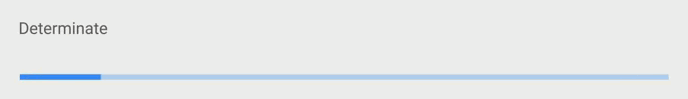](https://github.com/lightningtgc/MProgress.js#types-and-preview)
18 |
19 | * `template=2`,Buffer
20 |
21 | [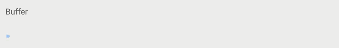](https://github.com/lightningtgc/MProgress.js#types-and-preview)
22 |
23 | * `template=3`,Indeterminate
24 |
25 | [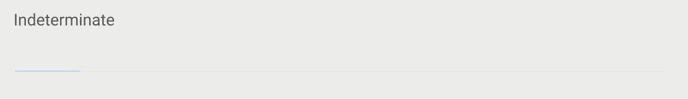](https://github.com/lightningtgc/MProgress.js#types-and-preview)
26 |
27 | * `template=4`,Query Indeterminate and Determinate
28 |
29 | [](https://github.com/lightningtgc/MProgress.js#types-and-preview)
30 |
31 |
32 | ## Demo
33 |
34 | ``` vux height=300 components=Group,Progress
35 |
36 |
37 |
38 |
39 |
40 |
41 |
42 |
43 |
44 |
45 |
46 |
47 |
48 |
49 |
50 |
51 |
52 |
54 |
63 | ```
--------------------------------------------------------------------------------
/ui/tips-components.md:
--------------------------------------------------------------------------------
1 | # 提示组件
2 |
3 |
--------------------------------------------------------------------------------
/wiki/meta.md:
--------------------------------------------------------------------------------
1 | # Meta
2 |
3 | ## 指定是否将网页内容中的手机号码显示为拨号的超链接
4 |
5 | `
`
--------------------------------------------------------------------------------
 4 |
5 |
4 |
5 |  10 |
11 |
10 |
11 |  16 |
17 |
18 |
16 |
17 |
18 |  19 |
20 |
21 |
19 |
20 |
21 |  40 |
40 |  87 |
--------------------------------------------------------------------------------
/book.json:
--------------------------------------------------------------------------------
1 | {
2 | "plugins": [
3 | "vuxcode"
4 | ],
5 | "pluginsConfig": {}
6 | }
--------------------------------------------------------------------------------
/chart/circle.md:
--------------------------------------------------------------------------------
1 | # 圆圈
2 |
3 | ## 应用场景
4 |
5 | 圆圈组件一般用于显示进度,展示百分比数据。
6 |
7 |
8 | ## 示例
9 |
10 | ### 简单示例
11 |
12 | ``` vux components=Circle
13 |
14 |
87 |
--------------------------------------------------------------------------------
/book.json:
--------------------------------------------------------------------------------
1 | {
2 | "plugins": [
3 | "vuxcode"
4 | ],
5 | "pluginsConfig": {}
6 | }
--------------------------------------------------------------------------------
/chart/circle.md:
--------------------------------------------------------------------------------
1 | # 圆圈
2 |
3 | ## 应用场景
4 |
5 | 圆圈组件一般用于显示进度,展示百分比数据。
6 |
7 |
8 | ## 示例
9 |
10 | ### 简单示例
11 |
12 | ``` vux components=Circle
13 |
14 |  44 |
44 |  28 | Wechat
29 |
28 | Wechat
29 |  32 | Message
33 |
32 | Message
33 |  36 | Explore
37 |
36 | Explore
37 |  40 | News
41 |
40 | News
41 |