Take a look at the MDN page for background-image, and use this picture of a Husky: http://whatisjasongoldstein.github.io/buildcss/img/husky.jpg.
The image is square, but the boxes we're using it as a background on are not. (You can tell this where the orange background-color shows through.)
Going left to right, do this:
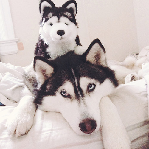
51 |cover the box (hint: background-size: cover) and be positioned so the tops align.background-size:contain).background-repeat.background-position).background-repeat), positioned 10px from the top. Make sure never to cut the image, it shouldn't be cut off at the box.background-size to a percentage to make that happen.background-size and background-position to zoom in.67 | Special Thanks: The giant fluffy creature shown above is Koda. Because we live in a ridiculous world, you can see more pictures of her on Instagram. 68 |
69 | 70 |In typography, the baseline is a line the letter sit on. If you've never heard this term, 49 | read the Wikipedia entry) 50 | quickly.
51 |line-height describes the amount of space between the baselines.
As you probably guessed, the boxes are inline-blocks. Inline elements sit on the baseline, but you can adjust how they set using the vertical-align property. If you were to look this up on MDN, you'll have the default is baseline, but you can make it hang in the middle or the top accordingly.
line-height to a number without units, this way it becomes a multiple
56 | of whatever the font-size is. This way, line-height: 2; is like double spacing,
57 | and if the font-size changes, your typography holds together.vertical-align describes the relationship between things to the baseline, its
59 | effect will be more pronounced when the baselines are further apart (bigger line-height).MDN has a pretty good intro to the box model.
49 |This one should be self explanatory.
50 |margin: 40px is next to a box with margin: 20px, the two boxes render 20 pixels apart. This is because margins don't add together - they dictate the minimum space
54 | the element needs to be spaced from other stuff. MDN has more on this.Inline and inline-block elements are centered by setting the text-align of the parent element to center.
Block elements are centered by having the left and right margins set to auto (e.g., margin: 0 auto);
Often you'll want things that are side by side on opposite ends of a container.
49 |By default, floating elements overhang their container, as you can see in the top example.
50 |There are two ways to fix this:
51 |overflow:hidden; on the container. This clips anything that runs over, but it also
53 | causes the container to extend to fit the floats.:after psuedoelement on the container and have it clear: both.box-shadow that would be clipped by overflow: hidden;<hr> for the lines between examples.myelement:after clears a psuedoelemnt. You need to set it's content and display to make it useful.
65 | content is probably blank in this case.Columns are tricky. Try to build this.
49 |box-sizing:border-box.clear:both.margin-top you put on the footer, it won't create
60 | a gap between the footer and the columns.overflow:hidden or an after clearfix, e.g., .wrapper:after {content: ""; display:block; clear:both;}.You could put a <div style="clear:both"></div> between the footer and the columns. It would clear the floats and provide something that the footer's top margin could push against. But then you'd have an empty, unsemantic element that you don't need in your code.
The very thought of this should fill you with disgust, that such ugliness should be allowed to blight your code even though your users would never notice.
77 |columns: 2; is a thing in CSS3, however, it still doesn't feel ready for prime time. Read more on MDN.
This is about the Display property.
49 |You should make it entirely with divs or spans, and use CSS 50 | properties to control them.
51 |<b> and <a>. They sit on the same line and can be thought of in things in text. They can have left/right margins but not top or bottom, can't have a set width height, and can't float. I like to think of them as "layout-less".<div> and <p> fill the whole line by default, and stack on top of each other. They have margins, padding, and floats.You'll use all three to build the above.
58 |Good luck!
59 | 60 |Enim in nostrud ea pariatur consequat occaecat tempor consectetur adipisicing est tempor est qui esse minim do do amet ea exercitation proident consequat sint quis cupidatat id et labore culpa cillum eiusmod nulla nostrud esse officia do deserunt id ipsum magna Lorem ad commodo culpa eiusmod laborum do eu nulla.
42 | 43 | 44 |Enim in nostrud ea pariatur consequat occaecat tempor consectetur adipisicing est tempor est qui esse minim do do amet ea exercitation proident consequat sint quis cupidatat id et labore culpa cillum eiusmod nulla nostrud esse officia do deserunt id ipsum magna Lorem ad commodo culpa eiusmod laborum do eu nulla.
46 | 47 | 48 | -------------------------------------------------------------------------------- /docs/examples/boxmodel.html: -------------------------------------------------------------------------------- 1 | 2 | 3 | 4 |This text is red.
22 |This text is blue.
23 | 24 | 25 | 26 | -------------------------------------------------------------------------------- /docs/examples/no-bootstrap.html: -------------------------------------------------------------------------------- 1 | 2 | 3 | 4 |84 | 85 | 86 | 87 | 88 | 89 | 90 |
91 |92 | 93 |
94 | 95 | 96 |Yay! Something worked the way it was supposed to!
97 | 98 | 99 | -------------------------------------------------------------------------------- /docs/examples/other.html: -------------------------------------------------------------------------------- 1 | 2 | 3 | 4 |Read the fine print.
24 | 25 | 26 | 27 | -------------------------------------------------------------------------------- /docs/examples/selectors.html: -------------------------------------------------------------------------------- 1 | 2 | 3 | 4 |This subhead doesn't have a border under it.
45 | 46 | 47 | 48 | -------------------------------------------------------------------------------- /docs/examples/tables.html: -------------------------------------------------------------------------------- 1 | 2 | 3 | 4 || Name | 39 |Content | 40 | 41 | 42 |
|---|---|
| Part 1 | 44 |Adipisicing in magna ipsum ullamco irure et sunt ex deserunt | 45 |
| Part 2 | 48 |Velit amet exercitation aute deserunt do anim consectetur aliqua nulla | 49 |
| Part 1 | 52 |Adipisicing in magna ipsum ullamco irure et sunt ex deserunt | 53 |
| Part 2 | 56 |Velit amet exercitation aute deserunt do anim consectetur aliqua nulla | 57 |
This isn't a Tetris board. Well, maybe it is. But it's also a demo 49 | of how floats and clears behave.
50 |line-height of the boxes the same as their height. You know how line-heights affect text in paragraphs, but its useful to think of them in relationship to other elements.Styling forms is tricky but important. In a large project, 49 | you'll want to create some styles that you can reuse on all your forms 50 | so you don't have to style them indiviually.
51 |This form markup is similar to what a web framework - say, Django - would generate.
52 |<form action="." method="POST">
53 | <p>
54 | <label>Name</label>
55 | <input type="text">
56 | </p>
57 |
58 | <p class="required">
59 | <label>Preferred Taco</label>
60 | <select>
61 | <option>Carne</option>
62 | <option>Al Pastor</option>
63 | <option>Don't care, just add guac</option>
64 | <option>All of Them</option>
65 | </select>
66 | </p>
67 |
68 | <p>
69 | <label>Spicy?</label>
70 | <input type="checkbox">
71 | </p>
72 |
73 | <p>
74 | <label>Address</label>
75 | <textarea></textarea>
76 | </p>
77 |
78 | <p>
79 | <input type="submit" value="Send Tacos!">
80 | </p>
81 | </form>
82 | :before to make the astericks on required fields.label is a good way to make everything line up.A common way to lay out a list of visual things is a grid like above.
49 |This one may be difficult. Especially since you have to use this markup:
50 |<ul class="images">
51 | <li>
52 | <figure>
53 | <a href="#">
54 | <img src="https://placebear.com/300/200">
55 | <figcaption>Be Aware of the Bear</figcaption>
56 | </a>
57 | </figure>
58 | </li>
59 | <li>
60 | <figure>
61 | <a href="#">
62 | <img src="https://placebear.com/300/201">
63 | <figcaption>Smokey</figcaption>
64 | </a>
65 | </figure>
66 | </li>
67 |
68 | <li>
69 | <figure>
70 | <a href="#">
71 | <img src="https://placebear.com/300/202">
72 | <figcaption>Gone Fishin</figcaption>
73 | </a>
74 | </figure>
75 | </li>
76 |
77 | <li>
78 | <figure>
79 | <a href="#">
80 | <img src="https://placebear.com/301/203">
81 | <figcaption>I'm stuck</figcaption>
82 | </a>
83 | </figure>
84 | </li>
85 | <li>
86 | <figure>
87 | <a href="#">
88 | <img src="https://placebear.com/305/205">
89 | <figcaption>PDA?</figcaption>
90 | </a>
91 | </figure>
92 | </li>
93 |
94 | <li>
95 | <figure>
96 | <a href="#">
97 | <img src="https://placebear.com/301/202">
98 | <figcaption>Hello?</figcaption>
99 | </a>
100 | </figure>
101 | </li>
102 | </ul>
103 | img is an inline element, and will get a mysterious space around it
106 | when when margin is set to zero. This is because inline elements get space around them
107 | from the line-height. You'll want to set your .figure img to display: block so it fills
108 | the space and doesn't have weird layout effects.float: left. But I want to use 1% of that space for margin on each item.margin-left only. Now you don't have to worry about the items at the end of the line - they'll set neatly against the edge..images li:nth-child(3n+1) to clear: left and margin-left: 0.nth-child is a psuedoclass that can select even, odd, third, etc, of the matching elements. This is useful for striping tables, or clearing the margin of every third+1 element. Read about it on MDN.n is 0, 3n+1 is 1, or the first element.figcaption is on top of the image. Perhaps position: absolute is a useful tool for this.figcaption is also transparent. You can do that with rgba colors. If you've never seen this before, you should look it up on MDN).The images are from placebear.com. It's exactly what it sounds like it is. 141 | There's also placekitten.com, if you want to make "I can haz placeholder art" jokes.
142 |Right now, if there were a 7th image, it would hang on the left. 144 | What if you wanted it centered?
145 |Perhaps, rather than floating, you could make a layout like this where the li's are
146 | inline-blocks, and set text-align:center; on the parent, so if there's 3 the fill the row,
147 | but if there's 1 or 2 they're centered across the row.
I bet that would work 😉
149 | 150 |This is not a tutorial; it's a series of examples.
49 |CSS is full of counterintuitive things. For example, float 50 | throws off a lot of people. According to MDN, the definition is:
51 |52 |54 |The float CSS property specifies that an element should be taken from the normal flow and placed along the left or right side of its container, where text and inline elements will wrap around it.
53 |
But this doesn't help you use it to build layouts.
55 |Each problem is an example of something made with html in CSS. Your job is to recreate it, without looking at the code. Some hints may be provided. The goal, of course, isn't to build stupid little UI things, but to understand how they can be built by illustrating one or two concepts per example.
62 |Clicking the image above opens the finished html document. You should view source, read it, open it in the inspector, and fiddle with it until you understand what's happening and why. This case is easy - you need two <p>'s and something like
.a {color: red;}
64 | .b {color: blue;}
65 |
Need a place to write code? You should get used to working with plain html files on your desktop. 66 | But you can also work in CodePen or JSFiddle.
67 | 68 |Above, you see several CSS components from Bootstrap, the popular (and highly opinionated) 49 | front-end framework.
50 |I bet you can build them on your own.
51 |I bet you don't need Bootstrap at all.
52 |Some Bootstrap users borrow pieces of it because the tooltip is nice and ready to go. Great.
54 |But others use it as a crutch because they're soft on the front-end. But you're not. 55 | This is a piece of cake compared to our last exercise.
56 |You can evaluate front-end tools and take the pieces you need, 57 | leave behind what you don't, and not be trapped doing things their way because 58 | you don't know how to draw a button.
59 |Buttons are easy.
60 |I didn't do any hover effects. You could if you want to show off.
62 |I use Bootstrap's tooltip in production because it's nice and it works. I may even borrow 64 | a few idea from their form code some day - they're good at forms.
65 |Their responsive stuff, however, is a tragic mess.
66 |But you're a professional developer. You shouldn't listen to me. You've got an Inspect Element 67 | and a Github, you can read the code of any front-end library and evaluate it for your purposes.
68 | 69 |The best way to learn how to build shit in CSS 44 | is to go forth and build websites.
45 |But if you're looking for more resources, here's some good stuff:
46 |Did I miss a topic? Is there a resource I should add to the list above? Open an Issue 58 | on Github.
59 |I'd love to see pull requests from other people! Here's what will get accepted:
61 |50pxposition: absolute; makes top/left/bottom/right set the exact
57 | number of pixels an element will appear relative to its innermost container that also
58 | has a postiion set.static) it would be ignored, and the position will be set based
62 | on the next container up the DOM that does have a position (or the whole page).position: relative moves things around from their default position. This means
69 | position:relative; left: 10px; would slide an element to the left by 10 pixels.position:fixed makes something sticky, and it will stay put as you scroll.Pseudoelements are things you add before or after an element that can be styled, 49 | but aren't part of the markup and can't be touched by Javascript. They're useful for 50 | icons and symbols, or adding an extra clearing element.
51 |Here's how you write them.
52 |.stuff:before {
53 | content: "this will be inserted before stuff";
54 | background: green;
55 | }
56 | Typically the content is a character or "", but it could be longer text.
For this example, use this HTML. Obviously, you can't just add a * and an "x" to your markup. That's cheating.
58 |<button class="close">Close</button>
59 | <p class="footnote">Read the fine print.</p>
60 | Sometimes pseudoelements take some finessing to lay them out correctly relative to the rest of the content.
61 | position, margin, line-height and vertical-align are usually good things to try fiddling with.
I assume you already know how to style stuff by its id, class, or element.
<h1>) followed by a subhead (<h2>) shouldn't have space between them.border-bottom) under them.<i> inside of h1 or h2 should be blue. But not elsewhere..a + .b is an adjacent selector. It matches elements with a class b that are right after elements with a class .a.nth-child is pretty cool. You should read about it.Tables are for tabular data, never for layout.
49 |Visually, they're advantage is they'll automatically fit the cells to the available space.
50 |Here's the markup. (If you're not familiar with any of the elements, you should look them up on MDN.)
51 |<table>
52 | <thead>
53 | <th>Name</th>
54 | <th>Content</th>
55 | </thead>
56 | <tbody>
57 | <tr>
58 | <td>Part 1</td>
59 | <td>Adipisicing in magna ipsum ullamco irure et sunt ex deserunt</td>
60 | </tr>
61 | <tr>
62 | <td>Part 2</td>
63 | <td>Velit amet exercitation aute deserunt do anim consectetur aliqua nulla</td>
64 | </tr>
65 | <tr>
66 | <td>Part 1</td>
67 | <td>Adipisicing in magna ipsum ullamco irure et sunt ex deserunt</td>
68 | </tr>
69 | <tr>
70 | <td>Part 2</td>
71 | <td>Velit amet exercitation aute deserunt do anim consectetur aliqua nulla</td>
72 | </tr>
73 | </tbody>
74 | </table>
75 | table {border-collapse: collapse;} removes the spacing between cells so you can control it with padding.vertical-align and nth-child might be helpful on this one.Transforms are a useful new property in CSS for rotating and warping. 49 | You've already used it to center things vertically. We're going to do one more thing, 50 | since transforms can be strange.
51 |This is your markup: <h1>Classified</h1>
color properties, causes
56 | one to overwrite the other. Instead, string the values together: translate(-50%, -50%) transform: rotate(90deg) scale(1.5). (Obviously, these aren't the real values.)transform-origin. It might help.body) to the width
61 | and height fo the window.translate step fo the rotate() first.transform. When using cutting edge CSS tools, always consider them progress enhancements. Make sure the design works to your satisfaction without them.margin:0 auto will center a block horizontally, because auto means equal space on each side.
50 | But margin: auto auto has no extra effect, because the automatic top/bottom margin is 0.
Why? Is the W3C on drugs? Well, maybe. The bigger issue is CSS was originally designed 52 | for relatively simple documents, and we keep pushing its limits.
53 |There are a few curve-balls here:
54 |transform gives us a way
57 | to hack around it.position: absolute; left: 50% to move the left edge on an object halfway across its container. However, this means its left edge is aligned to the center, and we need the center aligned to the center.transform (read about it on MDN) moves things around relative to themselves, no their container. so transform: translateX(50%) will slide an element over by half its width.position:absolute; top: 50%; left: 50%; transform: translate(-50%, -50%) will:border-radius might be helpful for making things circles.letter-spacing) and the font is all-caps.text-transform.text-transform, you ask? As usual, you should check on MDN.z-index is how you control the order of overlapping layers.
For this example, you need to use the following html:
50 |<div class="box green"></div>
51 | <div class="box blue"></div>
52 | <div class="box red"></div>
53 | By default, these boxes would be stacked with green on the bottom, red on top, and blue in the middle. 54 | We're going to manipulate that.
55 |position (not the default) can have z-index. That's not an issue for this case,
58 | because we need to set a position to get the squares to overlap anyway.z-index: 10; sets an arbitrary number. Higher ones go on top.z-index:1; and z-index:2; is a bad idea. z-index:10; and index:20; is better.Enim in nostrud ea pariatur consequat occaecat tempor consectetur adipisicing est tempor est qui esse minim do do amet ea exercitation proident consequat sint quis cupidatat id et labore culpa cillum eiusmod nulla nostrud esse officia do deserunt id ipsum magna Lorem ad commodo culpa eiusmod laborum do eu nulla.
42 | 43 | 44 |Enim in nostrud ea pariatur consequat occaecat tempor consectetur adipisicing est tempor est qui esse minim do do amet ea exercitation proident consequat sint quis cupidatat id et labore culpa cillum eiusmod nulla nostrud esse officia do deserunt id ipsum magna Lorem ad commodo culpa eiusmod laborum do eu nulla.
46 | 47 | 48 | -------------------------------------------------------------------------------- /src/examples/boxmodel.html: -------------------------------------------------------------------------------- 1 | 2 | 3 | 4 |This text is red.
22 |This text is blue.
23 | 24 | 25 | 26 | -------------------------------------------------------------------------------- /src/examples/no-bootstrap.html: -------------------------------------------------------------------------------- 1 | 2 | 3 | 4 |84 | 85 | 86 | 87 | 88 | 89 | 90 |
91 |92 | 93 |
94 | 95 | 96 |Yay! Something worked the way it was supposed to!
97 | 98 | 99 | -------------------------------------------------------------------------------- /src/examples/positioning.html: -------------------------------------------------------------------------------- 1 | 2 | 3 | 4 |Read the fine print.
24 | 25 | 26 | 27 | -------------------------------------------------------------------------------- /src/examples/selectors.html: -------------------------------------------------------------------------------- 1 | 2 | 3 | 4 |This subhead doesn't have a border under it.
45 | 46 | 47 | 48 | -------------------------------------------------------------------------------- /src/examples/tables.html: -------------------------------------------------------------------------------- 1 | 2 | 3 | 4 || Name | 39 |Content | 40 | 41 | 42 |
|---|---|
| Part 1 | 44 |Adipisicing in magna ipsum ullamco irure et sunt ex deserunt | 45 |
| Part 2 | 48 |Velit amet exercitation aute deserunt do anim consectetur aliqua nulla | 49 |
| Part 1 | 52 |Adipisicing in magna ipsum ullamco irure et sunt ex deserunt | 53 |
| Part 2 | 56 |Velit amet exercitation aute deserunt do anim consectetur aliqua nulla | 57 |
` fill the whole line by default, and stack on top of each other. They have margins, padding, and floats. 17 | * Inline-blocks have margins and padding like blocks do, but sit on the same line like inline elements. 18 | 19 | You'll use all three to build the above. 20 | 21 | Good luck! 22 | {% endset %} 23 | 24 | {% block content %} 25 | {{ framed("/buildcss/examples/display.html", text) }} 26 | {% endblock content %} -------------------------------------------------------------------------------- /src/pages/floating.html: -------------------------------------------------------------------------------- 1 | {% extends "pages/base.html" %} 2 | {% from "macros/framed-problem.html" import framed %} 3 | 4 | {% set text %} 5 | 6 | # Floating and clearing 7 | 8 | This isn't a Tetris board. Well, maybe it is. But it's also a demo 9 | of how floats and clears behave. 10 | 11 | ## Notes 12 | 13 | * Use [text-shadow](https://developer.mozilla.org/en-US/docs/Web/CSS/text-shadow) to help the numbers stand out against their backgrounds. 14 | * Try making the `line-height` of the boxes the same as their height. You know how `line-heights` affect text in paragraphs, but its useful to think of them in relationship to other elements. 15 | * The order of the boxes in important. If two boxes float right, the first one will be further right. 16 | {% endset %} 17 | 18 | {% block content %} 19 | {{ framed("/buildcss/examples/floating.html", text) }} 20 | {% endblock content %} 21 | -------------------------------------------------------------------------------- /src/pages/forms.html: -------------------------------------------------------------------------------- 1 | {% extends "pages/base.html" %} 2 | {% from "macros/framed-problem.html" import framed %} 3 | 4 | {% set text %} 5 | # Forms 6 | 7 | Styling forms is tricky but important. In a large project, 8 | you'll want to create some styles that you can reuse on all your forms 9 | so you don't have to style them indiviually. 10 | 11 | This form markup is similar to what a web framework - say, Django - would generate. 12 | 13 |
43 | 44 | ### Hints 45 | * Use `:before` to make the astericks on required fields. 46 | * Remember vertical-align when you can't figure out how to make textarea hang down. 47 | * Setting the width on `label` is a good way to make everything line up. 48 | 49 | {% endset %} 50 | 51 | {% block content %} 52 | {{ framed("/buildcss/examples/forms.html", text) }} 53 | {% endblock content %} -------------------------------------------------------------------------------- /src/pages/grids.html: -------------------------------------------------------------------------------- 1 | {% extends "pages/base.html" %} 2 | {% from "macros/framed-problem.html" import framed %} 3 | 4 | {% set text %} 5 | # Bear Awareness (in Grid Form) 6 | 7 | A common way to lay out a list of visual things is a grid like above. 8 | 9 | This one may be difficult. Especially since you have to use this markup: 10 | 11 |`'s and something like
26 |
27 | ```
28 | .a {color: red;}
29 | .b {color: blue;}
30 | ```
31 |
32 | **Need a place to write code?** You should get used to working with plain html files on your desktop.
33 | But you can also work in [CodePen](https://codepen.io) or [JSFiddle](https://jsfiddle.net/).
34 | {% endset %}
35 |
36 | {% block content %}
37 | {{ framed("/buildcss/examples/intro.html", text) }}
38 | {% endblock content %}
39 |
--------------------------------------------------------------------------------
/src/pages/no-bootstrap.html:
--------------------------------------------------------------------------------
1 | {% extends "pages/base.html" %}
2 | {% from "macros/framed-problem.html" import framed %}
3 |
4 | {% set text %}
5 |
6 | # Say No to Bootstrap (Sometimes)
7 |
8 | Above, you see several CSS components from [Bootstrap](http://getbootstrap.com/), the popular (and highly opinionated)
9 | front-end framework.
10 |
11 | I bet you can build them on your own.
12 |
13 | I bet you don't need Bootstrap at all.
14 |
15 | ### Why?
16 |
17 | Some Bootstrap users borrow pieces of it because the tooltip is nice and ready to go. Great.
18 |
19 | But others use it as a crutch because they're soft on the front-end. But you're not.
20 | This is a piece of cake compared to our last exercise.
21 |
22 | You can evaluate front-end tools and take the pieces you need,
23 | leave behind what you don't, and not be trapped doing things their way because
24 | you don't know how to draw a button.
25 |
26 | Buttons are easy.
27 |
28 | ### For Extra Points
29 |
30 | I didn't do any hover effects. You could if you want to show off.
31 |
32 | #### Now tell us, what do you really think?
33 |
34 | I use Bootstrap's tooltip in production because it's nice and it works. I may even borrow
35 | a few idea from their form code some day - they're good at forms.
36 |
37 | Their responsive stuff, however, is a tragic mess.
38 |
39 | But you're a professional developer. You shouldn't listen to me. You've got an Inspect Element
40 | and a Github, you can read the code of any front-end library and evaluate it for your purposes.
41 | {% endset %}
42 |
43 | {% block content %}
44 | {{ framed("/buildcss/examples/no-bootstrap.html", text) }}
45 | {% endblock content %}
46 |
--------------------------------------------------------------------------------
/src/pages/other.html:
--------------------------------------------------------------------------------
1 | {% extends "pages/base.html" %}
2 | {% block content %}
3 |
Read the fine print.
24 | 25 | Sometimes pseudoelements take some finessing to lay them out correctly relative to the rest of the content. 26 | `position`, `margin`, `line-height` and `vertical-align` are usually good things to try fiddling with. 27 | {% endset %} 28 | 29 | {% block content %} 30 | {{ framed("/buildcss/examples/pseudoelements.html", text) }} 31 | {% endblock content %} 32 | -------------------------------------------------------------------------------- /src/pages/selectors.html: -------------------------------------------------------------------------------- 1 | {% extends "pages/base.html" %} 2 | {% from "macros/framed-problem.html" import framed %} 3 | 4 | {% set text %} 5 | # Advanced Selectors 6 | 7 | I assume you already know how to style stuff by its `id`, `class`, or `element`. 8 | 9 | ## Goals 10 | 1. Headlines (`| Name | 16 |Content | 17 | 18 | 19 |
|---|---|
| Part 1 | 21 |Adipisicing in magna ipsum ullamco irure et sunt ex deserunt | 22 |
| Part 2 | 25 |Velit amet exercitation aute deserunt do anim consectetur aliqua nulla | 26 |
| Part 1 | 29 |Adipisicing in magna ipsum ullamco irure et sunt ex deserunt | 30 |
| Part 2 | 33 |Velit amet exercitation aute deserunt do anim consectetur aliqua nulla | 34 |