├── lib
├── utilities.js
├── TagItem.js
└── Button.js
├── LICENSE
├── package.json
├── README.md
└── index.js
/lib/utilities.js:
--------------------------------------------------------------------------------
1 | export default {
2 | changeAlias: (alias) => {
3 | var str = alias || '';
4 | str = str.toLowerCase();
5 | str = str.replace(/à|á|ạ|ả|ã|â|ầ|ấ|ậ|ẩ|ẫ|ă|ằ|ắ|ặ|ẳ|ẵ/g, "a");
6 | str = str.replace(/è|é|ẹ|ẻ|ẽ|ê|ề|ế|ệ|ể|ễ/g, "e");
7 | str = str.replace(/ì|í|ị|ỉ|ĩ/g, "i");
8 | str = str.replace(/ò|ó|ọ|ỏ|õ|ô|ồ|ố|ộ|ổ|ỗ|ơ|ờ|ớ|ợ|ở|ỡ/g, "o");
9 | str = str.replace(/ù|ú|ụ|ủ|ũ|ư|ừ|ứ|ự|ử|ữ/g, "u");
10 | str = str.replace(/ỳ|ý|ỵ|ỷ|ỹ/g, "y");
11 | str = str.replace(/đ/g, "d");
12 | str = str.replace(/!|@|%|\^|\*|\(|\)|\+|\=|\<|\>|\?|\/|,|\:|\;|\'|\"|\&|\#|\[|\]|~|\$|_|`|-|{|}|\||\\/g, " ");
13 | str = str.replace(/ + /g, " ");
14 | str = str.trim();
15 | return str;
16 | }
17 | }
--------------------------------------------------------------------------------
/lib/TagItem.js:
--------------------------------------------------------------------------------
1 | import React from 'react';
2 | import {TouchableOpacity, Text } from 'react-native';
3 | import Icon from 'react-native-vector-icons/MaterialCommunityIcons';
4 |
5 | const TagItem = ({ tagName, onRemoveTag }) => {
6 | return (
7 |
14 |
15 |
18 | {tagName}
19 |
20 |
21 | );
22 | }
23 | export default TagItem;
--------------------------------------------------------------------------------
/LICENSE:
--------------------------------------------------------------------------------
1 | MIT License
2 |
3 | Copyright (c) 2019 xuho
4 |
5 | Permission is hereby granted, free of charge, to any person obtaining a copy
6 | of this software and associated documentation files (the "Software"), to deal
7 | in the Software without restriction, including without limitation the rights
8 | to use, copy, modify, merge, publish, distribute, sublicense, and/or sell
9 | copies of the Software, and to permit persons to whom the Software is
10 | furnished to do so, subject to the following conditions:
11 |
12 | The above copyright notice and this permission notice shall be included in all
13 | copies or substantial portions of the Software.
14 |
15 | THE SOFTWARE IS PROVIDED "AS IS", WITHOUT WARRANTY OF ANY KIND, EXPRESS OR
16 | IMPLIED, INCLUDING BUT NOT LIMITED TO THE WARRANTIES OF MERCHANTABILITY,
17 | FITNESS FOR A PARTICULAR PURPOSE AND NONINFRINGEMENT. IN NO EVENT SHALL THE
18 | AUTHORS OR COPYRIGHT HOLDERS BE LIABLE FOR ANY CLAIM, DAMAGES OR OTHER
19 | LIABILITY, WHETHER IN AN ACTION OF CONTRACT, TORT OR OTHERWISE, ARISING FROM,
20 | OUT OF OR IN CONNECTION WITH THE SOFTWARE OR THE USE OR OTHER DEALINGS IN THE
21 | SOFTWARE.
22 |
--------------------------------------------------------------------------------
/lib/Button.js:
--------------------------------------------------------------------------------
1 | //import liraries
2 | import React from 'react';
3 | import { TouchableOpacity, Text, StyleSheet } from 'react-native';
4 | // create a component
5 | const Button = ({ title, backgroundColor, textColor, style, textStyle, onPress, disabled, defaultFont }) => {
6 | return (
7 |
15 |
16 | {title}
17 |
18 |
19 | );
20 | };
21 |
22 | // define your styles
23 | const styles = StyleSheet.create({
24 | button: {
25 | height: 45, borderRadius: 2, paddingHorizontal: 16, flexDirection: 'row', alignItems: 'center', justifyContent: 'center',
26 | },
27 | buttonText: { fontSize: 16, fontWeight: 'bold' },
28 | });
29 |
30 | //make this component available to the app
31 | export default Button;
32 |
--------------------------------------------------------------------------------
/package.json:
--------------------------------------------------------------------------------
1 | {
2 | "name": "react-native-select-two",
3 | "version": "1.1.0",
4 | "description": "Component like Select2 on web for React Native",
5 | "main": "index.js",
6 | "scripts": {
7 | "test": "echo \"Error: no test specified\" && exit 1"
8 | },
9 | "repository": {
10 | "type": "git",
11 | "url": "git+https://github.com/xuho/react-native-select-two.git"
12 | },
13 | "keywords": [
14 | "react-native",
15 | "react-component",
16 | "react-native-component",
17 | "react",
18 | "mobile",
19 | "ios",
20 | "android",
21 | "ui",
22 | "react-native-select2",
23 | "select2",
24 | "component"
25 | ],
26 | "author": "xuho",
27 | "license": "MIT",
28 | "bugs": {
29 | "url": "https://github.com/xuho/react-native-select-two/issues"
30 | },
31 | "homepage": "https://github.com/xuho/react-native-select-two#readme",
32 | "peerDependencies": {
33 | "react": "*",
34 | "react-native": "*",
35 | "react-native-vector-icons": "^4.2.0",
36 | "react-native-modal": "^11.1.0"
37 | },
38 | "devDependencies": {
39 | "react": "16.6.1",
40 | "react-native": "~0.57.7",
41 | "react-native-vector-icons": "^4.2.0",
42 | "react-native-modal": "^11.1.0"
43 | }
44 | }
--------------------------------------------------------------------------------
/README.md:
--------------------------------------------------------------------------------
1 | # react-native-select-two
2 |
3 | ## Component like [Select2](https://select2.org/) on web for React Native
4 |
5 | 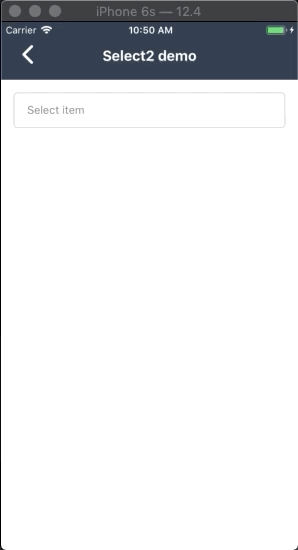
6 |
7 | ## Add it to your project
8 | - Using NPM
9 | `npm install react-native-select-two`
10 | - or:
11 | - Using Yarn
12 | `yarn add react-native-select-two`
13 |
14 |
15 | ## Install dependencies
16 |
17 | 1. [react-native-modal](https://github.com/react-native-community/react-native-modal)
18 | 2. [react-native-vector-icons](https://github.com/oblador/react-native-vector-icons)
19 |
20 |
21 | ## Usage
22 |
23 | ```javascript
24 | import React, { Component } from "react"
25 | import { View, Text, StyleSheet } from "react-native"
26 | import Select2 from "react-native-select-two"
27 |
28 | const mockData = [
29 | { id: 1, name: "React Native Developer", checked: true }, // set default checked for render option item
30 | { id: 2, name: "Android Developer" },
31 | { id: 3, name: "iOS Developer" }
32 | ]
33 |
34 | // create a component
35 | class CreateNewAppointment extends Component {
36 | render() {
37 | return (
38 |
39 | {
47 | this.setState({ data })
48 | }}
49 | onRemoveItem={data => {
50 | this.setState({ data })
51 | }}
52 | />
53 |
54 | )
55 | }
56 | }
57 | ```
58 |
59 | ### Multiple select
60 |
61 | 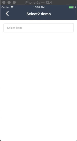
62 |
63 | ## Properties
64 |
65 | | Property name | Type | Default | Description |
66 | | ------------------------- | -------------- | ------------------------------- | ------------------------------------------------------------------------------------------- |
67 | | **style** | _Object_ | none | Custom style for component |
68 | | **modalStyle** | _Object_ | none | Custom style for modal |
69 | | **title** | _String_ | none | String display when you don't select any item |
70 | | **data** | _Array_ | \*required | Datasource of list options: an array of objects (each object have `name` and `id` property) |
71 | | **onSelect** | _Function_ | none | The callback function trigger after you press select button |
72 | | **onRemoveItem** | _Function_ | none | The callback function trigger after you press tags to remove them |
73 | | **popupTitle** | _String_ | none | Title of modal select item |
74 | | **colorTheme** | _string/color_ | #16a45f | Color for componet |
75 | | **isSelectSingle** | _Bool_ | false | Selelect only one option |
76 | | **showSearchBox** | _Bool_ | true | Show or hide search field |
77 | | **cancelButtonText** | _string_ | Hủy | Cancel button text title |
78 | | **selectButtonText** | _String_ | Chọn | Select button text title |
79 | | **searchPlaceHolderText** | _String_ | Nhập vào từ khóa | Placeholder text for search field |
80 | | **listEmptyTitle** | _String_ | Không tìm thấy lựa chọn phù hợp | Title to show when there's no item to be render |
81 | | **defaultFontName** | _String_ | none | Set custom font for all component |
82 | | **selectedTitleStyle** | _Object_ | none | Set custom style for display selected title text |
83 | | **buttonTextStyle** | _Object_ | none | Set custom button text style |
84 | | **buttonStyle** | _Object_ | none | Set custom button style |
85 |
86 | ## License
87 | **MIT Licensed**
88 |
89 | ## Support me
90 |  91 |
--------------------------------------------------------------------------------
/index.js:
--------------------------------------------------------------------------------
1 | //import liraries
2 | import React, { Component } from 'react';
3 | import { Text, StyleSheet, TouchableOpacity, View, FlatList, TextInput, Dimensions, Animated, Platform } from 'react-native';
4 | import Icon from 'react-native-vector-icons/MaterialCommunityIcons';
5 | import Modal from 'react-native-modal';
6 | import Button from './lib/Button';
7 | import TagItem from './lib/TagItem';
8 | import utilities from './lib/utilities';
9 | import PropTypes from 'prop-types';
10 |
11 | const { height } = Dimensions.get('window');
12 | const INIT_HEIGHT = height * 0.6;
13 | // create a component
14 | class Select2 extends Component {
15 | static defaultProps = {
16 | cancelButtonText: 'Hủy',
17 | selectButtonText: 'Chọn',
18 | searchPlaceHolderText: "Nhập vào từ khóa",
19 | listEmptyTitle: 'Không tìm thấy lựa chọn phù hợp',
20 | colorTheme: '#16a45f',
21 | buttonTextStyle: {},
22 | buttonStyle: {},
23 | showSearchBox: true
24 | }
25 | state = {
26 | show: false,
27 | preSelectedItem: [],
28 | selectedItem: [],
29 | data: [],
30 | keyword: ''
31 | }
32 | animatedHeight = new Animated.Value(INIT_HEIGHT);
33 |
34 | componentDidMount() {
35 | this.init();
36 | };
37 |
38 | UNSAFE_componentWillReceiveProps(newProps) {
39 | this.init(newProps);
40 | }
41 |
42 | init(newProps) {
43 | let preSelectedItem = [];
44 | let { data } = newProps || this.props;
45 | data.map(item => {
46 | if (item.checked) {
47 | preSelectedItem.push(item);
48 | }
49 | })
50 | this.setState({ data, preSelectedItem });
51 | }
52 |
53 | get dataRender() {
54 | let { data, keyword } = this.state;
55 | let listMappingKeyword = [];
56 | data.map(item => {
57 | if (utilities.changeAlias(item.name).includes(utilities.changeAlias(keyword))) {
58 | listMappingKeyword.push(item);
59 | }
60 | });
61 | return listMappingKeyword;
62 | }
63 |
64 | get defaultFont() {
65 | let { defaultFontName } = this.props;
66 | return defaultFontName ? { fontFamily: defaultFontName } : {};
67 | }
68 |
69 | cancelSelection() {
70 | let { data, preSelectedItem } = this.state;
71 | data.map(item => {
72 | item.checked = false;
73 | for (let _selectedItem of preSelectedItem) {
74 | if (item.id === _selectedItem.id) {
75 | item.checked = true;
76 | break;
77 | }
78 | }
79 | });
80 | this.setState({ data, show: false, keyword: '', selectedItem: preSelectedItem });
81 | }
82 |
83 | onItemSelected = (item, isSelectSingle) => {
84 | let selectedItem = [];
85 | let { data } = this.state;
86 | item.checked = !item.checked;
87 | for (let index in data) {
88 | if (data[index].id === item.id) {
89 | data[index] = item;
90 | } else if (isSelectSingle) {
91 | data[index].checked = false;
92 | }
93 | }
94 | data.map(item => {
95 | if (item.checked) selectedItem.push(item);
96 | })
97 | this.setState({ data, selectedItem });
98 | }
99 | keyExtractor = (item, idx) => idx.toString();
100 | renderItem = ({ item, idx }) => {
101 | let { colorTheme, isSelectSingle } = this.props;
102 | return (
103 | this.onItemSelected(item, isSelectSingle)}
106 | activeOpacity={0.7}
107 | style={styles.itemWrapper}>
108 |
109 | {item.name}
110 |
111 |
114 |
115 | );
116 | }
117 | renderEmpty = () => {
118 | let { listEmptyTitle } = this.props;
119 | return (
120 |
121 | {listEmptyTitle}
122 |
123 | );
124 | }
125 | closeModal = () => this.setState({ show: false });
126 | showModal = () => this.setState({ show: true });
127 |
128 | render() {
129 | let {
130 | style, modalStyle, title, onSelect, onRemoveItem, popupTitle, colorTheme,
131 | isSelectSingle, cancelButtonText, selectButtonText, searchPlaceHolderText,
132 | selectedTitleStyle, buttonTextStyle, buttonStyle, showSearchBox
133 | } = this.props;
134 | let { show, selectedItem, preSelectedItem } = this.state;
135 | return (
136 |
140 |
151 |
152 |
153 |
154 | {popupTitle || title}
155 |
156 |
157 |
158 | {
159 | showSearchBox
160 | ? this.setState({ keyword })}
167 | onFocus={() => {
168 | Animated.spring(this.animatedHeight, {
169 | toValue: INIT_HEIGHT + (Platform.OS === 'ios' ? height * 0.2 : 0),
170 | friction: 7
171 | }).start();
172 | }}
173 | onBlur={() => {
174 | Animated.spring(this.animatedHeight, {
175 | toValue: INIT_HEIGHT,
176 | friction: 7
177 | }).start();
178 | }}
179 | />
180 | : null
181 | }
182 |
189 |
190 |
191 |
217 |
218 |
219 | {
220 | preSelectedItem.length > 0
221 | ? (
222 | isSelectSingle
223 | ? {preSelectedItem[0].name}
224 | :
225 | {
226 | preSelectedItem.map((tag, index) => {
227 | return (
228 | {
231 | let preSelectedItem = [];
232 | let selectedIds = [], selectedObjectItems = [];
233 | let { data } = this.state;
234 | data.map(item => {
235 | if (item.id === tag.id) {
236 | item.checked = false;
237 | }
238 | if (item.checked) {
239 | preSelectedItem.push(item);
240 | selectedIds.push(item.id);
241 | selectedObjectItems.push(item);
242 | };
243 | })
244 | this.setState({ data, preSelectedItem });
245 | onRemoveItem && onRemoveItem(selectedIds, selectedObjectItems);
246 | }}
247 | tagName={tag.name} />
248 | );
249 | })
250 | }
251 |
252 | )
253 | : {title}
254 | }
255 |
256 | );
257 | }
258 | }
259 |
260 | // define your styles
261 | const styles = StyleSheet.create({
262 | container: {
263 | width: '100%', minHeight: 45, borderRadius: 2, paddingHorizontal: 16,
264 | flexDirection: 'row', alignItems: 'center', borderWidth: 1,
265 | borderColor: '#cacaca', paddingVertical: 4
266 | },
267 | modalContainer: {
268 | paddingTop: 16, backgroundColor: '#fff', borderTopLeftRadius: 8, borderTopRightRadius: 8
269 | },
270 | title: {
271 | fontSize: 16, marginBottom: 16, width: '100%', textAlign: 'center'
272 | },
273 | line: {
274 | height: 1, width: '100%', backgroundColor: '#cacaca'
275 | },
276 | inputKeyword: {
277 | height: 40, borderRadius: 5, borderWidth: 1, borderColor: '#cacaca',
278 | paddingLeft: 8, marginHorizontal: 24, marginTop: 16
279 | },
280 | buttonWrapper: {
281 | marginVertical: 16, flexDirection: 'row', alignItems: 'center', justifyContent: 'center'
282 | },
283 | button: {
284 | height: 36, flex: 1
285 | },
286 | selectedTitlte: {
287 | fontSize: 14, color: 'gray', flex: 1
288 | },
289 | tagWrapper: {
290 | flexDirection: 'row', flexWrap: 'wrap'
291 | },
292 | listOption: {
293 | paddingHorizontal: 24,
294 | paddingTop: 1, marginTop: 16
295 | },
296 | itemWrapper: {
297 | borderBottomWidth: 1, borderBottomColor: '#eaeaea',
298 | paddingVertical: 12, flexDirection: 'row', alignItems: 'center'
299 | },
300 | itemText: {
301 | fontSize: 16, color: '#333', flex: 1
302 | },
303 | itemIcon: {
304 | width: 30, textAlign: 'right'
305 | },
306 | empty: {
307 | fontSize: 16, color: 'gray', alignSelf: 'center', textAlign: 'center', paddingTop: 16
308 | }
309 | });
310 |
311 | Select2.propTypes = {
312 | data: PropTypes.array.isRequired,
313 | style: PropTypes.object,
314 | defaultFontName: PropTypes.string,
315 | selectedTitleStyle: PropTypes.object,
316 | buttonTextStyle: PropTypes.object,
317 | buttonStyle: PropTypes.object,
318 | title: PropTypes.string,
319 | onSelect: PropTypes.func,
320 | onRemoveItem: PropTypes.func,
321 | popupTitle: PropTypes.string,
322 | colorTheme: PropTypes.string,
323 | isSelectSingle: PropTypes.bool,
324 | showSearchBox: PropTypes.bool,
325 | cancelButtonText: PropTypes.string,
326 | selectButtonText: PropTypes.string
327 | }
328 |
329 | //make this component available to the app
330 | export default Select2;
331 |
--------------------------------------------------------------------------------
91 |
--------------------------------------------------------------------------------
/index.js:
--------------------------------------------------------------------------------
1 | //import liraries
2 | import React, { Component } from 'react';
3 | import { Text, StyleSheet, TouchableOpacity, View, FlatList, TextInput, Dimensions, Animated, Platform } from 'react-native';
4 | import Icon from 'react-native-vector-icons/MaterialCommunityIcons';
5 | import Modal from 'react-native-modal';
6 | import Button from './lib/Button';
7 | import TagItem from './lib/TagItem';
8 | import utilities from './lib/utilities';
9 | import PropTypes from 'prop-types';
10 |
11 | const { height } = Dimensions.get('window');
12 | const INIT_HEIGHT = height * 0.6;
13 | // create a component
14 | class Select2 extends Component {
15 | static defaultProps = {
16 | cancelButtonText: 'Hủy',
17 | selectButtonText: 'Chọn',
18 | searchPlaceHolderText: "Nhập vào từ khóa",
19 | listEmptyTitle: 'Không tìm thấy lựa chọn phù hợp',
20 | colorTheme: '#16a45f',
21 | buttonTextStyle: {},
22 | buttonStyle: {},
23 | showSearchBox: true
24 | }
25 | state = {
26 | show: false,
27 | preSelectedItem: [],
28 | selectedItem: [],
29 | data: [],
30 | keyword: ''
31 | }
32 | animatedHeight = new Animated.Value(INIT_HEIGHT);
33 |
34 | componentDidMount() {
35 | this.init();
36 | };
37 |
38 | UNSAFE_componentWillReceiveProps(newProps) {
39 | this.init(newProps);
40 | }
41 |
42 | init(newProps) {
43 | let preSelectedItem = [];
44 | let { data } = newProps || this.props;
45 | data.map(item => {
46 | if (item.checked) {
47 | preSelectedItem.push(item);
48 | }
49 | })
50 | this.setState({ data, preSelectedItem });
51 | }
52 |
53 | get dataRender() {
54 | let { data, keyword } = this.state;
55 | let listMappingKeyword = [];
56 | data.map(item => {
57 | if (utilities.changeAlias(item.name).includes(utilities.changeAlias(keyword))) {
58 | listMappingKeyword.push(item);
59 | }
60 | });
61 | return listMappingKeyword;
62 | }
63 |
64 | get defaultFont() {
65 | let { defaultFontName } = this.props;
66 | return defaultFontName ? { fontFamily: defaultFontName } : {};
67 | }
68 |
69 | cancelSelection() {
70 | let { data, preSelectedItem } = this.state;
71 | data.map(item => {
72 | item.checked = false;
73 | for (let _selectedItem of preSelectedItem) {
74 | if (item.id === _selectedItem.id) {
75 | item.checked = true;
76 | break;
77 | }
78 | }
79 | });
80 | this.setState({ data, show: false, keyword: '', selectedItem: preSelectedItem });
81 | }
82 |
83 | onItemSelected = (item, isSelectSingle) => {
84 | let selectedItem = [];
85 | let { data } = this.state;
86 | item.checked = !item.checked;
87 | for (let index in data) {
88 | if (data[index].id === item.id) {
89 | data[index] = item;
90 | } else if (isSelectSingle) {
91 | data[index].checked = false;
92 | }
93 | }
94 | data.map(item => {
95 | if (item.checked) selectedItem.push(item);
96 | })
97 | this.setState({ data, selectedItem });
98 | }
99 | keyExtractor = (item, idx) => idx.toString();
100 | renderItem = ({ item, idx }) => {
101 | let { colorTheme, isSelectSingle } = this.props;
102 | return (
103 | this.onItemSelected(item, isSelectSingle)}
106 | activeOpacity={0.7}
107 | style={styles.itemWrapper}>
108 |
109 | {item.name}
110 |
111 |
114 |
115 | );
116 | }
117 | renderEmpty = () => {
118 | let { listEmptyTitle } = this.props;
119 | return (
120 |
121 | {listEmptyTitle}
122 |
123 | );
124 | }
125 | closeModal = () => this.setState({ show: false });
126 | showModal = () => this.setState({ show: true });
127 |
128 | render() {
129 | let {
130 | style, modalStyle, title, onSelect, onRemoveItem, popupTitle, colorTheme,
131 | isSelectSingle, cancelButtonText, selectButtonText, searchPlaceHolderText,
132 | selectedTitleStyle, buttonTextStyle, buttonStyle, showSearchBox
133 | } = this.props;
134 | let { show, selectedItem, preSelectedItem } = this.state;
135 | return (
136 |
140 |
151 |
152 |
153 |
154 | {popupTitle || title}
155 |
156 |
157 |
158 | {
159 | showSearchBox
160 | ? this.setState({ keyword })}
167 | onFocus={() => {
168 | Animated.spring(this.animatedHeight, {
169 | toValue: INIT_HEIGHT + (Platform.OS === 'ios' ? height * 0.2 : 0),
170 | friction: 7
171 | }).start();
172 | }}
173 | onBlur={() => {
174 | Animated.spring(this.animatedHeight, {
175 | toValue: INIT_HEIGHT,
176 | friction: 7
177 | }).start();
178 | }}
179 | />
180 | : null
181 | }
182 |
189 |
190 |
191 |
217 |
218 |
219 | {
220 | preSelectedItem.length > 0
221 | ? (
222 | isSelectSingle
223 | ? {preSelectedItem[0].name}
224 | :
225 | {
226 | preSelectedItem.map((tag, index) => {
227 | return (
228 | {
231 | let preSelectedItem = [];
232 | let selectedIds = [], selectedObjectItems = [];
233 | let { data } = this.state;
234 | data.map(item => {
235 | if (item.id === tag.id) {
236 | item.checked = false;
237 | }
238 | if (item.checked) {
239 | preSelectedItem.push(item);
240 | selectedIds.push(item.id);
241 | selectedObjectItems.push(item);
242 | };
243 | })
244 | this.setState({ data, preSelectedItem });
245 | onRemoveItem && onRemoveItem(selectedIds, selectedObjectItems);
246 | }}
247 | tagName={tag.name} />
248 | );
249 | })
250 | }
251 |
252 | )
253 | : {title}
254 | }
255 |
256 | );
257 | }
258 | }
259 |
260 | // define your styles
261 | const styles = StyleSheet.create({
262 | container: {
263 | width: '100%', minHeight: 45, borderRadius: 2, paddingHorizontal: 16,
264 | flexDirection: 'row', alignItems: 'center', borderWidth: 1,
265 | borderColor: '#cacaca', paddingVertical: 4
266 | },
267 | modalContainer: {
268 | paddingTop: 16, backgroundColor: '#fff', borderTopLeftRadius: 8, borderTopRightRadius: 8
269 | },
270 | title: {
271 | fontSize: 16, marginBottom: 16, width: '100%', textAlign: 'center'
272 | },
273 | line: {
274 | height: 1, width: '100%', backgroundColor: '#cacaca'
275 | },
276 | inputKeyword: {
277 | height: 40, borderRadius: 5, borderWidth: 1, borderColor: '#cacaca',
278 | paddingLeft: 8, marginHorizontal: 24, marginTop: 16
279 | },
280 | buttonWrapper: {
281 | marginVertical: 16, flexDirection: 'row', alignItems: 'center', justifyContent: 'center'
282 | },
283 | button: {
284 | height: 36, flex: 1
285 | },
286 | selectedTitlte: {
287 | fontSize: 14, color: 'gray', flex: 1
288 | },
289 | tagWrapper: {
290 | flexDirection: 'row', flexWrap: 'wrap'
291 | },
292 | listOption: {
293 | paddingHorizontal: 24,
294 | paddingTop: 1, marginTop: 16
295 | },
296 | itemWrapper: {
297 | borderBottomWidth: 1, borderBottomColor: '#eaeaea',
298 | paddingVertical: 12, flexDirection: 'row', alignItems: 'center'
299 | },
300 | itemText: {
301 | fontSize: 16, color: '#333', flex: 1
302 | },
303 | itemIcon: {
304 | width: 30, textAlign: 'right'
305 | },
306 | empty: {
307 | fontSize: 16, color: 'gray', alignSelf: 'center', textAlign: 'center', paddingTop: 16
308 | }
309 | });
310 |
311 | Select2.propTypes = {
312 | data: PropTypes.array.isRequired,
313 | style: PropTypes.object,
314 | defaultFontName: PropTypes.string,
315 | selectedTitleStyle: PropTypes.object,
316 | buttonTextStyle: PropTypes.object,
317 | buttonStyle: PropTypes.object,
318 | title: PropTypes.string,
319 | onSelect: PropTypes.func,
320 | onRemoveItem: PropTypes.func,
321 | popupTitle: PropTypes.string,
322 | colorTheme: PropTypes.string,
323 | isSelectSingle: PropTypes.bool,
324 | showSearchBox: PropTypes.bool,
325 | cancelButtonText: PropTypes.string,
326 | selectButtonText: PropTypes.string
327 | }
328 |
329 | //make this component available to the app
330 | export default Select2;
331 |
--------------------------------------------------------------------------------