├── README.md
├── index.js
├── index.html
└── style.css
/README.md:
--------------------------------------------------------------------------------
1 | # responsive-navbar
2 |
3 | Barra de navegación responsive y accesible con HTML, CSS y JS | Diseño adaptativo - flexbox
4 |
5 | [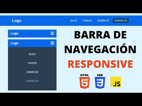](https://www.youtube.com/watch?v=xQstBIPeOdU "Barra de navegación responsive y accesible con HTML, CSS y JS")
6 |
--------------------------------------------------------------------------------
/index.js:
--------------------------------------------------------------------------------
1 | const navToggle = document.querySelector(".nav-toggle");
2 | const navMenu = document.querySelector(".nav-menu");
3 |
4 | navToggle.addEventListener("click", () => {
5 | navMenu.classList.toggle("nav-menu_visible");
6 |
7 | if (navMenu.classList.contains("nav-menu_visible")) {
8 | navToggle.setAttribute("aria-label", "Cerrar menú");
9 | } else {
10 | navToggle.setAttribute("aria-label", "Abrir menú");
11 | }
12 | });
13 |
--------------------------------------------------------------------------------
/index.html:
--------------------------------------------------------------------------------
1 |
2 |
3 |
4 |
5 |
6 |
7 | Navbar
8 |
9 |
10 |
14 |
15 |
16 |
17 |
41 |
42 | Responsive Navbar
43 |
44 |
45 |
46 |
--------------------------------------------------------------------------------
/style.css:
--------------------------------------------------------------------------------
1 | * {
2 | margin: 0;
3 | box-sizing: border-box;
4 | }
5 |
6 | body {
7 | font-family: sans-serif;
8 | padding: 90px 20px 0;
9 | }
10 |
11 | .header {
12 | background-color: #0769e9;
13 | height: 80px;
14 | position: fixed;
15 | width: 100%;
16 | top: 0;
17 | left: 0;
18 | }
19 |
20 | .nav {
21 | display: flex;
22 | justify-content: space-between;
23 |
24 | max-width: 992px;
25 | margin: 0 auto;
26 | }
27 |
28 | .nav-link {
29 | color: white;
30 | text-decoration: none;
31 | }
32 |
33 | .logo {
34 | font-size: 30px;
35 | font-weight: bold;
36 | padding: 0 40px;
37 | line-height: 80px;
38 | }
39 |
40 | .nav-menu {
41 | display: flex;
42 | margin-right: 40px;
43 | list-style: none;
44 | }
45 |
46 | .nav-menu-item {
47 | font-size: 18px;
48 | margin: 0 10px;
49 | line-height: 80px;
50 | text-transform: uppercase;
51 | width: max-content;
52 | }
53 |
54 | .nav-menu-link {
55 | padding: 8px 12px;
56 | border-radius: 3px;
57 | }
58 |
59 | .nav-menu-link:hover,
60 | .nav-menu-link_active {
61 | background-color: #034574;
62 | transition: 0.5s;
63 | }
64 |
65 | /* TOGGLE */
66 | .nav-toggle {
67 | color: white;
68 | background: none;
69 | border: none;
70 | font-size: 30px;
71 | padding: 0 20px;
72 | line-height: 60px;
73 | cursor: pointer;
74 |
75 | display: none;
76 | }
77 |
78 | /* MOBILE */
79 | @media (max-width: 768px) {
80 | body {
81 | padding-top: 70px;
82 | }
83 |
84 | .header {
85 | height: 60px;
86 | }
87 |
88 | .logo {
89 | font-size: 25px;
90 | padding: 0 20px;
91 | line-height: 60px;
92 | }
93 |
94 | .nav-menu {
95 | flex-direction: column;
96 | align-items: center;
97 | margin: 0;
98 | background-color: #2c3e50;
99 | position: fixed;
100 | top: 60px;
101 | width: 100%;
102 | padding: 20px 0;
103 |
104 | height: calc(100% - 60px);
105 | overflow-y: auto;
106 |
107 | left: 100%;
108 | transition: left 0.3s;
109 | }
110 |
111 | .nav-menu-item {
112 | line-height: 70px;
113 | }
114 |
115 | .nav-menu-link:hover,
116 | .nav-menu-link_active {
117 | background: none;
118 | color: #83c5f7;
119 | }
120 |
121 | .nav-toggle {
122 | display: block;
123 | }
124 |
125 | .nav-menu_visible {
126 | left: 0;
127 | }
128 |
129 | .nav-toggle:focus:not(:focus-visible) {
130 | outline: none;
131 | }
132 | }
133 |
--------------------------------------------------------------------------------