├── .editorconfig ├── .eslintrc.js ├── .github └── workflows │ └── main.yml ├── .gitignore ├── .stylelintrc ├── constants.js ├── package-lock.json ├── package.json ├── postcss.config.js ├── prod.config.js ├── readme.md ├── src ├── app.js ├── data │ ├── alignment.js │ ├── declaring.js │ ├── flexibility.js │ ├── groups.js │ ├── ordering-orientation.js │ └── props │ │ ├── alignment │ │ ├── align-content.js │ │ ├── align-items-self.js │ │ ├── align-items.js │ │ ├── align-self.js │ │ └── justify-content.js │ │ ├── display.js │ │ ├── flexibility │ │ ├── flex-basis.js │ │ ├── flex-grow.js │ │ ├── flex-shrink.js │ │ ├── flex-values.js │ │ └── flex.js │ │ └── ordering-orientation │ │ ├── flex-direction.js │ │ ├── flex-flow.js │ │ ├── flex-wrap.js │ │ └── order.js ├── fonts │ └── Roboto_Slab │ │ ├── LICENSE.txt │ │ ├── README.txt │ │ ├── RobotoSlab-VariableFont_wght.ttf │ │ └── static │ │ ├── RobotoSlab-Black.ttf │ │ ├── RobotoSlab-Bold.ttf │ │ ├── RobotoSlab-ExtraBold.ttf │ │ ├── RobotoSlab-ExtraLight.ttf │ │ ├── RobotoSlab-Light.ttf │ │ ├── RobotoSlab-Medium.ttf │ │ ├── RobotoSlab-Regular.ttf │ │ ├── RobotoSlab-SemiBold.ttf │ │ └── RobotoSlab-Thin.ttf ├── index-tmpl.html ├── js │ ├── components │ │ ├── demo.js │ │ ├── group.js │ │ ├── main-container.js │ │ ├── nav.js │ │ ├── prop-section.js │ │ ├── styles-controller.js │ │ └── theme-switcher.js │ └── helpers │ │ ├── createElement.js │ │ ├── debounce.js │ │ ├── getCellsQuantity.js │ │ ├── getPlurals.js │ │ ├── index.js │ │ └── isVisible.js ├── screenshot.png └── scss │ ├── blocks │ ├── demo.scss │ ├── group.scss │ ├── nav.scss │ ├── project-links.scss │ ├── prop.scss │ └── theme-control.scss │ ├── colors-map.scss │ ├── colors.scss │ ├── fonts.scss │ ├── global │ ├── base.scss │ └── layout.scss │ ├── normalize.scss │ ├── styles.scss │ └── themes │ ├── brown.scss │ ├── gray.scss │ ├── seagreen.scss │ ├── sunny.scss │ ├── warm.scss │ └── winter.scss └── webpack.config.js /.editorconfig: -------------------------------------------------------------------------------- 1 | # Файл с настройками для редактора. 2 | # 3 | # Если вы разрабатываете в редакторе от JetBrains, BBEdit, Coda или SourceLair 4 | # этот файл уже поддерживается и не нужно производить никаких дополнительных 5 | # действий. 6 | # 7 | # Если вы ведёте разработку в другом редакторе, зайдите 8 | # на http://editorconfig.org и в разделе «Download a Plugin» 9 | # скачайте дополнение для вашего редактора. 10 | 11 | root = true 12 | 13 | [*] 14 | charset = utf-8 15 | end_of_line = lf 16 | indent_size = 2 17 | indent_style = space 18 | insert_final_newline = true 19 | trim_trailing_whitespace = true 20 | 21 | [*.md] 22 | trim_trailing_whitespace = false 23 | -------------------------------------------------------------------------------- /.eslintrc.js: -------------------------------------------------------------------------------- 1 | module.exports = { 2 | env: { 3 | browser: true, 4 | es6: true, 5 | node: true 6 | }, 7 | extends: ['standard'], 8 | globals: { 9 | Atomics: 'readonly', 10 | SharedArrayBuffer: 'readonly' 11 | }, 12 | parser: "babel-eslint", 13 | parserOptions: { 14 | ecmaVersion: 2018, 15 | sourceType: 'module' 16 | }, 17 | rules: { 18 | semi: ['error', 'always'], 19 | // fix: Cannot read property 'range' of null 20 | //https://github.com/babel/babel-eslint/issues/681#issuecomment-420663038 21 | 'template-curly-spacing' : 'off', 22 | indent : "off" 23 | }, 24 | "ignorePatterns": ["**/*test.js"] 25 | } 26 | -------------------------------------------------------------------------------- /.github/workflows/main.yml: -------------------------------------------------------------------------------- 1 | # This is a basic workflow to help you get started with Actions 2 | 3 | name: CI 4 | 5 | # Controls when the action will run. Triggers the workflow on push or pull request 6 | # events but only for the master branch 7 | on: 8 | push: 9 | branches: [ master ] 10 | pull_request: 11 | branches: [ master ] 12 | 13 | # A workflow run is made up of one or more jobs that can run sequentially or in parallel 14 | jobs: 15 | # This workflow contains a single job called "build" 16 | build: 17 | # The type of runner that the job will run on 18 | runs-on: ubuntu-latest 19 | 20 | # Steps represent a sequence of tasks that will be executed as part of the job 21 | steps: 22 | # Checks-out your repository under $GITHUB_WORKSPACE, so your job can access it 23 | - uses: actions/checkout@v2 24 | 25 | # Runs a single command using the runners shell 26 | - name: Run a one-line script 27 | run: echo Hello, world! 28 | 29 | # Runs a set of commands using the runners shell 30 | - name: Run a multi-line script 31 | run: | 32 | echo Running tests... 33 | npm install 34 | npm test 35 | -------------------------------------------------------------------------------- /.gitignore: -------------------------------------------------------------------------------- 1 | .sass-cache 2 | .DS_Store 3 | npm-debug.log 4 | node_modules 5 | dists 6 | -------------------------------------------------------------------------------- /.stylelintrc: -------------------------------------------------------------------------------- 1 | { 2 | "extends": "stylelint-config-standard", 3 | "rules": { 4 | "indentation": 2, 5 | "string-quotes": "double", 6 | "no-duplicate-selectors": true, 7 | "color-hex-case": "upper", 8 | "color-hex-length": "short", 9 | "selector-max-id": 0, 10 | "selector-combinator-space-after": "always", 11 | "selector-attribute-quotes": "always", 12 | "selector-type-case": "upper", 13 | "declaration-block-trailing-semicolon": "always", 14 | "declaration-no-important": true, 15 | "declaration-colon-space-before": "never", 16 | "declaration-colon-space-after": "always-single-line", 17 | "declaration-colon-newline-after": null, 18 | "property-no-vendor-prefix": true, 19 | "value-no-vendor-prefix": true, 20 | "number-leading-zero": "never", 21 | "function-url-quotes": "always", 22 | "font-family-name-quotes": "always-where-required", 23 | "comment-whitespace-inside": "always", 24 | "comment-empty-line-before": null, 25 | "custom-property-empty-line-before": null, 26 | "at-rule-no-vendor-prefix": true, 27 | "selector-pseudo-element-colon-notation": "double", 28 | "selector-pseudo-class-parentheses-space-inside": "never", 29 | "selector-no-vendor-prefix": true, 30 | "media-feature-range-operator-space-before": "always", 31 | "media-feature-range-operator-space-after": "always", 32 | "media-feature-parentheses-space-inside": "always", 33 | "media-feature-colon-space-before": "never", 34 | "media-feature-colon-space-after": "always" 35 | } 36 | } 37 | -------------------------------------------------------------------------------- /constants.js: -------------------------------------------------------------------------------- 1 | const TITLE = 'Flex Cheatsheet'; 2 | const DESC = 'Demos for W3C CSS Flexbox Specification http://www.w3.org/TR/css-flexbox-1/'; 3 | const URL = 'https://yoksel.github.io/flex-cheatsheet/'; 4 | const IMAGE = '//yoksel.github.io/flex-cheatsheet/screenshot.png'; 5 | const GITHUB = 'https://github.com/yoksel/flex-cheatsheet/'; 6 | const COUNTER = ' '; 7 | const HIGHLIGHT_GRID = 0; 8 | const STORAGE_KEY = '"fbchTheme"'; 9 | const CLARIFICATION = 'All text content belongs to W3C CSS Flexbox Specification,
I only added interactive demos'; 10 | 11 | module.exports = { 12 | TITLE, 13 | DESC, 14 | URL, 15 | IMAGE, 16 | GITHUB, 17 | COUNTER, 18 | HIGHLIGHT_GRID, 19 | STORAGE_KEY, 20 | CLARIFICATION 21 | }; 22 | -------------------------------------------------------------------------------- /package.json: -------------------------------------------------------------------------------- 1 | { 2 | "name": "flex-cheatsheet", 3 | "version": "1.0.0", 4 | "description": "Flex Cheatsheet", 5 | "scripts": { 6 | "test": "npm run lint", 7 | "build": "webpack --config prod.config.js", 8 | "start": "webpack-dev-server --open", 9 | "deploy": "npm run build && gh-pages -d dist", 10 | "lint": "npm run js:lint && npm run css:lint", 11 | "lint:fix": "npm run js:fix && npm run css:fix", 12 | "js:lint": "eslint src", 13 | "js:fix": "eslint src --fix", 14 | "css:lint": "stylelint **/*.scss", 15 | "css:fix": "stylelint **/*.scss --fix", 16 | "jest": "jest" 17 | }, 18 | "author": "yoksel", 19 | "license": "ISC", 20 | "repository": { 21 | "type": "git", 22 | "url": "git@github.com:yoksel/flex-cheatsheet.git" 23 | }, 24 | "bugs": { 25 | "url": "https://github.com/yoksel/flex-cheatsheet/issues" 26 | }, 27 | "homepage": "https://github.com/yoksel/flex-cheatsheet", 28 | "devDependencies": { 29 | "@babel/cli": "^7.10.3", 30 | "@babel/core": "^7.8.4", 31 | "@babel/polyfill": "^7.8.3", 32 | "@babel/preset-env": "^7.8.4", 33 | "babel-eslint": "^10.0.3", 34 | "babel-jest": "^25.1.0", 35 | "css-loader": "^3.4.0", 36 | "dotenv": "^8.2.0", 37 | "eslint": "^6.8.0", 38 | "eslint-config-standard": "^14.1.0", 39 | "eslint-plugin-import": "^2.20.0", 40 | "eslint-plugin-node": "^11.0.0", 41 | "eslint-plugin-promise": "^4.2.1", 42 | "eslint-plugin-standard": "^4.0.1", 43 | "file-loader": "^5.0.2", 44 | "gh-pages": "^2.1.1", 45 | "html-webpack-plugin": "^3.2.0", 46 | "jest": "^25.1.0", 47 | "jest-transform-stub": "^2.0.0", 48 | "mini-css-extract-plugin": "^0.9.0", 49 | "node-sass": "^4.14.1", 50 | "postcss-loader": "^3.0.0", 51 | "sass-loader": "^8.0.2", 52 | "style-loader": "^1.1.2", 53 | "stylelint": "^13.0.0", 54 | "stylelint-config-standard": "^19.0.0", 55 | "url-loader": "^4.1.0", 56 | "webpack": "^4.43.0", 57 | "webpack-cli": "^3.3.11", 58 | "webpack-dev-server": "^3.11.0" 59 | } 60 | } 61 | -------------------------------------------------------------------------------- /postcss.config.js: -------------------------------------------------------------------------------- 1 | module.exports = { 2 | plugins: [ 3 | require('autoprefixer') 4 | ] 5 | }; 6 | -------------------------------------------------------------------------------- /prod.config.js: -------------------------------------------------------------------------------- 1 | const path = require('path'); 2 | const webpack = require('webpack'); 3 | const MiniCssExtractPlugin = require('mini-css-extract-plugin'); 4 | const HtmlWebpackPlugin = require('html-webpack-plugin'); 5 | 6 | const constants = require('./constants.js'); 7 | 8 | module.exports = () => { 9 | return { 10 | mode: 'production', 11 | entry: './src/app.js', 12 | output: { 13 | filename: 'bundle.js', 14 | path: path.resolve(__dirname, 'dist'), 15 | publicPath: '/flex-cheatsheet/' 16 | }, 17 | module: { 18 | rules: [ 19 | { 20 | test: /\.scss$/, 21 | use: [ 22 | MiniCssExtractPlugin.loader, 23 | 'css-loader', 24 | 'postcss-loader', 25 | 'sass-loader' 26 | ] 27 | }, 28 | { 29 | test: /\.(png|svg|jpg|gif|ttf)$/, 30 | loader: 'file-loader', 31 | options: { 32 | name: '[name].[ext]' 33 | } 34 | } 35 | ] 36 | }, 37 | plugins: [ 38 | new MiniCssExtractPlugin({ 39 | // Options similar to the same options in webpackOptions.output 40 | // all options are optional 41 | filename: 'styles.css', 42 | ignoreOrder: false // Enable to remove warnings about conflicting order 43 | }), 44 | // Fill template with global constants 45 | new HtmlWebpackPlugin({ 46 | ...constants, 47 | filename: 'index.html', 48 | template: 'src/index-tmpl.html' 49 | }), 50 | // Pass global constants to components 51 | new webpack.DefinePlugin(constants) 52 | ] 53 | }; 54 | }; 55 | -------------------------------------------------------------------------------- /readme.md: -------------------------------------------------------------------------------- 1 | # Flexbox cheatsheet 2 | 3 | The list of Flexbox properties with: 4 | 5 | * live demos 6 | * code snippets 7 | * definitions from the [W3C Flexbox specification](https://www.w3.org/TR/css-flexbox-1/) 8 | 9 | http://yoksel.github.io/flex-cheatsheet/ 10 | 11 | All text content belongs to W3C Flexbox Specification, I only added interactive demos 12 | 13 | Preview of Flex Cheatsheet 15 | -------------------------------------------------------------------------------- /src/app.js: -------------------------------------------------------------------------------- 1 | import { groups } from './data/groups'; 2 | import { Nav } from './js/components/nav'; 3 | import { ThemeSwitcher } from './js/components/theme-switcher'; 4 | import { MainContainer } from './js/components/main-container'; 5 | 6 | import './screenshot.png'; 7 | import './scss/styles.scss'; 8 | 9 | const main = document.querySelector('.page-main'); 10 | 11 | const themeSwitcher = new ThemeSwitcher(); 12 | themeSwitcher.setTheme(); 13 | const mainContainer = new MainContainer({ container: main, groups }); 14 | const asideElement = document.querySelector('.page-aside'); 15 | const asideContentElement = document.querySelector('.page-aside__content'); 16 | const asideTogglerElement = document.querySelector('.page-aside__toggler'); 17 | const nav = new Nav({ groups, sectionsComponents: mainContainer.getSectionsComponents() }); 18 | 19 | asideContentElement.prepend(nav.element); 20 | nav.moveMarker(); 21 | 22 | asideTogglerElement.addEventListener('click', () => { 23 | asideElement.classList.toggle('page-aside--collapsed'); 24 | }); 25 | 26 | if (window.location.search.includes('debug')) { 27 | checkLinks(); 28 | } 29 | 30 | function checkLinks () { 31 | const elemsWithId = Array.from(document.querySelectorAll('[id]')); 32 | const elemsById = elemsWithId.reduce((prev, item) => { 33 | prev[item.id] = item; 34 | return prev; 35 | }, {}); 36 | const links = document.querySelectorAll('a[href*="#"]'); 37 | let counter = 0; 38 | 39 | links.forEach((link) => { 40 | const href = link.getAttribute('href'); 41 | const isExternal = href.includes('http'); 42 | const hrefTail = link.getAttribute('href').split('#')[1]; 43 | 44 | if (isExternal) { 45 | if (elemsById[hrefTail] && 46 | (href.includes('css3-grid-layout') || href.includes('css-grid-1'))) { 47 | console.log('external, id exist in doc: ', hrefTail); 48 | link.classList.add('marked-link'); 49 | } 50 | } else if (!elemsById[hrefTail]) { 51 | console.log(`id not exist ${hrefTail}`); 52 | link.classList.add('marked-link'); 53 | counter++; 54 | } else if (!href) { 55 | link.classList.add('marked-link'); 56 | counter++; 57 | } 58 | }); 59 | 60 | console.log(`Wrong links total: ${counter}`); 61 | } 62 | -------------------------------------------------------------------------------- /src/data/alignment.js: -------------------------------------------------------------------------------- 1 | import justifyContent from './props/alignment/justify-content'; 2 | import alignContent from './props/alignment/align-content'; 3 | import alignItemsSelf from './props/alignment/align-items-self'; 4 | 5 | export default { 6 | title: 'Alignment', 7 | alias: 'alignment', 8 | 9 | link: 'https://www.w3.org/TR/css-flexbox-1/#alignment', 10 | 11 | desc: `

After a flex container’s contents have finished their flexing 12 | and the dimensions of all flex items are finalized, 13 | they can then be aligned within the flex container.

14 | 15 |

The margin properties can be used to align items in a manner similar to, but more powerful than, what margins can do in block layout. Flex items also respect the alignment properties from CSS Box Alignment, 16 | which allow easy keyword-based alignment of items in both the main axis and cross axis. 17 | These properties make many common types of alignment trivial, 18 | including some things that were very difficult in CSS 2.1, 19 | like horizontal and vertical centering.

20 | 21 |

Note: While the alignment properties are defined in CSS Box Alignment [CSS-ALIGN-3], 22 | Flexible Box Layout reproduces the definitions of the relevant ones here 23 | so as to not create a normative dependency that may slow down advancement of the spec. 24 | These properties apply only to flex layout 25 | until CSS Box Alignment Level 3 is finished 26 | and defines their effect for other layout modes. 27 | Additionally, any new values defined in the Box Alignment module 28 | will apply to Flexible Box Layout; 29 | in otherwords, the Box Alignment module, once completed, 30 | will supercede the definitions here.

`, 31 | 32 | items: [ 33 | justifyContent, 34 | alignItemsSelf, 35 | alignContent 36 | ] 37 | }; 38 | -------------------------------------------------------------------------------- /src/data/declaring.js: -------------------------------------------------------------------------------- 1 | import display from './props/display'; 2 | 3 | export default { 4 | title: 'Flex containers', 5 | 6 | hideTitle: true, 7 | 8 | items: [ 9 | display 10 | ] 11 | }; 12 | -------------------------------------------------------------------------------- /src/data/flexibility.js: -------------------------------------------------------------------------------- 1 | import flexGrow from './props/flexibility/flex-grow'; 2 | import flexShrink from './props/flexibility/flex-shrink'; 3 | import flexBasis from './props/flexibility/flex-basis'; 4 | import flex from './props/flexibility/flex'; 5 | 6 | export default { 7 | title: 'Flexibility', 8 | alias: 'flexibility', 9 | 10 | link: 'https://www.w3.org/TR/css-flexbox-1/#flexibility', 11 | 12 | desc: `

The defining aspect of flex layout is the ability to make the flex items “flex”, 13 | altering their width/height to fill the available space in the main dimension. 14 | This is done with the flex property. 15 | A flex container distributes free space to its items (proportional to their flex grow factor) to fill the container, 16 | or shrinks them (proportional to their flex shrink factor) to prevent overflow.

17 | 18 |

A flex item is fully inflexible if both its flex-grow and flex-shrink values are zero, 19 | and flexible otherwise.

`, 20 | 21 | items: [ 22 | flexGrow, 23 | flexShrink, 24 | flexBasis, 25 | flex 26 | ] 27 | }; 28 | -------------------------------------------------------------------------------- /src/data/groups.js: -------------------------------------------------------------------------------- 1 | import declaring from './declaring'; 2 | import orderingOrientation from './ordering-orientation'; 3 | import alignment from './alignment'; 4 | import flexibility from './flexibility'; 5 | 6 | export const groups = { 7 | declaring, 8 | orderingOrientation, 9 | alignment, 10 | flexibility 11 | }; 12 | -------------------------------------------------------------------------------- /src/data/ordering-orientation.js: -------------------------------------------------------------------------------- 1 | import flexDirection from './props/ordering-orientation/flex-direction'; 2 | import flexWrap from './props/ordering-orientation/flex-wrap'; 3 | import flexFlow from './props/ordering-orientation/flex-flow'; 4 | import order from './props/ordering-orientation/order'; 5 | 6 | export default { 7 | title: 'Ordering & Orientation', 8 | alias: 'ordering-orientation', 9 | 10 | link: 'https://www.w3.org/TR/css-flexbox-1/#flow-order', 11 | 12 | desc: `

The contents of a flex container can be laid out in any direction and in any order. 13 | This allows an author to trivially achieve effects that would previously have required complex or fragile methods, 14 | such as hacks using the float and clear properties. 15 | This functionality is exposed through the flex-direction, flex-wrap, and order properties.

16 | 17 |

Note: The reordering capabilities of flex layout intentionally affect only the visual rendering, 18 | leaving speech order and navigation based on the source order. 19 | This allows authors to manipulate the visual presentation 20 | while leaving the source order intact for non-CSS UAs and for 21 | linear models such as speech and sequential navigation. 22 | See Reordering and Accessibility and the Flex Layout Overview for examples 23 | that use this dichotomy to improve accessibility.

24 | 25 |

Authors must not use order or the *-reverse values of flex-flow/flex-direction as a substitute for correct source ordering, 26 | as that can ruin the accessibility of the document.

`, 27 | 28 | items: [ 29 | flexDirection, 30 | flexWrap, 31 | flexFlow, 32 | order 33 | ] 34 | }; 35 | -------------------------------------------------------------------------------- /src/data/props/alignment/align-content.js: -------------------------------------------------------------------------------- 1 | export default { 2 | name: 'align-content', 3 | 4 | link: 'http://www.w3.org/TR/css-flexbox-1/#align-content-property', 5 | 6 | appliesTo: 'multi-line flex containers', 7 | 8 | initValue: 'stretch', 9 | 10 | desc: `

The align-content property aligns a flex container’s lines within the flex container 11 | when there is extra space in the cross-axis, 12 | similar to how justify-content aligns individual items within the main-axis. 13 | Note, this property has no effect on a single-line flex container. 14 | Values have the following meanings:

15 | 16 |

Note: Only multi-line flex containers ever have free space in the cross-axis for lines to be aligned in, 17 | because in a single-line flex container 18 | the sole line automatically stretches to fill the space.

`, 19 | 20 | values: [ 21 | { 22 | name: 'flex-start', 23 | alias: 'valdef-align-content-flex-start', 24 | desc: `Lines are packed toward the start of the flex container. 25 | The cross-start edge of the first line in the flex container 26 | is placed flush with the cross-start edge of the flex container, 27 | and each subsequent line is placed flush with the preceding line.`, 28 | current: true 29 | }, 30 | 31 | { 32 | name: 'flex-end', 33 | alias: 'valdef-align-content-flex-end', 34 | desc: `Lines are packed toward the end of the flex container. 35 | The cross-end edge of the last line 36 | is placed flush with the cross-end edge of the flex container, 37 | and each preceding line is placed flush with the subsequent line.` 38 | }, 39 | 40 | { 41 | name: 'center', 42 | alias: 'valdef-align-content-center', 43 | desc: `Lines are packed toward the center of the flex container. 44 | The lines in the flex container are placed flush with each other 45 | and aligned in the center of the flex container, 46 | with equal amounts of space 47 | between the cross-start content edge of the flex container 48 | and the first line in the flex container, 49 | and between the cross-end content edge of the flex container 50 | and the last line in the flex container. 51 | (If the leftover free-space is negative, 52 | the lines will overflow equally in both directions.)` 53 | }, 54 | 55 | { 56 | name: 'space-between', 57 | alias: 'valdef-align-content-space-between', 58 | desc: `Lines are evenly distributed in the flex container. 59 | If the leftover free-space is negative 60 | or there is only a single flex line in the flex container, 61 | this value is identical to flex-start. 62 | Otherwise, 63 | the cross-start edge of the first line in the flex container 64 | is placed flush with the cross-start content edge of the flex container, 65 | the cross-end edge of the last line in the flex container 66 | is placed flush with the cross-end content edge of the flex container, 67 | and the remaining lines in the flex container are distributed 68 | so that the spacing between any two adjacent lines is the same.` 69 | }, 70 | 71 | { 72 | name: 'space-around', 73 | alias: 'valdef-align-content-space-around', 74 | desc: `Lines are evenly distributed in the flex container, 75 | with half-size spaces on either end. 76 | If the leftover free-space is negative 77 | this value is identical to center. 78 | Otherwise, the lines in the flex container are distributed 79 | such that the spacing between any two adjacent lines is the same, 80 | and the spacing between the first/last lines and the flex container edges 81 | is half the size of the spacing between flex lines.` 82 | }, 83 | 84 | { 85 | name: 'stretch', 86 | alias: 'valdef-align-content-stretch', 87 | desc: `Lines stretch to take up the remaining space. 88 | If the leftover free-space is negative, 89 | this value is identical to flex-start. 90 | Otherwise, 91 | the free-space is split equally between all of the lines, 92 | increasing their cross size.` 93 | } 94 | ], 95 | 96 | cssRules: [ 97 | { 98 | selector: '.parent', 99 | props: { 100 | display: 'flex', 101 | 'flex-wrap': 'wrap', 102 | 'align-content': 'stretch', 103 | height: '250px' 104 | } 105 | }, 106 | { 107 | selector: '.child', 108 | props: { 109 | width: '40%' 110 | } 111 | } 112 | ] 113 | }; 114 | -------------------------------------------------------------------------------- /src/data/props/alignment/align-items-self.js: -------------------------------------------------------------------------------- 1 | import alignItems from './align-items'; 2 | import alignSelf from './align-self'; 3 | 4 | export default { 5 | name: 'align-items, align-self', 6 | alias: 'align-items-self', 7 | 8 | link: 'https://www.w3.org/TR/css-flexbox-1/#align-items-property', 9 | 10 | desc: `

Flex items can be aligned in the cross axis of the current line of the flex container, 11 | similar to justify-content but in the perpendicular direction. align-items sets the default alignment for all of the flex container’s items, 12 | including anonymous flex items. align-self allows this default alignment to be overridden for individual flex items. 13 | (For anonymous flex items, align-self always matches the value of align-items on their associated flex container.)

14 | 15 |

If either of the flex item’s cross-axis margins are auto, align-self has no effect.

`, 16 | 17 | values: [ 18 | { 19 | name: 'auto', 20 | alias: 'valdef-align-items-auto', 21 | desc: `Defers cross-axis alignment control 22 | to the value of align-items on the parent box. 23 | (This is the initial value of align-self.)`, 24 | current: true 25 | }, 26 | 27 | { 28 | name: 'flex-start', 29 | alias: 'valdef-align-items-flex-start', 30 | desc: 'The cross-start margin edge of the flex item is placed flush with the cross-start edge of the line.' 31 | }, 32 | 33 | { 34 | name: 'flex-end', 35 | alias: 'valdef-align-items-flex-end', 36 | desc: 'The cross-end margin edge of the flex item is placed flush with the cross-end edge of the line.' 37 | }, 38 | 39 | { 40 | name: 'center', 41 | alias: 'valdef-align-items-center', 42 | desc: `The flex item’s margin box is centered in the cross axis within the line. 43 | (If the cross size of the flex line is less than that of the flex item, 44 | it will overflow equally in both directions.)` 45 | }, 46 | 47 | { 48 | name: 'baseline', 49 | alias: 'valdef-align-items-baseline', 50 | desc: `The flex item participates in baseline alignment: 51 | all participating flex items on the line 52 | are aligned such that their baselines align, 53 | and the item with the largest distance between its baseline and its cross-start margin edge 54 | is placed flush against the cross-start edge of the line. 55 | If the item does not have a baseline in the necessary axis, 56 | then one is synthesized from the flex item’s border box.` 57 | }, 58 | 59 | { 60 | name: 'stretch', 61 | alias: 'valdef-align-items-stretch', 62 | desc: `If the cross size property of the flex item computes to auto, 63 | and neither of the cross-axis margins are auto, 64 | the flex item is stretched. 65 | Its used value is the length necessary to make the cross size of the item’s margin box as close to the same size as the line as possible, 66 | while still respecting the constraints imposed by min-height/min-width/max-height/max-width. 67 |

Note: If the flex container’s height is constrained 68 | this value may cause the contents of the flex item to overflow the item.

69 |

The cross-start margin edge of the flex item is placed flush with the cross-start edge of the line.

` 70 | } 71 | ], 72 | 73 | demos: [ 74 | alignItems, 75 | alignSelf 76 | ] 77 | }; 78 | -------------------------------------------------------------------------------- /src/data/props/alignment/align-items.js: -------------------------------------------------------------------------------- 1 | export default { 2 | name: 'align-items', 3 | 4 | link: 'http://www.w3.org/TR/css-flexbox-1/#propdef-align-items', 5 | 6 | appliesTo: 'flex containers', 7 | 8 | initValue: 'stretch', 9 | 10 | customValues: [ 11 | { 12 | name: 'stretch', 13 | current: true 14 | }, 15 | { 16 | name: 'flex-start' 17 | }, 18 | { 19 | name: 'flex-end' 20 | }, 21 | { 22 | name: 'center' 23 | }, 24 | { 25 | name: 'baseline' 26 | }, 27 | { 28 | name: 'auto' 29 | } 30 | ], 31 | 32 | htmlMarkup: `
33 |
Ut enim minim
34 |
Ad veni
35 |
Quis nostrud exercitation neminaes
36 |
Duis aute irure dolor
37 |
`, 38 | 39 | cssRules: [ 40 | { 41 | selector: '.parent', 42 | props: { 43 | display: 'flex', 44 | 'align-items': 'stretch', 45 | height: '250px' 46 | } 47 | } 48 | ] 49 | }; 50 | -------------------------------------------------------------------------------- /src/data/props/alignment/align-self.js: -------------------------------------------------------------------------------- 1 | export default { 2 | name: 'align-self', 3 | 4 | link: 'http://www.w3.org/TR/css-flexbox-1/#propdef-align-self', 5 | 6 | initValue: 'auto', 7 | 8 | appliesTo: 'flex items', 9 | 10 | isFeaturedHighlighted: true, 11 | 12 | customValues: [ 13 | { 14 | name: 'auto', 15 | current: true 16 | }, 17 | { 18 | name: 'stretch' 19 | }, 20 | { 21 | name: 'flex-start' 22 | }, 23 | { 24 | name: 'flex-end' 25 | }, 26 | { 27 | name: 'center' 28 | }, 29 | { 30 | name: 'baseline' 31 | } 32 | ], 33 | 34 | htmlMarkup: `
35 | 36 | 37 |
Ad veni
38 |
Duis aute irure dolor
39 |
`, 40 | 41 | cssRules: [ 42 | { 43 | selector: '.parent', 44 | props: { 45 | display: 'flex', 46 | height: '250px' 47 | } 48 | }, 49 | { 50 | selector: '.child--featured', 51 | props: { 52 | 'align-self': 'flex-start' 53 | } 54 | } 55 | ] 56 | }; 57 | -------------------------------------------------------------------------------- /src/data/props/alignment/justify-content.js: -------------------------------------------------------------------------------- 1 | export default { 2 | name: 'justify-content', 3 | 4 | link: 'http://www.w3.org/TR/css-flexbox-1/#justify-content-property', 5 | 6 | appliesTo: 'flex containers', 7 | 8 | initValue: 'flex-start', 9 | 10 | desc: `

The justify-content property aligns flex items along the main axis of the current line of the flex container. 11 | This is done after any flexible lengths and any auto margins have been resolved. 12 | Typically it helps distribute extra free space leftover when either 13 | all the flex items on a line are inflexible, 14 | or are flexible but have reached their maximum size. 15 | It also exerts some control over the alignment of items when they overflow the line.

`, 16 | 17 | values: [ 18 | { 19 | name: 'flex-start', 20 | alias: 'valdef-justify-content-flex-start', 21 | desc: `Flex items are packed toward the start of the line. 22 | The main-start margin edge of the first flex item on the line 23 | is placed flush with the main-start edge of the line, 24 | and each subsequent flex item is placed flush with the preceding item.`, 25 | current: true 26 | }, 27 | 28 | { 29 | name: 'flex-end', 30 | alias: 'valdef-justify-content-flex-end', 31 | desc: `Flex items are packed toward the end of the line. 32 | The main-end margin edge of the last flex item is placed flush with the main-end edge of the line, 33 | and each preceding flex item is placed flush with the subsequent item.` 34 | }, 35 | 36 | { 37 | name: 'center', 38 | alias: 'valdef-justify-content-center', 39 | desc: `Flex items are packed toward the center of the line. 40 | The flex items on the line are placed flush with each other 41 | and aligned in the center of the line, 42 | with equal amounts of space between the main-start edge of the line and the first item on the line 43 | and between the main-end edge of the line and the last item on the line. 44 | (If the leftover free-space is negative, 45 | the flex items will overflow equally in both directions.)` 46 | }, 47 | 48 | { 49 | name: 'space-between', 50 | alias: 'valdef-justify-content-space-between', 51 | desc: `Flex items are evenly distributed in the line. 52 | If the leftover free-space is negative 53 | or there is only a single flex item on the line, 54 | this value is identical to flex-start. 55 | Otherwise, 56 | the main-start margin edge of the first flex item on the line 57 | is placed flush with the main-start edge of the line, 58 | the main-end margin edge of the last flex item on the line 59 | is placed flush with the main-end edge of the line, 60 | and the remaining flex items on the line are distributed 61 | so that the spacing between any two adjacent items is the same.` 62 | }, 63 | 64 | { 65 | name: 'space-around', 66 | alias: 'valdef-justify-content-space-around', 67 | desc: `Flex items are evenly distributed in the line, 68 | with half-size spaces on either end. 69 | If the leftover free-space is negative or 70 | there is only a single flex item on the line, 71 | this value is identical to center. 72 | Otherwise, the flex items on the line are distributed 73 | such that the spacing between any two adjacent flex items on the line is the same, 74 | and the spacing between the first/last flex items and the flex container edges 75 | is half the size of the spacing between flex items.` 76 | }, 77 | { 78 | name: 'space-evenly', 79 | alias: 'valdef-justify-content-space-evenly', 80 | desc: `

The alignment subjects are evenly distributed in the alignment container, 81 | with a full-size space on either end. 82 | The alignment subjects are distributed so that the spacing between any two adjacent alignment subjects, 83 | before the first alignment subject, 84 | and after the last alignment subject is the same. 85 | 86 |

The default fallback alignment for this value is center.

` 87 | } 88 | ], 89 | 90 | cssRules: [ 91 | { 92 | selector: '.parent', 93 | props: { 94 | display: 'flex', 95 | 'justify-content': 'flex-start', 96 | height: '250px' 97 | } 98 | } 99 | ] 100 | }; 101 | -------------------------------------------------------------------------------- /src/data/props/display.js: -------------------------------------------------------------------------------- 1 | export default { 2 | name: 'display', 3 | 4 | link: 'http://www.w3.org/TR/css-flexbox-1/#flex-containers', 5 | 6 | appliesTo: 'all elements', 7 | 8 | desc: `

A flex container establishes a new flex formatting context for its contents. 9 | This is the same as establishing a block formatting context, 10 | except that flex layout is used instead of block layout. 11 | For example, floats do not intrude into the flex container, 12 | and the flex container’s margins do not collapse with the margins of its contents. Flex containers form a containing block for their contents exactly like block containers do. [CSS21] The overflow property applies to flex containers.

13 | 14 |

Flex containers are not block containers, 15 | and so some properties that were designed with the assumption of block layout don’t apply in the context of flex layout. 16 | In particular:

17 | 18 | 32 | 33 |

If an element’s specified display is inline-flex, 34 | then its display property computes to flex in certain circumstances: 35 | the table in CSS 2.1 Section 9.7 is amended to contain an additional row, 36 | with inline-flex in the "Specified Value" column 37 | and flex in the "Computed Value" column.

`, 38 | 39 | values: [ 40 | { 41 | name: 'flex', 42 | alias: 'valdef-display-flex', 43 | desc: `This value causes an element to generate a flex container box 44 | that is block-level when placed in flow layout.`, 45 | current: true 46 | }, 47 | { 48 | name: 'inline-flex', 49 | alias: 'valdef-display-inline-flex', 50 | desc: `This value causes an element to generate a flex container box 51 | that is inline-level when placed in flow layout.` 52 | } 53 | ], 54 | 55 | cssRules: [ 56 | { 57 | selector: '.parent', 58 | props: { 59 | display: 'flex' 60 | } 61 | } 62 | ], 63 | 64 | demoBefore: 'Some text' 65 | }; 66 | -------------------------------------------------------------------------------- /src/data/props/flexibility/flex-basis.js: -------------------------------------------------------------------------------- 1 | export default { 2 | name: 'flex-basis', 3 | 4 | link: 'http://www.w3.org/TR/css-flexbox-1/#flex-basis-property', 5 | 6 | initValue: 'auto', 7 | 8 | appliesTo: 'flex items', 9 | 10 | isFeaturedHighlighted: true, 11 | 12 | desc: `

The flex-basis property sets the flex basis. 13 | It accepts the same values as the width and height property, plus content.

14 | 15 |

For all values other than auto and content (defined above), flex-basis is resolved the same way as width in horizontal writing modes [CSS21], 16 | except that if a value would resolve to auto for width, 17 | it instead resolves to content for flex-basis. 18 | For example, percentage values of flex-basis are resolved against 19 | the flex item’s containing block (i.e. its flex container); 20 | and if that containing block’s size is indefinite, 21 | the used value for flex-basis is content. 22 | As another corollary, flex-basis determines the size of the content box, 23 | unless otherwise specified 24 | such as by box-sizing [CSS3UI].

`, 25 | 26 | values: [ 27 | { 28 | name: 'content | <width>', 29 | alias: 'flex-basis-value', 30 | desc: '' 31 | } 32 | ], 33 | 34 | customValues: [ 35 | { 36 | name: '30%', 37 | current: true 38 | }, 39 | { 40 | name: '50%' 41 | }, 42 | { 43 | name: 'content' 44 | }, 45 | { 46 | name: 'auto' 47 | } 48 | ], 49 | 50 | htmlMarkup: `
51 |
52 |
53 | 54 |
55 |
`, 56 | 57 | cssRules: [ 58 | { 59 | selector: '.parent', 60 | props: { 61 | display: 'flex', 62 | 'flex-wrap': 'wrap', 63 | height: '250px' 64 | } 65 | }, 66 | { 67 | selector: '.child--featured', 68 | props: { 69 | 'flex-basis': '30%' 70 | } 71 | } 72 | ] 73 | }; 74 | -------------------------------------------------------------------------------- /src/data/props/flexibility/flex-grow.js: -------------------------------------------------------------------------------- 1 | export default { 2 | name: 'flex-grow', 3 | 4 | link: 'http://www.w3.org/TR/css-flexbox-1/#flex-grow-property', 5 | 6 | initValue: '0', 7 | 8 | appliesTo: 'flex items', 9 | 10 | isFeaturedHighlighted: true, 11 | 12 | desc: `

The flex-grow property sets the flex grow factor to the provided <number>. 13 | Negative numbers are invalid.

`, 14 | 15 | values: [ 16 | { 17 | name: '<number>', 18 | alias: 'flex-grow-value', 19 | desc: '' 20 | } 21 | ], 22 | 23 | customValues: [ 24 | { 25 | name: '0' 26 | }, 27 | { 28 | name: '1', 29 | current: true 30 | } 31 | ], 32 | 33 | cssRules: [ 34 | { 35 | selector: '.parent', 36 | props: { 37 | display: 'flex', 38 | height: '250px' 39 | } 40 | }, 41 | { 42 | selector: '.child--featured', 43 | props: { 44 | 'flex-grow': '1' 45 | } 46 | } 47 | ] 48 | }; 49 | -------------------------------------------------------------------------------- /src/data/props/flexibility/flex-shrink.js: -------------------------------------------------------------------------------- 1 | export default { 2 | name: 'flex-shrink', 3 | 4 | link: 'http://www.w3.org/TR/css-flexbox-1/#flex-shrink-property', 5 | 6 | initValue: '1', 7 | 8 | appliesTo: 'flex items', 9 | 10 | isFeaturedHighlighted: true, 11 | 12 | desc: `

The flex-shrink property sets the flex shrink factor to the provided <number>. 13 | Negative numbers are invalid.

`, 14 | 15 | values: [ 16 | { 17 | name: '<number>', 18 | alias: 'flex-shrink-value', 19 | desc: '' 20 | } 21 | ], 22 | 23 | customValues: [ 24 | { 25 | name: '1', 26 | current: true 27 | }, 28 | { 29 | name: '0' 30 | } 31 | ], 32 | 33 | cssRules: [ 34 | { 35 | selector: '.parent', 36 | props: { 37 | display: 'flex', 38 | height: '250px' 39 | } 40 | }, 41 | { 42 | selector: '.child', 43 | props: { 44 | width: '45%' 45 | } 46 | }, 47 | { 48 | selector: '.child--featured', 49 | props: { 50 | 'flex-shrink': '1' 51 | } 52 | } 53 | ] 54 | }; 55 | -------------------------------------------------------------------------------- /src/data/props/flexibility/flex-values.js: -------------------------------------------------------------------------------- 1 | export default { 2 | name: 'Flex values', 3 | alias: 'flex-values', 4 | 5 | isFeaturedHighlighted: true, 6 | 7 | propDemoName: 'flex', 8 | 9 | values: [ 10 | { 11 | name: '<flex-grow>', 12 | alias: 'valdef-flex-flex-grow', 13 | desc: `

This <number> component sets flex-grow longhand and specifies the flex grow factor, 14 | which determines how much the flex item will grow 15 | relative to the rest of the flex items in the flex container 16 | when positive free space is distributed. 17 | When omitted, it is set to 1.

18 | 19 |
20 | Flex values between 0 and 1 have a somewhat special behavior: 21 | when the sum of the flex values on the line is less than 1, 22 | they will take up less than 100% of the free space. 23 |

An item’s flex-grow value 24 | is effectively a request for some proportion of the free space, 25 | with 1 meaning “100% of the free space”; 26 | then if the items on the line are requesting more than 100% in total, 27 | the requests are rebalanced to keep the same ratio but use up exactly 100% of it. 28 | However, if the items request less than the full amount 29 | (such as three items that are each flex-grow: .25) 30 | then they’ll each get exactly what they request 31 | (25% of the free space to each, 32 | with the final 25% left unfilled). 33 | See §9.7 Resolving Flexible Lengths for the exact details 34 | of how free space is distributed.

35 | 36 |

This pattern is required for continuous behavior as flex-grow approaches zero 37 | (which means the item wants none of the free space). 38 | Without this, a flex-grow: 1 item would take all of the free space; 39 | but so would a flex-grow: 0.1 item, 40 | and a flex-grow: 0.01 item, 41 | etc., 42 | until finally the value is small enough to underflow to zero 43 | and the item suddenly takes up none of the free space. 44 | With this behavior, 45 | the item instead gradually takes less of the free space 46 | as flex-grow shrinks below 1, 47 | smoothly transitioning to taking none of the free space at zero.

48 | 49 |

Unless this “partial fill” behavior is specifically what’s desired, 50 | authors should stick to values ≥ 1; 51 | for example, using 1 and 2 is usually better 52 | than using .33 and .67, 53 | as they’re more likely to behave as intended 54 | if items are added, removed, or line-wrapped.

55 |
` 56 | }, 57 | 58 | { 59 | name: '<flex-shrink>', 60 | alias: 'valdef-flex-flex-shrink', 61 | desc: `

This <number> component sets flex-shrink longhand and specifies the flex shrink factor, 62 | which determines how much the flex item will shrink 63 | relative to the rest of the flex items in the flex container 64 | when negative free space is distributed. 65 | When omitted, it is set to 1.

66 | 67 |

Note: The flex shrink factor is multiplied by the flex base size when distributing negative space. 68 | This distributes negative space in proportion to how much the item is able to shrink, 69 | so that e.g. a small item won’t shrink to zero before a larger item has been noticeably reduced.

` 70 | }, 71 | 72 | { 73 | name: '<flex-basis>', 74 | alias: 'valdef-flex-flex-basis', 75 | desc: `

This component sets the flex-basis longhand, 76 | which specifies the flex basis: 77 | the initial main size of the flex item, 78 | before free space is distributed according to the flex factors.

79 | 80 |

<flex-basis> accepts the same values as the width and height properties 81 | (except that auto is treated differently) 82 | plus the content keyword:

83 |
84 | 85 |
86 | auto 87 | 88 |
89 |
90 | When specified on a flex item, the auto keyword 91 | retrieves the value of the main size property as the used flex-basis. 92 | If that value is itself auto, then the used value is content. 93 | 94 |
95 |
96 | content 97 | 98 |
99 |
100 | Indicates an automatic size based on the flex item’s content. 101 | (It is typically equivalent to the max-content size, 102 | but with adjustments to handle aspect ratios, 103 | intrinsic sizing constraints, 104 | and orthogonal flows; 105 | see details in §9 Flex Layout Algorithm.) 106 |

Note: This value was not present in the initial release of Flexible Box Layout, 107 | and thus some older implementations will not support it. 108 | The equivalent effect can be achieved by using auto together with a main size (width or height) of auto.

109 | 110 |
111 |
112 | <width> 113 | 114 |
115 |
116 | For all other values, flex-basis is resolved the same way as for width and height. 117 | 118 |
119 |
120 |

When omitted from the flex shorthand, its specified value is 0.

` 121 | }, 122 | 123 | { 124 | name: 'none', 125 | alias: 'valdef-flex-none', 126 | desc: 'The keyword none expands to 0 0 auto.' 127 | } 128 | ], 129 | 130 | customValues: [ 131 | { 132 | name: '0 1 auto', 133 | current: true 134 | }, 135 | { 136 | name: '0 1 30%' 137 | }, 138 | { 139 | name: '1 0 30%' 140 | }, 141 | { 142 | name: 'none' 143 | } 144 | ], 145 | 146 | cssRules: [ 147 | { 148 | selector: '.parent', 149 | props: { 150 | display: 'flex', 151 | height: '250px' 152 | } 153 | }, 154 | { 155 | selector: '.child--featured', 156 | props: { 157 | flex: '0 1 auto' 158 | } 159 | } 160 | ] 161 | }; 162 | -------------------------------------------------------------------------------- /src/data/props/flexibility/flex.js: -------------------------------------------------------------------------------- 1 | import flexValues from './flex-values'; 2 | 3 | export default { 4 | name: 'flex', 5 | 6 | link: 'https://www.w3.org/TR/css-flexbox-1/#flex-property', 7 | 8 | initValue: '0 1 auto', 9 | 10 | appliesTo: 'flex items', 11 | 12 | isFeaturedHighlighted: true, 13 | 14 | desc: `

The flex property specifies the components of a flexible length: 15 | the flex factors (grow and shrink) 16 | and the flex basis. 17 | When a box is a flex item, flex is consulted instead of the main size property to determine the main size of the box. 18 | If a box is not a flex item, flex has no effect.

19 | 20 |

The initial values of the flex components are equivalent to flex: 0 1 auto.

21 | 22 |

Note: The initial values of flex-grow and flex-basis are different from their defaults when omitted in the flex shorthand. 23 | This is so that the flex shorthand can better accommodate the most common cases.

24 | 25 |

A unitless zero that is not already preceded by two flex factors 26 | must be interpreted as a flex factor. 27 | To avoid misinterpretation or invalid declarations, 28 | authors must specify a zero <flex-basis> component 29 | with a unit or precede it by two flex factors.

`, 30 | 31 | values: [ 32 | { 33 | name: 'none | [ <flex-grow> <flex-shrink> ? || <flex-basis> ]', 34 | alias: 'flex-value', 35 | desc: '' 36 | } 37 | ], 38 | 39 | children: [ 40 | flexValues 41 | ] 42 | }; 43 | -------------------------------------------------------------------------------- /src/data/props/ordering-orientation/flex-direction.js: -------------------------------------------------------------------------------- 1 | export default { 2 | name: 'flex-direction', 3 | 4 | link: 'http://www.w3.org/TR/css-flexbox-1/#flex-direction-property', 5 | 6 | appliesTo: 'flex containers', 7 | 8 | initValue: 'row', 9 | 10 | desc: `

The flex-direction property specifies how flex items are placed in the flex container, 11 | by setting the direction of the flex container’s main axis. 12 | This determines the direction in which flex items are laid out.

13 | 14 |

Note: The reverse values do not reverse box ordering: 15 | like writing-mode and direction [CSS3-WRITING-MODES], 16 | they only change the direction of flow. 17 | Painting order, speech order, and sequential navigation orders 18 | are not affected.

`, 19 | 20 | values: [ 21 | { 22 | name: 'row', 23 | alias: 'valdef-flex-direction-row', 24 | desc: `The flex container’s main axis has the same orientation as the inline axis of the current writing mode. 25 | The main-start and main-end directions are equivalent to the inline-start and inline-end directions, respectively, 26 | of the current writing mode.`, 27 | current: true 28 | }, 29 | 30 | { 31 | name: 'row-reverse', 32 | alias: 'valdef-flex-direction-row-reverse', 33 | desc: `Same as row, 34 | except the main-start and main-end directions are swapped.` 35 | }, 36 | 37 | { 38 | name: 'column', 39 | alias: 'valdef-flex-direction-column', 40 | desc: `The flex container’s main axis has the same orientation as the block axis of the current writing mode. 41 | The main-start and main-end directions are equivalent to the block-start and block-end directions, respectively, 42 | of the current writing mode.` 43 | }, 44 | 45 | { 46 | name: 'column-reverse', 47 | alias: 'valdef-flex-direction-column-reverse', 48 | desc: `Same as column, 49 | except the main-start and main-end directions are swapped.` 50 | } 51 | ], 52 | 53 | cssRules: [ 54 | { 55 | selector: '.parent', 56 | props: { 57 | display: 'flex', 58 | 'flex-direction': 'row', 59 | height: '250px' 60 | } 61 | } 62 | ] 63 | }; 64 | -------------------------------------------------------------------------------- /src/data/props/ordering-orientation/flex-flow.js: -------------------------------------------------------------------------------- 1 | export default { 2 | name: 'flex-flow', 3 | 4 | link: 'http://www.w3.org/TR/css-flexbox-1/#flex-flow-property', 5 | 6 | appliesTo: 'flex containers', 7 | 8 | initValue: 'row nowrap', 9 | 10 | desc: `

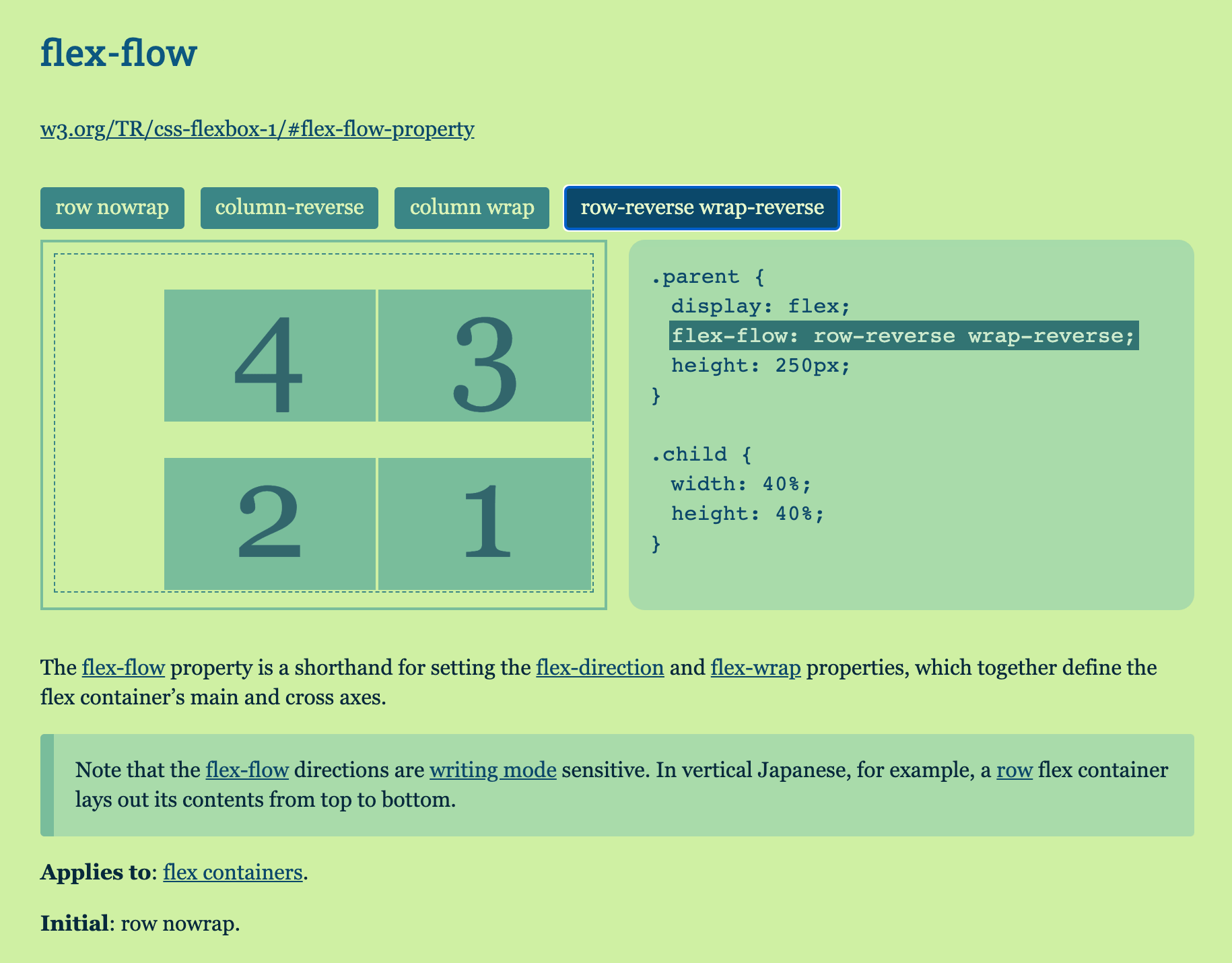
The flex-flow property is a shorthand for setting the flex-direction and flex-wrap properties, 11 | which together define the flex container’s main and cross axes.

12 | 13 |
14 | Note that the flex-flow directions are writing mode sensitive. 15 | In vertical Japanese, for example, 16 | a row flex container lays out its contents from top to bottom. 17 |
`, 18 | 19 | values: [ 20 | { 21 | name: '<flex-direction> || <flex-wrap>', 22 | alias: 'flex-flow-values', 23 | desc: '' 24 | } 25 | ], 26 | 27 | customValues: [ 28 | { 29 | name: 'row nowrap', 30 | current: true 31 | }, 32 | { 33 | name: 'column-reverse' 34 | }, 35 | { 36 | name: 'column wrap' 37 | }, 38 | { 39 | name: 'row-reverse wrap-reverse' 40 | } 41 | ], 42 | 43 | cssRules: [ 44 | { 45 | selector: '.parent', 46 | props: { 47 | display: 'flex', 48 | 'flex-flow': 'row nowrap', 49 | height: '250px' 50 | } 51 | }, 52 | { 53 | selector: '.child', 54 | props: { 55 | width: '40%', 56 | height: '40%' 57 | } 58 | } 59 | ] 60 | }; 61 | -------------------------------------------------------------------------------- /src/data/props/ordering-orientation/flex-wrap.js: -------------------------------------------------------------------------------- 1 | export default { 2 | name: 'flex-wrap', 3 | 4 | link: 'http://www.w3.org/TR/css-flexbox-1/#flex-wrap-property', 5 | 6 | appliesTo: 'flex containers', 7 | 8 | initValue: 'nowrap', 9 | 10 | desc: `

The flex-wrap property controls whether the flex container is single-line or multi-line, 11 | and the direction of the cross-axis, 12 | which determines the direction new lines are stacked in.

13 | 14 |

For the values that are not wrap-reverse, 15 | the cross-start direction is equivalent to either 16 | the inline-start or block-start direction of the current writing mode (whichever is in the cross axis) 17 | and the cross-end direction is the opposite direction of cross-start. 18 | When flex-wrap is wrap-reverse, 19 | the cross-start and cross-end directions 20 | are swapped.

`, 21 | 22 | values: [ 23 | { 24 | name: 'nowrap', 25 | alias: 'valdef-flex-wrap-nowrap', 26 | desc: 'The flex container is single-line.', 27 | current: true 28 | }, 29 | 30 | { 31 | name: 'wrap', 32 | alias: 'valdef-flex-wrap-wrap', 33 | desc: 'The flex container is multi-line.' 34 | }, 35 | 36 | { 37 | name: 'wrap-reverse', 38 | alias: 'valdef-flex-wrap-wrap-reverse', 39 | desc: 'Same as wrap.' 40 | } 41 | ], 42 | 43 | cssRules: [ 44 | { 45 | selector: '.parent', 46 | props: { 47 | display: 'flex', 48 | 'align-items': 'flex-start', 49 | 'flex-wrap': 'nowrap', 50 | height: '250px' 51 | } 52 | }, 53 | { 54 | selector: '.child', 55 | props: { 56 | width: '40%' 57 | } 58 | } 59 | ] 60 | }; 61 | -------------------------------------------------------------------------------- /src/data/props/ordering-orientation/order.js: -------------------------------------------------------------------------------- 1 | export default { 2 | name: 'order', 3 | 4 | link: 'https://www.w3.org/TR/css-flexbox-1/#order-property', 5 | 6 | appliesTo: 'flex items', 7 | 8 | initValue: '0', 9 | 10 | isFeaturedHighlighted: true, 11 | 12 | desc: `

Flex items are, by default, displayed and laid out in the same order as they appear in the source document. 13 | The order property can be used to change this ordering.

14 | 15 |

The order property controls the order in which 16 | flex items appear within the flex container, 17 | by assigning them to ordinal groups. 18 | It takes a single <integer> value, 19 | which specifies which ordinal group the flex item belongs to.

20 | 21 |

A flex container lays out its content in order-modified document order, 22 | starting from the lowest numbered ordinal group and going up. 23 | Items with the same ordinal group are laid out in the order they appear in the source document. 24 | This also affects the painting order [CSS21], 25 | exactly as if the flex items were reordered in the source document. 26 | Absolutely-positioned children of a flex container are treated as having order: 0 for the purpose of determining their painting order relative to flex items.

27 | 28 |

Unless otherwise specified by a future specification, 29 | this property has no effect on boxes that are not flex items.

`, 30 | 31 | values: [ 32 | { 33 | name: '<integer>', 34 | alias: 'order-values', 35 | desc: '' 36 | } 37 | ], 38 | 39 | customValues: [ 40 | { 41 | name: '-1', 42 | current: true 43 | }, 44 | { 45 | name: '0' 46 | }, 47 | { 48 | name: '1' 49 | } 50 | ], 51 | 52 | cssRules: [ 53 | { 54 | selector: '.parent', 55 | props: { 56 | display: 'flex', 57 | height: '250px' 58 | } 59 | }, 60 | { 61 | selector: '.child--featured', 62 | props: { 63 | order: '-1' 64 | } 65 | } 66 | ] 67 | }; 68 | -------------------------------------------------------------------------------- /src/fonts/Roboto_Slab/LICENSE.txt: -------------------------------------------------------------------------------- 1 | 2 | Apache License 3 | Version 2.0, January 2004 4 | http://www.apache.org/licenses/ 5 | 6 | TERMS AND CONDITIONS FOR USE, REPRODUCTION, AND DISTRIBUTION 7 | 8 | 1. Definitions. 9 | 10 | "License" shall mean the terms and conditions for use, reproduction, 11 | and distribution as defined by Sections 1 through 9 of this document. 12 | 13 | "Licensor" shall mean the copyright owner or entity authorized by 14 | the copyright owner that is granting the License. 15 | 16 | "Legal Entity" shall mean the union of the acting entity and all 17 | other entities that control, are controlled by, or are under common 18 | control with that entity. For the purposes of this definition, 19 | "control" means (i) the power, direct or indirect, to cause the 20 | direction or management of such entity, whether by contract or 21 | otherwise, or (ii) ownership of fifty percent (50%) or more of the 22 | outstanding shares, or (iii) beneficial ownership of such entity. 23 | 24 | "You" (or "Your") shall mean an individual or Legal Entity 25 | exercising permissions granted by this License. 26 | 27 | "Source" form shall mean the preferred form for making modifications, 28 | including but not limited to software source code, documentation 29 | source, and configuration files. 30 | 31 | "Object" form shall mean any form resulting from mechanical 32 | transformation or translation of a Source form, including but 33 | not limited to compiled object code, generated documentation, 34 | and conversions to other media types. 35 | 36 | "Work" shall mean the work of authorship, whether in Source or 37 | Object form, made available under the License, as indicated by a 38 | copyright notice that is included in or attached to the work 39 | (an example is provided in the Appendix below). 40 | 41 | "Derivative Works" shall mean any work, whether in Source or Object 42 | form, that is based on (or derived from) the Work and for which the 43 | editorial revisions, annotations, elaborations, or other modifications 44 | represent, as a whole, an original work of authorship. For the purposes 45 | of this License, Derivative Works shall not include works that remain 46 | separable from, or merely link (or bind by name) to the interfaces of, 47 | the Work and Derivative Works thereof. 48 | 49 | "Contribution" shall mean any work of authorship, including 50 | the original version of the Work and any modifications or additions 51 | to that Work or Derivative Works thereof, that is intentionally 52 | submitted to Licensor for inclusion in the Work by the copyright owner 53 | or by an individual or Legal Entity authorized to submit on behalf of 54 | the copyright owner. For the purposes of this definition, "submitted" 55 | means any form of electronic, verbal, or written communication sent 56 | to the Licensor or its representatives, including but not limited to 57 | communication on electronic mailing lists, source code control systems, 58 | and issue tracking systems that are managed by, or on behalf of, the 59 | Licensor for the purpose of discussing and improving the Work, but 60 | excluding communication that is conspicuously marked or otherwise 61 | designated in writing by the copyright owner as "Not a Contribution." 62 | 63 | "Contributor" shall mean Licensor and any individual or Legal Entity 64 | on behalf of whom a Contribution has been received by Licensor and 65 | subsequently incorporated within the Work. 66 | 67 | 2. Grant of Copyright License. Subject to the terms and conditions of 68 | this License, each Contributor hereby grants to You a perpetual, 69 | worldwide, non-exclusive, no-charge, royalty-free, irrevocable 70 | copyright license to reproduce, prepare Derivative Works of, 71 | publicly display, publicly perform, sublicense, and distribute the 72 | Work and such Derivative Works in Source or Object form. 73 | 74 | 3. Grant of Patent License. Subject to the terms and conditions of 75 | this License, each Contributor hereby grants to You a perpetual, 76 | worldwide, non-exclusive, no-charge, royalty-free, irrevocable 77 | (except as stated in this section) patent license to make, have made, 78 | use, offer to sell, sell, import, and otherwise transfer the Work, 79 | where such license applies only to those patent claims licensable 80 | by such Contributor that are necessarily infringed by their 81 | Contribution(s) alone or by combination of their Contribution(s) 82 | with the Work to which such Contribution(s) was submitted. If You 83 | institute patent litigation against any entity (including a 84 | cross-claim or counterclaim in a lawsuit) alleging that the Work 85 | or a Contribution incorporated within the Work constitutes direct 86 | or contributory patent infringement, then any patent licenses 87 | granted to You under this License for that Work shall terminate 88 | as of the date such litigation is filed. 89 | 90 | 4. Redistribution. You may reproduce and distribute copies of the 91 | Work or Derivative Works thereof in any medium, with or without 92 | modifications, and in Source or Object form, provided that You 93 | meet the following conditions: 94 | 95 | (a) You must give any other recipients of the Work or 96 | Derivative Works a copy of this License; and 97 | 98 | (b) You must cause any modified files to carry prominent notices 99 | stating that You changed the files; and 100 | 101 | (c) You must retain, in the Source form of any Derivative Works 102 | that You distribute, all copyright, patent, trademark, and 103 | attribution notices from the Source form of the Work, 104 | excluding those notices that do not pertain to any part of 105 | the Derivative Works; and 106 | 107 | (d) If the Work includes a "NOTICE" text file as part of its 108 | distribution, then any Derivative Works that You distribute must 109 | include a readable copy of the attribution notices contained 110 | within such NOTICE file, excluding those notices that do not 111 | pertain to any part of the Derivative Works, in at least one 112 | of the following places: within a NOTICE text file distributed 113 | as part of the Derivative Works; within the Source form or 114 | documentation, if provided along with the Derivative Works; or, 115 | within a display generated by the Derivative Works, if and 116 | wherever such third-party notices normally appear. The contents 117 | of the NOTICE file are for informational purposes only and 118 | do not modify the License. You may add Your own attribution 119 | notices within Derivative Works that You distribute, alongside 120 | or as an addendum to the NOTICE text from the Work, provided 121 | that such additional attribution notices cannot be construed 122 | as modifying the License. 123 | 124 | You may add Your own copyright statement to Your modifications and 125 | may provide additional or different license terms and conditions 126 | for use, reproduction, or distribution of Your modifications, or 127 | for any such Derivative Works as a whole, provided Your use, 128 | reproduction, and distribution of the Work otherwise complies with 129 | the conditions stated in this License. 130 | 131 | 5. Submission of Contributions. Unless You explicitly state otherwise, 132 | any Contribution intentionally submitted for inclusion in the Work 133 | by You to the Licensor shall be under the terms and conditions of 134 | this License, without any additional terms or conditions. 135 | Notwithstanding the above, nothing herein shall supersede or modify 136 | the terms of any separate license agreement you may have executed 137 | with Licensor regarding such Contributions. 138 | 139 | 6. Trademarks. This License does not grant permission to use the trade 140 | names, trademarks, service marks, or product names of the Licensor, 141 | except as required for reasonable and customary use in describing the 142 | origin of the Work and reproducing the content of the NOTICE file. 143 | 144 | 7. Disclaimer of Warranty. Unless required by applicable law or 145 | agreed to in writing, Licensor provides the Work (and each 146 | Contributor provides its Contributions) on an "AS IS" BASIS, 147 | WITHOUT WARRANTIES OR CONDITIONS OF ANY KIND, either express or 148 | implied, including, without limitation, any warranties or conditions 149 | of TITLE, NON-INFRINGEMENT, MERCHANTABILITY, or FITNESS FOR A 150 | PARTICULAR PURPOSE. You are solely responsible for determining the 151 | appropriateness of using or redistributing the Work and assume any 152 | risks associated with Your exercise of permissions under this License. 153 | 154 | 8. Limitation of Liability. In no event and under no legal theory, 155 | whether in tort (including negligence), contract, or otherwise, 156 | unless required by applicable law (such as deliberate and grossly 157 | negligent acts) or agreed to in writing, shall any Contributor be 158 | liable to You for damages, including any direct, indirect, special, 159 | incidental, or consequential damages of any character arising as a 160 | result of this License or out of the use or inability to use the 161 | Work (including but not limited to damages for loss of goodwill, 162 | work stoppage, computer failure or malfunction, or any and all 163 | other commercial damages or losses), even if such Contributor 164 | has been advised of the possibility of such damages. 165 | 166 | 9. Accepting Warranty or Additional Liability. While redistributing 167 | the Work or Derivative Works thereof, You may choose to offer, 168 | and charge a fee for, acceptance of support, warranty, indemnity, 169 | or other liability obligations and/or rights consistent with this 170 | License. However, in accepting such obligations, You may act only 171 | on Your own behalf and on Your sole responsibility, not on behalf 172 | of any other Contributor, and only if You agree to indemnify, 173 | defend, and hold each Contributor harmless for any liability 174 | incurred by, or claims asserted against, such Contributor by reason 175 | of your accepting any such warranty or additional liability. 176 | 177 | END OF TERMS AND CONDITIONS 178 | 179 | APPENDIX: How to apply the Apache License to your work. 180 | 181 | To apply the Apache License to your work, attach the following 182 | boilerplate notice, with the fields enclosed by brackets "[]" 183 | replaced with your own identifying information. (Don't include 184 | the brackets!) The text should be enclosed in the appropriate 185 | comment syntax for the file format. We also recommend that a 186 | file or class name and description of purpose be included on the 187 | same "printed page" as the copyright notice for easier 188 | identification within third-party archives. 189 | 190 | Copyright [yyyy] [name of copyright owner] 191 | 192 | Licensed under the Apache License, Version 2.0 (the "License"); 193 | you may not use this file except in compliance with the License. 194 | You may obtain a copy of the License at 195 | 196 | http://www.apache.org/licenses/LICENSE-2.0 197 | 198 | Unless required by applicable law or agreed to in writing, software 199 | distributed under the License is distributed on an "AS IS" BASIS, 200 | WITHOUT WARRANTIES OR CONDITIONS OF ANY KIND, either express or implied. 201 | See the License for the specific language governing permissions and 202 | limitations under the License. 203 | -------------------------------------------------------------------------------- /src/fonts/Roboto_Slab/README.txt: -------------------------------------------------------------------------------- 1 | Roboto Slab Variable Font 2 | ========================= 3 | 4 | This download contains Roboto Slab as both a variable font and static fonts. 5 | 6 | Roboto Slab is a variable font with this axis: 7 | wght 8 | 9 | This means all the styles are contained in a single file: 10 | RobotoSlab-VariableFont_wght.ttf 11 | 12 | If your app fully supports variable fonts, you can now pick intermediate styles 13 | that aren’t available as static fonts. Not all apps support variable fonts, and 14 | in those cases you can use the static font files for Roboto Slab: 15 | static/RobotoSlab-Thin.ttf 16 | static/RobotoSlab-ExtraLight.ttf 17 | static/RobotoSlab-Light.ttf 18 | static/RobotoSlab-Regular.ttf 19 | static/RobotoSlab-Medium.ttf 20 | static/RobotoSlab-SemiBold.ttf 21 | static/RobotoSlab-Bold.ttf 22 | static/RobotoSlab-ExtraBold.ttf 23 | static/RobotoSlab-Black.ttf 24 | 25 | Get started 26 | ----------- 27 | 28 | 1. Install the font files you want to use 29 | 30 | 2. Use your app's font picker to view the font family and all the 31 | available styles 32 | 33 | Learn more about variable fonts 34 | ------------------------------- 35 | 36 | https://developers.google.com/web/fundamentals/design-and-ux/typography/variable-fonts 37 | https://variablefonts.typenetwork.com 38 | https://medium.com/variable-fonts 39 | 40 | In desktop apps 41 | 42 | https://theblog.adobe.com/can-variable-fonts-illustrator-cc 43 | https://helpx.adobe.com/nz/photoshop/using/fonts.html#variable_fonts 44 | 45 | Online 46 | 47 | https://developers.google.com/fonts/docs/getting_started 48 | https://developer.mozilla.org/en-US/docs/Web/CSS/CSS_Fonts/Variable_Fonts_Guide 49 | https://developer.microsoft.com/en-us/microsoft-edge/testdrive/demos/variable-fonts 50 | 51 | Installing fonts 52 | 53 | MacOS: https://support.apple.com/en-us/HT201749 54 | Linux: https://www.google.com/search?q=how+to+install+a+font+on+gnu%2Blinux 55 | Windows: https://support.microsoft.com/en-us/help/314960/how-to-install-or-remove-a-font-in-windows 56 | 57 | Android Apps 58 | 59 | https://developers.google.com/fonts/docs/android 60 | https://developer.android.com/guide/topics/ui/look-and-feel/downloadable-fonts 61 | 62 | License 63 | ------- 64 | Please read the full license text (LICENSE.txt) to understand the permissions, 65 | restrictions and requirements for usage, redistribution, and modification. 66 | 67 | Commercial usage is allowed for any purpose, in any medium, but some 68 | requirements apply in some situations. Always read your font licenses and 69 | understand what they mean. 70 | -------------------------------------------------------------------------------- /src/fonts/Roboto_Slab/RobotoSlab-VariableFont_wght.ttf: -------------------------------------------------------------------------------- https://raw.githubusercontent.com/yoksel/flex-cheatsheet/834c735907e706b3667de6b507069b39acf7cd24/src/fonts/Roboto_Slab/RobotoSlab-VariableFont_wght.ttf -------------------------------------------------------------------------------- /src/fonts/Roboto_Slab/static/RobotoSlab-Black.ttf: -------------------------------------------------------------------------------- https://raw.githubusercontent.com/yoksel/flex-cheatsheet/834c735907e706b3667de6b507069b39acf7cd24/src/fonts/Roboto_Slab/static/RobotoSlab-Black.ttf -------------------------------------------------------------------------------- /src/fonts/Roboto_Slab/static/RobotoSlab-Bold.ttf: -------------------------------------------------------------------------------- https://raw.githubusercontent.com/yoksel/flex-cheatsheet/834c735907e706b3667de6b507069b39acf7cd24/src/fonts/Roboto_Slab/static/RobotoSlab-Bold.ttf -------------------------------------------------------------------------------- /src/fonts/Roboto_Slab/static/RobotoSlab-ExtraBold.ttf: -------------------------------------------------------------------------------- https://raw.githubusercontent.com/yoksel/flex-cheatsheet/834c735907e706b3667de6b507069b39acf7cd24/src/fonts/Roboto_Slab/static/RobotoSlab-ExtraBold.ttf -------------------------------------------------------------------------------- /src/fonts/Roboto_Slab/static/RobotoSlab-ExtraLight.ttf: -------------------------------------------------------------------------------- https://raw.githubusercontent.com/yoksel/flex-cheatsheet/834c735907e706b3667de6b507069b39acf7cd24/src/fonts/Roboto_Slab/static/RobotoSlab-ExtraLight.ttf -------------------------------------------------------------------------------- /src/fonts/Roboto_Slab/static/RobotoSlab-Light.ttf: -------------------------------------------------------------------------------- https://raw.githubusercontent.com/yoksel/flex-cheatsheet/834c735907e706b3667de6b507069b39acf7cd24/src/fonts/Roboto_Slab/static/RobotoSlab-Light.ttf -------------------------------------------------------------------------------- /src/fonts/Roboto_Slab/static/RobotoSlab-Medium.ttf: -------------------------------------------------------------------------------- https://raw.githubusercontent.com/yoksel/flex-cheatsheet/834c735907e706b3667de6b507069b39acf7cd24/src/fonts/Roboto_Slab/static/RobotoSlab-Medium.ttf -------------------------------------------------------------------------------- /src/fonts/Roboto_Slab/static/RobotoSlab-Regular.ttf: -------------------------------------------------------------------------------- https://raw.githubusercontent.com/yoksel/flex-cheatsheet/834c735907e706b3667de6b507069b39acf7cd24/src/fonts/Roboto_Slab/static/RobotoSlab-Regular.ttf -------------------------------------------------------------------------------- /src/fonts/Roboto_Slab/static/RobotoSlab-SemiBold.ttf: -------------------------------------------------------------------------------- https://raw.githubusercontent.com/yoksel/flex-cheatsheet/834c735907e706b3667de6b507069b39acf7cd24/src/fonts/Roboto_Slab/static/RobotoSlab-SemiBold.ttf -------------------------------------------------------------------------------- /src/fonts/Roboto_Slab/static/RobotoSlab-Thin.ttf: -------------------------------------------------------------------------------- https://raw.githubusercontent.com/yoksel/flex-cheatsheet/834c735907e706b3667de6b507069b39acf7cd24/src/fonts/Roboto_Slab/static/RobotoSlab-Thin.ttf -------------------------------------------------------------------------------- /src/index-tmpl.html: -------------------------------------------------------------------------------- 1 | 2 | 3 | 4 | <%= htmlWebpackPlugin.options.TITLE %> 5 | 7 | 8 | 9 | 10 | 11 | 12 | 13 | 14 | 16 | 17 | 18 | 19 |

<%= htmlWebpackPlugin.options.TITLE %>

20 | 21 |
22 |
23 | 24 | 42 |
43 | 44 | 45 | 46 | 62 | 63 | <%= htmlWebpackPlugin.options.COUNTER %> 64 | 65 | 66 | -------------------------------------------------------------------------------- /src/js/components/demo.js: -------------------------------------------------------------------------------- 1 | /* global HIGHLIGHT_GRID */ 2 | 3 | import { createElement, getCellsQuantity } from '../helpers'; 4 | import { StylesController } from './styles-controller'; 5 | 6 | const demoTmpl = document.querySelector('#demo-tmpl').content.firstElementChild; 7 | 8 | export class Demo { 9 | constructor (data) { 10 | this._data = data; 11 | this._id = this._data.alias || this._data.name; 12 | this._propNames = this._getPropNames(); 13 | this._values = this._getValuesList(); 14 | this._baseClass = `demo__content--prop-${this._id}`; 15 | this._current = this._getCurrent(); 16 | this._cellsQuantity = 0; 17 | this._parentElement = null; 18 | this._parentCopy = null; 19 | this._parentElementMarkup = ''; 20 | this.element = this._getElement(); 21 | const codesElement = this.element.querySelector('.demo__code'); 22 | 23 | this._stylesController = new StylesController({ 24 | data, 25 | current: this._current, 26 | codesElement, 27 | classList: [this._baseClass] 28 | }); 29 | 30 | this._controlsClickHandler = this._controlsClickHandler.bind(this); 31 | this._hightlightGrid = this._hightlightGrid.bind(this); 32 | 33 | this._addControls(); 34 | 35 | document.addEventListener('pageFilled', this._hightlightGrid); 36 | } 37 | 38 | _getElement () { 39 | const demo = demoTmpl.cloneNode(true); 40 | const demoContentElement = demo.querySelector('.demo__content'); 41 | demoContentElement.classList.add(...this._getClassList()); 42 | const viewElement = demo.querySelector('.demo__view'); 43 | 44 | if (this._data.htmlMarkup) { 45 | viewElement.innerHTML = this._data.htmlMarkup; 46 | } 47 | 48 | if (this._data.demoBefore) { 49 | viewElement.insertAdjacentHTML('afterbegin', this._data.demoBefore); 50 | } 51 | 52 | this._parentElement = viewElement.querySelector('.parent'); 53 | this._parentElementMarkup = this._parentElement.outerHTML; 54 | 55 | return demo; 56 | } 57 | 58 | _getValuesList () { 59 | const values = this._data.customValues || this._data.values; 60 | 61 | return values.map((item, index) => { 62 | return { 63 | ...item, 64 | id: item.id || `${this._id}-control-${index}` 65 | }; 66 | }); 67 | } 68 | 69 | _getClassList () { 70 | const list = [`demo__content--prop-${this._id}`]; 71 | 72 | if (this._data.isFeaturedHighlighted) { 73 | list.push('demo__content--highlight-featured'); 74 | } 75 | 76 | return list; 77 | } 78 | 79 | _addControls () { 80 | const controls = this._getControlsMarkup(); 81 | 82 | const element = createElement(`
${controls}
`); 83 | 84 | element.addEventListener('click', this._controlsClickHandler); 85 | 86 | this.element.prepend(element); 87 | this._current.control = element.querySelector('.demo__control--current'); 88 | } 89 | 90 | _getControlsMarkup () { 91 | const controlsList = []; 92 | 93 | if (!this._values) { 94 | return; 95 | } 96 | 97 | for (const { id, name, current } of this._values) { 98 | const classList = ['demo__control']; 99 | 100 | if (current || name === this._currentValueId) { 101 | classList.push('demo__control--current'); 102 | } 103 | 104 | controlsList.push(``); 108 | } 109 | 110 | return controlsList.join(' '); 111 | } 112 | 113 | _getPropNames () { 114 | const propName = this._data.propDemoName || this._data.name; 115 | 116 | if (!propName.includes('+')) { 117 | return [propName]; 118 | } 119 | 120 | return propName 121 | .split('+') 122 | .map(item => item.trim()); 123 | } 124 | 125 | _getCurrent () { 126 | if (!this._values) { 127 | return; 128 | } 129 | 130 | let currentValue; 131 | let currentValueId; 132 | 133 | for (const { id, name, current } of this._values) { 134 | if (current) { 135 | currentValueId = id; 136 | currentValue = name; 137 | } 138 | } 139 | 140 | if (!currentValueId) { 141 | currentValueId = this._values[0].id; 142 | currentValue = this._values[0].name; 143 | } 144 | 145 | return { 146 | id: currentValueId, 147 | propNames: this._propNames, 148 | // Need for double props (prop + prop) 149 | valuesByKey: this._getValuesByKey(currentValue) 150 | }; 151 | } 152 | 153 | _getValuesByKey (currentValue) { 154 | let valuesByKey = { [this._propNames[0]]: currentValue }; 155 | 156 | if (currentValue.includes('/')) { 157 | const values = currentValue.split('/'); 158 | 159 | if (values.length === this._propNames.length) { 160 | valuesByKey = this._propNames.reduce((prev, item, index) => { 161 | prev[item] = values[index]; 162 | return prev; 163 | }, {}); 164 | } 165 | } 166 | 167 | return valuesByKey; 168 | } 169 | 170 | _controlsClickHandler (ev) { 171 | const control = ev.target.closest('.demo__control'); 172 | 173 | if (!control) { 174 | return; 175 | } 176 | 177 | this._current.control.classList.remove('demo__control--current'); 178 | control.classList.add('demo__control--current'); 179 | 180 | this._current.control = control; 181 | this._current.id = control.id; 182 | this._current.valuesByKey = this._getValuesByKey(control.innerHTML); 183 | 184 | this._stylesController.updateStyles(this._current); 185 | 186 | this._hightlightGrid(); 187 | } 188 | 189 | _getHightlightedGridItemsMarkup (quantity) { 190 | let itemsMarkup = ''; 191 | 192 | for (let i = 0; i < quantity; i++) { 193 | itemsMarkup += '
'; 194 | } 195 | 196 | return itemsMarkup; 197 | } 198 | 199 | _hightlightGrid () { 200 | if (!HIGHLIGHT_GRID) { 201 | return; 202 | } 203 | 204 | const parentElemStyles = getComputedStyle(this._parentElement); 205 | const oldCellsQuantity = this._cellsQuantity; 206 | this._cellsQuantity = getCellsQuantity(parentElemStyles); 207 | 208 | if (oldCellsQuantity === this._cellsQuantity) { 209 | return; 210 | } 211 | 212 | const oldParentCopy = this._parentCopy; 213 | this._parentCopy = createElement(this._parentElementMarkup); 214 | this._parentCopy.classList.add('parent--grid-view'); 215 | const restCellsQuantity = this._cellsQuantity - this._parentCopy.children.length; 216 | const parentItemsMarkup = this._getHightlightedGridItemsMarkup(restCellsQuantity); 217 | this._parentCopy.insertAdjacentHTML('beforeEnd', parentItemsMarkup); 218 | 219 | if (oldParentCopy) { 220 | oldParentCopy.replaceWith(this._parentCopy); 221 | } else { 222 | this._parentElement.append(this._parentCopy); 223 | } 224 | } 225 | } 226 | -------------------------------------------------------------------------------- /src/js/components/group.js: -------------------------------------------------------------------------------- 1 | import { createElement } from '../helpers'; 2 | 3 | export class Group { 4 | constructor (data) { 5 | this._data = data; 6 | this._sectionId = `section-${this._data.id}`; 7 | const container = createElement('
'); 8 | 9 | const elements = [ 10 | this._getTitleElement(), 11 | this._getLinkElement(), 12 | this._getDescElement() 13 | ]; 14 | 15 | elements.forEach(element => container.append(element)); 16 | 17 | this.element = this._getElement(); 18 | 19 | this.element.append(container); 20 | } 21 | 22 | _getElement () { 23 | const { hideTitle } = this._data; 24 | let className = 'group'; 25 | 26 | if (hideTitle) { 27 | className += ' group--hidden-title'; 28 | } 29 | 30 | return createElement(`
`); 31 | } 32 | 33 | _getTitleElement () { 34 | const { title, hideTitle } = this._data; 35 | 36 | if (!title) { 37 | return ''; 38 | } 39 | 40 | let className = 'group__title'; 41 | 42 | if (hideTitle) { 43 | className += ' visually-hidden'; 44 | } 45 | 46 | return createElement(`

47 | ${title} 48 | 49 |

`); 50 | } 51 | 52 | _getDescElement () { 53 | const { desc } = this._data; 54 | 55 | if (!desc) { 56 | return ''; 57 | } 58 | 59 | return createElement(`
${desc}
`); 60 | } 61 | 62 | _getLinkElement () { 63 | const { link } = this._data; 64 | 65 | if (!link) { 66 | return ''; 67 | } 68 | 69 | var text = link.replace('http://www.', ''); 70 | 71 | return createElement(`${text}`); 72 | } 73 | } 74 | -------------------------------------------------------------------------------- /src/js/components/main-container.js: -------------------------------------------------------------------------------- 1 | import { Group } from './group'; 2 | import { PropSection } from './prop-section'; 3 | 4 | export class MainContainer { 5 | constructor ({ container, groups }) { 6 | this._container = container; 7 | this._groups = groups; 8 | this._sectionsComponents = []; 9 | 10 | this._fillContent(); 11 | } 12 | 13 | getSectionsComponents () { 14 | return this._sectionsComponents; 15 | } 16 | 17 | _fillContent () { 18 | for (const [id, data] of Object.entries(this._groups)) { 19 | const groupComponent = new Group({ id, ...data }); 20 | const groupElement = groupComponent.element; 21 | this._sectionsComponents.push(groupComponent); 22 | 23 | for (const item of data.items) { 24 | const sectionComponent = new PropSection(item); 25 | this._sectionsComponents.push(sectionComponent); 26 | 27 | groupElement.append(sectionComponent.element); 28 | 29 | this._addChildren(groupComponent, sectionComponent, item.demos); 30 | this._addChildren(groupComponent, sectionComponent, item.children); 31 | } 32 | 33 | this._container.append(groupElement); 34 | } 35 | 36 | // Add semitransparent grids to demos 37 | document.dispatchEvent(new Event('pageFilled')); 38 | } 39 | 40 | _addChildren (groupComponent, sectionComponent, children) { 41 | if (!children || children.length === 0) { 42 | return; 43 | } 44 | 45 | for (const child of children) { 46 | const section = new PropSection(child, { parentId: sectionComponent.id }); 47 | this._sectionsComponents.push(section); 48 | 49 | groupComponent.element.append(section.element); 50 | } 51 | } 52 | } 53 | -------------------------------------------------------------------------------- /src/js/components/nav.js: -------------------------------------------------------------------------------- 1 | import { createElement, isVisible, debounce } from '../helpers'; 2 | 3 | export class Nav { 4 | constructor ({ 5 | groups, 6 | sectionsComponents 7 | }) { 8 | this._groups = groups; 9 | // While get marker position 10 | // need to handle first the last of sections 11 | this._sectionsComponents = sectionsComponents.reverse(); 12 | this._current = null; 13 | this._isWindowScrolling = false; 14 | this._scrollTimeOut = null; 15 | 16 | this.element = this._getNavElement(); 17 | 18 | this._markerElement = createElement(''); 19 | this.element.prepend(this._markerElement); 20 | 21 | this._navItemsBySectionId = this._getItemsBySectionId(); 22 | 23 | this._navClickHandler = this._navClickHandler.bind(this); 24 | this.moveMarker = this.moveMarker.bind(this); 25 | this._windowScrollHandler = this._windowScrollHandler.bind(this); 26 | 27 | this.element.addEventListener('click', this._navClickHandler); 28 | 29 | window.addEventListener('scroll', this._windowScrollHandler); 30 | } 31 | 32 | setCurrentItem (element) { 33 | if (element === this._currentElement) { 34 | return; 35 | } 36 | 37 | if (this._currentElement) { 38 | this._currentElement.classList.remove('nav__item--current'); 39 | } 40 | 41 | this._markerElement.style.top = `${element.offsetTop}px`; 42 | 43 | element.classList.add('nav__item--current'); 44 | 45 | this._currentElement = element; 46 | 47 | this._isWindowScrolling = true; 48 | } 49 | 50 | _getItemsBySectionId () { 51 | const navItems = Array.from(this.element.querySelectorAll('.nav__item, .nav__subheader')); 52 | 53 | const navItemsById = navItems.reduce((prev, item) => { 54 | prev[item.dataset.name] = item; 55 | 56 | return prev; 57 | }, {}); 58 | 59 | return this._sectionsComponents.reduce((prev, item) => { 60 | const sectionId = `section-${item.id}`; 61 | let navItem = navItemsById[sectionId]; 62 | 63 | if (!navItem) { 64 | navItem = navItemsById[`section-${item.parentId}`]; 65 | } 66 | 67 | prev[sectionId] = navItem; 68 | 69 | return prev; 70 | }, {}); 71 | } 72 | 73 | _getNavElement () { 74 | const navMarkup = this._getNavContentMarkup(); 75 | 76 | return createElement(``); 80 | } 81 | 82 | _getNavContentMarkup () { 83 | const itemsList = Object.entries(this._groups) 84 | .map(([id, { title, items }]) => { 85 | let markup = ''; 86 | const sectionId = `section-${id}`; 87 | 88 | if (title) { 89 | markup += ``; 98 | } 99 | 100 | markup += this._getListMarkup(id, items); 101 | 102 | return markup; 103 | }); 104 | 105 | return itemsList.join(''); 106 | } 107 | 108 | _getListMarkup (parentId, items, customClass = '') { 109 | const itemsList = items.map(({ alias, name, children }) => { 110 | const itemClass = 'nav__item'; 111 | let itemsMarkup = ''; 112 | const id = alias || name; 113 | const sectionId = `section-${id}`; 114 | 115 | if (children) { 116 | itemsMarkup = this._getListMarkup(id, children, 'nav__list--inner'); 117 | } 118 | 119 | return `
  • ${name}${itemsMarkup}
  • `; 127 | }); 128 | 129 | return ``; 130 | } 131 | 132 | _navClickHandler (ev) { 133 | const navItem = ev.target.closest('.nav__item, .nav__subheader'); 134 | 135 | if (!navItem) { 136 | return; 137 | } 138 | 139 | this.setCurrentItem(navItem); 140 | } 141 | 142 | moveMarker () { 143 | for (const section of this._sectionsComponents) { 144 | const navItemById = this._navItemsBySectionId[`section-${section.id}`]; 145 | 146 | if (isVisible(section.element) && navItemById) { 147 | this.setCurrentItem(navItemById); 148 | break; 149 | } 150 | } 151 | } 152 | 153 | _windowScrollHandler () { 154 | // Instead of scrollend (doesn't work in FF) 155 | // https://gomakethings.com/detecting-when-a-visitor-has-stopped-scrolling-with-vanilla-javascript/ 156 | clearTimeout(this._scrollTimeOut); 157 | 158 | this._scrollTimeOut = setTimeout(() => { 159 | this._isWindowScrolling = false; 160 | }, 100); 161 | 162 | if (this._isWindowScrolling) { 163 | return; 164 | } 165 | 166 | debounce(this.moveMarker, 500)(); 167 | } 168 | } 169 | -------------------------------------------------------------------------------- /src/js/components/prop-section.js: -------------------------------------------------------------------------------- 1 | import { createElement, getPlurals } from '../helpers'; 2 | import { Demo } from './demo'; 3 | 4 | export class PropSection { 5 | constructor (data, params = {}) { 6 | this._data = data; 7 | this.id = data.alias || data.name; 8 | this._sectionId = `section-${this.id}`; 9 | this.parentId = params.parentId; 10 | this._isChild = !!this.parentId; 11 | const { children, demos, cssRules } = this._data; 12 | this._hasChildren = children && children.length > 0; 13 | this._hasDemos = demos && demos.length > 0; 14 | this._hasCSS = !!cssRules; 15 | 16 | const elements = [ 17 | this._getTitleElement(), 18 | this._getLinkElement(), 19 | this._getDemoElement(), 20 | this._getDescElement(), 21 | this._getTargetElement(), 22 | this._getInitialValueElement(), 23 | this._getValuesElement() 24 | ]; 25 | 26 | this.element = this._getSectionElement(); 27 | 28 | elements.forEach(element => this.element.append(element)); 29 | } 30 | 31 | _getSectionElement () { 32 | let className = 'prop'; 33 | 34 | if (this._isChild) { 35 | className += ' prop--child'; 36 | } 37 | if (this._hasDemos || this._hasChildren) { 38 | className += ' prop--has-children'; 39 | } 40 | 41 | return createElement(`
    ` 44 | ); 45 | } 46 | 47 | _getDemoElement () { 48 | if (this._hasDemos || this._hasChildren || !this._hasCSS) { 49 | return ''; 50 | } 51 | 52 | const demo = new Demo(this._data); 53 | return demo.element; 54 | } 55 | 56 | _getTitleElement () { 57 | return createElement(`

    58 | ${this._data.name} 59 | 60 |

    `); 61 | } 62 | 63 | _getLinkElement () { 64 | const link = this._data.link; 65 | 66 | if (!link) { 67 | return ''; 68 | } 69 | 70 | var text = link.replace('http://www.', ''); 71 | 72 | return createElement(`${text}`); 73 | } 74 | 75 | _getDescElement () { 76 | if (!this._data.desc) { 77 | return ''; 78 | } 79 | 80 | return createElement(`
    ${this._data.desc}
    `); 82 | } 83 | 84 | _getTargetElement () { 85 | if (!this._data.appliesTo) { 86 | return ''; 87 | } 88 | 89 | return createElement(`

    Applies to: ${this._data.appliesTo}.

    `); 90 | } 91 | 92 | _getInitialValueElement () { 93 | if (!this._data.initValue) { 94 | return ''; 95 | } 96 | 97 | return createElement(`

    Initial: ${this._data.initValue}.

    `); 98 | } 99 | 100 | _getValuesElement () { 101 | const { values, desc } = this._data; 102 | if (!values) { 103 | return ''; 104 | } 105 | 106 | let markup = ''; 107 | const title = getPlurals(values.length, ['Value', 'Values']); 108 | const isTitleHidden = !desc; 109 | 110 | for (const { name, alias, desc } of values) { 111 | const id = alias || `${this.id}-${name}`; 112 | 113 | markup += `
    116 | ${name} 117 | 118 |
    119 |
    ${desc}
    `; 120 | } 121 | 122 | return createElement(`
    127 |

    ${title}

    132 |
    ${markup}
    133 |
    134 | `); 135 | } 136 | } 137 | -------------------------------------------------------------------------------- /src/js/components/styles-controller.js: -------------------------------------------------------------------------------- 1 | import { createElement } from '../helpers'; 2 | 3 | export class StylesController { 4 | constructor ({ 5 | data, 6 | current, 7 | codesElement, 8 | classList 9 | }) { 10 | this._data = data; 11 | this._current = current; 12 | this._classList = classList; 13 | this._stylesElement = this._getStylesElement(); 14 | this._codesElement = codesElement; 15 | this._propNames = this._current.propNames; 16 | this._setStyles(); 17 | } 18 | 19 | updateStyles (current) { 20 | this._current = current; 21 | this._setStyles(); 22 | } 23 | 24 | _getStylesElement () { 25 | const id = this._data.alias || this._data.name; 26 | const element = createElement(``); 27 | document.head.append(element); 28 | 29 | return element; 30 | } 31 | 32 | _getStyles () { 33 | const rules = this._data.cssRules; 34 | const parentClass = `.${this._classList.join(' ')}`; 35 | let visibleStyles = ''; 36 | let hiddenStyles = ''; 37 | 38 | if (!rules) { 39 | return {}; 40 | } 41 | 42 | for (const { selector, props, valueId } of rules) { 43 | const propsListHidden = []; 44 | let propsListVisible = []; 45 | const hiddenSelector = [parentClass, selector].join(' '); 46 | 47 | if (valueId && valueId !== this._current.id) { 48 | continue; 49 | } 50 | 51 | for (let [name, value] of Object.entries(props)) { 52 | const valueByKey = this._current.valuesByKey[name]; 53 | 54 | if (valueByKey) { 55 | value = valueByKey; 56 | } 57 | 58 | if (typeof value === 'string' && value.includes('\n')) { 59 | const spaces = ' '; 60 | value = value.replace(/\s{2,}/g, `\n${spaces}`); 61 | value = `\n${spaces}${value}`; 62 | } 63 | 64 | let propString = `${name}: ${value};\n`; 65 | 66 | propsListHidden.push(propString); 67 | 68 | if (this._propNames.includes(name)) { 69 | propString = `${propString}`; 70 | } 71 | 72 | propsListVisible.push(propString); 73 | } 74 | 75 | propsListVisible = propsListVisible 76 | .map(prop => { 77 | return ( 78 | `
    ${prop}
    ` 79 | ); 80 | }); 81 | 82 | hiddenStyles += `${hiddenSelector} {\n${propsListHidden.join('')}}\n`; 83 | visibleStyles += `${selector} {${propsListVisible.join('')}}

    `; 84 | } 85 | 86 | return { 87 | visibleStyles, 88 | hiddenStyles 89 | }; 90 | } 91 | 92 | _setStyles () { 93 | this.styles = this._getStyles(); 94 | this._stylesElement.innerHTML = this.styles.hiddenStyles; 95 | this._codesElement.innerHTML = this.styles.visibleStyles; 96 | } 97 | } 98 | -------------------------------------------------------------------------------- /src/js/components/theme-switcher.js: -------------------------------------------------------------------------------- 1 | /* global STORAGE_KEY */ 2 | 3 | const themes = [ 4 | 'sunny', 5 | 'seagreen', 6 | 'winter', 7 | 'warm', 8 | 'brown', 9 | 'gray' 10 | ]; 11 | 12 | export class ThemeSwitcher { 13 | constructor () { 14 | this._lsKey = STORAGE_KEY; 15 | this._counter = 0; 16 | this._theme = this._getTheme(); 17 | this._control = document.querySelector('.theme-control'); 18 | 19 | this._controlOnClickHandler = this._controlOnClickHandler.bind(this); 20 | 21 | this._control.addEventListener('click', this._controlOnClickHandler); 22 | } 23 | 24 | setTheme () { 25 | document.body.dataset.theme = this._theme; 26 | localStorage.setItem(this._lsKey, this._theme); 27 | } 28 | 29 | _controlOnClickHandler () { 30 | this._counter++; 31 | 32 | if (this._counter > themes.length - 1) { 33 | this._counter = 0; 34 | } 35 | 36 | this._theme = themes[this._counter]; 37 | 38 | this.setTheme(); 39 | } 40 | 41 | _getTheme () { 42 | let theme = localStorage.getItem(this._lsKey); 43 | theme = theme || 'seagreen'; 44 | this._counter = themes.indexOf(theme); 45 | 46 | return theme; 47 | } 48 | } 49 | -------------------------------------------------------------------------------- /src/js/helpers/createElement.js: -------------------------------------------------------------------------------- 1 | // https://grrr.tech/posts/create-dom-node-from-html-string/ 2 | 3 | const hasSupport = 'content' in document.createElement('template'); 4 | 5 | export const createElement = (str) => { 6 | if (hasSupport) { 7 | const template = document.createElement('template'); 8 | template.innerHTML = str; 9 | return template.content.firstElementChild; 10 | } 11 | 12 | const template = document.createElement('div'); 13 | template.innerHTML = str; 14 | return template.firstElementChild; 15 | }; 16 | -------------------------------------------------------------------------------- /src/js/helpers/debounce.js: -------------------------------------------------------------------------------- 1 | // Source: https://davidwalsh.name/javascript-debounce-function 2 | 3 | // Returns a function, that, as long as it continues to be invoked, will not 4 | // be triggered. The function will be called after it stops being called for 5 | // N milliseconds. If `immediate` is passed, trigger the function on the 6 | // leading edge, instead of the trailing. 7 | export function debounce (func, wait, immediate) { 8 | let timeout; 9 | 10 | return function () { 11 | const context = this; 12 | const args = arguments; 13 | 14 | const later = function () { 15 | timeout = null; 16 | if (!immediate) func.apply(context, args); 17 | }; 18 | 19 | const callNow = immediate && !timeout; 20 | 21 | clearTimeout(timeout); 22 | 23 | timeout = setTimeout(later, wait); 24 | 25 | if (callNow) func.apply(context, args); 26 | }; 27 | } 28 | -------------------------------------------------------------------------------- /src/js/helpers/getCellsQuantity.js: -------------------------------------------------------------------------------- 1 | const getQuantityFromString = (str) => { 2 | // Remove named lines 3 | str = str.replace(/\[[^[]{0,}\]/g, ''); 4 | str = str.replace(/0px/g, ''); 5 | 6 | const items = str 7 | .split(' ') 8 | .filter(item => item.trim()); 9 | 10 | return items.length; 11 | }; 12 | 13 | export const getCellsQuantity = (styles) => { 14 | const rows = styles.gridTemplateRows; 15 | const columns = styles.gridTemplateColumns; 16 | 17 | return getQuantityFromString(rows) * getQuantityFromString(columns); 18 | }; 19 | -------------------------------------------------------------------------------- /src/js/helpers/getPlurals.js: -------------------------------------------------------------------------------- 1 | export function getPlurals (count, variants) { 2 | if (count === 1) { 3 | return variants[0]; 4 | } 5 | 6 | return variants[1]; 7 | }; 8 | -------------------------------------------------------------------------------- /src/js/helpers/index.js: -------------------------------------------------------------------------------- 1 | export { createElement } from './createElement'; 2 | export { isVisible } from './isVisible'; 3 | export { debounce } from './debounce'; 4 | export { getPlurals } from './getPlurals'; 5 | export { getCellsQuantity } from './getCellsQuantity'; 6 | -------------------------------------------------------------------------------- /src/js/helpers/isVisible.js: -------------------------------------------------------------------------------- 1 | export function isVisible (elem) { 2 | const coords = elem.getBoundingClientRect(); 3 | const windowHeight = document.documentElement.clientHeight; 4 | 5 | // верхняя граница elem в пределах видимости ИЛИ нижняя граница видима 6 | const topVisible = coords.top > 0 && coords.top < windowHeight / 2; 7 | const bottomVisible = coords.bottom < windowHeight && coords.bottom > 0; 8 | // элемент начинается за пределами экрана 9 | const inView = coords.top <= 0 && coords.bottom >= windowHeight; 10 | 11 | return topVisible || bottomVisible || inView; 12 | } 13 | -------------------------------------------------------------------------------- /src/screenshot.png: -------------------------------------------------------------------------------- https://raw.githubusercontent.com/yoksel/flex-cheatsheet/834c735907e706b3667de6b507069b39acf7cd24/src/screenshot.png -------------------------------------------------------------------------------- /src/scss/blocks/demo.scss: -------------------------------------------------------------------------------- 1 | .demo { 2 | margin: 0 0 2rem; 3 | } 4 | 5 | .demo__control { 6 | margin: 0 .5rem .5rem 0; 7 | padding: .3rem .7rem; 8 | border: 0; 9 | border-radius: 3px; 10 | background: var(--control-bg); 11 | white-space: pre-line; 12 | color: var(--control-color); 13 | 14 | &--current { 15 | background: var(--control-current-bg); 16 | color: var(--control-current-color); 17 | } 18 | } 19 | 20 | .demo__content { 21 | display: grid; 22 | grid-gap: 1rem; 23 | grid-template-columns: repeat(auto-fit, minmax(250px, 1fr)); 24 | } 25 | 26 | .demo__view { 27 | min-height: 275px; 28 | padding: .5rem; 29 | box-sizing: border-box; 30 | border: 2px solid var(--col-3); 31 | 32 | @media ( max-width: 960px ) { 33 | width: 100%; 34 | margin-right: 0; 35 | } 36 | } 37 | 38 | .demo__code { 39 | position: relative; 40 | padding: 1rem; 41 | box-sizing: border-box; 42 | background: var(--code-bg); 43 | border-radius: .75rem; 44 | white-space: pre-wrap; 45 | font-family: monospace; 46 | color: var(--code-color); 47 | } 48 | 49 | .demo__code-prop { 50 | margin-left: 1rem; 51 | } 52 | 53 | .parent { 54 | position: relative; 55 | grid-auto-columns: 1fr; 56 | overflow: hidden; 57 | border: 1px dashed var(--parent-border); 58 | 59 | &--grid-view { 60 | position: absolute; 61 | z-index: 0; 62 | top: 0; 63 | right: 0; 64 | bottom: 0; 65 | left: 0; 66 | border: 0; 67 | /* stylelint-disable-next-line declaration-no-important */ 68 | justify-items: stretch !important; 69 | grid-auto-flow: dense; 70 | pointer-events: none; 71 | } 72 | } 73 | 74 | .child { 75 | position: relative; 76 | min-width: 2.5rem; 77 | min-height: 2.5rem; 78 | padding: .5rem; 79 | box-sizing: border-box; 80 | background-color: var(--demo-bg); 81 | border: 1px solid var(--demo-border); 82 | 83 | /* stylelint-disable declaration-no-important */ 84 | .parent--grid-view & { 85 | grid-row: auto !important; 86 | grid-column: auto !important; 87 | justify-self: stretch !important; 88 | align-self: stretch !important; 89 | background: none !important; 90 | box-shadow: 0 0 0 1px var(--demo-color) inset; 91 | border-color: transparent; 92 | opacity: .25; 93 | color: transparent; 94 | /* stylelint-enable declaration-no-important */ 95 | } 96 | 97 | &--rtl { 98 | direction: rtl; 99 | } 100 | 101 | &--huge-text { 102 | font-size: 30px; 103 | } 104 | } 105 | 106 | .child::before { 107 | content: ""; 108 | position: absolute; 109 | top: 0; 110 | right: 0; 111 | bottom: 0; 112 | left: 0; 113 | background: var(--demo-color); 114 | mask-repeat: no-repeat; 115 | mask-position: 50% 50%; 116 | 117 | .parent--fade-children & { 118 | opacity: .15; 119 | } 120 | 121 | .parent--grid-view & { 122 | content: none; 123 | } 124 | } 125 | 126 | .child CODE { 127 | background: var(--demo-code-bg); 128 | } 129 | 130 | .child--featured CODE { 131 | background: var(--demo-code-bg-featured); 132 | } 133 | 134 | .demo__content--highlight-featured .child--featured { 135 | background-color: var(--demo-featured-bg); 136 | } 137 | 138 | .child:nth-child(1)::before { 139 | mask-image: url("data:image/svg+xml,%3Csvg viewBox='0 0 30 30' xmlns='http://www.w3.org/2000/svg'%3E%3Ctext x='50%25' y='50%25' text-anchor='middle' dy='.25em' style='font: 30px/1 Georgia, serif' fill='black' fill-opacity='.65'%3E 1 %3C/text%3E%3C/svg%3E"); 140 | } 141 | 142 | .child:nth-child(2)::before { 143 | mask-image: url("data:image/svg+xml,%3Csvg viewBox='0 0 30 30' xmlns='http://www.w3.org/2000/svg'%3E%3Ctext x='50%25' y='50%25' text-anchor='middle' dy='.25em' style='font: 30px/1 Georgia, serif' fill='black' fill-opacity='.65'%3E 2 %3C/text%3E%3C/svg%3E"); 144 | } 145 | 146 | .child:nth-child(3)::before { 147 | mask-image: url("data:image/svg+xml,%3Csvg viewBox='0 0 30 30' xmlns='http://www.w3.org/2000/svg'%3E%3Ctext x='50%25' y='50%25' text-anchor='middle' dy='.25em' style='font: 30px/1 Georgia, serif' fill='black' fill-opacity='.65'%3E 3 %3C/text%3E%3C/svg%3E"); 148 | } 149 | 150 | .child:nth-child(4)::before { 151 | mask-image: url("data:image/svg+xml,%3Csvg viewBox='0 0 30 30' xmlns='http://www.w3.org/2000/svg'%3E%3Ctext x='50%25' y='50%25' text-anchor='middle' dy='.25em' style='font: 30px/1 Georgia, serif' fill='black' fill-opacity='.65'%3E 4 %3C/text%3E%3C/svg%3E"); 152 | } 153 | 154 | .child:nth-child(5)::before { 155 | mask-image: url("data:image/svg+xml,%3Csvg viewBox='0 0 30 30' xmlns='http://www.w3.org/2000/svg'%3E%3Ctext x='50%25' y='50%25' text-anchor='middle' dy='.25em' style='font: 30px/1 Georgia, serif' fill='black' fill-opacity='.65'%3E 5 %3C/text%3E%3C/svg%3E"); 156 | } 157 | 158 | .child:nth-child(6)::before { 159 | mask-image: url("data:image/svg+xml,%3Csvg viewBox='0 0 30 30' xmlns='http://www.w3.org/2000/svg'%3E%3Ctext x='50%25' y='50%25' text-anchor='middle' dy='.25em' style='font: 30px/1 Georgia, serif' fill='black' fill-opacity='.65'%3E 6 %3C/text%3E%3C/svg%3E"); 160 | } 161 | 162 | .child:nth-child(7)::before { 163 | mask-image: url("data:image/svg+xml,%3Csvg viewBox='0 0 30 30' xmlns='http://www.w3.org/2000/svg'%3E%3Ctext x='50%25' y='50%25' text-anchor='middle' dy='.25em' style='font: 30px/1 Georgia, serif' fill='black' fill-opacity='.65'%3E 7 %3C/text%3E%3C/svg%3E"); 164 | } 165 | 166 | .child:nth-child(8)::before { 167 | mask-image: url("data:image/svg+xml,%3Csvg viewBox='0 0 30 30' xmlns='http://www.w3.org/2000/svg'%3E%3Ctext x='50%25' y='50%25' text-anchor='middle' dy='.25em' style='font: 30px/1 Georgia, serif' fill='black' fill-opacity='.65'%3E 8 %3C/text%3E%3C/svg%3E"); 168 | } 169 | 170 | .child:nth-child(9)::before { 171 | mask-image: url("data:image/svg+xml,%3Csvg viewBox='0 0 30 30' xmlns='http://www.w3.org/2000/svg'%3E%3Ctext x='50%25' y='50%25' text-anchor='middle' dy='.25em' style='font: 30px/1 Georgia, serif' fill='black' fill-opacity='.65'%3E 9 %3C/text%3E%3C/svg%3E"); 172 | } 173 | -------------------------------------------------------------------------------- /src/scss/blocks/group.scss: -------------------------------------------------------------------------------- 1 | .group { 2 | padding-top: 1.75rem; 3 | 4 | &--hidden-title { 5 | padding-top: 0; 6 | } 7 | 8 | &__title { 9 | margin: 0 0 1em; 10 | font-size: 2em; 11 | font-weight: 500; 12 | color: var(--group-title-color); 13 | 14 | @media ( max-width: 768px ) { 15 | margin-bottom: .5em; 16 | } 17 | } 18 | 19 | &__link { 20 | display: inline-block; 21 | margin: 0 0 2em; 22 | 23 | @media ( max-width: 768px ) { 24 | margin-bottom: 1.5em; 25 | } 26 | } 27 | 28 | TABLE { 29 | margin: auto; 30 | } 31 | 32 | TH, 33 | TD { 34 | padding: .5em; 35 | 36 | @media ( max-width: 375px ) { 37 | padding: .5em .15em; 38 | } 39 | } 40 | 41 | TR:not(:last-child) { 42 | border-bottom: 1px solid var(--col-3); 43 | } 44 | } 45 | -------------------------------------------------------------------------------- /src/scss/blocks/nav.scss: -------------------------------------------------------------------------------- 1 | .nav { 2 | position: relative; 3 | z-index: 1; 4 | display: flex; 5 | flex-direction: column; 6 | box-sizing: border-box; 7 | overflow: hidden; 8 | 9 | &__subheader { 10 | margin-top: 1rem; 11 | margin-bottom: 1rem; 12 | font-size: 1.45rem; 13 | line-height: 1; 14 | color: var(--aside-header-color); 15 | 16 | @media ( min-width: 1130px ) { 17 | font-size: 1.5rem; 18 | } 19 | } 20 | 21 | &__subheader-link { 22 | text-decoration: none; 23 | color: inherit; 24 | transition: all .15s; 25 | 26 | &:hover { 27 | color: inherit; 28 | opacity: .65; 29 | } 30 | } 31 | 32 | &__list { 33 | margin: 0 1.25rem; 34 | } 35 | 36 | &__list--inner { 37 | margin-top: .6rem; 38 | 39 | @media ( min-width: 900px ) { 40 | margin-top: .8rem; 41 | } 42 | } 43 | 44 | &__item { 45 | margin-bottom: .6rem; 46 | 47 | @media ( min-width: 900px ) { 48 | margin-bottom: .8rem; 49 | } 50 | } 51 | 52 | &__link { 53 | position: relative; 54 | display: block; 55 | color: var(--nav-link); 56 | 57 | &:hover { 58 | text-decoration: none; 59 | color: var(--nav-link-hover); 60 | } 61 | } 62 | 63 | &__item--current > &__link { 64 | text-decoration: none; 65 | font-weight: bold; 66 | color: var(--nav-link-current); 67 | } 68 | } 69 | 70 | /* Marker 71 | --------------------------------------------- */ 72 | .nav__marker { 73 | position: absolute; 74 | z-index: 2; 75 | margin-top: -.45rem; 76 | right: -1rem; 77 | width: 2rem; 78 | height: 2rem; 79 | border-radius: 50%; 80 | background: var(--nav-marker-bg); 81 | box-shadow: 0 0 0 10px var(--nav-marker-border); 82 | transition: top .5s; 83 | } 84 | -------------------------------------------------------------------------------- /src/scss/blocks/project-links.scss: -------------------------------------------------------------------------------- 1 | .project-links { 2 | display: flex; 3 | margin-top: 2rem; 4 | margin-bottom: 1rem; 5 | padding-left: 2rem; 6 | padding-right: 2rem; 7 | justify-content: center; 8 | } 9 | 10 | .project-link { 11 | position: relative; 12 | width: 1.75rem; 13 | height: 1.75rem; 14 | margin: 0 1rem; 15 | text-indent: -1000px; 16 | overflow: hidden; 17 | transition: color .25s; 18 | color: var(--project-icon); 19 | 20 | &:hover { 21 | color: var(--project-icon-hover); 22 | } 23 | 24 | &::before { 25 | content: ""; 26 | position: absolute; 27 | top: 0; 28 | right: 0; 29 | bottom: 0; 30 | left: 0; 31 | background: currentColor; 32 | mask-repeat: no-repeat; 33 | mask-position: 50% 50%; 34 | } 35 | 36 | &--git::before { 37 | mask-image: url("data:image/svg+xml,%3Csvg xmlns='http://www.w3.org/2000/svg' viewBox='0 0 16 16'%3E%3Cpath fill='%23000' d='M7.999,0.431c-4.285,0-7.76,3.474-7.76,7.761 c0,3.428,2.223,6.337,5.307,7.363c0.388,0.071,0.53-0.168,0.53-0.374c0-0.184-0.007-0.672-0.01-1.32 c-2.159,0.469-2.614-1.04-2.614-1.04c-0.353-0.896-0.862-1.135-0.862-1.135c-0.705-0.481,0.053-0.472,0.053-0.472 c0.779,0.055,1.189,0.8,1.189,0.8c0.692,1.186,1.816,0.843,2.258,0.645c0.071-0.502,0.271-0.843,0.493-1.037 C4.86,11.425,3.049,10.76,3.049,7.786c0-0.847,0.302-1.54,0.799-2.082C3.768,5.507,3.501,4.718,3.924,3.65 c0,0,0.652-0.209,2.134,0.796C6.677,4.273,7.34,4.187,8,4.184c0.659,0.003,1.323,0.089,1.943,0.261 c1.482-1.004,2.132-0.796,2.132-0.796c0.423,1.068,0.157,1.857,0.077,2.054c0.497,0.542,0.798,1.235,0.798,2.082 c0,2.981-1.814,3.637-3.543,3.829c0.279,0.24,0.527,0.713,0.527,1.437c0,1.037-0.01,1.874-0.01,2.129 c0,0.208,0.14,0.449,0.534,0.373c3.081-1.028,5.302-3.935,5.302-7.362C15.76,3.906,12.285,0.431,7.999,0.431z'%3E%3C/path%3E%3C/svg%3E"); 38 | } 39 | 40 | &--twitter::before { 41 | mask-image: url("data:image/svg+xml,%3Csvg xmlns='http://www.w3.org/2000/svg' viewBox='0 0 16 16'%3E%3Cpath fill='%23000' d='M15.969,3.058c-0.586,0.26-1.217,0.436-1.878,0.515c0.675-0.405,1.194-1.045,1.438-1.809c-0.632,0.375-1.332,0.647-2.076,0.793c-0.596-0.636-1.446-1.033-2.387-1.033c-1.806,0-3.27,1.464-3.27,3.27 c0,0.256,0.029,0.506,0.085,0.745C5.163,5.404,2.753,4.102,1.14,2.124C0.859,2.607,0.698,3.168,0.698,3.767 c0,1.134,0.577,2.135,1.455,2.722C1.616,6.472,1.112,6.325,0.671,6.08c0,0.014,0,0.027,0,0.041c0,1.584,1.127,2.906,2.623,3.206 C3.02,9.402,2.731,9.442,2.433,9.442c-0.211,0-0.416-0.021-0.615-0.059c0.416,1.299,1.624,2.245,3.055,2.271 c-1.119,0.877-2.529,1.4-4.061,1.4c-0.264,0-0.524-0.015-0.78-0.046c1.447,0.928,3.166,1.469,5.013,1.469 c6.015,0,9.304-4.983,9.304-9.304c0-0.142-0.003-0.283-0.009-0.423C14.976,4.29,15.531,3.714,15.969,3.058z'%3E%3C/path%3E%3C/svg%3E"); 42 | } 43 | } 44 | -------------------------------------------------------------------------------- /src/scss/blocks/prop.scss: -------------------------------------------------------------------------------- 1 | .prop { 2 | display: block; 3 | width: 100%; 4 | min-height: 100vh; 5 | padding-top: 1rem; 6 | padding-bottom: 1rem; 7 | box-sizing: border-box; 8 | border-bottom: 1px dotted var(--prop-border); 9 | 10 | &--child, 11 | &--has-children { 12 | min-height: 0; 13 | } 14 | 15 | &__title { 16 | margin-top: .75rem; 17 | font-size: 1.7em; 18 | font-weight: 470; 19 | color: var(--prop-title-color); 20 | } 21 | 22 | &--child &__title { 23 | margin-top: 1rem; 24 | font-size: 1.4em; 25 | color: var(--prop-values-title-color); 26 | } 27 | 28 | &__link { 29 | display: inline-block; 30 | margin: 0 0 2rem; 31 | } 32 | 33 | UL { 34 | list-style-type: disc; 35 | padding-left: 2rem; 36 | } 37 | 38 | CODE { 39 | display: inline-block; 40 | padding: 0 2px; 41 | border-radius: 3px; 42 | background: var(--code-bg); 43 | } 44 | 45 | PRE { 46 | margin: 1em 0; 47 | white-space: normal; 48 | 49 | CODE { 50 | display: block; 51 | width: fit-content; 52 | white-space: pre-line; 53 | padding: 4px; 54 | } 55 | } 56 | } 57 | 58 | /* Values */ 59 | 60 | .prop-values__title { 61 | margin-bottom: 0; 62 | font-size: 1.4em; 63 | color: var(--prop-values-title-color); 64 | } 65 | 66 | .prop-values__list { 67 | margin-left: 1rem; 68 | 69 | .prop-values--title-hidden & { 70 | margin-left: 0; 71 | margin-top: 0; 72 | } 73 | 74 | @media ( max-width: 768px ) { 75 | margin-left: 0; 76 | } 77 | } 78 | 79 | .prop-values__term { 80 | font-weight: bold; 81 | color: var(--term-color); 82 | } 83 | 84 | .prop-values__desc { 85 | margin-top: .5rem; 86 | margin-bottom: 1rem; 87 | margin-left: 2rem; 88 | 89 | @media ( max-width: 768px ) { 90 | margin-left: 1rem; 91 | } 92 | } 93 | -------------------------------------------------------------------------------- /src/scss/blocks/theme-control.scss: -------------------------------------------------------------------------------- 1 | .theme-control { 2 | position: absolute; 3 | right: .5rem; 4 | top: .5rem; 5 | z-index: 1; 6 | padding: .2rem .4rem; 7 | border-radius: 5px; 8 | background: transparent; 9 | border: 2px solid; 10 | color: var(--theme-control-color); 11 | } 12 | -------------------------------------------------------------------------------- /src/scss/colors-map.scss: -------------------------------------------------------------------------------- 1 | BODY { 2 | --body-bg: var(--col-1); 3 | --body-color: var(--col-5-darker); 4 | --link-color: var(--col-5); 5 | --link-color-hover: var(--col-5-lighter); 6 | 7 | --aside-bg: var(--col-5); 8 | --aside-header-color: var(--col-6-dark); 9 | 10 | --nav-marker-bg: var(--body-bg); 11 | --nav-marker-border: var(--col-4); 12 | 13 | --nav-link: var(--col-3-lighter); 14 | --nav-link-hover: var(--col-2); 15 | --nav-link-current: var(--col-1); 16 | 17 | --nav-scrollbar-bg: var(--nav-marker-border); 18 | --nav-thumb-bg: var(--nav-link); 19 | 20 | --mark-bg: var(--col-4-dark); 21 | --mark-color: var(--col-2-lighter); 22 | 23 | --code-bg: var(--col-2); 24 | --code-color: var(--col-5); 25 | 26 | --term-color: var(--col-4-darker); 27 | 28 | --control-bg: var(--col-4); 29 | --control-color: var(--col-2); 30 | 31 | --control-current-bg: var(--col-5); 32 | --control-current-color: var(--col-1); 33 | 34 | --parent-border: var(--col-4); 35 | 36 | --group-title-color: var(--col-5); 37 | 38 | --prop-border: var(--col-4); 39 | --prop-title-color: var(--col-4); 40 | --prop-values-title-color: var(--col-5-lightest); 41 | 42 | --demo-bg: var(--col-3); 43 | --demo-featured-bg: var(--col-2-darker); 44 | --demo-border: var(--col-1); 45 | --demo-color: var(--col-5); 46 | --demo-code-bg: var(--col-1-darker); 47 | --demo-code-bg-featured: var(--col-2-lightest); 48 | 49 | --note-bg: var(--col-2); 50 | --note-border: var(--col-3); 51 | 52 | --project-icon: var(--col-5-darkest); 53 | --project-icon-hover: var(--nav-link); 54 | 55 | --theme-control-color: var(--col-4); 56 | } 57 | -------------------------------------------------------------------------------- /src/scss/colors.scss: -------------------------------------------------------------------------------- 1 | :root { 2 | --col-1-darkest: #D1D1D1; 3 | --col-1-darker: #E0E0E0; 4 | --col-1-dark: #F0F0F0; 5 | --col-1: #FFF; 6 | --col-2-darkest: #AFAFAF; 7 | --col-2-darker: #BEBEBE; 8 | --col-2-dark: #CECECE; 9 | --col-2: #DDD; 10 | --col-2-light: #ECECEC; 11 | --col-2-lighter: #FCFCFC; 12 | --col-3-darkest: #5A5A5A; 13 | --col-3-darker: #696969; 14 | --col-3-dark: #797979; 15 | --col-3: #888; 16 | --col-3-light: #979797; 17 | --col-3-lighter: #A7A7A7; 18 | --col-3-lightest: #B6B6B6; 19 | --col-4-darkest: #272727; 20 | --col-4-darker: #363636; 21 | --col-4-dark: #464646; 22 | --col-4: #555; 23 | --col-4-light: #646464; 24 | --col-4-lighter: #747474; 25 | --col-4-lightest: #838383; 26 | --col-5-darkest: #050505; 27 | --col-5-darker: #141414; 28 | --col-5-dark: #242424; 29 | --col-5: #333; 30 | --col-5-light: #424242; 31 | --col-5-lighter: #525252; 32 | --col-5-lightest: #616161; 33 | --col-6-dark: #020202; 34 | --col-6: #111; 35 | --col-6-light: #202020; 36 | --col-6-lighter: #303030; 37 | --col-6-lightest: #3F3F3F; 38 | } 39 | -------------------------------------------------------------------------------- /src/scss/fonts.scss: -------------------------------------------------------------------------------- 1 | @font-face { 2 | font-family: RobotoSlabVariable; 3 | src: url("../fonts/Roboto_Slab/RobotoSlab-VariableFont_wght.ttf") format("truetype"); 4 | font-weight: 1 999; 5 | font-display: swap; 6 | } 7 | 8 | @font-face { 9 | font-family: RobotoSlab; 10 | src: url("../fonts/Roboto_Slab/static/RobotoSlab-Regular.ttf") format("truetype"); 11 | font-weight: 400; 12 | font-display: swap; 13 | } 14 | 15 | @font-face { 16 | font-family: RobotoSlab; 17 | src: url("../fonts/Roboto_Slab/static/RobotoSlab-SemiBold.ttf") format("truetype"); 18 | font-weight: 600; 19 | font-display: swap; 20 | } 21 | 22 | @font-face { 23 | font-family: RobotoSlab; 24 | src: url("../fonts/Roboto_Slab/static/RobotoSlab-Bold.ttf") format("truetype"); 25 | font-weight: 900; 26 | font-display: swap; 27 | } 28 | -------------------------------------------------------------------------------- /src/scss/global/base.scss: -------------------------------------------------------------------------------- 1 | BODY { 2 | display: flex; 3 | min-height: 100vh; 4 | background: var(--body-bg); 5 | font: 16px/1.4 Georgia, serif; 6 | color: var(--body-color); 7 | } 8 | 9 | A { 10 | transition: all .25s; 11 | color: var(--link-color); 12 | 13 | &:hover { 14 | text-decoration: none; 15 | color: var(--link-color-hover); 16 | } 17 | 18 | &[href*="http"]::after { 19 | // disable icon on external links 20 | // content: ""; 21 | display: inline-block; 22 | width: .9em; 23 | height: .9em; 24 | margin-left: .1em; 25 | vertical-align: middle; 26 | mask-image: url("data:image/svg+xml,%3Csvg xmlns='http://www.w3.org/2000/svg' viewBox='0 0 24 24'%3E%3Cpath d='M19 6.41L8.7 16.71a1 1 0 1 1-1.4-1.42L17.58 5H14a1 1 0 0 1 0-2h6a1 1 0 0 1 1 1v6a1 1 0 0 1-2 0V6.41zM17 14a1 1 0 0 1 2 0v5a2 2 0 0 1-2 2H5a2 2 0 0 1-2-2V7c0-1.1.9-2 2-2h5a1 1 0 0 1 0 2H5v12h12v-5z'/%3E%3C/svg%3E"); 27 | background: currentColor; 28 | opacity: .5; 29 | transition: inherit; 30 | } 31 | 32 | &[href*="http"]:hover::after { 33 | opacity: 1; 34 | } 35 | } 36 | 37 | .marked-link { 38 | box-shadow: 0 0 0 2px; 39 | border-radius: 3px; 40 | } 41 | 42 | UL { 43 | list-style-type: none; 44 | } 45 | 46 | H1, 47 | H2, 48 | H3, 49 | H4 { 50 | margin-top: 0; 51 | font-family: RobotoSlab, Georgia, serif; 52 | font-weight: 600; 53 | 54 | @supports (font-variation-settings: normal) { 55 | font-family: RobotoSlabVariable, Georgia, serif; 56 | } 57 | } 58 | 59 | UL, 60 | LI { 61 | margin: 0; 62 | padding: 0; 63 | } 64 | 65 | DD + DT { 66 | margin-top: 1rem; 67 | } 68 | 69 | MARK { 70 | box-shadow: 71 | 0 0 0 2px var(--mark-bg), 72 | 0 0 0 2px var(--mark-bg) inset; 73 | background: var(--mark-bg); 74 | color: var(--mark-color); 75 | } 76 | 77 | PRE { 78 | white-space: pre-line; 79 | } 80 | 81 | DFN { 82 | font-weight: bold; 83 | } 84 | 85 | P:first-child { 86 | margin-top: 0; 87 | } 88 | 89 | .hidden-content { 90 | display: none; 91 | } 92 | 93 | .visually-hidden { 94 | position: absolute; 95 | width: 1px; 96 | height: 1px; 97 | margin: -1px; 98 | border: 0; 99 | padding: 0; 100 | clip: rect(0 0 0 0); 101 | overflow: hidden; 102 | } 103 | 104 | .note { 105 | padding: 1em; 106 | background: var(--note-bg); 107 | border-left: 10px solid var(--note-border); 108 | border-radius: 3px; 109 | } 110 | 111 | .table-data--centered { 112 | text-align: center; 113 | } 114 | 115 | .self-link { 116 | opacity: 0; 117 | color: inherit; 118 | 119 | &::before { 120 | content: "#"; 121 | } 122 | 123 | DT:hover &, 124 | H2:hover &, 125 | H3:hover & { 126 | opacity: 1; 127 | } 128 | } 129 | -------------------------------------------------------------------------------- /src/scss/global/layout.scss: -------------------------------------------------------------------------------- 1 | .page-container { 2 | display: flex; 3 | width: 100%; 4 | min-height: 100%; 5 | } 6 | 7 | .page-main { 8 | flex: 1; 9 | } 10 | 11 | .page-aside, 12 | .page-aside__content { 13 | width: 23%; 14 | min-width: 280px; 15 | max-width: 350px; 16 | } 17 | 18 | .page-aside { 19 | --mob-collapsed-width: 40px; 20 | --mob-expanded-width: 320px; 21 | --mob-hidden-width: calc((var(--mob-expanded-width) - var(--mob-collapsed-width)) * -1); 22 | --stripe-width: 10px; 23 | --duration: .2s; 24 | 25 | position: relative; 26 | order: -1; 27 | z-index: 2; 28 | flex-shrink: 0; 29 | 30 | @media ( max-width: 900px ) { 31 | min-width: 0; 32 | width: var(--mob-collapsed-width); 33 | } 34 | } 35 | 36 | .page-aside__content { 37 | position: fixed; 38 | top: 0; 39 | bottom: 0; 40 | overflow: auto; 41 | background: var(--aside-bg); 42 | background-image: 43 | linear-gradient( 44 | to left, 45 | var(--nav-marker-border), 46 | var(--nav-marker-border) 47 | ); 48 | background-size: var(--stripe-width) 100%; 49 | background-position: 100% 0; 50 | background-repeat: no-repeat; 51 | scrollbar-width: thin; 52 | scrollbar-color: var(--nav-thumb-bg) var(--nav-scrollbar-bg); 53 | 54 | &::-webkit-scrollbar { 55 | width: 10px; 56 | } 57 | 58 | &::-webkit-scrollbar-track { 59 | background: var(--nav-scrollbar-bg); 60 | } 61 | 62 | &::-webkit-scrollbar-thumb { 63 | background-color: var(--nav-thumb-bg); 64 | border-radius: 6px; 65 | border: 3px solid var(--nav-scrollbar-bg); 66 | } 67 | 68 | @media ( max-width: 900px ) { 69 | --stripe-width: 6px; 70 | 71 | width: var(--mob-expanded-width); 72 | transition: transform var(--duration); 73 | 74 | .page-aside--collapsed & { 75 | transform: translateX(var(--mob-hidden-width)); 76 | overflow: hidden; 77 | 78 | .nav { 79 | opacity: 0; 80 | } 81 | } 82 | 83 | .nav__marker { 84 | display: none; 85 | } 86 | } 87 | } 88 | 89 | .page-aside__toggler { 90 | --button-size: 2rem; 91 | --offset: calc((var(--mob-expanded-width) - var(--button-size)) - 12px); 92 | 93 | display: none; 94 | position: fixed; 95 | z-index: 1; 96 | top: 0; 97 | bottom: 0; 98 | left: 0; 99 | transform: translateX(var(--offset)); 100 | width: var(--button-size); 101 | padding: 0; 102 | border: 0; 103 | outline: none; 104 | background: none; 105 | transition: transform var(--duration); 106 | 107 | &::before { 108 | content: ""; 109 | position: absolute; 110 | top: 0; 111 | bottom: 0; 112 | left: 0; 113 | width: var(--button-size); 114 | height: var(--button-size); 115 | margin: auto; 116 | mask-image: url("data:image/svg+xml,%3Csvg xmlns='http://www.w3.org/2000/svg' viewBox='0 0 30 56.083'%3E%3Cpath d='M29.344 52.229c.875.886.875 2.31 0 3.191a2.214 2.214 0 0 1-3.158 0L.656 29.64a2.27 2.27 0 0 1 0-3.191L26.186.664a2.212 2.212 0 0 1 3.158 0 2.27 2.27 0 0 1 0 3.191L6.064 28.042l23.28 24.187z'%3E%3C/path%3E%3C/svg%3E"); 117 | mask-repeat: no-repeat; 118 | mask-position: 50% 50%; 119 | background: var(--nav-link); 120 | transition: transform var(--duration); 121 | } 122 | 123 | .page-aside--collapsed & { 124 | transform: translateX(0); 125 | 126 | &::before { 127 | transform: rotate(180deg); 128 | } 129 | } 130 | 131 | @media ( max-width: 900px ) { 132 | display: block; 133 | } 134 | } 135 | 136 | .page-aside__container { 137 | padding: 1.5rem 1rem; 138 | 139 | @media ( min-width: 1200px ) { 140 | padding-left: 2rem; 141 | padding-right: 2rem; 142 | } 143 | } 144 | 145 | .page-aside__clarification { 146 | margin-bottom: 1rem; 147 | color: var(--nav-link); 148 | 149 | A { 150 | color: inherit; 151 | } 152 | } 153 | 154 | .container { 155 | padding-left: 1em; 156 | padding-right: 1em; 157 | box-sizing: border-box; 158 | 159 | @media ( min-width: 800px ) { 160 | padding-left: 2em; 161 | padding-right: 2em; 162 | } 163 | } 164 | -------------------------------------------------------------------------------- /src/scss/normalize.scss: -------------------------------------------------------------------------------- 1 | /* stylelint-disable */ 2 | 3 | /*! normalize.css v3.0.3 | MIT License | github.com/necolas/normalize.css */ 4 | 5 | /** 6 | * 1. Set default font family to sans-serif. 7 | * 2. Prevent iOS and IE text size adjust after device orientation change, 8 | * without disabling user zoom. 9 | */ 10 | 11 | html { 12 | font-family: sans-serif; /* 1 */ 13 | -ms-text-size-adjust: 100%; /* 2 */ 14 | -webkit-text-size-adjust: 100%; /* 2 */ 15 | } 16 | 17 | /** 18 | * Remove default margin. 19 | */ 20 | 21 | body { 22 | margin: 0; 23 | } 24 | 25 | /* HTML5 display definitions 26 | ========================================================================== */ 27 | 28 | /** 29 | * Correct `block` display not defined for any HTML5 element in IE 8/9. 30 | * Correct `block` display not defined for `details` or `summary` in IE 10/11 31 | * and Firefox. 32 | * Correct `block` display not defined for `main` in IE 11. 33 | */ 34 | 35 | article, 36 | aside, 37 | details, 38 | figcaption, 39 | figure, 40 | footer, 41 | header, 42 | hgroup, 43 | main, 44 | menu, 45 | nav, 46 | section, 47 | summary { 48 | display: block; 49 | } 50 | 51 | /** 52 | * 1. Correct `inline-block` display not defined in IE 8/9. 53 | * 2. Normalize vertical alignment of `progress` in Chrome, Firefox, and Opera. 54 | */ 55 | 56 | audio, 57 | canvas, 58 | progress, 59 | video { 60 | display: inline-block; /* 1 */ 61 | vertical-align: baseline; /* 2 */ 62 | } 63 | 64 | /** 65 | * Prevent modern browsers from displaying `audio` without controls. 66 | * Remove excess height in iOS 5 devices. 67 | */ 68 | 69 | audio:not([controls]) { 70 | display: none; 71 | height: 0; 72 | } 73 | 74 | /** 75 | * Address `[hidden]` styling not present in IE 8/9/10. 76 | * Hide the `template` element in IE 8/9/10/11, Safari, and Firefox < 22. 77 | */ 78 | 79 | [hidden], 80 | template { 81 | display: none; 82 | } 83 | 84 | /* Links 85 | ========================================================================== */ 86 | 87 | /** 88 | * Remove the gray background color from active links in IE 10. 89 | */ 90 | 91 | a { 92 | background-color: transparent; 93 | } 94 | 95 | /** 96 | * Improve readability of focused elements when they are also in an 97 | * active/hover state. 98 | */ 99 | 100 | a:active, 101 | a:hover { 102 | outline: 0; 103 | } 104 | 105 | /* Text-level semantics 106 | ========================================================================== */ 107 | 108 | /** 109 | * Address styling not present in IE 8/9/10/11, Safari, and Chrome. 110 | */ 111 | 112 | abbr[title] { 113 | border-bottom: 1px dotted; 114 | } 115 | 116 | /** 117 | * Address style set to `bolder` in Firefox 4+, Safari, and Chrome. 118 | */ 119 | 120 | b, 121 | strong { 122 | font-weight: bold; 123 | } 124 | 125 | /** 126 | * Address styling not present in Safari and Chrome. 127 | */ 128 | 129 | dfn { 130 | font-style: italic; 131 | } 132 | 133 | /** 134 | * Address variable `h1` font-size and margin within `section` and `article` 135 | * contexts in Firefox 4+, Safari, and Chrome. 136 | */ 137 | 138 | h1 { 139 | font-size: 2em; 140 | margin: 0.67em 0; 141 | } 142 | 143 | /** 144 | * Address styling not present in IE 8/9. 145 | */ 146 | 147 | mark { 148 | background: #ff0; 149 | color: #000; 150 | } 151 | 152 | /** 153 | * Address inconsistent and variable font size in all browsers. 154 | */ 155 | 156 | small { 157 | font-size: 80%; 158 | } 159 | 160 | /** 161 | * Prevent `sub` and `sup` affecting `line-height` in all browsers. 162 | */ 163 | 164 | sub, 165 | sup { 166 | font-size: 75%; 167 | line-height: 0; 168 | position: relative; 169 | vertical-align: baseline; 170 | } 171 | 172 | sup { 173 | top: -0.5em; 174 | } 175 | 176 | sub { 177 | bottom: -0.25em; 178 | } 179 | 180 | /* Embedded content 181 | ========================================================================== */ 182 | 183 | /** 184 | * Remove border when inside `a` element in IE 8/9/10. 185 | */ 186 | 187 | img { 188 | border: 0; 189 | } 190 | 191 | /** 192 | * Correct overflow not hidden in IE 9/10/11. 193 | */ 194 | 195 | svg:not(:root) { 196 | overflow: hidden; 197 | } 198 | 199 | /* Grouping content 200 | ========================================================================== */ 201 | 202 | /** 203 | * Address margin not present in IE 8/9 and Safari. 204 | */ 205 | 206 | figure { 207 | margin: 1em 40px; 208 | } 209 | 210 | /** 211 | * Address differences between Firefox and other browsers. 212 | */ 213 | 214 | hr { 215 | box-sizing: content-box; 216 | height: 0; 217 | } 218 | 219 | /** 220 | * Contain overflow in all browsers. 221 | */ 222 | 223 | pre { 224 | overflow: auto; 225 | } 226 | 227 | /** 228 | * Address odd `em`-unit font size rendering in all browsers. 229 | */ 230 | 231 | code, 232 | kbd, 233 | pre, 234 | samp { 235 | font-family: monospace, monospace; 236 | font-size: 1em; 237 | } 238 | 239 | /* Forms 240 | ========================================================================== */ 241 | 242 | /** 243 | * Known limitation: by default, Chrome and Safari on OS X allow very limited 244 | * styling of `select`, unless a `border` property is set. 245 | */ 246 | 247 | /** 248 | * 1. Correct color not being inherited. 249 | * Known issue: affects color of disabled elements. 250 | * 2. Correct font properties not being inherited. 251 | * 3. Address margins set differently in Firefox 4+, Safari, and Chrome. 252 | */ 253 | 254 | button, 255 | input, 256 | optgroup, 257 | select, 258 | textarea { 259 | color: inherit; /* 1 */ 260 | font: inherit; /* 2 */ 261 | margin: 0; /* 3 */ 262 | } 263 | 264 | /** 265 | * Address `overflow` set to `hidden` in IE 8/9/10/11. 266 | */ 267 | 268 | button { 269 | overflow: visible; 270 | } 271 | 272 | /** 273 | * Address inconsistent `text-transform` inheritance for `button` and `select`. 274 | * All other form control elements do not inherit `text-transform` values. 275 | * Correct `button` style inheritance in Firefox, IE 8/9/10/11, and Opera. 276 | * Correct `select` style inheritance in Firefox. 277 | */ 278 | 279 | button, 280 | select { 281 | text-transform: none; 282 | } 283 | 284 | /** 285 | * 1. Avoid the WebKit bug in Android 4.0.* where (2) destroys native `audio` 286 | * and `video` controls. 287 | * 2. Correct inability to style clickable `input` types in iOS. 288 | * 3. Improve usability and consistency of cursor style between image-type 289 | * `input` and others. 290 | */ 291 | 292 | button, 293 | html input[type="button"], /* 1 */ 294 | input[type="reset"], 295 | input[type="submit"] { 296 | -webkit-appearance: button; /* 2 */ 297 | cursor: pointer; /* 3 */ 298 | } 299 | 300 | /** 301 | * Re-set default cursor for disabled elements. 302 | */ 303 | 304 | button[disabled], 305 | html input[disabled] { 306 | cursor: default; 307 | } 308 | 309 | /** 310 | * Remove inner padding and border in Firefox 4+. 311 | */ 312 | 313 | button::-moz-focus-inner, 314 | input::-moz-focus-inner { 315 | border: 0; 316 | padding: 0; 317 | } 318 | 319 | /** 320 | * Address Firefox 4+ setting `line-height` on `input` using `!important` in 321 | * the UA stylesheet. 322 | */ 323 | 324 | input { 325 | line-height: normal; 326 | } 327 | 328 | /** 329 | * It's recommended that you don't attempt to style these elements. 330 | * Firefox's implementation doesn't respect box-sizing, padding, or width. 331 | * 332 | * 1. Address box sizing set to `content-box` in IE 8/9/10. 333 | * 2. Remove excess padding in IE 8/9/10. 334 | */ 335 | 336 | input[type="checkbox"], 337 | input[type="radio"] { 338 | box-sizing: border-box; /* 1 */ 339 | padding: 0; /* 2 */ 340 | } 341 | 342 | /** 343 | * Fix the cursor style for Chrome's increment/decrement buttons. For certain 344 | * `font-size` values of the `input`, it causes the cursor style of the 345 | * decrement button to change from `default` to `text`. 346 | */ 347 | 348 | input[type="number"]::-webkit-inner-spin-button, 349 | input[type="number"]::-webkit-outer-spin-button { 350 | height: auto; 351 | } 352 | 353 | /** 354 | * 1. Address `appearance` set to `searchfield` in Safari and Chrome. 355 | * 2. Address `box-sizing` set to `border-box` in Safari and Chrome. 356 | */ 357 | 358 | input[type="search"] { 359 | -webkit-appearance: textfield; /* 1 */ 360 | box-sizing: content-box; /* 2 */ 361 | } 362 | 363 | /** 364 | * Remove inner padding and search cancel button in Safari and Chrome on OS X. 365 | * Safari (but not Chrome) clips the cancel button when the search input has 366 | * padding (and `textfield` appearance). 367 | */ 368 | 369 | input[type="search"]::-webkit-search-cancel-button, 370 | input[type="search"]::-webkit-search-decoration { 371 | -webkit-appearance: none; 372 | } 373 | 374 | /** 375 | * Define consistent border, margin, and padding. 376 | */ 377 | 378 | fieldset { 379 | border: 1px solid #c0c0c0; 380 | margin: 0 2px; 381 | padding: 0.35em 0.625em 0.75em; 382 | } 383 | 384 | /** 385 | * 1. Correct `color` not being inherited in IE 8/9/10/11. 386 | * 2. Remove padding so people aren't caught out if they zero out fieldsets. 387 | */ 388 | 389 | legend { 390 | border: 0; /* 1 */ 391 | padding: 0; /* 2 */ 392 | } 393 | 394 | /** 395 | * Remove default vertical scrollbar in IE 8/9/10/11. 396 | */ 397 | 398 | textarea { 399 | overflow: auto; 400 | } 401 | 402 | /** 403 | * Don't inherit the `font-weight` (applied by a rule above). 404 | * NOTE: the default cannot safely be changed in Chrome and Safari on OS X. 405 | */ 406 | 407 | optgroup { 408 | font-weight: bold; 409 | } 410 | 411 | /* Tables 412 | ========================================================================== */ 413 | 414 | /** 415 | * Remove most spacing between table cells. 416 | */ 417 | 418 | table { 419 | border-collapse: collapse; 420 | border-spacing: 0; 421 | } 422 | 423 | td, 424 | th { 425 | padding: 0; 426 | } 427 | -------------------------------------------------------------------------------- /src/scss/styles.scss: -------------------------------------------------------------------------------- 1 | @import "normalize"; 2 | @import "fonts"; 3 | @import "colors"; 4 | @import "colors-map"; 5 | @import "themes/gray"; 6 | @import "themes/winter"; 7 | @import "themes/seagreen"; 8 | @import "themes/sunny"; 9 | @import "themes/warm"; 10 | @import "themes/brown"; 11 | @import "global/base"; 12 | @import "global/layout"; 13 | @import "blocks/group"; 14 | @import "blocks/prop"; 15 | @import "blocks/demo"; 16 | @import "blocks/nav"; 17 | @import "blocks/project-links"; 18 | @import "blocks/theme-control"; 19 | -------------------------------------------------------------------------------- /src/scss/themes/brown.scss: -------------------------------------------------------------------------------- 1 | [data-theme="brown"] { 2 | --col-1-darkest: hsl(50, 80%, 69%); 3 | --col-1-darker: hsl(50, 80%, 76%); 4 | --col-1-dark: hsl(50, 80%, 83%); 5 | --col-1: hsl(50, 80%, 90%); 6 | --col-1-light: hsl(50, 80%, 97%); 7 | 8 | --col-2-darkest: hsl(45, 75%, 59%); 9 | --col-2-darker: hsl(45, 75%, 66%); 10 | --col-2-dark: hsl(45, 75%, 73%); 11 | --col-2: hsl(45, 75%, 80%); 12 | --col-2-light: hsl(45, 75%, 87%); 13 | --col-2-lighter: hsl(45, 75%, 94%); 14 | 15 | --col-3-darkest: hsl(41, 60%, 49%); 16 | --col-3-darker: hsl(41, 60%, 56%); 17 | --col-3-dark: hsl(41, 60%, 63%); 18 | --col-3: hsl(41, 60%, 70%); 19 | --col-3-light: hsl(41, 60%, 77%); 20 | --col-3-lighter: hsl(41, 60%, 84%); 21 | --col-3-lightest: hsl(41, 60%, 91%); 22 | 23 | --col-4-darkest: hsl(34, 33%, 24%); 24 | --col-4-darker: hsl(34, 33%, 31%); 25 | --col-4-dark: hsl(34, 33%, 38%); 26 | --col-4: hsl(34, 33%, 45%); 27 | --col-4-light: hsl(34, 33%, 52%); 28 | --col-4-lighter: hsl(34, 33%, 59%); 29 | --col-4-lightest: hsl(34, 33%, 66%); 30 | 31 | --col-5-darkest: hsl(32, 33%, 14%); 32 | --col-5-darker: hsl(32, 33%, 21%); 33 | --col-5-dark: hsl(32, 33%, 28%); 34 | --col-5: hsl(32, 33%, 33%); 35 | --col-5-light: hsl(32, 33%, 42%); 36 | --col-5-lighter: hsl(32, 33%, 49%); 37 | --col-5-lightest: hsl(32, 33%, 56%); 38 | 39 | --col-6-darker: hsl(32, 35%, 1%); 40 | --col-6-dark: hsl(32, 35%, 8%); 41 | --col-6: hsl(32, 35%, 15%); 42 | --col-6-light: hsl(32, 35%, 22%); 43 | --col-6-lighter: hsl(32, 35%, 29%); 44 | --col-6-lightest: hsl(32, 35%, 36%); 45 | 46 | --project-icon: var(--col-6-darker); 47 | --aside-header-color: var(--col-6-darker); 48 | --control-bg: var(--col-4-dark); 49 | --control-color: var(--col-2-light); 50 | --control-current-bg: var(--col-5-darker); 51 | 52 | --demo-color: var(--col-5-darker); 53 | --demo-featured-bg: var(--col-4-light); 54 | --demo-code-bg: var(--col-2); 55 | --demo-code-bg-featured: var(--col-3-dark); 56 | } 57 | -------------------------------------------------------------------------------- /src/scss/themes/gray.scss: -------------------------------------------------------------------------------- 1 | [data-theme="gray"] { 2 | --col-1-darkest: #D1D1D1; 3 | --col-1-darker: #E0E0E0; 4 | --col-1-dark: #F0F0F0; 5 | --col-1: #FFF; 6 | 7 | --col-2-darkest: #AFAFAF; 8 | --col-2-darker: #BEBEBE; 9 | --col-2-dark: #CECECE; 10 | --col-2: #DDD; 11 | --col-2-light: #ECECEC; 12 | --col-2-lighter: #FCFCFC; 13 | 14 | --col-3-darkest: #5A5A5A; 15 | --col-3-darker: #696969; 16 | --col-3-dark: #797979; 17 | --col-3: #888; 18 | --col-3-light: #979797; 19 | --col-3-lighter: #A7A7A7; 20 | --col-3-lightest: #B6B6B6; 21 | 22 | --col-4-darkest: #272727; 23 | --col-4-darker: #363636; 24 | --col-4-dark: #464646; 25 | --col-4: #555; 26 | --col-4-light: #646464; 27 | --col-4-lighter: #747474; 28 | --col-4-lightest: #838383; 29 | 30 | --col-5-darkest: #050505; 31 | --col-5-darker: #141414; 32 | --col-5-dark: #242424; 33 | --col-5: #333; 34 | --col-5-light: #424242; 35 | --col-5-lighter: #525252; 36 | --col-5-lightest: #616161; 37 | 38 | --col-6-dark: #020202; 39 | --col-6: #111; 40 | --col-6-light: #202020; 41 | --col-6-lighter: #303030; 42 | --col-6-lightest: #3F3F3F; 43 | 44 | --aside-bg: var(--col-3-lighter); 45 | --nav-marker-border: var(--col-2-dark); 46 | --nav-link: var(--col-4-darker); 47 | --nav-link-hover: var(--col-6); 48 | --nav-link-current: var(--col-6-dark); 49 | --demo-bg: var(--col-2-dark); 50 | 51 | --control-bg: var(--col-4-light); 52 | --control-color: var(--col-2-light); 53 | --control-current-bg: var(--col-5-dark); 54 | 55 | --demo-featured-bg: var(--col-3-light); 56 | --demo-code-bg: var(--col-1-dark); 57 | --demo-code-bg-featured: var(--col-2-dark); 58 | } 59 | -------------------------------------------------------------------------------- /src/scss/themes/seagreen.scss: -------------------------------------------------------------------------------- 1 | // $col-1: #CFF09E; 2 | // $col-2: #A8DBA8; 3 | // $col-3: #79BD9A; 4 | // $col-4: #3B8686; 5 | // $col-5: #0B486B; 6 | 7 | [data-theme="seagreen"] { 8 | --col-1-darkest: #AEE65C; 9 | --col-1-darker: #B9E972; 10 | --col-1-dark: #C4ED88; 11 | --col-1: #CFF09E; 12 | --col-1-light: #DAF3B4; 13 | --col-1-lighter: #E5F7CA; 14 | --col-1-lightest: #F0FAE0; 15 | 16 | --col-2-darkest: #72C572; 17 | --col-2-darker: #84CC84; 18 | --col-2-dark: #96D496; 19 | --col-2: #A8DBA8; 20 | --col-2-light: #BAE3BA; 21 | --col-2-lighter: #CCEACC; 22 | --col-2-lightest: #DEF1DE; 23 | 24 | --col-3-darkest: #4D9C73; 25 | --col-3-darker: #57AC80; 26 | --col-3-dark: #68B58D; 27 | --col-3: #79BD9A; 28 | --col-3-light: #8AC5A7; 29 | --col-3-lighter: #9BCEB4; 30 | --col-3-lightest: #ACD6C1; 31 | 32 | --col-4-darkest: #245151; 33 | --col-4-darker: #2B6262; 34 | --col-4-dark: #337474; 35 | --col-4: #3B8686; 36 | --col-4-light: #439898; 37 | --col-4-lighter: #4AA9A9; 38 | --col-4-lightest: #58B5B5; 39 | 40 | --col-5-darkest: #041925; 41 | --col-5-darker: #06293D; 42 | --col-5-dark: #093854; 43 | --col-5: #0B486B; 44 | --col-5-light: #0D5782; 45 | --col-5-lighter: #106799; 46 | --col-5-lightest: #1276B0; 47 | 48 | --col-6-dark: #01090E; 49 | --col-6: #041925; 50 | --col-6-light: #06283C; 51 | --col-6-lighter: #093853; 52 | --col-6-lightest: #0B476A; 53 | 54 | --prop-title-color: var(--col-5-light); 55 | --prop-values-title-color: var(--col-5-lighter); 56 | --control-current-color: var(--col-1-lighter); 57 | --control-color: var(--col-1-light); 58 | --demo-featured-bg: var(--col-4); 59 | --demo-color: var(--col-5-dark); 60 | --demo-code-bg: var(--col-2); 61 | --demo-code-bg-featured: var(--col-3); 62 | } 63 | -------------------------------------------------------------------------------- /src/scss/themes/sunny.scss: -------------------------------------------------------------------------------- 1 | [data-theme="sunny"] { 2 | --col-1-darkest: #FFE867; 3 | --col-1-darker: #FFEC80; 4 | --col-1-dark: #FFF09A; 5 | --col-1: #FFF4B3; 6 | --col-1-light: #FFF7CD; 7 | --col-1-lighter: #FFFBE6; 8 | 9 | --col-2-darkest: #ECA201; 10 | --col-2-darker: #FEB009; 11 | --col-2-dark: #FEB923; 12 | --col-2: #FEC13C; 13 | --col-2-light: #FEC956; 14 | --col-2-lighter: #FED16F; 15 | --col-2-lightest: #FED988; 16 | 17 | --col-3-darkest: #9E960E; 18 | --col-3-darker: #B5AD10; 19 | --col-3-dark: #CCC312; 20 | --col-3: #E4DA14; 21 | --col-3-light: #ECE225; 22 | --col-3-lighter: #EEE53D; 23 | --col-3-lightest: #F0E854; 24 | 25 | --col-4-darkest: #2B7268; 26 | --col-4-darker: #328479; 27 | --col-4-dark: #39978A; 28 | --col-4: #40A99B; 29 | --col-4-light: #49BAAB; 30 | --col-4-lighter: #5BC1B3; 31 | --col-4-lightest: #6EC8BC; 32 | 33 | --col-5-darkest: #312A1E; 34 | --col-5-darker: #413728; 35 | --col-5-dark: #514431; 36 | --col-5: #61523B; 37 | --col-5-light: #715F45; 38 | --col-5-lighter: #816D4E; 39 | --col-5-lightest: #917A58; 40 | 41 | --col-6-darkest: #020101; 42 | --col-6-darker: #110F0B; 43 | --col-6-dark: #211C14; 44 | --col-6: #312A1E; 45 | --col-6-light: #413828; 46 | --col-6-lighter: #514531; 47 | --col-6-lightest: #61533B; 48 | 49 | --mark-color: var(--col-1); 50 | --control-color: var(--col-1-dark); 51 | --code-bg: var(--col-2-light); 52 | } 53 | -------------------------------------------------------------------------------- /src/scss/themes/warm.scss: -------------------------------------------------------------------------------- 1 | [data-theme="warm"] { 2 | --col-1-darkest: hsl(40, 80%, 61%); 3 | --col-1-darker: hsl(40, 80%, 68%); 4 | --col-1-dark: hsl(40, 80%, 75%); 5 | --col-1: hsl(40, 80%, 82%); 6 | --col-1-light: hsl(40, 80%, 89%); 7 | --col-1-lighter: hsl(40, 80%, 96%); 8 | 9 | --col-2-darkest: hsl(30, 80%, 50%); 10 | --col-2-darker: hsl(30, 80%, 57%); 11 | --col-2-dark: hsl(30, 80%, 64%); 12 | --col-2: hsl(30, 80%, 71%); 13 | --col-2-light: hsl(30, 80%, 78%); 14 | --col-2-lighter: hsl(30, 80%, 85%); 15 | --col-2-lightest: hsl(30, 80%, 92%); 16 | 17 | --col-3-darkest: hsl(358, 60%, 43%); 18 | --col-3-darker: hsl(358, 60%, 50%); 19 | --col-3-dark: hsl(358, 60%, 57%); 20 | --col-3: hsl(358, 60%, 64%); 21 | --col-3-light: hsl(358, 60%, 71%); 22 | --col-3-lighter: hsl(358, 60%, 78%); 23 | --col-3-lightest: hsl(358, 60%, 85%); 24 | 25 | --col-4-darkest: hsl(345, 45%, 12.9%); 26 | --col-4-darker: hsl(345, 45%, 19.9%); 27 | --col-4-dark: hsl(345, 45%, 26.9%); 28 | --col-4: hsl(345, 45%, 33.9%); 29 | --col-4-light: hsl(345, 45%, 40.9%); 30 | --col-4-lighter: hsl(345, 45%, 47.9%); 31 | --col-4-lightest: hsl(345, 45%, 54.9%); 32 | 33 | --col-5-darkest: hsl(340, 50%, 3.9%); 34 | --col-5-darker: hsl(340, 50%, 10.9%); 35 | --col-5-dark: hsl(340, 50%, 17.9%); 36 | --col-5: hsl(340, 50%, 24.9%); 37 | --col-5-light: hsl(340, 50%, 31.9%); 38 | --col-5-lighter: hsl(340, 50%, 38.9%); 39 | --col-5-lightest: hsl(340, 50%, 45.9%); 40 | 41 | --col-6-dark: hsl(337, 71.7%, 3.9%); 42 | --col-6: hsl(337, 71.7%, 10.9%); 43 | --col-6-light: hsl(337, 71.7%, 17.9%); 44 | --col-6-lighter: hsl(337, 71.7%, 24.9%); 45 | --col-6-lightest: hsl(337, 71.7%, 31.9%); 46 | 47 | --body-bg: var(--col-1); 48 | --body-color: var(--col-6-dark); 49 | --nav-marker-bg: var(--body-bg); 50 | --aside-bg: var(--col-5-light); 51 | --code-bg: var(--col-2-light); 52 | --nav-marker-border: var(--col-4-lighter); 53 | 54 | --control-color: var(--col-2-light); 55 | --control-bg: var(--col-4-light); 56 | 57 | --demo-featured-bg: var(--col-4-lighter); 58 | --demo-code-bg: var(--col-3-light); 59 | --demo-code-bg-featured: var(--col-3); 60 | } 61 | -------------------------------------------------------------------------------- /src/scss/themes/winter.scss: -------------------------------------------------------------------------------- 1 | [data-theme="winter"] { 2 | --col-1-darkest: #D9BB83; 3 | --col-1-darker: #E1CA9E; 4 | --col-1-dark: #EAD9BA; 5 | --col-1: #F2E8D5; 6 | --col-1-light: #FAF7F0; 7 | 8 | --col-2-darkest: #E0B763; 9 | --col-2-darker: #E6C581; 10 | --col-2-dark: #ECD29F; 11 | --col-2: #F2E0BD; 12 | --col-2-light: #F8EEDB; 13 | --col-2-lighter: #FEFCF9; 14 | 15 | --col-3-darkest: #E6693C; 16 | --col-3-darker: #EA825C; 17 | --col-3-dark: #EE9A7B; 18 | --col-3: #F2B29B; 19 | --col-3-light: #F6CABA; 20 | --col-3-lighter: #FAE3DA; 21 | --col-3-lightest: #FEFBFA; 22 | 23 | --col-4-darkest: #122B3A; 24 | --col-4-darker: #1A3F55; 25 | --col-4-dark: #235371; 26 | --col-4: #2B678C; 27 | --col-4-light: #337BA7; 28 | --col-4-lighter: #3C8FC3; 29 | --col-4-lightest: #579FCB; 30 | 31 | --col-5-darkest: #030609; 32 | --col-5-darker: #0C1923; 33 | --col-5-dark: #152C3E; 34 | --col-5: #1E3E59; 35 | --col-5-light: #275174; 36 | --col-5-lighter: #30648E; 37 | --col-5-lightest: #3977A9; 38 | 39 | --col-6-dark: #050B10; 40 | --col-6: #0C1923; 41 | --col-6-light: #132736; 42 | --col-6-lighter: #193449; 43 | --col-6-lightest: #20425C; 44 | 45 | --nav-link: var(--col-2-darker); 46 | --aside-bg: var(--col-4-dark); 47 | 48 | --control-bg: var(--col-4-light); 49 | --control-current-bg: var(--col-5-dark); 50 | 51 | --demo-code-bg: var(--col-3-light); 52 | --demo-code-bg-featured: var(--col-2-dark); 53 | } 54 | -------------------------------------------------------------------------------- /webpack.config.js: -------------------------------------------------------------------------------- 1 | const path = require('path'); 2 | const webpack = require('webpack'); 3 | const HtmlWebpackPlugin = require('html-webpack-plugin'); 4 | 5 | const constants = require('./constants.js'); 6 | 7 | module.exports = () => { 8 | return { 9 | mode: 'development', 10 | entry: './src/app.js', 11 | output: { 12 | filename: 'bundle.js', 13 | path: path.resolve(__dirname, 'dist'), 14 | publicPath: '/' 15 | }, 16 | module: { 17 | rules: [ 18 | { 19 | test: /\.scss$/, 20 | use: [ 21 | 'style-loader', 22 | 'css-loader', 23 | 'postcss-loader', 24 | 'sass-loader' 25 | ] 26 | }, 27 | { 28 | test: /\.(png|svg|jpg|gif|ttf)$/, 29 | loader: 'file-loader', 30 | options: { 31 | name: '[name].[ext]' 32 | } 33 | } 34 | ] 35 | }, 36 | devtool: 'inline-source-map', 37 | devServer: { 38 | contentBase: path.join(__dirname, 'dist'), 39 | compress: true, 40 | port: 9001 41 | }, 42 | plugins: [ 43 | // Fill template with global constants 44 | new HtmlWebpackPlugin({ 45 | ...constants, 46 | filename: 'index.html', 47 | template: 'src/index-tmpl.html' 48 | }), 49 | // Pass global constants to components 50 | new webpack.DefinePlugin(constants) 51 | ] 52 | }; 53 | }; 54 | --------------------------------------------------------------------------------