20 |
28 | );
29 | };
30 |
31 | export default App;
32 |
--------------------------------------------------------------------------------
/packages/examples/src/simple-squares/App.tsx:
--------------------------------------------------------------------------------
1 | import { Overlay } from "snapdrag";
2 | import { DraggableSquare } from "./DraggableSquare";
3 | import { DroppableSquare } from "./DroppableSquare";
4 |
5 | import "./styles.css";
6 |
7 | export default function App() {
8 | return (
9 | <>
10 |
21 | {draggable(
23 | Drag me
)}
22 |
24 | {droppable(
26 | Drop on me
)}
25 |
11 |
24 |
12 |
14 |
15 |
17 |
18 |
20 |
21 |
23 |
28 | {text}
29 |
30 | );
31 | };
32 |
--------------------------------------------------------------------------------
/packages/core/src/droppable.ts:
--------------------------------------------------------------------------------
1 | import { DROPPABLE_ATTRIBUTE } from "./constants";
2 | import { Destructor, DroppableConfig, IDroppable } from "./types";
3 |
4 | export const registeredDropTargets = new WeakMap
41 | {text}
42 |
43 | );
44 | };
45 |
--------------------------------------------------------------------------------
/packages/examples/src/complex-draggable-list/styles.css:
--------------------------------------------------------------------------------
1 | #root {
2 | max-width: 1280px;
3 | margin: 0 auto;
4 | padding: 2rem;
5 | text-align: center;
6 | font-family: 'Roboto', sans-serif;
7 | }
8 |
9 | .item-wrapper {
10 | user-select: none;
11 | width: 300px;
12 | padding: 5px;
13 | cursor: grab;
14 | }
15 |
16 | .item-wrapper.dragging {
17 | opacity: 0.8;
18 | cursor: grabbing;
19 | }
20 |
21 | .with-animation {
22 | transition: height 0.7s cubic-bezier(.23, 1, .32, 1);
23 | }
24 |
25 | .item-placeholder {
26 | height: 0px;
27 | will-change: height;
28 | }
29 |
30 | .item-placeholder.hovered {
31 | height: 68px;
32 | }
33 |
34 | .placeholder {
35 | height: 68px;
36 | }
37 |
38 | .placeholder.collapsed {
39 | height: 0px;
40 | }
41 |
42 | .moved-placeholder {
43 | height: 40px;
44 | }
45 |
46 | .moved-placeholder.collapsed {
47 | height: 0px;
48 | }
49 |
50 | .item {
51 | background-color: #fffbf3; /* Soft beige background */
52 | padding: 10px;
53 | font-size: 18px;
54 | line-height: 24px;
55 | color: #333333;
56 | border: 2px solid #ff6f61; /* Coral border */
57 | border-radius: 8px;
58 | box-shadow: 0 4px 8px rgba(0, 0, 0, 0.1);
59 | margin-bottom: 10px;
60 | transition: transform 0.2s ease-in-out, border-color 0.2s ease-in-out;
61 | }
62 |
63 | .item:hover {
64 | transform: scale(1.03);
65 | border-color: #ff4d3a; /* Darker coral on hover */
66 | }
67 |
68 | .item:active {
69 | transform: scale(0.98);
70 | }
71 |
72 | .last-placeholder {
73 | height: 100px;
74 | }
75 |
76 | @media (max-width: 768px) {
77 | .item-wrapper {
78 | width: 100%;
79 | }
80 | }
--------------------------------------------------------------------------------
/packages/plugins/package.json:
--------------------------------------------------------------------------------
1 | {
2 | "name": "@snapdrag/plugins",
3 | "version": "0.8.9",
4 | "description": "Plugins for Snapdrag drag and drop library",
5 | "keywords": [
6 | "snapdrag",
7 | "drag",
8 | "drop",
9 | "drag-and-drop",
10 | "draggable",
11 | "vanilla",
12 | "typescript",
13 | "plugins",
14 | "scroller"
15 | ],
16 | "repository": {
17 | "type": "git",
18 | "url": "git+https://github.com/zheksoon/snapdrag.git",
19 | "directory": "packages/plugins"
20 | },
21 | "license": "MIT",
22 | "author": {
23 | "name": "Eugene Daragan"
24 | },
25 | "type": "module",
26 | "exports": {
27 | ".": {
28 | "import": {
29 | "types": "./dist/index.d.ts",
30 | "default": "./dist/index.js"
31 | },
32 | "require": {
33 | "types": "./dist/index.d.cts",
34 | "default": "./dist/index.cjs"
35 | }
36 | }
37 | },
38 | "main": "./dist/index.cjs",
39 | "module": "./dist/index.js",
40 | "source": "./src/index.ts",
41 | "types": "./dist/index.d.ts",
42 | "files": [
43 | "dist/**/*",
44 | "src/**/*",
45 | "package.json",
46 | "README.md",
47 | "LICENSE"
48 | ],
49 | "sideEffects": false,
50 | "scripts": {
51 | "build": "tsup --clean && yarn copy-files && yarn publint",
52 | "copy-files": "cp ../../README.md ../../LICENSE dist",
53 | "dev": "tsup --watch",
54 | "lint": "yarn typecheck",
55 | "typecheck": "tsc --noEmit"
56 | },
57 | "dependencies": {
58 | "@snapdrag/core": "workspace:*"
59 | },
60 | "devDependencies": {
61 | "@types/node": ">=20.18.0",
62 | "publint": "^0.3.9",
63 | "tsup": "^8.4.0",
64 | "typescript": "^5.2.2"
65 | },
66 | "packageManager": "yarn@4.9.1",
67 | "engines": {
68 | "node": ">=20.18.0"
69 | },
70 | "publishConfig": {
71 | "access": "public"
72 | }
73 | }
74 |
--------------------------------------------------------------------------------
/packages/core/package.json:
--------------------------------------------------------------------------------
1 | {
2 | "name": "@snapdrag/core",
3 | "version": "0.8.9",
4 | "description": "Core logic for Snapdrag drag and drop library",
5 | "keywords": [
6 | "snapdrag",
7 | "drag",
8 | "drop",
9 | "draggable",
10 | "droppable",
11 | "sortable",
12 | "kanban",
13 | "vanilla",
14 | "typescript",
15 | "performance",
16 | "customizable",
17 | "touch",
18 | "dnd",
19 | "react-dnd",
20 | "dnd-kit",
21 | "beautiful-dnd",
22 | "sortablejs",
23 | "dragula",
24 | "interactjs",
25 | "draggablejs",
26 | "typescript"
27 | ],
28 | "repository": {
29 | "type": "git",
30 | "url": "git+https://github.com/zheksoon/snapdrag.git",
31 | "directory": "packages/core"
32 | },
33 | "license": "MIT",
34 | "author": {
35 | "name": "Eugene Daragan"
36 | },
37 | "type": "module",
38 | "exports": {
39 | ".": {
40 | "import": {
41 | "types": "./dist/index.d.ts",
42 | "default": "./dist/index.js"
43 | },
44 | "require": {
45 | "types": "./dist/index.d.cts",
46 | "default": "./dist/index.cjs"
47 | }
48 | }
49 | },
50 | "main": "./dist/index.cjs",
51 | "module": "./dist/index.js",
52 | "source": "./src/index.ts",
53 | "types": "./dist/index.d.ts",
54 | "files": [
55 | "dist/**/*",
56 | "src/**/*",
57 | "package.json",
58 | "README.md",
59 | "LICENSE"
60 | ],
61 | "sideEffects": false,
62 | "scripts": {
63 | "build": "tsup --clean && yarn copy-files && yarn publint",
64 | "copy-files": "cp ../../LICENSE dist",
65 | "dev": "tsup --watch",
66 | "lint": "yarn typecheck",
67 | "typecheck": "tsc --noEmit"
68 | },
69 | "devDependencies": {
70 | "@types/node": ">=20.18.0",
71 | "publint": "^0.3.9",
72 | "tsup": "^8.4.0",
73 | "typescript": "^5.2.2"
74 | },
75 | "packageManager": "yarn@4.9.1",
76 | "engines": {
77 | "node": ">=20.18.0"
78 | },
79 | "publishConfig": {
80 | "access": "public"
81 | }
82 | }
83 |
--------------------------------------------------------------------------------
/packages/react/package.json:
--------------------------------------------------------------------------------
1 | {
2 | "name": "@snapdrag/react",
3 | "version": "0.8.9",
4 | "description": "React hooks for Snapdrag drag and drop library",
5 | "keywords": [
6 | "snapdrag",
7 | "drag",
8 | "drop",
9 | "draggable",
10 | "droppable",
11 | "sortable",
12 | "kanban",
13 | "react",
14 | "vanilla",
15 | "typescript",
16 | "performance",
17 | "customizable",
18 | "touch",
19 | "dnd",
20 | "react-dnd",
21 | "dnd-kit",
22 | "beautiful-dnd",
23 | "sortablejs",
24 | "dragula",
25 | "interactjs",
26 | "draggablejs"
27 | ],
28 | "repository": {
29 | "type": "git",
30 | "url": "git+https://github.com/zheksoon/snapdrag.git",
31 | "directory": "packages/react"
32 | },
33 | "license": "MIT",
34 | "author": {
35 | "name": "Eugene Daragan"
36 | },
37 | "type": "module",
38 | "exports": {
39 | ".": {
40 | "import": {
41 | "types": "./dist/index.d.ts",
42 | "default": "./dist/index.js"
43 | },
44 | "require": {
45 | "types": "./dist/index.d.cts",
46 | "default": "./dist/index.cjs"
47 | }
48 | }
49 | },
50 | "main": "./dist/index.cjs",
51 | "module": "./dist/index.js",
52 | "source": "./src/index.ts",
53 | "types": "./dist/index.d.ts",
54 | "files": [
55 | "dist/**/*",
56 | "src/**/*",
57 | "package.json",
58 | "README.md",
59 | "LICENSE"
60 | ],
61 | "sideEffects": false,
62 | "scripts": {
63 | "build": "tsup --clean && yarn copy-files && yarn publint",
64 | "copy-files": "cp ../../README.md ../../LICENSE dist",
65 | "dev": "tsup --watch",
66 | "lint": "yarn typecheck",
67 | "typecheck": "tsc --noEmit"
68 | },
69 | "dependencies": {
70 | "@snapdrag/core": "workspace:*"
71 | },
72 | "devDependencies": {
73 | "@types/node": ">=20.18.0",
74 | "@types/react": ">=18.3.0",
75 | "publint": "^0.3.9",
76 | "react": ">=18.3.0",
77 | "tsup": "^8.4.0",
78 | "typescript": "^5.2.2"
79 | },
80 | "peerDependencies": {
81 | "react": ">=18.3.0"
82 | },
83 | "packageManager": "yarn@4.9.1",
84 | "engines": {
85 | "node": ">=20.18.0"
86 | },
87 | "publishConfig": {
88 | "access": "public"
89 | }
90 | }
91 |
--------------------------------------------------------------------------------
/packages/react/src/Overlay.tsx:
--------------------------------------------------------------------------------
1 | import { DROPPABLE_ATTRIBUTE, DROPPABLE_FORCE_ATTRIBUTE } from "@snapdrag/core";
2 | import React, { ReactElement, useEffect, useRef, useState } from "react";
3 |
4 | const NOOP = () => {};
5 |
6 | export let setOverlayVisible: (visible: boolean) => void = NOOP;
7 | export let setDragElementPosition: (position: { top: number; left: number }) => void = NOOP;
8 |
9 | export const OVERLAY_ID = "$snapdrag-overlay";
10 |
11 | export function Overlay({ style = {}, className = "" }) {
12 | const dragOverlayRef = useRef
68 |
69 |
70 | );
71 | }
72 |
--------------------------------------------------------------------------------
/packages/examples/src/kanban-dashboard/store.tsx:
--------------------------------------------------------------------------------
1 | import React, { useState, useCallback, useEffect } from "react";
2 | import { partition } from "lodash";
3 | import { IColumn, IProject, ITask, initialTasks } from "./data";
4 |
5 | type AddTask = (task: Partial
53 | {hovered && }
54 |
56 | )
57 | );
58 | }
59 |
60 | function App() {
61 | const [items, setItems] = useState(defaultItems);
62 |
63 | const _moveItem = (fromIndex: number, toIndex: number) => {
64 | setItems((_items) => moveItem(_items, fromIndex, toIndex));
65 | };
66 |
67 | return (
68 | <>
69 | {text}
55 |
70 | {items.map((item) => (
71 |
79 |
87 |
94 |
96 | )
97 | );
98 | }
99 |
100 | function App() {
101 | const [items, setItems] = useState(defaultItems);
102 |
103 | const { droppable } = useDroppable({
104 | accepts: "ITEM",
105 | onDrop({ data }) {
106 | _moveItem(data.index, items.length);
107 | },
108 | });
109 |
110 | const _moveItem = (fromIndex: number, toIndex: number) => {
111 | setItems((_items) => moveItem(_items, fromIndex, toIndex));
112 | };
113 |
114 | return (
115 | <>
116 | {text}
95 |
117 |
129 |
118 | {items.map((item) => (
119 |
127 | {droppable()}
128 |
127 | {draggable(
128 | droppable(
131 | );
132 | }
133 |
134 | function Canvas() {
135 | const height = Math.max(...squares.map((sq) => sq.y));
136 | const width = Math.max(...squares.map((sq) => sq.x));
137 |
138 | return (
139 | // canvas is scrollable
140 |
141 | {/* canvasInner is bigger size than the canvas viewport */}
142 |
148 | );
149 | }
150 |
151 | export default function App() {
152 | return (
153 |
143 | {squares.map((model) => (
144 |
147 |
154 |
155 |
157 | );
158 | }
159 |
--------------------------------------------------------------------------------
/packages/plugins/src/scroller.ts:
--------------------------------------------------------------------------------
1 | import { PluginType } from "@snapdrag/core";
2 |
3 | type AxisConfig = {
4 | threshold?: number;
5 | speed?: number;
6 | distancePower?: number;
7 | };
8 |
9 | type ScrollerConfig = {
10 | x?: AxisConfig | boolean;
11 | y?: AxisConfig | boolean;
12 | };
13 |
14 | const defaultAxisConfig: AxisConfig = {
15 | threshold: 100,
16 | speed: 2000,
17 | distancePower: 1.5,
18 | };
19 |
20 | function getAxisConfig(axisConfig: AxisConfig | boolean) {
21 | if (typeof axisConfig === "boolean") {
22 | return { ...defaultAxisConfig } as Required
2 |  3 |
3 |
6 | ⚡️ Simple yet powerful drag-and-drop for React and Vanilla JS ⚡️ 7 |
8 | 9 |
10 |  11 |
11 |
51 |
59 | );
60 | };
61 | ```
62 |
63 | Result:
64 |
65 |
52 | {draggable(
54 | Drag me
)}
53 |
55 | {droppable(
57 | Drop on me
)}
56 |
66 | 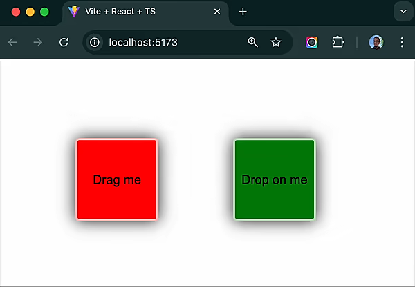 67 |
67 |
126 | 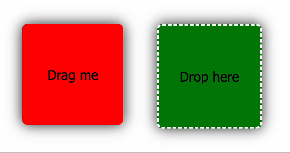 127 |
127 |
169 | {text}
170 |
171 | );
172 | };
173 | ```
174 |
175 | **DroppableSquare.tsx**
176 |
177 | ```tsx
178 | import { useState } from "react";
179 | import { useDroppable } from "snapdrag";
180 |
181 | export const DroppableSquare = ({ color }: { color: string }) => {
182 | const [text, setText] = useState("Drop here");
183 |
184 | const { droppable } = useDroppable({
185 | accepts: "SQUARE",
186 | data: { color },
187 | // Optional callbacks
188 | onDragIn({ data }) {
189 | // Some draggable is hovering over this droppable
190 | // data is the data of the draggable
191 | setText(`Hovered over ${data.color}`);
192 | },
193 | onDragOut() {
194 | // The draggable is no longer hovering over this droppable
195 | setText("Drop here");
196 | },
197 | onDrop({ data }) {
198 | // Finally, the draggable is dropped on this droppable
199 | setText(`Dropped ${data.color}`);
200 | },
201 | });
202 |
203 | return droppable(
204 |
205 | {text}
206 |
207 | );
208 | };
209 | ```
210 |
211 | **App.tsx**
212 |
213 | ```tsx
214 | import { Overlay } from "snapdrag";
215 |
216 | export default function App() {
217 | return (
218 |
219 | {/* Just two squares for simplicity */}
220 |
230 | );
231 | }
232 | ```
233 |
234 | This example on [CodeSandbox](https://codesandbox.io/p/sandbox/snapdrag-simple-squares-8rw96s)
235 |
236 | ## How Snapdrag Works
237 |
238 | Under the hood, Snapdrag takes a different approach than traditional drag-and-drop libraries:
239 |
240 | 1. **Event Listening**: Snapdrag attaches a `pointerdown` event listener to draggable elements
241 | 2. **Tracking Movement**: Once triggered, it tracks `pointermove` events on the document until `pointerup` occurs
242 | 3. **Finding Targets**: On every move, it uses `document.elementsFromPoint()` to check what elements are under the cursor
243 | 4. **Target Handling**: It then determines which droppable elements are valid targets and manages the interaction
244 | 5. **Event Firing**: Appropriate callbacks are fired based on the current state of the drag operation
245 |
246 | Unlike HTML5 drag-and-drop which has limited customization options, Snapdrag gives you control over every aspect of the drag experience.
247 |
248 | You can change settings of draggable and droppable at any time during the drag operation, making Snapdrag extremely flexible. Want to dynamically change what a draggable can do based on its current position? No problem!
249 |
250 | ## Core Components
251 |
252 | ### `useDraggable`
253 |
254 | The `useDraggable` hook makes any React element draggable. It returns an object with two properties:
255 |
256 | - `draggable`: A function that wraps your component, making it draggable
257 | - `isDragging`: A boolean indicating if the element is currently being dragged
258 |
259 | Basic usage:
260 |
261 | ```tsx
262 | const DraggableItem = () => {
263 | const { draggable, isDragging } = useDraggable({
264 | kind: "ITEM", // Required: identifies this draggable type
265 | data: { id: "123" }, // Optional: data to share during drag operations
266 | move: true, // Optional: move vs clone during dragging
267 | });
268 |
269 | return draggable(
221 |
223 |
224 |
226 |
227 | {/* Render overlay to show the dragged component */}
228 | Drag me!
);
270 | };
271 | ```
272 |
273 | **Important Note**: The wrapped component must accept a `ref` to the DOM node to be draggable. If you already have a ref, Snapdrag will handle it correctly:
274 |
275 | ```jsx
276 | const myRef = useRef(null);
277 |
278 | const { draggable } = useDraggable({
279 | kind: "ITEM",
280 | });
281 |
282 | // Both refs work correctly
283 | return draggable();
284 | ```
285 |
286 | You can even make an element both draggable and droppable:
287 |
288 | ```jsx
289 | const { draggable } = useDraggable({ kind: "ITEM" });
290 | const { droppable } = useDroppable({ accepts: "ITEM" });
291 |
292 | // Combine the wrappers (order doesn't matter)
293 | return draggable(droppable(I'm both!
));
294 | ```
295 |
296 | ### `useDroppable`
297 |
298 | The `useDroppable` hook makes any React element a potential drop target. It returns:
299 |
300 | - `droppable`: A function that wraps your component, making it a drop target
301 | - `hovered`: Data about the draggable currently hovering over this element (or `null` if none)
302 |
303 | Basic usage:
304 |
305 | ```jsx
306 | const DropZone = () => {
307 | const { droppable, hovered } = useDroppable({
308 | accepts: "ITEM", // Required: which draggable kinds to accept
309 | data: { zone: "main" }, // Optional: data to share with draggables
310 | onDrop({ data }) {
311 | // Optional: handle successful drops
312 | console.log("Dropped item:", data.id);
313 | },
314 | });
315 |
316 | // Change appearance when being hovered
317 | const isHovered = Boolean(hovered);
318 |
319 | return droppable(Drop here
);
320 | };
321 | ```
322 |
323 | ### `Overlay`
324 |
325 | The `Overlay` component renders the currently dragged element. It should be included once in your application:
326 |
327 | ```tsx
328 | import { Overlay } from "snapdrag";
329 |
330 | function App() {
331 | return (
332 |
333 | {/* Your app content */}
334 |
339 | );
340 | }
341 | ```
342 |
343 | You can add your own classes and styles to the overlay to make it fit your application.
344 |
345 | ## Draggable Lifecycle
346 |
347 | The draggable component goes through a lifecycle during drag interactions, with callbacks at each stage.
348 |
349 | ### `onDragStart`
350 |
351 | Called when the drag operation begins (after the user clicks and begins moving, and after `shouldDrag` if provided, returns `true`):
352 |
353 | ```jsx
354 | const { draggable } = useDraggable({
355 | kind: "CARD",
356 | onDragStart({ data, event, dragStartEvent, element }) {
357 | console.log("Started dragging card:", data.id);
358 | // Setup any state needed during dragging
359 | },
360 | });
361 | ```
362 |
363 | The callback receives an object with the following properties:
364 |
365 | - `data`: The draggable's data (from the `data` config option of `useDraggable`).
366 | - `event`: The `PointerEvent` that triggered the drag start (usually the first `pointermove` after `pointerdown` and `shouldDrag` validation).
367 | - `dragStartEvent`: The initial `PointerEvent` from `pointerdown` that initiated the drag attempt.
368 | - `element`: The DOM element that is being dragged (this is the element rendered in the `Overlay`).
369 |
370 | ### `onDragMove`
371 |
372 | Called on every pointer movement during dragging:
373 |
374 | ```jsx
375 | const { draggable } = useDraggable({
376 | kind: "CARD",
377 | onDragMove({ dropTargets, top, left, data, event, dragStartEvent, element }) {
378 | // dropTargets contains info about all drop targets under the pointer
379 | if (dropTargets.length > 0) {
380 | console.log("Over drop zone:", dropTargets[0].data.zone);
381 | }
382 |
383 | // top and left are the screen coordinates of the draggable
384 | console.log(`Position: ${left}px, ${top}px`);
385 | },
386 | });
387 | ```
388 |
389 | In addition to the properties from `onDragStart` (`data`, `dragStartEvent`, `element`), this callback receives:
390 |
391 | - `event`: The current `PointerEvent` from the `pointermove` handler.
392 | - `dropTargets`: An array of objects, each representing a droppable target currently under the pointer. Each object contains:
393 | - `data`: The `data` associated with the droppable (from its `useDroppable` configuration).
394 | - `element`: The DOM element of the droppable.
395 | - `top`: The calculated top screen coordinate of the draggable element in the overlay.
396 | - `left`: The calculated left screen coordinate of the draggable element in the overlay.
397 |
398 | **Note**: This callback is called frequently, so avoid expensive operations here.
399 |
400 | ### `onDragEnd`
401 |
402 | Called when the drag operation completes (on `pointerup`):
403 |
404 | ```jsx
405 | const { draggable } = useDraggable({
406 | kind: "CARD",
407 | onDragEnd({ dropTargets, top, left, data, event, dragStartEvent, element }) {
408 | if (dropTargets.length > 0) {
409 | console.log("Dropped on:", dropTargets[0].data.zone);
410 | } else {
411 | console.log("Dropped outside of any drop zone");
412 | // Handle "cancel" logic
413 | }
414 | },
415 | });
416 | ```
417 |
418 | Receives the same properties as `onDragMove` (`data`, `event`, `dragStartEvent`, `element`, `dropTargets`, `top`, `left`).
419 | If the user dropped the element on valid drop targets, `dropTargets` will contain them; otherwise, it will be an empty array.
420 | The `top` and `left` coordinates represent the final position of the draggable in the overlay just before it's hidden.
421 |
422 | ## Droppable Lifecycle
423 |
424 | The droppable component also has lifecycle events during drag interactions. All droppable callbacks receive a `dropTargets` array, similar to the one in `useDraggable`'s `onDragMove` and `onDragEnd`, representing all droppables currently under the pointer.
425 |
426 | ### `onDragIn`
427 |
428 | Called when a draggable first enters this drop target:
429 |
430 | ```jsx
431 | const { droppable } = useDroppable({
432 | accepts: "CARD",
433 | onDragIn({ kind, data, event, element, dropElement, dropTargets }) {
434 | console.log(`${kind} entered drop zone`);
435 | // Change appearance, update state, etc.
436 | },
437 | });
438 | ```
439 |
440 | The callback receives an object with:
441 |
442 | - `kind`: The `kind` of the draggable that entered.
443 | - `data`: The `data` from the draggable.
444 | - `event`: The current `PointerEvent` from the `pointermove` handler.
445 | - `element`: The DOM element of the draggable.
446 | - `dropElement`: The DOM element of this droppable.
447 | - `dropTargets`: Array of all active drop targets under the pointer, including the current one. Each entry contains:
448 | - `data`: The `data` from the droppable (from its `useDroppable` configuration).
449 | - `element`: The DOM element of the droppable.
450 |
451 | This is called once when a draggable enters and can be used to trigger animations or state changes.
452 |
453 | ### `onDragMove` (Droppable)
454 |
455 | Called as a draggable moves _within_ the drop target:
456 |
457 | ```jsx
458 | const { droppable } = useDroppable({
459 | accepts: "CARD",
460 | onDragMove({ kind, data, event, element, dropElement, dropTargets }) {
461 | // Calculate position within the drop zone
462 | const rect = dropElement.getBoundingClientRect();
463 | const x = event.clientX - rect.left;
464 | const y = event.clientY - rect.top;
465 |
466 | console.log(`Position in drop zone: ${x}px, ${y}px`);
467 | },
468 | });
469 | ```
470 |
471 | Receives the same properties as `onDragIn`. Like the draggable version, this is called frequently, so keep operations light. This is perfect for creating dynamic visual cues like highlighting different sections of your drop zone based on cursor position.
472 |
473 | ### `onDragOut`
474 |
475 | Called when a draggable leaves the drop target:
476 |
477 | ```jsx
478 | const { droppable } = useDroppable({
479 | accepts: "CARD",
480 | onDragOut({ kind, data, event, element, dropElement, dropTargets }) {
481 | console.log(`${kind} left drop zone`);
482 | // Revert animations, update state, etc.
483 | },
484 | });
485 | ```
486 |
487 | Receives the same properties as `onDragIn`. This is typically used to undo changes made in `onDragIn`. Use it to clean up and reset any visual changes you made when the draggable entered.
488 |
489 | ### `onDrop`
490 |
491 | Called when a draggable is successfully dropped on this target:
492 |
493 | ```jsx
494 | const { droppable } = useDroppable({
495 | accepts: "CARD",
496 | onDrop({ kind, data, event, element, dropElement, dropTargets }) {
497 | console.log(`${kind} was dropped with data:`, data);
498 | // Handle the dropped item
499 | },
500 | });
501 | ```
502 |
503 | Receives the same properties as `onDragIn`. This is where you implement the main logic for what happens when a drop succeeds. Update your application state, save the new position, or trigger any other business logic related to the completed drag operation.
504 |
505 | ## Common Patterns
506 |
507 | ### Two-way Data Exchange
508 |
509 | Snapdrag makes it simple for draggables and droppables to talk to each other by exchanging data in both directions:
510 |
511 | ```jsx
512 | // Draggable component accessing droppable data
513 | const { draggable } = useDraggable({
514 | kind: "CARD",
515 | data: { id: "card-1", color: "red" },
516 | onDragMove({ dropTargets }) {
517 | if (dropTargets.length > 0) {
518 | // Read data from the drop zone underneath
519 | const dropZoneType = dropTargets[0].data.type;
520 | console.log(`Over ${dropZoneType} zone`);
521 | }
522 | },
523 | });
524 |
525 | // Droppable component accessing draggable data
526 | const { droppable, hovered } = useDroppable({
527 | accepts: "CARD",
528 | data: { type: "inbox" },
529 | onDragIn({ data }) {
530 | console.log(`Card ${data.id} entered inbox`);
531 | },
532 | });
533 | ```
534 |
535 | This pattern is especially useful for adapting the UI based on the interaction context.
536 |
537 | ### Dynamic Colors Example
538 |
539 | Here's how to create a draggable that changes color based on the droppable it's over:
540 |
541 | ```jsx
542 | // In DraggableSquare.tsx
543 | import { useState } from "react";
544 | import { useDraggable } from "snapdrag";
545 |
546 | export const DraggableSquare = ({ color: initialColor }) => {
547 | const [color, setColor] = useState(initialColor);
548 |
549 | const { draggable, isDragging } = useDraggable({
550 | kind: "SQUARE",
551 | data: { color },
552 | move: true,
553 | onDragMove({ dropTargets }) {
554 | if (dropTargets.length) {
555 | setColor(dropTargets[0].data.color);
556 | } else {
557 | setColor(initialColor);
558 | }
559 | },
560 | onDragEnd() {
561 | setColor(initialColor); // Reset on drop
562 | },
563 | });
564 |
565 | return draggable(
566 |
573 | {isDragging ? "Dragging" : "Drag me"}
574 |
575 | );
576 | };
577 |
578 | // In DroppableSquare.tsx
579 | import { useDroppable } from "snapdrag";
580 |
581 | export const DroppableSquare = ({ color }) => {
582 | const [text, setText] = useState("Drop here");
583 |
584 | const { droppable } = useDroppable({
585 | accepts: "SQUARE",
586 | data: { color }, // Share this color with draggables
587 | onDrop({ data }) {
588 | setText(`Dropped ${data.color}`);
589 | },
590 | });
591 |
592 | return droppable(
593 |
594 | {text}
595 |
596 | );
597 | };
598 | ```
599 |
600 | ### Dynamic Border Example
601 |
602 | This example shows how to create a visual indication of where an item will be dropped:
603 |
604 | ```jsx
605 | import { useState } from "react";
606 | import { useDroppable } from "snapdrag";
607 |
608 | export const DroppableSquare = ({ color }) => {
609 | const [text, setText] = useState("Drop here");
610 | const [borderPosition, setBorderPosition] = useState("");
611 |
612 | const { droppable } = useDroppable({
613 | accepts: "SQUARE",
614 | onDragMove({ event, dropElement }) {
615 | // Calculate which quadrant of the square the pointer is in
616 | const { top, left, height } = dropElement.getBoundingClientRect();
617 | const x = event.clientX - left;
618 | const y = event.clientY - top;
619 |
620 | // Set border on the appropriate side
621 | if (x / y < 1.0) {
622 | if (x / (height - y) < 1.0) {
623 | setBorderPosition("borderLeft");
624 | } else {
625 | setBorderPosition("borderBottom");
626 | }
627 | } else {
628 | if (x / (height - y) < 1.0) {
629 | setBorderPosition("borderTop");
630 | } else {
631 | setBorderPosition("borderRight");
632 | }
633 | }
634 | },
635 | onDragOut() {
636 | setBorderPosition(""); // Remove border when draggable leaves
637 | },
638 | onDrop({ data }) {
639 | setText(`Dropped ${data.color}`);
640 | setBorderPosition(""); // Remove border after drop
641 | },
642 | });
643 |
644 | // Add border to appropriate side
645 | const style = {
646 | backgroundColor: color,
647 | [borderPosition]: "10px solid red",
648 | };
649 |
650 | return droppable(
651 |
652 | {text}
653 |
654 | );
655 | };
656 | ```
657 |
658 | ### Multiple Drop Targets
659 |
660 | Snapdrag handles the case where multiple drop targets overlap:
661 |
662 | ```jsx
663 | const { draggable } = useDraggable({
664 | kind: "ITEM",
665 | onDragMove({ dropTargets }) {
666 | // Sort by order to find the topmost
667 | const sorted = [...dropTargets].sort((a, b) => b.data.order - a.data.order);
668 |
669 | if (sorted.length) {
670 | console.log(`Topmost target: ${sorted[0].data.name}`);
671 | }
672 | },
673 | });
674 |
675 | // ... somewere in your code
676 |
677 | const { droppable } = useDroppable({
678 | accepts: "ITEM",
679 | data: { order: 10 },
680 | });
681 | ```
682 |
683 | You also can you DOM elements to get the topmost drop target:
684 |
685 | ```tsx
686 | const { draggable } = useDraggable({
687 | kind: "ITEM",
688 | onDragMove({ dropTargets }) {
689 | // Sort by order to find the topmost
690 |
691 | const sorted = [...dropTargets].sort((a, b) => {
692 | // access drop target element instead of data
693 | const aIndex = a.element.getComputedStyle().zIndex || 0;
694 | const bIndex = b.element.getComputedStyle().zIndex || 0;
695 |
696 | return bIndex - aIndex;
697 | });
698 |
699 | if (sorted.length) {
700 | console.log(`Topmost target: ${sorted[0].data.name}`);
701 | }
702 | },
703 | });
704 | ```
705 |
706 | ### Drag Threshold
707 |
708 | For finer control, you can start dragging only after the pointer has moved a certain distance:
709 |
710 | ```jsx
711 | const { draggable } = useDraggable({
712 | kind: "ITEM",
713 | shouldDrag({ event, dragStartEvent }) {
714 | // Calculate distance from start position
715 | const dx = event.clientX - dragStartEvent.clientX;
716 | const dy = event.clientY - dragStartEvent.clientY;
717 | const distance = Math.sqrt(dx * dx + dy * dy);
718 |
719 | // Only start dragging after moving 5px
720 | return distance > 5;
721 | },
722 | });
723 | ```
724 |
725 | ### Touch Support
726 |
727 | Snapdrag supports touch events out of the box. It uses `PointerEvent` to handle both mouse and touch interactions seamlessly. You can use the same API for both types of events.
728 |
729 | To make your draggable elements touch-friendly, ensure they are touchable (e.g., using `touch-action: none` in CSS). The container can have `touch-action: pan-x` or `touch-action: pan-y` to allow scrolling while dragging.
730 |
731 | ## Examples
732 |
733 | Snapdrag includes several examples that demonstrate its capabilities, from simple to complex use cases.
734 |
735 | ### Basic: Colored Squares
736 |
737 | The simplest example shows dragging a colored square onto a drop target:
738 |
739 |
740 | 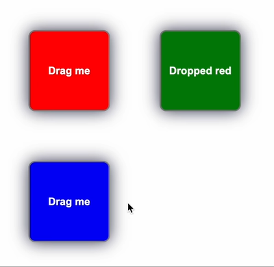 741 |
741 |
756 | 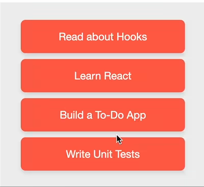 757 |
757 |
772 | 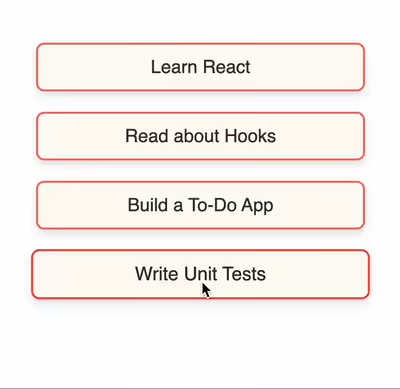 773 |
773 |
788 |
789 |
1210 |
1220 | );
1221 | };
1222 | ```
1223 |
1224 | **How it Works**
1225 |
1226 | 1. **Initialization**: `createScroller` returns a new scroller function configured with your desired settings.
1227 | 2. **Plugin Attachment**: When you pass `scrollerPlugin(containerElement)` to `useDraggable`, Snapdrag calls the appropriate lifecycle methods of the plugin (`onDragStart`, `onDragMove`, `onDragEnd`).
1228 | 3. **Drag Monitoring**: During a drag operation, `onDragMove` is continuously called. The scroller plugin checks the pointer's position relative to the specified `containerElement`.
1229 | 4. **Edge Detection**: If the pointer moves within the `threshold` distance of an edge for an enabled axis (x or y), the plugin initiates scrolling.
1230 | 5. **Scrolling Speed**: The scrolling speed increases polynomially (based on `distancePower`) as the pointer gets closer to the edge, up to the maximum `speed`.
1231 | 6. **Animation Loop**: Scrolling is performed using `requestAnimationFrame` for smooth animation.
1232 | 7. **Cleanup**: When the drag ends (`onDragEnd`) or the component unmounts, the plugin cleans up any active animation frames.
1233 |
1234 | **Important Considerations:**
1235 |
1236 | - The `containerElement` passed to the scroller function must be the actual scrollable DOM element.
1237 | - Ensure the `containerElement` has `overflow: auto` or `overflow: scroll` CSS properties set for the respective axes you want to enable scrolling on.
1238 | - If the scrollable container is not immediately available on component mount (e.g., if its ref is populated later), you might need to conditionally apply the plugin or update it, as shown in the example using `useState` and `useEffect` to pass the container element once it's available.
1239 | - The plugin calculates distances based on the viewport. If your scroll container or draggable items are scaled using CSS transforms, you might need to adjust threshold and speed values accordingly or ensure pointer events are correctly mapped.
1240 |
1241 | The `scroller` plugin offers a straightforward way to add automatic scrolling to your drag-and-drop interfaces. It significantly enhances usability, especially when users need to drag items across large, scrollable containers or overflowing content areas.
1242 |
1243 | ## Browser Compatibility
1244 |
1245 | Snapdrag is compatible with all modern browsers that support Pointer Events. This includes:
1246 |
1247 | - Chrome 55+
1248 | - Firefox 59+
1249 | - Safari 13.1+
1250 | - Edge 18+
1251 |
1252 | Mobile devices are also supported as long as they support Pointer Events.
1253 |
1254 | ## License
1255 |
1256 | MIT
1257 |
1258 | ## Author
1259 |
1260 | Eugene Daragan
1261 |
--------------------------------------------------------------------------------
1211 | {/* Inner content larger than container */}
1212 | {draggable(
1213 |
1219 |
1214 | Drag me
1215 |
1216 | )}
1217 | {/* More draggable items or content here */}
1218 |